
Designing your site in Terminalfour
The purpose of this article is to help you understand how pages are constructed in Terminalfour so you can code pages that will work neatly once built into Terminalfour.
If you are undertaking your first build with the system then this is aimed at you.
Page Layouts
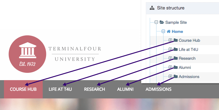
A single Page Layout can be used on multiple pages on your site. You can think of it as the template for pages in your site. Each Page Layout is made up of Header and Footer code. In this example, the Header contains the logo, main header text and the navigation. Both the Header and Footer will be consistent across all the pages in your site that use this Page Layout.
These two pages use the same Page Layout, so while the content is different on each, the Header and Footer are the same:
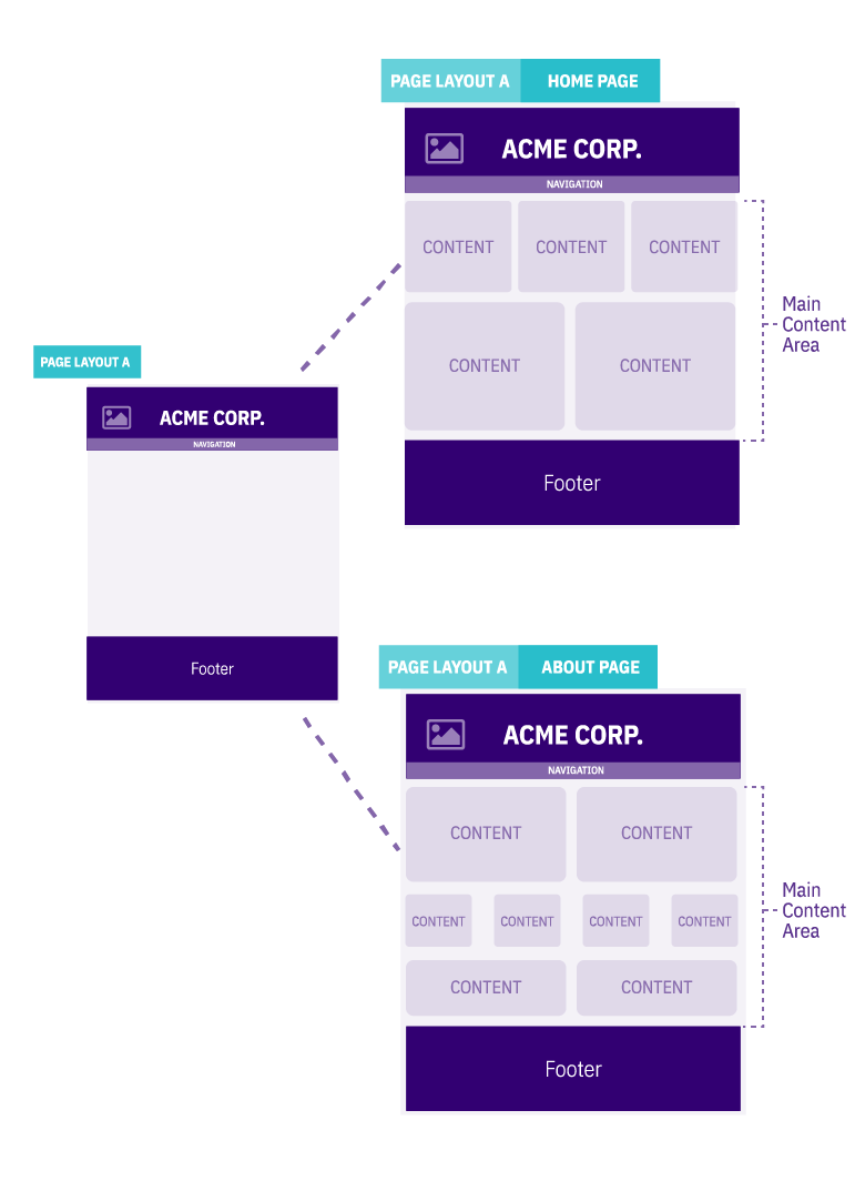
Changes to the Page Layout are reflected across all pages using that Page Layout:
Design consistency not only makes your site easier to use, but it also reduces the build and any maintenance time for your site in Terminalfour.
The Header and Footer code for your Page Layouts is just plain HTML (with as much JavaScript and CSS as you need). If your site is configured to use a server-side scripting language such as PHP, you can use this too.
Using T4 Tags lets you add useful features like Navigation Objects, metadata and Media Library assets, so your markup can be as simple or complex as you need it.
It's also a good idea to use consistent stylesheets & JavaScript across the Page Layouts to keep things as simple as possible.
For more on Page Layouts, check out the Page Layouts page in the documentation.
Content Types
Each content item added to your site with Terminalfour uses a Content Type. A Content Type is a template for a Content Item.
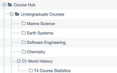
For instance, you could create a Content Type called "Article" that will be used for all the news articles published on your site:
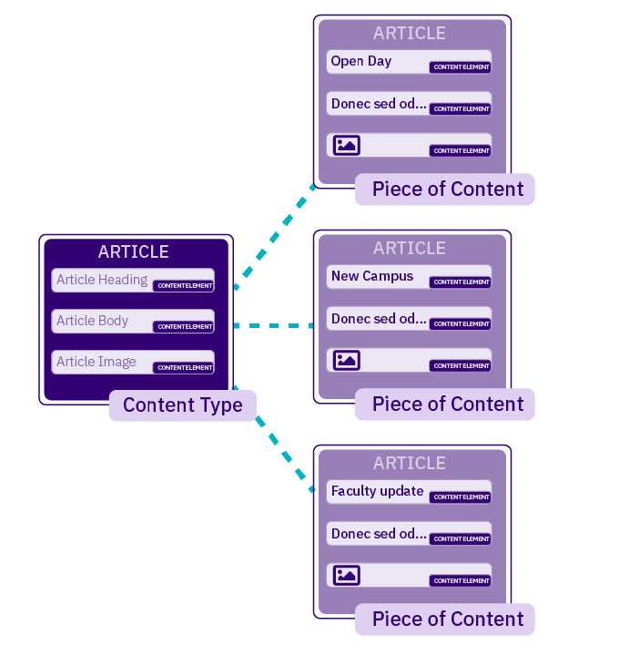
The Content Type specifies the fields (called Content Type Elements) that can be populated in order to create an article. In this example, the "Article" Content Type has a heading, body text and an image. Each article that is written has some or all of these elements.
For more on Content Types, check out the Content Types page in the documentation.
Content Layouts
Content Layouts let you display a single Content Item in multiple ways. For instance, maybe we want our news article to appear on our site as a full article and within an RSS feed. While both use the same "Article" Content Type we can use different Content Layouts to present that same content in two different ways.
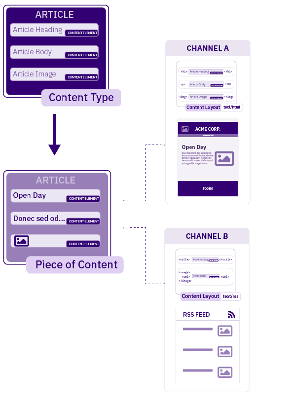
Like Page Layouts, Content Layouts use plain HTML. You add T4 Tags as placeholders for the content that will display on publish.
Try to be consistent & reuse designs across the site. Having a news preview with an h2 title on one page, and h3 title tags on another page will require two separate layouts
For more on Content Layouts, check out the Content Types page in the documentation.
General Text Areas (WYSIWYG) / Manually Entered Content
Most projects include at least one HTML/WYSIWYG area so content editors can manually add different kinds of formatted text content. Terminalfour uses TinyMCE by default but allows for other choices. We suggest taking a few additional steps to improve content editors’ experience and ensure web visitors get the most usable and accessible visit possible.
The following documentation includes custom classes and JavaScript to cut down on edits needed in the HTML area’s code view.
General Text Content
When designing HTML/WYSIWYG areas, include a class that can serve as a catch-all. Example:
<div class=″general-text″>...</div>
This allows for easier styling/formatting of manually entered content like bullet points, tables, bold text, left/right image alignment, etc.
Tables
Improve table usability for web visitors by using JavaScript.
When a table is entered manually, TinyMCE will output:
<table>...</table>
JavaScript should modify it to:
<div class="table-responsive"> <table class="table-overflow"> ... </table></div>
Then use CSS to apply responsive rules to
.general-text .table-responsive {…}
and
.general-text .table-overflow {…}
to ensure the table behaves gracefully on all viewports.
Iframes
Improve Iframes usability for web visitors by using JavaScript.
Assume the following Iframe is pasted:
<iframe width="560" height="315" src="https://www.youtube.com/embed/zTurtwfQ5yU?si=5DIT1Ab3WWsq5uEG" title="YouTube video player" frameborder="0" allow="accelerometer; autoplay; clipboard-write; encrypted-media; gyroscope; picture-in-picture; web-share" allowfullscreen></iframe>
JavaScript should modify it to:
<div class="iframe-responsive"> <iframe width="560" height="315" src="https://www.youtube.com/embed/zTurtwfQ5yU?si=5DIT1Ab3WWsq5uEG" title="YouTube video player" frameborder="0" allow="accelerometer; autoplay; clipboard-write; encrypted-media; gyroscope; picture-in-picture; web-share" allowfullscreen></iframe></div>
Then use CSS to apply responsive rules to .general-text .iframe-responsive {…} to ensure the Iframe behaves gracefully on all viewports.
Inline Images
When designing in-line images’ behavior, consider adding helper classes to your CSS. We suggest the following:
- .image-full-width - image displays the full width of the content area
- .image-float-left - image floats left, maintains its natural width and text flows around the image
- .image-float-right - image floats right, maintains its natural width and text flows around the image
- .image-float-none - image maintains its natural width and text flows above/below the image
Acceptable mark up for inline images looks like:
<img src="image.jpg" alt="#" class="image-float-none"><div class="image-float-left"><img src="image.jpg" alt="#"></div><figure class="image-full-width "><img src="image.jpg" alt="#"><figcaption>A photo caption</figcaption></figure>
The last example (3. <figure>) shows the use of a photo caption. Terminalfour can make a media layout that will prompt the content editor to fill in the caption text.
List styling
When designing list behaviour, consider that it’s possible to nest lists of different types. e.g. an unordered list within an ordered list. Set margin and padding appropriately.
Custom Formats for Buttons
In TerminalFour, we can add custom formats for call-to-action buttons in our WYSIWYG editor, TinyMCE. This allows content editors to create clickable buttons on the fly.
The HTML output depends on where the content editor has placed their cursor. That could be output as any of the following examples:
Class applied to wrapping paragraph
<p class="button"><a href="#">Lorem ipsum</a></p>
Class applied to anchor
<p><a href="#" class="button">Lorem ipsum</a></p>
Class applied to span within anchor
<p><a href="#"><span class="button">Lorem ipsum</span></a></p>
Instead of using a generic .button class in your CSS:
.button {...}
Use more targeted selectors to account for the different ways a the class could be applied:
a.button,a span.button,.button a {...}
If there are multiple design options for call-to-action buttons, use clear and descriptive class names to differentiate them:
a.button-blue,a span.button-blue,.button-blue a {...}a.button-red,a span.button-red,.button-red a {...}
Treatment of Links Within WYSIWYG Content Areas
When designing content sections or modules, it is better if there are not CSS classes applied to links.
The following code wrapped between <div> tags are examples of the treatment of links in text that will work best with Terminalfour.
First, for a title within a component called, for instance, a “Feature Image Box:”
<div class="feature-img-box__box-inner"><h2 class="display-2">Lorem ipsum dolor sit amet, <a href="#">consectetur adipiscing</a> elit. Suspendisse orci eros, rutrum eu nisl nec, <a href="#">iaculis dictum urna</a>.</h2></div>
This theoretical Feature Image Box could also contain a field or element for a description, as follows:
<div class="feature-img-box__box-inner"><p>Lorem ipsum dolor sit amet, <a href="#">consectetur adipiscing</a> elit. Suspendisse orci eros, rutrum eu nisl nec, <a href="#">iaculis dictum urna</a>.</p></div>
The CSS class could then be structured in the following manner, to accommodate the component:
.feature-img-box__box-inner p {}Please note the lack of a class reference in the anchor tags in particular, <a href=”#”>.
Link Menus and Lists
Terminalfour has a number of built-in Navigation Objects to help you add features like sitemaps, breadcrumbs and, of course, navigation menus to your pages quickly.
Each site in Terminalfour is made up of Sections in a Site Structure. Sections, like folders, help you arrange the pages of your site. The can be used to create a menu listing and link to Sections. If new Sections are added or existing ones are removed or renamed, the Link Menu will be updated.
The most common way to set this up is to use an unordered list.
Single-Level Menu
Here you might want to create main navigation that will list and link to all Sections in the "Top Nav" Branch (a Branch is just a Section that contains Child Sections).
- creating a link menu using an ordered list will only work on a single level
- linking to content such as media or PDFs from within a link menu is not possible
- you can link to external URLs if one of your Sections is a Link Section
You can create a Link Menu Navigation Object that points to that Branch. In the Page Layout, you can add the following markup:
<nav><t4 type="navigation" name=Top Nav content" id="363" /></nav>
The navigation element’s source code looks like this on the published page:
<nav><ul><li><a href="/news/">News</a></li><li><span class=”currentbranch0”><a href="/blog/">Blog</a></span></li> <li><a href="/careers/">Careers</a></li><li><a href="/partners/">Partners</a></li><li><a href="http://external link.com">Community</a></li></ul></nav>
- you might notice the span with a class of “currentbranch0” that has been added to the “Blog” item. This would be added if we were currently on the “Blog” page. The span is applied to the list item of the current Section name at this level where X is the level of the menu (starting at 0 & incrementing 1 per level deep)
- it is also possible to put a class/id on the ul and li, but if using a class on the li then all li's need to use the same class (i.e. do not apply a different class to each li)
- the current branch does not have to be a link
Multilevel Menus (Two Levels)
When you have a multilevel menu in your Link Menu, the source code for your navigation will look like this:
<nav><ul><li class="item"><a href="/terminalfour">Homepage</a></li><li class="item"><span class="currentbranch0"><a href="/terminalfour/aboutus/">About us</a></span><ul class="multilevel-linkul-0" title=""><li><span class="currentbranch1"><a href="/terminalfour/aboutus/Introduction/">Introduction</a></span></li></ul></li><li class="item"><a href="/terminalfour/ourstory/">Our Story</a></li><li class="item"><a href="/terminalfour/ourphilosophy/">Our Philosophy</a></li> <li class="item"><a href="/terminalfour/ourteams /">Our Teams</a></li></ul></nav>
Like the single-level menu, a span with a class of ‘currentbranch0’ is added to the current page’s item. In this example, however, there’s another level below ‘About Us’.
When we’re on the ‘Introduction’ page, a span with a class of ‘currentbranch1’ is added to that item. The nested unordered list has a class of ‘multilevel-linkul-0’ added to it.
Thanks to the addition of these classes, we know precisely where we are in the navigation tree.
This is especially useful when we have even more than two levels.
- Child Sections are output in a new UL LI
- this new level has a class multilevel-linkurl-X where X is the depth of the child sections (starting at 0 & incrementing 1 per level deep)
- no class can be applied to the second level of LI's
- the <span class="currentbranchX"> is applied to the current section at this level where X is the level of the menu (starting at 0 & incrementing 1 per level deep)
- making the current branch a link is optional
- the class on the main UL and first-level of LIs are optional (as per the single level menu above)
Multilevel Menus (Three Levels)
<nav><ul><li class="item"><a href="/terminalfour/">Homepage</a></li><li class="item"><span class="currentbranch0"><a href="/terminalfour/aboutus/">About us</a></span> <ul class="multilevel-linkul-0" title=""> <li><span class="currentbranch1"><a href="/terminalfour/aboutus/Introduction/">Introduction</a></span><ul class="multilevel-linkul-1" title=""> <li><span class="currentbranch2"><a href="/terminalfour/Aboutus/Introduction/Staff/">Staff</a></span></li> </ul></li></ul></li><li class="item"><a href="/terminalfour/ourstory/">Our Story</a></li><li class="item"><a href="/terminalfour/ourphilosophy/">Our Philosophy</a></li><li class="item"><a href="/terminalfour/ourteams /">Our Teams</a></li></ul></nav>
In this example, our current Branch is two levels below the top level. The list item is given a class of ‘currentbranch2’. The second nested list has a class of ‘multilevel-linkul-1’.
- this new level has a class multilevel-linkurl-X where X is the depth of the child sections (starting at 0 & incrementing 1 per level deep)
- adding a current class to the branch is optional
- the <span class="currentbranchX"> is applied to the current section at this level where X is the level of the menu (starting at 0 & incrementing 1 per level deep)
- making the current branch a link is optional
Responsive Images
Having the correct image size for the correct screen size is always beneficial for everyone. The user will have faster screen loading times, and the server will use less bandwidth and processing time.
As a good practice, the design of a page should always aim to have different image sizes for different situations, ideally covering all the possible scenarios, such as different screen sizes, resolutions, etc. Also, sometimes, the same component might have a different behaviour on different devices, i.e.: a horizontal carrousel gallery that, on a mobile, turns into a vertical carrousel gallery.
Thinking of that we, at Terminalfour, always suggest that your code reflects and caters for that using different srcset, as shown in the example below:
<img src="image-1200.jpg"srcset="image-480.jpg 480w,image-768.jpg 768w,image-1200.jpg 1200w"sizes="(max-width: 600px) 480px, (max-width: 1200px) 768px, 1200px"alt="A scenic view of a mountain range">
It is also a good idea to think of the file size of the images and, with the most modern browsers, WebP is always a good choice to use to reduce even further the loading times and give more flexibility to your page. Below is an example using WebP images with a jpg option as fallback for older browsers/devices:
<picture><!-- WebP as a fallback for modern browsers --><source type="image/webp"srcset="image-480.webp 480w,image-768.webp 768w,image-1200.webp 1200w"sizes="(max-width: 600px) 480px, (max-width: 1200px) 768px, 1200px"><!-- Default JPEG fallback --><img src="image-1200.jpg"srcset="image-480.jpg 480w,image-768.jpg 768w,image-1200.jpg 1200w"sizes="(max-width: 600px) 480px, (max-width: 1200px) 768px, 1200px"alt="A scenic view of a mountain range"></picture>
IMPORTANT NOTE: although these practices are the best in the market as of date, there are some caveats attached: they may significantly affect the back-end work by having multiple image elements on the same component to cater for every image size/proportion AND/OR requiring the creation of different image variants, by cropping and resizing them.
All these caveats are softened if PXL is a part of your implementation, as it could create these variants on the fly (see more details about it here CDN/PXL Overview - Terminalfour Knowledge Base). Be sure to always check with your CRM/Implementation Analyst what would be the best approach to implement responsive imagery.
A-Z Navigation
The A to Z Navigation Object is a variation outputs a list of Sections in alphabetical order. The order of the list can either be ascending or descending.
For more on A-Z Navigation Navigation Object, check out the page in the documentation
Breadcrumbs
Breadcrumbs help orient a site user within the site. In general, any custom code can appear before and after the breadcrumbs, as well as between the breadcrumbs.
You cannot have separate classes for each part of the breadcrumb. Adding the class 'first' & 'last' is also not possible in Terminalfour though you can target these with CSS.
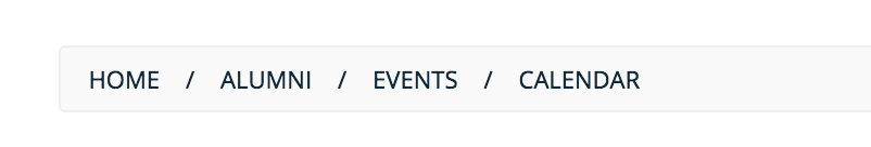
When creating a Breadcrumb Navigation you can specify the separating HTML that you would like to appear between the breadcrumb items.
In this case, a right double-angled arrow and a non-breaking space ( » ) is specified as the separating HTML:
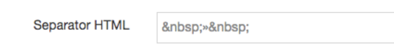
The following then appears between all links in the published breadcrumbs:
<a href="/ ">Home</a> »<a href="/news">News</a> »<a href="/internal">Internal</a> » <a href="/archive">Archive</a>
Breadcrumbs can also be added to a list (the <ul> can have any id/class):
<ul class="breadcrumb"><li class="linkItem"><a href="/">Home</a></li><li class="linkItem"><a href="/news">News</a></li><li class="linkItem"><a href="/internal">Internal</a></li><li class="linkItem"><a href="/archive">Archive</a></li></ul>
- each link produced by the CMS will have the same code (and therefore class) applied before & after each link
- the current section can be a link or just text
- custom classes can be added with JQuery
For more on the Breadcrumbs Navigation Object, check out the page in the documentation.
Grouped content
Many websites include groups of similarly structured content like tabs, accordions, sliders, and carousels/galleries.
Terminalfour has functionality that wraps grouped content with opening/closing code. This method allows content editors to add each item as a separate piece of content and control the position of each item.
When designing this type of content, ensure there is a wrapping tag and that the HTML markup is identical for each item similar to the example below.
<div class="accordion-group"><div class="accordion-item"><h4><button>Title 1</button></h4><div class="accordion-body">This is the first item's accordion body.</div></div><div class="accordion-item"><h4><button>Title 2</button></h4><div class="accordion-body">This is the second item's accordion body. </div></div><div class="accordion-item"><h4><button>Title 3</button></h4><div class="accordion-body">This is the third item's accordion body.</div></div></div>
CSS styles can be used within these repeatable items. However, any changes to appearance of a repeatable item should come from its parent style. For instance, zebra striping could be accomplished as follows:
.accordion-group div.accordion-item:nth-child(odd) { background:grey; color:black; }
Often in components that repeat, something may be defined before the repeated code (like a heading or description) and something may be defined after the repeated code (such as a Call to Action button). Styles can be applied to these items.
<h3>This is the group title</h3><div class="accordion-description"><p>Lorem <strong class="alert">Ipsum</strong></p></div><div class="accordion-group accordion-3"><div class="accordion-item"><h4><button>Title 1</button></h4><div class="accordion-body">This is the first item's accordion body.</div></div><div class="accordion-item"><h4><button>Title 2</button></h4><div class="accordion-body">This is the second item's accordion body. </div></div><div class="accordion-item"><h4><button>Title 3</button></h4><div class="accordion-body">This is the third item's accordion body.</div></div></div><div class="accordion-footer"><p>Lorem ipsum.</p></div>
In the accordion example below, there is 2 accordions with the same class "accordion-item". Ensure there is no 'active' class in the div and each div is the same. If an unique ID is required, we can output the content ID as shown below:
<span id="d.en.459721"></span>
<div class="accordion-item">
    <h2 class="accordion-header" id="agenda-heading459721">
        <button class="accordion-button collapsed js-triggerRefresh" type="button" data-bs-toggle="collapse"
            data-bs-target="#agenda-collapse459721" aria-expanded="true" aria-controls="agenda-collapse459721">
            Title 1
        </button>
    </h2>
    <div id="agenda-collapse459721" class="accordion-collapse collapse" aria-labelledby="agenda-heading459721"
        data-bs-parent="">
        <div class="accordion-body">
            <div class="accordion-body">
                  <p>Description</p>
            </div>
        </div>
    </div>
</div><span id="d.en.459722"></span>
<div class="accordion-item">
    <h2 class="accordion-header" id="agenda-heading459722">
        <button class="accordion-button collapsed js-triggerRefresh" type="button" data-bs-toggle="collapse"
            data-bs-target="#agenda-collapse459722" aria-expanded="true" aria-controls="agenda-collapse459722">
           Title 2
        </button>
    </h2>
    <div id="agenda-collapse459722" class="accordion-collapse collapse" aria-labelledby="agenda-heading459722"
        data-bs-parent="">
        <div class="accordion-body">
            <div class="accordion-body">
                <p>Description</p>
            </div>
        </div>
    </div>
</div>
Anchor links
Terminalfour allows a user to anchor link to a particular piece of content within the same section or a different section.
For content types that require this functionality, Terminalfour outputs an anchor span above the piece of content or for grouped content such accordions, above the group of accordions and also above each accordion dropdown.
Example of this code:
<span id="d.en.12345"></span>
'en' is the language code of the piece of content and '12345' is the ID of the piece of content. This is an unique ID for the anchor tag.
<span id="d.en.12345"></span> <div class="accordion-item"> <h2 class="accordion-header" id="agenda-heading12345"> <button class="accordion-button collapsed js-triggerRefresh" type="button" data-bs-toggle="collapse" data-bs-target="#agenda-collapse459720" aria-expanded="true" aria-controls="agenda-collapse12345"> This is the accordion title </button> </h2> <div id="agenda-collapse12345" class="accordion-collapse collapse" aria-labelledby="agenda-heading12345" data-bs-parent=""> <div class="accordion-body"> <div class="accordion-body"> <p>This is the accordion description</p> </div> </div> </div>
When designing for Terminalfour, ensure that an example of anchor links is provided, particularly with grouped content. A anchor link to a specific accordion for example must open and padding added to ensure that the accordion is not blocked by a sticky inner menu or header.
Pagination
Pagination makes it easier for your site users to navigate large numbers of content items.
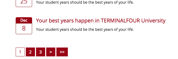
You can add your own HTML before, after and between the page number links:
In the set up you will be asked to specify the Content Type used for the pagination, how many can be displayed on the page, and how many overall can be shown through pagination.
<nav class="pagination"><span class="currentpage">1</span><a href="/alumni/news/2/">2</a><a href="/alumni/news/3/">3</a><a href="/alumni/news/2/">></a><a href="/alumni/news/3/">>></a></nav>
A span with a class of ‘currentpage’ is added to the current page number.
- the surrounding html (div, ul, li) are configurable
- ALL pages are shown in the pagination. If there will be a large number of pages, add JavaScript to replace some of the links with a ...
- each item produced by Terminalfour will be the same, but with the updated link
For more on Pagination Navigation Object, check out the Pagination page in the documentation.
Form Builder
Form Builder is a WYSIWYG form editor that makes it easy to create, edit and publish forms on your site. When customizing the look of your form you can apply your own stylesheet but you can't make changes to the generated HTML. Styled forms use Bootstrap 3.3.7. so it's worth familiarizing yourself with the class names and mark up structure that Bootstrap forms use. Even when 'Include styling' is disabled the generated mark-up will still use Bootstrap class names. The form elements most commonly altered are radio buttons and checkboxes but again, bear in mind that the markup for these elements cannot be changed.
If you want to review Form Builder's generated markup there is a sample form featuring available form input elements.
If you want to change DOM elements with JavaScript bear in mind that there is already jQuery included for form functionality (even on unstyled forms) so conflicts may occur.
See the note on AJAX below.
Here's an example of a script that will change the background of a published form to 'red':
<script>
(function() {
    var proxied = window.XMLHttpRequest.prototype.send;
    window.XMLHttpRequest.prototype.send = function() {
        var pointer = this
        var intervalId = window.setInterval(function(){
          if(pointer.readyState != 4){
            return;
          }

         // START CUSTOM CODE

          var elements = document.querySelectorAll('.form-group');
          for (var i = 0; i < elements.length; i++) {
          	elements[i].style.background = 'red';
          }

          // END CUSTOM CODE

        }, 1);
        return proxied.apply(this, [].slice.call(arguments));
    };


})();
</script>
When the page is published a style attribute with a value of 'red' is added to the div with a class of form-group:
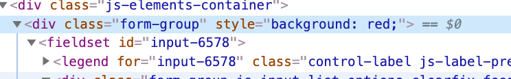
This script will only work with forms deployed with a T4 Tag (and not using the 'Embed code' or 'Shareable link' methods).
You can learn more about creating forms in the documentation here.
Terminalfour Modules
A note on AJAX
Terminalfour's Sample Site contains examples of pre-made modules like the Events Calendar, Advanced Program Search, and a Staff Directory. Many of these rely on Ajax to load content. If you want to use JavaScript or jQuery to manipulate module elements or their content it's worth being aware of how events are attached.
Here's a typical click event with jQuery:
$("#accordion").on("click", function() {...} );In that case, we bind the click event to the element with an ID of 'accordion'. However, if the accordion element's content is loaded by Ajax, the click event won't work. That's because it only affects elements that are present on page load. Instead, when targetting Ajax loaded content we must bind the event to the body element or the closest static parent element:
$("body").on("click", "#accordion", function() {...} );Have a look at this Stack Overflow page for more info.
A note of JavaScript files
When supplying JavaScript files to Professional Services please ensure that they are not minified and combined from multiple files. Ideally, a separate JavaScript file should be supplied for each module and/or page. This makes it easier for our developers to parse for potential conflicts.
Events Calendar
The Terminalfour Events Calendar is a PHP application which displays event content in a calendar format. There is an example of the events calendar on our sample site.
- the events listing is within <div class="" id="calendar_events">. The code within this is customizable, allowing you to style the events listing, and to display the event details that are important to your website visitors
- the calendar box, categories, search etc. can be moved to the left column, if preferred
- the detailed view of the event information does not need to be replicated. This is 100% customizable for each implementation.