
Form Builder
Description
With Terminalfour Form Builder you can create advanced web forms easily without coding. The forms you create can be fully customized to meet your needs.
When you click create new form, you initially start with a blank form. Click on field types to add new fields to your form. Fields include text fields, drop-down boxes, buttons etc. Fields can have dependencies and validations associated with them.
When a form is created and a submission made, Terminalfour creates a corresponding Content Type to manage the content.
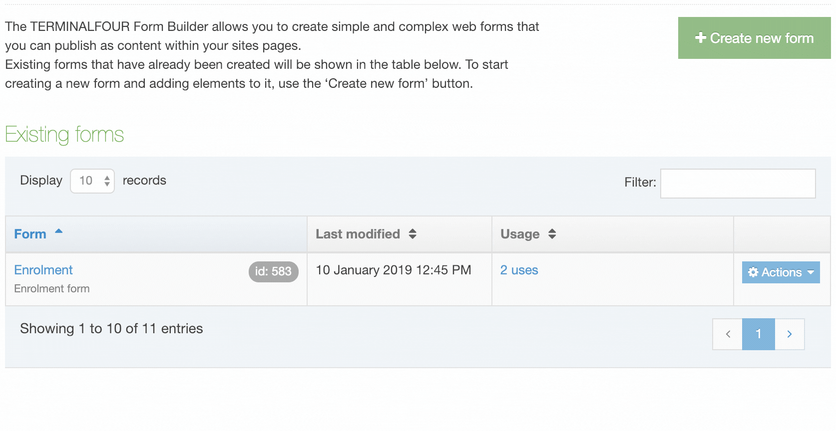
To edit or create a new form go to Engage > Forms & Transactions.
Form Listing
Existing forms are listed in the table and can be sorted and filtered by:
- Name
- Last Modified Date
- Usage - the number of instances of this form within Terminalfour
- this can be clicked on to show the number of location of the form instances:

If you are not connected to a Form Bank no forms will be listed and a warning will be displayed on the page.
To edit a form, you can either click on the form name or select Edit from the Actions Menu.
When submissions have been received for a form, they can be viewed from the Submissions option in the Actions Menu.
Have a look at the documentation on Submissions to learn more.
To delete a form select Actions > Delete.
Create a form
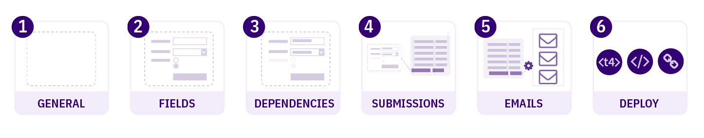
Form creation divides into six steps:
- General Settings – add necessary form information such as name and description. You can also apply Bootstrap styling or use your own.
- Fields - select, add and configure form fields. You can also base your form on an existing Content Type
- Dependencies – optional rules that can show or hide a form field based on the value that is input in another. For example, you might want to hide a list of faculty names unless the respondent ticks a box identifying themselves as a faculty member
- Submissions – specifies the location that the submissions will be saved to. By default, this is set to an unpublished Section in TERMINALFOUR but a published Section can be specified too. Fields can also be mapped to a Payment Gateway here. In order to use this, a Payment Gateway must already be configured in System settings. You can also customize the redirects (to a URL or TERMINALFOUR Section) and messages for submission success or failure
- Emails – a copy of each submission can be mailed to one or more Terminalfour Users. Non-Terminalfour user mail addresses can also be added
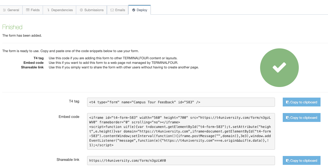
- Finish – forms can be deployed using:
- a T4 Tag to add to other Terminalfour content or layouts
- embed code to add your form to a page not managed by Terminalfour
- a shareable link that doesn't require a page to be created to deploy it
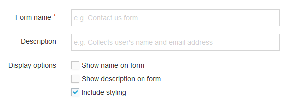
General settings

| Item | Description |
|---|---|
| Form name | Sets the name used to identify the form in the application. Can be output on form (see option below) |
| Description | Sets the text used to describe the form in the application. Can also be output on the form (see option below) |
| Display options | |
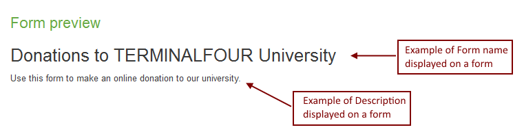
| Show name on form | Outputs the name specified above as a heading (h2) at the start of your form |
| Show description on form | Outputs the description specified above as a paragraph of text at the beginning of your form |
| Include styling |
By default, Terminalfour Form Builder uses Bootstrap CSS to style your form. When this option is unchecked Bootstrap CSS is not added and you can use your own styling. This is only relevant for forms that are deployed with a T4 Tag; both embedded and standalone forms always use Bootstrap CSS. Because the date pickers rely so heavily on styling, if styling is disabled and the form is included on your site using a T4 Tag, the date pickers will not display or function. |
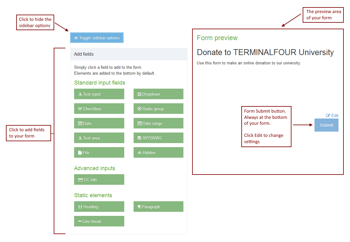
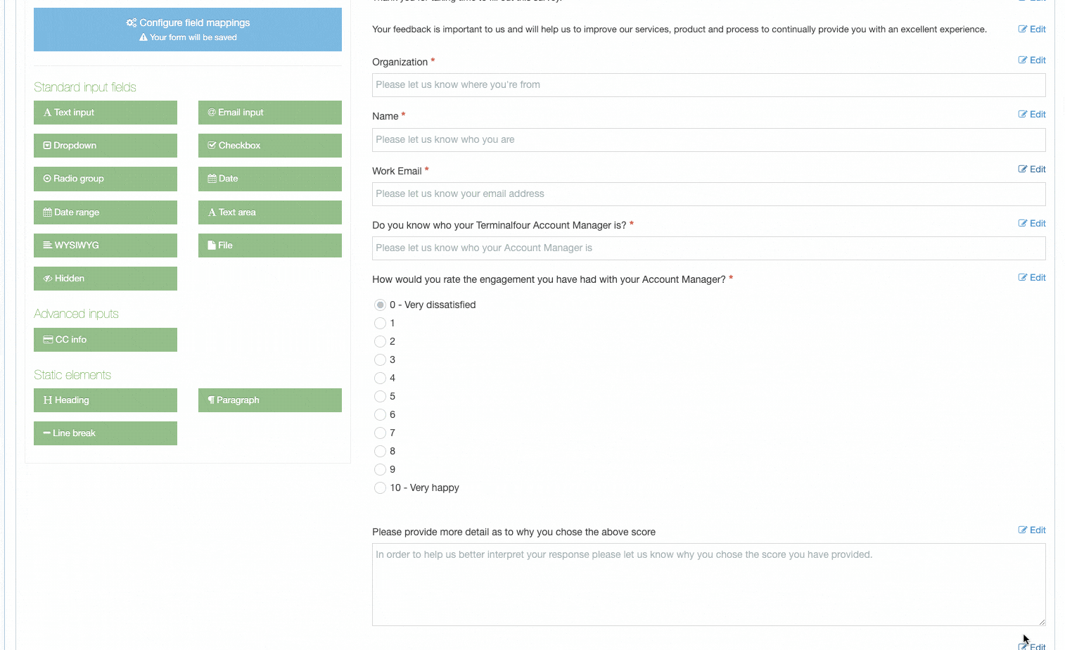
Fields
This is where you build your form by adding fields.
Configure field mappings
Map to Content Type
By default, a Content Type is automatically created for each form you create however you can map the Content Elements from an existing Content Type to your form fields.
The quickest way to do this is to select an existing Content Type from the dropdown list and click Create fields from Content Type. A form will be created with fields that map to the Content Elements in that Content Type:
The "Create fields from content type" option is only displayed on new forms that don't already contain form elements. If you have enabled reCAPTCHA on every form, then a form element is added, and you won't see the "Create fields from content type" option.
If you need to change how fields are mapped to the Content Elements, select Configure Field Mapping:
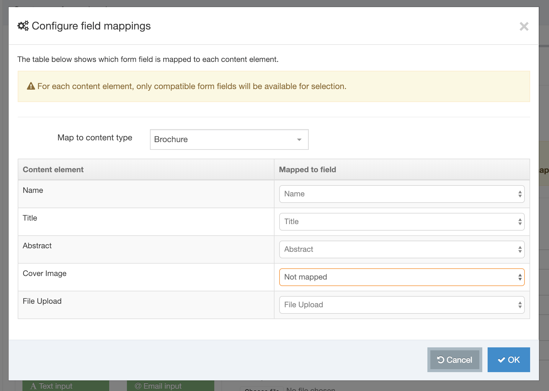
You may notice in the example above that not all Content Elements have been mapped to a field. In this example, one of the elements is a Media File. These do not map to fields. The following field mapping matrix will show you the fields that can and cannot be mapped:
| Field | |||||||||||
|---|---|---|---|---|---|---|---|---|---|---|---|
| Text input | Dropdown | Checkbox | Radio group | Date | Date range | Text area | WYSIWYG | File | Hidden | CC info | |
| Plain Text | ✔ | ✘ | ✘ | ✘ | ✘ | ✔ | ✔ | ✘ | ✘ | ✔ | ✔ |
| Image | ✘ | ✘ | ✘ | ✘ | ✘ | ✘ | ✘ | ✘ | ✘ | ✘ | ✘ |
| HTML | ✘ | ✘ | ✘ | ✘ | ✘ | ✘ | ✘ | ✔ | ✘ | ✘ | ✘ |
| File | ✘ | ✘ | ✘ | ✘ | ✘ | ✘ | ✘ | ✘ | ✔ | ✘ | ✘ |
| Date | ✘ | ✘ | ✘ | ✘ | ✔ | ✘ | ✘ | ✘ | ✘ | ✘ | ✘ |
| Check Box | ✘ | ✘ | ✔ | ✘ | ✘ | ✘ | ✘ | ✘ | ✘ | ✘ | ✘ |
| Select Box | ✘ | ✔ | ✘ | ✘ | ✘ | ✘ | ✘ | ✘ | ✘ | ✘ | ✘ |
| Multiple Select | ✘ | ✘ | ✘ | ✘ | ✘ | ✘ | ✘ | ✘ | ✘ | ✘ | ✘ |
| Radio Button | ✘ | ✘ | ✘ | ✔ | ✘ | ✘ | ✘ | ✘ | ✘ | ✘ | ✘ |
| Cascading List | ✘ | ✘ | ✘ | ✘ | ✘ | ✘ | ✘ | ✘ | ✘ | ✘ | ✘ |
| Media | ✘ | ✘ | ✘ | ✘ | ✘ | ✘ | ✘ | ✘ | ✘ | ✘ | ✘ |
| Decimal Number | ✘ | ✘ | ✘ | ✘ | ✘ | ✘ | ✘ | ✘ | ✘ | ✘ | ✘ |
| Whole Number | ✘ | ✘ | ✘ | ✘ | ✘ | ✘ | ✘ | ✘ | ✘ | ✘ | ✘ |
| Section/Content Link | ✘ | ✘ | ✘ | ✘ | ✘ | ✘ | ✘ | ✘ | ✘ | ✘ | ✘ |
| Multi-select List | ✘ | ✘ | ✘ | ✘ | ✘ | ✘ | ✘ | ✘ | ✘ | ✘ | ✘ |
| Content Owner | ✘ | ✘ | ✘ | ✘ | ✘ | ✘ | ✘ | ✘ | ✘ | ✘ | ✘ |
| Group Select | ✘ | ✘ | ✘ | ✘ | ✘ | ✘ | ✘ | ✘ | ✘ | ✘ | ✘ |
| Keyword Selector | ✘ | ✘ | ✘ | ✘ | ✘ | ✘ | ✘ | ✘ | ✘ | ✘ | ✘ |
| ✔ | ✘ | ✘ | ✘ | ✘ | ✘ | ✘ | ✘ | ✘ | ✘ | ✘ | |
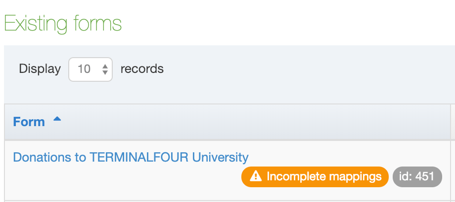
Forms that have incomplete mappings are highlighted with an alert badge in the Existing Form table:
Field / input types
To get started, click on a field type to add it to your form:
| Icon | Field type | Description |
 |
Text input | Adds a text input used for text, numbers, passwords, web addresses etc. |
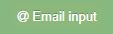 |
Email input | Adds an email input with an option to allow the user to receive a confirmation of their submission by email |
 |
Dropdown | Allows users to select a single option from a dropdown |
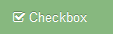 |
Checkbox | Allows multiple options to be selected from a group |
 |
Radio group | Allows users to select a single option from a group |
 |
Date | Allows users to select a date and optional time |
 |
Date range | Allows a start and end date to be set |
 |
Text area | Allows multiple lines of text to be entered |
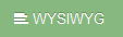 |
WYSIWYG |
Displays a WYSIWYG editor to enter HTML. TinyMCE, the WYSIWYG editor that Form Builder uses, follows the WAI specification making it compatible with screen readers. |
 |
File | Uploads a file |
 |
Hidden | Adds an input that will submit a value without the user seeing it |
| Advanced inputs | ||
 |
CC info | Adds the required fields to accept payment information from the user. i.e. credit card number, expiry date etc. Only one occurrence allowed per form |
 |
reCAPTCHA | Adds a to help prevent spam submissions (available from Terminalfour v8.2.10) |
| Static elements | ||
 |
Heading | Adds a Heading to the form |
 |
Paragraph | Adds text to the form - useful to explain parts of your form to users |
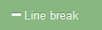 |
Line break | Adds a line between fields to divide the form into sections |
Field settings
Once added, each field can be edited.
General
| Field/input data type | Item | Description |
|---|---|---|
| All | Label | Sets the label displayed |
| All | Hide | Hide the label from the user |
| All | Required field | Sets the field as required |
| All | Tooltip text | Sets the text displayed when hovering over the form field |
| All | Placeholder text | Sets the text displayed in the form field |
| Confirmation email settings |
Allow a user to receive a copy of their submission: Enables the user to receive a copy of their submission, sent to the email they enter in this field Email subject: Sets the subject of the confirmation email Customize the confirmation message: You can customize the message that will appear before the copy of the submission |
|
| Dropdown, Checkbox, Radio group | Field options |
|
| Text area | Number of rows | Sets the number of text rows in the textarea |
| Hidden | "value" attribute | Specifies a value for this field when the form is submitted |
| File | File storage method |
This method is currently not functioning as intended and should not be used while a fix is being implemented.
|
Advanced
| Item | Description |
|---|---|
| "name" attribute | Specifies a specific HTML name attribute for this field when the form is submitted |
| Input data type | Specifies an HTML5 data type for this input. For example a number or web address. Validation for these additional types is handled automatically. Options are; Text, Email address, Number, Password, Telephone number, URL / Web address |
| CSS class | Specifies a CSS class to be added to the field |
| ID | Specifies a specific id attribute for this field |
Validation
Validation can be set for different input data types.
| Field/input data type | Item | Description |
|---|---|---|
| Text, Email address, Number, Password, Telephone number, URL / Web address, Date, Date range, Text area | Required field | Sets the field as required |
| Text, Telephone number | Validation text pattern | Specifies a regex pattern to use to validate the field |
| Text, Email address, Password, Telephone number, URL / Web address, Text area | Minimum length | Ensure that input has at least N characters |
| Text, Email address, Password, Telephone number, URL / Web address, Text area | Maximum length | Ensure that input has less than or equal to N characters |
| Number | Minimum value | Ensure that input will not be lower than this value |
| Number | Maximum value | Ensure that input is not greater than this value |
| Password | Must match another field | Ensure that this field has the same value as another |
| Password | Must contain a numeric digit | Digit from 0 to 9 |
| Password | Must contain a symbol | Any of the following symbols will be valid: %+\/'@!#$^?:.(){}~[]-_ |
| Password | Must contain a capital letter | Must contain a capital letter |
| Date, Date range | Minimum date | Ensures the date set is later than this date |
| Date, Date range | Maximum date | Ensures the date set is earlier than this date |
| Date range | Min date range difference | Ensures that the second date in a range must be at least the specified amount after the first selected date. Time scale options are; Hour(s), Day(s), Week(s), Month(s), Year(s) |
| File | Accepted file extensions |
|
| File | Max upload size |
|
Submit and Reset buttons
| Item | Description |
|---|---|
| Button text | Sets the text displayed on the submit button |
| Show Reset Button | Adds a reset button to the form that allows users to clear all fields |
Firing a Google Tag Manager Custom Event
When the user clicks the submit button a Google Tag Manager (GTM) custom event named formSubmitted is fired, which also contains the name and description of the form:
{
  'event':'formSubmitted',
  'formName': 'The form name',
  'formDescription': 'The form description'
}
This event can be used in Google Tag Manager so form submissions are tracked.
Dependencies
Dependencies show and hide fields based on the rules you provide.
Dependencies read like a sentence and allow you to show or hide a field based on the value of another one. Click the 'Add dependency' button to get started.
For each dependency, you can have one or more "if" statements and then can show or hide another field based on those conditions.
The operators for the if statements will vary based on the field input type:
- is
- is not
- contains
- does not contain
- is selected
- not selected
- begins with
- ends with
- is populated
- is not populated
From version 8.3.5 the conditions have been simplified so the dependency rule will be triggered:
- "If all" conditions are true (an AND statement)
- "If any" of the conditions are true (an OR statement)
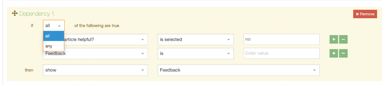
The 'option value' should be entered rather than the 'option text' for any list-based fields.
Submissions
When your form is created you will have to consider what happens to the data when the form is submitted.
By default, submissions are saved in an unpublished Section, but you can also specify the Section to save submissions to – either a specified Section or a Child of the Section that an instance of the form appears in. You can also send submitted data to a payment gateway.
| Item | Description |
|---|---|
| Save submissions to |
|
| Submission Name Mapping | By default, each submission is given the same name as the form. Finding the right submission can be difficult when faced with a large number. Instead, you can map a field so its value is the submission name, e.g., if one of your fields is an email address you can map this as the submission name making it easier to identify a particular submission. |
| Channel Mapping |
If you are saving submission to a "Named Child Section" or a "Specified Section" and you intend to publish the submissions, you can associate a Channel to publish the content with. Submissions saved to Terminalfour only cannot be published. |
Submission Statuses
When your form is successfully submitted a new entry is added to the submission database table in Form Bank with a status of "pending". On a failed submission, no entry is added to the database.
When Form Builder imports the "pending" submissions from Form Bank to Terminalfour, the status of pending entries is changed to "received".
The following two scenarios could result in a failed submission:
- A Password input type with validation (added via the Validation tab) that requires a capital letter. When a form is submitted without a capital letter in the password input value the Form Bank server will throw a validation error that will result in a submission failure message.
- Shutting down Form Bank server right before submitting a form triggers a connection error
You should always test your form before deploying.
On a successful submission
When a submission is successfully saved the default message displayed to the end-user appears:
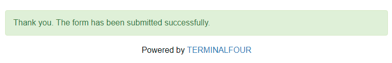
The following options can be edited:
| Item | Description |
|---|---|
| Show a message |
You can amend or change the default message text entirely. There's a limit of 256 characters on the text entered |
| Redirect to a Terminalfour | Select a Section to redirect to following a successful submission |
| Redirect to a URL | Enter a custom URL to redirect following a successful submission |
On a failed submission
When a submission has failed, the default message displayed to the end-user appears:
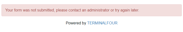
The following options can be edited:
| Item | Description |
|---|---|
| Show a message |
You can amend or change the default message text entirely. There's a limit of 256 characters on the text entered |
| Redirect to a Terminalfour | Select a Section to redirect to following a failed submission |
| Redirect to a URL | Enter a custom URL to redirect following a failed submission |
Additional Submission Options
Webhook URL
When a form submission is received in Terminalfour, the submission data will be sent to the URL in the Webhook URL field.

Example Payload
Below is an example of a a payload that would be sent in a form submission.
Payment gateway/credit card fields are ignored and not sent in the webhook request.
File upload fields are ignored and not sent in the webhook request.
{
"data": {
"formFields": [
{
"Name": "Form test",
"fieldName": "Name",
"fieldValue": "Form test"
},
{
"Are you filling surname 1": "Yes",
"fieldName": "Are you filling surname 1",
"fieldValue": "Yes"
},
{
"Check any option that apply": "Option 1, Option 3",
"fieldName": "Check any option that apply",
"fieldValue": "Option 1, Option 3"
},
{
"Comment": "This is a comment",
"fieldName": "Comment",
"fieldValue": "This is a comment"
},
{
"Date with time": "2024-03-27T12:32:00Z",
"fieldName": "Date with time",
"fieldValue": "2024-03-27T12:32:00Z"
},
{
"Email": "test@test.com",
"fieldName": "Email",
"fieldValue": "test@test.com"
},
{
"Pick a date": "2024-03-28T12:32:00Z",
"fieldName": "Pick a date",
"fieldValue": "2024-03-28T12:32:00Z"
},
{
"Select an option": "Option 1",
"fieldName": "Select an option",
"fieldValue": "Option 1"
},
{
"Surname1": "This is my surname",
"fieldName": "Surname1",
"fieldValue": "This is my surname"
},
{
"Text": "Some text",
"fieldName": "Text",
"fieldValue": "Some text"
},
{
"Text (1)": "Some text",
"fieldName": "Text (1)",
"fieldValue": "Some text"
},
{
"HTML": "<p>This is an <strong>example</strong>, let's see how is displayed",
"fieldName": "HTML",
"fieldValue": "<p>This is an <strong>example</strong>, let's see how is displayed"
}
],
"formID": 1,
"formName": "Form test",
"submissionURL": "http://example.com/form/MS1lbg==",
"submissionIP": "0:0:0:0:0:0:0:1",
"submissionTimestamp": "2024-03-15T12:33:29Z"
},
"event": "form_submission_add",
"id": 7,
"requestType": "Terminalfour Form Submission",
"timestamp": "2024-03-15T12:34:09.674Z"
}
Error handling
If Terminalfour receives a 200 response from the endpoint you supply the submission we will consider that successfully delivered.
If there is no response, or if we receive an error response, we will retry sending the submission every 10 minutes (be default). After 5 successive timeouts or errors for a given submission we'll display a notification in the main header area of Terminalfour for admins.
Payment gateway field mappings
When a Payment Gateway has been configured and a CC Info field has been added to the form you can select the configured Payment Gateway from a drop-down list.

You can specify values for all submissions here, map them to values submitted in the form, or even calculate them from the values of multiple fields in your form.
| Item | Description |
|---|---|
| Amount |
The amount can be set in one of three ways:
|
| Currency |
The currency can be set in one of two ways:
|
Emails
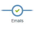
There are two types of emails that can be sent from Form Builder:
- Submission email
- the emails sent to specified Terminalfour Users or Groups or external (non-system) recipients when the form receives a submission
- Confirmation email
- this is the email that is sent to the user who has submitted the form (if they have provided their email); it can also contain a copy of their submission
Submission email
The submission mail is sent to specified Terminalfour Users and Groups as well as external mail addresses.
These are the options:
| Item | Description |
|---|---|
| System Users and Groups |
Select the Terminalfour Users or Groups who you would like to receive submissions via email. The table lists all Terminalfour Users and Groups, it displays the type of user, their first and last name and their username. The table can be filtered based on any of these values, the "Restrict by user type" drop-down will filter the table based on which value is selected. |
| Non-system recipients |
The email address(es) of non-Terminalfour Users who will receive copies of each submission. Use this option if a user with the email address does not already exist within your system. Multiple addresses should be comma-separated. If a Terminalfour Group or User is selected, and their email is also entered manually, the Terminalfour entry will be used. Only one email will be sent per email address, even if the email is duplicated between Terminalfour and non-Terminalfour users. |
| Additional Options | |
| Subject field mapping | The subject field mapping will include the text value from a specified field in the email subject, it will take the form of "Terminalfour form submission - <form name> - <value mapped in the subject field mapping>" you will only be able to choose form fields that produce text output, i.e., file fields will not be listed here. |
| Recipient minimum user level |
The "Recipient minimum user-level" will control the Minimum User Level a submission email will be sent to. This only applies to Groups, e.g., if this is set to Administrator and a Group is selected as a mail recipient, only Administrators in that Group will receive an email. |
| Sender / Reply-to mapping |
As well as Terminalfour Users and Groups you can also specify the email address(es) that you'd like to use for the sender and reply-to value. You can use one of the following options:
|
Any files included in a form submission will be attached to the email. In the email itself, the label of the file field will appear with the file name next to it.
If your Terminalfour instance is cloud-hosted with AWS, the submission emails (including attachments) cannot exceed 10MB.
Confirmation email
When a submission is successful, you can select who receives an email with the submission values. Confirmation emails can only be sent from a form that includes an email input field.
To configure the confirmation email:
- Select Allow a user to receive a copy of their submission in the Confirmation email settings
- You can customize the Email subject text in the email that's sent
- By default, this message that appears above the submission text in the confirmation email is "Below is a copy of the information you sent to us". You can change the text by clicking on Customize the confirmation message. This will bring you to the Emails tab, where you can add the custom text.
If you are setting up a new form, the form will be saved before you can customize the text.
Customizing the confirmation message
You can customize the header and footer of the email by clicking on the Customize the confirmation message link and adding the custom header and footer:
The following HTML tags and attributes can be added to the custom header and footer:
| Tag | Attribute |
a |
class, href, id, style |
b |
class, id, style |
br |
class, id, style |
div |
align, class, id, style |
h1 |
align, class, dir, id, style |
h2 |
align, class, dir, id, style |
h3 |
align, class, dir, id, style |
h4 |
align, class, dir, id, style |
h5 |
align, class, dir, id, style |
h6 |
align, class, dir, id, style |
hr |
align, size, width |
img |
align, border, class, height, hspace, id, src, style, vspace, width |
li |
class, dir, id, style, type |
ol |
class, dir, id, style, type |
p |
align, class, dir, id, style |
span |
class, id, style |
strong |
class, id, style |
table |
align, bgcolor, border, cellpadding, cellspacing, class, dir, frame, id, rules, style, width |
td |
abbr, align, bgcolor, class, colspan, dir, height, id, lang, rowspan, scope, style, valign, width |
th |
abbr, align, background, bgcolor, class, colspan, dir, height, id, lang, scope, style, valign, width |
tr |
align, bgcolor, class, dir, id, style, valign |
u |
class, id, style |
ul |
class, dir, id, style |
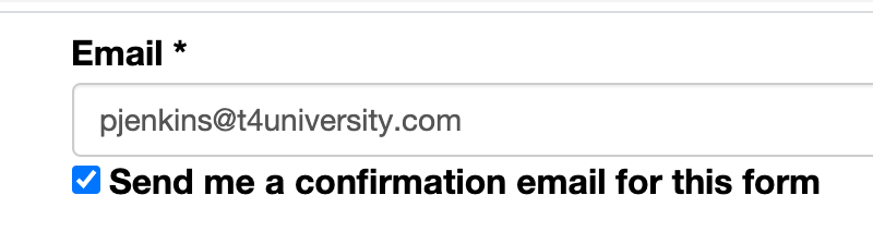
When the Allow a user to receive a copy of their submission box is selected, the user will see a checkbox beside the email input:
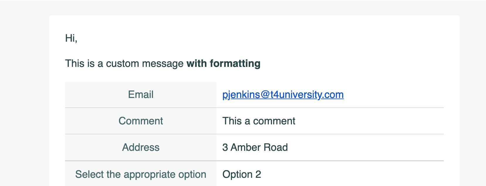
The confirmation mail looks like this:
Finish
Once you have created and configured your form there are three ways you can configure it:
- T4 Tag
- Embed code
- Shareable link
Just copy and paste one of the code snippets to deploy your form.
If your form is added with a T4 Tag and contains a WYSIWYG input type you must ensure that the Page Layout that the form is deployed with explicitly has a doctype declaration (<!DOCTYPE html>). If this isn't present, input data will not be saved.
This is because TinyMCE enforces strict standards mode
Forms added with the embed code or those that use a shareable link are not affected by this.
| Item | Description |
|---|---|
| T4 Tag |
Use this code if you are adding this form to a Terminalfour site. The tag can be added to the following:
Content Items (it will need to be parsed), Content Type, Content and Page Layouts |
| Embed Code | Use this if you want to add this form to a web page not managed by Terminalfour |
| Shareable link | Use this if you simply want to share a standalone form with other users without having to add it to another page |