
Links content type
- Let's now create a "Links" content type. One of the elements of the "Links" content type is a list that will be used to select whether the link is internal, external or a pdf file.
- Let's start by creating a list that you will add as one of the elements in your "Links" content type. The "Link Type" list will be added as a select box and will be used to select which type of link (internal, external or pdf) is being created.
Before you start
Be sure you have the following added to your training site:
- Duplicate the "T201H Training Site Example" page layout.
- Create a channel for your training website.
- Duplicate the "T201H Training Site Example: Sidebar Box" content type.
- Enable the content type to your "Home" branch and add some sidebar content.
How to create a list
- Go to Assets > Lists > Add new list
- Fill in the List information:
- Name: enter a name here. This should suggest what type of list it is used for.
- Description: describe in more detail when to use this list.
- Localization: if the List is available in more than one language, you can use the localization options to:
- checkbox: Use current language version of this list (This prevents translations of the list).
- checkbox: Only use this list when localized versions are not available (when no translation of the List exists, this List is used).
- Primary group: select your group. This allows you to select the group which is permitted to use this list. Click Toggle shared groups to share the list with more than one group.
- List items: enter the individual list items by clicking on the Add row button:
- Order: list items can be re-ordered using the move icon
- Name: the name of the list item
- Value: the value of the list item
- Selected: when checked, this item will be the default selected item in the content type Element.
- Sublist: list items may have sub-categories that you want to link them to. Sublists are used with Cascading and Multi-select content type Elements.
| Name | Value | Selected | Sublist |
|---|---|---|---|
| Internal Link | internal | leave blank | |
| External Link | external | leave blank | |
| Media/PDF Link | leave blank |
- Click on the Save changes button to save your list.
How to create the "Links" content type
- Go to Assets > Content Types > Create content type
- Fill in the General content type information:
- Name: enter a name here. This should suggest what type of content it is used for.
- Description: describe in more detail when to use this content type.
- Minimum user level: if you wish to restrict who can use this content type, you can set a level here. If content types are created in groups, a user must be a member of the group as well as meet the minimum user level criteria to use the content type.
- Enable direct edit: decide if direct edit can be used for this content type.
- Mark as eForm: if checked, this allows your content type to collect eForm data.
- Workflow: if relevant, enable a workflow for content created using this content type.
- Primary group: select your group. This allows you to select the group which is permitted to use this content type. Click Toggle shared groups to share the content type with more than one group.
- Select the Elements tab.
- Each content type has a Name element by default. This is used to name the content and is typically not displayed on the published site.
- Add the other elements you need by filling in the information as outlined in the table below. Click Add element to begin filling in the details for each element.
- Once you have added all your elements, click Save changes. The Content Layout tab opens.
| Name | Description | Type | Max Size | Required | Show |
|---|---|---|---|---|---|
| Button Text | Enter the text to appear on the button. E.g. “Learn More”. | Plain Text | 80 | Yes | Yes |
| Link Type | Select which kind of link you’d like to use. | Select Box (Link Type) | 80 | No | Yes |
| Button Link (internal) | Select a section/content for an internal link. | Section/Content Link | 80 | Yes | Yes |
| Button Link (external) | Select this if you are entering a link to an external website. | Plain Text | 200 | Yes | Yes |
| Button link (media) | Select this if you’d like to link to a PDF. | Media | 80 | Yes | Yes |
- The Content Layout tab is a new content layout for your content type. Click +Add content layout.
- Name: text/html - this is the default Type set in the Channel. This ensures the content can be displayed.
- File Extension: Default - unless this is used with a different File Extension. This requires other extensions being permitted in the Channel
- Syntax Type: HTML/XML – this determines which syntax is highlighted.
- Content layout processor: must be set to Handlebars Content.
- Content Layout code: this determines the output for your content.
You will make use of the selectedValues Helper and the eq comparison Helper. In this particular example, you will use the eq comparison Helper to compare the value in the "Link Type" list which can be "internal", "external" or "pdf" and display the correct link based on what is selected in the content.
There are a number of Helpers to allow you to compare values:
eq - Tests if two values are equal
neq - Tests if two values are not equal
gt - Tests if one value is greater than another
gte - Tests if one value is greater than or equal to another
lt - Tests if one value is less than another
lte - Tests if one value is less than or equal to another
and - Tests if values are true (you can pass two or more arguments)
or - Tests if any values are true (you can pass two or more arguments)
not - If the provided input is false then the block will not be processed
Arguments are space separated when passed to Handlebars expressions (as opposed to comma separated).
{{#eq (publish element="Greeting") "Hello"}}
<p>Hello to you too!</p>
{{else}}
<p>You didn't say "Hello".</p>
{{/eq}}
{{#lt 5 8}}
<p>5 is indeed less than 8.</p>
{{else}}
<p>This will never be published because 5 is always less than 8.</p>
{{/lt}}
- Click into the Content layout code tab.
- Click on the </> Generate Handlebars Expression button.
- Open the </> Misc tab.
- In the Helpers drop-down, select the eq Helper.
- Click on Copy to clipboard to copy the generated Handlebars code.
- Paste the Handlebars code into your content layout.
The code generated by the Handlebars expression builder should look like the code below:
{{#eq value1 value2}}
value1 and value2 are equal
{{else}}
value1 and value2 are not equal
{{/eq}}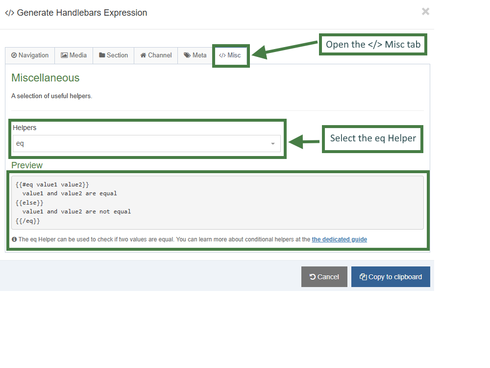
- Update the code to match your requirements. Create three separate
eqHelper blocks — one for each link type:"internal","external", and"pdf". The Handlebars expressions for each link type are shown below. Note that the selected value from the “Link Type” list is compared against the three possible options using theselectedValuesHelper. Copy the code into your layout.
{{#eq (selectedValues element="Link Type") "internal"}}
{{/eq}}
{{#eq (selectedValues element="Link Type") "external"}}
{{/eq}}
{{#eq (selectedValues element="Link Type") "pdf"}}
{{/eq}}
Next, create the appropriate output for each link type inside its corresponding Helper block. You can use the Handlebars expression builder to generate the required expressions.
- Click on the </> Generate Handlebars Expression button.
- In the Content tab:
- Information to output (select the Element radio button)
- Element: The Element option is used to output elements to the page.
- Metadata: The Metadata option allows output of specific Metadata (HTML anchor, Content ID, Last Modified Date, Publish Date, etc.).
- Fulltext: Used to output a fulltext link.
- Content element: Select the "Button Link (internal)" element from the content element drop-down.
- Handlebars helper: Choose Link from the drop-down.
- Options:
- Convert special characters to their HTML encoded values This is disabled by default as links are not HTML encoded.
- Allow this element to be edited inline in Direct Edit This is disabled by default as list elements are not editable inline in Direct Edit.
- Check if value is set This option will wrap the element with an ifSet Helper. It ensures the element outputs only if it contains data.
- Information to output (select the Element radio button)
- Click Copy to clipboard and paste in the Handlebars expression into the body of the Button Link (internal) eq block.
- Repeat the steps above for the Button Link (external) and Button Link (media) elements.
Your content layout should now look like the code below:
{{~#eq (selectedValues element="Link Type") "internal"~}}
{{~#link element="Button Text(internal)"~}}
<p>The link URL is: {{linkURL}}</p>
<p>The link Text is: {{linkText}}</p>
{{~/link~}}
{{~/eq~}}
{{~#eq (selectedValues element="Link Type") "external"~}}
{{publish element="Button Link (external)" inline-edit="true"}}
{{~/eq~}}
{{~#eq (selectedValues element="Link Type") "pdf"~}}
{{publish element="Button Link (media)" inline-edit="true"}}
{{~/eq~}}
- Update the code as per below with the correct output for each type of link:
{{~#eq (selectedValues element="Link Type") "internal"~}}
{{~#link element="Button Link (internal)"~}}
<p><a href="{{linkUrl}}">{{linkText}}</a></p>
{{~/link~}}
{{~/eq~}}
{{~#eq (selectedValues element="Link Type") "external"~}}
<p><a href="{{publish element="Button Link (external)"}}">{{publish element="Button Text"}}</a></p>
{{~/eq~}}
{{~#eq (selectedValues element="Link Type") "pdf"~}}
{{{media id=(mediaId element="Button Link (media)") layout="application/*"}}}
{{~/eq~}}
- Click Save changes to save the changes to your content layout.
Conditional elements
- In order to make the "Links" content type work correctly, you will add conditional statements to show/hide the different types of links based on the selection made in the "Link Type" list. Let's learn how this can be achieved.
- Conditional Elements allow Administrators and Power Users to customize the Content Editing Experience for their users by conditionally displaying elements based on specific criteria.
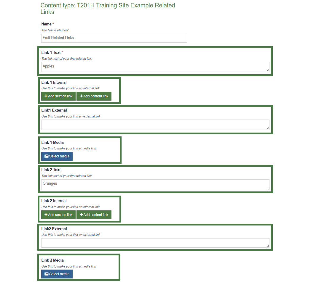
Below you can see a "Links" content type without conditional elements. Multiple groupings of elements for each type of link would be created as part of the content type, i.e. Link 1 Text, Link 1 Internal, Link 1 External, Link 1 Media, Link 2 Text, Link 2 Internal, Link 2 External, Link 2 Media...etc.
Without conditional elements, content types would become difficult to use and error prone to most content editors.
How to add conditional elements to a content type
- There are three types of conditional statements that can be added:
- Content Element-Based Conditions
- e.g. If 'Research Type' is set to 'Grant-Funded', then show 'Funding Body Details' field
- e.g. If 'Course Level' dropdown is 'Postgraduate', then show 'Research Methodology' field
- User Group Conditions
- e.g. If User is in group 'International Admissions', then show 'Visa Requirements' elements
- e.g. If User is in group 'Research Grants Team', then show 'Indirect Cost Calculation' element
- User Type Conditions
- e.g. If User is at least 'Administrator', then show 'Advanced Options' element
- e.g. If User is at least 'Moderator', then show 'Background Image' element
- Let's add the following Content Element-Based Conditions to the sidebar content type:
- If 'Link Type' is set to 'Internal Link' then show 'Button Link (internal)' field
- If 'Link Type' is set to 'External Link' then show 'Button Link (external)' field
- If 'Link Type' is set to 'Media/PDF Link' then show 'Button Link (media)' field
- Go to Assets > Content Types
- Click your content type name to edit it. (Use the Filter tool to search).
- Open the Elements tab.
- Click on the Conditional logic button to bring up the Conditional logic & Live Preview screen.
- Click on the +Add conditional statement button. Build a conditional statement for the "Internal Link" as per the table below:
| Conditional Statement | Element | Column 3 | Value | Then show |
|---|---|---|---|---|
| Content Element | Link Type (Select Box) | Contains | Internal Link | Button Link (internal) |
.jpg)
- Click on the +Add conditional statement button. Build a conditional statement for the "External Link" as per the table below:
| Conditional Statement | Element | Column 3 | Value | Then show |
|---|---|---|---|---|
| Content Element | Link Type (Select Box) | Contains | External Link | Button Link (external) |
.jpg)
- Click on +Add conditional statement button. Build a conditional statement for the "Media Link" as per the table below:
| Conditional Statement | Element | Column 3 | Value | Then show |
|---|---|---|---|---|
| Content Element | Link Type (Select Box) | Contains | Media/PDF Link | Button Link (media) |
.jpg)
- Click on the Apply and close button to apply your conditional elements to the content type.
- Click Save changes to save your content type.
Enable a content type
- Now that you’ve built your content type, you need to decide where it can be used and by whom.
- You need to enable your new content type to your Site structure to test it.
- Content types can only be used in Sections where they are enabled.
- If a content type is created in a Group, only users who are members of that Group can use the content type.
- Only users who meet the Minimum User Level criteria can use the content type.
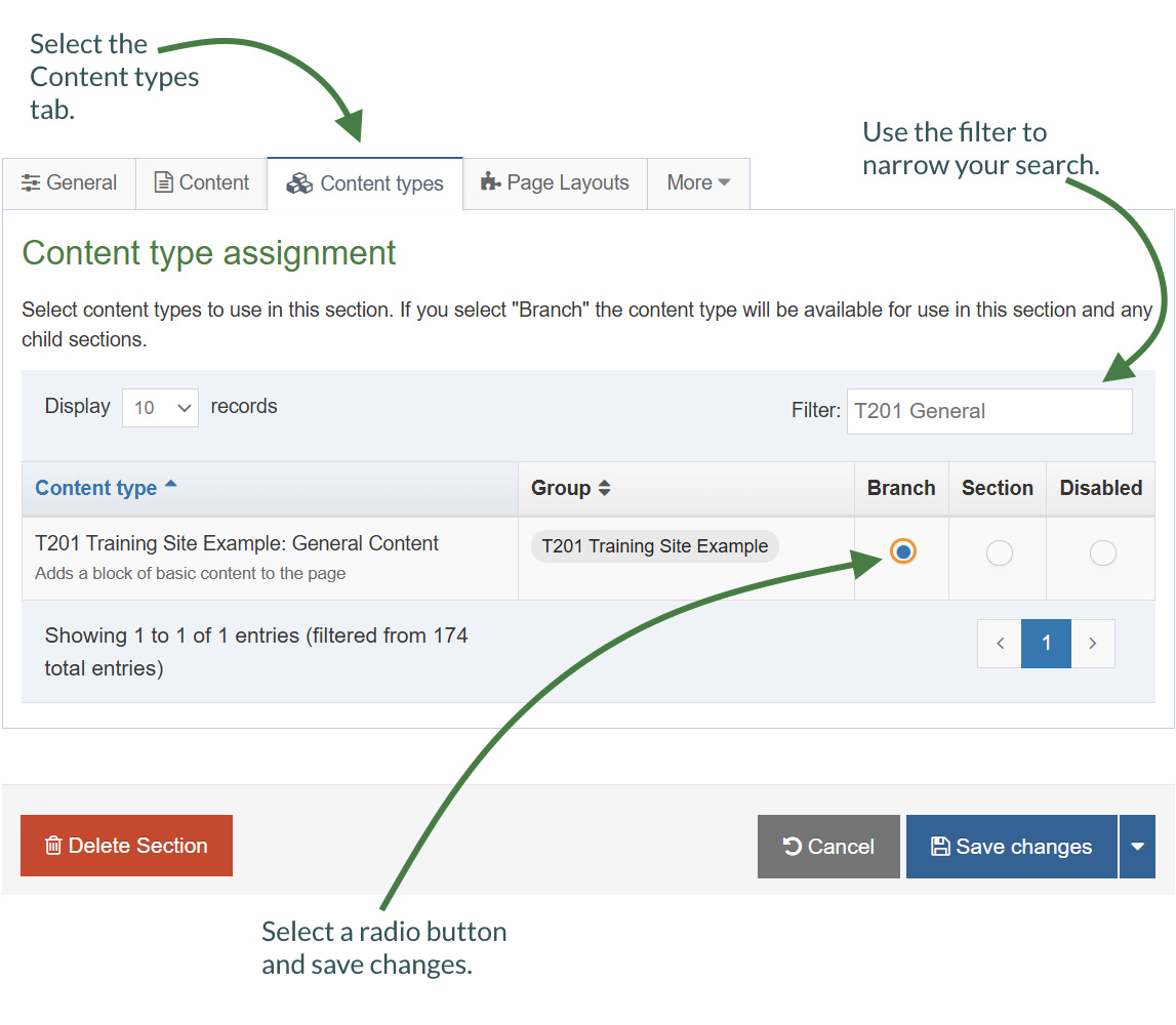
How to enable a content type
- On the Site Structure screen, click on the name of your main section.
- The General information about this section screen appears, select the Content types tab.
- Using the Filter feature, locate your content type.
- Select the radio button to enable your content type for either the branch or section:
- Enabled (branch): the content type can be used in this section as well as all its sub-sections.
- Enabled (section): the content type can be used in this section only.
- Click Save changes to confirm your selection. You can now use the new content type to add content to your section.
Repeaters
- Repeaters allow you to configure a content type so that it can include another content type inside it.
- You will use a "Sidebar" content type that will output to the left side of the page and then add your "Links" content type as a repeater element to the "Sidebar" content type.
Before You Start
Make sure you have a "Sidebar" content type that outputs content to the left side of the page.
You can use a Related Content Navigation in your page layout to do this.
How to add a repeater element
Let's now add the "Links" content type as a repeater element to the Sidebar content type.
- Go to Assets > Content Types.
- Click your content type name to edit it. (Use the Filter tool to search).
- Select the Elements Tab.
- Add a repeater element by filling in the information as outlined in the table below. Click Add element to begin filling in the details.
| Name | Description | Type |
|---|---|---|
| Related Links | Enter related links for the sidebar content | Repeater |
When selecting "Repeater" as the type, a new "Flyout screen" will be displayed automatically that allows you to choose which content type should be repeated.
- Configure the repeater element:
- Content type: select the content type to be repeated, this should be the name of your "Links" content type.
- Content layout: the default layout that will be output for this repeater element, e.g. text/html.
- Repeater settings:
- Minimum repeats: the minimum amount of repeats allowed, e.g. 1.
- Maximum repeats: the maximum amount of repeats allowed, e.g. 5.
- Once you have finished configuring your repeater element, click Save changes.

How to output the repeater
- Click into the Content layouts tab.
- Select the "text/html" content layout and open the </> Content layout code tab.
- Add the output of the repeater element by generating the correct Handlebars code.
- Click the </> Generate Handlebars Expression button again.
- You are now going to build an expression to output the "Related Links" repeater element.
- In the Content tab:
- Information to output (select the Element radio button)
- Element: the Element option is used to output elements to the page.
- Metadata: the Metadata option allows output of specific Metadata (HTML anchor, Content ID, Last Modified Date, Publish Date, etc.).
- Fulltext: used to output a fulltext link.
- Content element: select the "Related Links" repeater element from the content element drop-down.
- Handlebars helper: select Publish from the drop-down.
- Content Layout: choose the content layout to apply to the display of the repeater element. This appears if you select Repeater as the Handlebars helper.
- Options:
- Convert special characters to their HTML encoded values This is disabled for repeater elements.
- Allow this element to be edited inline in Direct Edit This is disabled by default as list elements are not editable inline in Direct Edit.
- Check if value is set This option will wrap the element with an ifSet Helper. It ensures the element outputs only if it contains data.
- Information to output (select the Element radio button)
- Click Copy to clipboard to copy the Handlebars expression.
- Add the Handlebars expression and a heading as per below to your content layout:
<h5>Related Links:</h5>
{{{publish element="Related Links"}}}
- Click Save changes to save the changes to your content layout.
- Update your preview to check the result.
Updating the content layout with the repeater Helper
The repeater Helper is used to output a Repeater element (introduced in 8.4.1).
By default, if you output a repeater element with the publish Helper, then the repeater will be output using the default Content Layout associated with the repeater configuration.
If you need more control over which layout should be output you can use the repeater Helper to explicitly select a layout like so:
{{repeater element="Repeater Element" layout="text/example"}}
How to use the Repeater Helper
- Go to Assets > Content Types.
- Click your content type name to edit it. (Use the Filter tool to search).
- Click into the Content layouts tab.
- Click on the +Add content layout button to add an alternative content layout.
- Name: text/alternative
- File Extension: Default - unless this is used with a different File Extension. This requires other extensions being permitted in the Channel
- Syntax Type: HTML/XML – this determines which syntax is highlighted.
- Content layout processor: must be set to Handlebars Content.
- Content layout code: this determines the output for your content. If you have created the HTML already, you can start by pasting that into the code field as displayed below.
{{~#eq (selectedValues element="Link Type") "internal"~}}
{{~#link element="Button Link (internal)"~}}
<p><a style="display: block" class="button small radius" href="{{linkUrl}}">{{publish element="Button Text"}}</a></p>
{{~/link~}}
{{~/eq~}}
{{~#eq (selectedValues element="Link Type") "external"~}}
<p><a style="display: block" class="button small radius" href="{{publish element="Button Link (external)"}}">{{publish element="Button Text"}}</a></p>
{{~/eq~}}
{{~#eq (selectedValues element="Link Type") "pdf"~}}
<a href="{{{media id=(mediaId element="Button Link (media)") layout="path/*"}}}">{{publish element="Button Text"}}</a>
{{~/eq~}}
- Click Save changes to save the changes to your content layout.
- Go to your Sidebar content type.
- Click into the Content layouts tab.
- Select the "text/html" content layout and open the </> Content layout code tab.
- Add the output of the repeater element by generating the correct Handlebars code.
- Click the </> Generate Handlebars Expression button again.
- You are now going to build an expression to output the "Related Links" repeater element.
- In the Content tab:
- Information to output (select the Element radio button)
- Element: the Element option is used to output elements to the page.
- Metadata: the Metadata option allows output of specific Metadata (HTML anchor, Content ID, Last Modified Date, Publish Date, etc.).
- Fulltext: used to output a fulltext link.
- Content element: select the "Related Links" repeater element from the content element drop-down.
- Handlebars helper: select Repeater from the drop-down.
- Content Layout: choose text/alternative.
- Options:
- Convert special characters to their HTML encoded values This is disabled for repeater elements.
- Allow this element to be edited inline in Direct Edit This is disabled by default as list elements are not editable inline in Direct Edit.
- Check if value is set This option will wrap the element with an ifSet Helper. It ensures the element outputs only if it contains data. It is the equivalent of selective output in t4 tags.
- Information to output (select the Element radio button)
- Click Copy to clipboard to copy the Handlebars expression.
- Add the handlebars expression to your content layout. The expression should look like the code below:
{{{repeater element="Related Links" layout="text/alternative"}}}
- Click Save changes to save the changes to your content layout.
- Update your preview to check the result.
If you need even more control over how the repeated items should be output the repeater Helper can be used in an each expression to give you full control. For example:
{{#each (repeater element="Repeater Content Element")}}
<p>Output</p>
{{/each}}
In the above example above, the word "Output" will be output once for every repeater instance that exists in the content. So if the content contains five slides, then "Output" will be output 5 times.
Because we're inside an each block, we have several variables available to us:
- @length - this will return a number corresponding to how many repeated items there are in this element.
- @first - true if this is the first repeater instance being output
- @last - true if this is the last repeater instance being output
- @odd - true if this this repeater instance has an odd index. Note that the array is zero-indexed.
- @even - true if this this repeater instance has an even index. Note that the array is zero-indexed.
- @index - Returns the index of this entry within the repeater instance. (Starting from "zero" for the first item)
- @index_1 - Returns the index of this entry within the repeater instance. (Starting from "one" for the first item)
While inside this each loop the context or scope has shifted to the "Repeated" content type. This means that you can output the elements and content metadata from the repeated child items.
For example:
{{#each (repeater element="Repeater Content Element")}}
{{publish element="Name"}}
{{/each}}
The above code will output the Name element of each Repeated content item, not the Name element of the "parent" content item.
If you need Helpers to be evaluated from the parent content item's scope, you can pass a scope="parent" flag into your helpers.
For example:
{{!-- Outside of the each loop, so will output the Name element from the parent content item --}}
{{publish element="Name"}}
{{#each (repeater element="Repeater Content Element")}}
{{!-- Inside of the each loop, so will output the Name element from the repeated/child content item --}}
{{publish element="Name"}}
{{!-- Inside of the each loop, but contains a scope="parent"
So will output the Name element from the parent content item. --}}
{{publish element="Name" scope="parent"}}
{{!-- Inside of the each loop, so will output the Content ID of the repeated/child content item --}}
{{contentId}}
{{!-- Inside of the each loop, but contains a scope="parent"
So will output the Content Id of the parent content item. --}}
{{contentId scope="parent"}}
{{/each}}
The scope="parent" is ignored if it's not used within an each Helper looping over repeated content items.
Feedback survey
Congratulations on completing the Advanced Web Developer Training module.
Please provide feedback in our on-line survey.