
Getting Started with handlebars
Description
The following document assumes some knowledge of T4 tags and uses T4 tags to explain how Handlebars will function.
If you'd like to attend Handlebars Training, get in touch with us!
Instead of using T4 tags with Handlebars content, you can now use handlebars expressions by selecting Handlebars content when choosing a processor type on your Content or Page Layouts.
Handlebars expressions use double curly braces {{}} to denote placeholders, that contain "helpers". These expressions are then replaced with actcual data when the layout is Published – much like the t4 tags you may be familiar with today.
This document will aim to give you the basics you need in order to start building your layouts with Handlebars.
If you're not familiar with the Handlebars templating engine you may want to refer to the Introduction to Handlebars Concepts page for some background.
Terminalfour 8.4.2 introduced a new UI to help you generate Handlebars Expressions. The expression builder helps you generate the most commonly used Handlebars Expressions. The extensive list of all available Handlebars Helpers can be found on this page.
Ensure you've read the Handlebars overview in full before continuing.
There are a number of different "Helpers" which can be used to output data or apply logic.
Let's start with the most basic:
publish Helper
The publish Helper is used in Content layouts to output the elements of a Content type.
Using the publish Helper to output a plain text element called "Title":
The equivalent T4 tag would be:
<t4 type="Content" name="Title" output="normal" />
A key thing to note is that when using the publish Helper with two curly braces ({{}}), is that it will not process any HTML and instead will output the HTML encoded equivalent by default.
If you need the output the data as HTML (for example, if you're using a HTML element, or if it's a Plain text element being used to output "Code") then you would use triple curly braces {{{}}} .
Using the publish Helper to output an HTML element called "Main content":
The equivalent T4 tag would be:
<t4 type="content" name="Main Content" output="normal" modifiers="medialibrary,nav_sections" />
You do not need to add any additional parameters or "modifiers" in order for Media, or links to be published. This happens automatically.
You can use the publish Helper in conjunction with the String Manipulation helpers outlined below to further control the output of Plain text and HTML elements.
An important note about Direct Edit
Support for inline editing Handlebars content in Direct Edit has been introduced in Terminalfour 8.4.1. That means that you must be using 8.4.1 or above in order for it to be possible to inline edit Content Elements that have been output with the publish Helper.
It's possible to inline edit content from Plain Text and HTML elements but you'll need to make sure your expression contains the inline-edit="true" flag like so
link Helper
The link Helper is used to give you more control around how Section / Content Link elements are output.
By default, if you output a Section/Content Link element using the publish Helper a full link will be output.
Using the example of an element called "Event Link":
You may need to access just the link URL or just the link text.
This is where the link Helper can help.
The link Helper is our first example of a "block level" helper. That means it has an opening and closing expression and content can be output in between.
It's used like:
The {{linkUrl}} and {{linkText}} expressions are only available when used inside the Block level link Helper.
selectedNames and selectedValues Helpers
Introduced in Terminalfour 8.4.0
The selectedNames and selectedValues Helpers are used to give you some control over how List elements are output:
- Select Box
- Check Box
- Radio Button
- Multi-select List
- Multiple Select
- Cascading List
By default, if you output a List element with the publish Helper (in 8.4.0 and above), the selected List Item's Name will be output. If more than one item is selected, the names will be separated by a comma and a space , .
The selectedNames Helper allows you to modify that separator value if required (it defaults to , if the argument isn't passed).
If the selected list items contain sublists then you can choose to modify the level-separator between the parent and child items. It defaults to > if the argument isn't passed.
The selectedValues Helper works exactly the same way, except instead of outputting the selected list item's name, it output's the value.
list and selected Helpers
The list and selected Helpers are both used in order to give full control over the output of List elements:
- Select Box
- Check Box
- Radio Button
- Multi-select List
- Multiple Select
- Cascading List
The list and selected Helpers can't be used with the Keyword Selector element as that element accepts a mix of list items and plain text. You can use the publish Helper to output the value of a Keyword Selector element if required.
Both the list and selected Helpers are designed to be used alongside the built-in each block expression with handlebars.
Let's start with the list Helper:
The above code is looping over every element in the list whether it is selected by the user or not and outputting the name and value in paragraphs.
However, there are a lot more variables available to use than just {{name}} and {{value}}. With both the list and selected Helpers we have the following variables available to us:
- listId - The Id of the list that this entry belongs to.
- listName - The Name of the list that this entry belongs to. (introduced in 8.4.0)
- entryId - The Id of this list entry.
- name - The name of this list entry.
- value - The value of this list entry.
- sequence - The sequence of this entry in the list.
- language - The language of the list entry.
- selected - true if the list entry is selected, false otherwise.
- hasSubList - true if the entry contains a sub-list.
- subList - A reference to the sub-list, if one is present.
- subListId - the Id of the sub-list, if present.
- subListName - the Name of the sub-list, if present. (introduced in 8.4.0)
In addition to the variables relating to each list entry returned, there are a number of variables made available to give the developer more information about the position of each entry in the list.
- @first - true if this is the first entry in the list/array.
- @last - true if this is the last entry in the list/array.
- @length - Returns the total number of entries in the list. (introduced in 8.4.2)
- @odd - true if this this entry has an odd index. Note that the array is zero-indexed.
- @even - true if this this entry has an even index. Note that the array is zero-indexed.
- @index - Returns the index of this entry within the list/array. (Starting from "zero" for the first item)
- @index_1 - Returns the index of this entry within the list/array. (Starting from "one" for the first item)
These allow us full control over how the lists should be output.
In the following example we'll create a HTML unordered list (<ul>) containing all the values in the list, and the values the user has selected in the content type should be output in bold:
We make use of the if block expression to only output information if the parameter passed in is true. We'll deep dive into conditional logic a little later.
Here's a more complex example where we make use of the subList and hasSubList variables to output a List and its sublists as a nested unordered list (<ul>).
If a user has selected an item from the list (or sublist) it will be output inside a <strong> tag. If the user hasn't selected an item, it will be output in an <em> tag.
This is especially useful if you need to output the selected child items in sublists for elements like Multi-select and Cascading list elements.
The selected Helper works exactly the same way and has the same variables available to us. The only difference is that while the list Helper allows you to loop over all items in the list (whether they're selected or not), the selected Helper will allow you to loop over just the list items a user has selected in the content.
listById Helper
Introduced in 8.4.0
The listById Helper works exactly like the list and selected Helpers above, and includes all the same variables. The difference is this Helper outputs the list by referencing the list ID, rather than a list element.
This can be useful if you need to output a full list, but don't need it to be an item of content.
When using the listById Helper the selected variable will now return true or false depending on whether the list item is set to be selected by default in the List configuration page.
repeater Helper
The repeater Helper is used to output a Repeater element (introduced in 8.4.1).
By default, if you output a repeater element with the publish Helper, then the repeater will be output using the default Content Layout associated with the repeater configuration.
If you need more control over which layout should be output you can use the repeater Helper to explicitly select a layout like so:
If you need even more control over how the repeated items should be output the repeater Helper can be used in an each expression to give you full control. For example:
In the above example above, the word "Output" will be output once for every repeater instance that exists in the content. So if the content contains five slides, then "output" will be output 5 times.
Because we're inside an each block, we have several variables available to us:
- @length - this will return a number corresponding to how many repeated items there are in this element.
- @first - true if this is the first repeater instance being output
- @last - true if this is the last repeater instance being output
- @odd - true if this this repeater instance has an odd index. Note that the array is zero-indexed.
- @even - true if this this repeater instance has an even index. Note that the array is zero-indexed.
- @index - Returns the index of this entry within the repeater instance. (Starting from "zero" for the first item)
- @index_1 - Returns the index of this entry within the repeater instance. (Starting from "one" for the first item)
While inside this each loop the context or scope has shifted to the "Repeated" content type. This means that you can output the elements and content metadata from the repeated child items.
For example:
The above code will output the Name element of each Repeated content item, not the Name element of the "parent" content item.
If you need Helpers to be evaluated from the parent content item's scope, you can pass a scope="parent" flag into your helpers.
For example:
The scope="parent" is ignored if it's not used within an each Helper looping over repeated content items.
dateElement Helper
If you were to output a Date element using the publish Helper like this:
You'd get an output in the following format.
Thu, 25 Apr 2024 09:00:05 UTC
This is where the dateElement Helper comes in. The dateElement Helper is used alongside the built-in dateFormat Helper in order to allow you to output Date elements in whatever format you need.
If I wanted to output a Date Element using a custom format I could do that like:
Which would output something like:
2024/04/25 09:00AM
mediaId Helper
If you were to output a Media element using the publish Helper like this:
The media element would be output using the standard media layout selected in the UI.
If you needed to enforce a specific alternate Media layout you can pass the mediaID Helper into the media Helper as a subexpression to do so.
It would work like:
The mediaId Helper outputs the ID of the selected Media element and then passes it through to the media Helper to output with an alternate layout.
file Helper
The file Helper is used to output File elements.
It's used like this:
The equivalent T4 tag would be:
<t4 type="content" name="File Element" output="download" />
filesize Helper
The filesize Helper is used to output the size of the referenced Content Element. In the case of text elements, it outputs the length of the text returned by the publish method. For elements such as "File" it will output the size of the file.
It's used like:
scale Helper
The scale Helper is used to scale images that are output by Image or File elements. It's generally used within the Media Content Layouts.
It can be used as a standard or block level expression.
When this Helper is used as a Block Level expression, you have more control over the generated output and can output the path as well as the scaled width and height in the block.
There are four variables available within the Block level expression when using the scale helper:
- path - This is the path (URL) to which the scaled image has been published. It should be noted that if client-scaling was specified, the image will not have been scaled during publish.
- width - This is the scaled width of the image, based solely on the original dimensions and the max-width and max-height expression attributes.
- height - This is the scaled height of the image, based solely on the original dimensions and the max-width and max-height expression attributes.
- error - This contains the generated error message and should assist with debugging. Can be output within the
{{else}}
Important note: Editable attributes are not yet supported with Handlebars. If you need to allow users to resize images or add alt text inline via TinyMCE then we recommend continuing to use T4 Tags for the time being.
process Helper
The process Helper is used to tell the Handlebars engine to explicitly try and process content editor supplied text for Handlebars expressions.
It's used like:
In the above example if a user supplied some text that included Handlebars expressions (e.g. a form Helper to include a form on a page), any user-provided expressions will be processed as expected during Preview or Publish.
Without using the process Helper, handlebars expressions will not be processed and will be output as plain text on the page.
raw Helper
The raw Helper allows for the contents of the block to be output as-is, without any further processing.
This can be particularly useful when the block may contain handlebars expressions, but the developer wants them to be output as-is within the published page.
It's used like:
In the above example, the contents of the raw block will be published directly within the page, without the {{canonicalURL}} handlebars expression being evaluated.
Conditional Helpers
One of the most powerful things about handlebars is that you can apply conditional logic to change how things get output.
Below are some examples of how to work with these helpers.
ifSet Helper
The ifSet Block level Helper allows you to determine whether or not a content element has been set/used.
For example, you may decide to display different things depending on whether a Checkbox is checked, or when an element does or doesn't have a value.
It's used like:
Note the use of the {{else}} expression – allowing us to determine what should be output if an element isn't set.
if and unless Helpers
Alongside the ifSet Helper for checking whether an element has been used, you also have access to the built-in if and unless handlebars helpers.
These can be used to check whether a value is true or false and then modify our output.
For example here's an if:
Unless is the inverse behaviour of if. Here's an example of unless:
Comparison operators
For an in-depth overview on these Helpers and how they work you can check out our dedicated guide on conditional logic.
There are a number of helpers to allow you to compare values:
- eq - Tests if two values are equal
- neq - Tests if two values are not equal
- gt - Tests if one value is greater than another
- gte - Tests if one value is greater than or equal to another
- lt - Tests if one value is less than another
- lte - Tests if one value is less than or equal to another
- and - Tests if values are true (you can pass 2 or more arguments)
- or - Tests if any values are true (you can pass 2 or more arguments)
- not - If the provided input is false then the block will be processed. Used to test if a value is NOT true.
This is a good time to talk about the syntax used for passing arguments/parameters to handlebar expressions as it may not be intuitive if you're used to how we pass parameters into functions in languages like Java, JavaScript, PHP, Python etc.
Arguments are space separated when passed to handlebars expressions (as opposed to comma separated).
So for example if I want to check if the number 5 is less than 8 I would do:
This would be most useful when comparing data a user has input with expected data.
For example if we want to output information if a user enters the word "Hello" in a plain text element called "Greeting".
Asset Helpers
nav Helper
The nav helper is a simple helper that allows you to output a navigation object.
It's used like:
The equivalent T4 tag would be:
<t4 type="navigation" id="123" name="My Related Content Navigation Object" />
Note: The nav helper will always return data unescaped. Navigation objects are generally expected to return HTML, so this has been accounted for by not requiring triple-stashing
media Helper
The media helper is a simple helper that allows you to output an item from the media library.
It's used like:
The equivalent T4 tag would be:
<t4 type="media" id="123" formatter="image/responsive" />
From 8.4.1 it's possible to also add CDN or PXL Filters to your Handlebars expressions so that they will be processed by CDN/PXL.
"CDN Only" example
If you have CDN configured, then you can ensure your Media is output via the CDN by passing the cdn="true" flag like so:
"PXL Filter" example
If you have CDN/PXL configured, then you can ensure your images are output via PXL by passing the PXL filter into the media expression like so:
cdn Helper
The cdn Helper was introduced in Terminalfour 8.4.1.
This is a block level helper that will ensure all media and files inside the block level expression will be output to the CDN (if the CDN is configured).
pxl Helper
The pxl Helper was introduced in Terminalfour 8.4.1.
This is a block level helper that will ensure all media and files inside the block level expression will be output with PXL with the provided PXL filter.
form Helper
The form helper is a simple helper that allows you to output a Form Builder form.
You can choose to output the form with or without an iframe.
It's used like:
or
The equivalent T4 tag would be:
<t4 type="form" name="My form" id="123" />
meta Helper
The meta helper is a simple helper that will output defined meta tags.
It's used like:
The equivalent T4 tag would be:
<t4 type="meta" id="123" />
Content Position Helpers
You may want to modify the format of content in a section depending on where that content is positioned in a section.
There are a number of block level helpers that will allow you to do this.
first Helper
The first Block level helper will be true when the content item is the first piece of content in a section.
Used like:
last Helper
The last Block level expression will be true when the content item is the last piece of content in a section.
Used like:
firstOfType Helper
The firstOfType Block level helper will be true when the content item is the first piece of content using this Content Type in a section.
Used like:
lastOfType Helper
The lastOfType Block level helper will be true when the content item is the last piece of content using this Content Type in a section.
Used like:
firstInSequence Helper
The firstInSequence Block level helper will be true when the content item is the first piece of content using this Content Type in an uninterrupted sequence of content in a section.
Used like:
By default firstInSequence considers single instances of items as being in a sequence (of one). If you need this to be considered false you can pass the optional parameter match-single="false" like so:
{{#firstInSequence match-single="false"}}
This will not be output if the content before and after this content item use a different Content type.
{{/firstInSequence}}
lastInSequence Helper
The lastInSequence Block level helper will be true when the content item is the last piece of content using this Content Type in an uninterrupted sequence of content in a section.
Used like:
By default lastInSequence considers single instances of items as being in a sequence (of one). If you need this to be considered false you can pass the optional parameter match-single="false" like so:
{{#lastInSequence match-single="false"}}
This will not be output if the content before and after this content item use a different Content type.
{{/lastInSequence}}
Summary of position helpers
Consider this section with 8 instances of content:
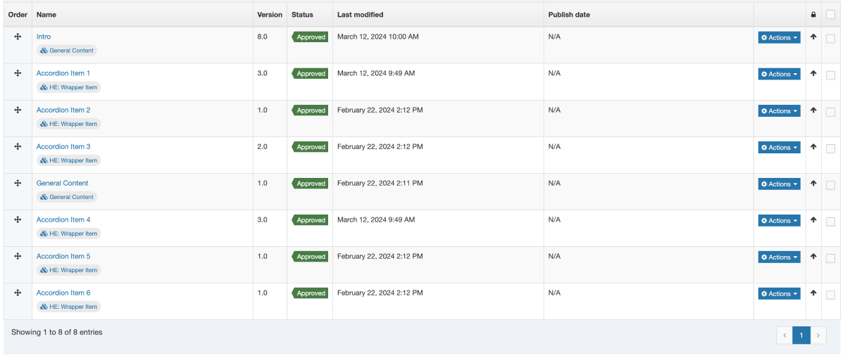
there is:
- 1 "general content"
- 3 "wrapper item"s
- 1 "general content"
- 3 more "wrapper items"
This is the resulting logic table:
| Order | Content Type | first | last | firstOfType | lastOfType | firstInSequence | lastInSequence |
|---|---|---|---|---|---|---|---|
| 1 | General Content | ✅ | ❌ | ✅ | ❌ | ✅ | ✅ |
| 2 | Wrapper Item | ❌ | ❌ | ✅ | ❌ | ✅ | ❌ |
| 3 | Wrapper Item | ❌ | ❌ | ❌ | ❌ | ❌ | ❌ |
| 4 | Wrapper Item | ❌ | ❌ | ❌ | ❌ | ❌ | ✅ |
| 5 | General Content | ❌ | ❌ | ❌ | ✅ | ✅ | ✅ |
| 6 | Wrapper Item | ❌ | ❌ | ❌ | ❌ | ✅ | ❌ |
| 7 | Wrapper Item | ❌ | ❌ | ❌ | ❌ | ❌ | ❌ |
| 8 | Wrapper Item | ❌ | ✅ | ❌ | ✅ | ❌ | ✅ |
Preview and Fulltext Helpers
The following helpers give you information about the current page context, whether it's being previewed, or it's a fulltext page.
preview Helper
The preview Block level helper is used to determine whether or not the page is currently being previewed or not.
It's used like:
fulltextURL Helper
The fulltextURL Helper was introduced in Terminalfour 8.4.1.
It will output the URL to the fulltext page for the current content item. This is useful if you just need the URL and don't need the full link to be generated.
It's used like:
fulltext Helper
The fulltext Helper has both a standard and block level variant. It behaves differently depending on which is used.
The fulltext Helper used in a standard expression outputs a link to the fulltext page of a given content type.
It's used like:
This would have the same output as this equivalent t4 tag based layout:
<a href="<t4 type="content" name="Name" output="fulltext" />">Keep reading</a>
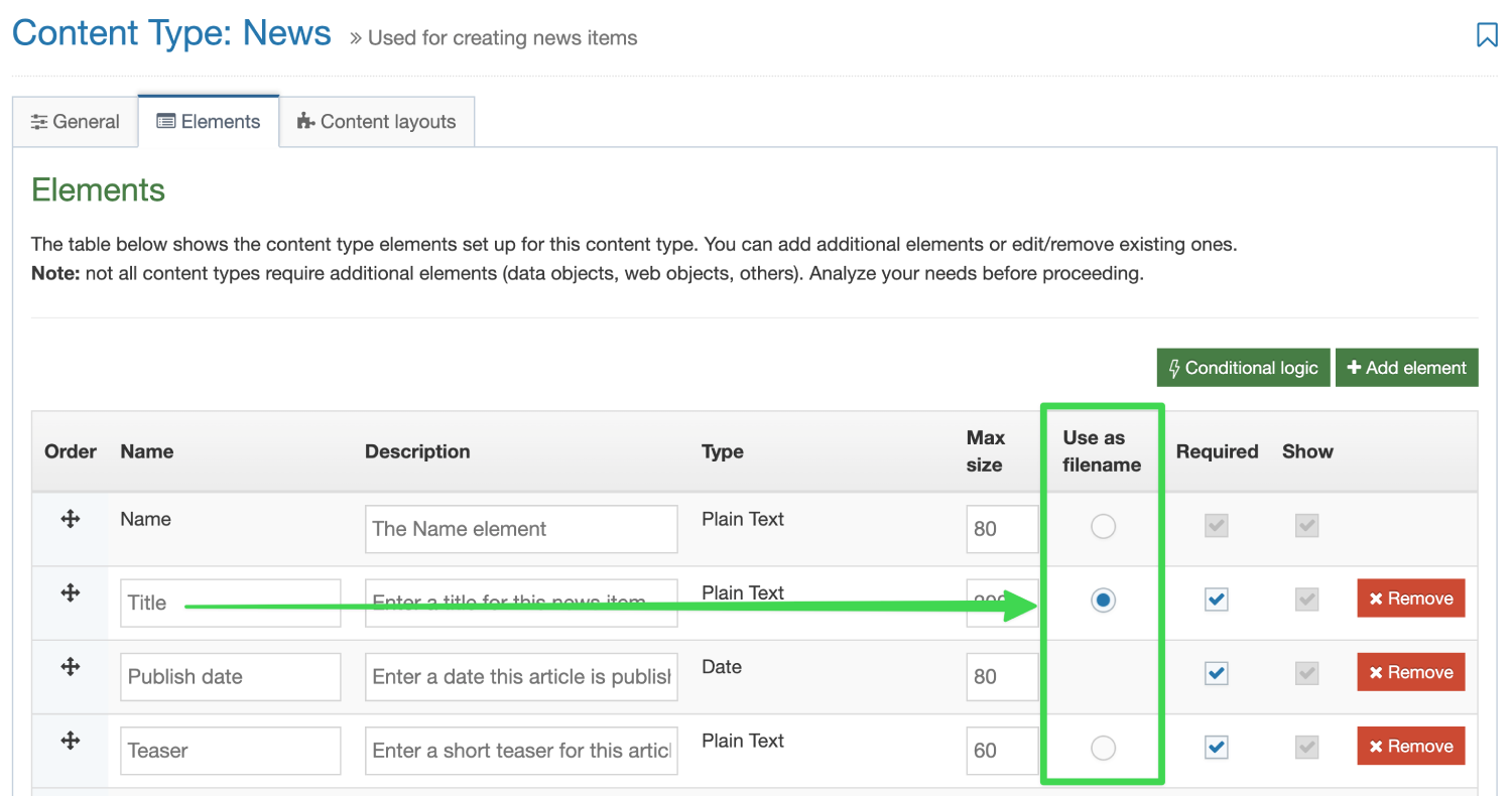
To control which element is used to form the output filename of the fulltext page, be sure to mark the element in the UI.
When used in a block level expression, the fulltext helper can be used to let you know if the current page is a fulltext page or not. This is most useful in a Page Layout.
For example:
A great benefit of the fulltext helper as a block level expression in Page Layouts means that you can output content elements from a page layout. This is something that isn't possible with T4 tags but makes for some pretty interesting use cases.
For example – create a custom title element using the "Title" element of a content type if on a fulltext page.a
The following example could be put into a Page Layout:
Context Helpers
You may want to modify the format of content layouts or page layouts depending on the context in which they are being output. The following Helpers aim to simplify that process.
You can also see our dedicated guide on context aware layouts for examples on how you can use these helpers on your sites.
sectionLevel Helper
Introduced in version 8.4.0
The sectionLevel Helper is used to output the current Section Level in the hierarchy of the site.
The channel Root is considered level 1. Direct children of that section are considered level 2, etc.
This can be used in conjunction with the Comparison Operators above to give you more control over your Page Layouts and Content Layouts.
or
pageLayoutId Helper
Introduced in version 8.4.0
The pageLayoutId Helper is used to output the ID of the currently processing Page Layout.
This can be used in conjunction with the Comparison Operators above to give you more control over your Content Layouts.
For example you may want to output a slightly different layout of your content type when it's being used within the "Full Width" Page Layout.
contentInSection Helper
Introduced in version 8.4.2
The contentInSection Helper allows you to loop over the content in the current section context.
It's used in conjunction with an each Helper
There is an optional parameter named contentTypeId that allows you to only loop over content types in the current section context.
This could be used, for example, in a Page Layout to loop over all the content in the section of type "Sidebar Content" (ID:23) and embed an alternate layout of that content into a sidebar like so:
It's important to recognise that inside the each loop, information is processed from the content's scope.
This means that if I call a helper like contentId while inside this loop, it will output the content ID of the currently processing content item.
The contentInSection Helper, is made even more powerful when used in conjunction with the linkTarget Helper.
Alternate Layout Helpers
The following helpers allow you to output content or process content layouts from other places.
embed Helper
The embed helper is used to embed an alternate content layout from the current Content Type. This can be really useful if you want to have variations on a template or want to display content in different ways depending on conditions.
It's also useful for keeping Content layout code clean, organised and isolated.
It's used like:
It doesn't matter if what the processor type is of the layout you're embedding. So whether it's a standard T4 tag layout, a Handlebars layout, or even a Programmable layout you can use the snippet helper to include it.
snippet Helper
It's quite common to use the SectionMetaDescription Content type to create layouts for code or information that you want to be available in every section.
This is often used alongside a Related Content navigation object that looks in the current section for content with an alternate layout.
With the snippet Helper you can now pull in a layout from the SectionMetaDescription Content type without the need to create any navigation objects.
Used like:
It doesn't matter if what the processor type is of the layout you're including with the snippet Helper. So whether it's a standard T4 tag layout, a Handlebars layout, or even a Programmable layout you can use the snippet helper to include it.
linkTarget Helper
The linkTarget Helper allows you to process Handlebars Expressions from within the context Section or Content a user has selected with a Section/Content Link element.
It's used in conjunction with a with helper in order for you to change the processing context to what's selected.
For example, you may have a Content Type with a Section/Content Link element called "Select News Item". A user can use that element to select a news item from somewhere else in the system. Using with and linkTarget you can now process Handlebars expressions from that selected content item.
For example, maybe you want to embed an alternate layout from the selected Content Item
{{#with (linkTarget element="Select News Item")}}
{{embed layout="text/homepage-promo"}}
{{/with}}The above example assumes the user has selected a Content Link.
We can tell whether the user selected a Section Link or a Content Link by checking whether the contentId is a value greater than zero. If it is, the user selected a Content Link.
{{#with (linkTarget element="Select News Item")}}
{{#gt (contentId) 0}} {{!-- Check if the content Id is greater than 0 --}}
{{!-- This is a content Link --}}
{{embed layout="text/homepage-promo"}}
{{else}}
{{!-- This is a section Link --}}
DO SOMETHING ELSE INSTEAD.
MAYBE OUTPUT AN ERROR?
{{/gt}}
{{/with}}
If instead they have selected a Section Link you may want to loop over all the Content in that section.
This can be done by making use of the contentInSection Helper.
{{sectionName}}
{{!-- The above will output "Home" because this content item exists in the Home section --}}
{{#with (linkTarget element="Select News Item")}}
{{#gt (contentId) 0}}
{{!-- This is a content Link --}}
{{embed layout="text/homepage-promo"}}
{{else}}
{{!-- This is a section Link --}}
{{sectionName}}
THE ABOVE EXPRESSION will output "News" because the user selected the "News" section
and all Handlebars Helpers inside the `with` block are being processed as if they're in that selected section.
You may use add a scope="parent" to expressions if you need them processed at the parent scope, like so:
{{sectionName scope="parent"}}
{{/gt}}
{{/with}}
Miscellaneous Content Helpers
There are a number of miscellaneous Helpers to output information about a piece of content.
contentId Helper
Used to output the content Id of the content it's used in.
Used like:
contentVersion Helper
Used to output the content version of the content it's used in.
Used like:
anchor Helper
Used to output a span tag with an id for the specific content item. Used so you can link to specific pieces of content and it will scroll them in to view.
Used like:
Content Date Helpers
There are a number of Helpers to output dates associated with content items.
The following helpers can all be used in conjunction with the dateFormat Helper in order to format the date as you like.
The date format string can contain values as outlined in the format Dates section of the documentation.
publishDate Helper
Used to output the publish date of content if it is set (if it isn't set this returns an empty value).
Used like:
expiryDate Helper
Used to output the expiry date of content if it is set (if it isn't set this returns an empty value).
Used like:
contentLastModifiedDate Helper
Used to output the last modified date of the current content (if there's no currently publishing version of the content this will return an empty value).
Used like:
createDate Helper
Used to output the last modified date the content was first created.
Used like:
now Helper
The now Helper allows you to output the current datetime.
It's important to recognise that it will output the datetime at the time it is processed.
That means when you preview a page, it will output the current date and time.
When you view it on the published page, it will output the date and time that the page was published.
The above will output the date and time the layout is processed. For example:
2025/04/25 09:00AM
Miscellaneous Page URL Helpers
There are a number of miscellaneous Helpers to provide you with information about the URL of the page being viewed (whether it's a fulltext page, or a standard index page).
The following URL Helpers all rely on the Channel settings including a "Channel publish URL" value. If this field is blank in your channel settings these helpers cannot output the published page URLs.
pageURL Helper
Used to output the current page URL. In preview this will output the Preview URL, and in publish it will output the published URL.
Used like:
publishURL Helper
Used to output the current page's publish URL. In preview and in publish it will output the published URL.
Used like:
previewURL Helper
Used to output the current page's preview URL. In preview and in publish it will output the preview URL.
Used like:
canonicalURL Helper
Used to output the current page's canonical URL. Generally this is used to output a <link> tag in the header of a Page Layout so that if a section is mirrored, the canonicalURL will always return the original URL.
Used like:
You can learn more about Canonical URLs on our dedicated guide.
Language Related Helpers
All language related helpers were introduced in version 8.4.0
languageCode Helper
Outputs the currently publishing language code.
Used like:
You may want to use this with Comparison Operators to modify your content layouts depending on what language they're currently being published with.
languageLink Helper
The languageLink Helper relies on the Channel settings including a "Channel publish URL" value. If this field is blank in your channel settings these helpers cannot output the URLs.
The languageLink Helper is used to output a link to an alternate language version of the current page.
It can be used within a Standard Expression or within a Block Level Expression.
When used in a Standard Expression, the helper will return a link to the language passed within the target argument.
When used in a Block-level expression, you'll have access to three variables to give you full control of the markup.
- targetLanguageCode - returns whatever was passed into the target attribute.
- targetLanguageURL - returns the URL to the translated page.
- targetLanguageName - returns the name of the language corresponding to the value passed in the target attribute
Miscellaneous Section and Channel Helpers
The following helpers allow you to output information about a section or a channel.
section Helper
The section helper can be used to output an element from the SectionMetaDescription content type.
It's used like:
The field attribute is an element name from the SectionMetaDescription content type.
sectionId Helper
Used to output the ID of the current section.
It's used like:
sectionName Helper
Used to output the name of the current section.
It's used like:
parentSectionId Helper
Introduced in Terminalfour 8.4.4
Used to output the ID of the current section's parent.
It's used like:
If there's no valid parent found (i.e. you're at the channel root), the helper will return 0
channelId Helper
Used to output the current Channel's ID.
It's used like:
channelName Helper
Used to output the Name of the current Channel.
Used like:
channelDescription Helper
Used to output the Description of the current Channel.
Used like:
channelPublishURL Helper
Introduced in Terminalfour 8.4.3, this helper is used to output the Channel Publish URL of the current Channel.
Used like:
Note: This is the value set for the field named "Channel Publish URL" when editing a channel. It represents the root of the current channel.
Not to be confused with Helpers used to output the current page's URL.
Miscellaneous CMS Links helper
The following helpers allow you to output quick links to manage the current page or content.
directEditSection Helper
Used to output a link to Direct Edit a section.
Used like:
editSection Helper
Used to output a link to edit this section in the standard Terminalfour interface
Used like:
createSection Helper
Used to create a link that will create a subsection of the current section in the standard Terminalfour interface.
Used like:
editContent Helper
Used to create a link to edit the current content item within the standard Terminalfour interface.
Used like:
createContent Helper
Used to create a link that will create content within the current section in the standard Terminalfour interface.
Used like:
String Manipulation Helpers
The following Helpers allow you to modify Strings before they are output to the page.
jsonString Helper
Introduced in Terminalfour 8.4.3, the jsonString Helper is used to escape a string so that is safe to be used in JSON.
It's used like:
When used with the publish Helper it might be used like so:
The above expression will escape all characters that are not JSON safe. This Helper should be used whenever the content being output will be used to create a JSON file.
abbreviate Helper
The abbreviate Helper is used to truncate a string to the provided number of characters. If a string is smaller than the provided number it is not changed. Otherwise an ellipses (...) is appended to the abbreviated string.
It's used like:
When used with the publish Helper it might be used like so:
The above expression will output the first 20 characters of the Title element.
For example, if the abbreviate Helper was called like so:
{{abbreviate "This is a string that will be abbreviated" 10}}
then the expected output would be:
This is a ...
capitalize Helper
The capitalize Helper is used to capitalize all the white space separated words in the provided string.
It's used like:
When used with the publish Helper it might be used like so:
The above expression will capitalize the first letter in each word provided in the Title element.
For example, if the capitalize Helper was called like so:
{{capitalize "This is a string that will be capitalized"}}
then the expected output would be:
This Is A String That Will Be Capitalized
capitalizeFirst Helper
The capitalizeFirst Helper is used to capitalize the first word in the provided string.
It's used like:
When used with the publish Helper it might be used like so:
The above expression will capitalize the first letter of the first word provided in the Title element.
For example, if the capitalizeFirst Helper was called like so:
{{capitalizeFirst "this is a string"}}
then the expected output would be:
This is a string
replace Helper
The replace Helper is used to replace all substrings of a given string with a different string. For example, you can replace all occurrences of the word "T4U" with the phrase "Terminalfour University".
It's used like:
When used with the publish Helper it might be used like so:
The above expression will find all occurrences of the string "T4U" provided in the Title element and replace them with the string "Terminalfour University".
For example, if the replace Helper was called like so:
{{replace "This is a string" "string" "sentence"}}
then the expected output would be:
This is a sentence
slugify Helper
The slugify Helper is used to make a given string suitable for use in a URL (or other situation where you want to avoid spaces and special characters). It converts the given string to all lowercase, removes non-word characters (alphanumerics and underscores) and converts spaces to hyphens. It will also strip leading and trailing whitespace.
It's used like:
When used with the publish Helper it might be used like so:
The above expression will "slugify" the string provided in the Title element.
For example, if the slugify Helper was called like so:
{{slugify " This is a string "}}
then the expected output would be:
this-is-a-string
cut Helper
The cut Helper is used to remove all occurrences of a given value or string from the provided string.
It's used like:
When used with the publish Helper it might be used like so:
The above expression will remove all space characters (" ") provided in the Title element.
For example, if the cut Helper was called like so:
{{cut "This is a string" " "}}
then the expected output would be:
Thisisastring
stripTags Helper
The stripTags Helper is used to remove all [X]HTML tags from a given string.
It's used like:
When used with the publish Helper it might be used like so:
The above expression will remove all [X]HTML tags provided in the Title element if any are present.
For example, if the stripTags Helper was called like so:
{{stripTags "This is a <em>string</em>"}}
then the expected output would be:
This is a string
nl2br Helper
The nl2br (New Line to <br> tag) Helper is used to convert all line breaks with <br> characters to ensure the output on the publish page contains the line breaks.
It's generally used with the publish Helper with Plain Text elements like:
For example, if the nl2br Helper was called like so:
{{nl2br "this is a \nstring"}}
then the expected output would be:
This is a <br>string
upper Helper
The upper Helper is used to convert a string into all uppercase.
It's used like:
When used with the publish Helper it might be used like so:
The above expression will replace all lowercase characters found in the Title element with their uppercase equivalent.
For example, if the upper Helper was called like so:
{{upper "This is a string"}}
then the expected output would be:
THIS IS A STRING
lower Helper
The lower Helper is used to convert a string into all lowercase.
It's used like:
When used with the publish Helper it might be used like so:
The above expression will replace all uppercase characters found in the Title element with their lowercase equivalent.
For example, if the lower Helper was called like so:
{{lower "THIS is a STRING"}}
then the expected output would be:
this is a string
Development Related Helpers
These helpers are aimed specifically at developers to improve the development experience while working with Handlebars.
The following Helpers were introduced in Terminalfour 8.4.3
try Helper
The try Helper is used to ensure that any errors encountered in your layout do not cause Preview and Publish to fail entirely.
Terminalfour recommends making use of the try Helper when working on new layouts where errors are more likely.
The try Helper is used in a Block level expression. Any code inside the try block will process as normal. However, if an error is encountered, Terminalfour will continue to process any layouts or pages found after the try block.
It's used like:
There are two variables available within the else block of a try expression (@error and @output).
These can be used to help debug what the problem is with the layout if it fails.
The @error variable will output more detail about the error encountered.
The @ouput variable will output everything that was processed in the try block before the error was encountered.
Example:
captureLogs Helper
The captureLogs Helper is used to help assist with debugging errors encountered when using Handlebars.
It is used in a Block level expression. Any code inside the captureLogs block will process as normal. However, if an error/warning/debug log is triggered, those logs will be output to the user. This Helper should only be used during development and should be removed when putting the layout live.
It's used like:
There are several optional parameters that can be passed to the captureLogs Helper.
1. mode
The mode parameter defines whether the logs will be output to a HTML table (mode="table") or whether they'll be output within HTML comments (mode="comment").
If no mode parameter is passed, the default behaviour is for logs to be output in a HTML comment.
Example:
The mode is only used for page preview. captureLogs won't output anything on the published site by default.
2. level
There are four levels of severity for logs:
errorwarninfodebug
By default, the captureLogs Helper will output logs that are warn and above.
If you need to see info or debug logs, you can pass this in as a parameter.
Example:
3. publish
If, for some reason, you need to see the log information on the published page you will need to set the attribute publish="true".
Example:
If this attribute is not set, no logs will be output to the page during publish. They will still continue to be saved into the standard log files on disk.
Note: Even when publish="true" is set; the logs will only every be output as HTML comments on a published page. The value of the mode attribute (defined above) is ignored on published pages.