
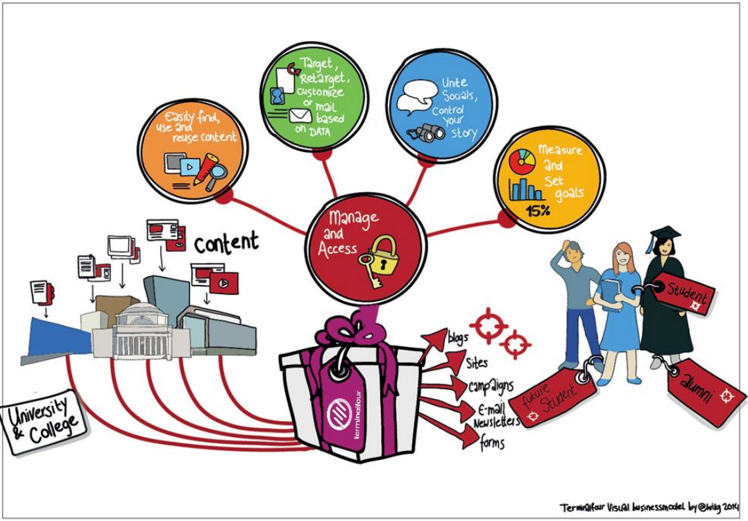
Web content management
- At a basic level, Terminalfour is used for building and maintaining large amounts of digital content.
- Users at various levels can be given permission to add and modify content. All content goes through an approval cycle, at which point dedicated "approvers" review the content. In some cases, this may be the authors who wrote the content; in other cases, a more complex workflow may be used to allow several people to review the content.
- Once content has been approved, it is ready to "go live". This happens in the publishing process. Page layouts (header/footer) and content layouts are wrapped around the content to ensure the content is displayed correctly.
- One piece of content may be published to various channels. These are simply output mechanisms, like websites, mobile sites, paper publishing, etc. By applying the page layouts and content types, different displays can be achieved whilst still just producing one piece of content.
- At the publishing stage, external data can also be incorporated. This could be information from a database, website or similar.
User roles
There are 5 user roles in Terminalfour:
- Administrator
- Power User
- Moderator
- Contributor
- Visitor
Meet the team below:
Visitor Vinny
Hi, I’m a student at the University and a member of the library.
There’s a password-controlled area of the library’s website which I access using my student authentication details. I can keep track of my library account from there.
Contributor Carla
I work at the University library.
I don’t update content very often, but when I do I like to use Direct-Edit as it’s easy to update the content. I have a moderator check my work before it gets published.
Moderator Mike
I also work at the library.
Content that Carla and other Contributors create comes to me and I decide what gets published.
I have permission to add new pages to the website when needed.
Power User Pete
I oversee the library website.
I can add content, but my main duties are to look after the look and feel of the library site, I can change the page layouts and create/edit content types for the Contributors and Moderators to use.
Administrator Ann
I oversee all the Websites here at the University.
My duties are like Power User Pete’s, but I get to oversee all the websites and have access to all areas within Terminalfour.
User rights
- The default rights of each user type are detailed below.
- Some rights and roles are customizable by going to:
Administration > User Rights & Roles > Role Customization
| Action | Contributor | Moderator | Power User | Administrator |
|---|---|---|---|---|
| Add/Modify/Delete Content | ✓ | ✓ | ✓ | ✓ |
| Manage Site Structure | ✓ | ✓ | ✓ | |
| Approve/Reject Content | ✓ | ✓ | ✓ | |
| Modify User Profile | ✓ | ✓ | ✓ | ✓ |
| Purge Content | ✓ | ✓ | ||
| Manage Users | ✓ | ✓ | ||
| Manage Groups | ✓ | ✓ | ||
| Assign Rights to Contributors | ✓ | ✓ | ✓ | |
| Assign Rights to Moderators | ✓ | ✓ | ||
| Assign Rights to Groups | ✓ | ✓ | ||
| Manage Channels | ✓ | ✓ | ||
| Manage Page Layouts | ✓ | ✓ | ||
| Manage Content Types | ✓ | ✓ | ||
| Manage Navigation Objects | ✓ | ✓ | ||
| Manage Languages | ✓ | ✓ | ||
| Manage Workflows | ✓ | ✓ | ||
| View Audit/Error Reports | ✓ | |||
| Configure Terminalfour | ✓ | |||
| Publish Content | ✓ | ✓ | ✓ |
Create a user
- To complete the training, you need a power user or administrator user account. For the training, you may be asked to use an account specifically set up for you.
- The steps below will instruct you how to create a new user in Terminalfour.
- Users can also be managed externally via LDAP, SAML, CAS or Remote user.
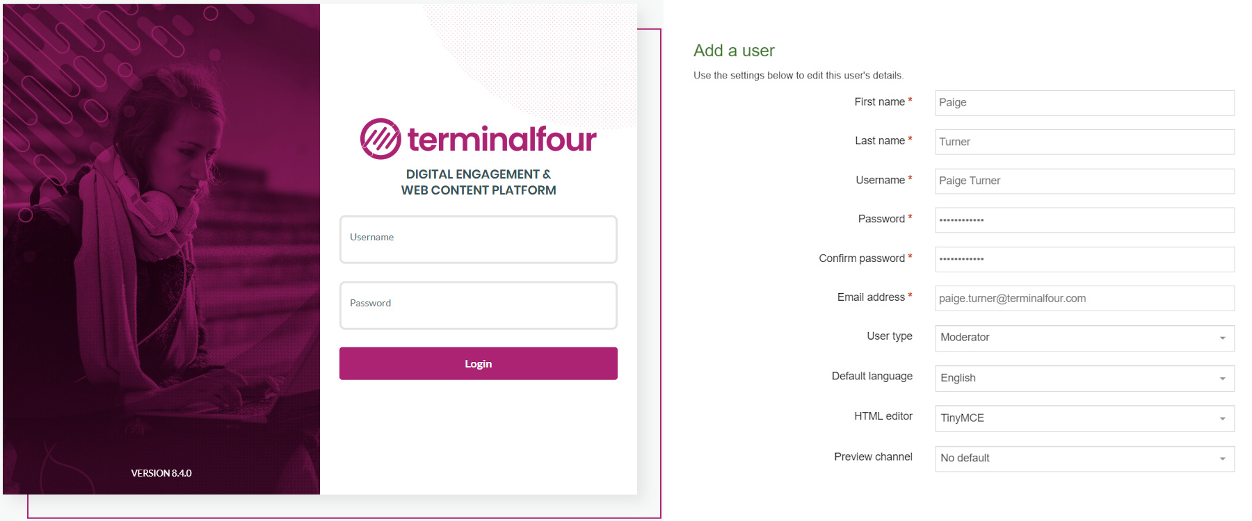
How to create a user
- Go to Administration > User Rights & Roles > User Management > Add new user
- Fill in the relevant information:
- First name: enter the user’s first name.
- Last name: enter the user’s surname.
- Username: enter a username.
- Password: enter a password of minimum six characters.
- Confirm password: confirm the password by entering it again here.
- Email address: enter the user’s email address. This is used for alerts and notifications.
- User type: select the relevant level of user access (as instructed by the trainer).
- Terminalfour user interface language: select the language you wish to use for the interface.
- Default language: select the language you wish to use for the site structure. The languages available will depend on your specific installation.
- HTML editor: select the editor you wish to use for HTML elements. Depending on your set-up, several may be available.
- Preview channel: select a channel the user works within, if possible. If you leave this as "no default", the user needs to select the relevant channel when previewing content.
- Click Save changes to save the details. The new user has now been created and can log in.
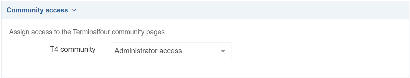
Community access
- Select End user access or Administrator access if you want the user to have access to the Terminalfour Community.
- End user access gives restricted access.
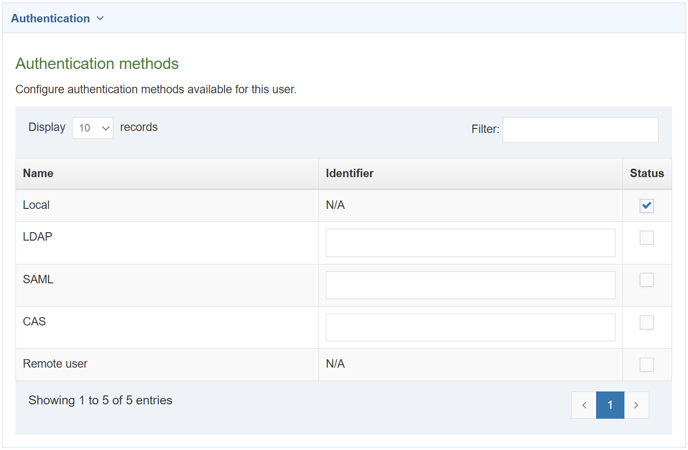
Authentication methods
- Configure authentication methods available for this user.
- This is where you indicate what authentication methods are necessary for the user.
- The three columns are for the Name, Status and Identifier. Select status to correspond with the user's requirements. Using the user's username - enter the username as the identifier.
Download training material
- Training material for this course can be downloaded from the Terminalfour Knowledge Base.
- The Terminalfour Knowledge Base is your source of all information about Terminalfour.
- Being part of the Terminalfour Community gives you access to training materials and documentation about the product.
How to download training materials
- Navigate to the 8.4 Implementer training materials page
- Download the Training Files.
Create a group and add users
- Groups are used to group users as well as assets. By grouping users, you can assign a group to the site structure, rather than having to assign each individual user.
- By grouping assets, you can restrict who can update and use the assets.
- Create a group to use in this training. Users are added to this group, allowing you to organize users and assets.
How to create a group and add users
- Expand Administration > User Rights and Roles > Group Management > Create new group
- Fill in the relevant information:
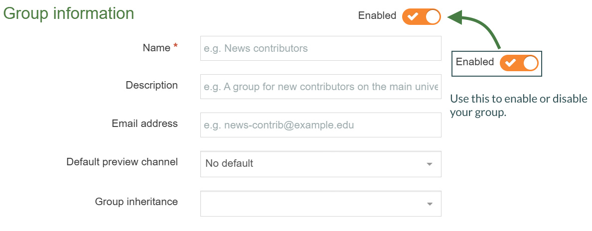
- Name: enter a name for your group.
- Description: enter a description for your group to indicate what it is used for.
- Email address: enter an email address for the group if desired. This can be practical if all members of a group have a shared inbox.
- Default preview channel: select a channel the group works within, if possible. If you leave this as "No default", the members of the group need to select the relevant channel when previewing content, unless they have a default set in their user profiles.
- Group inheritance: sets the group as the main/parent group of the groups selected. This feature is currently limited to the group select content element and access control only.
- A group must contain at least one user. Add your user to the group.
- Locate the list of available users and click +add beside the users you wish to add as members of this group.
- Click Save changes to save the group details. Members can be added and removed at any point.
Site structure
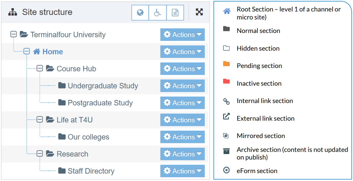
- The first part of building a website is identifying at least the high-level architecture. In Terminalfour this involves building a site structure consisting of sections.
- There are many types of Section, and each type has an icon so you can identify it.
- Once the different options have been explained by the trainer, build a small site structure you can use as a foundation for your new website.
How to create sections
- On the Site Structure screen, locate the section under which you wish to add your first section. Click Actions > Create section.
- Enter the relevant information to create a section. As a minimum, the Name must be filled in. All other default options are explained on the next page.
- Click Save changes to save the section.
- Repeat the steps above to add additional sections. Section information can be modified at any stage.
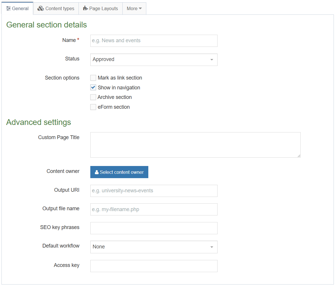
General Section Details
When creating sections, the only required element is Name. Additional elements are described below:
Name: This is the name of your section and is typically used in the menu navigation and forms the basis of the URL for the published page (if an Output URI is not specified).
Status: There are three status levels:
Approved: Sections are published when they have at least one approved Content Item.
Pending: Pending Sections will not publish, even if the content within the Section is Approved.
Inactive: Deleted Sections have an Inactive status. Sections can be restored by changing the
status to Approved.
Mark as link section: Link Sections contain no content and instead link to another Section in the Site Structure or an external URL.
eForm section: This option is used if you want to submit an eForm. Refer to the documentation for eForms for further details.
Advanced Settings
It should be noted that depending on your Section metadata content type, more fields may be available at the top of the Advanced settings. These fields are installation specific and hence not covered here.
Custom Page Title: This is an example of an installation specific element, added using the Section meta content type. This element is not used in this T201 training.
Content owner: Select the Content Owner from the list. If left blank, it will inherit from the parent section. The content owner can be used in workflows or get notified when content expires.
Output URI: Lets you specify the Uniform Resource Identifier (URI) as the destination of the new Section. Using this field improves the Search Engine Optimization (SEO) for this Section. Otherwise, with the field left blank, the Section's name is used when publishing.
Output file name: Specify the file name used for the page. When you leave this blank, the system uses the default file name configured in the Channel Settings.
Want to hide this option from your users?
Go to Administration > Hierarchy & Content Settings > Hierarchy > Enable output to filename
Default workflow: The default Workflow for this Section's content.
Access key: You can enter a single character which is used as a shortcut within a Link Menu Navigation Object.
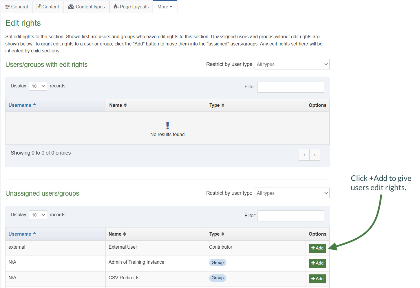
Edit rights
- Administrator users by default have edit rights to the entire site structure. All other user types need to be given edit rights.
- Give your users/groups the right to edit your site structure.
How to assign edit rights
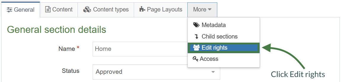
- To give a user or group edit rights, go to the Site Structure, and click on the relevant section.
- Expand the More tab and click Edit rights.
- Use the Filter to find the relevant users or groups.
- Click +Add beside the users/groups you want to give access to the Section.
- Click Save changes.
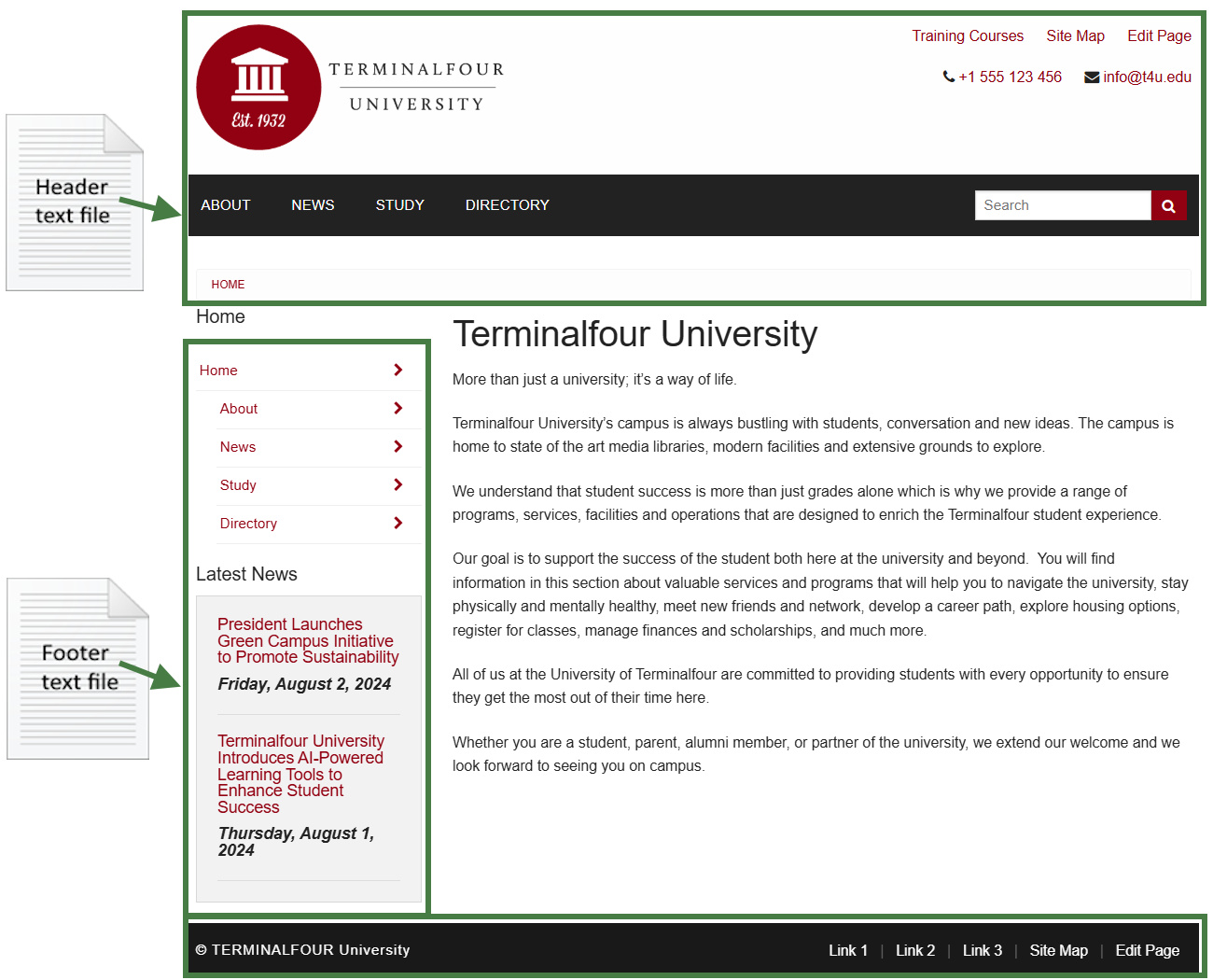
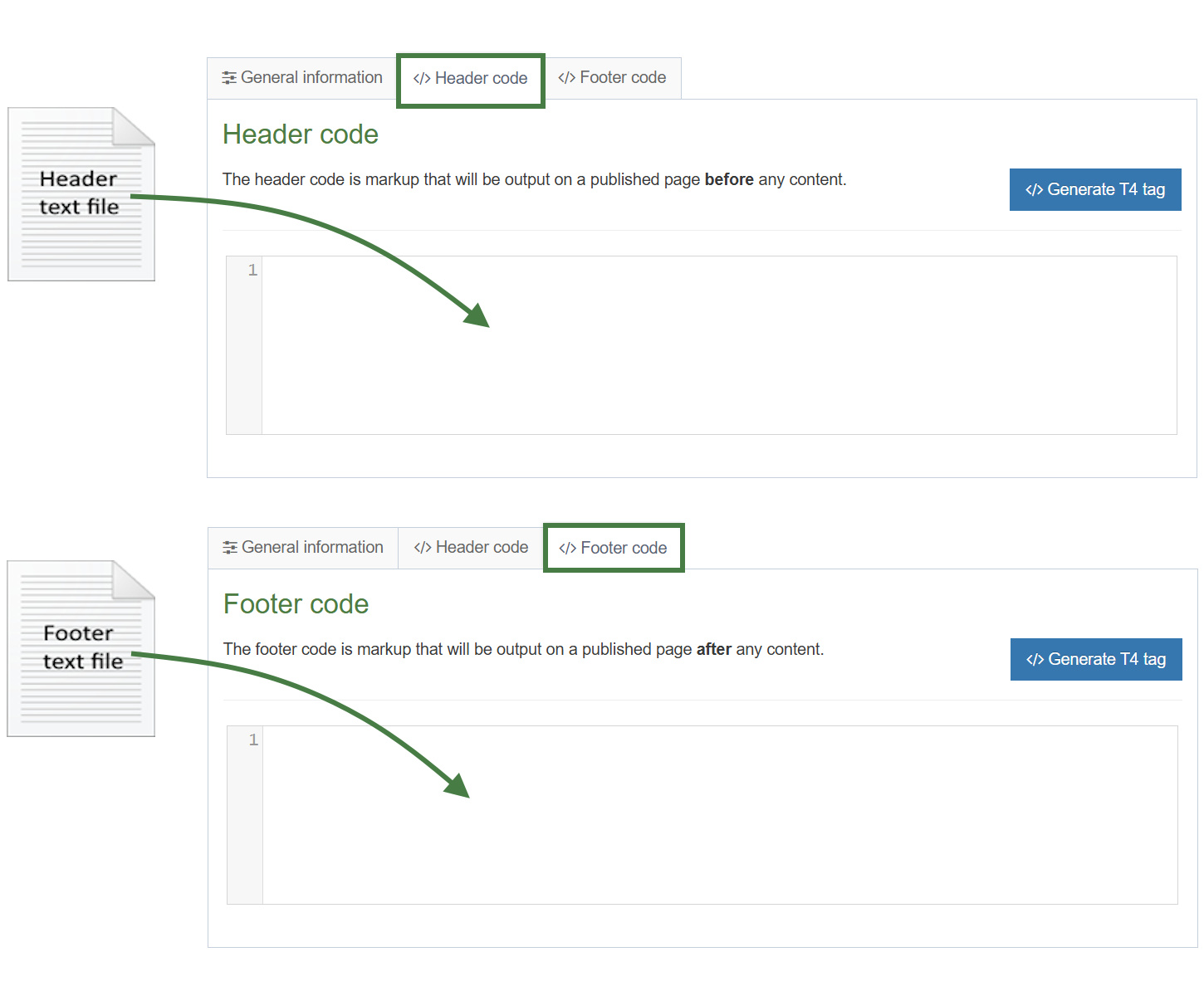
Page layouts
- Page layouts provide a consistent structure and style to the pages on your website.
- A page layout in Terminalfour consists of at least a header and footer and it typically also includes one or multiple media references and navigation objects.
- To get started, build a basic “blank” page layout consisting of only a basic header and footer.
.png)
How to create a blank page layout
- Go to Assets > Page Layouts > Add new layout
- There are 3 tabs to complete on the General information tab, you can fill in the following information:
- Name: enter a name for your page layout.
- Description: enter a description for your page layout.
- File extension: if you are not going to use the default, select the relevant extension here.
- Syntax type: if you wish to use syntax highlighting, select it here.
- Layout processor: you can select the processor you wish to use. Select the default option T4 Tag Page, as using an alternative layout processor is not covered in these exercises.
- Primary group: select your group from the list. You can share your page layout with other groups by clicking Toggle shared groups and selecting the groups to share with; shared groups can be granted either read only or full access to your page layout.
Header and footer of a page layout
- When building your page layout, you will need to consider what will appear in the header and footer of every page that uses the page layout.
- Typically, the Header tab will feature HTML elements up to and including the opening body tag, while the Footer tab will feature HTML from the closing body tag.
- Use the code from the header and footer below to build your initial blank page layout.
.png)
<!DOCTYPE html>
<html lang="en">
<head>
<title>Page Title</title>
</head>
<body>
.png)
</body>
</html>
- Copy the HTML from the header and footer above and paste it into the Header code and Footer code tabs in your page layout.
- Click Save changes to save the page layout.
Channels
- A channel creates a way for content to be assembled and directed to the website or alternative output. The space for the site itself must exist on a target web server accessible to Terminalfour to publish content to it.
How to create a channel
- To create a channel, go to Administration > Set up Sites & Channels > Channels > Add new channel
- General information
- Name: give your channel a name, e.g.,"My University Website".
- Description: enter a description to accurately describe what the channel is used for.
- Type: assign a "type" to your channel, e.g.,text/html. This is used when publishing a site, so only items with the right type is published. It allows you to have several types in use for the same content to, for instance, display content in one way on the website and a different way on the mobile site.
- Root Section: click Select section to open the site structure. Select the root section for your site. This will be your "homepage" and is always considered as level 1 in the site structure.
- Languages: select the languages you wish to publish to by checking the relevant boxes. Only languages set up in your installation will appear on the list.
- Output information
- Output directory: specify the output directory to indicate the operating system’s folder to which the channel will be published. The folder structure needs to match the Site Structure.
- Default filename: specify the default filename, e.g., index.html.
- Base HREF: this holds the published URL for the channel, e.g., http://www.oursite.com or http://www.someisp.com/ourwebsite, etc. It is used to correctly preview content in Terminalfour.
- Site root: the Site Root refers to the part of the URL after the domain name. If the published channel is http://www.oursite.com/, the Site Root would be "/". If the published channel is http://www.someisp.com/ourwebsite/, the Site Root would be "/ourwebsite/
- Channel publish URL:
- Path conversion: specify if upper or lower case should be used – this is especially useful if the host server is case sensitive, e.g., UNIX/Linux servers.
- Convert spaces in:
- Output URI
- Section name
- Retained filenames
- File part separator: specify a character to convert spaces, if left blank it uses the overall configuration that is set in the Preview and Publish settings.
- Favicon: if desired, you can select a favorite icon from the Media Library.
- Page Layouts and Content
- Page layouts: select the default page layout you wish to use for this channel.
- Inheritable page layout: select the page layout your sub-sections should "inherit". If not set, subsections will automatically inherit the main page layout you have selected.
- Publish empty sections: check this box to allow sections to publish even if they contain no content.
- Full text Defaults
- Type: this field specifies the "type" for the Layout of the second page of a full text content type. It is typically set to text/fulltext but can be set to anything you want.
- File extensions: this field contains the default file extension for the secondary full text content type, e.g.,"html".
- Fulltext publish period: if you do not wish to always publish full text content, you can specify how frequently this will publish. You can either use the global settings or specify this directly for the channel.
- Available file extensions
- Enable file extension overriding: if you have previously defined additional extensions, this allows you to publish your channel using alternative extensions such as PHP, RSS, JSP etc.
- Permitted file extensions: select the relevant extensions.
- Publish options
- Enable channel cleanup: this will clean up the publish directory after publishing by deleting any files which were not re-published. You can add exclusion rules.
- Publish reporting level: to access reports on how long publish takes, reporting needs to be enabled. The full report will include content and section information.
- Media publish options: if cleanup is globally enabled, specify if you wish to publish media which is not used. This can be done on a channel or category level.
- Access control and personalization
- Enable access control: adds a requirement to authenticate the published page when displayed to a user. This authentication may be via a login screen using any configured authentication service (e.g., NTLM, LDAP, Shibboleth, Site Manager Local User Login, IP address, .htaccess file etc.). Access Control may be inherited from a higher location in the Site Structure. Access Control can be combined with the use of personalization to determine who can see what content on the site.
- Configuration: allows you to specify what code will be added before and after the section.
- Enable personalization: allows you to enable section or page based personalization for certain sections; i.e. the user will be presented with the section and associated navigation links based on the sections he/she has been given access to. This may require authentication before the page is displayed to the user (see Access Control). Personalization can be configured to display specific sections and links based on the configuration (for example, if group-based personalization is used, users who are members of a "Student" group may see different content to users in a "Staff" group).
- Configuration: allows you to specify what code will be added before and after the link.
- Poll
- Default poll Icon: the poll functionality is no longer in use.
- Pending version output: the pending version of a channel will publish all content that is Pending (awaiting approval) to allow non Terminalfour users to see the content. This does not include pending sections. If this is configured, an extra option appears when publishing the channel, or scheduling the publish.
- Output directory: specify the output directory to indicate the operating system’s folder, to which the channel will be published, this will include Pending content. The folder structure needs to match the Site Structure.
- Base HREF: the Base HREF holds the published URL for the channel, e.g., http://www.oursite.com or http://www.someisp.com/ourwebsite, etc. It is used to correctly preview content in Terminalfour.
- Site root: the Site Root refers to the part of the URL after the domain name. If the published channel is http://www.oursite.com/, the Site Root would be "/". If the published channel is http://www.someisp.com/ourwebsite/, the Site Root would be "/ourwebsite/.
- General information
- Click Save changes to save the new channel. A channel can be updated at any point.
Content types
- A content type is the structure of a content item and is made up of one or more content elements. You can think of content types as structured templates for the content items that you will create, edit and publish.
- Content types are used for adding different types of content (e.g., news, general content, events, etc.) to editable areas on your website.
- Content types contain elements and one or multiple layouts; elements are fields which an end user fills in when adding content and the layout determines how the content is displayed on the site.
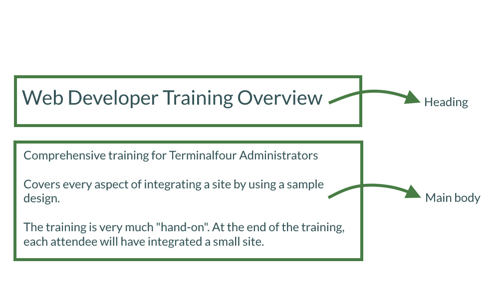
- To determine the elements for a content type, you need to analyze the desired output and decide how to cut it up. In this example, you are going to build a generic content type containing a heading and main body.
How to create a simple content type
- Go to Assets > Content Types > Create content type
- Fill in the General content type information:
- Name: enter a name here. This should suggest what type of content it is used for.
- Description: describe in more detail when to use this content type.
- Minimum user level: if you wish to restrict who can use this content type, you can set a level here. If content types are created in groups, a user must be a member of the group as well as meet the minimum user level criteria to use the content type.
- Enable direct edit: decide if direct edit can be used for this content type.
- Mark as eForm: if checked, this allows your content type to collect eForm data.
- Workflow: if relevant, enable a workflow for content created using this content type.
- Primary group: select your group. This allows you to select the group which is permitted to use this content type. Click Toggle shared groups to share the content type with more than one group.
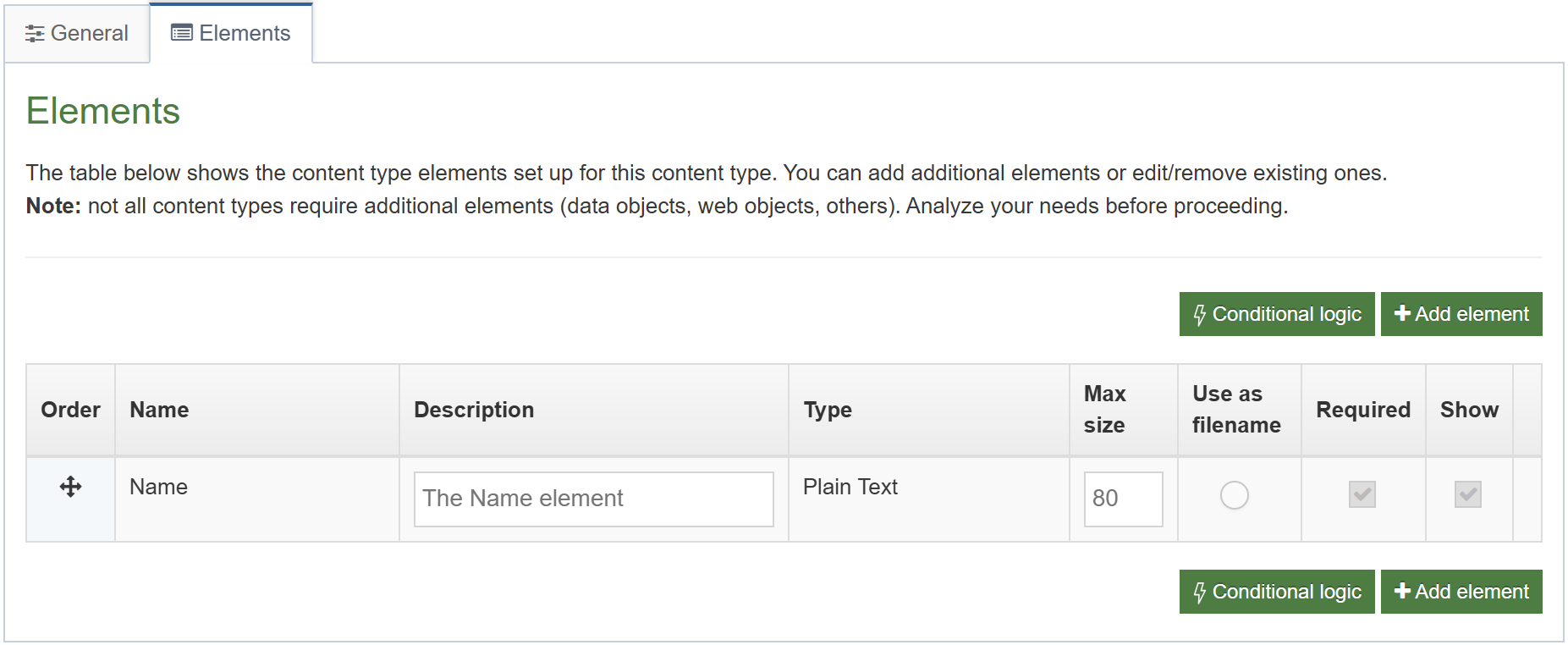
- Select the Elements tab.
- Each content type has a Name element by default. This is used to name the content and is typically not displayed on the published site.
- Add the other elements you need by filling in the information as outlined in the table below. Click Add element to begin filling in the details for each element.
- Once you have added all your elements, click Save changes. The Content layout tab opens.
| Name | Description | Type | Max Size | Required | Show |
|---|---|---|---|---|---|
| Heading | Enter the main heading | Plain Text | 150 | No | Yes |
| Main body | Enter the main body of the content | HTML | 1000000 | Yes | Yes |
- The Content layout tab is a new content layout for your content type. Click +Add content layout.
- Name: text/html - this is the default Type set in the Channel. This ensures the content can be displayed.
- File Extension: Default - unless this is used with a different File Extension. This requires other extensions being permitted in the Channel
- Syntax Type: HTML/XML – this determines which syntax is highlighted.
- Content layout processor: must be set to T4 Tag Content.
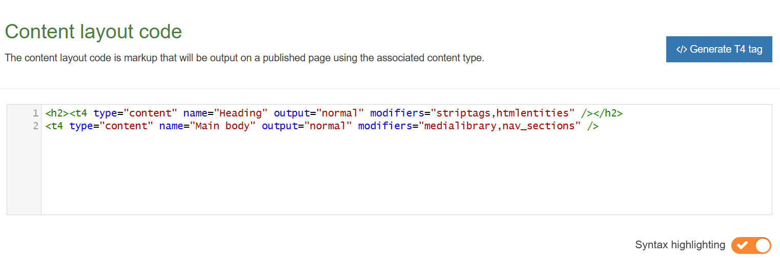
- Content layout code: this determines the output for your content. If you have created the HTML already, you can start by pasting that into the code field as displayed below.
- As each piece of content will have unique information in the Header and Main body, the text below needs to be replaced with what the user enters when creating the content. To do that you need to build some T4 Tags.
.png)
.png)
<h2>Terminalfour Web Developer training</h2>
<p>This training covers every aspect of the front-end administrative interface of Terminalfour.</p>
- In this example, the text Terminalfour Web Developer training is the Heading and needs to be replaced with a T4 Tag. To build this, click </> Generate T4 tag.
- Generate T4 tag:
- Tag Output: select Element;
This outputs the information the user enters in the element. - Content element: select the element you created earlier for the Heading.
- Output method: select Normal output (inline); this outputs the element by adopting the text layout of the page.
- The relevant Modifiers are automatically selected by Terminalfour, these are:
- Strip out all HTML Tags.
- Encode special characters to their HTML equivalent.
- Decide if you wish to Disable direct edit for this element.
- Tag Output: select Element;
- The T4 Tag is automatically generated; click Copy to clipboard to copy the generated t4 tag. It should look something like the T4 Tag below (depending on which modifiers you have selected):
<t4 type="content" name="Heading" output="normal" modifiers="striptags, htmlentities" />
- Replace the original heading Terminalfour Web Developer Training with the new tag. By leaving the tags around the new T4 Tag, the information entered by the end user will be wrapped in a H2.
- Click the </> Generate T4 tag button again.
- Using what you have learned above, build a tag to output the Main body:
- Normal output (inline).
- Parse for media library t4 tags.
- Parse for navigation t4 tags.
- Click Copy to clipboard to copy the code from the Preview field.
- Replace the original content for the Main Body with the new tag. You do not need to leave tags around the tag as the HTML editor will generate the necessary tags.
- The code should look like the screen below.
- Click Save changes to save the new content layout. The main part of the content type is complete.
A note about elements
> Once you have created and saved an element, the element cannot be modified. If changes need to be made, delete the element, and create another.
Output Methods
> Normal output (inline): outputs the element by adopting the text layout of the page.
> Output to File: allows the file to be downloaded.
> Output to fulltext: outputs the element on a separate page, which can have its own layout.
> Output to Image: outputs the image directly on the page. This requires the use of an Image Element.
> Selective output: can be used to ensure a content type element with no value is hidden from the published site and should be used for non-required elements.
Output Modifiers
> Parse for media library t4 tags: should be checked for HTML elements to ensure media elements are displayed. If left unchecked, media elements will not be displayed. This would be relevant for a text only format.
> Parse for navigation t4 tags: should be checked for HTML and Section/Content Link elements to ensure section navigation is displayed.
> Strip out all HTML tags: should be checked for plain text elements to avoid code being added when content is entered.
> Encode special characters to their HTML equivalent: should be checked for plain text elements if you wish to convert any non-standard characters to HTML.
> Change new lines to HTML line breaks: should be checked if you wish to convert line breaks in plain text fields into actual HTML line breaks.
> Convert invalid RSS characters to their XML equivalent: creates character code for valid RSS. This should never be used in combination with "Strip out all HTML tags".
> Convert output to be suitable for use in JavaScript: should be ticked if the element is going to be used with JavaScript.
> Encode email addresses to ASCII format: should be ticked if the element is going to be used for an email address. An email address posted on any website can be easily extracted with special email collection programs and used later for sending spam. Converting an email to ASCII allows it to display on a web page as normal but would prevent spam activity.
Add an HTML anchor to a content type
- If you wish to be able to create links to specific pieces of content, you need to ensure you have placed an HTML Anchor in your content layout.
- Add an HTML Anchor by building a T4 Tag of the type: Tag output Metadata.
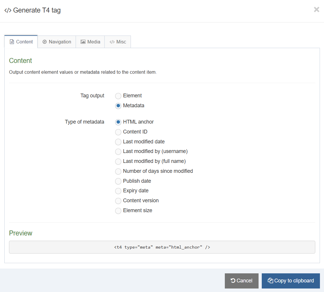
How to create an anchor
- To modify the content type, go to Assets > Content Types
- Using the Filter tool, locate your content type and click your content type’s name to edit it.
- Select the Content layouts tab and click the name of the content layout you wish to edit e.g., text/html. The Content layouts screen opens.
- Click the </> Generate T4 tag button:
- Tag output: select the option Metadata.
- Type of metadata: select HTML Anchor.
- Click Copy to clipboard to save the Generated T4 tag.
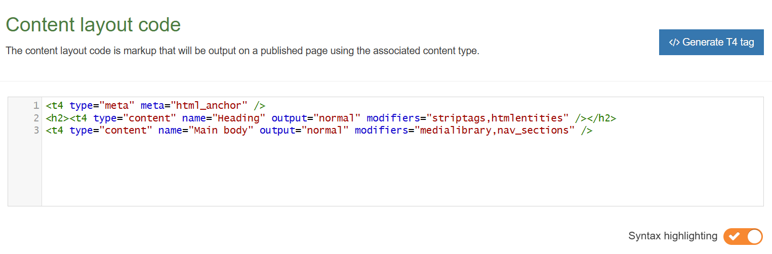
- Paste the tag into the top of the content layout code. This will place an HTML Anchor at the top of each piece of content, allowing users to link to this content.
- Your content type layout should now be like what is displayed below.
- Click Save changes to save your work.
Enable a content type
- Now that you’ve built your content type, you need to decide where it can be used and by whom.
- You need to enable your new content type to your Site structure to test it.
- Content types can only be used in Sections where they are enabled.
- If a content type is created in a Group, only users who are members of that Group can use the content type.
- Only users who meet the Minimum User Level criteria can use the content type.
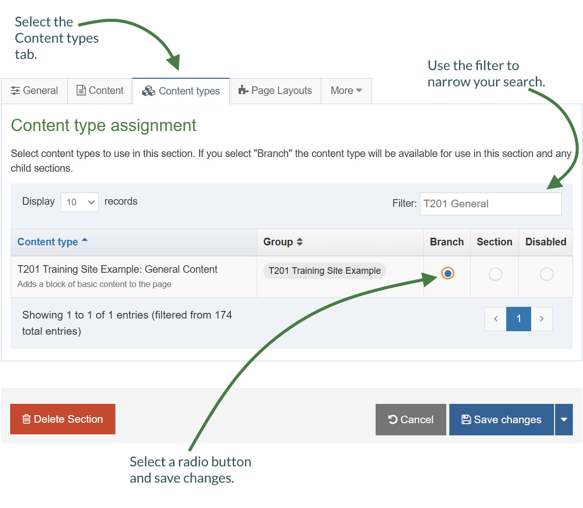
How to enable a content type
- On the Site Structure screen, click on the name of your main section.
- The General information about this section screen appears, select the Content types tab.
- Using the Filter feature, locate your content type.
- Select the radio button to enable your content type for either the branch or section:
- Enabled (branch): the content type can be used in this section as well as all its sub-sections.
- Enabled (section): the content type can be used in this section only.
- Click Save changes to confirm your selection. You can now use the new content type to add content to your section.
Create content
- The trainer will demonstrate the basic concepts of working with content. This will give you an idea of what your end users will see.
- After the demonstration, add a piece of content using your new content type. This will be the test to ensure everything works and will allow you to tweak it if needed.
.png)
How to create content
- On the site structure screen, expand the Actions menu of the section you wish to add content to and select +Create content.
- A list of available content types is displayed; select the content type you wish to use.
- Fill in all required elements (marked with *).
- Enter a Name for the content. This will typically not be displayed on the published page, but simply act as a name within the system. This element is always present, no matter which content type is used.
- Use the Heading to enter the main heading for your content. This will automatically be wrapped in an H2 tag if you created your content type correctly.
- Use the Main body to add the rest of the content. This can, for instance, be copied from a word document (you can use the file Training Overview Document as an example), or you can simply type in the text.
- When you have created your content, Preview (top of the page) to ensure you are happy with the result.
- Use the Save changes drop-down menu to either Save changes, Save & approve, Save as Draft, or to publish your new content now, click on the green Publish button at the top of the page.
Selective output
- If you want to output the value of an element only when that element is filled in, you can make use of selective output in your T4 tags.
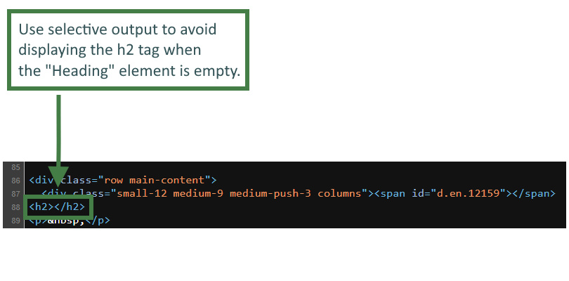
- Let's add selective output to the "Heading" element, since this element is not required, it may be purposefully left empty. By using selective output you can ensure the element is not output to the page if there is no content in the element.
Currently, when the "Heading" element of your General Content content type is not filled in the content layout will still output the <h2></h2> tags that surround the "Heading" element, this would not be semantically correct. You can prevent this situation using selective output.
How to generate the selective output tag
- Using the Filter tool, locate your content type and click your content type’s name to edit it.
- Select the Content layouts tab and click the name of the content layout you wish to edit e.g., text/html. The Content layouts screen opens.
- Click the </> Generate T4 tag button:
- Tag output: select the option Element.
- Content Element: select Heading. (This is the element you want to output)
- Output Method: choose Selective output.
- Process selective output markup: Parse for t4 tags Check this box if your output markup contains t4 tags
- Selective output markup: enter the code that should display when the "Heading" element is not empty. <h2><t4 type="content" name="Heading" output="normal" modifiers="striptags,htmlentities" /></h2>
- The relevant Modifiers are automatically selected by Terminalfour, these are:
Uncheck both of these options, since the selective output now requires the <h2> tag.
- Strip out all HTML tags
- Encode special characters to their HTML equivalent
- Format modifiers: Enable format modifiers
- Direct Edit: Disable direct edit for this element
- Click Copy to clipboard to save the generated T4 tag.
- Paste the tag into the Content layout code.
- Click Save changes to save your work.
Updating a content type to use Handlebars
- In this exercise, you will learn how to switch from using the T4 Tag Content layout processor to using the Handlebars Content layout processor.
- You will convert the t4 tags used in the "General Content" content type with the appropriate Handlebars code.
How to update the "text/html" content layout to use Handlebars
- Go to Assets > Content Types.
- Click your content type name to edit it. (Use the Filter tool to search). Open the content layouts tab.
- The content layouts tab is an area to add content layout(s) for your content type. Click into the "text/html" default content layout to edit it.
- Click into the General information tab.
- Name: "text/html" - this is the default Type set in the Channel. This ensures the content can be displayed.
- File Extension: Default - unless this is used with a different File Extension. This requires other extensions being permitted in the Channel.
- Syntax Type: HTML/XML – this determines which syntax is highlighted.
- Content layout processor: update the content layout processor to Handlebars Content.
- Click Save changes to save the changes to your content type.
- Update your preview to check the result.
.jpg)
How to replace a t4 anchor tag with Handlebars
- Click into the Content layouts tab.
- Select the "text/html" content layout and open the </> Content layout code tab.
- Click on the </> Generate Handlebars Expression button.
- In the Content tab:
- Information to output (select the Metadata radio button)
- Element: the Element option is used to output elements to the page.
- Metadata: the Metadata option allows output of specific Metadata (HTML anchor, Content ID, Last Modified Date, Publish Date, etc.).
- Fulltext: used to output a fulltext link.
- Metadata: leave the default selected "HTML anchor" radio button as this is what is needed to generate the anchor.
- Information to output (select the Metadata radio button)
- Click the Copy to clipboard button and paste the Handlebars expression into your content layout replacing the t4 anchor tag "<t4 type="meta" meta="html_anchor" />" with the Handlebars expression.
.png)
anchor Helper
Used to output a span tag with an id for the specific content item. Used so you can link to specific pieces of content and it will scroll them in to view.
Usage:
{{anchor}}
{{anchor}}
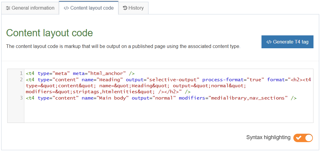
<t4 type="content" name="Heading" output="selective-output" process-format="true" format="<h2><t4 type="content" name="Heading" output="normal" modifiers="striptags,htmlentities" /></h2>" />
<t4 type="content" name="Main body" output="normal" modifiers="medialibrary,nav_sections" />
- Click Save changes to save the changes to your content layout.
- Update your preview to check the result.
Do not use t4 tags to display the "Heading" and "Main body" elements of the content type. Since you are using the Handlebars Content layout processor in this content layout you must use Handlebars code only as t4 tags will not work in this context.
How to replace the "Heading" and "Main body" elements
- Replace the "Heading" and "Main body" t4 tags to ensure these are displayed. You can use the publish Helper to achieve this.
- Click into the Content layouts tab.
- Select the "text/html" content layout and open the </> Content layout code tab.
- Click on the </> Generate Handlebars Expression button.
- In the Content tab:
- Information to output (select the Element radio button)
- Element: the Element option is used to output elements to the page.
- Metadata: the Metadata option allows output of specific Metadata (HTML anchor, Content ID, Last Modified Date, Publish Date, etc.).
- Fulltext: used to output a fulltext link.
- Content element: select the "Heading" element from the content element drop-down.
- Handlebars helper: this will be selected by default as the Publish Helper, used to output elements to the page.
- Options:
- Convert special characters to their HTML encoded values This is selected by default for Plain Text elements. It ensures that html characters are treated as literal text and not processed as HTML.
- Allow this element to be edited inline in Direct Edit Adds inline-edit="true" to enable inline editing of this element in Direct Edit.
- Check if value is set This option will wrap the element with an ifSet Helper. It ensures the element outputs only if it contains data.
- Information to output (select the Element radio button)
- Click the Copy to clipboard button to copy the generated Handlebars expression and replace the "Heading" t4 tag.
.png)
- Click on the </> Generate Handlebars Expression button again.
- In the Content tab:
- Information to output (select the Element radio button)
- Element: the Element option is used to output elements to the page.
- Metadata: the Metadata option allows output of specific Metadata (HTML anchor, Content ID, Last Modified Date, Publish Date, etc.).
- Fulltext: used to output a fulltext link.
- Content element: select the "Main body" element from the content element drop-down.
- Handlebars helper: this will be selected by default as the Publish Helper, used to output elements to the page.
- Options:
- Convert special characters to their HTML encoded values This is selected by default for Plain Text elements. It ensures that html characters are treated as literal text and not processed as HTML. In this case, the Main body element is an HTML element and it will display unchecked by default causing the expression to be tripled-stashed and allowing for correct processing of HTML.
- Allow this element to be edited inline in Direct Edit Adds inline-edit="true" to enable inline editing of this element in Direct Edit.
- Check if value is set This option will wrap the element with an ifSet Helper. It ensures the element outputs only if it contains data.
- Information to output (select the Element radio button)
- Click the Copy to clipboard button to copy the generated Handlebars expression and replace the "Main body" t4 tag.
.png)
publish Helper
The publish Helper is used to output the elements of a content type.
Usage:
{{publish element="Heading" inline-edit="true"}}
The code below is what your resulting content layout should look like once it has been fully converted to Handlebars:
{{anchor}}
<h2>{{publish element="Heading" inline-edit="true"}}</h2>
{{{publish element="Main body" inline-edit="true"}}}
- Click Save changes to save the changes to your content layout.
- Update your preview to check the result.
Adding conditional logic using Handlebars
- Previously, you used selective output on the "Heading" element to display it only when it's filled in. Let's now do the same but using the equivalent Handlebars code.
- In this exercise, you will make use of the ifSet Helper which allows you to determine whether or not a content element has been set/used.
How to use the ifSet Helper
- Click into the Content layouts tab.
- Select the "text/html" content layout and open the </> Content layout code tab.
- Click on the </> Generate Handlebars Expression button.
- In the Content tab:
- Information to output (select the Element radio button)
- Element: the Element option is used to output elements to the page.
- Metadata: the Metadata option allows output of specific Metadata (HTML anchor, Content ID, Last Modified Date, Publish Date, etc.).
- Fulltext: used to output a fulltext link.
- Content element: select the "Heading" element from the content element drop-down.
- Handlebars helper: this will be selected by default as the Publish Helper, used to output elements to the page.
- Options:
- Convert special characters to their HTML encoded values This is selected by default for Plain Text elements. It ensures that html characters are treated as literal text and not processed as HTML.
- Allow this element to be edited inline in Direct Edit Adds inline-edit="true" to enable inline editing of this element in Direct Edit.
- Check if value is set This option will wrap the element with an ifSet Helper. It ensures the element outputs only if it contains data.
- Information to output (select the Element radio button)
- Click the Copy to clipboard button to copy the generated Handlebars expression and replace the previous expression.
ifSet Helper
The ifSet Block level Helper allows you to determine whether or not a content element has been set/used.
Usage:
{{#ifSet element="Heading"}}
{{publish element="Heading"}}
{{else}}
{{This is a fallback heading.}}
{{/ifSet}}
The Handlebars expression you generated should look like this:
{{#ifSet element="Heading"}}
{{publish element="Heading" inline-edit="true"}}
{{/ifSet}}
- Click Save changes to save the changes to your content layout.
- Update your preview to check the result.
Links
- When working with links, a distinction is made between External and Internal links.
- An external link is used to create a link to an external website, such as https://www.terminalfour.com.
- Internal links are used to link to a Section or a specific piece of content in a Section. If you wish to use content links, you need to ensure you have HTML Anchors in your content type layout code.
- Add different types of links into your content to test that your content type has an HTML Anchor and the right modifiers have been set for the HTML element to allow parsing of Section Navigation.
How to edit content
- You can continue to work with the content you added previously (or add new content if preferred).
- From the Site Structure screen, click the Actions button belonging to the section which contains your content and select Edit content.
- Click on the content you wish to edit.
How to insert external links
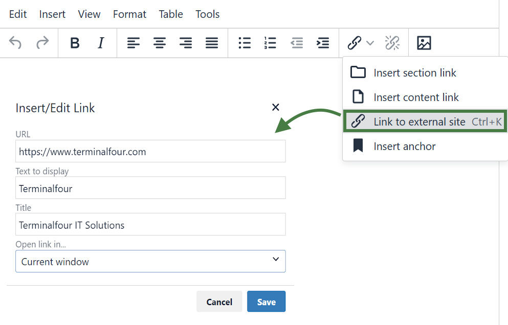
- To insert an External Link in the Main Body of the content, click to where in your main body of content you wish to add the link.
- Click the link icon in the toolbar/WYSIWYG.
- Url: enter the external site’s URL. (e.g., https://www.terminalfour.com).
- Text to display: type the text that you wish to display as your link text.
- Title: add a title for your link. This may be spoken by a Screen-reader, rendered as a tool tip, etc.
- Target: select the relevant option for opening your hyperlink:
- None: the link will open in the existing window.
- New window: the link will open a new window.
- Click Ok to add your link.
How to insert section links
- To create a Section Link in the Main Body of the content, highlight the text you wish to use as the link text or simply place your mouse where you want the link inserted.
- Select Insert Section link from the WYSIWYG.
- The Site Structure will appear in a pop-up window. Click on the section you want to link to.
- Click Select Section to create the link.
How to insert content links
- To create a Content Link in the Main Body of the content, highlight the text you wish to use as the link text or simply place your mouse where you want the link inserted.
- Select Insert Content link from the WYSIWYG.
- As with a Section link, the Site Structure will appear in a pop-up window. Click on the section which contains the content you wish to link to.
- Click View Content to display a list of all content contained in your selected section.
- Click on the relevant content and click Insert Content to create the link.
Section/Content Link Title
By default, the Title for a Section Link is the full section path, and for a Content Link it is the full path as well as the name of the content. This default option can be changed via the HTML Editor in:
Administration > Hierarchy & Content Settings > HTML Editor > Default title in editor
History and versions
- Terminalfour allows you to see all changes made to content, compare different versions and set previous versions of the content live.
- To see how this works, modify a piece of content; then compare the two versions of the content.
- Set the original version of the content live again.
How to review history and versions
- Modify a piece of content: select Edit content from the Actions menu beside the section containing the content.
- Click the content’s name to open it or select Edit from the Actions menu.
- Make changes to the content and click Save changes.
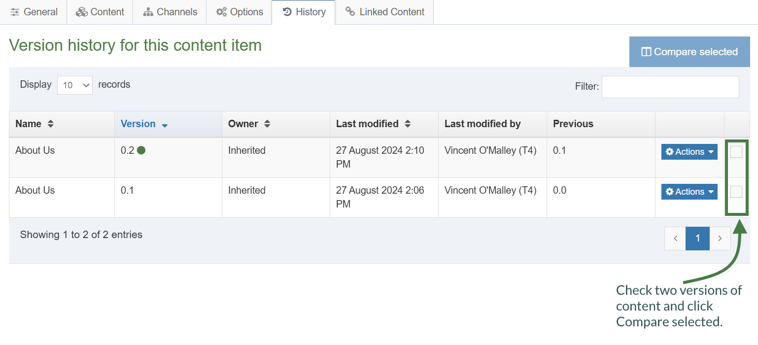
- Click back into the content and go to the History tab or select History from the Actions menu beside the content.
- Select the two versions of content you wish to compare by checking the box for each version (located in the far right column).
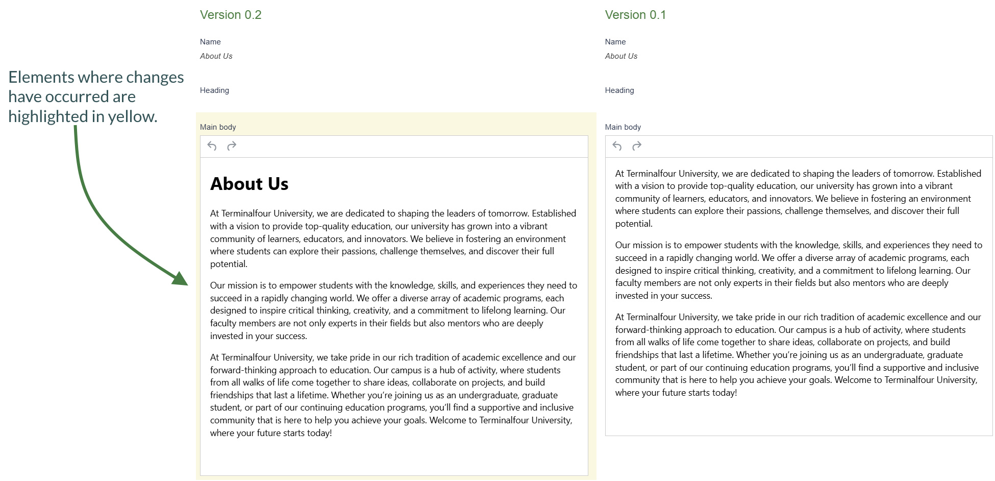
- Click Compare selected to display both versions of content in a side-by-side comparison; elements where changes have occurred are highlighted in yellow.
- Click Back to return to the History tab.
- You can set any version as the current version by clickingActions > Make current > Confirm.
Content options
- When adding a new piece of content or modifying an existing piece, there are additional options available to control and manage the publishing of the piece of content.
- The content options can be used to manage when the content will publish, expire, be reviewed, and archived. All the fields are optional.
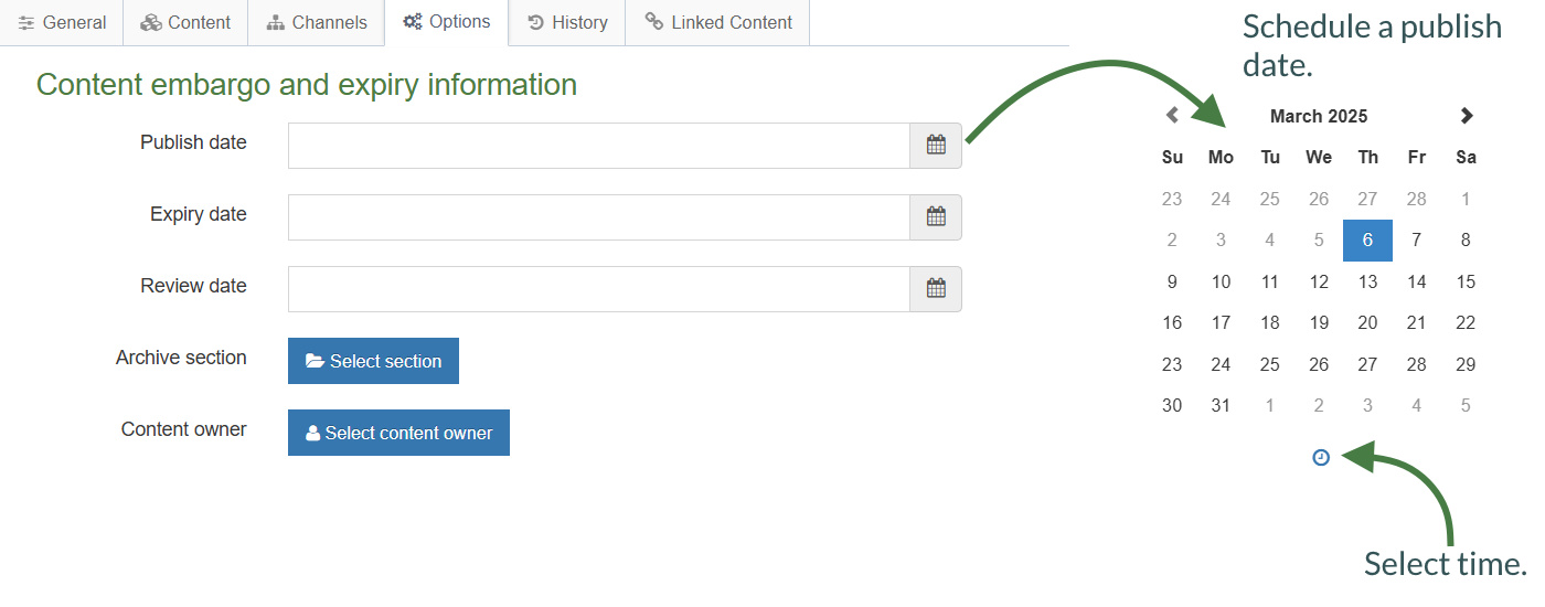
Content Options
Publish date: schedules a publish date, i.e. the date the content will go live on the site. The content has to be approved before it can be published.
Expiry date: content will expire and be removed from the site.
Review date: Terminalfour will email the Content Owner on the selected date. If no owner is set, the person who last modified the content will be notified instead.
Archive section: allows you to specify a section for the content to go to once it has expired. If you are publishing lots of content, it may be a good idea to create an Archive Section to store expired content in. This way the content can be used and published again later. Click Select section and select a section; the section id is inserted as a reference.
Content owner: sets an owner to the Content Item.
How to manage content options
- To modify a piece of content, select Edit content from the Actions menu beside the section containing the content.
- Click on the content’s name to open it.
- Click the Options tab.
- Fill in the relevant fields by clicking the box to open the calendar; simply click on the date you wish to use and adjust the time by clicking the clock icon and selecting the hours and minutes. If you do not set the time, it will default to the current time.
- Click Save changes to save your work.
Mirror and duplicate
- Branches of the Site Structure as well as individual pieces of content can be Mirrored and Duplicated.
- If you Mirror a piece of content, there is only one ID, and any changes made to the content will affect all instances of it.
Mirror Content/Sections Configuration
You can enable/disable the mirroring of sections or content by changing the settings:
Administration > Hierarchy & content settings > Hierarchy > Enable mirroring of sections
Administration > Hierarchy & content settings > Hierarchy > Allow non-mirroring of content
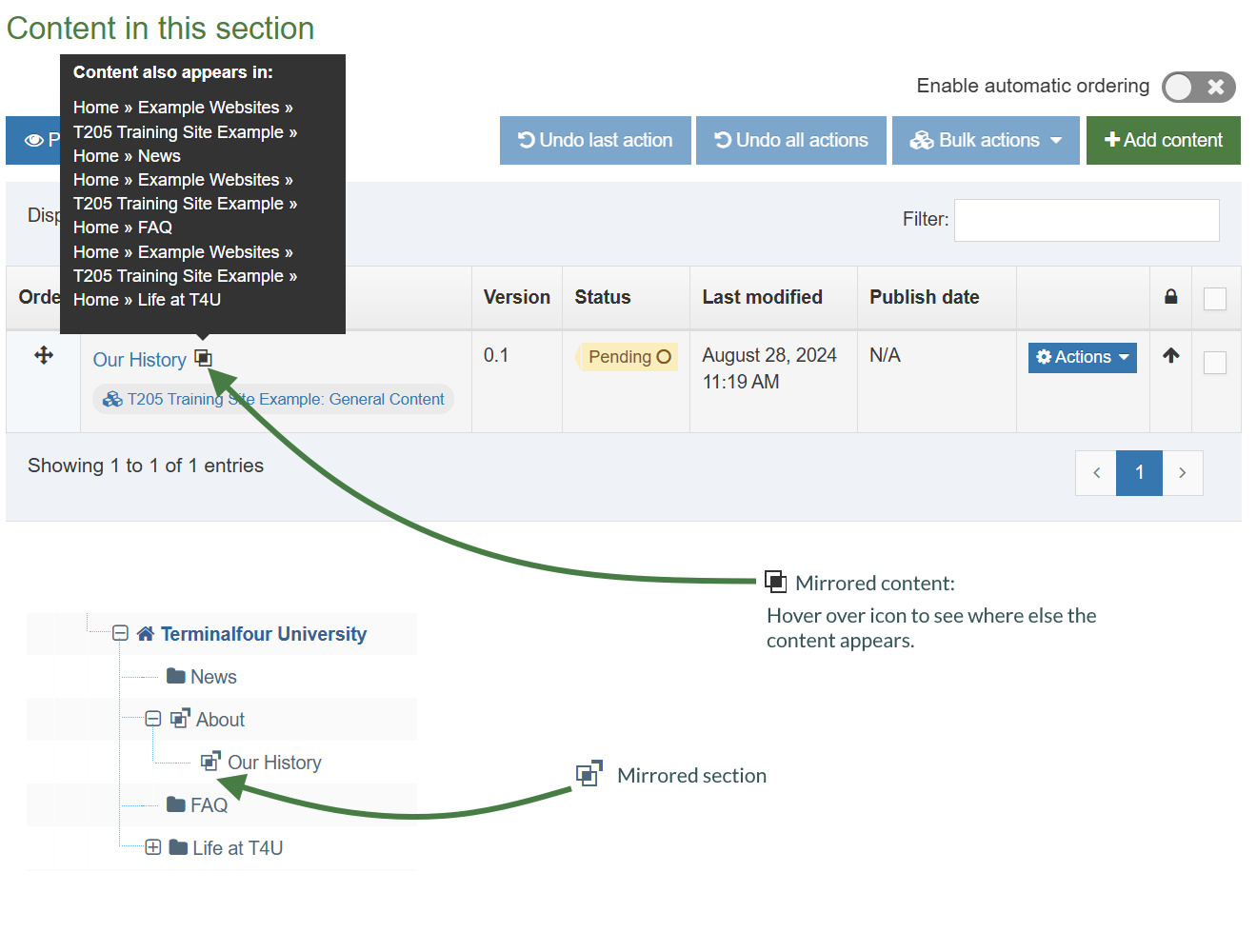
How to mirror/duplicate
Mirror/duplicate content
- Select Edit content from the Actions menu beside the section containing the content you wish to mirror or duplicate.
- Select Mirror or Duplicate from the Actions menu beside the content.
- The Site Structure opens. Click on the Section you wish the mirrored/duplicated content to appear in. A small icon appears beside the mirrored content. Hover the mouse over it to see the various locations of the content. The duplicated content, however, will appear as new content.
Mirror/duplicate branch
- Select Mirror Branch or Duplicate Branch from the Section Drop-Down Menu beside the section containing the content you wish to duplicate.
- Select the Section you wish to place the mirrored or duplicated section under.
- A mirrored section’s folder symbol will have an arrow pointing out for the original section and an arrow pointing in for the new section.
Media library overview
- The media library is used to store files of all sorts to use in content and assets. You can upload images, documents, videos, etc., if you have a means to output these files.
- You can assign read and write access to different users/groups, so not all users necessarily need to have permission to upload files into the media library.
- Media permitted file types: you can restrict the file types that can be uploaded into the Media Library. This can be set at a global or media type level.
- Maximum file size: Sets the maximum file size in bytes for this type. This cannot exceed the default maximum file size of the Media element specified in the Media Content Type, which cannot exceed the global Max upload size set in Advanced Configuration. Leave blank to use the default value in the Media Content Type.
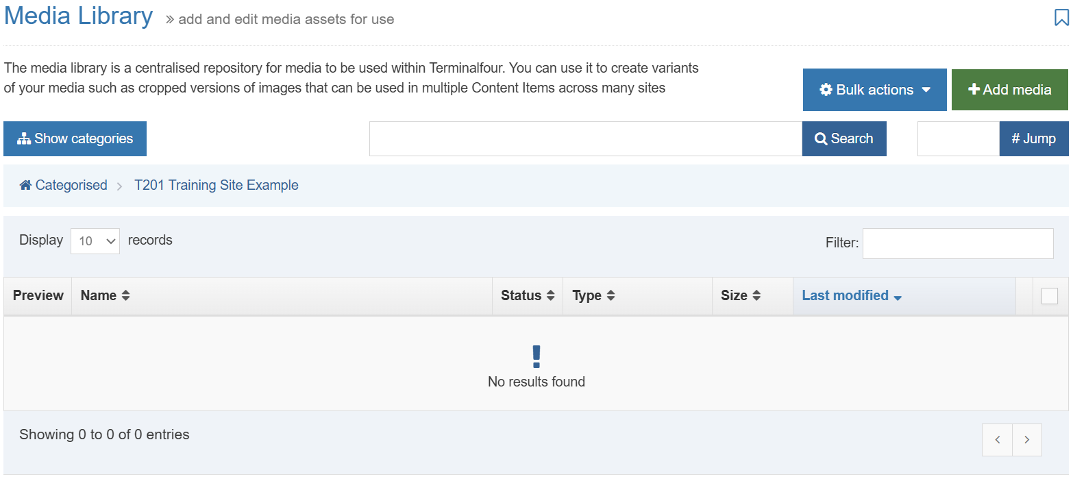
Media Library Overview
> The Media Library can be accessed either as a separate item (go to Content and select Media Library) or directly from an Asset or piece of Content.
> By default, only Administrators have write access, and all user types have read access.
> The Actions button allows you to edit, create, or delete categories.
> If you click on a category, the uploaded media will appear on the right.
> If you modify a Category, you can determine the Write Access, Read Access, Workflow, Media Categories (manual and automatic ordering), Auto Publish and Access Control.
> The Add Media button allows you to add new media items to the category you have selected.
> You can Search for an item by entering keywords or an ID # in the #Jump box
How to add a media category
- To add a Category, go to Content and select Media library.
- The Media Library opens.
- Expand the tree structure to find the "Training" category and click on the Actions menu.
- Click Create sub-category.
- Enter your new category name and click Save changes.
- Click on your new category.
Upload and use an image
- Now that you understand how the Media content type is pieced together, you should have a better idea of how the Media Library content is used.
- Upload an image to the Media Library, create Image Variants and use the image in content.
How to upload media
- From the site structure screen, locate the section you added content to earlier.
- Go to the Actions menu and select Edit content. Click on the content you want to edit.
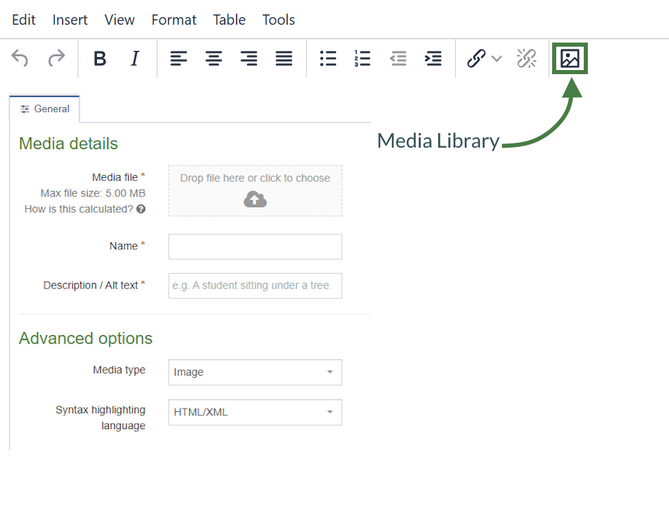
- In the main body of your content, place the mouse where you want to insert an image; click the media icon.
- The media library opens. Locate the category you wish to add the image to and click on it.
- Click +Add media (the use of Name, Description and Keywords is dependent on your media content layouts):
- Media file: drop your image file here or click to select the image from your drive.
- Name: enter a name for your Image. By default, this is not output on the site, but is used only as a name in the
Media Library to allow easy identification. - Description/Alt text: by default, this is used as the alt tag and should always be filled to describe the image.
- Media type: select Image -this is automatically detected where possible.
- Syntax highlighting language: for non-binary files you can select what syntax highlighting to use (if any).
- Media Language Dependence:
- Fully independent: the media is the same in all languages and cannot be translated.
- Independent media file: the file and thumbnail exist independent of language. Other elements can be modified based on language, such as the image description/alt text.
- Fully dependent: all elements depend on language and can be translated.
- Click Save changes to add your image.
- The image is ready to be used. Hover over it and click Select.
Media attributes
- If your Media Type Layout for images contains "style" options, you can set the Media Attributes in the content to specify Margin, Float, etc.
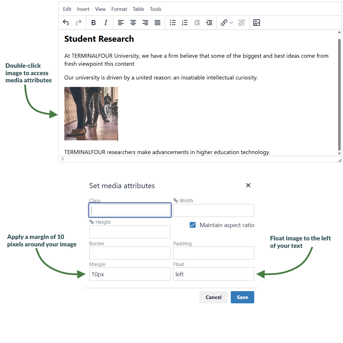
How to set media attributes
- The image (or image variant) has been inserted in your content. If your Media Type Layout for images contains "style" options, you can set those from the content.
- Double-click on the image to Set Media Attributes.
- Specify the values you wish to set. In the example above, a margin of 10px has been set, and the image has been set to float left (wrapping the text around the image with the image floating to the left).
- Click OK to return to the content screen.
- Click Save changes to save the changes made to the content.
Upload and use a PDF
- You can upload a PDF to the Media Library, use it in your content and edit the Media Attributes.
- Edit your content.
- Open the Media Library and locate your category.
- Upload a PDF and add a link to it.
How to upload a PDF
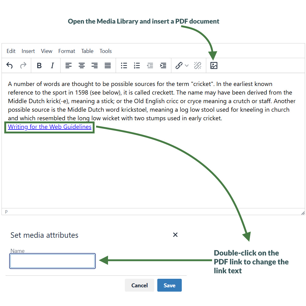
- To add a PDF link to your content, click where you want the link to be and click the Media Library icon.
- The Media Library opens. Locate the Category you wish to add the PDF to and click on it.
- Click +Add Media (the use of Name, Description and Keywords is dependent on your Media Library's configuration):
- Media file: click here and select the relevant PDF.
- Media type: this is automatically detected where possible. Alternatively, select the Media Type you want to use.
- Name: enter a name for your PDF. By default, this is used as a name in the Media Library to allow easy identification and serves as the link text in your content.
- Description: give your PDF a description; by default, the description of PDF’s is for internal use and does not appear on your webpage
- Syntax highlighting language: for non-binary files you can select what syntax highlighting to use (if any).
- Media language dependence:
- Fully independent: the media is the same in all languages and can hence not be translated.
- Independent media file: the file and thumbnail exist independent of language. Other elements can be modified based on language.
- Fully dependent: all elements depend on language and can be translated.
- Click Save changes to add your PDF document to the Media Library.
- The PDF is ready to be used. Click it to add a link to your content.
- The PDF link has been inserted into your content.
- If you do not wish to use the item’s Name as the link text, double-click on the PDF link text to open the Media attributes.
- In the empty Name element, enter the new link text.
- Click Ok to return to the content screen.
- Click Save changes to save the changes you’ve made.
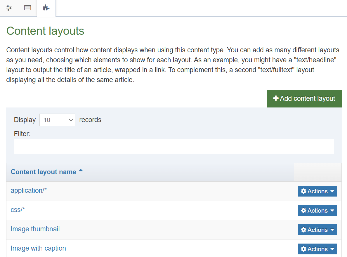
Media types and media content type
- The Media content type controls all content added to the Media Library. This is a System content type for storing uploaded Media Library items.
- Different types of files are output in different ways (using different content layouts).
- The Media content type is a System Type. You can add additional content layouts or edit the existing ones. You can add to the list of file types in system settings.
.png)
How to view media content types
- To edit the Media content type content layouts, go to: Assets > Content types
- Use the filter to search for the Media content type; click the name of the Media content type to edit.
- Each type of media uses a content layout as displayed above. These are linked to the different Media Content Type Layouts, and the same content type layout can be used for several types of media. One type of media can also use several content layouts, but one must be set as the default.
- Content layouts in the Media content type are created exactly like content layouts in a content type. Changing a content layout will impact the media items which use the content layout.
- The default content layout used for images has the content layout image/* and contains the code above.
- The element Media outputs a file, the Description is used as the alt tag. You can customize this to your specific requirements using media attribute options to allow users to specify alt text, title, border, margin, float, etc.
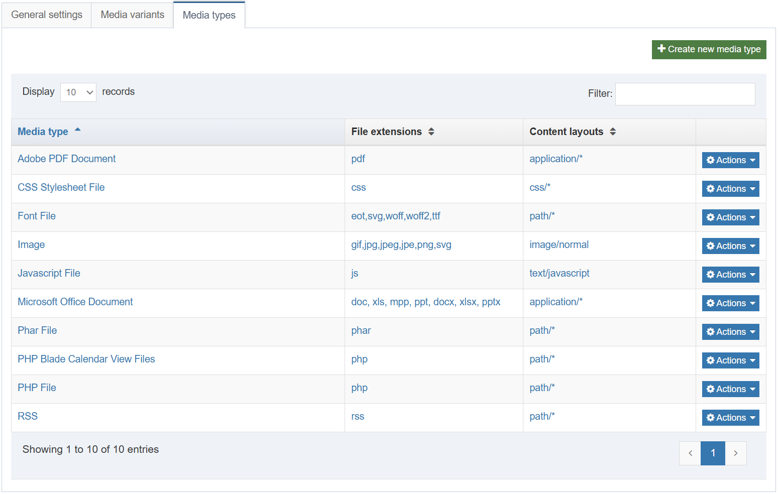
How to edit media content types
- To edit the Media Types (or add new ones), go to:
Administration > Settings > Media library > Media Types tab (see screen shot above). - Each Type is linked to one or more Layouts in the Media content type. To create a new Type, click +Create new media type.
- Name: enter a name for the new Media Type. This will display in the drop-down menu in the Media Library.
- Permitted file extensions: list all permitted extensions (comma separated list). If a file extension is not listed for a Media Type, it will not be automatically recognized and the user will have to manually select the Media Type. This can be further restricted in the Media Handler.
- Maximum file size: if you do not wish to use the default maximum size, you can specify a smaller size here (bytes).
- Media type options – Binary file: check this option if the files are binary. This can also be used for non-binary files to prevent users from being able to edit the text directly in the Media Library.
Associated content layouts
-
- Content Layouts: select the Media content layout you wish to associate to this Media Type. Each Media Type must have a default content layout but can have additional content layouts added.
- Click Save changes to save the new Media Type.
Modify header and footer
- It’s time to update the look and feel of your website.
- You currently have an empty page layout (a blank page). Modify the page layout you created earlier to consist of a new header (green) and a new footer (red).
- The trainer will explain where to download the HTML for the header and footer.
How to modify an existing page layout
- To modify a page layout, go to Assets > Page layouts
- The page layouts screen opens. Locate the page layout you created earlier and click its name to begin modifying.
- On the general Information tab, you can update the following information, if needed:
- Name: enter a new name for your page layout.
- Description: enter a description for your page layout.
- Content layout: this needs to match what you set up in the channel, e.g., text/html.
- File extension: if you are not going to use the default, select the relevant extension here.
- Syntax type: if you wish to use syntax highlighting, select it here, e.g., HTML/XML.
- Layout processor: you can select the processor you wish to use. Select the default option T4 Standard Page, as using an alternative layout processor is not covered in these exercises.
- Primary group: select your group from the list. You can share your page layout with other groups by clicking show shared groups and selecting the groups to share with; shared groups can be granted either read only or full access to your page layout.
Header and footer for page layout
- Use the information from the header and footer files (located in the web developer training folder) to update your page layout.
- Drag & drop the header and footer files (located in the web developer training folder) into the header code and footer code tabs in the page layout.
- Click Save changes to save the updates to your page layout.
Add CSS files to header
- There are 2 CSS files in the <head> tag of your header. These are not currently referenced correctly and hence do not display when you preview your site.
- Upload the required files to the media library and build T4 tags to reference them in your page layout.
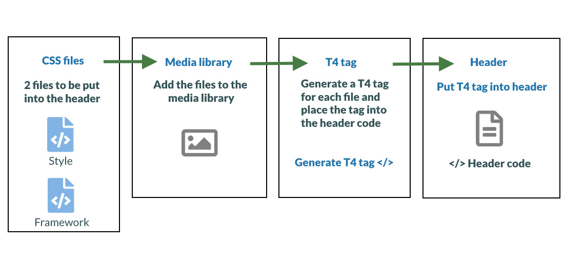
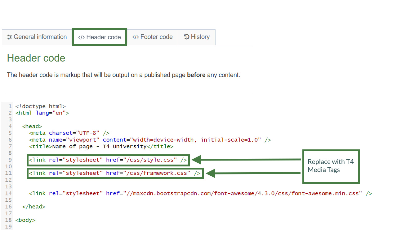
How to add CSS files
- In your page layout, select the </> Header code tab and click </> Generate T4 tag, the T4 tag builder opens.
- Select the Media tab and click Select media. This opens the Media Library.
- To upload the css files to your Category in the Media Library, click +Add media:
- Media file: drop files here or click to choose.
- Name: enter a name for your css file.
- Description/Alt text: this is used to define the CSS media type such as print, screen, tv etc., etc. In the sample site the CSS files you upload are intended for use by all devices so we will set the value to all.
- Media type: set to CSS Stylesheet File
- Syntax highlighting language: set to Stylesheet CSS to avail of syntax highlighting.
- Media language dependence:
- Fully Independent: the media is the same in all languages and can hence not be translated.
- Independent media file: the file and thumbnail exist independent of language. Other elements can be modified based on language.
- Fully dependent: all elements depend on language and can be translated.
- Click Save changes.
- The CSS file is ready to be used. Hover over it and click it.
- A T4 Tag appears in the Preview field. Click Copy to clipboard to copy this tag. It should look like this:
<t4 type="media" formatter="css/*" id="1370"/>
- Locate the CSS reference in the Header and replace it with your T4 Tag to create a reference to it.
- Repeat these steps until you have replaced both CSS references with T4 Tags.
- Your Header code should now look like the screenshot below.
-Header-Code.jpg)
Modifying the footer
- There are several JavaScript files in the new footer code that you added to your page layout. Once again, these are not currently referenced correctly and hence do not display when you preview your site.
- Add the missing JavaScript files to your Footer code. The trainer will point you to the required files.
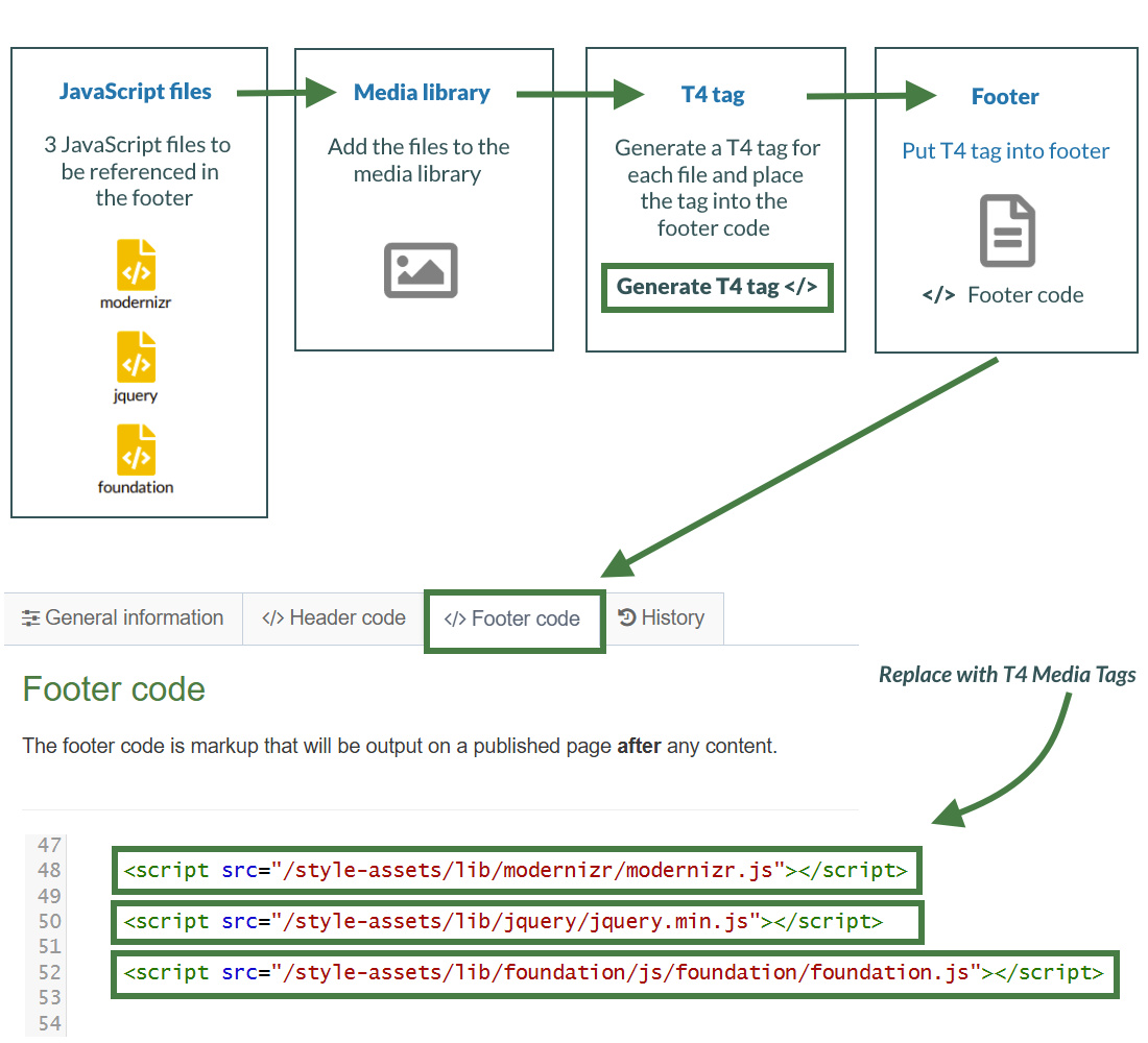
How to add JavaScript files
- In your page layout, select the </> Footer code tab and click </> Generate T4 tag, the T4 tag builder opens.
- Select the Media tab and click Select media, this opens the Media Library.
- The Media Library opens. Click +Add media to upload the JavaScript files to your Category in the Media Library:
- Media file: drop files here or click to choose.
- Media type: set to JavaScript (based on standard configuration).
- Name: enter a name for your JavaScript file.
- Description: describe the file, i.e., Sample site JS.
- Syntax highlighting language: set to JavaScript to avail of syntax highlighting.
- Media language dependence:
- Fully Independent: the media is the same in all languages and can hence not be translated.
- Independent media file: the file and thumbnail exist independent of language. Other elements can be modified based on language.
- Fully dependent: all elements depend on language and can be translated.
- Click Save changes.
- The JavaScript file is ready to be used. Hover over it and click it.
- A T4 Tag appears in the Preview field. Click Copy to clipboard to copy this tag. It should look like this:
<t4 type="media" formatter="javascript/*" id="1376"/>
- Locate the JavaScript reference in the Footer and replace it with your T4 Tag to create a reference to it.
- Repeat these steps until you have replaced all 3 JavaScript references with T4 Tags.
- Your Footer code should now look like the screenshot below.
-Footer-Code.jpg)
Assign a page layout
- You need to assign your new page layout to your site structure to test it. This will allow you to preview your sections and content with the new page layout wrapped around it.
- You can keep your preview window open and refresh it whenever you make changes. This saves you having to open a preview window all the time.
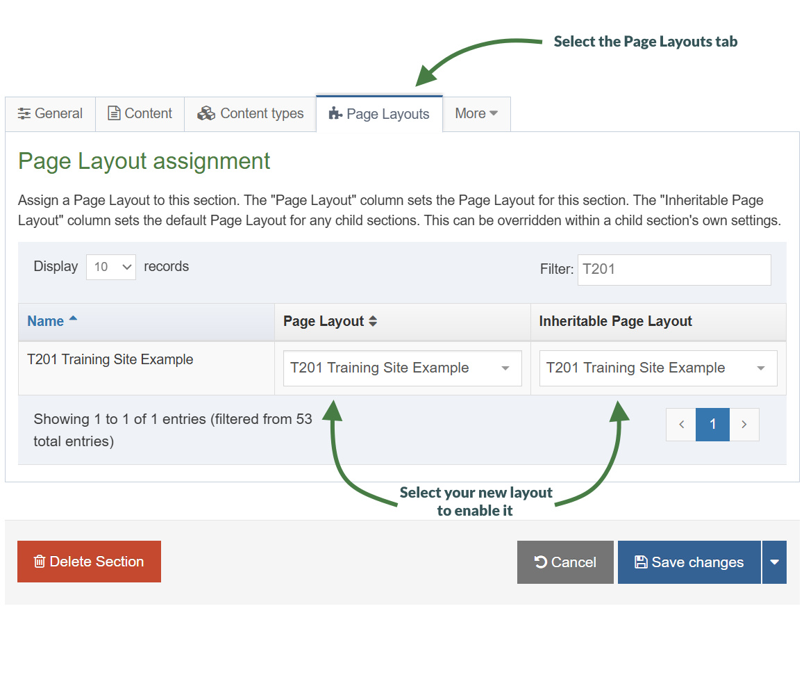
How to assign the page layout
- On the Site Structure screen, click the name of your main section.
- Select the Page Layouts tab.
- Select your page layout from the drop-down menu.
- Click Save changes to save the work. Your page layout has now been assigned to your section/branch.
Multiple Page Layouts
> You can create as many page layouts as required for your website design.
> But the more page layouts you have, the more you’ll need to maintain.
> Page layouts can be assigned to individual sections or entire branches of your site structure.
> Based on your website design, how many page layouts will you need?
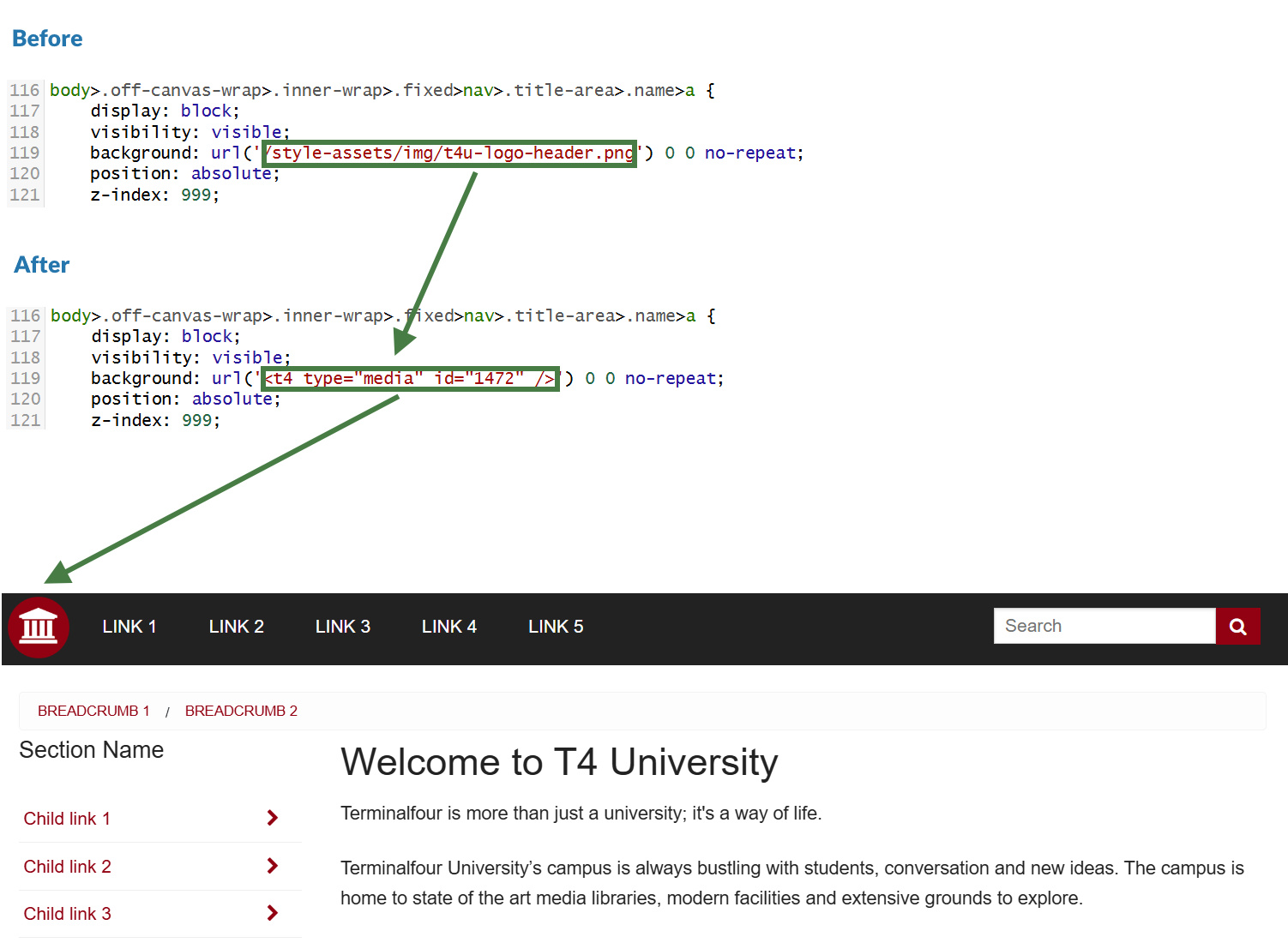
Images in CSS
- There is an image in the CSS file which is not currently referenced correctly and hence does not display when you preview your site.
- Upload the image to the media library and build a T4 Tag to reference it in the CSS file.
- To avoid opening and closing screens all the time, consider having one screen open for the page layout and one for the CSS file in the Media Library.
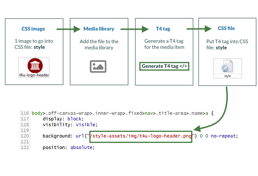
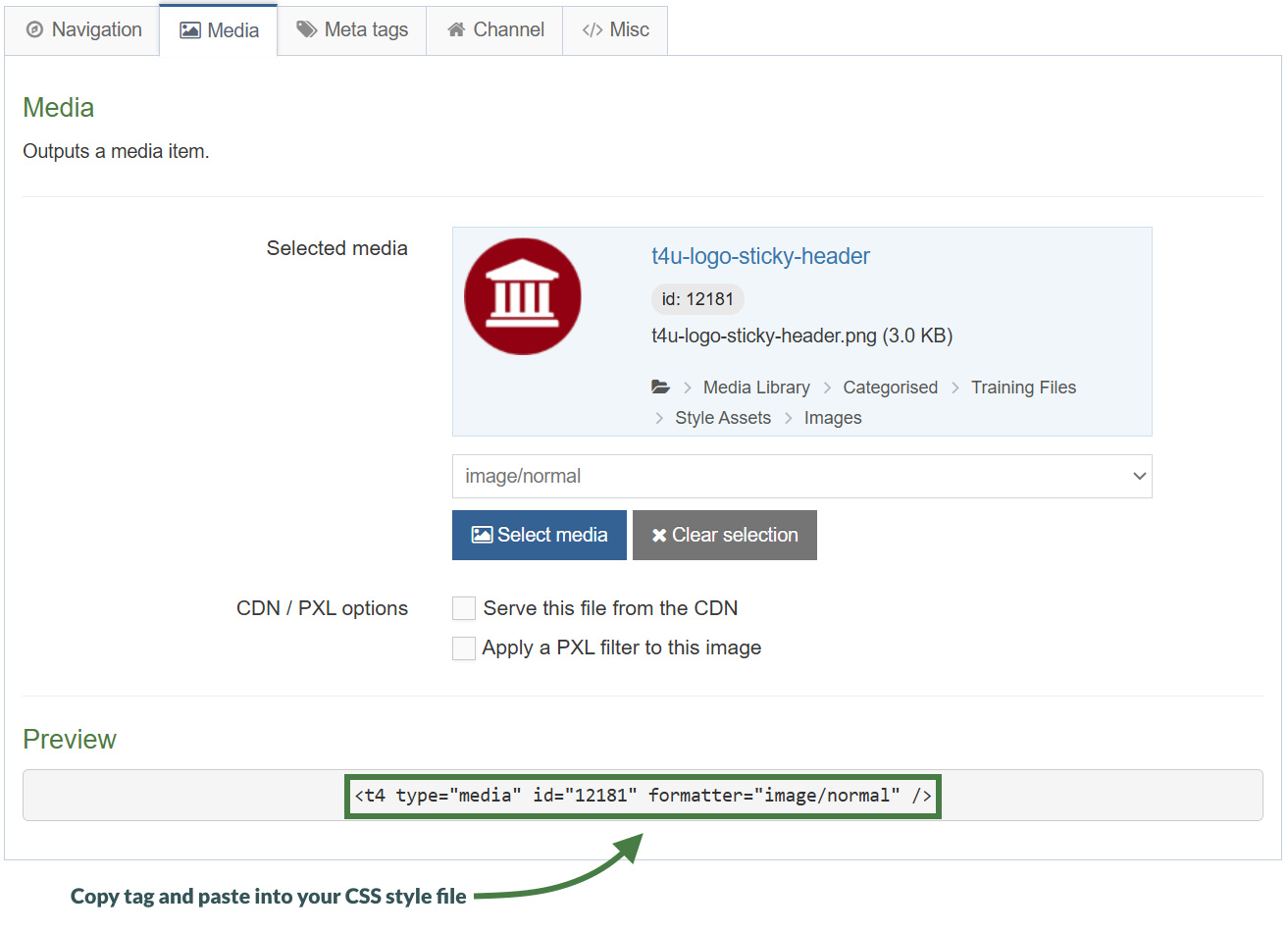
How to add a header logo
- Go to Assets > Page Layouts
- Use the filter tool to search for your page layout and click the name to edit.
- Select the header tab.
- Click the </> Generate T4 tag.
- Select the Media tab and click Select media. This opens the Media Library.
- To upload a css image to your Category in the Media Library, click +Add media.
- Media file: drop files here or click to choose.
- Media type: set to Image Path (css) (based on standard configuration).
- Name: enter a name for your image.
- Description: give your file a description.
- Syntax highlighting language: set this to None.
- Media language dependence:
- Fully Independent: the media is the same in all languages and can hence not be translated.
- Independent media file: the file and thumbnail exist independent of language. Other elements can be modified based on language.
- Fully dependent: all elements depend on language and can be translated.
- Click Save changes.
- The CSS Image is ready to be used. Hover over it and click it.
- A T4 Tag appears in the Preview field. Click Copy to clipboard to copy this tag. It should look like the tag shown above in the screen shot.
- Paste the T4 Tag of your CSS Image into your Style CSS:
- Click </> Generate T4 tag.
- Click Select Media.
- Click the Category where your Style CSS file is.
- Click the Actions button belonging to your Style CSS file and select Edit.
- Select the Editor tab.
- Locate the image path for the CSS image and replace it with the T4 Tag you built to reference the image.
- Click Save changes to save the changes made to your Style CSS file.
- Refresh the preview of your site to see the changes.
Title tag
- The T4 Title Tag outputs the name of the section being displayed in a web browser.
- Your page layout currently has "Name of page - T4 University" as the title. Make the page title dynamic by replacing the title with the T4 Title Tag.
- You can also update the Meta Tag with the T4 Title tag.
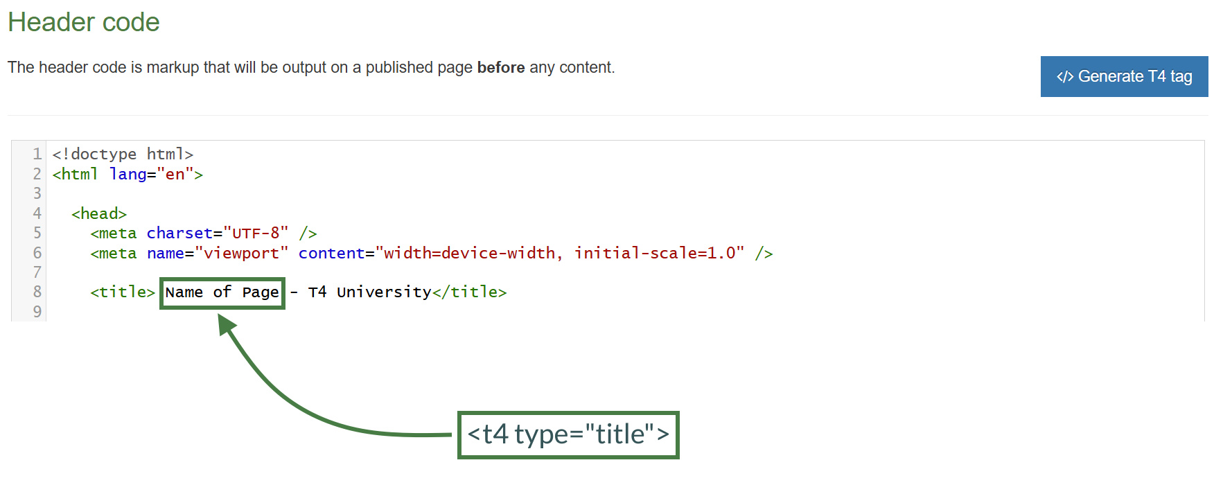
How to add a title tag
- Go to Assets > Page Layouts
- Click your page layout name to edit it. (Use the Filter tool to search). Open the </> Header code tab.
- We will replace the actual title or part of it with a T4 title tag. Click on </> Generate T4 tag.
- Click on the </> Misc tab.
- Select "Title" from the drop-down options from “Available page layout tags”.
- Copy the tag to your clipboard, and copy the tag into the Header code at
<title>Name of Page - T4 University</title>
- Click Save changes to save the changes to your page layout.
- Update your preview to check the result.
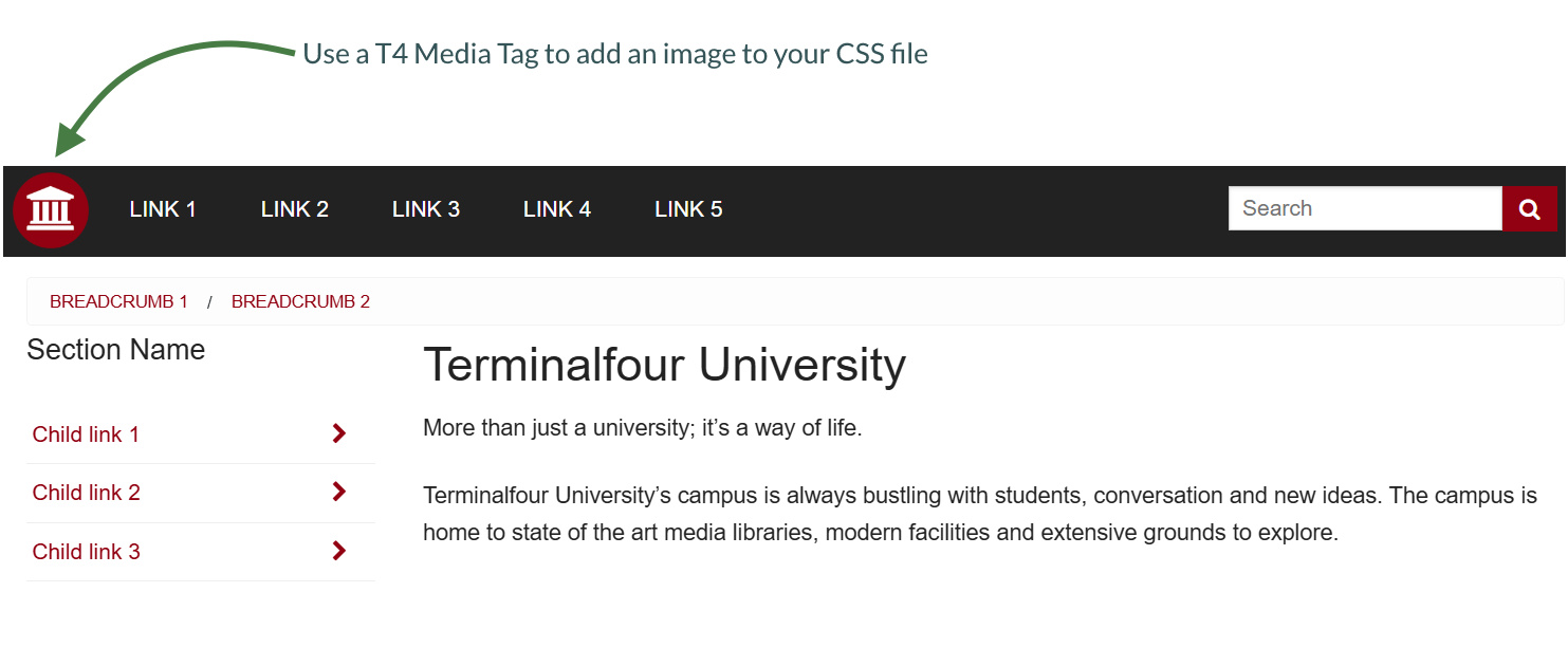
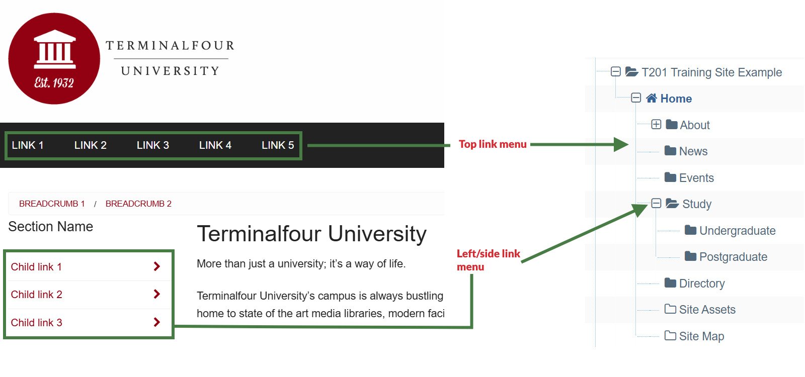
Navigation objects
- Navigation objects are primarily used to create navigation structures but also to create place holding objects to pull in content, etc.
- Navigation objects are created to change what they output depending on where on a site you are, so a breadcrumb navigation object will display one trail on the homepage and another trail on sub-pages.
- Navigation objects can be placed in page layouts, content types or content, depending on what function they will have.
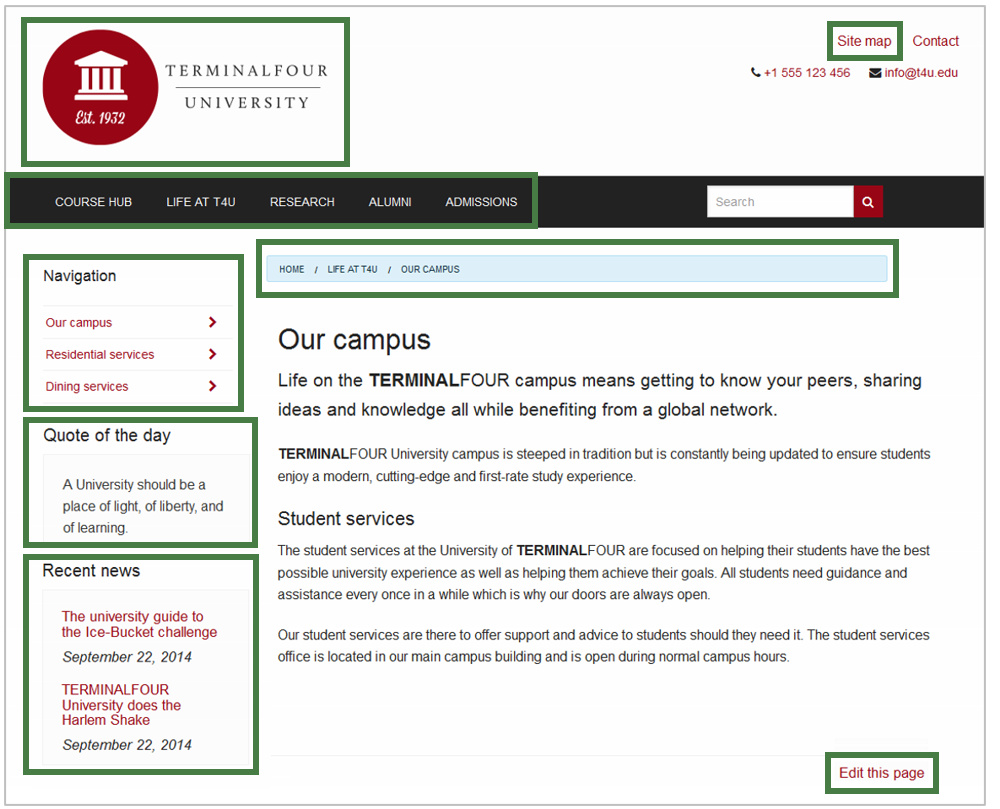
How to access the navigation menu
- In the example above, there is an image of a webpage as it is intended to look on completion of the build. To determine what navigation objects you need to build, consider each "function" on the page.
- To create a navigation object, go to Assets > Navigation > Add new navigation
- An alphabetical list of each navigation object type is described. The exercises on the following pages will guide you through how to build the navigation objects highlighted above.
Link menu navigation object
- With the Link Menu Navigation Object, you can add links to a specific Section and its Child Sections to your pages. Typically, the main and side navigation menus of a website are built with the Link Menu Navigation Objects.
- For your website, the top navigation and left navigation are both going to be built using link menu navigation objects.
- The example below requires you to create a navigation object for the top menu and use it in your page layout.
How to create your main/top link menu
- Go to Assets > Navigation > Add new navigation > Link menu
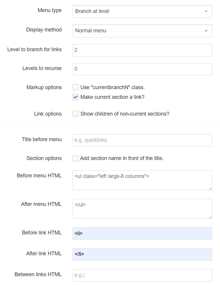
- The link menu contains the following options:
- Name: enter a name for the link menu.
- Description: enter a description for the Link Menu, i.e., what will be output.
- Primary group: select the primary group you wish to add the navigation to, you can also share the navigation with other groups by clicking show shared groups and selecting the relevant groups from the list.
- View in preview: includes pending content when previewing a page.
- Menu type: determine where the links will be sourced from:
- Branch at level: links are to sections found at the specified level in your branch. The root section is always level 1.
- Children: links are to the child sections of the current or specific section.
- Siblings: links are to the sibling sections of the current or specific section.
- Siblings and children: links are to the sibling and child sections of the current or specific section.
- Display method: specify how to display the menu:
- Normal Menu: plain HTML links.
- Javascript drop-down: each link is an option in a select box. The visitor jumps to the link by clicking it.
- Level to branch for links: this is only used if the menu type is branch at level, as it specifies the level to find links at.
- Levels to recurse: enter the number of levels to create sub-menus for.
- Use "currentbranchN" class: allows you to use different css classes for different branches, so instead of using the regular "currentsection" span class, each link in the current branch gets its own span class of "currentbranchN" where N is that particular section's level in the channel hierarchy. This works best if the number of levels to recurse is set to 2 or greater.
- Make current section a link?: check this to display the current section as a link.
- Link options: Show children of non-current sections?: only relevant when creating a children menu. If checked, it will output the children of all sections.
- Title before menu: enter the title you wish to output before the menu or leave it blank if you do not wish to use a title.
- Add the section’s name in front of the title?: if checked, it will place the section's name in front of the title (assuming a title is used).
- Before menu HTML: the HTML to be output before the menu, i.e., <ul class="left large-8 columns">
- After menu HTML: the HTML to be output after the menu, i.e., </ul>
- Before link HTML: the HTML to be output before each link, i.e., <li>
- After link HTML: the HTML to be output after each link, i.e., </li>
- Between Links: the HTML to be output between the links.
- Click Next to save the navigation object.
Top link menu
<ul class="left large-8 columns">
<li></li>
</ul>
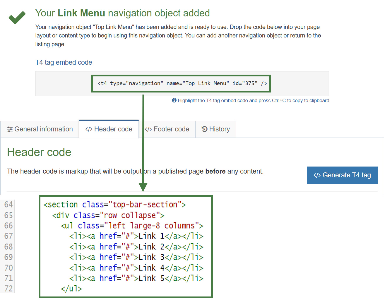
Apply the link menu navigation to the page layout
- The Link Menu navigation object you just built now needs to be applied to your page layout to replace the hardcoded menu.
- Build a T4 Tag to output the Top Menu.
How to apply the link menu navigation to the page layout
- Go to Assets > Page Layouts.
- Find your page layout and click the name to edit it.
- Select the Header tab.
- Click </> Generate T4 tag.
- Use the Navigation T4 Tag Builder:
- Select Navigation Type: Link Menu.
- Choose a Navigation Object: select your Top Menu.
- Copy the Navigation T4 Tag.
- Paste the T4 Tag in to replace the HTML you entered in the Navigation Object.
- Click Save Changes.
- Preview your site to check the result. If you have a preview open already, simply refresh that one. Otherwise, you can preview the site from the Site Structure screen.
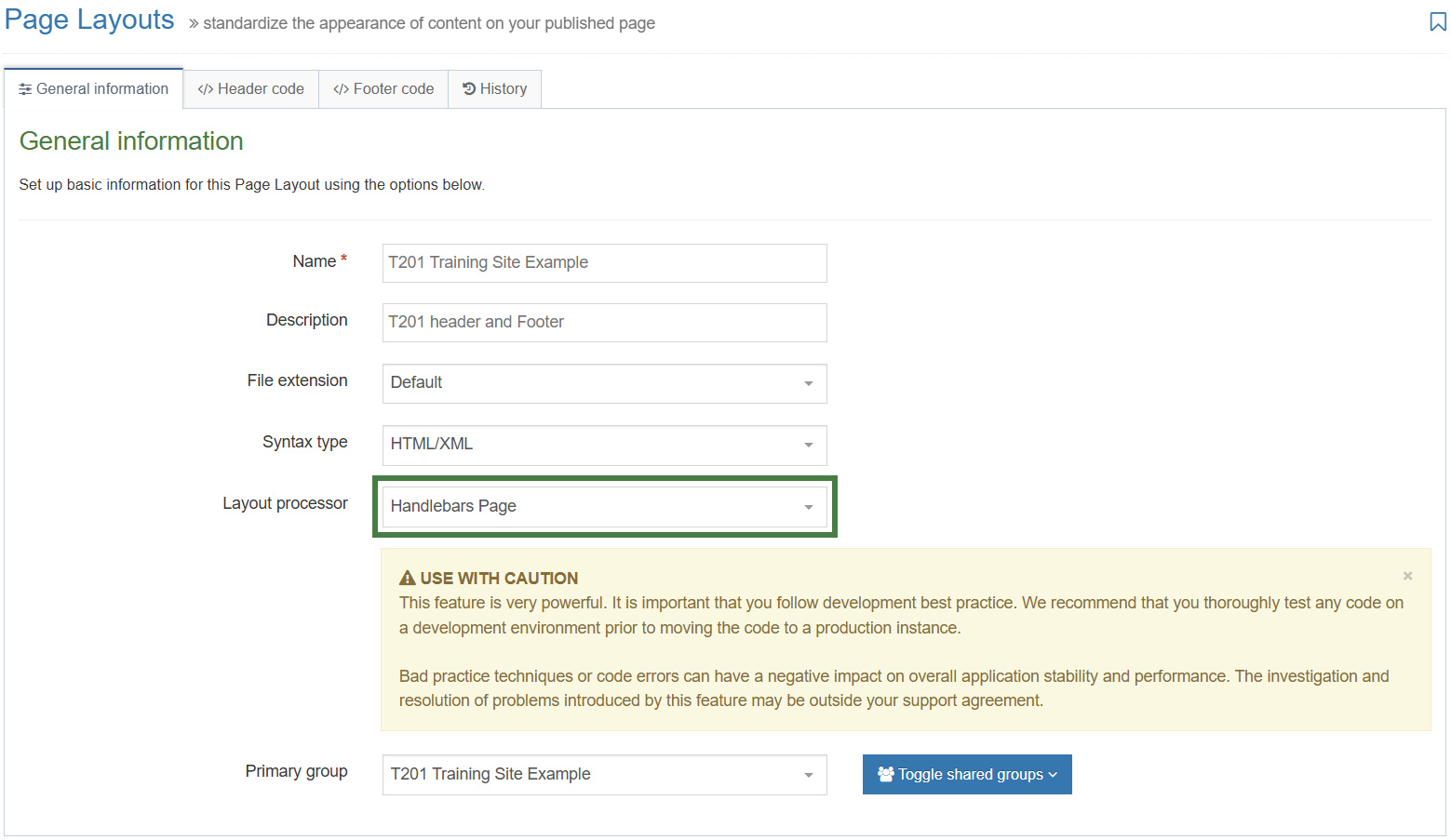
Updating the page layout to use Handlebars
- Up to this point, you have been using the "T4 Tag Page" Layout processor in your page layout, let's now update the page layout to use the "Handlebars Page" Layout processor going forward.
How to update the layout processor
- Go to Assets > Page Layouts.
- Click your page layout name to edit it. (Use the Filter tool to search).
- General information tab:
- Name: the name assigned to your page layout.
- Description: the description of your page layout.
- File Extension: Default - unless this is used with a different File Extension. This requires other extensions being permitted in the Channel.
- Syntax Type: HTML/XML – this determines which syntax is highlighted.
- Layout processor: update the layout processor to Handlebars Page.
- Primary Group: restricts the availability of the asset to this group.
- Click Save changes to save the changes to your page layout.
- Update your preview to check the result.
Linking to files in the media library
- In these next few exercises, you will learn how to update t4 tags contained within the page layout that are referencing files in the media library. To do this you will generate Handlebars expressions that use the media Helper.
media Helper
The media helper is a simple helper that allows you to output an item from the media library.
Usage:
{{{media id="123" layout="image/normal"}}}
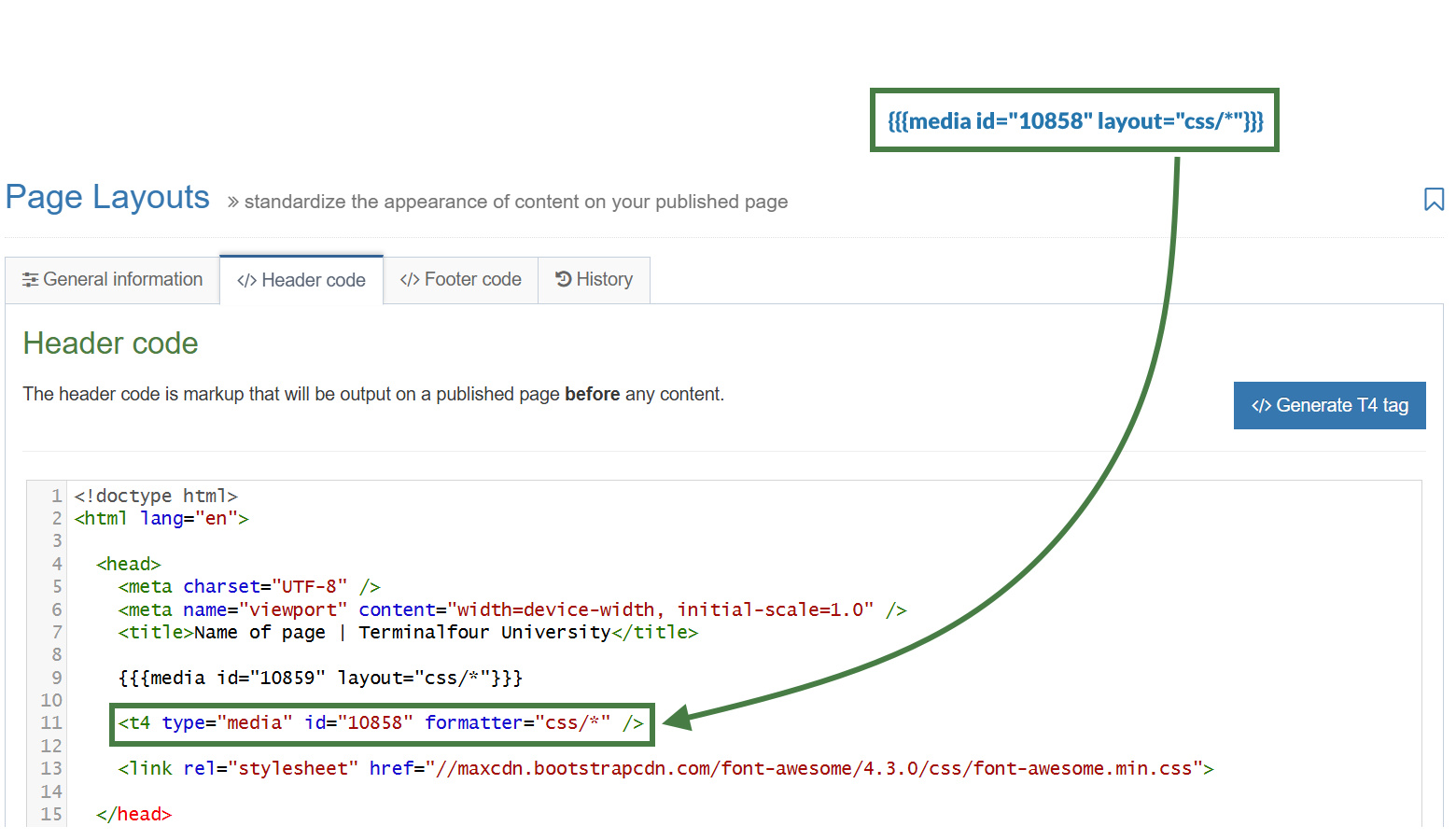
How to reference a CSS with Handlebars
- Go to Assets > Page Layouts.
- Click your page layout name to edit it. (Use the Filter tool to search).
- Open the </> Header code tab.
- Click on the </> Generate Handlebars Expression button.
- Open the Media tab.
- Click the Select media button to open up the media library.
- Navigate to the folder where the CSS file is located and select the CSS file.
- Media Output: Select the media layout to apply to CSS files. Select css/* from the drop-down.
- Click the Copy to clipboard button and paste the Handlebars expression into your page layout replacing the t4 tag. The Handlebars expression you generated should look similar to this:
{{{media id="10858" layout="css/*"}}}
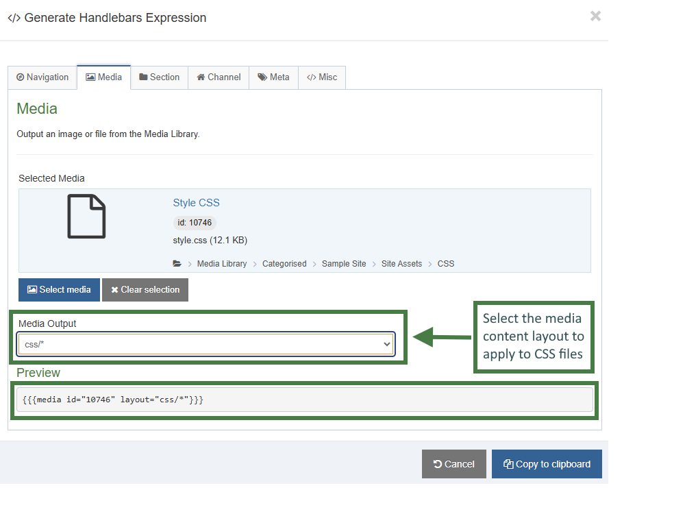
- Repeat the steps above with the remaining additional CSS files that are linked in your page layout.
- Click Save changes to save the changes to your page layout.
- Update your preview to check the result.
How to reference a JavaScript file with Handlebars
- Go to Assets > Page Layouts.
- Click your page layout name to edit it. (Use the Filter tool to search).
- Open the </> Footer code tab.
- Click on the </> Generate Handlebars Expression button.
- Open the Media tab.
- Click the Select media button to open up the media library.
- Navigate to the folder where the JavaScript file is located and select the JavaScript file.
- Media Output: Select the media content layout to apply to JavaScript files. Select "text/javascript" from the drop-down.
- Click the Copy to clipboard button and paste the Handlebars expression into your page layout replacing the t4 tag. The Handlebars expression you generated should look similar to this:
{{{media id="10861" layout="text/javascript"}}}
- Repeat the steps above with the remaining additional JavaScript files that are linked in your page layout.
- Click Save changes to save the changes to your page layout.
- Update your preview to check the result.
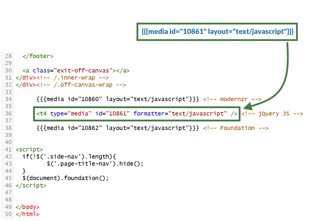
How to output the section name with Handlebars
- Go to Assets > Page Layouts.
- Click your page layout name to edit it. (Use the Filter tool to search).
- Open the </> Header code tab.
- Click on the </> Generate Handlebars Expression button.
- Open the Section tab.
- Section metadata: leave "Section name" as the selected radio button: This will generate the sectionName Helper which will output the name of the current section.
sectionName Helper
Used to output the name of the current section.
Usage:
{{sectionName}}
- Section metadata: leave "Section name" as the selected radio button: This will generate the sectionName Helper which will output the name of the current section.
- Copy the generated Handlebars expression into your title tag like so:
<title>{{sectionName}} - Terminalfour University</title>
- Click Save changes to save the changes to your page layout.
- Update your preview to check the result.
How to output the link menu with Handlebars
- Go to Assets > Page Layouts.
- Click your page layout name to edit it. (Use the Filter tool to search).
- Open the </> Header code tab.
- Click on the </> Generate Handlebars Expression button.
- Open the Navigation tab.
- Restrict navigation objects by type: select "Link Menu". This acts as a filter facilitating the search for your navigation object.
- Available navigation objects: find the name of your navigation object and select it. Once selected the expression builder will generate a Handlebars expression that uses the nav Helper.
nav Helper
The nav helper is a simple helper that allows you to output a navigation object.
Usage:
{{nav id="123" name="My Navigation Object"}}
- Copy the generated Handlebars expression and replace the existing T4 link menu navigation tag. The Handlebars expression you generated should look similar to the code below:
{{nav name="Top Link Menu" id="375"}}
- Click Save changes to save the changes to your page layout.
- Update your preview to check the result.
Canonical URL
- Canonical URLs tell search engines the preferred web page URLs to index, resolving duplicate content issues and improving SEO.
- A Canonical URL is the preferred version of a web page that you want search engines to prioritize and display in search results. It helps address situations where the same content is accessible via multiple URLs (for example, when you have mirrored a section in Terminalfour to another area of your site).
- Using a Canonical URL ensures that search engines understand which version of a page to index, avoiding duplicate content issues that could harm your site's search engine rankings. It also consolidates ranking signals like backlinks and helps deliver a more consistent experience for users and search engines alike.
- Your page layout currently is missing a Canonical URL, let’s add one to the page layout of your website.
Adding a Canonical URL to the page layout
- Go to Assets > Page Layouts.
- Click your page layout name to edit it. (Use the Filter tool to search).
- Open the </> Header code tab.
- Click on the </> Generate Handlebars Expression button.
- Open the Channel tab:
- URLs (select the Canonical URL radio button)
- Canonical URL
- URLs (select the Canonical URL radio button)
- Click the Copy to clipboard button to copy the generated Handlebars expression.
- The Handlebars expression should be inserted into a canonical URL link. Copy the code below to your clipboard, and paste it into the Header code:<link rel="canonical" href="{{canonicalURL}}" />
- Click Save changes to save the changes to your page layout.
- Update your preview to check the result.
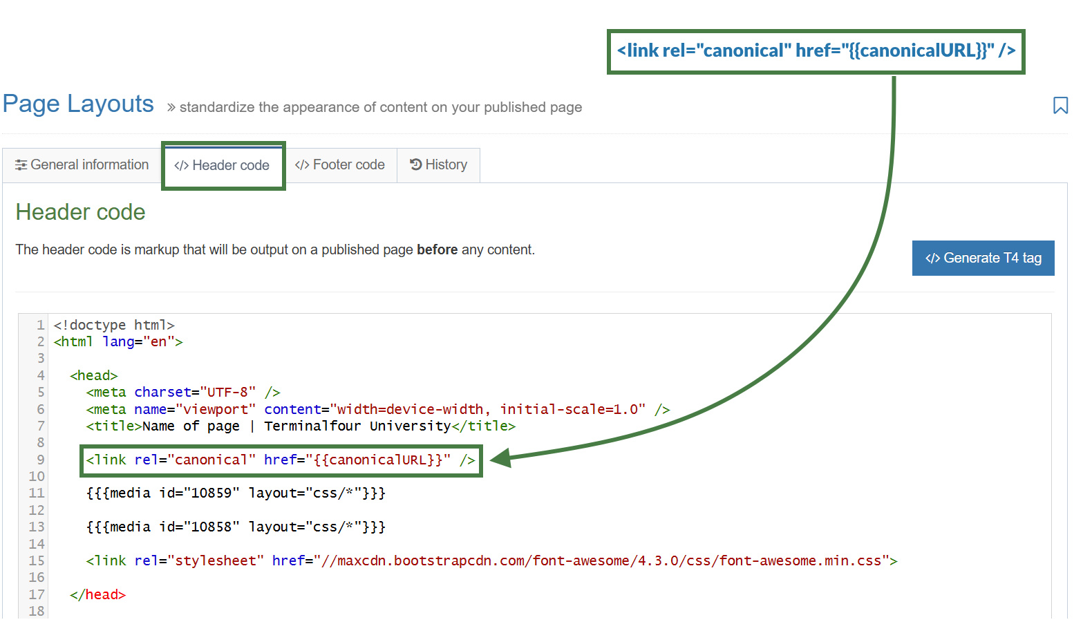
Testing the Canonical URL using a mirrored section
- In your site structure mirror your "About" section into your "Life at T4U" section of your website.
- Click into the actions button of your "About" section and select "Mirror branch". Then select your "Life at T4U" section in the pop-up modal.
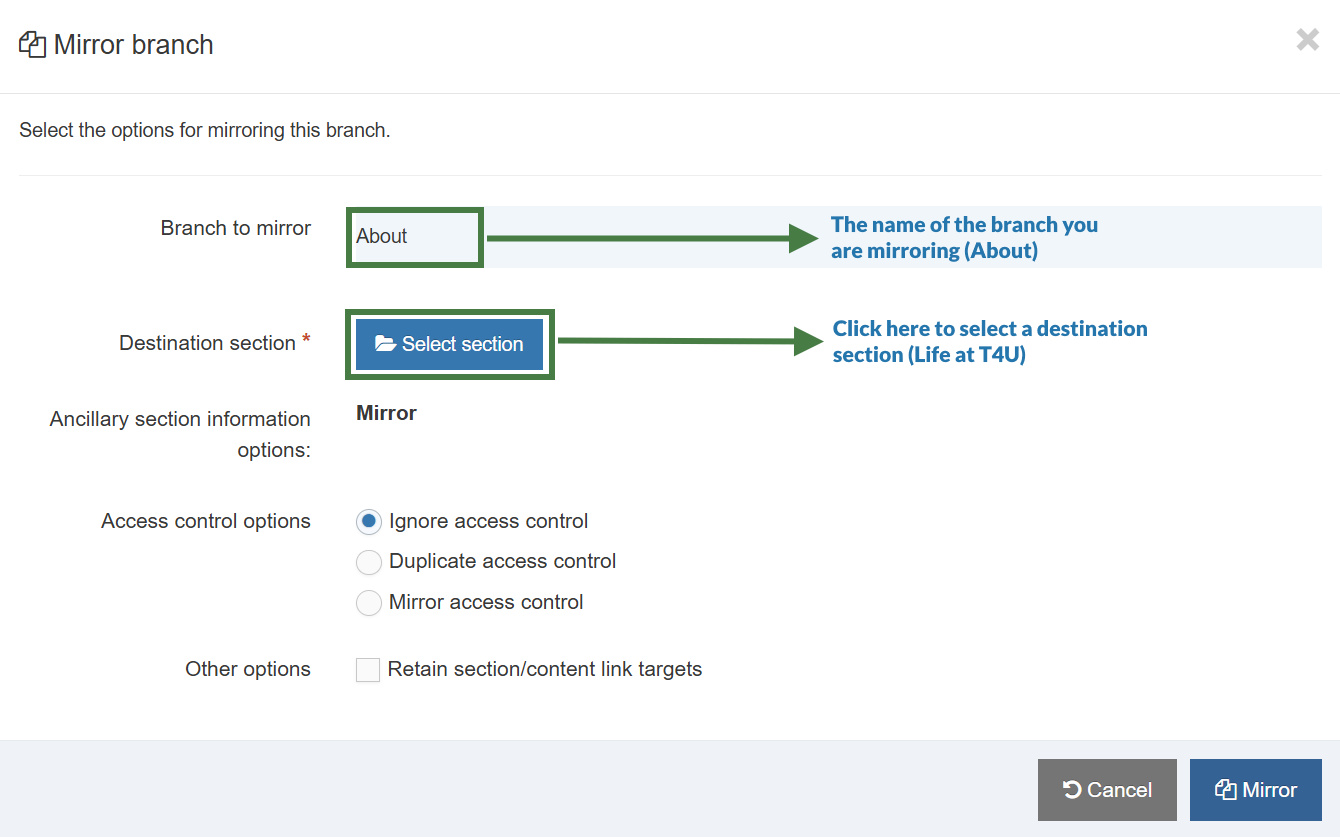
- Preview the mirrored "About" section from your "Life at T4U" section. The Canonical URL should output a link referencing the original URL of the "About" section.
Children link menu navigation object
- With the Link Menu Navigation Object, you can add links to a specific Section and its Child Sections to your pages. Typically, the main and side navigation menus of a website are built with the Link Menu Navigation Objects.
- Let's now use a Link Menu navigation again but this time to configure a menu of children sections that output to the left side of the page.
How to create a left/side link menu
- Using what you have learned, build another Link Menu Navigation object to be used to output your left menu. You can use the screenshot below as a reference when deciding on the properties to select.
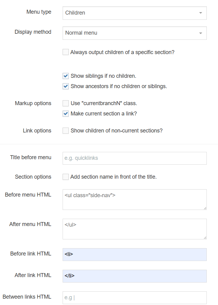
<ul class="side-nav">
<li></li>
</ul>
Apply the left link menu navigation to the page layout
- The Link Menu navigation object you just built now needs to be applied to your page layout to replace the hardcoded menu.
- Use the generated Handlebars expression to output the Left Menu.
The left menu is referenced in the footer of your page layout.
How to apply the left link menu navigation to the page layout
- Go to Assets > Page Layouts.
- Click your page layout name to edit it. (Use the Filter tool to search).
- Open the </> Header code tab.
- Click on the </> Generate Handlebars Expression button.
- Open the Navigation tab.
- Restrict navigation objects by type: select "Link menu". This acts as a filter facilitating the search for your navigation object.
- Available navigation objects: find the name of your navigation object and select it. Once selected the expression builder will generate a Handlebars expression that uses the nav Helper.
- Copy the Handlebars expression.
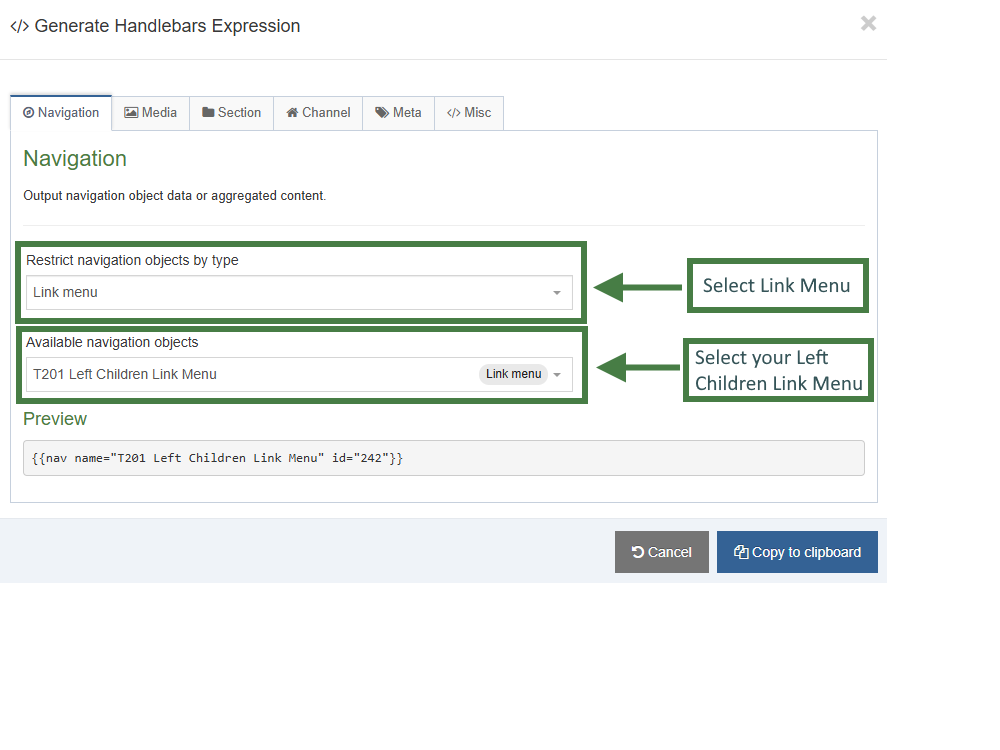
- Paste the Handlebars expression in to replace the HTML in your page layout.
- Click Save Changes.
- Preview your site to check the result. If you have a preview open already, simply refresh that one. Otherwise, you can preview the site from the Site Structure screen.
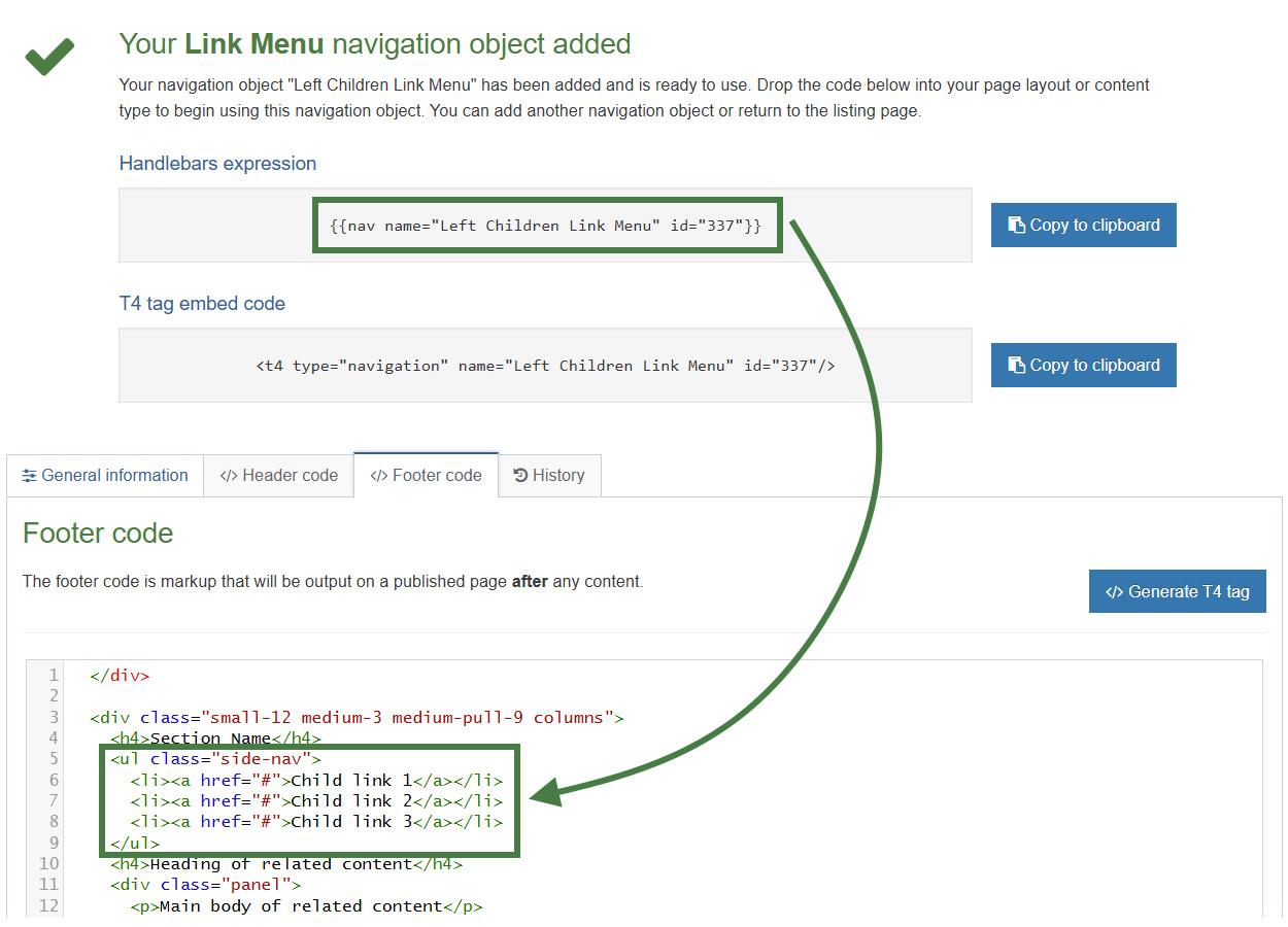
Section details - path to home
- To allow visitors to click on a link or logo to return to your Homepage, you need a Section Details Navigation.
- Build a Handlebars expression to output a path to your Homepage.
- Upload a logo to the Media Library and build a Handlebars expression to use instead of the link text.
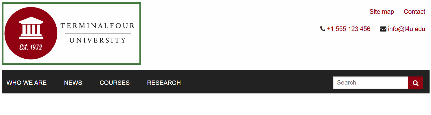
How to add a path to home
- Go to Assets > Navigation > Add new navigation > Section Details
- Use the HTML from the header to determine how the Link to Home should be built. You need to replace the # with a path to the section/branch in the Site Structure, and the image path must be replaced with a media tag to allow you to select a logo in the Media Library.
- The Section Details contains the following options:
- Enabled: if the Navigation is used, it needs to be enabled or otherwise nothing will be output.
- Name: enter a name for the Link to Home.
- Primary group: select a primary group
- Description: enter a description for the Link to Home, i.e., what will be output.
- View in preview: lets you view non-approved content in preview.
- Detail method:
- Current section
- Use section at level: if selected, specify the level here. This will be ignored if you select Current section or Use section.
- Use section: if selected, click Browse and select the section you wish to use. This will be ignored if you select Current section or Use section at level.
- Output detail: you can output the section's ID, Name or Path or alternatively output Link to Section.
- Click Next to save the Navigation Object.
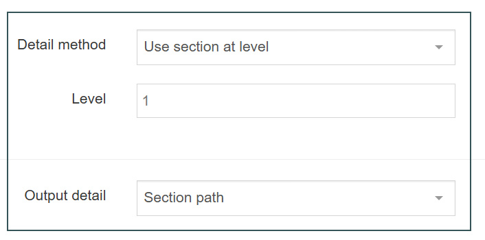
Apply section details navigation to page layout
- The Navigation Object you just built now needs to be applied to the page layout to replace the hardcoded path.
- Build a Handlebars expression to output the Link to Home.
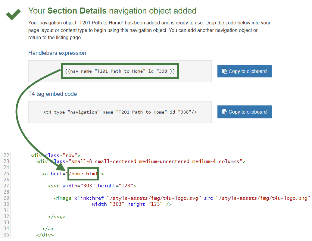
How to apply the path to home link to the page layout
- Go to Assets > Page Layouts.
- Click your page layout name to edit it. (Use the Filter tool to search).
- Open the </> Header code tab.
- Click on the </> Generate Handlebars Expression button.
- Open the Navigation tab.
- Restrict navigation objects by type: select "Section details". This acts as a filter facilitating the search for your navigation object.
- Available navigation objects: find the name of your navigation object and select it. Once selected the expression builder will generate a Handlebars expression that uses the nav Helper.
- Click Copy to clipboard to copy the Handlebars expression.
- Paste the Handlebars expression into your header to replace the original section path, i.e., the /home.html.
- Click Save changes.
- The path is now complete, but the image needs to be replaced with an actual image.
Add logo to the home link
- Upload your logo into the Media Library and build a Handlebars expression to output it as part of the Link to Home.
.jpg)
How to add a logo to the home link
- Go to Assets > Page Layouts.
- Click your page layout name to edit it. (Use the Filter tool to search).
- Open the </> Header code tab.
- Click on the </> Generate Handlebars Expression button.
- From the Media tab, click the Select media button.
- The Media Library opens. Use what you have learned previously to upload the logo (image) to the Media Library.
- Paste the Handlebars expression in to replace the original image reference, i.e. the <svg width="303"...</svg>
- Click Save changes.
- Preview your site to check the result. If you have a preview open already, simply refresh that one. Otherwise, you can preview the site from the Site Structure screen.
Breadcrumbs navigation
- To allow visitors to see how they got to a page, a breadcrumb trail may be useful.
- Build a Breadcrumbs Navigation Object and apply it to your page layout.
- Breadcrumbs are used to provide the visitor with the ability to instantly see their location within the site structure. If links are enabled, the user can click any of the sections forming the path between the site root and current section. Start & end level can also be specified.
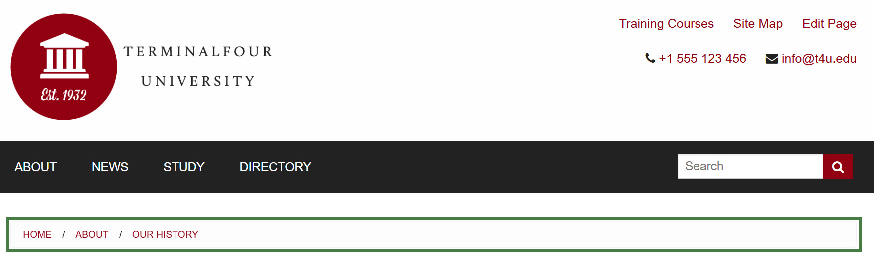
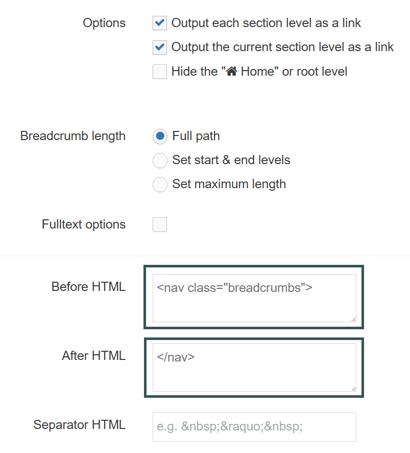
<nav class="breadcrumbs">
</nav>
How to create breadcrumbs
- Go to Assets > Navigation > Add new navigation > Breadcrumbs
- Use the HTML from the header to determine how the breadcrumb trail should be built.
- The breadcrumbs navigation object contains the following:
- Name: enter a name for the breadcrumb trail.
- Description: enter a description for the breadcrumb trail, i.e. what will be output
- Primary group: select your group.
- View in preview: allows the breadcrumb output to be viewable in preview.
- Options
- Output each section level as a link.
- Output the current section as a link.
- Hide the Home or root level.
- Breadcrumb length
- Full path
- Set start & end levels.
- Set maximum length.
- Full text options
- Append content “name” for full text pages. This will add your fulltext contents to appear within the breadcrumb path (we will not use this feature in this activity as it has not been styled)
- Choose the content element you would like to display.
- Before HTML: the HTML to be output before the Breadcrumb trail.
- After HTML: the HTML to be output after the Breadcrumb trail.
- Separator HTML: leave this blank as the Style CSS will control the breadcrumb separator.
- Click Next to save the Navigation Object
- Copy the Handlebars expression to your clipboard; to be pasted into your page layout later.
Apply breadcrumb navigation to page layout
- The Navigation Object you just built now needs to be applied to the page layout to replace the hardcoded breadcrumb trail.
- Build a Handlebars expression to output the Breadcrumbs.
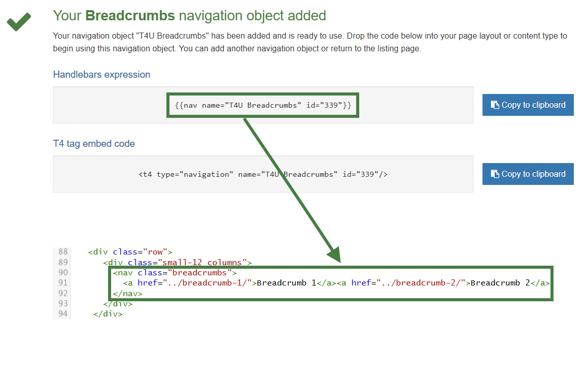
How to apply breadcrumbs to page layout
- Go to Assets > Page Layouts.
- Click your page layout name to edit it. (Use the Filter tool to search).
- Open the </> Header code tab.
- Click on the </> Generate Handlebars Expression button.
- Open the Navigation tab.
- Restrict navigation objects by type: select "Breadcrumbs". This acts as a filter facilitating the search for your navigation object.
- Available navigation objects: find the name of your navigation object and select it. Once selected the expression builder will generate a Handlebars expression that uses the nav Helper.
- Click Copy to clipboard to copy the Handlebars expression.
- Paste the Handlebars expression for the Breadcrumb Navigation in to replace the original breadcrumb trail as highlighted above.
- Click Save changes.
- Preview your site to check the result. If you have a preview open already, simply refresh that one. Otherwise, you can preview the site from the Site Structure screen.
News content type
- When adding news items to a site it is often useful to give the visitor a "quick overview" first and then provide a link to the full news item. You are going to create this effect by using a fulltext content layout.
- To first determine the elements for this content type, you need to analyze the desired output and decide how to cut it up. In this example, you are going to have two different outputs – the quick overview as well as the main news item.
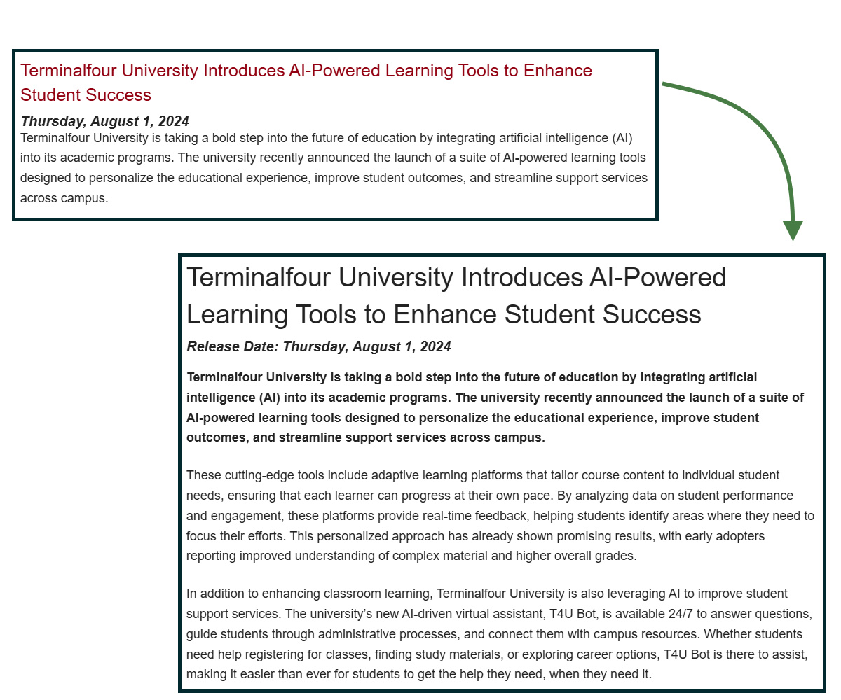
How to create a news content type
- To start the work, go to Assets > Content Types > Create content type
- Fill in the General information:
- Name: enter a name here. This should suggest what type of content it is used for.
- Description: describe in more detail when to use this content type.
- Minimum user level: if you wish to restrict who can use this content type, you can set a level here. If content types are created in groups, a user must be a member of the group as well as meet the minimum user level criteria to use the content type.
- Enable direct edit: is checked as a default. Decide if Direct Edit should not be used for this content type.
- eForm: check this if the content type will be an e-form.
- Workflow: if relevant, enable a workflow for content using this content type.
- Primary group: select your group.
.png)
- Select the Elements tab.
- Add the elements you need by filling in the information as outlined in the table below.
- Once you have added all your elements, click Save changes.
- From the content types table, search for your News content type and click on the name to edit.
- Select the Content Layout tab.
- Click Add content layout to begin creating a new content layout for your content type.
- Name: needs to be filled in with the default Type set in the Channel. This ensures the content can be displayed. Use text/html
- File Extension should be left at Default, unless this is used with a different file extension. This requires other extensions being permitted in the Channel.
- Syntax type: select the relevant language to enable syntax highlighting. I.e., HTML/XML.
| Name | Description | Element Type | Maximum Size | Required | Show |
|---|---|---|---|---|---|
| Headline | Enter the main headline here | Plain Text | 250 | Yes | Yes |
| Release date | Select a date using the date picker | Date | *leave at default* | Yes | Yes |
| Teaser | Enter a short summary of your news item | Plain Text | 300 | Yes | Yes |
| News story | Enter the main content for your news item | HTML | 100000 | Yes | Yes |
| Image | Select an image from the Media Library | Media | *leave at default* | No | Yes |
| Image caption | Enter a caption for the image | Plain Text | 150 | No | Yes |
- Content layout processor: select Handlebars Content.
- Use the Content layout code to build the first output for your content. If you have created the HTML already, you can start by pasting that into the code field as displayed below (copy the code text in the code box below).
<h3><a href="#">The Terminalfour panel debates the challenges facing higher education</a></h3>
<em><strong>2024, 12 March</strong></em>
<p>We hosted our first panel debate of 2020 and got deep into a debate on a wide range of challenges facing institutions.</p>
<hr>
- As each piece of content will have unique information in the Headline, Release Date and Teaser, the text below needs to be replaced with what the user enters when creating the content. To do that you need to build some Handlebars expressions.
.png)
- In this example, the text The Terminalfour panel debates the challenges facing higher education is the Headline and needs to be replaced with a Handlebars expression that uses the publish Helper. To build this, click the </> Generate Handlebars Expression button.
- Build Content Type Handlebars Expression:
- In the Content tab:
- Information to output (select the Element radio button)
- Element: the Element option is used to output elements to the page.
- Metadata: the Metadata option allows output of specific Metadata (HTML anchor, Content ID, Last Modified Date, Publish Date, etc.).
- Fulltext: used to output a fulltext link.
- Content element: select the "Headline" element from the content element drop-down.
- Handlebars helper: this will be selected by default as the Publish Helper, used to output elements to the page.
- Options:
- Convert special characters to their HTML encoded values This is selected by default for Plain Text elements. It ensures that html characters are treated as literal text and not processed as HTML.
- Allow this element to be edited inline in Direct Edit Adds the inline-edit="true" to enable inline editing of this element in Direct Edit.
- Check if value is set This option will wrap the element with an ifSet Helper. It ensures the element outputs only if it contains data.
- Information to output (select the Element radio button)
- Click Copy to clipboard to copy the Handlebars expression.
- The Handlebars expression you generated should look like this:
{{publish element="Headline" inline-edit="true"}}
- Replace the original Headline with the new Handlebars expression.
- Click the </> Generate Handlebars Expression button again.
- You are now going to build a tag to replace the date (Release date):
- In the Content tab:
- Information to output (select the Element radio button)
- Element: the Element option is used to output elements to the page.
- Metadata: the Metadata option allows output of specific Metadata (HTML anchor, Content ID, Last Modified Date, Publish Date, etc.).
- Fulltext: used to output a fulltext link.
- Content element: select the "Release date" element from the content element drop-down.
- Handlebars helper: this will be selected by default as the Publish Helper, used to output elements to the page.
- Options:
- Convert special characters to their HTML encoded values This is selected by default for Plain Text elements. It ensures that html characters are treated as literal text and not processed as HTML.
- Allow this element to be edited inline in Direct Edit Adds the inline-edit="true" to enable inline editing of this element in Direct Edit.
For date elements this option is disabled as Date elements can't be edited inline in Direct Edit. - Check if value is set This option will wrap the element with an ifSet Helper. It ensures the element outputs only if it contains data.
- Information to output (select the Element radio button)
- Click Copy to clipboard to copy the Handlebars expression.
- The Handlebars expression you generated should look like this:
{{publish element="Release date"}}Outputs date in the following format: EEE, d MMM yyyy HH:mm:ss z
For example: Thu, 25 Dec 2025 15:00:05 UTC - Replace the original date 2024, 12 March with the new expression.
- Click the </> Generate Handlebars Expression button again.
- In the Content tab:
- Information to output (select the Element radio button)
- Element: the Element option is used to output elements to the page.
- Metadata: the Metadata option allows output of specific Metadata (HTML anchor, Content ID, Last Modified Date, Publish Date, etc.).
- Fulltext: used to output a fulltext link.
- Content element: select the "Teaser" element from the content element drop-down.
- Handlebars helper: this will be selected by default as the Publish Helper, used to output elements to the page.
- Options:
- Convert special characters to their HTML encoded values This is selected by default for Plain Text elements. It ensures that html characters are treated as literal text and not processed as HTML.
- Allow this element to be edited inline in Direct Edit Adds the inline-edit="true" to enable inline editing of this element in Direct Edit.
- Check if value is set This option will wrap the element with an ifSet Helper. It ensures the element outputs only if it contains data.
- Information to output (select the Element radio button)
- Click Copy to clipboard to copy the Handlebars expression.
- The Handlebars expression you generated should look like this:
{{publish element="Teaser" inline-edit="true"}}
- Replace the original teaser with the new expression. You need to leave a set of <p> tags around the Handlebars expression or it will not display as a paragraph.
- Click the </> Generate Handlebars Expression button again.
- You are now going to build a tag to replace the path for the link (#).
- Information to output (select the Fulltext radio button)
- Element: the Element option is used to output elements to the page.
- Metadata: the Metadata option allows output of specific Metadata (HTML anchor, Content ID, Last Modified Date, Publish Date, etc.).
- Fulltext: used to output a fulltext link.
- Fulltext:
- Fulltext Link (Outputs a fulltext link)
- Fulltext URL (Outputs the path of the fulltext link only)
- Information to output (select the Fulltext radio button)
- Click Copy to clipboard to copy the Handlebars expression.
- The Handlebars expression you generated should look like this:
{{{fulltext linkText="Read More"}}} - Replace the default "Read More" text with a subexpression that outputs the Headline element like so:
{{{fulltext linkText=(publish element="Headline"}}}
- Replace the # with the new expression.
- Click Save changes to save the new content layout. The first part of the content type is complete.
- In order to have the "Headline" element behave as a friendly URL, select the "Use as filename" radio button of the "Headline" element in the Elements tab of your content type.
- Click Save changes.
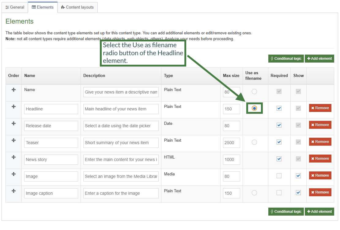
Formatting a date element with Handlebars
If you output a Date element using the publish Helper like this:
<em><strong>{{publish element="Release date"}}</strong></em>
You'd get an output in the following format (Standard ISO Date format):
Mon, 10 Sep 2024 11:35:00 IST
There is also a second Helper called dateElement that works like so:
{{dateElement element="Date element"}}This will output in a slightly different format:
2024-09-20T09:30:10Z[Etc/UTC]The difference is that the dateElement Helper outputs a date in such a format that can be accepted into the dateFormat Helper. You can use the dateFormat Helper to define a date format and pass in the dateElement Helper (which provides the date in the required structure for the dateFormat Helper to function).
The dateFormat Helper accepts two arguments: (dateToFormat and formatToUse)
{{dateFormat dateToFormat formatToUse}}
How to format dates with Handlebars
- Click into the Content layouts tab.
- Select the "text/html" content layout and open the </> Content layout code tab.
- Output the "Release date" element using the dateFormat and dateElement Helpers.
You can reference different date formats here: T4 Tags: Format Dates
Replace the existing output of the release date in your content layout with the code below:
<em><strong>{{dateFormat (dateElement element="Release date") "EEEE, MMMM d, yyyy"</strong></em>
- Click Save changes to save the changes to your content layout.
- Update your preview to check the result.
How to create the "fulltext" content layout
- To build the fulltext content layout, click Add content layout in the Content layout tab.
- Name: We have already used text/html. Use the default fulltext type set in the channel. You’ll use text/fulltext.
- File Extension should be left at Default unless this is used with a different File Extension. This requires other extensions being permitted in the Channel.
- Syntax type: select the relevant language to enable syntax highlighting. E.g., HTML/XML.
- Content layout processor should be Handlebars Content.
- Use the Content Layout Code to build the first output for your content. If you have created the HTML already, you can start by pasting that into the code field as displayed below (copy the code text in the code box below).
<h2>The Terminalfour panel debates the challenges facing higher education</h2>
<em><strong>Release date: 2024, 12 March</strong></em>
<div class="newsimage">
<img src="images/Image.jpg" alt="Image">
<div class="caption">Caption text</div>
</div>
<p>Last month we hosted our first webinar of 2024 with a panel discussion featuring our founder Piero Tintori, as well as Liz Gross and Claire Gibbons.</p>As each piece of content will have unique information in the Headline, Release Date, News Story, Image and Image Caption, the text below needs to be replaced with what the user enters when creating the content. To do that you need to build some Handlebars expressions.
.png)
- In this example, the text The Terminalfour panel debates the challenges facing higher education is the Headline and needs to be replaced with a Handlebars expression. Use what you have learned to build the tag and replace the original Headline with the new expression.
- The text 2024, 12 March is the Release date element and needs to be replaced with a Handlebars expression. Use what you have learned to build the tag and replace the original date with the new expression.
- <img src="/images/Image.jpg" alt="Image"> needs to be replaced with the image the user selects from the Media Library. To make that possible, build a Handlebars expression for the Image (You will make use of the media and mediaId Helpers):
- In the Content tab:
- Information to output (select the Element radio button)
- Element: the Element option is used to output elements to the page.
- Metadata: the Metadata option allows output of specific Metadata (HTML anchor, Content ID, Last Modified Date, Publish Date, etc.).
- Fulltext: used to output a fulltext link.
- Content element: select the "Image" element from the content element drop-down.
- Handlebars helper: select "Media" from the drop-down.
- Media Output: select "image/normal" as the layout.
- Options:
- Convert special characters to their HTML encoded values This is selected by default for Plain Text elements. It ensures that html characters are treated as literal text and not processed as HTML.
- Allow this element to be edited inline in Direct Edit Adds the inline-edit="true" to enable inline editing of this element in Direct Edit.
For media elements this option is disabled as Media elements can't be edited inline in Direct Edit. - Check if value is set This option will wrap the element with an ifSet Helper. It ensures the element outputs only if it contains data.
- Information to output (select the Element radio button)
- Click Copy to clipboard to copy the Handlebars expression.
- Replace the original image tag with the new Handlebars expression. Based on the Media content type layout, the Description in the Media Library will be used as the alt tag.
- The text Caption text is the Image Caption and needs to be replaced with a Handlebars expression. Use what you have learned to build the expression and replace the original Image Caption with the new expression.
- The paragraph of text (News Story) needs to be replaced with a Handlebars expression. Use what you have learned to build the expression and replace with the new expression.
- Click Save changes to save the new content layout. The content type is complete.
Enable news content type
- You need to enable your new content type to your Site Structure to test it.
- Content types can only be used in Sections where they are enabled.
- If a content type is created in a Group, only users who are members of that Group can use the content type.
- Only users who meet the Minimum User Level criteria can use the content type.
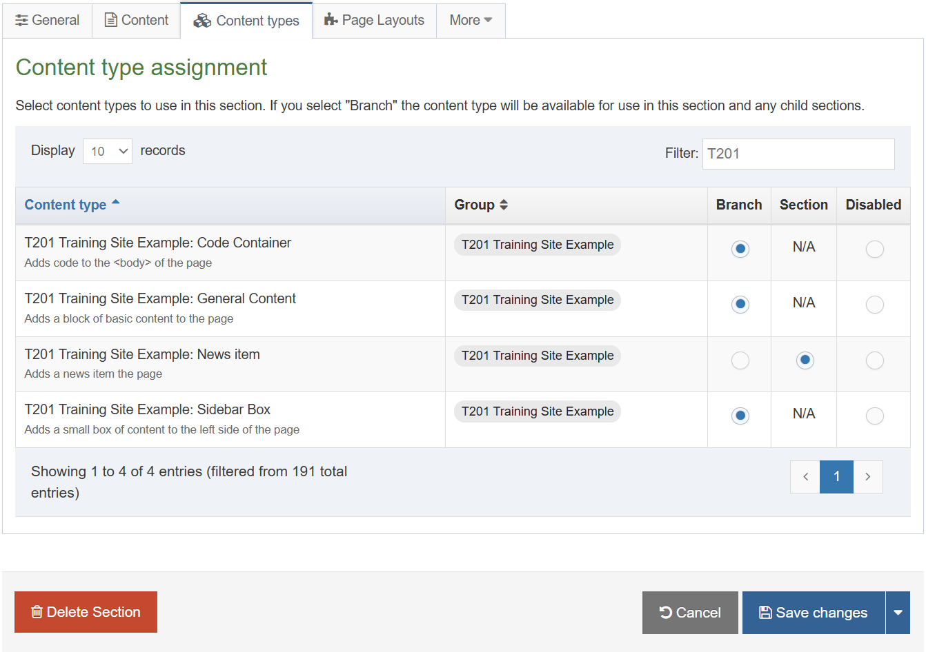
How to enable the news content type
- On the Site Structure screen, beside your main section, click Actions menu > Edit section.
- Select the Content types tab.
- Click the radio button to enable the newly created content type for either the branch or section:
- Enabled (branch): the content type can be used in this section as well as all its sub-sections.
- Enabled (section): the content type can be used in this section only.
- Click Save changes to save the changes.
- Use the new content type to add content to your section.
Top content navigation
- A Top Content Navigation Object can be used to output, for instance, the most recent news items in a specific location on your site.
- In this example, build a Top Content Navigation Object to output the three most recent news stories in the Latest News box on the left.
- Build a third content layout for your News content type to output the Headline and the Publish Date.
.jpg)
How to create a top content navigation
- Go to Assets > Navigation > Add new navigation > Top content
- Use the HTML from the footer to determine how the Top News should be built.
- The Top content contains the following options:
- Name: enter a name for the Top News.
- Description: enter a description for the Top News, i.e., what will be output.
- Primary group: select a group to add the navigation to.
- Options
- Show pending content in preview: lets you view non-approved content in preview.
- Cache output: check this option to cache the output of this Navigation Object, which can improve preview and publish performance. This is useful once the object is configured and working as expected.
- Title: enter the title you wish to output before the menu or leave it blank if you do not wish to use a title.
- Fetch Method: select the relevant option:
- Use section: content will be fetched only from the Section you specified above.
- Use branch: content will be fetched from the Branch, starting at the Section you specified above.
- Use current: content will be fetched from the current section. If you selected a Section above, this will be ignored.
- Use current branch: content will be fetched from the Branch, starting at the current section. If you selected a Section above, this will be ignored.
- Select section: click and navigate to the section you wish to fetch the content from.
- Content type name: select one or multiple content types from the list. Only content using these content types will be fetched.
- Channel: content should be restricted to a specific Channel or Microsite.
- Content dates:
- Use current content:
Display content where the date is in the past, up until the current date/time, with the most recent item shown first. - Use upcoming or future content:
Display content where the date is in the future, with the next upcoming item shown first
- Use current content:
- Date element: enter the name of the date element in your content type(s). This must be an exact match.
- Ignore date ordering: checkbox to order the content based on the order in the Section (only relevant if the Fetch method is Use section or Use current). Unchecked, the date element is used instead.
- Number of Content Items to display: specify the maximum number of content items you wish to display.
- Which Content Item to start at?: specify which piece of content to start with. This does not have to be the first piece.
- Content layouts
- Use channel default:
Select to use Channel default (specified in the channel settings) - Use alternate content layout:
Select to use an alternate content layout.
Alternate Content Layout: specify which content layout you wish to use. In this instance you have not created the content layout yet, but you can still set one, e.g., text/latest-news
- Use channel default:
- Before HTML: the HTML to be output before the list of items.
- After HTML: the HTML to be output after the list of items.
- Click Next to save the Navigation Object
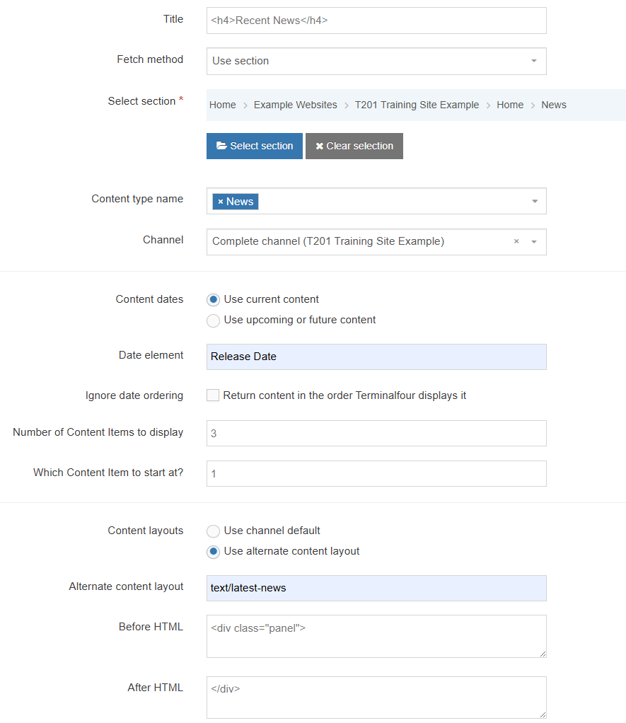
<div class="panel">
</div>
How to create an alternate layout for recent news
- To build the alternate content layout, go to Assets > Content Types.
- Click Edit beside your content type (News).
- Select the Content Layout tab and click Add content layout.
- The content layout Name will be empty, as you have also used the default fulltext content layout, you need to create a new one to match what you specified in the Navigation Object, e.g., text/latest-news.
- The File Extension should be left at Default unless this is used with a different File Extension. This requires other extensions being permitted in the Channel.
- Select the relevant Syntax type language to enable syntax highlighting.
- Content layout processor should be Handlebars Content.
- Use the Content layout code to build the output for your content. If you have created the HTML already, you can start by pasting that into the code field as displayed below (copy the code text in the code box below).
<h5><a href="#fulltext">Terminalfour wins "Company of the Year" at ICT Excellence Awards</a></h5>
<em><strong>17 May</strong></em>
<hr>
- As each piece of content will have unique information in the Headline and Release Date, the text below needs to be replaced with what the user enters when creating the content. To do that you need to build some Handlebars expressions.
- The content layout is very similar to the original text/html content layout, so you should be able to build this by using what you have learned.
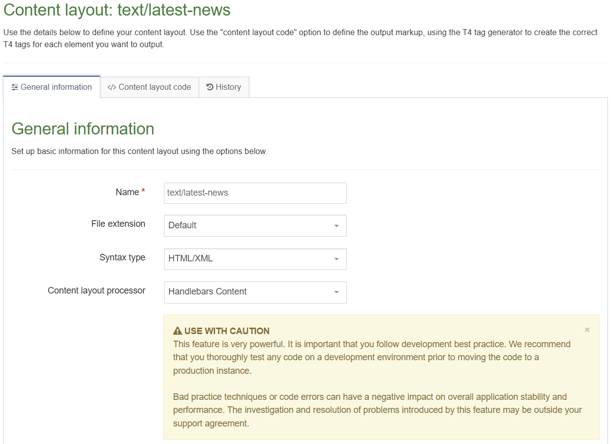
Apply top content navigation to page layout
- The Top Content Navigation Object you just built now needs to be added to your page layout to replace the hardcoded list of Top News.
- Build a Handlebars expression to output the Top Content.
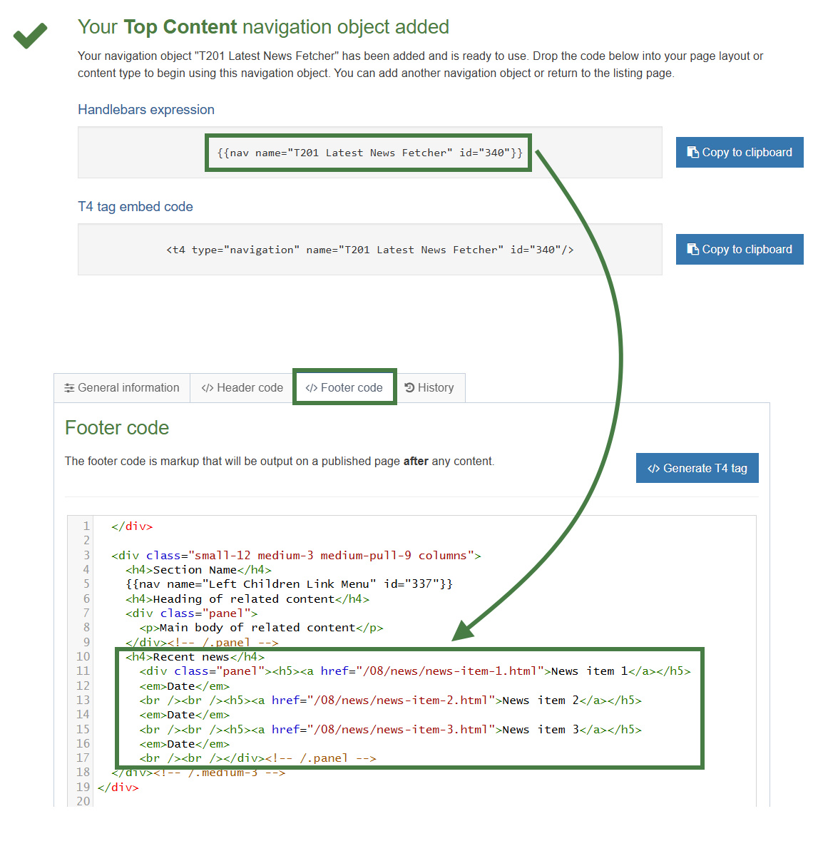
How to apply a new navigation object to page layout
- Go to Assets > Page Layouts.
- Click your page layout name to edit it. (Use the Filter tool to search).
- Open the </> Footer code tab.
- Click on the </> Generate Handlebars Expression button.
- Open the Navigation tab.
- Restrict navigation objects by type: select "Top content". This acts as a filter facilitating the search for your navigation object.
- Available navigation objects: find the name of your navigation object and select it. Once selected the expression builder will generate a Handlebars expression that uses the nav Helper.
- Click Copy to clipboard to copy the Handlebars expression.
- Paste the Navigation Handlebars expression in to replace the original menu as highlighted above.
- Click Save changes.
- Preview your site to check the result. If you have a preview open already, simply refresh that one. Otherwise, you can preview the site from the Site Structure screen.
- You may wish to add a couple of news items to be able to check the result.
Related content
- A Related Content Navigation Object fetches content which relates to the main content. This can be based on where the related content is added, what content layout is used, etc.
.jpg)
How to add a related content navigation
- Go to Assets > Navigation > Add new navigation > Related content. Use the HTML from the footer to determine how the Related Content should be built.
- The Related Content contains the following options:
- Enabled: if the Navigation Object is used, it needs to be enabled, otherwise nothing will be output.
- Name: enter a name for the Related Content, to make it easy to identify what it is used for.
- Description: enter a description for the Related Content, i.e., what will be output.
- Show pending content in preview: allows you to view non-approved content in preview.
- Cache output: check this option to cache the output of this Navigation Object, which can improve preview and publish performance. This is useful once the object is configured and working as expected.
- Output title: enter the title you wish to output before the menu or leave it blank if you do not wish to use a title.
- Fetch method: determine where the content will be fetched from:
- Use current: the content will be fetched from the current section. Unless an Alternate Content Layout is specified, it will fetch all content with the default (text/html) content layout from the current section.
- Use section: the content will be fetched from a specific section.
- Use child: the content will be fetched from a child section with a specific name. You need to specify the details in Child section name. Also, select the content type(s) to be used, and number of pieces to display.
- Use grandchild: functions like the Use child option.
- Content layouts
Use channel default.
Select to use Channel default (specified in the channel settings)
Use alternate content layout.
Select to use an alternate content layout.
Alternate Content Layout: specify which content layout you wish to use. In this instance you have not created the content layout yet, but you can still set one, e.g., text/sidebar-box - Before HTML: the HTML to be output before the content.
- After HTML: the HTML to be output after the content.
- Click Next to save the Navigation Object
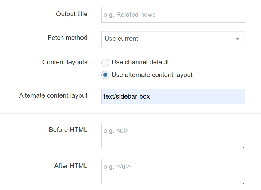
- You need a new content type for adding content in a sidebar box on the left-side of your page.
To create that, go to Assets > Content Types > Create content type - Fill in the General information:
- Name: enter a name here. This should suggest what type of content it is used for.
- Description: describe in more detail when to use this content type.
- Minimum user level: if you wish to restrict who can use this content type, you can set a level here. If content types are created in groups, a user must be a member of the group as well as meet the minimum user level criteria to use the content type.
- Options: decide if Direct Edit can be used for this content type and if the content type should be an eForm.
- Enable in direct edit
- Mark as eForm
- Mark as eForm: check this for eForms and xForms only. This will be described in detail later.
- Workflow: if relevant, enable a workflow for content using this content type.
- Primary group: restricts access to the content type based on the Primary Group a User is a member of
- Select the Elements tab.
- Add the elements you need by filling in the information as outlined in the table below.
| Name | Description | Type | Max size | Required | Show |
|---|---|---|---|---|---|
| Heading | Enter your main heading | Plain Text | 150 | Yes | Yes |
| Main body | Enter the main body for the left side | HTML | 2500 | Yes | Yes |
- Once you have added all your elements, click Save changes. The Content layouts tab opens.
- Add a new content layout by clicking on the Add content layout button.
- Fill in the General information:
- Name: enter the name of the content layout, text/sidebar-box.
- File extension: the File extension should be left at Default unless this is used with a different File Extension. This requires other extensions being permitted in the Channel.
- Syntax Type: select the relevant Language to enable syntax highlighting, i.e., HTML/XML.
- Content layout processor: select Handlebars Content as the content layout processor.
- Use the Content Layout Code to build the first output for your content. If you have created the HTML already, you can start by pasting that into the code field as displayed below (copy the code text in the code box below).
<h4>Heading of related content</h4>
<div class="panel">
<p>Main body of related content</p>
</div><!-- /.panel -->
- As each piece of content will have unique information in the Heading and Main Body, the text below needs to be replaced with what the user enters when creating the content. To do that you need to build some Handlebars expressions.
.jpg)
- In this example, the text Heading of related Content needs to be replaced with a Handlebars expression. To build this, select the </> Generate Handlebars Expressions button.
- The Handlebars code is automatically generated; click Copy to clipboard to copy the generated Handlebars expression. The Handlebars code you have copied should look like this:
{{publish element="Heading" inline-edit="true"}}
- Replace the original heading: Heading of related content, with the new Handlebars expression.
- Select the </> Generate Handlebars Expression button again.
- Using what you have learned above, build a Handlebars expression to output the Main Body:
- The Handlebars code is automatically generated; click Copy to clipboard to copy the generated Handlebars expression.
- Replace the original content for the Main Body with the new Handlebars expression. You do not need to leave <p> tags around the tag as the HTML editor will generate the necessary tags.
- The content layout should look like the screen below.
- Click Save changes to save the new content layout. The content type is complete.
.png)
Enable your sidebar box content type
- You need to enable your new content type to your Site Structure to test it.
- Content types can only be used in Sections where they are enabled.
- If a content type is created in a Group, only users who are members of that Group can use the content type.
- Only users who meet the Minimum User Level criteria can use the content type.
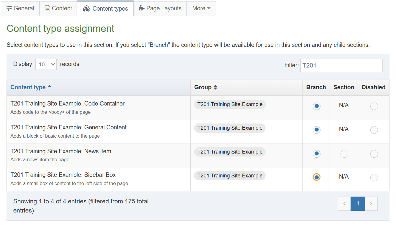 How to enable the sidebar box content type
- On the Site Structure screen click your main section name to edit it
- Select the Content types tab.
- Click the radio button to enable the content type for either the branch or section:
- Enabled (branch): the content type can be used in this section as well as all its sub-sections.
- Enabled (section): the content type can be used in this section only.
- Click Save changes to save the changes.
- Use the new content type to add content to your section.
Apply related content navigation to page layout
- The Navigation Object you just built now needs to be applied to the page layout to replace the hardcoded Related Content.
- Build a Handlebars expression to output the Related Content.
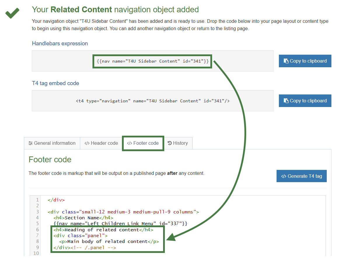
How to apply the new navigation object
- Go to Assets > Page Layouts.
- Click your page layout name to edit it. (Use the Filter tool to search).
- Open the </> Footer code tab.
- Click on the </> Generate Handlebars Expression button.
- Open the Navigation tab.
- Restrict navigation objects by type: select "Related content". This acts as a filter facilitating the search for your navigation object.
- Available navigation objects: find the name of your navigation object and select it. Once selected the expression builder will generate a Handlebars expression that uses the nav Helper.
- Click Copy to clipboard to copy the Handlebars expression.
- Paste the Handlebars expression in to replace the original content as highlighted above.
- Click Save changes.
- Preview your site to check the result. If you have a preview open already, simply refresh that one. Otherwise, you can preview the site from the Site Structure screen.
Lists
- A List is a collection of items with a meaningful grouping or sequence. When used as part of a content type, a List allows a user to select one or more of the items within it as an option.
- When a List has been created and populated it is added to a Content Type. There are six Content Elements types that can be used with Lists:
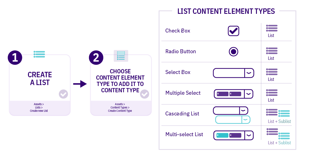
| Item | Description |
|---|---|
| Check Box | Multiple items can be selected |
| Radio Button | One item can be selected |
| Select Box | One item can be selected from a dropdown list (good for long lists) |
| Multiple Select | Multiple items can be selected from a dropdown list |
| Cascading List | One item can be selected from a dropdown list; for items that have a related Sublist, a second drop-down menu will appear below it listing items from that Sublist |
| Multi-select List | Items can be selected from both the List and the Sublist |
How to create a list
- Go to Assets > Lists > Add new list
- Fill in the List information:
- Name: enter a name here. This should suggest what type of list it is used for.
- Description: describe in more detail when to use this list.
- Localization: if the List is available in more than one language, you can use the localization options to:
- checkbox: Use current language version of this list (This prevents translations of the list).
- checkbox: Only use this list when localized versions are not available (when no translation of the List exists, this List is used).
- Primary group: select your group. This allows you to select the group which is permitted to use this list. Click Toggle shared groups to share the list with more than one group.
- List items: enter the individual list items by clicking on the Add row button:
- Order: list items can be re-ordered using the move icon
- Name: the name of the list item
- Value: the value of the list item
- Selected: when checked, this item will be the default selected item in the content type Element.
- Sublist: list items may have sub-categories that you want to link them to. Sublists are used with Cascading and Multi-select content type Elements.
| Name | Value | Selected | Sublist |
|---|---|---|---|
| Entertainment | 1 | Leave blank | |
| Lifestyle | 2 | Leave blank | |
| Politics | 3 | Leave blank | |
| Sports | 4 | Leave blank | |
| World News | 5 | Leave blank |
- Click the Save changes button to save your list.
Adding a list element to the "News" content type
- Go to Assets > Content Types.
- Click your content type name to edit it. (Use the Filter tool to search). Open the Content layouts tab.
- Select the Elements tab.
- Click the Add element button to add the new list select element as per the table below:
- Name: Give your List element a descriptive name. (e.g. "News categories")
- Description: Give your List element a description.
- Type: Choose "Multi-select List".
- List used for values: Select "[your_name] News Categories" from the available list options.
| Name | Description | Type | Max Size | Use as filename | Required | Show |
|---|---|---|---|---|---|---|
| News categories | Select news categories |
Multi-select List List used for values: [your_name] News Categories |
leave default | N/A | Yes | Yes |
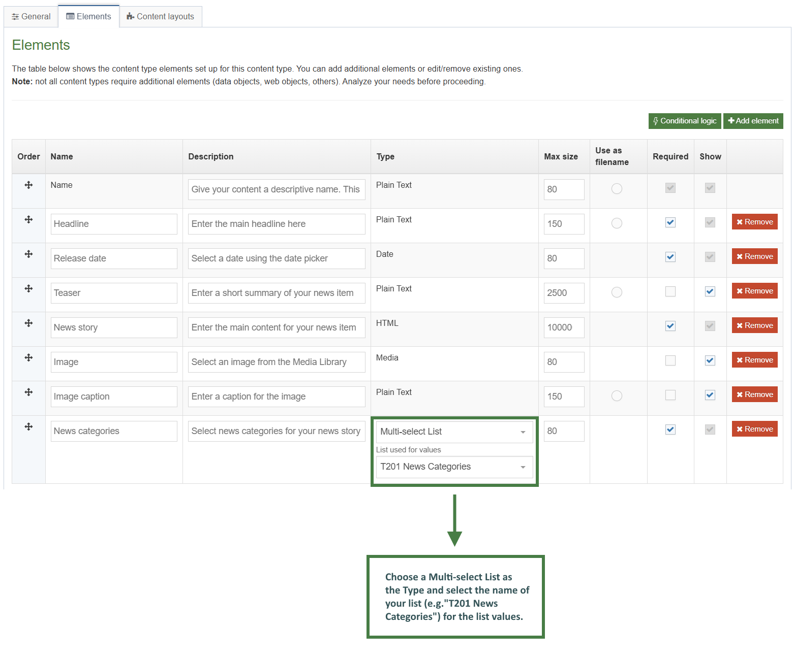
selectedNames and selectedValues Helpers
The selectedNames and selectedValues Helpers are used to give you some control over how List elements are output.
By default, if you output a List element with the publish Helper (in 8.4.0 and above), the selected List Item's Name will be output. If more than one item is selected, the names will be separated by a comma and a space , .
{{publish element="Checkbox"}}
<!-- output would be "Name1, Name2, Name3" etc. -->
The selectedNames Helper allows you to modify that separator value if required (it defaults to , if the argument isn't passed).
{{selectedNames element="Checkbox" separator="|"}}
<!-- output would be "Name1|Name2|Name3" etc. -->
If the selected list items contain sublists then you can choose to modify the level-separator between the parent and child items. It defaults to > if the argument isn't passed.
{{selectedNames element="Checkbox" separator="|" level-separator="~"}}
<!-- output would be "Name1|Name1~Child1|Name1~Child2|Name2|Name3" etc. -->
The selectedValues Helper works exactly the same way, except instead of outputting the selected list item's name, it output's the value.
How to use the selectedNames and selectedValues Helpers
- Go to Assets > Content Types.
- Click your content type name to edit it. (Use the Filter tool to search). Open the Content layouts tab.
- Click into the Content layouts tab.
- Choose to edit your "text/html" content layout.
- Use the selectedNames and selectedValues Helpers to output the names and values of the items in the list. Use the separator option to separate the elements with a "|" symbol.
- Click on the </> Generate Handlebars Expression button.
- In the Content tab:
- Information to output (select the Element radio button)
- Element: the Element option is used to output elements to the page.
- Metadata: the Metadata option allows output of specific Metadata (HTML anchor, Content ID, Last Modified Date, Publish Date, etc.).
- Fulltext: used to output a fulltext link.
- Content element: select the "News categories" element from the content element drop-down.
- Handlebars helper: Choose Selected Names, used to output the selected item names from a list.
- Options:
- Convert special characters to their HTML encoded values This is selected by default for List elements. It ensures that html characters are treated as literal text and not processed as HTML.
- Allow this element to be edited inline in Direct Edit Adds inline-edit="true" to enable inline editing of this element in Direct Edit. This is disabled for list elements.
- Check if value is set This option will wrap the element with an ifSet Helper. It ensures the element outputs only if it contains data.
- Information to output (select the Element radio button)
- Click the Copy to clipboard button to copy the generated Handlebars expression. The expression should look like the code below:
{{selectedNames element="News categories" separator=", " level-separator=">"}}
- Paste the Handlebars expression at the bottom of the news "text/html" content layout. Give it some context as per below:
<p>Tags: {{selectedNames element="News categories" separator=", " level-separator=">"}}</p>
The list and selected Helpers
The list and selected Helpers are both used in order to give full control over the output of List elements.
List Helper
It allows you to loop over every item in a list. You have access to helpful variables that let you know whether the list item was selected by the user, whether there's a sublist, whether the list item is first or last, and many more. Check the docs for full information.
Selected Helper
The selected Helper works in a very similar way but instead of looping over the whole list, it just loops over the selected items in the list.
The list and selected Helpers are both used in order to help with the output of List elements:
- Select Box
- Check Box
- Radio Button
- Multi-select List
- Multiple Select
- Cascading List
Both the list and selected Helpers are designed to be used alongside the built-in each block expression with Handlebars.
Using the list Helper as an example:
{{#each (list element="List Content Element")}}
<p>{{name}} - {{value}}</p>
{{/each}}
The above code is looping over every element in the list whether it is selected by the user or not and outputting the name and value in paragraphs.
However, there are a lot more variables available to use than just {{name}} and {{value}}. With both the list and selected Helpers we have the following variables available to us:
- listId - The Id of the list that this entry belongs to.
- listName - The Name of the list that this entry belongs to. (introduced in 8.4.0)
- entryId - The Id of this list entry.
- name - The name of this list entry.
- value - The value of this list entry.
- sequence - The sequence of this entry in the list.
- language - The language of the list entry.
- selected - true if the list entry is selected, false otherwise.
- hasSubList - true if the entry contains a sub-list.
- subList - A reference to the sub-list, if one is present.
- subListId - the Id of the sub-list, if present.
- subListName - the Name of the sub-list, if present. (introduced in 8.4.0)
In addition to the variables relating to each list entry returned, there are a number of variables made available to give the developer more information about the position of each entry in the list.
- @first - true if this is the first entry in the list/array.
- @last - true if this is the last entry in the list/array.
- @odd - true if this this entry has an odd index. Note that the array is zero-indexed.
- @even - true if this this entry has an even index. Note that the array is zero-indexed.
- @index - Returns the index of this entry within the list/array.
These allow us full control over how the lists should be output.
How to use the list and selected Helpers
- In this exercise, you will use the selected Helper and iterate not through the whole list but rather only through the selected items and display them.
- Go to Assets > Content Types.
- Click your content type name to edit it. (Use the Filter tool to search). Open the Content layouts tab.
- Click into the Content layouts tab.
- Choose to edit your "text/html" content layout.
- Click on the </> Generate Handlebars Expression button.
- In the Content tab:
- Information to output (select the Element radio button)
- Element: the Element option is used to output elements to the page.
- Metadata: the Metadata option allows output of specific Metadata (HTML anchor, Content ID, Last Modified Date, Publish Date, etc.).
- Fulltext: used to output a fulltext link.
- Content element: select the "News categories" element from the content element drop-down.
- Handlebars helper: Choose Selected, used to output the selected items from a list.
- Options:
- Convert special characters to their HTML encoded values This is disabled when using the list Helper.
- Allow this element to be edited inline in Direct Edit Adds inline-edit="true" to enable inline editing of this element in Direct Edit. This is disabled for list elements.
- Check if value is set This option will wrap the element with an ifSet Helper. It ensures the element outputs only if it contains data.
- Information to output (select the Element radio button)
- Click the Copy to clipboard button to copy the generated Handlebars expression. The expression should look like the code below:
{{#each (selected element="News categories")}}
<p>{{name}} - {{value}}</p>
{{/each}}This type of expression gives you full control over the output. Lets now update the code to output the selected names of the list in an unordered list format.
- Click on the </> Generate Handlebars Expression button.
- Open the </> Misc tab.
- Select the "if" helper from the Helpers drop-down.
- Click the Copy to clipboard button to copy the generated Handlebars expression.
- Paste the Handlebars expression twice before and after the existing list output as below:
{{#each (selected element="News categories")}}
{{#if condition}}
condition is TRUE
{{else}}
condition is FALSE
{{/if}}
<p>{{name}} - {{value}}</p>
{{#if condition}}
condition is TRUE
{{else}}
condition is FALSE
{{/if}}
{{/each}}
- Update the code to output as as an unordered list, use the @first and @last variables to open and close the unordered list. The else clause previously generated by the expression builder is optional and not necessary in this exercise, make sure to delete it as per below:
<p>Tags:</p>
{{#each (selected element="News categories")}}
{{#if @first}}
<ul>
{{/if}}
<li>{{name}}</li>
{{#if @last}}
</ul>
{{/if}}
{{/each}}
- Click on the Save changes button to save your content layout.
- Update your preview to check your result.
Using the list Helper
- In this exercise, let's use the list Helper to display the whole list and additionally display the items that have been selected in bold.
- Go to Assets > Content Types.
- Click your content type name to edit it. (Use the Filter tool to search). Open the Content layouts tab.
- Click into the Content layouts tab.
- Choose to edit your "text/html" content layout.
- Use the each and list Helpers to iterate through all the items in the list.
- Open an unordered list (<ul>) if in the first iteration of the loop. Use the if Helper and the @first variable.
- Wrap the name of the list item with <li></li> tags.
- Close the unordered list (</ul>) if in the last iteration of the loop. Use the if Helper and the @last variable.
[Iterate through all the items in the list]
{{#if @first}}
<ul>
{{/if}}
<li>{{name}}</li>
{{#if @last}}
</ul>
{{/if}}
[Close the each Helper]
- Click Save changes to save the changes to your content layout.
- Update your preview to check the result.
Using the selected variable
- Let's wrap each selected item in the list with a <strong> tag to display selected items in bold. Use the "selected" variable with an if Helper to achieve this.
[Iterate through all the items in the list]
[Open the unordered list <ul>]
[Output the name of the list item, if the item is selected display it in bold]
[Close the unordered list </ul>]
[Close the each Helper]
- Click Save changes to save the changes to your content layout.
- Update your preview to check the result.
listById Helper
The listById Helper works exactly like the list and selected Helpers above, and includes all the same variables. The difference is this Helper outputs the list by referencing the list ID, rather than a list element.
This can be useful if you need to output a full list, but don't need it to be an item of content.
When using the listById Helper the selected variable will now return true or false depending on whether the list item is set to be selected by default in the List configuration page.
Related links content type
- Let's add a related links section to the sidebar content. To do this you will create a new content type called "Related links" which will be used as a repeater element that you will then add to the sidebar content type.
- One of the elements of the "Related links" content type is a list that will be used to select whether the link is internal, external or a pdf file.
- Now that you've learned how to work with lists, let's start by creating a list that you will add as one of the elements in your "Related Links" content type. The "Link Type" list will be added as a select box and will be used to select which type of link (internal, external or pdf) is being created.
How to create a list
- Go to Assets > Lists > Add new list
- Fill in the List information:
- Name: enter a name here. This should suggest what type of list it is used for.
- Description: describe in more detail when to use this list.
- Localization: if the List is available in more than one language, you can use the localization options to:
- checkbox: Use current language version of this list (This prevents translations of the list).
- checkbox: Only use this list when localized versions are not available (when no translation of the List exists, this List is used).
- Primary group: select your group. This allows you to select the group which is permitted to use this list. Click Toggle shared groups to share the list with more than one group.
- List items: enter the individual list items by clicking on the Add row button:
- Order: list items can be re-ordered using the move icon
- Name: the name of the list item
- Value: the value of the list item
- Selected: when checked, this item will be the default selected item in the content type Element.
- Sublist: list items may have sub-categories that you want to link them to. Sublists are used with Cascading and Multi-select content type Elements.
| Name | Value | Selected | Sublist |
|---|---|---|---|
| Internal Link | internal | leave blank | |
| External Link | external | leave blank | |
| Media/PDF Link | leave blank |
- Click on the Save changes button to save your list.
How to create the "Related Links" content type
- Go to Assets > Content Types > Create content type
- Fill in the General content type information:
- Name: enter a name here. This should suggest what type of content it is used for.
- Description: describe in more detail when to use this content type.
- Minimum user level: if you wish to restrict who can use this content type, you can set a level here. If content types are created in groups, a user must be a member of the group as well as meet the minimum user level criteria to use the content type.
- Enable direct edit: decide if direct edit can be used for this content type.
- Mark as eForm: if checked, this allows your content type to collect eForm data.
- Workflow: if relevant, enable a workflow for content created using this content type.
- Primary group: select your group. This allows you to select the group which is permitted to use this content type. Click Toggle shared groups to share the content type with more than one group.
- Select the Elements tab.
- Each content type has a Name element by default. This is used to name the content and is typically not displayed on the published site.
- Add the other elements you need by filling in the information as outlined in the table below. Click Add element to begin filling in the details for each element.
- Once you have added all your elements, click Save changes. The Content Layout tab opens.
| Name | Description | Type | Max Size | Required | Show |
|---|---|---|---|---|---|
| Button Text | Enter the text to appear on the button. E.g. “Learn More” | Plain Text | 80 | No | Yes |
| Link Type | Select which kind of link you’d like to use | Select Box (Link Type) | 80 | No | Yes |
| Button Link (internal) | Select a section/content for an internal link | Section/Content Link | 80 | Yes | Yes |
| Button Link (external) | Select this if you are entering a link to an external website. Only enter this if you are NOT entering an internal or media link | Plain Text | 200 | Yes | Yes |
| Button link (media) | Select this if you’d like to link to a PDF. Only enter this if you are NOT entering an internal or external link | Media | 80 | Yes | Yes |
- The Content Layout tab is a new content layout for your content type. Click +Add content layout.
- Name: text/html - this is the default Type set in the Channel. This ensures the content can be displayed.
- File Extension: Default - unless this is used with a different File Extension. This requires other extensions being permitted in the Channel
- Syntax Type: HTML/XML – this determines which syntax is highlighted.
- Content layout processor: must be set to Handlebars Content.
- Content Layout code: this determines the output for your content.
You will make use of the selectedValues Helper and the eq comparison Helper. In this particular example, you will use the eq comparison Helper to compare the value in the "Link Type" list which can be "internal", "external" or "pdf" and display the correct link based on what is selected in the content.
There are a number of Helpers to allow you to compare values:
eq - Tests if two values are equal
neq - Tests if two values are not equal
gt - Tests if one value is greater than another
gte - Tests if one value is greater than or equal to another
lt - Tests if one value is less than another
lte - Tests if one value is less than or equal to another
and - Tests if values are true (you can pass two or more arguments)
or - Tests if any values are true (you can pass two or more arguments)
not - If the provided input is false then the block will not be processed
Arguments are space separated when passed to Handlebars expressions (as opposed to comma separated).
{{#eq (publish element="Greeting") "Hello"}}
<p>Hello to you too!</p>
{{else}}
<p>You didn't say "Hello".</p>
{{/eq}}
{{#lt 5 8}}
<p>5 is indeed less than 8.</p>
{{else}}
<p>This will never be published because 5 is always less than 8.</p>
{{/lt}}
- Click into the Content layout code tab.
- Click on the </> Generate Handlebars Expression button.
- Open the </> Misc tab.
- In the Helpers drop-down, select the eq Helper.
- Click on Copy to clipboard to copy the generated Handlebars code.
- Paste the Handlebars code into your content layout.
The code generated by the Handlebars expression builder should look like the code below:
{{#eq value1 value2}}
value1 and value2 are equal
{{else}}
value1 and value2 are not equal
{{/eq}}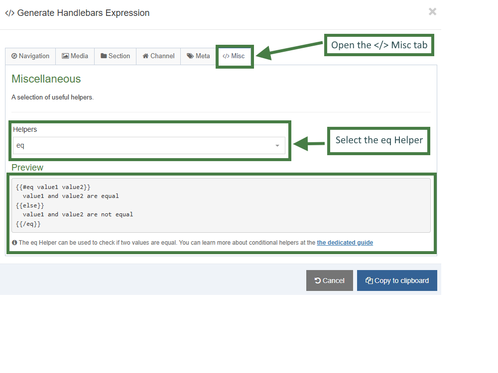
- Let's update the code to suit our requirements (The updated code should look like the code below):
- Remove the else clause.
- Remove the placeholder output "value1 and value2 are equal" as you will be outputting links.
- Repeat the code for the three different types of links.
- Replace "value2" with the three different values of links: ("internal", "external", "pdf").
{{#eq value1 "internal"}}
{{~/eq}}
{{#eq value1 "external"}}
{{~/eq}}
{{#eq value1 "pdf"}}
{{~/eq}}
- Click on the </> Generate Handlebars Expression button.
- In the Content tab:
- Information to output (select the Element radio button)
- Element: The Element option is used to output elements to the page.
- Metadata: The Metadata option allows output of specific Metadata (HTML anchor, Content ID, Last Modified Date, Publish Date, etc.).
- Fulltext: Used to output a fulltext link.
- Content element: Select the "Link Type" list element from the content element drop-down.
- Handlebars helper: Choose Selected Values from the drop-down.
- Options:
- Convert special characters to their HTML encoded values This is selected by default for Plain Text elements. It ensures that html characters are treated as literal text and not processed as HTML.
- Allow this element to be edited inline in Direct Edit This is disabled by default as list elements are not editable inline in Direct Edit.
- Check if value is set This option will wrap the element with an ifSet Helper. It ensures the element outputs only if it contains data. It is the equivalent of selective output in t4 tags.
- Information to output (select the Element radio button)
- Click the Copy to clipboard button to copy the generated Handlebars expression and replace the "value1" with the Handlebars expression.
The handlebars expressions needed for the three different types of links are displayed below. Notice how the selected value of the "Link Type" list is compared to the three possible values in the list: "internal", "external" and "pdf". Copy the code into your layout.
You will need to remove the opening and closing curly braces "{{ }}" and use parentheses instead. This allows you to create a subexpression that can be inserted into your existing Handlebars expression. Additionally, there is no need to have the separator and level-separator parameters since you are not outputting values but just comparing them.
{{#eq (selectedValues element="Link Type") "internal"~}}
{{~/eq}}
{{#eq (selectedValues element="Link Type") "external"~}}
{{~/eq}}
{{#eq (selectedValues element="Link Type") "pdf"~}}
{{~/eq}}
- Click on the </> Generate Handlebars Expression button.
- In the Content tab:
- Information to output (select the Element radio button)
- Element: The Element option is used to output elements to the page.
- Metadata: The Metadata option allows output of specific Metadata (HTML anchor, Content ID, Last Modified Date, Publish Date, etc.).
- Fulltext: Used to output a fulltext link.
- Content element: Select the "Button Link (internal)" element from the content element drop-down.
- Handlebars helper: Choose Link from the drop-down.
- Options:
- Convert special characters to their HTML encoded values This is disabled by default as links are not HTML encoded.
- Allow this element to be edited inline in Direct Edit This is disabled by default as list elements are not editable inline in Direct Edit.
- Check if value is set This option will wrap the element with an ifSet Helper. It ensures the element outputs only if it contains data.
- Information to output (select the Element radio button)
- Click Copy to clipboard and paste in the Handlebars expression into the body of the Button Link (internal) eq block.
- Repeat the steps above for the Button Link (external) and Button Link (media) elements.
Your content layout should now look like the code below:
{{#eq (selectedValues element="Link Type") "internal"~}}
{{#link element="Button Text(internal)"}}
<p>The link URL is: {{linkURL}}</p>
<p>The link Text is: {{linkText}}</p>
{{/link}}
{{~/eq}}
{{#eq (selectedValues element="Link Type") "external"~}}
{{publish element="Button Link (external)" inline-edit="true"}}
{{~/eq}}
{{#eq (selectedValues element="Link Type") "pdf"~}}
{{publish element="Button Link (media)" inline-edit="true"}}
{{~/eq}}
- Update the code as per below with the correct output for each type of link:
{{#eq (selectedValues element="Link Type") "internal"~}}
{{#link element="Button Link (internal)"~}}
<p><a href="{{linkUrl}}">{{publish element="Button Text"}}</a></p>
{{~/link}}
{{~/eq}}
{{#eq (selectedValues element="Link Type") "external"~}}
<p><a href="{{publish element="Button Link (external)"}}">{{publish element="Button Text"}}</a></p>
{{~/eq}}
{{#eq (selectedValues element="Link Type") "pdf"~}}
{{{media id=(mediaId element="Button Link (media)") layout="application/*"}}}
{{~/eq}}
- Click Save changes to save the changes to your content layout.
Conditional elements
- In order to make the "Related Links" content type work correctly, you will add conditional elements to show/hide the different types of links based on the selection made in the "Link Type" list. Let's learn how this can be achieved.
- Conditional Elements allows Administrators and Power Users to customize the Content Editing Experience for their users by conditionally displaying elements based on specific criteria.
How to add conditional elements to a content type
- There are three types of conditional statements that can be added:
- Content Element-Based Conditions
- e.g. If 'Research Type' is set to 'Grant-Funded', then show 'Funding Body Details' field
- e.g. If 'Course Level' dropdown is 'Postgraduate', then show 'Research Methodology' field
- User Group Conditions
- e.g. If User is in group 'International Admissions', then show 'Visa Requirements' elements
- e.g. If User is in group 'Research Grants Team', then show 'Indirect Cost Calculation' element
- User Type Conditions
- e.g. If User is at least 'Administrator', then show 'Advanced Options' element
- e.g. If User is at least 'Moderator', then show 'Background Image' element
- Let's add the following Content Element-Based Conditions to the sidebar content type:
- If 'Link Type' is set to 'Internal Link' then show 'Button Link (internal)' field
- If 'Link Type' is set to 'External Link' then show 'Button Link (external)' field
- If 'Link Type' is set to 'Media/PDF Link' then show 'Button Link (media)' field
- Go to Assets > Content Types
- Click your content type name to edit it. (Use the Filter tool to search).
- Open the Elements tab.
- Click on the Conditional logic button to bring up the Conditional logic & Live Preview screen.
- Click on the +Add conditional statement button. Build a conditional statement for the "Internal Link" as per the table below:
| Conditional Statement | Element | Column 3 | Value | Then show |
|---|---|---|---|---|
| Content Element | Link Type (Select Box) | Contains | Internal Link | Button Link (internal) |
.jpg)
- Click on the +Add conditional statement button. Build a conditional statement for the "External Link" as per the table below:
| Conditional Statement | Element | Column 3 | Value | Then show |
|---|---|---|---|---|
| Content Element | Link Type (Select Box) | Contains | External Link | Button Link (external) |
.jpg)
- Click on +Add conditional statement button. Build a conditional statement for the "Media Link" as per the table below:
| Conditional Statement | Element | Column 3 | Value | Then show |
|---|---|---|---|---|
| Content Element | Link Type (Select Box) | Contains | Media/PDF Link | Button Link (media) |
.jpg)
- Click on the Apply and close button to apply your conditional elements to the content type.
- Click Save changes to save your content type.
Repeaters
- Repeaters allow you to configure a content type so that it can include another content type inside it.
How to add a repeater element
Let's now add the "Related Links" content type as a repeater element to the Sidebar content type.
- Go to Assets > Content Types.
- Click your content type name to edit it. (Use the Filter tool to search).
- Select the Elements Tab.
- Add a repeater element by filling in the information as outlined in the table below. Click Add element to begin filling in the details.
| Name | Description | Type |
|---|---|---|
| Related Links | Enter related links for the sidebar content | Repeater |
When selecting "Repeater" as the type, a new "Flyout screen" will be displayed automatically that allows you to choose which content type should be repeated.
- Configure the repeater element:
- Content type: select the content type to be repeated, this should be the name of your "Related Links" content type.
- Content layout: the default layout that will be output for this repeater element, e.g. text/html.
- Repeater settings:
- Minimum repeats: the minimum amount of repeats allowed, e.g. 1.
- Maximum repeats: the maximum amount of repeats allowed, e.g. 5.
- Once you have finished configuring your repeater element, click Save changes.

How to output the repeater
- Click into the Content layouts tab.
- Select the "text/html" content layout and open the </> Content layout code tab.
- Add the output of the repeater element by generating the correct Handlebars code.
- Click the </> Generate Handlebars Expression button again.
- You are now going to build an expression to output the "Related Links" repeater element.
- In the Content tab:
- Information to output (select the Element radio button)
- Element: the Element option is used to output elements to the page.
- Metadata: the Metadata option allows output of specific Metadata (HTML anchor, Content ID, Last Modified Date, Publish Date, etc.).
- Fulltext: used to output a fulltext link.
- Content element: select the "Related Links" repeater element from the content element drop-down.
- Handlebars helper: select Publish from the drop-down.
- Content Layout: choose the content layout to apply to the display of the repeater element. This appears if you select Repeater as the Handlebars helper.
- Options:
- Convert special characters to their HTML encoded values This is disabled for repeater elements.
- Allow this element to be edited inline in Direct Edit This is disabled by default as list elements are not editable inline in Direct Edit.
- Check if value is set This option will wrap the element with an ifSet Helper. It ensures the element outputs only if it contains data.
- Information to output (select the Element radio button)
- Click Copy to clipboard to copy the Handlebars expression.
- Add the Handlebars expression and a heading as per below to your content layout:
<h4>Related Links:</h4>
{{{publish element="Related Links"}}}
- Click Save changes to save the changes to your content layout.
- Update your preview to check the result.
Updating the content layout with the repeater Helper
The repeater Helper is used to output a Repeater element (introduced in 8.4.1).
By default, if you output a repeater element with the publish Helper, then the repeater will be output using the default Content Layout associated with the repeater configuration.
If you need more control over which layout should be output you can use the repeater Helper to explicitly select a layout like so:
{{repeater element="Repeater Element" layout="text/example"}}
How to use the Repeater Helper
- Go to Assets > Content Types.
- Click your content type name to edit it. (Use the Filter tool to search).
- Click into the Content layouts tab.
- Click on the +Add content layout button to add an alternative content layout.
- Name: text/alternative
- File Extension: Default - unless this is used with a different File Extension. This requires other extensions being permitted in the Channel
- Syntax Type: HTML/XML – this determines which syntax is highlighted.
- Content layout processor: must be set to Handlebars Content.
- Content layout code: this determines the output for your content. If you have created the HTML already, you can start by pasting that into the code field as displayed below.
{{#eq (selectedValues element="Link Type") "internal"}}
{{#link element="Button Link (internal)"~}}
<p><a class="button small radius" href="{{linkUrl}}">{{publish element="Button Text"}}</a></p>
{{~/link}}
{{~/eq}}
{{#eq (selectedValues element="Link Type") "external"}}
<p><a class="button small radius" href="{{publish element="Button Link (external)"}}">{{publish element="Button Text"}}</a></p>
{{~/eq}}
{{#eq (selectedValues element="Link Type") "pdf"}}
{{{media id=(mediaId element="Button Link (media)") layout="PDF link with filesize"}}}
{{~/eq}}
- Click Save changes to save the changes to your content layout.
- Go to your Sidebar content type.
- Click into the Content layouts tab.
- Select the "text/html" content layout and open the </> Content layout code tab.
- Add the output of the repeater element by generating the correct Handlebars code.
- Click the </> Generate Handlebars Expression button again.
- You are now going to build an expression to output the "Related Links" repeater element.
- In the Content tab:
- Information to output (select the Element radio button)
- Element: the Element option is used to output elements to the page.
- Metadata: the Metadata option allows output of specific Metadata (HTML anchor, Content ID, Last Modified Date, Publish Date, etc.).
- Fulltext: used to output a fulltext link.
- Content element: select the "Related Links" repeater element from the content element drop-down.
- Handlebars helper: select Repeater from the drop-down.
- Content Layout: choose text/alternative.
- Options:
- Convert special characters to their HTML encoded values This is disabled for repeater elements.
- Allow this element to be edited inline in Direct Edit This is disabled by default as list elements are not editable inline in Direct Edit.
- Check if value is set This option will wrap the element with an ifSet Helper. It ensures the element outputs only if it contains data. It is the equivalent of selective output in t4 tags.
- Information to output (select the Element radio button)
- Click Copy to clipboard to copy the Handlebars expression.
- Add the handlebars expression to your content layout. The expression should look like the code below:
{{{repeater element="Related Links" layout="text/alternative"}}}
- Click Save changes to save the changes to your content layout.
- Update your preview to check the result.
If you need even more control over how the repeated items should be output the repeater Helper can be used in an each expression to give you full control. For example:
{{#each (repeater element="Repeater Content Element")}}
<p>Output</p>
{{/each}}
In the above example above, the word "Output" will be output once for every repeater instance that exists in the content. So if the content contains five slides, then "Output" will be output 5 times.
Because we're inside an each block, we have several variables available to us:
- @length - this will return a number corresponding to how many repeated items there are in this element.
- @first - true if this is the first repeater instance being output
- @last - true if this is the last repeater instance being output
- @odd - true if this this repeater instance has an odd index. Note that the array is zero-indexed.
- @even - true if this this repeater instance has an even index. Note that the array is zero-indexed.
- @index - Returns the index of this entry within the repeater instance. (Starting from "zero" for the first item)
- @index_1 - Returns the index of this entry within the repeater instance. (Starting from "one" for the first item)
While inside this each loop the context or scope has shifted to the "Repeated" content type. This means that you can output the elements and content metadata from the repeated child items.
For example:
{{#each (repeater element="Repeater Content Element")}}
{{publish element="Name"}}
{{/each}}
The above code will output the Name element of each Repeated content item, not the Name element of the "parent" content item.
If you need Helpers to be evaluated from the parent content item's scope, you can pass a scope="parent" flag into your helpers.
For example:
{{!-- Outside of the each loop, so will output the Name element from the parent content item --}}
{{publish element="Name"}}
{{#each (repeater element="Repeater Content Element")}}
{{!-- Inside of the each loop, so will output the Name element from the repeated/child content item --}}
{{publish element="Name"}}
{{!-- Inside of the each loop, but contains a scope="parent"
So will output the Name element from the parent content item. --}}
{{publish element="Name" scope="parent"}}
{{!-- Inside of the each loop, so will output the Content ID of the repeated/child content item --}}
{{contentId}}
{{!-- Inside of the each loop, but contains a scope="parent"
So will output the Content Id of the parent content item. --}}
{{contentId scope="parent"}}
{{/each}}
The scope="parent" is ignored if it's not used within an each Helper looping over repeated content items.
Site map
- Build a Site Map Navigation Object and link to the Site Map by using a Section Details Navigation Object.
- A Site Map is typically used in a piece of content using a plain text content type to avoid having a Site Map appear on every page of your website.
- The Navigation Object outputs your Site Structure as links (with the ability to set a start and finish point).
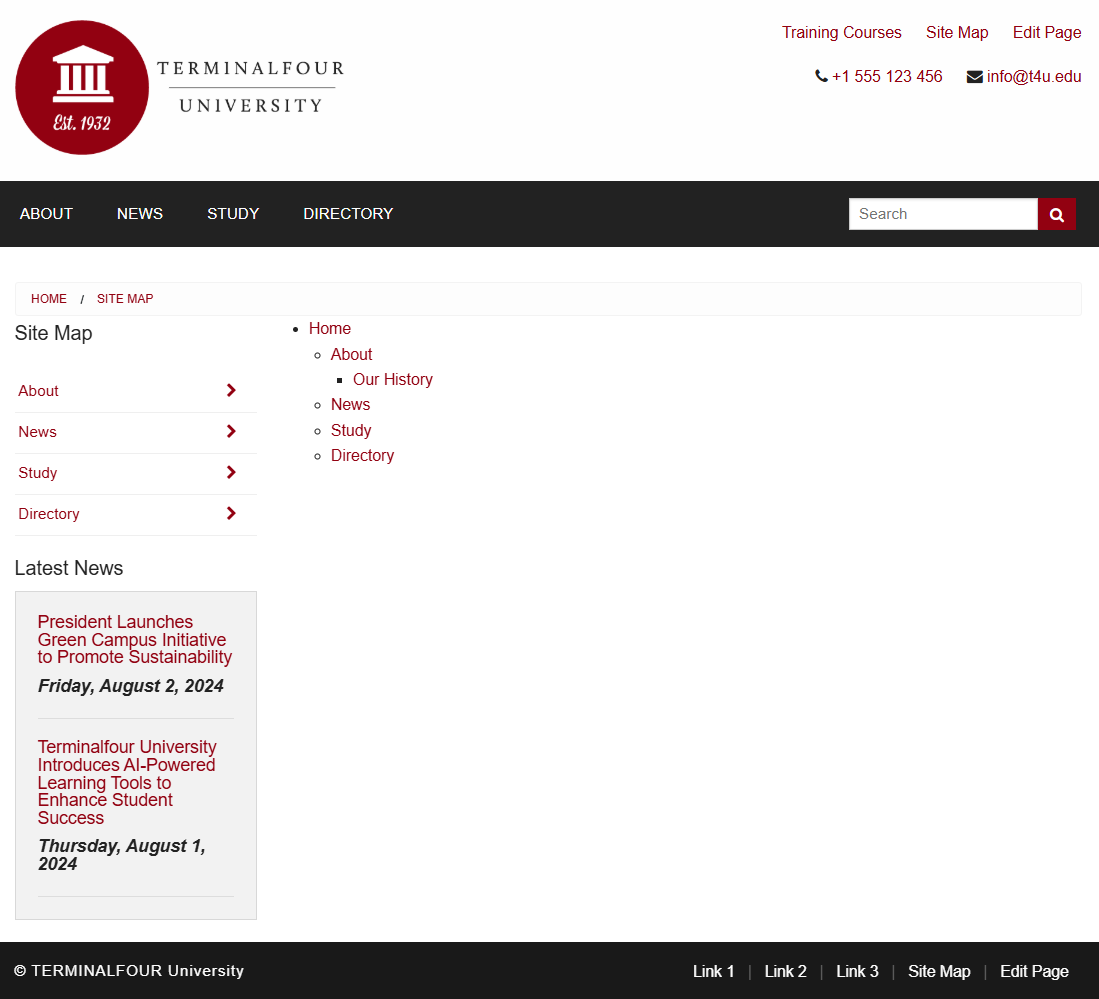
How to create a site map
- To create the section for the Site Map Content, select Create section from the Actions menu beside your main section.
- Enter a Name for your section, e.g., Site Map.
- Uncheck the box Show in Navigation.
- Click Save changes. The section has been added to your Site Structure.
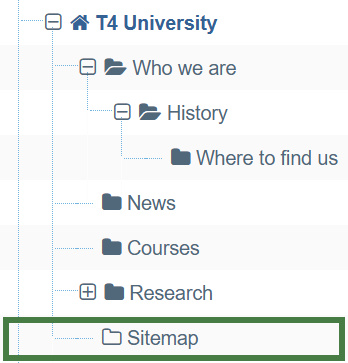
- To create the content type, go to Assets > Content Types > Create content type
- Fill in the General information:
- Name: enter a name here. This should suggest what type of content it is used for, e.g., Code container.
- Description: describe in more detail when to use this content type.
- Minimum user level: if you wish to restrict who can use this content type, you can set a level here. If content types are created in groups, a user has to be a member of the group as well as meet the minimum user level criteria in order to use the content type.
- Enable in direct edit: decide if Direct Edit can be used for this content type.
- Mark as eForm: check this for eForms and xForms only. This will be described in detail later.
- Workflow: if relevant, enable a workflow for content using this content type.
- Primary group: select the group that will use this content type.
.png)
- Select the Elements tab.
- Add the elements you need by filling in the information as outlined in the table below.
- Once you have added all your elements, click Save changes. The Content layout tab opens.
| Name | Description | Type | Max size | Required | Show |
|---|---|---|---|---|---|
| Code | Enter your code here | Plain Text | 25000 | Yes | Yes |
How to create a site map
- Click Add content layout
The Content layouts screen is a new content layout for your content type.- Name: text/html -this is the default Type set in the Channel. This ensures the content can be displayed.
- File extension: Default- unless this is used with a different File Extension. This requires other extensions being permitted in the Channel
- Syntax type: HTML/XML – this determines which syntax is highlighted.
- Content layout processor: must be set to Handlebars Content.
- Content layout code: this determines the output for your content.
To allow you to output the content, you need to write a Handlebars expression for the Code element.
- Click </> Generate Handlebars Expression.
- Open the Content tab:
- Information to output (select the Element radio button)
- Element: the Element option is used to output elements to the page.
- Metadata: the Metadata option allows output of specific Metadata (HTML anchor, Content ID, Last Modified Date, Publish Date, etc.).
- Fulltext: used to output a fulltext link.
- Content element: select the "Code" element from the content element drop-down.
- Handlebars helper: this will be selected by default as the Publish Helper, used to output elements to the page.
- Options:
- Convert special characters to their HTML encoded values This is selected by default for Plain Text elements. It ensures that html characters are treated as literal text and not processed as HTML. Since code needs to be processed leave this option unchecked.
- Allow this element to be edited inline in Direct Edit Adds the inline-edit="true" to enable inline editing of this element in Direct Edit.
- Check if value is set This option will wrap the element with an ifSet Helper. It ensures the element outputs only if it contains data. It is the equivalent of selective output in t4 tags.
- Information to output (select the Element radio button)
- Click Copy to clipboard to copy the Handlebars expression.
- The Handlebars expression you generated should look like this:
{{{publish element="Code"}}}
- The Handlebars expression is generated in the Preview area.
- Click Copy to clipboard to copy the Handlebars code.
- Paste the code into the Content layout code field.
In this example, if a user supplied some text that included Handlebars expressions (e.g. a Site map navigation object) to include a site map on a page, as in this exercise, without using the process Helper, Handlebars expressions will not be processed and will be output as plain text on the page.
The process Helper is used to tell the Handlebars engine to explicitly try and process content editor supplied text for Handlebars expressions.
It's used like:
{{{process (publish element="Code Only")}}}
The process Helper is not part of the Handlebars expression builder as of version 4.2.1 and so you will need to wrap the output of the Code element manually like so:
{{{process(publish element="Code")}}}
- Click Save changes to save the new content layout. The content type is complete.
.png)
Enable a content type
- You need to enable your new content type to your Site Structure to test it.
- Content types can only be used in Sections where they are enabled.
- If a content type is created in a Group, only users who are members of that Group can use the content type.
- Only users who meet the Minimum User Level criteria can use the content type.
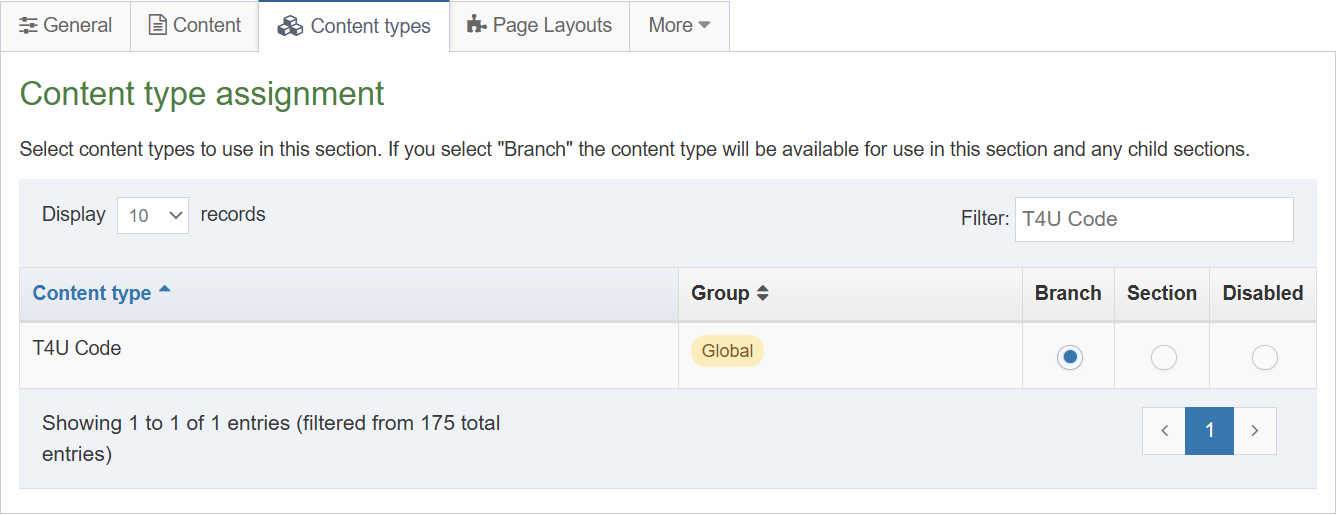
How to enable the new content type
- On the Site Structure screen click your main section name to edit it
- Select the Content Types tab.
- Click the radio button to enable the content type for either the branch or section:
- Enabled (branch): the content type can be used in this section as well as all its sub-sections.
- Enabled (section): the content type can be used in this section only.
- Click Save changes to save the changes.
- Use the new content type to add content to your section.
Site map navigation object
- The Navigation Object needs to output the Site Map for your part of the site.
- Build a Handlebars expression to output the Site Map.
- Create a piece of Content with the Site Map Navigation Object.
How to create a site map navigation object
- Go to Assets > Navigation > Add new navigation > Site map
- The Site Map navigation object contains the following options:
- Name: enter a name for the Site Map; to make it easy to identify what it is used for; a descriptive name
should be considered. - Description: enter a description for the Site Map, i.e., what will be output.
- Primary group: select a group to add the navigation to.
- Show pending content in preview: lets you view non-approved content in preview.
- Start section: decide where you want the site map to start.
- Child section links: check this option to hide the section you selected above as the root.
- Levels: leave this as 0 to show the full Site Map. Alternatively specify the number of levels.
- Add content count: check this option to count the pieces of content in each section and display it.
- Restrict content types: select the content types to include in the count above.
- Maximum level count: set a level if you wish to stop the count of content.
- Recursive count: if checked, this adds up all the sub-sections and outputs a total at the parent section, otherwise each section will have its own total.
- Text before: enter the text you wish to display before the count.
- Text after: enter the text you wish to display after the count.
- Name: enter a name for the Site Map; to make it easy to identify what it is used for; a descriptive name
- Click Next to complete the Navigation Object.
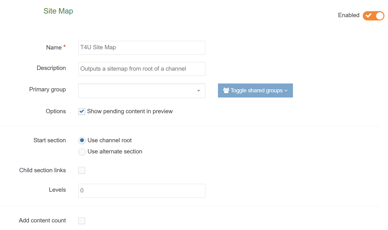
Use navigation object in content
- The Navigation Object you just built now needs to be used as a piece of Content in the hidden Section you created called Site Map.
- Build a Handlebars expression (in your page layout) to output the Site Map.
- Create a piece of content using your Code content type and paste the Handlebars expression in as the content.
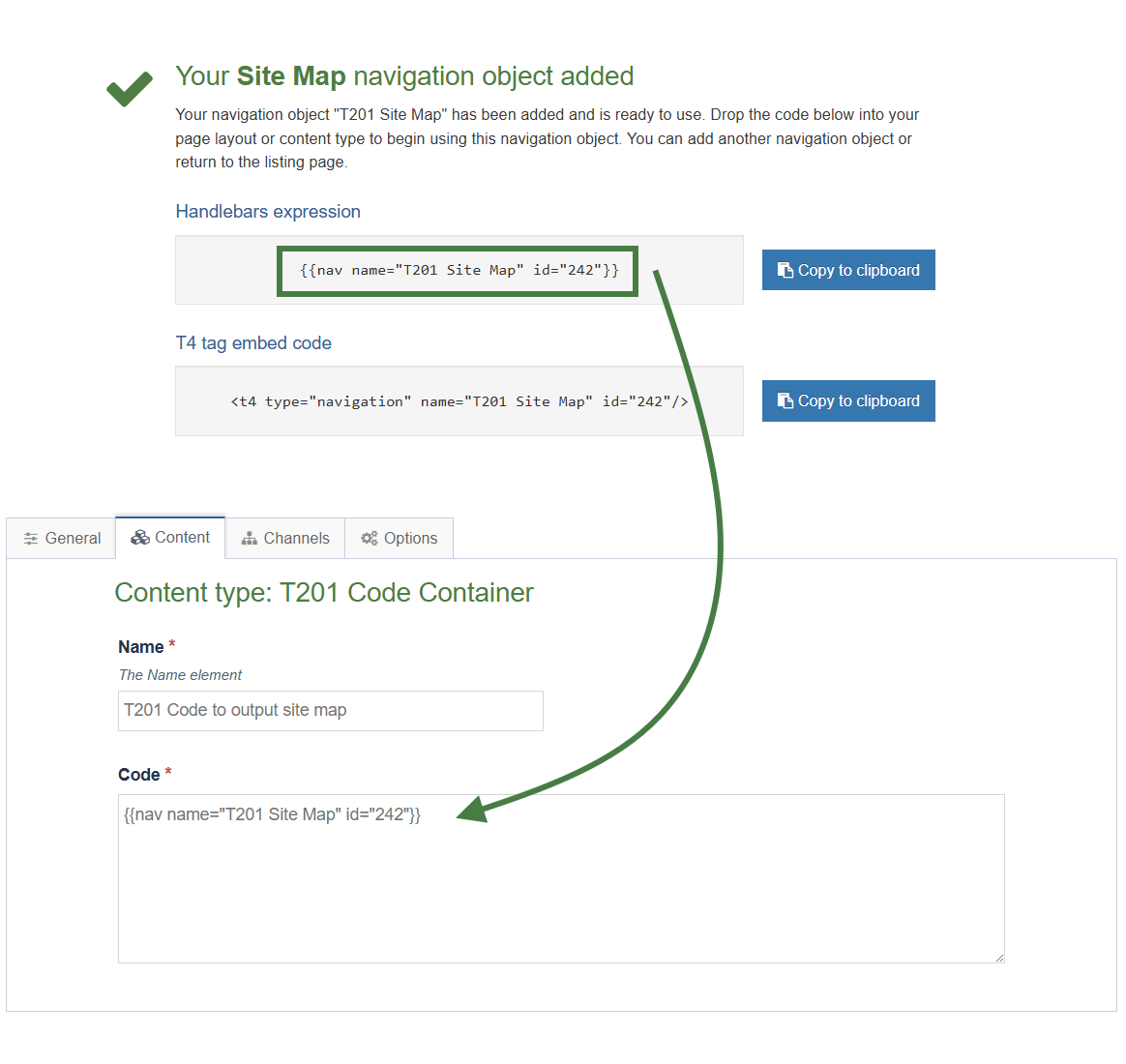 How to use the new navigation object in content
- Once your navigation object has been created, copy the generated Handlebars expression.
- Navigate to the Site Structure screen and select Add Content from the Action menu beside your Site Map section.
- Select your Code container content type.
- Give the piece of content a name and paste the Handlebars expression into the Code element as displayed above.
- Click Preview to check the result.
- Return to the content screen and click either Save changes or Save and approve to save the content.
Section details - link to section
- As the Site Map Section is hidden from navigation, you need a link for visitors to click on to get to the Site Map. To create that, you need a Section Details Navigation Object.
- Build a Handlebars expression to output the Link to Site Map and apply it to your page layout.
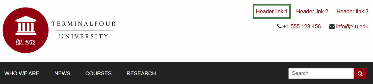
How to link to a hidden section
- Go to Assets > Navigation > Add new navigation > Section details
- Use the HTML from the header to determine how the Link to Site Map should be built. In this case you can build a full link.
- The Section Details navigation contains the following options:
- Name: enter a name for the Link to Site Map.
- Description: enter a description for the Link to Site Map, i.e., what will be output.
- Primary group: the members of the Primary Group can modify the Navigation Object. Click Show Shared Groups to share an object with other Groups, providing either full access or read-only access for the members of that Group.
- Show pending content in preview: lets you view non-approved content in preview.
- Detail method: determine whether the detail refers to Use section at level or Use section; then use one of the following two options to specify the relevant details.
- Current section:
- Level: if you selected Use section at level, specify the level here.
- Select section: if you selected Use section, click Select section and select the section you wish to use.
- Output detail: you can output the section's ID, Name or Path or alternatively output Link to Section.
- Click Next to complete the Navigation Object.
- The Handlebars code is automatically generated; copy this Handlebars expression to your clipboard, to be applied to your page layout later.
.png)
Apply section details navigation to page layout
- The Navigation Object you just built now needs to be applied to the page layout to replace the hardcoded links in the header or footer.
- Build a Handlebars expression to output the Link to Site Map.
.jpg)
How to apply the section details to page layout
- Go to Assets > Page Layouts.
- Click your page layout name to edit it. (Use the Filter tool to search).
- Open the </> Header code tab.
- Click on the </> Generate Handlebars Expression button.
- Open the Navigation tab.
- Restrict navigation objects by type: select "Section details". This acts as a filter facilitating the search for your navigation object.
- Available navigation objects: find the name of your navigation object and select it. Once selected the expression builder will generate a Handlebars expression that uses the nav Helper.
- Click Copy to clipboard to copy the Handlebars expression.
- Paste the Handlebars expression in to replace the original section link, i.e., <a href="#1">Header link 1</a>.
- Click Save changes to save the work.
- The link is now complete. Preview your site to check the result.
Direct edit
- To allow users to update content directly from the published site, add an Edit this Page link in the footer of your page layout.
- You can use the directEditSection Helper to do this.
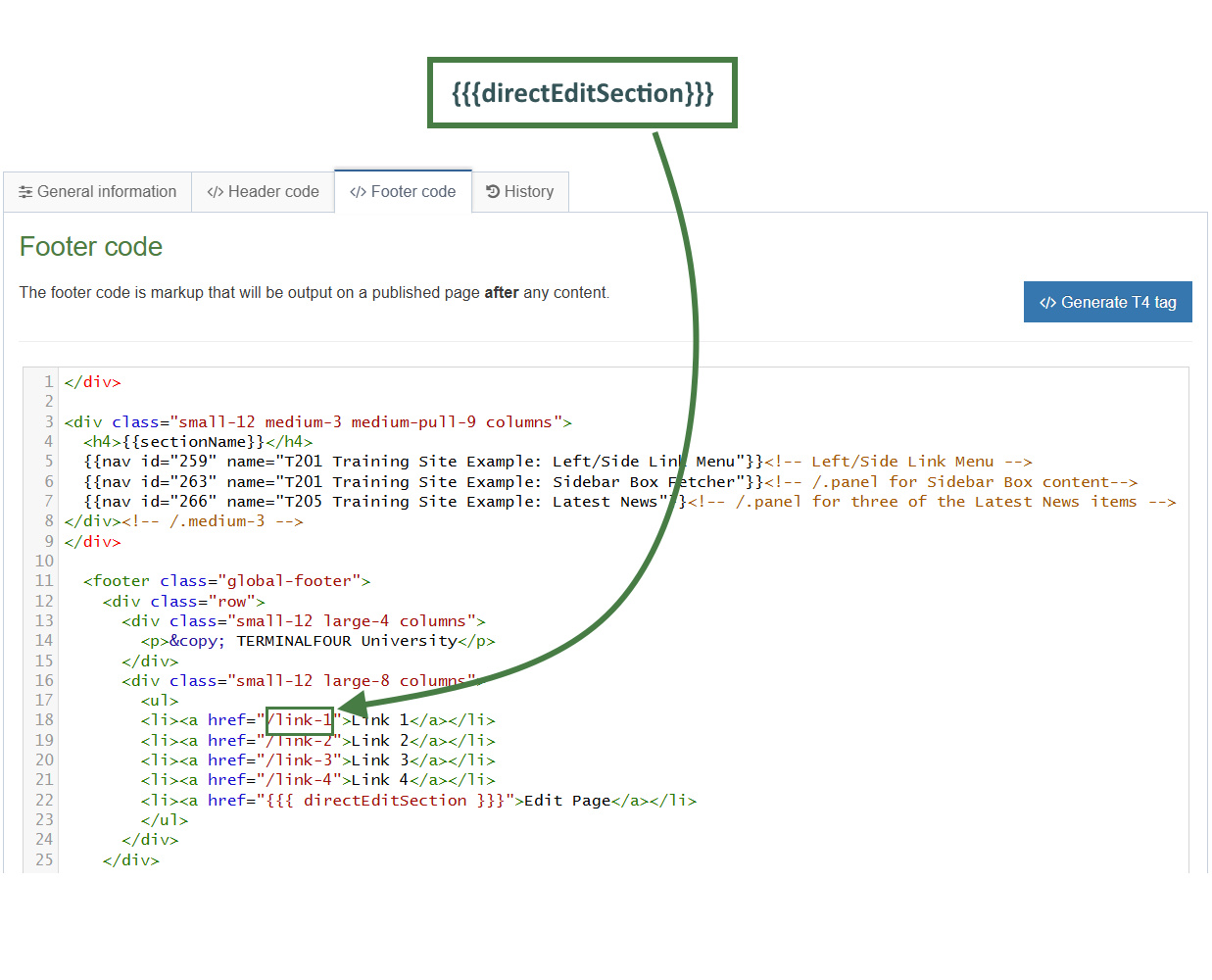
How to edit content from published site
- Go to Assets > Page Layouts
- Click your page layout’s name to edit it.
- Go into the </> Footer code tab.
- Click on the </> Generate Handlebars Expression button.
- Open the Section tab.
- Section links: select the Direct edit section link radio button.
- Click Copy to clipboard to copy the Handlebars expression.
- Locate the "Link 1" link as highlighted above and paste in the Handlebars expression into the "href" attribute as indicated above.
- The handlebars expression you generated should look like this:
{{{directEditSection}}}
- Click Save changes. The link is now complete. Preview your site to check the result. If you have a preview open already, simply refresh that one. Otherwise, you can preview the site from the Site Structure screen.
Approve content
- When content is added to Terminalfour, it needs to go through an approval process before it can be published; only published content will be visible on your website.
- The content you have created so far is all pending approval. Ensure your content is approved.
A note about Approving Content
> Approval of content can also be done from the Direct Edit screen.
> If selective approval is enabled, you can approve content by checking the Approve box beside the content and then clicking on Approve.
> The Approve Content screen will refresh itself periodically; the refresh rate can be set in Configuration.
> If content is assigned to a workflow, approving the content will advance it to the next step. Fast Track is an option available to Administrators allowing you to by-pass any further steps in the workflow and brings the content straight through to completion of the Approval workflow.
How to approve content
- To approve content, go to Content > Approve content.
Content status color code
 Approved Content
 Pending Content
 Inactive Content
- Use the Filter tool to filter for the items you wish to approve.
- Click Approve if you are happy to approve content; otherwise, click Reject.
- When content has been rejected, a Reject Reason can be added to explain the decision.
- Once content has been approved, it will disappear from the main list.
- In the Site Structure, the approved content appears in the green column
Workflow
- By default, content goes through an approval process in Terminalfour. Moderators + can approve content in sections they are assigned to. To specify a process for approving content, you can create workflows.
- Create a workflow to ensure all content added using your content type for generic content is approved by you.
- Assign the workflow to your content type.
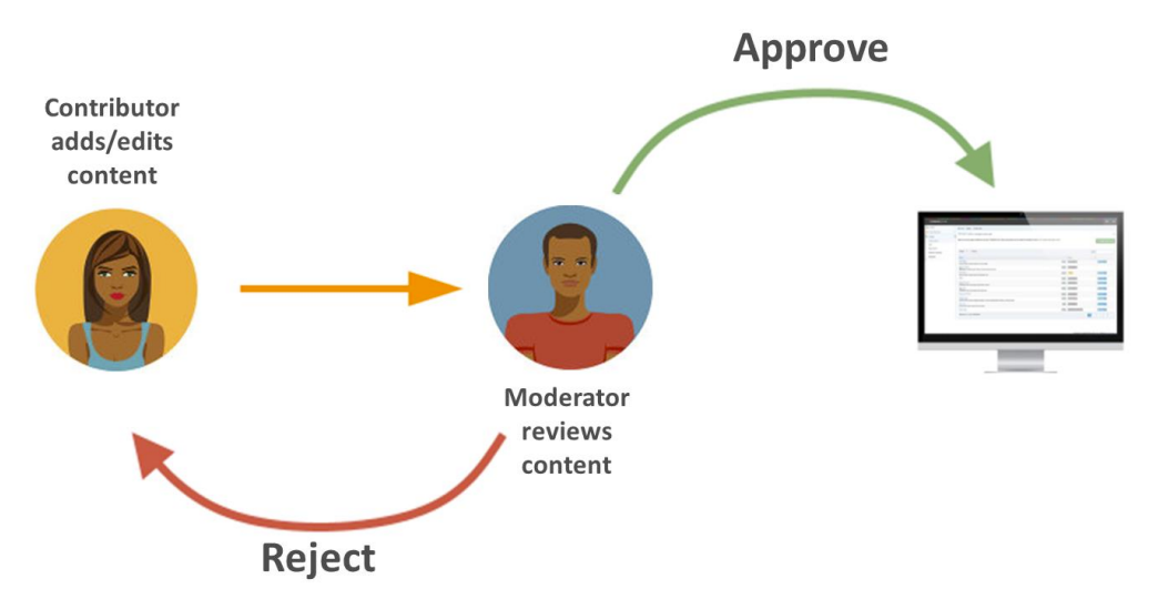
Assigning Workflows
> Workflows can be assigned to:
Sections,
Content types,
Media library categories
How to set up a workflow
- To build a workflow, go to Administration > User rights & roles > Workflow > Add new workflow
- Give your workflow a Name and Description and assign to your group; then click Save changes.
- The Steps tab appears. Click Add new step to add the first step to your workflow.
- Give your step a Name and Description.
- Select the Step priority; approvers can sort content by Priority in the Approval list.
- Check the box Restrict to editors if you wish to restrict the users who can review/approve this step to those who have editing rights to the content.
- Configure users:
Select the users or groups to be involved in this step. - Optional settings:
Select the radio button to specify what happens to a piece of content if it is rejected.- Content owner: will reject content back to the content owner.
- Last modified by: will reject content back to the person who last modified the content.
- Step X: send the content to a step within the same workflow and select the step.
- Different workflow: from a drop-down menu you can select a different workflow to send the content to.
- Do nothing: use this option if you do not wish to reject the content to anyone; content will therefore remain in the Approval list.
- Step approval settings:
If there is more than one approver in a workflow step, approval of content can be put to a vote; select the radio button for the option you wish to apply.- All moderators: if selected, all the approvers in this step will need to vote to approve the content.
- Majority: content will only be approved once a majority of approvers have approved the piece of content.
- X number of moderators: determines how many approvers will need to approve the content in order for it to be approved in this step; set a number by entering it into the field.
- Content owner: if selected, only the content owner can vote to approve content; this option requires that a content owner has been set. If no owner is set, the content may only be approved by an administrator.
- Enable active moderation if checked, the vote count will be for both approval and rejection with content being either approved or rejected once the configured “X” number has been reached.
- Notification settings:
Email alerts can be sent to content owners or those involved in the workflow step during the approval process. Avoid selecting all options as this generates large quantities of emails.- Start: an alert is sent to the content owner or those involved in the workflow step when a piece of content enters a step they participate in.
- In progress: an alert is sent to the content owner or those involved in the workflow step when a piece of content is either approved or rejected.
- End: an alert is sent to the content owner or those involved in the workflow step when a piece of content is either fully approved or rejected, hence completing the current step.
- User alert settings:
Specifies who receives alerts and notifications by email.- Content owner: this informs the content owner when any of the above alerts or triggers are fired.
- Step moderators: this informs any of those involved in the workflow step when any of the above notifications are sent.
- All content owners and moderators: this informs content owners and any of those involved in the workflow step when any of the above alerts or triggers are fired.
- Click Save changes to add the step to the workflow.
- Click Add new step to add a further step to the workflow if required, otherwise click Save changes.
- To assign the workflow to your content type, go to Assets > Content types > Edit your content type.
- From the Workflow drop-down list, select your workflow.
- Click Save changes.
Accessibility Report
- In Terminalfour 8.4.2 we announced a newly redeveloped accessibility reporting tool.
- This tool allows users to test any page in the Terminalfour Platform that they have access to to ensure that it meets WCAG 2.2 AA standards.
Accessibility is a crucial aspect of web design and content management, ensuring that all users, regardless of ability, can access, understand, and engage with digital content.
Adhering to accessibility standards not only enhances user experience but also broadens your audience reach while fulfilling legal and ethical responsibilities. Our new accessibility reporting tool is designed specifically for the Terminalfour Platform to streamline this process. By identifying and highlighting non-conformances with established accessibility guidelines, this tool empowers users to create inclusive content, making it easier to meet compliance standards and support diverse user needs.
Accessing the report
The report can be accessed from multiple places.
- Click on the Site structure icon.
- From the Sites structure screen, click on the Actions menu on a section.
- Select Accessibility report.
- If you need to run the report against a fulltext content item, you can do so by clicking the Actions menu on a piece of content and selecting Accessibility report.
- From Direct Edit, click the Accessibility icon in the left menu.
The report will show the same information about the accessibility of your page, regardless of where you open the report from.
The report is generated immediately when a report is opened. Meaning you can fix a problem and reopen the report and it will immediately reflect the change.
When the report is open you can navigate between pages and the report will updated to reflect the current page being viewed.
What's in the report?
When the report opens you'll see a split page view.
On the right, you'll see a preview of the page the report is run against.
On the left, you'll see the report itself which includes:
- The title of the the page or content item being reviewed
- The path to that section within the Terminalfour Platform
- The published page URL for the page being reviewed
- The total number of violations found on the page
- The total number of "Review items" found on the page
- Review items are items that the tool couldn't automatically confirm were meeting accessibility guidelines and need manual review
- A filter system allowing you to filter violations by severity
Below this, you'll be shown a list of all of the violations on the page.
For each violation you'll be shown:
- The name of the accessibility violation (as defined in the WCAG Guidelines)
- The severity of the violation (as defined in the WCAG Guidelines)
- A link to an external site where you can learn more about this violation and how to fix it
- A list of the elements in the page that contain the violation
- You can click the "Highlight" button to scroll that element into view on the right and highlight it with a red border
- Suggested fixes for how you can address the violation
Publish
- Once Content has been approved, it still needs to be published before the content will appear on the website.
- Publish the channel you have been working on. The trainer will advise you of the published URL.
How to publish your website
- To publish your website, go toSites & Channels > Publish Channels
- Locate your channel and select Enable publish
- Click Publish channels to publish.
- You can also create a publish schedule by clicking Schedule publish.
- Next due: use the calendar to select the next publish date and time.
- Execution interval: select the frequency of the scheduled publish.
- Channel: set the channel to publish.
- Publish archive sections: check the box to force a publish of archived sections.
- Override publish period restriction: if your channel has a publish period restriction on fulltext content check this box to override the restriction.
Feedback survey
Congratulations on completing the Terminalfour for Implementers training course.
Please provide feedback in our on-line survey.