Lists
Description
A List is a collection of items with a meaningful grouping or sequence. When used as part of a Content Type, a List allows a user to select one or more of the items within it as an option. For example, if news articles on your site are categorized as "Sport", "Weather" and "Current Affairs", you would create a List with these three categories and add it to a "News Article" Content Type. When a news article is created, the user selects one (or more) of the categories.
Lists can also be used with selective output to apply a class to display or hide an HTML element such as a disclaimer.
When Are Lists Used?
We use Lists when we want to restrict the content items that can be input in a Content Type. In the example above, instead of leaving it to the user to input (and possibly misspell) text for a news category, the options are pre-defined for the user. List items can be added as needed by a user with the access rights to edit that List.
How Are Lists Used?
When a List has been created and populated it is added to a Content Type. There are six Content Elements types that can be used with Lists:
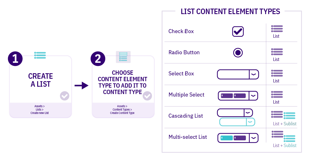
| Item | Description |
|---|---|
| Check Box | Multiple items can be selected |
| Radio Button | One item can be selected |
| Select Box | One item can be selected from a dropdown list (good for long lists) |
| Multiple Select | Multiple items can be selected from a dropdown list |
| Cascading List | One item can be selected from a dropdown list; for items that have a related Sublist, a second drop-down menu will appear below it listing items from that Sublist |
| Multi-select List | Items can be selected from both the List and the Sublist |
Who Can Create a List?
Administrators can create Lists which are accessible Globally or within a Group. Power Users can create Lists within their Group(s).
Power Users cannot create or modify Global Lists. They can only use Global Lists, or Lists in Groups to which they belong when creating Content Types.
List Listing Page
To work with Lists, go to Assets > Lists. All List names and descriptions that the user has rights to edit and/or view (i.e., Global Lists, and Lists that have been shared with the Power User's Group(s) as read-only) are listed in the table with the Asset ID and the Group that the List belongs to. If you have a lot of Lists, use the Filter box to filter by List name, description, ID or Group.
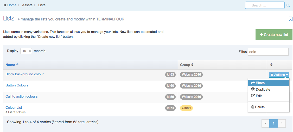
The columns in the table are Name, Group(s) and the Actions button:
| Item | Description |
|---|---|
| Name | Contains List name, a brief description (if one has been provided), and the List ID number. The arrow in the header row can re-order the list alphabetically. |
| Group | Shows the Group(s) the List belongs to. If the List is shared with one other Group or more, you'll see a + and the number of Groups it's shared with. To see a list of those shared Groups hover over the + symbol. |
| Action Menu Button | Provides options to Share, Duplicate, Edit, and Delete. The Share function is not present where the Group designator is "Global," however, you can move a global List to a Group by Editing the List and selecting a Primary Group. |
Create New List
When you select Add New List the List Information screen is displayed:
| Item | Description |
|---|---|
| Name | This is a mandatory entry. Give your List a name - it is recommended to make the name as descriptive as possible. |
| Description | This is an optional entry. This is used by the filter on the Lists listing and can be useful for finding Lists. |
| Localization |
For multi-language sites, if the List is available in more than one language, you can use the localization options to:
|
| Primary group |
Select a Primary Group for this list. Grouping and sharing Lists restricts the users that can use or edit the List. It is good practice to add all your assets to Groups. This makes it easier to identify which assets are being used and where. By grouping assets together, you can also restrict access to them. When a user is not part of the Group, they cannot see or access assets in that Group. |
| Shared groups |
This table has three columns. Click on Add row, to share with a group:
The Remove button removes the List from the group. |
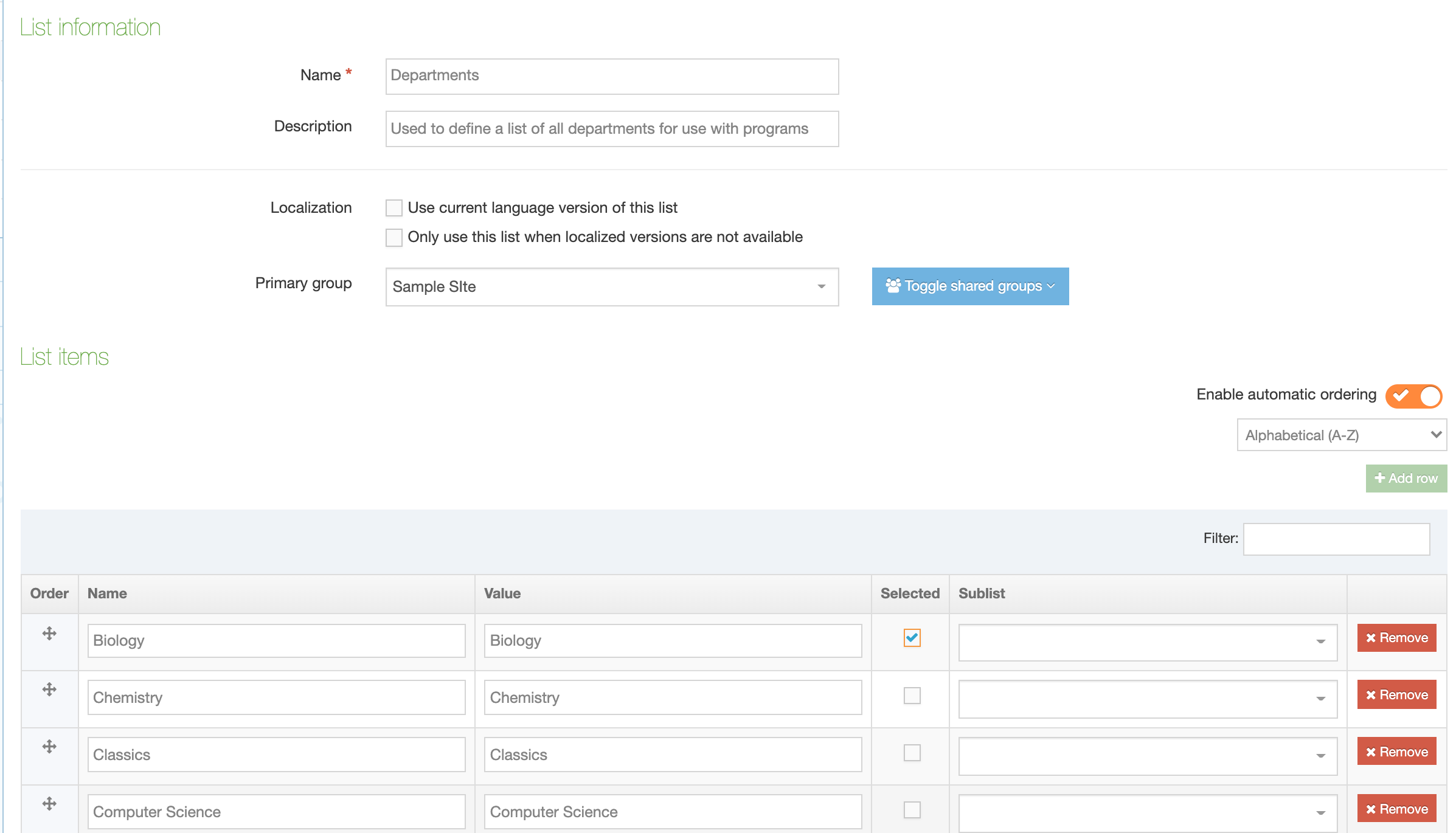
List items
List items can be added below the List Information options.
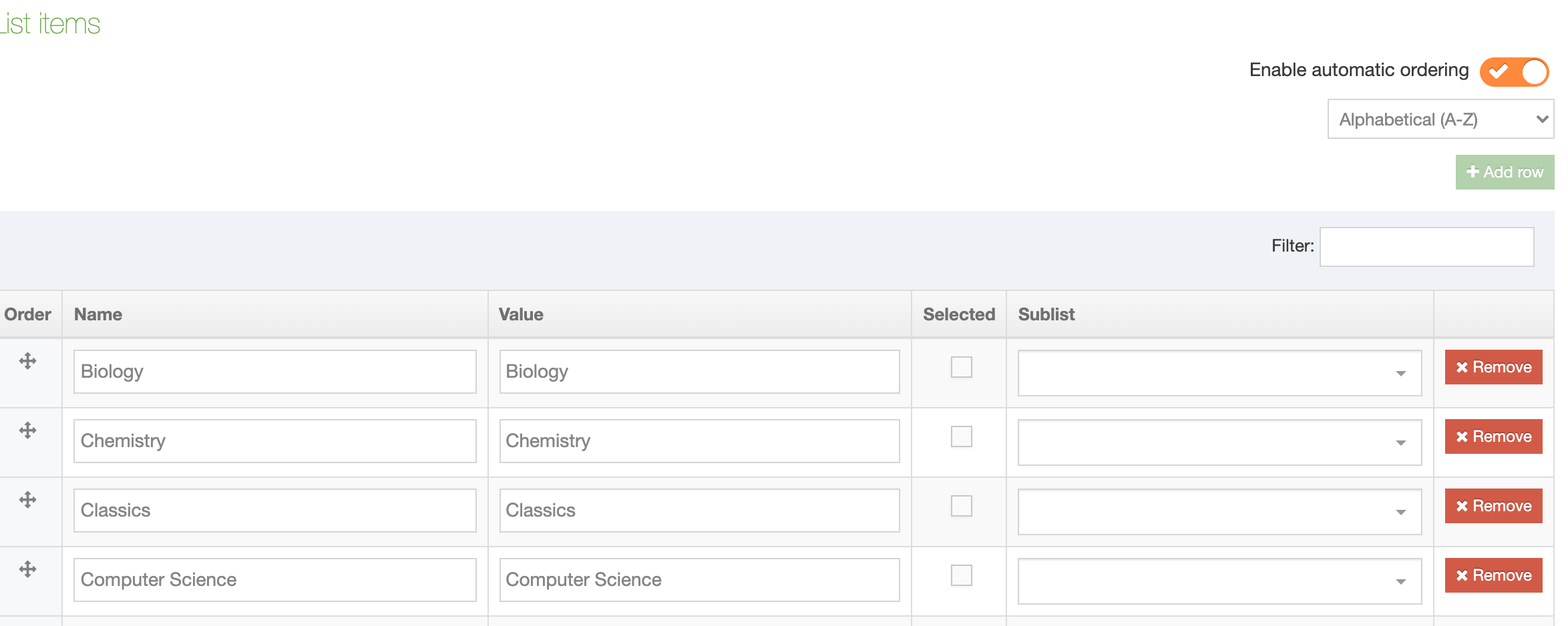
Each row contains:
| Item | Description |
|---|---|
| Order | Lists Items can be re-ordered using the move icon |
| Name | The name is used as the label when you are creating or editing content |
| Value | This is what will be published on the site. For example, the List Item Names could be abbreviations used internally within an organization and will be used when creating content, while the Values would be more widely understood equivalents that are published on the site |
| Selected | When checked, this item will be the default selected item in the Content Type Element. More than one item can be selected, though Content Type Elements which only permit the selection of one item, like Radio Buttons, will only pre-select the first item selected in the List |
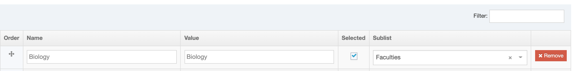
| Sublist | List items may have sub-categories that you want to link them to. Sublists are used with Cascading and Multi-select Content Type Elements |
| Remove |
Select Remove to remove a List Remove does not delete the List until you click Save changes. If you navigate away from this page before you click Save changes, the List will still be present. |
In this example, the List comprises university departments. Since "Biology" is the largest department, it is selected by default:
We can also add Sublists – another existing List that you want to associate with this a List Item:
Re-ordering List Items
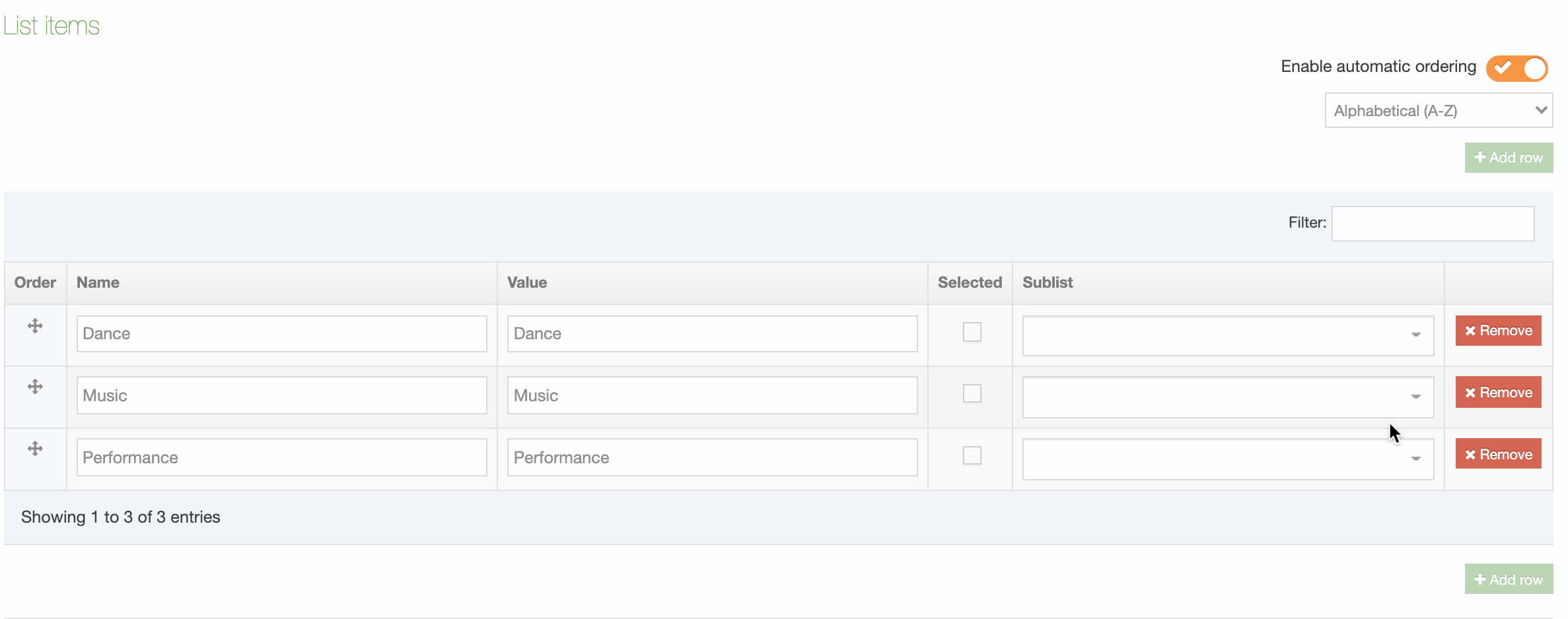
From version 8.3.11 you can re-order List Items. If you have upgraded from a previous version of Terminalour, all List Items will be ordered alphabetically. In previous versions, Items were ordered as entered and could not be re-ordered.
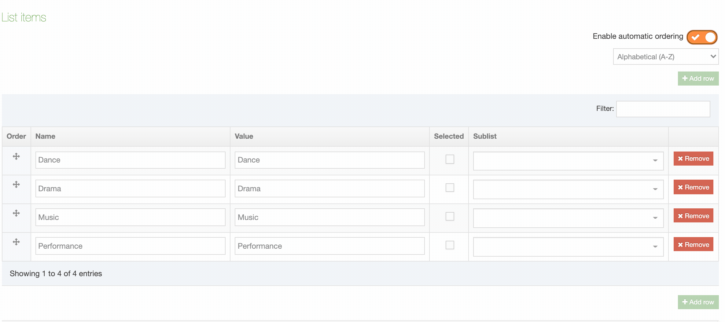
Lists are alphabetically ordered by toggling "Enable automatic ordering" to on. Automatic ordering can order alphabetically A-Z or Z-A:
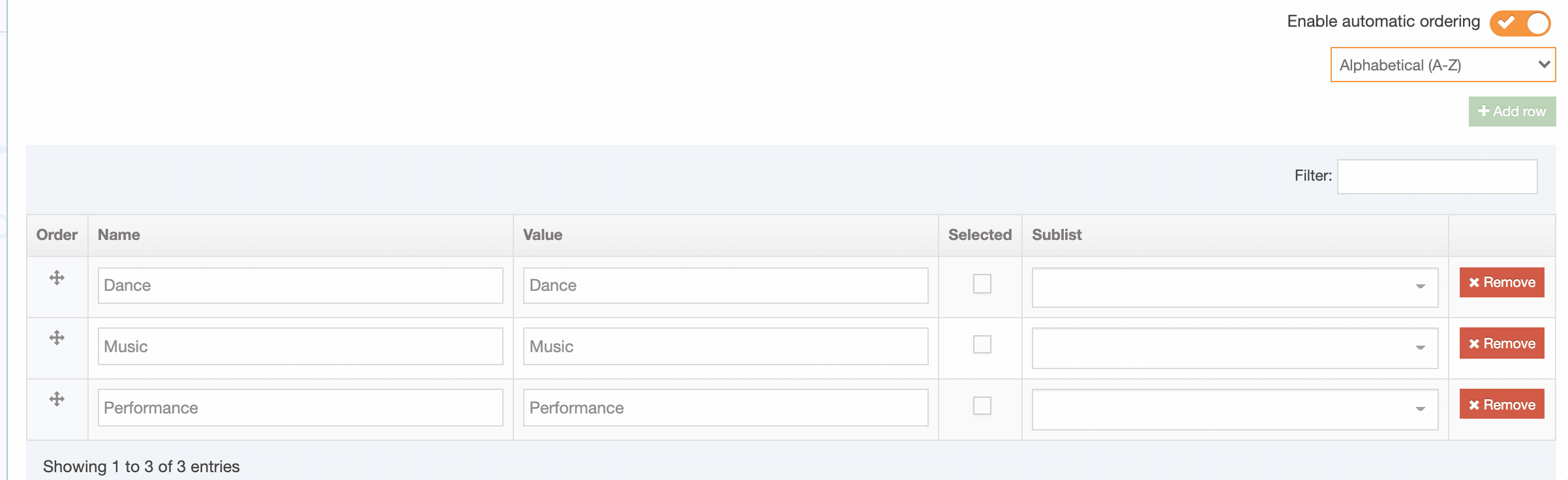
Add row
While "Automatic ordering" is enabled the "Add row" button can't be clicked. When "Automatic ordering" is disabled the alphabetic ordering is preserved and you can add a new row. Enable "Automatic ordering" again to re-order the List and the added Item(s) alphabetically.
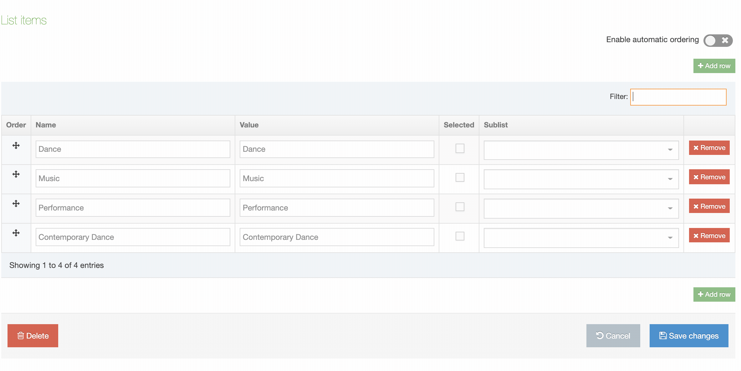
Manually re-order List Items
To manually re-order List Items disable "Automatic ordering" and using the move handles in the Order column to move the item:
Manual re-ordering is disabled when a filter is applied to the List:
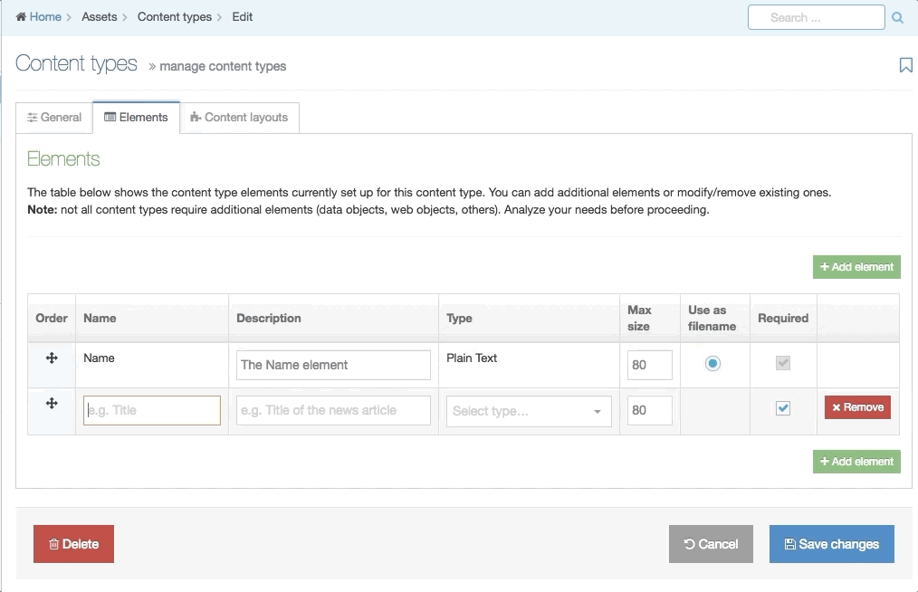
Using a List in a Content Type
In a new or existing Content Type, go to the Elements tab and select Add Element. Give the Element a name and set the Type to one of the Element Types that are used with Lists. In this example, Radio Button is selected. A drop-down menu will appear below from which you can select the List:
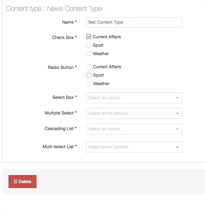
This example shows how the different List Content Elements behave in a Content Type. Since "Sport" has a Sublist, items from that Sublist can be selected in the Cascading and Multi-select List:
Share a List
Global Lists can be used by any Power User when creating a Content Type but can only be edited by Administrators. Power Users and Administrators can create Lists within groups or share Lists with other groups. The List can either be shared with Read-only or Full access:
- Read-only access: Power Users within the group can view the List but cannot edit it
- Full access: Power Users within the group can view and edit the List
Regardless of how the List is shared, all Power Users within the group can use the List within a Content Type.
A Global List cannot be shared with Groups; however, you can move a global List to a Group by Editing the List and selecting a Primary Group.
Duplicate a List
You can duplicate a List. Do this either into a new Group or the same Group or with other Groups. A duplicate List creates a copy of the original and the two Lists are not linked to each other.
Changes made to one List do not affect duplicated versions. Sharing and Duplication are two different functions.
Delete a List
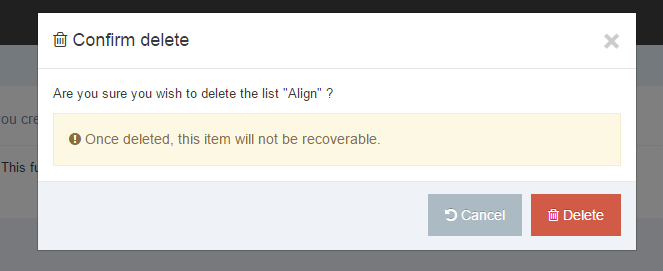
In the row of the corresponding List, open the Actions drop-down list and select Delete.
A confirmation pop-up window appears and you can confirm your choice and Delete, or Cancel the action. Upon successful deletion, a green banner appears confirming the deletion, and the List is removed from the list.
When a List is deleted you cannot recover the data.
Automatically Mirror Content with a List
To mirror a Content Item to other parts of your site when it's approved you can use the Auto Content Mirroring feature. This will mirror content based on the value(s) selected from a Content Type's List element (an Auto Mirroring List).
With an Auto Mirroring List, the entries in the List element correspond to the Sections of your Site Structure. The List element is added to a Content Type that an end user uses to select the Section(s) that the Content Item will be mirrored to.
The Content Item is only mirrored when the source content is Approved. If the Content Item already exists in the designated Section or its parent Section, it will not be re-mirrored. If there a Workflow is used, the mirroring will take place when the final step in the Workflow has been completed.
In order to set up Auto Content Mirroring, you need to do the following:
- Create a List
- Add the List as an Element to a Content Type
- Navigate to System administration > Hierarchy & content settings > Content
- Check the Enable auto mirroring of content option (if it is not already checked)
- For the List created above, check the Use as auto mirroring list option
- For each List value, select the Section that the Content Item will be mirrored to
- Save changes
- Add a Content Item using the Content Type and select an option from the List. Once the Content Item is approved, it will mirror into the relevant Section(s).
The content will mirror to the selected Sections in the List even if the person approving the Content Item does not have access to those Sections.
If the mirrored Content Item is deleted from a Section, the corresponding Content Element will be automatically updated, to reflect that the user has decided that the Content Item should no longer be mirrored there (i.e. the selected option will be de-selected).
If a user deselects a designated Section when modifying the source Content Item – in the case where the Content Item has already been mirrored – the mirrored Content Item will not be deleted.
If Sections are removed from the original List, Content Items which had been mirrored into those Sections will not be removed.
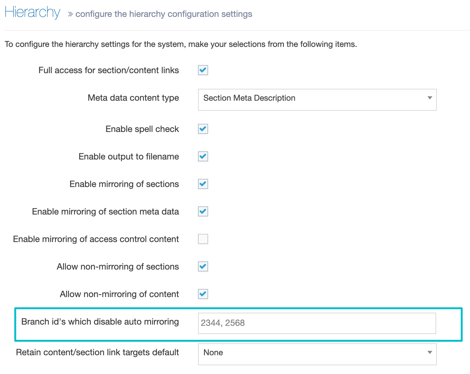
Disabling auto-mirroring for certain branches
It is possible to disable auto-mirroring when the source Content Item resides in certain Sections or Branches by configuring the Branch id's which disable auto mirroring option at System Administration > Hierarchy & Content Settings > Hierarchy.