
Retrofitting Handlebars, Conditionals and Repeaters to your existing implementations
The introduction of Handlebars, Repeater Elements and Conditional Elements functionality in version 8.4 has improved the developer and content editing experience for users. But how do you make use of these features in your existing Content Types?
This training module will guide you step by step through retrofitting Repeater and Conditional Elements into existing Content Types and Page Layouts, along with key considerations to keep in mind along the way.
Introduction to Handlebars
Handlebars in Terminalfour is implemented using handlebars.java, a Java implementation of the widely used handlebars.js templating engine. Because Handlebars is an open-source templating standard adopted by many frameworks and platforms, many developers are already familiar with its syntax and functionality. This makes it easier to create and maintain reusable templates within Terminalfour.
How Handlebars works
Instead of hard-coding values into your HTML, you create a template with Handlebars expressions. These expressions are enclosed in double curly braces ({{ }}).
For example, the template:
<h1>Hello, {{publish element="Name"}}!</h1>
<p>You have {{publish element="Message count"}} new messages.</p>
contains two expressions: {{publish element="Name"}} and {{publish element="Message count"}}.
When the template is run, Handlebars replaces each expression with the corresponding value from the data provided.
Key advantages of using Handlebars
- Separation of content and logic: Keeps HTML templates separate from application code, making projects easier to organize and maintain.
- Reusable templates: Supports partials and reusable components, reducing duplicated code and improving consistency.
- Easy to read and write: Uses simple placeholder syntax (
{{ }}), making templates accessible to both developers and non-developers. - Dynamic content: Automatically inserts data into templates, allowing the same template to generate different outputs.
- Extensible: Custom helpers can be created to add formatting and other reusable functionality.
- Improved maintainability: Changes to the layout or presentation can often be made in the template without modifying the underlying application logic.
What is a Helper?
A helper is a function that you can use within a template, such as a Page Layout or Content Layout, to perform a specific task, process data, or output a value. For example, helpers can format dates, convert text to uppercase, or display the contents of Content Elements.
Terminalfour includes a wide range of built-in helpers that you can use when creating Page Layouts and Content Layouts. These helpers simplify common tasks, reduce the amount of custom code required, and make your templates easier to maintain.
To learn about all available built-in helpers, see the Getting Started with Handlebars page in our Knowledge Base.
The Handlebars Expression Builder
Terminalfour 8.4.2 introduced a new UI to help you generate Handlebars Expressions. The expression builder helps you generate the most commonly used Handlebars Expressions.
Handlebars Expressions can be added to Page Layouts and Content Layouts using the Generate Handlebars Expression button from Page Layouts and Content Types.
The "Generate Handlebars Expression" button is visible when the Layout Processor is set to "Handlebars".
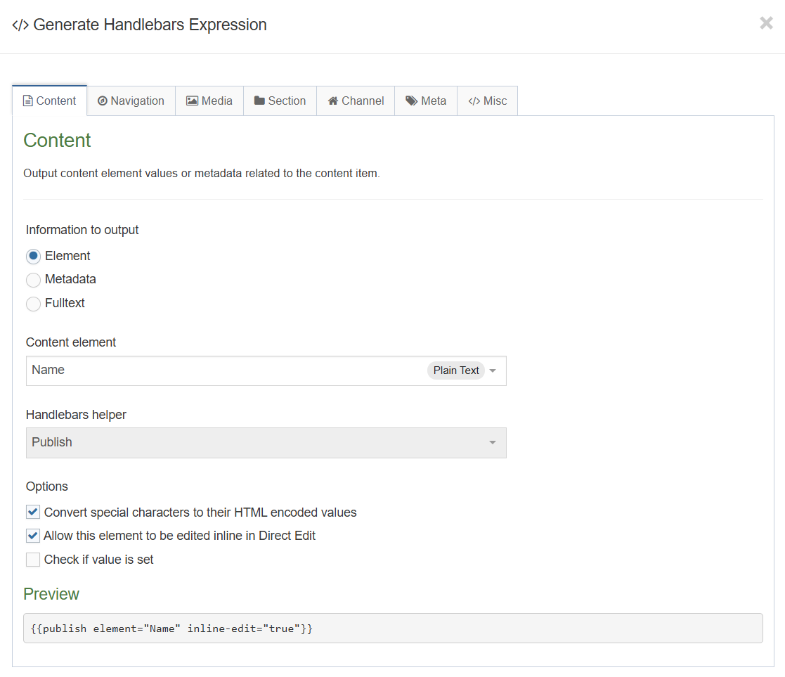
Different types of expressions
An expression is any content enclosed within double curly braces ({{...}}). An expression can contain a variable, a helper, or a combination of both. During template rendering, Handlebars evaluates each expression and replaces it with the corresponding output in the final HTML.
Standard expression
{{publish element="Title"}}
{{sectionName}}
Block-level expression
A block-level expression is an expression that uses both an opening tag and a closing tag, similar to HTML tags, to define a section of content. The content enclosed within the block is processed according to the expression's logic. Block-level expressions are commonly used to control how content is rendered, such as by applying conditional logic, repeating content in loops, or executing custom processing for everything contained within the block.
{{#preview}}
<p>This will only get output when the page is previewed.</p>
{{/preview}}
Common use cases:
Conditionals
Display a value only when a specified condition is true.
{{#ifSet element="Heading"}}
<p>This is only output if the Heading element is set</p>
{{/ifSet}}
Loops
Iterate through an array and output data for each item
{{#each (list element="Department")}}
<p>Department name: {{name}}</p>
{{/each}}
Subexpression
A subexpression is an expression contained within another expression. Use a subexpression when you need to perform a helper function or calculation as part of a larger expression. Subexpressions are enclosed in parentheses.
{{upper (publish element="Title")}}
Double stashing and triple stashing
Handlebars provides two ways to output values in a template: double stash ({{...}}) and triple stash ({{{...}}}).
- Double stash (
{{...}}) automatically HTML-escapes the output. This means special characters, such as<,>, and&, are converted to their HTML-safe equivalents before being rendered. Use double stash for most content, especially user-provided data, to help prevent unintended HTML rendering. - Triple stash (
{{{...}}}) outputs the value without HTML escaping. If the value contains HTML markup, it is rendered as HTML rather than displayed as plain text. Use triple stash only when the content is trusted and is intended to include HTML.
Handlebars
Handlebars escapes HTML by default when using double-stash ({{ }}) syntax. Special characters like <, >, and & are converted to their HTML entity equivalents.
T4 Tags
Traditional T4 tags output content exactly as entered — no HTML escaping occurs. If a user enters <h2>Test</h2> into an element, that markup is output as-is and rendered as HTML.
Unlike Handlebars' double-stash, which escapes HTML automatically by default, T4 tags never escape anything unless you explicitly add a modifier. The relevant one is:
- htmlentities — Converts un-encoded special characters to their HTML equivalent (e.g. < → <), same outcome as Handlebars' default double-stash escaping.
- striptags — Removes HTML tags entirely (a different behaviour — not escaping, but stripping).
These are typically used together in a T4 tag like:
<t4 type="content" name="Heading" output="normal" modifiers="striptags, htmlentities" />
- Double-stash {{publish element="Title"}} → escapes the output. If the user entered <h2>Test</h2>, it renders literally as text <h2>Test</h2> on the page rather than as actual HTML.
- Triple-stash {{{publish element="Title"}}} → does not escape the output, behaving like a traditional T4 tag. The value <h2>Test</h2> would render as an actual <h2> heading.
Common use cases for triple-stashing
- If you need to output the data as HTML (for example, if you're using a HTML element)
{{{publish element="Main body"}}}
- If it's a Plain text element being used to output "Code" then you would use triple curly braces {{{ }}}.
{{{publish element="Code"}}}
- Outputting a file from the media library (images, css, javascript, etc.)
{{{media id="123" layout="css/*"}}}
Error handling
Like with standard T4 tag based layouts and programmable layouts it's possible to configure things incorrectly and get undesired or unexpected results.
Preview & Direct Edit
When an error is encountered with a Handlebars layout during Preview or Direct Edit we output an inline error message on the page to users.
This error is in the form of a table and displays the following info:
- The Section ID where the error is occurring
- The asset language
- The Content ID (if applicable)
- The error message
- The content layout name (if applicable)
- The layout code (if applicable)
This should give you enough information to find out where the problem exists so you can debug.
Example:
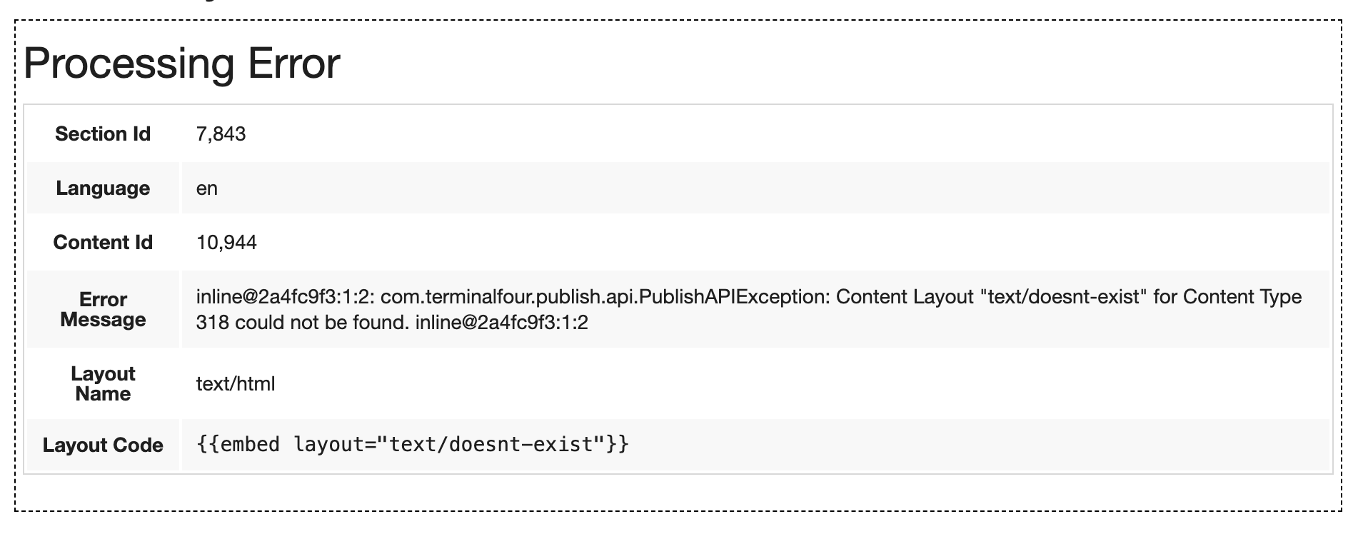 Publish
- When a Publish happens and an error is encountered:
- The publish stops to prevent breaking the live site.
- This means if you accidentally introduce a breaking error in your Content Type or Page Layout, we'll prevent that error from getting pushed to your live site and ultimately breaking a significant portion of your web pages.
- When the publish fails it does so with very clear messaging in the logs explaining the reason for the failure.
Example
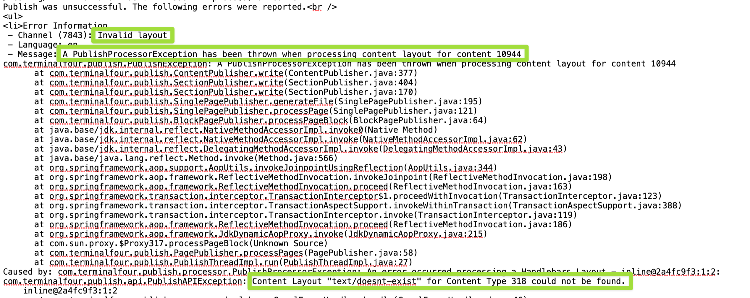
Using the try helper
The try helper (available since Terminalfour 8.4.3) wraps a block of layout code so that if a Handlebars error occurs inside it, the error doesn't cause the entire Preview or Publish to fail. Instead, Terminalfour skips the failing block and continues processing everything after it.
By default, if an error is encountered anywhere in a layout, a publish will fail outright — this is intentional, so your live site doesn't break from Handlebars errors. Wrapping risky or "in-progress" code in a try block lets you safely continue developing new layouts without affecting your live publish.
Basic usage:
{{#try}}
{{/try}}
With error debugging (else block):
You can add an else block to output debugging info if an error occurs. Two special variables are available inside it:
- @error — details about the error that was encountered.
- @output — everything that was already processed in the try block before the error happened.
{{#try}}
{{else}}
{{/try}}
Terminalfour recommends using try particularly when working on new layouts where errors are more likely, since it prevents a small mistake from breaking the whole publish.
Related tip: for tracking down warnings/debug logs during development, there's also a captureLogs helper that outputs log messages inline — but this should be removed before going live.
Training Site Setup
Begin by setting up your training instance to complete the exercises in this course. Follow your trainer's instructions to configure your site structure, duplicate an existing Page Layout, and create a channel for your training website.
Complete the following setup tasks for your training website:
- Navigate to the training site by opening up the following URL in your web browser: https://training.terminalfour.net/terminalfour/login.jsp
- Log in using the username and password provided by your trainer.
- Create a site structure that includes a parent folder named with your name and a Home section beneath it.
- Create an additional section, such as About or News, as a child page branching from the Home section.
- Duplicate the HCR Training Site Example: Main Layout Page Layout.
- Create a channel for your training website.
- Reset the content on your channel, navigate to Administration > Set up Sites & Channels > Channels, select the required channel, and then choose Reset content.
Page Layout conversion
Before updating the Page Layout to use Handlebars, change the layout processor to Handlebars Page.
How to update the layout processor
- Go to Assets > Page Layouts.
- Click your Page Layout name to edit it. (Use the Filter tool to search).
- General information tab:
- Name: the name assigned to your Page Layout.
- Description: the description of your Page Layout.
- File Extension: Default - unless this is used with a different File Extension. This requires other extensions being permitted in the Channel.
- Syntax Type: HTML/XML – this determines which syntax is highlighted.
- Layout processor: update the layout processor to Handlebars Page.
- Primary Group: restricts the availability of the asset to this group.
- Click Save changes to save the changes to your Page Layout.
- Update your preview to check the result.
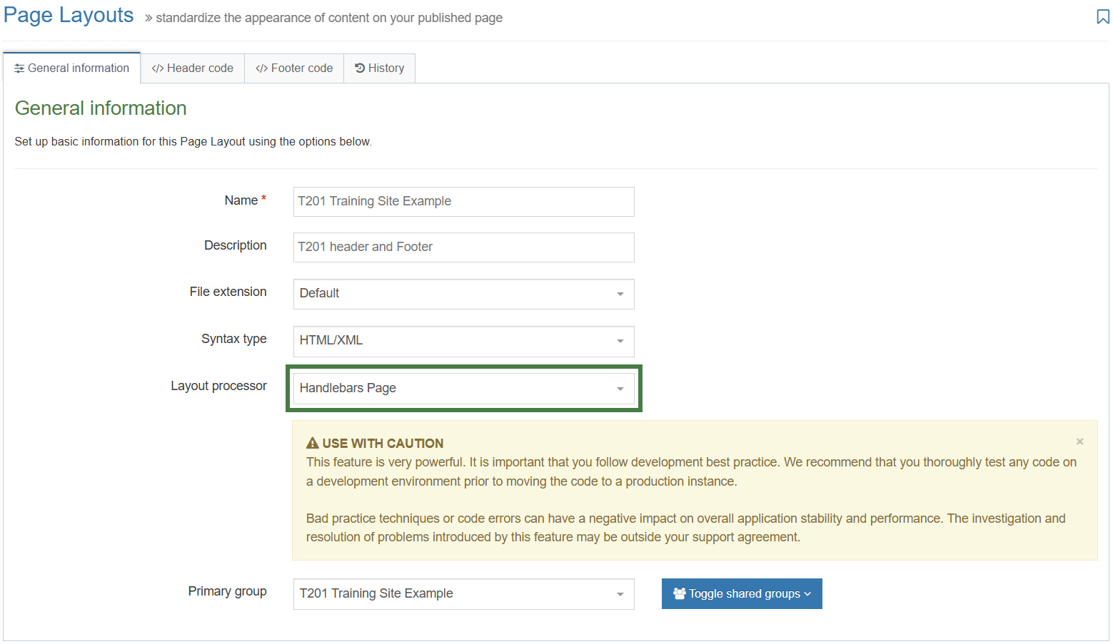
Preview the page and observe the result. After changing the layout processor to Handlebars Page, the browser no longer renders values for the remaining T4 tags in the Page Layout. This is because T4 tags are processed by the Terminalfour publishing engine and have no meaning to a web browser.
When setting the layout processor to Handlebars Page, you can no longer use T4 tags in the layout.
Your next task is to replace the remaining T4 tags with the appropriate Handlebars expressions so the page can be rendered correctly.
Open the Page Layout and navigate to the Header Code / Footer Code tabs. Use the search function (Ctrl+F) to search for <t4 and locate the remaining T4 tags that need to be converted to Handlebars expressions.
Your search should return the following T4 tags.
Header code tab:
- <t4 type="title" />
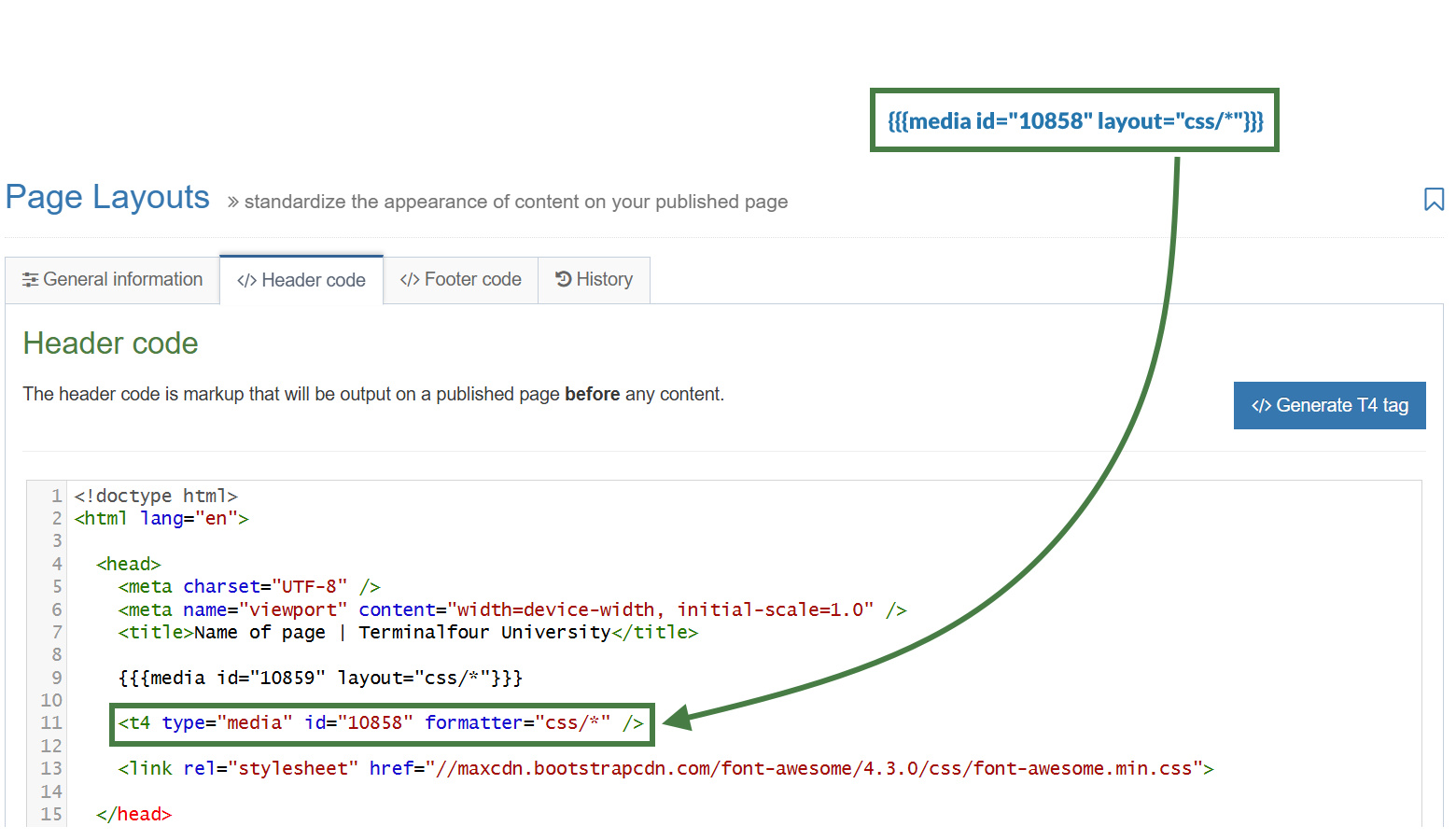
- <t4 type="media" id="10859" formatter="css/*" />
- <t4 type="navigation" name="T201 Training Site Example: Main/Top Link Menu" id="258" />
Footer code tab:
- <t4 type="title" />
- <t4 type="edit-page" action="direct-edit" text="Edit this page" />
These are the remaining T4 tags that need to be converted to their equivalent Handlebars expressions.
How to output the section name with Handlebars
- Go to Assets > Page Layouts.
- Click your Page Layout name to edit it. (Use the Filter tool to search).
- Open the </> Header code tab.
- Click on the </> Generate Handlebars Expression button.
- Open the Section tab.
- Section metadata: leave Section name selected. This option uses the
sectionNamehelper to output the name of the current section.
sectionName Helper
Used to output the name of the current section.
Usage:
{{sectionName}}
- Section metadata: leave Section name selected. This option uses the
- Copy the Handlebars expression and replace the existing
<t4 type="title" />tag as shown below:
<title>{{sectionName}} - Terminalfour University</title>
- The
<t4 type="title" />tag is also used in the footer code. Click into the </>Footer code tab and replace it there with the same Handlebars expression. - Click Save changes to save the updates to your Page Layout.
- Update your preview to check the result.
How to link to a CSS file with Handlebars
Next, you will learn how to update a T4 tag in the Page Layout that references a CSS file in the Media Library.
- Go to Assets > Page Layouts.
- Click your Page Layout name to edit it. (Use the Filter tool to search).
- Open the </> Header code tab.
- Click on the </> Generate Handlebars Expression button.
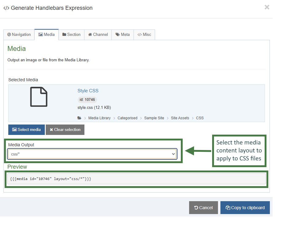
- Open the Media tab.
- Click the Select media button to open up the media library.
- Navigate to the folder where the CSS file is located and select the CSS file.
- Media Output: Select the media layout to apply to CSS files. Select css/* from the drop-down.
The Handlebars expression uses the media helper to output the CSS file.
media Helper
The media helper is a simple helper that allows you to output an item from the media library.
Usage:
{{{media id="123" layout="image/normal"}}}
- Click Copy to clipboard, then paste the Handlebars expression into your Page Layout, replacing the existing T4 tag.
- Click Save changes to save the updates to your Page Layout.
- Update your preview to check the result.
How to output the link menu with Handlebars
- Go to Assets > Page Layouts.
- Click your Page Layout name to edit it. (Use the Filter tool to search).
- Open the </> Header code tab.
- Click on the </> Generate Handlebars Expression button.
- Open the Navigation tab.
- Restrict navigation objects by type: select "Link Menu". This acts as a filter facilitating the search for your navigation object.
- Available navigation objects: find the name of your navigation object (T201 Training Site Example: Main/Top Link Menu) and select it. Once selected the expression builder will generate a Handlebars expression that uses the nav Helper.
nav Helper
The nav helper is a simple helper that allows you to output a navigation object.
Usage:
{{nav name="My Navigation Object" id="123"}}
- Copy the Handlebars expression and replace the existing T4 link menu navigation tag. The expression should look similar to the example below:
{{nav name="T201 Training Site Example: Main/Top Link Menu" id="258"}}
- Click Save changes to save the updates to your Page Layout.
- Update your preview to check the result.
How to output a link to Direct Edit with Handlebars
- Go to Assets > Page Layouts.
- Click your Page Layout name to edit it. (Use the Filter tool to search).
- Open the </> Footer code tab.
- Click on the </> Generate Handlebars Expression button.
- Open the Section tab.
- Section links: select the Direct edit section link radio button. This option uses the
directEditSectionhelper to output the path to Direct Edit.
directEditSection Helper
Used to output the path to Direct Edit.
Usage:
{{directEditSection}}
- Section links: select the Direct edit section link radio button. This option uses the
- Copy the Handlebars expression and replace the existing
<t4 type="edit-page" action="direct-edit" text="Edit this page" />tag with it, as shown below:
<li><a href="{{directEditSection}}">Edit this page</a></li>
- Click Save changes to save the updates to your Page Layout.
- Update your preview to check the result.
News Content Type conversion
Complete the following setup tasks for your training website:
- Create a News section in your site structure.
- Duplicate the HCR Training Site Example: News item Content Type.
- Enable the Content Type in your News section.
- Create a sample news story to verify that the Content Type is working correctly.
In this section, you will learn how to update a News Content Type that is built entirely with T4 tags. The News Content Type includes two distinct content layouts:
- text/html – Displays the default view, which lists available news items.
- text/fulltext – Displays the full-text view of an individual news item.
You will learn how each layout is structured and how to update them using Handlebars expressions.
How to update the "text/html" content layout to Handlebars
- Go to Assets > Content Types.
- Click your Content Type name to edit it. (Use the Filter tool to search). Open the content layouts tab.
- The content layouts tab is an area to add content layout(s) for your Content Type. Click into the "text/html" default content layout to edit it.
- Click into the General information tab.
- Name: "text/html" - this is the default Type set in the Channel. This ensures the content can be displayed.
- File Extension: Default - unless this is used with a different File Extension. This requires other extensions being permitted in the Channel.
- Syntax Type: HTML/XML – this determines which syntax is highlighted.
- Content layout processor: update the content layout processor to Handlebars Content.
- Click Save changes to save the updates to your Content Type.
- Update your preview to check the result.
.jpg)
Preview the page and observe the result. After changing the layout processor to Handlebars Content, the browser no longer renders values for the T4 tags in the content layout. This is because T4 tags are processed by the Terminalfour publishing engine and have no meaning to a web browser.
When setting the layout processor to Handlebars Content, you can no longer use T4 tags in the layout.
In the Content layouts tab click into the text/html content layout. Use the search function (Ctrl+F) to search for <t4 and locate the T4 tags that need to be converted to Handlebars expressions.
Your search should return the following T4 tags.
- The URL of the fulltext link: <t4 type="content" name="Name" output="fulltext" use-element="true" filename-element="Headline" modifiers="striptags,htmlentities" />
- The clickable text of the URL link (Heading element): <t4 type="content" name="Headline" output="normal" modifiers="striptags,htmlentities" />
- The "Release date" element: <t4 type="content" name="Release date" output="normal" date_format="EEEE, MMMM d, yyyy" />
- The "Teaser" element: <t4 type="content" name="Teaser" output="normal" modifiers="striptags,htmlentities" />
How to output the fulltext link in Handlebars
- Click the </> Generate Handlebars Expression button.
- In the Content tab:
- Information to output (select the Fulltext radio button)
- Element: the Element option is used to output elements to the page.
- Metadata: the Metadata option allows output of specific Metadata (HTML anchor, Content ID, Last Modified Date, Publish Date, etc.).
- Fulltext: used to output a fulltext link.
- Fulltext:
- Fulltext Link (Outputs a fulltext link)
- Fulltext URL (Outputs the path of the fulltext link only)
- Information to output (select the Fulltext radio button)
- Click Copy to clipboard to copy the Handlebars expression.
- Replace the T4 tag in the
hrefattribute of the link with the appropriate Handlebars expression. The resulting code should look like the following:
<h3><a href="{{fulltextURL}}"><t4 type="content" name="Headline" output="normal" modifiers="striptags,htmlentities" /></a></h3>
Notice that the fulltextURL helper outputs only the URL for the full-text link. You must also replace the T4 tag that outputs the Headline element, which provides the clickable text for the link.
- Click the </> Generate Handlebars Expression button again.
- In the Content tab:
- Information to output (select the Element radio button)
- Element: the Element option is used to output elements to the page.
- Metadata: the Metadata option allows output of specific Metadata (HTML anchor, Content ID, Last Modified Date, Publish Date, etc.).
- Fulltext: used to output a fulltext link.
- Content element: select the "Headline" element from the content element drop-down.
- Handlebars helper: this will be selected by default as the Publish Helper, used to output elements to the page.
- Options:
- Convert special characters to their HTML encoded values This is selected by default for Plain Text elements. It ensures that html characters are treated as literal text and not processed as HTML.
- Allow this element to be edited inline in Direct Edit Adds the inline-edit="true" to enable inline editing of this element in Direct Edit.
- Check if value is set This option will wrap the element with an ifSet Helper. It ensures the element outputs only if it contains data.
- Information to output (select the Element radio button)
- Click Copy to clipboard to copy the Handlebars expression.
- Replace the T4 tag within the link with the corresponding Handlebars expression. Once complete, your finished link should look like the example below:
<h3><a href="{{fulltextURL}}">{{publish element="Headline" inline-edit="true"}}</a></h3>
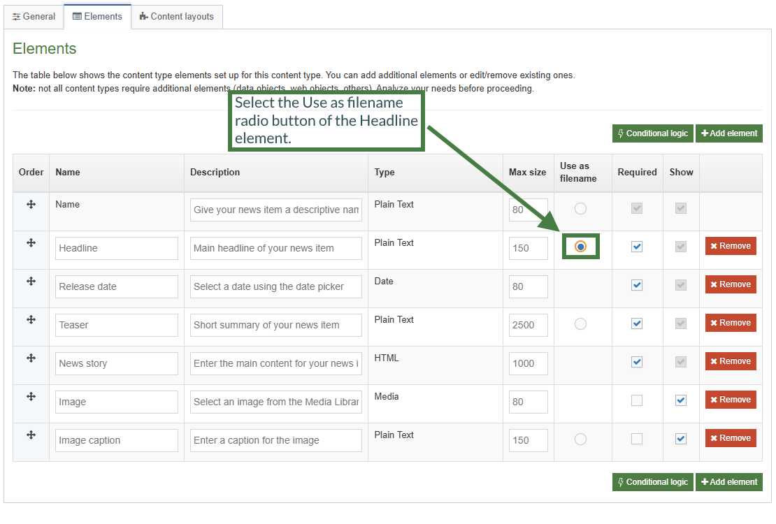
- In order to have the "Headline" element behave as a friendly URL, select the "Use as filename" radio button of the "Headline" element in the Elements tab of your Content Type.
- Click Save changes to update the Content Type.
How to output a date in Handlebars
- Click the </> Generate Handlebars Expression button again.
- In the Content tab:
- Information to output (select the Element radio button)
- Element: the Element option is used to output elements to the page.
- Metadata: the Metadata option allows output of specific Metadata (HTML anchor, Content ID, Last Modified Date, Publish Date, etc.).
- Fulltext: used to output a fulltext link.
- Content element: select the "Release date" element from the content element drop-down.
- Handlebars helper: Select the Date format Helper in the drop-down.
- Options:
- Convert special characters to their HTML encoded values This is selected by default for Plain Text elements. It ensures that html characters are treated as literal text and not processed as HTML.
- Allow this element to be edited inline in Direct Edit Adds the inline-edit="true" to enable inline editing of this element in Direct Edit.
For date elements this option is disabled as Date elements can't be edited inline in Direct Edit. - Check if value is set This option will wrap the element with an ifSet Helper. It ensures the element outputs only if it contains data.
- Information to output (select the Element radio button)
- Click Copy to clipboard to copy the Handlebars expression.
{{dateFormat (dateElement element="Release date") "yyyy-MM-dd"}}You can customize how dates are displayed by specifying a date format. For a list of supported date format patterns and examples, refer to the documentation here: Formatting Dates and Times - Replace the T4 tag with the corresponding Handlebars expression, as shown below:
<em><strong>{{dateFormat (dateElement element="Release date") "EEEE, MMMM d, yyyy"}}</strong></em>
How to output a plain text element in Handlebars
- Click the </> Generate Handlebars Expression button again.
- In the Content tab:
- Information to output (select the Element radio button)
- Element: the Element option is used to output elements to the page.
- Metadata: the Metadata option allows output of specific Metadata (HTML anchor, Content ID, Last Modified Date, Publish Date, etc.).
- Fulltext: used to output a fulltext link.
- Content element: select the "Teaser" element from the content element drop-down.
- Handlebars helper: this will be selected by default as the Publish Helper, used to output elements to the page.
- Options:
- Convert special characters to their HTML encoded values This is selected by default for Plain Text elements. It ensures that html characters are treated as literal text and not processed as HTML.
- Allow this element to be edited inline in Direct Edit Adds the inline-edit="true" to enable inline editing of this element in Direct Edit.
- Check if value is set This option will wrap the element with an ifSet Helper. It ensures the element outputs only if it contains data.
- Information to output (select the Element radio button)
- Click Copy to clipboard to copy the Handlebars expression and replace the T4 tag for the teaser element.
{{publish element="Teaser" inline-edit="true"}}
- Click Save changes to save the new content layout. The first part of the Content Type is complete.
How to update the "text/fulltext" content layout to Handlebars
- Go to Assets > Content Types.
- Click your Content Type name to edit it. (Use the Filter tool to search). Open the content layouts tab.
- The content layouts tab is an area to add content layout(s) for your Content Type. Click into the "text/fulltext" content layout to edit it.
- Click into the General information tab.
- Name: "text/fulltext" - this is the default Type set in the Channel. This ensures the content can be displayed.
- File Extension: Default - unless this is used with a different File Extension. This requires other extensions being permitted in the Channel.
- Syntax Type: HTML/XML – this determines which syntax is highlighted.
- Content layout processor: update the content layout processor to Handlebars Content.
- Click Save changes to save the updates to your Content Type.
- Update your preview to check the result.
In the Content layouts tab click into the text/fulltext content layout. Use the search function (Ctrl+F) to search for <t4 and locate the T4 tags that need to be converted to Handlebars expressions.
Your search should return the following T4 tags.
- The "Headline" element: <t4 type="content" name="Headline" output="normal" modifiers="striptags,htmlentities" />
- The "Release date" element: <t4 type="content" name="Release date" output="normal" date_format="EEEE, MMMM d, yyyy" />
- The "Image" element: <t4 type="content" name="Image" output="normal" formatter="image/normal" />
- The "Image caption" element: <t4 type="content" name="Image caption" output="normal" modifiers="striptags,htmlentities" />
- The "Teaser" element: <t4 type="content" name="Teaser" output="normal" modifiers="striptags,htmlentities" />
- The "News story" element: <t4 type="content" name="News story" output="normal" modifiers="medialibrary,nav_sections" />
Updating the T4 tags with Handlebars expressions
- The T4 tag outputting the "Headline" element needs to be replaced with a Handlebars expression. Use what you have learned to build a Handlebars expression and replace the original T4 tag for the Headline with the new expression.
- The T4 tag outputting the "Release date" element needs to be replaced with a Handlebars expression. Use what you have learned to build a Handlebars expression to output a date and replace the T4 tag with the new expression.
- The T4 tag that outputs the image: <t4 type="content" name="Image" output="normal" formatter="image/normal" /> needs to be replaced with a Handlebars expression. To make that possible, build a Handlebars expression for the "Image" element (You will make use of the media and mediaId Helpers):
- In the Content tab:
- Information to output (select the Element radio button)
- Element: the Element option is used to output elements to the page.
- Metadata: the Metadata option allows output of specific Metadata (HTML anchor, Content ID, Last Modified Date, Publish Date, etc.).
- Fulltext: used to output a fulltext link.
- Content element: select the "Image" element from the content element drop-down.
- Handlebars helper: select "Media" from the drop-down.
- Media Output: select "image/normal" as the layout.
- Options:
- Convert special characters to their HTML encoded values This is selected by default for Plain Text elements. It ensures that html characters are treated as literal text and not processed as HTML.
- Allow this element to be edited inline in Direct Edit Adds the inline-edit="true" to enable inline editing of this element in Direct Edit.
For media elements this option is disabled as Media elements can't be edited inline in Direct Edit. - Check if value is set This option will wrap the element with an ifSet Helper. It ensures the element outputs only if it contains data.
- Information to output (select the Element radio button)
- Click Copy to clipboard to copy the Handlebars expression.
- Replace the original image T4 tag with the new Handlebars expression.
- The T4 tag that outputs the "Image caption" element needs to be replaced with a Handlebars expression. Use what you have learned to build the expression and replace the T4 tag with the new expression.
- The T4 tag that outputs the "News Story" element needs to be replaced with a Handlebars expression. Use what you have learned to build the expression and replace the corresponding T4 tag with the new expression.
- Click Save changes to save the new content layout. The Content Type is complete.
Page titles
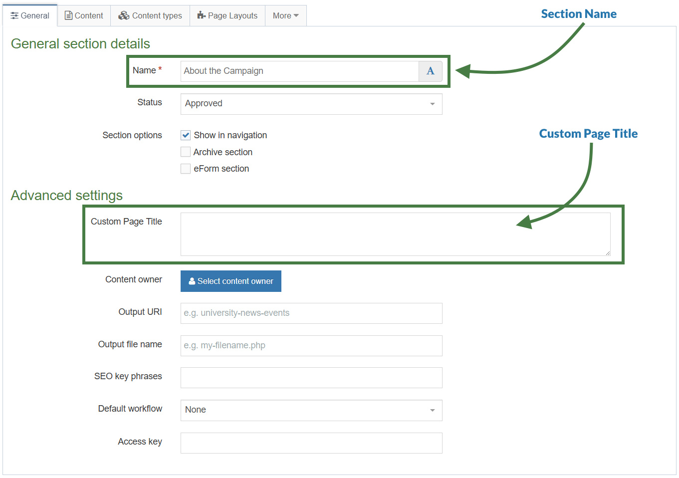
In this exercise, you will learn how to display custom page titles in the <title> tag of your Page Layout.
You will begin by outputting a Custom Page Title using the Custom Page Title field from the SectionMetaDescription Content Type.
Next, for full-text pages, you will output a content element from the Page Layout.
Finally, you will add conditional logic to your code so that the correct page title is displayed based on two factors:
- Whether the content element contains a value.
- Whether the current page is a full-text page.
How to display a custom page title
In this exercise, you will use the Section Helper to output the Custom Page Title field. This field is defined in the SectionMetaDescription Content Type and is available on the General tab of each section.
- Go to Assets > Page Layouts.
- Click your Page Layout to open it for editing. (Use the Filter tool to locate it if needed.)
- Open the </> Header code tab.
- Click </> Generate Handlebars Expression.
- In the Section tab:
- Under Section metadata, select the Section meta field radio button.
- Select Custom Page Title from the drop-down list.
- Click Copy to clipboard to copy the generated Handlebars expression.
- Add the Handlebars code to the title tag in the Page Layout.
<title>{{section field="Custom Page Title"}} - Terminalfour University</title>
- Click Save Changes to save your updates to the Page Layout.
- Refresh the preview to verify that the custom page title is displayed correctly.
How to use the if/else Helpers
- Go to Assets > Page Layouts.
- Click your Page Layout to open it for editing. (Use the Filter tool to locate it if needed.)
- Open the </> Header code tab.
- You will use the if helper to determine whether the Custom Page Title field in SectionMetaDescription contains a value. If it does, output the Custom Page Title in the
<title>tag. Otherwise, use the else helper to output the section name with the sectionName helper. - Click </> Generate Handlebars Expression.
- Open the </> Misc tab.
- Select if from the Helpers drop-down list.
- Click Copy to clipboard, then paste the generated
if/elseblock into the title of the Page Layout. - Modify the generated code as follows::
- Update the
ifcondition to check whether the Custom Page Title field contains a value. - Output the Custom Page Title when a value is present.
- In the
elseblock, output the section name using the sectionName helper.
- Update the
{{#if (section field="Custom Page Title")}}
<title>{{section field="Custom Page Title"}} - Terminalfour University</title>
{{else}}
<title>{{sectionName}} - Terminalfour University</title>
{{/if}}
- Click Save Changes to save your updates to the Page Layout.
- Refresh the preview to verify that the correct page title is displayed.
The fulltext Helper (block level variant)
The fulltext Helper is available in both standard and block expression forms, and its behavior depends on how it is used.
When used as a standard expression, the fulltext Helper outputs a link to the full-text page for a specified Content Type.
In this exercise, you will use the block expression form of the fulltext Helper. This form allows you to determine whether the current page is a full-text page, enabling you to display different output based on the page type.
How to use the fulltext Helper (block level variant)
- Go to Assets > Page Layouts.
- Click your Page Layout to open it for editing. (Use the Filter tool to locate it if needed.)
- Open the </> Header code tab.
- Click </> Generate Handlebars Expression.
- Open the </> Misc tab.
- Select fulltext from the Helpers drop-down list.
- Click Copy to clipboard, then paste the generated fulltext block into the Page Layout.
- Update the code to use the fulltext Helper to check whether the current page is a full-text page. When it is, output the Headline element within the
<title>tag.
{{#fulltext}}
{{#if (section field="Custom Page Title")}}
<title>{{section field="Custom Page Title"}} | {{publish element="Headline"}} - Terminalfour University</title>
{{else}}
<title>{{sectionName}} | {{publish element="Headline"}} - Terminalfour University</title>
{{/if}}
{{/fulltext}}
A great benefit of using the fulltext Helper as a block level expression in page layouts is that you have access to the elements of the Content Type which is something that isn't possible using t4 tags. This allows you to use the publish Helper to output the "Headline" element of the fulltext Content Type.
- Add an else condition to handle cases where the current page is not a full-text page. Within the else block, add the original code created in the How to use the if/else Helpers exercise.
{{#fulltext}}
{{#if (section field="Custom Page Title")}}
<title>{{section field="Custom Page Title"}} | {{publish element="Headline"}} - Terminalfour University</title>
{{else}}
<title>{{sectionName}} | {{publish element="Headline"}} - Terminalfour University</title>
{{/if}}
{{else}}
{{#if (section field="Custom Page Title")}}
<title>{{section field="Custom Page Title"}} - Terminalfour University</title>
{{else}}
<title>{{sectionName}} - Terminalfour University</title>
{{/if}}
{{/fulltext}}
Note that by adding an else condition to the fulltext Helper, you are now also creating a nested if within your logic.
- Click Save Changes to save your updates to the Page Layout.
- Refresh the preview to verify that the correct page title is displayed for both full-text and non-full-text pages.
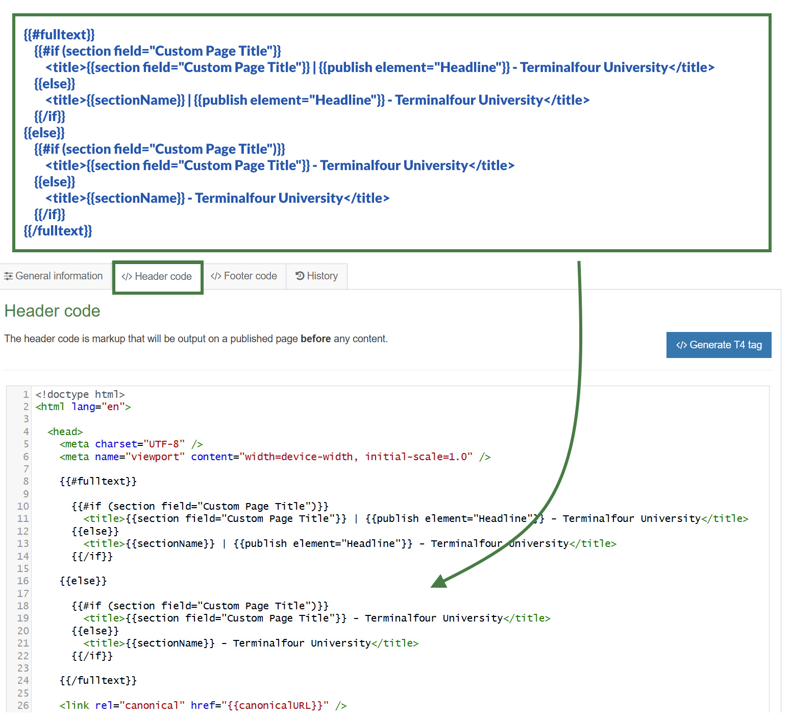
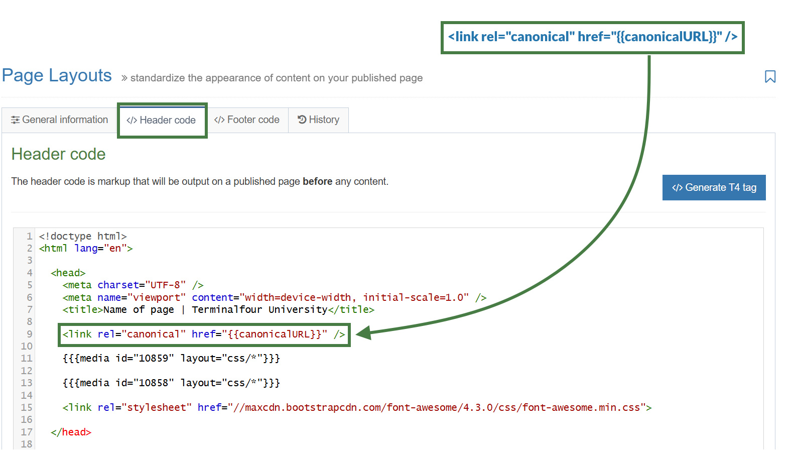
Canonical URL
- A Canonical URL tells search engines which version of a page should be indexed when the same content appears at multiple URLs.
- Adding a Canonical URL helps:
- Prevent duplicate content issues
- Improve SEO by focusing ranking signals on the preferred page
- Ensure search engines display the correct page in search results
Adding a canonical URL to the Page Layout
- Go to Assets > Page Layouts.
- Click your Page Layout to open it for editing. (Use the Filter tool to locate it if needed.)
- Open the </> Header code tab.
- Click </> Generate Handlebars Expression.
- Open the Channel tab:
- select the Canonical URL radio button.
- Click Copy to clipboard to copy the generated Handlebars expression.
- Insert the Handlebars expression into a canonical URL link like so:
<link rel="canonical" href="{{canonicalURL}}" /> - Click Save Changes to save your updates to the Page Layout.
- Refresh the preview to verify that the canonical URL is displayed correctly.
Testing the canonical URL using a mirrored section
- In your site structure mirror your "About" section into your "Life at T4U" section of your website.
- Click into the actions button of your "About" section and select "Mirror branch". Then select your "Life at T4U" section in the pop-up modal.
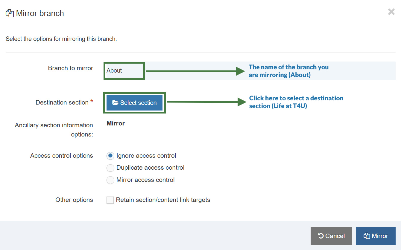
- Preview the mirrored "About" section from your "Life at T4U" section. The Canonical URL should output a link referencing the original URL of the "About" section.
Conditional Elements Introduction
Conditional Elements allow Administrators and Power Users to customize the Content Editing Experience for their users by conditionally displaying elements based on specific criteria. This feature helps simplify and streamline the content creation process for users by showing only relevant fields to Content Editors.
Conditional Statement Types
There are three types of conditional statements;
Content Element-Based Conditions, User Group Conditions, and User Type Conditions.
1. Content Element-Based Conditions
- Allows element(s) to be shown based on the content of a different element.
- Useful for revealing additional elements based on specific input.
Example 1: "If 'Research Type' is set to 'Grant-Funded', then show 'Funding Body Details' field"
Example 2: "If 'Course Level' dropdown is 'Postgraduate', then show 'Research Methodology' field"
Options depending on element type
Depending on the type of element you select, the options available for your conditional statements may be different.
The table below outlines all the different options depending on the element type selected.
| Element Type | Conditions Available | Option Available (If applicable) |
|---|---|---|
| Plain Text |
|
If the Condition is set to "Contains" or "Does not contain": User is shown a text input where they can type a string |
| HTML |
|
If the Condition is set to "Contains" or "Does not contain": User is shown a text input where they can type a string |
| Date |
|
N/A |
| Decimal Number |
|
N/A |
| Whole Number |
|
N/A |
| Media |
|
N/A |
| File |
|
N/A |
| Image |
|
N/A |
| Select Box |
|
If the Condition is set to "Contains" or "Does not contain": User is shown dropdown input where they can select a single value from the selected list |
| Check Box |
|
If the Condition is set to "Contains" or "Does not contain": User is shown dropdown input where they can select a single value from the selected list |
| Radio Button |
|
If the Condition is set to "Contains" or "Does not contain": User is shown dropdown input where they can select a single value from the selected list |
| Multi-select List |
|
If the Condition is set to "Contains" or "Does not contain": User is shown dropdown input where they can select a single value from the selected list |
| Multiple Select |
|
If the Condition is set to "Contains" or "Does not contain": User is shown dropdown input where they can select a single value from the selected list |
| Cascading List |
|
If the Condition is set to "Contains" or "Does not contain": User is shown dropdown input where they can select a single value from the selected list |
| Keyword Selector |
|
N/A |
| Section/Content Link |
|
N/A |
| Content Owner |
|
N/A |
| Group Select |
|
N/A |
2. User Group Conditions
Allows showing/hiding elements based on user group membership.
Example 1: "If User is in group 'International Admissions', then show 'Visa Requirements' elements"
Example 2: "If User is in group 'Research Grants Team', then show 'Indirect Cost Calculation' element"
3. User Type Conditions
- Controls element visibility based on the user's permission level
- Helps manage element access for different user types (Administrator, Power User, Moderator, Contributor)
- Simplifies content creation UI for user types that may not need to see all elements
Example 1: "If User is at least 'Administrator', then show 'Advanced Options' element"
Example 2: "If User is at least 'Moderator', then show 'Background Image' element"
Important Considerations
Logic Rules
- All conditional statements use OR logic
- If ANY conditional statement indicates an element should be displayed, it will be shown
- Note: Currently, AND logic is not supported
- For example, it's not possible currently to create a rule like "If 'Element A' contains 'Test' AND 'Element B' contains 'Test' Then show 'Element C'.
Scope of Functionality
Editing Experience Only
- Conditional Elements ONLY affect how elements are displayed to Content Editors.
- This feature does NOT impact how content is output on published pages.
Not a Security Feature
- Conditional Elements is a quality of life improvement.
- Hidden elements can still potentially be accessed or edited.
Not Supported on System Content Types
- Conditional Elements are not designed to work with System Content Types such as:
- Attempting to add conditional rules to these Content Types will likely cause breaking behaviour.
Power User Permissions
Power Users do have the ability to manage Content Types for any groups they are a member of.
This means that Power Users can create and edit existing Conditional Statements.
Important Note User Group-Based Conditions
- If an already existing Conditional Statement specifies an element should be shown only to users in a specific group
- AND the Power User is NOT a member of that group
- THEN the Power User will be prevented from:
- Modifying that existing Conditional Statement
- Removing that existing Conditional Statement
- Power Users can safely modify other conditional statements and add new ones
In the scenario that a Power User needs to remove or modify a Conditional Statement that they do not have access to, it is recommended that they
- Consult an Admin to make the change for them OR
- Request temporary access to the required group from an Admin
Required Fields
- If an element is marked as "required" but it is hidden by a conditional statement, it is NOT considered required.
- "Required" now means "required if shown to content editors".
Saving Content with hidden fields
When saving content items, the data within hidden elements is NOT changed from how it was stored when the content is first loaded.
- If a user edits a content item and a field is hidden, the data in that field isn’t removed when saving
- If a user edits a content item and makes a change that results in a previously displayed element to become hidden, the value of the now hidden field remains unchanged when saving
- If a user edits a content item and changes a value in "Field A" and then that user subsequently makes a change that results in "Field A" being hidden, when the content item is saved, the changes in "Field A" will not be saved
If adding conditional statements to existing Content Types it is advised that you consider whether logic is also required in your Content Layouts to ensure the expected data is output.
Debugging Conditional Elements
Reveal Hidden Elements Option
When an Admin (or a Power User with the permissions to edit the Content Type) edits a content item with Conditional Elements:
- A new "Reveal hidden elements" checkbox is available
- When checked, ALL conditional logic is temporarily disabled
- All elements are displayed, regardless of existing conditions
This option is there to help administrators troubleshoot cases where elements are hidden and it's not clear why.
How to Configure Conditional Elements
There are three types of conditional statements that can be used:
Content Element-Based Conditions
- e.g. If an 'Image' is added to a news item, then show 'Image Caption' element.
- e.g. If 'Research Type' is set to 'Grant-Funded', then show 'Funding Body Details' element.
- e.g. If 'Course Level' dropdown is 'Postgraduate', then show 'Research Methodology' element.
User Group Conditions
- e.g. If User is in group 'Marketing & Communications', then show 'Feature News on Homepage' element.
- e.g. If User is in group 'International Admissions', then show 'Visa Requirements' elements.
- e.g. If User is in group 'Research Grants Team', then show 'Indirect Cost Calculation' element.
User Type Conditions
- e.g. If User is at least 'Administrator', then show 'Advanced Options' element.
- e.g. If User is at least 'Moderator', then show 'Background Image' element.
Accessing Conditional Logic
- Navigate to a Content Type (Assets > Content Types) and select a Content Type
- Select the "Elements" tab
- Click on the "Conditional logic" button
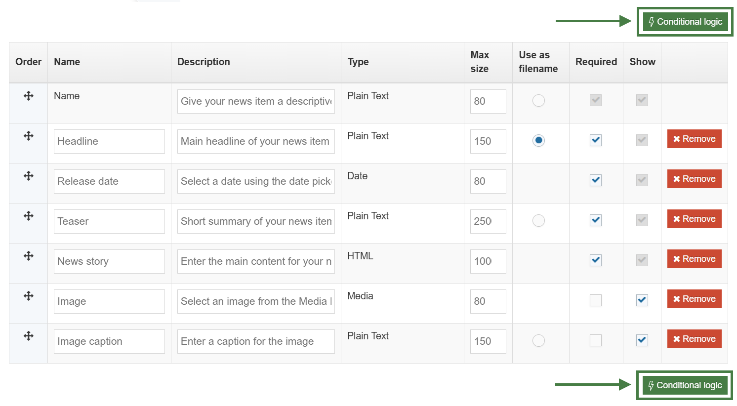
This opens a slide-out window where you can create conditional statements and view a real-time preview.
Real-Time Preview
When configuring Conditional Elements, you'll notice:
- A live preview of the content item is automatically displayed.
- The preview updates in real time as you add or modify conditional statements.
- You can immediately see how your logic affects the editing interface.
Saving changes
Once you've created your conditional statements, ensure you save the Content Type before navigating away from the page.
Conditional elements in News Content Type
In the News Content Type you created earlier, some elements are optional, allowing content editors to decide whether they should be populated.
One example is the Image Caption element. While it is optional, it should only be completed when an image has been added. Relying on editors to remember this can lead to inconsistent content and accessibility issues.
Another example is to use the Groups condition to only allow members of specific groups access to an element that will have the news item "feature" on your home page.
Conditional Elements allow you to control when elements are displayed and whether they are required, based on the values of other elements. This helps enforce editorial standards, improve content quality, and simplify the editing experience by showing only the fields that are relevant.
In the following exercise, you'll configure the Image Caption element so that it is displayed and becomes mandatory only when the preceding Image element has been populated.
How to configure your Image Caption using "Content Element" conditional logic
- Go to Assets > Content Types
- Click into your News Content Type to open it for editing. (Use the Filter tool to locate it if needed.)
- Go to the Elements tab
- Click Conditional logic, a conditional logic window will slide out.
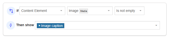
- Click Add conditional statement and build the following statement:
- If: Content Element
- Image (Media)
- Is not empty
- Then show: Image caption
If wanted, you can make the Image Caption element a required/mandatory element - Click Apply and close, you will be returned to the Elements tab
- Click Save changes to save your work.
How to configure a "Feature on Homepage" element using "User is in Group" conditional logic
- Go to Assets > Content Types
- Click into your News Content Type to open it for editing. (Use the Filter tool to locate it if needed.)
- Go to the Elements tab
- Click Conditional logic, a conditional logic window will slide out.
- Click Add conditional statement and build the following statement:
- If: User is in group
- Select your group i.e., Marketing & Communications
- Then show: Feature on Homepage?
- Click Apply and close, you will be returned to the Elements tab
- Click Save changes to save your work.
Links Content Type
In this exercise, you will learn how to create a Links Content Type that incorporates conditional elements. Using conditional elements improves the content editing experience by displaying only the fields that are relevant based on the editor's selections, making the interface more intuitive and efficient.
How to create the "Links" Content Type
- Go to Assets > Content Types > Create content type
- Fill in the General Content Type information:
- Name: enter a name here. This should suggest what type of content it is used for.
- Description: describe in more detail when to use this Content Type.
- Minimum user level: if you wish to restrict who can use this Content Type, you can set a level here. If Content Types are created in groups, a user must be a member of the group as well as meet the minimum user level criteria to use the Content Type.
- Enable direct edit: decide if direct edit can be used for this Content Type.
- Mark as eForm: if checked, this allows your Content Type to collect eForm data.
- Workflow: if relevant, enable a workflow for content created using this Content Type.
- Primary group: select your group. This allows you to select the group which is permitted to use this Content Type. Click Toggle shared groups to share the Content Type with more than one group.
- Select the Elements tab.
- Each Content Type has a Name element by default. This is used to name the content and is typically not displayed on the published site.
- Add the other elements you need by filling in the information as outlined in the table below. Click Add element to begin filling in the details for each element.
- Once you have added all your elements, click Save changes. The Content Layout tab opens.
| Name | Description | Type | Max Size | Required | Show |
|---|---|---|---|---|---|
| Button Text | Enter the text to appear on the button. E.g. “Learn More”. | Plain Text | 80 | Yes | Yes |
| Button Link (internal) | Select a section/content for an internal link. | Section/Content Link | 80 | Yes | Yes |
| Button Link (external) | Select this if you are entering a link to an external website. | Plain Text | 200 | Yes | Yes |
| Button Link (media) | Select this if you’d like to link to a PDF. | Media | 80 | Yes | Yes |
- The Content Layout tab is a new content layout for your Content Type. Click +Add content layout.
- Name: text/html - this is the default Type set in the Channel. This ensures the content can be displayed.
- File Extension: Default - unless this is used with a different File Extension. This requires other extensions being permitted in the Channel
- Syntax Type: HTML/XML – this determines which syntax is highlighted.
- Content layout processor: must be set to Handlebars Content.
- Content Layout code: this determines the output for your content.
In the content layout, you need to output three different types of links: internal, external, and PDF links.
- Internal link: Use the Link Helper to generate the URL. How to use the link Helper
- External link: Set the
hrefattribute to the value of the Button Link (External) field. - PDF link: Use the Media Helper to generate the
hrefattribute. Be sure to use thepath/*layout when generating the media URL.
{{#link element="Button Link (internal)"}}
<p><a style="display: block" class="button small radius" href="{{linkUrl}}">{{publish element="Button Text"}}</a></p>
{{/link}}
<p><a style="display: block" class="button small radius" href="{{publish element="Button Link (external)"}}">{{publish element="Button Text"}}</a></p>
<p><a href="{{{media id=(mediaId element="Button Link (media)") layout="path/*"}}}">{{publish element="Button Text"}}</a></p>
- Click Save changes to save the changes to your content layout.
- Enable the Content Type in one of your sections, then create a Links content item to test its functionality and verify that it displays correctly on the page.
Lets now enhance the Content Type by adding a new element (Link Type) that will allow a content editor to select which type of link is being created.
How to create a list
- Begin by creating a list that will populate the Link Type element. This list will be used as the source for a Select field, allowing users to choose the type of link they want to create. The available options are Internal, External, and PDF.
- Go to Assets > Lists > Add new list
- Fill in the List information:
- Name: enter a name here. This should suggest what type of list it is used for.
- Description: describe in more detail when to use this list.
- Localization: if the List is available in more than one language, you can use the localization options to:
- checkbox: Use current language version of this list (This prevents translations of the list).
- checkbox: Only use this list when localized versions are not available (when no translation of the List exists, this List is used).
- Primary group: select your group. This allows you to select the group which is permitted to use this list. Click Toggle shared groups to share the list with more than one group.
- List items: enter the individual list items by clicking on the Add row button:
- Order: list items can be re-ordered using the move icon
- Name: the name of the list item
- Value: the value of the list item
- Selected: when checked, this item will be the default selected item in the Content Type Element.
- Sublist: list items may have sub-categories that you want to link them to. Sublists are used with Cascading and Multi-select Content Type Elements.
| Name | Value | Selected | Sublist |
|---|---|---|---|
| Internal Link | internal | leave blank | |
| External Link | external | leave blank | |
| Media/PDF Link | leave blank |
- Click on the Save changes button to save your list.
- Add the following new element to the Content Type (Link Type):
| Name | Description | Type | Max Size | Required | Show |
|---|---|---|---|---|---|
| Link Type | Select which kind of link you’d like to use. | Select Box (Link Type) | 80 | Yes | Yes |
You will make use of the selectedValues Helper and the eq comparison Helper. In this particular example, you will use the eq comparison Helper to compare the value in the "Link Type" list which can be "internal", "external" or "pdf" and display the correct link based on what is selected in the content.
There are a number of Helpers to allow you to compare values:
eq - Tests if two values are equal
neq - Tests if two values are not equal
gt - Tests if one value is greater than another
gte - Tests if one value is greater than or equal to another
lt - Tests if one value is less than another
lte - Tests if one value is less than or equal to another
and - Tests if values are true (you can pass two or more arguments)
or - Tests if any values are true (you can pass two or more arguments)
not - If the provided input is false then the block will not be processed
Arguments are space separated when passed to Handlebars expressions (as opposed to comma separated).
{{#eq (publish element="Greeting") "Hello"}}
<p>Hello to you too!</p>
{{else}}
<p>You didn't say "Hello".</p>
{{/eq}}
{{#lt 5 8}}
<p>5 is indeed less than 8.</p>
{{else}}
<p>This will never be published because 5 is always less than 8.</p>
{{/lt}}
- Click into the Content layout code tab.
- Click on the </> Generate Handlebars Expression button.
- Open the </> Misc tab.
- In the Helpers drop-down, select the eq Helper.
- Click on Copy to clipboard to copy the generated Handlebars code.
- Paste the Handlebars code into your content layout.
The code generated by the Handlebars expression builder should look like the code below:
{{#eq value1 value2}}
value1 and value2 are equal
{{else}}
value1 and value2 are not equal
{{/eq}}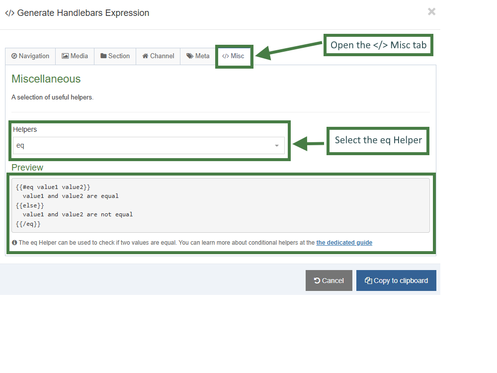
- Update the code to match your requirements. Create three separate
eqHelper blocks — one for each link type:"internal","external", and"pdf". The Handlebars expressions for each link type are shown below. Note that the selected value from the “Link Type” list is compared against the three possible options using theselectedValuesHelper. Copy the code into your layout.
{{#eq (selectedValues element="Link Type") "internal"}}
{{/eq}}
{{#eq (selectedValues element="Link Type") "external"}}
{{/eq}}
{{#eq (selectedValues element="Link Type") "pdf"}}
{{/eq}}
Next, create the appropriate output for each link type inside its corresponding Helper block. You can use the Handlebars expression builder to generate the required expressions.
- Click on the </> Generate Handlebars Expression button.
- In the Content tab:
- Information to output (select the Element radio button)
- Element: The Element option is used to output elements to the page.
- Metadata: The Metadata option allows output of specific Metadata (HTML anchor, Content ID, Last Modified Date, Publish Date, etc.).
- Fulltext: Used to output a fulltext link.
- Content element: Select the "Button Link (internal)" element from the content element drop-down.
- Handlebars helper: Choose Link from the drop-down.
- Options:
- Convert special characters to their HTML encoded values This is disabled by default as links are not HTML encoded.
- Allow this element to be edited inline in Direct Edit This is disabled by default as list elements are not editable inline in Direct Edit.
- Check if value is set This option will wrap the element with an ifSet Helper. It ensures the element outputs only if it contains data.
- Information to output (select the Element radio button)
- Click Copy to clipboard and paste in the Handlebars expression into the body of the Button Link (internal) eq block.
- Repeat the steps above for the Button Link (external) and Button Link (media) elements.
- Update the code as per below with the correct output for each type of link:
{{#eq (selectedValues element="Link Type") "internal"}}
{{#link element="Button Link (internal)"}}
<p><a style="display: block" class="button small radius" href="{{linkUrl}}">{{publish element="Button Text"}}</a></p>
{{/link}}
{{/eq}}
{{#eq (selectedValues element="Link Type") "external"}}
<p><a style="display: block" class="button small radius" href="{{publish element="Button Link (external)"}}">{{publish element="Button Text"}}</a></p>
{{/eq}}
{{#eq (selectedValues element="Link Type") "pdf"}}
<a href="{{{media id=(mediaId element="Button Link (media)") layout="path/*"}}}">{{publish element="Button Text"}}</a>
{{/eq}}
- Click Save changes to save the changes to your content layout.
Let's now add the following Content Element-Based Conditions to the Content Type:
- If 'Link Type' is set to 'Internal Link' then show 'Button Link (internal)' field
- If 'Link Type' is set to 'External Link' then show 'Button Link (external)' field
- If 'Link Type' is set to 'Media/PDF Link' then show 'Button Link (media)' field
- Go to Assets > Content Types
- Click your Content Type name to edit it. (Use the Filter tool to search).
- Open the Elements tab.
- Click on the Conditional logic button to bring up the Conditional logic & Live Preview screen.
- Click on the +Add conditional statement button. Build a conditional statement for the "Internal Link" as per the table below:
| Conditional Statement | Element | Column 3 | Value | Then show |
|---|---|---|---|---|
| Content Element | Link Type (Select Box) | Contains | Internal Link | Button Link (internal) |
.jpg)
- Click on the +Add conditional statement button. Build a conditional statement for the "External Link" as per the table below:
| Conditional Statement | Element | Column 3 | Value | Then show |
|---|---|---|---|---|
| Content Element | Link Type (Select Box) | Contains | External Link | Button Link (external) |
.jpg)
- Click on +Add conditional statement button. Build a conditional statement for the "Media Link" as per the table below:
| Conditional Statement | Element | Column 3 | Value | Then show |
|---|---|---|---|---|
| Content Element | Link Type (Select Box) | Contains | Media/PDF Link | Button Link (media) |
.jpg)
- Click on the Apply and close button to apply your conditional elements to the Content Type.
- Click Save changes to save your Content Type.
Individual Card Content Type
- Repeaters allow you to configure a Content Type so that it can include another Content Type inside it. This allows for the easy creation of Content Types that are made of repeated elements, such as:
-
- Carousels and sliders
- Accordions and tabbed content
- Card rows and feature blocks
- FAQs and more
-
In this section, you will create a new "Individual Card" Content Type. As part of this process, you will use several new Helpers to display the content for each individual card on the page.
-
Next, you will use repeaters to output multiple "Card" Content Type items. To enable this, the "Individual Card" Content Type will be added as a repeater element within the "Card Section" Content Type.
How to create the "Individual Card" Content Type
- Go to Assets > Content Types > Create content type
- Fill in the General Content Type information:
- Name: enter a name here. This should suggest what type of content it is used for.
- Description: describe in more detail when to use this Content Type.
- Minimum user level: if you wish to restrict who can use this Content Type, you can set a level here. If Content Types are created in groups, a user must be a member of the group as well as meet the minimum user level criteria to use the Content Type.
- Enable direct edit: decide if direct edit can be used for this Content Type.
- Mark as eForm: if checked, this allows your Content Type to collect eForm data.
- Workflow: if relevant, enable a workflow for content created using this Content Type.
- Primary group: select your group. This allows you to select the group which is permitted to use this Content Type. Click Toggle shared groups to share the content type with more than one group.
- Select the Elements tab.
- Each Content Type has a Name element by default.
- Add the other elements you need by filling in the information as outlined in the table below. Click Add element to begin filling in the details for each element.
- Once you have added all your elements, click Save changes. The Content Layout tab opens.
| Name | Description | Type | Max Size | Required | Show |
|---|---|---|---|---|---|
| Card Title | Enter a title for the Card | Plain Text | 80 | Yes | Yes |
| Card Image | Select an Image to be output on the card | Media | 80 | No | Yes |
| Card Content | Some simple overview for the card | HTML | 8000 | Yes | Yes |
| Call To Action | Choose where the card should link the user | Section/Content Link | 80 | No | Yes |
How to create the "text/card-item" content layout
The next step is to create the text/card-item content layout that will define the output of the content of each individual card.
- The Content Layout tab is a new content layout for your Content Type. Click +Add content layout.
- Name: text/card-item - this is the name of the content layout for an individual card-item.
- File Extension: Default - unless this is used with a different File Extension. This requires other extensions being permitted in the Channel
- Syntax Type: HTML/XML – this determines which syntax is highlighted.
- Content layout processor: must be set to Handlebars Content.
- Content Layout code: this determines the output for your content.
- Complete the TODOs below to create your content layout:
- Write a Handlebars expression to output the src of the card image. (HINT: Make sure to select the "path/*" as the layout).
- Write a Handlebars expression to output the card title inside the h3 headline.
- Write a Handlebars expression to output the Card Content.
- Write two handlebars expressions to output the "Call To Action". You should write an expression for the href attribute and a second expression for the clickable text of the link. (HINT: Use the link Helper).
Click here to view the solution:
<div class="card">
{{#ifSet element="Card Image"}}
<div class="card-image">
{{!--1. TODO: Write a Handlebars expression to output the src of the card image (HINT: Make sure to select "path/*" as the layout).--}}
<img src="{{{media id=(mediaId element="Card Image") layout="path/*"}}}" alt="" class="card-image"/>
</div>
{{/ifSet}}
{{!--2. TODO: Write a Handlebars expression to output the "Card Title" inside the h3 headline.--}}
<h3>{{publish element="Card Title" inline-edit="true"}}</h3>
<div class="card-content">
{{!--3. TODO: Write a Handlebars expression to output the Card Content.--}}
{{{publish element="Card Content" inline-edit="true"}}}
</div>
{{!--4. TODO: Write two Handlebars expression to output the "Call To Action". You should write an expression for the href attribute and another one for the clickable text of the link. (HINT: Use the link Helper).--}}
<a href="{{#link element="Call To Action"}}{{linkUrl}}{{/link}}" class="card-cta">{{#link element="Call To Action"}}{{linkText}}{{/link}}</a>
</div>
<div class="card">
{{#ifSet element="Card Image"}}
<div class="card-image">
{{!--1. TODO: Write a Handlebars expression to output the src of the card image (HINT: Make sure to select "path/*" as the layout).--}}
<img src="" alt="" class="card-image"/>
</div>
{{/ifSet}}
{{!--2. TODO: Write a Handlebars expression to output the "Card Title" inside the h3 headline.--}}
<h3></h3>
<div class="card-content">
{{!--3. TODO: Write a Handlebars expression to output the Card Content.--}}
</div>
{{!--4. TODO: Write two Handlebars expression to output the "Call To Action". You should write an expression for the href attribute and another one for the clickable text of the link. (HINT: Use the link Helper).--}}
<a href="" class="card-cta"></a>
</div>
- Click Save changes to save the changes to your content layout.
How to create the "text/html" content layout for the Card Content Type
- The Content Layout tab is a new content layout for your Content Type. Click +Add content layout.
- Name: text/html - this is the default Type set in the Channel. This ensures the content can be displayed.
- File Extension: Default - unless this is used with a different File Extension. This requires other extensions being permitted in the Channel
- Syntax Type: HTML/XML – this determines which syntax is highlighted.
- Content layout processor: must be set to Handlebars Content.
- Content Layout code: this determines the output for your content.
You will make use of the firstInSequence and lastInSequence Helpers in this content layout. These Helpers will allow you to output the opening and closing tags for each individual card section as needed.
first and last Helpers
The first Helper will be true when the content item is the first piece of content in a section.
{{#first}}
<h1>First content item in the section</h1>
{{/first}}The last Helper will be true when the content item is the last piece of content in a section.
{{#last}}
<footer>Last content item in the section</footer>
{{/last}}
firstOfType and lastOfType Helpers
These Helpers let you know if an item of content is the first and last of its type in a section:
{{#firstOfType}}
Only output if first of this Content Type in section
{{/firstOfType}}{{#lastOfType}}
Only output if last of this Content Type in section}}
{{/lastOfType}}
firstInSequence and lastInSequence Helpers
Perhaps more flexible though, are these Helpers which allow you to determine if an item of content is the first and last of its type in an uninterrupted sequence of content in a section.
The firstInSequence Helper will be true when the content item is the first piece of content using this Content Type in an uninterrupted sequence of content in a section.
{{#firstInSequence}}
Only output if first of this Content Type in an uninterrupted sequence in this section
{{/firstInSequence}}
The lastInSequence Helper will be true when the content item is the last piece of content using this Content Type in an uninterrupted sequence of content in a section.
{{#lastInSequence}}
Only output if last of this Content Type in an uninterrupted sequence in this section
{{/lastInSequence}}
Let's now demonstrate the use of these Helpers inside of the "text/html" content layout.
- Complete the TODOs below to create your content layout:
- Use the "firstInSequence" Helper to output the opening section tag.
- Use the ember Helper to embed the "text/card-item" layout.
- Use the "lastInSequence" Helper to output the closing section tag.
Click here to view the solution:
{{!--1. TODO: Use the "firstInSequence" Helper to output the opening section tag.--}}
{{#firstInSequence}}
<section class="card-group-section">
{{/firstInSequence}}
<div class="card-group-content-container">
{{!--2. TODO: Use the embed Helper to embed the "text/card-item" layout.--}}
{{embed layout="text/card-item"}}
</div>
{{!--3. TODO: Use the "lastInSequence" Helper to output the closing section tag.--}}
{{#lastInSequence}}
</section>
{{#lastInSequence}}
{{!--1. TODO: Use the "firstInSequence" Helper to output the opening section tag.--}}
<section class="card-group-section">
<div class="card-group-content-container">
{{!--2. TODO: Use the embed Helper to embed the "text/card-item" layout.--}}
</div>
{{!--3. TODO: Use the "lastInSequence" Helper to output the closing section tag.--}}
</section>
- Click Save changes to save the changes to your content layout.
- Enable the Card Content Type.
- In the Home section, create a Card Item and use it to test the newly created Content Type.
Use meaningful names that describe the content or purpose of each element. Avoid generic names like "Link 1" or "Card 1", as these can cause confusion when elements are reordered and repeaters are minimized.
Card Section Content Type
- In this exercise, you will use a repeater element to display Card items on the page. You will also learn how to customize the repeater's output by using Handlebars code.
How to create the "Card Section" Content Type
- Go to Assets > Content Types > Create content type
- Fill in the General Content Type information:
- Name: enter a name here. This should suggest what type of content it is used for.
- Description: describe in more detail when to use this Content Type.
- Minimum user level: if you wish to restrict who can use this Content Type, you can set a level here. If Content Types are created in groups, a user must be a member of the group as well as meet the minimum user level criteria to use the Content Type.
- Enable direct edit: decide if direct edit can be used for this Content Type.
- Mark as eForm: if checked, this allows your content type to collect eForm data.
- Workflow: if relevant, enable a workflow for content created using this Content Type.
- Primary group: select your group. This allows you to select the group which is permitted to use this Content Type. Click Toggle shared groups to share the Content Type with more than one group.
- Select the Elements tab.
- Each Content Type has a Name element by default. You will use the Name element to output the Card's title.
- Add the other elements you need by filling in the information as outlined in the table below. Click Add element to begin filling in the details for each element.
| Name | Description | Type | Max Size | Required | Show |
|---|---|---|---|---|---|
| Name | The Name element | Plain Text | 80 | Yes | Yes |
| Card Group Header | Enter text for the header to be displayed above the Card Group | Plain Text | 200 | Yes | Yes |
| Card Group Introduction | Enter text to be displayed before the Cards | HTML | 5000 | Yes | Yes |
| Card | Individual Card Content | Repeater: Individual Card | Yes |
How to configure a repeater element
Notice that when selecting "Repeater" as the type for the Card element, a new "Flyout screen" will be displayed automatically that allows you to choose which Content Type should be repeated.
- Configure the repeater:
- Content type: select the Content Type to be repeated, this should be the name of your "Individual Card" Content Type.
- Content layout: the default layout that will be output for this repeater element, e.g. text/html.
- Repeater settings:
- Minimum repeats: the minimum amount of repeats allowed, e.g. 1.
- Maximum repeats: the maximum amount of repeats allowed, e.g. 5.
- Once you have finished configuring your repeater element, click Save changes.
- Once you have added all your elements, click Save changes. The Content Layout tab opens.

How to create the "text/html" content layout
- The Content Layout tab is a new content layout for your Content Type. Click +Add content layout.
- Name: text/html - this is the default Type set in the Channel. This ensures the content can be displayed.
- File Extension: Default - unless this is used with a different File Extension. This requires other extensions being permitted in the Channel
- Syntax Type: HTML/XML – this determines which syntax is highlighted.
- Content layout processor: must be set to Handlebars Content.
- Content Layout code: this determines the output for your content.
In this content layout you will use the repeater Helper to output the repeater element and you will be making use of the @first and @length variables.
The Repeater Helper is used to render a Repeater element, which was introduced in version 8.4.1.
By default, when a Repeater element is rendered using the Publish Helper, it uses the default Content Layout defined in the repeater's configuration.
If you need to specify a different Content Layout, use the Repeater Helper. This allows you to explicitly select the layout to render, as shown in the following example:
{{repeater element="Card" layout="text/card-item"}}
By combining the Each Helper with the Repeater Helper, you can iterate through each repeater item, access its variables, and gain greater control over how the repeater content is rendered.
For example:
{{#each (repeater element="Repeater Content Element")}}
<p>Output</p>
{{/each}}
In this example, the <p>Output</p> block is rendered once for each repeater item. For instance, if the repeater contains five slides, the word Output will be rendered five times—once for each slide.
Because we're inside an each block, we have several variables available to us:
- @length - this will return a number corresponding to how many repeated items there are in this element.
- @first - true if this is the first repeater instance being output
- @last - true if this is the last repeater instance being output
- @odd - true if this this repeater instance has an odd index. Note that the array is zero-indexed.
- @even - true if this this repeater instance has an even index. Note that the array is zero-indexed.
- @index - Returns the index of this entry within the repeater instance. (Starting from "zero" for the first item)
- @index_1 - Returns the index of this entry within the repeater instance. (Starting from "one" for the first item)
- Complete the TODOs below to create your content layout:
- Write a Handlebars expression to output the "Card Group Header" element.
- Write a Handlebars expression to output the "Card Group Introduction" element.
- Write a Handlebars expression to output a class "amount-n" where n is the total number of cards to be displayed on one row.
- Write a handlebars expression to output the "Card" repeater element.
Click here to view the solution:
<section class="card-group-section">
{{!--1. TODO: Write a Handlebars expression to output the "Card Group Header" element.--}}
<h3>{{publish element="Card Group Header" inline-edit="true"}}</h3>
<div class="card-group-intro">
{{!--2. TODO: Write a Handlebars expression to output the "Card Group Introduction" element.--}}
{{{publish element="Card Group Introduction" inline-edit="true"}}}
</div>
{{!--3.TODO: Write a Handlebars expression to output a class "amount-n" where n is the total number of cards to be displayed on one row.--}}
<div class="card-group-content-container {{#each (repeater element="Card")}}{{#if @first}}amount-{{@length}}{{/if}}{{/each}}">
{{!--4. TODO: Write a Handlebars expression to output the "Card" repeater element.--}}
{{repeater element="Card" layout="text/card-item"}}
</div>
</section>
<section class="card-group-section">
{{!--1. TODO: Write a Handlebars expression to output the "Card Group Header" element.--}}
<h3></h3>
<div class="card-group-intro">
{{!--2. TODO: Write a Handlebars expression to output the "Card Group Introduction" element.--}}
</div>
{{!--3.TODO: Write a Handlebars expression to output a class "amount-n" where n is the total number of cards to be displayed on one row.--}}
<div class="card-group-content-container">
{{!--4. TODO: Write a Handlebars expression to output the "Card" repeater element.--}}
</div>
</section>
- Click Save changes to save the changes to your content layout.