Handlebars Training Manual
T205: Terminalfour Handlebars
Handlebars is a versatile templating engine designed to simplify the process of creating dynamic content. For those who are unfamiliar with Handlebars, think of it as a tool that bridges the gap between static HTML and dynamic data.
Overview
Handlebars allows you to create content layouts and page layouts with placeholders and simple logic that will be filled in with data at Publish time, making it easier to manage and manipulate content in ways that are not possible using standard T4 Tags without needing extensive coding expertise or familiarity with the complexities of Programmable Layouts.
One of the key features of Handlebars is its simplicity. With a syntax that closely resembles regular HTML, users can quickly grasp the basics and start building more "dynamic" content types and page layouts.
Handlebars uses double curly braces {{}} to denote placeholders, which are then replaced with actual data when the layout is Published – much like the t4 tags you may be familiar with today.
The Terminalfour implementation of Handlebars comes with an extensive toolkit of "Helpers" to allow you to add logic to your layouts in a way that just isn't possible with t4 tags.
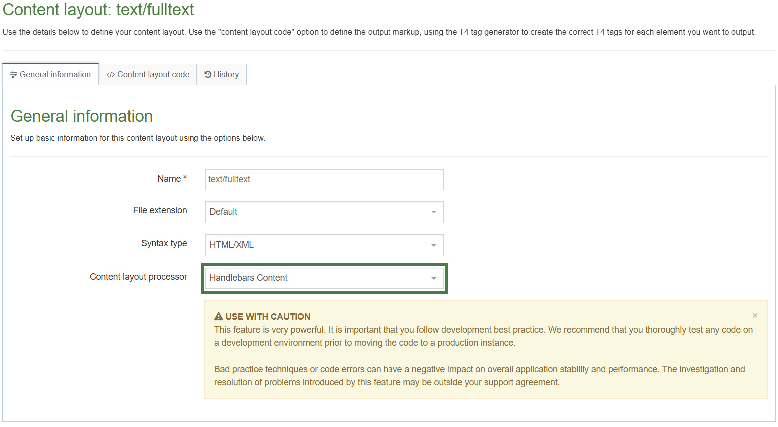
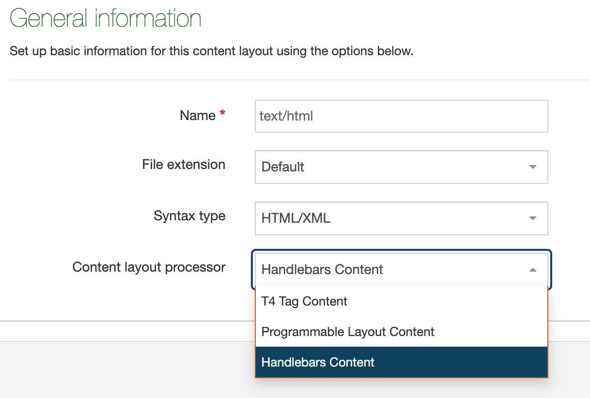
From Terminalfour 8.3.19 you can make use of Handlebars by selecting it as a processor type on your page layouts and content layouts:
Before we dive in...
8.3.19 is our initial release of Handlebars and we'll be extending the functionality and improving the experience over the next several releases of the platform.
Before we explore how Handlebars works it's important to mention a few items up front to help you make the best use of the feature.
Mixing t4 tags and Handlebars expressions
When setting the Content layout processor to Handlebars Content you can no longer use "T4 tags" in the layout. Instead you must use the Handlebars Helpers outlined in the rest of this guide.
Subexpressions
A subexpression is an expression inside another expression. It’s used when you want to call a helper or a calculation inside another expression. Subexpressions are wrapped in parentheses.
For example, if you wanted to use the publish Helper to output the Title element of a Content item it might look like this:
{{publish element="Title"}}
But if you wanted to make use of the built in upper Helper to output that value in uppercase you'd need to pass in the publish Helper into the upper Helper as a subexpression like this:
{{upper (publish element="Title")}}Notice that by using subexpressions you can combine different Helpers, thereby creating more powerful Handlebars expressions. You will look at several examples of doing this throughout this training, remember that when using subexpressions you will need to use parentheses in your syntax.
"Double stashing" and "Triple stashing"
With some limited exceptions, Handlebars HTML-escapes values returned by an expression using two curly-braces (e.g. {{expression}}).
This means certain special characters will be converted to their HTML equivalents. For example, if a user entered a value of < then a "double-stashed" handlebars expression would convert that to <.
If you don't want Handlebars to escape a value, use the "triple-stash", {{{.
Double-stash example
{{publish element="Title"}}If a user enters the value <h2>Test</h2> into a Title element then this expression would output <h2>Test</h2> (the value is HTML-escaped)
Triple-stash example
{{{publish element="Title"}}}If a user enters the value <h2>Test</h2> into a Title element then this expression would output <h2>Test</h2> (the value is not HTML-escaped)
Error handling
Like with standard T4 tag based layouts and programmable layouts it's possible to configure things incorrectly and get undesired or unexpected results.
Preview & Direct Edit
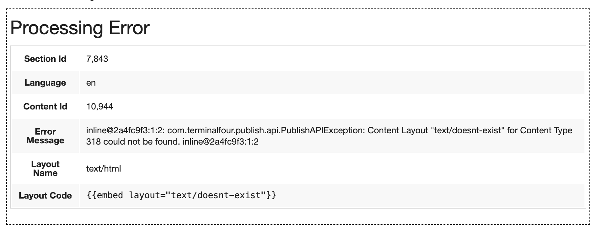
When an error is encountered with a Handlebars layout during Preview or Direct Edit we output an inline error message on the page to users.
This error is in the form of a table and displays the following info:
- The Section ID where the error is occurring
- The asset language
- The Content ID (if applicable)
- The error message
- The content layout name (if applicable)
- The layout code (if applicable)
This should give you enough information to find out where the problem exists so you can debug.
Example:
 Publish
When a Publish happens and an error is encountered we could have done one of two things:
- We could ignore the error, and continue the Publish
- We could stop the publish to prevent breaking the live site
Both have their pros and cons and ultimately we'll need to hear from you, our users, about how you're using Handlebars to determine the best long term solution.
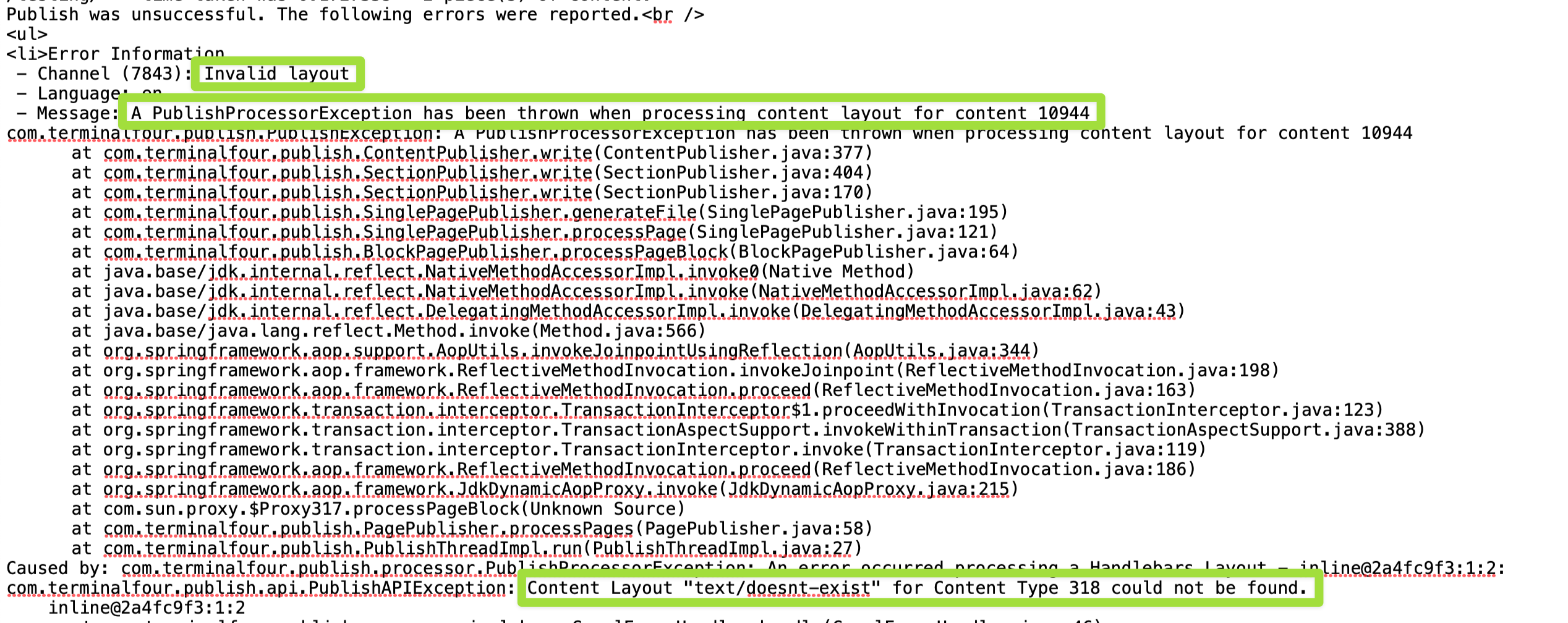
For now, we've taken the safest and least destructive option which is to fail the publish. This means if you accidentally introduce a breaking error in your most commonly used content type or page layout we'll prevent that error from getting pushed to your live site and ultimately breaking a significant portion of your web pages.
When the publish fails it does so with very clear messaging in the logs explaining the reason for the failure.
Example
Direct Edit
In the initial release of Handlebars, it does not support inline editing with Direct Edit.
However, the Handlebars feature was designed with Direct Edit in mind, and we aim to bring inline editing to an upcoming release of Terminalfour.
When support for inline editing arrives in in a future release, Plain text and HTML elements that are output using the publish Helper will be able to be edited inline. However, they will need the inline-edit="true" flag to be set like so:
{{publish element="Title" inline-edit="true"}}
You may wish to add this flag to your Handlebars Expressions today so that they will become editable with inline editing in Direct Edit in the future without the need for any changes to your code.
Before you start
Be sure you have the following added to your training site:
1. Duplicate the "T205: Training Site Example (Duplicate Me)" into your Site Structure
2. Duplicate the "T205 Training Site Example (Duplicate Me)" page layout
3. Create a "T205 Training Site Example" Channel
4. Duplicate the "T205 Training Site Example: General (Duplicate Me)" content type
5. Duplicate the "T205 Training Site Example: News (Duplicate Me)" content type
Let's also add some sample content using the "General Content" content type.
1. On the Site Structure screen, click on the name of your "Home" section.
2. The General information about this section screen appears, select the Content types tab.
3. Using the Filter feature, locate your content type.
4. Select the radio button to enable your content type for either the branch or section:
a. Enabled (branch): the content type can be used in this section as well as all its sub-sections.
b. Enabled (section): the content type can be used in this section only.
5. Click Save changes to confirm your selection. You can now use the "General Content" content type to add content to your section.
6. Add "General Content" to both the "Home" and "About" sections of your website. Feel free to use this Lorem Ipsum generator.
1. Updating the page layout
In this exercise, you will learn how to update several t4 tags contained within the page layout. The page layout has been prepared to use the Handlebars Content layout processor. However, several t4 tags remain in the page layout.
- Let's learn how to replace any t4 tags that point to CSS and/or JavaScript files and any Navigation Object t4 tags with the appropriate Handlebars code.
Exercise 1.1: replacing a t4 tag that references a CSS stylesheet in the media library
- Go to Assets > Page Layouts.
- Click your page layout name to edit it. (Use the Filter tool to search). Open the </> Header code tab.
- You will add the new Handlebars code below to the header code of the page layout.
- Click on the </> Header code tab.
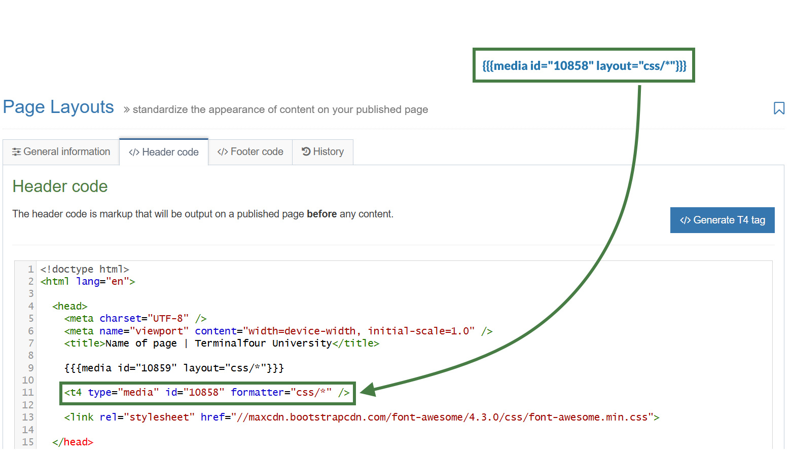
- Let's replace the existing t4 tag which is used to reference a CSS file in the media library.
{{{media id="10858" layout="css/*"}}}
- Click Save changes to save the changes to your page layout.
- Update your preview to check the result.
Exercise 1.2: replacing a t4 tag link menu navigation object that generates a navigation menu
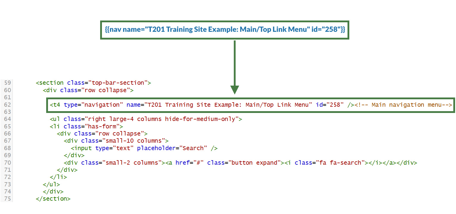
- Replace the t4 tag Link Menu Navigation Object that generates the top navigation menu.
{{nav name="T201 Training Site Example: Main/Top Link Menu" id="258"}}
- Click Save changes to save the changes to your page layout.
- Update your preview to check the result.
Exercise 1.3: replacing a t4 tag that references a JavaScript file in the media library
- Click on the </> Footer code tab.
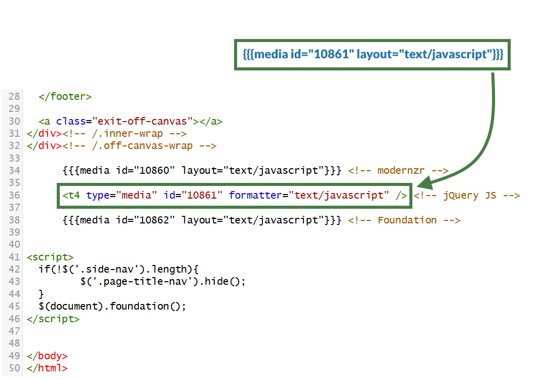
- Replace the t4 tag that references the JavaScript file.
{{{media id="10861" layout="text/javascript"}}}
- Click Save changes to save the changes to your page layout.
- Update your preview to check the result.
2. Updating the "General Content" content type
In this exercise, you will learn how to switch from using the T4 Tag Content layout processor to using the Handlebars Content layout processor.
- You will convert the t4 tags used in the "General Content" content type with the appropriate Handlebars code.
Exercise 2.1: updating the "text/html" content layout to use Handlebars
- Go to Assets > Content Types.
- Click your content type name to edit it. (Use the Filter tool to search). Open the Content layouts tab.
- The Content layouts tab is an area to add content layout(s) for your content type. Click into the "text/html" default content layout to edit it.
- Click into the General information tab.
- Name: "text/html" - this is the default Type set in the Channel. This ensures the content can be displayed.
- File Extension: Default - unless this is used with a different File Extension. This requires other extensions being permitted in the Channel.
- Syntax Type: HTML/XML – this determines which syntax is highlighted.
- Content layout processor: Update the content layout processor to Handlebars Content.
- Click Save changes to save the changes to your content type.
- Update your preview to check the result.
.jpg)
Exercise 2.2: replacing a t4 anchor tag with Handlebars
- Click into the Content layouts tab.
- Select the "text/html" content layout and open the </> Content layout code tab.
- Replace the HTML anchor t4 tag. You can use the anchor Helper to achieve this.
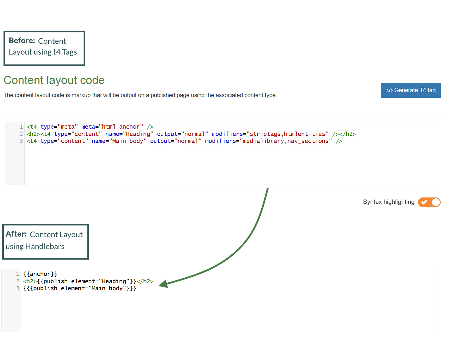
- Replace <t4 type="meta" meta="html_anchor" /> with the anchor Helper.
{{anchor}}
<h2><t4 type="content" name="Heading" output="normal" modifiers="striptags,htmlentities" /></h2>
<t4 type="content" name="Main body" output="normal" modifiers="medialibrary,nav_sections" />
- Click Save changes to save the changes to your content layout.
- Update your preview to check the result.
Do not use t4 tags to display the "Header" and "Main body" elements of the content type. Since you are using the Handlebars Content layout processor in this content layout you must use Handlebars code only as t4 tags will not work in this context.
Exercise 2.3: replacing the "Heading" and "Main body" elements
- Replace the "Heading" and "Main body" t4 tags to ensure these are displayed. You can use the publish Helper to achieve this.
- Replace the "Heading" t4 tag with: {{publish element="Heading"}}
- Replace the "Main body" t4 tag with: {{publish element="Main body"}}
{{anchor}}
<h2>{{publish element="Heading"}}</h2>
{{publish element="Main body"}}
- Click Save changes to save the changes to your content layout.
- Update your preview to check the result.
Exercise 2.4: troubleshooting the "General Content" content type
- Let's preview the page to see how the content is being displayed. Notice how the content inside your "Main body" element is being output to the page.
A key thing to note is that when using the publish Helper it will not process any HTML and instead will output the HTML encoded equivalent by default. If you need to output the data as HTML (for example, if you're using a HTML element, or if it's a Plain text element being used to output "Code") then you would use triple curly braces {{{}}} .
- Add the triple curly braces {{{ }}} to wrap your HTML "Main body" element.
- Click Save changes to save the changes to your content layout.
- Update your preview to check the result.
{{anchor}}
<h2>{{publish element="Heading"}}</h2>
{{{publish element="Main body"}}}
3. Canonical URL
- A Canonical URL is the preferred version of a web page that you want search engines to prioritize and display in search results. It helps address situations where the same content is accessible via multiple URLs (for example, when you have mirrored a section in Terminalfour to another area of your site).
- Using a Canonical URL ensures that search engines understand which version of a page to index, avoiding duplicate content issues that could harm your site's search engine rankings. It also consolidates ranking signals like backlinks and helps deliver a more consistent experience for users and search engines alike.
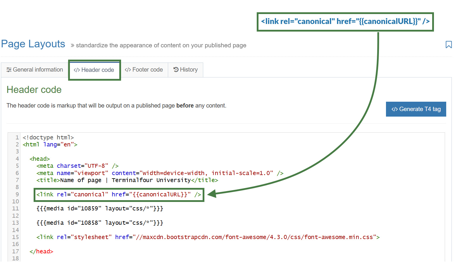
- Your page layout currently is missing a Canonical URL, let’s add one to the page layout of your website.
Exercise 3.1: adding a Canonical URL to the page layout
- Go to Assets > Page Layouts.
- Click your page layout name to edit it. (Use the Filter tool to search). Open the </> Header code tab.
- You will add the new Handlebars code below to the header code of the page layout.
- Click on the </> Header code tab.
- Copy the code below to your clipboard, and paste it into the Header code:<link rel="canonical" href="{{canonicalURL}}" />
- Click Save changes to save the changes to your page layout.
- Update your preview to check the result.
Exercise 3.2: testing the Canonical URL using a mirrored section
- In your site structure mirror your "About" section into your "Life at T4U" section of your website.
- Click into the actions button of your "About" section and select "Mirror branch". Then select your "Life at T4U" section in the pop-up modal.
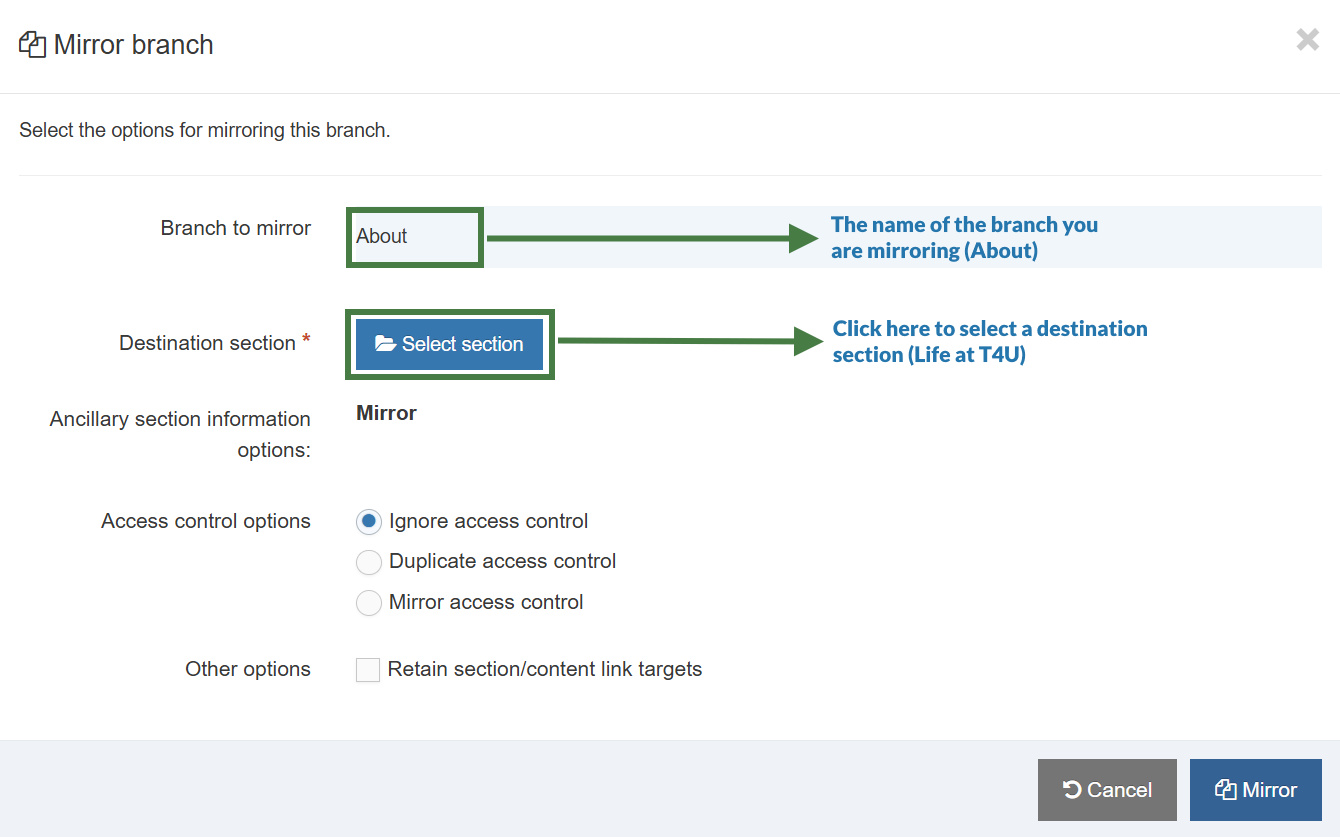
- Preview the mirrored "About" section from your "Life at T4U" section. The Canonical URL should output a link referencing the original URL of the "About" section.
4. Page titles
In this exercise, you will learn how to output custom page titles in the title tag of your page layout. You will look at a variety of different options to do this.
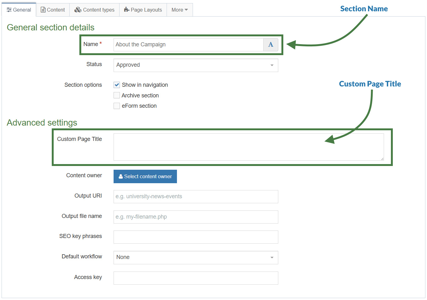
- You will learn how to use the sectionName Helper to output the section name as the title of your page. Next, you will learn how to output a "Custom Page Title" by using a field from the SectionMetaDescription content type.
- On fulltext pages, you will output a content element from the page layout.
- Finally, you will build logic into your code to output the appropriate title depending on whether the element is populated and whether you are in a fulltext page or not.
Exercise 4.1: displaying the section name
- Go to Assets > Page Layouts.
- Click your page layout name to edit it. (Use the Filter tool to search). Open the </> Header code tab.
- Add the new Handlebars code below to the Header code of the page layout.
- Click on the </> Header code tab.
- Display the Section name using the sectionName Helper. To do this replace the [Name of page] placeholder with Handlebars code.
<title>[Name of page] - Terminalfour University</title>
- Click Save changes to save the changes to your page layout.
- Update your preview to check the result.
Exercise 4.2: displaying a custom page title
In this exercise, you will use the section Helper to output a "Custom Page Title". This field is configured in the SectionMetaDescription content type and is available within the General tab of your sections.
- Go to Assets > Page Layouts.
- Click your page layout name to edit it. (Use the Filter tool to search). Open the </> Header code tab.
- Add the new Handlebars code below to the Header code of the page layout.
- Click on the </> Header code tab.
- Display the "Custom Page Title" from the SectionMetaDescription content type using the section Helper. To do this replace the [Custom Page Title] placeholder with Handlebars code.
<title>[Custom Page Title] - Terminalfour University</title>
- Click Save changes to save the changes to your page layout.
- Update your preview to check the result.
Exercise 4.3: using the if/else Helpers
- Go to Assets > Page Layouts.
- Click your page layout name to edit it. (Use the Filter tool to search). Open the </> Header code tab.
- Add the new Handlebars code below to the Header code of the page layout.
- Click on the </> Header code tab.
- You can use the if Helper to check if the SectionMetaDescription has a field called “Custom Page Title” and whether it is set to a value. If so, output the title tag with the name of the “Custom Page Title” field.
- Use the else Helper for when the “Custom Page Title” field is not set, in which case, you can display the section name using the sectionName Helper. Make sure to replace the [Custom Page Title] and [Section name] placeholders with Handlebars code.
In this exercise, you will need to use a subexpression for the first time, combining the if and section Helpers, notice the use of the parentheses when creating subexpressions.
{{#if (section field="Custom Page Title")}}
<title>[Custom Page Title] - Terminalfour University</title>
{{else}}
<title>[Section name] - Terminalfour University</title>
{{/if}}
- Click Save changes to save the changes to your page layout.
- Update your preview to check the result.
Exercise 4.4: using the fulltext Helper (block level variant)
Before you start
Let's add some sample content using the "News Item" content type.
1. On the Site Structure screen, click on the name of your "News" section.
2. The General information about this section screen appears, select the Content types tab.
3. Using the Filter feature, locate your content type.
4. Select the radio button to enable your content type for either the branch or section:
a. Enabled (branch): the content type can be used in this section as well as all its sub-sections.
b. Enabled (section): the content type can be used in this section only.
5. Click Save changes to confirm your selection. You can now use the "News Item" content type to add content to your section.
6. Add a "News Item" to your "News" section of your website. Feel free to use this Lorem Ipsum generator.
The fulltext Helper has both a standard and block level variant. It behaves differently depending on which is used.
The fulltext Helper when used in a standard expression outputs a link to the fulltext page of a given content type. You will learn to use this variant in an upcoming exercise.
The fulltext Helper when used in a block level expression, which you will use in this exercise, allows you to know if you are viewing a fulltext page.
- Go to Assets > Page Layouts.
- Click your page layout name to edit it. (Use the Filter tool to search). Open the </> Header code tab.
- Add the new Handlebars code below to the Header code of the page layout.
- Click on the </> Header code tab.
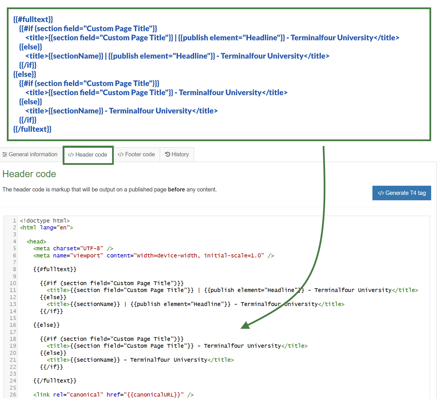
- Let's add the fulltext Helper to the code to output the appropriate title when you are in a fulltext page. Update the code by outputting the "Headline" element within the title tag only when in a fulltext page. Replace the [Headline] placeholders below by using the publish Helper.
{{#fulltext}}
{{#if (section field="Custom Page Title")}}
<title>{{section field="Custom Page Title"}} | [Headline] - Terminalfour University</title>
{{else}}
<title>{{sectionName}} | [Headline] - Terminalfour University</title>
{{/if}}
{{/fulltext}}
A great benefit of using the fulltext Helper as a block level expression in page layouts is that you have access to the elements of the content type which is something that isn't possible using t4 tags. This allows you to use the publish Helper to output the "Headline" element of the fulltext content type.
- Let's now handle the case when you are not in a fulltext page, to do this you can make use of the else Helper to add an else condition. Add the original code that you wrote in Exercise 4.3: Using the if/else Helpers inside of the else block:
{{#fulltext}}
{{#if (section field="Custom Page Title")}}
<title>{{section field="Custom Page Title"}} | [Headline] - Terminalfour University</title>
{{else}}
<title>{{sectionName}} | [Headline] - Terminalfour University</title>
{{/if}}
{{else}}
{{#if (section field="Custom Page Title")}}
<title>{{section field="Custom Page Title"}} - Terminalfour University</title>
{{else}}
<title>{{sectionName}} - Terminalfour University</title>
{{/if}}
{{/fulltext}}
Note that by adding an else condition to the fulltext Helper, you are now also creating a nested if within your logic.
- Click Save changes to save the changes to your page layout.
- Update your preview to check the result.
5. Preview Helper
The preview Helper is used to determine whether or not the page is currently being previewed or not. It allows you to output content only in Preview.
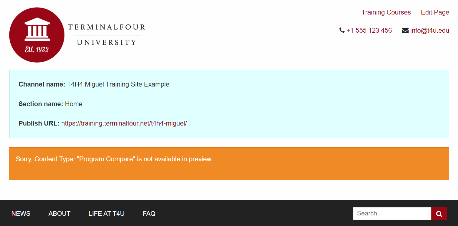
- You will learn how to use the preview Helper to output the channel name, section name and publish URL when in Preview.
Exercise 5.1: using the preview Helper
- Go to Assets > Page Layouts.
- Click your page layout name to edit it. (Use the Filter tool to search). Open the </> Header code tab.
- You will add the new Handlebars code below to the header code of the page layout.
- Click on the </> Header code tab.
- Let's use the preview Helper to determine if we are in Preview and output a simple message. Replace the placeholders below with Handlebars code.
[Open the preview Helper]
<p>You are in preview.</p>
[Close the preview Helper]
- Click Save changes to save the changes to your page layout.
- Update your preview to check the result.
Exercise 5.2: using the channelName, sectionName and publishURL Helpers
- Display the channel name, section name and publish URL. Use the channelName, sectionName, and publishURL Helpers to achieve this. Replace the [Channel name], [Section name] and [publish URL] placeholders with Handlebars code.
{{#preview}}
<p><strong>Channel name:</strong> [Channel name]</p>
<p><strong>Section name:</strong> [Section name]</p>
<p><strong>Publish URL:</strong> [publish URL]</p>
{{/preview}}
- Click Save changes to save the changes to your page layout.
- Update your preview to check the result.
Exercise 5.3: adding an else condition to the preview Helper
- Add an else condition to the preview Helper and display a link to the published URL.
[Open the preview Helper]
<p><strong>Channel name: </strong> [Channel name]</p>
<p><strong>Section name: </strong> [Section name]</p>
<p><strong>Publish URL:</strong><a href="[publish URL]"> [publish URL]</a></p>
[else]
<p><strong>This is the published page.</strong></p>
[Close the preview Helper]
- Click Save changes to save the changes to your page layout.
- Publish your site to check the published output.
Exercise 5.4: adding styling to the preview
- Copy the code below into your page layout.
<div class="row">
<div class="small-12 columns text-left hide-for-small-only" >
<div class="panel callout">
{{#preview}}
<p><strong>Channel name:</strong> {{channelName}}</p>
<p><strong>Section name:</strong> {{sectionName}}</p>
<p><strong>Publish URL:</strong><a href="{{publishURL}}"> {{publishURL}}</a></p>
{{else}}
<p><strong>This is the published Page.</strong></p>
{{/preview}}
</div>
</div>
</div>
<style>
.panel.callout {
background-color: lightcyan;
border-color: darkblue;
margin-top: 1rem;
}
</style>
- Click Save changes to save the changes to your page layout.
- Update your preview to check the result.
Exercise 5.5: adding a warning message to the preview
You may want to display a placeholder "warning" message when in preview only, a possible use case is an alert informing of functionality that may not be available in preview.
- Let's add a warning message to the display. Copy the code below into your page layout.
<div class="row">
<div class="small-12 columns text-left hide-for-small-only" >
<div class="panel callout">
{{#preview}}
<p><strong>Channel name:</strong> {{channelName}}</p>
<p><strong>Section name:</strong> {{sectionName}}</p>
<p><strong>Publish URL:</strong><a href="{{publishURL}}"> {{publishURL}}</a></p>
</div>
</div>
</div>
<div class="row">
<div class="small-12 columns text-left hide-for-small-only" >
<div class="alert-box alert warning">
<p>Sorry, Content Type: "Program Compare" is not available in preview.</p>
</div>
</div>
</div>
{{else}}
<p><strong>This is the published Page.</strong></p>
</div>
</div>
</div>
{{/preview}}
<style>
.panel.callout {
background-color: lightcyan;
border-color: darkblue;
margin-top: 1rem;
}
</style>
- Click Save changes to save the changes to your page layout.
- Click on the Actions button of your Home section and select publish branch so you can test the publish URL.
- Update your preview to check the result.
6. Updating the "News Item" content type
In this exercise, you will get additional practice converting a content type to use Handlebars. You will use the "News Item" content type and update the content layouts with the Handlebars code required.
- You will learn how to create a link to a fulltext page and how to format dates using Handlebars.
- Additionally, you will learn to use the media and mediaId Helpers to output images.
Exercise 6.1: updating the "text/html" content layout to use Handlebars
- Go to Assets > Content Types.
- Click your content type name to edit it. (Use the Filter tool to search). Open the Content layouts tab.
- The Content layout tab is an area to add content layout(s) for your content type. Click into the "text/html" content layout to edit it.
- Click into the General information tab.
- Name: "text/html" - this is the default Type set in the Channel. This ensures the content can be displayed.
- File Extension: Default - unless this is used with a different File Extension. This requires other extensions being permitted in the Channel.
- Syntax Type: HTML/XML – this determines which syntax is highlighted.
- Content layout processor: Update the content layout processor to Handlebars Content.
- Content Layout code: this determines the output for your content. If you have created the HTML already, you can start by pasting that into the code field as displayed below.
.jpg)
Exercise 6.2: updating the "text/html" content layout
- Click into the Content layouts tab.
- Select the "text/html" content layout and open the </> Content layout code tab.
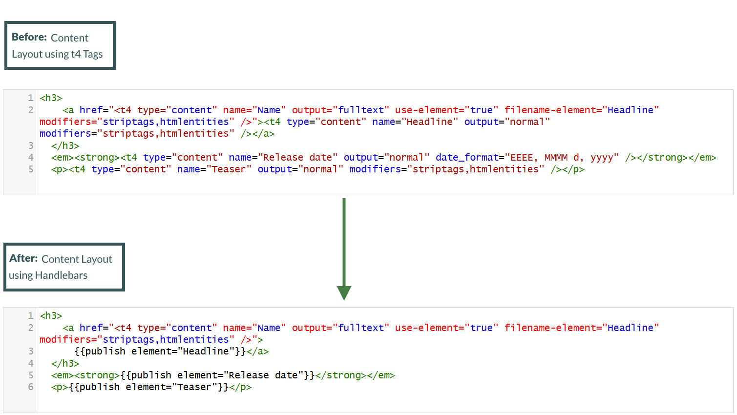
- Replace the "Headline" element t4 tag only. You can use the publish Helper to do this. You will replace the fulltext link in an upcoming exercise.
<h3>
<a href="<t4 type="content" name="Name" output="fulltext" use-element="true" filename-element="Headline" modifiers="striptags,htmlentities" />">
<t4 type="content" name="Headline" output="normal" modifiers="striptags,htmlentities" /></a>
</h3>
- Replace the "Release date" element t4 tag. You can use the publish Helper to do this.
<em><strong><t4 type="content" name="Release date" output="normal" date_format="EEEE, MMMM d, yyyy" /></strong></em>
- Replace the "Teaser" element t4 tag. You can use the publish Helper to do this.
<p><t4 type="content" name="Teaser" output="normal" modifiers="striptags,htmlentities" /></p>
- Click Save changes to save the changes to your content layout.
- Update your preview to check the result.
Exercise 6.3: creating the Fulltext link
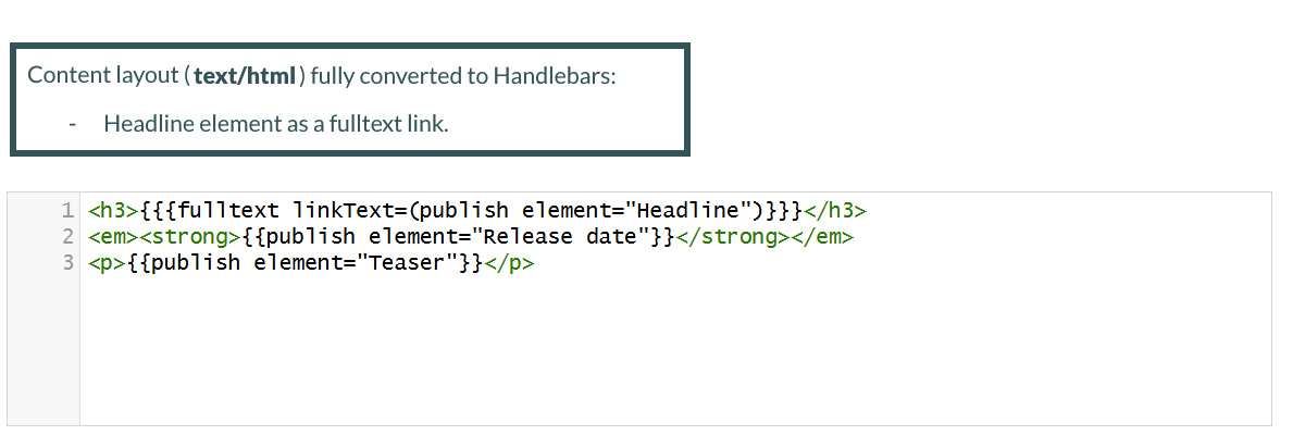
In the previous exercise (Exercise 4.4: Using the fulltext Helper (Block Level Variant)), you learned how to use the block level variant of the fulltext Helper. To create a fulltext link, however, you can use the fulltext Helper but in a standard level expression instead.
- Click into the Content layouts tab.
- Select the "text/html" content layout and open the </> Content layout code tab.
- To generate a fulltext link update the "Headline" element using the fulltext Helper. The linkText option of the fulltext Helper should be the "Headline" element. Replace the [fulltext] placeholder with Handlebars code.
<h3>[fulltext]</h3>
- Click Save changes to save the changes to your content layout.
- Update your preview to check the result.
The fulltextURL Helper introduced in Terminalfour 8.4.1 will allow you to output the URL to the fulltext page for the current content item. This is useful if you just need the URL and don't need the full link to be generated.
It's used like:
{{fulltextURL}}
Exercise 6.4: formatting a date element
If you output a Date element using the publish Helper like this:
<em><strong>{{publish element="Release date"}}</strong></em>
You'd get an output in the following format (Standard ISO Date format):
Mon, 10 Sep 2024 11:35:00 IST
There is also a second Helper called dateElement that works like so:
{{dateElement element="Date element"}}This will output in a slightly different format:
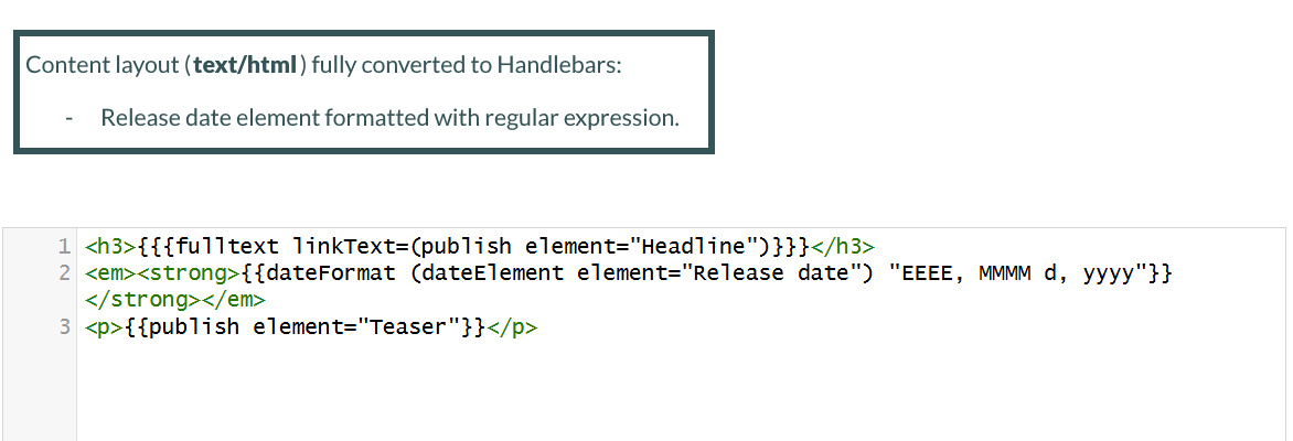
2024-09-20T09:30:10Z[Etc/UTC]The difference is that the dateElement Helper outputs a date in such a format that can be accepted into the dateFormat Helper. You can use the dateFormat Helper to define a date format and pass in the dateElement Helper (which provides the date in the required structure for the dateFormat Helper to function).
Note that the dateFormat Helper accepts two arguments: (dateToFormat and formatToUse)
{{dateFormat dateToFormat formatToUse}}
- Click into the Content layouts tab.
- Select the "text/html" content layout and open the </> Content layout code tab.
- Output the "Release date" element using the dateFormat and dateElement Helpers. Replace the [Release date] placeholder with Handlebars code.
You can reference different date formats here: T4 Tags: Format Dates
<em><strong>[Release date]</strong></em>
- Click Save changes to save the changes to your content layout.
- Update your preview to check the result.
Exercise 6.5: updating the "text/fulltext" content layout to use Handlebars
- Go to Assets > Content Types.
- Click your content type name to edit it. (Use the Filter tool to search). Open the Content layouts tab.
- The Content layout tab is an area to add content layout(s) for your content type. Click into the "text/fulltext" content layout to edit it.
- Click into the General information tab.
- Name: "text/fulltext" - this is the default Type set in the Channel. This ensures the content can be displayed.
- File Extension: Default - unless this is used with a different File Extension. This requires other extensions being permitted in the Channel.
- Syntax Type: HTML/XML – this determines which syntax is highlighted.
- Content layout processor: Update the content layout processor to Handlebars Content.
- Content Layout code: this determines the output for your content. If you have created the HTML already, you can start by pasting that into the code field as displayed below.
Exercise 6.6: updating the "text/fulltext" content layout
- Click into the Content layouts tab.
- Select the "text/fulltext" content layout and open the </> Content layout code tab.
- Replace the "Headline" element t4 tag. You can use the publish Helper to do this.
<h2><t4 type="content" name="Headline" output="normal" modifiers="striptags,htmlentities" /></h2>
- Replace the "Release date" element t4 tag. Make sure to add the correct formatting. You can use the dateFormat and dateElement Helpers to do this.
You can reference different date formats here: T4 Tags: Format Dates
<em><strong><t4 type="content" name="Release date" output="normal" date_format="EEEE, MMMM d, yyyy" /></strong></em>
- Replace the "Image" element t4 tag. You can use the publish Helper to do this.
<div>
<t4 type="content" name="Image" output="normal" formatter="image/normal" />
</div>
- Replace the "Teaser" element t4 tag. You can use the publish Helper to do this.
<p><t4 type="content" name="Teaser" output="normal" modifiers="striptags,htmlentities" /></p>
- Replace the "News story" element t4 tag. You can use the publish Helper to do this.
<t4 type="content" name="News story" output="normal" modifiers="medialibrary,nav_sections" />
- Click Save changes to save the changes to your content layout.
- Update your preview to check the result.
Exercise 6.7: using the media and mediaId Helpers
In this exercise, you will learn how to use the media and mediaId Helpers to apply a different layout to the image in the content layout.
Note that when you output a Media element using the publish Helper like you are doing here, the media element will be output using the standard media layout selected in the UI. If you needed to enforce a specific alternate Media layout you can use the mediaId Helper alongside the media Helper to do so.
For this exercise, you need to use the media Helper to output a piece of Media with an explicit layout:
{{{media id="123" layout="image/alternative"}}}
You will then use the mediaId Helper to pass in the id of your "Image" element to the media Helper. It would work like so:
{{{media id=(mediaId element="Media element") layout="text/alternative"}}}
- Click into the Content layouts tab.
- Select the "text/fulltext" content layout and open the </> Content layout code tab.
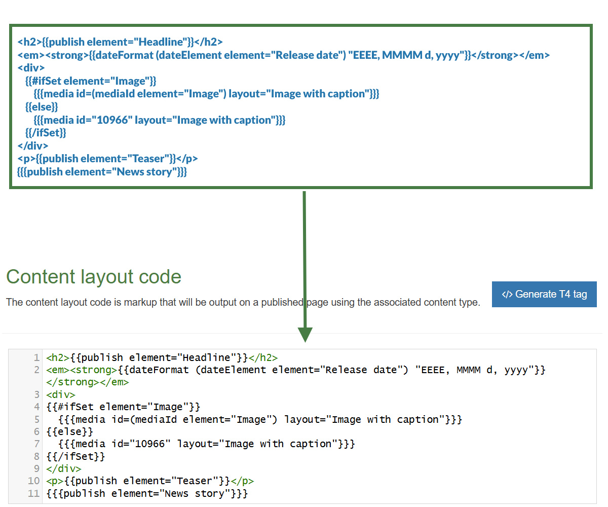
- Let's apply a different layout to the image in the content layout by using the media and mediaId Helpers. Let's use the alternate layout: "Image with caption". Replace the [Image] placeholder with Handlebars code.
<h2>{{publish element="Headline"}}</h2>
<em><strong>{{dateFormat (dateElement element="Release date") "EEEE, MMMM d, yyyy"}}</strong></em>
<div>
[Image]
</div>
<p>{{publish element="Teaser"}}</p>
{{{publish element="News story"}}}
- Click Save changes to save the changes to your content layout.
- Update your preview to check the result.
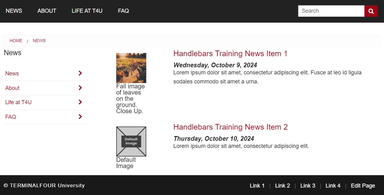
7. Display image based on element
In this exercise, you will learn how to provide a fallback image depending on whether an image element has been set. You will use the "News Item" content type and update the content layout with the Handlebars code required.
- If the "Image" element of the content type is set, then display the image, otherwise display a default fallback image.
- You can use a simple ifSet Helper to check if the image is set.
Exercise 7.1: adding an image to the "text/html" content layout
- Go to Assets > Content Types.
- Click your content type name to edit it. (Use the Filter tool to search). Open the Content layouts tab.
- The Content layout tab is an area to add content layout(s) for your content type. Click into the "text/html" content layout to edit it.
- Copy/paste the code below into your content layout. This code adds the "Image" element and some wrapper divs to position the image alongside the "Headline", "Release date" and "Teaser" elements.
- Replace the [Image], [fulltext], [Release date] and [Teaser] placeholders with Handlebars code.
<div class="row">
<div class="large-3 columns">
[Image]
</div>
<div class="large-9 columns">
<h3>[fulltext]</h3>
<em><strong>[Release date]</strong></em>
<p>[Teaser]</p>
</div>
</div>
- Click Save changes to save the changes to your page layout.
- Update your preview to check the result.
Exercise 7.2: using the ifSet Helper
- Click into the Content layouts tab.
- Select the "text/html" content layout and open the </> Content layout code tab.
- The ifSet Helper allows you to check whether the "Image" element is set. If the "Image" element is set display it.
{{#ifSet element="Image"}}
{{{media id=(mediaId element="Image") layout="Image with caption"}}}
- Otherwise if the "Image" element is not set, display a fallback image.
- You need to retrieve the id for the fallback image from the media library. In this exercise, you will use the image with id 10966 already in the media library.

{{else}}
{{{media id="10966" layout="Image with caption"}}}
{{/ifSet}}
- Click Save changes to save the changes to your page layout.
- Update your preview to check the result.
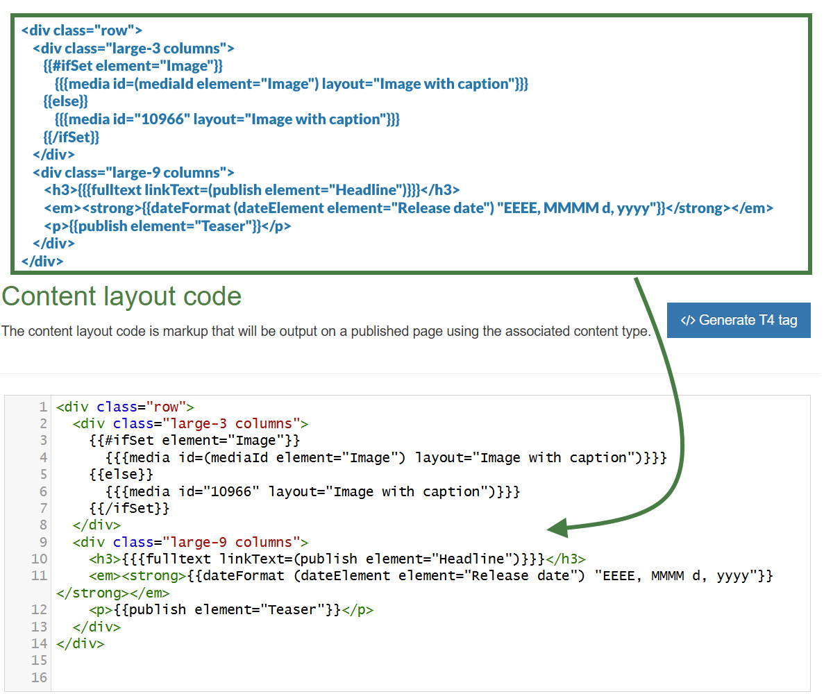
Exercise 7.3: updating the "text/fulltext" content layout
Let's update the code in the "text/fulltext" content layout to also display the fallback image when needed.
- Click into the Content layouts tab.
- Select the "text/fulltext" content layout and open the </> Content layout code tab.
- The ifSet Helper allows you to check whether the "Image" element is set. If the "Image" element is set display it, otherwise if the "Image" element is not set, display the fallback image. Replace the [Open ifSet], [else] and [Close ifSet] placeholders with Handlebars code.
[Open ifSet]
{{{media id=(mediaId element="Image") layout="Image with caption"}}}
[else]
{{{media id="10966" layout="Image with caption"}}}
[Close ifSet]
8. Working with lists
In the following exercises, you will learn how to work with lists and display them on the page. You will learn to use the selectedNames, selectedValues, selected and list Helpers and the different variables that can be used within lists in Handlebars.
- In the following exercises, you will focus on learning how to use the in-built Helpers selectedNames, selectedValues, list and selected to work with lists.
- You will use the each Helper to loop over the elements in a list and decide your output.
- You will learn how to take the selected values from a list and output them as HTML unordered lists (<ul>).
selectedNames and selectedValues Helpers
The selectedNames and selectedValues Helpers are used to give you some control over how List elements are output.
By default, if you output a List element with the publish Helper (in 8.4.0 and above), the selected List Item's Name will be output. If more than one item is selected, the names will be separated by a comma and a space , .
{{publish element="Checkbox"}}
<!-- output would be "Name1, Name2, Name3" etc. -->
The selectedNames Helper allows you to modify that separator value if required (it defaults to , if the argument isn't passed).
{{selectedNames element="Checkbox" separator="|"}}
<!-- output would be "Name1|Name2|Name3" etc. -->
If the selected list items contain sublists then you can choose to modify the level-separator between the parent and child items. It defaults to > if the argument isn't passed.
{{selectedNames element="Checkbox" separator="|" level-separator="~"}}
<!-- output would be "Name1|Name1~Child1|Name1~Child2|Name2|Name3" etc. -->
The selectedValues Helper works exactly the same way, except instead of outputting the selected list item's name, it output's the value.
list and selected Helpers
The list and selected Helpers are both used in order to give full control over the output of List elements.
List Helper
It allows you to loop over every item in a list. You have access to helpful variables that let you know whether the list item was selected by the user, whether there's a sublist, whether the list item is first or last, and many more. Check the docs for full information.
Selected Helper
The selected Helper works in a very similar way but instead of looping over the whole list, it just loops over the selected items in the list.
The list and selected Helpers are both used in order to help with the output of List elements:
- Select Box
- Check Box
- Radio Button
- Multi-select List
- Multiple Select
- Cascading List
Both the list and selected Helpers are designed to be used alongside the built-in each block expression with Handlebars.
Using the list Helper as an example:
{{#each (list element="List Content Element")}}
<p>{{name}} - {{value}}</p>
{{/each}}
The above code is looping over every element in the list whether it is selected by the user or not and outputting the name and value in paragraphs.
However, there are a lot more variables available to use than just {{name}} and {{value}}. With both the list and selected Helpers we have the following variables available to us:
- listId - The Id of the list that this entry belongs to.
- listName - The Name of the list that this entry belongs to. (introduced in 8.4.0)
- entryId - The Id of this list entry.
- name - The name of this list entry.
- value - The value of this list entry.
- sequence - The sequence of this entry in the list.
- language - The language of the list entry.
- selected - true if the list entry is selected, false otherwise.
- hasSubList - true if the entry contains a sub-list.
- subList - A reference to the sub-list, if one is present.
- subListId - the Id of the sub-list, if present.
- subListName - the Name of the sub-list, if present. (introduced in 8.4.0)
In addition to the variables relating to each list entry returned, there are a number of variables made available to give the developer more information about the position of each entry in the list.
- @first - true if this is the first entry in the list/array.
- @last - true if this is the last entry in the list/array.
- @odd - true if this this entry has an odd index. Note that the array is zero-indexed.
- @even - true if this this entry has an even index. Note that the array is zero-indexed.
- @index - Returns the index of this entry within the list/array.
These allow us full control over how the lists should be output.
Exercise 8.1: adding a list element to the "General Content" content type
- Go to Assets > Content Types.
- Click your content type name to edit it. (Use the Filter tool to search). Open the Content layouts tab.
- Select the Elements tab.
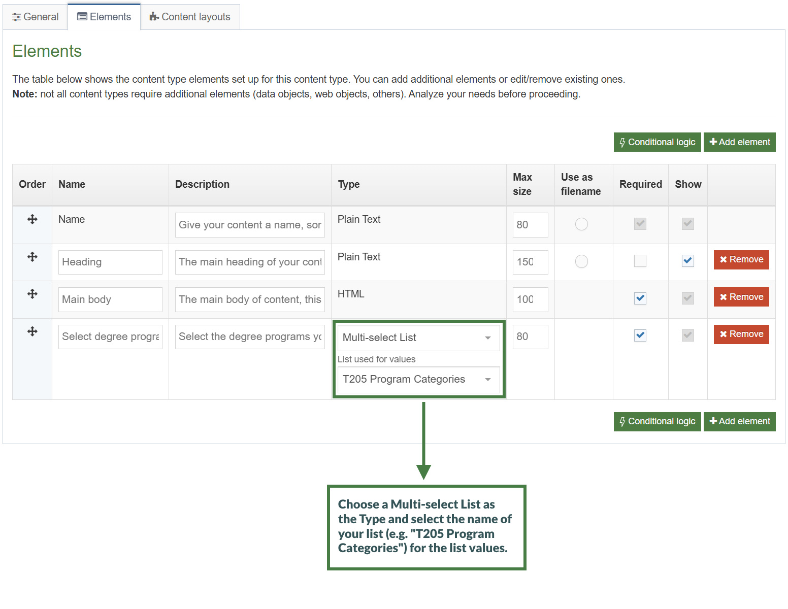
- Click the Add element button to add the new list select element as per the table below:
- Name: Give your List element a descriptive name. (e.g. "Select degree programs")
- Description: Give your List element a description.
- Type: Choose "Multi-select List".
- List used for values: Select "T205 Program Categories" from the available list options.
| Name | Description | Type | Max Size | Use as filename | Required | Show |
|---|---|---|---|---|---|---|
| Select degree programs | Select the degree programs you are interested in. |
Multi-select List List used for values: T205 Program Categories |
leave default | N/A | Yes | Yes |
Exercise 8.2: using the selectedNames and selectedValues Helpers
- Go to Assets > Content Types.
- Click your content type name to edit it. (Use the Filter tool to search). Open the Content layouts tab.
- Click into the Content layouts tab.
- Choose to edit your "text/html" content layout.
- Use the selectedNames and selectedValues Helpers to output the names and values of the items in the list. Use the separator option to separate the elements with a "|" symbol.
- Replace the [selectedNames] and [selectedValues] placeholders with Handlebars code.
[selectedNames]
[selectedValues]
Exercise 8.3: using the each and selected Helpers
- In this exercise, you will use the selected Helper and iterate not through the whole list but rather only through the selected items and display them.
- Go to Assets > Content Types.
- Click your content type name to edit it. (Use the Filter tool to search). Open the Content layouts tab.
- Click into the Content layouts tab.
- Choose to edit your "text/html" content layout.
- Use the each and selected Helpers to iterate through the selected items in the list only and use the "name" variable to output the name of each item in the list.
{{#each (selected element="Select degree programs")}}
{{name}}
{{/each}}
Exercise 8.4: using the @first and @last variables
- Open an unordered list (<ul>) if in the first iteration of the loop. Use the if Helper and the @first variable.
- Wrap the name of the list item with <li></li> tags.
- Close the unordered list (</ul>) if in the last iteration of the loop. Use the if Helper and the @last variable.
{{#each (selected element="Select degree programs")}}
[Open the unordered list <ul>]
[Output the name of the list item]
[Close the unordered list </ul>]
{{/each}}
- Click Save changes to save the changes to your content layout.
- Update your preview to check the result.
Note: You can make use of the ~ (tilde) character in Handlebars expressions to tell Handlebars to ignore the whitespace and output everything on a single line.
Exercise 8.5: using the list Helper
- In this second exercise, let's use the list Helper to display the whole list and additionally display the items that have been selected in bold.
- Go to Assets > Content Types.
- Click your content type name to edit it. (Use the Filter tool to search). Open the Content layouts tab.
- Click into the Content layouts tab.
- Choose to edit your "text/html" content layout.
- Use the each and list Helpers to iterate through all the items in the list.
- Open an unordered list (<ul>) if in the first iteration of the loop. Use the if Helper and the @first variable.
- Wrap the name of the list item with <li></li> tags.
- Close the unordered list (</ul>) if in the last iteration of the loop. Use the if Helper and the @last variable.
[Iterate through all the items in the list]
{{#if @first}}
<ul>
{{/if}}
<li>{{name}}</li>
{{#if @last}}
</ul>
{{/if}}
[Close the each Helper]
- Click Save changes to save the changes to your content layout.
- Update your preview to check the result.
Exercise 8.6: using the selected variable
- Let's wrap each selected item in the list with a <strong> tag to display selected items in bold. Use the "selected" variable with an if Helper to achieve this.
[Iterate through all the items in the list]
[Open the unordered list <ul>]
[Output the name of the list item, if the item is selected display it in bold]
[Close the unordered list </ul>]
[Close the each Helper]
- Click Save changes to save the changes to your content layout.
- Update your preview to check the result.
listById Helper
The listById Helper works exactly like the list and selected Helpers above, and includes all the same variables. The difference is this Helper outputs the list by referencing the list ID, rather than a list element.
This can be useful if you need to output a full list, but don't need it to be an item of content.
When using the listById Helper the selected variable will now return true or false depending on whether the list item is set to be selected by default in the List configuration page.
9. Embedding content layouts
In the following exercise, you will learn how to embed content layouts using the embed Helper.
- You will learn how to output a different content layout based on what value a user has selected in a list.
- You will add a list element to choose a specific content layout to be applied to the "News Item" content type.
- The user can only choose a single item in the list (e.g. they're not using a Multi-select list or a Checkbox). You will then use the choice selected to output the corresponding layout.
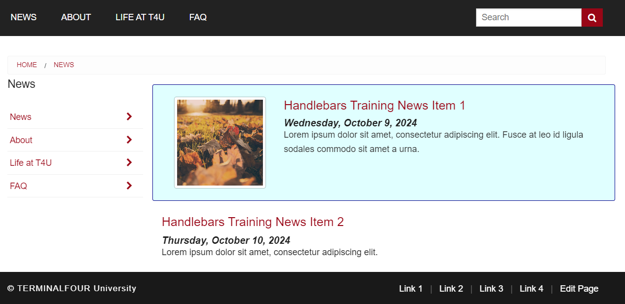
Exercise 9.1: creating the "Basic" content layout
- The "Basic" content layout will only output the "Headline", "Release date" and "News story" elements of the "News Item" content type.
- Go to Assets > Content Types.
- Click your content type name to edit it (Use the Filter tool to search).
- Open the Content layouts tab and click Add content layout.
- Fill in the General information tab.
- Name: "text/basic-layout".
- File Extension: Default - unless this is used with a different File Extension. This requires other extensions being permitted in the Channel.
- Syntax Type: HTML/XML – this determines which syntax is highlighted.
- Content layout processor: Update the content layout processor to Handlebars Content.
- Click into the Content layout code tab.
- Copy the code below as your "Basic" content layout code.
<h3>{{{fulltext linkText=(publish element="Headline")}}}</h3>
<em><strong>{{dateFormat (dateElement element="Release date") "EEEE, MMMM d, yyyy"}}</strong></em>
<p>{{publish element="Teaser"}}</p>
- Click Save changes to save the changes to your content layout.
Exercise 9.2: using the abbreviate Helper
Note: Handlebars has several String Manipulation Helpers available. You will use the abbreviate Helper in this exercise, you can learn about some of these other Helpers here: String Manipulation Helpers
- Go to Assets > Content Types.
- Click your content type name to edit it (Use the Filter tool to search).
- Click into the Content layouts tab and then into the "text/basic-layout" content layout.
- Add the abbreviate Helper to output only the first 50 characters of the "Teaser" element. Replace the [Teaser] placeholder with Handlebars code.
<h3>{{{fulltext linkText=(publish element="Headline")}}}</h3>
<em><strong>{{dateFormat (dateElement element="Release date") "EEEE, MMMM d, yyyy"}}</strong></em>
<p>[Teaser]</p>
- Click Save changes to save the changes to your content layout.
Exercise 9.3: embedding the "Basic" content layout using the embed Helper
- Update the "text/html" content layout of the "News Item" content type. Use the embed Helper to embed the "Basic" content layout you created in the previous exercise.
[Embed the "text/basic-layout"]
- Click Save changes to save the changes to your content layout.
- Update your preview to check the result.
Snippet Helper
It's quite common to use the SectionMetaDescription Content type to create layouts for code or information that you want to be available in every section.
This is often used alongside a Related Content navigation object that looks in the current section for content with an alternate layout.
With the snippet Helper you can now pull in a layout from the SectionMetaDescription content type without the need to create any navigation objects.
Used like:
{{snippet layout="text/section-meta-layout"}}
Exercise 9.4: adding a list element to the "News Item" content type
- Go to Assets > Content Types.
- Click your content type name to edit it. (Use the Filter tool to search).
- Open the Elements tab.
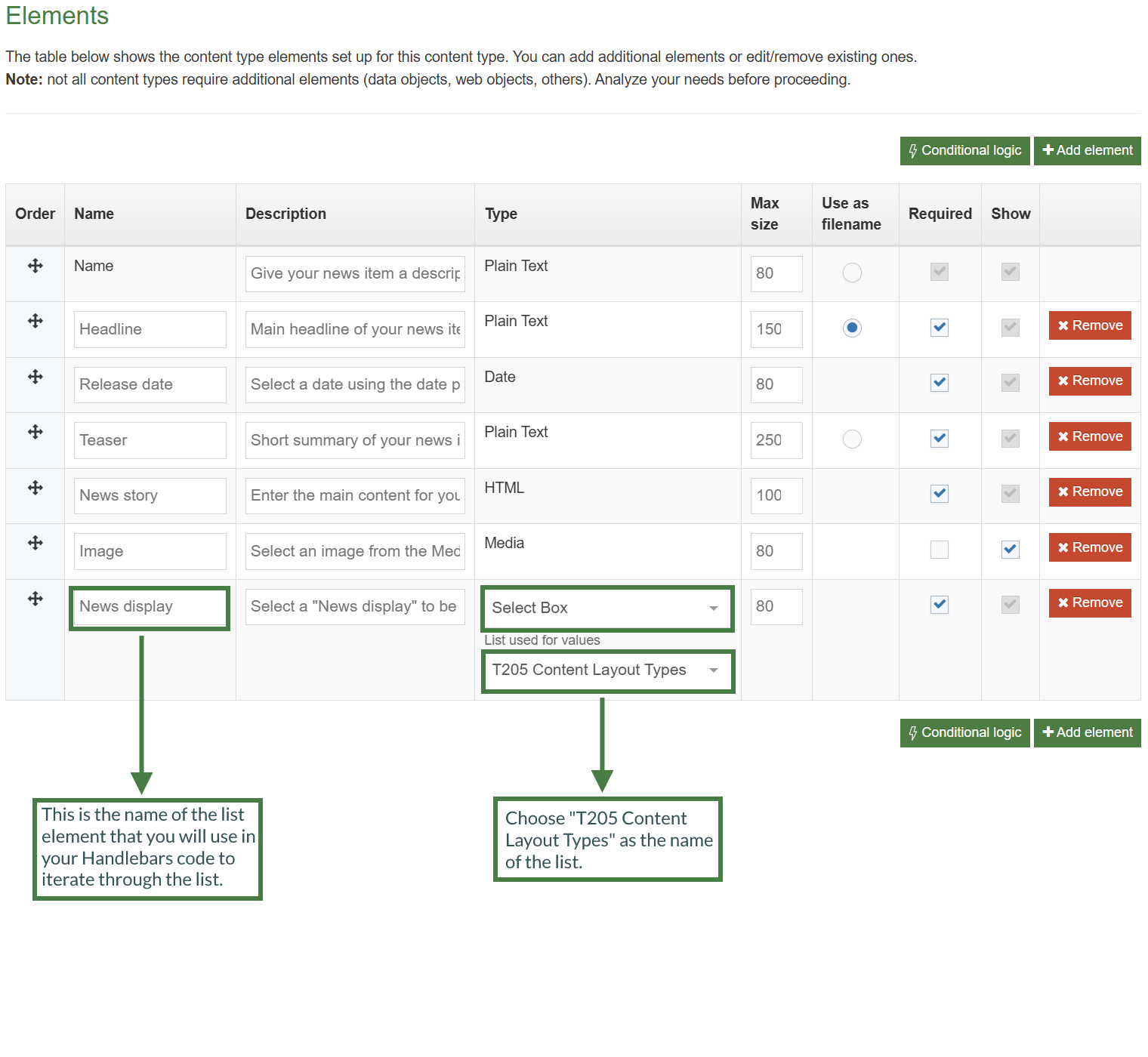
- Click the Add element button to add the new list select element as per the table below:
- Name: Give the element a descriptive name.
- Description: Give your select list a description.
- Type: Choose "Select Box".
- List used for values: Select "T205 Content Layout Types" from the available list options.
| Name | Description | Type | Max size | Use as filename | Required | Show |
|---|---|---|---|---|---|---|
| News display | Select a "News display" to be used for this content. A "Basic" display for basic output or a "Fancy" display for a more stylized output. |
Select Box List used for values: T205 Content Layout Types
|
leave default | N/A | Yes | Yes |
Exercise 9.5: adding the "Fancy" content layout
- The "Fancy" content layout will add the "Image" element depending on whether it is set.
- Additionally, let's make the "Image" element a link to the fulltext news page using the fulltext Helper.
- To further differentiate the "Fancy" layout, you will add a different layout to the image and some styling to the panel that contains the elements.
- Go to Assets > Content Types.
- Click your content type name to edit it (Use the Filter tool to search).
- Open the Content layouts tab and click Add content layout.
- Fill in the General information tab.
- Name: "text/fancy-layout".
- File Extension: Default - unless this is used with a different File Extension. This requires other extensions being permitted in the Channel.
- Syntax Type: HTML/XML – this determines which syntax is highlighted.
- Content layout processor: Update the content layout processor to Handlebars Content.
- Click into the Content layout code tab.
- Copy the code below as your "Fancy" content layout code.
<div class="row panel callout radius">
<div class="large-3 columns">
{{#ifSet element="Image"}}
{{{fulltext linkText=(media id=(mediaId element="Image") layout="Image thumbnail")}}}
{{else}}
{{{fulltext linkText=(media id="10966" layout="Image thumbnail")}}}
{{/ifSet}}
</div>
<div class="large-9 columns">
<h3>{{{fulltext linkText=(publish element="Headline")}}}</h3>
<em><strong>{{dateFormat (dateElement element="Release date") "EEEE, MMMM d, yyyy"}}</strong></em>
<p>{{publish element="Teaser"}}</p>
</div>
</div>
- Click Save changes to save the changes to your content layout.
Exercise 9.6: updating the "text/html" content layout
- Use the each and selected Helpers to retrieve the selected value in the list.
{{#each (selected element="News display")}}
{{/each}}
- You can use the eq Helper to check the value of the list selected ("Basic Layout") and the embed Helper to then embed the appropriate layout, "basic-layout", this must be the name of the content layout defined in the content type.
There are a number of Helpers to allow you to compare values:
eq - Tests if two values are equal
neq - Tests if two values are not equal
gt - Tests if one value is greater than another
gte - Tests if one value is greater than or equal to another
lt - Tests if one value is less than another
lte - Tests if one value is less than or equal to another
and - Tests if values are true (you can pass two or more arguments)
or - Tests if any values are true (you can pass two or more arguments)
not - If the provided input is false then the block will not be processed
Arguments are space separated when passed to Handlebars expressions (as opposed to comma separated).
{{#eq (publish element="Greeting") "Hello"}}
<p>Hello to you too!</p>
{{else}}
<p>You didn't say "Hello".</p>
{{/eq}}
{{#lt 5 8}}
<p>5 is indeed less than 8.</p>
{{else}}
<p>This will never be published because 5 is always less than 8.</p>
{{/lt}}
{{#each (selected element="News display")}}
{{#eq value "Basic Layout"}}
[Embed the "text/basic-layout"]
{{/eq}}
- You can use the eq Helper to check the value of the list selected ("Fancy Layout") and the embed Helper to then embed the appropriate layout, "fancy-layout", this must be the name of the content layout defined in the content type.
{{#each (selected element="News display")}}
{{#eq value "Basic Layout"}}
[Embed the "text/basic-layout"]
{{/eq}}
[Check if the value of the list item is "Fancy Layout"]
[Embed the "text/fancy-layout"]
[Close the eq Helper]
{{/each}}
- Click Save changes to save the changes to your content layout.
- Update your preview to check the result.
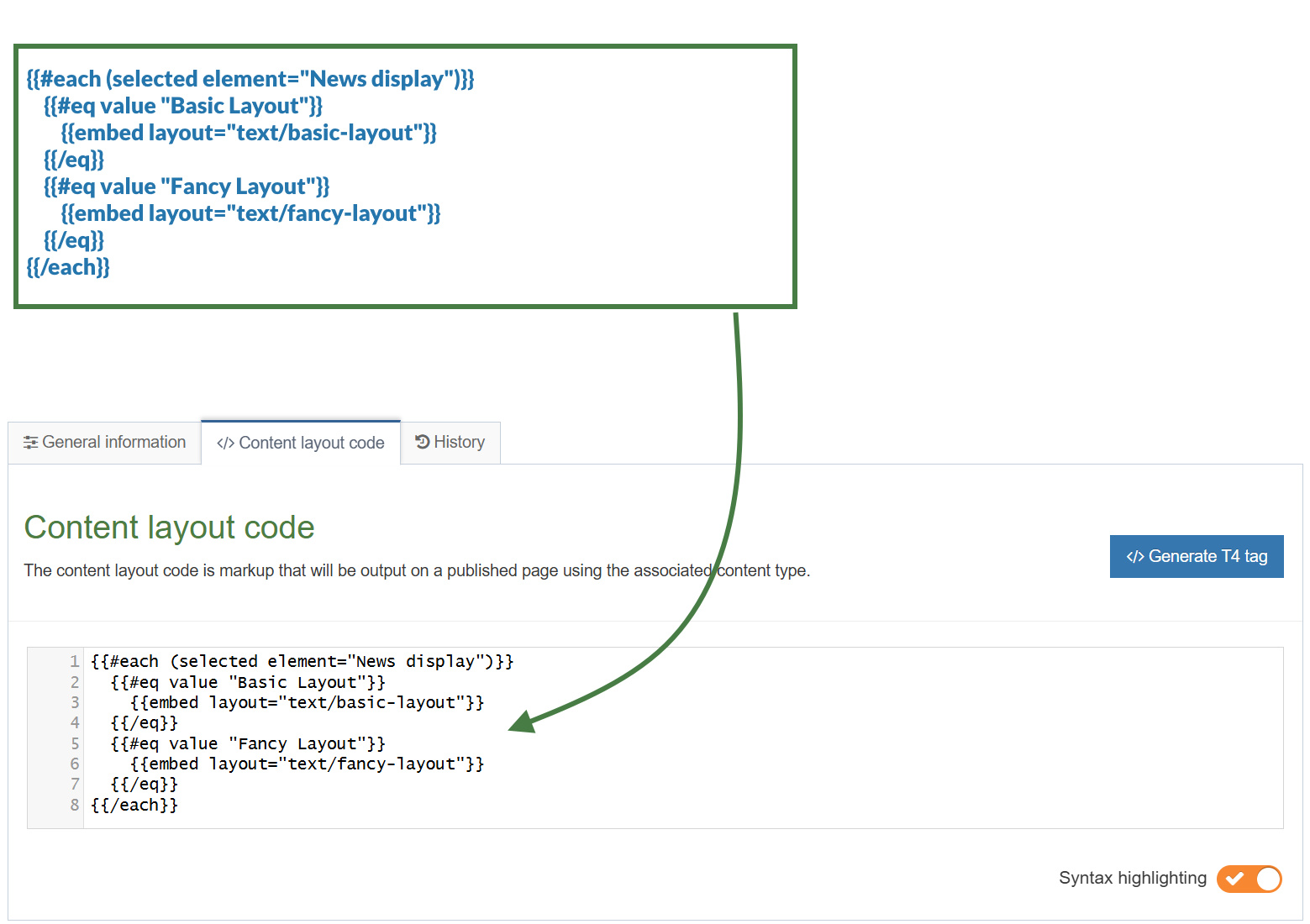
10. Wrapper content type
In this last exercise, you will build an Accordion content type to learn how to work with sequences of content items of the same type.
- Allows a sequence of content items of the same type to be wrapped in markup.
- Used for sliders, accordions, tabs, card groups and other repeatable items.
first and last Helpers
The first Helper will be true when the content item is the first piece of content in a section.
{{#first}}
<h1>First content item in the section</h1>
{{/first}}The last Helper will be true when the content item is the last piece of content in a section.
{{#last}}
<footer>Last content item in the section</footer>
{{/last}}
firstOfType and lastOfType Helpers
These Helpers let you know if an item of content is the first and last of its type in a section:
{{#firstOfType}}
Only output if first of this content type in section
{{/firstOfType}}{{#lastOfType}}
Only output if last of this content type in section}}
{{/lastOfType}}
firstInSequence and lastInSequence Helpers
Perhaps more flexible though, are these Helpers which allow you to determine if an item of content is the first and last of its type in an uninterrupted sequence of content in a section.
The firstInSequence Helper will be true when the content item is the first piece of content using this content type in an uninterrupted sequence of content in a section.
{{#firstInSequence}}
Only output if first of this content type in an uninterrupted sequence in this section
{{/firstInSequence}}
The lastInSequence Helper will be true when the content item is the last piece of content using this content type in an uninterrupted sequence of content in a section.
{{#lastInSequence}}
Only output if last of this content type in an uninterrupted sequence in this section
{{/lastInSequence}}
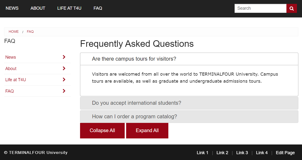
Let's now demonstrate the use of these Helpers. In the following exercises, you will build an accordion component that displays FAQs.
Exercise 10.1: setting up the jQuery UI library
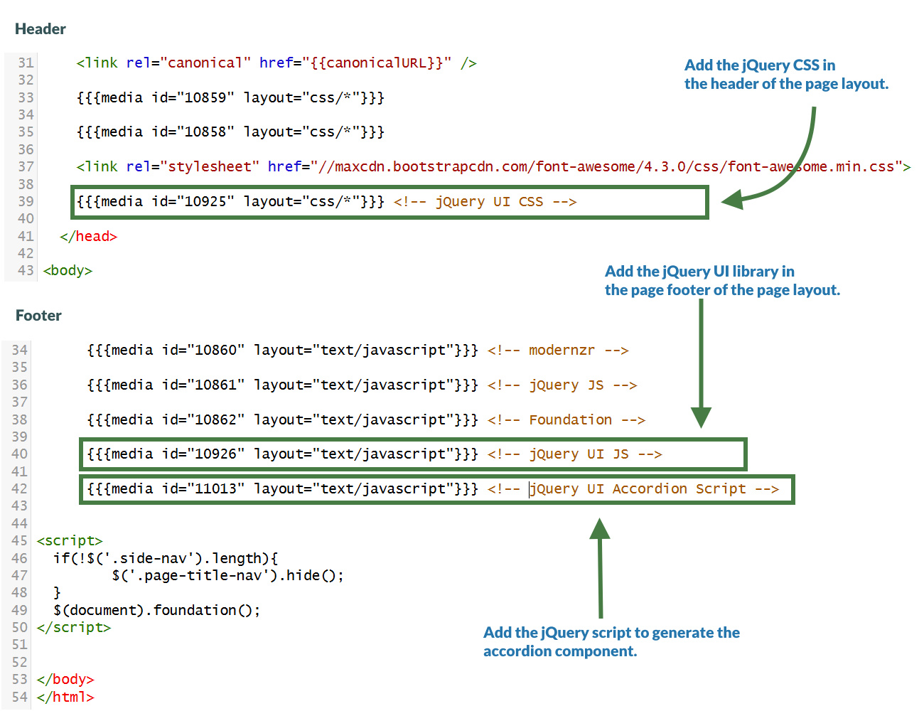
The accordion component is generated using the jQuery UI Library. In order to use this library, you will need to upload three files into your media library and then target them using Handlebars in your page layout. These files have been previously uploaded to the media library, let's learn how to reference them using Handlebars in the page layout.
- Go to Content > Media Library.
- Click into "T205 Training Site Example" and then into Developer Assets.
- Click into the CSS and JavaScript folders to retrieve the corresponding ids of the required libraries.
- Go to Assets > Page Layouts.
- Click your page layout name to edit it. (Use the Filter tool to search). Open the </> Header code tab.
- Use the media Helper to create the link to the jQuery UI CSS file.
{{{media id="10925" layout="css/*"}}} <!-- jQuery UI CSS-->
- Open the </> Footer code tab.
- Use the media Helper to create the link to the jQuery UI file.
{{{media id="10926" layout="text/javascript"}}} <!-- jQuery UI JS -->
- Use the media Helper to insert the jQuery accordion script that generates the accordion component.
{{{media id="11013" layout="text/javascript"}}} <!-- jQuery UI Accordion Script -->
- Click Save changes to save the changes to your page layout.
Exercise 10.2: using the sectionLevel Helper
In this exercise, let's improve the page layout by linking to the jQuery UI library CSS and JS files only when you are in the "FAQ" section of your site, which is the only section that needs to display an accordion and therefore make use of this library.
The sectionLevel Helper is used to output the current Section Level in the hierarchy of the site. The channel root is considered level 1. Direct children of that section are considered level 2, etc.
- Go to Assets > Page Layouts.
- Click your page layout name to edit it. (Use the Filter tool to search). Open the </> Header code tab.
- Use the eq and sectionLevel Helpers to insert the jQuery UI CSS file into the header of the page layout only when in the level 2 sections of the site structure.
{{#eq (sectionLevel) 2}}
{{{media id="10925" layout="css/*"}}} <!-- jQuery UI CSS -->
{{/eq}}
- Use the eq and sectionLevel Helpers to insert the jQuery UI JS and jQuery UI accordion script files into the footer of the page layout only when in the level 2 sections of the site structure.
{{#eq (sectionLevel) 2}}
{{{media id="10926" layout="text/javascript"}}} <!--jQuery UI JS -->
{{{media id="11013" layout="text/javascript"}}} <!--jQuery UI Accordion Script -->
{{/eq}}
- Click Save changes to save the changes to your content layout.
- Update your preview to check the result.
Exercise 10.3: creating the "Accordion" content type
- Go to Assets > Content Types > Create content type.
- Fill in the General content type information:
- Name: enter a name here. This should suggest what type of content it is used for.
- Description: describe in more detail when to use this content type.
- Minimum user level: if you wish to restrict who can use this content type, you can set a level here. If content types are created in groups, a user must be a member of the group as well as meet the minimum user level criteria to use the content type.
- Enable direct edit: decide if direct edit can be used for this content type.
- Mark as eForm: If checked, this allows your content type to collect eForm data.
- Workflow: if relevant, enable a workflow for content created using this content type.
- Primary group: Select your group. This allows you to select the group which is permitted to use this content type. Click Toggle shared groups to share the content type with more than one group.
- Select the Elements Tab.
- Each content type has a Name element by default. This is used to name the content and is typically not displayed on the published site.
- Add the other elements you need by filling in the information as outlined in the table below. Click add element to begin filling in the details for each element.
- Once you have added all your elements, click Save changes. The Content layout tab opens.
| Name | Description | Type | Max Size | Required | Show |
|---|---|---|---|---|---|
| Accordion Component Heading | Optional main accordion heading | Plain Text | 80 | No | Yes |
| Accordion Heading | The heading/title of the accordion item | Plain Text | 80 | Yes | Yes |
| Accordion Body | The content of the accordion item | HTML | 100000 | Yes | Yes |
Use the firstInSequence and lastInSequence Helpers to ensure the accordion is surrounded appropriately with a wrapper div.
Exercise 10.4: creating the "text/html" content layout
- Go to Assets > Content Types.
- Click your content type name to edit it. (Use the Filter tool to search). Open the Content layouts tab.
- Click into the Content layouts tab.
- Choose to edit your "text/html" content layout.
- In the Content layout code tab of your "text/html" content layout add the code as per below:
- Use the firstInSequence Helper to embed the "text/before" content layout at the beginning of the accordion. Then embed your "text/middle" content layout. Finally, use the lastInSequence Helper to embed the "text/after" content layout at the end of the accordion.
{{#firstInSequence}}
[Embed the text/before content layout]
{{/firstInSequence}}
[Embed the text/middle content layout]
{{#lastInSequence}}
[Embed the text/after content layout]
{{/lastInSequence}}
- Click Save changes to save the changes to your content layout.
Exercise 10.5: creating the "text/before" content layout
- Go to Assets > Content Types.
- Click your content type name to edit it (Use the Filter tool to search).
- Open the Content layouts tab and click Add content layout.
- Fill in the General information tab.
- Name: "text/before".
- File Extension: Default - unless this is used with a different File Extension. This requires other extensions being permitted in the Channel.
- Syntax Type: HTML/XML – this determines which syntax is highlighted.
- Content layout processor: Update the content layout processor to Handlebars Content.
- Click into the Content layout code tab.
- Copy the code below as your "text/before" content layout code.
- Since the "Accordion Component Heading" element is not a required element use the ifSet Helper to output it only if it has been set.
- Make sure to replace the [Open ifSet], [Accordion Component Heading] and [Close ifSet] placeholders with Handlebars code.
[Open ifSet]
<h2>[Accordion Component Heading]</h2>
[Close ifSet]
<div id="accordion"> <!-- open #accordion -->
- Click Save changes to save the changes to your content layout.
Exercise 10.6: creating the "text/middle" content layout
- Go to Assets > Content Types.
- Click your content type name to edit it (Use the Filter tool to search).
- Open the Content layouts tab and click Add content layout.
- Fill in the General information tab.
- Name: "text/middle".
- File Extension: Default - unless this is used with a different File Extension. This requires other extensions being permitted in the Channel.
- Syntax Type: HTML/XML – this determines which syntax is highlighted.
- Content layout processor: Update the content layout processor to Handlebars Content.
- Click into the Content layout code tab.
- Copy the code below as your "text/middle" content layout code.
- Make sure to replace the [Accordion Heading] and [Accordion Body] placeholders with Handlebars code.
<h3>[Accordion Heading]</h3>
<div>[Accordion Body]</div>
- Click Save changes to save the changes to your content layout.
Exercise 10.7: creating the "text/after" content layout
- Go to Assets > Content Types.
- Click your content type name to edit it (Use the Filter tool to search).
- Open the Content layouts tab and click Add content layout.
- Fill in the General information tab.
- Name: "text/after".
- File Extension: Default - unless this is used with a different File Extension. This requires other extensions being permitted in the Channel.
- Syntax Type: HTML/XML – this determines which syntax is highlighted.
- Content layout processor: Update the content layout processor to Handlebars Content.
- Click into the Content layout code tab.
- Copy the code below as your "text/after" content layout code.
</div> <!-- close #accordion -->
<div>
<a href="#" class="button">Collapse All</a>
<a href="#" class="button">Expand All</a>
</div>
- Click Save changes to save the changes to your content layout.
Let's add some sample content using the "Accordion" content type.
1. On the Site Structure screen, click on the name of your "FAQ" section.
2. The General information about this section screen appears, select the Content types tab.
3. Using the Filter feature, locate your content type.
4. Select the radio button to enable your content type for either the branch or section:
a. Enabled (branch): the content type can be used in this section as well as all its sub-sections.
b. Enabled (section): the content type can be used in this section only.
5. Click Save changes to confirm your selection. You can now use the "Accordion" content type to add content to your section.
6. Add at least two "Accordion Items" to your "FAQ" section of your website. Feel free to use this Lorem Ipsum generator.
- Update your preview to check the result.
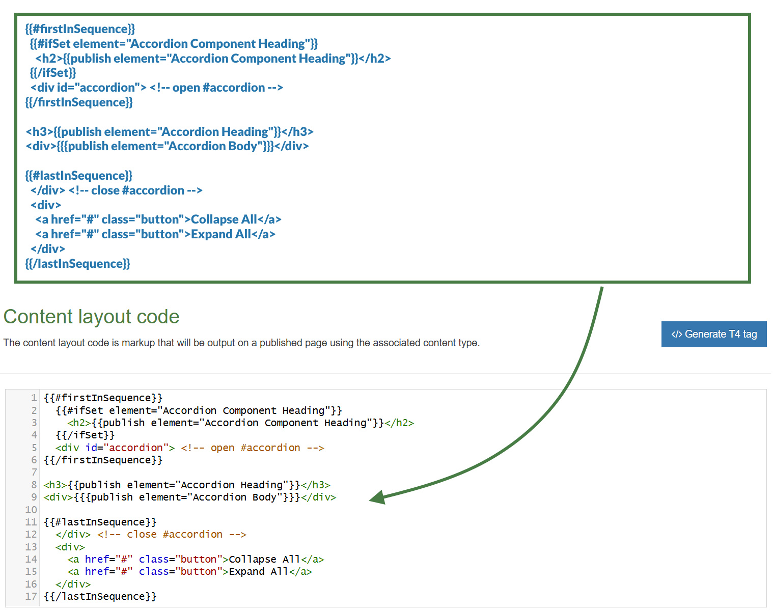
Exercise 10.8: updating the "text/html" content layout
Because this is so much shorter and easier to work with than the Programmable layout equivalent you should consider avoiding embedding alternate layouts altogether to improve performance and instead, do something like:
{{#firstInSequence}}
{{#ifSet element="Accordion Component Heading"}}
<h2>{{publish element="Accordion Component Heading"}}</h2>
{{/ifSet}}
<div id="accordion"> <!-- open #accordion -->
{{/firstInSequence}}
<h3>{{publish element="Accordion Heading"}}</h3>
<div>{{{publish element="Accordion Body"}}}</div>
{{#lastInSequence}}
</div> <!-- close #accordion -->
<div>
<a href="#" class="button">Collapse All</a>
<a href="#" class="button">Expand All</a>
</div>
{{/lastInSequence}}
- Click Save changes to save the changes to your content layout.
- Update your preview to check the result.
Feedback survey
- Congratulations on completing the Terminalfour Handlebars training course.
- Please click on the link below to open our on-line survey and provide your feedback.

