
All the content
Navigation Objects
Description
Navigation Objects can perform one of two functions:
- create link menus such as main navigation, breadcrumbs and sitemaps to orient users on your site
- aggregate content from across one or more Branches of a site
How are Navigation Objects Used?
Most often, T4 Tags for Navigation Objects are placed in a Page Layout, Content Layout or a Content Item (within a plain text element). Some Navigation Objects have limitations around where and how they can be used.
You can learn more about how each Navigation Object type by selecting its name in the table below.
Navigation Objects can also be used within List Values, allowing a content author to select an item from a List, determining which Navigation Object is output onto the page. Or, they can be used within Media Items (e.g. JSON files), if the Media Type is configured to parse for T4 tags.
While Navigation Objects work within List Values and Media, this is not intended functionality and is not routinely tested. In addition, Navigation Objects that are used within Lists or Media are not recorded in the Navigation Usage Report.
While this approach can be used, it should be used with caution.
The Navigation Object Listing Screen
When you go to Assets > Navigation you will see a list of existing Navigation Objects on the page.
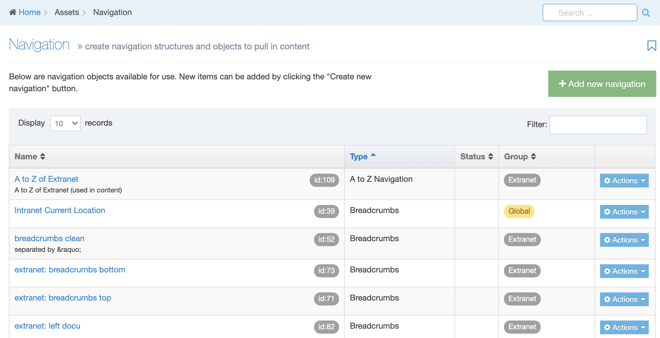
The five columns in the table are Name, Type, Status, Group and the Actions button.
| Item | Description |
|---|---|
| Name | Contains Navigation Object name, a brief description (if one has been provided), and the Navigation Object ID number. The arrow in the header row can re-order the list alphabetically. |
| Type | The type of Navigation Object. |
| Status | Indicates if the Navigation Object has been disabled, in which case it is still within Terminalfour but will not output anything if used. |
| Group | Shows the Group(s) the Navigation Object belongs to. If the Navigation Object is shared with one other Group or more you'll see a + and the number of Groups it's shared with. To see a list of those shared Groups hover over the + symbol. |
| Action Menu Button | Provides options to Share, Duplicate, Edit, and Delete. |
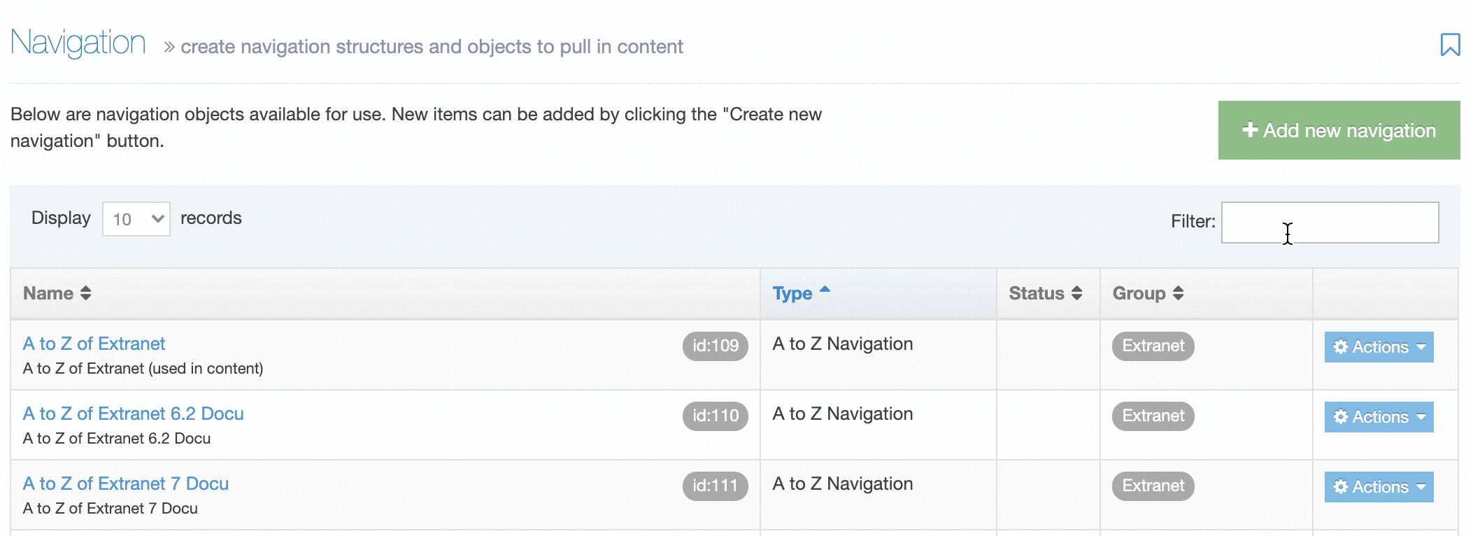
You can filter the list of Navigation Objects by inputting the Name, ID, Type, Status or Group in the "Filter" text input:
Types of Navigation Objects
| Navigation Object | Description |
|---|---|
| A to Z navigation | The A to Z navigation is a variation on the Site map navigation object. It allows you to output an A to Z listing of Sections. |
| Breadcrumbs | The Breadcrumbs show the hierarchical location of the current page (the parent, grandparent, etc.) |
| CSS selector | You can use different CSS files within different branches of the site. You use the CSS Selector feature to assign the different CSS files. When doing so, define the branch using a Section name or selecting a specific Section. |
| Generate file |
You use this feature to generate a file, with a specified file name, into a specified directory. The contents of the file originates from another Content Layout*, or from a Media Item in the Media Library. The Generate File Navigation Object does not create a link to the file - it only publishes the file into the appropriate directory. * This only applies where the Navigation Object is within a Content Type. |
| Keyword search content |
Shows a specified number of content items in a branch with keywords related to the keywords of the content in the current/parent Section. |
| Language switcher |
This function allows you to switch between languages on a multi-language site. Using this function requires only to click a link, which can either be text or an image. You can only use the language switcher link on pages that have been translated or contain a disclaimer. |
| Link menu | The Link Menu object allows you to implement a series of clickable links to other Sections or pages. The top menu and side menus are often built using Link Menu Navigation Objects. |
| Pagination | The Pagination object fetches all content from a specified branch or Section. You can specify which Content Items are output to an HTML page. The rest of the content is output in batches of the same size to new folders under the root which corresponds to the page number. Links are visible at the bottom of the page and you can click through the pages. |
| Previous/next fulltext content | The Previous/next Fulltext Content Navigation Object moves between the previous and next fulltext Content Items within a Section, functioning almost like a "forward/back" link. This is useful for Content Items which are sequential, when a user may want to move from page to page in a specific order. |
| Publish to one file |
The Publish to One File Navigation Object displays all content below the Section to which it is added. This results in publishing a branch of content on one page. It uses the TERMINALFOUR hierarchy and draws in the content from those Sections. This can be used to create a listing of content on a page, for example, all Event content to create an Event listing. |
| Related content | The Related Content Navigation Object can retrieve content from a specified Section (branch, level, or other) and use this to populate content in various locations on the website allowing content to be shared and re-used on pages throughout the site. |
| Related section branch | The Related Section Branch object is a variation of the Related content Navigation Object. If the Navigation Object finds a child Section of the specified name, it creates a link to the child using the link text supplied. If there is no child, it looks at the parent Section, to see whether the parent has a child of the specified name to create the link. If not, then it looks at the parent's parent, etc. |
| Return to index | The Return to Index Navigation Object is used within a Content Layout of fulltext pages. It creates a link "Back to" the Section's index page, and if the Target option is specified, then the link opens in a new window by that name. |
| Section details |
The Section Details Navigation Object outputs information about a Section. The section can either be specified directly, or it can be a section at a particular level of the site structure, allowing different pages to output information about different sections, depending on the location of the page. For example, this could be used to output a heading above the left navigation that is always the name of the section at Level 2, creating different headings for different areas of the site. |
| Section iterator | The Section Iterator Navigation Object moves between the previous and next siblings in a Section, functioning almost like a "forward/back" link. It outputs the Section name and allows the user to quickly go back to the Section before, or move to the next Section. |
| Section meta info | The Section Meta Info Navigation Object allows you to output the page or Section metadata without the surrounding meta tags. |
| Site map | The Site map Navigation Object lists Section and Subsection names hierarchically so the user can see the parent/child/grandchild etc. relationship between published pages. If needed, it can be configured to also display the total number of Content Items within a Section. |
| Top content | The Top Content Navigation Object can be used to output content items from a specific location in your site. The object can search a full Channel, Branch or particular Section and return content from one or several specified Content Types (defined in the properties). |
| Top stories | The Top Stories Navigation Object goes to the specified Section and creates a menu of links of the top content items found in that Section. |
Create a New Navigation Object
To create a new Navigation Object, select Add new navigation. For further details, refer to our detailed step by step on creating a Navigation Object.
Share a Navigation Object
Global Navigation Objects can be used by any Power User but can only be edited by Administrators. Power Users and Administrators can create Navigation Objects within groups or share Navigation Objects with other groups. The Navigation Object can either be shared with Read-only or Full access:
- Read-only access: Power Users within the group can view the Navigation Object, and use the Navigation Object, but cannot edit it
- Full access: Power Users within the group can view and edit the Navigation Object
A Global Navigation Object cannot be shared with Groups; however, you can move a global Navigation Object to a Group by editing the Navigation Object and selecting a Primary Group.
Duplicate a Navigation Object
You can duplicate a Navigation Object. Do this either into a new Group or the same Group or with other Groups. A duplicate Navigation Object creates a copy of the original and the two Navigation Objects are not linked to each other.
Changes made to one Navigation Object do not affect duplicated versions. Sharing and Duplication are two different functions.
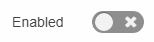
Disable a Navigation Object
If a Navigation Object is disabled, it will remain within TERMINALFOUR but will not generate any output onto the published site. To disable an object, Edit the Navigation Object and use toggle the "Enabled" toggle to the Disabled position:
On the Navigation Object Listing, the object will now be listed as Disabled with a label:

Delete a Navigation Object
If you are unsure whether or not a Navigation Object is in use, check the Navigation Object Usage Reporting first. In the row of the corresponding Navigation Object, open the Actions drop-down list and select Delete.
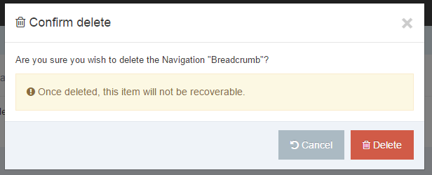
A confirmation pop-up window appears and you can confirm your choice and Delete, or Cancel the action. Upon successful deletion, a green banner appears confirming the deletion, and the object is removed from the list.
When a Navigation Object is deleted you cannot recover the data. To retain the Navigation Object, but prevent it from generating anything onto the site, rather disable the object.
Content Types
Description
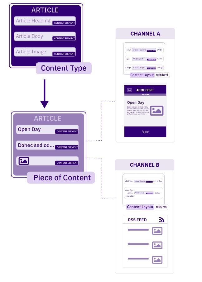
A Content Type is the structure of a Content Item and is made up of one or more Content Elements. You can think of Content Types as structured templates for the Content Items that you will create, edit and publish.
When we create a Content Item, we use a specific Content Type to determine the number and type of elements that can be populated with Content.
For example, a news article Content Type might comprise Title, Main Body and Image Content elements. A user will populate some or all of these elements when adding a news article to the site.
To publish content on your site, a Content Type must use a Content Layout to determine the elements that will be displayed on a page and how they will be presented. If you are publishing a webpage, inserting T4 Tags between HTML tags will act as placeholders for our content when creating a Content Layout.
Each Channel has a default Content Layout associated with it, so for your content to appear as defined in the Content Layout, the Content Layout name must match the default associated with the Channel.
The diagram shows how a single Content Item using a Content Type can be displayed in two different ways. In this example, the Content Item uses the "Article" Content Type. This Content Type has two Content Layouts - one that is used to publish on the news webpage (text/html) and another for publishing to RSS (text/rss). Each Channel has a default Content Layout associated with it.
Who can use Content Types and where?
There are three ways that the use of Content Types can be restricted. These can be broken into two categories:
Who can use a Content Type?
- User Level: this is the Minimum User Level that can create or edit content using the Content Type
- Group Membership: even though a User may fulfill the Minimum User Level requirement, if a Group is specified, the User must also be a member of that Primary and/or Shared Group to use the Content Type.
If no Group is assigned to the Content Type, then it is labeled as Global. Assets which are labeled as Global are available to any User Level with permission to use it. How that Asset can be used is restricted by the Role Settings for that User Level. For instance, Power Users cannot edit a Global Content Type unless it is moved to a Group from which they have permission to edit from.
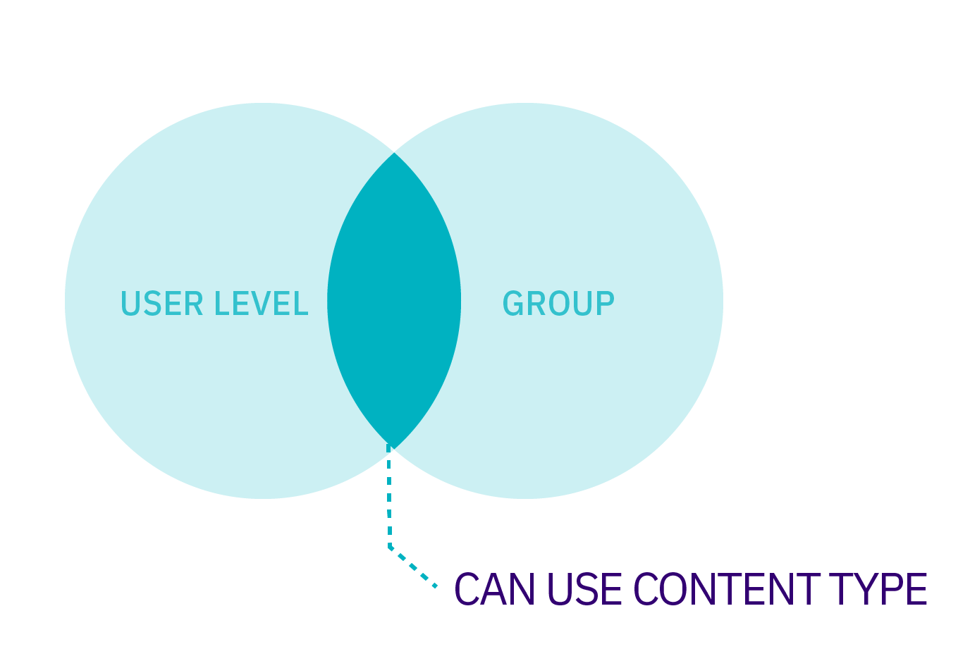
Permissions extend to what a User can do with a Content Type. When a Shared Group has been assigned to a Content Type, you can determine if the Users within that Group have Read Only or Full Access to the Content Type.
When Full Access is assigned, Users in that Group can create and edit content with the Content Type and Power Users in that group can edit the Content Type itself. With Read-Only, Users in that Group can only create and edit content with the Content Type.
Where Can a Content Type Be Used?
Section / Branch: a Content Type must be enabled for a Section and/or Branch for it to be used
Even though a User may have Group and User Level access to a Content Type, it cannot be used until it has been enabled for a Branch or Section. Administrators and Power Users can enable Content Types for the sections of the site to which they have been given access by editing the Section and selecting the Content Types tab.
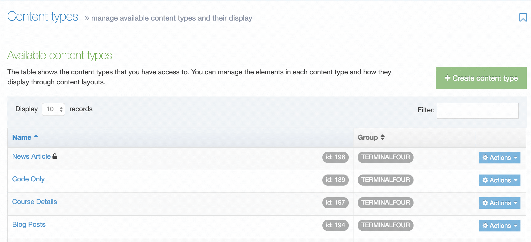
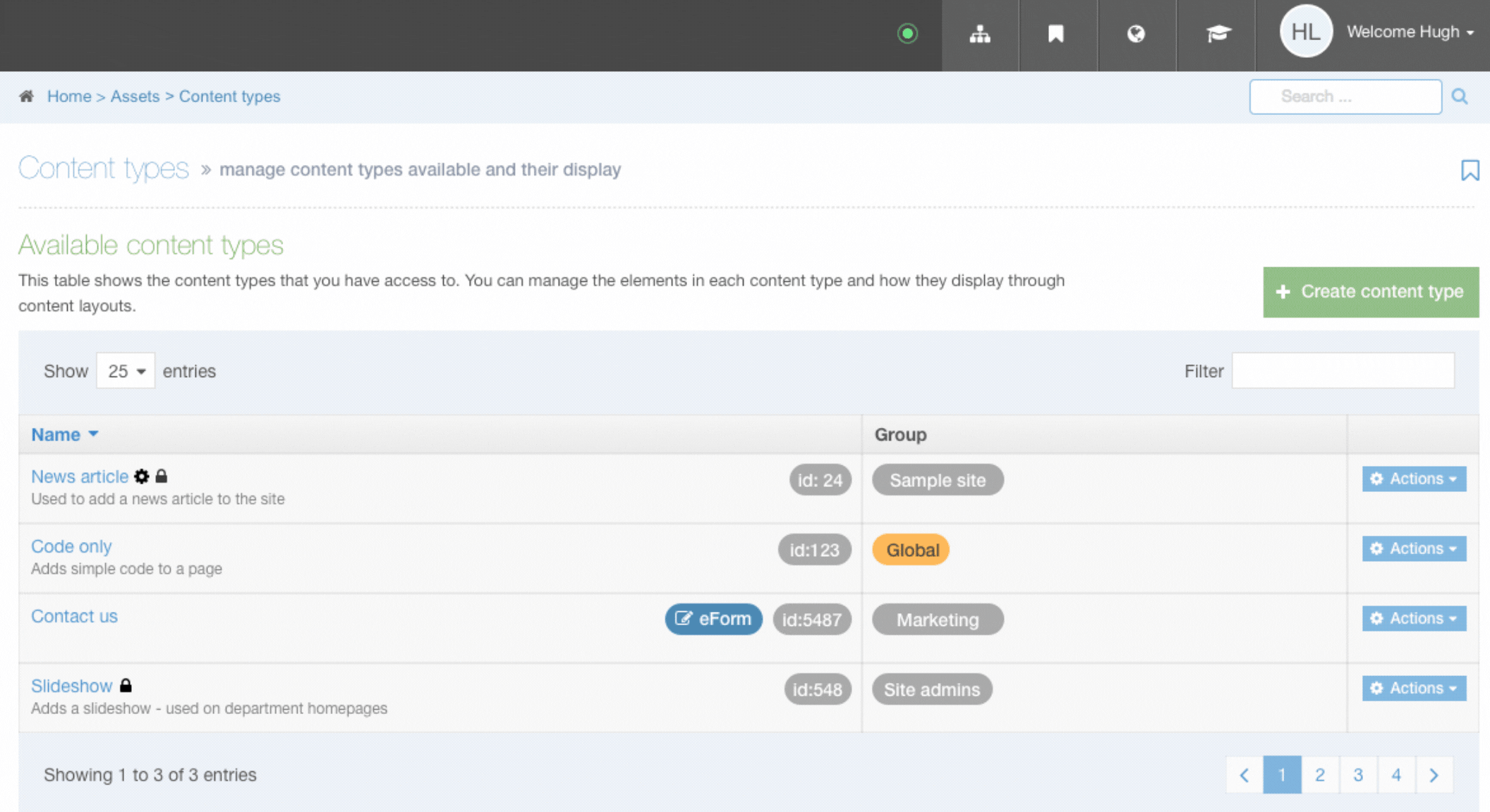
Content Type Listing
When you go to Assets > Content Types, you will see a list of existing Content Types in the Content Types page.
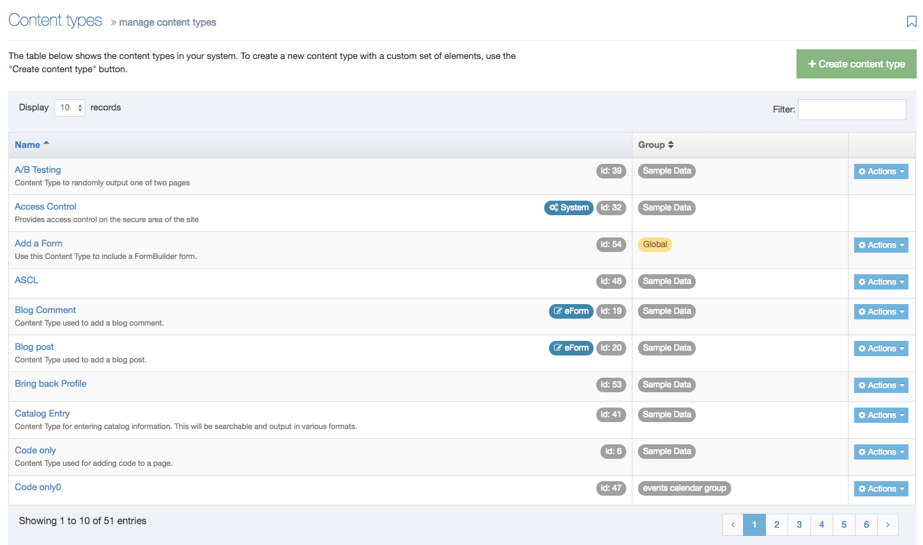
The three columns in the table are Name, Group and the Actions button:
| Item | Description |
|---|---|
| Name Column | Contains Content Type name, a brief description (if one has been provided), and the Content Type ID number. The arrow in the header row can re-order the list alphabetically |
| Group Column | Shows the Group(s) the Content Type belongs to. If the Content Type is shared with one other Group or more, you'll see a + and the number of Groups it's shared with. To see a list of those shared Groups hover over the + symbol. |
| Action Menu Button | Provides options to Share, Duplicate, Edit, and Delete |
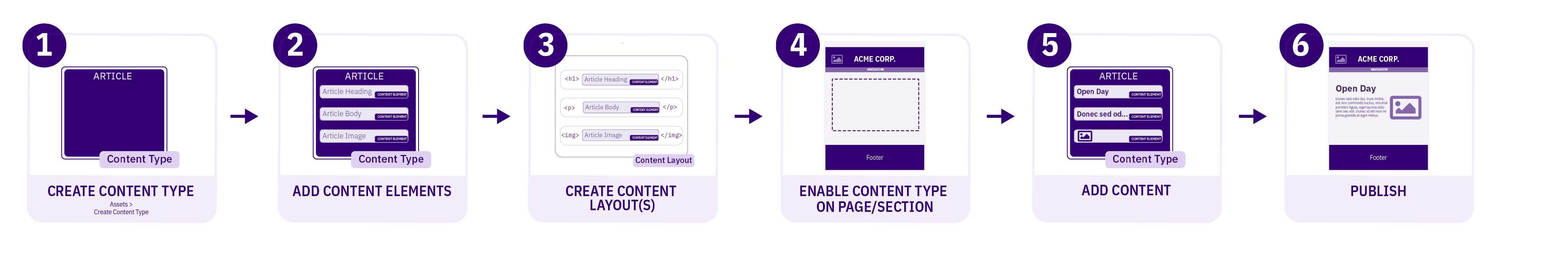
Creating a Content Type
To create a new Content Type select Create Content Type
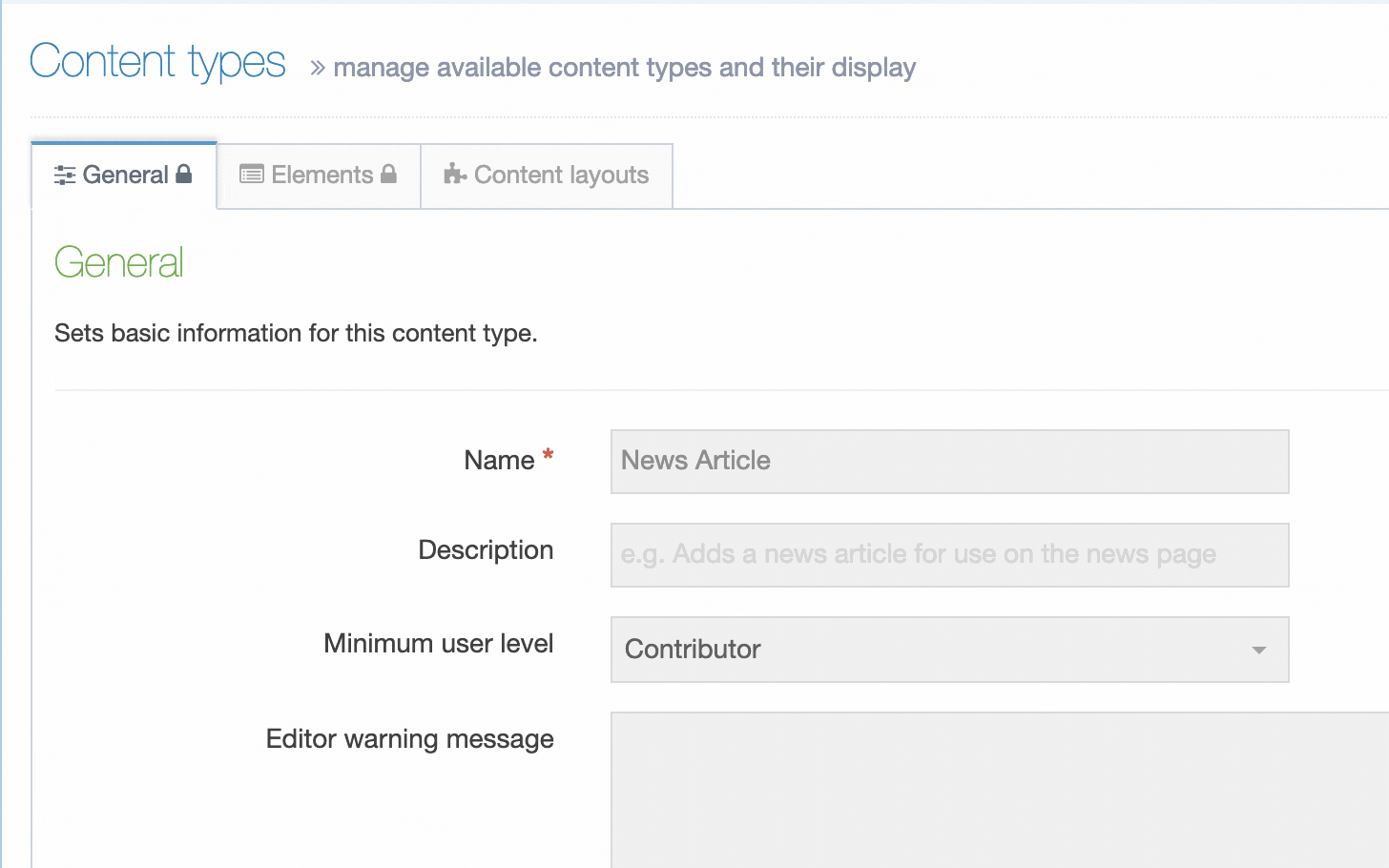
This screen has two tabs - General Information and Elements.
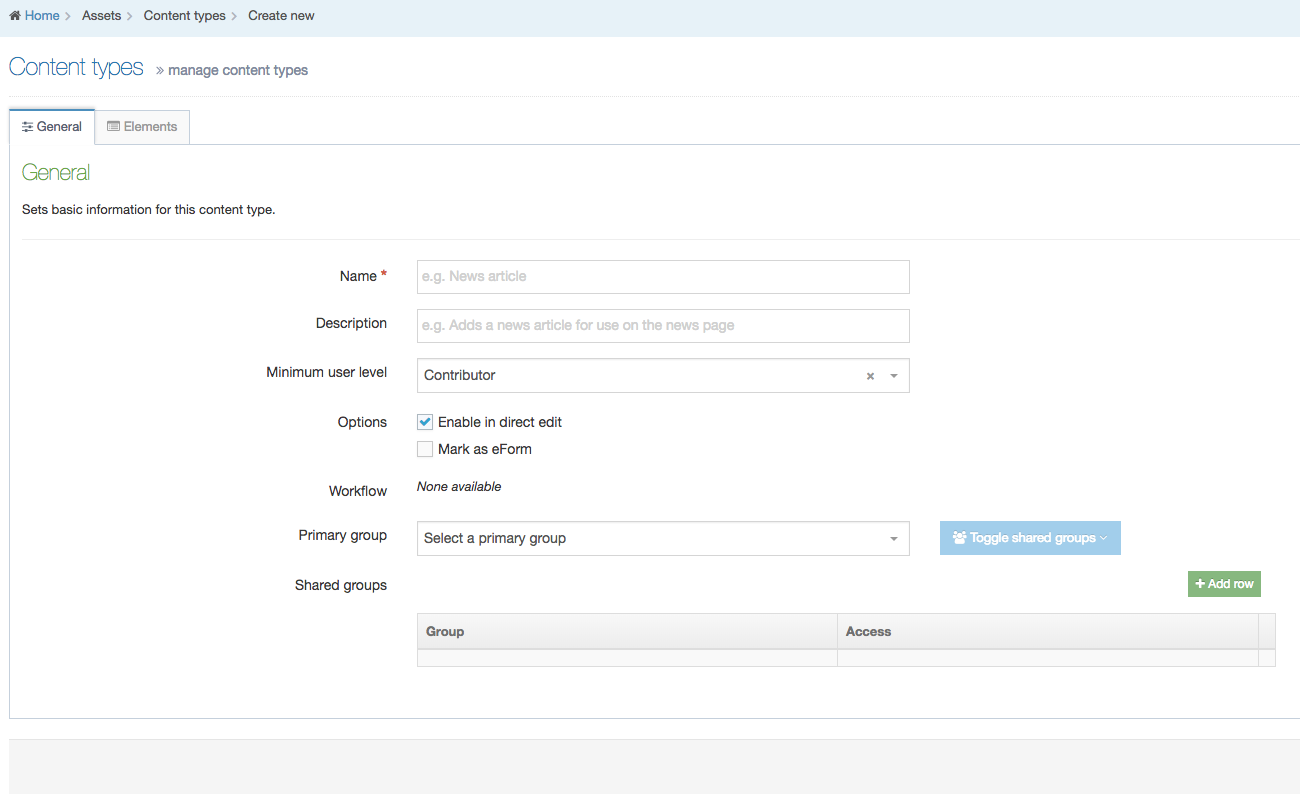
General Information
| Item | Description |
|---|---|
| Name |
A unique Name is required for each Content Type |
| Description | Can be added to provide more information about the Content Type. This text is used by the filter feature on the listing page so it's best for the text to be meaningful and descriptive |
| Minimum User Level | Determines who can use a specific Content Type to add new or modify existing content. For example, if the User Level is set to Moderators, a Contributor can't create or modify content that uses this Content Type. |
| Enable Direct Edit | When this option is selected, users can edit the content with this Content Type when working in Direct Edit. This is suitable for most content. Direct Edit may not preview code snippets, video and audio content as intended. |
| eForm | If checked, this allows your Content Type to collect eForm data. |
| Workflow | Applies an existing Workflow to the Content Type. If a Workflow is applied to a Content Type, all content using this Content Type will Workflow when created/edited. Workflows can also be applied to sections of the Site structure. When a Workflow is applied to a Section and a Content Type within a Section, the configuration settings will determine the Workflow that's used. |
| Primary Group |
Restricts access to the Content Type based on the Primary Group a User is a member of:
|
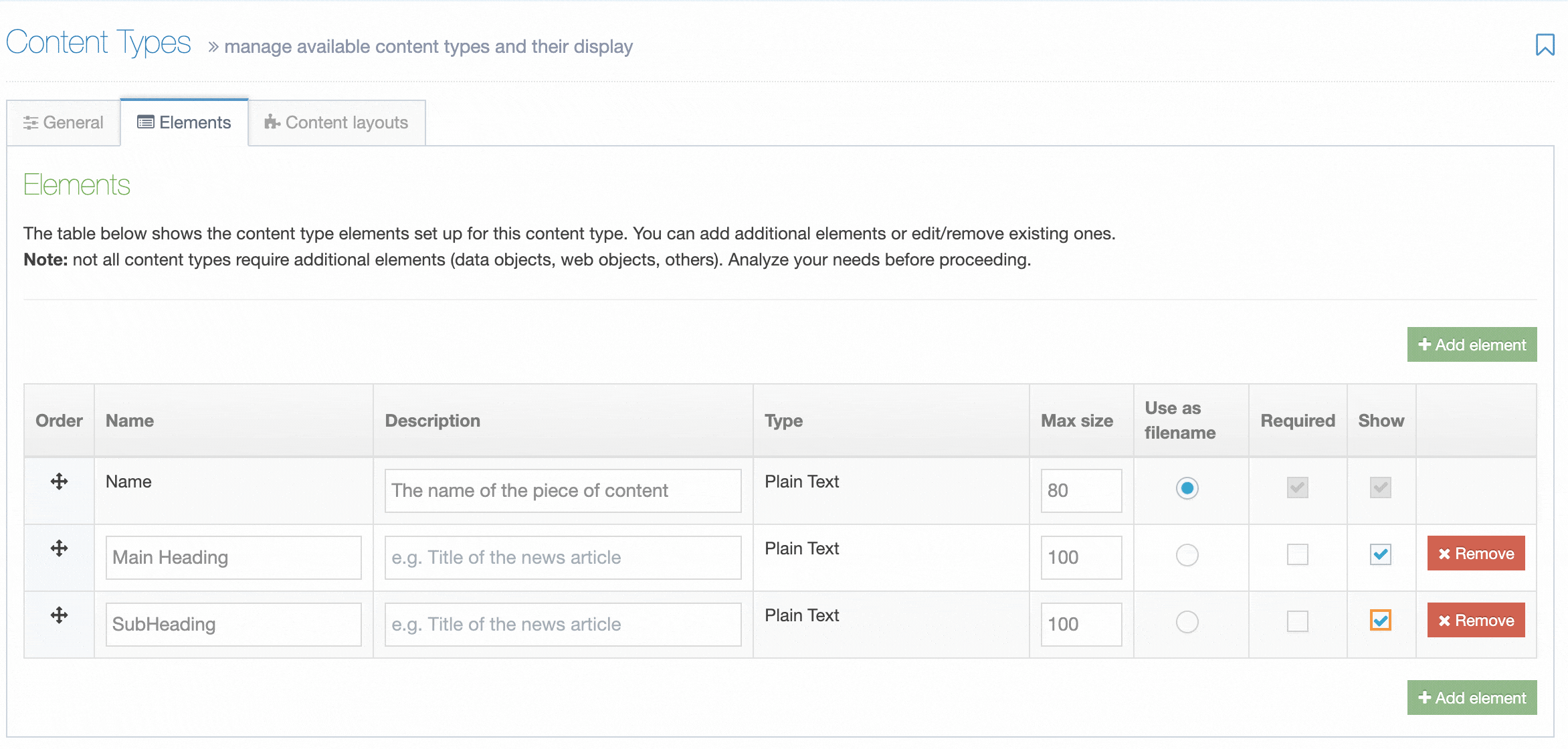
Content Elements
A Content Type is made up of Content Elements. These are the fields that will be populated to make up a Content Item.
Guidelines for using the Name Content Element
The first element of every Content Type is a plain text element called Name. This element cannot be removed or renamed and the Element Type cannot be changed. Though the Name given is not a unique identifier (since more than one Content Item can share the same name), it is used to allow users to identify content within a Section or when approving content.
It's recommended that you use the Name element for tracking the content within the system but avoid publishing it on your site. If the Name element is published on the site, you should indicate so in the description of the content element.
There are a couple of ways to use the Name element to help track your content's use:
1. Names that Describe a Content Location
Using this setup the Name element can be used to give a descriptive name to the content so it can be easily identified. Content could be added to the site on the 'Department News' section. In this case, the Name and Heading elements could be populated as follows:
- Name: Department News Articles
- Heading: News Article Heading
Using the example above, the content can be quickly identified within TERMINALFOUR as it has a descriptive name which indicates the location of the content.
2. Names that Describe a Content Type
Pages that have multiple content items can use the Name element to describe the Content Type in use. Doing so allows a user to scan the list of content and find the relevant content item to update. e.g., "right sidebar" or "left column content".
Content Element Types
Content comes in different formats and so do Content Elements. While a Media Content element is used to add items from the Media Library, a Plain Text Element is used to input plain, unformatted text.
Though most Content Types require more than one element, there are exceptions (e.g., Data and Web Objects, and others) where no additional elements may be needed.
While a page analysis process determines the types of elements, you need to create, make sure you allow for some flexibility.
Remember - each element in a Content Type must have a unique Name. It is good practice to use descriptive names which help users when adding content.
This is a list of TERMINALFOUR standard formatted elements:
| Name | Description |
|---|---|
| Cascading List | A list with one or multiple sub-lists. It works like a drop-down List with sub-lists branching off of particular options. The content layout T4 Tag permits you to output either the value or name of the list entry and lets you change the delimiter used when multiple list items are selected. |
| Check Box | Check one or more options from a List. |
| Content Owner | The user can specify the owner of the content by selecting the user's profile name from a drop-down list. When building the Content Layout, you can determine what user information is published on the site. |
| Date | The user can pick a date and time from a calendar. A date format can be applied to output a specific format e.g., dd/MM/YYYY etc. |
| Decimal Number | The user inserts a number with decimal places. The decimals can be left out, but attempting to enter anything other than a number, results in an error. |
| File | Lets a user to upload a file. The file is stored in the Content store but is not added to the Media Library and cannot be reused in other content. The File T4 Tag for the Content Layout generates a path to the file. It is possible to restrict the file types that can be uploaded in the Content Configuration Settings. |
| Group Select | You can select one or multiple groups. The purpose is to secure data when integrating Access control. |
| HTML | This gives the user an area with a WYSIWYG editor to enter text. The default editor is TinyMCE. In the HTML editor settings, you can enable custom styles and modify the options available in the editor. |
| Image | The user can upload an image but it is not added to the Media Library and cannot be reused in other content. When using an Image element, you can modify the Image T4 Tag for the Content Layout to resize the image, output alt text, and other actions. It is possible to restrict the file types that can be uploaded in the Media Library Settings. |
| Keyword Selector | Allows the user to build a list of keywords, using AND/OR logic, that is used by the Keyword Search Content Navigation Object to retrieve results. |
| Media | A user can select a file (e.g., image, pdf, video/audio file) from the Media Library. When the file is not in the Media Library already, the user can upload it (assuming write permission has been granted). The Media items are formatted according to the Content Layouts in the Media Content Type. Or, the T4 Tag for the Media element can be changed to choose the Content Layout to use. |
| Multi-Select List | A Multi-select list is similar to a Cascading list, as it lets a user select multiple items from a List. Where it differs the user is not limited to selecting items from a single list, to include from sub-lists branching off of the initial list. The list T4 Tag for the Content Layout permits you to output either the value (or name of the list entry) plus you can change the delimiter used when multiple list items are selected. |
| Multiple Select Box | Permits the user to select one or multiple options from a drop-down List. The list T4 tag for the Content Layout lets you to output either the value or name of the list entry and lets you change the delimiter used when multiple list items are selected. |
| Plain Text | Enables the user to enter text and numbers. Depending on the T4 tag output modifiers, if the user enters HTML, the tags will be removed. This is convenient when you want to lock down how titles or headings will appear on the page. |
| Radio Button | A radio button allows the user to select an option from predefined List items. |
| Section/Content Link | A Section/Content link allows a user to create a link to a Section (page) or a Content Item. You can determine when users are permitted access to the full Site Structure or only the parts they are assigned to. With the T4 Tag for the Content Layout, you can output either: the full link, the URL, or the link text. |
| Select Box | A Select box allows a user to select one option from a predefined drop-down List. |
| Whole Number | A Whole number allows a user to insert a number with no decimal places. Attempting to enter anything else (example: text) in this element results in an error. |
Creating Content Elements
When creating or editing a Content Element you will populate rows in the Content Element table. Each row is broken up into the following columns:
| Item | Description |
|---|---|
| Order | Select and drag the move icon to change the order of individual Elements |
| Name | A name for the Element |
| Description | This appears as a tooltip when a user is creating or editing content |
| Type | Select an element type from the drop-down list |
| Required |
When creating or editing content with this Content Type, if this is checked, the element will display an asterisk beside it denoting that it is required. Content cannot be saved without populating this element. If a Plain Text element is set to Required, only entering one or more space characters as content will not be accepted. |
| Size |
Restricts the maximum amount of text that can be input or files that can be uploaded. The maximum size can be restricted for each element. Plain text and HTML elements are counted in characters. File and image elements are counted in kilobytes (Kb). All other element types use the default, so no maximum size needs to be specified. For file and image elements, if the maximum size on the element is larger than the global Max upload size, the global Max upload size will apply. |
| Use as filename |
To control the URL of fulltext pages (when creating friendly URLs), you can use one of the Content Type elements. By default, the Name element is used, but you can set another Plain Text element to use as filename instead. The filename is used for Content Types that have a fulltext layout. If the "Use as filename" option is selected for a Content Element, and the T4 Tag specifies a different Content Element, the Content Element set on the T4 Tag will override the Content Element that has "Use as filename" selected. |
| Show |
From 8.3.17 it's now possible to hide elements from the content editing view. This may be useful for old content types where the element may not be used, or for elements populated by the External Content Sync tool that you do not want to allow content editors to modify. |
| Remove | Selecting this will remove the Element. Removal does not occur unless you also click Save changes. If you navigate away without saving the Element will remain in place. |
Conditional Logic
Conditional Elements (Introduced in 8.4.0) allows Admins and Power Users to customize the Content Editing Experience by conditionally displaying elements based on specific criteria.
This feature helps simplify and streamline the content creation process by showing only relevant fields to Content Editors.
Learn more about Conditional Elements.
When the General Information and Elements tabs have been populated and saved, the Content Layout tab appears. You can proceed to build a Content Layout.
Content Layouts
A Content Type can have one or multiple Content Layouts, these can either be linked together or used individually.
About Fulltext
When Content Layouts are linked together, an element in the Content Layout needs to link to the next Content Layout. This uses a feature called "fulltext".
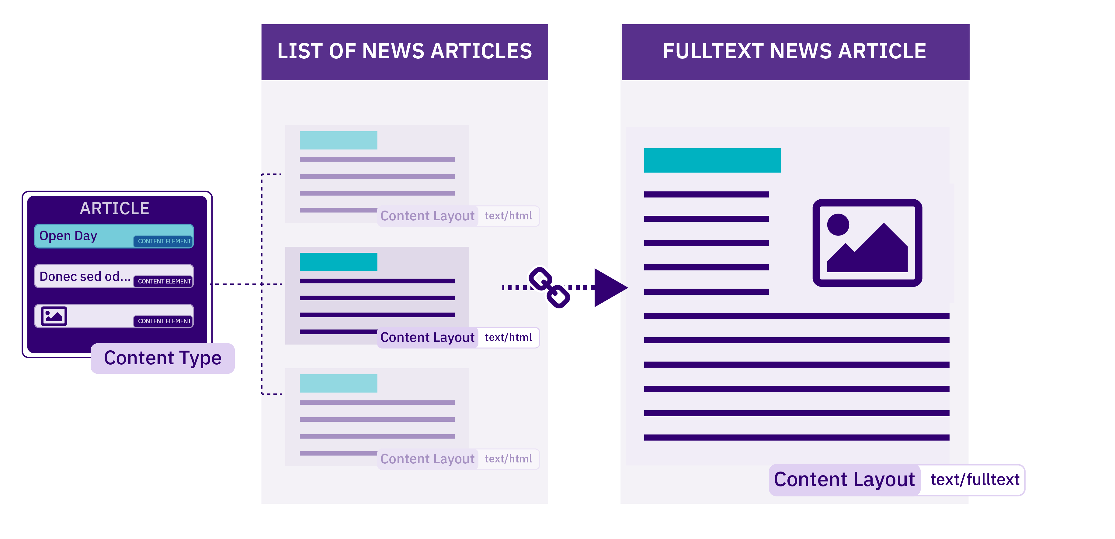
In this case, we might have a listing page where each item links to a more detailed page. For example, a list of news articles will each feature the headline and an abbreviated version of the article. Each headline links to the full version of the related news story. Both versions use the same Content Type with different Content Layouts. There is an explanation of this within the documentation of the T4 Tag for Fulltext.
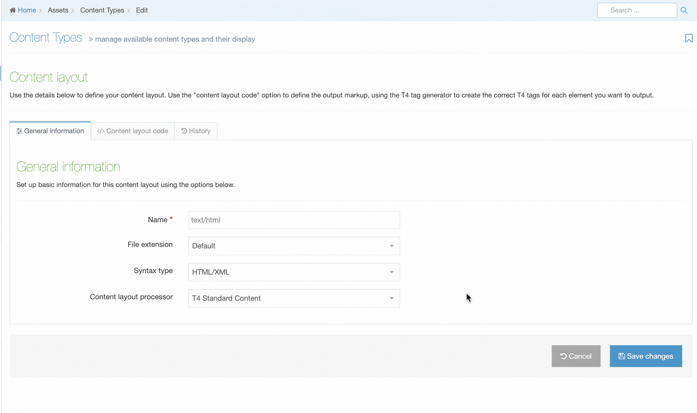
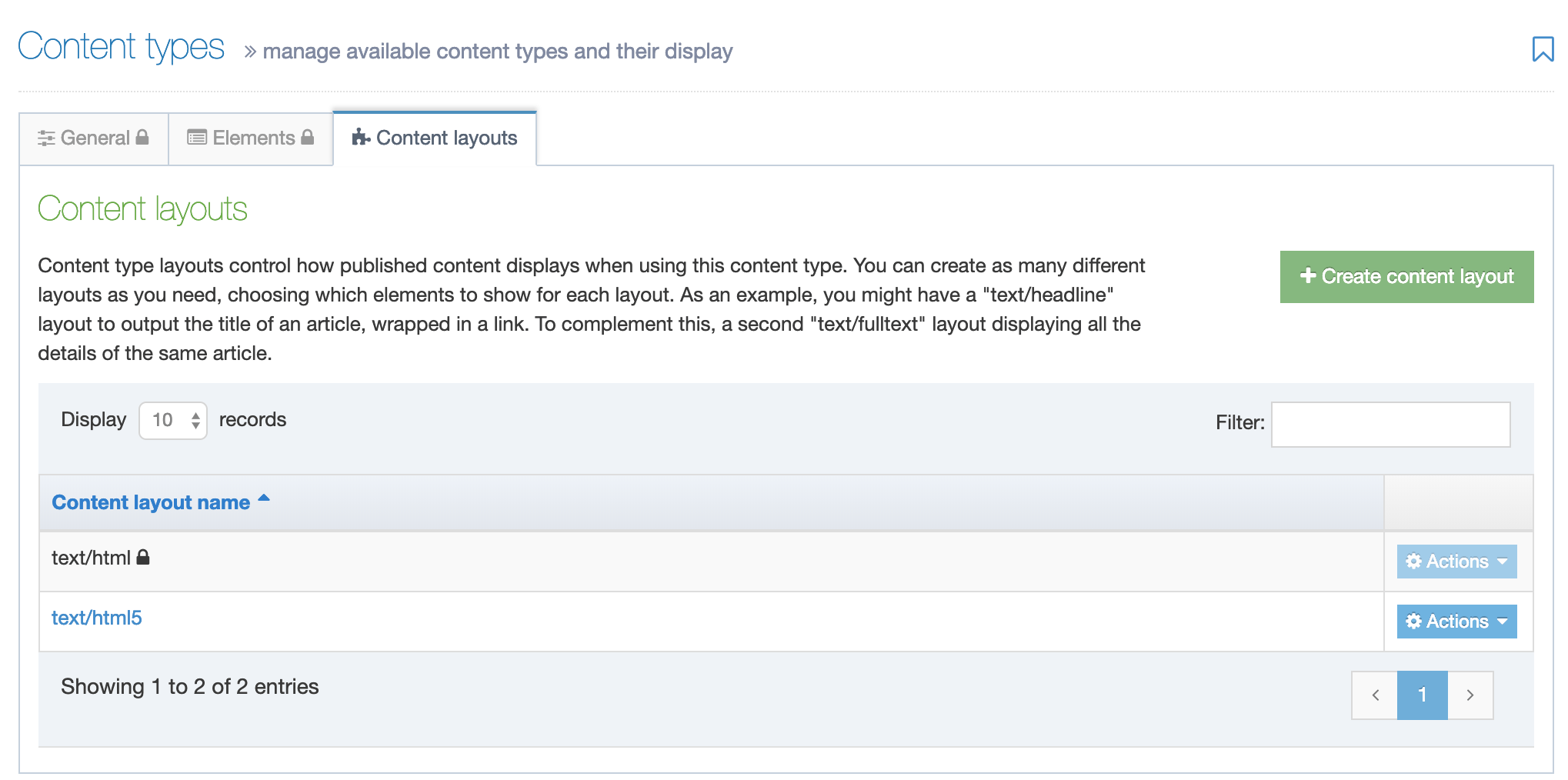
Create a Content Layout
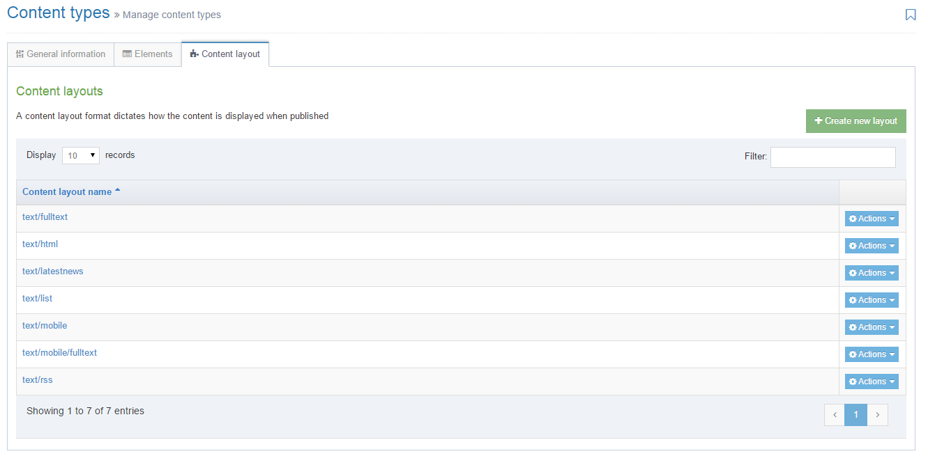
To access Content Layouts, go to the Content Type listing page at Assets > Content Types and identify the Content Type you need. Select the Content Type name or select the Actions button and select Edit. From the Content Type page select the Content Layout tab. You'll see a list of all existing Content Layouts. You can filter the list by name. The number of results listed can be modified via the drop-down list on the top left. If there are no existing Content Layouts, the list will be empty:
Selecting Create New Layout will open a new screen:
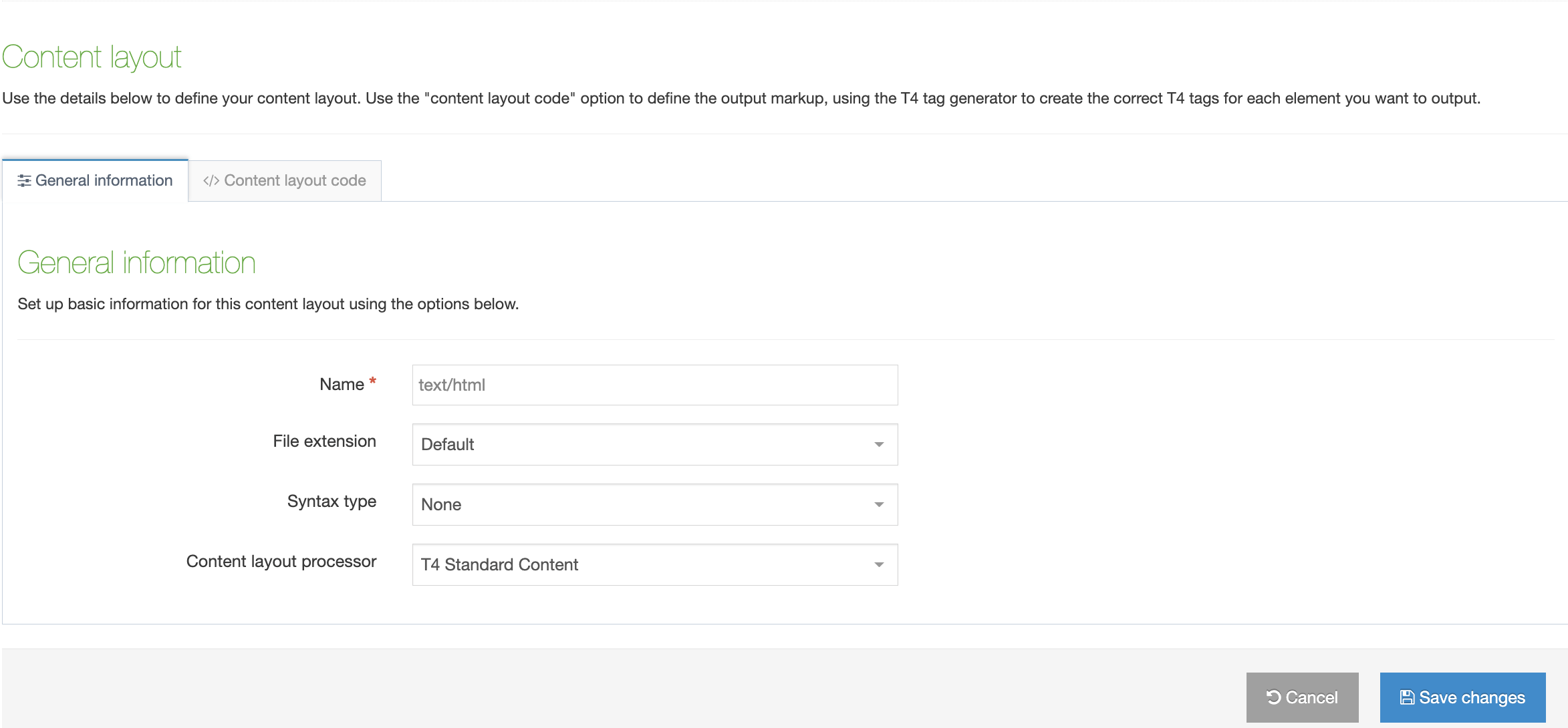
| Item | Description |
|---|---|
| Name | Each Content Layout requires a unique Name (e.g. text/html) which should match the Channel's default that is defined in the Channel settings or that referenced via a fulltext output or Navigation Object. |
| File extension |
The Default setting will use the Channel's default extension. A different extension must be specified in the The extension must be permitted in the Channel Settings under Available file extensions. After a Content Type has been in use, changing the extension can impact the content and result in content no longer being published. The Channel associated with the Section containing the content must have the same extension defined. |
| Select a Syntax type |
Used for syntax highlighting when editing the code of the Content Layout. There is syntax highlighting for Javascript, CSS, HTML/XML, PHP and Java. |
| Content Layout Processor |
There are two options that determine how your Layout is processed
|
You can add code in the "Content layout code" tab:
| Content Layout Code |
This determines what is output and how it is displayed. Depending on the Content Layout Processor selected, T4 Tags or Handlebars Expressions are used to output the content entered in your Content type elements. |
|---|---|
| Syntax Highlighting |
Choose whether you want Syntax Highlighting. This must be in the enabled position for highlighting to happen. |
Processing T4 Tags and Handlebars Expressions in Content
Some users like to create a "Code Only" Content type that can be used by admins or advanced users. This content type is generally made up of a Plain text element where users can enter code that will be rendered as-is on the page.
If you're creating a Code Only content type and you want users to be able to add T4 Tags or Handlebars Expressions it's important that the Content Layout Processor is set appropriately on this Content Type.
For example: A Code Only Content Type that is using the "T4 Tag content" layout processor will be able to parse and output T4 tags added by content editors but not Handlebars expressions. And similarly, a Code Only Content Type that is using the "Handlebars content" layout processor will be able to parse and output Handlebars expressions added by content editors but not T4 tags.
Content Layout Versioning
From version 8.3.13 you can manage versions of Content Layouts by selecting the History tab. From here you'll see a list of all versions of the current Content Layout.
The name of the current version is bolded and you'll see a "Current" label.
To compare two versions side by side, just check the checkboxes and click "Compare Selected".
To make a version "Current" click "Make Current" in the comparison screen or the version listing screen.
Share a Content Type
Global Content Types can be used by any user (for areas of the site where they are enabled) but can only be edited by Administrators. Power Users and Administrators can create Content Types within groups or share Content Types with other groups. The Content Types can either be shared with Read-only or Full access:
- Read-only access: Power Users within the group can view the Content Type but cannot edit it
- Full access: Power Users within the group can view and edit the Content Type
Regardless of how the Content Type is shared, all users within the group can use the Content Type, if it is enabled on the section, and they meet the Minimum User Level.
Duplicate a Content Type
You can duplicate a Content Type. Do this either into a new Group or the same Group or with other Groups. A duplicate Content Type creates a copy of the original and the two Content Types are not linked to each other.
Delete a Content Type
If you are unsure whether or not a Content Type is in use, check the Content Type Usage Reporting first. In the row of the corresponding Content Type, open the Actions drop-down list and select Delete.
A confirmation pop-up window appears and you can confirm your choice and Delete, or Cancel the action. Upon successful deletion, a green banner appears confirming the deletion, and the Content Type is removed from the list.
System Content Types
System Content Types are Global Content types that are used by TERMINALFOUR, to store special types of content that are used in various parts of the system. When viewing the Content Type Listing, System Content Types are represented with a System badge. System Content Types cannot be edited, but it is possible to create/edit Content Layouts on them.
There are eight possible System Content Types in TERMINALFOUR:
| Content Type | Description |
|---|---|
| Access Control | System Content Type used to provide access control on a secure area of a site. |
| Content Layout | System Content Type for storing User defined Content Layouts. |
| Extended User Details Content Type | System Content Type for adding elements to the User Profile. |
| Media | System Content Type for storing uploaded Media Library items. |
| Migration Tool Configuration | System Content Type for storing predefined migration configurations. |
| Page Layout | System Content Type for storing User defined Page Layouts. |
| Section Meta Description | System Content Type to be used to add a custom fields to a section. |
| Widget | System Content Type for Widgets (historic and not used in v8+). |
Content Type Locking
From version 8.2.18, Content Type Locking will help you and other users see which Content Types and Layouts are locked and cannot be edited.
An asset is locked while another user makes changes to it and is unlocked when the user Saves Changes, clicks on the Cancel button or navigates away from the Edit page to another screen in TERMINALFOUR.
If the browser window or tab is closed or the Edit screen is left open indefinitely, the lock will expire after the duration configured under Content Lock Timeout in System Administration > Hierarchy & Content Settings > Content.
A user who is editing a Content Type or Content Layout when a lock expires will receive an onscreen notification in which they can renew the lock.
When a Content Type is locked you will see a padlock icon beside the name of the Content Type which signifies that this Content Type is being edited by another user. You can see the name of the user who is editing the Content Type by hovering over it. Locked Content Types also have less options available from the Actions menu:
When a locked Content Type is selected, the fields in the General and Element tabs are grayed out:
If a user has already saved the Content Type, it may be locked while it is being processed. In this case, in addition to the padlock icon, you will see a cog icon. Hovering over this will inform you that updates to the Content Type are being applied. The tooltip will show the name of the user whose updates are currently being applied. You will also be able to see this from elsewhere in the product via the Notifications in the Header:
Content Layout Locking
Content Layouts that are not currently being edited by other users can be edited. If a Content Layout is being edited by another user it will be locked and will not be clickable. The Actions menu will also be grayed out:
Just as in the Content Type lock, to see who is editing it, just hover over the padlock icon.
Hiding a Content Element
From version 8.3.17 Administrators can hide Content Elements from content editors. This is especially useful for older Content Items where there may be redundant Content Elements that you are reluctant to delete.
Administrators will now see an additional column named "Show" when editing a Content Element. To hide a Content Element, uncheck the box for the Content Element you want to hide.
When "Show" is unchecked for a Content Element, it will not be displayed when editing the Content Item.
 Hidden Content Elements are only hidden when editing a Content Item but are still visible when previewing and publishing content.
"Required" Elements cannot be hidden.
Page Layouts
Description
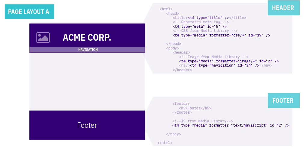
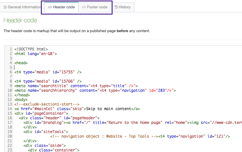
Page Layouts provide a consistent structure and style to the pages on your website. When creating a Page Layout for an HTML page you add custom Header code (the head element and opening body tag so it might contain the logo image, meta tags, links to stylesheets etc.) and the Footer code (footer element, closing body, and HTML tags so might contain the copyright notice, footer links and links to JavaScript). When the Page Layout is modified, all pages that use it will be updated. For example, if the logo is removed from the Header code in the Page layout, this change will be reflected on all pages that use this Page Layout.
Page Layouts can also contain T4 Tags so you can add the following to all of the pages that use the Page Layout:
- Navigation Objects e.g. adding sitewide navigation or breadcrumbs
- Media items e.g. adding items from the Media Library such as images, scripts or stylesheets
- Meta information e.g. adding a page title and description
- Channel information e.g. adding a favicon that will is deployed on this Channel
Terminalfour does not validate the code within the Page Layouts so it is up to Administrator or Power User to ensure the code is of good quality and validated.
Conducting Page Analysis to Create Page Layouts
When creating a new Page Layout you need to determine how the page will be set up. Things to consider include:
- the elements that should appear in the Header and Footer of every page using the Page Layout
- the elements and content in the Header and Footer markup that can be replaced by T4 Tags e.g. navigation elements and images, stylesheets and scripts that are stored in the Media Library
- how the Page Layout and the main content area will look when combined when Published
This diagram shows how a Page Layout is used across multiple pages throughout the site.
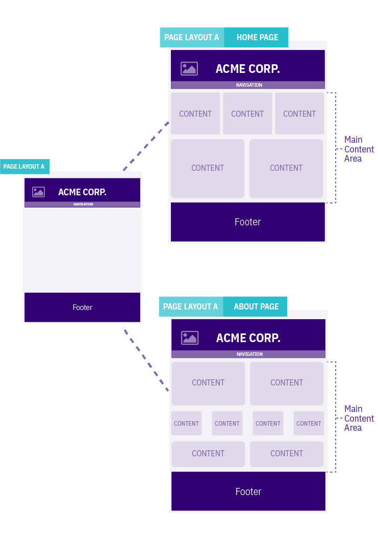
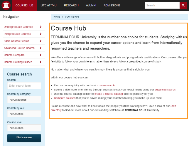
The screenshot above shows a sample of the main content area within the orange box.
In the image below, the highlighted areas show parts of the Page Layout that could use Navigation Object T4 Tags.
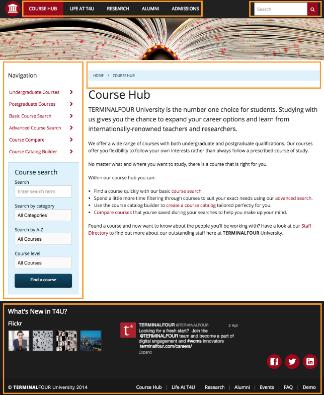
At this stage of your page analysis, you can identify the elements that are part of the Page Layout, elements that can be replaced by a T4 Tag and what the main content area will look like.
Page Layout Listing
To work with Page Layout, go to Assets > Page Layouts.
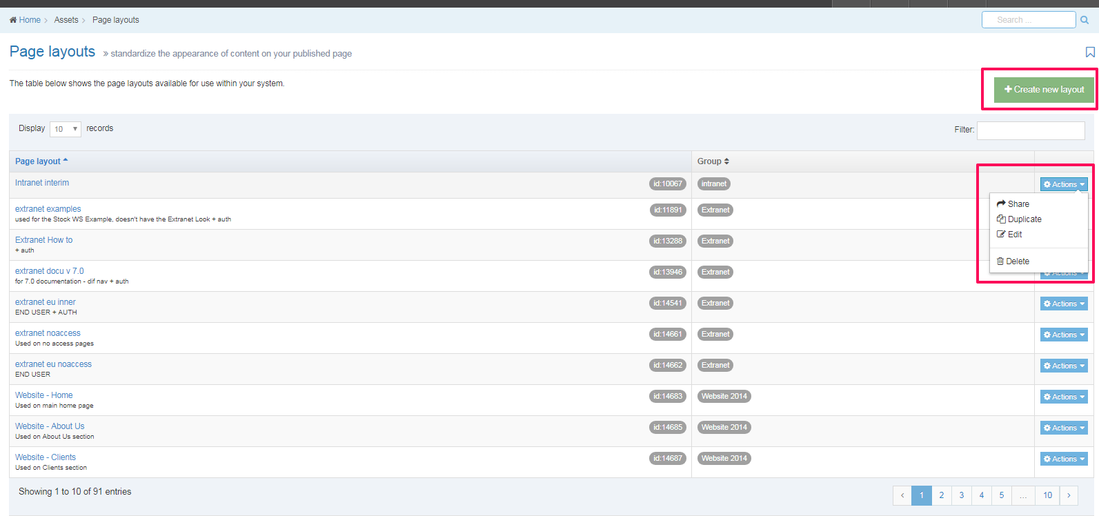
The columns in the table are Name, Group(s) and the Actions button:
| Item | Description |
|---|---|
| Name | Contains Page Layout name, a brief description (if one has been provided), and the Page Layout ID number. The arrow in the header row can re-order the list alphabetically. |
| Group | Shows the Group(s) the Page Layout belongs to. If the Page Layout is shared with one other Group or more you'll see a + and the number of Groups it's shared with. To see a list of those shared Groups, hover over the + symbol. |
| Action Menu Button | Provides options to Share, Duplicate, Edit, and Delete. The Share function is not present where the Group designator is "Global", however, you can move a global Page Layout to a Group by Editing the Page Layout and selecting a Primary Group. |
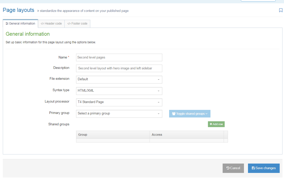
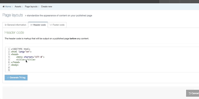
Create New Page Layout
When you select Create New Layout the General Information screen is displayed:
| Item | Description |
|---|---|
| Name | This is a mandatory entry. Give your Page Layout a name - it is recommended to make the name as descriptive as possible |
| Description | This is an optional entry. This is used by the filter on the Page Layouts listing and can be useful for finding Page Layouts. |
| File extension |
Specifies the file extension of the published page using this Page Layout. In general, this would be left as "Default", but you can choose an alternative extension from the drop-down list. You need to configure the system to output the intended file type in the configuration options and channel settings. After the Page Layout is in use, modifications to the file extension (or configurations) can inadvertently alter the Page Layout and prevent sections of content not being published. |
| Syntax type | Used for syntax highlighting when editing the code of the Page Layout header and footer. There is syntax highlighting for JavaScript, CSS, HTML/XML, PHP and Java. |
| Layout processor |
|
| Primary group |
Select a Primary Group for this Page Layout. Grouping and sharing Page Layouts restricts the users that can use or edit the Page Layout. It is good practice to add all your assets to Groups. This makes it easier to identify which assets are being used and where. By grouping assets together, you can also restrict access to them. When a user is not part of the Group, they cannot see or access assets in that Group. |
| Shared groups |
This table has three columns. Click on Add row, to share with a group:
The Remove button removes the Page Layout from the group. |
If you are satisfied with your inputs so far, then click Save Changes.
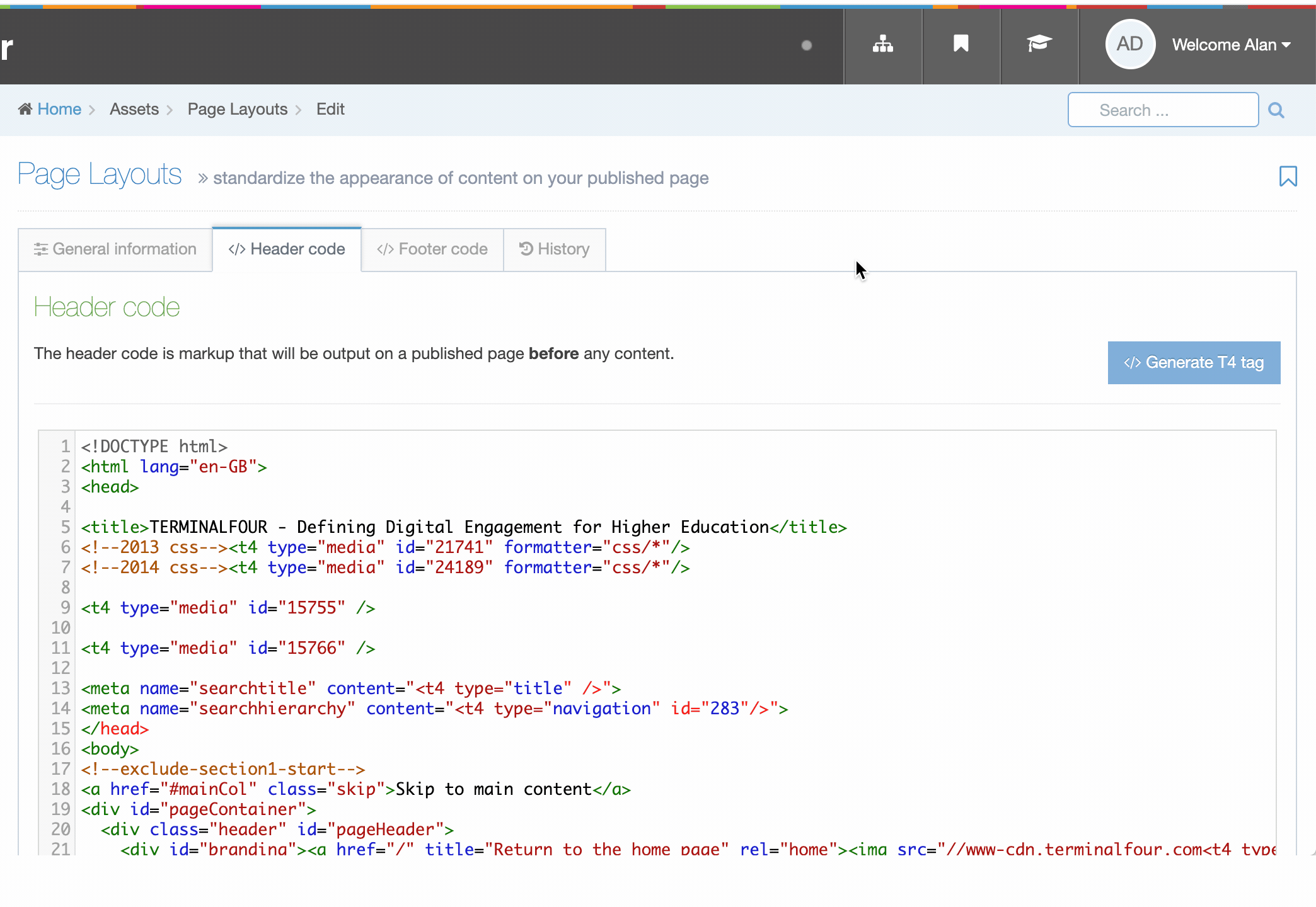
The Header and Footer Code Tabs
When building your Page Layout you will need to consider what will appear in the header and footer of every page that uses the Page Layout. Typically, the Header tab will feature HTML elements up to and including the opening body tag, while the Footer tab will feature HTML from the closing body tag on. Using T4 Tags you can add items such as images, stylesheets and scripts from the Media Library or add navigation elements.
| Item | Description |
|---|---|
| Header and Footer Code Tabs | you can add and edit the markup that will be used in the Page Layout. This can be typed directly in the input or pasted from a third party application. |
| Generate T4 tag | this is located below the Header Code and Footer Code inputs (you may need to scroll down). When selected a modal window will appear where you can generate the T4 Tags that can be used in the Page Layout. After you have built a T4 Tag, select Copy to clipboard and paste the T4 Tag into your Page Layout |
The following types of tags can be generated:
- Navigation: Insert navigation objects into the Page Layout
- Media: Used to reference images or CSS files
- Metadata: When you are editing a Section an option is provided to add metadata. This metadata can be used by search engines or can be used to determine how your content will look when shared on social networks.
- Channel: Using the Channel T4 Tags, you can add Channel specific information such as the Channel title, description to the Page Layout.
- Misc(ellaneous): Title tags and Edit this page tags
History Tab
Each time a Page Layout is amended and saved a new version is created. All versions of the Page Layout are listed in the History tab.
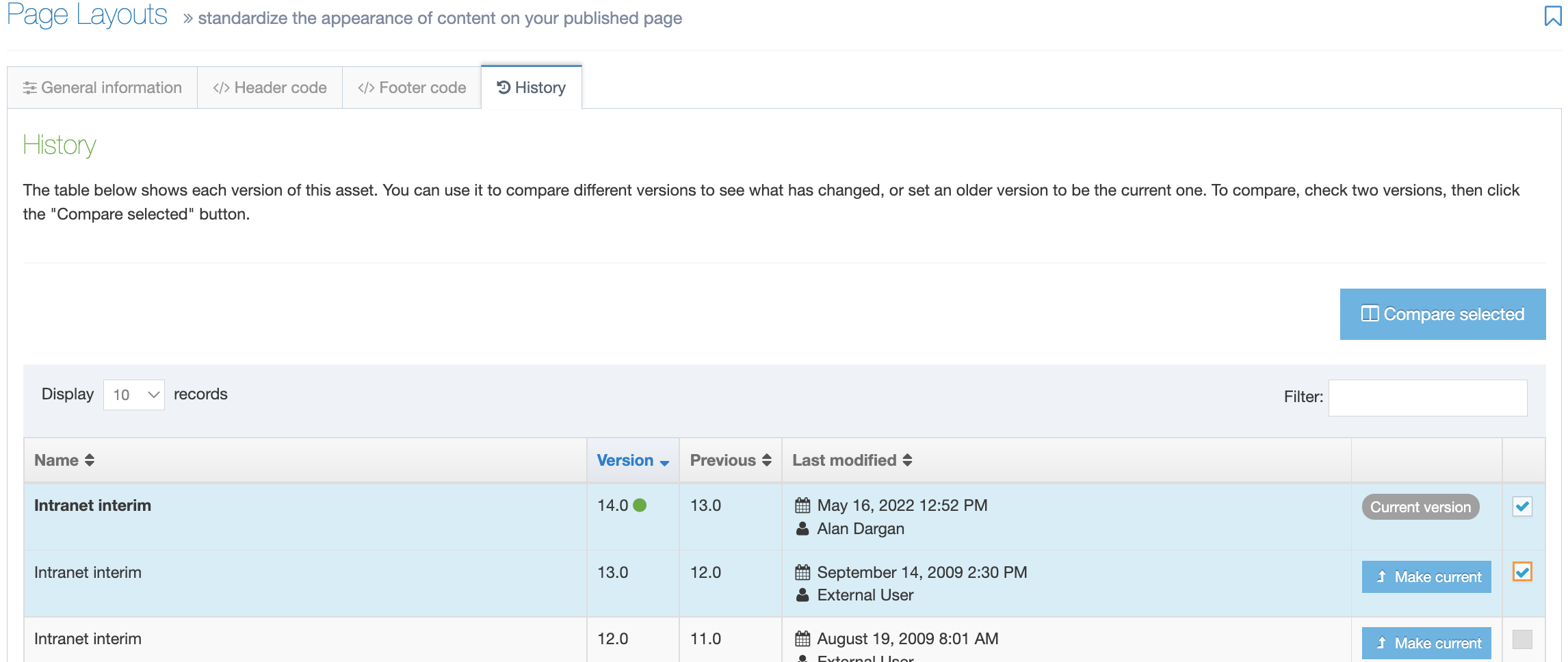
The list in this display shows six columns:
| Item | Description |
|---|---|
| Name | Page Layout name |
| Version | Each version created is given a number; a green dot indicates the active version |
| Last modified | The date, time and user who made the change |
| Previous | Previous version number |
| Actions | Click and it lets you Preview the page layout or set that version as the Current version |
| Select box | Check one or more if you wish to Compare selected. When a layout is checked the row becomes shaded |
You can choose to compare versions with a side-by-side comparison. Check two boxes in the far right column to choose the layouts to compare and select Compare selected.
The most recent version selected is shown on the left and the older version on the right. Code changes are highlighted in yellow. In this instance, the highlighted line of code in the older version on the right has been removed from the more recent version on the left. If selected, the Revert option highlighted will add this back to the more recent version.

Remember - over time you can store many Page Layout examples and versions. This provides you with a dependable record of the layouts developed and refined.
When you are satisfied with the entries and selection you have made, you can click Save changes.
Share a Page Layout
Global Page Layouts can be used by any user but can only be edited by Administrators. Power Users and Administrators can create Page Layouts within groups or share Page Layouts with other groups. The Page Layout can either be shared with Read only or Full access:
- Read only access: Power Users within the group can view the Page Layout but cannot edit it
- Full access: Power Users within the group can view and edit the Page Layout
Regardless of how the Page Layout is shared, all users within the group can use the Page Layout to apply it to a section.
Duplicate a Page Layout
You can duplicate a Page Layout. Do this either into a new Group or the same Group or with other Groups. A duplicate Page Layout creates a copy of the original and the two Page Layouts are not linked to each other.
Delete a Page Layout
If you are unsure whether or not a Page Layout is in use, check the Page Layout Usage Reporting first. In the row of the corresponding Page Layout, open the Actions drop-down list and select Delete.
A confirmation pop-up window appears and you can confirm your choice and Delete, or Cancel the action. Upon successful deletion, a green banner appears confirming the deletion, and the Page Layout is removed from the list.
Page Layout Locking
Similar to Content Type Locking, Page Layout Locking prevents multiple users editing the same Page Layout at once, a lock is placed on it while a user makes edits. Locked Page Layouts are indicated by a padlock icon next to the Page Layout name in the listing page. A locked Page Layout cannot be clicked on.
To see who is editing the Page Layout hover over the padlock icon, The Actions Menu of a locked Page Layout is disabled:
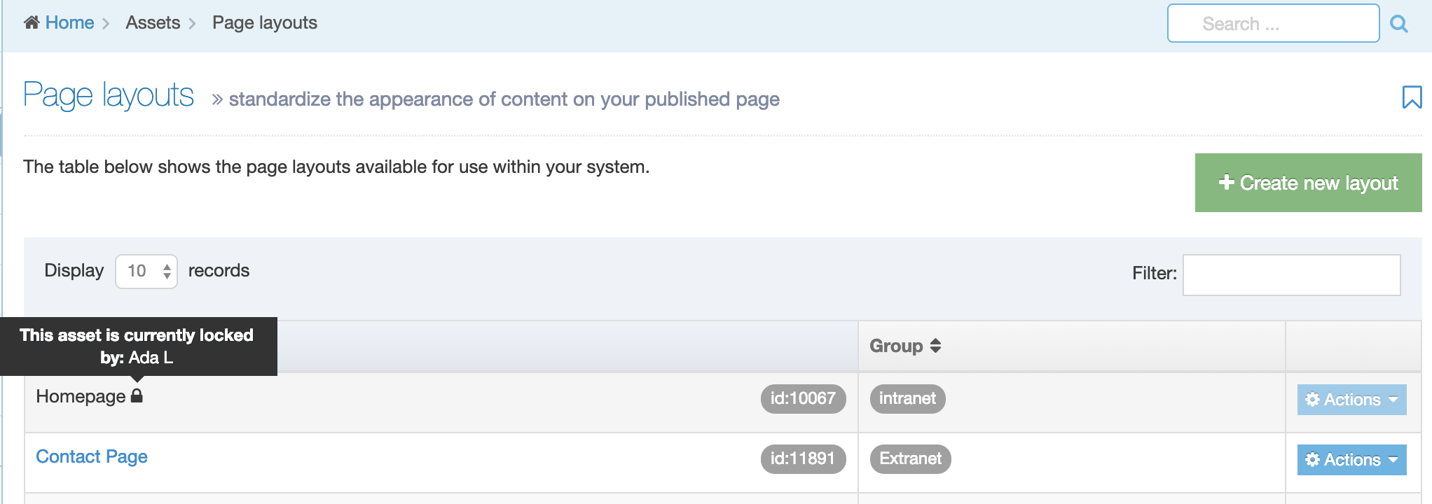
An asset is locked while another user is making changes to it and is unlocked when the user Saves Changes, clicks on the Cancel button or navigates away from the Edit page to another screen in Terminalfour.
If the browser window or tab is closed or the Edit screen is left open indefinitely, the lock will expire after the duration configured under Content Lock Timeout in System Administration > Hierarchy & Content Settings > Content.
A user who is editing a Page Layout when a lock expires will receive an onscreen notification in which they can renew the lock.
Metadata
Description
Meta tags are used to describe your page's content. They can be used to help with Search Engine Optimization (SEO) and how a link will appear when shared on social media.
Metadata in TERMINALFOUR can be:
- added when creating and editing Sections on the Metadata tab
- automatically generated for Page last modified and Page created
- associated with Content Elements so metadata for multiple Content Items on a page is output in the Page Layout header
Configure meta tags
To configure meta tags go to Assets > Metadata:
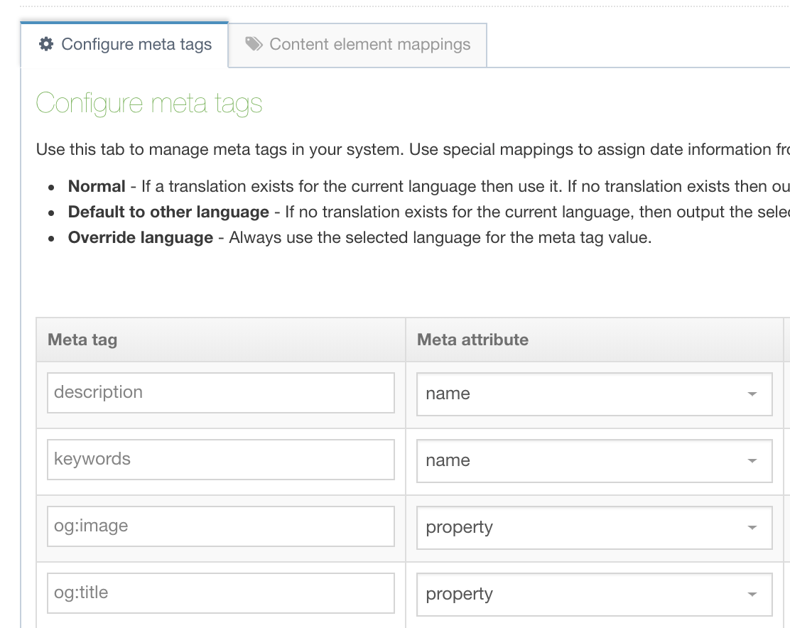
All new installs have the following meta tags:
- name="description"
- name="keywords"
- property="og:description"
- property="og:image"
- property="og:title"
Clients upgrading their installations should manually add the three "og" tags. These will not be added automatically during the upgrade process.
Learn more about Open Graph (og) metatags.
Meta tags can be added and removed from this page. Adding a meta tag requires a meta tag name and a meta attribute to be set. The meta attribute can be a name or a property.
Special mapping: Meta Tags for Page last modified and Page created
An optional special mapping meta tag can be used to output the Page last modified and Page created date and time. In the Special mapping column, select whether the meta tag is populated with the Page last modified or Page created date:
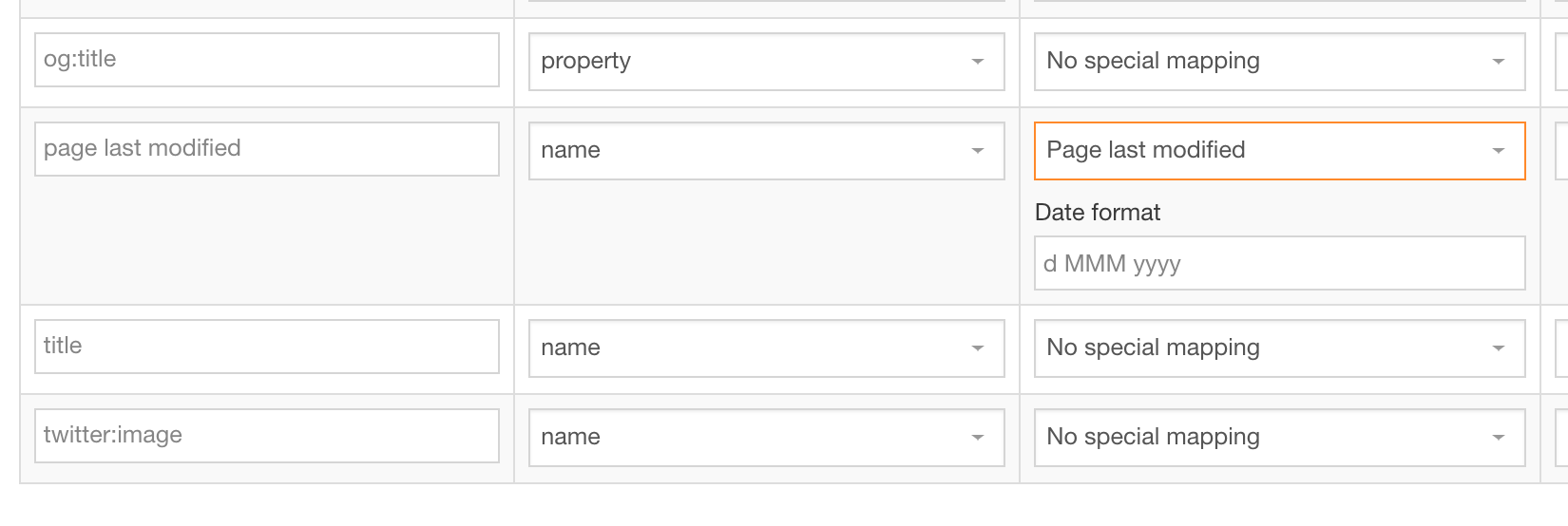
The output value of these tags depends on the content within the Section.
- Page last modified: the most recent last modified date of the content in the section is output
- Page created: the create date of the oldest Content Item is output
A date format is also required for these and should comply with the Java date pattern. An example format is YYYY-MM-dd.
Managing metadata for different languages
The Language Behavior column allows you to choose from three options:
- Normal: If a translation exists for the current language then use it. If no translation exists then output nothing.
- Default to other language: If no translation exists for the current language, then output the selected language's version instead.
- Override other language: Always use the selected language for the meta tag value.
If "Default to other language" or "Override other language" is selected, in the Language option, select a language from the drop-down list.
Remember to Save changes.
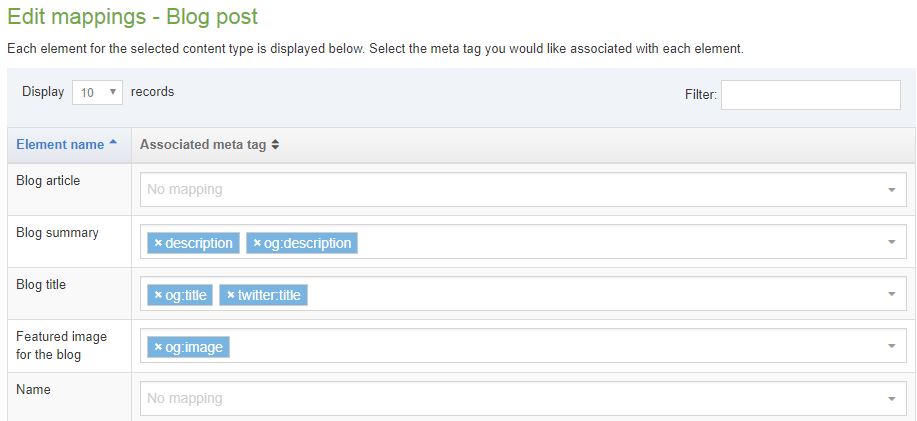
Content element mappings
The meta tags can be associated with Content Elements allowing metadata for multiple Content Items on a page to be output in the Page Layout header.
For each Content Type, the name, description, id and groups are displayed. If a Content Type has mappings configured then selecting Show/hide mappings will display the mappings.
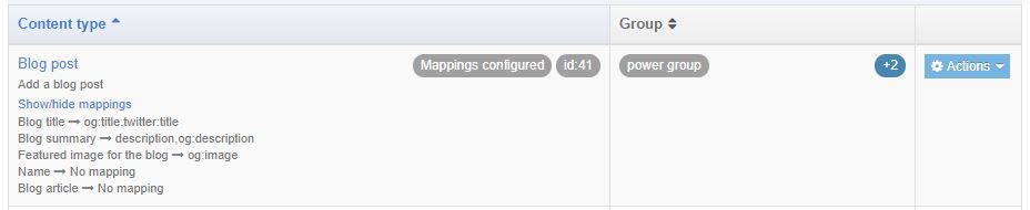
The Actions button allows you to Edit mappings or Edit content type:
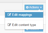
If you click the Edit mappings you then select the meta tags you want to map to each element. You can map multiple elements to the same meta tag and you can also map multiple meta tags to the same element.
If you click Edit Content Type, you are transferred to the General Information tab of the corresponding Content Type.
It is not possible to map File and Image elements.
Map & output a media element
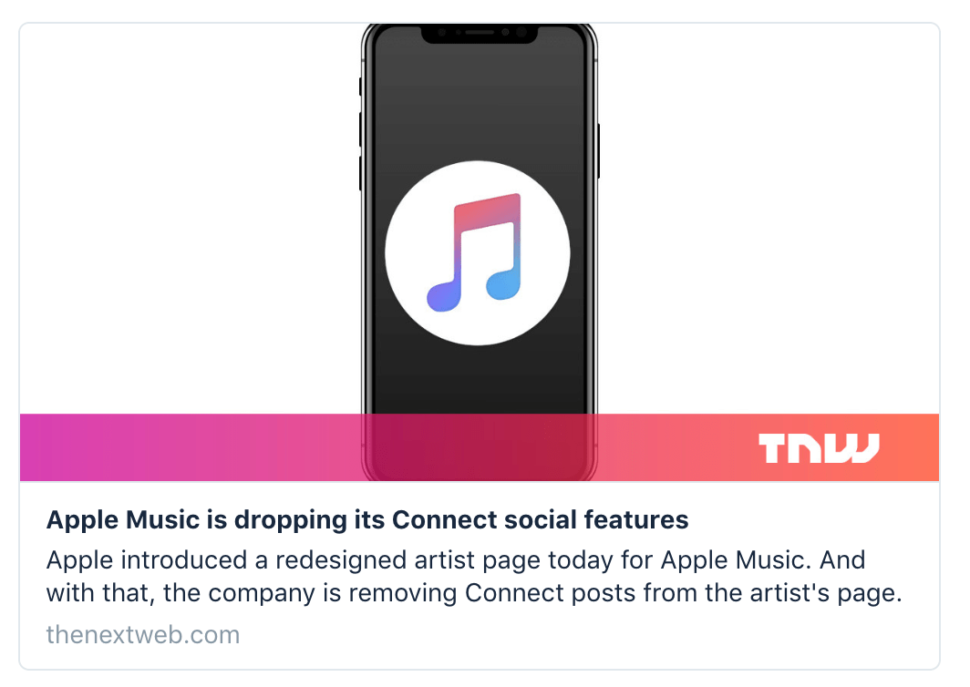
One of the uses of mapping a media element is so you can specify an image that will accompany the link to your content when it is shared on social media.
Here's an example of a sharing card that uses the og:image meta tag to display a specific image when the page is shared on Twitter:
If you haven't already, you'll need to set up a Content Layout for the Media Content Type with the following settings:
- Name: path/*
- File Extension: Default
- Syntax type: HTML/XML
- Content Layout Processor: T4 Standard Content:
The name of this layout must be path/* - if this layout doesn't exist in your system, references to this metatag will cause a publish failure.
Use the Content layout code:
<t4 type ="content" name="Media" output="file" />Then, add the Media type under System administration > System settings > Media library:
- Name: Path
- Permitted file extensions: jpeg,gif,png
- Maximum file size: 5242880
- Associated content layouts: path/*
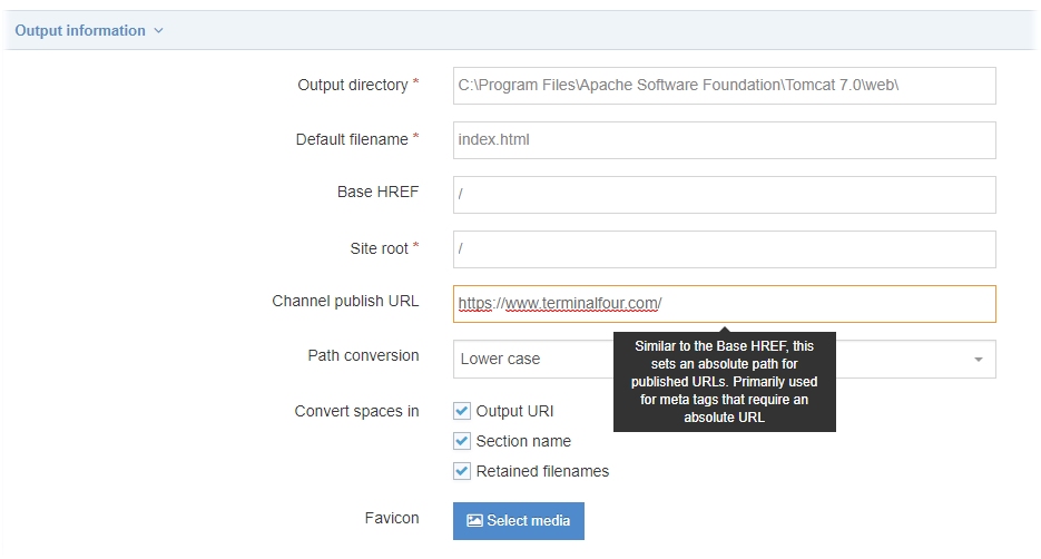
Update the Channel to set the Channel publish URL for the featured image
Edit your channel under System administration > Set up sites & channels > Channels and set a value for the Channel publish URL. This is used to form the URL for the image. In this example the value has been set to https://www.terminalfour.com/ :
Output the meta tags
Once meta tags are configured, they can then be output into the header of pages by using T4 Tags in the header of a Page Layout. The values of meta tags (without the surrounding meta tag) can also be output in Page Layouts or Content Layouts using the Section meta info navigation object.
When your page is published, you can test how it will look when shared by using service like metatags.io.
T4 tags
Description
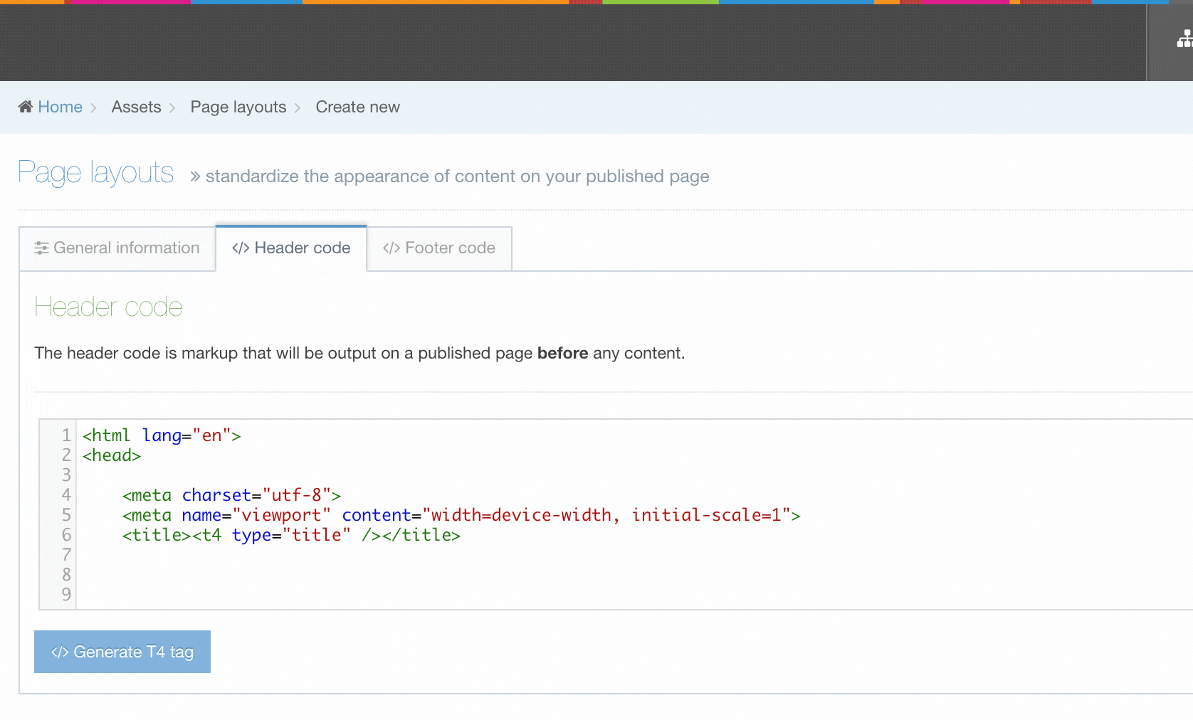
T4 Tags are built are added to Page Layouts and Content Layouts using the Generate T4 tag button from Page Layouts and Content Types. When the button is clicked you can add and customize T4 Tags to the layout.
In this example we are adding a Nav Object T4 Tag to a Page Layout:
In addition to the Generate T4 tag builder, there are other tags that can be added to Page and Content Layouts. These are all covered below.
- Content (type="content")
- Tag output: Element
- Settings for all output methods
- Settings for normal output (inline) (output="normal")
- List elements
- Media elements
- Content owner elements
- Section/Content link elements
- Settings for selective output (output="selective-output")
- Settings for Repeaters (output="repeater")
- Settings for output to fulltext (output="fulltext")
- Settings for image output (output="image")
- Settings for image url output (output="imageurl")
- Settings for file output (output="file")
- Settings for download output (output="download")
- Fix URL (type="fix-url")
- Tag output: Metadata (type="meta")
- Tag output: Element
- Navigation (type="navigation")
- Media (type "media")
- Outputting content from the Media library
- Standard attributes
- Meta tags (type="meta")
- Channel (type="channel")
- Misc
- Format dates
- Other tags that can be added outside the tag builder
- Incorporate content from databases, RSS feeds and other web pages
- Access control
- Excel© to HTML (type="exceltohtml")
- Social poster
- Appendix
- Type
- Output
- Other
Generate Handlebars Expressions
Description
Handlebars Expressions can be added to Page Layouts and Content Layouts using the Generate Handlebars Expression button from Page Layouts and Content Types.
The "Generate Handlebars Expression" button is visible when the Layout Processor is set to "Handlebars".
When the button is clicked you can add and customize Handlebars Expressions and copy them for use in your layout.
In this example we are adding a Nav Object Expression to a Content Layout:
The Generate Expression Builder can be used to generate most of the common Handlebars expressions.
For an extensive list of all available Handlebars Expressions please see the full documentation.
Available expressions
Below is an extensive list of all of the Handlebars expressions you can generate in the Handlebars Expression Builder
- ifSet
- publish
- media
- mediaId
- file
- list
- with each
- selected
- with each
- selectedNames
- selectedValues
- link
- dateFormat
- dateElement
- repeater
- fulltext
- fulltextURL
- contentId
- fileSize
- anchor
- contentLastModifiedDate
- expiryDate
- publishDate
- createDate
- pageURL
- publishURL
- previewURL
- canonicalURL
- section
- with "field" parameter
- sectionId
- sectionName
- channelId
- channelName
- channelDescription
- directEditSection
- editSection
- createSection
- editContent
- createContent
- embed
- snippet
- preview
- nav
- meta
- if
- unless
- eq
- neq
- gt
- gte
- lt
- lte
- and
- or
- not
T4 tags: Content
Content (type="content")
Available from the Content Layout T4 tag builder.
Settings for all output methods
Output methods differ depending on the element type:
- Normal output (inline) output="normal". Outputs the element by adopting the text style of the page.
- Selective output (output="selective-output"). Used to only output the value of an element if the element is filled in.
- Output repeater (output="repeater"). Used to output the Repeater element and define which layout should be output.
- Output to fulltext (output="fulltext"). Outputs the element on a separate page, which can have its own layout.
- Output to image (output="image"). Outputs an image and path to the image.
- Output to image url (output="imageurl"). Outputs the path to an image.
- Output to file (output="file"). Outputs a file and path to the file.
- Output to download (output="download"). Not available on the T4 Tag builder. Outputs a file and path to the file, but any links to this Content Item link directly to the file.
Modifiers
| Name | Modifier | Description | Elements |
|---|---|---|---|
| Parse for media library t4 tags | medialibrary | Converts media library tags to media. | Plaintext, HTML, Checkbox, Select box, Multiple select, Radio button, Cascading list, Multiselect list |
| Parse for navigation t4 tags | nav_sections | Converts Section Section and content link tags into the link to the published URL. | HTML, Section/Content link |
| Strip out all HTML tags | striptags | Removes HTML tags. | Plaintext, HTML, Checkbox, Select box, Multiple select, Radio button, Cascading list, Multiselect list |
| Encode special characters to their HTML equivalent | htmlentities |
Converts un-encoded special characters to their HTML equivalent. See https://www.ascii.cl/htmlcodes.htm for more information. |
Plaintext, HTML, Checkbox, Select box, Multiple select, Radio button, Cascading list, Multiselect list |
| Change new lines to HTML line breaks | nl2br | Converts new lines (\n\n) to an HTML line break <br>. | Plaintext only |
| Convert invalid RSS characters to their XML equivalent | rssentities | Converts invalid RSS characters to an XML equivalent. Do not use this modifier in combination with Strip out all HTML tags. | Plaintext, HTML, Checkbox, Select box, Multiple select, Radio button, Cascading list, Multiselect list |
| Convert output to be suitable for use in JavaScript | js-var | Escapes single quotes, double quotes and new lines. Makes content suitable for use in JavaScript, but not necessarily JSON. | Plaintext, HTML, Checkbox, Select box, Multiple select, Radio button, Cascading list, Multiselect list |
| Encode email addresses to ASCII format | encode_emails | Converts email addresses to ASCII format. An email address posted on any website can be easily extracted with special email collection programs and used later for sending spam. This allows it to display on a web page as normal but would prevent spam activity. | Plaintext, HTML, Checkbox, Select box, Multiple select, Radio button, Cascading list, Multiselect list |
Direct edit
Disable direct edit for this element: enable-dedit="false"
This attribute can be used to prevent users from editing content in Direct Edit. This attribute is added to a T4 tag, like below:
You can edit this Content Type element
<h1>Plain text element</h1> <t4 type="content" name="Code only" output="normal" modifiers="medialibrary" enable-dedit="true" />
You cannot edit this Content Type element in direct edit:
<h1>HTML element</h1> <t4 type="content" name="HTML" output="normal" modifiers="medialibrary,nav_sections" enable-dedit="false" />
In most situations this tag enable-dedit will not exist, so its value is therefore considered null. A null value is actually considered true. Only if the value is not null and equals false, does the content element get marked as "not editable". So the below two lines would be considered the same:
<t4 type="content" name="HTML" output="normal" modifiers="medialibrary,nav_sections" /> <t4 type="content" name="HTML" output="normal" modifiers="medialibrary,nav_sections" enable-dedit="true" />
List elements
Further settings can be applied manually for lists under the tags type="content" output="normal"
List entry names, values
List entries have a name and a value and sometimes you need to specify which of these to output. To do this, add the display_field attribute to the T4 tag.
<t4 type="content" name="Element Name" output="normal" display_field="name" />
or
<t4 type="content" name="Element Name" output="normal" display_field="value" />
The use of this code effects the three different List content elements in the following way:
- Cascading list - The list entry value is displayed by default. If the attribute is missing, the value is published. An exception is when display_field="name" is added.
- Multiple select - The list entry value is displayed by default. If the attribute is missing, the value is published. An exception is when display_field="name" is added.
- Multi-select list - The list entry name is displayed by default. This is consistent with how this content element is currently published, and the default does not change for backwards compatibility reasons.
List delimiters
For Multi-select lists and Cascading list elements, the T4 tag for that list element uses a comma (,) to separate the values selected within a Content Item.
For example, if a user selects "Fruit > Apple" and "Fruit > Pear" and "Vegetable > Carrot" list values, the T4 tag outputs "Fruit, Apple, Fruit, Pear, Vegetable, Carrot".
It is possible to change the delimiters used by adding the textual-name-separator and delimiter attributes to the T4 tag.
<t4 type="content" name="Element Name" output="normal" textual-name-separator=">" delimiter="|" />
In the example above, this would output "Fruit>Apple | Fruit>Pear | Vegetable>Carrot".
For a Cascading list element, where only one item can be selected, it only uses the textual-name-separator example: "Fruit>Apple".
Media elements
Further settings can be applied manually for media under the tags type="content" output="normal".
By default, Media elements are formatted using the Media content layout on the Media Content type, but if a specific Media content layout is required, it is possible to add the formatter attribute to the T4 tag to specify the layout to use.
<t4 type="content" name="Featured image for the blog" output="normal" modifiers="" formatter="path/*" />
In the example above, the "Featured image for the blog" media element, is formatted using the "path/*" layout on the Media Content type.
Content owner elements (output="userinfo")
output="userinfo" can be used to output the details of the user.
Tag to output the username, e.g. joebloggs
<t4 type="content" name="Content Owner" output="userinfo" info="username" />
Tag to output the Full Name, e.g. Joe Bloggs
<t4 type="content" name="Content Owner" output="userinfo" info="first_last" />
Tag to output the Lastname, Firstname, e.g. Bloggs, Joe
<t4 type="content" name="Content Owner" output="userinfo" info="last_first" />
Section/Content link elements (output=linktext or output=linkurl)
Using the Tag builder, Section/Content Link elements output the full anchor tag to the selected Section Section or Content Item.
Further settings can be applied manually for section/content links under the tag type="content".
It is possible to generate the URL of the Section Section/content, or the link text for the Section Section/content by using custom T4 tags. The name is set to the name of the Section/Content link element.
The T4 tag to output the link text for the Section Section/content is:
<t4 type="content" name="element-name" output="linktext" />
The T4 tag to output the URL for the Section Section/content is:
<t4 type="content" name="element-name" output="linkurl" />
Example: Create a Content Type that has a media image with a Section Section/content link on it
This example Content type allows end users to select an image from the media library and create a link on the image:
| Name | Type | Compulsory |
|---|---|---|
| Select an Image | Media library | Yes |
| Select a Link | Section/Content Link | Yes |
<a href="<t4 type="content" name="Select a Link" output="linkurl" />"><t4 type="content" name="Select an Image" output="normal" modifiers=""/></a>
If a normal T4 tag is used to output Section/Content Link elements, ensure the Parse for Section Navigation tags modifier has been checked on the Content type element.
<t4 type="content" name="element" output="normal" modifiers="nav_sections"/>
If you have elements in a Content Type which are not required, you can ensure the element is not output if there is no content in the element.
Selective output is not available with file or image elements. For image elements, consider using the output=image option.
Attributes
| type | Always set to content | type="content" |
|---|---|---|
| name | Name of the element | name="Name" |
| process-format | Process selective output markup, true or false. Use this to process other tags within this tag. | process-format="true" |
| format | Selective output markup | format="<p>Phone: $value</p>" |
| modifiers | Modifiers | modifiers="" |
| format-modifiers | Apply different modifiers (such as, htmlentities) to the Content Type element value and the format attribute. For example, you want characters within the Content Type element value to be changed to their HTML equivalent (change & to &) - but if you have an & in the format tag, and you want it to remain as & in the output. To do this, the "process-format" attribute must be set to true and the format-modifiers attribute is specified. | format-modifiers="" |
Example of a standard tag
The Content Type has an element "Phone". We only want HTML to be output if the user has added the phone number in the element. If no content has been added to the Phone element then nothing will be published.
<t4 type="content" output="selective-output" modifiers="" name="Phone" format="<p>Phone: $value</p>" />
Example of a tag containing quotes
Quote symbols in the HTML need to be added in their Unicode equivalent.
<t4 type="content" output="selective-output" modifiers="" name="Phone" format="<p class="phone">Phone: $value</p>" />
Example of a tag containing additional t4 tags
The format attribute can contain other T4 tags such as (language variable tag). To do this, the "process-format" attribute must be set to true, and the quote symbols in the nested t4 tag must be replaced with "
<t4 type="content" output="selective-output" process-format="true" modifiers="" name="Name" format="<p><t4 type="lang-var" default-language="en" en="Name" ga="Irish Name" fr="French Name" /> : $value</p>" />
Example of a tag containing different modifiers on the element value and format attribute
You can apply different modifiers (such as, htmlentities) to the element value and the format attribute. For example, you want characters within the element value to be changed to their HTML equivalent (change & to &) and if you have an & in the format tag, you want it to remain as & in the output.
To do this, the "process-format" attribute must be set to true and the format-modifiers attribute is specified. You can specify the modifiers as follows:
<t4 type="content" output="selective-output" process-format="true" format-modifiers="" modifiers="htmlentities" name="Full Name" format="<p>First & Lastname : $value</p>" />
This is used in Content Layouts to output Repeater elements. It allows you to select which content layout from the Repeated Content Type should be used when processing the output.
Attributes
| type | Always set to content. | type="content" |
| name | Name of the repeater element. | name="element-name" |
| output | Always set to repeater. | output="repeater" |
| layout |
Name of the content layout to be repeated. Note: if the layout is not passed, the T4 tag will fall back to the default layout defined in the Repeater Config for this Content Type |
layout="text/example" |
Example
<t4 type="content" name="Repeater Element Name" output="repeater" layout="text/example" />
The output would be the processed text/example layout being output once for each repeated item in the content type.
Fulltext formatters can be used to link from one Content layout to another.
Potential usage scenario
As an example: this can be used for news Items to display some of the elements on the main page (index) (Title, Date and Summary), and then link one of the elements (the Title) to the fulltext content layout to display the relevant elements (Title, Date and Main Story).
Example standard tag
The initial Content layout needs to include a tag to generate the fulltext content. Check the channel settings to find the Type used for the channel, the default being text/html. Use Generate T4 tag, select the output method as Output to Fulltext. You can use any element to generate the fulltext content. By default, the generated URL reflects the selected element. In this case, we have selected the Question element which generates a fulltext URL similar to /mysite/question,123,en.html.
<t4 type="content" name="Question" output="fulltext" />
A link should be provided to link to the fulltext page:
<a href="<t4 type="content" name="Question" output="fulltext" />">Link text</a>
The element referencing each layout should be unique. If the same element is referencing different fulltext layouts, they will have the same filename and overwrite each other until only the last fulltext file written will be published.
Example tag using an element to set the file name
If you want to be able to control the URL of the fulltext version of the content and make friendly URLs, you can modify the T4 Tag to use the contents of one of the elements. Specify use-element="true" and the element to be used filename-element="Title". The example below uses the Title element.
The URL for the fulltext version of the content will then contain the text entered in the title element example: "how-to-make-content,en.html".
<t4 type="content" name="Title" output="fulltext" modifiers="" use-element="true" filename-element="Title"/>
A link should be provided to link to the fulltext page:
<a href="<t4 type="content" name="Title" output="fulltext" modifiers="" use-element="true" filename-element="Title"/>">Link text</a>
Instead of using a T4 Tag, you can specify a Content Type Element to output a friendly URL by selecting the "Use as filename" option for the Content Element.
If the "Use as filename" option is selected for a Content Element, and the T4 Tag specifies a different Content Element, the Content Element set on the T4 Tag will override the Content Element that has "Use as filename" selected.
In versions earlier than 8.3, this behaves differently. Instead the Content Element with "Use as filename" is used and overrides any Content Element specified in the T4 Tag.
Example tag using a specific formatter
If you wish to specify a type formatter to use, the formatter attribute can be set. In the example below, the name of the Content layout is called text/website:
<t4 type="content" name="Question" output="fulltext" modifiers="" formatter="text/website" />
Example of tabbed Content Type using multiple formats
Example of tabbed Content Type using multiple formats
Using the fulltext tag, multiple formats can be created and linked from the one Content Item.
This example splits the content into three tabs for "Contact Info", "Biography" and "Awards".
Each tab contains some of the elements from the Content Type.
Create a Content Type with the following elements:
| NAME | TYPE | COMPULSORY | MAXIMUM SIZE |
|---|---|---|---|
| Name | Plain text | Yes | 10 words |
| Address | Plain text | Yes | 100 words |
| Phone number | Plain text | Yes | 10 words |
| Biography | HTML | Yes | 500 words |
| Research interests | Plain text | Yes | 100 words |
| Awards | Plain text | Yes | 100 words |
Create the first Content type layout, using text/html as the name.
<!-- start formatter="text/html" for Content Type -->
<p class="multiFormatter">
<a href="<t4 type="content" name="Biography" output="fulltext" modifiers="" formatter="text/biography"/>">Biography</a>
<a href="<t4 type="content" name="Awards" output="fulltext" modifiers="" formatter="text/other" />">Research and Awards</a>
<h2>Contact details</h2>
<p><strong>Name: </strong><t4 type="content" name="Name" output="normal" modifiers="" /></p>
<p><strong>Address: </strong><t4 type="content" name="Address" output="normal" modifiers="striptags,htmlentities" /></p>
<p><strong>Phone: </strong><t4 type="content" name="Phone number" output="normal" modifiers="striptags,htmlentities" /></p>
<!-- end formatter="text/html" for Content Type -->
Create the second Content type layout, using text/biography as the name.
<!-- start formatter="text/biography" for Content Type -->
<p class="multiFormatter">
<a href="<t4 type="content" name="Name" output="fulltext" modifiers="" formatter="text/html" />">Contact Details</a>
<a href="<t4 type="content" name="Awards" output="fulltext" modifiers="" formatter="text/other" />">Other</a></p>
<h2>Biography details</h2>
<p><strong>Name: </strong><t4 type="content" name="Name" output="normal" modifiers="" /></p>
<p><strong>Biography: </strong><t4 type="content" name="Biography" output="normal" modifiers="medialibrary,nav_sections" /></p>
<!-- end formatter="text/biography" for Content Type -->
Create the third Content type layout, using text/other as the name.
<!-- start formatter="text/other" for Content Type -->
<p class="multiFormatter">
<a href="<t4 type="content" name="Name" output="fulltext" modifiers="" formatter="text/html" />">Contact Details</a>
<a href="<t4 type="content" name="Biography" output="fulltext" modifiers="" formatter="text/biography" />">Biography</a>
<h2>Research & award details</h2>
<p><strong>Name: </strong><t4 type="content" name="Name" output="normal" /></p>
<p><strong>Research Interests: </strong><t4 type="content" name="Research interests" output="normal" modifiers="striptags,htmlentities" /></p>
<p><strong>Awards: </strong><t4 type="content" name="Awards" output="normal" modifiers="striptags,htmlentities" /></p>
<!-- end formatter="text/other" for Content Type -->
When the content is published, 3 files will be published
- index.html which will provide links to:
- biography-280-en.html
- awards-280-en.html
The code in the files will be in the following format
index.html (from the text/html format)
<!-- start formatter="text/html" for Content Type -->
<p class="multiFormatter">
<a href="/multi-fulltext/biography-280-en.html">Biography</a>
<a href="/multi-fulltext/awards-280-en.html">Research and Awards</a>
<h2>Contact details</h2>
<p><strong>Name: </strong>multi fulltext example</p>
<p><strong>Address: </strong>110 Amiens Street</p>
<p><strong>Phone: </strong>018509700</p>
<!-- end formatter="text/html" for Content Type -->
biography-280-en.html (from the text/biography format)
<!-- start formatter="text/biography" for Content Type -->
<p class="multiFormatter">
<a href="/multi-fulltext/name-280-en.html">Contact Details</a>
<a href="/multi-fulltext/awards-280-en.html">Other</a></p>
<h2>Biography details</h2>
<p><strong>Name: </strong>multi fulltext example</p>
<p><strong>Biography: </strong><p>All about the person.</p>
<p> </p></p>
<!-- end formatter="text/biography" for Content Type -->
awards-280-en.html (from the text/other format)
<!-- start formatter="text/other" for Content Type -->
<p class="multiFormatter">
<a href="/multi-fulltext/name-280-en.html">Contact Details</a>
<a href="/multi-fulltext/biography-280-en.html">Biography</a>
<h2>Research & award details</h2>
<p><strong>Name: </strong>multi fulltext example</p>
<p><strong>Research Interests: </strong>Higher education</p>
<p><strong>Awards: </strong>Degrees</p>
<!-- end formatter="text/other" for Content Type --></html>
Notes
If you use the T4 Title tag to create the title of the page, the T4 tag can be modified for fulltext pages to generate a unique Title tag for each fulltext page.
If your Page layout contains a Breadcrumb Navigation object, the object can be configured to include the fulltext content, instead of simply generating a path to the Section Section.
This is used in Content Layouts to format Image elements (not to be confused with Media).
Attributes
| type | Always set to content. | type="content" |
| name | Name of the image element. | name="element-name" |
| output | Always set to image. | output="image" |
| max-width | Forces a maximum width on the image. max-width="100" limits resize to a maximum width of 100 pixels. | max-width="100" |
| max-height | Forces a maximum height on the image. max-height="100" limits resize to a maximum height of 100 pixels. | max-height="100" |
| client-resize |
Specifies if the image resizing is carried out by the browser (the client) or during publish. By default, if no client-resize attribute has been added, the image is resized by Terminalfour on publish. If the attribute has a "false" value, the image is resized by Terminalfour on publish, resulting in a new image with the size added to the name. If the attribute has a "true" value, the actual image dimensions and size are not changed. The image is displayed to the specified size in the browser, so it appears re-sized. The width and height attributes and values are added based on the presence of the max-width and/or max-height values. This can impact the publish time, as new images have to be created during publish. This can impact the publish time, as new images have to be created during publish. |
client-resize="false" |
| alt | The ALT text for the image. | alt="This is a blue image" |
| alt-element | The Content type element you want to use for the ALT text. | alt-element="Description" |
| style |
CSS Style options, examples: border, margin, float and class.
|
Example
<t4 type="content" name="element-name" output="image" />
The output would be:
<img src="/mysite/name-of-image-file.jpg" />
This is used in Content type layouts to output the URL of Image elements (not to be confused with Media).
Attributes
| type | Always set to content. | type="content" |
|---|---|---|
| name | Name of the image element. | name="image-element" |
| output | Always set to imageurl. | output="imageurl" |
| max-width | Optional. Forces a maximum width on the image. max-width="55" limits resize to a maximum width of 100 pixels. | max-width="55" |
| max-height | Optional. Forces a maximum height on the image. max-height="44" limits resize to a maximum height of 100 pixels. | max-height="44" |
Example
<t4 type="content" name="the-image" output="imageurl" max-width="55" max-height="44" />
The output would be:
/mysite/name-of-image-file-55x15.jpg
Used to output a path to an Image or File element.
<t4 type="content" name="element" output="file" />
The output would be:
/mysite/name-of-file.jpg
The output of Content Links to this Content Item would be an anchor link to the Content Item on the page (as opposed to the download output that links directly to the file):
<a href="/mysite/#d.en.36301">my content link text</a>
It is not possible to create this T4 Tag through the T4 Tag Builder. To create this tag, build the tag using the file output, and manually change the output in the T4 Tag.
This is used to output the path to an Image or File element. Any links to the Content Item that contains a T4 Tag that uses output="download" will link directly to the file.
This can be useful if the Content Type is used to upload documents. Links would output the direct path to the document rather than link to the page anchor that contains the link.
<t4 type="content" name="element" output="download" />
The output would be:
/mysite/name-of-file.jpg
The output of Content Links to this Content Item would be to the file (as opposed to the file output that links to an anchor on the page):
<a href="/mysite/name-of-file.jpg">my content link text</a>
Fix URL (type="fix-url")
The Fix URL tag checks URLs within a specified Element in a Content Type and prepends http:// to it, as necessary, when published. This is used for Content Types which contain an Element for users to enter a URL.
The tag does not output the element, so you must also use the normal t4 tag to output the element.
There is a single required attribute, element, the name of the Content Type Element to be checked and updated.
Example:
<t4 type="fix-url" element="External URL" />
Tag output: Metadata (type="meta")
These meta tags are generated for the specific Content Item in the content tab of the tag builder. Please note that under the meta tags tab in the page layout tag builder, further meta tag outputs are available.
| Type of metadata | Tag | Date format | Note |
|---|---|---|---|
| HTML anchor | meta="html_anchor" | HTML anchors are required for content links to work correctly | |
| Content ID | meta="content_id" | Output the ID of the Content Item. | |
| Last modified date | meta="last_modified" | The date that the content was last modified. Format the date as required by using the format attribute. | |
| Last modified by (username) | meta="last_modified_by_username" | The username of the user who last modified the content. If this user no longer exists, nothing is output. | |
| Last modified by (full name) | meta="last_modified_by_fullname" | The full name (Firstname Lastname) of the user who last modified the content. If this user no longer exists, nothing is output. | |
| Publish date | meta="publish_date" | The date the content was published. Format the date as required by using the format attribute. This is linked to the Content Options and is only output if the options are chosen. | |
| Expiry date | meta="expiry_date" | The date the content is due to expire. Format the date as required by using the format attribute. This is linked to the Content Options and is only output if the options are chosen. | |
| Content version | meta="version" | The current version number of the content. | |
| Element size | meta="filesize" | The size of a chosen element (typically of a file or media). The output is in KB. The Element Size metadata requires the use of an Element. This will result in an additional drop-down list when building the tag to allow you to select an Element. In the T4 tag, the Element is added as a "name" parameter. | |
| Number of days since modified | meta="recently_modified" | The number of days since content was last modified.
Additional attributes for "threshold" and "text" must be added to this tag which will output the value in the "text" attribute if the content was last modified within the "threshold" days. |
<t4 type="meta" meta="recently_modified" threshold="2" text="<t4 type="media" id="5" /> NEW: " />
In the example above, where content was modified within the last 2 days (48 hours), this tag would output a media item (media id 5) and text. Notice how quote symbols within the text attribute are changed to " to escape them.
T4 tags: Media (type="media")
Available from the Content Type and Page Layout tag builder. The "media" tag type is used for outputting content from the Media library, and to add Media attributes within the Media content layout.
Outputting content from the Media Library
The tag can be used within Content Types, Page Layouts, CSS and JavaScript files.
When you use it for a Content Type, it does not allow a user to select a file from the Media Library in content, but rather insert a media file (image, file) into the Content Type Layout.
Example media tag generated from the tag builder
<t4 type="media" formatter="image/*" id="10" />
In the T4 Tag, the type is "media", the id is the media file's id and the formatter is the Media Layout to be used (a Content Type Layout on the Media Content Type).
Media attributes within the Media Content Layout
Media Attributes can be used within the Media Content Type Layout to allow an end-user to specify further information about the Media Item or override values populated within the Media Library when using Media in an HTML element.
As an example, the default alt text could be the Description from the Media Library. This would be with the option to define a different alt text for a particular instance of the Media through a Media attribute. Another example might be that the default text for linking to File Media is the Name element, but with the option to define a different link text for this particular instance of the Media through a Media attribute.
Standard attributes
There are four standard attributes used with media located in the Media library. These attributes all have a default value, defined in the Media Library and users can modify them for their particular instances of the media if they have been configured to allow it. This could be used to resize images or change the text used to link to file Media.
| Attribute | Description |
|---|---|
| name | The name of the Media Item |
| description | The description of a Media Item |
| width | Dimensions only apply to image files |
| height | Dimensions only apply to image files |
User-defined attributes
Additional Media attributes can be set by inserting the T4 tag into the Media Content layout. These Media attributes are optional for users and are blank by default.
Do not rename User Defined Media attributes after content has been added using these attributes. Renaming the attributes can cause loss of data
Attributes
The following are specified:
| Attribute | Description | Example |
|---|---|---|
| type |
This should always be media. |
type="media" |
| attribute |
Name of the attribute. |
attribute="description" |
| editable |
To determine whether or not this attribute is editable by the user. This attribute is only applicable to the four standard attributes (name, description, width and height). If not specified within the T4 tag, the default is true. Values are true or false. |
editable="false" |
| format |
Used to output text and a value for the attribute. |
format="width: $value" |
Examples
Allow users to specify a different alt text
The alt text for image media is populated with the Description from the Media library (in a standard installation). This does allow users to specify a different alt text for this instance of the media. NOTE: this does not update the Description in the Media library.
In this example, the editable attribute is not specified, and therefore the default value of true is assumed, making it editable by users.
<img src="<t4 type="content" name="Media" output="file" modifiers="" />" alt="<t4 type="media" attribute="description" />" />
Do not allow users to specify a different alt text
The alt text for image media is populated with the Description from the Media library making users unable to modify this when editing media attributes.
<img src="<t4 type="content" name="Media" output="file" modifiers="" />" alt="<t4 type="media" attribute="description" editable="false" />" />
Allow users to resize images
The width and height for image media is populated by the size of the image within the Media library. Users are able to resize the image in the editor by specifying an alternative height or width, or both.
<img src="<t4 type="content" name="Media" output="file" modifiers="" />" alt="<t4 type="media" attribute="description" />" style="height: <t4 type="media" attribute="height" editable="true" />px; width: <t4 type="media" attribute="width" editable="true" />px;" />
The following code is generated when a user enters a height of 80px and a width of 40px. As a result, file name of the image is changed because the published file is resized to different dimensions.
<img src="/media/images/myimages/myimage-40x80.jpg" alt="a resized image" style="height: 80px; width: 40px;" />
By default, the size of the published image file on the server is resized during publish and is not resized purely by the browser.
From 8.4.0 you can add the attribute client-resize="true" to File elements to ensure that the Publish engine does not resize the image and instead leaves the resizing to be done by the browser client-side.
<img src="<t4 type="content" name="Media" output="file" client-resize="true" />" alt="<t4 type="media" attribute="description" />" style="height: <t4 type="media" attribute="height" editable="true" />px; width: <t4 type="media" attribute="width" editable="true" />px;" />
Allow users to specify a class for an image
A user defined attribute can be added to allow users to specify an optional class for an image. When modifying Media attributes, users have the option for class where they can type the required class. If this is not specified, the default value would be blank.
<img src="<t4 type="content" name="Media" output="file" modifiers="" />" alt="<t4 type="media" attribute="description" />" style="height: <t4 type="media" attribute="height" editable="true" />px; width: <t4 type="media" attribute="width"editable="true"/>px;" class="<t4 type="media" attribute="class" />" />
Allow users to specify the link text used for a file
When file media (such as, PDFs and Word Documents) are inserted into the WYSIWYG, the text used to link to the file is populated by the Name in the Media library (default installation), but users can modify the link text by editing Media attributes.
<a href="<t4 type="content" name="Media" output="file" modifiers="" />"><t4 type="media" attribute="name" editable="true" /></a> (<t4 type="meta" name="Media" meta="filesize" />kB)
Allow users to output media attributes as text
A user defines the attributes which they want to be output as text, in this case, the height and width of the image. They also need to add a format tag that formats the text being output; adding $value outputs the value of the selected attribute. When there is no value for that attribute, nothing is output.
<img src="<t4 type="content" name="Media" output="file" modifiers="" />" alt="<t4 type="media" attribute="description" />" <br /> <t4 type="media" attribute="height" format="Height: $value " /> <br /> <t4 type="media" attribute="width" format="width: $value" />
T4 tags: Metadata (type="meta")
Available from the Page Layout tag builder. This creates tags based on the settings that have been configured under Assets > Metadata.
There is also a T4 Meta tag for use with Content Types.
The tag is as follows:
<t4 type="meta" id="19" />
This generates the full meta tag on the page. As an example:
<meta name="keywords" content="web content management system, cms, wcms, website content management, mobile" />
To output just the "content" of the meta tag, use a Section META Info navigation object.
List values and names
If the special Metadata Mappings are mapped to List Elements, the Meta T4 tag can specify whether to use the Value or Name of the List entry by using the display_field attribute:
<t4 type="meta" ID="5" display_field="name" />
OR
<t4 type="meta" ID="5" display_field="value" />
This effects the three separate List content elements in the following way:
- Cascading List: The list entry value is displayed by default. So if the attribute is missing, the value is published. i.e. the value is published in all cases except when display_field="name" is added.
- Multiple Select: The list entry value is displayed by default. So if the attribute is missing, the value is published. i.e. the value is published in all cases except when display_field="name" is added.
- Multi-select List: The list entry name is displayed by default. This is in keeping with how this content element is currently published, and the default does not change for backwards compatibility reasons.
Sections with Fulltext Content
Where sections contain Fulltext content, the T4 Meta tag can be configured to determine whether the Metadata entered in Fulltext content is displayed on the index page by using the output_to_index or include_content_on_index attributes. In all cases the fulltext page contains the section metadata and the metadata for this particular Content Item. The fulltext page does not include meta information added for other Content Items in the same section.
The output_to_index attribute can be added to the T4 tag with a value of either true or false. For example:
<t4 type="meta" ID="5" output_to_index="false" />
If set to false, the index page does not include any meta data tag. The fulltext page contains the section metadata and the metadata for this particular Content Item. The fulltext page does not include meta information added for other Content Items in the same section.
If set to true, or left blank, the index page includes section metadata and metadata for all content within the section. The fulltext page contains the section metadata and the metadata for this particular Content Item. The fulltext page does not include meta information added for other Content Items in the same section.
The include_content_on_index attribute can be added to the T4 tag with a value of either true or false. For example:
<t4 type="meta" ID="5" include_content_on_index="false" />
If set to false, the index page only includes section metadata and does not include any content metadata. The fulltext page contains the section metadata and the metadata for this particular Content Item. It does not include meta information added for other Content Items in the same section.
If set to true, or left blank, the index page includes section metadata and metadata for all content within the section. The fulltext page contains the section metadata and the metadata for this particular Content Item. It does not include meta information added for other Content Items in the same section.
The output_to_index overrides the include_content_on_index tag, so, if you set output_to_index to false and the include_content_on_index to true the meta tag is not generated on the index page.
T4 tags: Navigation (type="navigation")
Available from the Content Type and Page Layout tag builder this tag outputs information specified in a Navigation Object.
Navigation tags can be used in Content Layouts, Page Layouts or a Content Item (within a plain text element). Some types of Navigation Objects have restrictions around where and how they can be used, and these are detailed on each separate page about each type of Navigation Object.
Navigation Objects can also be used within List Values, allowing a content author to select an item from a List, determining which Navigation Object is output onto the page. Or, they can be used within Media Items (e.g. JSON files), if the Media Type is configured to parse for T4 tags.
While Navigation Objects work within List Values and Media, this is not intended functionality and is not routinely tested. In addition, Navigation Objects that are used within Lists or Media are not recorded in the Navigation Usage Report. While this approach can be used, it should be used with caution.
Example
<t4 type="navigation" name="A-Z Site Map" id="34" />
T4 Tags: Channel (type="channel")
Available from the Page Layout T4 Tag builder but these tags can also be used in Content Layouts.
| Item | Example | Description |
|---|---|---|
| Site Root | <t4 type="channel" output="site-root" /> | Output the Site Root of the channel |
| Description | <t4 type="channel" output="description" /> | Output the Description of the channel |
| Fav(orite) Icon | <t4 type="channel" output="fav-icon" /> | Output the favorite icon of the channel |
| Channel ID | <t4 type="channel" output="id" /> | Output the channel ID |
| Channel name | <t4 type="channel" output="name" /> | Output the channel name |
T4 tags: Access control
When implementing access control on the published site, the T4 tag that is used to output the list of groups that have access to a section is:
<t4 type="accesscontrol" output="groupnames" />
This will output a comma-separated list of the names of groups that have access to that section.
This tag only works within the access control configuration code, for Group select content elements.
T4 tags: Format dates
Format dates
You can format Meta dates and date elements in the Content Layout. With no date formatting, a default date format will be used.
To format the date of content type elements use the attribute date_format.
To format the date of meta tags use format.
When selecting dates/times in the Generate T4 Tag you can choose from the following options:
| Value | Output |
|---|---|
| MM/dd/yyyy | 09/25/1980 |
| M/d/yy | 4/5/94 |
| dd/MM/yyyy | 04/10/1970 |
| d/M/yy | 4/1/86 |
| EEE, MMM d, ''yy | Tue, Feb 3, '59 |
| EEEE, MMMM d, yyyy | Monday, December 8, 1980 |
| hh:mm a | 09:30 AM |
| h:mm a | 9:30 PM |
| HH:mm | 21:30 |
| HH:mm:ss z | 21:30:56 PDT |
| HH:mm:ss Z | 21:30:56 -0700 |
| h 'o''clock' a, zzzz | 9 o'clock PM, Pacific Daylight Time |
| MM/dd/yyyy 'at' HH:mm:ss z | 05/29/1997 at 21:30:56 PDT |
| h:mm a 'on' EEE, d MMMM | 9:30 AM on Sat, 22 November |
| yyyyMMdd'T'HHmmss'Z' | iCalendar .ics format |
| yyyy-MM-dd'T'HH:mm:ss'Z' | Google/Outlook format |
Custom formats can be created based on the following:
| Letter | Date or Time Component | Presentation | Examples |
|---|---|---|---|
| G | Era designator | Text | AD |
| y | Year | Year | 1996; 96 |
| M | Month in year | Month | July; Jul; 07 |
| w | Week in year | Number | 27 |
| W | Week in month | Number | 2 |
| D | Day in year | Number | 189 |
| d | Day in month | Number | 10 |
| F | Day of week in month | Number | 2 |
| E | Day in week | Text | Tuesday; Tue |
| a | Am/pm marker | Text | PM |
| H | Hour in day (0-23) | Number | 0 |
| k | Hour in day (1-24) | Number | 24 |
| K | Hour in am/pm (0-11) | Number | 0 |
| h | Hour in am/pm (1-12) | Number | 12 |
| m | Minute in hour | Number | 30 |
| s | Second in minute | Number | 55 |
| S | Millisecond | Number | 978 |
| z | Time zone | General time zone | Pacific Standard Time; PST; GMT-08:00 |
| Z | Time zone | RFC 822 time zone | -800 |
Examples
The date 22 January 13 or 9 January 13
<t4 date_format="d MMMM yy" type="content" name="the date" output="normal" modifiers="" />
The date 22 January 2013 or 9 January 2013
<t4 type="content" date_format="d MMMM yyyy" name="the date" output="normal" modifiers="" />
The date 22 01 2013 or 09 01 2013
<t4 type="content" date_format="d MM yy" name="the date" output="normal" modifiers="" />
The date Friday, Mar. 21. 2014:
<t4 type="content" date_format="EEEE, MMM. d. yyyy" name="the date" output="normal" modifiers="" />
The date Last Modified 22 01 2013
<t4 type="meta" format="d MM yyyy" meta="last modified" />
Dates in multiple language sites
The locale attributes must be added manually to the tags. The date_format attribute outputs the date in the relevant language so an English page uses the English month names, and for a French page it uses the French month names.
Example tag using the locale:
<t4 type="content" name="Date Released" output="normal" modifiers="" date_format="d MMMM yyyy" locale="fr" locale_es="en" />
T4 Tags: Misc
Available from the Content Type and Page Layout tag builder.
Title (type="title")
<t4 type="title" />
The T4 title tag is most frequently placed within the <title> and </title> fields in a Page Layout. When a channel is published, the tag is replaced with the name of the current section as specified within the Site Structure.
Optional attributes
There are additional attributes you can add to this T4 tag. They enable an element from within a Content Item to be appended to the page title on "fulltext" pages.
| Attribute | Example | Description |
|---|---|---|
| title | title="Sample Company Website - " | Prepends the text to the name of the current section |
| append-content | append-content="true" | Append information about the current content item (used on fulltext pages) |
| append-element | append-element="element-name" | The element to be appended (on fulltext pages) |
| separator | separator=":- " | The text to be output between the current section name and current content item text (used on fulltext pages) |
Standard example
<title>Sample Company Website - <t4 type="title" /></title>
<title><t4 type="title" title="Sample Company Website - " /></title>
If the current section name is "Services" then the output based on the previous two examples will be
<title>Sample Company Website - Services</title>
Fulltext example using optional attributes
<t4 type="title" append-content="true" append-element="Title" separator=":- " />
In the example above, "append-content" is set to true so on fulltext pages, information about the content should be appended to the page title.
The "append-element" attribute is set to "Title" so the content of the "Title" element will be output. If the "append-element" attribute is not specified, the "name" of the content is used.
Image, media, file and Section links cannot be mapped
The "separator" attribute has been set to ":- " so the standard title and the content specific information is separated by ":- ". If not specified, the default value for this attribute is ": ".
Title on index (type="title-on-index")
This is used on Page Layouts only and shows the name of the section on the index page but not on the fulltext page. This is displayed on preview and on publish.
Standard example
<t4 type="title-on-index" />
Before and after code example
<t4 type="title-on-index" before="<h2>" after="</h2>" />
Edit page (type="edit-page")
The "edit-page" T4 tag is used to create a link on a page of your site, to edit the content within TERMINALFOUR.
For the edit-page T4 tag to work, the context_url configuration option needs to be set.
Attributes
| Attribute | Example | Description |
|---|---|---|
| action | action="direct-edit" |
Determines what action is taken in TERMINALFOUR: |
| text | text="Edit this page" | Determines the text used when creating the link |
Examples
Link to create content
<t4 type="edit-page" action="add" text="add/create" />
Link to edit content
<t4 type="edit-page" action="modify" text="modify/edit" />
Link to edit content with Direct Edit
<t4 type="edit-page" action="direct-edit" text="edit with direct edit" />
Social poster
Description
The Social Poster Tag triggers TERMINALFOUR to post the content to the relevant social media account through the Social poster.
- Attributes
- Example tags
- Twitter example
- Facebook example
- LinkedIn example
The link is generated from where the tag is placed, for example if the tag is in the text/html, the link will be to the section. It is recommended to place the t4 tag in the text/fulltext content layout so the link is generated to the full content.
<t4 type ="social" post_element="Tweet" account_identifier="Twitter" base_url="http://www.mywebsite.com" resource="https://api.twitter.com/1.1/statuses/update.json" post_type="post" expires="12" />
Attributes
| Item | Description | Example |
|---|---|---|
| type | Always set to social | type ="social" |
| post_element | Name of the element containing the text to be posted to the social networks. | post_element="Tweet" |
| account_identifier | The account associated with this content. The value in here must match the value entered when adding an account in the Social poster. | account_identifier="Twitter" |
| base_url | The URL of the live website. Note: when the social poster task is scheduled it checks that the link exists on this domain before posting it to the social network | base_url="http://www.mywebsite.com" |
| resource |
The URL will depend on the type of social media being used: Facebook wall: for a user this is https://graph.facebook.com/ the username and the location of where the entry goes so if the username is terminalfour the resource is: https://graph.facebook.com/terminalfour/feed |
resource="https://api.twitter.com/1.1/statuses/update.json" |
| post_type | Always set to post | post_type="post" |
| expires |
How long the tag stays active, in hours. This needs to be large enough that the content post doesn't expire before content publishes. For example, if you set the site to publish every 3 hours, ensure that the "expires" attribute is larger than 3, otherwise post content may expire before it is published and sent to the Social Poster. |
expires="12" |
Example tags
Twitter example
<t4 type="social" post_element="Post Text" account_identifier="Twitter" base_url="http://www.baseurl.com" resource="https://api.twitter.com/1.1/statuses/update.json" post_type="post" expires="12" />
Facebook example
<t4 type="social" post_element="Post Text" account_identifier="Facebook" base_url="http://www.baseurl.com" resource="https://graph.facebook.com/321844344589231/feed" post_type="post" expires="12" />
LinkedIn example
<t4 type="social" post_element="Post Text" account_identifier="LinkedIn" base_url="http://www.baseurl.com" resource="http://api.linkedin.com/v1/people/~/shares" post_type="post" expires="12" />
T4 Tags outside the tag builder
Description
These are tags that can be used that are not available from the Content Type and Page Layout tag builder.
Language variable tag (type="lang-var")
The Language variable tag allows you to provide text for different languages within Page Layouts and Content Layouts.
Example
Use of this code results in the following output on the published site:
- On English pages output: "English String"
- On German pages output: "German String"
- On French pages output: "French String"
- On other pages so default language output is used: "English String"
<t4 type="lang-var" default-language="en" en="English String" de="German String" fr="French String" />
Example with other t4 tags
It is possible to use other T4 tags within the Language variable tag. To do this the "process-format" attribute must be set to true and the quote symbols in the nested t4 tag must be replaced with " . For example:
<t4 type="lang-var" default-language="en" process-format="true" format-modifiers="" en="<li><t4 type="navigation" id="15" /></li>" es="<li><t4 type="navigation" id="16" /></li>" ar="<li><t4 type="navigation" id="17" /></li>" />
Secondary publish (type="warning")
The tag is useful on multiple language sites and publishes a language disclaimer when Secondary Publish is in use on a Channel. In this case, a disclaimer will be generated for content that has not been translated into a secondary language.
The text for the disclaimer can be added at both the Channel and Language level. If a disclaimer for a language appears in both Channel and Language level, the Channel disclaimer is used.
The examples are based on a Channel with the following languages:
- English is set to Publish, is the Default language and Secondary Publish is active
- German is set to Publish
If content exists in English and it has not been translated in German then a T4 Tag can be used to publish the disclaimer on the German page alongside the English content. The T4 Tag can either be added to the Page Layout or to the Content Layouts. The difference between the two is the logic used to see if any output is necessary:
- T4 Tag in Page Layout: will print the disclaimer if any content in the Section is taken from the Secondary publish language.
- T4 Tag in Content Layout: will print, on a per content basis, if that Content Item is taken from the Secondary publish language (which may result in multiple disclaimers on the page, if there are multiple Content Items that are not translated).
Example tag added to a Page Layout
<t4 type="warning" output="lang_disclosure_style" />
This will be published on the German (Not translated) page, either before all content or after all content:
<p>Keine deutschsprachigen Inhalte hier</p>
Example tag added to a Content Layout
<t4 type="warning" output="lang_disclosure_template" />
This will be published on the German (Not translated) page for each Content Item using a Content Type where the tag is added to the Content Layout:
<p>Keine deutschsprachigen Inhalte hier</p>
Ancestor or Parent name (type="parentnames")
This tag can be added to a Page Layout or Content Layout and outputs the name(s) of the parent section(s). It can generate the name of one section (for example the parent section), or a breadcrumb-style format which generates the name of multiple ancestors (for example the grandparent and parent sections).
This is an extra Add On to TERMINALFOUR and hence may not be enabled in your TERMINALFOUR. Please contact Client Support to install this for you if you do not have access to your database.
Enable the Ancestor Broker
To enable the Ancestor Broker, the below sql statement will have to be entered in the database:
insert into sm_brokers values ('com.terminalfour.publish.brokers.AncestorBroker', 1);
Configure the Ancestor Broker
The following configuration options are required. For each of these, a default value is specified. If the field is not specified within the tag, or if the value entered does not match the expected value, then the default is used.
| Item | Description | Default Value |
|---|---|---|
| separator | Characters used to separate the names of the sections. Similar to the Selective output, this is parsed for t4 tags and allows " to be used for quote symbols. | |
| start-level |
Numerical value for the level at which to start generating ancestors. If this is set to 0, it will start at the current section. If set to 1, it will start at the parent section. |
The default value is 0 |
| number-of-levels | Maximum number of levels to recurse. If this is set to 2 then it will output 2 levels. If "start-level" is 0, then 2 levels will be the current level and the parent. If "start-level" is 1, then 2 levels will be the parent and the grandparent. | The default value is endless, which will output as far as the channel root |
| first-child | A value of "true" or "false". If this is set to true then it will stop recursing up the tree where a section is not the first child in the hierarchy. If false, then it will continue to recurse the tree, regardless. | The default value is "true" |
| first-content | A value of "true" or "false". If this is set to true then it will only parse the tag if it is the first Content Item in the section for that channel. If false, then it will always parse the tag. If the tag is within the page layout then first-content will not be checked. | The default value is "false" |
| empty-section |
A value of "true" or "false". If this is set to true then it will stop the search once it encounters an ancestor section that contains content and it will not output the name of the section if it contains content, i.e. it will only output the names of empty sections (and maybe the current section). |
The default value is "false" |
Examples
The following T4 tags can be added to a Page Layout or Content Layout:
Output the name of the parent section
<t4 type="parentnames" separator="" start-level="1" number-of-levels="1" first-child="false" first-content="false" empty-section="false" />
or it could be formatted without the unnecessary attributes:
<t4 type="parentnames" separator="" start-level="1" number-of-levels="1" />
Output the name of the current section
<t4 type="parentnames" separator="" start-level="0" number-of-levels="1" first-child="false" first-content="false" empty-section="false" />
or it could be formatted without the unnecessary attributes:
<t4 type="parentnames" separator="" number-of-levels="1" />
Output the name of the parent section and current section, for the first Content Item on a page
Add the following T4 tag to content layout for one or more content types:
<t4 type="parentnames" separator=" > " start-level="0" number-of-levels="2" first-child="false" first-content="true" empty-section="false" />
or it could be formatted without the unnecessary attributes:
<t4 type="parentnames" separator=" : " number-of-levels="2" first-content="true" />
This will generate an output similar to Name of Parent Section : Name of Current Section if the Content Item is the first Content Item on the page.
Output a separator text which includes a quote symbol
Similar to the selective output tag, if you need to output a quote symbol as part of the separator text, then it needs to be changed to ". For example:
<t4 type="parentnames" separator=" <span class="separator">:</span> " start-level="0" number-of-levels="2" />
This will generate an output similar to
Name of Parent Section <span class="separator">:</span> Name of Current Section
Output a different separator text in different languages
For multiple language sites, the language variable tag is used to specify different text in different languages. This can be used within the separator tag as follows:
<t4 type="parentnames" separator=" <t4 type="lang-var" default-language="en" en=" is the parent of " ga=" mar tuismitheoir do " /> " start-level="0" number-of-levels="2" />
In English this will generate an output similar to:
Name of Parent Section is the parent of Name of Current Section
In Gaeilge this will generate an output similar to:
Name of Parent Section mar tuismitheoir do Name of Current Section
Server-side Link (type="sslink")
The Server-side link tag is used for generation of section and content links and should not be changed manually.
Incorporate content from databases, RSS feeds and other web pages
Description
With Data Objects, Web Objects and the import-url tag you can use content which is maintained outside of Terminalfour in Terminalfour published pages.
Since the Data Object connects to the data source and retrieves content on each publish, you may see an increase in publish duration. Based on your requirements, you should consider the External Content Syncer or Packages when retrieving large amounts of content from external sources.
However, if your license is limited by content item number, the Content Syncer will import content items into Terminalfour which will increase your content count. The Data Object does not import content items into Terminalfour since content is retrieved and added to the page on publish and so does not add to your content count.
There's more than one way to integrate external data in Terminalfour and the method you choose can depend on the type of data and what you want to do with it.
- Database content can be included using the Data Object for databases
- RSS content can be included using the Data Object for RSS feeds
- Web content from multiple pages (http and https) can be included using the Web object
- Web content from one page (http and https) can be included using the Import URL tag
Data Object for Databases
The Data Object connects to an external database each time the site publishes. On publish, the content is pulled from the database and inserted into the HTML of the published page. The presentation of the content can be controlled within the Content Layouts.
For security reasons, the password to the external database is not configured in the Data Object tag, but rather in the Data Object configuration.
Configuration options
A Data Object T4 tag is added to a Content Layout and content is added to the site using the Content Type. The following configuration options are available on the T4 tag (a * indicates that it is required):
| Item | Description |
|---|---|
| method | This should be jdbc. |
| driver* |
Enter the driver that is used to connect to the database. Examples:
If you have not created a Data Source to connect to this type of database before, a database driver may need to be installed.
|
| db-url* |
Enter the JDBC URL used to connect to the database. This should be in the format Example for MySQL: Example for SQL Server: |
| username* | Enter the username which has access to the database. This user requires only read access. |
| table-name | Name of the database table to retrieve content from. This is required unless the sql attribute is used. If content from more than one table is required, this can be a comma-separated a list of table names. e.g. company,countries |
| column-names |
Names of the columns to be returned from the table(s) specified in table-name. If the content is from multiple tables, prefix the table name followed by a period before the column name, e.g., This is required unless the sql attribute is used. |
| where | This is an optional conditional statement for the database query and is not required if all data is required from the table selected. Placeholders can be used to replace values with the relevant Content Element. e.g., where price = $template.price$ and countries.id = company.country |
| sql | Rather than specifying the table-name, column-names and where attributes, it is possible to use the sql attribute to contain the full SQL statement. Similar to the where attribute, placeholders can be used to replace values with the relevant Content Element. |
| max-number | To restrict the number of records displayed by a Data Object, enter the number of records, or the name of the Content Element that controls the number. By default (if not specified), all records are displayed. For further information, refer to an example of the max-number attribute. |
| formatter* | The name of the Content Layout that will be used to format the data returned from the database. |
| elem-ident-char |
Enter the character that is used to wrap the database column names when creating the Content Layout for the Data Object content. By default a $ symbol is used, however, if the Content Layout for the database content already contains $ symbols (e.g., PHP code), then you can change it here. |
Example Data Object Tag
<t4 type="data-obj" method="jdbc" driver="com.mysql.jdbc.Driver" db-url="jdbc:mysql://localhost/external_db" username="dbusername" table-name="company,countries" column-names="company.id, company.name, price, email_address, department, telephone, countries.name" where="where price = $template.price$ and countries.id = company.country" formatter="text/output" />
Using a "where" Statement
The "where" option in the Data Object tag is not required and is used, as in a SQL query, to return only data that matches defined criteria.
An example would be:
where="where faculty = 'Science' and countries.id = company.country"
If you would like each Content Item using the Data Object Content Type to display different results, you can apply different criteria to the same Content Element for each Content Item.
For example, if you wanted a Content Item to display all data where the faculty is "Science". Add "Science" to the "Faculty" element in the Content Item then change the "where" option in the Data Object tag to reference the "Faculty" Content Element as $template.Faculty$. This would read as follows:
where="where faculty=$template.Faculty$"
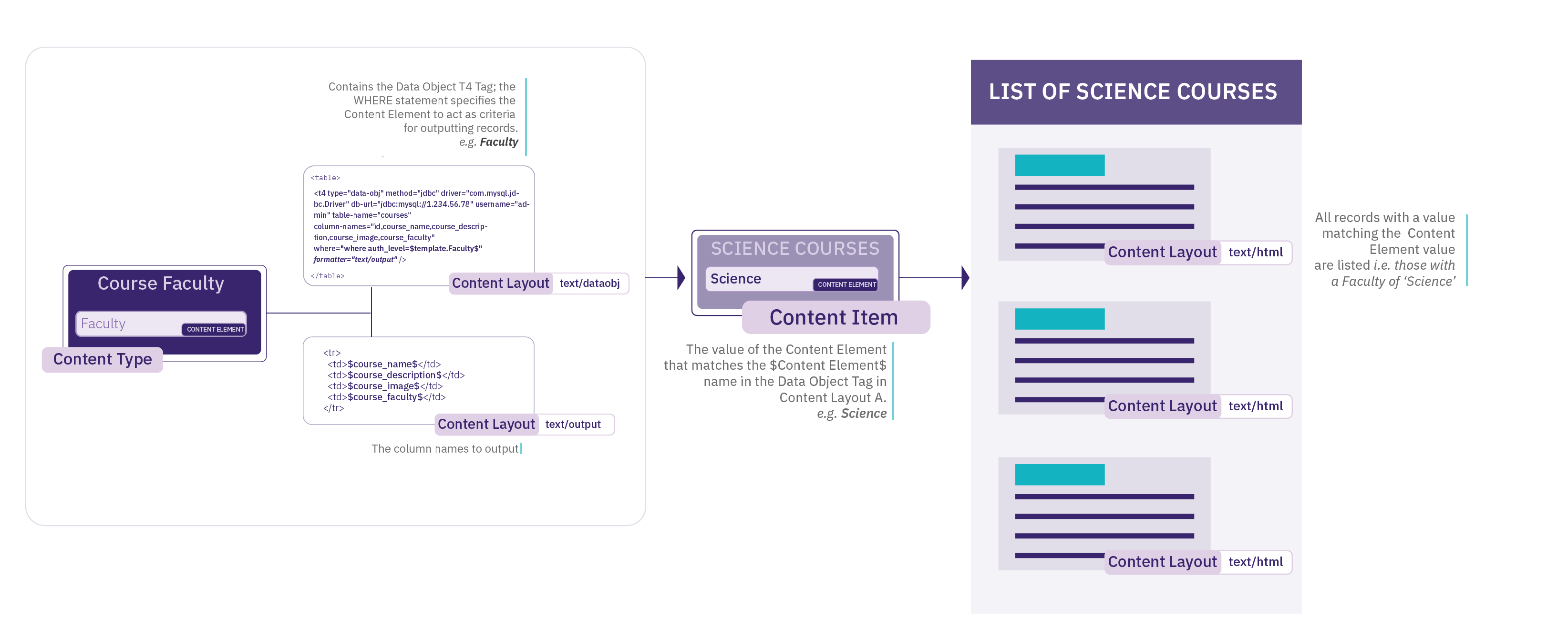
You could also use the same Content Type to publish two Content Items to output the results from both the "Science" and "Humanities" faculties by changing the value in the "Faculty" Content Element.
Using a "sql" attribute
Rather than specifying the table name, columns names and where clauses separately, it is possible to use the sql attribute to enter a full SQL statement. For example:
<t4 type="data-obj" method="jdbc" driver="com.mysql.jdbc.Driver" db-url="jdbc:mysql://localhost/external_db" username="dbusername" sql="select company.id, company.name, price, email_address, department, telephone, countries.name from company,countries where price = $template.price$ and countries.id = company.country" formatter="text/output" />If you alias columns in your query, you must use the "as" statement; not just white-space.
Creating the Content Layout
To determine the Content Layout for the database query results when the site is published, you must specify the Content Layout that will be used. In your Data Object Content Type, you create a new Content Layout called "text/output" and set the "formatter" option in the Data Object tag to this name.
In the Content Layout, add the HTML to use with the data returned from the database query. You can then call the individually returned columns by putting the column name between two $ signs. An example of this would be:
<h1>$id$</h1>
<p>Name: $example.name$ <br />Email: $email_address$ <br />Dept: $department$<br /> Tel: $telephone$ <br /> Price: $price$ <br /> Country: $countries.name$ </p>
This layout can contain other T4 Tags and HTML code. If the Content Layout for the database content contains $ symbols (e.g. PHP code) then it is possible to specify a different character to be used in order to identify the database fields in the Data Object. An example tag would be:
<t4 type="data-obj" method="jdbc" driver="com.mysql.jdbc.Driver" db-url="jdbc:mysql://localhost/external_db" username="dbusername" table-name="company,countries" column-names="company.id, company.name, price, email_address, department, telephone, countries.name" where="where price = $template.price$ and countries.id = company.country" elem-ident-char="+" formatter="text/output" />
in which case the "text/output" Content Layout would be:
<h1>+id+</h1>
<p>Name: +example.name+ <br />Email: +email_address+ <br />Dept: +department+<br /> Tel: +telephone+ <br /> Price: +price+ <br /> Country: +countries.name+ </p>
Restrict the number of items displayed
If a database query contains a number of records, and you only want to display the first few records, the Data Object tag can restrict the number of items, max-number="x"
An example tag would be:
<t4 type="data-obj" method="jdbc" driver="com.mysql.jdbc.Driver" db-url="jdbc:mysql://localhost/external_db" username="dbusername" table-name="company,countries" column-names="company.id, company.name, price, email_address, department, telephone, countries.name" where="where price = $template.price$ and countries.id = company.country" max-number="3" formatter="text/output" />
The maximum value can also come from a Content Element. An example tag, assuming a Content Element called Number, would be:
<t4 type="data-obj" method="jdbc" driver="com.mysql.jdbc.Driver" db-url="jdbc:mysql://localhost/external_db" username="dbusername" table-name="company,countries" column-names="company.id, company.name, price, email_address, department, telephone, countries.name" where="where price = $template.price$ and countries.id = company.country" max-number="$template.Number$" formatter="text/output" />
Ordering results
Results can be ordered by a column name. For example, to order by a column named "Company Name" you would add order=”Order by company.name”:
<t4 type="data-obj" method="jdbc" driver="com.mysql.jdbc.Driver" db-url="jdbc:mysql://localhost/external_db" username="dbusername" table-name="company,countries" column-names="company.id, company.name, price, email_address, department, telephone, countries.name" where="where price = $template.price$ and countries.id = company.country ORDER BY company.name" formatter="text/output" />Database Drivers
The driver for the database used by your TERMINALFOUR application (MySQL/MS SQL Server/Oracle) will already be installed. Drivers for other databases will require a separate install in order to sync with them.
To install other drivers, the driver (JAR file) should be accessible to the TERMINALFOUR application i.e., included in the TERMINALFOUR application's classpath. For example, the JAR file could be placed in the Tomcat's lib directory, or another location that is referenced by the Tomcat server.xml configuration file.
For further assistance, please discuss this with your TERMINALFOUR server administrator or contact our support team.
Data Object for RSS
The Data Object connects to an RSS feed each time the site publishes. On publish, the content is taken from the RSS feed and embedded within the HTML of the published page. The presentation of the content can be controlled within the Content Layouts.
Configuration options
A Data Object T4 tag is added to a Content Layout and then content is added to the site using the Content Type. The following configuration options are available on the T4 tag (a * indicates that it is required):
| Item | Description |
|---|---|
| method* | This should be set to a value of rss. |
| rss-url* | The URL of the RSS feed to be accessed. This can be a URL or can reference a Content Type Element where the user enters the URL e.g. $template.url$. An example of the rss-url options is available. |
| for-each* | The name of the parent tag for each set of data required. e.g., item An example of the for-each options is available. |
| formatter* | The name of the Content layout to be used to style the published page. |
| max-number | To restrict the number of records displayed by a Data Object, enter the number of records, or the name of the Content Type element that controls the number. By default (if not specified), all records are displayed. For further information, refer to an example of the max-number attribute. |
Example Data Object tag
<t4 type="data-obj" method="rss" rss-url="$template.url$" for-each="item" formatter="text/output" />
Configuring the rss-url option
The "rss-url" option should be set to the URL of the RSS feed to be accessed. This can be achieved in one of two ways.
Setting the URL in the Content Layout. This can be used if you would like each Content Item added using the Data Object Content Type to show the same RSS feed. It would look similar to the following:
rss-url="http://www.terminalfour.com/rss/news.xml"
If you would like each Content Item added using the Data Object Content Type to display a different RSS Feed, you can add an element to the Data Object Content Type called "url" and then change the rss-url option in the tag to be similar to the example below. Then when you add content to a Section, you can enter the URL of the feed into the "url" element.
rss-url="$template.url$"
Configuring the "for-each" option
The "for-each" option is related to the parent tag of the information you wish to retrieve. If you look at the following extract from an RSS feed, you can see in this case it is called "item":
<channel>
<title>TERMINALFOUR News</title>
<item>
<title>The Genie is out of the bottle, and at your service - a glimpse into the future</title>
<link>http://www.terminalfour.com/news/</link>
<description>The Genie is out of the bottle, and at your service - a glimpse into the future of student support. In a future not too far away, students are all going to have personal assistants. That's if Deakin University's Genie app is anything to go by.</description>
</item>
<item>
<title>How is Artificial Intelligence revolutionizing HigherEd digital marketing?</title>
<link>http://www.terminalfour.com/news/</link>
<description>Artificial Intelligence (AI) is the technology of the moment. And rightly so, as AI has started to sweep through industries and disrupt them. And it’s not stopping at the front gates of Universities and Colleges.</description>
</item>
</channel>
Creating the Content Layout
To determine the layout of the RSS feed information for the published site, you need to specify a Content Layout to be used. In your Data Object Content Type, create a Content Layout called "text/output" and set the formatter option in the Data Object tag to this name as in the tag example earlier. In this Content Layout, you can create the HTML code you want to wrap around the data in the RSS feed. You can then call the individual tags by putting the tag name between two $ signs. An example would be:
<h2>$title$</h2>
<p>Link: $link$</p>
<p>Description: $description$</p>
Output an attribute of a tag
If you would like to output a tag's attribute value, you write this as $nodeName.attribute[attribute_name]$ in the Content Layout, and it will output the attribute value instead of the node's text.
Example:
<entrance type="main" disabled_access="true" id="1">
<place>
<id>53.405750424917244</id>
<number>-2.9651740193367004</number>
</place>
</entrance>
So, using the example above, if $entrance.attribute[disabled_access]$ is found in the Content Layout, the value "true" will be output on publish.
Restrict the number of items displayed
If an RSS feed includes 10 items, but you only want to publish the top 3, the Data Object tag can restrict the number of items.
An example tag would be:
<t4 type="data-obj" method="rss" rss-url="$template.url$" for-each="item" max-number="3" formatter="text/output" />
The maximum value can also come from a content type element. An example tag, assuming a content type element called Number, would be:
<t4 type="data-obj" method="rss" rss-url="$template.url$" for-each="item" max-number="$template.Number$" formatter="text/output" />
Web Object
A Web Object is a broker similar to the Import URL Broker; however, the Web Object can be configured to follow links on the target URL to the linked web pages too. Each time the site publishes, the content is taken from an http or https location and embedded within the HTML of the published page.
You generate a Web Object in one of two ways:
- Using a standard URL
- the same URL is used for all instances of the Web Object
- Using a custom URL
- different URLs are used for different instances of the Web Object, depending on input from the user creating content
Configuration Options
A Web Object T4 tag is added to a Content Layout and then content is added to the site using the Content Type. The following configuration options are available on the T4 tag (a * indicates that it is required):
| Item | Description |
|---|---|
| method* | Enter a value of http. |
| start-url* | The target URL for the Web Object. This can contain a variable which looks to an element in the Content Type in order to construct all or part of the target URL. Refer to the example of the standard URL and the example of the custom URL below. |
| parse-body* | Allows a value of true or false. If set to true, the Web Object reads only the content between the body tags of the target page. If set to false, the Web Object reads the entire target page. There is also a start-tag and end-tag option below. |
| start-tag and end-tag |
Use specific tags in the code where you want to start displaying content and where you want to end. The quote characters within these values do not need to be escaped. Ensure you use a unique start tag. Including comments in your code can help when choosing a suitable place to start. |
| link-match* | If the Web Object is going to follow links on the target page and import linked pages, use this option to specify the start of the URL which the Web Object can use to match URL strings. The Web Object only imports links starting with the link-match value. If link matching is not required, enter a value of "no-link-match". e.g. link-match="/careers" |
| link-match-import-method* | Currently only allows a value of subsection. This instructs the Web Object to create sub-directories to hold the linked content. |
| max-level-site | Define how far you want to crawl within the content when using the "follow links" option. e.g. max-level-site="5" |
| use-title-attribute | When the Web Object follows links and creates sub-directories for each link, the name of the sub-directory will use the link text. Alternatively, if the url has a title attribute, you can use it by setting the use-title-attribute="true". |
| cache-expiry* | To decrease the publish time for Web Objects, caching can be enabled. If cache is enabled, the first time the Channel is published, the Web Object creates a folder within the content store to keep a copy of the content. The next time a publish is run on the same Channel, the information is pulled from the content store instead of sending a request to the URL, improving publish performance. After the cache expires, the publish connects to the URL again and restarts the process. The time is set in hours. Setting cache-expiry="0" ensures that the cache never expires as it is never refreshed. Setting cache-expiry="24" will expire the cache after 24 hours. |
| object-name | Give the Web Object a name. Each instance of the Web Object it has its own folder; as a result, it is recommended to give it a name. Failing to do so results in the Web Object using the Section ID and Content ID as a name reference. |
Use of a standard URL
Create a Content Type; it does not require any additional elements to be added, so the only element is Name. Add a Web Object tag to the Content Layout, and then add content to the site using the Content Type.
In the Content Layout, apply the following code:
<t4 type="web-obj"
method="http"
start-url="http://www.terminalfour.com"
link-match="/careers"
link-match-import-method="subsection"
parse-body="true"
/>
After the Content Type has been enabled, you can add content and publish the Channel as normal.
Use of a custom URL
The following example demonstrates a Web Object which is pointed at a person profile management system to output the person details in HTML. The individual person's details can then be published as part of the TERMINALFOUR published page.
The URL for the person profile management system contains a variable for the person's email address:
https://my.othersite.com/here/PEOPLE_SHOW.SHOW_PEOPLE?email=mary.smith@mysite.com will display the details for Mary Smith
https://my.othersite.com/here/PEOPLE_SHOW.SHOW_PEOPLE?email=john.smith@mysite.com will display the details for John Smith
The start-url requires a variable for end users to be able to specify the email address of the person when adding content using the Web object Content type.
Create a Content Type. In this example, the Content Type requires one element to store the email address, called "staffemail".
In the Content Layout, apply the following code:
<t4 type="web-obj"
method="http"
start-url="https://my.othersite.com/here/PEOPLE_SHOW.SHOW_PEOPLE?email=$template.staffemail$"
link-match="PEOPLE_SHOW.SHOW"
link-match-import-method="subsection"
parse-body="true"
/>
Add content using the new Content Type. Enter "john.smith@mysite.com" in the element "staffemail" and update the content. Then, add an additional Content Item and enter "mary.smith@mysite.com" into the element "staffemail". Publish the Channel as normal.
The above example replaces the $template.staffemail$ value with the entry in the content's "staffemail" element (mary.smith@mysite.com).
On publish, TERMINALFOUR goes to the url https://my.othersite.com/here/PEOPLE_SHOW.SHOW_PEOPLE?email=mary.smith@mysite.com and makes a copy of the content within the body tags for that page and inserts them into the TERMINALFOUR published page.
The start-url can contain T4 tags. The quote symbols in the T4 tag need to be single quotes ( ' ), as in this example:
start-url="https://my.othersite.com/here/PEOPLE_SHOW.SHOW_PEOPLE?lang=<t4 type='lang-var' default-language='en' en='en' fr='fr'/>"
Import URL
The Import URL T4 Tag allows content to be taken from a web page (http or https) and to be added to the HTML of the published page. To follow links on the specified page and import multiple pages, use a Web Object.
The Import URL tag is added to a Content Layout and then content is added to the site using the Content Type. There are two options for the configuration of the target URL:
| Item | Description |
|---|---|
| url | The URL, including http://. In this case, all instances of the Content Type use the same URL. |
| element | Name of the Content Type element to use for the URL. In this case, users enter the full URL (including the http://) when adding content using the Content Type. Each instance of the Content Type can use a different URL. |
Example Using the URL Attribute
If the following T4 Tag is inserted into a Content Layout, it connects to http://www.terminalfour.com/, reads the page content and includes it in the TERMINALFOUR published page.
<t4 type="import-url" url="http://www.terminalfour.com" />
Example Using the element Attribute
If the following T4 Tag is inserted into a Content Layout, it connects to the URL specified in the "external link" element, reads the page content and includes it in the TERMINALFOUR published page.
<t4 type="import-url" element="external link" />
Include content from a PDF file on a page
Description
This tag, type="pdfdoc" is added to a Content Layout. It takes a given file element, checks to see if it is a PDF document and uses the "output" attribute to determine how the PDF should appear on the published page.
The file name of the PDF document should not contain spaces.
Potential usage scenarios
- Display a PDF within an iframe on a Content Item.
- Allow the content of the PDF to be extracted and published on a page so that it can be used for search indexing.
Content Type
Create a content type with a file element (not a media element). Add the tag to a Content Layout. Create content using the Content Type and publish. There are three options for the tag.
Embed
The "embed" option will upload the file in the normal way, output code pointing at the uploaded file, embedding the file on the published page. The PDF file can be viewed in a PDF reader like Adobe reader. If no reader is installed in the browser, a link to the PDF will be provided instead. This publishes the PDF document in the same directory as the published page.
<t4 type="pdfdoc" output="embed" name="file-element-name" />
<iframe height="100%" width="98%" frameborder="0" src="/include-content-from-a-pdf-file/sample.pdf" align="center"><a href="/include-content-from-a-pdf-file/sample.pdf">sample.pdf</a></iframe>
Hidden - with the file
The "hidden-file" option will read the contents of the PDF document and then output it inside a hidden div on the published page. This publishes the PDF document in the same directory as the published page.
<t4 type="pdfdoc" output="hidden-file" name="file-element-name" />
<div class="hidden-div" style="display:none;">Content from PDF Document</div>
Hidden - without the file
The "hidden-no-file" option will read the contents of the PDF document and then output it inside a hidden div on the published page. This does not publish the PDF document.
<t4 type="pdfdoc" output="hidden-no-file" name="file-element-name" />
<div class="hidden-div" style="display:none;">Content from PDF Document</div>
Notes
- If the file is not a PDF document nothing will be output.
- The element referenced must be a file content element.
- The tag can only be used in Content Layout.
- If hidden-no-file is used in conjunction with either embed or hidden-file then the option will be overridden and the PDF document will be published in same directory as the published page.
- If both embed and either hidden-file or hidden-no-file are specified, the PDF will be both embedded on the page and added to a hidden div.
- If both hidden-file and hidden-no-file are specified, the PDF will be both embedded on the page and added to a hidden div.
- The iFrame created is a set width and can't be changed.
- The div created can't be changed unless css is used to set it to be displayed.
- The line breaks from PDF file are ignored when published on the page.
T4 tags: Convert Excel to HTML
Description
This tag takes an Excel spreadsheet in the Media Library and publishes the data within that file as an HTML table on the page. The Excel to HTML tag is added to a Content Layout (to create the table) and to a Page Layout (to format the table) and content is added to the site using the Content Type.
There's more than one way to integrate external data in TERMINALFOUR and the method you choose can depend on the type of data and what you want to do with it.
Content Layout tag
For the example we are using a very basic spreadsheet:
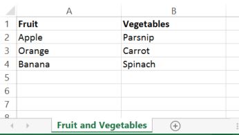
Create a Content Type with a media element. In the Content Layout, add the tag. There are two attributes for this tag:
| Item | Description |
|---|---|
| name | Name of the media element in the content type that contains the Excel file. |
| output-sheet-name | Setting this attribute to true will output the Excel sheet names. If this attribute is not included in the tag, sheet names will not be output on the page. |
Examples
<t4 type="exceltohtml" name="media-file" />
<t4 type="exceltohtml" name="media-file" output-sheet-name="true" />
The output generated would be:
<div id="excel-285-media-file">
<div id="table-285-1-media-file">
<table class="excel-285-media-t1">
<colgroup>
<col width="144">
<col width="144">
<col width="56">
</colgroup>
<tbody>
<tr class="excel-285-media-r1">
<td class="excel-285-media-c1">Fruit</td>
<td class="excel-285-media-c1">Vegetables</td>
<td class="excel-285-media-c1"> </td>
</tr>
<tr class="excel-285-media-r1">
<td>Apple</td><td>Parsnip</td>
</tr>
<tr class="excel-285-media-r1">
<td>Orange</td><td>Carrot</td>
</tr>
<tr class="excel-285-media-r1">
<td>Banana</td><td>Spinach</td>
</tr>
</tbody>
</table>
</div>
</div>
Page Layout tag
A tag is added to the header of the Page Layout within the <style type="text/css"> tag in the header.
| Item | Description |
|---|---|
| name | Name of the media element in the Content Type that contains the Excel file. |
| default-font |
If set, this allows a font-family and font-size to be configured and used for all tables in the Excel spreadsheet. |
| sheet-numbers-element | if set, this allows specific sheets in the Excel spreadsheet to be published to the page. By default, all sheets within the Excel file are published onto the page. To specify the sheets to be published, create a plain text element in the content type (for example, called "Sheet Numbers") and specify this element name in the sheet-numbers-element attribute. When adding the content using this template the ‘Sheet Numbers’ element should be populated with a comma separated list of sheet numbers example: 1,3,4, |
Example
<style type="text/css">
<t4 type="exceltohtml" name="media-file" default-font="font-family:arial;font-size:8pt;" sheet-numbers-element="Sheet Numbers" />
</style>
<style type="text/css">
.b1{white-space-collapsing:preserve;}
.excel-285-media-t1{border-collapse:collapse;border-spacing:0;}
.excel-285-media-r1{height:14.5pt;}
.excel-285-media-c1{white-space: pre-wrap; text-align: left; vertical-align: bottom; font-weight: bold; color: black; font-family:arial;font-size:8pt; }
</style>
Notes
- If a title is in one cell in the Excel file, it appears in one cell in the HTML table. If you want a title to span over more than one column in the HTML table then cells must be merged in the Excel file.
- Rows merged in an Excel file can cause problems as there is no way to merge rows in a HTML table. The formatting of these rows must be corrected before they is displayed in the HTML correctly.
T4 tags: Appendix
Appendix
This is a listing of tags and the main attributes.
Type
Output
| output |
|---|
| output="description" |
| output="fav-icon" |
| output="file" |
| output="fulltext" |
| output="id" |
| output="image" |
| output="imageurl" |
| output="lang_disclosure_style" |
| output="lang_disclosure_template" |
| output="linktext" |
| output="linkurl" |
| output="normal" |
| output="selective-output" |
| output="site-root" |
| output="userinfo" |
Other
| other |
|---|
| action="" |
| after="" |
| append-content="" |
| append-element="" |
| attribute="" |
| before="" |
| client-resize="" |
| date_format="" |
| default-language="" |
| delimiter="" |
| display_field="" |
| editable="" |
| element="" |
| empty-section="" |
| enable-dedit="" |
| filename-element="" |
| first-child="" |
| first-content="" |
| format-modifiers="" |
| format="" |
| formatter="" |
| id="" |
| info="" |
| locale="" |
| locale_es="" |
| max-height="" |
| max-width="" |
| meta="" |
| modifiers="" |
| name="" |
| number-of-levels="" |
| process-format="" |
| separator="" |
| start-level="" |
| text="" |
| textual-name-separator="" |
| threshold="" |
| use-element="" |
Data Object Connection Settings
Description
With Data Objects you can add content from external data sources to your pages simply by adding a T4 Tag to your Content Layout. External content is maintained outside of TERMINALFOUR, and can come from a variety of sources like RSS, CSV or through a JDBC database connection. While the Data Object is stored within the Content Layout, database connection settings such as authentication details are configured separately as an added security measure.
Configure the Data Object Database Connection
To create a new database connection for Data Objects, go to System Administration > Configure Integration Tools > Data Object and select the option to Create New Data Object. For each Data Object enter:
| Item | Description |
|---|---|
| Name | Give the database connection a name. |
| Username | Enter the username that is used to connect to the database. |
| Password | Enter the password that is used to connect to the database; this password will not be displayed. Clicking the associated toggle can display and hide the password. This password is encrypted when it is stored within the TERMINALFOUR database. |
| Content types | The Content Types permitted to use this database connection. These Content Types will include Content Layouts that can contain the Data Object T4 Tag. |
If you are satisfied with your inputs, then click Save Changes. Continue to configure the Data Object T4 Tag within the Content Layout.
Metadata
Description
Metadata mapping allows you to create map between Content type elements and Meta tags. This is done in a tabular form. This process publishes the value of content from the content type elements which are then output as HTML meta elements with the header of the HTML page.
You can map multiple elements from one, or multiple Content types in the same meta tag. Each tag is appended to the standard section metadata one at a time.
To access this system function, go to Assets > Metadata mappings.
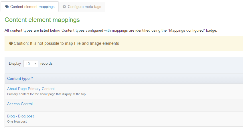
It is not possible to map File and Image elements.There are two tabs on this page, Content element mappings, Configure meta tags. The Content element mappings tab also has a Filter function.
Content element mappingss
In the tab Content element mappings there is a tabular list of three columns - Name, Group, and the last column with blue Action buttons.
1. In the Name column you have a list of Content types each one linked. The link goes to the meta data mappings, where you can add a meta tag (see below). In some cases the name has a short description included. For each entry there is an ID number assigned to the content type. This ID number also appears in the name column. You can sort the groups using the "up/down" arrows in the column head. If the content type is already mapped to meta tags, a "Show/hide mappings" link appears.
2. The Group column contains the group assigned to the content type. You can sort the groups using the "up/down" arrows in the column head.
3. From the Actions button (see below) you can select to Edit mappings or Edit content type:
3a. If you click the Edit mappings - you are transferred to the mapping activity for that Content type name. In the example below the Content type name is Blog post - and the content type elements are: Name, Title, and MainBody. You then select an appropriate Meta tag for each element:
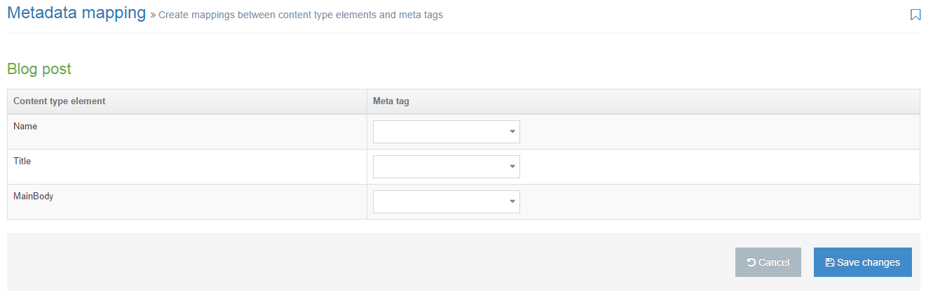
3b. If you click Edit content type - you are transferred to the General information tab of the corresponding Content type. Example shown below:

Configure meta tags
You can add a meta tag, select its configuration and specify an associated language with this feature. The Configure meta tags page is shown below.
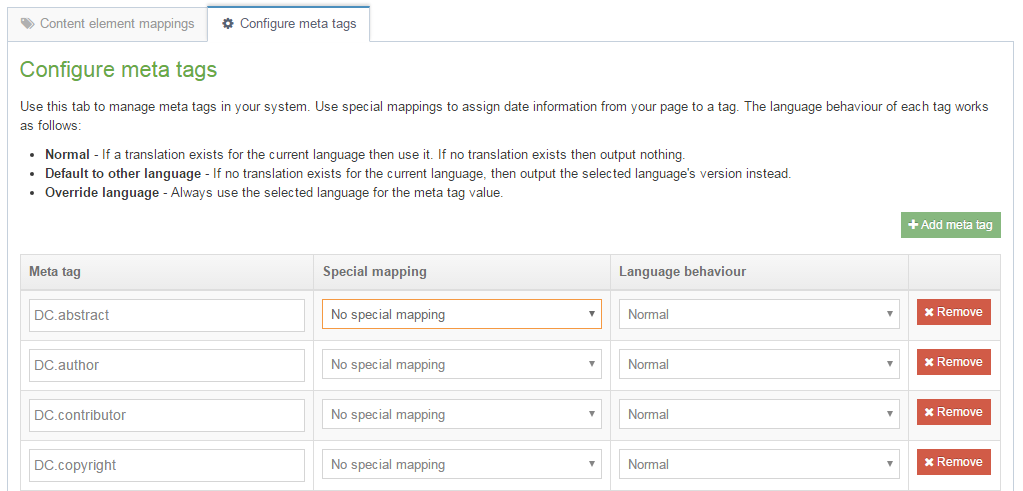
To add a meta tag click the link marked Add a meta tag. Then add the name of the meta tag e.g. DC.abstract.
In the Special mapping column, select whether the meta tag is automatically populated with the Page last modified or Page created date. The output value of these tags depends on the content within the section.
- Page last modified: the most recent last modified date of the content in the section is output
- Page created: the create date of the oldest Content Item is output
A date format is also required for these and should comply with the Java date pattern. An example format is YYYY-MM-dd.
In the Language Behaviour column, choose from three options:
- Normal: If a translation exists for the current language then use it. If no translation exists then output nothing.
- Default to other language: If no translation exists for the current language, then output the selected language's version instead.
- Override other language: Always use the selected language for the meta tag value.
If "Default to other language" or "Override other language" is selected, in the Language option, select a language from the drop-down list.
Repeat, or click Save changes.
Using meta tags
Meta tags can be output into the header of pages by using t4 tags within the header of Page Layouts. The values of meta tags (without the surrounding meta tag) can also be output in page layouts or content layouts using the Section meta info navigation object.
Page layout usage
Description
With the Page Layout Usage Report, you can see the Page Layouts that are in use and where they are being used. This can be important to know if you need to change or delete a Page Layout, as it might be in use, and potentially in more than one place.
To use the Page Layout Usage report, go to Assets > Asset usage > Page layout usage.
Search tools
The report can be run on a specific Page Layout or Section / Branch.
| Item | Description |
|---|---|
| Search by |
|
| Page Layout | If Search by is Page Layout, select a specific Page Layout and see where it is being used. |
| Section | If Search by is Section, select a specific section and see which Page Layouts are in use. |
| Number of levels to recurse |
If Search by is Section, set how deep through the site structure this report will run
|
| Restrict to channel |
Search can select all Channels or be restricted to the selected Channel |
Click Run report will display the search results.
Search results
Results matching the search will be displayed in the listing. For each item, the Section, Page Layout, Channel and Applied/Inherited will be displayed. Results can be sorted and filtered.
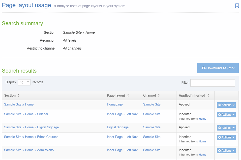
| Item | Description |
|---|---|
| Section | The full path to the Section. Click to edit the Section. |
| Page layout | Name of the Page Layout. Click to edit the Page Layout. |
| Channel | Name of the Channel the Page Layout is assigned to. Click to edit the Channel. |
| Applied/Inherited | Whether the Page Layout is applied to the section or if it is inherited from a Parent Section. When inherited, the name of the Section it is applied to is displayed. |
| Actions |
The Actions menu allows you to:
|
Download as CSV
Click Download as CSV to download the results in a CSV file which can be opened in Excel.
Lists
Description
A List is a collection of items with a meaningful grouping or sequence. When used as part of a Content Type, a List allows a user to select one or more of the items within it as an option. For example, if news articles on your site are categorized as "Sport", "Weather" and "Current Affairs", you would create a List with these three categories and add it to a "News Article" Content Type. When a news article is created, the user selects one (or more) of the categories.
Lists can also be used with selective output to apply a class to display or hide an HTML element such as a disclaimer.
When Are Lists Used?
We use Lists when we want to restrict the content items that can be input in a Content Type. In the example above, instead of leaving it to the user to input (and possibly misspell) text for a news category, the options are pre-defined for the user. List items can be added as needed by a user with the access rights to edit that List.
How Are Lists Used?
When a List has been created and populated it is added to a Content Type. There are six Content Elements types that can be used with Lists:
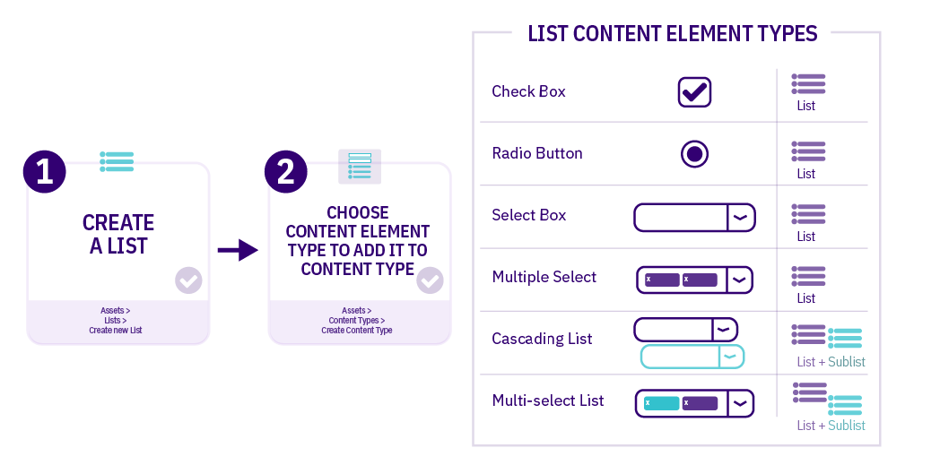
| Item | Description |
|---|---|
| Check Box | Multiple items can be selected |
| Radio Button | One item can be selected |
| Select Box | One item can be selected from a dropdown list (good for long lists) |
| Multiple Select | Multiple items can be selected from a dropdown list |
| Cascading List | One item can be selected from a dropdown list; for items that have a related Sublist, a second drop-down menu will appear below it listing items from that Sublist |
| Multi-select List | Items can be selected from both the List and the Sublist |
Who Can Create a List?
Administrators can create Lists which are accessible Globally or within a Group. Power Users can create Lists within their Group(s).
Power Users cannot create or modify Global Lists. They can only use Global Lists, or Lists in Groups to which they belong when creating Content Types.
List Listing Page
To work with Lists, go to Assets > Lists. All List names and descriptions that the user has rights to edit and/or view (i.e., Global Lists, and Lists that have been shared with the Power User's Group(s) as read-only) are listed in the table with the Asset ID and the Group that the List belongs to. If you have a lot of Lists, use the Filter box to filter by List name, description, ID or Group.
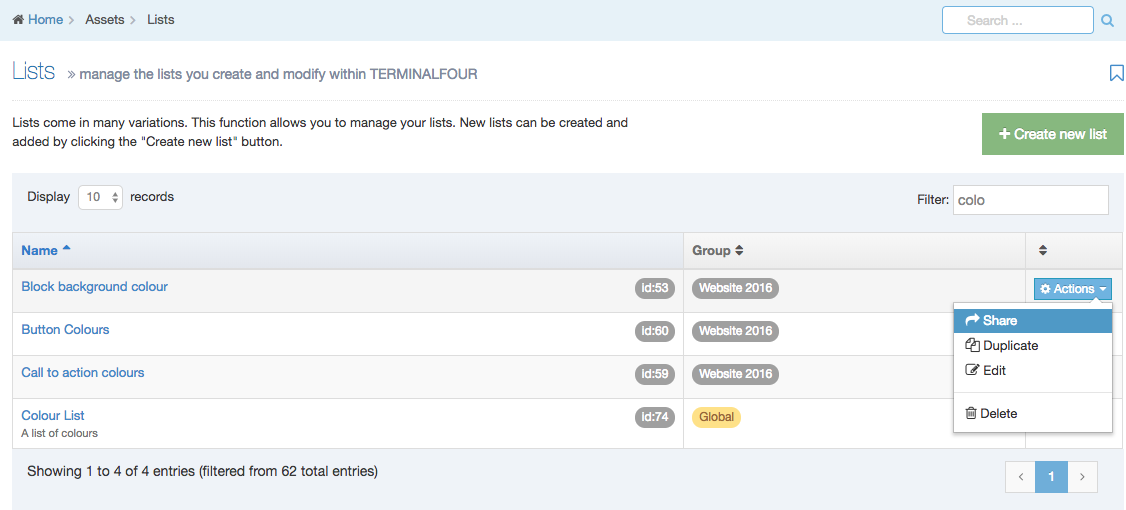
The columns in the table are Name, Group(s) and the Actions button:
| Item | Description |
|---|---|
| Name | Contains List name, a brief description (if one has been provided), and the List ID number. The arrow in the header row can re-order the list alphabetically. |
| Group | Shows the Group(s) the List belongs to. If the List is shared with one other Group or more, you'll see a + and the number of Groups it's shared with. To see a list of those shared Groups hover over the + symbol. |
| Action Menu Button | Provides options to Share, Duplicate, Edit, and Delete. The Share function is not present where the Group designator is "Global," however, you can move a global List to a Group by Editing the List and selecting a Primary Group. |
Create New List
When you select Add New List the List Information screen is displayed:
| Item | Description |
|---|---|
| Name | This is a mandatory entry. Give your List a name - it is recommended to make the name as descriptive as possible. |
| Description | This is an optional entry. This is used by the filter on the Lists listing and can be useful for finding Lists. |
| Localization |
For multi-language sites, if the List is available in more than one language, you can use the localization options to:
|
| Primary group |
Select a Primary Group for this list. Grouping and sharing Lists restricts the users that can use or edit the List. It is good practice to add all your assets to Groups. This makes it easier to identify which assets are being used and where. By grouping assets together, you can also restrict access to them. When a user is not part of the Group, they cannot see or access assets in that Group. |
| Shared groups |
This table has three columns. Click on Add row, to share with a group:
The Remove button removes the List from the group. |
List items
List items can be added below the List Information options.
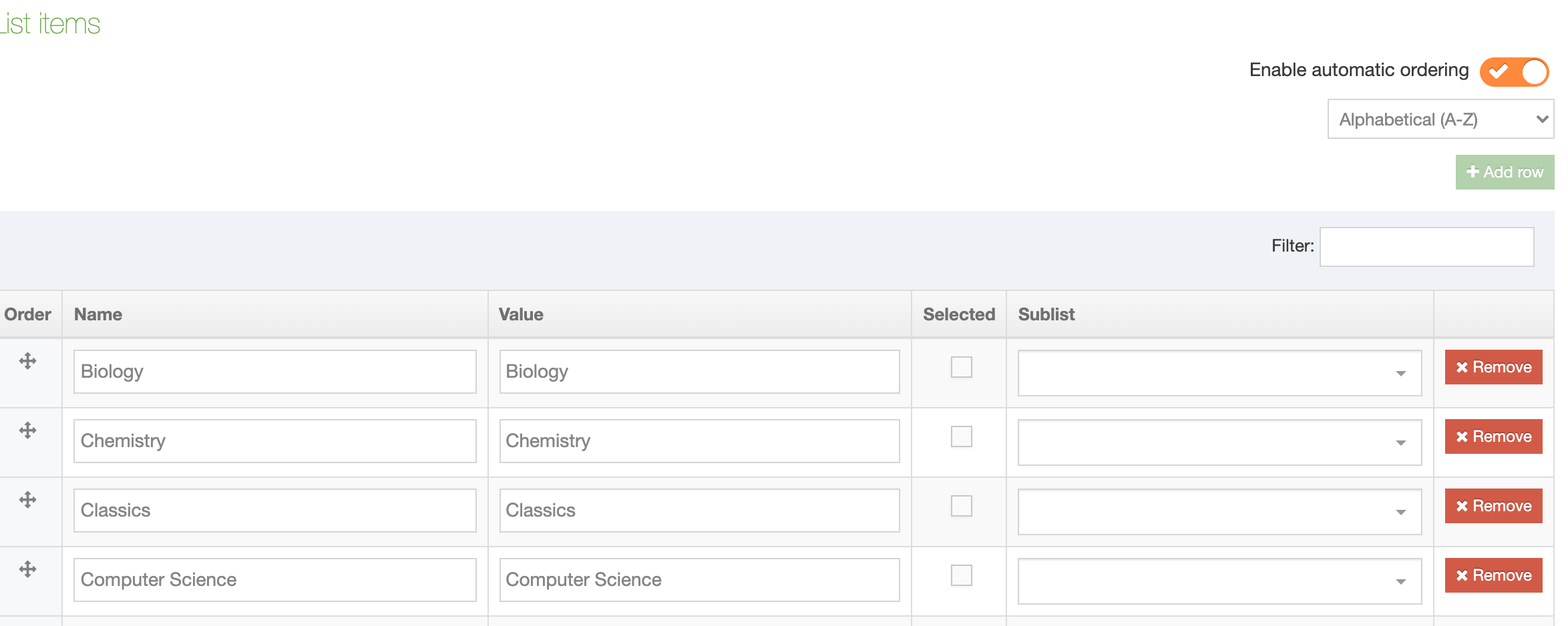
Each row contains:
| Item | Description |
|---|---|
| Order | Lists Items can be re-ordered using the move icon |
| Name | The name is used as the label when you are creating or editing content |
| Value | This is what will be published on the site. For example, the List Item Names could be abbreviations used internally within an organization and will be used when creating content, while the Values would be more widely understood equivalents that are published on the site |
| Selected | When checked, this item will be the default selected item in the Content Type Element. More than one item can be selected, though Content Type Elements which only permit the selection of one item, like Radio Buttons, will only pre-select the first item selected in the List |
| Sublist | List items may have sub-categories that you want to link them to. Sublists are used with Cascading and Multi-select Content Type Elements |
| Remove |
Select Remove to remove a List Remove does not delete the List until you click Save changes. If you navigate away from this page before you click Save changes, the List will still be present. |
In this example, the List comprises university departments. Since "Biology" is the largest department, it is selected by default:
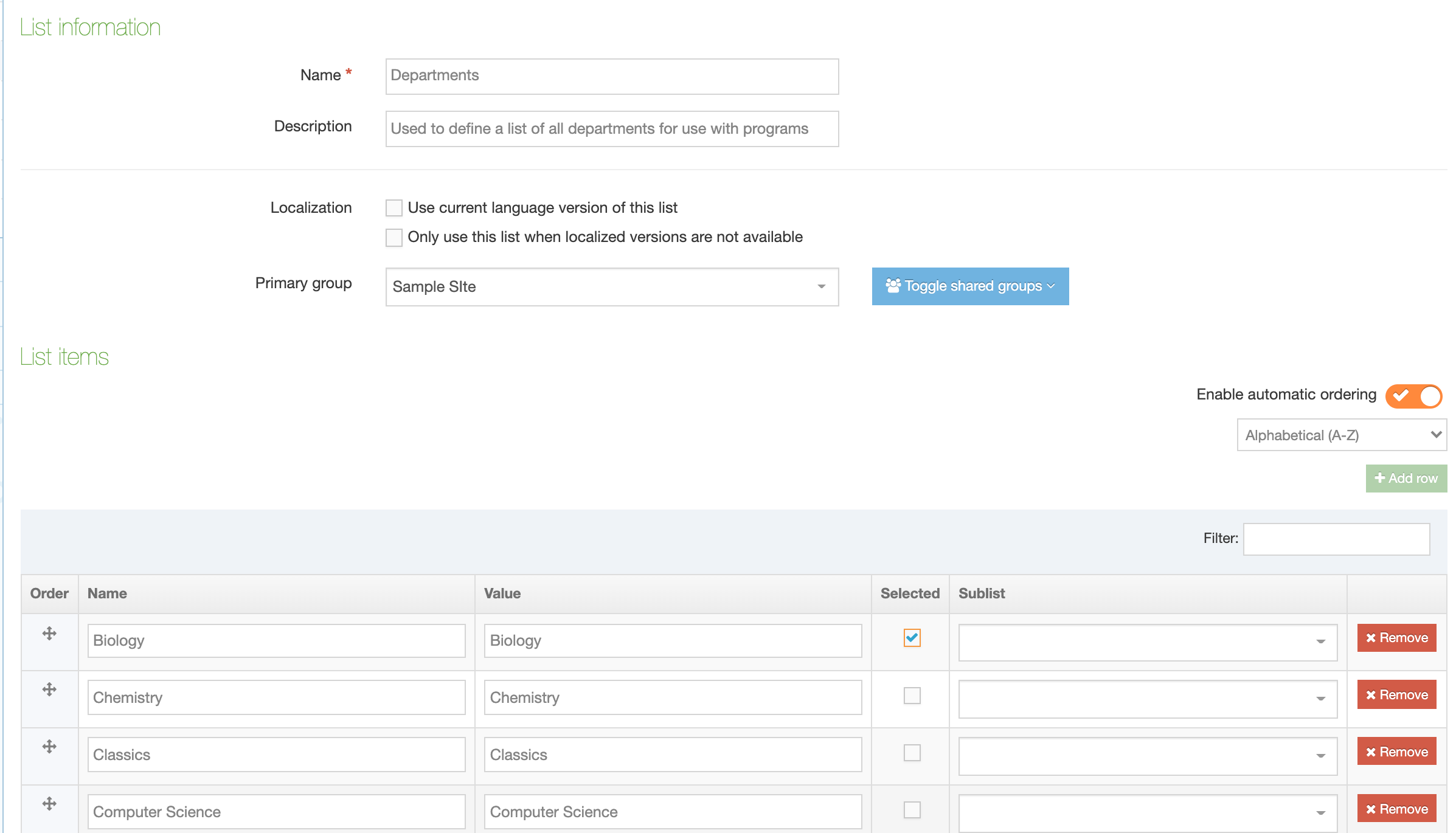
We can also add Sublists – another existing List that you want to associate with this a List Item:
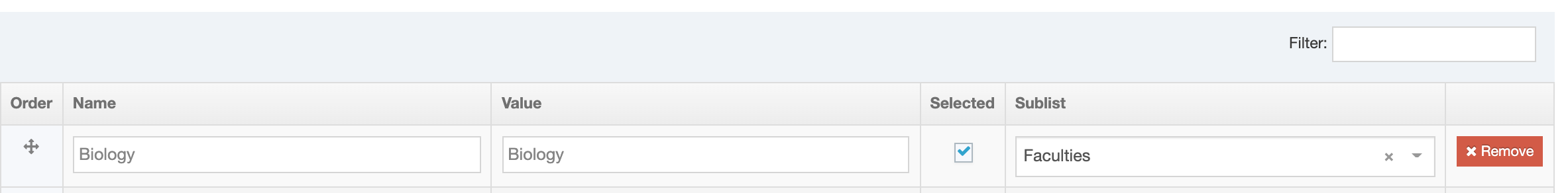
Re-ordering List Items
From version 8.3.11 you can re-order List Items. If you have upgraded from a previous version of Terminalour, all List Items will be ordered alphabetically. In previous versions, Items were ordered as entered and could not be re-ordered.
Lists are alphabetically ordered by toggling "Enable automatic ordering" to on. Automatic ordering can order alphabetically A-Z or Z-A:
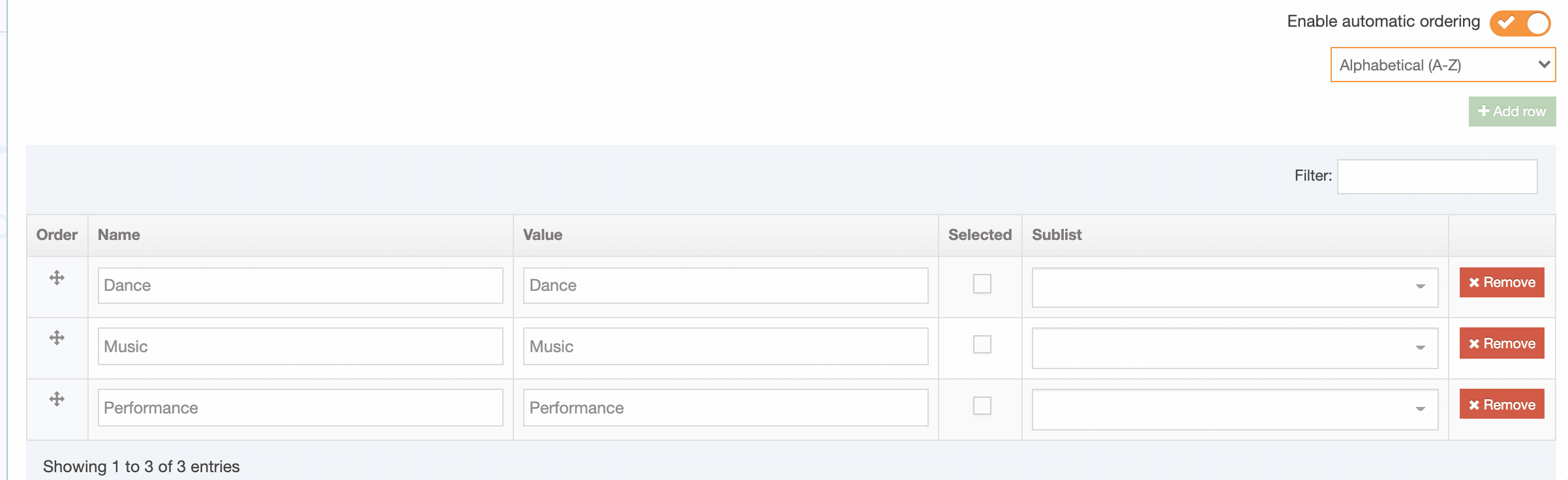
Add row
While "Automatic ordering" is enabled the "Add row" button can't be clicked. When "Automatic ordering" is disabled the alphabetic ordering is preserved and you can add a new row. Enable "Automatic ordering" again to re-order the List and the added Item(s) alphabetically.
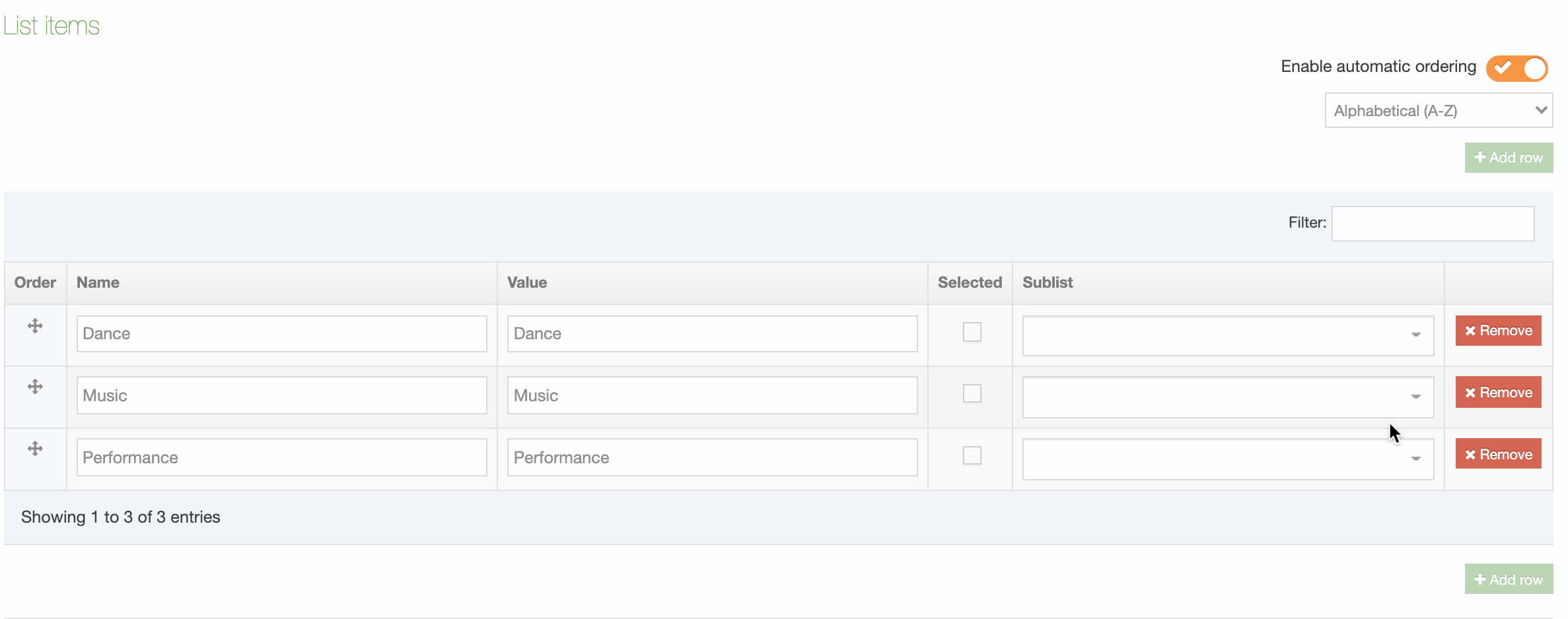
Manually re-order List Items
To manually re-order List Items disable "Automatic ordering" and using the move handles in the Order column to move the item:
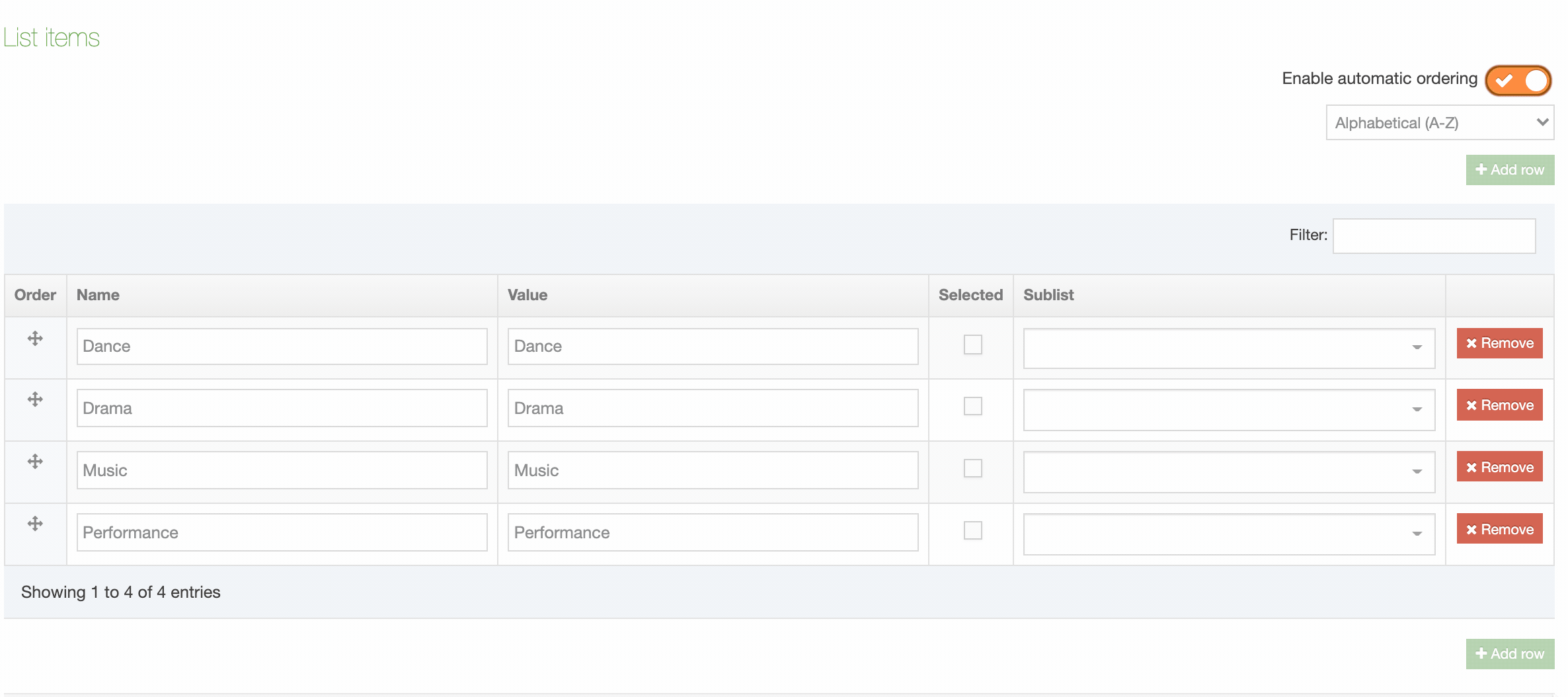
Manual re-ordering is disabled when a filter is applied to the List:
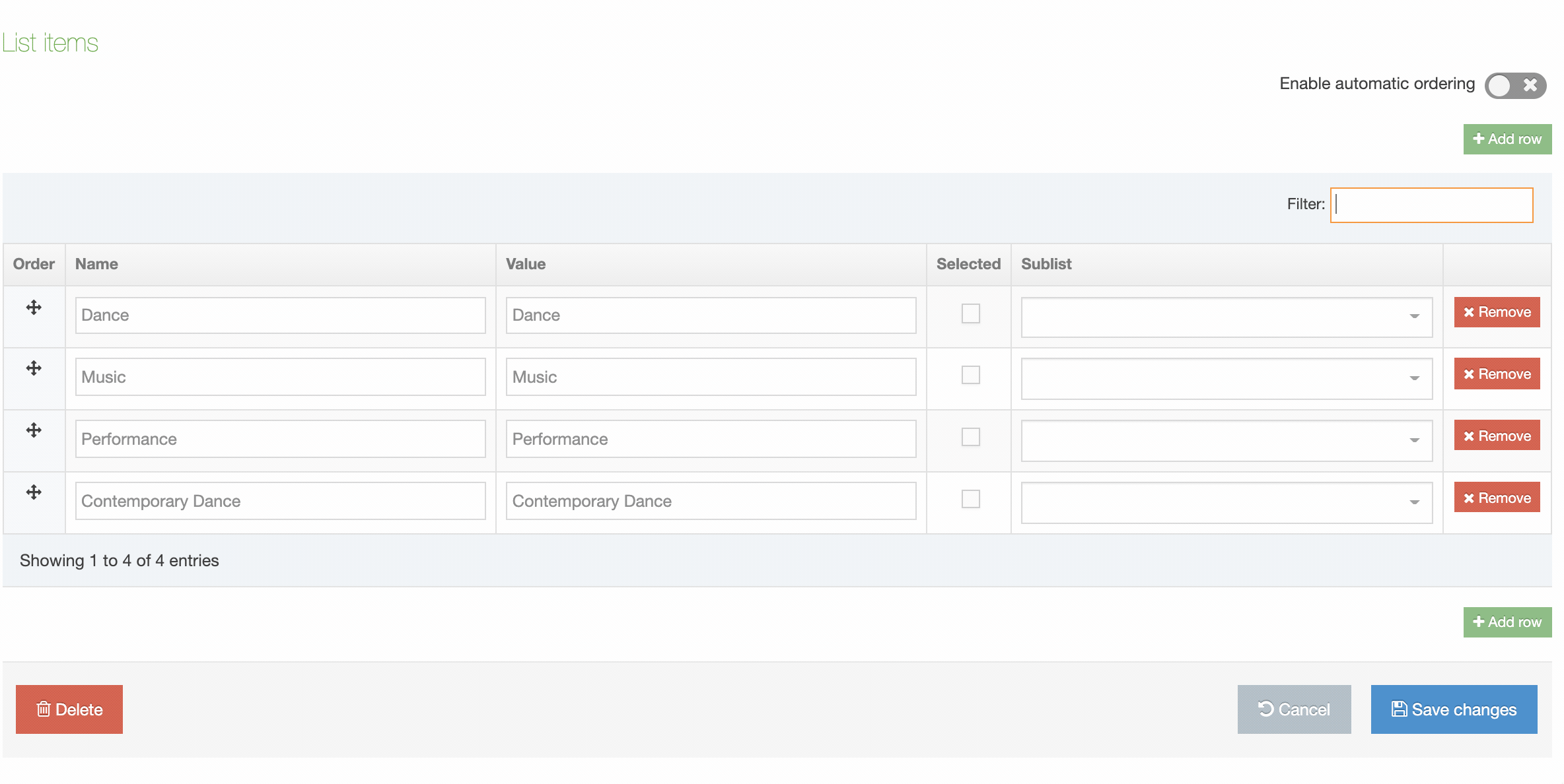
Using a List in a Content Type
In a new or existing Content Type, go to the Elements tab and select Add Element. Give the Element a name and set the Type to one of the Element Types that are used with Lists. In this example, Radio Button is selected. A drop-down menu will appear below from which you can select the List:
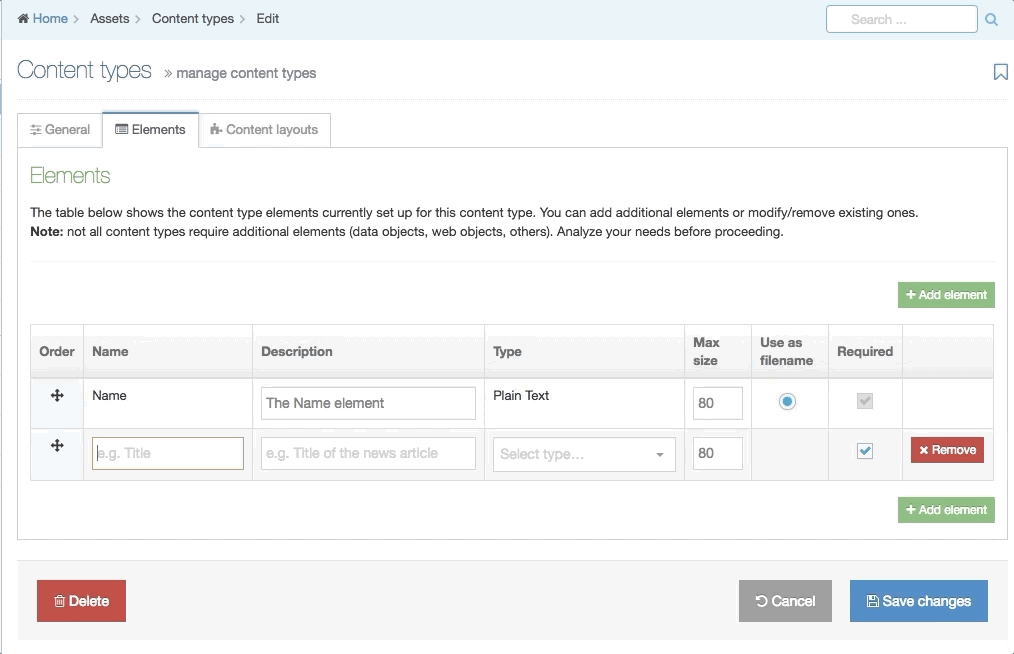
This example shows how the different List Content Elements behave in a Content Type. Since "Sport" has a Sublist, items from that Sublist can be selected in the Cascading and Multi-select List:
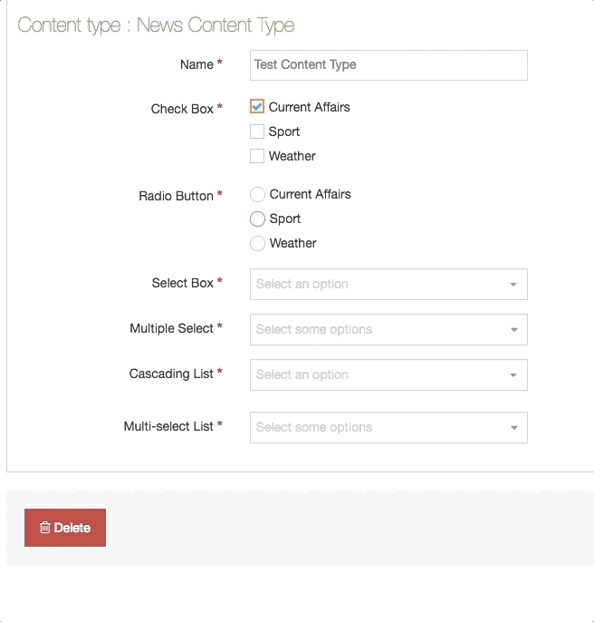
Share a List
Global Lists can be used by any Power User when creating a Content Type but can only be edited by Administrators. Power Users and Administrators can create Lists within groups or share Lists with other groups. The List can either be shared with Read-only or Full access:
- Read-only access: Power Users within the group can view the List but cannot edit it
- Full access: Power Users within the group can view and edit the List
Regardless of how the List is shared, all Power Users within the group can use the List within a Content Type.
A Global List cannot be shared with Groups; however, you can move a global List to a Group by Editing the List and selecting a Primary Group.
Duplicate a List
You can duplicate a List. Do this either into a new Group or the same Group or with other Groups. A duplicate List creates a copy of the original and the two Lists are not linked to each other.
Changes made to one List do not affect duplicated versions. Sharing and Duplication are two different functions.
Delete a List
In the row of the corresponding List, open the Actions drop-down list and select Delete.
A confirmation pop-up window appears and you can confirm your choice and Delete, or Cancel the action. Upon successful deletion, a green banner appears confirming the deletion, and the List is removed from the list.
When a List is deleted you cannot recover the data.
Automatically Mirror Content with a List
To mirror a Content Item to other parts of your site when it's approved you can use the Auto Content Mirroring feature. This will mirror content based on the value(s) selected from a Content Type's List element (an Auto Mirroring List).
With an Auto Mirroring List, the entries in the List element correspond to the Sections of your Site Structure. The List element is added to a Content Type that an end user uses to select the Section(s) that the Content Item will be mirrored to.
The Content Item is only mirrored when the source content is Approved. If the Content Item already exists in the designated Section or its parent Section, it will not be re-mirrored. If there a Workflow is used, the mirroring will take place when the final step in the Workflow has been completed.
In order to set up Auto Content Mirroring, you need to do the following:
- Create a List
- Add the List as an Element to a Content Type
- Navigate to System administration > Hierarchy & content settings > Content
- Check the Enable auto mirroring of content option (if it is not already checked)
- For the List created above, check the Use as auto mirroring list option
- For each List value, select the Section that the Content Item will be mirrored to
- Save changes
- Add a Content Item using the Content Type and select an option from the List. Once the Content Item is approved, it will mirror into the relevant Section(s).
The content will mirror to the selected Sections in the List even if the person approving the Content Item does not have access to those Sections.
If the mirrored Content Item is deleted from a Section, the corresponding Content Element will be automatically updated, to reflect that the user has decided that the Content Item should no longer be mirrored there (i.e. the selected option will be de-selected).
If a user deselects a designated Section when modifying the source Content Item – in the case where the Content Item has already been mirrored – the mirrored Content Item will not be deleted.
If Sections are removed from the original List, Content Items which had been mirrored into those Sections will not be removed.
Disabling auto-mirroring for certain branches
It is possible to disable auto-mirroring when the source Content Item resides in certain Sections or Branches by configuring the Branch id's which disable auto mirroring option at System Administration > Hierarchy & Content Settings > Hierarchy.
Content type usage
Description
The Content Type Usage Report lets you see the Content Types that are in use and where they are being used. This can be important to know if you need to change or delete a Content Type, as it may already be in use, and potentially in more than one place.
To use the Content Type Usage report, go to Assets > Asset usage > Content type usage.
Search tools
The report can be run on a specific Content Type or Section / Branch.
| ITEM | DESCRIPTION |
|---|---|
| Search by: Content type | |
| Content type | Select a specific Content Type and see where it is being used |
| Search by: Section | |
| Section | Select a specific Section using the Section selector |
| Number of levels to recurse |
Sets how deep through the site structure this report will run
|
Click Run report to display the search results.
Search results
Results matching the search will be displayed. For each item, the following will be displayed. Results can be sorted and filtered.
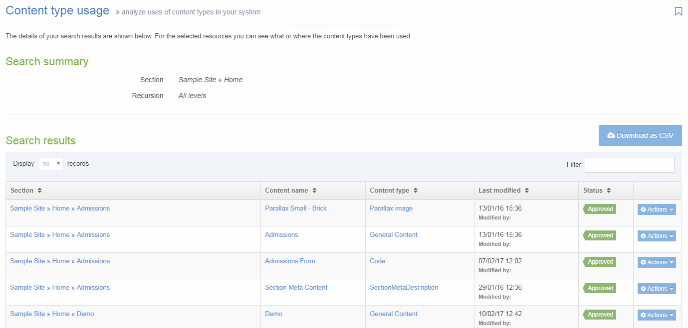
| Item | Description |
|---|---|
| Section | The full path to the Section. Click to edit the section. |
| Content name | Name of the Content Item. Click to edit. |
| Content type | Name of the Content Type. Click to edit. |
| Last modified | Date/time of the last modification and the username of the user. |
| Status | Approved, Pending or Inactive. |
| Actions |
The Actions menu allows you to:
|
Download as CSV
Click Download as CSV to download the results in a CSV file that can be opened in Excel.
Media Content Type
Description
The Media Content Type is a System Content Type. Since System Content Types are used by the Terminalfour system, they are pre-configured on installation. The Media Library uses this Content Type when an item is added or edited.
Media Types
When you add an item to the Media Library, you can select a Media Type from the drop-down list. A suitable option may be pre-selected based on the file extension of the Media Item, though this can be changed. The Media Type determines the settings for a Media Item based on its file extension. Settings include the maximum file size and whether it contains code that can be edited directly within the Media Library (like CSS and Javascript files).
When you are configuring a Media Type, one or more Media Content Layouts can be associated with it. Select Add row and choose it from the Media Content Layout dropdown list to add an existing Media Content Layout. When more than Media Content Layout is associated with a Media Type, a default can be selected:
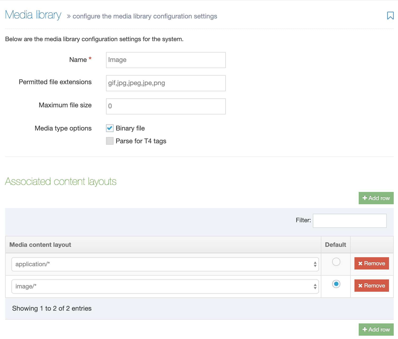
The Default is the Media Content Layout that is used when a Media Item is selected from the HTML Editor.
Editing the Media Content Type
Since the Media Content Type is used by the system to add and edit Media Library items, edits to the Content Elements should only be carried by a database administrator. We would also recommend that back-ups should be taken ahead of making changes.
Hosted Terminalfour clients can log a support ticket with Client Services who will be happy to make changes.
Making the "Description" field required
On new installs of Terminalfour, the "Description" field is required. This is to ensure that users must add text that can be used to populate the "alt" attribute which improves accessibility on the published website.
If you are upgrading from an older version of Terminalfour the "Description" Content Element may not be a required field. To make this element required, the following SQL query can be run (only users with access to the query handler can run queries):
update template_element set compulsory="1" where template=xx and name="Description"
In this case, xx is the id of the Media Content Type (which is typically "1").
Media Content Layouts
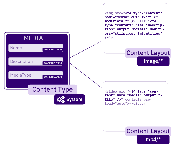
A Media Content Layout is a Content Layout associated with the Media Content Type. You can view all Media Content Layouts by going to Assets > Content Types and filtering for the Media Content Type (this is a System Content Type) It can be edited in the same way as any other Content Layout:
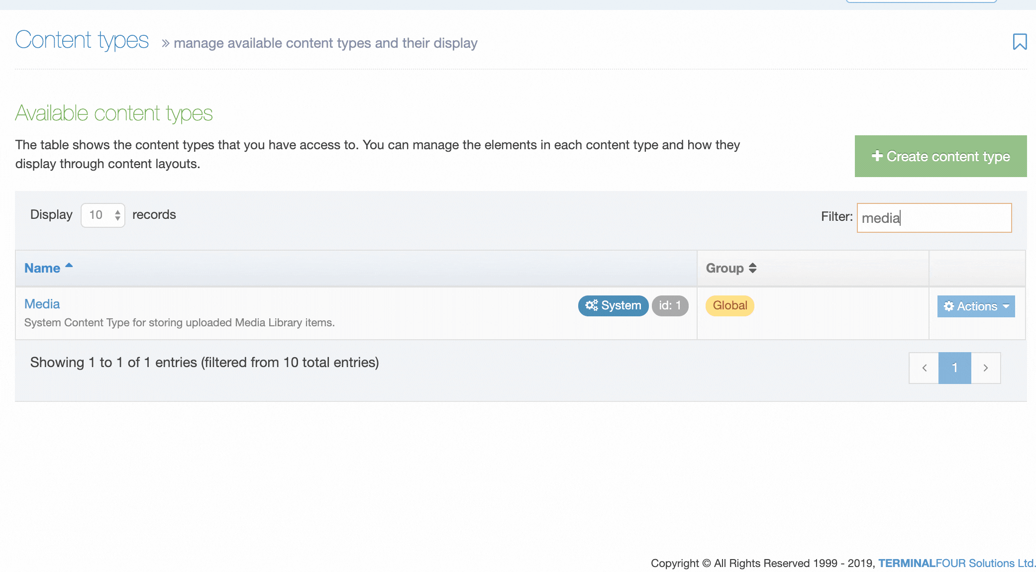
There are some Media Content Layouts that are pre-configured with a fresh install of TERMINALFOUR. These include:
| Name | Description | Content Layout Code |
|---|---|---|
| application/* |
Add a Media Item to an HTML page as a link. This would typically be used for Media Items like MS Office documents, PDFs and other files that you intend a user to download. |
<a href="<t4 type="content" name="Media" output="file" modifiers=""/>"><t4 type="media" attribute="Name" editable="true" /></a> |
| css/* | Add a CSS Media Item to an HTML page with the link element | <link rel="stylesheet" type="text/css" media="<t4 type="content" name="Description" output="normal" modifiers="" />" href="<t4 type="content" name="Media" output="file" modifiers="" />" /> |
| image/* | Add an image Media Item to an HTML page in an img element so it displays on the page. The Media Item's description is used as the alt attribute's value. |
<img src="<t4 type="content" name="Media" output="file" modifiers="" />" alt="<t4 type="content" name="Description" output="normal" modifiers="striptags,htmlentities" />" <t4 type="media" attribute="title" format=" title="$value"" />/> |
If you have added custom Media Types, you may also have additional Content Layouts. To edit a Content Layout, select Edit on the Actions menu for the Content Layout.
Modifying a Media Content Layout will update the published versions of all Media Items using that Media Content Layout.
A Media Type can use one or more Media Content Layouts. If more than one is available, a default can be defined. Where a default is defined there is no need to add a formatter attribute to the T4 Tag. Alternatively, a Media T4 Tag can specify which Media Content Layout is used.
A Media Content Layout must include a T4 Tag to output the Media Item (highlighted below). In this example, the Media is an image and the Description element is used to populate the alt text of the image.
<img src="<t4 type="content" name="Media" output="file" modifiers="" />" alt="<t4 type="content" name="Description" output="normal" modifiers="striptags,htmlentities" />" />
Media Attributes
HTML attributes can be added to the Media Content Layout markup to provide more control over how a Media Item is published on a page. In the example above, the default alt text is populated by the Description element from the Media Library.
You could also specify a width and/or height to resize an image. Media Attributes are T4 Tags within the Media Content Layout.
Setting up Media Types and Media Content Layouts
How to set up a Media Content Layout and Media Type for Javascript files:
Section Metadata Content Type
Description
The Section Metadata Content Type is a System Content Type. When enabled, it adds extra fields on the "General" tab for creating or editing a Section. This additional Section metadata is stored in Terminalfour as content within the Section, but it is not visible in the "Content" tab. These can be used for Programmable Layouts, Metadata, or a Content Layout can be added to the Content Type to output the content to the page. Most commonly, Section Metadata content is displayed with a Related Content Navigation Object, either in a Page Layout or another Content Layout.
For example, the Section Metadata Content Type could have a "Title" and a "Description" element. The "Title" could be used as the h1 on the page and in the "Title" tag (<title>). The "Description" could be mapped to the description meta tag, used in the header of your Page Layouts.
Configuration - Content Type Set Up
To check whether a Metadata Content Type already exists, go to Hierarchy Settings at System Administration > Hierarchy & Content Settings > Hierarchy.
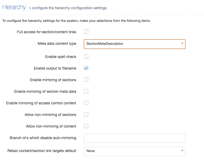
If no Content Type is selected, then create a new Section Meta Content Type. If a Content Type is selected, then edit an existing Section Meta Content Type.
Creating a New Section Meta Content Type
- Create a new Content Type called, for example, "Section metadata"
- Set the "Minimum User Level" to "Contributor"
- Add the elements/fields required in the "General" tab when creating or editing a Section. The "Name" field from this Content Type will not be displayed.
- Note the Content Type ID
- To convert it into a System Content Type, the person or team that manages your TERMINALFOUR database will need to run the following SQL on the database:
UPDATE template SET template_type=30 WHERE id=<CONTENT TYPE ID>
-
Go to System Administration > Hierarchy & content settings > Hierarchy and select the Content Type as the Meta data content type.
When creating or editing a Section, you should now see the extra elements you defined within the Content Type.
Edit a Section Meta Content Type
To edit an existing Section Meta Content Type, navigate to Assets > Content Type and note the ID of the Content Type. Since it's a System Content Type, it is not editable. To edit it, you will need turn it into a non-System Content Type. This is done with a SQL statement run on the Terminalfour database. When the edits are made, another SQL statement is run to turn it back into a System Content Type.
Once the SQL that converts the Content Type into a non-System Content Type is run, the options will no longer be shown on the 'General' tab and the content will appear as normal content within a Section.
The Content Type should be edited and turned back into a System Content Type as quickly as possible.
-
To convert it to a non-System Content Type, the person or team that manages your Terminalfour database will run the following SQL on the database:
UPDATE template SET template_type=10 WHERE id=<CONTENT TYPE ID>
- Edit the Content Type and add/edit the elements/fields that are required in the "General" tab when creating or editing a Section.
-
Once you have created/edited the Content Type with the desired fields, convert it back into a System Type. The person or team that manages your Terminalfour database will run the following SQL on the database:
UPDATE template SET template_type=30 WHERE id=<CONTENT TYPE ID>
When creating or editing a Section, you should now see the extra elements you defined within the Content Type.
Access Control Content Type
Description
The Access Control Content Type is a System Content Type. When enabled, it adds options onto the Access tab when creating or editing a section to restrict access to the published section.
This document explains how to create or edit the Access Control Content Type. For a more detailed description of Access Control configuration, refer to our article on the Access Control Module.
Configuration
To check whether an Access Control Content Type already exists, go to Access Control Configuration at System administration > Set up sites & channels > Access control.
If an Access Control Content Type has been created, it will be listed and selected in the dropdown with other System Content Types:
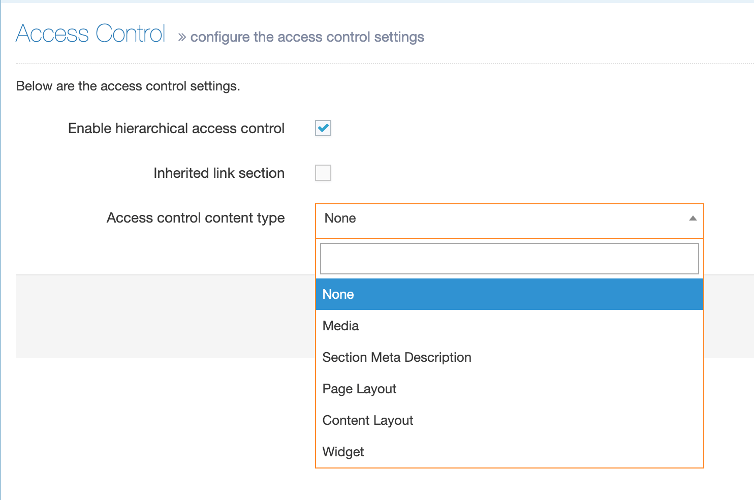
If there is no Content Type selected or listed, then you can create a new Access Content Type.
Create an Access Control Content Type
- Create a new Content Type; you can name this "Access Control" or give it another name
- The most common Content Element used for Access Control is a Group Select element, which allows the Section to be restricted based on a Group name. All elements should be non-compulsory. This allows users to leave the access control tab blank, and inherit access from a parent Section. The element settings would look like this:
| Name | Type | Required | Maximum Size |
|---|---|---|---|
| Group Select | Group Select | No | Default |
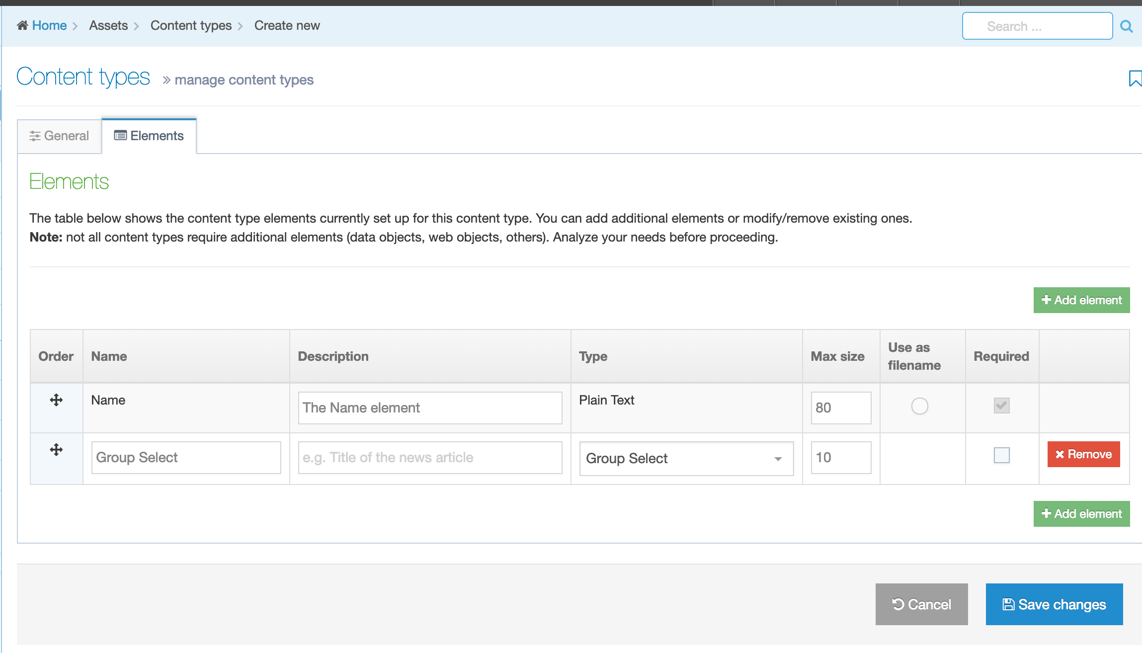
Convert the Content Type to a System Content Type
- When the Content Type has been saved note the Content Type ID. This can be copied from the Content Type listing page:
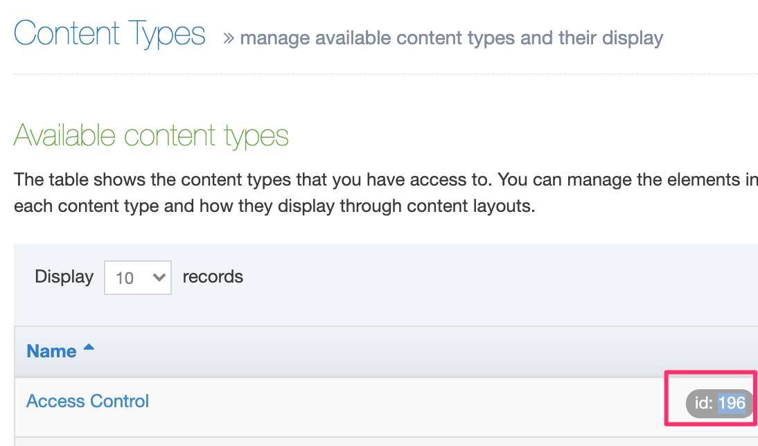
- To convert the Content Type into a System Content Type, run the following SQL statement on the database (you may need to ask the team or person or team that manages your Terminalfour database):
UPDATE template SET template_type=30 WHERE id=<CONTENT TYPE ID> -
Return to System Administration > Set up sites & channels > Access control and select the Content Type as the Access Control Content Type:
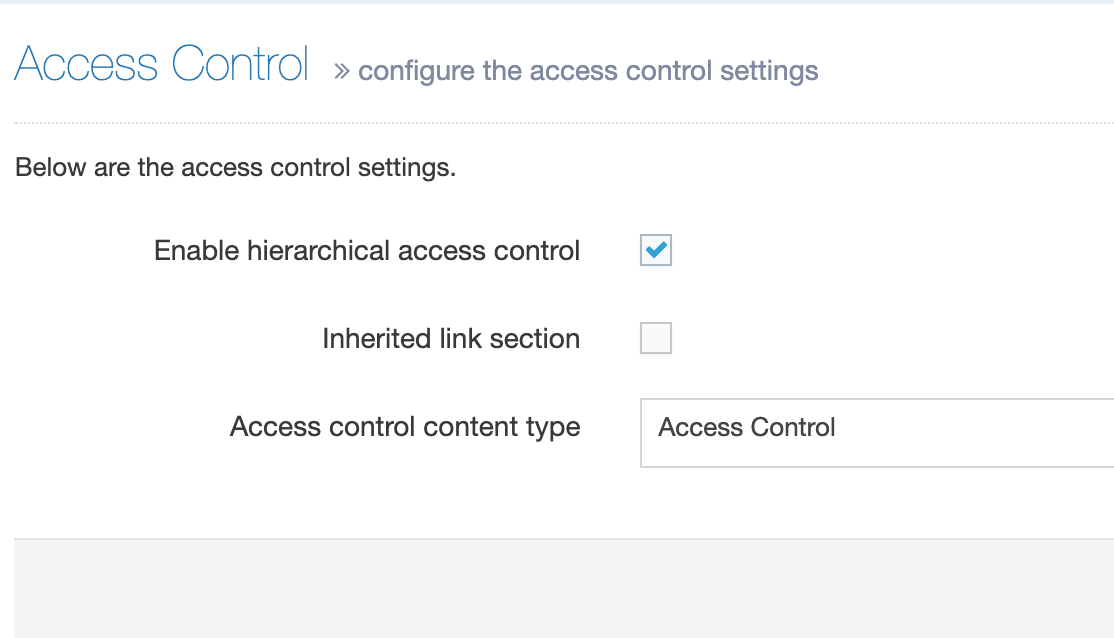
When creating or editing a Section, you should now see the options on the Access tab if Access Control is Enabled for the section.
Edit an Access Control Content Type
To edit an existing Access Control Content Type, navigate to Assets > Content Type and note the ID of the Content Type. Since it's a System Content Type, it is not editable.
Once the SQL to turn the Content Type into a non-System Content Type is run, the options will no longer be shown when creating or editing Sections.
The Content Type should be edited and turned back into a System Content Type as quickly as possible.
-
Convert a System Content Type to a non-System Content Type
To convert the Access Control Content Type to a non-System Content Type, the person or team that manages your Terminalfour database will need to run the following SQL on the database:UPDATE template SET template_type=10 WHERE id=<CONTENT TYPE ID> - Edit the Content Type and add/edit the elements/fields that are required to store the access control.
-
Convert the Content Type back to System Content Type
Once you have created/edited the Content Type with the desired fields, convert it back into a System Type. The person or team that manages your Terminalfour database will need to run the following SQL on the database:UPDATE template SET template_type=30 WHERE id=<CONTENT TYPE ID>
When creating or editing a Section, you should now see the extra elements you defined within the Content Type.
Extended User Details Content Type
Description
The Extended User Details Content Type is a System Content Type. When enabled, it adds extra fields on user profiles when creating or editing a user and these can be automatically populated when configuring LDAP or can be manually populated by users when editing their user profile. For example, the Extended User Details Content Type Content Type could have a "Job Title" and a "Department" element. The additional user profile information is stored in TERMINALFOUR as content within a Section in a hidden area of the Site Structure. The content can be published onto a site using the External Content Syncer or a Programmable Layout in order to create a staff directory.
Configuration - Content Type Set Up
To check whether an Extended User Details Content Type already exists, go to Users and workflows Settings at System Administration > System Settings > Users and workflow.
If no Content Type is selected for the Extended user details content type option, then create a new Extended User Details Content Type. If a Content Type is selected, then edit an existing Extended User Details Content Type.
Creating a New Extended User Details Content Type
- Create a new Content Type called, for example, "Extended User Details".
- Add the elements/fields required to store the user information. The "Name" element from this Content Type will not be displayed.
- Note the Content Type ID.
- To convert it into a System Content Type, the person or team that manages your TERMINALFOUR database will need to run the following SQL on the database:
UPDATE template SET template_type=30 WHERE id=<CONTENT TYPE ID>
-
Go to System Administration > System Settings > Users and workflow and select the Content Type as the Extended user details content type.
When creating or editing a user, you should now see the extra elements you defined within the Content Type.
Edit a Section Meta Content Type
To edit an existing Extended User Details Content Type, navigate to Assets > Content Type and note the ID of the Content Type. Since it's a System Content Type, it is not editable. To edit it, you will need turn it into a non-System Content Type. This is done with a SQL statement run on the TERMINALFOUR database. When the edits are made, another SQL statement is run to turn it back into a System Content Type.
Once the SQL to turn the Content Type into a non-System Content Type is run, the options will no longer be shown when creating or editing users..
The Content Type should be edited and turned back into a System Content Type as quickly as possible.
-
To change it into a non-System Content Type, the person or team that manages your TERMINALFOUR database will need to run the following SQL on the database:
UPDATE template SET template_type=10 WHERE id=<CONTENT TYPE ID>
- Edit the Content Type and add/edit the elements/fields that are required to store the user information.
-
Once you have created/edited the Content Type with the desired fields, convert it back into a System Type. The person or team that manages your TERMINALFOUR database will need to run the following SQL on the database:
UPDATE template SET template_type=30 WHERE id=<CONTENT TYPE ID>
When creating or editing a user, you should now see the extra elements you defined within the Content Type.
Conditional Elements
Description
Conditional Elements allows Administrators and Power Users to customize the Content Editing Experience for their users by conditionally displaying elements based on specific criteria. This feature helps simplify and streamline the content creation process for users by showing only relevant fields to Content Editors.
Note: The Conditional Elements feature is used to determine which elements are shown to Content Editors. It has no impact on how elements are output in your layouts.
For more information on how to add conditional logic to your layouts, you can check out our .
How to Configure Conditional Elements
Accessing Conditional Logic
- Navigate to the Content Type configuration (Assets » Content Types) and select a Content Type
- Select the "Elements" tab
- Click on the new "Conditional logic" button
This will open a slide-out window where you can create conditional statements and see a real-time preview
Real-Time Preview
When configuring Conditional Elements, you'll notice:
- A live preview of a content item is automatically displayed
- This preview updates in real-time as you add or modify conditional statements
- Allows you to immediately see how your logic affects the editing interface
Saving changes
Once you've created your conditional statements, ensure you save the Content Type before navigating away from the page.
Conditional Statement Types
There are three types of conditional statements.
Content Element-Based Conditions, User Group Conditions, and User Type Conditions.
1. Content Element-Based Conditions
- Allows element(s) to be shown based on the content of a different element.
- Useful for revealing additional elements based on specific input
Example 1: "If 'Research Type' is set to 'Grant-Funded', then show 'Funding Body Details' field"
Example 2: "If 'Course Level' dropdown is 'Postgraduate', then show 'Research Methodology' field"
Options depending on element type
Depending on the type of element you select, the options available for your conditional statements may be different.
The table below outlines all the different options depending on the element type selected.
| Element Type | Conditions Available | Option Available (If applicable) |
|---|---|---|
| Plain Text |
|
If the Condition is set to "Contains" or "Does not contain": User is shown a text input where they can type a string |
| HTML |
|
If the Condition is set to "Contains" or "Does not contain": User is shown a text input where they can type a string |
| Date |
|
N/A |
| Decimal Number |
|
N/A |
| Whole Number |
|
N/A |
| Media |
|
N/A |
| File |
|
N/A |
| Image |
|
N/A |
| Select Box |
|
If the Condition is set to "Contains" or "Does not contain": User is shown dropdown input where they can select a single value from the selected list |
| Check Box |
|
If the Condition is set to "Contains" or "Does not contain": User is shown dropdown input where they can select a single value from the selected list |
| Radio Button |
|
If the Condition is set to "Contains" or "Does not contain": User is shown dropdown input where they can select a single value from the selected list |
| Multi-select List |
|
If the Condition is set to "Contains" or "Does not contain": User is shown dropdown input where they can select a single value from the selected list |
| Multiple Select |
|
If the Condition is set to "Contains" or "Does not contain": User is shown dropdown input where they can select a single value from the selected list |
| Cascading List |
|
If the Condition is set to "Contains" or "Does not contain": User is shown dropdown input where they can select a single value from the selected list |
| Keyword Selector |
|
N/A |
| Section/Content Link |
|
N/A |
| Content Owner |
|
N/A |
| Group Select |
|
N/A |
2. User Group Conditions
Allows showing/hiding elements based on user group membership.
Example 1: "If User is in group 'International Admissions', then show 'Visa Requirements' elements"
Example 2: "If User is in group 'Research Grants Team', then show 'Indirect Cost Calculation' element"
3. User Type Conditions
- Controls element visibility based on the user's permission level
- Helps manage element access for different user types (Administrator, Power User, Moderator, Contributor)
- Simplifies content creation UI for user types that may not need to see all elements
Example 1: "If User is at least 'Administrator', then show 'Advanced Options' element"
Example 2: "If User is at least 'Moderator', then show 'Background Image' element"
Important Considerations
Logic Rules
- All conditional statements use OR logic
- If ANY conditional statement indicates an element should be displayed, it will be shown
- Note: Currently, AND logic is not supported
- For example, it's not possible currently to create a rule like "If 'Element A' contains 'Test' AND 'Element B' contains 'Test' Then show 'Element C'.
- Let us know if this is something you'd use and how you'd like to use it!
Scope of Functionality
Editing Experience Only
- Conditional Elements ONLY affect how elements are displayed to Content Editors
- This feature does NOT impact how content is output on published pages
Content Layouts may require separate configuration for output logic.
See our dedicated guide on .
Not a Security Feature
- Conditional Elements is a quality of life improvement
- Hidden elements can still potentially be accessed or edited
Do NOT rely on this feature for access control or security purposes
Not Supported on System Content Types
- Conditional Elements are not designed to work with System Content Types such as:
- Attempting to add conditional rules to these content types will likely cause breaking behaviour.
Power User Permissions
Power Users do have the ability to manage Content types for any groups they are a member of.
This means that Power Users can create and edit existing Conditional Statements.
Important Note User Group-Based Conditions
- If an already existing Conditional Statement specifies an element should be shown only to users in a specific group
- AND the Power User is NOT a member of that group
- THEN the Power User will be prevented from:
- Modifying that existing Conditional Statement
- Removing that existing Conditional Statement
- Power Users can safely modify other conditional statements and add new ones
In the scenario that a Power User needs to remove or modify a Conditional Statement that they do not have access to, it is recommended that they
- Consult an Admin to make the change for them OR
- Request temporary access to the required group from an Admin
Required Fields
- If an element is marked as "required" but it is hidden by a conditional statement, it is NOT considered required
- "Required" now means "required if shown to content editors"
Saving Content with hidden fields
When saving content items, the data within hidden elements is NOT changed from how it was stored when the content is first loaded.
- If a user edits a content item and a field is hidden, the data in that field isn’t removed when saving
- If a user edits a content item and makes a change that results in a previously displayed element to become hidden, the value of the now hidden field remains unchanged when saving
- If a user edits a content item and changes a value in "Field A" and then that user subsequently makes a change that results in "Field A" being hidden, when the content item is saved, the changes in "Field A" will not be saved
If adding conditional statements to existing Content Types it is advised that you consider whether logic is also required in your Content Layouts to ensure the expected data is output.
Debugging Conditional Elements
Reveal Hidden Elements Option
When an Admin (or a Power User with the permissions to edit the Content Type) edits a content item with Conditional Elements:
- A new "Reveal hidden elements" checkbox is available
- When checked, ALL conditional logic is temporarily disabled
- All elements are displayed, regardless of existing conditions
This option is there to help administrators troubleshoot cases where elements are hidden and it's not clear why.
Practical Uses For Conditional Elements
Here are some examples to give you some ideas of how conditional elements could be used.
This is far from an exhaustive list, but should give you some ideas of what's possible.
- Course Catalog Content Type
- Show 'International Student Requirements' when 'Applicant' is not 'Local'
- Show 'Research Supervision Details' only when 'Program level' is Postgraduate
- Show 'Funding Opportunities' element to content editors in 'Financial Aid' group
- Research Content Type
- Show 'Collaborative Research' element only when 'Project Type' is 'Interdepartmental'
- Show 'Compliance Documentation' for research involving human subjects
- Show 'Budget Modification' field only for users in the 'Department Head' group
- Carousel Slider Content Type
- Show 'Background Image' element when 'Background Type' is 'Image'
- Show 'YouTube URL' element when 'Background Type' is 'Video'
- Call To Action Content Type
- Show 'Internal Link' element when 'Link Type' is 'Internal'
- Show 'External Link Text' and 'External Link URL' elements when 'Link Type' is 'External'
Best Practices
The purpose of conditional elements is to simplify the content editing experience for your users. Below are some best practices to consider if you decide to implement Conditional Elements in your Content Types.
- Only hide elements when it genuinely improves the editing experience
- Consider the overall user experience when applying conditions
- Ensure that hidden elements do not create confusion for content editors
- Avoid adding too many conditional statements to a single Content type
- This is likely to result in a confusing Content Editor experience and may result in performance degradations
- Utilize the real-time preview when configuring conditional logic
- Ensure that content layouts also contain logic to output the appropriate elements if required
- Admins can use the "Reveal hidden elements" option on content items when troubleshooting hidden fields
- Carefully test conditional logic
- Be aware that conflicting conditional statements can create scenarios where elements are never displayed
- Review all conditional statements to ensure they do not inadvertently prevent element visibility
- Use the real-time preview to validate that elements can be shown under expected conditions
- If in doubt, ask another administrator to review your conditional logic
Repeater Element
Description
Repeaters allow you to configure a Content Type so that it can include another content type inside it. Content editors can then "Add another" to make for an intuitive editing experience.
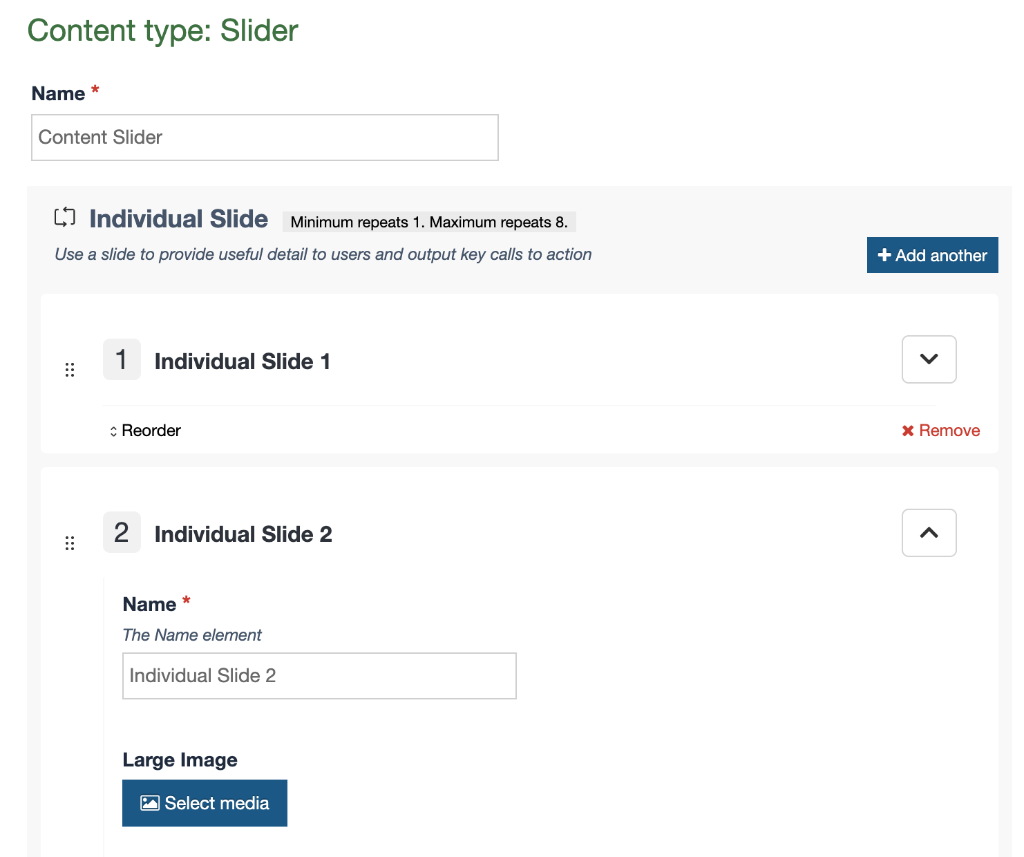
This allows for the easy creation of content types that are made of repeated elements, such as:
- Carousels and sliders
- Accordions and tabbed content
- Card rows and feature blocks
- FAQs and more
How to Configure Repeater Elements
While creating or editing a content type (Assets > Content Types) you'll now have the ability to select a new element type called "Repeater".
When you select this element type, a new "Flyout screen" will be displayed automatically that allows you to choose which Content Type should be repeated.
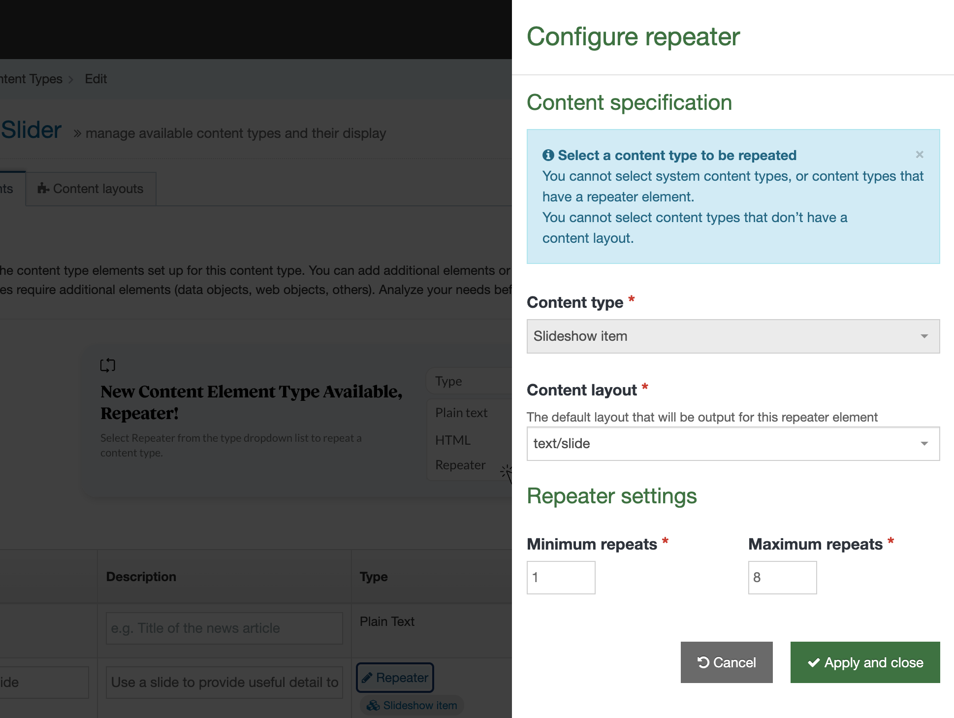
You must choose:
- Which Content Type should be repeated
- Which Content Layout should be the "default" layout for output
- The minimum number of times this can be repeated
- The lowest value that can be selected is 0.
- A minimum of "0" makes the Repeater field "Not required"
- This number must be less than or equal to the "maximum" field
- The lowest value that can be selected is 0.
- The maximum number of times this can be repeated
- The lowest value that can be selected is 1.
- This number must be greater than or equal to the "minimum" field
- The largest allowed value is 100.
Be sure to click "Apply and Close" to save your settings. You can edit these settings in the future by clicking the "Repeater" link in the element listing table (Note: The default Content Type being repeated cannot be changed after a Repeater element is saved).
Now when Content editors add Content using this Content type they'll see the repeated content item inline and get the option to "Add another" (until the maximum is reached).
Important Considerations
- A Content Type can have several Repeater elements.
- When selecting the Content Type to be repeated:
- You cannot select any System Content Types
- You cannot select any Content Types with no content layouts
- You cannot select any Content Types that already have a Repeater element
- The Primary Group, Workflows, and Minimum user levels set on "Repeated Content Types" are ignored.
- Only the Primary Group, Workflow, and Minimum user level on the "Parent" Content type is respected.
- A "Repeated Content Type" cannot be deleted. The Repeater element must be removed first.
- Similarly, the Default content layout selected in a Repeater Content Configuration cannot be renamed or deleted.
Outputting Repeaters
You can output a Repeater element via T4 Tags or Handlebars Helpers.
T4 Tags
To output a Repeater element with a T4 tag you must set the output="repeater". For example:
<t4 type="content" name="Individual Slide" output="repeater" />This will output the repeater's default layout (set in the Repeater Element Config) for each repeated content item an editor has added.
You can choose to override this default layout and output a different content layout of the Repeated content item if you need to. To do this, set the layout="text/layout-name". For example:
<t4 type="content" name="Individual Slide" output="repeater" layout="text/slide"/>
This T4 tag can be created using the T4 Tag generator. The T4 tag generator will also provide you with a link to the Content Type if you need to make modifications.
Handlebars Helpers
To output a Repeater element with Handlebars you can use the standard publish Helper. For example:
This will output the repeater's default layout (set in the Repeater Element Config) for each repeated content item an editor has added.
You can choose to override this default layout and output a different content layout of the Repeated content item if you need to. To do this, use the repeater Helper and provide a layout like so:
Handlebars gives you even more control over the output of Repeaters content if you need it. The Repeaters Helper can be passed into an each Helper to give you total control over how a repeater is output. For example:
See the full Handlebars documentation to learn more.
Creating Content with a repeater element
The Content editing experience for using repeaters is intuitive.
When a new content item is created that contains a Repeater element the user will see the Repeated content types inline. If the Repeater is configured with a "minimum repeats" greater than zero, then the content will already include some repeated items and the user can start filling out the fields.
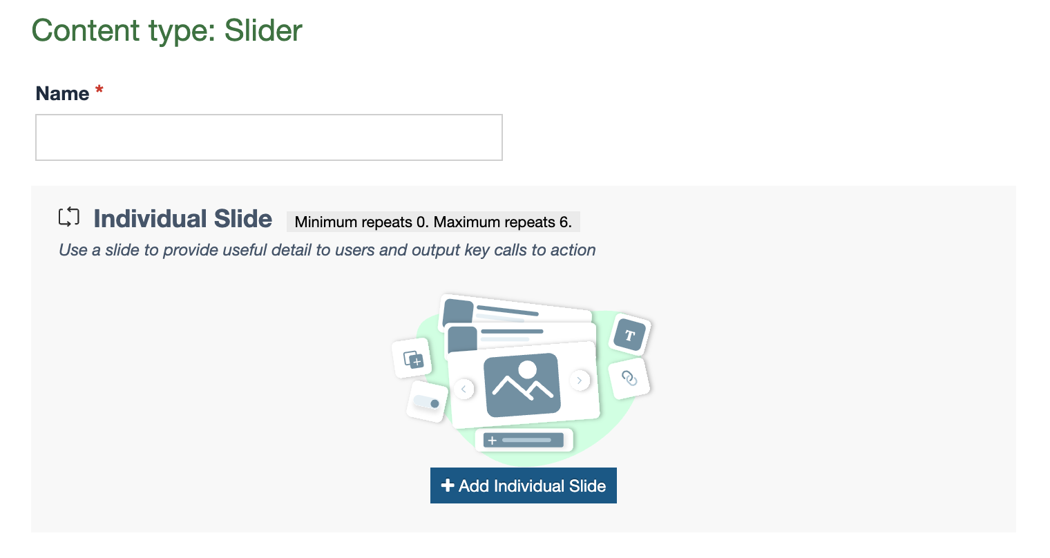 The user has the ability to "Add another" and they can remove and reorder repeated items as needed. The user can collapse the repeated items into an accordion if they don't need to see all elements.
Removing a repeated item
To remove a repeated content item (AKA Repeater instance) a user can click the "Remove" button.

Once an item is removed it can be retrieved by rolling back the history of the content item to a previous version.
Reordering a repeated item
There are several ways to reorder repeater items as we wanted to support lots of different users and use cases.
- Editors can drag and drop repeater instances to reorder them
- Editors can click the "reorder" button and then use the arrows to move up or down
- Editors can click the "reorder" button and then type in the position they want this repeated item to be moved to
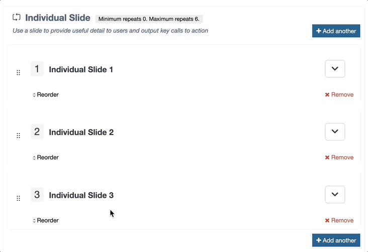
The order is consistent on each edit. There is currently no way to allow a "random" order at edit time.
Converting Existing Content to Repeaters
Admins have the ability to move existing content into a Repeater.
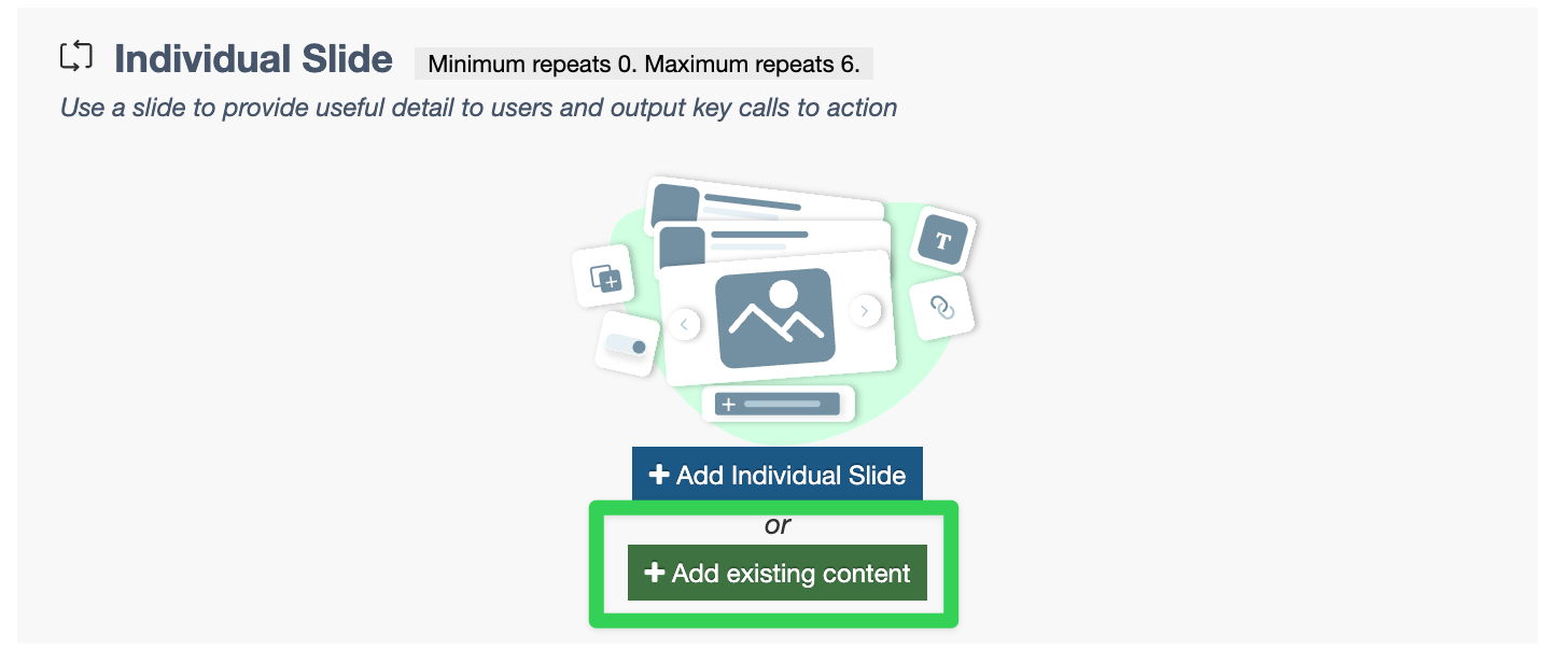
To do this they should:
- Create a new Content Type that uses a Repeater element
- Configure it to repeat an existing content type
- Add this new Content Type to a section
- Click "Add existing content"
- Select existing content from the site structure
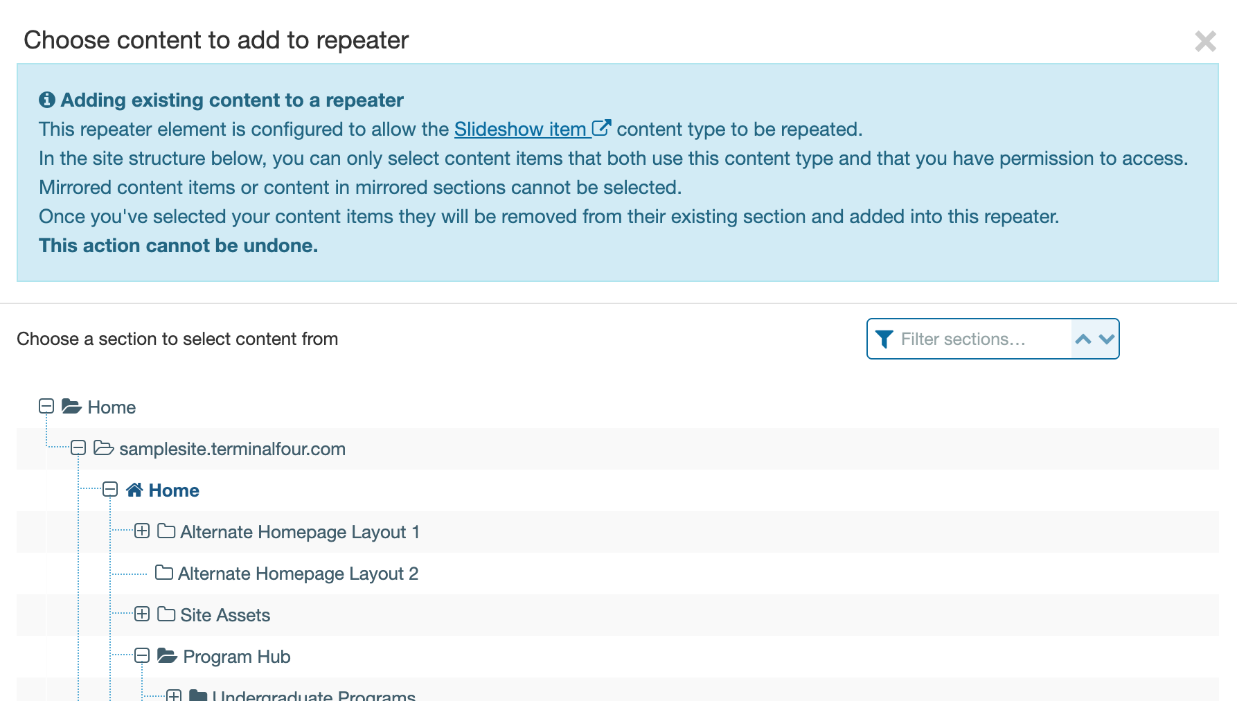
The content will be moved from its current section into the repeater. This action cannot be undone.
Note: You cannot add mirrored content to a repeater. Unmirror it first before adding.
Repeaters and Multiple Languages
Repeaters supports multiple languages.
When you add repeater instances in one languages they will be automatically available for translation in other languages immediately.
It's important to note that Repeaters will expect the number of repeated items to be the same in all languages.
The order of repeated content items is independent across languages, so reordering items in one language will not reorder them in another.
Known Limitations
We'd love to hear what's important to you with this feature so we can add improvements in future releases. The following are known limitations with Repeaters.
- Repeaters cannot be "nested". You cannot repeat a content Type that itself has a Repeater element.
- Repeaters cannot be used with System Content Types (Such as Media, Section Meta Data, Extended User, Access Control etc)
- Repeaters can be used in Direct Edit, but inline Direct Edit will come in a future release.
- It is not possible to set Review Dates, Expiry Dates, or Publish Dates on repeated content items (Only on the parent content)
- It is not possible to use a content link to link to a repeated content item (Only the parent content item)
- It is not possible to "map" into a repeater element using the External Content Syncer, HTML Packages, or Form Builder
Quality control
Description
TERMINALFOUR helps you maintain quality with Quality Control reporting tools for three areas:
- Accessibility
- Go to Measure > Quality Control > Accessibility
- SEO
- Go to Measure > Quality Control > SEO
- Broken links
- Go to Measure > Quality Control > Broken links
You can configure the settings for these tools in Quality Control Configuration by going to System administration > System settings > Quality control.
Google Analytics Dashboards
Description
Google Analytics Dashboards has been removed from the product in 8.3.16. Google Analytics charts will still be viewable in Direct Edit or can Google Analytics Reports be embedded within the Terminalfour Dashboard.
In Terminalfour you can use Google Analytics to learn about the traffic to your site as well as conversion rates, sources of traffic and bounce rates. This allows you to measure and analyze your content's impact to improve your site's effectiveness.
The Analytics Dashboards are context-specific, and the reports are based on "Views" from Google Analytics. All configuration is handled by Terminalfour administrators. Group rights are used to determine who can view the various dashboards.
There are four main steps when creating Dashboards:
Authorize Google Analytics Account API
First, go to System Administration > System Settings > Analytics:
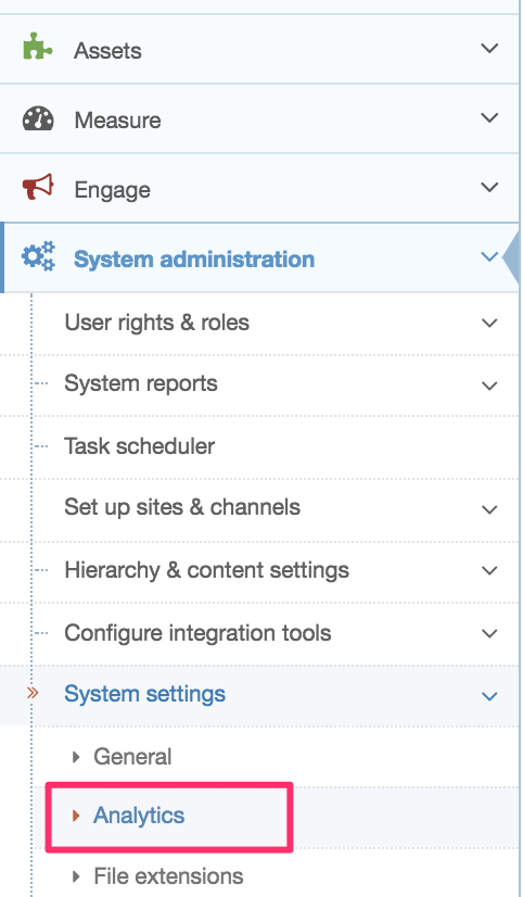
If you haven’t already linked a Google Analytics account to Terminalfour, select Analytics Account:
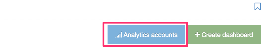
From the next screen, select Create New Account:
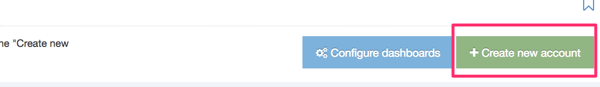
You'll need the Google API details to authenticate the account. Go to the Google API Console and create a new project specifically to use the Analytics API with Terminalfour:
Give your project a meaningful name that you can recognize (this is especially important if you have more than one Project):
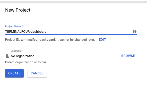
When you've created the Project, select Enable APIs and Services:
Searching for analytics will return some results. Select Analytics API (not the Google Analytics Reporting API):
Select Enable:
To get started with the API you’ll have to Create Credentials to use with it:
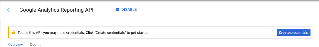
Next up, you’ll need to specify how you will be calling the API and the type of data you intend to access:
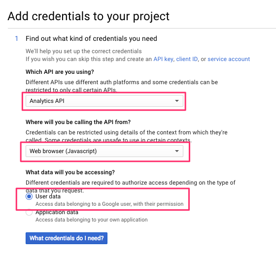
Next, you’ll be creating an OAuth2 Client ID to authorize the use of API with URLs from your Terminalfour instance:
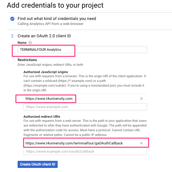
Here are some suggestions of what you could add here:
| Name | Description |
|---|---|
| Name | The name of the Client ID |
| Authorized Javascript Origins |
The Base URL for your Terminalfour instance. This is the IP address or hostname where API requests originate. Usually, this is the Terminalfour Application server IP address or hostname. e.g., if you log into Terminalfour at https://www.t4university.com/terminalfour/login.jspthen enter https://www.t4university.com into this field |
| Authorized redirect URIs |
Just copy the Redirect URL from the Create Site Analytics screen in Terminalfour. This is the location your browser will be redirected to when authorization is successful. The authorization information will be passed to this location and saved on the Terminalfour Application server; this is usually the Terminalfour context_url found in General Settings with gaOAuthCallback appended to it (case sensitive). Google Analytics requires an absolute URL so your Redirect URL cannot be relative.
|
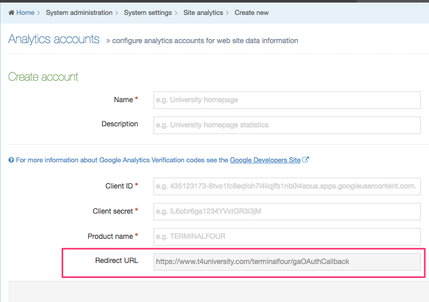
In the next step, select add the Product name. Your mail should already be filled in:
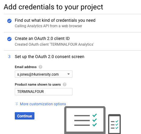
Select Done.
Once you've created the credentials are created, you can select its name from the list that appears:
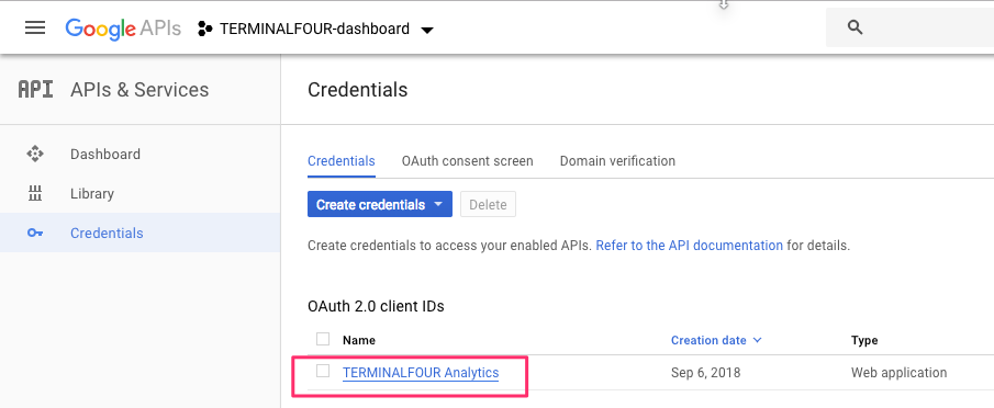
From the next screen, you’ll see the Client ID and Client Secret that you will require to complete the analytics account set up.
Just copy and paste both into the input boxes in Terminalfour:
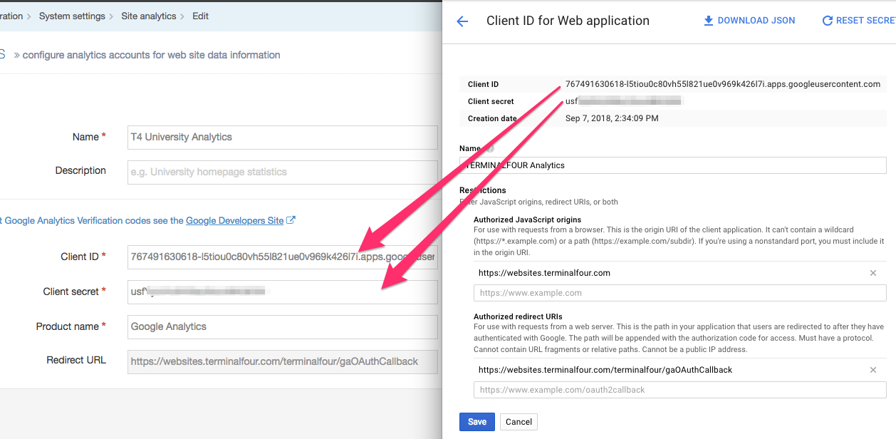
Make the account and product names recognizable to you and others in your organization.
After you’ve saved your changes, you will have to authorize the account. Just select the Actions menu and choose Authorize:
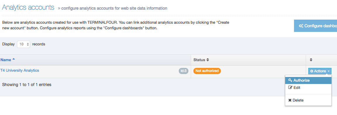
Then, select Allow from the pop-up that will appear. The requesting domain will differ from the one here:
When authorized, the status will be updated:
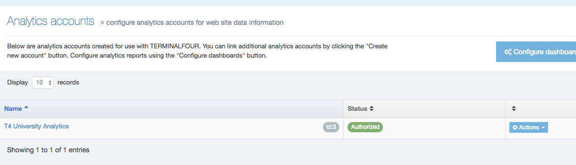
Now that your account is set up, it’s time to set up your Dashboards.
Each Terminalfour instance comes with a sample Dashboard. In this example, we are going to use that as our starting point.
In System Administration > System Settings > Analytics you will see a list of existing Dashboards. If you haven’t created any others, the only one you’ll notice is ‘Sample dashboards with useful reports’. From the Actions menu select Edit Dashboard:
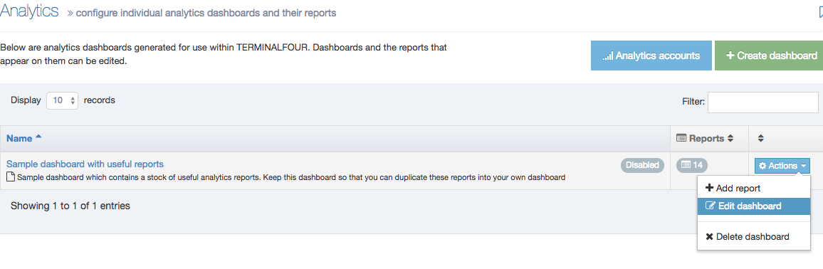
You’ll need to do a couple of things here. First up, link the Google Analytics account you’ve linked with your Terminalfour installation to the dashboard.
Click on Select Account and choose the analytics you’ve just set up:
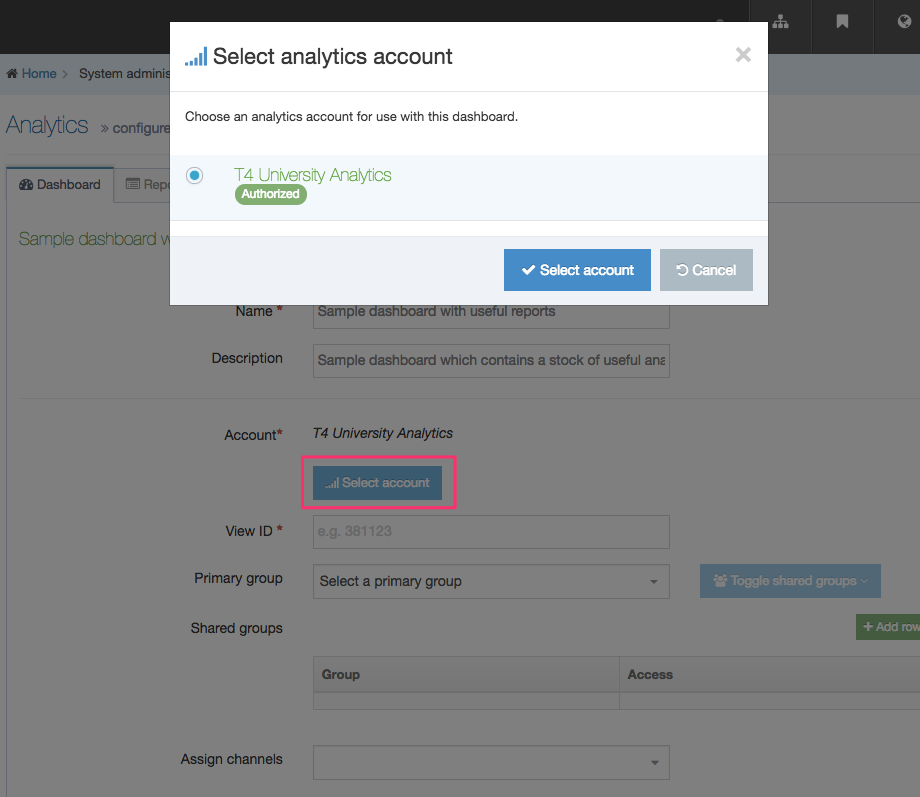
Using the Dashboard
Create a Dashboard with Account and View ID
Next up, you are going to need the Google Analytics View ID. A ‘View’ is essentially the data from a particular site and while a View can be filtered, so it only includes some of the data, the default that Google Analytics creates is unfiltered. That’s the one we are going to use.
This article on how a Google Analytics account is organized will give you a little more detail on some of the terms, like Property and View, which are used in Google Analytics.
Go to Google Analytics. You should already be logged in with the same Google account that you used to set up the API and select Admin:
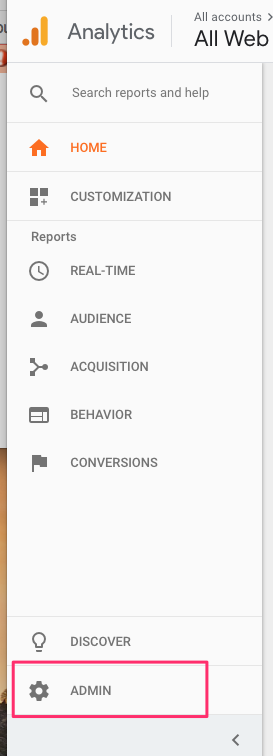
Make sure that you have the right Property (website to track) selected and select View Settings:
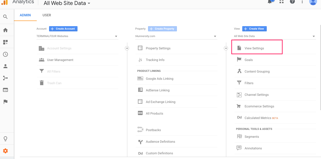
Copy the View ID:
Paste it into the View ID box in the Analytics settings:
Enable the Dashboard and choose Save Changes:
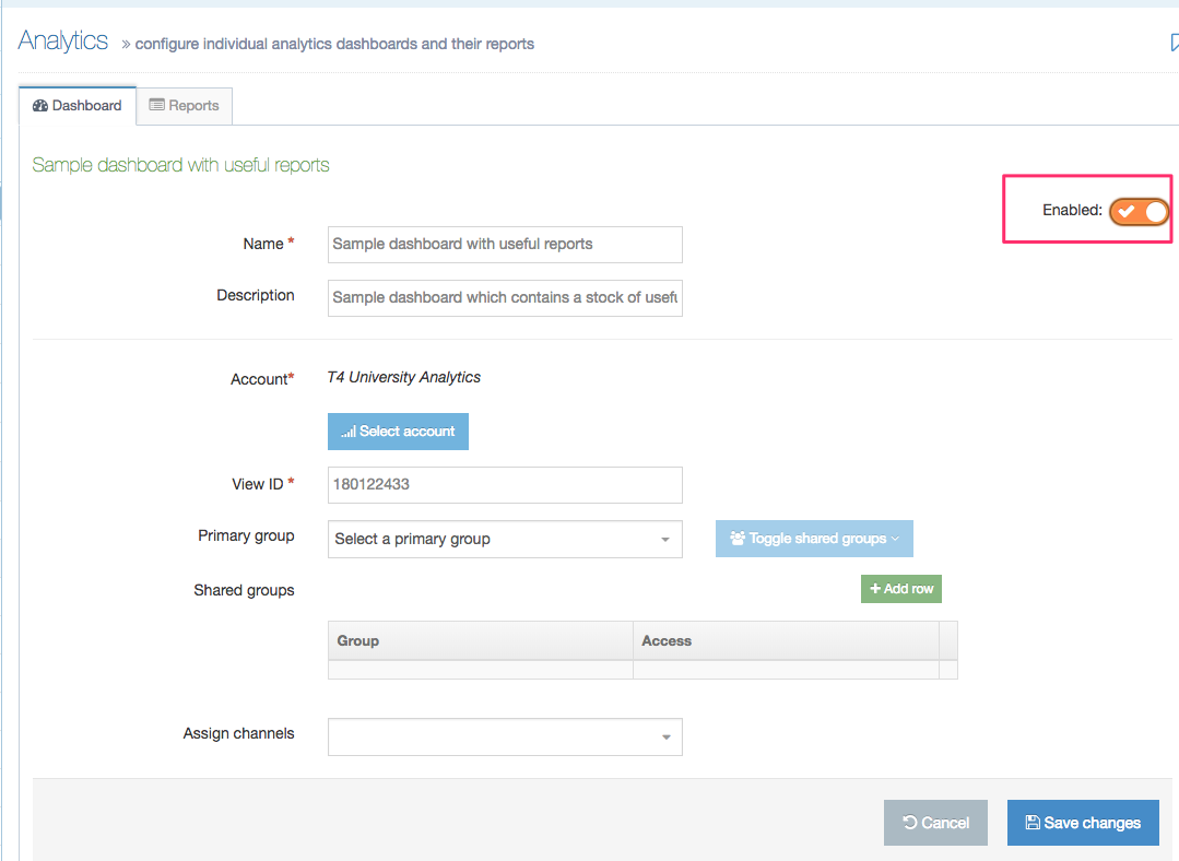
On this screen, you can also specify the Groups who can view the Dashboard.
View your Dashboard
To view your Dashboard go to Measure > Performance Dashboards > Site Analytics:
Customize Dashboard
You can change the order of Reports by clicking and dragging the Move icon from the Order column of each Report. Reports can be deleted and edited via the Actions menu on the right:
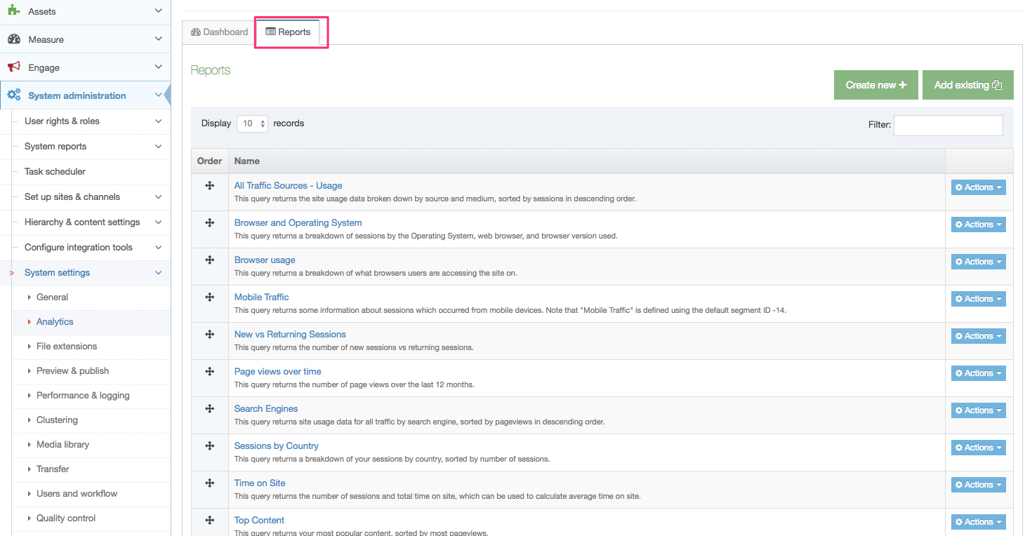
Each Report can be based on some or all of the following options:
A Query Explorer is available here so you can try out your queries beforehand.
| Item | Description |
|---|---|
| Widget Size |
Determines the size of the widget on the user's Dashboard.
|
| Dimensions |
Used to describe data. A dimension for a geographic location could have dimensions called Latitude, Longitude, or City Name. Values for the City Name dimension could be Boston, Dublin, or Sydney. To learn more about Dimension and Metrics have a look at Analytics Help. |
| Metrics |
Individual elements of a dimension that can be measured as a sum or a ratio. For example, the dimension City can be associated with a metric like Population, which would have a sum value of all the residents of the specific city. Screenviews, Page per Session and Average Session Duration are examples of metrics in Google Analytics. To learn more about Dimension and Metrics have a look at Analytics Help. |
| Segment |
Helps you to focus on specific elements of your traffic. As an example, you can focus on users from a particular country, from a specific campaign, who visit during a particular hour of the day, etc. More information on segments. |
| Filters |
Limits the data that is included in a view. For example, you can use filters to exclude traffic from particular IP addresses, focus on a specific subdomain or directory, or convert dynamic page URLs into readable text strings. Google Analytics supports two main kinds of filters: predefined and custom. For information on how to create filters, check the Google documentation. |
| Sort | The order and direction to retrieve the results. Can have multiple Dimensions and Metrics. Ascending: ga:visits Descending: -ga:visits |
| Date range | Select the fixed date range if you want to set a start date and end date. Alternatively, select the variable date range and set the interval |
| Start index | If your result set contains 50 values, you can opt to start the index at 20 to ignore the first 20 values. |
| Max results | Specify the maximum results to output |
| Results data | Choose to clean up labels returned from the analytics service. |
| Chart data |
Display returned data as a pie chart or line chart.
|
Sample Report
Below you can see a sample Report measuring mobile traffic to a site.
This query returns information about sessions which occurred from mobile devices. Note that "Mobile Traffic" is defined using the default segment ID -14:
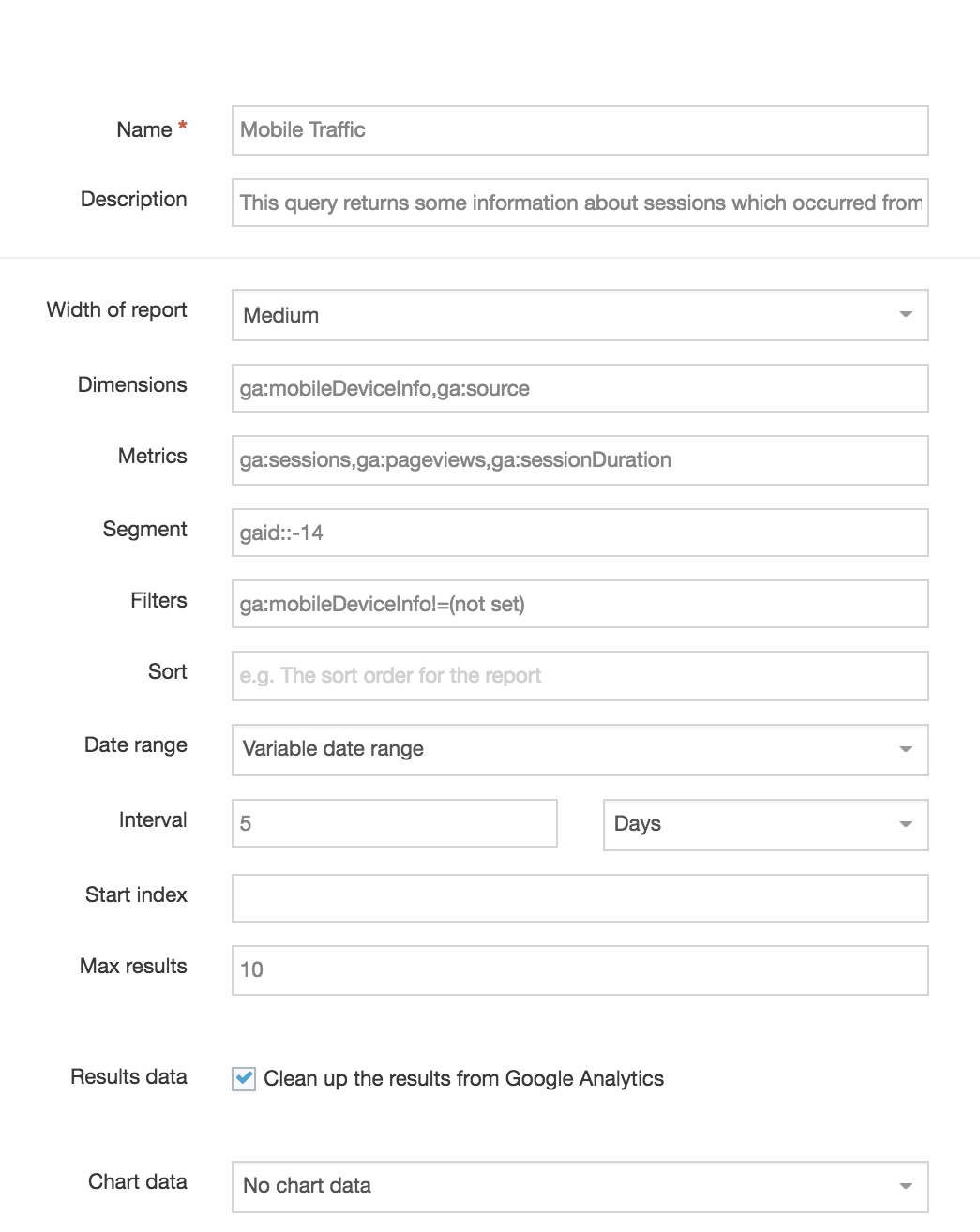
Direct Edit Integration
Once a Dashboard is displaying correctly it can be associated with a Channel.
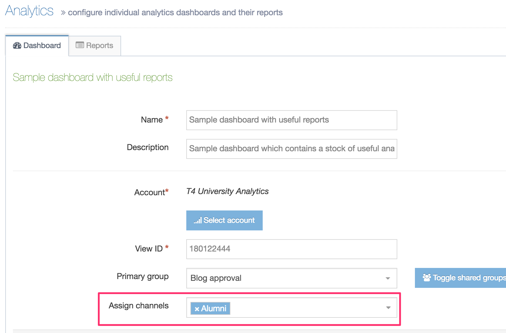
When the Dashboard is associated with a Channel, the analytics will display in Direct Edit. The results are based on the Section path and displays like so:
Governance
Description
TERMINALFOUR provides reports to assist with Governance:
Google sitemap generator
- Last Modified:
- 20 Aug 2019
- User Level:
Description
Google Sitemap lets you create a site map of your system and submit it to Google on a scheduled basis. This is a way of keeping your site up-to-date for indexing on Google.
System administration > Set up sites & channels > Google sitemap generator
Please note there are a number of know bugs with this feature and we advise that you contact the Client Support team before setting up a Google Site Map.
In the future, we will be updating this feature and would welcome any input you have. Again you can contact the Client Support team and reference "PM-1495 Refresh & enhance google sitemap generator".
If you need more control, you can use Programmable Layouts to generate your Google Sitemap.
In this section you can read about the information you find in the four tabs:
Sites
On the Sites tab, you can Edit the sites you have sitemaps created for already, and you can also create a new sitemap by clicking Create New.
Google Sitemap Information
Whether you create a new Google Sitemap or edit an existing one, the following information is needed:
| Item | Description |
|---|---|
| Site Name | sets the name of the sitemap |
| Output Directory | sets the directory on the server to output the sitemap. The output directory would usually be set to the channels output directory. This way, the sitemap can be accessed via the main site e.g. www.website.com/sitemap-en.xml |
| Base URL | sets the base url of the site e.g. http://www.example.com/ |
| Show Hidden Sections | when checked, sections that are not set to "show in navigation" are included |
| Channel | sets the channel |
| Language | sets the language to be used |
| Date element to override last modified date | sets the name of a Date Element in the content type(s) which will be used to override the last modified date in the sitemap. If this element is available and set, it will be used. If it is not available, the last modified date of the content will be used as default. |
| Exclude Sections | enter a comma separated list of section names to exclude from the sitemap. When this is set, the sections entered and their children will not be included. |
| Set Frequency | sets the change frequency to be reported by the sitemap to either "Daily" or "Weekly" |
| Use the news sitemap type | enables the output of a news sitemap |
| News Type | set the content types to be included in the news sitemap |
Generate
Generate an up-to-date sitemap
Queue
View scheduled uploads to Google.
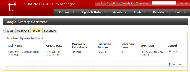
Schedule
Set up a schedule for uploads of your sitemap to Google.
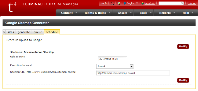
Content owners
Description
This report allows you to quickly set the owner across multiple sections or content items. You can also use it to see what items a particular user owns.
Go to Measure > Governance > Content owners
Report configuration
The report can be run on a Section, Channel or User/group.
Report target: Section
| Item | Description |
|---|---|
| Section | Select the section to run the report on |
| Number of levels to recurse |
Sets how deep through the site structure this report will run:
|
| Content to show |
Sets the content to show in the report:
|
Report target: Channel
| Item | Description |
|---|---|
| Channel | Select the channel to run the report on |
| Content to show |
Sets the content to show in the report:
|
Report target: User or group
User or group: select a user or group to run the report on
| Item | Description |
|---|---|
| Content owner | Select the user or group to run the report on |
Click +Run report will display the search results.
Search results
Content matching the search will be displayed in the listing. For each content item the Name, id, Owner, Section, Last modified and Status will be displayed. Results can be sorted and filtered.
The Actions menu allows you to Edit or Delete the content.
Reassign owner
To reassign the content owner, select the items you want to reassign, select the owner and then select "Reassign owner".
Accessibility Report
Description
In Terminalfour 8.4.2 we announced a newly redeveloped accessibility reporting tool.
This tool allows users to test any page in the Terminalfour Platform that they have access to to ensure that it means WCAG 2.2 AA standards.
Accessibility is a crucial aspect of web design and content management, ensuring that all users, regardless of ability, can access, understand, and engage with digital content.
Adhering to accessibility standards not only enhances user experience but also broadens your audience reach while fulfilling legal and ethical responsibilities. Our new accessibility reporting tool is designed specifically for the Terminalfour Platform to streamline this process. By identifying and highlighting non-conformances with established accessibility guidelines, this tool empowers users to create inclusive content, making it easier to meet compliance standards and support diverse user needs.
Accessing the report
The report can be accessed from multiple places.
- The Site Structure
- By clicking the "Actions" menu on a section and selecting "Accessibility report"
- The Content Listing view
- If you need to run the report against a fulltext content item, you can do so by clicking the "Actions" menu on a piece of content and selecting "Accessibility report"
- Direct Edit
- By clicking the "Accessibility" icon in the left menu.
The report will show the same information about the accessibility of your page, regardless of where you open the report from.
The report is generated immediately when a report is opened. Meaning you can fix a problem and reopen the report and it will immediately reflect the change.
When the report is open you can navigate between pages and the report will updated to reflect the current page being viewed.
What's in the report?
When the report opens you'll see a split page view.
On the right, you'll see a preview of the page the report is run against.
On the left, you'll see the report itself which includes:
- The title of the the page or content item being reviewed
- The path to that section within the Terminalfour Platform
- The published page URL for the page being reviewed
- The total number of violations found on the page
- The total number of "Review items" found on the page
- Review items are items that the tool couldn't automatically confirm were meeting accessibility guidelines and need manual review
- A filter system allowing you to filter violations by severity
Below this, you'll be shown a list of all of the violations on the page.
For each violation you'll be shown:
- The name of the accessibility violation (as defined in the WCAG Guidelines)
- The severity of the violation (as defined in the WCAG Guidelines)
- A link to an external site where you can learn more about this violation and how to fix it
- A list of the elements in the page that contain the violation
- You can click the "Highlight" button to scroll that element into view on the right and highlight it with a red border
- Suggested fixes for how you can address the violation
Frequently Asked Questions
Who can see this report?
Any user with the rights to preview a section will be able to see the accessibility report for that section.
Can I share the report?
Yes. You can copy the URL when the report is opened and send it to a colleague. As long as they have rights to preview the page, they'll be able to see the report.
Can I run this against every page in my site and see an overall report?
Not in this initial release. For now, you can check individual pages and this feature will be expanded in future releases so that it can run at a schedule and check all pages.
You can navigate your site with the report open and it will update as you move between pages.
Can I run the report against fulltext pages?
Yes! Navigate to the Content listing view, find your content item that has a fulltext view and click "Actions" and run the report from there.
Exactly which guidelines do you test against?
The WAI - WCAG 2.2 AA guidelines. We also test against "Industry best practice" guidelines as defined by Deque.
I need to be able to test for WCAG 2.2 AAA. Is this possible?
Yes. By default the tool will check WCAG 2.2 AA. If you need something different (e.g. if you only need to check against the 2.2 A guidelines; or if you need to test against the stricter 2.2 AAA guidelines) reach out to our client support and they can change the config behind the scenes. If you are self-hosted, the support team can let you know the SQL to run to update which guidelines to test against.
How do you test a page is conforming to guidelines?
Behind the scenes we're running industry standard accessibility testing tools developed by Axe-core. This testing framework is used by most automated accessibility testing platforms.
Does the report work if I use the Preview Filter?
Yes. The report is run against the rendered page preview. So anything that is in a page preview will be tested in the accessibility report.
Can the report tell me which Content Type or Page Layout has the problem?
Not in this initial release. This is a natural next step which we're working towards in future versions. Please reach out if this is something you'd like to see.
Are results always consistent between Direct Edit and the Standard UI?
Yes. The non-conformances will always be the same. However, the total number of violations may appear higher in Direct Edit as extra markup is added to Direct Edit to break pages into smaller parts. This markup could break 1 element with a problem into two different elements with the same problem.
Once you've fixed the issue, it will no longer show up in either the Direct Edit report or the report in the standard interface.
What happened to the legacy accessibility tool?
The legacy Terminalfour accessibility reporter is no longer being updated and will be removed in a future version of Terminalfour. See below for information on the legacy report tools.
Documentation is available in our version 7.4 documentation of the Accessibility reports.
There are configuration options available for:
- The number of past reports are stored at System administration > System settings > Quality control
- The minimum user level who can access reports at System administration > User rights & roles > Role customization
SEO Report
Description
With Search Engine Optimization (SEO) Reporting in Terminalfour, you can learn how easily a search engine can find your content. The SEO Reporting Tool is made up of a number of plug-ins that check the occurrences of key phrases in HTML elements. If you want a search engine to remember a specific phrase or word, e.g. "Terminalfour", the system can examine a Channel or Section to see how effective it is.
To run or configure a report, go to Measure > Quality Control > SEO. SEO Reports can be run immediately or recurrently via the Task Scheduler.
The reports are still using the v7.4 interface, so click the OK button to continue.
Documentation is available in our version 7.4 documentation of the SEO reports.
There are configuration options available for:
- The number of past reports are stored at System administration > System settings > Quality control
- The minimum user level who can access SEO reports at System administration > User rights & roles > Role customization
Description of plugins available
With the exception of the URL checker and the Meta Check the score of each plugin is based on the total number of occurrences of key phrases found divided by a given threshold. If the number of occurrences are found the plugin returns full marks. Each plugin also has a weighted score which is configurable. The SEO score is then calculated by dividing the cumulative weighted score of all plugins by the cumulative weight of all plugins.
| Plugin | Description |
|---|---|
| Body check | Checks the number of occurrences of key phrases in the body tag, returns full marks if the total occurrences any/all key phrases is 5 or more |
| First 100 words | Checks the number of occurrences of key phrases in the first 100 words in the body tag, returns full marks if the total occurrences any/all key phrases is 3 or more |
| H1 Check | Checks total occurrences of key phrases in H1 tags, returns full marks if any found |
| H2 Check | Checks total occurrences of key phrases in H2 tags, returns full marks if any found |
| H3 Check | Checks total occurrences of key phrases in H3 tags, returns full marks if any found |
| H4 Check | Checks total occurrences of key phrases in H4 tags, returns full marks if any found |
| Image Alt Checker | Checks the number of occurrences of key phrases in alt tags, returns full marks if the total occurrences any/all key phrases is 2 or more |
| Meta Check | Checks the number of occurrences of key phrases in meta tags, returns full marks if key phrases are found in both the "description" and "keywords" meta tag |
| STRONG Check | Checks total occurrences of key phrases in strong tags, returns full marks if any found |
| Title Check | Checks total occurrences of key phrases in the title tag, returns full marks if any found |
| Url Check | Checks total occurrences of key phrases in the section names up to the channel root (as this is how the url will be built), returns full marks if any found |
Broken links
Description
The Broken Links Report identifies links not behaving as intended on your sites. This could be because the page they link to no longer exists, or a permission issue may prevent links from being followed.
To use the Broken Links Report, use Measure > Quality Control > Broken links.
The Broken Links Report can be configured in the Quality Control Configuration.
Task Scheduler
Internal broken links link between Sections and Content Items and the broken internal links report is generated when loading the report page.
To list external broken links in the report, an External link checker report must be scheduled with the Task Scheduler.
Listing
The listing page will automatically generate and list all broken internal links. However, external broken links will only be shown when an External link checker task has run.
Both internal and external links are shown together on this page, and you can order by each type.
When you click on the Action menu, you'll see links to:
- Edit content
- See response
- Preview content
Entries can be sorted and filtered.
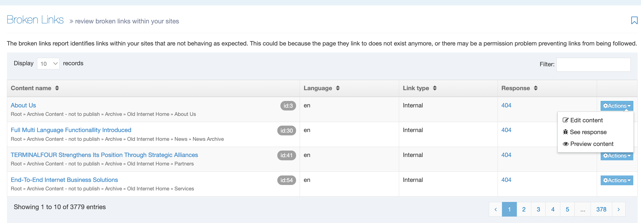
For each broken link, the following is displayed:
- Content Item name
- Location
- ID
- Language
- Link type
- Internal (links to Section and Content Items in Terminalfour)
- External (hyperlinks)
- Response code
- if you're not sure about a response code, you can check this reference
Edit Content
Clicking on the Content Item name or selecting Edit Content from the Actions menu will take you to the Edit Content Item page, where each broken link is highlighted in red:
You can then fix the broken link and save the Content Item.
Response Information
To see more information on the Actions menu and select See Response:
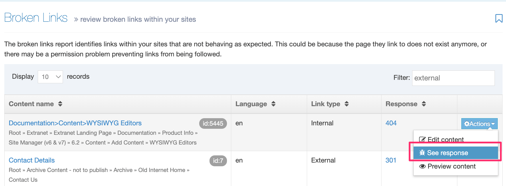
For an internal broken link you can see the Section that can no longer be located:
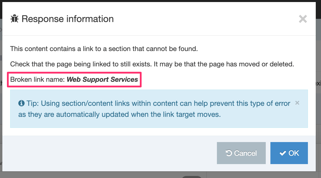
For an external broken link, the URL will be displayed:
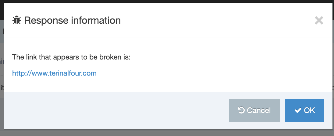
Quality control configuration
Description
This page contains the settings to configure the SEO report, broken link report and accessibility report.
Go to System administration > System settings > Quality control.
Accessibility report
| Item | Description |
|---|---|
| Number of records to keep | Sets the number of reports to keep. The default is 10. |
Broken link checking
| Item | Description |
|---|---|
| Days to keep records for | Sets the number of days before reports are deleted. The default is 28 days |
| Verify content access | Displays links within content to which the user has edit rights. Unchecked, all broken links are displayed |
| Number of threads | Sets the number of threads to be used by the link checker. Default is 1 |
| Connection timeout | Sets the number of milliseconds to wait for a URL to respond before it is marked as a failure. The default value is 5000 |
| Schedule check | Enables the setting of a date for the next broken link report to run |
| Excluded URLs |
URLs that you want to omit from the report can be added here.
e.g.,
|
| Number of records to keep | Sets the number of reports to keep. The default is 10. |
SEO report
| Item | Description |
|---|---|
| Number of records to keep | Sets the number of reports to keep. The default is 10. |
Social posts
Description
With Social Poster, you can post short messages from your content to:
Posts usually contain a short description and a link to the page containing the content. This page lists all of the posts made to Social Poster.
To view the list of social messages to be published on Facebook, Twitter, or LinkedIn, go to Engage > Push to Social. This opens the page shown below:
In the upper right corner is the Create New Post button (green). This allows you to manually create a post to one of the social media accounts. There is also an Accounts button (blue), which allows you to configure the social media accounts.
Posts are displayed in descending order with the most recent posts appearing at the top of the list. Posts will remain on this list for the time period specified in the Remove sent posts in the social poster configuration.
Actions
In the column with Actions buttons, you can use the drop-down list to choose actions to take with the Post in the row.
- If you click View details, this opens a window with more information about the post.
- If you click Post, this will send the post to the selected social media account. Alternatively, this can be configured to be sent automatically in the social poster configuration.
- You can Delete a post. If you choose to delete a post, you are challenged with a confirmation box. Confirm your selection to Cancel or Delete.
Access Control
Description
If you'd like to add an authentication requirement to published pages on your site you can use Access Control to limit access to users within a specified Group. For example, you might have a staff-only area on your site that should only be accessible by specific Groups or Users.
Users can be authenticated using the following methods:
- log-in as a Terminalfour user
- log-in with a third-party authentication protocol like NTLM, LDAP or Shibboleth
- IP address based
- using a Control Rule Profile to configure a .htaccess file
In this article we'll cover the Access Control feature which allows you to configure the Groups who can access a Section's published pages.
Check out the Access Control Module we've created to give you even more control over Access Control.
Follow the steps below to configure and implement Access Control:
- Enable Access Control
- Create Access Control Profile
- Create the File Extension
- Configure the Channel
- Build the Site Structure
- Create & enable Page Layout with PHP ext
- Grant Group Access
- Publish the Channel
- Update the Configuration
Enable Access Control
To enable Access Control on a Section the first things we must do are:
- set up an Access Control Content Type
- configure the Access Control settings to use the Access Control Content Type
Now when you select the Access Control tab and enable the setting you can check the Group(s) that you would like to grant access to the published pages in this Section:
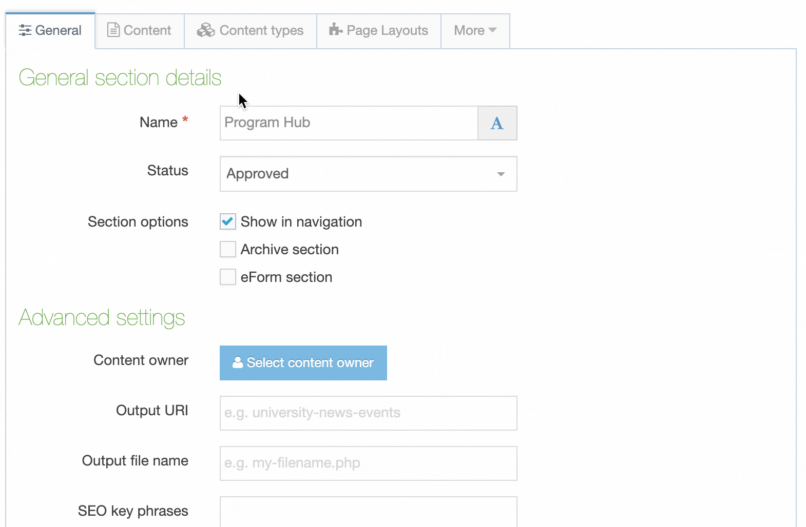
Create the Access Control Profile
Add the T4 Tag
<t4 type="accesscontrol" output="groupnames" />
Adding this T4 Tag to a Content Element will output a comma-separated list of the Group names that are flagged as having access to the published page:
However, we need to enforce this. To do this we use an Access Control Profile.
Access Control Profiles
Access Control Profiles let you specify how Access Control rules should be applied to the published page.
Go to Sites & Channels > Access Control. Create a new Access Control Profile and select the Create New Basic PHP Access Control
A basic profile has the following fields:
| Item | Description |
|---|---|
| Name | The name of the Access Control Profile. |
| Description | An optional description of the Access Control Profile. |
| Code Before Section |
The code that is output before a Section is published.
|
| Code After Section | The code that is output after a Section is published (if any). |
| Code Before Link |
The code that is output before a link is published.
|
| Code After Link |
The code that is output after a link is published. |
Create a File Extension
You may be using server-side code like PHP or ASP.NET on your page. In this case you will need to ensure that the file extension has been created.
Go to System Administration > System Settings > File Extensions. If you are using PHP and this file extension has not already been added, select Create New File Extension.
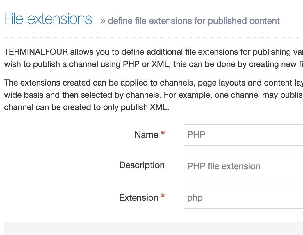
The extension value should not be preceded by a dot.
Configure the Channel
The Channel must be configured to publish content using the file extension you've added and to enable Access Control.
Go to System Administration > Set up Sites & Channels > Channels and edit the Channel that you want to use Access Control with.
Under Available File Extensions check Enable File Extension Overriding and permit PHP (if you are using PHP).
Under Access Control and Personalization, enable both Access Control and Personalization. From Configuration, select the Access Control Profile created earlier:
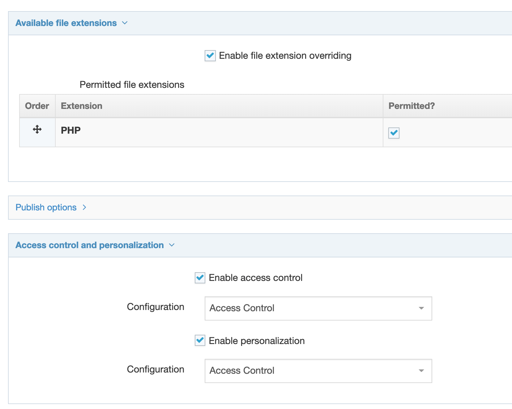
Click Save Changes when you are done.
These settings must be applied to a Channel and will have no effect when applied to a Microsite.
Build the Site Structure
Three new Sections are required below the Section that has Access Control applied.
- Login
- displays Login Screen (hidden from navigation).
- No Access
- displays a message to users who have restricted access
- hidden from navigation).
- Logout
- displays a link to log out. Set the link to /?logout
- not hidden from navigation.
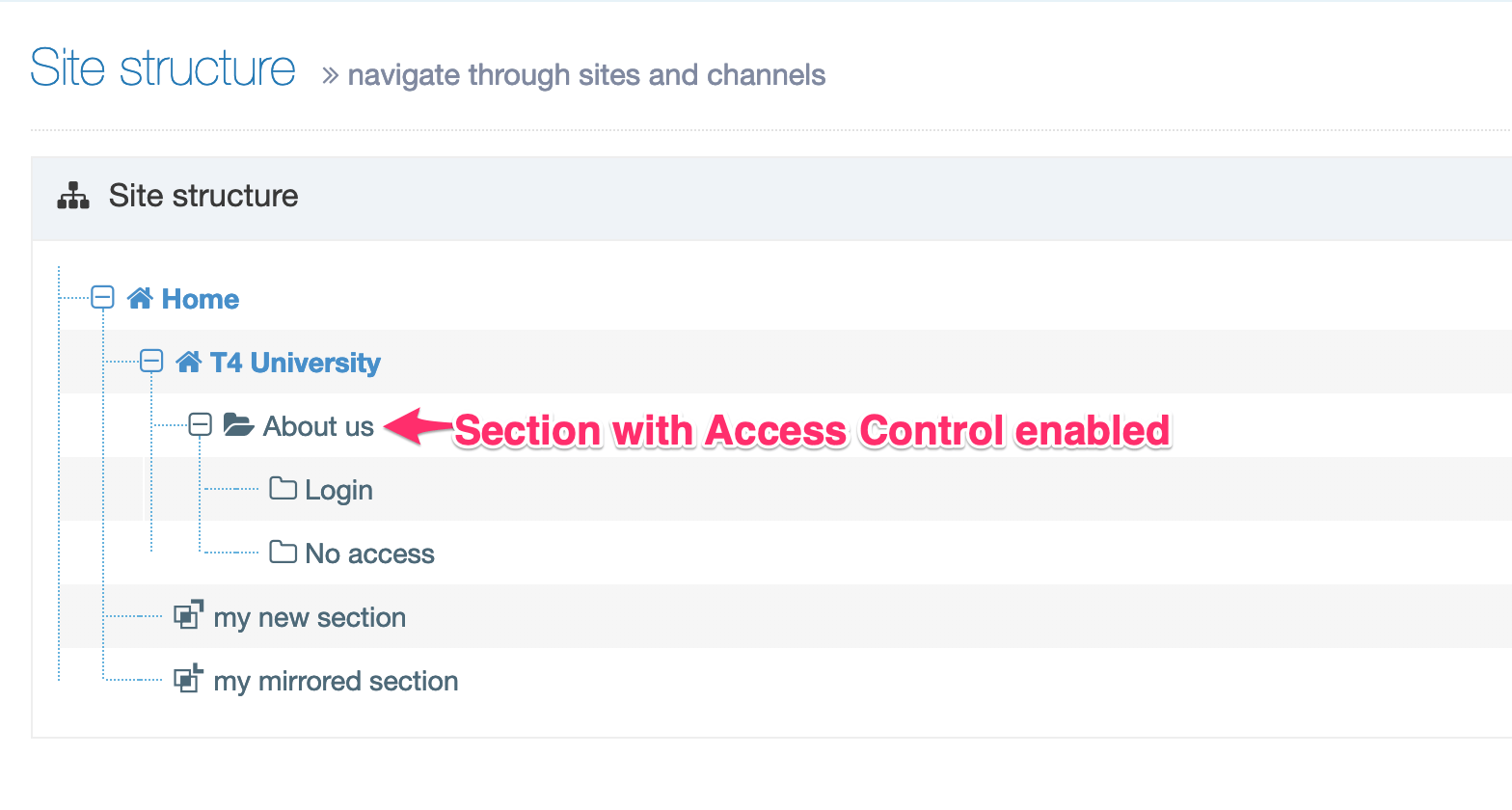
Add Content - Login
Your login panel could look like this:
<!-- login form -->
<div class="loginPanel">
<h1>Heading goes here </h1>
<form action="" method="post">
<label for="uname">Username</label><input type="text" name="uname" id="uname">
<br />
<label for="pwd">Password</label><input type="password" name="pwd" id="pwd">
<br />
<input type="submit" value="Log in">
</form>
</div>
The form action must either be empty, as in this example, or contain the path to the published login page itself.
Add Content - No Access
Add the following code to the No Access Section using a plain text or code only Content Type:
<h1>You do not have access to see this page</h1>
<p>If you believe that you should have access to see this page, please contact your support team.</p>
<p><a href="/?logout">Please click here to log out</a></p>
Create & enable a Page Layout with the file extension
- Edit the Page Layout which is currently enabled on the Section, for example, "About us". Copy the header and footer code and paste this into a new Page Layout.
- Enable the appropriate file extension for the Page Layout.
- In the Site Structure, enable the Page Layout where the Access Control is set up
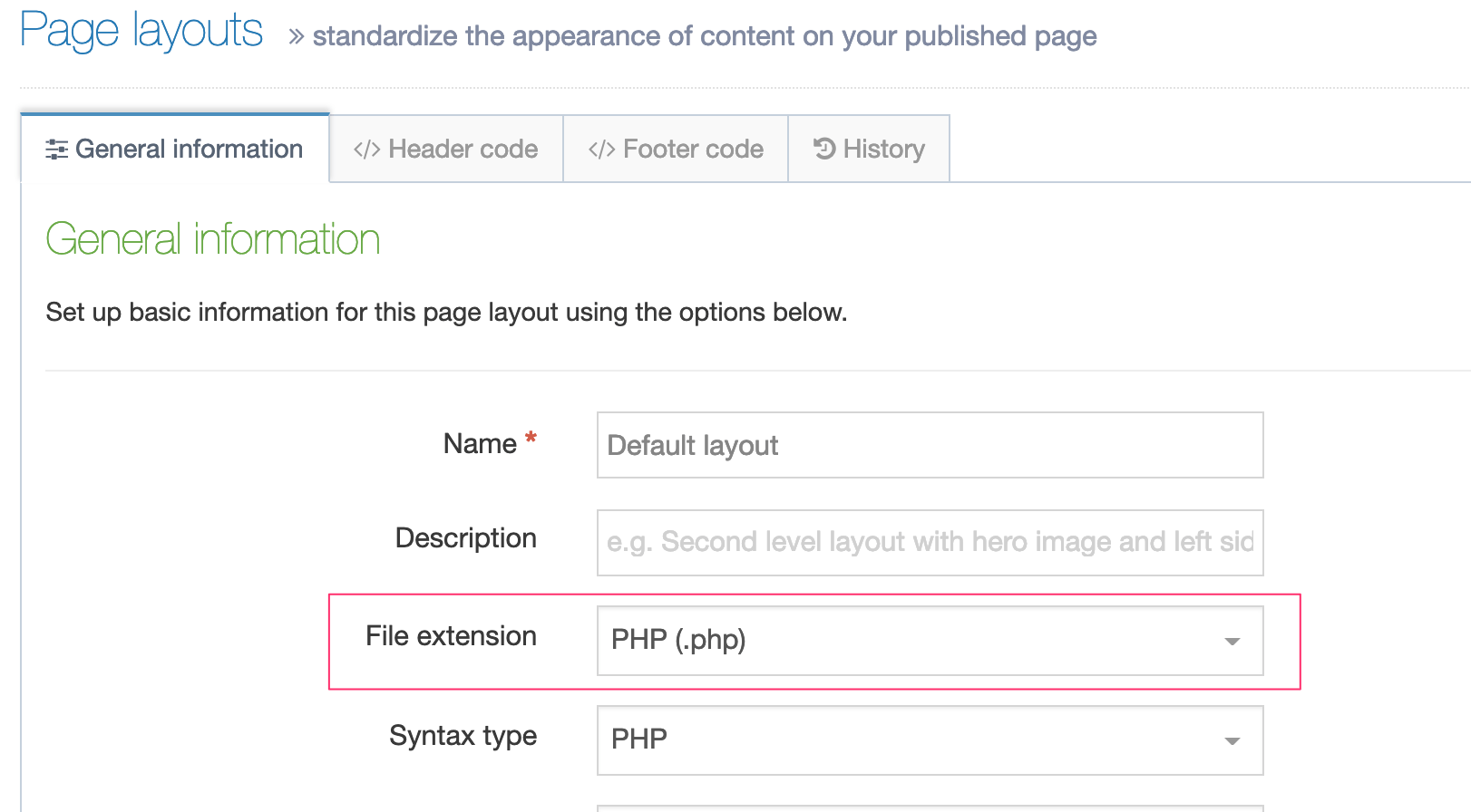
Grant Group Access
Once Access Control has been configured and enabled you can assign Groups to the required Sections in the Site Structure.
- Modify the Section(s) that you wish to control access to.
- Select the Access tab.
- Assign access by enabling the Group(s) that you want to grant access to
Enabling Groups allows members of those Groups access to the published Section. These Groups can consist of both TERMINALFOUR and Visitor Users.
Visitor User
You may have users who are required to access published content but do not require access to Terminalfour or may not be managed by your directory service.
For instance, you may want to grant access to users outside your organization, in this case, Visitor Users can be created. Visitor Users only have access to the published Section(s) and do not have access to the Terminalfour system.
Publish the Channel
Publish the Channel to apply the changes.

Update the Configuration
The only file you need to modify is "Code-Before-Section.php" as this is where the settings for connecting to Terminalfour Site Manager Web Services are held, as well as the base URLs for each Access Controlled section or site.
Web Services Settings
The following three variables store the settings for connecting to TERMINALFOUR Web Services:
// Site Manager Web Services Username, Password & URL
$s_ws_user = 't4wsuser';
$s_ws_pass = 'password';
$s_ws_url = 'http://10.0.0.242/740001/services/';
Each variable must be updated to values which are appropriate for your own Terminalfour installation.
The username and password must log in as a local account within Terminalfour.
The URL specified for Web Services is your Terminalfour URL with "services/" replacing the "SiteManager" part. This URL must be accessible from your Web Server/PHP installation.
Forms & Transactions
Description
Creating and maintaining web forms can be a headache. Not only do you need to create the mark-up (and sometimes scripting too), but you also have to consider who gets notified when someone fills out the form. Not to mention where and how the submissions are stored.
Terminalfour makes this easy with two features:
Form Builder
Form Builder is a WYSIWYG form creation tool that lets you build advanced forms without HTML or scripting. As well as the standard form elements you can add:
- dependencies – if you want to add conditions to your form elements so a text box is displayed when a particular checkbox has been selected, you can
- email notifications – send a copy of each submission, including uploaded files, Terminalfour Users or Groups. Want to send the mail to a non-Terminalfour User? Just add an email address
- reCAPTCHA – want your forms bot-free? You can add Google reCAPTCHA functionality to keep your form submissions human only
- Payment gateway – use Stripe as a payment gateway so you can process credit cards
- customization – with Form Builder you can add classes and IDs to your form elements so you can add your own styling and scripts
- easy to publish – there are three ways to publish forms – T4 Tag, iFrame embed or, if you don't want to add it to a page you can just post a direct link to the form
Form Bank
Form Bank is a cloud-based server that securely stores your form definitions and submissions
- encryption – all form definitions and submissions are encrypted in transit and at rest so you can be sure they are secure
- multi-region – Form Bank servers are located in Australia, Canada, the EU so depending on your data retention policy, you can be confident you know where it's stored
Form Builder
Description
With Terminalfour Form Builder you can create advanced web forms easily without coding. The forms you create can be fully customized to meet your needs.
When you click create new form, you initially start with a blank form. Click on field types to add new fields to your form. Fields include text fields, drop-down boxes, buttons etc. Fields can have dependencies and validations associated with them.
When a form is created and a submission made, Terminalfour creates a corresponding Content Type to manage the content.
To edit or create a new form go to Engage > Forms & Transactions.
Form Listing
Existing forms are listed in the table and can be sorted and filtered by:
- Name
- Last Modified Date
- Usage - the number of instances of this form within Terminalfour
- this can be clicked on to show the number of location of the form instances:

If you are not connected to a Form Bank no forms will be listed and a warning will be displayed on the page.
To edit a form, you can either click on the form name or select Edit from the Actions Menu.
When submissions have been received for a form, they can be viewed from the Submissions option in the Actions Menu.
Have a look at the documentation on Submissions to learn more.
To delete a form select Actions > Delete.
Create a form
Form creation divides into six steps:
- General Settings – add necessary form information such as name and description. You can also apply Bootstrap styling or use your own.
- Fields - select, add and configure form fields. You can also base your form on an existing Content Type
- Dependencies – optional rules that can show or hide a form field based on the value that is input in another. For example, you might want to hide a list of faculty names unless the respondent ticks a box identifying themselves as a faculty member
- Submissions – specifies the location that the submissions will be saved to. By default, this is set to an unpublished Section in TERMINALFOUR but a published Section can be specified too. Fields can also be mapped to a Payment Gateway here. In order to use this, a Payment Gateway must already be configured in System settings. You can also customize the redirects (to a URL or TERMINALFOUR Section) and messages for submission success or failure
- Emails – a copy of each submission can be mailed to one or more Terminalfour Users. Non-Terminalfour user mail addresses can also be added
- Finish – forms can be deployed using:
- a T4 Tag to add to other Terminalfour content or layouts
- embed code to add your form to a page not managed by Terminalfour
- a shareable link that doesn't require a page to be created to deploy it
General settings

| Item | Description |
|---|---|
| Form name | Sets the name used to identify the form in the application. Can be output on form (see option below) |
| Description | Sets the text used to describe the form in the application. Can also be output on the form (see option below) |
| Display options | |
| Show name on form | Outputs the name specified above as a heading (h2) at the start of your form |
| Show description on form | Outputs the description specified above as a paragraph of text at the beginning of your form |
| Include styling |
By default, Terminalfour Form Builder uses Bootstrap CSS to style your form. When this option is unchecked Bootstrap CSS is not added and you can use your own styling. This is only relevant for forms that are deployed with a T4 Tag; both embedded and standalone forms always use Bootstrap CSS. Because the date pickers rely so heavily on styling, if styling is disabled and the form is included on your site using a T4 Tag, the date pickers will not display or function. |
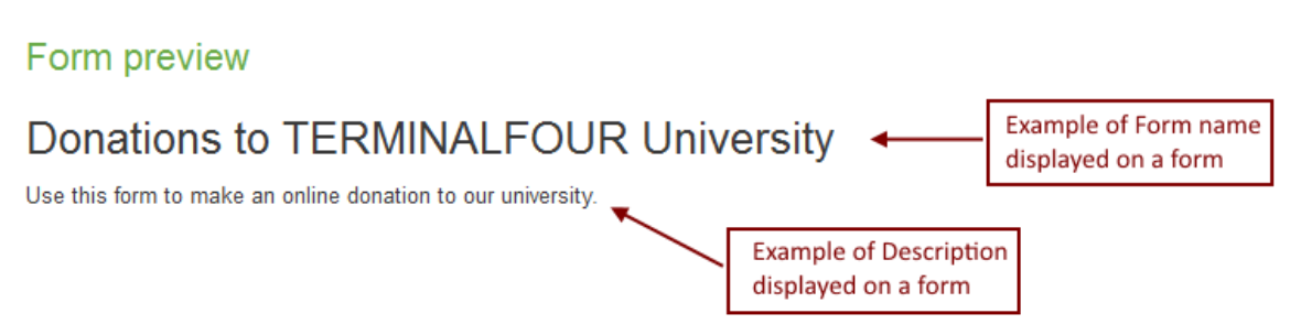
Fields
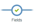
This is where you build your form by adding fields.
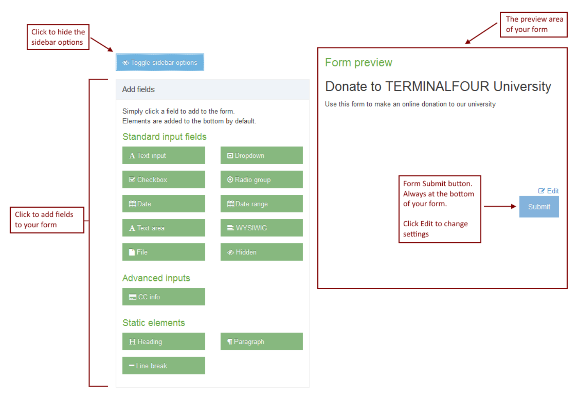
Configure field mappings
Map to Content Type
By default, a Content Type is automatically created for each form you create however you can map the Content Elements from an existing Content Type to your form fields.
The quickest way to do this is to select an existing Content Type from the dropdown list and click Create fields from Content Type. A form will be created with fields that map to the Content Elements in that Content Type:
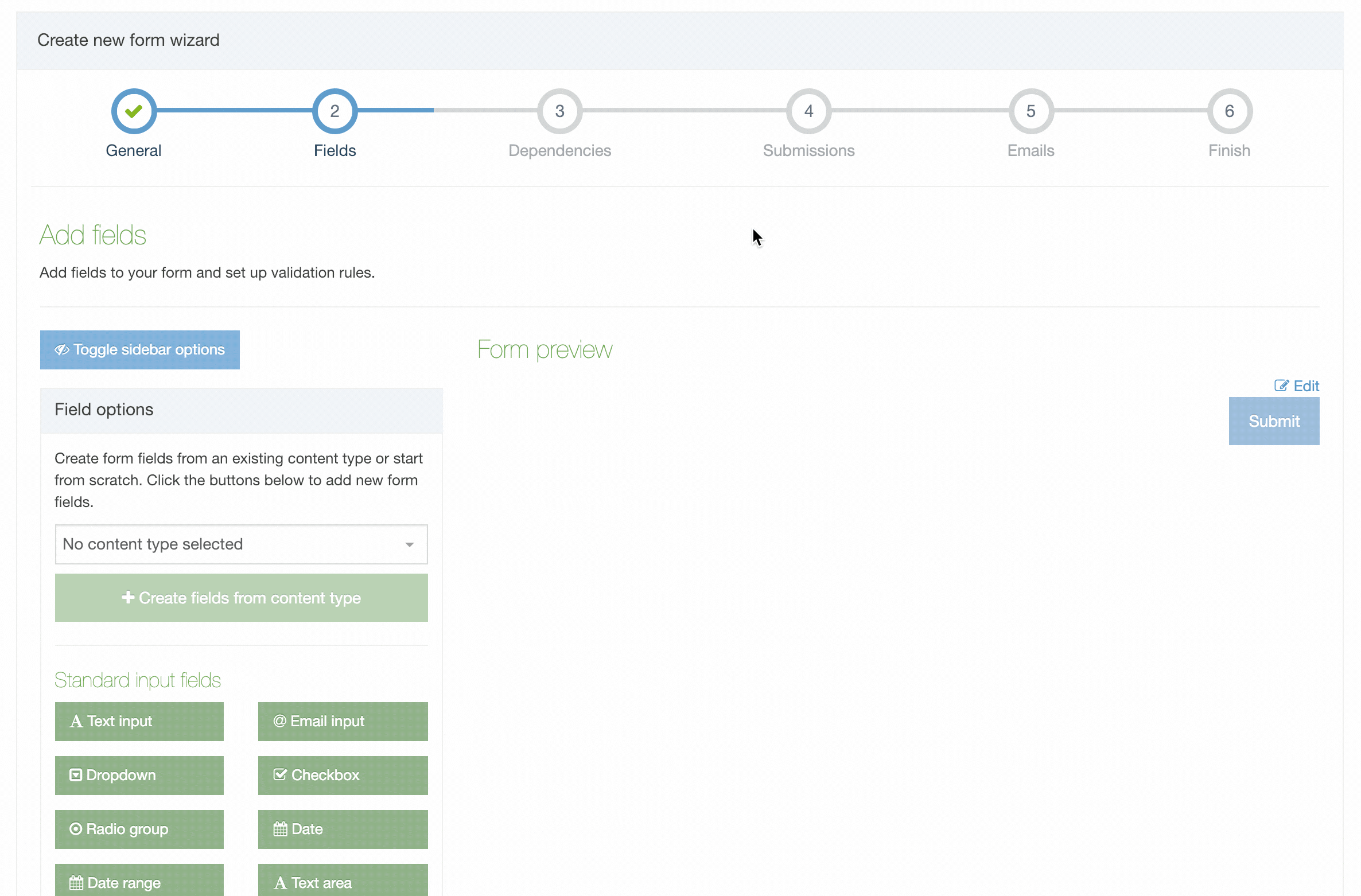
The "Create fields from content type" option is only displayed on new forms that don't already contain form elements. If you have enabled reCAPTCHA on every form, then a form element is added, and you won't see the "Create fields from content type" option.
If you need to change how fields are mapped to the Content Elements, select Configure Field Mapping:
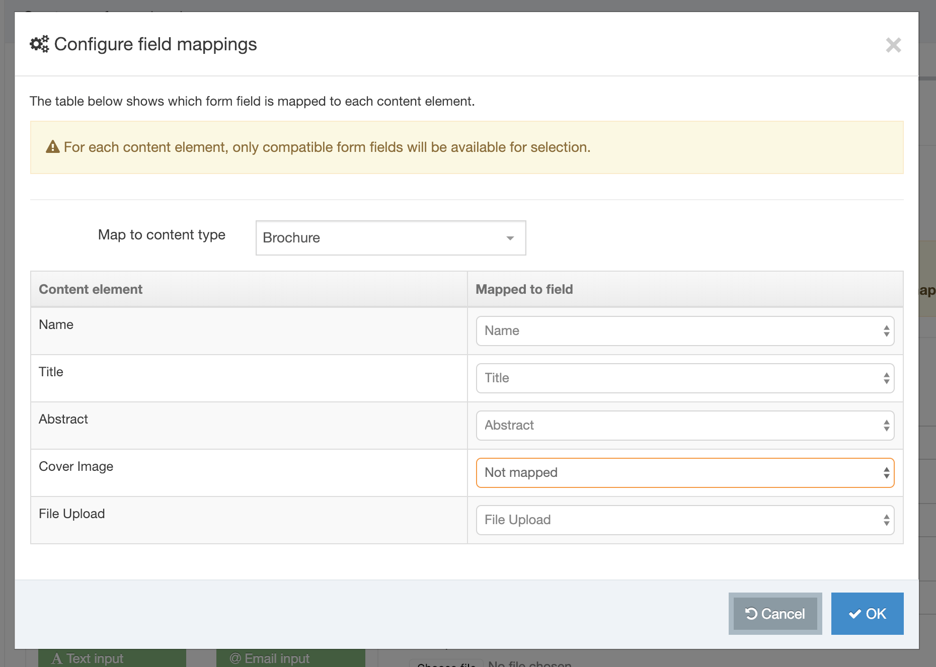
You may notice in the example above that not all Content Elements have been mapped to a field. In this example, one of the elements is a Media File. These do not map to fields. The following field mapping matrix will show you the fields that can and cannot be mapped:
| Field | |||||||||||
|---|---|---|---|---|---|---|---|---|---|---|---|
| Text input | Dropdown | Checkbox | Radio group | Date | Date range | Text area | WYSIWYG | File | Hidden | CC info | |
| Plain Text | ✔ | ✘ | ✘ | ✘ | ✘ | ✔ | ✔ | ✘ | ✘ | ✔ | ✔ |
| Image | ✘ | ✘ | ✘ | ✘ | ✘ | ✘ | ✘ | ✘ | ✘ | ✘ | ✘ |
| HTML | ✘ | ✘ | ✘ | ✘ | ✘ | ✘ | ✘ | ✔ | ✘ | ✘ | ✘ |
| File | ✘ | ✘ | ✘ | ✘ | ✘ | ✘ | ✘ | ✘ | ✔ | ✘ | ✘ |
| Date | ✘ | ✘ | ✘ | ✘ | ✔ | ✘ | ✘ | ✘ | ✘ | ✘ | ✘ |
| Check Box | ✘ | ✘ | ✔ | ✘ | ✘ | ✘ | ✘ | ✘ | ✘ | ✘ | ✘ |
| Select Box | ✘ | ✔ | ✘ | ✘ | ✘ | ✘ | ✘ | ✘ | ✘ | ✘ | ✘ |
| Multiple Select | ✘ | ✘ | ✘ | ✘ | ✘ | ✘ | ✘ | ✘ | ✘ | ✘ | ✘ |
| Radio Button | ✘ | ✘ | ✘ | ✔ | ✘ | ✘ | ✘ | ✘ | ✘ | ✘ | ✘ |
| Cascading List | ✘ | ✘ | ✘ | ✘ | ✘ | ✘ | ✘ | ✘ | ✘ | ✘ | ✘ |
| Media | ✘ | ✘ | ✘ | ✘ | ✘ | ✘ | ✘ | ✘ | ✘ | ✘ | ✘ |
| Decimal Number | ✘ | ✘ | ✘ | ✘ | ✘ | ✘ | ✘ | ✘ | ✘ | ✘ | ✘ |
| Whole Number | ✘ | ✘ | ✘ | ✘ | ✘ | ✘ | ✘ | ✘ | ✘ | ✘ | ✘ |
| Section/Content Link | ✘ | ✘ | ✘ | ✘ | ✘ | ✘ | ✘ | ✘ | ✘ | ✘ | ✘ |
| Multi-select List | ✘ | ✘ | ✘ | ✘ | ✘ | ✘ | ✘ | ✘ | ✘ | ✘ | ✘ |
| Content Owner | ✘ | ✘ | ✘ | ✘ | ✘ | ✘ | ✘ | ✘ | ✘ | ✘ | ✘ |
| Group Select | ✘ | ✘ | ✘ | ✘ | ✘ | ✘ | ✘ | ✘ | ✘ | ✘ | ✘ |
| Keyword Selector | ✘ | ✘ | ✘ | ✘ | ✘ | ✘ | ✘ | ✘ | ✘ | ✘ | ✘ |
| ✔ | ✘ | ✘ | ✘ | ✘ | ✘ | ✘ | ✘ | ✘ | ✘ | ✘ | |
Forms that have incomplete mappings are highlighted with an alert badge in the Existing Form table:
Field / input types
To get started, click on a field type to add it to your form:
| Icon | Field type | Description |
 |
Text input | Adds a text input used for text, numbers, passwords, web addresses etc. |
 |
Email input | Adds an email input with an option to allow the user to receive a confirmation of their submission by email |
 |
Dropdown | Allows users to select a single option from a dropdown |
 |
Checkbox | Allows multiple options to be selected from a group |
 |
Radio group | Allows users to select a single option from a group |
 |
Date | Allows users to select a date and optional time |
 |
Date range | Allows a start and end date to be set |
 |
Text area | Allows multiple lines of text to be entered |
 |
WYSIWYG |
Displays a WYSIWYG editor to enter HTML. TinyMCE, the WYSIWYG editor that Form Builder uses, follows the WAI specification making it compatible with screen readers. |
 |
File | Uploads a file |
 |
Hidden | Adds an input that will submit a value without the user seeing it |
| Advanced inputs | ||
 |
CC info | Adds the required fields to accept payment information from the user. i.e. credit card number, expiry date etc. Only one occurrence allowed per form |
 |
reCAPTCHA | Adds a to help prevent spam submissions (available from Terminalfour v8.2.10) |
| Static elements | ||
 |
Heading | Adds a Heading to the form |
 |
Paragraph | Adds text to the form - useful to explain parts of your form to users |
 |
Line break | Adds a line between fields to divide the form into sections |
Field settings
Once added, each field can be edited.
General
| Field/input data type | Item | Description |
|---|---|---|
| All | Label | Sets the label displayed |
| All | Hide | Hide the label from the user |
| All | Required field | Sets the field as required |
| All | Tooltip text | Sets the text displayed when hovering over the form field |
| All | Placeholder text | Sets the text displayed in the form field |
| Confirmation email settings |
Allow a user to receive a copy of their submission: Enables the user to receive a copy of their submission, sent to the email they enter in this field Email subject: Sets the subject of the confirmation email Customize the confirmation message: You can customize the message that will appear before the copy of the submission |
|
| Dropdown, Checkbox, Radio group | Field options |
|
| Text area | Number of rows | Sets the number of text rows in the textarea |
| Hidden | "value" attribute | Specifies a value for this field when the form is submitted |
| File | File storage method |
This method is currently not functioning as intended and should not be used while a fix is being implemented.
|
Advanced
| Item | Description |
|---|---|
| "name" attribute | Specifies a specific HTML name attribute for this field when the form is submitted |
| Input data type | Specifies an HTML5 data type for this input. For example a number or web address. Validation for these additional types is handled automatically. Options are; Text, Email address, Number, Password, Telephone number, URL / Web address |
| CSS class | Specifies a CSS class to be added to the field |
| ID | Specifies a specific id attribute for this field |
Validation
Validation can be set for different input data types.
| Field/input data type | Item | Description |
|---|---|---|
| Text, Email address, Number, Password, Telephone number, URL / Web address, Date, Date range, Text area | Required field | Sets the field as required |
| Text, Telephone number | Validation text pattern | Specifies a regex pattern to use to validate the field |
| Text, Email address, Password, Telephone number, URL / Web address, Text area | Minimum length | Ensure that input has at least N characters |
| Text, Email address, Password, Telephone number, URL / Web address, Text area | Maximum length | Ensure that input has less than or equal to N characters |
| Number | Minimum value | Ensure that input will not be lower than this value |
| Number | Maximum value | Ensure that input is not greater than this value |
| Password | Must match another field | Ensure that this field has the same value as another |
| Password | Must contain a numeric digit | Digit from 0 to 9 |
| Password | Must contain a symbol | Any of the following symbols will be valid: %+\/'@!#$^?:.(){}~[]-_ |
| Password | Must contain a capital letter | Must contain a capital letter |
| Date, Date range | Minimum date | Ensures the date set is later than this date |
| Date, Date range | Maximum date | Ensures the date set is earlier than this date |
| Date range | Min date range difference | Ensures that the second date in a range must be at least the specified amount after the first selected date. Time scale options are; Hour(s), Day(s), Week(s), Month(s), Year(s) |
| File | Accepted file extensions |
|
| File | Max upload size |
|
Submit and Reset buttons
| Item | Description |
|---|---|
| Button text | Sets the text displayed on the submit button |
| Show Reset Button | Adds a reset button to the form that allows users to clear all fields |
Firing a Google Tag Manager Custom Event
When the user clicks the submit button a Google Tag Manager (GTM) custom event named formSubmitted is fired, which also contains the name and description of the form:
{
  'event':'formSubmitted',
  'formName': 'The form name',
  'formDescription': 'The form description'
}
This event can be used in Google Tag Manager so form submissions are tracked.
Dependencies
Dependencies show and hide fields based on the rules you provide.
Dependencies read like a sentence and allow you to show or hide a field based on the value of another one. Click the 'Add dependency' button to get started.
For each dependency, you can have one or more "if" statements and then can show or hide another field based on those conditions.
The operators for the if statements will vary based on the field input type:
- is
- is not
- contains
- does not contain
- is selected
- not selected
- begins with
- ends with
- is populated
- is not populated
From version 8.3.5 the conditions have been simplified so the dependency rule will be triggered:
- "If all" conditions are true (an AND statement)
- "If any" of the conditions are true (an OR statement)
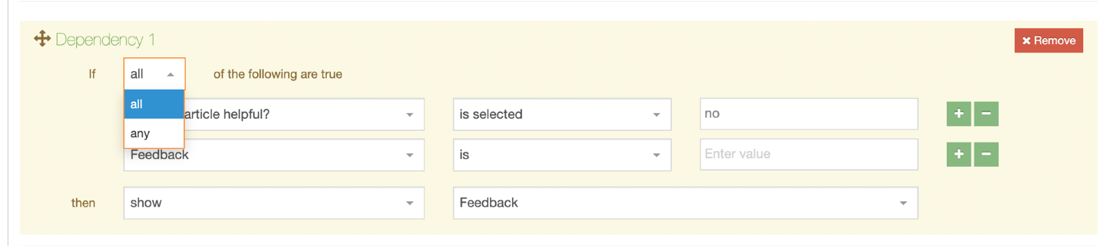
The 'option value' should be entered rather than the 'option text' for any list-based fields.
Submissions
When your form is created you will have to consider what happens to the data when the form is submitted.
By default, submissions are saved in an unpublished Section, but you can also specify the Section to save submissions to – either a specified Section or a Child of the Section that an instance of the form appears in. You can also send submitted data to a payment gateway.
| Item | Description |
|---|---|
| Save submissions to |
|
| Submission Name Mapping | By default, each submission is given the same name as the form. Finding the right submission can be difficult when faced with a large number. Instead, you can map a field so its value is the submission name, e.g., if one of your fields is an email address you can map this as the submission name making it easier to identify a particular submission. |
| Channel Mapping |
If you are saving submission to a "Named Child Section" or a "Specified Section" and you intend to publish the submissions, you can associate a Channel to publish the content with. Submissions saved to Terminalfour only cannot be published. |
Submission Statuses
When your form is successfully submitted a new entry is added to the submission database table in Form Bank with a status of "pending". On a failed submission, no entry is added to the database.
When Form Builder imports the "pending" submissions from Form Bank to Terminalfour, the status of pending entries is changed to "received".
The following two scenarios could result in a failed submission:
- A Password input type with validation (added via the Validation tab) that requires a capital letter. When a form is submitted without a capital letter in the password input value the Form Bank server will throw a validation error that will result in a submission failure message.
- Shutting down Form Bank server right before submitting a form triggers a connection error
You should always test your form before deploying.
On a successful submission
When a submission is successfully saved the default message displayed to the end-user appears:
The following options can be edited:
| Item | Description |
|---|---|
| Show a message |
You can amend or change the default message text entirely. There's a limit of 256 characters on the text entered |
| Redirect to a Terminalfour | Select a Section to redirect to following a successful submission |
| Redirect to a URL | Enter a custom URL to redirect following a successful submission |
On a failed submission
When a submission has failed, the default message displayed to the end-user appears:
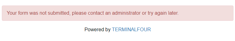
The following options can be edited:
| Item | Description |
|---|---|
| Show a message |
You can amend or change the default message text entirely. There's a limit of 256 characters on the text entered |
| Redirect to a Terminalfour | Select a Section to redirect to following a failed submission |
| Redirect to a URL | Enter a custom URL to redirect following a failed submission |
Additional Submission Options
Webhook URL
When a form submission is received in Terminalfour, the submission data will be sent to the URL in the Webhook URL field.

Example Payload
Below is an example of a a payload that would be sent in a form submission.
Payment gateway/credit card fields are ignored and not sent in the webhook request.
File upload fields are ignored and not sent in the webhook request.
{
"data": {
"formFields": [
{
"Name": "Form test",
"fieldName": "Name",
"fieldValue": "Form test"
},
{
"Are you filling surname 1": "Yes",
"fieldName": "Are you filling surname 1",
"fieldValue": "Yes"
},
{
"Check any option that apply": "Option 1, Option 3",
"fieldName": "Check any option that apply",
"fieldValue": "Option 1, Option 3"
},
{
"Comment": "This is a comment",
"fieldName": "Comment",
"fieldValue": "This is a comment"
},
{
"Date with time": "2024-03-27T12:32:00Z",
"fieldName": "Date with time",
"fieldValue": "2024-03-27T12:32:00Z"
},
{
"Email": "test@test.com",
"fieldName": "Email",
"fieldValue": "test@test.com"
},
{
"Pick a date": "2024-03-28T12:32:00Z",
"fieldName": "Pick a date",
"fieldValue": "2024-03-28T12:32:00Z"
},
{
"Select an option": "Option 1",
"fieldName": "Select an option",
"fieldValue": "Option 1"
},
{
"Surname1": "This is my surname",
"fieldName": "Surname1",
"fieldValue": "This is my surname"
},
{
"Text": "Some text",
"fieldName": "Text",
"fieldValue": "Some text"
},
{
"Text (1)": "Some text",
"fieldName": "Text (1)",
"fieldValue": "Some text"
},
{
"HTML": "<p>This is an <strong>example</strong>, let's see how is displayed",
"fieldName": "HTML",
"fieldValue": "<p>This is an <strong>example</strong>, let's see how is displayed"
}
],
"formID": 1,
"formName": "Form test",
"submissionURL": "http://example.com/form/MS1lbg==",
"submissionIP": "0:0:0:0:0:0:0:1",
"submissionTimestamp": "2024-03-15T12:33:29Z"
},
"event": "form_submission_add",
"id": 7,
"requestType": "Terminalfour Form Submission",
"timestamp": "2024-03-15T12:34:09.674Z"
}
Error handling
If Terminalfour receives a 200 response from the endpoint you supply the submission we will consider that successfully delivered.
If there is no response, or if we receive an error response, we will retry sending the submission every 10 minutes (be default). After 5 successive timeouts or errors for a given submission we'll display a notification in the main header area of Terminalfour for admins.
Payment gateway field mappings
When a Payment Gateway has been configured and a CC Info field has been added to the form you can select the configured Payment Gateway from a drop-down list.

You can specify values for all submissions here, map them to values submitted in the form, or even calculate them from the values of multiple fields in your form.
| Item | Description |
|---|---|
| Amount |
The amount can be set in one of three ways:
|
| Currency |
The currency can be set in one of two ways:
|
Emails
There are two types of emails that can be sent from Form Builder:
- Submission email
- the emails sent to specified Terminalfour Users or Groups or external (non-system) recipients when the form receives a submission
- Confirmation email
- this is the email that is sent to the user who has submitted the form (if they have provided their email); it can also contain a copy of their submission
Submission email
The submission mail is sent to specified Terminalfour Users and Groups as well as external mail addresses.
These are the options:
| Item | Description |
|---|---|
| System Users and Groups |
Select the Terminalfour Users or Groups who you would like to receive submissions via email. The table lists all Terminalfour Users and Groups, it displays the type of user, their first and last name and their username. The table can be filtered based on any of these values, the "Restrict by user type" drop-down will filter the table based on which value is selected. |
| Non-system recipients |
The email address(es) of non-Terminalfour Users who will receive copies of each submission. Use this option if a user with the email address does not already exist within your system. Multiple addresses should be comma-separated. If a Terminalfour Group or User is selected, and their email is also entered manually, the Terminalfour entry will be used. Only one email will be sent per email address, even if the email is duplicated between Terminalfour and non-Terminalfour users. |
| Additional Options | |
| Subject field mapping | The subject field mapping will include the text value from a specified field in the email subject, it will take the form of "Terminalfour form submission - <form name> - <value mapped in the subject field mapping>" you will only be able to choose form fields that produce text output, i.e., file fields will not be listed here. |
| Recipient minimum user level |
The "Recipient minimum user-level" will control the Minimum User Level a submission email will be sent to. This only applies to Groups, e.g., if this is set to Administrator and a Group is selected as a mail recipient, only Administrators in that Group will receive an email. |
| Sender / Reply-to mapping |
As well as Terminalfour Users and Groups you can also specify the email address(es) that you'd like to use for the sender and reply-to value. You can use one of the following options:
|
Any files included in a form submission will be attached to the email. In the email itself, the label of the file field will appear with the file name next to it.
If your Terminalfour instance is cloud-hosted with AWS, the submission emails (including attachments) cannot exceed 10MB.
Confirmation email
When a submission is successful, you can select who receives an email with the submission values. Confirmation emails can only be sent from a form that includes an email input field.
To configure the confirmation email:
- Select Allow a user to receive a copy of their submission in the Confirmation email settings
- You can customize the Email subject text in the email that's sent
- By default, this message that appears above the submission text in the confirmation email is "Below is a copy of the information you sent to us". You can change the text by clicking on Customize the confirmation message. This will bring you to the Emails tab, where you can add the custom text.
If you are setting up a new form, the form will be saved before you can customize the text.
Customizing the confirmation message
You can customize the header and footer of the email by clicking on the Customize the confirmation message link and adding the custom header and footer:
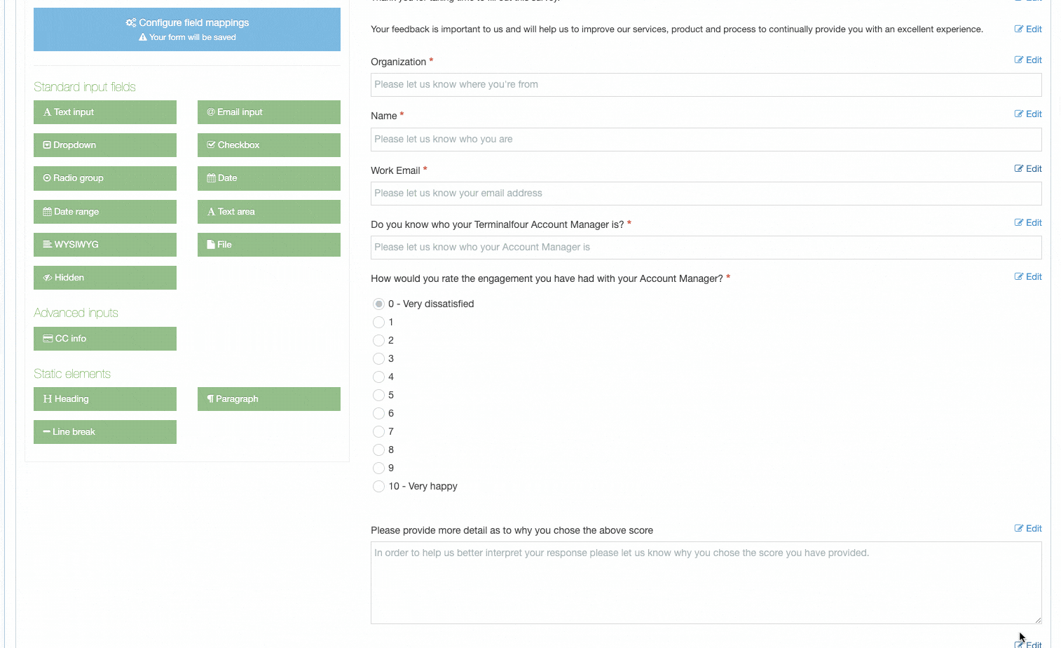
The following HTML tags and attributes can be added to the custom header and footer:
| Tag | Attribute |
a |
class, href, id, style |
b |
class, id, style |
br |
class, id, style |
div |
align, class, id, style |
h1 |
align, class, dir, id, style |
h2 |
align, class, dir, id, style |
h3 |
align, class, dir, id, style |
h4 |
align, class, dir, id, style |
h5 |
align, class, dir, id, style |
h6 |
align, class, dir, id, style |
hr |
align, size, width |
img |
align, border, class, height, hspace, id, src, style, vspace, width |
li |
class, dir, id, style, type |
ol |
class, dir, id, style, type |
p |
align, class, dir, id, style |
span |
class, id, style |
strong |
class, id, style |
table |
align, bgcolor, border, cellpadding, cellspacing, class, dir, frame, id, rules, style, width |
td |
abbr, align, bgcolor, class, colspan, dir, height, id, lang, rowspan, scope, style, valign, width |
th |
abbr, align, background, bgcolor, class, colspan, dir, height, id, lang, scope, style, valign, width |
tr |
align, bgcolor, class, dir, id, style, valign |
u |
class, id, style |
ul |
class, dir, id, style |
When the Allow a user to receive a copy of their submission box is selected, the user will see a checkbox beside the email input:
The confirmation mail looks like this:
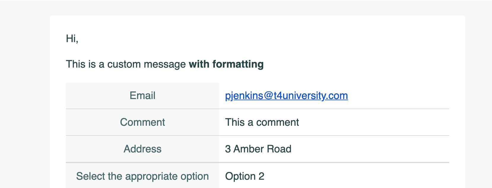
Finish
Once you have created and configured your form there are three ways you can configure it:
- T4 Tag
- Embed code
- Shareable link
Just copy and paste one of the code snippets to deploy your form.
If your form is added with a T4 Tag and contains a WYSIWYG input type you must ensure that the Page Layout that the form is deployed with explicitly has a doctype declaration (<!DOCTYPE html>). If this isn't present, input data will not be saved.
This is because TinyMCE enforces strict standards mode
Forms added with the embed code or those that use a shareable link are not affected by this.
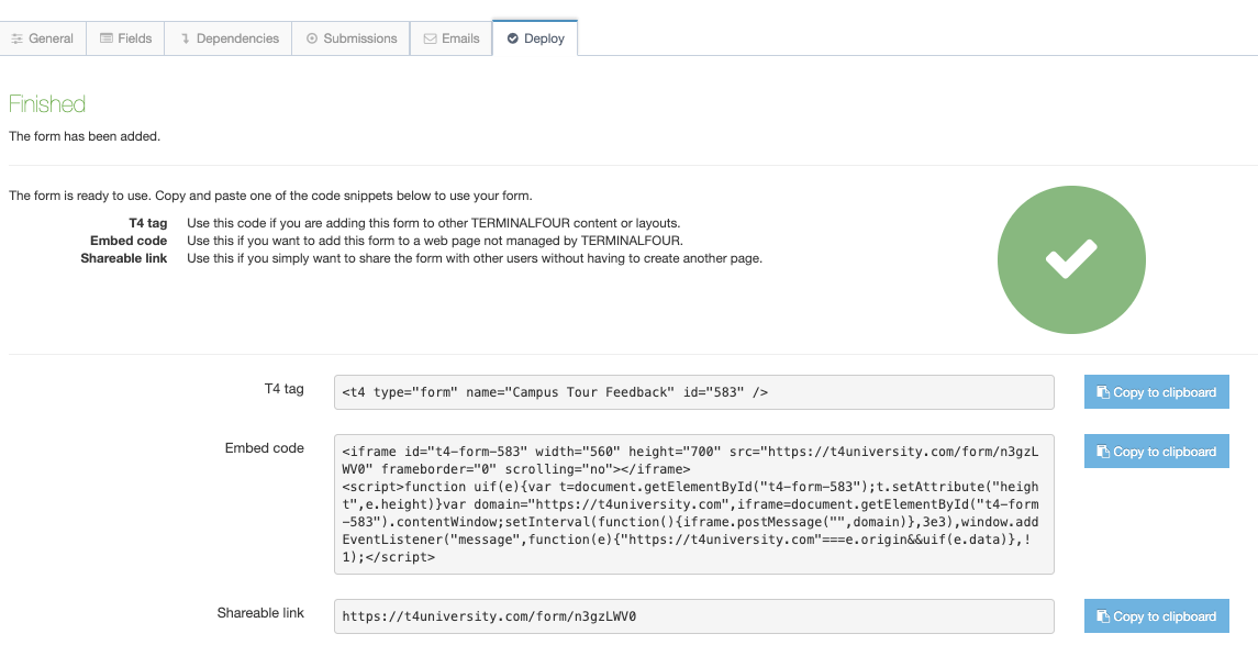
| Item | Description |
|---|---|
| T4 Tag |
Use this code if you are adding this form to a Terminalfour site. The tag can be added to the following:
Content Items (it will need to be parsed), Content Type, Content and Page Layouts |
| Embed Code | Use this if you want to add this form to a web page not managed by Terminalfour |
| Shareable link | Use this if you simply want to share a standalone form with other users without having to add it to another page |
Form Bank
Description
Form Builder allows you to easily create advanced web forms without programming. Forms can be fully customized to meet your needs. Features include payment processing and reCAPTCHA bot detection.
The definition and submission data from Form Builder forms is stored on a dedicated, cloud-based Form Bank server that your TERMINALFOUR installation authenticates with. To keep you aligned with data retention legislation, Form Bank server locations are region specific. This lets you know where submitted data is stored. The following regions are currently available:
- Australia
- Canada
- European Union
- United States
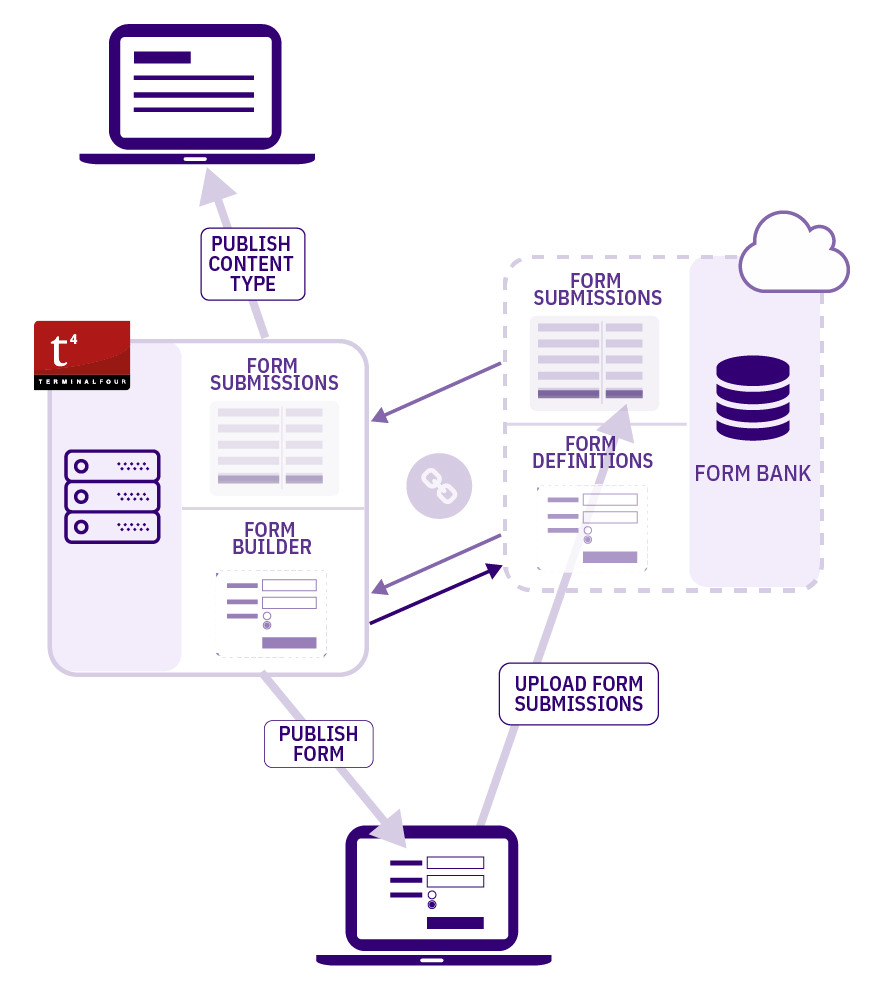
The Form Builder FAQ page has further details on the server architecture and security.
Connect to Form Bank
A connection to Form Bank must be configured in System Administration > System Settings > Form Builder. The Form Bank is where the form definition information and submission data is stored. The Form Bank URL is region dependent.
You can obtain a region-specific URL from Terminalfour support. This is entered in the input box labeled Form Bank URL. Click Authenticate.
When authenticating, Terminalfour generates a private/public key pair, the private key is stored in the Terminalfour "contentstore" directory. Terminalfour then takes the current active license hash and the public key together with client information and sends this to the Form Bank. Form Bank saves this information and returns a customer ID to Terminalfour.
Since Form Bank works only over SSL your Terminalfour server must have an SSL cert.
When the keys are exchanged a token is generated on the Form Bank server, encrypted using the public key and sent back to Terminalfour. Terminalfour decrypts this token and this is then used for between Terminalfour and the Form Bank. A new token is generated at ongoing intervals.
If the there's an issue with your Form Bank connection or if Form Bank becomes unavailable then a connection error w.ill be show in the Notification center.
Disconnect from Form Bank
To disconnect Terminalfour from Form Bank, select the Disconnect button. When Disconnected, you will be unable to access, edit or view any forms on the Form Bank server.
While you can use Form Bank servers from more than one region, you can only connect to one server at a time and only the forms from the currently connected Form Bank server will be available within Terminalfour.
When disconnecting from a Form Bank server, the data is not removed. On reconnection, existing forms and submissions will still be available.
Form Bank FAQs
- Last Modified:
- 30 Jan 2025
- User Level:
What level of security is used?
Terminalfour generates a unique RSA public/private key pair. The public part of this key pair is uploaded to Form Bank. This upload can only be completed over Secure HTTP (HTTPS). The private part of the key pair remains on your server at all times. Forms and their submissions are encrypted in transit using HTTPS/TLS and encrypted at rest using AES-128-bit encryption and the generated RSA public key. This data cannot be decrypted without the private key.
See Form Bank Configuration for more information.
How do email notifications work?
You can configure who receives a notification email when a new submission is created; this includes Terminalfour Users and Groups. You can also add the email addresses of non-Terminalfour users. The mail that is sent includes the submission content and is HTML.
Does the Form Builder require the live website to interact with the Terminalfour server?
No - a connection between the web server and the Terminalfour server is not required. Please see the architecture section for further information.
How are the submissions stored?
Submissions are stored temporarily on the Form Bank servers. The Form Bank does not require direct access to the Terminalfour server. However, the Terminalfour server needs access to download the configured forms and the generated submissions. On a timed basis (via a scheduled task), the Terminalfour application will connect to the Form Bank server (using HTTPS). Once correctly authenticated, the application will download all new encrypted form data. When the encrypted form data has been downloaded, it is decrypted using the customer's unique private key and added to the Terminalfour database.
Once this download has been completed successfully, the data is deleted from the Form Bank server. When the first submissions for a form are downloaded to the Terminalfour server, a Content Type is created. The submission is then saved in the Content Type in a hidden Section or the section you have specified submissions to save to in the Form's settings. This Section can be accessed from the form listing page. Please note that submissions can then be mirrored into a Section and published as regular content.
Since downloaded submissions on Terminalfour are decrypted, other appropriate security measures should be implemented to safeguard access to submissions. Such measures include applying Edit Rights to the submission Section and the form's Content Type, encryption of the Terminalfour database, and implementing processes for processed submissions (deleting the submission or editing confidential information).
Can file upload sizes be limited on a per-upload field basis?
When selecting and configuring file input fields, you have the option to specify a max-upload size under the "Validation" tab. By default it will use the Terminalfour server's max upload size.
Can we restrict file types on a per-upload field basis?
Yes, it is possible to specify permitted file extensions under the validation options for File inputs.
Are the files scanned for malicious code/viruses upon upload?
This is dependent on the anti-virus setup on the user's PC and the Terminalfour server.
How are the files stored/accessed? Is it possible to have them easily downloaded?
Submitted files cannot be easily accessed outside of Terminalfour. They are protected using the client's license and encrypted using the private key generated when connecting to the Form Bank. Once the file is downloaded to Terminalfour, it is attached to the submission content and can be published like any other file that is part of the system.
Please see "How are submissions stored?".
Where are the Form Bank servers located?
We currently have four locations available as follows:
- Ireland
- North Virginia, USA
- Sydney, Australia
- Central Canada
What redundancy is provided for the Form Bank servers?
The Form Bank servers comprise multiple nodes in a cluster. This will provide both the performance and resilience required for this service.
What happens if my Terminalfour server is down?
The submissions will be stored on the Form Bank server until the scheduled task on the Terminalfour server requests to download them.
The forms will still operate as they are called from the Form Bank server.
Can I use my own Form Bank server?
At the moment, you can use the SaaS Form Bank servers provided by Terminalfour. If there are sufficient requests for client-specific Form Bank servers, we will consider this in the future.
Do I need SSL on the web server?
It is recommended but not required. The form will work via a web server with http, as it will be loaded over https and submitted over https on the Form Bank server. If the site has https, then the browser will display it as being secure; this is why we recommend the site also runs over https.
Is there any spam protection on forms?
A Cross-Site Request Forgery (CSRF) token guarantees one-time form submissions to prevent spam. When the form is requested, the browser is given a token. The form can only be submitted once with the token and before the token expires.
In addition, reCAPTCHA can be added to your form.
Form Bank Configuration
Description
Forms are stored on a dedicated Form Bank server, which your Terminalfour creates a connection and authenticates with. Form submissions are all handled through the same Form Bank server. Terminalfour has a number of Form Bank servers located around the world and you need to connect to the Form Bank for your region.
The Form Builder FAQ page has further details on the server architecture and security.
Form Bank connection
To configure the Form Builder, go to System administration > System settings > Form builder:
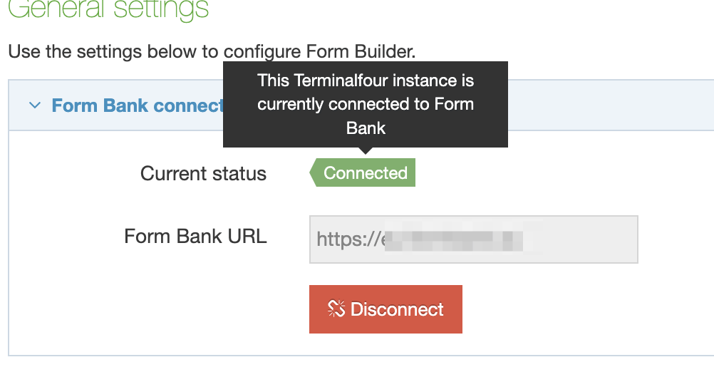
Current status
Displays the status of the Form Bank connection status:
| Status | Description |
|---|---|
| Not connected | This Terminalfour instance is not connected to Form Bank. To connect to Form Bank, enter the Form Bank URL and click "Connect" |
| Connected | This Terminalfour instance is currently connected to Form bank |
| Connection error | Terminalfour could not connect to Form Bank. This can be caused by network or availability issues which are usually resolved in a short amount of time. If not, you should contact Terminalfour Client Support. |
| Validation error | Form Bank could not validate the connection details for this Terminalfour instance. This may occur if the configuration has been changed recently or is no longer valid. You can contact Terminalfour Client Support for assistance |
Form Bank URL
Enter the URL for the Form Bank server, as provided to you by Terminalfour and click the Connect button
Once you have authenticated your Form Bank connection, all forms will be saved to your Form Bank. The public form is pulled from Form Bank and all data submitted by a form is sent to the Form Bank.
Security and Authentication
When you connect to the Form Bank server, TERMINALFOUR creates a key pair. The private key is saved locally in a password-protected Java key store. The public key is sent to the Form Bank server.
Connection to the Form Bank from the public is via HTTPS (SSL) only; this avoids fallback, removing the possibility of "man in the middle (MitM)" attacks on the public forms.
Form submissions are saved with 2 phase encryption using RSA and AES; the submitted forms can only be unlocked using the private key.
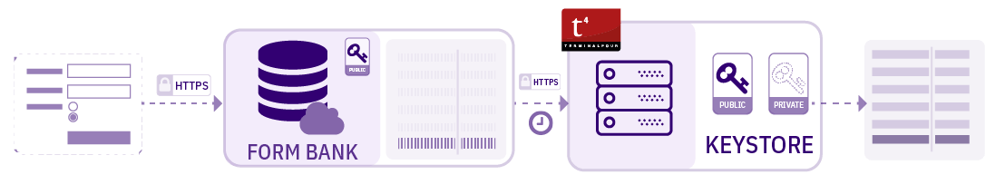
Our Form Builder FAQ page has further details on the server architecture and security.
To prevent against spam, a Cross-Site Request Forgery (CSRF) token is used to guarantee one-time form submissions. When the form is requested, the browser is given a token. The form can only be submitted once with the token and before the token expires.
Submission Downloading
After linking to the Form Bank server, TERMINALFOUR will automatically create a Scheduled Task to download form submissions into your instance of TERMINALFOUR.
For versions prior to 8.1.6, the scheduled task will need to be created manually in the Task Scheduler.
By default, Submissions are downloaded every 10 minutes. You can change this by going to System Administration > Task Scheduler. Filter for the word "form". The item called named "Formbank submission import" has an Execution Interval of 10 minutes:
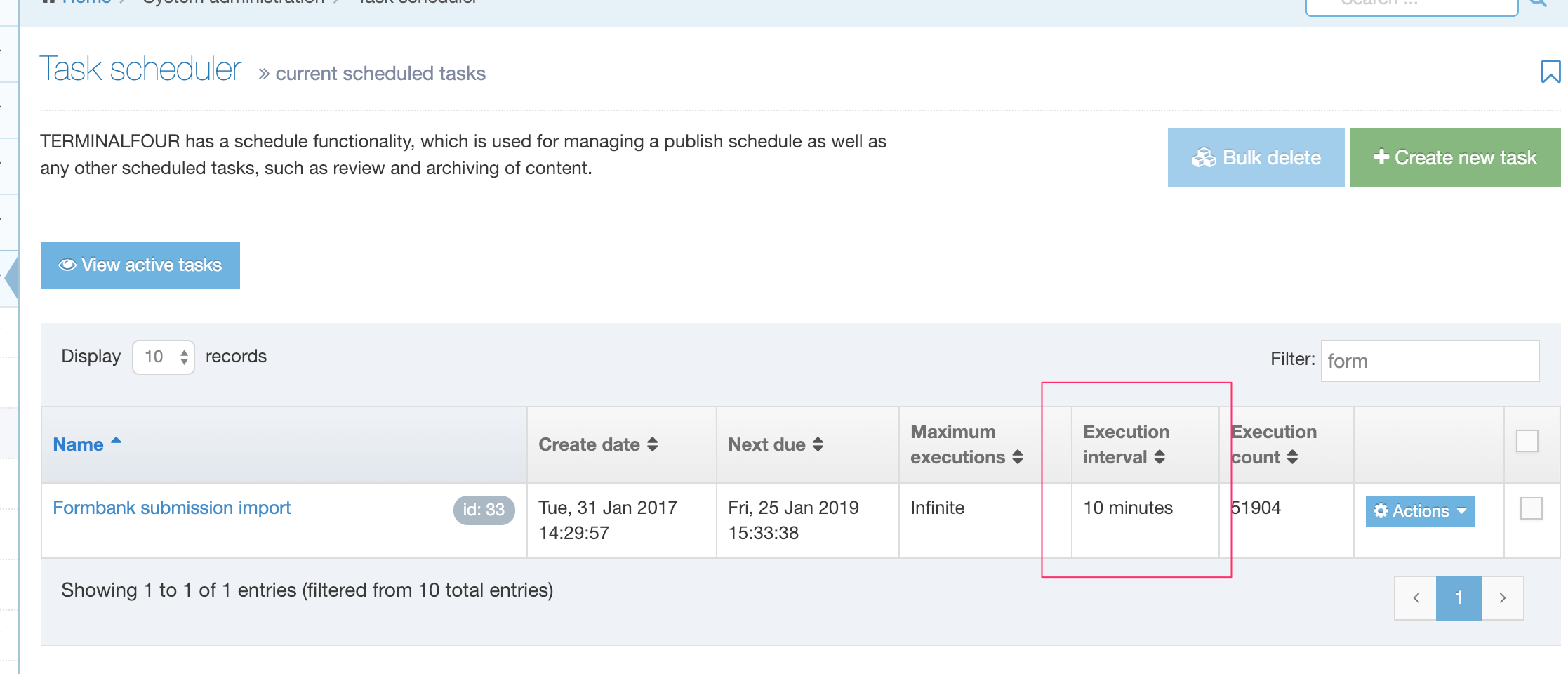
Click on the name or go to Actions > Edit and change the Execution Interval.
Learn more about Submissions here.
Manually Sync Submissions
From 8.3, you can force a re-index of submissions if submissions have not synced.
When "Sync submissions" is clicked, an alert is displayed at the bottom of the screen.
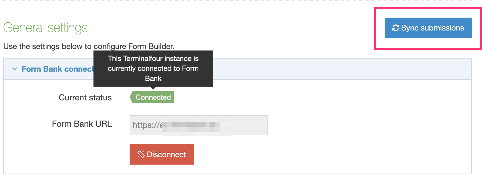
reCAPTCHA setup
Description
With reCAPTCHA you can bot-proof your forms by ensuring that they're filled out by humans. Terminalfour offers reCAPTCHA validation on all the forms you create with Form Builder. There are reCAPTCHA FAQs here.
In late 2025 Google are beginning the process of removing support for reCAPTCHA classic. Meaning that keys generated from the reCAPTCHA Admin Console will stop working unless you migrate them to reCAPTCHA enterprise (no change required in Terminalfour) or, you generate new keys in reCAPTCHA Enterprise Cloud console (instructions below).
Google have provided a guide on how to migrate old keys that were originally created in the reCAPTCHA console.
The instructions below outline how to generate keys from the Google Cloud Console which is the most up-to-date method for generating reCAPTCHA keys.
Create reCAPTCHA keys in Google Cloud
Log in to your Google Cloud account and ensure you're in the correct project for your site.
If you don't have any existing projects you can create a new one.
You can now navigate to "Security > reCAPTCHA" and ensure that you enable the Enterprise reCAPTHCA API.
You can now click "Get started" to begin creating a key.
Creating Keys
Provide a display name that's descriptive to help you locate these details in the future.
Ensure the Application type is set to "Web"
Under domain list, add each domain that will contain Terminalfour forms. You can disable domain verification but Google do not recommend it.
If you are creating AMP pages, you can choose to allow the key to work with AMP pages. If you're unsure, this can be left disabled.
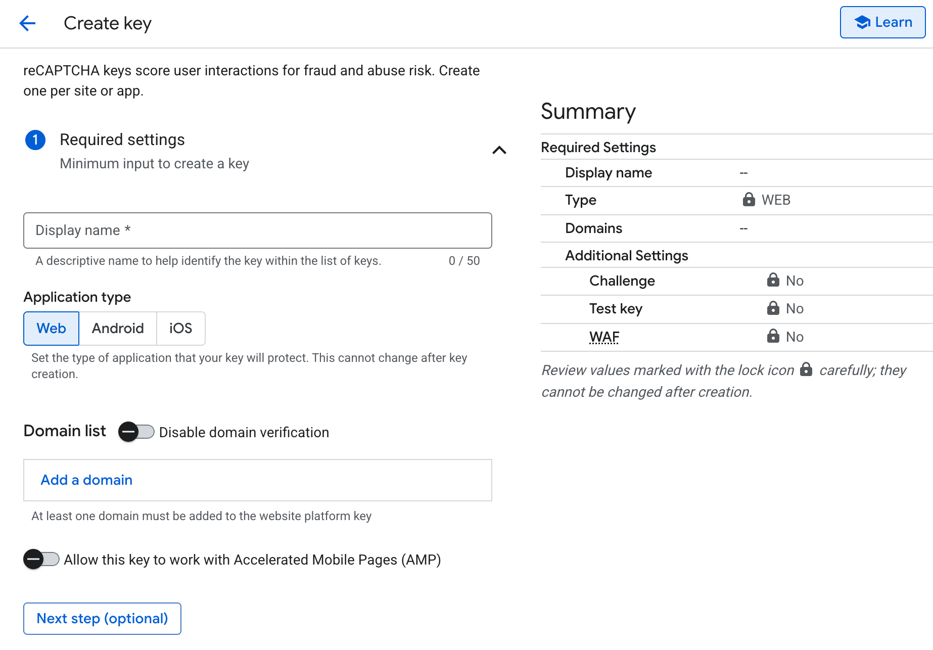
Once you've entered your settings, scroll to the very bottom of the page and click "Create key"
At this point you'll need to copy keys which you'll add into Terminalfour.
The ID (previously named Site key) and the Secret key will both be required.
The Site key can be found at the top of the page.
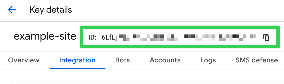
To retrieve the Secret key, click the "Integrate with a third-party service or a plug-in" button.
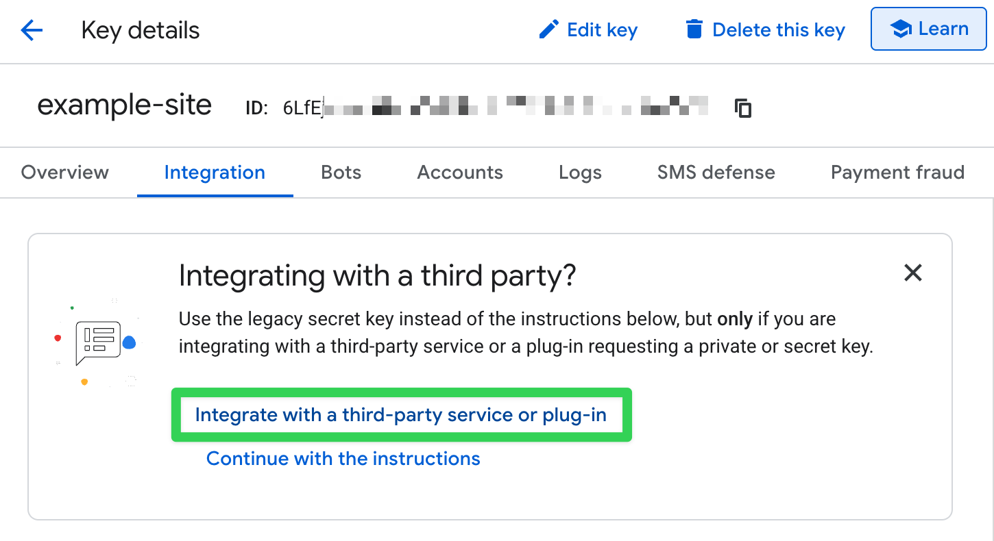
This will open a popup that contains your Secret key
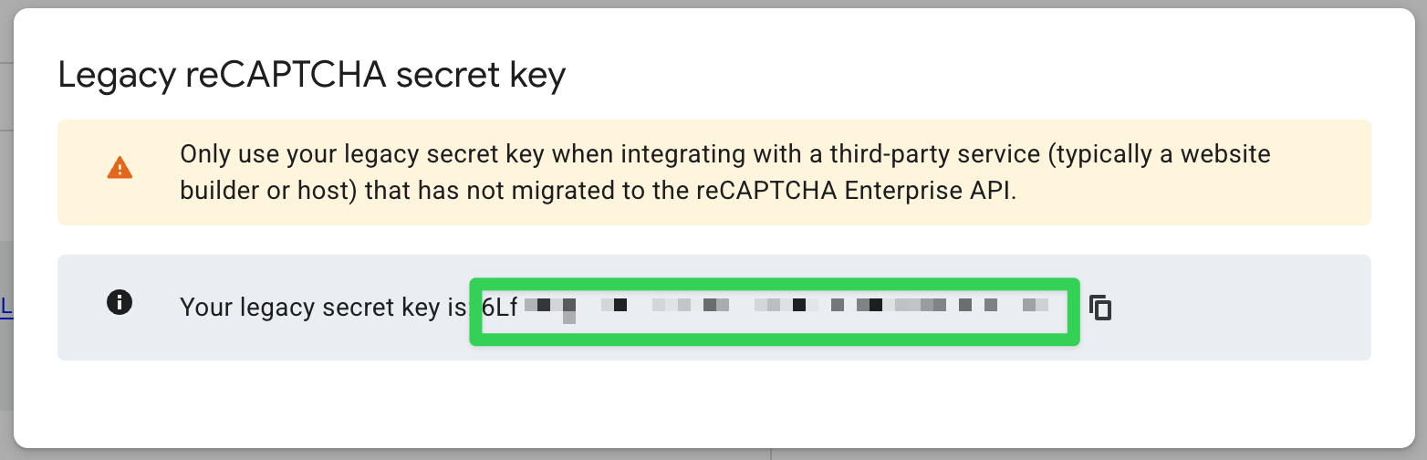
Only one reCAPTCHA key pair can be added to FORM Builder in your Terminalfour instance.
You'll need both of these so keep this tab open.
Form Builder Settings
In another tab, open Terminalfour and go to System administration > System settings > Form Builder to complete the configuration.
Use the switch to enable reCAPTCHA across your site(s). When reCAPTCHA is enabled in the settings, a reCAPTCHA option will be available in Form Builder under Advanced Inputs. Paste the Site and Secret keys into the text boxes.
When "enforcement" is enabled, reCAPTCHA is added to every form, so you do not add it. If you want to select the forms that reCAPTCHA is added to, then you should disable "enforcement."
If you choose to add reCAPTCHA to all forms, you will not see the "Create fields from content type" option. This is because "Create fields from content type" is only available when there are no form elements present in a form.
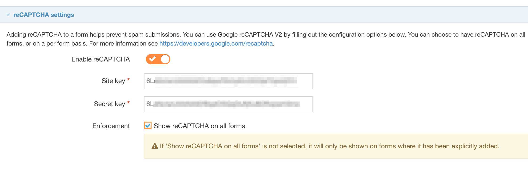
When you create a new form or editing an existing form, the display of the reCAPTCHA field will change, depending on the combination of enable and enforcement settings you choose.
| reCAPTCHA is disabled | reCAPTCHA is enabled and not enforced | reCAPTCHA is enabled and enforced |
|---|---|---|
| The reCAPTCHA button is not visible on any of your forms | The reCAPTCHA button is visible under advanced inputs when selecting fields but is not clickable | |
| One reCAPTCHA field can be added to the form |
||
| The reCAPTCHA field, if added will be positioned before the submit /reset buttons and it is not possible to move it |
||
| It is possible to delete the reCAPTCHA field | It is not possible to delete the reCAPTCHA fieldAdding a | |
Adding reCAPTCHA to your form when reCPATCHA is enabled and not enforced:
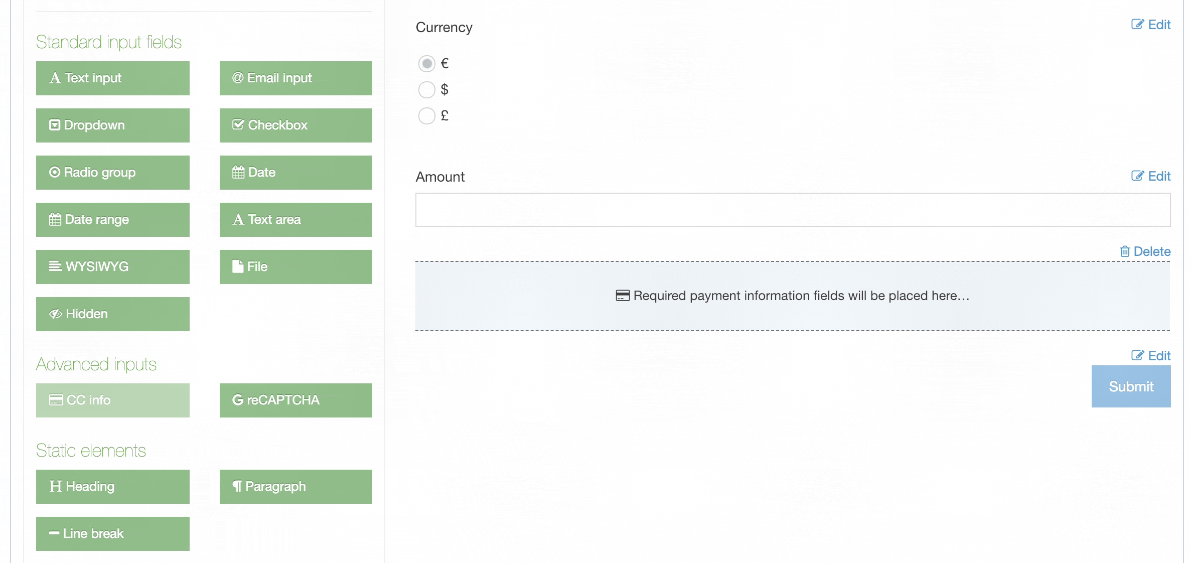
Adding reCAPTCHA to your form when reCAPTCHA is enabled and is enforced:
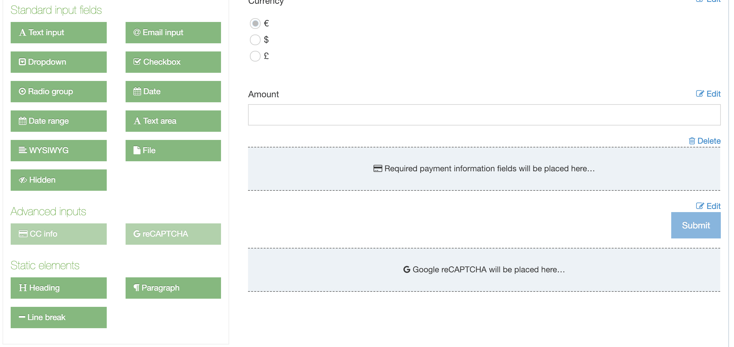
When enforcement is disabled, forms that had a reCAPTCHA explicitly added before enforcement was enabled will still have a reCAPTCHA field. Forms that had a reCAPTCHA because enforcement was enabled will not have a reCAPTCHA field.
reCAPTCHA FAQ
How many reCAPTCHA key pairs can be added?
One reCAPTCHA key pair can be added.
How can I add more than one domain?
Multiple domains can be added to one site key in Google. Please include the domain of the Form Bank URL when configuring the Google reCAPTCHA.
Which users can configure the reCAPTCHA?
Administrator users can configure the reCAPTCHA at System administration > System settings > Form builder.
Can a reCAPTCHA be shared?
Sharing is not required as only one reCAPTCHA is configured per installation.
Can the Google site type be specified?
The site type reCAPTCHA v2 is used.
How is the widget rendered?
The widget is explicitly rendered.
Do I need to specify the language code?
There is no need to set the language code as Google will set the language based on the user's browser.
How do I ensure reCAPTCHA is set on all forms?
Administrator users can configure "enforcement" so that the reCAPTCHA will show on all forms. This is configured at System administration > System settings > Form builder.
Where on the form will the reCAPTCHA be displayed?
It will be displayed before the Submit button in all cases. It is not possible to reorder the position of the reCAPTCHA.
How is the reCAPTCHA response processed?
The response is verified via an API request to https://www.google.com/recaptcha/api/siteverify.
What logic is applied to the "hostname" data in the API response?
The logic is based on the "success" property in the API response.
If the "success" response is true, the response token is set as a value in the submission so it can be submitted.
If the "success" response is false, the user is brought the the failure error message / page specified for the form. No response token is sent so the submission is not submitted. The API request error code can be seen in the POST request, via the developer console.
What happened to the old reCAPTCHA admin console?
In 2025 Google are removing the old reCAPTCHA admin console and are migrating to reCAPTCHA Enterprise in Google cloud. Communication about this migration would have been sent to your Google admins.
Do I need a Google Cloud billing account?
reCAPTCHA Enterprise has a free tier so you don't necessarily need a billing account. However, if you have more than 1,000 forms submitted that use reCAPTCHA per month you'll need to set up a billing account with Google cloud.
Can I still use my existing keys?
If you already had reCAPTCHA configured in Terminalfour you do not need to create new keys in Google Cloud. However, you will need to migrate your existing keys from the reCAPTCHA admin console to Google cloud. Google have provided a migration guide on how to do this.
Form submissions
Description
When a form created with Form Builder has been submitted, the submission data is stored on Form Bank. All submission data is encrypted, the only way of decrypting the submissions is using the private key that was generated and is saved on the Terminalfour server. This is done automatically when the form submissions are downloaded using the download task.
The Submission screen in Terminalfour is accessed by going to Engage > Forms & Transactions and selecting View Submissions from the Actions menu:
You can use this to track down a particular submission or see how a form is performing over time.
Submission summary
This shows a summary of submissions for the form over the date range.
The selected date range can be changed by Day, Week, 30 days or a custom range:
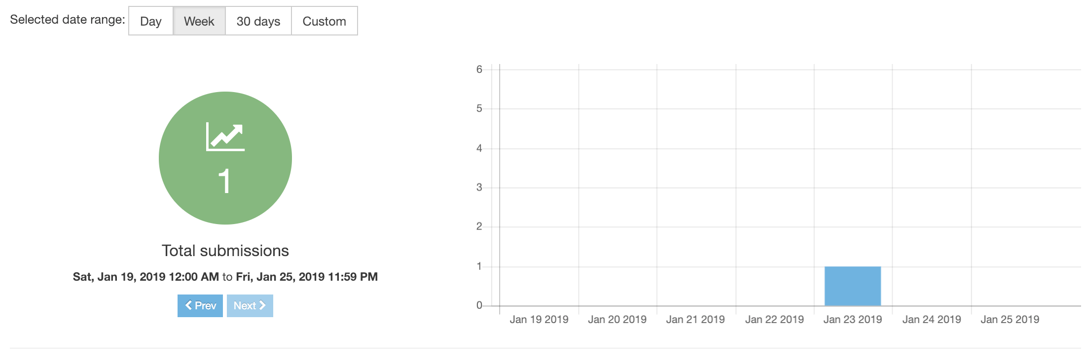
Submission listing
The listing shows all submissions for the form in the selected time period.
Created date/time: the date/time the form was submitted:
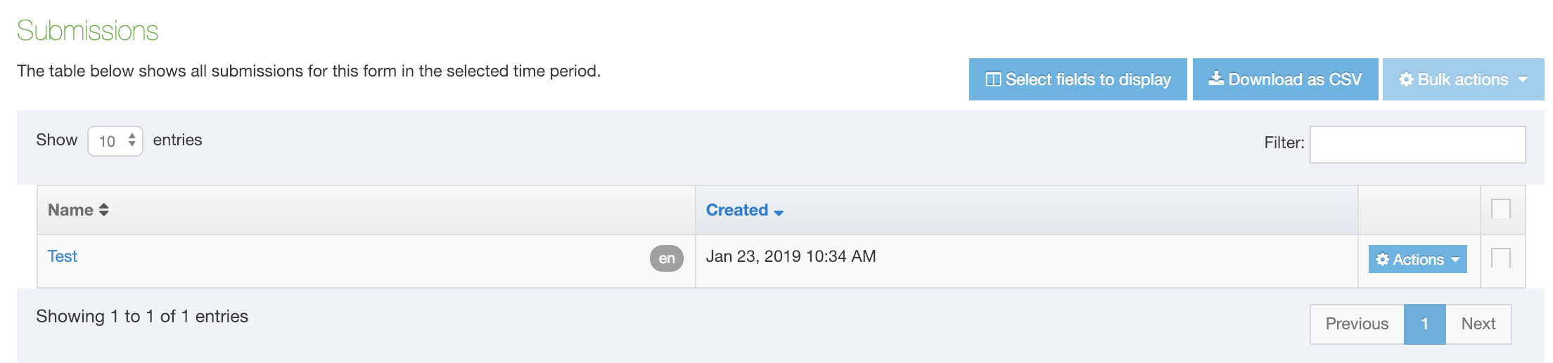
The submissions can be filtered and sorted by the columns.
Actions
- View/edit submission
- Delete
- When a submission is deleted, it is marked as inactive and purged from the system entirely. When submission content is deleted from the section it becomes inactive. Inactive submission content still displays in the submission report. When submission content is purged using recycled content, it is removed from the submission report entirely.
Additional fields can be selected for display:
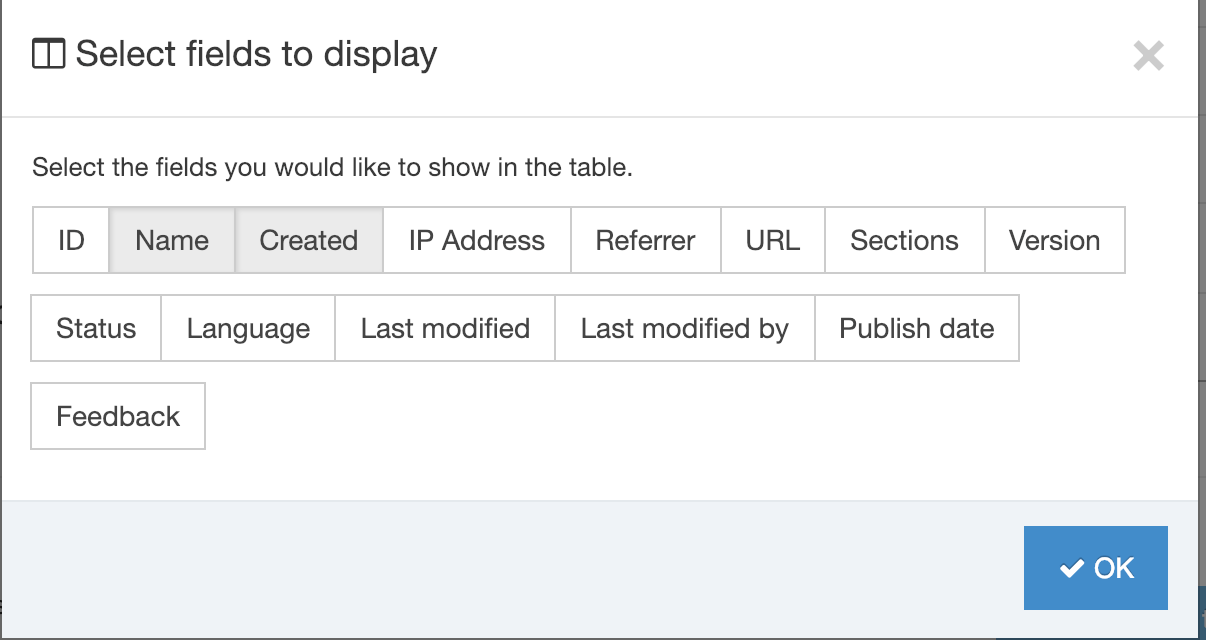
Download as CSV this will download all of the submissions as a CSV file.
Stripe Payment Gateway Form Submissions
If your form contains payments made with Stripe each submission will feature a column titled "Credit Card". If this is not visible, click on the "Select fields to display" button to enable the column. Each form submission with a successful credit card transaction will feature a "Succeeded" link. When selected, the link will open a "Payment details" modal.
In the modal, the Transaction ID is a link that will open the Stripe page for that transaction (Stripe log-in required):
In the event that a payment is unsuccessful, the form will not submit and the form submission will not appear in Terminalfour.
Email notification
When a form is submitted successfully, an email is sent to those who have been selected as notification recipients. When the form contains a Stripe payment, details of the payment transaction, including the transaction ID, are appended to the email:
The Stripe documentation features a list of test credit card numbers you can use to test payment processing.
Payment gateways configuration
Description
To configure the Payment Gateways that you want to use with Form Builder, go to System Administration > System Settings > Payment Gateways. Before configuring a Payment Gateway, the connection with Form Bank server will need to be configured.
Set up a Payment Gateway
If you are an Administrator and you want to process online payments with your forms, then the Payment Gateway must be configured in System Administration > System Settings > Payment Gateways.
For Administrators, there are two types of gateway available:
Terminalfour
- this is a test Payment Gateway that simulates how the form will work, this will not charge a card or accept any information
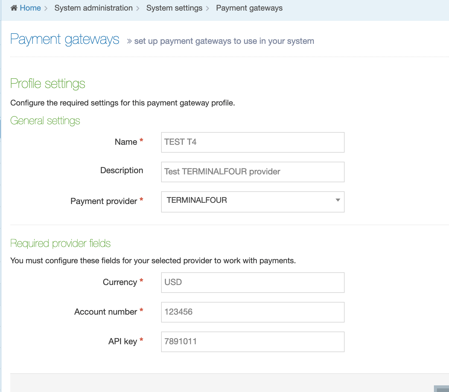
- the "Required Provider Fields" are mandatory:
- Currency: the default currency that payments will be processed with
- Account Number and API Key fields will accept any string
- this should not be used in a production environment
Stripe
There's a list of the minimum and maximum amounts that can be charged with Stripe here.
Stripe is the default payment processor in Terminalfour. When you have created a Stripe account, you will have access to two sets of API keys – one for test and one for live mode. In test mode, no payment information is sent or processed. Use this to test the payment functionality on your form initially
In this example, two gateway profiles – "Test" (using the Stripe test API key) and "Production" (using the Stripe live key) have been set up:
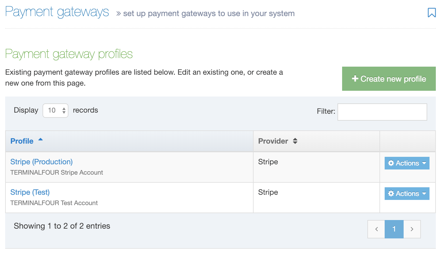
Set up a Stripe payment gateway
You'll need a Stripe account to login to the dashboard. From here, you can get the Publishable and Secret keys to set up your Payment Gateway profile. Select a key to copy it to your clipboard. In this example the test API keys are displayed:
Go to Administration > Settings > Payment Gateways and select Add new profile. When adding your profile details ensure that Stripe is selected from the Payment Provider dropdown and paste your Publishable and Secret keys in the provider fields:
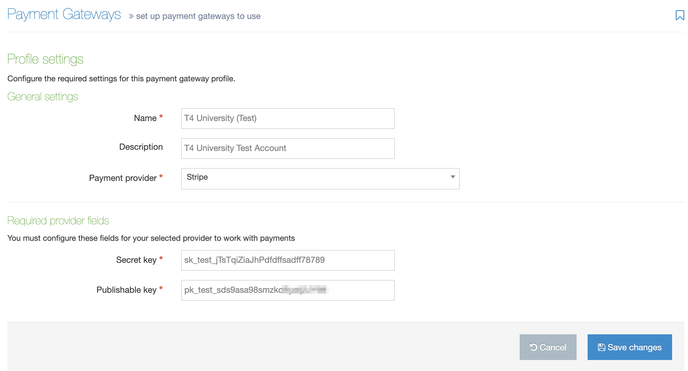
Don't forget to Save changes.
You can switch from Test to Production when you are satisfied with the payment flow on your form.
Learn how form submissions with Stripe payments are handled.
Adding Credit Card Info with Form Builder
When a payment gateway has been set up, a CC Info field will display in Form Builder below the Advanced inputs heading:
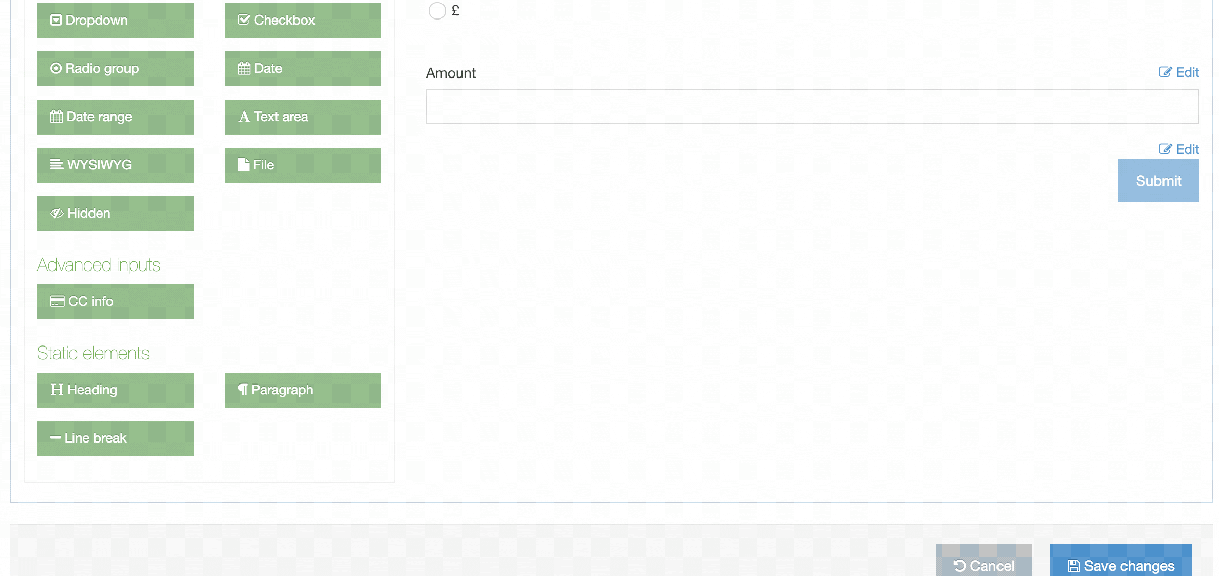 If you have more than one Payment Gateway configured (e.g., test and production gateways) you can specify the one to use in the Additional Submission Options as well as field mapping options.
The input's position can be moved up or down within the form.
Form submissions that contain Stripe payments contain the Stripe payment ID and a link to the payment.
Testing your form
It's recommended that you thoroughly test your form with a test Payment Gateway before making it live with a production Payment Gateway. Since real credit card numbers cannot be used in test mode Stripe has provided a list of test credit card numbers you can use.
Here's how a published form with a CC Info field can look:
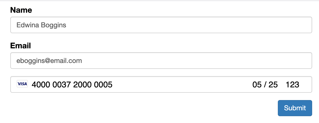
Access Control Configuration
Description
Access Control gives you greater control over who can view published pages.
To configure the options for Access Control, go to System administration > Set up sites & channels > Access control.
An Access Control Content Type must be created before you can select it from the dropdown list.
| Item | Description |
|---|---|
| Enable hierarchical access control | When enabled and Group Access Control is used, a Child Section will inherit the rights of the Parent Section unless a more specific access rule is applied. |
| Inherited link section | Check this option to force Link Sections to inherit their Access Control from the target Section. |
| Access control content type | Select the Access Control System Content Type that is used to configure the Access Control on sections. |
Access Control Rule Profile
Description
With Access Control you can configure the .htaccess file to restrict access to published pages to users with specific usernames and passwords. To do this you must configure Apache and have access to the Terminalfour database.
We have also created a module that provides more flexibility over Access Control that you might want to look at.
- Configure Apache
- Create the System Content Type
- Enable Access Control Content Type
- Create the Access Control Profile
- Configure the Channel
- Site Structure
- Publish the Channel
Configure Apache
In this example, we are using the default .htaccess file. Your server may be configured to use a file with a different name. The file locations here are provided as an example.
We'll create a Content Type that will allow the author to enter the username of the user who has permission to view a Section. This is done by entering their username and checking it against a static file on the server that is not accessible from the web.
Set AllowOverride AuthConfig
Edit the httpd.conf. The location of the file is dependant on where Apache is installed.
Find the directory entry for your site, e.g.
<Directory "/etc/apache2/htdocs">Change the line from
AllowOverride Noneto
AllowOverride AuthConfig<Directory "/etc/apache2/htdocs">## Possible values for the Options directive are "None", "All",# or any combination of:# Indexes Includes FollowSymLinks SymLinksifOwnerMatch ExecCGI MultiViews## Note that "MultiViews" must be named *explicitly* --- "Options All"# doesn't give it to you.## The Options directive is both complicated and important. Please see# http://httpd.apache.org/docs/2.4/mod/core.html#options# for more information.#Options Indexes FollowSymLinks## AllowOverride controls what directives may be placed in .htaccess files.# It can be "All", "None", or any combination of the keywords:# AllowOverride FileInfo AuthConfig Limit#AllowOverride AuthConfig## Controls who can get stuff from this server.#Require all granted</Directory>
Create the password directory and .htpasswd file
Create a directory /etc/apache2/passwords. This should be a location that is not accessible from the web.
Create a file called .htpasswd. If you're not sure about creating .htpasswd files have a look at this guide.
Usernames and passwords should have the following form:jbloggs:$ttr1$MwpTbdEW$5tt6SOJ4oQIa9807Ex/MV0
This file will be referenced from the Content Layout to verify users for access to restricted content.
Create the System Content Type
Before you follow the guide to creating an Access Control Content Type note that for this example, the Content Type comprises just one Content Element:
| Name | Type | Required | Maximum size |
|---|---|---|---|
| Users Allowed | Plain text | No | 400 |
Create a Content Layout called text/access-control. All other fields can be left as the default
Add the following Content Layout Code and save.
# start file
AuthType Basic
AuthName "Restricted Files"
AuthBasicProvider file
AuthUserFile /etc/apache2/passwords/.htpasswd
Require user <t4 type="content" name="Users Allowed" output="normal" modifiers="striptags,htmlentities" />
# end file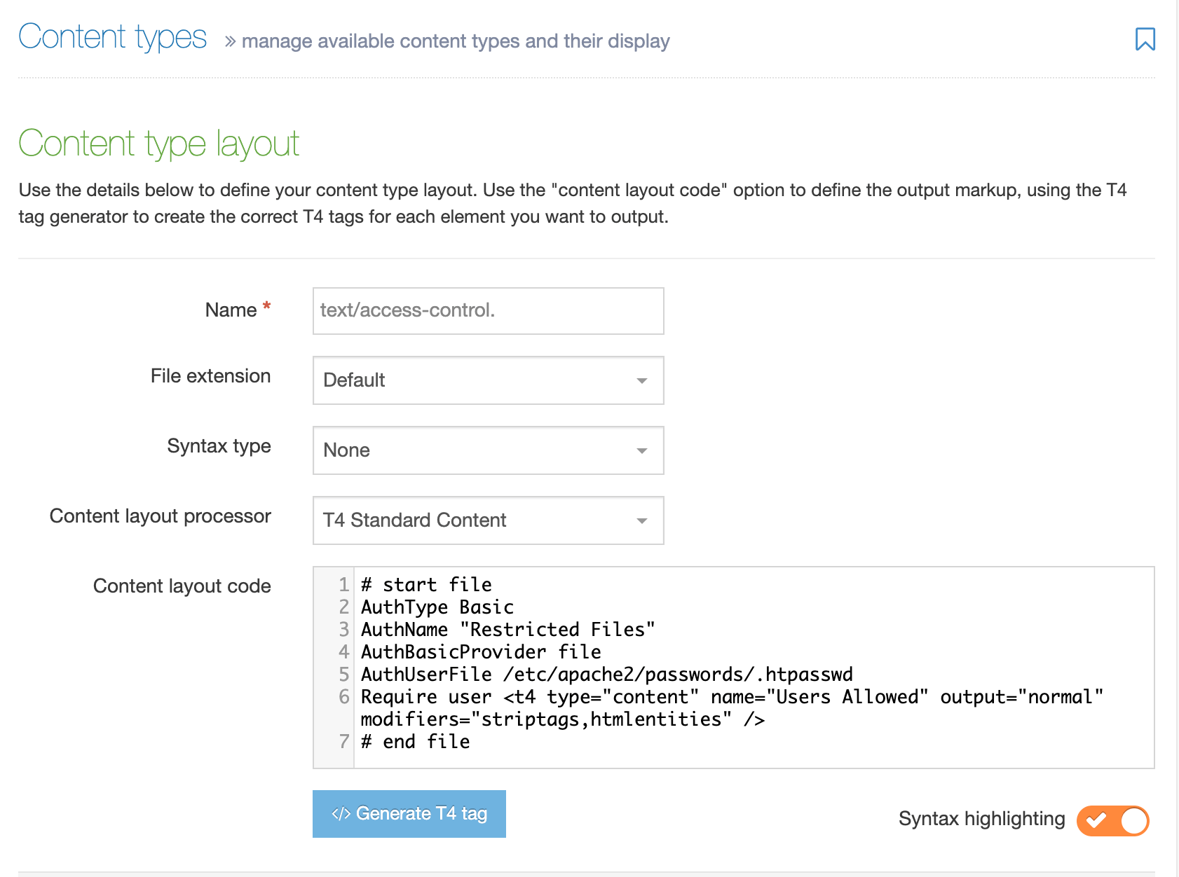
Enable Access Control Content Type
Go to the Access Control Configuration at System administration > Set up sites & channels > Access control
Check Enable hierarchical access control.
Set the Access control content type to the Content Type just created.
Save changes.
Create the Access Control Profile
Go to Sites & Channels > Access control
Select Create new to create a profile. Then select Create new next to Access Control Rule Profile and provide a Name and Description.
- File Name: enter the name of the access file name set on your Apache webserver. By default, the name will be ".htaccess".
- CSS for links to Access Controlled Sections/Media categories: enter the path to the CSS file if you've styled the links that have been created.
Select Add to save the changes.
Configure the Channel
Go to System administration > Set up sites & channels > Channels
Edit the Channel you want to enable Access Control on.
Under Access control and personalization, check Enable Access Control and select the Access Control Profile created earlier.
The setup is now complete and Sections can be access-controlled for that Channel.
Site Structure
Edit the Section(s) you wish to control access to and ensure it contains content that will publish for the channel.
- Select the Access tab.
- Enable Access Control
- Enter the usernames with a space between each user.
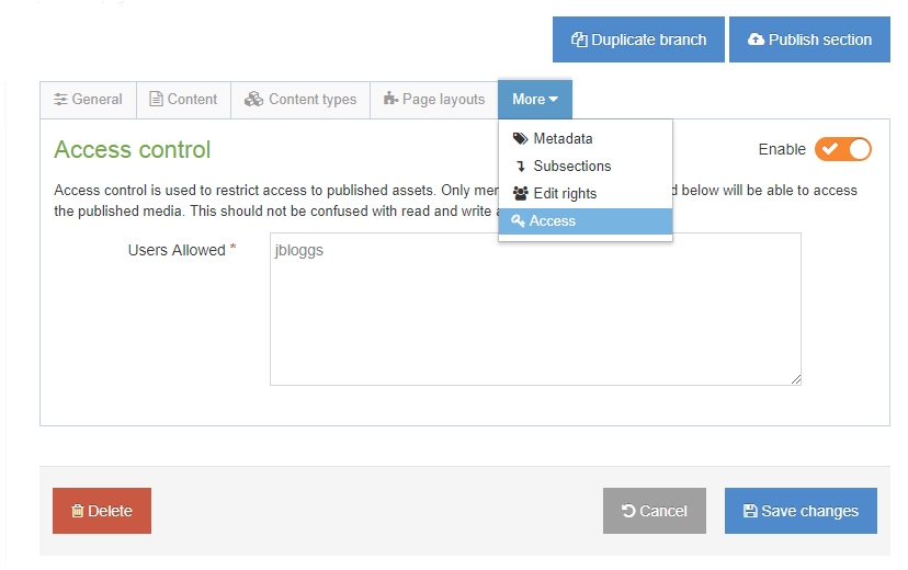
Publish the Channel
Publish the Channel and browse to the restricted section on the published site. A popup requesting a username and password will be presented. Once a valid username and password is entered, the restricted page will be displayed.
Social poster
Description
With Social Poster you can post short messages from Content Items to:
Posts usually contain a short description and a link to the page containing the Content Item.
To ensure the full use of this feature, check that the server running Terminalfour has web access. Social Poster must be able to access the live content and it needs access to Twitter and Facebook for authentication and to send the post.
- For Twitter, you'll need a Twitter account to create the Twitter app used for sending posts
- For Facebook, a Facebook account is required to create the Facebook app that is used to send posts
- For LinkedIn, a LinkedIn account is required to create the LinkedIn app that is used to send posts
Ensure you have an accurate time source on this server as access tokens are time-sensitive.
After you create an app, the API keys required by the Social Poster will be generated,
How to work with the Social Poster
When you want to publish content to be published on Facebook, Twitter, or LinkedIn, go to System Administration > Set up sites & channels > Social poster. You'll need to create the accounts.
To set up an account you should:
- Go to the Setup tab and add your API keys
- Create a new account
You can use the +Create new account to add a new account
Accounts
From this tab, you can manage accounts and review status.
Here's an example of the screen with all three types of social network accounts configured:
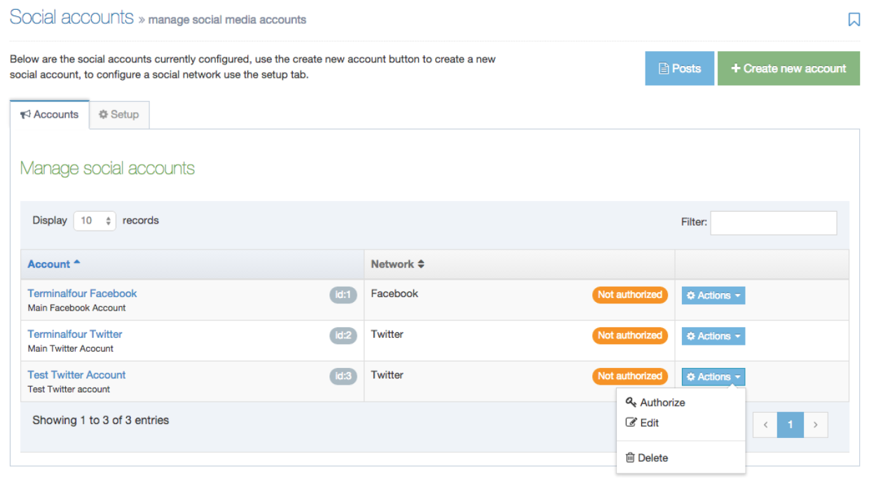
In the first column of the list is Accounts. The contents of this column are the Name of the account. A brief description can be included if an entry was made. Use the arrow button in the head row to change the list displayed from an A to Z list to Z to A list. There is also an ID number. The ID is assigned when you create a new account.
Network
This is a list of associated networks used with the name of the account - they are listed as Facebook, Twitter, or LinkedIn. Each box shows the network name and the status of the post. The status can be:
| Name | Description |
|---|---|
| Not authorized | The post has been created but not authorized |
| Authorized | The post has been created and is authorized to release |
| Pending | The post has been creeated |
Use the arrow button in the head row to change the list displayed from an A to Z list to Z to A list.
Actions
In the column with Actions buttons, you can use the drop-down list to choose actions to take with the Account in the row.
- You can Authorize the release of a message from that account.
- If you click Edit, this takes you to the corresponding Account page where you can confirm or edit the fields on that page.
- You can Delete an account. If you choose to delete an Account, you are challenged with a confirmation box - see below. Confirm your selection to Cancel or Delete.
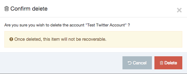
Deleted accounts are not recoverable.
Setup
Before you can authorize a network you must first add the API keys for the network(s) you'd like to add.
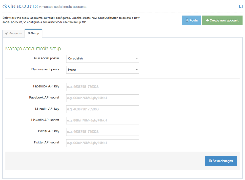 Run social poster
This dropdown allows you to set how often posts are sent to the specified social network(s). The options are:
| Name | Description |
|---|---|
| Never | Social Poster will never automatically send posts to any network. |
| On Publish | The post will be sent as soon as the content is published |
| Every # hour/minute | Social Poster will run at the specified interval minute |
Remove sent posts
This dropdown allows you to set when sent posts are removed from the system completely. The options are:
| Name | Description |
|---|---|
| Never | Always keep sent posts |
| Every day | Sent posts over one day old will be removed |
| Every 3 days | Sent posts over three days old will be removed |
| Every week | Sent posts over a week old will be removed |
Add the account key and secret
For each network, you need an account to get developer information to create an app for sending posts.
When all entries are complete, click Save changes.
+ Create new account
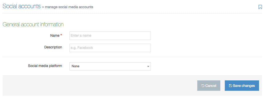
1. To create a new account, from the start page, click the green + Create new account button > General account information
2. Enter the Name of the account - each account must have a name – this is required
3. Enter a Description - you can choose to enter a description or wait till a later date when you can add or edit a description.
4. Choose from the drop-down list for a Social media platform - you can choose Facebook, LinkedIn, or Twitter.
5. If you are satisfied with your entries, click Save changes. If you click Save Changes, this returns you to the start page.
6. After the account is added, select the Authorize option from the Actions dropdown to authorize the account. This will open a prompt to login to the social media account to authorize the app created above for the account. For Facebook, you will need to log in as a user who has access to post as the page that is posting the content i.e. a user who is able to post content as the page.
The T4 Social tag
Insert the T4 Social tag into the Content Layouts of the Content Type to automatically post the content to social media.
Post information
Once posts have been sent to the Social poster, they are listed when clicking on the +Posts button (blue). The post information is shown by choosing Actions > View details or click directly on the post.
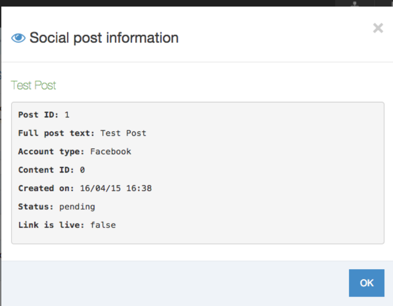
1. This page displays:
- Post ID
- Full post text
- Account type
- Content ID (from where the post was generated)
- Created on date
- Posted on date (if the post has been sent)
- Status (pending, error or sent).
2. There is a link to the post, whether the link is live or not and you can view any errors that could be associated with the sending of this post.
3. Click OK or close when finished.
Example uses
A. News content type

1. Create a new content type called News, go to Assets > Content Types > Create New.
2. Create two elements, Post text and Full article and click Add content type.
3. For the text/html layout enter the following code: (NOTE: with Twitter you have 140 characters only, so setting the length of the template to 120 would be advised.)
4. This is a link to the fulltext layout.
5. Create a new layout called text/fulltext and enter the following code:
<t4 type="social" post_element="Post Text" account_identifier="Account" base_url="http://www.baseurl.com" resource="" post_type="post" expires="1" />
<h1><t4 type="content" name="Post Text" output="normal" modifiers="" /></h1>
<t4 type="content" name="Full Article" output="normal" modifiers="" />
6. This outputs the Post text as a heading and the full version of the article underneath.
7. Update the account_identifier to match one of the added accounts.
8. Enable this Content type on a section, add some content using it and publish.
9. You should see a new post has been added as Pending.
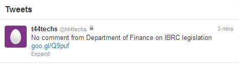
Special Notice content type
1. Create a new content type called News, go to Assets > Content Types > Create New.
2. Create two elements, Post text and Full article and click Add content type.
3. For the text/html layout enter the following code:
<p><a href="<t4 type="content" name="Post Text" output="fulltext" modifiers="" />"><t4 type="content" name="Post Text" output="normal" modifiers="" /></a></p>
4. This is a link to the fulltext layout.
5. Create a new layout called text/fulltext and enter the following code:
<t4 type="social" post_element="Post Text" account_identifier="Twitter Account" base_url="http://www.baseurl.com" resource="" post_type="post" expires="1" />
<t4 type="social" post_element="Post Text" account_identifier="Facebook Account" base_url="http://www.baseurl.com" resource="https://graph.facebook.com/321844344589231/feed" post_type="post" expires="1" />
<h1><t4 type="content" name="Post Text" output="normal" modifiers="" /></h1>
<t4 type="content" name="Full Article" output="normal" modifiers="" />
6. This outputs the Post text as a heading and the full version of the article underneath.
7. Update the identifier to match one of the added accounts.
8. This will post to 2 accounts, you could have many accounts in one layout.
9. Enable this Content type on a section, add some content using it and publish.
10. You should see a new post has been added as Pending.
General configuration
Description
To configure the General Settings go to System Administration > System Settings > General.
This brings you to the screen shown below.
| Item | Description |
|---|---|
| context_url | Specifies the base URL (including the base domain) of the TERMINALFOUR application servlet. The installation wizard sets it automatically and there should be no reason to change it. |
| default_sender | This is the default address that is used for emails generated and sent by TERMINALFOUR. |
| Default login page |
Enter the default page to be displayed after login. This is the part of the URL starting with "page/xxx". To display a welcome message, leave this field blank and the value will revert to "page/welcome". |
| Message |
Sets the welcome message if no other default login page has been specified. This input will accept HTML so you can add basic formatting and links to your message. |
In this screen, the default login page is set to "page/site-structure". In this case, because the Site Structure is shown on login, the welcome message will not be displayed.
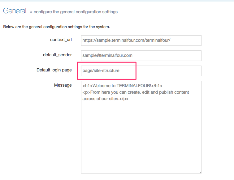
User rights & roles
Description
For Terminalfour to function as a coherent system, there are roles and rights assigned to each type of user account. We have five types of user accounts ranging from the 'visitor' to the site, to the Administrator. Below describes each user role / type, and the typical rights assigned to that user.
Terminalfour User Roles
As with any organization, people serve in different roles to perform their duties. The users of the Terminalfour system are also assigned specific roles that entitle them to perform various duties associated with the use of the system. With the exception of the Administrator, not all roles can have access to all functions.
The primary role for the system is held by the Administrator, followed by the Power user, Moderator, and Contributor. In general terms, the roles are defined as:
| Administrator |
Administrators have access to everything in the system. Some of the rights only an Administrator has are as follows:
|
|---|---|
| Power user |
A Power User can be viewed as a "Local Administrator" and they are designed to have some Administrator privileges but based around Channels/Microsites & Groups, rather than globally.
|
| Moderator |
In addition to the rights of a Contributor:
|
| Contributor |
|
*These roles are configurable with customization. You can also impose local practices regarding roles and access.
Please see the matrix of user rights and roles.
Visitor
In what can be called a 'sub-role' is the Visitor. As they view the organization's published material and complete eForms on the site, they become participants in the site, and their actions complete the loop from creating the site to the audience.
In some cases, they would have controlled access, as an example: the staff would have access to staff areas that the student would not.
Accounts access is made using a traditional format of username and password pairs. Username and password combinations must be unique within the system. Local security practices for username and password prevail.
Users can be combined into groups to simplify assigning rights and roles within Terminalfour. The system also supports LDAP and NTLM single sign-on functionality where users can use their existing network usernames and passwords.
System reports
Description
System reports
Google Analytics
Description
There are two changes to how Google Analytics in version 8.3.16:
- Only Google Analytics 4 is supported (this means that Universal Analytics properties are no longer supported)
- Google Analytics Dashboards has been removed from the product in 8.3.16. Google Analytics charts will still be viewable in Direct Edit and can be embedded in Dashboards.
In Terminalfour, you can use Google Analytics to learn about the traffic to your site, conversion rates, sources of traffic, and bounce rates. This allows you to measure and analyze your content's impact to improve your site's effectiveness.
These metrics are visible to all users who can view pages in Direct Edit.
There are four main steps when creating Dashboards:
First, you must have a Google Analytics 4 (GA4) property set up. You can create a new one, or, if you already have a Universal Analytics (UA) property, you can link a new GA4 one to it.
Authorize Google Analytics Account API
First, go to System Administration > System Settings > Analytics:
If you haven’t already linked a Google Analytics account to Terminalfour, select Analytics Account:
From the next screen, select Create New Account:
Create a Google Platform Project
If you were already using Google Analytics in Terminalfour and have a project set up, you can enable the Google Analytics Data API for that project (the UA API was named "Analytics API").
Since Terminalfour uses the GA4 API, you must create a project on Google Cloud Platform Console.
Go to the Google API Console and create a new project specifically to use the Google Analytics API with Terminalfour:
Give your project a meaningful name that you can recognize (this is especially important if you have more than one Project):
When you've created the Project, select Enable APIs and Services:
Add Google Analytics Data API
Searching for analytics will return some results. Select Google Analytics Data API (not the Google Analytics Reporting API):
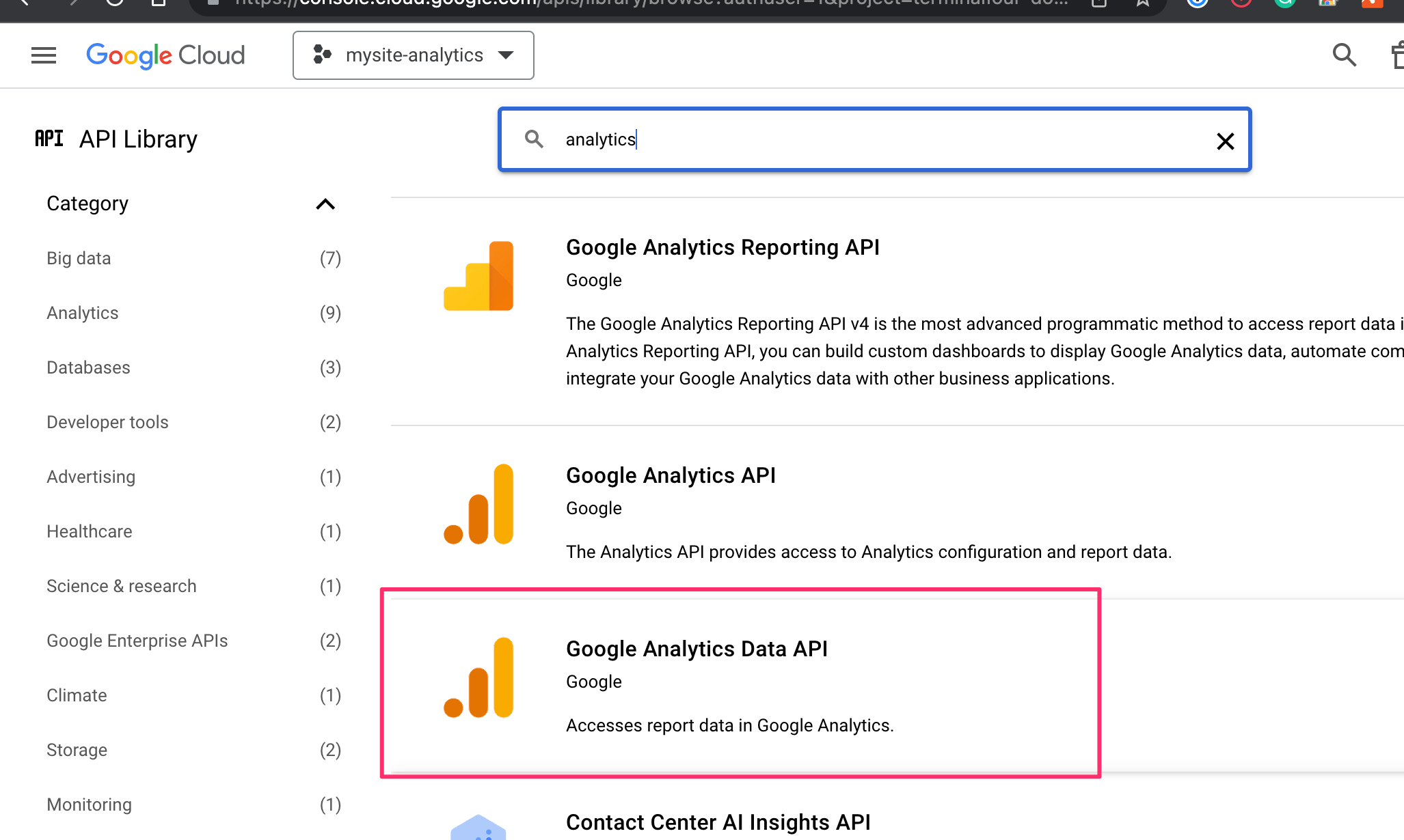
Select Enable:
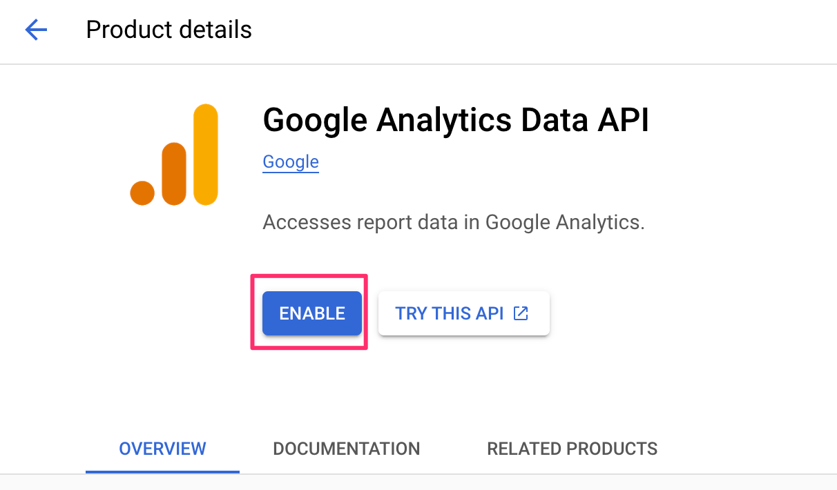
To get started with the API you’ll have to Create Credentials to use with it:
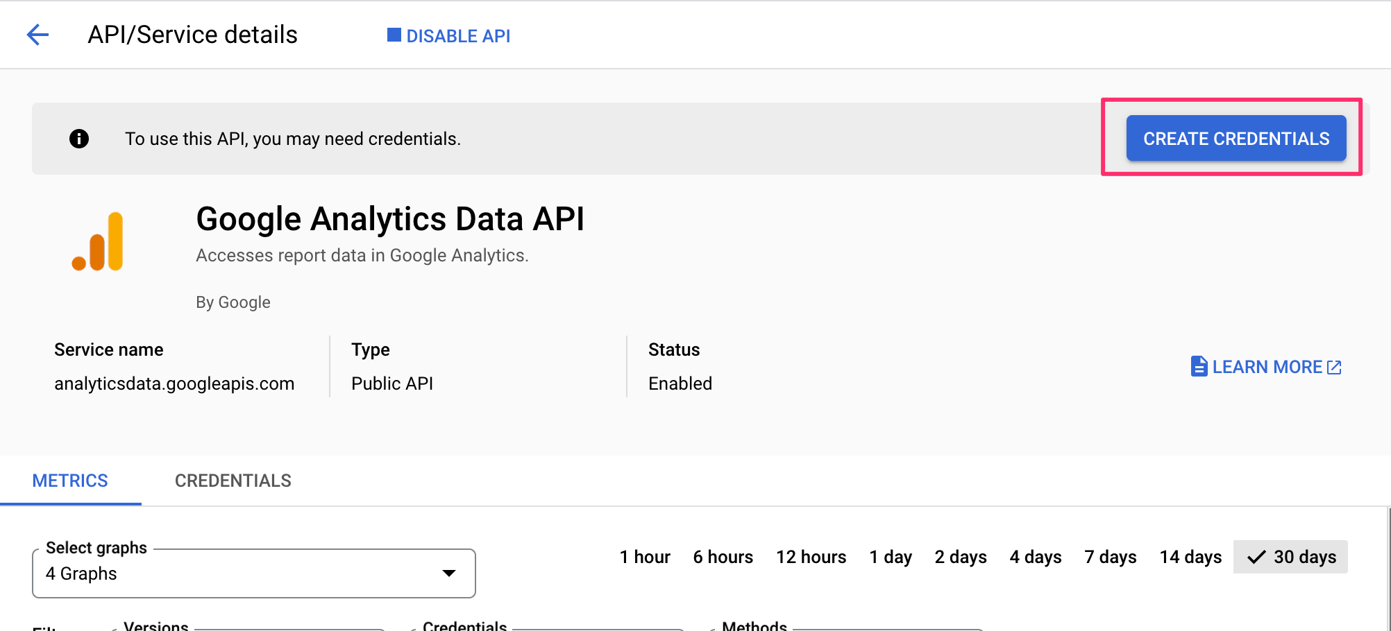
Credential Type
Next up, you’ll need to specify how you will be calling the API and the type of data you intend to access:
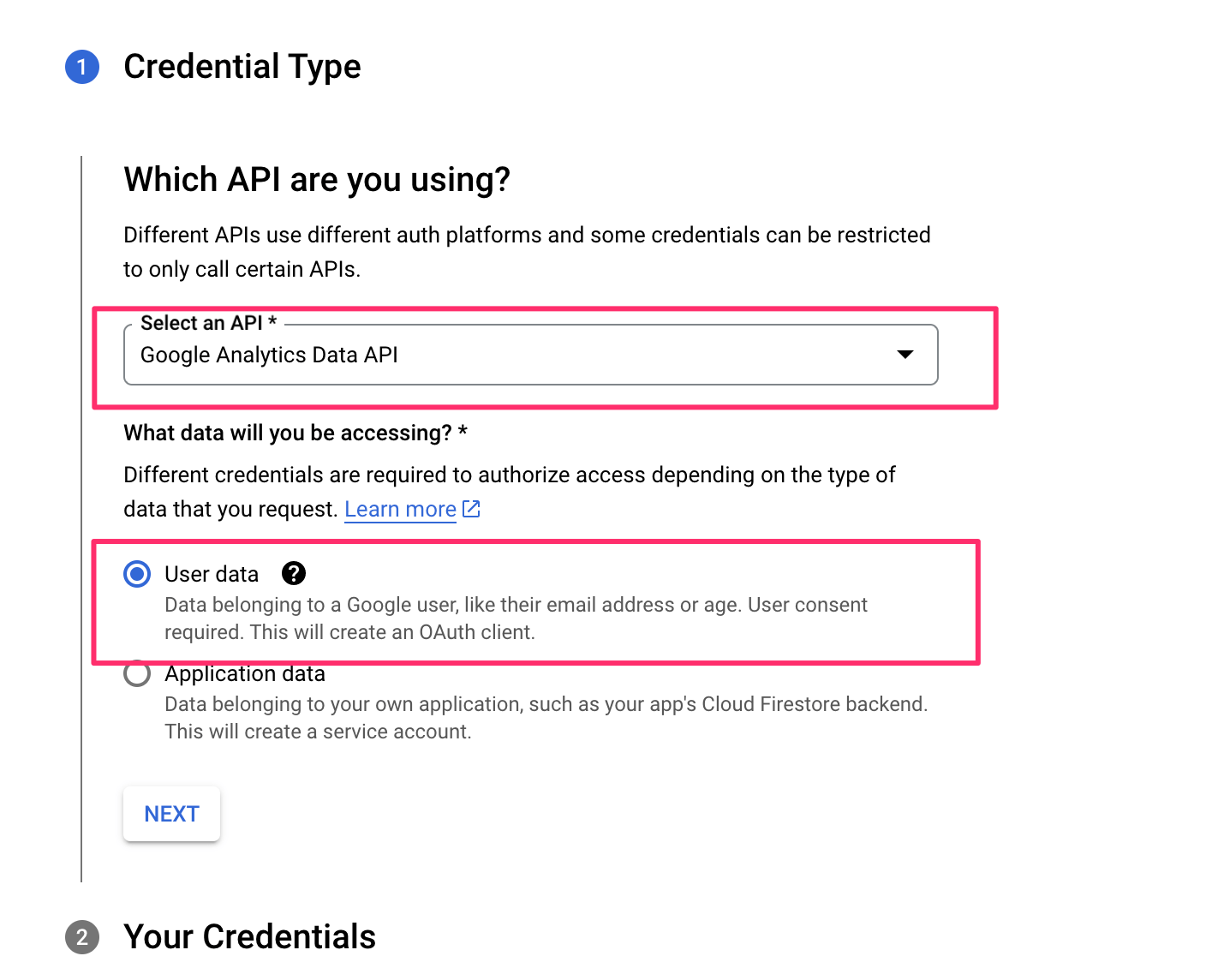
OAuth Consent Screen
Next, you’ll be creating an OAuth2 Client ID to authorize the use of API with URLs from your Terminalfour instance:
Adding a logo will require verification from Google which can take a number of weeks. It's best to leave this blank.
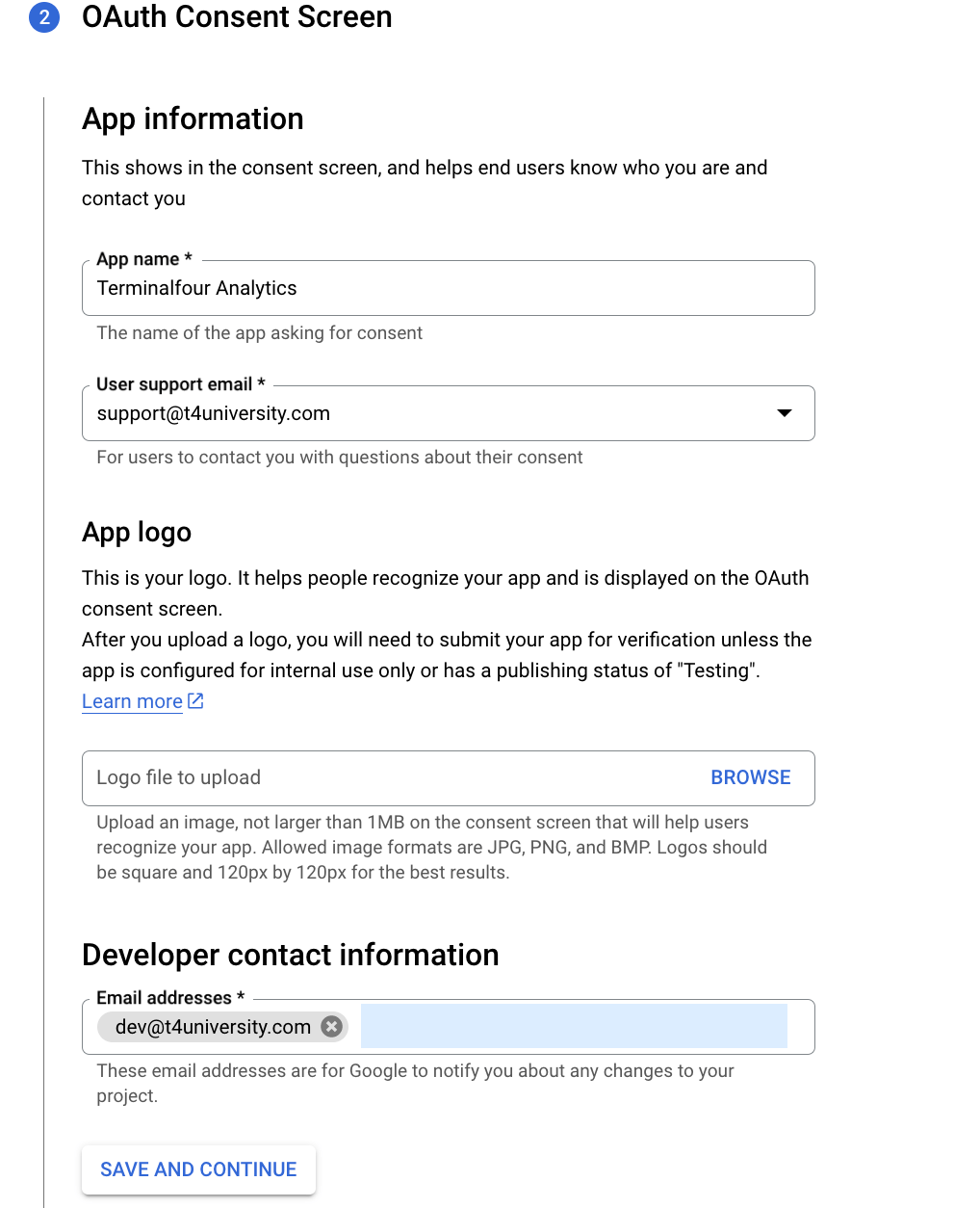
Scopes
You can skip this step
OAuth Client ID
Select "Web application" as the Application type:
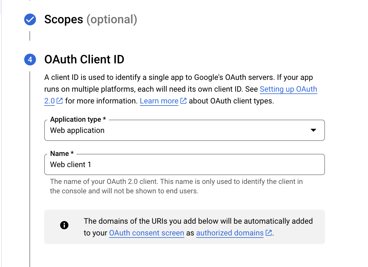
Next up, you can add the JavaScript origins:
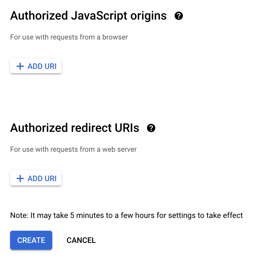
Here are some suggestions of what you could add here:
| Name | Description |
|---|---|
| Authorized Javascript Origins |
The Base URL for your Terminalfour instance. This is the IP address or hostname where API requests originate. Usually, this is the Terminalfour server IP address or hostname. e.g., if you log into Terminalfour at https://www.t4university.com/Terminalfour/login.jspthen enter https://www.t4university.com into this field |
| Authorized redirect URIs |
Just copy the Redirect URL from the Create Site Analytics screen in Terminalfour. This is the location your browser will be redirected to when authorization is successful. The authorization information will be passed to this location and saved on the Terminalfour CMS server; this is usually the Terminalfour context_url found in General Settings with gaOAuthCallback appended to it (case sensitive). Google Analytics requires an absolute URL, so your Redirect URL cannot be relative.
|
Credentials
In the next step, you can copy the Client ID but we also need the Client Secret so click on the link to the credentials page:
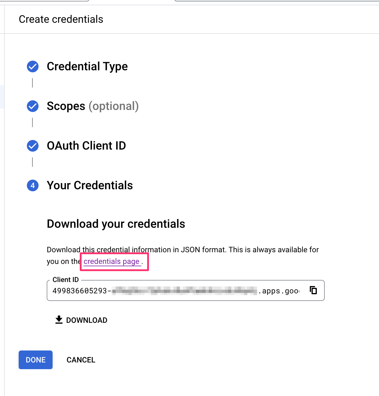
Once the credentials are created, you can select its name from the list that appears:
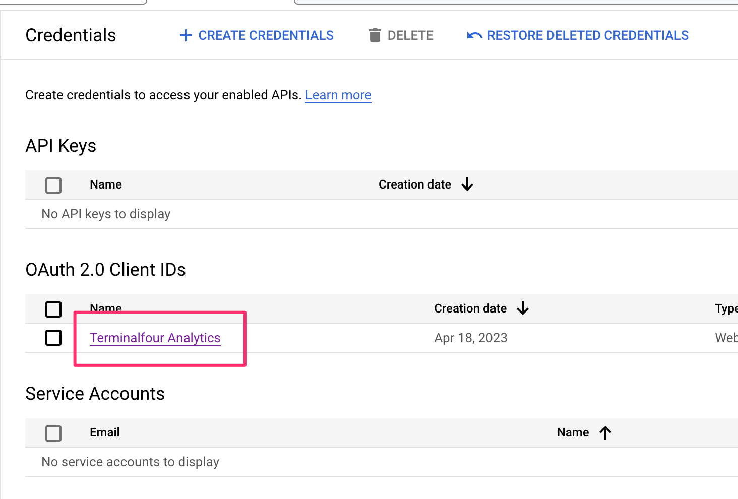
The next screen shows the Client ID and Client Secret required to complete the analytics account set-up.
Just copy and paste both into the input boxes in Terminalfour:
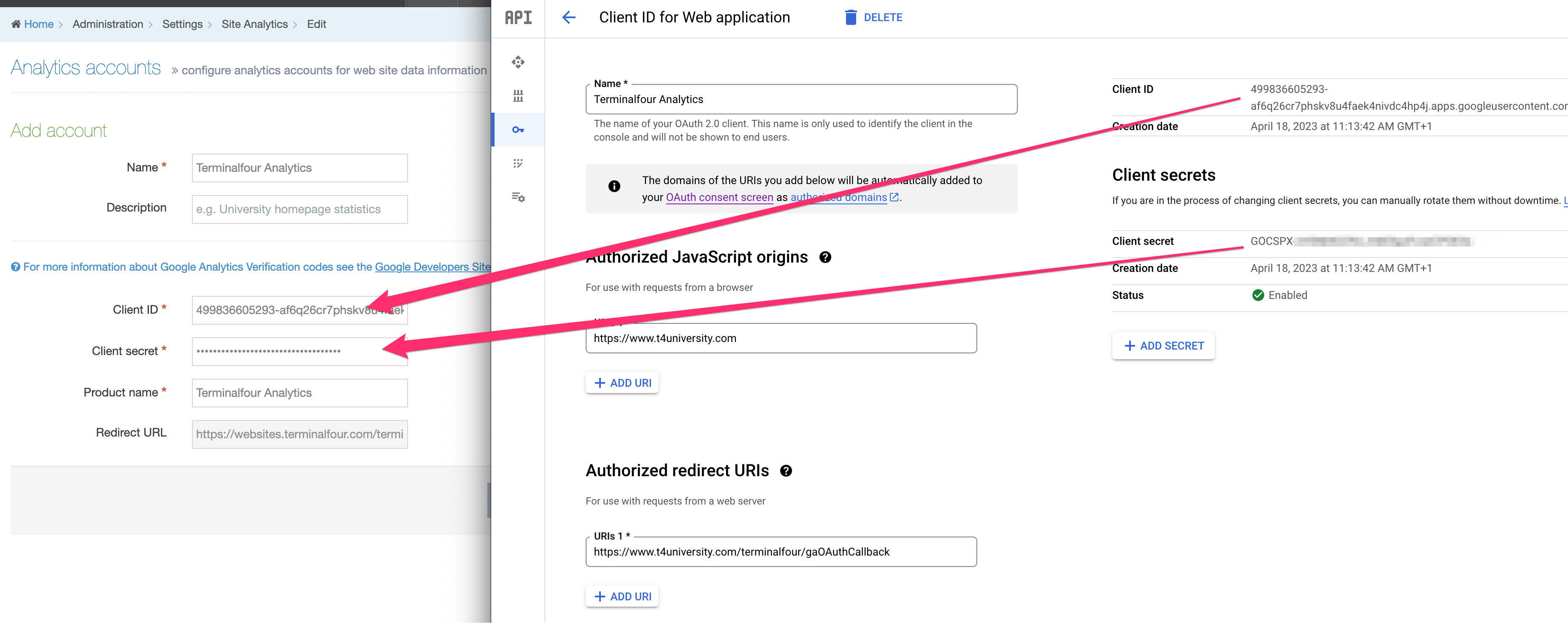
Make the account and product names recognizable to you and others in your organization.
After you’ve saved your changes, you will have to authorize the account. Just select the Actions menu and choose Authorize:
Then, select Allow from the pop-up that will appear. The requesting domain will differ from the one here:
When authorized, the status will be updated:
Set up your charts
In versions before 8.3.16, this page referred to setting up Dashboards. Since Dashboards were removed from the product in that version, the following refers to setting up Charts visible in Direct Edit.
Now that your account is set up, it’s time to set up your Charts.
Each Terminalfour instance comes with a sample Chart. In this example, we will use that as our starting point.
In System Administration > System Settings > Analytics you will see a list of existing Charts.
If you haven’t created any others, the only one you’ll notice is ‘Sample chart’. From the Actions menu, select Edit chart:
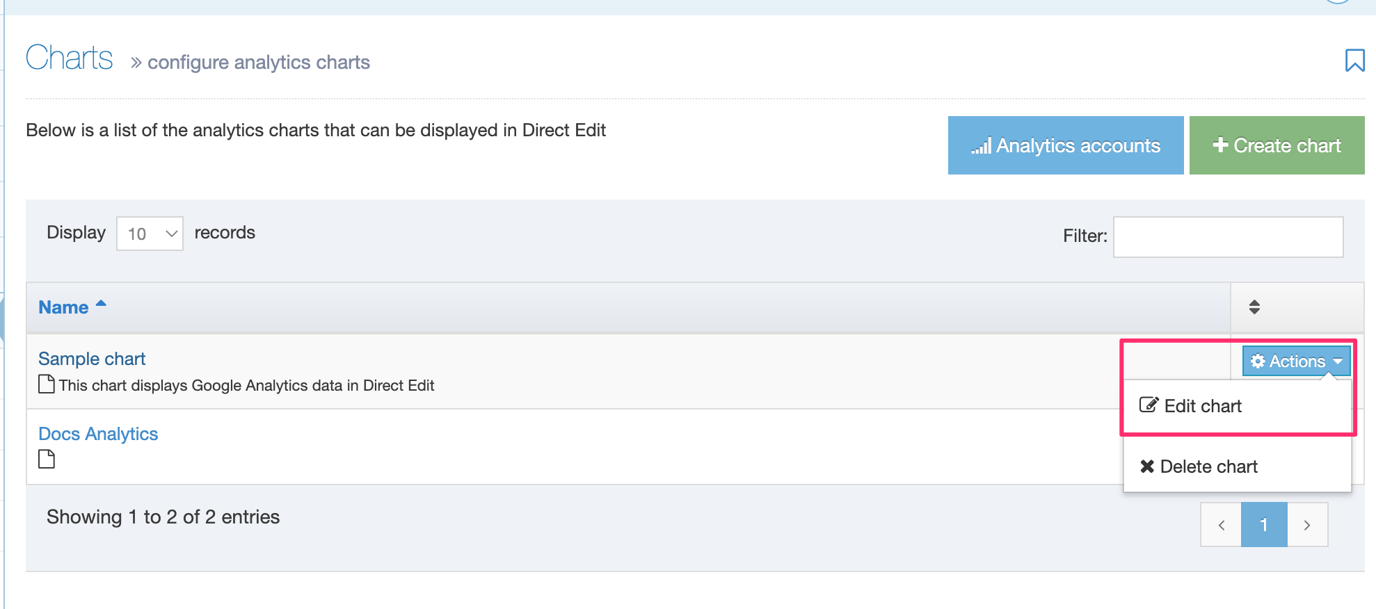
You’ll need to do a couple of things here. First up, link the Google Analytics account you’ve linked with your Terminalfour installation to the dashboard.
Click on Select Account and choose the analytics you’ve just set up:
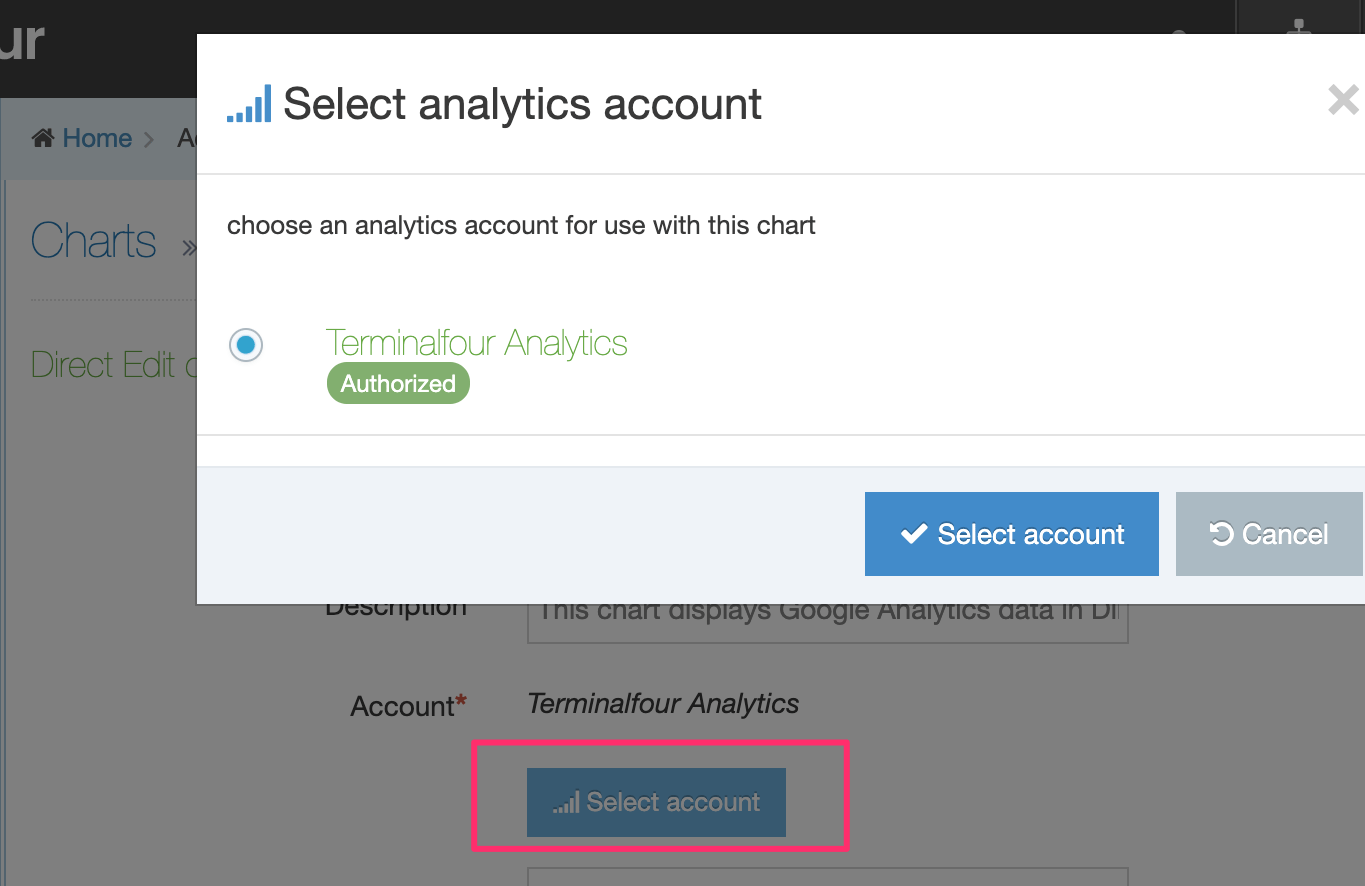
Next, you can add the Property ID from the Google Analytics 4 account you want to use in Direct Edit.
If you were previously using Google Analytics with Terminalfour in versions prior to 8.3.16, the Property ID value will be blank and you will have to add it.
Assign the Channel you would like the Analytics to be displayed for.
Add Google tag to your pages
Before Terminalfour can display any analytics data within Direct Edit, the pages you wish to track must include the code snippet that tracks user interaction.
The global tag can be received from your Google Analytics console and will look something like:
<!-- Global tag (gtag.js) -->
<script async src="https://www.googletagmanager.com/gtag/js?id=G-<TAGIDHERE>"></script>
<script>
  window.dataLayer = window.dataLayer || [];
  function gtag(){dataLayer.push(arguments);}
  gtag('js', new Date());
  gtag('config', 'G-<TAGIDHERE>');
</script>
This can be added directly to your Page Layouts or within content to specific pages you wish to track.
File extensions
Description
Terminalfour allows you to define the file extension used when publishing content. The extensions created can be applied to Channels, Page Layouts and Content Layouts. Extensions are defined on a system-wide basis and then selected by Channels. For example, one Channel can publish both PHP and HTML pages while another Channel can be configured to only publish XML.
Terminalfour comes with several pre-loaded file extensions for use in the system. These file extensions are used by a Channel when publishing a site.
To configure the list of available file extensions, go to Administration > Settings > File Extensions
Examples of additional filename extensions would include:
- .php
- .xml
- .aspx
When you click File extensions, the existing configured file extensions are displayed.
Create new file extension
To add a new File extension, click Create new file extension and enter the details:
| Item | Description |
|---|---|
| Allow conflicting updates to file extensions |
It is recommended that you leave this unchecked. When checked you can use Channels, Page Layouts and Content Layouts with different file extensions. For example, if a Page Layout applied to a Section required a PHP extension, you can mirror content that requires a JSP extension into the Section and create a conflict. |
| Name | Sets the name of the file extension |
| Description | Sets the description of the file extension |
| Extension | Sets the suffix file extension without the dot (examples: csv, xml, php) |
Task scheduler
Description
Terminalfour's task scheduling functionality is used for managing a publish schedule as well as other scheduled tasks, like content review and archiving.
Current scheduled tasks
To view the Task Scheduler go to System administration > Task Scheduler.
All existing scheduled tasks are listed showing their name, create date, the date it is next due to run, the maximum number of times it will run, how often it runs and how many times it has run to date.
Tasks that are added by a user, tasks for content review and content archiving are also shown:
| Task Type | Description |
|---|---|
| Review content | When a Content Item has a Review date specified in the Options tab |
| Archive content | When a Content Item has an Expiry date and Archive section set under the Options tab. |
The following details and options are listed in the table:
| Item | Description |
|---|---|
| Name (id) | Name of the task and the ID |
| Create date | Date/time the task was created |
| Next due | Date/time the task is next due to run |
| Execution interval | The execution interval of the task e.g., Once, 1 hour, 1 day, 10 minutes, etc. |
| Execution rate | If "Fixed rate" is enabled, the task execution interval starts only when the previous task has finished. This option disregards any Daylight Savings Time (DST) changes. |
| Maximum executions |
The maximum number of times this task will run, e.g., Infinite, 1. This option is only displayed when a frequency interval is selected (i.e., any option but "Once"). |
| Execution count |
The number of times this task has run. This option is only displayed when a frequency interval is selected (i.e., any option but "Once") and "Infinite" is not selected. |
| Enabled | Shows if the scheduled task is enabled (play icon) or disabled (pause icon) |
| Actions | The Actions menu contains two options – Edit and Delete |
As well as adding tasks you can also Reload Tasks.
Add new task

Select type
Click the Add new task button and select the type of task you need:
| Item | Description |
|---|---|
| Channel SEO report | Schedule an SEO report for a Channel |
| Channel accessibility report | Schedule an Accessibility Report for a Channel |
| Channel publish | Schedule a publish of a Channel |
| Content syncer | Schedule a sync for a Content Syncer data store |
| External link checker report | Schedule a check of all external links within the system |
| Formbuilder submissions | Schedule a task to import submissions from the configured form bank server |
| Google sitemap | Schedule a Google site map to be generated for a given site |
| LDAP import | Schedule an import of users from an LDAP server |
| Social poster | Schedule the Social Poster to process pending posts |
| Temporary directory clearout | Schedule a task to clean the temp directory |
| Transfer site | Schedule a transfer for a Transfer Manager site |
| URLRedirect generator | Schedule a task to generate the files for a URLRedirect site |
| xForms | Schedule a task to download files for xForms and import any relevant content |
Enter details
Details to enter depend on the task type selected:
| Task | Item | Description |
|---|---|---|
| All | Name | Specify the name of the task |
| All | Next due | Specify the date/time for the next/first execution of the task |
| All | Execution interval | Specify the execution interval of the task. Options are: Once, 10 minutes, 15 minutes, 30 minutes, 1 hour, 2 hours, 3 hours, 4 hours, 5 hours, 6 hours, 12 hours, 1 day, 2 days, 3 days, 4 days, 5 days, 6 days, 1 week |
| Channel SEO report | Channel | Specify the Channel to run an SEO Report on |
| Channel accessibility report | Channel | Specify the Channel to run an Accessibility Report on |
| Channel publish | Channel | Specify the Channel to publish. |
| Channel publish | Publish complete Channel or Publish microsites | This only displays if one or more Microsites have been configured on your Channel and if "Allow advanced options for scheduled publishes" has been enabled in Preview & Publish settings. Choose whether to publish the full channel, or a specific Microsite). |
| Channel publish | Microsites | This only displays if one or more Microsites have been configured on your Channel. Check one or more boxes to specify the Microsite(s) to publish. |
| Channel publish | Publish pending version | Publishes the Channels pending version |
| Channel publish | Publish archive sections | If Allow advanced options for scheduled publishes is enabled in the Preview & Publish Settings, this option is available. If checked, it forces a publish of archive sections (configured on the General tab when Creating or Edting a Section) |
| Channel publish | Override publish period restriction | If Allow advanced options for scheduled publishes is enabled in the Preview & Publish Settings, this option is available. If checked, it publishes all fulltext content, even if the fulltext publish period on the Channel is not complete. |
| Content syncer | Data store | Specify the data store to sync |
| Content Syncer | Sync type |
Specify the type of sync to perform:
|
| Content syncer | Email address | The email address of the person(s) you want to be notified in case of a failure of the sync. |
| Google sitemap | Google site | Specify the id of the Google site to use when generating the sitemap xml file |
| Google sitemap | Sitemap URL | Specify the URL for the sitemap xml file |
| Transfer site | Transfer site | Specify the site to transfer |
| URLRedirect generator | URLRedirect site | Specify the id of the URLRedirect site to use to generate the relevant files |
| xForms | Configuration file | Specify the path to the xForms configuration file |
Select recipients
Select the users to receive notifications.
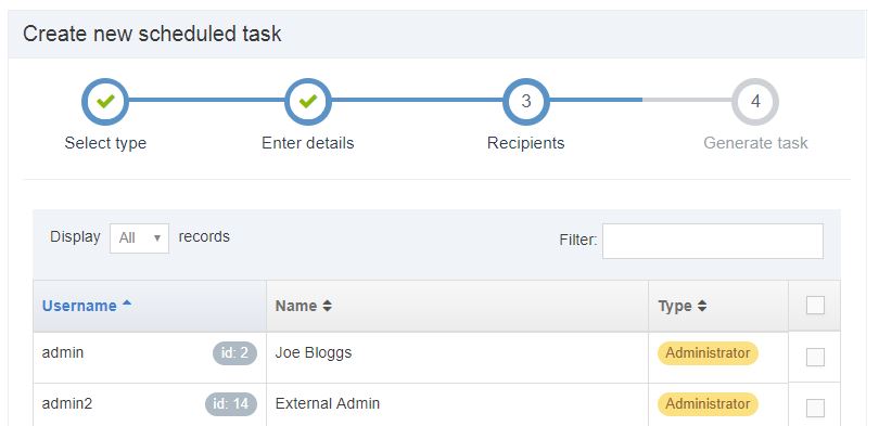
Generate task
Click Save changes to generate the task.
Edit a task
A task can be edited by clicking the name or by selecting Actions > Edit
Delete a task
To delete a task, place a check in the box beside the task and click Actions > Delete. You can Select all items by checking the box located in the header row and bulk delete the items.
Alternatively, it is possible to temporarily suspend scheduled tasks, to prevent them from running.
Reload Tasks
Use the Reload tasks button when you need to:
- restart paused tasks
- start tasks that should have run but have not
- fix issues with tasks that have been edited and are not running
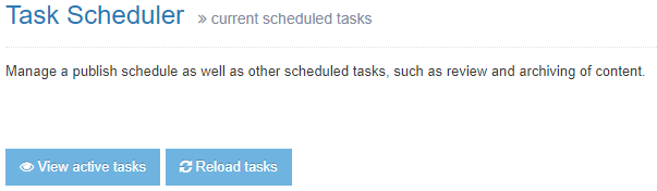
Performance & logging
Description
Configure the performance and logging settings at System Administration > System Settings > Performance & Logging.
Logging
| Item | Description |
|---|---|
| Minimum severity |
Choose the minimum severity level of information stored in the logs. The recommended level is "Information". |
| Event type | |
| Access | Logs pages viewed by users |
| Update | Logs updates by users |
| Scheduled | Logs scheduled tasks |
| System | Logs internal system events |
| Error | Logs internal problems |
Memory usage options
| Item | Description |
|---|---|
| Enabled | Monitors memory usage |
| Check interval (minutes) | Sets the number of minutes between each memory usage check |
| Warn when application server reaches 100% memory allocation | Enables an email to be sent when the application reaches 100% of the memory allocation |
| Send warning message when usage reaches certain level | Sets the memory allocation used (%) threshold before a warning email is sent |
| Send critical message when usage reaches a certain level | Sets the memory allocation used (%) threshold before a critical email is sent |
| Send contact email to all TERMINALFOUR administrators | Sends emails to all administrator users |
| Email addresses of external users that should be contacted | Comma separated list of email addresses |
Performance report
Only integers should be added here; decimal values will be rounded down to 0.
| Item | Description |
|---|---|
| Performance record interval (seconds) | Sets the number of seconds between each system performance check |
| Duration to store records (hours) | Sets the number of hours to store performance reports |
| Duration to store publish records (days) | Sets the number of days to store publish reports. Old reports are cleaned down when a publish is run i.e. if no publish is run for any channel, old reports will not be removed, although they are older than the configured duration that should be stored. |
Timer filter
| Item | Description |
|---|---|
| Enable timer filter | Outputs average page request times to the logs |
Asset usage
Description
TERMINALFOUR provides reporting for asset usage to analyze where the assets are used and how often they are used.
Reports are generated in sortable tables in TERMINALFOUR, or can be exported to CSV to open in Excel, for further analysis.
Reports are available for:
Download management configuration
Description
Configure how downloads from within TERMINALFOUR are handled.
Go to System Administration > Hierarchy & Content Settings > Download Management
Please note that these configuration options are going to be removed in future releases.
| Item | Description |
|---|---|
| Download method | Specifies the download method to use: Attachment - the browser downloads and saves to disk with a specific filename. Inline - the browser downloads the file and opens it in the browser window. None - the browser decides how the file download is handled |
| Character set | Character set to use for downloading text elements. Default is UTF-8. |
| Enable caching of files | Caches downloaded files on the user's computer This may especially be useful for sensitive content. In Internet Explorer, if the "Download Method" is set to "Attachment", caching of files must be enabled. |
Clustering
Description
Note: We have announced the deprecation of clustering. See our deprecation page for more information.
Clustering allows a single Terminalfour instance to be clustered over multiple application servers. All updates are automatically propagated to other servers within the cluster to ensure a consistent experience between all clustered servers.
- License keys can be tied to multiple servers.
- All configuration information is shared.
- All events within the system are serialized and propagated to all known servers in the cluster.
- Scheduled tasks will always take place on a single server instance within the cluster.
To configure Clustering, go to System administration > System settings > Clustering.
General options
Remote object port
The port number on which the remote objects bound in the registry receive calls. This defaults to a free port if not specified. Should be an unused port in the range 1025 - 65536.
Cluster nodes
There is no limit to the number of clustered nodes.
| Item | Description |
|---|---|
| Host | Sets the server hostname or IP address |
| Port | Defines the port number used by the application |
| Use as scheduled server | Sets the server to run all scheduled tasks |
| Use as index server | Sets the server as the index server |
Note: We advise that sticky nodes are enabled for clustered environments so users typically stay on the same server. This is required if MFA is enabled for local/LDAP users.
Search configuration settings
Description
The CMS search, within the header of the interface, can be configured at System administration > Hierarchy & content settings > Search.
| Item | Description |
|---|---|
| Index location | Sets the location of the index files |
| Results per page | Sets the number of search results per page |
| Show HTML entities | Includes HTML tags within the search results |
| Parse queries | Parses search queries for special parameters. Enables searches to be restricted based on a variety of criteria |
| Disable indexing of Media Items and Files | Does not include content from media and uploaded files in the search results |
| Disable indexing of System Content Types |
Does not include content within system content types (e.g. content layouts) in the search results |
Languages (Site localization)
Description
Terminalfour is 100% Unicode compliant so you can publish a website in a number of languages at once. Supported languages include:
- Thai
- Arabic
- Chinese
- Japanese
- Irish, and others.
The database used by TERMINALFOUR must support Unicode. You cannot publish Unicode compliant languages otherwise.
Recommended practice
With Terminalfour you can publish a localized website in two ways:
- Parallel Publish – publish a website in multiple separate languages with each page paired with an equivalent page in another language. This permits you to switch from one language to another. This would be the case if the majority of the website was available in a second language.
- Publish Individual Pages – publish in multiple languages without adding a language to the system. This is done by creating content in another language in the same Site Structure.
E.g., create a Section on the website called "Espanol", and add Spanish content below that Section or set up individual Channels for the other languages.
Multiple language websites require some additional considerations:
- They require a proportionally higher level of staff and content editors compared to a single language website
- Unless your content editors are bilingual, ensure you have added a step in the workflow to allow for translation. This would be required for new content and edits to existing content.
- You should develop policies for content that is only available in a single language. In this case, you should determine whether the other language is left blank (i.e. will not publish), translated, or publishes the content in the primary language alongside a disclaimer to explain that the content is not translated. Consider how much content will be affected and the experience for the user who is using the secondary language of the site and may be faced with content from the primary language.
- Determine whether the main language content is published with future languages added later, or to wait until all the translations are complete before publishing any updates.
Manage Languages
To configure the languages, go to System Administration > Languages. This opens the screen shown below:
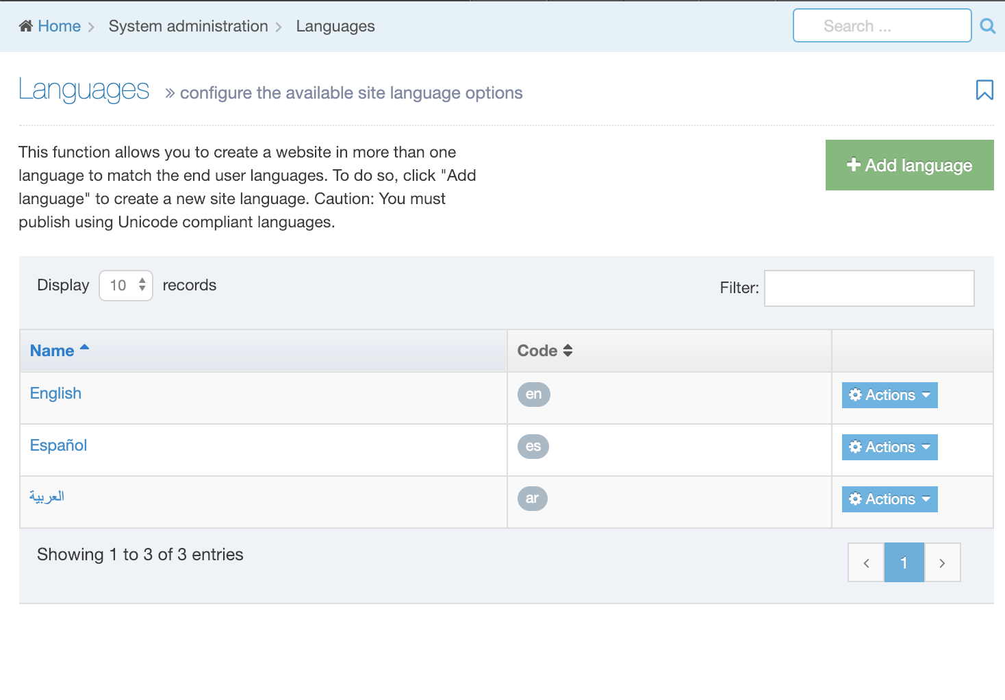
This page displays a list of the Languages. They are listed by name and two-letter code. In the far right column is the Actions button. Select Edit or Delete for the corresponding language.
Add language
In the upper right corner select Add Language. The screen to add a language is shown below:
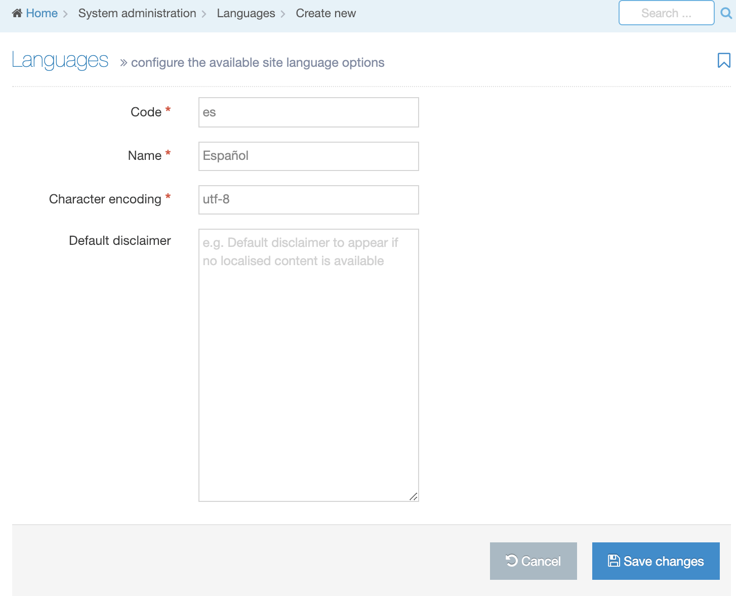
To Add a language to Terminalfour:
| Item | Description |
|---|---|
| Code | The two-letter designator for the language. e.g. en. It's recommended that you use the ISO 639-1 codes |
| Name | The name used to identify the language within Terminalfour. e.g. English |
| Character encoding | It is recommended to use UTF-8. e.g. utf-8 |
| Default disclaimer | The default disclaimer to appear if no localized content is available. A different disclaimer can be configured on the individual Channel Settings, if preferred. To use this on the site, a Warning T4 Tag is required in either Content Layouts or Page Layouts. |
Click Save changes.
Assign Language to Channels
After the language is created, edit the channel to publish in the secondary language and configure the rules around URLs and non-translated content.
Language Switcher
The Language Switcher Navigation object allows users to switch between languages, assuming the content is available. Switching between languages is typically done by clicking a link, which can be text or an image.
Language Variable Tag
The Language variable tag lets you output text for different languages within Page Layouts and Content Layouts with a single T4 Tag.
Place the Unicode character set reference within your Page Layout
Although UTF-8 is the default character encoding method in HTML5 it is recommended that you declare the character encoding used on the page. Add the following to your Page Layout within the <head></head> section of your webpage:
<meta charset="UTF-8">
Translate Sections and Content
Use the language option in the header menu to switch to another language. All sections and content are now shown in the selected language. Those that have not been translated are listed as "Not Translated". Selecting a section or content that has not been translated allows you to enter the section name or content in the current language.
Edit or Delete a Language
To Edit or Delete a language, click the Actions button next to the corresponding Language and select either Edit or Delete.
For Edit, make your changes and click Save changes.
In the Actions box, click Delete. When you delete a Language, a warning box will appear requesting you to confirm your choice. Click Delete to confirm, or Cancel to return to the listing.
When you delete a Language the corresponding content disappears from the Terminalfour interface (but not deleted). You can choose to reinstate a Language, at which point the content appears again.
Licensing
Description
To Manage and configure your TERMINALFOUR licenses go to System administration > System settings > Licensing.
Your installed licenses are listed. Use the Create new license button to install a new license. If necessary, use "drag and drop" to change the order license entries. TERMINALFOUR lists the first valid license (marked with Active beside its name) on top. If you have multiple licenses, you can opt to place the one you use on top.
This opens the screen shown below:
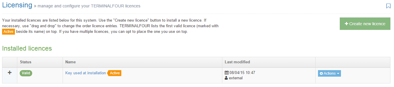
1. Click the "Order" symbol in the first column if you need to move entries.
2. The Status column displays if the license entry is valid.
3. In the Name column is the key name entered when the license was added. If the license is active there is an Active symbol appended to the name. The name is shown in blue (hyperlink) and links you to the license page where you can Edit changes to the license.
4. Details of the Last modification are in this column including the date/time and the user.
5. In the last column there is an Actions blue button which allows you to View information, Edit, or Delete the license entry. This is shown below.
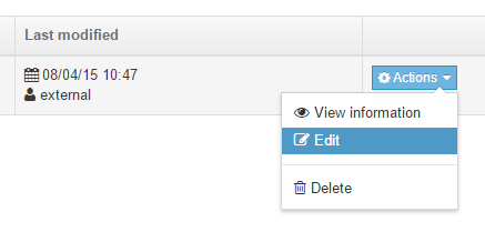
License Limits
If your license is limited based on the number of Content Items, this can be monitored on the Content tab of the About page at System Administration > System Settings > About. The Content Tab shows the content limit that for your license, the Content Items in the system and the number of Content Items that are counted as part of your license as well as any remaining Content Items that can be used.
Create new license
A licence is obtained from TERMINALFOUR. To add a licence, click Create new license.
Enter a Name for the license and paste the copy of your licence Key. Once complete, click Save changes.
Cache management
Description
The Cache management page allows you to rebuild the cache in Terminalfour, view information about cached sections and content and configure which elements are stored in the cache. To access this page go to System Administration > Cache Management.
The Cache management page is still using the old v7 interface.
Rebuild
Within Terminalfour there are a number of different types of caches.
Main System Cache
The main cache stores information about the structure of Sections and Content within your installation. Should this data become out of sync with the database, it is possible to force the cache to be rebuilt.
Low-Level Caches
Low-level caches are used to improve the performance of areas of the system used extensively, e.g. Content Types and Content Elements (links only) and Lists. Caching of these will improve the overall performance of your Terminalfour installation.
If you have enabled Content Types caching, Content Elements caching or List caching, another option to rebuild these low-level caches is available. This is useful when elements within Content Types are changed directly through the database or when new Lists are added from outside Terminalfour.
Cached Sections and Content
It is possible to query information about Sections and Content which is currently stored in the main system cache. This allows you to view Subsections and Content within the queried Section. To access this, select the Sections or Content tab and enter the ID of the relevant Section or content.
From the returned results, you can query any of the Child Sections or obtain more information about any Content Item within that Section by clicking on the Section or content name.
Configure Elements Stored in Cache
It is possible to configure the main system Cache to store information about elements within Content Types which are used for ordering or selecting content. Some of the Navigation Objects this applies to are Top Content, Keyword Search Content and Mapped metadata (for mapped meta keywords).
Adding elements which are used within these Navigation Objects can improve preview and publish performance on pages using those Navigation Objects.
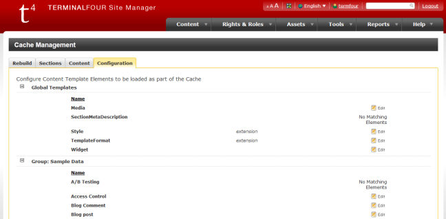
The main configuration page shows a list of all Content Types and gives you an option to Edit the cache properties for each Content Type.
Click Change cached beside the relevant Content Type to select the elements you want to make available within the main system cache.
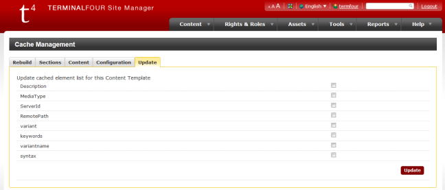
The more items you add to the Terminalfour cache, the more server memory will be used. Ensure your server has sufficient memory to cache all of the items selected.
After adding elements to the cache and selecting Update, Rebuild the cache.
Header menu links
Description
Header Menu Items
Header Menu Items are labeled below:
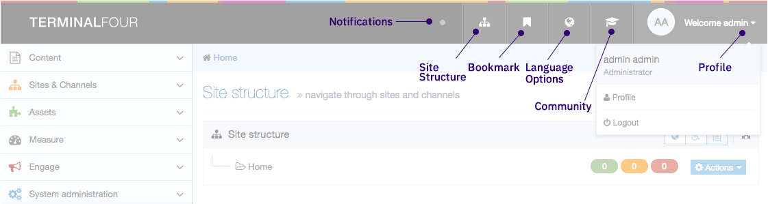
| Item | Item | Description |
|---|---|---|
 |
TERMINALFOUR logo | Return to Site Structure or Welcome page. This can be configured to link to any page. |
 |
Notifications | View notifications for Publish tasks that you have initiated. |
 |
Site Structure | Displays Site Structure |
 |
Bookmark | View Bookmarked pages. |
 |
Language options | Lists available languages if multiple languages are configured |
 |
Community | Access TERMINALFOUR Community site |
 |
Profile | View and edit current User Profile |
| Logout | ||
 |
Search | Search content and assets |
About TERMINALFOUR
To get information about your TERMINALFOUR installation including licensing information go to System Administration > System Settings > About
Your User Level determines what you can see in the About page. The Administrator's view shows detailed information about TERMINALFOUR and the system. You can access this with the five tabs below:
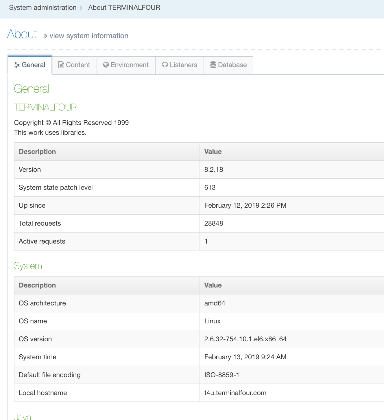
Other, non-Administrator users can only see the General tab with basic TERMINALFOUR and System information:
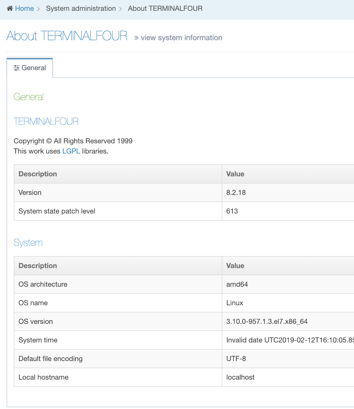
General Tab
Administrators can see system information such as:
| Item | Description |
|---|---|
| TERMINALFOUR | Information related to your TERMINALFOUR installation including the version number and current active requests |
| Version | The version number of your TERMINALFOUR installation. |
| System state patch level | The patch level that TERMINALFOUR has been upgraded to. |
| Up since | The date and time when the application was started/restarted adjusted for the time on your local machine. e.g.. if the application was started at 02:00 and the TERMINALFOUR user was located in timezone one hour ahead, the "Up since" time displayed would be 03:00. |
| Total requests | The total number of login requests since the application was last started. |
| Active requests | The total number of login of active login for the application. |
| System | Information related to the system that hosts your TERMINALFOUR installation. |
| OS Architecture | The processor architecture used by the host operating system. |
| OS name | The operating system name |
| OS version | The operating system version |
| System time | The operating system date and time value when the About page was requested. This value is updated when you refresh the page. An offset is shown if you are not in the same time zone as the server. |
| Java | Details of the Java installation used by TERMINALFOUR. |
| Vendor | The vendor who has implemented the currently installed version of the Java Virtual Machine on the system. |
| Java version | The version number of the currently installed version of Java. |
| Java home | The path to the Java compiler on your system. |
| Classpaths | The Java Runtime Environment classpaths. |
| Available processors | The number of processors or cores capable of executing Java code. |
| Heap memory | The amount of Used, Allocated and Maximum Heap Memory used by the system to store Java Objects. |
| User | |
| Name | The name of the user that runs the Tomcat application. |
| Working directory | The path to the directory where Tomcat writes files required during run time. |
| Home directory | The path to the directory where Tomcat conf, webapps, logs, and work directories are stored. |
| Servlet container | Details of the Servlet container used to publish web pages. |
| Container name | The name and version number of Tomcat, the Servlet container used by TERMINALFOUR. |
| Specification version | The Servlet specification number used by the installed version of Tomcat. See this table mapping specification and Tomcat versions. |
| Context name | The name of the TERMINALFOUR installation .war file deployed in Tomcat. |
| Context directory | The path to the directory that TERMINALFOUR is deployed from. |
Content Tab
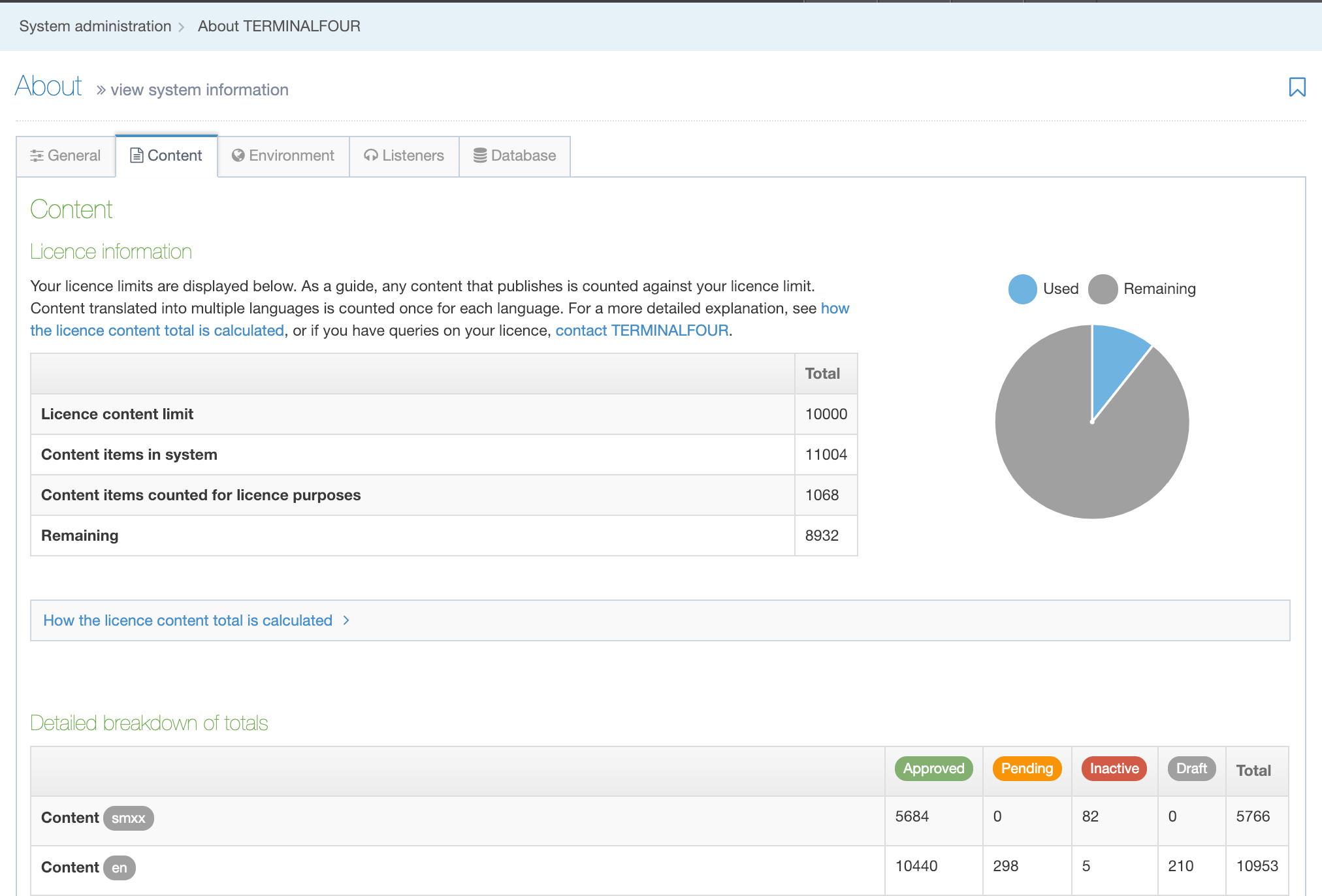
The Content Tab shows the content limit for your license, the Content Items in the system and the number of Content Items that are counted as part of your license as well as any remaining Content Items that can be used.
A pie chart provides a visual representation of the breakdown. If you require clarification on how content totals are calculated a brief description is provided below.
| Item | Description |
|---|---|
| Licence content limit | The maximum number of Content Items that are included as part of your license. |
| Content items in system | The total number of Content Items in TERMINALFOUR |
| Content items counted for licence purposes | The total number of Content Items in TERMINALFOUR that count towards your license content limit. |
| Remaining | The number of Content Items that you have remaining before the content limit is reached. |
Published Content Items are counted toward your license's content limit if:
- they have a status of Approved
- they are located in the Section of a Channel
- they are associated with one or Channels
- its current Section's ancestors have a status of Approved
- they originated from a form submission and are published
Note: repeated Content Items (i.e. content made with the Repeater element) will count towards your license.
For example: 1 Content item that outputs 5 slides using the Repeater Element will count as "6" total towards your license.
The following are not counted toward your license's content limit:
- Media Files
- System Content Items
- Orphaned Content Items
- Expired Content Items
- Content Items in a Section that is not associated with a Channel
- Content Items in a Section or Branch that has a status of Pending
- Content Items in a Section or Branch that has a status of Inactive
- Content Items originating from form submissions that are not published
In addition:
- Mirrored Content Items are only counted once
- Translated Content Items are counted once for each language
The "Detailed breakdown of Totals" table below provides a list of Content Item and Section totals by language and status. The label "smxx" indicates Content Items that are Language independent.
The "Statistics" table provides you with Section statistics:
| Item | Description |
|---|---|
| Content per Section | The average number of Content Items per Section. |
| Deepest Section |
A breadcrumb listing names of the Section paths to the section that has the highest number of levels deep. The highest number of levels is displayed beside the row heading. This ignores system Sections and Media. |
| Widest Branch |
A breadcrumb listing names of the Section paths to the section that has the highest number of child sections. The widest number is displayed beside the row heading. This ignores system Sections and Media |
Environment Tab
This contains all the System Environment variables like the context_url.
| Item | Description |
|---|---|
| context_url |
Specifies the base URL of the TERMINALFOUR application servlet. This setting can be changed in System Administration > System Settings > General. The installation wizard sets it automatically so there should be no reason to change it. |
| debug_auto_publish | Debug automatic publish. Outputs the same logging information for automatic publishes as manual publish – System administration > System Settings > Advanced |
| default_sender |
The email address used to send automated email notifications. This value can be changed in System Administration > System Settings > General. |
| enable-caching |
Enabling caching is recommended as disabling can impact performance. This value can be changed in System administration > System settings > Advanced. |
| enable-publish-logfile |
This is a deprecated setting and is disabled because it could fill up disk space if every publish log is saved and not manually cleared. Since the log file is always generated now, enabling this will save the one that is already created. |
| enable-transfer-logfile |
As with enable-publish-logfile, this is a deprecated setting and should be left disabled. |
| enable_hierarchical_access_control |
If enabled, when Group Access Control is used, Child Sections will inherit the rights of the Parent Section unless a more specific (or stringent) access rule is applied. This value can be changed in System Administration > Set up Sites & Channels > Access Control |
| file-char-remove |
If enabled this setting removes specified characters from filenames. This value can be changed at System Administration > System Settings > Preview & Publish. |
| file_part_separator |
Specifies the character(s) used to separate spaces in filenames. e.g., if a hyphen is specificed as the file separator, a Section named Contact Us will publish as contact-us.html This value can be changed at System Administration > System Settings > Preview & Publish. Note: It is advisable to use hyphens as other characters can cause issues when linking to fulltext pages. |
| file_store |
Specifies the server directory where uploaded files are stored. This applies to Media Library files and files uploaded via file or image elements. This value can be changed in System Administration > System Settings > Advanced. |
| max_upload_size |
Sets the maximum size (in kilobytes) of files uploaded to TERMINALFOUR. This applies to Media Library files and files uploaded via file or image elements. This value can be changed in System Administration > System Settings > Advanced. |
| media-output-directory |
Specifies the directory for published Media Files. By default, this is called "media" in the Channel Root (output directory). This value can be changed at System Administration > System Settings > Preview & Publish. |
| publish-logfile-dir |
Specifies the directory location for the Publish log file. This value can be changed at System Administration > System Settings > Preview & Publish |
| sm_location |
The application directory that TERMINALFOUR is installed in. This value can be changed in System Administration > System Settings > Advanced. |
| t4-cache-pre-gen-preview |
Re-initializes previews when creating or editing content on the selected Channel(s) to ensure accuracy. This value can be changed at System Administration > System Settings > Preview & Publish |
| t4-cache-builder-debug-load |
Adds cache builder times to logs. Can be changed at System administration > System settings > Advanced |
| t4-max-cache-build-processes |
A numeric value that represents the number of threads which may be used when building the cache. The higher this number, the faster it's built. Defaults to the CPU count for the server. Minimum of 1. Each thread will be a DB connection. In some cases, the machine may have more CPUs than Database connections. Restricting this number will prevent all the connections from being exhausted. Can be changed in System Administration > System Settings > Advanced |
| t4-publisher-debug-load |
When enabled, the same information is output to the logs for both manual and automatic publishes. This value can be changed by the "Debug automatic publish" option in System Administration > System Settings > Advanced. |
| t4-query-users |
The usernames of users permitted to use the Query Handler. This value can be changed in System Administration > System Settings > Advanced. |
| t4-skin-file-location |
The root location of the skins directory. This value can be changed by the "Skin files location" option in System Administration > System Settings > Advanced. |
| t4-skin-no-cache |
When enabled, skin files are not cached. This value can be changed by the "Don't allow the caching of skin files" option in System Administration > System Settings > Advanced. |
| t4-suppress-formatter-not-found-warnings |
When enabled, warnings about missing Content Layouts will not be included in the application server log. This value can be changed by the "Hide warnings about missing Content Layouts" option in System Administration > System Settings > Advanced. |
| temp |
Specifies the directory where temporary files are stored. This must be a valid, writeable, filesystem location. If a temp directory is not specified, the application server This value can be changed in System Administration > System Settings > Advanced. |
| tm-cleanup-debug |
When enabled, a comparison between the rules defined for upload in transfer sites and the currently transferring directory/extension is output. These are output to the screen, the transfer log and the application server log files. This value can be changed by the "Debug transfer cleanup" option in System Administration > System Settings > Advanced. |
| transfer-logfile-dir |
Specifies the directory to output transfer logs to. If a directory is not specified, the content store directory is used. This value can be changed in System Administration > System Settings > Transfer. |
Listeners Tab
A list of all Event Listeners enabled on your System.
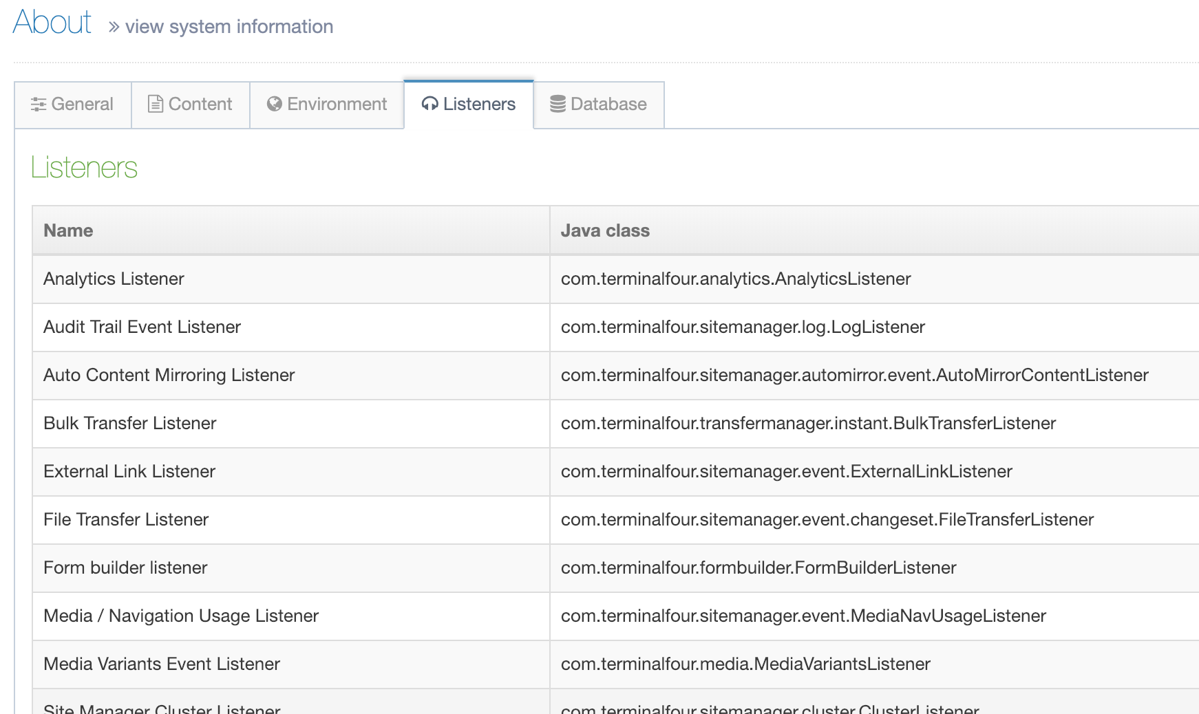
Database Tab
This provides information about the Database such as the name, type and user name. You can also see information on the JDBC driver including its version number.
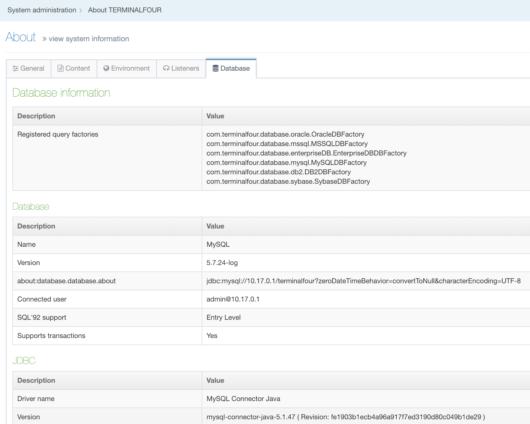
| Item | Description |
|---|---|
| Database Information | |
| Registered query factories | These allow TERMINALFOUR to efficiently generate queries that will work with a wide variety of databases. |
| Database | The details for the database that your TERMINALFOUR installation is using. |
| Name | The name of the database. |
| Version | The database version |
| Address | The database address |
| Connected user | The username that TERMINALFOUR is using to connect to the database. |
| SQL 92 support | SQL 92 conformance level |
| Supports transactions | Describes whether the database supports ACID transactions. |
| JDBC | The details of the database connection driver settings used by Java. |
| Driver name | The name of the driver used. |
| Version | The version of the driver. |
| Datasource class | The name of the datasource class used. |
| Connection class | The name of the connection class used. |
Advanced configuration
Description
Before making changes to the Advanced Configuration Settings, you should be confident you know what you are doing. Applying incorrect settings can impede system performance or render it unusable.
If in doubt, contact TERMINALFOUR support.
The advanced configuration page contains a number of configuration options, grouped into their relevant areas.
Go to System Administration > System Settings > Advanced.
Settings are grouped by theme:
| Item | Description |
|---|---|
| Scheduler | |
| Enable reload scheduler | Reloads the scheduled tasks after the set number of executions |
| Number of executions before reload | Sets the number of task executions before the task is restarted |
| Send email on successful task completion | Sends emails to specified recipients to inform them that the task has completed |
| Anti-virus | |
| Enabled | Enables the anti-virus filter. This currently supports the anti-virus application called ClamAV. ClamAV needs to be downloaded first for anti-virus to work |
| Path to executable | Sets the file system path to the command line executable. e.g. /usr/bin/clamscan |
| Parameter | Sets the parameters to the command line anti-virus scanner application |
| Text processor | Sets the full class name of the text processor used for the anti-virus scanner. e.g. com.terminalfour.filter.antivirus.textProcessor.ClamAVTextProcessor |
| Caching | |
| Enabled | TERMINALFOUR advise enabling this as disabling it can impact performance |
| Add cache builder times to logs | Enter a value of true or false. The time to publish the site is recorded and output to the log files. TERMINALFOUR recommend that this is set to true |
| Maximum number of threads that will be used during building of cache |
Sets the max number of concurrent cache building processes. This applies to loading content type-specific information during cache builds. If not set, the number of available processors in the system is used. e.g. 2. This should not generally be used unless cache rebuilds are putting pressure on a shared server, in which case setting this value to a smaller number can relieve the pressure on the server. |
| Debugging | |
| Don't allow the caching of skin files | Disables caching of the skin files. TERMINALFOUR recommends that this is left unchecked. |
| Skin files location | Sets the root location of the skins directory. e.g. /web/dev/sitemanager/support/skins/ |
| Hide warnings about missing content layouts | Excludes warnings about missing content layouts from the application server log |
| Debug automatic publish | Outputs the same information to the logs for manual and automatic publishes |
| Add preview times to logs | Logs the time taken to generate the preview page |
| Debug transfer cleanup | Outputs the comparison between the rules defined for upload in transfer sites and the currently transferring directory/extension. These are output to the screen, the transfer log and the application server log files |
| Debug publishable file creation | Outputs the publishable file creation path should an error occur in publishing target files |
| File management | |
| File store | Sets the directory on the server where uploaded files are stored. e.g. /web/sitemanager/contentstore/ |
| Max upload size (KB) | Sets the maximum size of files (in kilobytes) which can be uploaded to TERMINALFOUR. Applies to media library and files uploaded via file or image elements. e.g. 50000 |
| temp | Sets the directory on the server where temporary files are stored. Must be a valid, writeable, filesystem location. If not set, the application server work directory is used. e.g. /web/sitemanager/temp/ |
| Database | |
| Allow dirty reads | Allows a transaction to read data from a row that has been modified by another running transaction and not yet committed |
| Enable stack traces for database connections | Outputs stack traces for database connections. TERMINALFOUR advise enabling this for troubleshooting only |
| Environment | |
| Users with access to query handler | Sets the usernames of those users permitted to use the query handler |
| xForms sections |
Enter the section IDs into which xForms post data is allowed. Use a comma-separated list without spaces. This is a legacy option for TERMINALFOUR xForms, and is not required for Form Builder forms. |
| xForms content types |
Enter the content type IDs into which xForms post data is allowed. Use a comma-separated list without spaces. This is a legacy option for TERMINALFOUR xForms, and is not required for Form Builder forms. |
| Application location | Sets the location of the TERMINALFOUR application |
| JS CSS Minification | Minifies interface JS and CSS files. Settings can improve application performance |
Anti-virus
Please note that TERMINALFOUR recommends using an anti-virus web proxy.
The Anti-virus is designed to scan any uploaded files for viruses, either when uploading files directly in content or when uploading files to the Media library. Essentially, this filter is making calls to the operating system to run the configured command line scanner.
If any malicious files are encountered, a message will be displayed in the web browser and the files are not uploaded. If for any reason a critical error occurs trying to scan (such as the AV scan not starting/completing) then all appropriate output is sent to the application server's error log. Currently, there is no log for uploads which were blocked.
The ClamAVTextProcessor class as implemented in TERMINALFOUR is tasked with checking the results of "Standard Out" to process the report provided by ClamScan and interpret the list of infected files (if present). Before that, it consults the status code returned by ClamScan to discover if it completed successfully and if text processing is appropriate.
TERMINALFOUR requires two parameters to Clamscan; the "Text Processor" classname and the "Path To Executable" which are set in the Anti-virus configuration. The clamscan application may require additional parameters to successfully scan (dependent on how you have chosen to install clamscan). If the virus database is not set by system-wide environment variables, it may be necessary to explicitly set it using the -d flag (as shown in the diagram on the configuration page).
Keystore configuration
Description
To manage keys and certificates, go to System administration > System settings > Keystore.
Please note that this was introduced in TERMINALFOUR 8.2.3. During the upgrade, existing keys will be imported to the keystore.
Keys or certificates in use by TERMINALFOUR configuration options (e.g. Form bank) are marked as "In use" and cannot be deleted.
Key/certificate details
| Item | Description |
|---|---|
| Name | The name used within TERMINALFOUR for this key/certificate |
| Description | A short description for this key/certificate |
| Public key/certificate |
Sets the key/certificate. e.g.
|
| Private key/certificate |
Sets the key/certificate. e.g.
or
|
| Password (for private keys) | Enter the password to be used for private keys. |
About TERMINALFOUR
To get information about your TERMINALFOUR installation including licensing information go to System Administration > System Settings > About
Your User Level determines what you will see in the About page. The Administrator's view shows detailed information about TERMINALFOUR and the system (see the section tabs below). Other users can only see a high-level view this information.
As an Administrator, you can view all system information. Click the corresponding tabs:
General
This contains all the information related to the system information
- TERMINALFOUR information
- System Specification
- Java information
- System User
- Servlet Container
Content
This contains a breakdown of sections and content being used in the system.
- "smxx" indicates Language independent content.
Environment
This contains all the System Environment variables.
Listeners
Information for all the Event Listeners enabled on your System.
Database
Information for the Database.
Only the Administrator can see the full information for TERMINALFOUR and the system. Other users are limited to a less detailed, high-level view.
Notifications
Description
The Notification Area is visible can be viewed when the circle next to the Site Structure is selected. The circle is grey when there is no current publishing activity and turns green when a Publish task that has been started by the current user is in progress.
It will also show as a red pulse to indicate when there is a Form Bank connection issue.
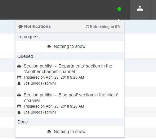
There's a video on the feature here:
Overview
Scheduled Publish tasks are shown at Sites & Channels > Publish Channels and are not included in the Notifications.
There are three types of notifications:
- In progress: tasks that are currently running
- Queued: tasks that are queued to run in the future
- Done: tasks that have completed
- Error: Indicates when there is a Form Bank connection error
The following information is displayed:
| Item | Description | Example |
|---|---|---|
| Publish type | The type of Publish | Channel Publish Microsite Publish Branch Publish Branch Publish/Multiple Branches Section Publish Section Publish/Multiple Sections Content Publish (A Section Publish that is initialized within the content) |
| Channel name | The name of the Channel | Main website |
| Date/time | In progress tasks: the date/time that task started is displayed Queued tasks: the date/time the task was triggered is displayed Done tasks: the date/time the task was completed is displayed |
|
| Duration | For In progress tasks, the duration is displayed in hh:mm:ss format | 00:00:09 |
| Status | For Done tasks, a green tick icon is displayed for a successful task | |
| View output | For In progress tasks, a link is provided to view the publish output | See further information. |
| View report | For Done tasks, a link is provided to view the publish report |
Currently, Publish tasks started/created by the current user are shown in the Notification Area though additional tasks will be included in future releases.
Configuring the Display of Notifications
Under System administration > System settings > Preview and publish, you can configure two options:
- Length of time to show Publish Notifications: Sets the length of time Notifications will be shown once a Publish finishes. The default is 30 minutes.
- Number of Publish Notifications to show: Sets the maximum number of Publish Notifications that are displayed. The default is 10.
View Output
It is possible to view to view the output of a running Publish by clicking the View Output link on the Notification. The Publish output modal displays basic information about the publish and two tabs contain more specific information.
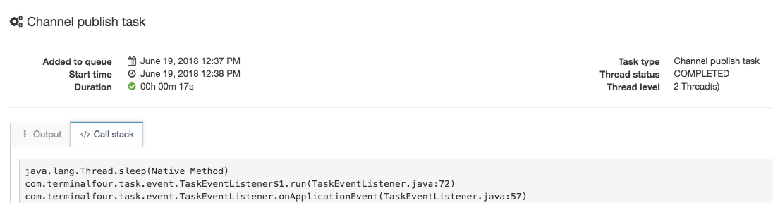
| Item | Description |
|---|---|
| Output | Displays the Publish log output. The log will automatically scroll to the most recent output. |
| Call stack | Displays the current stack trace of the Publish. This can be useful for determining the status of the Publish, or for identifying issues like stalled or blocked Publishes. |
Profile
Description
To view or update your profile click on the Welcome link on the top right of the page.
Your full name is displayed and your user type. Clicking on Profile displays your profile details:
Click Edit profile to make changes.
The following information is displayed:
| Item | Description |
|---|---|
| First name* | This is required |
| Last name* | This is required |
| Email address* | This address is used for notifications and alerts. Ensure it represents an actively used address. |
| Current password | If changing password, enter the current password. |
| New password | If changing password, enter the new password. |
| Confirm password | If changing password, enter the new password. |
| Default language | The default language used when logging in. |
| HTML editor | Choose either TinyMCE or Standard textarea as the editor used on any HTML Content Type Elements.. If custom versions of TinyMCE have been created, these will be available in the list. |
| Preview channel | Sets the channel to preview content. If a default preview channel has been specified in more than one place, the system applies the following logic:
If no default channel is set at all, the user is prompted to select the desired channel whenever previewing content. |
If you are using an Extended user details Content Type you may see additional elements. This will vary from installation to installation. If such elements are present populate them with the appropriate information.
Enter any changes, such as a new password, and click Save changes.
Community
Description
Access the TERMINALFOUR community
The TERMINALFOUR Community is your source of all information about TERMINALFOUR and related products. It provides you with access to documentation, current news and other information about TERMINALFOUR. You can also use it to provide feedback on the product, or suggest features for future releases.
Overview
When you click on the Community link on the top right of the page, you will be prompted to agree to our terms of use.
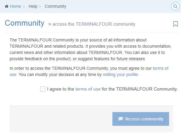
The connection page will then be displayed.
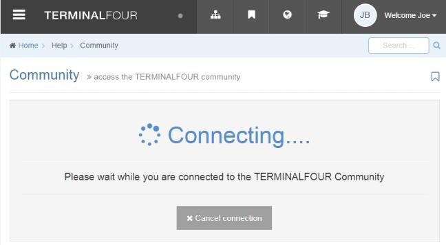
You will then be brought to the TERMINALFOUR Community extranet.
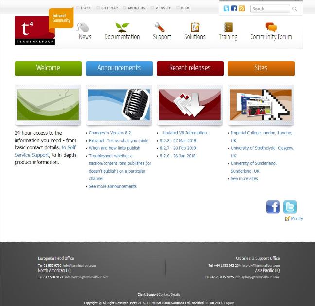
Bookmarks
Description
When you click on the Bookmark icon on the top right of the page, Sections and screens you have previously bookmarked are displayed.
Here, you can see that the Bookmark icons match the icons in their menu category, i.e. the "Forms" icons matches the "Engage" menu item icon.
Each Bookmark links to that screen or Section.
Learn more about Bookmarks here.
Language options
Description
Some sites may be configured with more than one site language. This icon allows you to change to another site language so the sections and content can be written or translated for the selected language.
When you login, the default language as set in your profile is selected automatically. When you click on the Language options icon on the top right of the page, the additional language options are displayed and can be selected.
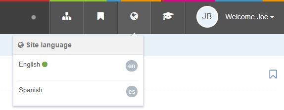
Welcome
Description
The Welcome Page is an optional page which can be displayed after login. The content of this message and whether it is displayed or not can be configured by an Administrator.
Overview
If it's configured to display, users will see the message on the Welcome Page when they log in or when the TERMINALFOUR logo is selected. The Welcome Page can be a useful resource to help keep users up to date on upgrades and new features.

System performance
- Last Modified:
- 10 Dec 2018
- User Level:
Description
Please note that the system performance dashboard functionality is no longer supported and will be removed in future releases.
Please contact us if you have any queries.
Error reports
Description
The error report allows you to search the Terminalfour logs for errors that have been reported in your installation. Use the tools to search the error logs. You can use as many or as little of the options as you like, there are no required elements.
To search for logged errors within the system go to Administration > Reports > Error Reports.
Search tools
| ITEM | DESCRIPTION |
|---|---|
| Error | Select a specific error from the list |
| Action taken | Select a specific action from the list |
| Start date | The date and time to start |
| End date | The date and time to end |
| Restrict to user | Select to restrict the search to a specific user |
| Section | Select to restrict the search to a specific section |
| Restrict to content | Select to restrict the search to specific content |
| Content ID | Enter the content id to restrict the search to specific content |
Click Search error logs to display the search results.
Search results
Results matching the search will be displayed in the listing. Results can be sorted and filtered.
| Item | Description |
|---|---|
| Description | The action taken. Click to view more information. |
| Section | The full path to the section. Click to edit the section. |
| Content | Name of the content. Click to edit the content. |
| User | The username and full name of the user who took the action e.g. admin (Joe Bloggs) |
| Action date | The date and time the action was taken e.g. April 4, 2016 9:30 PM |
| Actions |
The Actions menu options will vary depending on the type of result:
|
Error log entry
Clicking View more information displays further information on the error
| Item | Description |
|---|---|
| ID | A unique id for the action e.g. 4196 |
| Occurred | The date and time the action occurred e.g. October 27, 2017 5:48 AM |
| Action | The action taken e.g. Publish site |
| Type | The type of action e.g. Error |
| Severity | The severity of the action e.g. Error |
| Message | The description of the action e.g. Scheduled Task 'Channel publish for the main channel. Every 10 minutes.' failed with an error. |
| Remote address | e.g. 127.1.1.0 |
| Stack trace | If available, e.g. java.lang.NullPointerException at com.terminalfour.publish.task.ChannelPublishTask.merge(ChannelPublishTask.java:204) |
Download as CSV
Click Download as CSV to download the results in a CSV file that can be opened in Excel.
Audit trail
Description
The audit trail report allows you to search the Terminalfour logs for actions taken in your installation. Use the tools to search the audit trail. You can use as many or as little of the options as you like, there are no required elements.
To search for actions taken by users within the system go to System Administration > System Reports > Audit Trail.
Search tools
| Item | Description |
|---|---|
| Action taken | Select a specific action from the list |
| Start date | The date and time to start |
| End date | The date and time to end |
| Restrict to user | Select to restrict the search to a specific user |
| Section | Select to restrict the search to a specific section |
| Restrict to content | Select to restrict the search to specific content |
| Content ID | Enter the content id to restrict the search to specific content |
Click Search audit trail to will display the search results.
Search results
Results matching the search will be displayed in the listing. Results can be sorted and filtered.
| Item | Description |
|---|---|
| Description | The action taken. Click to view more information. |
| Section | The full path to the section. Click to edit the section. |
| Content | Name of the content. Click to edit the content. |
| User | The username and full name of the user who took the action e.g. admin (Joe Bloggs) |
| Action date | The date and time the action was taken e.g. April 4, 2016 9:30 PM |
| Actions |
The Actions menu options will vary depending on the type of result:
|
Audit information
Clicking View more information, displays further information on the action
| Item | Description |
|---|---|
| ID | A unique id for the action e.g. 4196 |
| Occurred | The date and time the action occurred e.g. October 27, 2017 5:48 AM |
| Action | The action taken e.g. Publish site |
| Type | The type of action e.g. Update |
| Severity | The severity of the action e.g. Information |
| Message | The description of the action e.g. Full Manual Publish publish for channel (Main) started |
| Remote address |
Download as CSV
Click Download as CSV to download the results in a CSV file that can be opened in Excel.
Publish reports
Description
Publish reports give information about each channels' publish performance. To access the Publish reports, go to System administration > System reports > Publish reports.
The level of reporting for each channel is configured in the Channel settings, under 'Publish options', and the duration for which publish reports are retained is configured in the Performance & Logging configuration.
Publish data
A listing of previous publishes is displayed. Currently, channel & microsite publishes are listed. In future, publishes for content, section and section branch publishes will be listed.
For each publish, the following is provided:
| Item | Description |
|---|---|
| Channel | Name of the channel published, links to publish details |
| Publish type | Scheduled or Manual |
| Start time | Date and time the publish started e.g. June 30, 2017 10:30 AM |
| Duration | Length of time the publish took e.g. 3 minutes, 5 seconds |
| Result | Introduced in 8.2.9. If the publish was successful, a green tick is displayed  or if the publish failed, then a red circle with an X in it, is shown or if the publish failed, then a red circle with an X in it, is shown  |
| Actions: View details | Link to view publish details |
| Actions: Download log | Link to download the log in a text file e.g. PublishReport-11-30_30_Jun_2017.txt |
| Actions: Download statistics | Link to download the statistics in a csv file e.g. PublishStatistics-11-20_30_Jun_2017.csv |
Publish reports of deleted Channels cannot be viewed.
Example of the statistics file opened in excel
The "count" column shows the number of times that object is processed within the publish. The "average" column is the average number of milliseconds per instance of that object. Multiply the two columns together to get the approximate length (in milliseconds) that the individual object is adding to the publish duration.
Publish details
A summary is displayed for all publishes and details of sections, content, navigation objects and tag brokers is provided for some publishes.
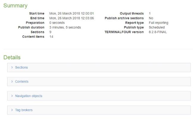
Summary
| Item | Description | Example |
|---|---|---|
| Start time | Date and time the publish started | Fri, 30 March 2018 11:30:42 |
| End time | Date and time the publish ended | Fri, 30 March 2018 11:30:46 |
| Preparation | Time it took to prepare the publish | 0 seconds |
| Publish duration | Time the publish took | 3 seconds |
| Sections | Total number of sections published | 142 |
| Content items | Total number of content items published | 236 |
| Output threads | Number of threads used during publish | 1 |
| Publish archive sections | Whether archive sections were published | No |
| Report type | Level of reporting | Full reporting |
| Publish type | Scheduled or Manual | Scheduled |
| TERMINALFOUR version | Version of the product | 8.2.9 |
Details
| Item | Description | Example |
|---|---|---|
| Sections | ||
| Section | Section name and link to edit | |
| Language | Publish language | en |
| Publish time | Time to publish the section | 0.108 seconds |
| Content | ||
| Content name | Content name and link to edit | |
| Language | Publish language | en |
| Section ID | ID of the section that contains the content | 268 |
| Publish time | Time to publish the content | 0.041 seconds |
| Navigation objects | ||
| Navigation object | Navigation object name, id and link to edit | Children or siblings id: 2 |
| Language | Publish language | en |
| Usage count | Number of times the navigation object was used | 144 |
| Average publish time | Average time to publish the navigation object | 0.001 seconds |
| Tag brokers | ||
| Broker | Excel To HTML Broker | |
| Language | Publish language | en |
| Usage count | Number of times the tag broker was used | 3 |
| Average publish time | Average time to publish the tag broker | 0.011 seconds |
Publish durations
A chart shows recorded publish times, in seconds, for each channel that has been published. Drag across an area on the chart to zoom in to that area.
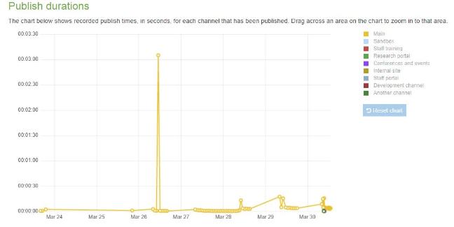
Publish duration versus content count
A chart shows how publish time is affected by the amount of content in your channel. By default the channel that is published most is shown, but you can select a different channel using the drop down menu.
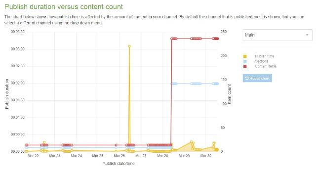
User Management
Description
Kerberos support was removed in version 8.3.16.
Users are assigned permissions that limits what they can access as well as the actions they can carry out. For instance, you may want to limit the Sections that a user can access. Multiple Users can be assigned permissions with Groups.
To modify or create new Users for use within the system, go to System administration > User rights & roles > User management
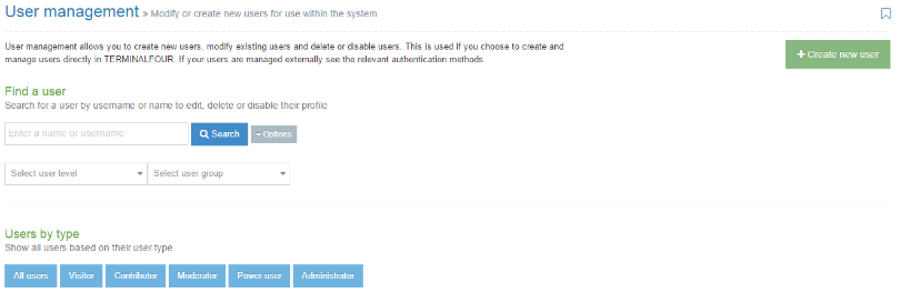
You have several options to choose from this starting point. The Search functions lets you enter a name or username to fetch their records. There are two search box options - Select user level and Select user group. These serve as short cut methods for these categories. If you wish to see the Users by type - you can click any of the blue tabs, including the first on the far left that enables you to see all users. To create a new user, click the Create new user button.
You can choose a User type grouping them by type, or as a master list "All users". To click All users tab gives you this result:
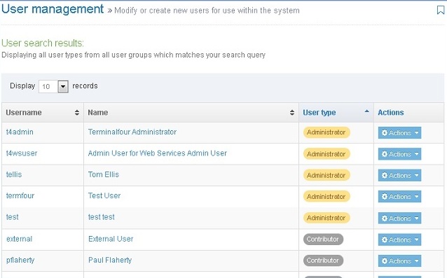
This shows the table of all users - the results are listed by:
- Username: this can be for an individual or group.
- Name: the user's first name and last name
- User type: this is the five types of users (Visitor, Contributor, Moderator, Power user, and Administrator)
- Action button: click this button and you can choose to view their Access Rights, Edit or Delete the corresponding user in that row.
If Power Users are configured to be able to Edit users, they are able to see Visitors, Contributors and Moderators who are in the same Group as the Power User.
Create a user
Power Users can only create users if they are configured to do so in Role Customization.
See the Users Rights and Roles page for a description of roles.
After you click the green Create new user button, the system opens to this page. This image represents a portion of the page. Additional sections are presented below:
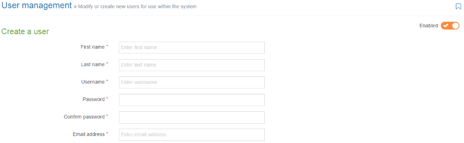
When you are creating a new user you begin with this screen image.
| Item | Description |
|---|---|
| Enabled | To ensure that the rights and roles of the user are in place, confirm that the Enable button in the upper right corner is in the Enabled position. You can create a user and not enable their rights and roles pending the user becoming an active participant on the site. If you wish to disable the user at this point - move the Enable button to the Disabled position. |
| First name * | This can only be changed by a Power User or Administrator after the user is added. |
| Last name * | This can only be changed by a Power User or Administrator after the user is added. |
| Username * | This cannot be changed after the user is added. |
| Password * | Consisting of at least six characters. The characters are not displayed on screen. When safe passwords are used, certain passwords are not accepted by Terminalfour. |
| Confirm password * | |
| Email address * | This address is used for notifications and alerts. Ensure it represents an actively used address. |
| User type | Sets the user level. This restricts access to parts of Terminalfour based on the user level |
| Terminalfour user interface language | Sets the language for the Terminalfour user interface |
| Default language | Sets the language for written content (for multiple language content) |
| HTML editor | Choose either TinyMCE or Standard textarea - your choice can be changed at a later date. If custom versions of TinyMCE have been created, these will be available in the list. |
| Preview Channel | Sets the Channel to preview content. If a default preview Channel has been specified in more than one place, the system applies the following logic:
If no default Channel is set at all, the user is prompted to select the desired Channel whenever previewing content. |
| Assign Channels | See below |
| Community access | Assign access to the Terminalfour community pages |
| Authentication |
Authentication Tokens From Version 8.3.4 Administrators can create authentication tokens to use with third-party applications via the Web API. |
|
Authentication Methods Configure the authentication methods available for a User. The three columns are
|
You may have additional elements if you use an Extended user details content type. This will vary from installation to installation. If such elements are present populate them with the appropriate information.
Assign Channels
For Power users and potentially Moderators, depending on the minimum user level selected for the 'Publish now' minimum user level When assigned to Channel/microsite in Role customization.
When the user is designated a Power user or Moderator then the user is permitted to publish specific Channels, or micro sites, or both. This enables the User to run a manual publish of the selected Channels or microsites. Make the appropriate selections and then proceed to Community access.
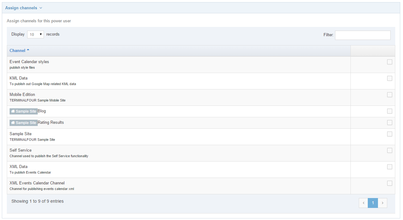
If your entries are complete, you can now click Save changes to record a new user.
How to access a user profile
If you need to make changes to a User profile, you have to search for the user. This image below shows your options:
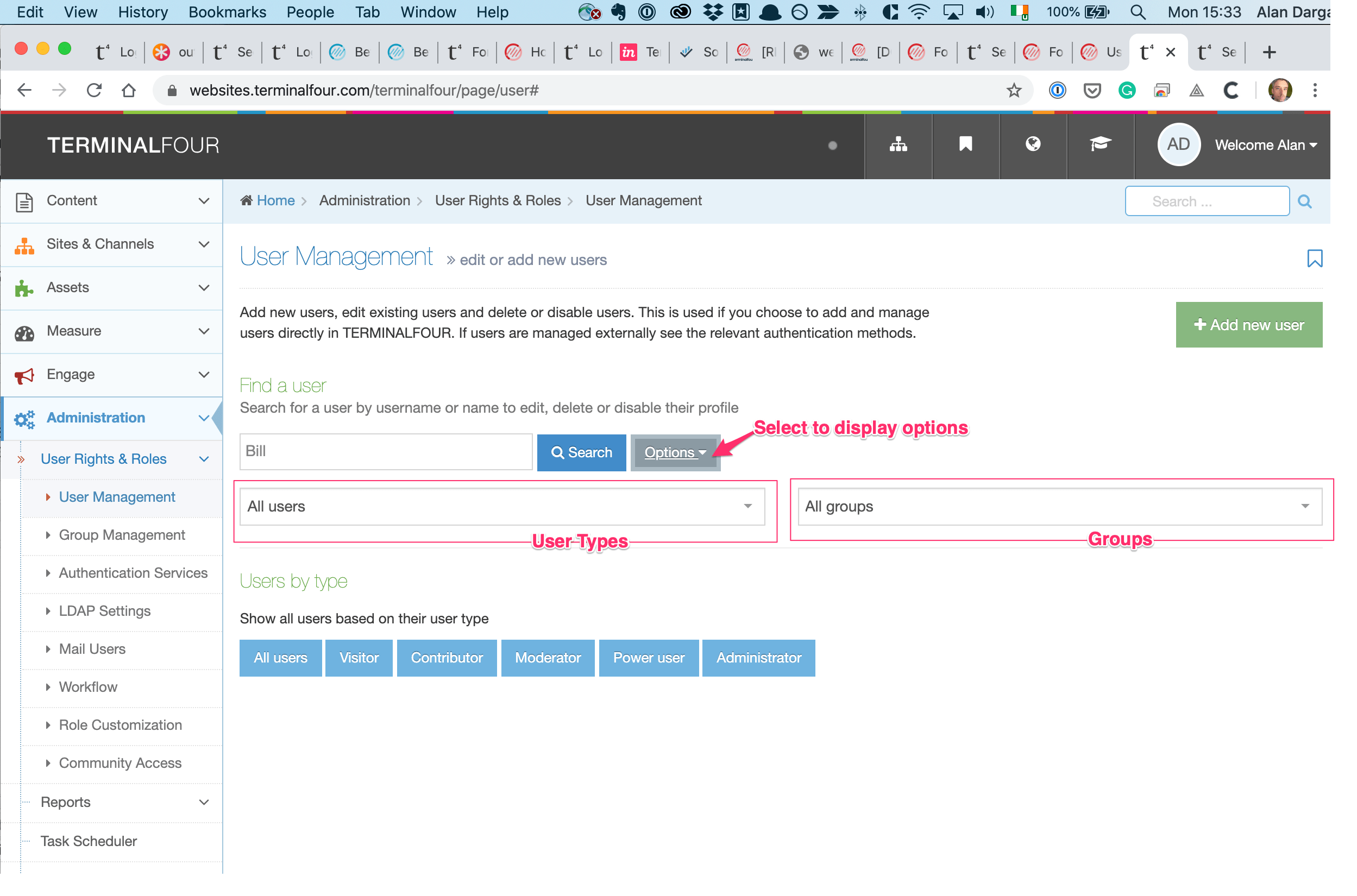
Using the Search box your results (if found) are presented like this:

To view the complete profile you can click the Username, the Name, or Edit (on the Actions button). This action takes you to:
Modify (Edit) user
Power Users are only able to edit users if it has been configured that they are able to Edit users. This is configured in the Role customization. If enabled, they are able to edit Visitors, Contributors and Moderators that are in the same group as the Power User.
As with the create a user page - there are several sub-sections on this page - this would be the same for this Modify page too.
Regardless of what method you use to find a User profile, you end up with this view of a profile. After you arrive here you can make changes to all the main items and sub-sections
Delete
A deletion always results if the loss of data and it is not recoverable. Deleting a user will remove all history of that user including the username (and details) in the Audit trail and content history when editing content. It is recommended to rather deisable the user in order to retain those records.
Power Users are only able to delete users if it has been configured that they are able to Delete users. This is configured in the Role customization. If enabled, they are able to delete Visitors, Contributors and Moderators that are in the same group as the Power User.
There are two methods of deleting a user.
- From the Actions button (located on the Search results, or in a table format) you can click the Delete button. The popup window "Confirm delete" appears.
- When you have a User profile open - the Delete button is located at the bottom of the page. When you click the Delete button the "Confirm delete" popup window appears.
Disable user
On the User profile page is an Enable button. As discussed with creating a user, this button must be in the Enable position for the user to exercise their rights and roles. You have the option of disabling these rights and roles without deleting the user. This is done on the User profile page. In the upper right corner is the Enable button.

In this position the user's rights and roles are enabled.
When moved to this position, the user's rights and roles are suspended until such time as the Enable button is returned to the enabled position.
Remember - the User profile is not deleted when in this position and can be 'searched' as it was when enabled.
When you have completed this action, ensure you click the Save changes button.
Access rights
 This presents the Username, Name, User type and an Actions button. In this example you can see the options you have if you click the Actions button.
The term Access rights includes Assigned sections and Groups. When you click Access rights the screen shown below appears:
There are two tabs in this popup screen - Assigned sections and Groups.
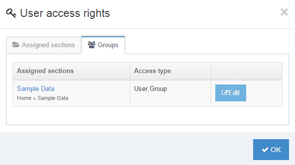
The second tab, Groups, it lists the sections to which the user has access, based on their Group permissions.
Authentication Tokens
You can create an API token to securely authenticate a Terminalfour user without passing a username and password.
Learn more about the benefits of token authentication here.
Creating a token
There's a video on creating a token here:
Step by step
The first option in the Authentication box is the Authentication tokens table:
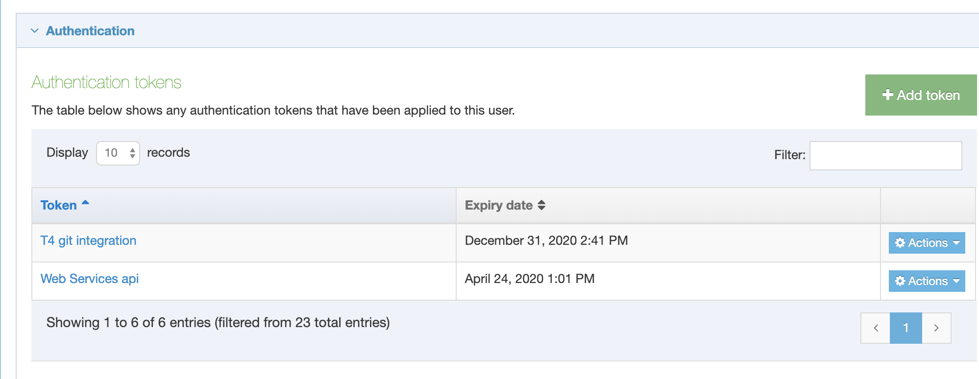
To create a token select Add token:
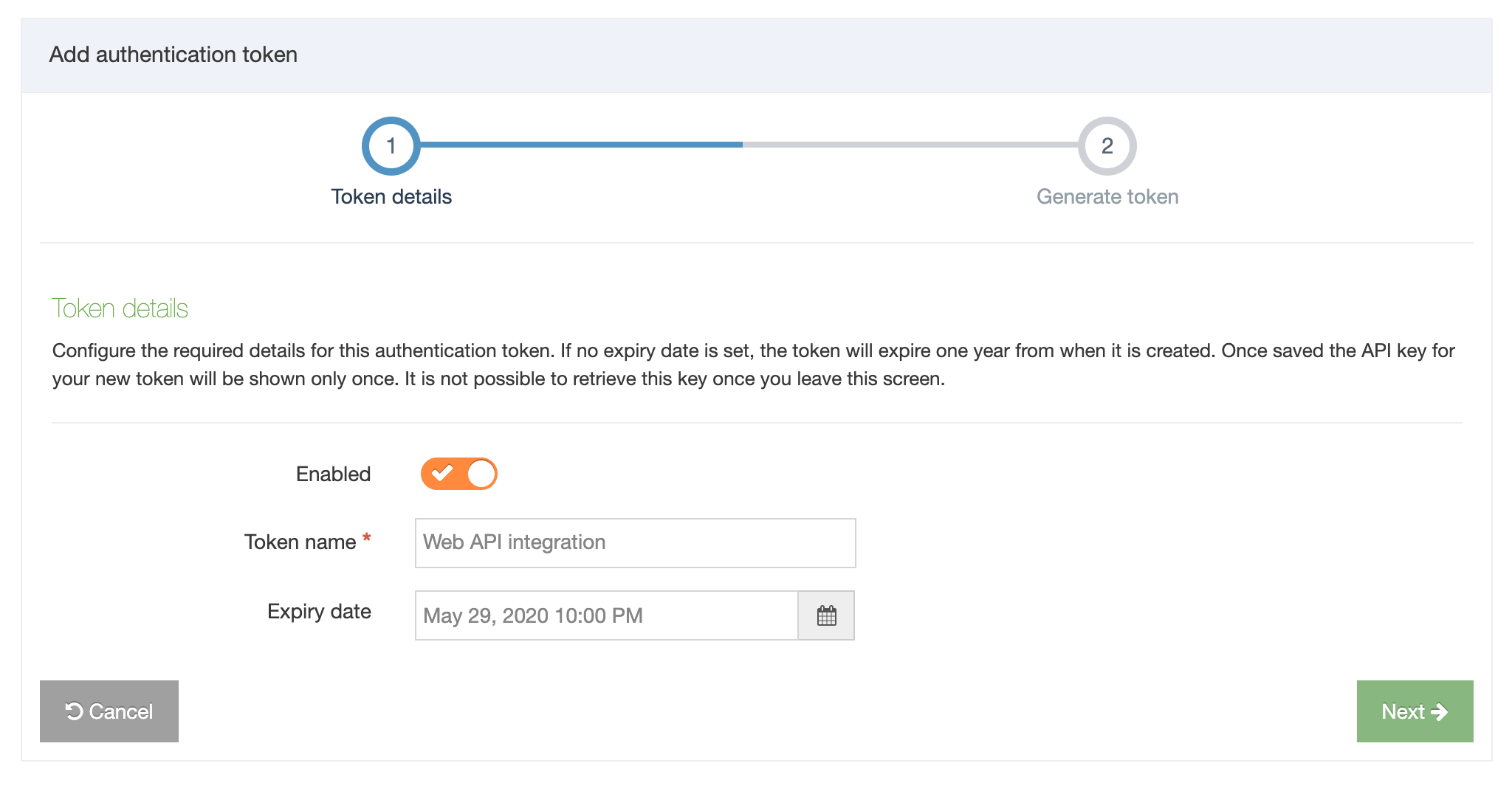
Provide the name of the token and expiry date.
Click Next to proceed. A modal will be displayed to confirm the creation of a token:
When Create token is selected the Generate token screen is displayed:
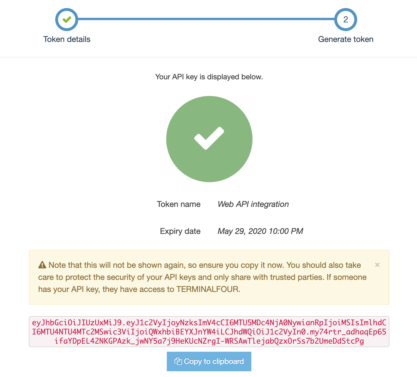
Select Finish to return to the Add User screen.
The token just created will be visible in the Authentication Tokens listing table:
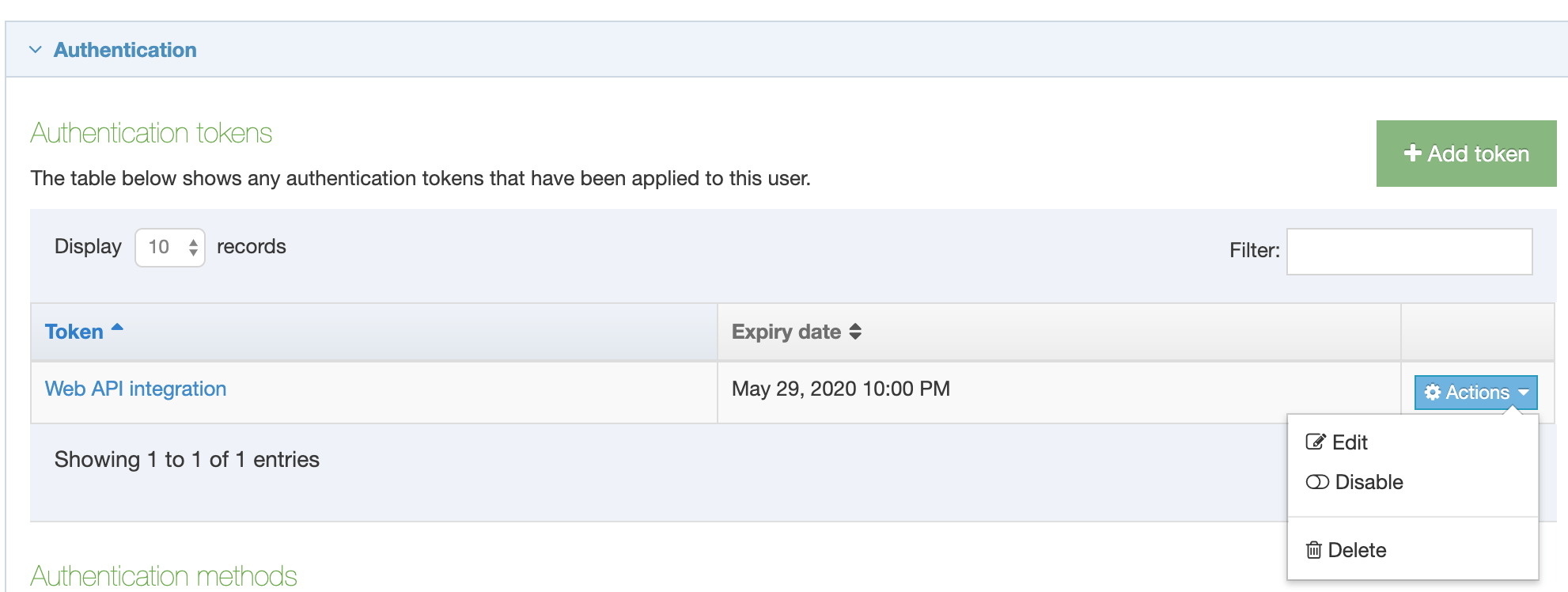
Tokens can be disabled and deleted from the Actions menu. The Edit option permits a user to rename or disable a token.
You may have additional elements if you use an Extended user details content type. This will vary from installation to installation. If such elements are present populate them with the appropriate information.
Group Management
Description
With Group Management you can manage multiple Users who have may need to share common assets (e.g., Content Types, Page Layouts) and carry out similar tasks. Using Group Management you can avoid assigning rights to individual Users. Additional tasks in Group Management:
- add or remove members
- delete a Group
- disable a Group temporarily
- restore Group actions
The image below is the start page for Group Management. To create a group, go to System Administration > User Rights & Roles > Group Management. The listing screen is shown below.
Create new group
Click Create new group and enter the following information about the group:
| Item | Description |
|---|---|
| Name | Name of the group |
| Description | Description of the group. |
| Email address | Sets the email address to send Group notifications to |
| Default preview channel |
This determines which Channel is used for previewing Content Items for this Group. If a default preview Channel has been specified in more than one place, the system applies the following logic:
|
| Group inheritance |
Choose from this list to add subgroups to the new Group. This does not affect the group's or user's access within TERMINALFOUR and is currently only used by the Group select element for Access control of the published site. When it is used, the subgroups are nested below their parent groups in the Access tab when creating or editing a Section, which controls the group's access to the section/page on the published site. In this case, if the parent group is granted access to a section on the published site, subgroups will also inherit access to the section. From Terminalfour 8.4.2 circular references in group inheritances are prevented. |
Add users to the group
Select the members of the new Group from the list of available Users. This is shown on the left side of the screen.
Power Users can only edit the Group(s) that they are members of so only Users who are members of the same Group(s) as the Power User are displayed.
You can filter your selection when you click the types of Available Users:
- All Users
- Visitors
- Contributors
- Moderators
- Power Users
- Administrators
- Group
When you have selected a User, click Add to move a User to the Group member list on the right side of the page. The list appears below:
 When you complete your list, ensure you Save changes.
Delete/Disable Group
If you no longer require a Group, permanently or temporarily, you can select one of the following options:
- Delete: The Group is removed from TERMINALFOUR. When deleting a Group, only the Group is deleted; Assets and Users within the Group are not deleted. Assets that were owned by the Group will become Global Assets.
Deleting a Group is permanent and it cannot be restored.
- Disable: Typically you disable a Group temporarily. The important aspect is the flexibility of this feature – you can turn it on and turn it off, yet still modify to suit your needs. Where a Group has been granted Edit Rights to a Section, disabling the Group will remove access to the Sections for each Group member.
Delete Group
To delete a Group, go to System Administration > User Rights & Roles > Group Management:
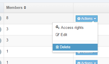
Using the Actions menu, click Delete beside the group to be deleted.
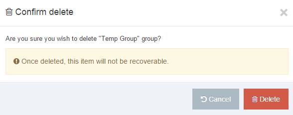
A confirmation box appears where you must confirm the deletion to proceed. Click Delete to proceed, or Cancel.
Disable Group (or Edit)
To temporarily disable a Group, go to System Administration > User Rights & Roles > Group Management.
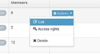
Using the Actions menu, click Edit beside the Group to be disabled.
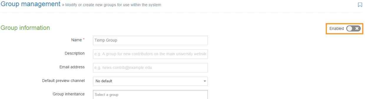 Click Enabled to remove the checkmark. This action disables the Group.
Authentication services
Description
Authentication services are available to ensure security protection of your site, network, and directories. To provide this protection, the normal process is to use various standardized protocols.
The protocols and services available to TERMINALFOUR are:
The following section describe each service and how to configure the service to meet your needs.
How to use Authentication services
To access Authentication services, go to System Administration > User Rights & Roles > Authentication Services. The start page is shown below. The services are presented in a tabular form allowing you to view their current status as either Enabled or Disabled.
You can directly access each service by either clicking the Edit option on the Actions menu or click the service name.
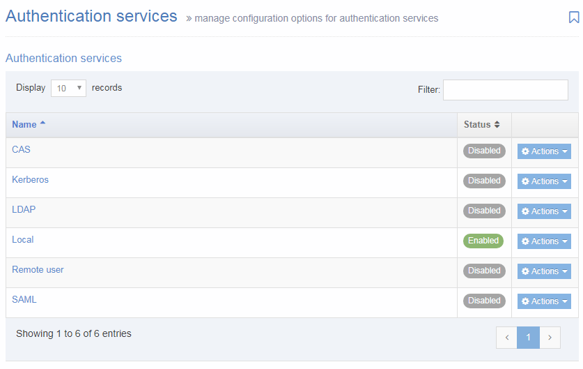
CAS
You can choose to work CAS with the TERMINALFOUR system. As with SAML, when a user logs in to TERMINALFOUR, they are directed to use their CAS login. Additionally, a login to the CAS service automatically logs the user into TERMINALFOUR.
Your user accounts need to pre-exist in TERMINALFOUR (either created manually or via an import from LDAP/AD).
To configure CAS, go to System Administration > User Rights & Roles > Authentication Services. Select Edit from the Actions menu next to CAS.
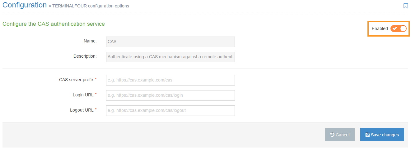
To enable CAS, click on the Enabled toggle.
Configure the following options:
| Item | Description |
|---|---|
| CAS server prefix | Enter the root URL to the CAS server installation, used for communication between TERMINALFOUR and the CAS server |
| Login URL | Enter the URL to the CAS servers login page |
| Logout URL | Enter the URL to the CAS servers logout page |
If you are satisfied with your entries, then click Save changes.
Kerberos
Kerberos support was removed in version 8.3.16.
Terminalfour can work with a Kerberos protocol service. Kerberos is a computer network authentication protocol that uses 'tickets' to allow nodes communicating over a non-secure network to prove their identity to one another securely. This service functions as a client-server model to provide mutual authentication — both the user and the server verify each other's identity.
To configure Kerberos, go to System Administration > User Rights & Roles > Authentication Services. Select Edit from the Actions menu next to Kerberos.
To enable Kerberos, click on the Enabled toggle.
Configure the following options:
| Item | Description |
|---|---|
| Service principal name* | Enter the name of the Kerberos service principal you are accessing. |
| Location of keytab file* | Enter the file location of the keytab file, which contains the Kerberos encrypted keys. E.g. /usr/var/secure/krb5.keytab. This file must be readable. |
| Kerberos realm* | Enter the Kerberos authenticate administrative domain. For more information, see Kerberos domain. |
| Strip realm from principal? | The Kerberos user principal needs to be mapped to a username. If the two are not the same and the specified realm needs to be stripped from the former to get the latter, then check this. Note a '@' is prefixed to the realm before it is stripped out. |
If you are satisfied with your entries, then click Save changes.
LDAP
This service permits your LDAP or Active Directory users to log in to TERMINALFOUR using their standard user credentials. Permissions within TERMINALFOUR can be configured based on the roles these users are assigned within your directory service. If used, TERMINALFOUR locally stores some user information (example: username) but does not store any password related information.
Each authentication request takes place against your LDAP or Active Directory service.
To configure LDAP, go to System Administration > User Rights & Roles > Authentication Services. Select Edit from the Actions menu next to LDAP.
To enable LDAP, click on the Enabled toggle.
Configure the following options:
| Item | Description |
|---|---|
| HostName/IP address* | Sets the hostname or IP address used to connect to the LDAP server |
| Port* | Sets the port used to connect to the LDAP server |
| Secure communication |
When communicating with the LDAP server, three mechanisms are available:
|
| Admin DN* | Enter the full Distinguished Name (DN) used to bind to the LDAP server e.g. cn=t4sitemanager, ou=ServiceAccounts, dc=terminalfour, dc=com |
| Admin password | Sets the administrative password for the account specified above |
| Referral method |
Property for specifying how referrals encountered by the service provider are to be processed. The value of the property is one of the following strings:
|
| Maximum results per page |
Sets the page size when searching the LDAP server during an import. Set to 0 for no limit. |
| Update user record |
Updates user information (e.g. first name) using values taken from the LDAP server. This keeps the TERMINALFOUR user information in sync with the user directory information. It is highly recommended that you use this option. |
| Deactivate user record | Sets imported LDAP users as inactive rather than deleted if not found during subsequent imports. It is recommended that this is checked since if users are deleted all history and auditing information of that user is deleted. |
| Enable users on import | Sets imported LDAP users to enabled by default |
| Default language | Sets the default language for users from LDAP imports |
| Default html editor | Sets the default html editor for users from LDAP imports |
| Username attribute | Sets the LDAP attribute used to populate the user's username. This must be unique to each user. e.g. sAMAccountName |
| Email attribute | Sets the LDAP attribute used to populate the user's email address e.g. mail |
| First name attribute | Sets the LDAP attribute used to populate the user's first name e.g. givenName |
| Last name attribute | Sets the LDAP attribute used to populate the user's surname e.g. sn |
You may have additional elements if you use an Extended user details Content Type. This will vary from installation to installation. If such elements are present populate them with the appropriate attribute values for your user records.
Choosing an Authentication Service
When an Authentication Service has been configured and enabled, it will be listed in 'Default authentication method' drop-down. In this example, SAML has been configured and enabled and can then be selected as the 'Default Authentication method':
To complete the configuration of the user import and creation, see LDAP Settings.
Common issues
The most common LDAP issues are the result of one or more of the following:
- The CMS server is not whitelisted on the LDAP server
- The LDAP server certificate doesn’t exist in the Tomcat keystore on the CMS
- Username/password for the admin DN is incorrect in the LDAP config
Local
This service is for accounts associated with TERMINALFOUR use only. These accounts are stored securely on the TERMINALFOUR database and use the standard combination of the username and password. This service can be beneficial for providing access to users who are not in your organization's directory services. Also, you can use if integration between TERMINALFOUR and your directory service or other authentication servers is not possible.
To configure Local, go to System administration > User Rights & Roles > Authentication services. Select Edit from the Actions menu next to Local. The only configurable option is to Enable or Disable local authentication.
TERMINALFOUR recommend leaving this enabled at all times. You must always maintain one Local user for use with TERMINALFOUR administration should there ever be a problem connecting to your directory service. This account is required when upgrading TERMINALFOUR.
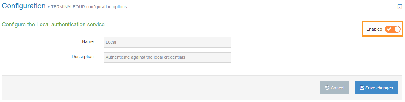
Remote User
This method is designed to permit ease of integration with non-standard or custom authentication functionality. With the Remote user function you can pass a username to TERMINALFOUR as a header variable, and if matched, the user login is successful.
Your user accounts need to pre-exist in TERMINALFOUR (either created manually or via an import from LDAP/AD).
To configure Remote user, go to System Administration > User Rights & Roles > Authentication Services. Select Edit from the Actions menu next to Remote user.
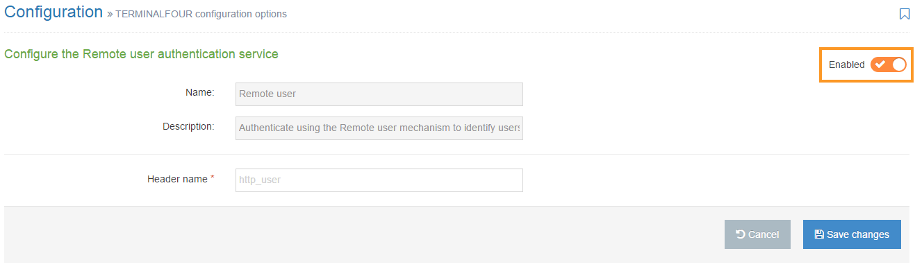
Enter the Header name: the request header to parse that TERMINALFOUR will use to identify the correct user
If you are satisfied with your entries, then click Save Changes.
SAML
If your organization prefers to use SAML or Shibboleth-based single sign-on services, this service works with TERMINALFOUR. If this is the case, TERMINALFOUR acts as a service provider and initiates authentication requests against your Identity Provider. Each time a user needs to login to TERMINALFOUR they are directed to the organization's single sign-on page to login. In cases where your users have already logged in to your single sign-on server then they are automatically logged in to TERMINALFOUR.
Your user accounts need to pre-exist in TERMINALFOUR (either created manually or via an import from LDAP/AD).
If you are using LDAP with SAML, it's recommended that you configure, test and import users with LDAP first.
To configure SAML, go to System Administration > User Rights & Roles > Authentication Services. Select Edit from the Actions menu next to SAML.
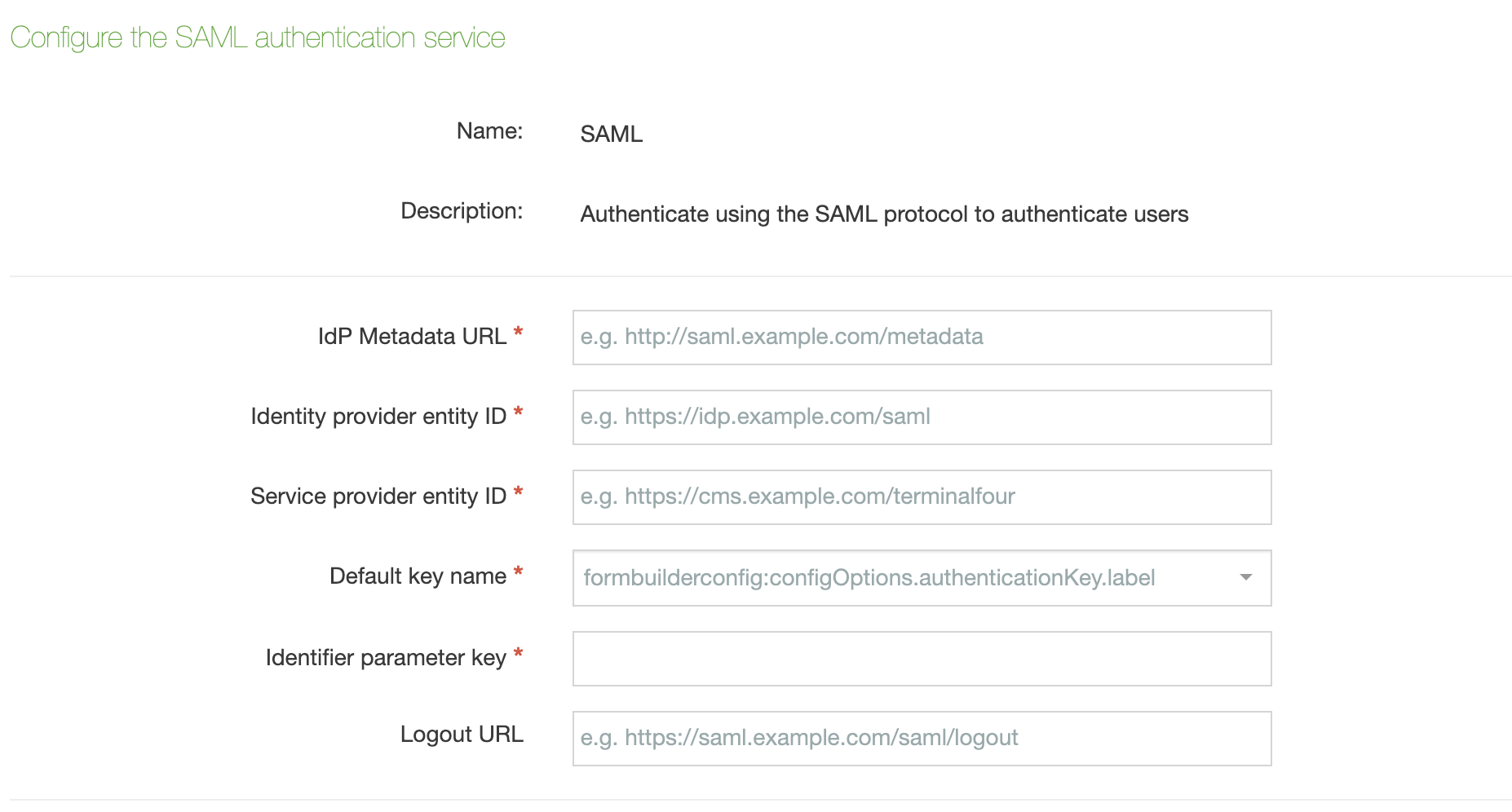
To enable SAML, click on the Enabled toggle.
Configure the following options:
| Item | Description |
|---|---|
| IdP Metadata URL* | The URL to a document describing one or multiple identity and service providers. Exchange of metadata between identity and service providers is typically the first step for establishing federation. |
| Identity provider entity ID* | The ID of the entity taken from the metadata document which authenticates users and provides information about their identity to service providers/relaying parties using federation protocols. |
| Service provider entity ID* | The ID of the service provider TERMINALFOUR uses to communicate with the identity provider. |
| Default key name* | The default key in the keystore file. |
| Identifier parameter key* | The parameter returned as part of the SAML assertion for TERMINALFOUR. Used to identify the correct user |
| Logout URL | The URL of a custom logout screen |
If you are satisfied with your entries, then click Save Changes.
While SAML defaults to SHA1 encryption, from 8.2.18 support has been added for SHA1/SHA256/SHA384/SHA512. You can override this using the jvm property in Tomcat. In the setenv.sh file, you can change the last part of the line
JAVA_OPTS="$JAVA_OPTS -Dcom.terminalfour.saml.signatureAlgorithm=SHA1"
to reflect the algorithm required.
LDAP Settings
Description
Kerberos support has been deprecated and will be removed in version 8.3.16.
TERMINALFOUR can integrate with your directory service (e.g.: Microsoft Active Directory) using LDAP(S).
LDAP settings permit the user login request to be authenticated against the directory service rather than against TERMINALFOUR's internal user database. This streamlines the user provisioning and authentication processes for your users and you.
While you can choose to use either directory based authentication or TERMINALFOUR authentication, you can also use a combination of both.
After configuring a connection to the directory service, each user record matching set criteria are imported into TERMINALFOUR's user list. For a minimum setup, you'll need the following user information from your directory service:
- first name attribute
- last name attribute
- username / user ID attribute
- email address attribute
User passwords are never imported; authentication always takes place against the directory server.
Before you start
There are important things to know before you can use LDAP authentication with TERMINALFOUR:
- TERMINALFOUR can integrate with a single directory service only
- TERMINALFOUR does not support Continuation References in your directory structure
- When configuring the link between TERMINALFOUR and your directory service ensure you have an LDAP or Active Directory administrator present to assist as they'll be the most familiar with the structure of your directory tree.
- TERMINALFOUR can only deal with user records when reading your directory. For this reason, it must be set to look at your user containers (OUs) rather than the groups you may have defined
- Treat all attributes and values as being case sensitive whether your underlying directory service is case sensitive or not
- Many LDAP browsers (such as Microsoft Active Directory Browser) allow renaming of names and values into a more human-readable format, however, TERMINALFOUR reads the actual names and values for attributes on a user record
- TERMINALFOUR suggests you use the Java-based browser JXplorer to verify the names and values in your directory. TERMINALFOUR expects to find exactly what is specified in JXplorer.
- When connecting using LDAPS you must import the SSL certificate for your directory server into a Java Keystore and have your application server (Tomcat, etc.) read this keystore when starting.
- As of version 8.2.3, you must import the SSL certificate into the TERMINALFOUR keystore as per the documentation on Keystore Configuration
You must always maintain one non-directory account (local user) for use with TERMINALFOUR administration should there ever be a problem connecting to your directory service. This account is also required when upgrading TERMINALFOUR.
LDAP management
To manage your LDAP settings, go to System Administration > User Rights & Roles > LDAP Settings. The starting page is shown below:
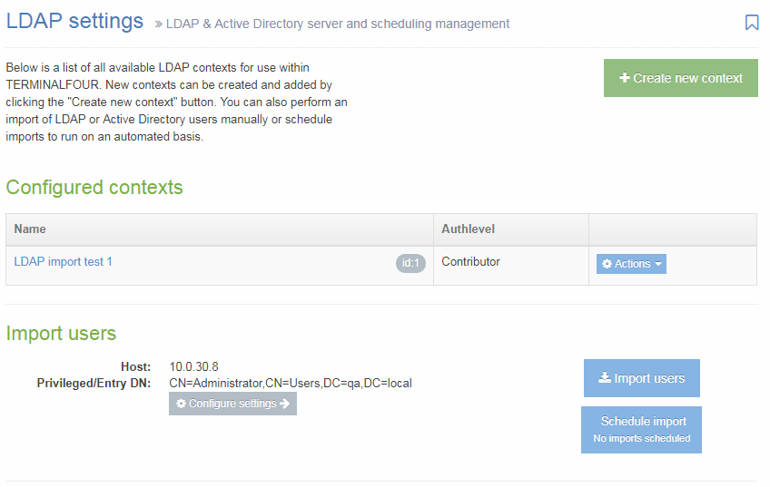
From this point, you can manage your LDAP settings. In the center of the page is a table displaying Configured contexts. From the Actions button, you can either edit or delete an entry. From this page, there are options to:
- Create new context
- Configure settings
- Import users
- Schedule import: The button has a sub-text which displays the next scheduled import.
Create new context
Consider an LDAP context in TERMINALFOUR to be a collection of rules which are used when searching for users to import.
Each context should refer to an Organizational Unit (OU) in your directory which contains users records. As an example: ou=Development, ou=Staff, dc=terminalfour, dc=com
In addition to specifying the target for the context, you can also specify some filters which are used to exclude or include users based on particular attributes and values.
When you click Create New Context, this screen opens:
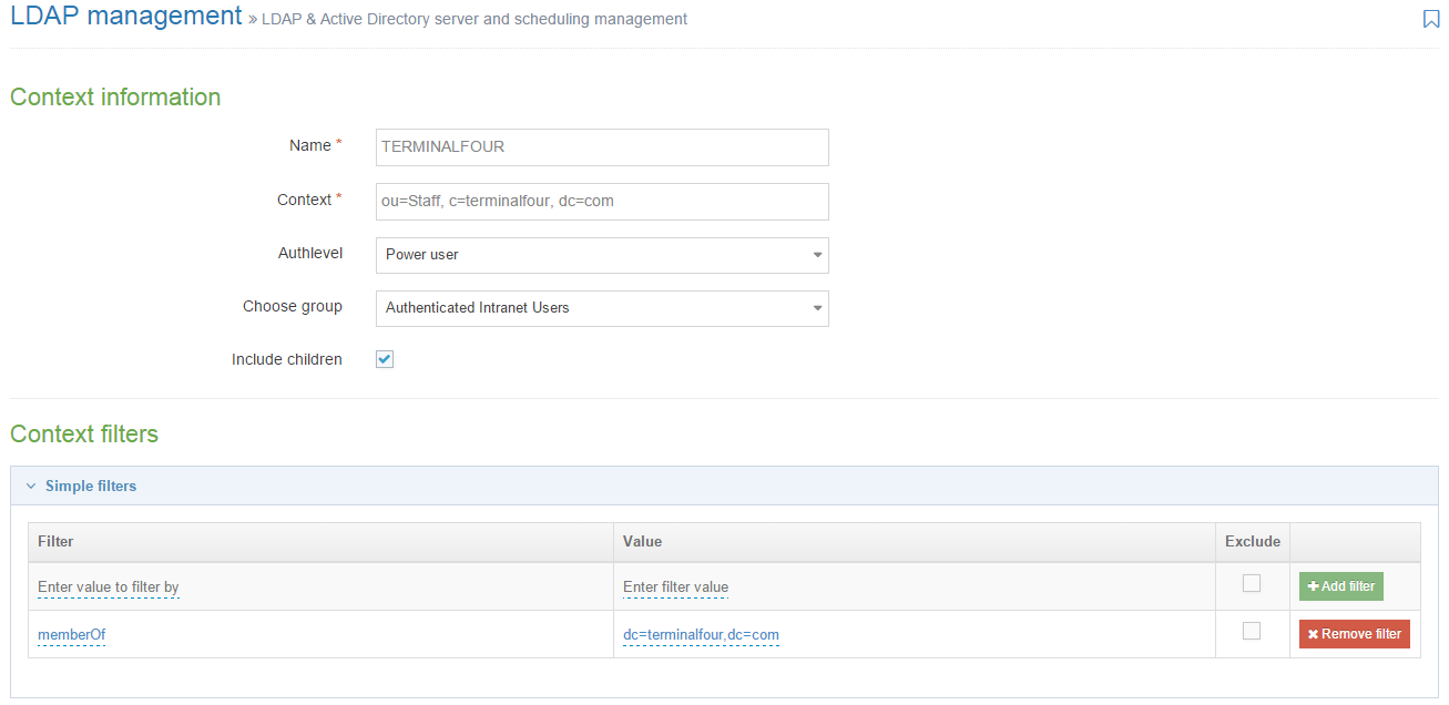
Configure the following options:
| Item | Description |
|---|---|
| Name | This is the name you assign to this import configuration. Example values include "Marketing Team", "IT Dept", "Full Time Staff", and others associated with the organization. |
| Context |
Specify the LDAP context associated with the group of users for import. This is the full DN of the OU containing user records. This is a case-sensitive value (regardless of whether your directory service is case sensitive or not.) Examples: ou=Staff, c=terminalfour, dc=com Do not use a group definition as the target for the context. TERMINALFOUR only reads user records, it does not read a group to determine the users who are members of it. |
| Authlevel | Sets the user level assigned to users created during an import of this context. For further information on the user types, refer to the documentation on User rights & roles. |
| Default authentication method | Sets the default authentication method for new users imported by this LDAP context. |
| Choose group | Sets the group that users are assigned to when created during an import of this context. |
| Include children | Sets whether or not sub-containers are included during an import. |
Context filters
You can add multiple filters (both Simple and Advanced) to each context. If there are multiple filters, by default a user record must fulfill all filters to be imported into the context, but an OR logic can be created with Advanced filters.
Simple filters
Simple filters can be used to target certain users in a given OU. They represent a pairing of attributes and values. Both the attribute and the value specified here is case sensitive (regardless of your directories case sensitivity). These filters are mostly used to import users of certain groups from the directory.
| Item | Description |
|---|---|
| Filter |
Choose an attribute from your directory which specifies group membership is When targeting groups you must enter exactly what appears on the user record to indicate the group membership. |
| Value | Enter the intended attribute value. |
| Exclude | Check this box to exclude users matching this filter instead of including just users who match it. |
Advanced filters
Advanced filters are similar to Simple filters but allow you to write LDAP queries to match multiple names or values and does not restrict the filter to using attribute values. To create an Advanced Filter, Enter the Filter query and click Add filter.
Processing Simple and Advanced Filters
When processing simple and advanced filters within a context, by default, AND logic is used. Advanced filters need to be used to use OR logic. To use OR operators, a '|' symbol is used.
The example below outlines an advanced filter that will import multiple users based on their sAMAccountName. The '|' is added to the beginning of the filter and then each attribute/value pair that you want to use within the filter is encapsulated individually.
(|(sAMAccountName=CiaraF)(sAMAccountName=VincentO)(sAMAccountName=KevinW))
For each filter that is added, it will also process this with AND logic. If you have a simple filter and then an advanced filter that uses OR logic, the LDAP context will query the active directory for users/objects that match the values in both queries.
You can learn more about LDAP filters here.
Once complete, click Save changes to save the context.
Import users
To import users, you need to be on the LDAP settings page. Click the Import users button. The popup window, shown below, appears. If you want to continue, click the Confirm button.
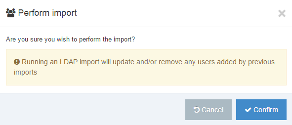
If the import is successful this popup window appears:
Schedule imports
To schedule an import, you need to be on the LDAP settings page. Click the Schedule import button. A popup window appears, shown below.
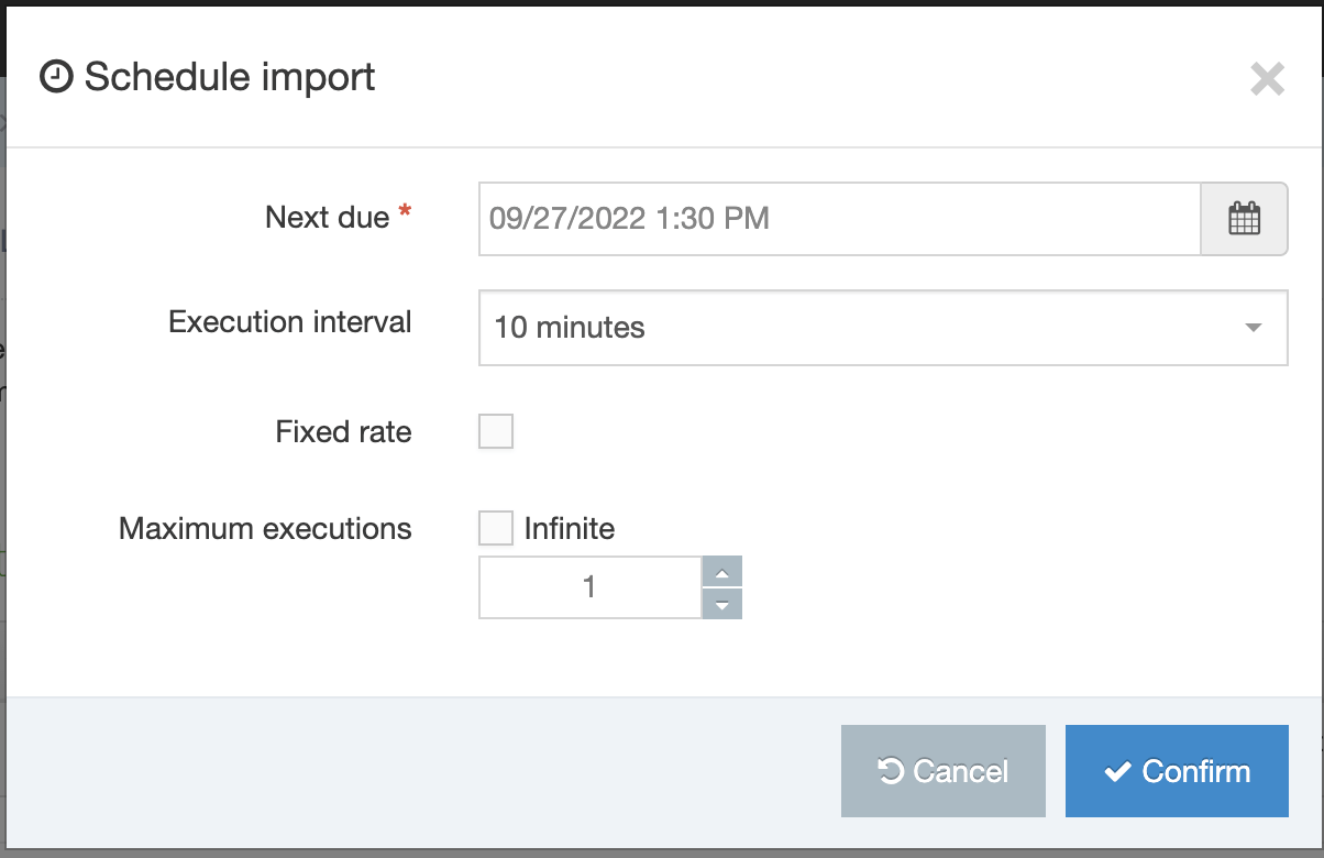
| Item | Description |
|---|---|
| Next due | Set the date and time for the next (or first) execution of this task. |
| Execution interval | The execution interval of the task e.g. 1 hour, 1 day, 10 minutes, Once |
| Fixed rate | Sets if the task to add/update should run on a fixed rate. |
| Infinite | Check here to continue imports indefinitely. If you do not check this box, then set a number of repetitions in the field below. |
| Maximum executions | Set the maximum number of times this task should run. |
When your entries are complete, click Confirm. This adds the import to the Task Scheduler.
Mail users
Description
You can compose and send plain text emails to Users, Groups, or User Types within TERMINALFOUR. The system uses the email address specified in the User Profile or the Group Details, depending on how Group emails are configured.
In order to send emails, a mail server should be configured under Mediums in the Users and Workflow settings.
Send a mail
Go to System Administration > User Rights & Roles > Mail Users
This screen appears as shown below:
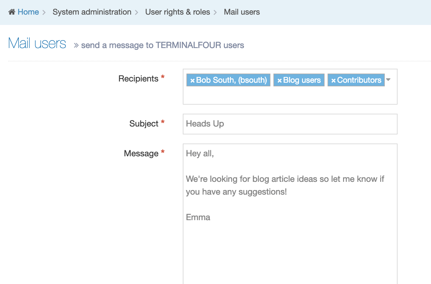
All three fields - Recipients, Subject and Message are required.
Enter Recipients by choosing from a multi-select list. You cannot enter an email address with free text. After entering a subject and a message, click Send mail. A green success banner will appear once the email is sent.
Workflow
Description
By default, all content within Terminalfour uses the built-in Workflow where a user (Contributor+) creates or edits content, and a user (Moderator+) approves content. Within this workflow, the content only needs to be approved by one user, and that user is any Moderator, Power User or Administrator who has edit rights to the content. If more complex approval logic is required, it is possible to configure a custom Workflow.
How are Workflows Used?
Workflows can either be assigned to a:
- Section: all content within that Section or Child Sections will use the Workflow. This is useful for parts of the website where users may require additional assistance, for example, where they are newly trained and need some initial guidance.
- Content Type: all content within a specific Content Type will use the Workflow. This is useful for special types of content (e.g. Site Configurations, Code content) which may require additional approval before publishing.
Where a workflow is applied to both a Section and a Content Type, a configuration option defines which Workflow should be used.
Workflow Recommendations
To prevent large time delays between content edits and content approvals, Terminalfour recommends that you:
- use Workflows as sparingly as possible
- keep Workflows simple
- minimize the number of Workflow steps
- ensure that more than one user is able to approve in any one step (if that one user is out of the office, content may not get approved)
Workflow Listing
When you go to Administration > User Rights & Roles > Workflow you will see a list of existing Workflows on the page.
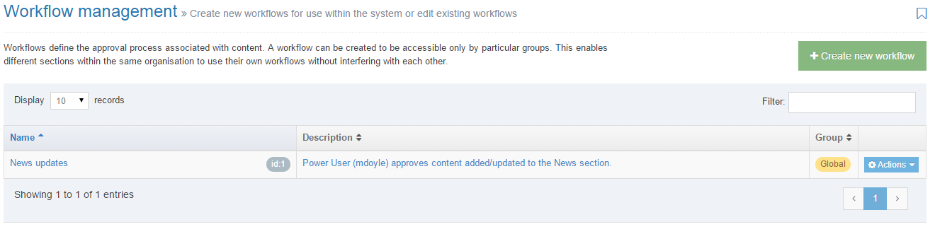
The columns in the table are Name, Group and the Action Menu button:
| Item | Description |
|---|---|
| Name | Contains Workflow name, a brief description (if one has been provided), and the Workflow ID number. The arrow in the header row can re-order the list alphabetically. |
| Group | Shows the Group the Workflow belongs to. Workflows cannot be shared with multiple groups. |
| Action Menu Button | Provides options to Edit, and Delete the Workflow. |
Create New Workflow
When you select Create New Workflow, the General screen is displayed:
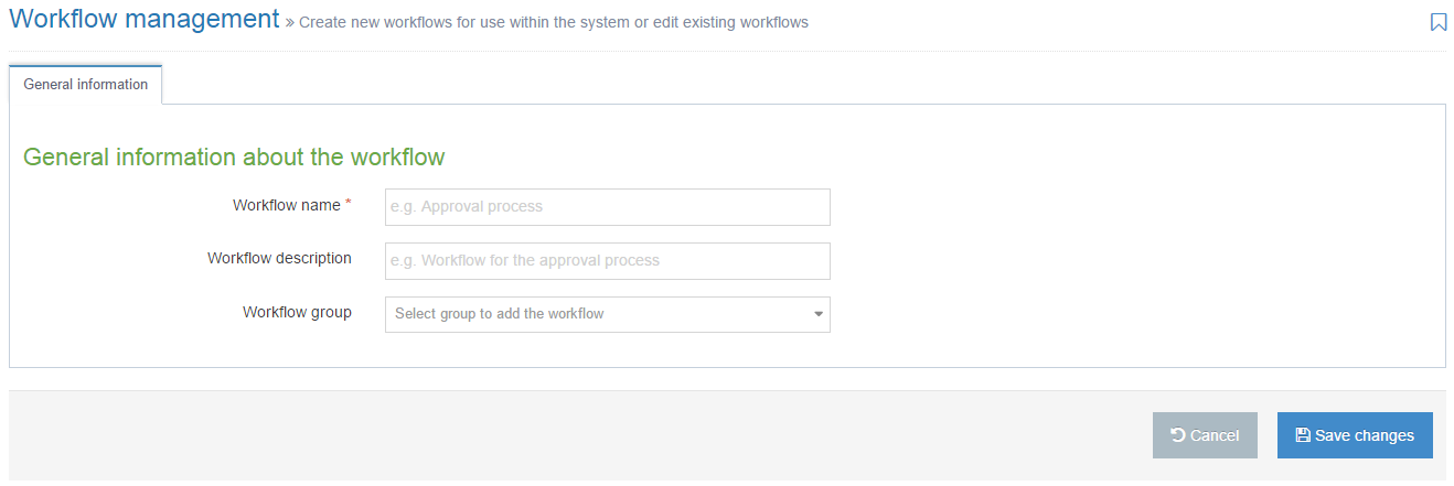
| Item | Description |
|---|---|
| Name | This is a mandatory entry. Give your Workflow a name - it is recommended that the name is as descriptive as possible. |
| Description | This is an optional entry. This is used by the filter on the Workflow listing and can be useful for finding Workflows. |
| Group |
Select a Group for this Workflow. Grouping Workflows restricts the users that can use or edit the Workflow. It is good practice to add all your assets to Groups. This makes it easier to identify which assets are being used and where. By grouping assets together, you can also restrict access to them. When a user is not part of the Group, they cannot see or access assets in that Group. |
If you are satisfied with your inputs so far, click Save Changes.
Workflow Steps
The Steps tab lists the individual steps in the selected Workflow. When creating a new Workflow, this will be blank until new steps are created.
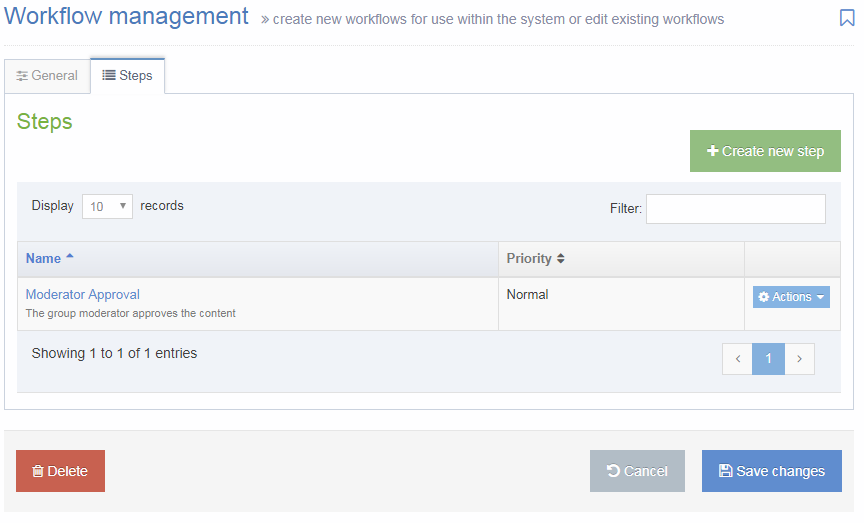
The columns in the table are Name and Priority:
| Item | Description |
|---|---|
| Name | Contains Workflow Step name, a brief description (if one has been provided). The arrow in the header row can re-order the list alphabetically. |
| Priority | Shows the Priority assigned to the step when creating the step. |
| Action Menu Button | Provides options to Edit the Step, and Delete the Step. |
To add a step to the Workflow, select Create New Step.
General
Enter the general information about the Workflow step:
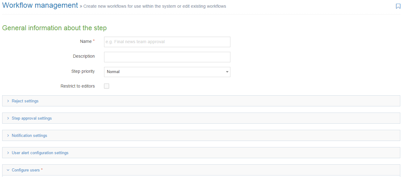
| Item | Description |
|---|---|
| Name | Give the Workflow step a name. This is also used in any email alerts that are configured. |
| Description | Give the Workflow step a description. This is also used in any email alerts that are configured. |
| Step priority | This can be left at normal as it is a legacy setting from previous versions that is no longer used. |
| Restrict to editors |
Check this box if you want to restrict the users who can review/approve this step to only those who have editing rights to the content. This is used in conjunction with the Configure Users option to ensure that only users with editing rights can approve a Content Item. This makes the Workflow re-usable across different Branches of the site, with different approvers for the Branches they have access to. Terminalfour recommend that this is checked. |
Configure users
Configure the users who can approve content in this Workflow step:

The Available Users are individuals or groups who can participate in the Workflow you are creating.
The Current Users are the users who are able to approve content in this Workflow step.
To move an Available user to the Current Users' list, click the Add button next to the user.
Reject settings
Configure the action that is taken when content is rejected in this Workflow step:
The options are:
- Content Owner: sends the content to the content owner, as specified in the Section or content options.
- Last modified by: send the content back to the person who last modified the content. This is the Terminalfour-recommended setting.
- Step x: send the content to a different step in this workflow.
- Different workflow: send the content to a different workflow.
- Do nothing: the content remains in the Approval list.
Step Approval Settings
Select the number of step approvers required to approve the content for it to successfully pass through this Workflow step:
The options are:
- All moderators: all users who are configured as step approvers must approve the content
- Majority: the majority of step approvers must approve the content
- X number of moderators: set the minimum number of step approvers who must approve the content (Terminalfour recommend this setting is used and it is set at 1)
- Content owner: only the content owner, specified in the Section or content options, can approve the content. If no owner is selected, the content can only be approved by an Administrator.
If the Enable active moderation option is checked, combined with X number of moderators, once the set number of approvals or rejections are reached, ultimately meaning that content can never be approved (because too many users have rejected it), the content is considered to be rejected. We recommend that this option is checked (if using x number of moderators).
Notification settings
Email alerts can be sent as part of the workflow. The "from" address of these emails can be configured to be the logged in user's email address in Approval configuration settings. This can be useful as users have been known to reply to the Workflow emails. Alternatively, they will use the application default email address (configured in General configuration).
Configure when email alerts are sent:
Check the options for when email alerts should be sent:
- Start: an email alert is sent when a Content Item enters the workflow step. This is required if the step approvers are to receive email alerts of new content.
- In progress: if multiple users are required to approve the content, an email alert is sent for each user who approves or rejects the content
- End: an email alert is sent when the workflow step is complete (i.e. content is approved through the step, or content is rejected in the step). This is required if the content editors are to receive email alerts of rejected content.
User alert configuration settings
Configure who receives the email alerts:
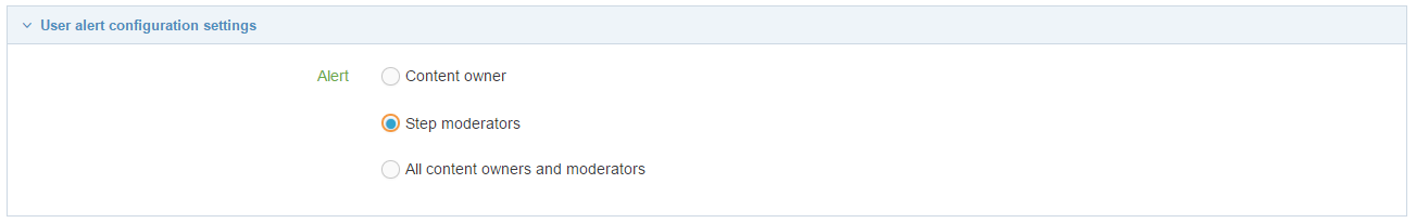
Check the options for who will receive email alerts:
- Content owner: the user who submitted the content for approval. This is required if the content editors are to receive email alerts of rejected content, but cannot be used if Step moderators need email notifications for content awaiting approval.
- Step moderators: the user(s) who can approve the content. This is required if the step approvers are to receive email alerts of new content, but will result in content rejection emails not being sent to the content editors.
- All content owners and moderators: This is required if both content editors and step approvers are to receive email alerts. This is the recommended setting if content editors are to receive email alerts of rejected content AND step approvers are to receive email alerts of new content.
It is not currently possible to configure that different emails are sent to different users, e.g. step start email are sent to moderators and step end emails are sent to editors.
If you are satisfied with your inputs so far, then click Save Changes.
Apply the Workflow
Once a Workflow is created, it should either be applied to a section or to a Content Type.
Existing Pending Content
When a workflow is applied to either a section or a Content Type, and content within that section or Content Type, that is currently Pending approval will automatically move into the workflow and any email alerts that are configured will be triggered for each of those content items.
Section
When a Workflow is applied to a Section, all Content Items within that Section or Child Sections will use the Workflow. This is useful for parts of the website where users may require additional assistance, for example, where they are newly trained and need some initial guidance.
To apply a workflow to a section, Edit the section and select the Default workflow on the General tab.
Workflows and Mirrored content
When a Content Item that has been mirrored into a Section with a Workflow is updated, the Content Item will run the Workflow applied to the Section where the Content Item was edited. i.e. if the Content Item was edited in a Section with no Workflow, then none is applied.
Content Type
If applied to a Content Type, all content within a specific Content Type will use the Workflow. This is useful for special types of content (e.g. Site Configurations, Code content) which may require additional approval before publishing.
To apply a workflow to a Content Type, Edit the Content Type, and select the Workflow on the General tab.
Delete a Workflow
In the row of the corresponding Workflow, open the Actions drop-down list and select Delete. A confirmation pop-up window appears and you can confirm your choice and Delete, or Cancel the action. Upon successful deletion, a green banner appears confirming the deletion, and the object is removed from the list.
Troubleshooting Workflow Emails
If the workflow is not being sent, perhaps try the following:
- Check whether Terminalfour is sending emails at all: The easiest way to do this is to go to Administration > User rights & roles > Mail users and send yourself a message. If this is not working, check the mail server configuration. If you are hosted by Terminalfour, or you believe that the mail server configuration is correct but is still not working, then please contact our support team for assistance.
- Check the email address in the user profile: Check the email address configured in the user's profile to ensure that it is correct.
- Check that the content is using the working: After selecting "Save changes" on the Content Item, navigate to the Approval page and ensure that the Workflow (Step) column is populated correctly for the Content Item. If not, check that the workflow has been applied to the section or to the Content Type.
- Check the workflow step notification settings: Check that the workflow step is configured for email notifications at the correct stages. This is configured in the workflow step Notification settings.
- Check the workflow step user settings: Check that the workflow step is configured to email the correct users. This is configured in the workflow step User alert configuration settings.
Role customization
Description
User rights and roles can be customized to suit your organization and governance requirements.
- View details of the user types.
- View a matrix of configurable rights.
Go to System administration > User rights & roles > Role customization
Within Role customization there are ten areas where customizations can be made:
- Site structure
- Approval
- Preview/Publish
- Media
- User management
- Accessibility reports
- SEO reports
- Channel management
- Package
| Item | Description | Options | Default |
|---|---|---|---|
| Site structure | |||
| Create/edit/delete sections | Sets the minimum access level required to create/edit/delete sections | Select Contributor, Moderator, Power user or Administrator | Moderator |
| Set output URIs | Sets the minimum access level required to set output URIs | Select Moderator, Power user or Administrator | Moderator |
| Set a path as an output URI | Sets the minimum access level required to set a path as an output URI (an output URI that contains one or more "/") | Select Moderator, Power user or Administrator | Administrator |
| Only show accessible sections for | Restricts the site structure for the user level to only display sections to which they have been granted edit rights | Enable / disable for Power user, Moderator, Contributor | |
| Approval | |||
| Enable automatic approval for | Adds a "Save and approve" option when adding or editing content | Enable / disable for Administrator, Power user, Moderator | |
| Enable selective approval for | Sets the ability to bulk select content for approval | Enable / disable for Administrator, Power user, Moderator | |
| Preview/Publish | |||
| Default channel |
Sets the default channel for the user type. If no default channel is set and there is more than one channel, the user is prompted to select a channel when previewing content. This setting can also be configured for groups or for individual users by modifying their profiles. If a default preview channel has been specified in more than one place, the system will apply the following logic:
|
Select a channel from the list | |
| 'Publish now' minimum user level | Specify the minimum user level permitted to "publish now" on content or sections. "Publish now" is enabled in the publish and preview configuration. | Select Moderator, Power user or Administrator | Administrator |
| When assigned to channel/microsite | Specify the minimum user level permitted to use "publish now" within channels/microsites to which they have been assigned. The user level selected would be a lower level than the 'Publish now' minimum user level above. Set the minimum user level to which this applies and then assign the channels to the users by editing the individual users. | Select Moderator or Power user | Moderator |
| Media | |||
| Media auto publish minimum user level | Select the minimum user level permitted to set the "auto publish" options of a media category. | Select Moderator, Power user or Administrator | Administrator |
| Media access rights minimum user level | Select the minimum user level permitted to set the "access" options of a media category. | Select Moderator, Power user or Administrator | Administrator |
| Media edit rights minimum user level | Select the minimum user level permitted to set the "edit rights" options of a media category. | Select Moderator, Power user or Administrator | Moderator |
| User management | |||
| Allow power users to | Sets actions available to power users | Enable / disable for Add users, Edit users and Delete users | |
| Accessibility reports | |||
| Allow access to | Sets the user levels with access to the accessibility reports when viewing the site structure | Enable / disable for Administrator, Power user, Moderator, Contributor | |
| SEO reports | |||
| Allow access to | Sets the user levels with access to the SEO reports when viewing the site structure | Enable / disable for Administrator, Power user, Moderator, Contributor | |
| Channel management | |||
| Allow power users to manage channels | Check this option to allow power users to manage channels | Enable / disable | |
| Package | |||
| Media archive minimum user level | Sets the minimum user level permitted to upload a zip archive of media. You can then create a package to upload to the media library | Select Moderator, Power user or Administrator | Power user |
Community access
Description
To configure the community access settings to to System administration > User Rights & roles > Community access.
| Item | Description |
|---|---|
| Enable inherited access | Enables new users to automatically gain community access based on the default settings below |
| Default settings, Access level for: | |
| Administrator | Options are No access, Administrator access, End user access. The default is Administrator access. |
| Power user | Options are No access, Administrator access, End user access. The default is Administrator access. |
| Moderator | Options are No access, Administrator access, End user access. The default is End user access. |
| Contributor | Options are No access, Administrator access, End user access. The default is End user access. |
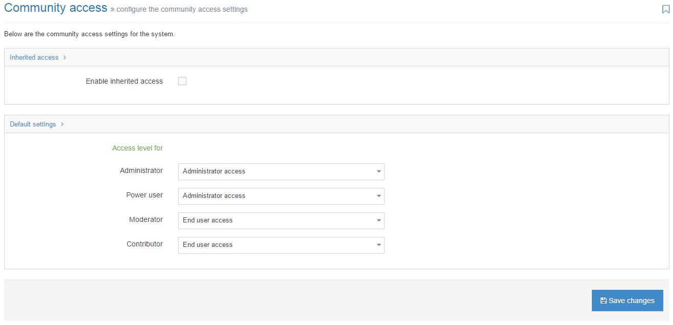
Users and Workflow Configuration
Description
To configure the users and Workflow configuration settings go to System Administration > System Settings > Users and Workflow.
General settings
The General Settings tab has the following options:
| Item | Description |
|---|---|
| Check weak passwords |
Limits a password to between 8 and 40 characters and prevents the use of dictionary words as passwords. This applies to local users only and is enabled by default. |
| If content is added to a Section which follows a workflow, and the content type used to add the content follows a different Workflow, which workflow should be used? | You can assign Workflows to both Sections and Content Types, and this can sometimes create a conflict. For instance, you might have assigned a Workflow to the Content Type used for Press Releases and you might also have assigned a different Workflow to the Section the Press Releases are added to. Since the content cannot go through both Workflows, you will specify the Workflow that should be used by selecting the relevant radio button. |
| Extended user details Content Type | Sets the Content Type that contains the additional fields for the user profile |
| Mail users or group | Specifies if the emails are sent to the group email or individuals email |
| Enable forgotten password | Enables users to reset their password at login |
| Enable MFA | Ensures all local or LDAP users must enter a verification code sent to their email address each time they log in. This applies immediately to all future login attempts.
Important: Enabling MFA will increase account security, but may also cause login issues for users without access to their registered email. Ensure user email records are accurate. |
| Enable visitor user type | Enables the visitor user type, which is used for access control on the published site. |
Mediums
It is advised that you have one mail server configured in the Mediums tab in Terminalfour. In order to be able to send alerts and notifications from Terminalfour, at least one mail server must be configured. Click the Create new medium button and enter the details:
| Item | Description |
|---|---|
| Enabled | Enables the medium for use |
| Name | Enter a name |
| Description | Enter a description |
| Path | Sets the IP address or server name |
| Class | Sets the Java class used to dispatch alerts for the medium. This should be a value of com.terminalfour.alert.EmailDispatcher |
| Username | Sets the username used to connect to the server if authentication is required |
| Password | Sets the password used for authentication |
| Confirm password | Sets the password used for authentication |
| Use TLS? | Sets the usage of TLS (Transfer Layer Security). This is a method used to communicate between Terminalfour and the email server and requires configuration within Tomcat |
| TLS port | Sets the port to use when TLS is specified. The default is 587, but confirm this setting as it can be different on your installation |
| Is this the primary or secondary server? | Sets the server as primary or secondary. The primary server is the default server. If the primary server fails the secondary server is used |
| Choose secondary medium (used if primary fails) | Sets the secondary server to use if the primary one fails |
Configuration of rights
Description
Under Role customization in System administration > User rights & roles, there are a number of configuration options that can be set.
The options for configuration vary by setting and are as follows:
- Set minimum user level
- Set Moderator, Power user, Administrator
- Allow power users
- Set Contributor, Moderator, Power user, Administrator
- Set per user level
Other configurable rights can be set per power user, when workflows are used and based on access control rules. The table below outlines the configuration options and where the setting is configured.
| Area | Right/Action | Role/User Level | Configuration details | Configuration Location |
|---|---|---|---|---|
| Content | View access controlled content | All Roles | Based on access control rules | Access control |
| Site Structure | Create/edit/delete section | Contributor + | Set minimum user level | Role customization |
| Site Structure | Edit section: set output URIs | Moderator + | Set minimum user level | |
| Site Structure | Edit section: set a path as an output URI | Moderator + | Set minimum user level | |
| Site Structure | View non accessible sections | Contributor + | Set minimum user level | |
| Approval | Approve/Reject Content | Moderator + | When workflows are used | Workflow |
| Approval | "Update & Approve" (content not in workflow) | Moderator + | Set Moderator, Power user, Administrator | |
| Approval | Bulk Selective approval | Moderator + | Set Moderator, Power user, Administrator | |
| Media | Set Media auto publish | Moderator + | Set minimum user level | |
| Media | Set Media access rights | Moderator + | Set minimum user level | |
| Media | Set Media edit rights | Moderator + | Set minimum user level | |
| Media | Upload a package of media | Moderator + | Set minimum user level | |
| Preview/Publish | Publish Channel/Microsite | Power User + | Set per power user. When the user is designated a Power user then the user is permitted to publish specific channels, or microsites, or both. This enables the Power User to run a manual publish of the selected channels or microsites. | User rights & roles, User management, Publish channels |
| Preview/Publish | Set default channel for preview/publish | Contributor + | Set per user level. Sets the default channel for the user type. If no default channel is set and there is more than one channel, the user is prompted to select a channel when previewing content. This setting can also be configured for groups or for individual users by modifying their profiles. | |
| Preview/Publish | Publish now | Moderator + | Set minimum user level | |
| Preview/Publish | When assigned to channel/microsite | Moderator + | Set minimum user level. Specifies the minimum user level permitted to use publish now within channels/microsites to which they have been assigned. | |
| Transfer | Transfer Channel/Microsite | Power User + | Set per power user. When the user is designated a Power user then the user is permitted to publish specific channels, or microsites, or both. This enables the Power User to run a manual publish of the selected channels or microsites. | User rights & roles |
| Transfer | Transfer now | Moderator + | Based on "publish now" settings. Based on "publish now" setting being enabled and the publish channel being mapped to the transfer. | Preview & publish, Transfer to live |
| User management | Create/edit/delete Users | Power User + | Allow power users to add, edit, delete | |
| Channel management | Manage Channels | Power User + | Allow power users | |
| Reports Quality control: Accessibility | View reports | Contributor + | Set Contributor, Moderator, Power user, Administrator | |
| Reports Quality control: SEO | View reports | Contributor + | Set Contributor, Moderator, Power user, Administrator |
Matrix of user rights and roles
Description
Please see Configuration of rights. Below is the a matrix of users rights.
| Area | Right/Action | Configure? | Role / User Level | Con | Mod | PU | Admin |
|---|---|---|---|---|---|---|---|
| Content | Create Content | ✖ | Contributor + | ✔ | ✔ | ✔ | ✔ |
| Content | Edit Content | ✖ | Contributor + | ✔ | ✔ | ✔ | ✔ |
| Content | Delete Content | ✖ | Contributor + | ✔ | ✔ | ✔ | ✔ |
| Content | Recycle Content | ✖ | Admin Only | ✖ | ✖ | ✖ | ✔ |
| Site Structure | Create/edit/delete section | ✔ | Contributor + | ✔ | ✔ | ✔ | ✔ |
| Site Structure | Edit section: set output URIs | ✔ | Moderator + | ✖ | ✔ | ✔ | ✔ |
| Site Structure | Edit section: set a path as an output URI | ✔ | Moderator + | ✖ | ✔ | ✔ | ✔ |
| Site Structure | Duplicate Section | ✖ | Moderator + | ✖ | ✔ | ✔ | ✔ |
| Site Structure | View non accessible sections | ✔ | Contributor + | ✔ | ✔ | ✔ | ✖ |
| Approval | Approve/Reject Content | ✔ | Moderator + | ✖ | ✔ | ✔ | ✔ |
| Approval | "Update & Approve" (content not in workflow) | ✔ | Moderator + | ✖ | ✔ | ✔ | ✔ |
| Approval | "Update & Approve" (content in workflow) | ✖ | Admin Only | ✖ | ✖ | ✖ | ✔ |
| Approval | Bulk Selective approval | ✔ | Moderator + | ✖ | ✔ | ✔ | ✔ |
| Media | Set Media auto publish | ✔ | Moderator + | ✖ | ✔ | ✔ | ✔ |
| Media | Set Media access rights | ✔ | Moderator + | ✖ | ✔ | ✔ | ✔ |
| Media | Set Media edit rights | ✔ | Moderator + | ✖ | ✔ | ✔ | ✔ |
| Media | Upload a package of media | ✔ | Moderator + | ✖ | ✔ | ✔ | ✔ |
| Preview/Publish | Publish Channel/Microsite | ✔ | Power User + | ✖ | ✖ | ✔ | ✔ |
| Preview/Publish | Set default channel for preview/publish | ✔ | Contributor + | ✔ | ✔ | ✔ | ✔ |
| Preview/Publish | Publish Now | ✔ | Moderator + | ✖ | ✔ | ✔ | ✔ |
| Preview/Publish | When assigned to channel/microsite | ✔ | Moderator + | ✖ | ✔ | ✔ | ✔ |
| Transfer | Transfer Channel/Microsite | ✖ | Power User + | ✖ | ✖ | ✔ | ✔ |
| Transfer | Transfer now | ✖ | Moderator + | ✖ | ✔ | ✔ | ✔ |
| User management | User Profile: Edit | ✖ | Contributor + | ✔ | ✔ | ✔ | ✔ |
| User management | Create/edit/delete Users | ✔ | Power User + | ✖ | ✖ | ✔ | ✔ |
| User management | Create Groups | ✖ | Admin Only | ✖ | ✖ | ✖ | ✔ |
| User management | Edit Groups | ✖ | Power User + | ✖ | ✖ | ✔ | ✔ |
| User management | Delete Groups | ✖ | Admin Only | ✖ | ✖ | ✖ | ✔ |
| User management | Assign Rights to Contributors | ✖ | Moderator + | ✖ | ✔ | ✔ | ✔ |
| User management | Assign Rights to Moderators | ✖ | Power User + | ✖ | ✖ | ✔ | ✔ |
| User management | Assign Rights to Groups | ✖ | Power User + | ✖ | ✖ | ✔ | ✔ |
| User management | Assign Power users to Groups | ✖ | Admin Only | ✖ | ✖ | ✖ | ✔ |
| User management | Mail users | ✖ | Admin Only | ✖ | ✖ | ✖ | ✔ |
| Channel management | Manage Channels | ✔ | Power User + | ✖ | ✖ | ✔ | ✔ |
| Assets | Manage Page Layouts | ✖ | Power User + | ✖ | ✖ | ✔ | ✔ |
| Assets | Manage Content Types | ✖ | Power User + | ✖ | ✖ | ✔ | ✔ |
| Assets | Manage Navigation Objects | ✖ | Power User + | ✖ | ✖ | ✔ | ✔ |
| Assets | Manage Lists | ✖ | Power User + | ✖ | ✖ | ✔ | ✔ |
| Assets | Manage Workflows | ✖ | Power User + | ✖ | ✖ | ✔ | ✔ |
| Assets | Manage Languages | ✖ | Admin Only | ✖ | ✖ | ✖ | ✔ |
| Assets | Manage Metadata mappings | ✖ | Admin Only | ✖ | ✖ | ✖ | ✔ |
| Reports Quality control: Accessibility | Create, edit, delete reports | ✖ | Admin Only | ✖ | ✖ | ✖ | ✔ |
| Reports Quality control: Accessibility | View reports | ✔ | Contributor + | ✔ | ✔ | ✔ | ✔ |
| Reports Performance dashboards: Site analytics | Create, edit, delete reports | ✖ | Admin Only | ✖ | ✖ | ✖ | ✔ |
| Reports Performance dashboards: Site analytics | View reports | ✖ | Contributor + | ✔ | ✔ | ✔ | ✔ |
| Reports Quality control: SEO | Create, edit, delete reports | ✖ | Admin Only | ✖ | ✖ | ✖ | ✔ |
| Reports Quality control: SEO | View reports | ✔ | Contributor + | ✔ | ✔ | ✔ | ✔ |
| Reports Quality control: Broken links | Schedule reports | ✖ | Admin Only | ✖ | ✖ | ✖ | ✔ |
| Reports Quality control: Broken links | View reports | ✖ | Power User + | ✖ | ✖ | ✔ | ✔ |
| Reports Governance: Content owners | Create, edit, view, delete reports | ✖ | Admin Only | ✖ | ✖ | ✖ | ✔ |
| Reports Governance: Page layout usage | Create, edit, view reports | ✖ | Admin Only | ✖ | ✖ | ✖ | ✔ |
| Reports Governance: Navigation usage | Create, edit, view reports | ✖ | Admin Only | ✖ | ✖ | ✖ | ✔ |
| Reports Governance: Content type usage | Create, edit, view reports | ✖ | Admin Only | ✖ | ✖ | ✖ | ✔ |
| Migration | Manage HTML import | ✖ | Admin Only | ✖ | ✖ | ✖ | ✔ |
| Migration | Manage Packages | ✖ | Power User + | ✖ | ✖ | ✔ | ✔ |
| Integration tools | Manage External sources | ✖ | Admin Only | ✖ | ✖ | ✖ | ✔ |
| Integration tools | Manage External content syncer | ✖ | Admin Only | ✖ | ✖ | ✖ | ✔ |
| Personalization | Manage Access control | ✖ | Admin Only | ✖ | ✖ | ✖ | ✔ |
| Push to social | Manage Push to social | ✖ | Admin Only | ✖ | ✖ | ✖ | ✔ |
| Mobile integration | Manage Mobile integration | ✖ | Admin Only | ✖ | ✖ | ✖ | ✔ |
| Email campaigns | Manage Email campaigns | ✖ | Admin Only | ✖ | ✖ | ✖ | ✔ |
| Task scheduler | Create, edit, delete tasks | ✖ | Admin Only | ✖ | ✖ | ✖ | ✔ |
| System Management | View Audit Report | ✖ | Admin Only | ✖ | ✖ | ✖ | ✔ |
| System Management | View Error Report | ✖ | Admin Only | ✖ | ✖ | ✖ | ✔ |
| System Management | Configure CMS | ✖ | Admin Only | ✖ | ✖ | ✖ | ✔ |
Create a New Navigation Object
Description
This section deals with the process of creating Navigation Objects.
For more information, read an overview of Navigation Objects, including a list and description of the different kinds of Navigation Objects.
Step 1 - Select Create New Navigation
To create a Navigation Object go to Assets > Navigation and select Create New Navigation
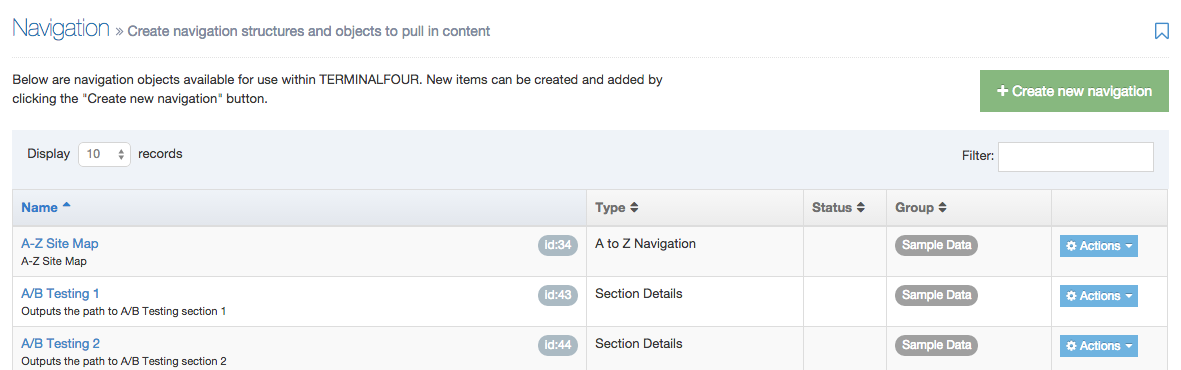
Step 2 - Select Type
As you roll over the types of Navigation Object from the list on the left you'll see a brief description of it appear on the right. In this example, Breadcrumbs has been selected. Once the name of the Navigation Object type has been clicked, you will proceed to the next screen. More information on the different types of Navigation Objects is available on the Navigation Object page.
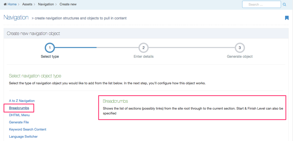
Step 3 - Enter details
Each Navigation Object requires a baseline of common fields of information to be entered when creating a new object:
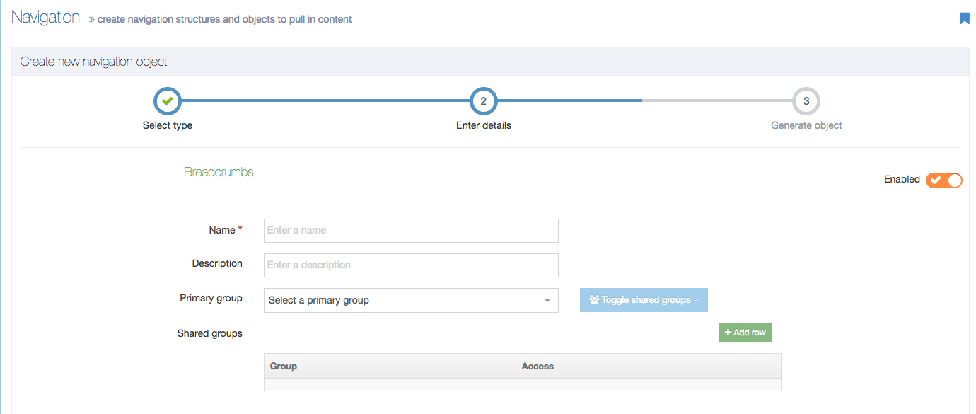
A list of the fields to be entered is below:
| Item | Description |
|---|---|
| Name | Enter a name for the object. You cannot output an object without entering a name. |
| Description | Although optional, this text is used by the filter on the Navigation Objects listing so make finding Navigation Objects easier. |
| Primary Group | The members of the Primary Group can modify the Navigation Object. Click Show Shared Groups to share an object with other Groups, providing either full access or read-only access for the members of that Group. |
| Show pending content in preview |
When checked, this Navigation Object will display pending content when Previewed. Otherwise, only approved content will be retrieved by the Navigation Object. |
| Cache output |
When checked, Terminalfour will cache the output of this Navigation Object, which can improve preview and publish performance. Terminalfour recommends that this is checked. This option appears for Top Content, Top Stories, Related Content and Keyword Search Navigation Objects. |
Granting Full access to users of the Shared Group allow them to edit and delete the Navigation Object.
Be considerate of which level of access you choose.
A Navigation Object is not output and available unless the orange switch on the right is set to "Enabled". This is its default state. Disabled Navigation Objects are flagged in the Navigation Object list:
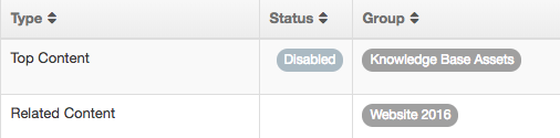
Step 4 - Generate Object
The Navigation Object has been generated.
From this page you can Copy the Navigation T4 Tag, select to return to All navigation objects or to Create another object.
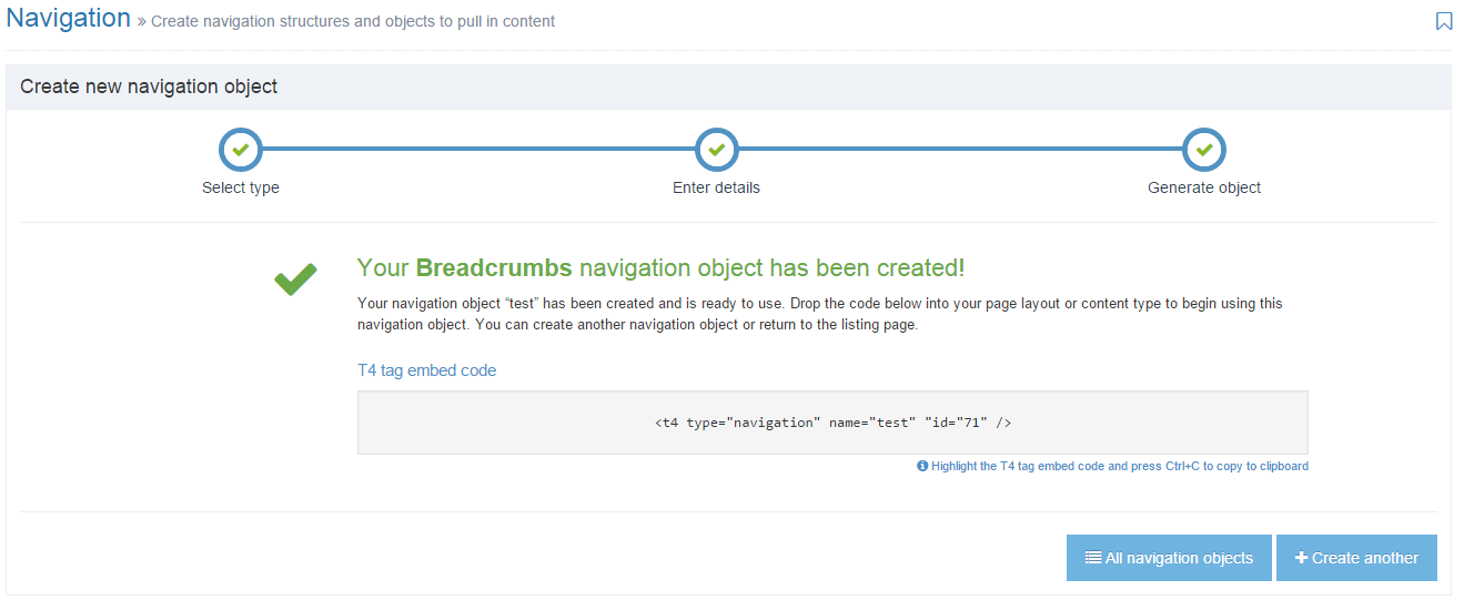
Navigation usage
Description
The Navigation Usage Report lets you to see the Navigation Objects that are in use and where they are being used. This can be useful when changing or deleting a Navigation Object, as it might be in use, and potentially in more than one place.
To use the Navigation Usage Report, go to Assets > Asset usage > Navigation usage.
Search tools
The report can be run on a specific Navigation object or Section / Branch.
| Item | Description |
|---|---|
| Search by: Navigation object | |
| Navigation object | Select a specific Navigation Object and see where it is being used |
| Search by: Section | |
| Section | From the Select Section modal window click on a Section and then click the Select Section button at the bottom. |
| Number of levels to recurse |
Sets how deep through the Site Structure this report will run
|
Click Run report to display the search results.
Search results
Results matching the search will be displayed in four listings:
1. Usage in Page Layouts
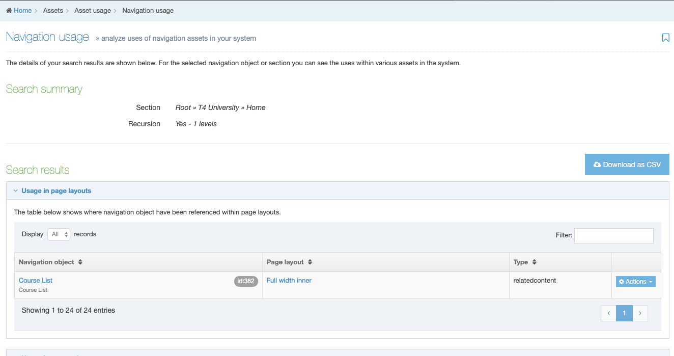
2. Usage in Content Layouts
3. Usage in content
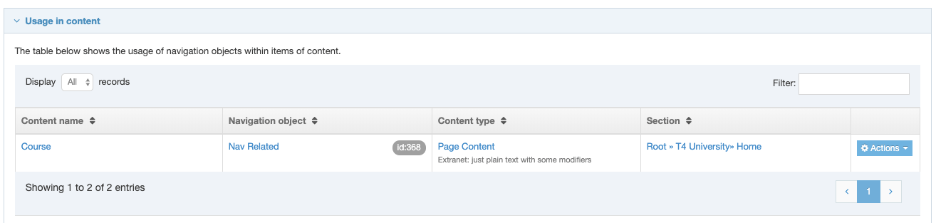
4. Usage Totals
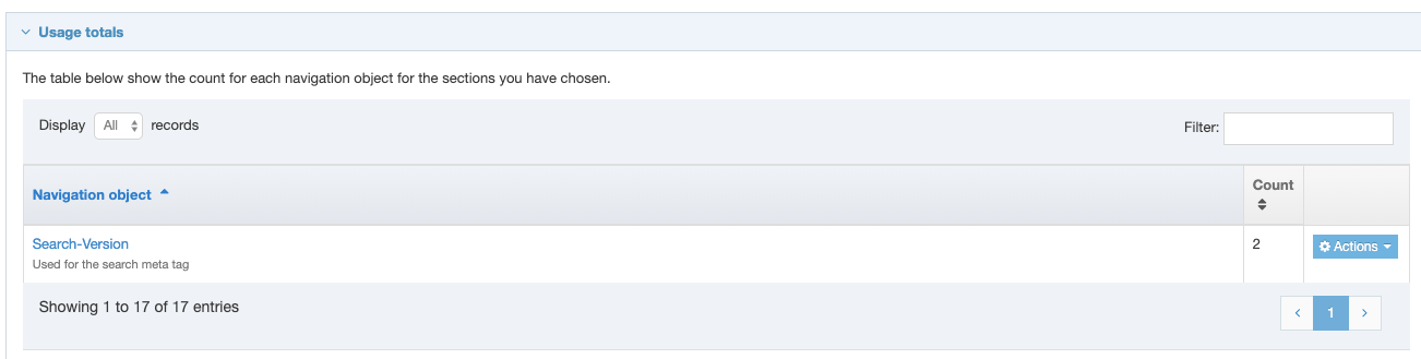
For each item, the Navigation Object, Navigation Object Type and the usage will be displayed. Results can be sorted and filtered.
| Item | Description |
|---|---|
| Navigation object | The name and id of the Navigation Object. Click the name to edit. |
| Type | The type of Navigation Object e.g. breadcrumb. |
| Line number | When searching for a specific Navigation Object, the line number that contains the object is displayed. Click Actions, View code snippet to view the excerpt of code from where the Navigation Object is being referenced in the page layout. |
| Page layout | If the Navigation Object is used in a Page Layout, the name of the Page Layout is displayed. Click the name to edit the Page Layout. |
| Content type | If the Navigation Object is used in a Content Type or Content Item, the name and description of the Content Type are displayed. Click the name to edit the Content Type. |
| Layout |
If the Navigation Object is used in a Content Layout, the name of the Content Layout is displayed. |
| Content name |
If the Navigation Object is used in a Content Item, the name of the Content Item is displayed. |
| Section |
If the Navigation Object is used in a Section, a breadcrumb to the Section is displayed. |
| Count |
The total number of times that the Navigation Object is used, displayed under usage totals. This is the usage count and does not necessarily represent the number of pages on which the Navigation Object appears. |
| Actions |
The Actions menu options change depending on the listing and allow you to:
|
Download as CSV
Click Download as CSV to download the results in a CSV file that can be opened in Excel.
A to Z Navigation
Description
The A to Z Navigation Object is a variation on the Site Map Navigation Object that allows you to output a list of Sections in alphabetical order. The order of the list can either be A-Z, or Z-A.
How to create an A to Z Navigation
To create this object, go to Assets > Navigation and click Create new navigation and select A to Z Navigation.
After completing the standard options used for all types of Navigation Objects, fill in each of the following, where relevant:
| Item | Description |
|---|---|
| Restrict to microsite | If left as No restrictions, all links within the current channel will be used. Alternatively, the links can be restricted to a specific Microsite. If a Microsite is selected, the T4 Tag for this Navigation Object needs to be used within that Microsite. If the T4 Tag is used outside of the selected Microsite, it will not generate any links. |
| Start level | The level at which this object should start. Level 1 is the root (or home) Section of the current Channel, or the root (or home) section of the Microsite selected above. If left at 0, the root (or home) Section of the Channel, or selected Microsite, is used. |
| End level | Enter the level at which this object should end. Level 1 is the root (or home) Section of the current Channel, or the root (or home) section of the Microsite selected above. If left at 0, there is no restriction on the number of levels. |
| Before menu HTML | HTML output before the menu. |
| After menu HTML | HTML output after the menu. |
| Before link HTML | HTML output before each link. |
| After link HTML | HTML output after each link. |
| Use section metadata element instead of section name? | Checkbox to use a plain text element within the Section meta mata Content Type for the link text instead of using the Section name. |
| Choose element | If the Section meta data Content Type is being used, select the element that should be used as the link text. If this element is left blank, no link will be generated. |
Review your entries and selections, if you are satisfied with your entries, click Next to generate the object.
Once generated, highlight the T4 Tag Embed Code, copy to your clipboard (Ctrl+C) and paste into a Page Layout or Content Layout or within a Content Item.
Breadcrumbs
Description
A Breadcrumbs Navigation Object shows the hierarchical location of the current page (the parent, grandparent etc.):

Breadcrumbs allow you to backtrack one step at a time, to higher level pages of the website.
How to create Breadcrumbs
To create this object, go to Assets > Navigation and click Create new navigation and select Breadcrumbs.
After completing the standard options used for all types of Navigation Objects, fill in each of the following, where relevant:
| Item | Description |
|---|---|
| Output each section level as a link | Checkbox to output each breadcrumb has a link. If you leave the box unchecked then only section names appear and they are not linked to their pages. |
| Output the current section level as a link | Checkbox to hyperlink the current breadcrumb. If left unchecked, only the name is displayed. |
| Hide the "Home", or root level | Checkbox to remove/hide the home section from the beginning of the breadcrumbs. |
| Exclude spaces from section names | Only an option if Output each section level as a link is unchecked, this will remove all spaces from the section names. This is sometimes used for Analytics code to identify the current page. |
| Breadcrumb length |
|
| Append content "name" for fulltext pages | Checkbox to append an item to the end of the breadcrumbs for fulltext content pages. |
| Content element | If Append content "name" for fulltext pages is checked, enter the name of the content element that will be added to the end of the breadcrumb on these pages. All fulltext Content Types will need an element of the same name if this option is to work on all fulltext pages. |
| Before HTML | The code to appear before the breadcrumb. |
| After HTML | The code to appear after the breadcrumb. |
| Separator HTML | The code used between each breadcrumb link. |
Review your entries and selections, if you are satisfied with your entries, click Next to generate the object.
Once generated, highlight the T4 Tag Embed Code, copy to your clipboard (Ctrl+C) and paste into a Page Layout or Content Layout or within a Content Item.
CSS Selector
Description
You can use particular CSS files for different Branches of your site using the CSS Selector Navigation Object in the header of a Page Layout. When doing so, define the Branch that uses a specific Section name or by selecting a particular Section. This allows different pages, using the same Page Layout, to use different CSS files and therefore be styled differently. This would typically be used where different parts of the site have unique branding (e.g. different color schemes or branding).
NOTES:
- You can only output one CSS file per page per Navigation Object.
- If two CSS files are applied to the same Branch root within one Navigation Object only the first assigned is output. If multiple CSS files are required, create two separate Navigation Objects and put both within the Page Layout.
- There is no limit to the number of CSS files and Branches that can be configured within one Navigation Object.
How to create a CSS Selector
To create this object, go to Assets > Navigation and click Create new navigation and select CSS selector.
After completing the standard options used for all types of Navigation Objects, fill in each of the following, where relevant:
| Item | Description |
|---|---|
| Language code | The two-character language code ("en", "fr") that is used in the language configuration. This is only used if the Find section by section name option is used and separate Navigation Objects are created for each language. |
| Default stylesheet | Select a default stylesheet that can be used if the current page is not within one of the options configured below. |
For each branch of the site that needs a custom CSS file, add a new CSS Selector:
| Item | Description |
|---|---|
| Select stylesheet | Choose the stylesheet from the Media Library. You can add the CSS file to the Media Library at this stage if it is not there already. |
| Section |
|
Review your entries and selections, if you are satisfied with your entries, click Next to generate the object.
Once generated, highlight the T4 Tag Embed Code, copy to your clipboard (Ctrl+C) and paste into a Page Layout or Content Layout.
Generate File
Description
You use this feature to generate a file into a specified directory. The file content can originate in a Content Layout (where the Navigation Object is within a Content Type), or from a Media Item in the Media Library. The Generate File Navigation Object does not create a link to the file - it only publishes the file into the appropriate directory.
This Navigation Object has many uses, for example, to create iCalendar files for event information or publish htaccess and htpasswd files.
How to create Generate File Navigation Object
To create this object, go to Assets > Navigation and click Create new navigation and select Generate File.
After completing the standard options used for all types of Navigation Objects, fill in each of the following, where relevant:
| Item | Description |
|---|---|
| File name | The name of the file to be created, without the file extension |
| Append the content ID to the name of the file | Checkbox to append the Content ID as part of the file name. By default, a comma is used to separate the File Name and Content ID. This cannot be used if the T4 Tag for this Navigation Object is being placed within a Page Layout. |
| File extension | The file extension of the file, excluding the "dot" e.g. doc, csv |
| Output directory |
|
| Base directory | If Use alternate directory is selected above, specify the directory into which the file will be published. If the site is publishing in multiple languages, the base directory will be appended with the language code, using the channel settings for default language. |
| Append the current section path to the base directory | If Use alternate directory is selected above, check this to append the Base directory with the current section path to build a structure. If left unchecked, the Base directory will always be used. |
| Content layout |
If the object is within a Content Layout or within a Content Item, specify the Content Layout to use for the content of the file. This layout should be added to the same Content Type in which the Navigation Object is used. This cannot be used if the T4 Tag for this Navigation Object is being placed within a Page Layout. |
| Media file | If the Content layout is not used, select the Media Item to be placed within the file. If used, the Media file will get renamed on publish (as per the File Name and the File Extension above), and will publish into the directory Base directory/Append Directory specified i.e. the Media file will not publish into the normal media directory. |
Review your entries and selections, if you are satisfied with your entries, click Next to generate the object.
Once generated, highlight the T4 Tag Embed Code, copy to your clipboard (Ctrl+C) and paste into a Page Layout, or within a Content Layout or within a Content Item.
Keyword Search Content
Description
The Keyword Search Content Navigation Object is used to obtain keywords from a Content Element in the current, parent or specified Section. The keywords are then used to find all Content Items with matching keywords in another specified Content Element.
As an example, if news items are tagged with keywords, you can use the Keyword Search Content Navigation Object to create a listing of all news items with a specific keyword.
To make sure the keywords are entered correctly, you can consider creating a List for the user to select from, rather than allowing the user to enter the keywords as free text.
How to create a Keyword Search Content
To create this object, go to Assets > Navigation and click Create new navigation and select Keyword Search Content.
After completing the standard options used for all types of Navigation Objects, fill in each of the following, where relevant:
| Item | Description |
|---|---|
| Keyword fetch method |
Specify the location of the content that defines which keywords should be used for the search
|
| Root section | If using Specified section, click Select section, and select the section via Browse or Search. |
| Narrow keyword selection | If unchecked, keyword retrieval will use keywords found in all relevant Content Items within the Section to search for matching content in the target section / branch. If checked and the T4 tag appears within a Content Layout or is processed on a full text page, keyword retrieval will be restricted to the currently publishing Content Item. To optimize publish performance, it is best to leave this disabled, unless it is required. |
| Content type to get keywords | Select the Content Type that is used to specify the keywords for which to search (this is not the content you are "tagging") |
| Get keywords element name |
Select one or more of the Elements which contain the content used for the keyword search. HTML elements cannot be used for entering keywords. To optimize publish performance, it may be advisable to add this Element to the System Cache. |
| Content fetch method |
Specify the location of the content containing the keywords. This is the content you have tagged:
|
| Search section from |
If the Content fetch method is Specified section or Branch select to either:
Keyword Search will not return any results for content that is within a section listed in the "Ignore section names on publish per channel" configuration option. |
| Search section | If using a Specified section or Branch, and choosing a section, select the section via Browse or Search. |
| Start level | If using the Content fetch method is Use branch at level, specify the start level, where level 1 is the home (root) section of the channel, regardless of whether Microsites are used or not. |
| End level | If using the Content fetch method is Use branch at level, specify the end level, where level 1 is the home (root) section of the channel, regardless of whether Microsites are used or not. |
| Name of content element used to determine which section to search from |
if From content element is chosen for the Section to search from, select the section/content link element that will determine the Search section. If this option is used, the T4 tag for the Navigation Object needs to be placed within the Content Layout for the selected Content Type. To optimize publish performance, it may be advisable to add this Element to the System Cache. |
| Content type to search keywords |
The default setting is Any content type, or select the Content Type where the system searches for matching keywords. This is the content you are "tagging". |
| Search keywords element name | The element(s) to determine the keyword element within the Content Type selected above. To optimize publish performance, it may be advisable to add these Elements to the System Cache. |
| Number of pieces of content to display | The number of Content Items to display. |
| Sort type |
Select how the content should be ordered (or sort the results by date element, below):
|
| Sort the results by a date element |
Checkbox to order the results according to a date element in the Content Type instead of using the Sort type option above. If the Only display upcoming content option is checked, content is ordered with the next upcoming dates first (for example, for upcoming events). |
| Only display upcoming content | Checkbox to only display content where the date in the content's date element is in the future. Works with the Sort the results by a date element to determine how content is sorted. |
| Date element name |
If using the Sort results by a date element, enter the name of the date element from the Content Type. Make sure the entry is an exact match and it is a case sensitive entry. If the element is renamed, the original name should be specified. To optimize publish performance, it may be advisable to add this Element to the System Cache. |
| Include hidden sections | Checkbox to search content within sections that are hidden from navigation. |
| Allow matching of composite keywords |
Checkbox to allow the results to display partial matches so "composite" keywords can be matched to a "single" keyword. This is limited to if the keywords elements are list elements (this is not used for text elements), and would be used where a list element value contains multiple values in a comma-separated list. For example, the list entries are:
If the Get keywords element name is "apple, pear, orange" and this option is checked, it then matches any content that is "apple, pear, orange", "apple" or "pear" or "orange". If the Get keywords element name is "apple, pear, orange" and this option is unchecked, it then only matches content that is "apple, pear, orange". To optimize publish performance, it is best to leave this disabled, unless it is required. |
| Allow matching on sub-items | Checkbox to include content tagged with a taxonomy item's sub-items. For example, if the keywords are entered using a cascading list, selecting a parent option in the list displays all content which matches the parent or the sub-list related to the parent. To optimize publish performance, it is best to leave this disabled, unless it is required. |
| Enable cross language searching | If you have a multi-lingual site, check this box to search content in the other languages. If left unchecked, the object will only search for content in the current language. |
| Languages to search in | If using cross language searching, choose one or more of the available languages. |
| Before HTML | HTML output before the Navigation Object. |
| After HTML | HTML output after the Navigation Object. |
| Content layouts | Use channel default (set on the channel settings) or select alternate Content Layout. |
| Alternate content layout | If the channel default is not used, enter the name of the alternate Content Layout. |
| Pagination output across pages | Check box to paginate the content that is displayed. This automatically creates pagination links to navigate between the pages of content. |
| Display | The number of Content Items you want to display on each page if you use pagination. |
| Before pagination HTML | The code to be output before the pagination links. |
| Between pagination HTML | The code to be output between each pagination link. |
| After pagination HTML | The code to be output after the pagination links. |
Review your entries and selections, if you are satisfied with your entries, click Next to generate the object.
Once generated, highlight the T4 Tag Embed Code, copy to your clipboard (Ctrl+C) and paste into a Page Layout or Content Layout. When using a Keyword Search Content Navigation Object, there may be different results, depending on where the object is placed:
- If a section/content link element is used to determine the location of the tagged content, the T4 Tag for the Navigation Object needs to be placed within the Content Layout for the selected Content Type.
- If the "Keyword retrieval" content type is the same as the Content retrieval Content Type, the T4 Tag for the Navigation Object needs to be placed within the Content Layout for the selected Content Type (placing it within the Page Layout does not work).
Mirrored Content
In Top Content and Keyword Search Content Navigation Objects, where a Content Item is mirrored into multiple Sections, the Navigation Object will recurse the Branch and only return the first instance of that Content Item. Re-ordering Sections can, therefore, affect the instance of the Content Item that is returned by the Navigation Object.
For Publish to One File Navigation Objects, where a Content Item is mirrored into multiple Sections, the Navigation Object returns all instances of a Content Item.
Language Switcher
Description
A Language Switcher Navigation Object allows the user to change switch between languages on multiple language sites.
How to create a Language Switcher
To create this object, go to Assets > Navigation and click Create new navigation and select Language Switcher.
After completing the standard options used for all types of Navigation Objects, fill in each of the following, where relevant:
| Item | Description |
|---|---|
| Language code | The two-letter code that is used for the language in the language configuration. The name of the language is used as the link text. |
| Generate output even if no language content | If checked, the language switcher will create a link, even if the current page does not exist in the other language. e.g. <a href="#">English</a> |
| Use images for links | Checkbox to use images for links instead of text. |
| URL for images | If Use images for links is checked, specify the URL/directory for the images. The image should be have the name "main-en" for English, "main-fr" for French, etc. |
| Image properties | If Use images for links is checked, specify the image properties (for example, width=20) |
| Image file extension | If Use images for links is checked, specify the file extension used for the image files. |
| Before HTML | The HTML code to output before the language switcher link. |
| After HTML | The HTML code to output after the language switcher link. |
Review your entries and selections, if you are satisfied with your entries, click Next to generate the object.
Once generated, highlight the T4 Tag Embed Code, copy to your clipboard (Ctrl+C) and paste into a Page Layout or Content Layout.
Link Menu
Description
With the Link Menu Navigation Object, you can add links to a specific Section and its Child Sections to your pages. A website's main and side navigation menus are typically built with Link Menu Navigation Objects.
How to create a Link Menu
To create this object, go to Assets > Navigation and click Create new navigation and select Link Menu.
After completing the standard options used for all types of Navigation Objects, fill in each of the following, where relevant:
| Item | Description |
|---|---|
| Menu type |
|
| Display method |
|
| Level to branch for links | This appears if the menu type is Branch at level and allows the user to specify the level at which the navigation should start. Level 1 is the root section (or home section) of the current channel, regardless of whether Microsites are used or not. |
| Levels to recurse | This appears if the menu type is Branch at level. Specify the number of additional levels of sub-navigation to show. For example, if this is a value of 2, the navigation will start at the level selected to start, and show an additional 2 levels below that. |
| Always output children of a specific section? | This appears if the menu type is Children. If not checked, the child Sections of the current Section are output. If checked, you need to specify the Section you want to output from. |
| Show siblings if no children | This appears if the menu type is Children. It outputs the Section's siblings if no children are available. |
| Show ancestors if no children or siblings | This appears if the menu type is Children. If the current Section has no children, the tree is traversed until a Section with children is encountered. This option overrides the value of Show siblings if no children. |
| Use currentbranchN class | Each link in the current branch gets its own span class of "currentbranchN" where N is that particular Section's level in the Channel hierarchy. |
| Make current section a link? | Checkbox to make the current Section a link, if it is included in the menu. If unchecked, the current section will not be a link. |
| Show children of non-current sections | Checkbox to output the children of all Sections, similar to a Site map. This is only relevant if the menu type is Branch at level. The Levels to recurse option will determine how many levels deep are displayed on each page. |
| Sub-navigation | Appears if the Menu type is Branch at level or Siblings and children. Select the markup that should be used for the submenu lists. HTML ul (unordered lists) are recommended for compliance with XHTML standards. |
| Title before menu | The title you wish to output before the menu, or leave it blank. |
| Add the section's name in front of the title | If Title before menu is completed, and you tick this box, it places the section's name in front of the title. |
| Before menu HTML | HTML output before the menu. |
| After menu HTML | HTML output after the menu. |
| Before link HTML | HTML output before each link in the menu. |
| After link HTML | HTML output after each link in the menu. |
| Between links HTML | HTML output between each link in the menu. |
Review your entries and selections, if you are satisfied with your entries, click Next to generate the object.
Once generated, highlight the T4 Tag Embed Code, copy to your clipboard (Ctrl+C) and paste into a Page Layout or Content Layout or a Content Item.
Pagination
Description
Using the Pagination Navigation Object you can specify the number of Content Items from a Branch or Section that is output to a page. The rest of the content is output, in batches of the same size, to new folders under the root which correspond to the page number. These links are visible at the bottom of the page, allowing the visitor to move through the pages. This is useful when creating paginated listings of content (e.g. News or Events).
The other types of Navigation Objects that provide paginated content (with different types of logic and options to search for the content) are:
How to create a Pagination object
Using multiple Pagination Navigation Objects on a published page can result in unexpected behavior. This is because each Pagination Navigation Object outputs a subfolder with an index page. More than one instance of this Navigation Object on a page will out multiple subfolders with the same name which will result in pages overwriting each other. We recommend using only one per page.
To create this object, go to Assets > Navigation and click Create new navigation and select Pagination.
After completing the standard options used for all types of Navigation Objects, fill in each of the following, where relevant:
| Item | Description |
|---|---|
| Content type name | Select the type of content returned by the Navigation Object. |
| Number of pieces of content to display on page | The number of Content Items you want to display on each page. |
| Maximum number of pieces of content to display | The maximum number of Content Items you want to retrieve and paginate. |
| Maximum number of links to display on page | The maximum number of pagination links to display on each page. Where the total number of pages exceeds the maximum number of links to display on a page, links to the pages before/after the current page are displayed, along with links to first page, previous page, next page and last page. |
| Fetch method |
Pagination Navigation Object will not return any content for Sections included in the Ignore section names on publish per channel configuration option. |
| Current branch level to look at | The level of the current branch of the hierarchy at which to start. Level 1 is considered to be the root (or home section) of the channel, regardless of whether Microsites are used or not. |
| Number of levels to recurse | The number of levels down the hierarchy to recurse to find content. A value of 0 will recurse indefinitely. This is only available if the Fetch method is Use current branch, Use branch or Use branch at level. |
| Select section | Where the Fetch method is Use branch or Use section, select the section from which to start the search for content. |
| Hidden sections | Checkbox to also search sections that have been hidden from navigation. |
| Before HTML | HTML output before the Navigation Object. |
| After HTML | HTML output after the Navigation Object. |
| Before pagination HTML | The code to be output before the pagination links. |
| Between pagination HTML | The code to be output between each pagination link. |
| After pagination HTML | The code to be output after the pagination links. |
| Content layouts | Use channel default (set on the Channel settings) or select alternate Content Layout. |
| Alternate content layout | If the channel default is not used, enter the name of the alternate Content Layout. |
Review your entries and selections, if you are satisfied with your entries, click Next to generate the object.
Once generated, highlight the T4 Tag Embed Code, copy to your clipboard (Ctrl+C) and paste into a Page Layout or Content Layout or within a Content Item.
Previous/Next Fulltext Content
Description
With the Previous/Next Fulltext Content Navigation Object you can output "Previous" and "Next" links to enable users to navigate through the fulltext content items in a Section. This is useful in cases where a user would want to view fulltext content in a particular sequence.
The one Navigation Object can be configured to either output the "Previous" link, "Next" link or both links.
How to Create a Previous/Next Fulltext Content Object
To create this object, go to Assets > Navigation and click Create New Navigation and select Previous/Next Fulltext Content.
After completing the standard options used for all types of Navigation Objects, fill in each of the following, where relevant:
| Item | Description |
|---|---|
| Navigation type |
|
| Content layouts |
|
| Alternate content layout | If an alternate Content Layout is used, specify its name. |
| Skip non-fulltext content | Checkbox to exclude any content without fulltext Content Layout when calculating the previous or next content item. |
| Next fulltext content With previous/next navigation | Checkbox to only create links to content that share the same Navigation Object. This allows certain content items within the Section to be "skipped" if they are not in a Content Type that contains this Navigation Object in the fulltext layout. |
| Same Content Type restriction | Checkbox to only create links to the previous and next content items within the same Content Type as the current content item. |
| Display on boundary | By default, the "Previous" link will not display on the first page and the "Next" link will not display on the last. Checking this option displays those links on all pages. Though a "Previous" link will appear on the first page, it does not function. The same is true for the "Next" link on the last page. |
| Display content name as title on link | Checkbox to use content name as a title attribute on the link. |
| Previous HTML | The text to be used for the Previous link (e.g., "Previous News Article") |
| Between HTML | The HTML code to be generated between the Previous link and the Next link. |
| Next HTML | The text to be used for the Next link (e.g., "Next News Article") |
Review your entries and selections, if you are satisfied with your entries, click Next to generate the object.
Once generated, highlight the T4 Tag Embed Code, copy to your clipboard (Ctrl+C) and paste into a fulltext Content Layout.
This object does not work in a Page Layout or within a Content Item.
Publish to One File
Description
With the Publish to One File Navigation Object you can publish the content from an entire Branch on a single page. This can be used to create a content listing, for example, all Event content from a Branch could be used to create an Event listing.
The Navigation Object can be added to Content Types and Content Layouts.
How to Create a Publish to One File object
To create this object, go to Assets > Navigation, click Create New Navigation and select Publish to One File. You can use this
After completing the standard options used for all types of Navigation Objects, fill in each of the following, where relevant:
| Item | Description |
|---|---|
| Content Type name | Choose your Content Type from the drop-down list. If a specific Content Type is selected, only that content is used. If you select All content types, all content will be included. |
| Start Section |
The Start Section you select will only publish Content Items from the Child Sections below it. Content Items from the Start Section will not be published with this Navigation Object.
|
| Specify Section | If Use a specific Section is selected, select the Section to use. |
| Start Section element | If Take Section from Content Type element is selected, specify the name of the Section/content link element that will determine the location of the content. |
| Show hidden Sections? |
Checkbox to include hidden Sections in the Navigation Object. Publish to One File will not include any content within Sections listed in the Ignore Section names on publish per Channel configuration option. |
| Number of levels to recurse | Specify the number of levels to recurse. If set to 0, all content under the selected Section will be displayed. When set to 2 it displays one Section below the current Section. |
| Before HTML | HTML output before the Navigation Object. |
| After HTML | HTML output after the Navigation Object. |
| Display the Section name as part of the output | When checked, the name of each Section will be displayed. |
| Show Section name when hidden | Checkbox to show the name of each Section even if the Section is hidden from navigation. Left unchecked, Section names of Sections that are hidden from navigation are not displayed. |
| Before Section HTML | HTML output before the name of the Section. |
| After Section HTML | HTML output after the name of the Section. |
| Surrounding Page Layout | The selected Page Layout will output the header before the first Section at each level and the footer after the last Section at each level. If no Page Layout is required, then select No Page Layout. This may be useful if you need to create nested divs for the content structure or for an XML output. |
| Content Layouts | Use Channel default (specified on the Channel settings) or select alternate Content Layout. |
| Alternate Content Layout | If the Channel default is not used, enter the name of the alternate Content Layout. |
| Enable caching of output |
If you choose this option, TERMINALFOUR keeps a cache of each Content Item used by the object in separate .ser files. With the next publish, if the content has not changed, the system uses the cached version of that content item. If the content has changed, the system uses the new version of that content item. Selecting this option results in significant performance improvements when publishing. If your selection uses a fulltext (and the fulltext content is NOT published elsewhere on the site, and cleanup is enabled on your Channel) TERMINALFOUR does not re-publish the fulltext content - this results in it being deleted on cleanup. |
| Pagination output across pages | Checkbox to paginate the content that is displayed from this Navigation Object. This automatically creates pagination links to navigate between the pages of content. |
| Display | Specify the number of Content Items you want to display on each page if you use pagination. |
| Before pagination HTML | Enter the code to be output before the pagination links. |
| Between pagination HTML | Enter the code to be output between each pagination link. |
| After pagination HTML | Enter the code to be output after the pagination links. |
Review your entries and selections, if you are satisfied with your entries, click Next to generate the object. Once generated, highlight the T4 Tag Embed Code, copy to your clipboard (Ctrl+C) and paste into a Content Layout or a Content Item.
This object does not work in a Page Layout.
Related Content
Description
The Related Content Navigation Object retrieves content from a specified Section (Branch, level, or other) so it can be re-used in other locations of the site.
Apart from the content re-use, this can also be used to control edit rights to a page by allowing a user access to edit the main content area on the page and populating the page with content from other parts of the site, managed by another user.
How to create a Related Content object
To create this object, go to Assets > Navigation and click Create new navigation and select Related Content.
After completing the standard options used for all types of Navigation Objects, fill in each of the following, where relevant.
| Item | Description |
|---|---|
| Output title | Add a title which appears before the content pulled by the object. |
| Fetch method |
From 8.3.12, fetching Grandchildren with this Navigation Object is deprecated and this will be removed from a future release. |
| Recurse hierarchy to find child section | This appears if the fetch method is Use child. If the current Section does not have a child Section of the specified name, the object will check the parent for a child Section of the specified name. If the parent does not have a child of the specified name, the object will check the parent's parent for a child Section of the specified name etc. until it finds a child Section of the specified name. |
| Child section name | This appears if the fetch method is Use child or Use grandchild. Specify the name of the child Section to use. |
| Content types | This appears if the fetch method is Use child or Use grandchild. Restrict the object to only return content using the selected Content Type(s). |
| Display | This appears if the fetch method is Use child or Use grandchild. Specify the number of Content Items to display. |
| Display "more" link | This appears if the fetch method is Use grandchild. Display a link when more Content Items are available than displayed by the object. The link displays below the grandchild section. |
| Text for link | This appears if the Display "more" link is checked. Specify the text for generated link. For a multi-lingual site use a separate navigation object, using one for each language and a different name of the child section for each language. |
| Search upwards | This appears if the fetch method is Use grandchild. Similar to the Recurse hierarchy to find child section option, this allows the object to search up the site structure for content. |
| Levels | This appears if the Search upwards is selected and specifies the number of levels to recurse upwards. If set at 0, it will search all Sections with no restrictions. |
| Hidden sections name | Checkbox to output the Section name of grandchild Sections as the heading. |
| Content layouts | Use Channel default (specified in the channel settings) or select alternate Content Layout. |
| Alternate content layout | If the Channel default is not used, enter the name of the alternate Content Layout to be used. |
| Before HTML | HTML output before the Navigation Object. |
| After HTML | HTML output after the Navigation Object. |
| Before grandchild HTML | This appears if the fetch method is Use grandchild. Enter the HTML to be used before each grandchild Section. |
| After grandchild HTML | This appears if the fetch method is Use grandchild. Enter the HTML to be used after each grandchild Section. |
Review your entries and selections, if you are satisfied with your entries, click Next to generate the object.
Once generated, highlight the T4 Tag Embed Code, copy to your clipboard (Ctrl+C) and paste into a Page Layout or Content Layout or a Content Item.
Related Section Branch
Description
The Related Section Branch object is a variation of the Related Content Navigation Object. If the Navigation Object finds a Child Section of the specified name, it creates a link to the child using the link text supplied. If there is no child, it looks at the parent Section, to see whether the parent has a child of the specified name to create the link. If not, then it looks at the parent's parent etc. This could be used to automatically create a link to a section of a Specific name (e.g. Contact us) or it could be used in conjunction with a Related Content Navigation Object that is configured to use the same section name, to create a "more" link to link to the Section that contains more content.
How to create a Related Section Branch Object
To create this object, go to Assets > Navigation and click Create new navigation and select Related Section Branch.
After completing the standard options used for all types of Navigation Objects, fill in each of the following, where relevant:
| Item | Description |
|---|---|
| Name of child section | The name of the child Section to which you are linking. |
| Link text | The text that is used for the link. |
The link text function is limited for multiple language websites since the same text would be used for all languages. TERMINALFOUR recommends creating a separate Related Section object for each language, using a different Name of child section in each language.
Review your entries and selections, if you are satisfied with your entries, click Next to generate the object.
Once generated, highlight the T4 Tag Embed Code, copy to your clipboard (Ctrl+C) and paste into a Page Layout, Content Layout or a Content Item.
Return to Index
Description
The Return to Index Navigation Object is used within a Content Layout of fulltext pages. It creates a link back to the Section's index listing page.
How to create a Return to Index object
To create this object, go to Assets > Navigation and click Create New Navigation and select Return to Index.
After completing the standard options used for all types of Navigation Objects, fill in each of the following, where relevant:
| Item | Description |
|---|---|
| Link text | The text that is used for the link, for example, "Back to" or "Return to listing". |
| Append section name to link text | Checkbox to add the Section's name to the link text. For example: "Back to News", where "News" is the name of the listing page. |
| Link target attribute |
Enter either:
|
| Scroll to content within the page | Checkbox for the link to automatically jump down the listing page to the content item that was being viewed. For example, if the user was reading the fulltext of the fourth news item in the Section when clicking the link to return to the listing page, the user would be taken to the listing page but would jump down in the listing to the fourth news item. |
Review your entries and selections, if you are satisfied with your entries, click Next to generate the object.
Once generated, highlight the T4 Tag Embed Code, copy to your clipboard (Ctrl+C) and paste into a fulltext Content Layout. This object does not work in a Page Layout or within a Content Item.
Section Details
Description
The Section Details Navigation Object outputs information about a Section. The following Section details can be output:
- Section ID
- Section name
- Section path
- Link to Section
The Section can either be specified directly, or it can be a Section at a particular level of the Site Structure, allowing different pages to output information about different Sections, depending on the location of the page. For example, this could be used to output a heading above the left navigation that is always the name of the section at Level 2, creating different headings for different areas of the site.
How to create a Section Details object
To create this object, go to Assets > Navigation and click Create new navigation and select Section Details.
After completing the standard options used for all types of Navigation Objects, fill in each of the following, where relevant:
| Item | Description |
|---|---|
| Detail method |
Select the location of the Section. This could be:
|
| Level | Enter the level of the Section to use, where the home/root of the Channel is level 1, regardless of whether Microsites are used or not. |
| Select section | Select the specific Section that should be used |
| Output detail |
Select the Section information to be generated:
|
Review your entries and selections, if you are satisfied with your entries, click Next to generate the object. Once generated, highlight the T4 tag embed code and press Ctrl+C to copy to clipboard which can then be pasted into a Page Layout or Content Layout or within a Content Item.
Section Iterator
Description
The Section Iterator Navigation Object moves between the previous and next siblings in a Section, functioning almost like a "forward/back" link. It outputs the Section name and allows the user to quickly go back to the Section before, or move to the next Section. This is useful for Sections of content which are sequential, when a user may want to move from page to page in a specific order.
The one Navigation Object outputs links to both the Section before and section after the current Section, excluding any sections that are hidden from navigation.
How to create a Section Iterator object
To create this object, go to Assets > Navigation and click Create new navigation and select Section Iterator.
After completing the standard options used for all types of Navigation Objects, fill in each of the following, where relevant:
| Item | Description |
|---|---|
| Before HTML | The code or characters to be output before the links. |
| Between HTML | The code or character(s) used to separate the sections. For example |. |
| After HTML | The code or characters to be output after the links. |
Review your entries and selections, if you are satisfied with your entries, click Next to generate the object.
Once generated, highlight the T4 Tag Embed Code, copy to your clipboard (Ctrl+C) and paste into a Page Layout or Content Layout or within a Content Item.
Section Meta Info
Description
The Section Meta Info Navigation Object allows you to output the page or Section metadata without the surrounding meta tags. This provides more flexibility than using Metadata T4 Tags. For example, this could be used to output the last modified date of a page anywhere on it or to output a page description as the first paragraph on the page.
How to Create a Section Meta Info Object
To create this object, go to Assets > Navigation and click Create New Navigation and select Section Meta Info.
After completing the standard options used for all types of Navigation Objects, fill in each of the following, where relevant:
| Item | Description |
|---|---|
| Metadata type | Select from the drop-down list. This list of metadata is the list of configured section meta data and special mappings. |
| Date format | If outputting the date created or date last modified, enter the date format e.g., dd.MM.yyyy hh:mm:ss. For more information about date formatting, refer to the T4 tags page. |
| Before HTML | Enter the HTML code to output before the meta value |
| After HTML | Enter the HTML code to output after the meta value |
Review your entries and selections, if you are satisfied with your entries, click Next to generate the object.
Once generated, highlight the T4 Tag Embed Code, copy to the clipboard (Ctrl+C) and paste into a Page Layout or Content Layout.
Site Map
Description
Publishing a list of links to the pages in your site or even pages within a particular Branch lets your site visitors quickly navigate to areas of interest. You can do this with the Site Map Navigation Object. This lists Section and Subsection names hierarchically so the user can see the parent/child/grandchild etc. relationship between published pages.
The Site Map Navigation Object can also display the total number of Content Items within a Section. You can restrict the number of Content Items included in the count by Content Type(s).
An output site map could look like this:
- News (1)
- Category 1 (71)
- Category 2 (2)
- Sub-category 1 (17)
- Sub-category 2 (38)
- Sub-category 3 (42)
- Category 3 (23)
The number of Content Items for each Section is displayed after the Section name.
Because it typically appears on a single page in a site, you add the Site Map Navigation Object to content within a plain text or code only Content Type. However, a sitemap can also be styled and used as the main navigation on a site, in which case it would be added to the Page Layout.
How to Create a Site Map Object
To create this object, go to Assets > Navigation and click Create New Navigation and select Site map.
After completing the standard options used for all types of Navigation Objects, fill in each of the following, where relevant:
| Item | Description |
|---|---|
| Start Section |
|
| Child section links | Only display the links below the start Section. |
| Levels | Enter the maximum number of levels to display, or leave it at 0 to display all levels. |
| Add content count | Display a count of the Content Items in each Section. |
| Restrict by content type |
This is a multi-list to select the Content Types used for the count above. You can choose one or more Content Types to restrict. If selected, only content within the selected Content Types will be added to the content count. Using this setting for the sample Site map above, this might be restricted to only include content using the News Content Type. |
| Maximum level count |
Set a level if you want to stop the count of content at a certain level in the hierarchy. For example, only the first two levels may have a content count displayed, but lower levels do not display the content count. Using this setting for the sample Site map above, this could be used to generate the content count for the categories, but not for the subcategories. |
| Recursive count |
Adds all Subsections and outputs a total at the parent Section (otherwise each Section has its own total). Using this setting for the sample Site map above, the number next to "News" would be the sum of all of the numbers, plus the 1 for "News" and the number for "Category 2" would be 2+17+38+42. |
| Text before |
The text to display before the content count. In the sample Site map above, this would be the opening bracket preceding the number: (17). |
| Text after |
The text to display after the content count. In the sample Site map above, this would be the closing bracket following the number: (17). |
Review your entries and selections and, if you are satisfied with your entries, click Next to generate the object.
Once generated, highlight the T4 Tag Embed Code, copy to your clipboard (Ctrl+C) and paste into a Page Layout or Content Layout or within a Content Item.
Top Content
Description
The Top Content Navigation Object can be used to output content items from a specific location in your site. The object can search a full Channel, Branch or particular Section and return content from one or several specified Content Types (defined in the properties).
How to create a Top Content object
To create this object, go to Assets > Navigation and click Create New Navigation and select Top Content.
After completing the standard options used for all types of Navigation Objects, fill in each of the following, where relevant:
| Item | Description |
|---|---|
| Title | A Title will be output preceding the output content. This can be left blank. |
| Fetch method |
|
| Select section | If "Use Section" or "Use Branch" has been selected, select the section via Browse or Search. |
| Content type name | Select one or multiple Content Types from the list. Only content using these Content Types are fetched. |
| Channel | Content should be restricted to a specific Channel or Microsite. |
| Content dates |
|
| Date element |
Enter the name of the date element in your Content Type(s). This must be an exact match. If you fetch content from multiple Content Types, the name of the date element must be the same in all those Content Types. Enter "Last Modified" to show recently modified content based on the last modified date of the Content Items. If this is left blank, the Publish date (on the Options tab when adding/editing content) is used. To optimize publish performance, it may be advisable to add this Element to the System Cache. |
| Ignore date ordering | Checkbox to order the content based on the order in the Section (only relevant if the Fetch method is Use Section or Use Current). Unchecked, the date element is used instead. |
| Display | Specify the number of Content Items to display. |
| Which piece of content to start at? |
Specify the Content Item to start at. A value of 0 would begin at the first Content Item. This is useful when the first Content Item requires a different layout to the second/third/fourth Content Item. For example, the latest news item could have a larger and more prominent layout than the second, third and fourth. In that case, 2 separate objects can be created:
|
| Content layouts | Use Channel default (specified in the channel settings) or select alternate Content Layout. If you choose an alternate enter the name in the field below. |
| Alternate content layout | If the Channel default is not used, enter the name of the alternate Content Layout to be used. |
| Before HTML | The HTML that will be output before the Navigation Object. |
| After HTML | The HTML that will be output after the Navigation Object. |
Review your entries and selections, if you are satisfied with your entries, click Next to generate the object.
Once generated, highlight the T4 Tag Embed Code, copy to your clipboard (Ctrl+C) and paste into a Page Layout or Content Layout or within a Content Item.
Top Stories
Description
The Top Stories Navigation Object goes to the specified Section, and creates a menu of links of the top content items found in that Section. Where the Link directly to fulltext option is selected, then all links are to the full details page of the content, where it exists; otherwise the links are to the Section containing the content. This may be used to display most recent news on a home page. Where the layout of the content from this Navigation Object is too limited, consider using the Top content Navigation Object instead.
How to create a Top Stories object
To create this object, go to Assets > Navigation and click Create new navigation and select Top Stories.
After completing the standard options used for all types of Navigation Objects, fill in each of the following, where relevant:
| Iten | Description |
|---|---|
| Select section | Select the Section you want to use to display content. |
| Number of pieces of content to display | Specify the number of content items to display. If set to 0, it display all content items. |
| Link directly to fulltext | Enables links directly to fulltext layout of a Content Item. Unchecked, the links are to the Section containing the content. |
| Title before menu | Output before the content. |
| Before menu HTML | HTML output before the navigation output. |
| After menu HTML | HTML output after the navigation output. |
| Before link HTML | HTML output before each Content Item link. |
| After link HTML | HTML output after each Content Item link. |
Review your entries and selections, if you are satisfied with your entries, click Next to generate the object.
Once generated, highlight the T4 Tag Embed Code, copy to the clipboard (Ctrl+C) and paste into a Page Layout or Content Layout or a Content Item.
Transfer Sites
Description
With Transfer to Live you can transfer a Channel's published output to a web server other than the server running TERMINALFOUR. Typically Transfers are used to copy a site from a staging server. For example, a Channel might first publish your site to the same server that TERMINALFOUR is hosted. Using Transfer to Live, the site can then be published, manually or at scheduled intervals, to a remote server using the common web protocols, FTP, FTPS, SFTP and SCP. Additionally, Transfer to Live can be deployed as part of your disaster recovery or load balancing strategy where a duplicate of the site is generated on a schedule.
Transfers can be scheduled using the Task Scheduler (System Administration > Task Scheduler) and you can also schedule Transfers using Transfer to Live. If a schedule has not been created for a Transfer Site or you would like to manually run a Transfer outside the scheduled interval then you can use Transfer to Live.
How it Works
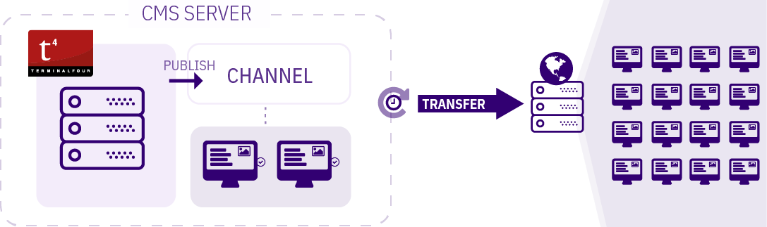
To use Transfer to Live, System Transfer Settings must be configured in System Settings.
Before Transferring a site, a transfer site must be created and configured.
Getting Ready to Transfer
To use Transfer to Live, a Channel, the System Transfer settings and a Transfer Site must be configured first:

Adding a Transfer Site
To configure a Transfer Site go to System Administration > Set Up Sites & Channels > Transfer Sites. You will provide:
| Item | Description |
|---|---|
| Site Name* | Required field. Provide a meaningful name to identify the Transfer Site when listed on the Transfer to Live screen. |
| Description | The description will accompany the name in the Transfer to Live screen. |
| Transfer Type* |
The method of transfer to use:
|
| Channel* |
Sets the publish Channel to be transferred. |
| Remote Root* | Sets the location of the site root directory on the remote server. TERMINALFOUR will not create this directory so it must be present on the server before running the Transfer. |
| Remote Host* | Specifies the hostname or IP of the remote server. |
| Remote Port | Sets the port number to use.
|
| Username | Sets the username. |
| Password | Sets the password. |
| Use Passive Mode |
Using Passive Mode is recommended. When enabled the client sends the PASV command to the server, and the server responds with an address. The client then issues a command to transfer a file or to get a directory listing and establishes a secondary connection to the address returned by the server. Using Active Mode, the client opens a socket on the local machine and tells its address to the server using the PORT command. After the client issues a command to transfer a file or listing, the server connects to the address provided by the client. |
| Ignore file extension on upload | Enter a comma-separated list of file extensions to ignore. When a sync is run, files with these file extensions will not be transferred. |
| Ignore directories on upload | Enter a comma-separated list of directories to ignore. When a sync is run, these directories are not transferred. The directory path should be the path to the specific directory, relative to the site root. |
| Recursively ignore subdirectories on upload | The subdirectories of the directories specified will not be transferred. |
| Clean Up Server | Runs the cleanup for each scheduled transfer of the site. |
| Ignore file extensions on clean up | Enter a comma-separated list of file extensions to ignore. When a sync and cleanup is run, files of these file extensions are not deleted. |
| Ignore directories on clean up | Enter a comma-separated list of directories to ignore. When a sync and cleanup is run, these directories are not deleted. |
| Recursively ignore subdirectories on clean up | Ignores the subdirectories of the directories specified. They are not deleted. |
| Backup directory |
Sets the backup directory to use on the remote server, example: /backup/. Place this outside of the Remote root and the user specified in Username must be granted access to this folder. TERMINALFOUR will not create this directory - it needs to be created on the server before running the transfer. The Backup directory option was removed in TERMINALFOUR 8.1.9.7.
|
|
Scheduler Information | |
| Clean up server | Runs the cleanup for each scheduled transfer of the site |
| Ignore file extensions on clean up | Comma-separated list of file extensions to ignore. When a sync and cleanup is run, files of these file extensions are not deleted. |
| Ignore directories on clean up | Comma-separated list of directories to ignore. When a sync and cleanup is run, these directories are not deleted. |
| Recursively ignore subdirectories on clean up |
Ignores the subdirectories of the directories specified. They are not deleted. |
The Debug transfer cleanup configuration option in Advanced Configuration can be used to assist with troubleshooting of any issues.
After your site is created, you can run a transfer of the site and/or schedule a transfer of the site.
The email addresses that will receive error and success messages are configured in the Task Scheduler, under Recipients.
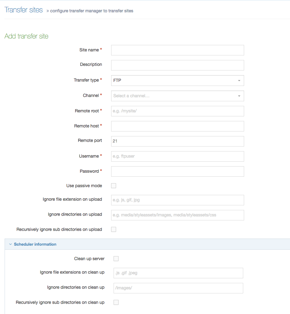
Setting up Transfer to Live
On the Transfer to Live screen (Sites & Channels > Transfer to Live), the Upcoming Transfers are listed in the box on the left. The two buttons above it are:
- Hide active transfer - toggles the visibility of the Upcoming transfers box
- Reload transfer scheduler - reloads the list of Upcoming transfers
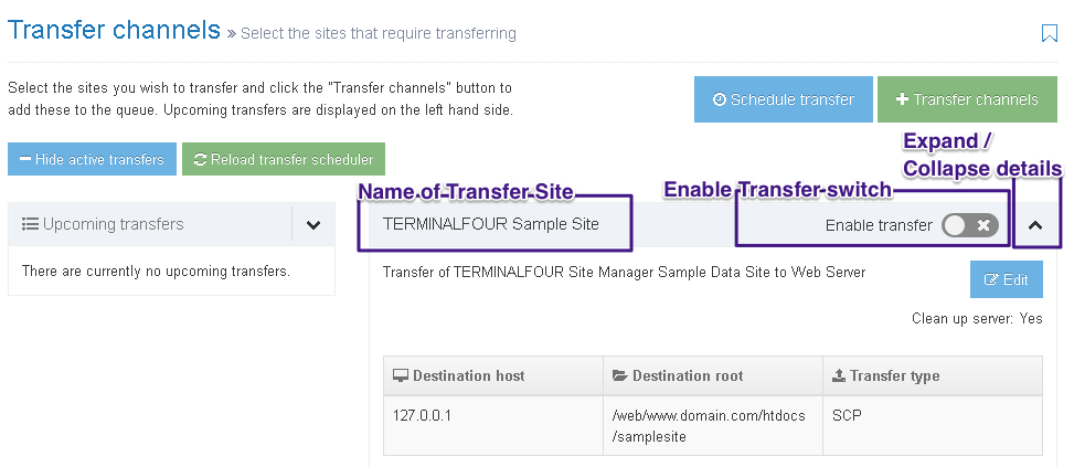
All configured Transfer Sites are listed in the box on the right. You'll need to activate the Enable Transfer switch to schedule a transfer or initiate a transfer with the buttons above:
- Schedule transfer - displays a modal window where you can select the Channel that is to be transferred and the date and time that the next Transfer for that Channel occurs. A Transfer can execute just once or recur at set intervals ranging from 10 minutes to 1 week
- Transfer channels - moves queued transfers to Upcoming transfers. Only files with the Enable transfer button engaged will be moved
If you need to change any of Transfer Site settings such as server or authentication details, you can select the Edit button.
Scheduling a Transfer
When Schedule Transfer is selected the following pop up appears:
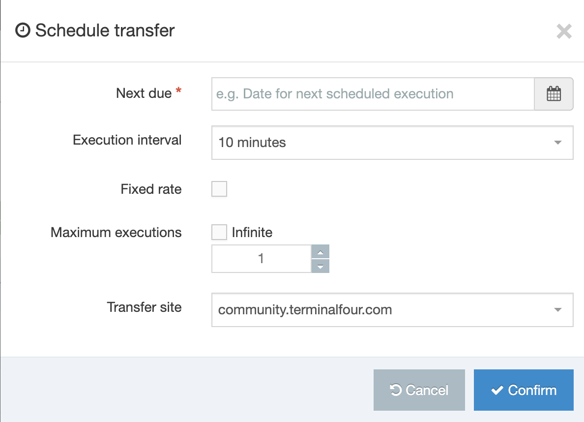
| Item | Description |
|---|---|
| Next due* | Set the date and time for the next/first execution of the task. Select the field to open the calendar/clock and make your settings. |
| Execution Interval | Select the frequency of the scheduled transfer. You can choose from the drop-down list of times (Once, minutes, hours, days, up to 1 week). |
| Transfer Site | Set the site to transfer. Choose from the drop-down list. |
When you have entered the settings, click Confirm. When successful, a green confirmation banner appears (shown below).
The Transfer Channel will be added to the schedule.
Transferring a Channel without Scheduling
Step 1
When your Channel is ready to Transfer you can choose to put it in the Transfer Queue without making a schedule.
Step 2
To do this, ensure you have enabled the Transfer button on the Channel. Remember, when enabled, the button is orange in color and displays a tick mark.
Step 3
Select Transfer Channel. When successful a green confirmation banner appears (shown below)
Step 4
The Channel being transferred now appears in the Upcoming Transfer Queue.
Channels
Description
Channels are the instruction manual for how content will be published. Channel settings can determine things like:
- the Content Layouts and Page Layouts that can be used on the Channel
- the output directory and base href for the published site
- the file extensions that are permitted on the published site
The output directory for the published site must exist on a web server accessible to Terminalfour.
Channels are not just limited to published HTML pages, they can also publish to formats like RSS, XML, CSV and JSON.
Channels can be published in two ways:
- Published to a staging area on the CMS server followed by a transfer to the web server
- Published directly to the web server
Each channel has an ID that can be located at the end of the URL when modifying the channel, or on the page that lists all channels. The search functionality also allows you to enter an ID to search for a specific channel. See this example - note the last character:
http://localhost.terminalfour.com/terminalfour/page/channel#edit/1A Microsite is a part of a channel, allowing updates at a different schedule, and allowing more fine-grained access for a Power User to a part of a channel.
Unsure of whether to use a Channel or a Microsite? Consider reading our Guide to Microsites to explain the reasons for using a microsite, the types of microsites and choosing another channel over a microsite.
Channel listing
With Terminalfour you can publish to a number of Channels or devices in multiple formats.
System Administration > Set up Sites & Channels > Channels displays a listing of Channels.
You can change the number of Channel records displayed on the page and use the filter to narrow the Channels displayed.
The listing shows:
- The Channel Name, description and the ID number.
- How many microsites the channel has.
- The Actions button with a drop-down list to Edit, Reset content, New Microsite and Delete. These options are explained in more detail below.
Create new channel
This screen is also displayed when editing an existing channel.
Select Create new Channel to open the create new channel page. The options to be completed are displayed in the following sections.
- General information
- Output information
- Page Layouts and content
- Fulltext defaults
- Available file extensions
- Publish options
- Access control and personalization
- Poll
- Pending version output
Hovering over the fields will bring up a tooltip that provides further information on the field. Below is an example of the tooltip displayed for the Channel publish URL:
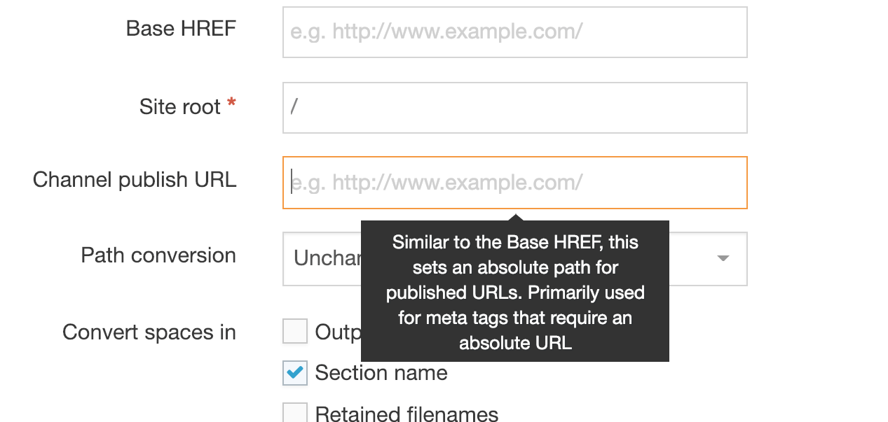
The options are as follows (* indicates a required field):
| Area / Item | Description |
|---|---|
| General information | |
| Name* | Identifies the channel. |
| Description | Sets a brief description of the channel. |
| Type* |
This entry needs to match the type that is set on the Page Layouts and Content Layouts used on this Channel. It is used when publishing a site, so only items with the right type are published. It allows you to have several types in use for the same content so for instance, you can display content in one way on the website and a different way on the mobile site. The default type is text/html. |
| Root section* | This allows you to select the root (home) section for your channel. You can browse or search to find and select the correct section. |
| Languages* | This allows you to control the output of languages in your channel. Only languages currently configured under System Administration > Languages, appear on this list. If you wish to publish your channel in English only then check the Publish option next to English. Where the site publishes in more than one language, check the Publish option next to the other languages. If your channel has more than one language available but portions of the translation are not complete, you can use the Secondary publish language option. For example, your channel has content in English and Spanish, but not all the English content has been translated into Spanish, rather than leaving the section blank, you can display the English content where the content has not been translated into Spanish. In this case, select Secondary publish next to the Primary language (in this example the Secondary publish would be English). The section names need to be translated for the Secondary publish content to publish. i.e. if the section name is "Not translated" then the section will not appear on the site. In addition to publishing the English content, a disclaimer can be published. For example, your channel has content in English and Spanish, but not all the English content has been translated into Spanish, as well as publishing the English content, enables you to display a disclaimer on the page. The disclaimer can be set at both Channel and Language levels. If a disclaimer for a language appears in both then the Channel disclaimer is used. To display the disclaimer, configure it on the Channel, or Language, and add the Warning T4 Tag to Page Layouts or Content Layouts. |
| Output information | |
| Output directory* | Specify the directory on the server into which the files are published/generated. This folder needs to exist on the server (Terminalfour will not create it). |
| Default filename* | Enter a filename, such as index.html. By default, all pages published on the Channel will use this filename. This should match your web server (Apache/IIS) configuration for your site. Additional file extensions can be configured for the channel. |
| Base HREF | Sets the base HREF used in the Channel's published URL. This is used for linking between Microsites and Channels and should be the absolute URL to the site. If the published channel is http://www.oursite.com/, the Base HREF would be http://www.oursite.com/. If the published channel is http://www.someisp.com/ourwebsite/, the Base HREF would be http://www.someisp.com/ourwebsite/. |
| Site root* | Sets the part of the URL after the base HREF and is used for all links within the channel. If the published channel is http://www.oursite.com/, the Site root would be "/". If the published channel is http://www.someisp.com/ourwebsite/, the Site root would be /ourwebsite/. |
| Channel publish URL |
Similar to the base HREF, this sets an absolute path for published URLs and is used primarily for meta tags that require an absolute URL. Meta tags like Open Graph and those used for Twitter cards determine how content is previewed when posted on social media. An absolute URL is required when providing canonical URLs and paths to images or other media in these tags. Adding a value to the Channel Publish URL will ensure that your meta tags will publish as intended. e.g.: Open Graph meta with Channel Publish URL value of http://example.com: <meta property="og:image" content="http://example.com/images/rock.jpg" /> Open Graph meta without Channel Publish URL: <meta property="og:image" content="/images/rock.jpg" /> |
| Path conversion | Specifies whether the URLs generated are unchanged, upper case or lower case. This should match the requirements of the host server and is useful if the host server is case-sensitive like UNIX/Linux servers. |
| Convert spaces in | Convert spaces in Output URI, Section name and Retained filenames to the character specified in the "File part separator" field below. If that is blank, it will use the File part separator defined in System administration > System settings > Preview & publish. |
| File part separator | Introduced in 8.4.1, this character is used to replace spaces in the options selected above. |
| Favicon | Select media to be used as the favorite icon (favicon) by the website. This image appears as an icon on the user's browser tab and bookmarks. The favicon can then be added to Page layouts using the Generate T4 tag builder. |
| Page Layouts and content | |
| Page layouts* | Sets the Page Layout to be used at the root section of the channel. |
| Inheritable page layout | Sets the default Page Layout for sections below the root section of the channel. This is the equivalent of the Inheritable layout on the Page Layout tab when creating/editing a Section. By default, all Sections underneath the Channel Root Section will inherit this layout, unless a different layout is specified. |
| Publish options | Check this to allow "empty sections" to publish. An empty section is defined as having content that should publish but does not have a content layout matching the default content layout of the channel. Sections with no content are never published. |
| Allow scripts in Direct Edit? |
Introduced in 8.2.13, this option allows more control over JavaScript in Direct Edit for this channel. Some JavaScript libraries and scripts can conflict with the JavaScript used for Direct Edit and may need to be disabled. The options for each site are:
|
| Fulltext defaults | |
| Type* | Set the default type for the Content Layout of fulltext Content Types. It is typically set to text/fulltext but can be set to other. |
| File extensions* | Set the default file extension for fulltext pages |
| Fulltext publish period | Sets the amount and unit of time for fulltext pages to be included in a publish. This setting overrides the global setting under Fulltext publish period in Preview & publish settings. |
| Available file extensions | |
| Enable file extension overriding | Sets the channel to publish using multiple file extensions. |
| Permitted file extensions | Sets the order of priority for file extensions. The top row reflects the highest priority. File extensions are managed under System administration > System settings > File extensions. |
| Publish options. See further information. | |
| Enable channel cleanup | Sets deleted/moved pages and files in the output directory on the server to be cleaned up, if enabled globally in Preview & publish settings. |
| Publish reporting level |
Set the reporting level for the publish reports. Basic/Duration reporting is advised for general use and full reporting for troubleshooting (depending on the configuration for the duration to store these reports, Full reporting could significantly increase the volume of data stored in the database and the disk space required).
|
| Media publish options | This allows advanced options for Media Item publishing. To optimize publish times, it's advised that the default setting of "None" is selected so a Media Item only publishes if it is referenced by a Media T4 Tag.
|
| Access control and personalization | |
| Enable access control | Enables access control |
| Configuration | Sets the configuration to use |
| Enable personalization | Enables |
| Configuration | Sets the configuration to use |
| Poll | |
| Default poll icon | The poll functionality is no longer in use. |
| Pending version output | |
| The pending version of a channel will publish all content that is Pending (awaiting approval) to allow non-Terminalfour users to see the content. This does not include pending sections. If this is configured, and extra option appears when publishing the channel, or scheduling the publish. | |
| Output directory | Specify the directory on the server into which the files for the pending version of the channel are published/generated. This folder needs to exist on the server (Terminalfour will not create it). It is recommended that this is a directory that is not publically accessible via http/https (i.e. that is only available internally within your organization), and is not a sub-directory of the main channel. |
| Base HREF | Sets the base HREF used in the pending version of the channel's published URL and is used for linking between microsites and channels. If you are unsure, leave this blank. |
| Site root | Sets the part of the URL after the base HREF and is used for all links within the pending version of the channel. If the published channel is http://www.oursite.com/, the Site root would be ""/"". If the published channel is http://www.someisp.com/ourwebsite/, the Site root would be /ourwebsite/. |
Channel actions
Each Channel can be modified using the Actions button on the channel listing page. The options are:
| Action | Description |
|---|---|
| Edit | Edit the channel information |
| Reset content | Associate content under the channel root with the channel |
| New Micro site | Create a new micro site |
| Delete | Permanently remove the channel from the system |
Create New Microsite
A Microsite requires similar information to a Channel and specific information which can differ from the parent Channel. There are two types of Microsites:
- Symbolic Microsite: the Base HREF is the same for both the Channel and the Microsite
- Fully-formed Microsite: the Microsite is on a different domain to the Channel, or is on a sub-domain of the Channel
For further information, refer to the documentation on Microsites.
Publish options - Enable Channel Cleanup
When Channel Cleanup is enabled, all pages and files that have been moved and deleted will be moved and deleted in the server's output directory at each publish. This is enabled globally in Preview & publish settings.
If you are still seeing deleted files in your output directory following a publish, check that Channel Cleanup has been enabled.
The Channel must have been published once with the following two options checked:
- Publish archive sections
- Override publish period restriction
That initial publish is then used as the baseline for subsequent publishes.
Only files that were referenced during the baseline publish will be removed when they're no longer referenced. Files that may have been located within the published file structure and were not referenced during the baseline publish will not be deleted.
Setting Rules to Publish Channels and Microsites
Administrators can assign publish rights to other users. These settings offer different models to be used across Channels, Microsites, user roles and individual users. It is recommended that these publish models are thought through in detail before implementing them.
Assign a Moderator or Power User to a channel/microsite
Individual Moderators and Power users can be assigned to Channels and/or Microsites under their user profile at System Administration > User Rights & Roles > User Management > Edit.
"Publish now" for Moderators and Power Users
You can enable "Publish now" functionality for Moderators and Power Users which will then allow them to immediately publish content and Sections that they have access to.
- First Enable "Publish now" functionality under System Administration > System Settings > Preview & Publish.
- Then you can set the "Publish now" minimum user level under System Administration > User Rights & Roles > Role Customization > Preview/Publish.
You can also set the 'Publish now' minimum user level when the user is assigned to Channel/Microsite.
Cancel a running Publish
To cancel a scheduled publish you can disable or delete the task in the Task Scheduler.
To cancel a publish that is running restart your application server (e.g. Tomcat).
Preview & Publish Settings
Description
To configure the preview and publish settings go to System administration > System settings > Preview & publish.
General settings
General publish preview
| Item | Description |
|---|---|
| Enable full filenames | To enable full filenames, enter a value of "true". when enabled, the name of the uploaded file is used as the name of the file on the published site. When not enabled, the name of the file on the published site is the file ID, example: 12344. |
| Avoid filename clashes | Renames duplicate files on publish to avoid filename clashes, e.g. myfile.pdf and myfile-1.pdf |
| Allow advanced options for scheduled publishes | Enables scheduled publishes to be run with advanced options (publish archive sections, publish microsites, publish pending version etc.) |
| Generate media categories | Publishes the media library directory structure to match the media category structure. Unchecked, all published media is published into one directory. |
| xhtml-output | Setting this value to "true" results in better adherence to XHTML standards when publishing. It changes the generated HTML to be XHTML compliant and converts a string to a HTML entitised version but it will skip any regular tags in in the code. |
| xhtml-strict-output | Setting this value to "true" results in better adherence to XHTML standards when publishing anchor tags. It changes name attributes to ID attributes for html_anchor and also meta tags (example: <a id="d.en.183"></a> instead of <a name="d.en.183"></a>) |
| Show pending sections in preview | Displays pending sections in preview |
|
When enabled, if a section has Access Control enabled, only users that have edit rights to a section can preview that section. |
|
| When enabled, all users can only preview sections if they also have edit rights to that section. | |
| Enable "Publish now" functionality | Enables users to publish the individual page. An additional button is added to the interface when creating or editing content, and when editing a section. Access to this feature can be configured at a user level. |
| Number of publish threads | Specifies the number of threads used during publish. Further information on setting the number of publish threads and file writing threads is available. |
| Number of file writing threads | Specifies the number of threads used to write the files to disk. Further information on setting the number of publish threads and file writing threads is available. |
| Maximum size of file output queue | Sets the number of files placed on the file output queue |
| Only write changed pages | Enables the publish of changed HTML files only. Unchecking this may impact performance. |
| Only write changed files | Enables the publish of changed media and files only. Unchecking this may impact performance. |
| Number of scheduled publishes available | Sets the maximum number of scheduled publishes that can be created for each channel. |
| Fulltext publish period | Sets the amount of time between fulltext content publishes. Increasing this value improves publish performance. Only use when fulltext content does not change frequently. This can also be entered for a channel. If entered on both, the channel period is used. |
| Fulltext publish period unit | Sets the unit of measurement for the fulltext publish period. |
| Media output directory | Specifies directory name for published media items. By default, this is called media in the channel root (output directory). |
| t4-cache-pre-gen-preview | Use this feature sparingly as it can cause performance issues. A publish cache is maintained in memory and rebuilt when content is added or edited, guaranteeing accuracy |
| Characters to remove from filenames |
Removes specified characters from filenames (including media) when they are published or when downloading/viewing files. The original name is stored in the database. e.g. xy-34 would remove x, y, -, 3 and 4. On new installs, the following values are added by default: <>&¢£€¥ƒ¤©®™•§-—¶«»€œ¿¡*#@=%:?!{}|^
To avoid media publishing issues, you should consider adding these values if they are not already present. Avoid adding a period (.) to this list since it will result in malformed file extensions – e.g., "myimage.jpg" will be output as "myimagejpg". |
| File part separator |
Specifies the character(s) used to separate filenames. By default, generated filenames are separated by a hyphen, e.g. "my-file.png" unless you have upgraded from version 7.4 where the default will be a comma. From version 8.4.1, you can override this setting on a per channel basis, by setting a different separator character within the channel. |
| Verify folder names | Verifies directory names in a case sensitive manner. This can increase publish time. |
| Set file IO block size | Sets the size of the File IO Block within the application. This should only be modified if you change the System File IO Block size. Further information about determining the setting for the file IO block size is available. |
| Send email on successful publish | Sends an email to the users specified in the scheduler each time a successful scheduled publish is completed |
| Number of concurrent Full running publishes | Specifies the maximum number of full channel publishes that can run concurrently |
| Number of concurrent Publish now/Instant publish running publishes | Specify the maximum number of "Publish now" publishes that can run concurrently |
| Global channel enable cleanup | Setting this value to "true" allows cleanup on channels during publish to remove deleted and moved files. The cleanup needs to be enabled on each individual channel to run.
For this to operate properly, the channel first needs to be published once with the following two options checked. That publish is then used as the baseline for subsequent publishes.
Only files that were referenced during the baseline publish will be removed when they're no longer referenced. Any files already within the published file structure that were not referenced during the baseline publish will not be deleted. |
| Maximum fulltext filename characters | Sets the maximum number of characters for fulltext filenames, including the file extension |
| Enable output to log file during a publish | Outputs the publish logs to a designated directory |
| Log file directory | Sets the directory to output publish logs. The default is the content store directory |
| Enable programmable page layouts | From version 8.3.3 you can enable and disable Programmable Layouts for Page Layouts for all sites published by your instance of Terminalfour. |
| Enable programmable content layouts | From version 8.3.3 you can enable and disable Programmable Layouts for Content Layouts for all sites published by your instance of Terminalfour. |
Diagram explaining max Full Publish threads
Diagram explaining max Instant Publish settings
Publish notifications
Introduced in version 8.2.9.
| Item | Description |
|---|---|
| Length of time to show publish notifications | Sets the length of time notifications will be shown once a publish finishes. The default is 30 minutes. |
| Number of publish notifications to show | Sets the maximum number of publish notifications that can be shown. The default is 10. |
Instant publish listener
The instant publish listener is event driven, so if any the following actions occur, the listener is notified and a background process is started that triggers the publish:
- Content approved
- Content marked as inactive
- Content reordered
- Content moved
- Content mirrored
- Workflow fast-tracked
| Item | Description |
|---|---|
| Enabled instant publish listener | Enables the instant publish listener and can be configured below |
| Enabled content types | Sets the Content Type(s) to publish instantly once approved. If not specified, all Content Types will be enabled. |
| Publish the section above | Publishes the parent section when the section or content is published. This can be used to update the navigation within the parent section. |
| Enabled channels | Sets the channels to publish instantly. All channels enabled if not specified. |
| Enable batching | Enables bulk processing for batch events. |
| Batch timeout | Sets the number of seconds to wait before processing the batch. |
| Maximum batch size | Sets the maximum number of Content Items/sections in a single batch. |
Ignore Section names on publish per channel
A comma-separated list of Section names that are to be to be excluded from the publish, excluding any space characters before or after the comma. The Sections need to be hidden from navigation.
This feature will not work for Section names that contain commas. It's not possible to escape commas in Section names nor is it possible to change the delimiter.
A use case for this might be that if Sections contain Content Items that are used exclusively for Related Content Navigation Objects, the Sections are likely to be hidden from the Site Structure. The Content Items published on other Sections via the Related Content Navigation Object.
The Keyword Search Content, Pagination and Publish to One File Navigation Objects will not include Content Items from Sections that are listed within this configuration option.
Preview filters
Preview filters allow you to preview code which needs to be executed by the server, e.g. PHP, ASP and JSP.
| Item | Description |
|---|---|
| Name | Give the preview filter a name. |
| File extensions | Comma separated list of file extensions to process with the filter. |
| Filter options | Enables the filter |
| Filter method |
|
| Save directory | If the Filter method is Redirect, this sets the directory where the temporary file will be saved and run from e.g. /user/local/apache/htdocs/preview/ |
| Base URL | If the Filter method is Redirect, this sets the base URL used to preview the page e.g. http://localhost/preview/ |
| Executable | If the Filter method is Pass thru, this sets the path to the file used to preview the page when the filter is enabled e.g. /user/local/php/bin/php |
| Parameter | If the Filter method is Pass thru, this specifies the parameters passed to the command you want to run. The parameters depend on the application specified in the Executable field. |
Setting the number of publish threads and file writing threads
Number of publish threads
Specifies the number of threads used during publish
Number of file writing threads
Specifies the number of threads used to write the files to disk
The default settings for both these fields are 1.
The guideline is, the more the better up to a point, as at some point code synchronization/contention will become more significant.
As an example, one client has a 32 CPU server and has 24 publish and 8 write threads.
We do not recommend having more threads than CPUs. Based on experience, the publish threads are fairly processor intensive. The file writing threads would spend much of their time waiting on disk IO.
From version 7.3, the following message will be output to the log if the publish output level is set to "High": "Wait time for: <filename> #ms"
Upon publish completion, the following will be output when standard level of publish output is set: " - Total wait time on file output queue: #s seconds"
Depending on the number of files and their size, it may be simpler to increase the maximum size of the file writing queue, as opposed to creating more threads.
If a large number of large files are written to disk at the same time and there is only contention / blocking at one point during publish, it may well be better to increase the maximum queue size, instead of adding more threads. This will use more memory temporarily, but will not generally increase the amount of strain on disks.
In general, many more publish threads should be used than file writing threads, but the "correct" number depends on installation, etc.
Determining the setting for the file IO block size
This sets the size of the File IO Block within the application and should only be modified if you know the System File IO Block size
To determine the block size on Windows:
- Run msinfo32 at the command prompt which should open a window called "System Information".
- In the left pane select "System Summary > Components > Storage > Disks".
- This should load info of all drives in the right pane.
- Find your desired drive and check the value for "Bytes/Sector".
- It should say something like "Bytes/Sector 4096".
For Unix/Linux machines run the following:
perl -e '$a=(stat ".")[11]; print $a'Convert from bytes to kilobytes and then select the relevant option in the dropdown. Faster / modern disks may be able to handle a larger block size.
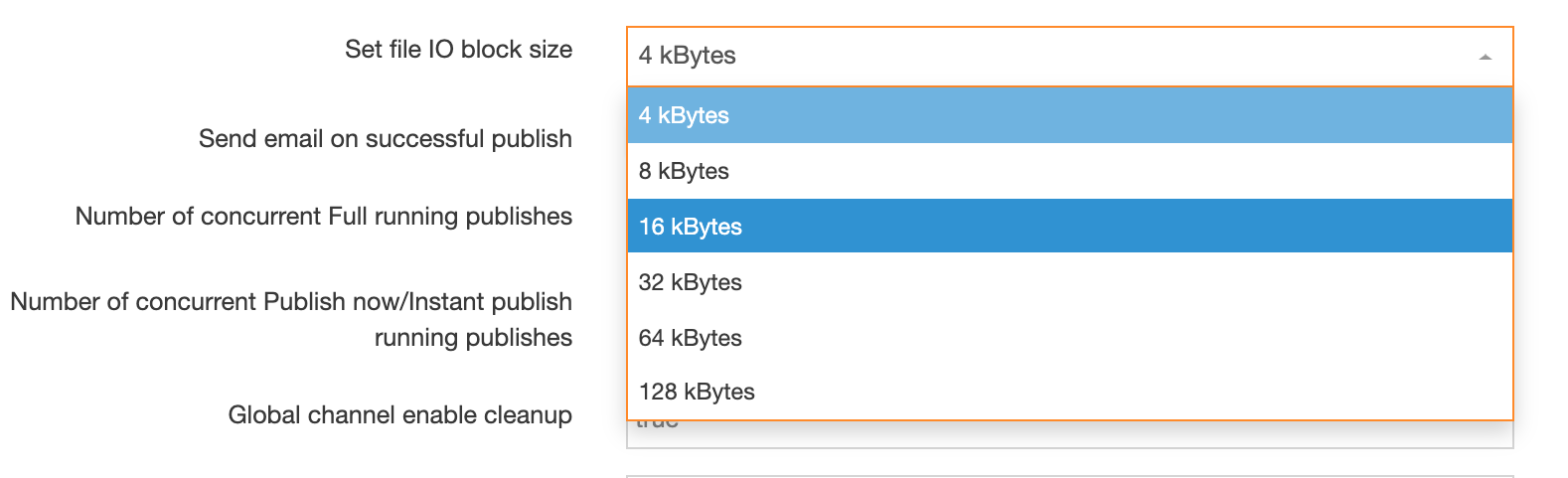
Publishing Sections and Branches
Description
If you enable Publish Now, you can permit users from Moderators and higher to publish a Section or a Branch, instead of waiting for a full site publish.
Content must be approved before it can be published.
Publishing a Section
To publish a Section, expand the Site Structure to display the relevant Section, and use the Actions menu associated with the section to select Publish Section from the menu (see below).
Publishing a Branch
To publish a Branch, expand the Site Structure to display the relevant Branch, and use the Actions menu associated with the section to select Publish Branch from the menu (see below).
Selecting a Channel
If the Section is published on more than one Channel, a confirmation modal appears prompting you to select the publish Channel:
Either click the Channel name or select the Channel's radio button in the right column and click Confirm.
A cleanup is not run during a Branch or Section publish. A full Channel publish is required for cleanup.
Preview Restrictor
By default, all authenticated users in Terminalfour can preview any page within the system.
You may want to limit preview access for certain pages, such as:
- Intranet or "Portal" content
- Pages that require authentication to view when published
The Preview Restrictor Feature
The Preview Restrictor allows you to limit page preview access to users with Edit Rights for specific sections.
As well as restricting preview, it will also restrict access to Direct Edit and the Accessibility Report.
Enabling Preview Restrictor
Navigate to Administration > Settings > Preview & Publish
Check the "Enable Preview Restrictor" checkbox
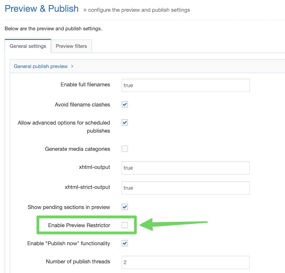
How It Works
When enabled:
- If a section has "Access Control" enabled, only users with Edit Rights to that section can preview it.
- Other users will not have preview access to these restricted sections.
Additional Restriction Option
To apply preview restriction to all sections, regardless of their "Access Control" status:
- Enable Preview Restrictor (as described above)
- Check the "Restrict preview for all sections" button
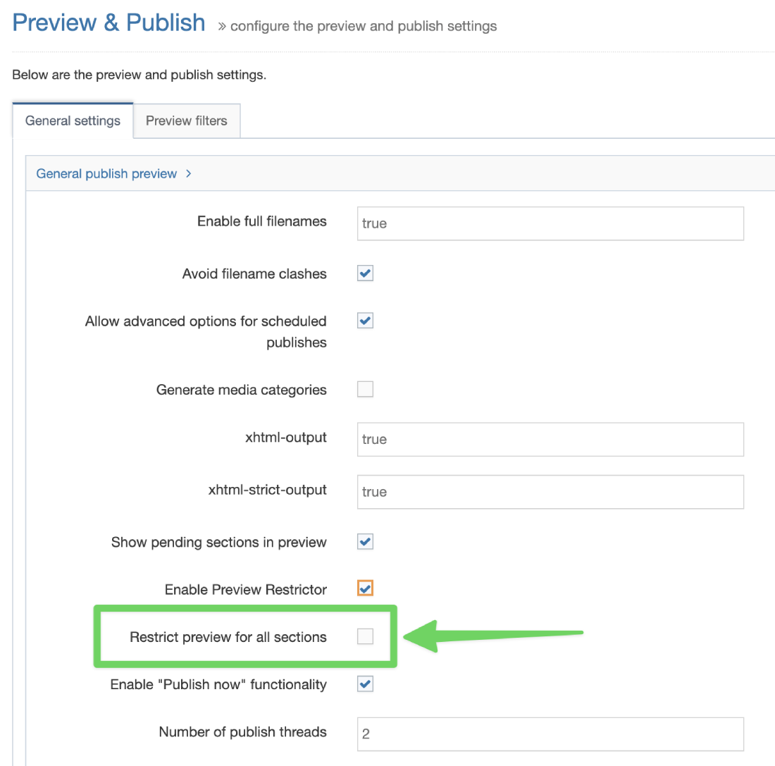
This setting ensures that only users with Edit Rights can preview any section, providing maximum preview security.
Publish channels
Description
Publishing a Channel takes all the changes since the last publish and publishes them to the site, as configured. To do so, select the Channels you wish to publish and click the Publish Channels button to add them to the queue.
Please note that it is assumed that the Channels and Microsites have been correctly configured.
There are two main types of publication:
- Scheduled
- initiated by a scheduled task (automatic)
- Manual
- initiated manually (on demand)
How to use Publish Channels
Go to Sites & Channels > Publish Channels.
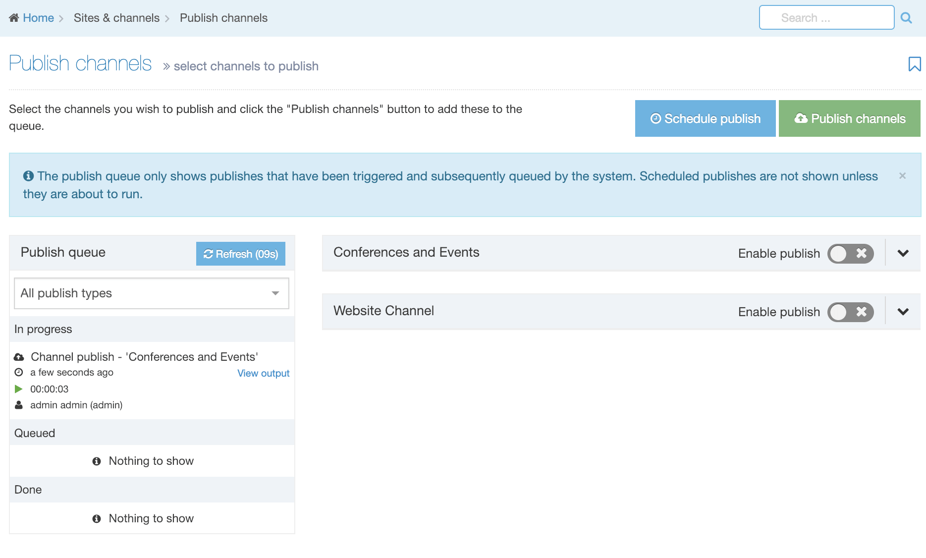
The page is divided into two main sections:
Publish Queue
The publish queue is displayed on the left. The publish queue lists triggered publishes that are queued by the system. Scheduled publishes are not shown unless they are about to run.
Schedule Publish and Publish Channels
The right of the screen lists all available Publish Channels and allows for publishes to be initiated by a scheduled publish or initiated manually (on demand).
Publish Queue
By default, this displays details of all publish types for both manual and scheduled publishes. Publish types can be filtered by selecting the relevant option from the drop-down:
- All publish types (default)
- Channel publishes
- Microsite publishes
- Section publishes
- Branch publishes
- Content publishes
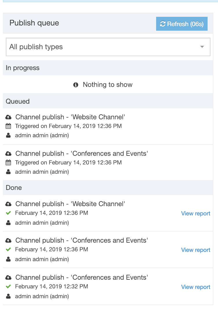
Publishes are displayed by status:
1. In progress: publishes that are currently running
2. Queued: publishes that are queued to run in the future
3. Done: publishes that have run
The following information is displayed:
| Item | Description | Example |
|---|---|---|
| Publish type | The type of publish | Channel publish Microsite publish Branch publish Branch publish - Multiple branches Section publish Section publish - Multiple Sections Content publish (A section publish that is initialized within the content) |
| Channel name | The name of the Channel | Main website |
| Date / time | In progress tasks, the date/time that the publish started is displayed For Queued tasks, the date/time the publish was triggered is displayed For Done tasks, the date/time the publish was completed is displayed |
|
| User | Fullname and username of the user who initiated the publish. User details are not displayed for scheduled publishes. | Joe Bloggs (admin) |
| Duration | For In progress publishes, the duration is displayed in hh:mm:ss format | 00:00:09 |
| Status | For Done publishes, a green tick icon is displayed for a successful publish | |
| View output | For In progress publishes, a link is provided to view the publish output | See further information. |
| View report | For Done publishes, a link is provided to view the publish report |
View output
It is possible to view to view the output of a running publish by clicking the View output link. The publish output modal displays basic information about the publish and two tabs contain more specific information.
- Output: Displays the publish log output. The log will automatically scroll to the most recent output.
- Call stack: Displays the current stack trace of the publish. This can be useful for determining the status of the publish, or for identifying issues like stalled or blocked publishes.

This allows a publish to be scheduled either once or ongoing.
| Item | Description |
|---|---|
| Next due | Sets the date/time for the next/first execution of the task |
| Execution interval |
Sets the frequency of the scheduled publish. Options are; Once, 10 minutes, 15 minutes, 30 minutes, 1 hour, 2 hours, 3 hours, 4 hours, 5 hours, 6 hours, 12 hours, 1 day, 2 days, 3 days, 4 days, 5 days, 6 days, 1 week. The "Fixed rate" and "Maximum executions" options are only displayed when a frequency interval is selected (i.e., any option but "Once"). |
| Fixed-rate |
Sets if the task to add/update should run on a fixed rate. When enabled, the execution interval starts only when the previous task has finished and will disregard any Daylight Savings Time (DST) changes. This option is only displayed when a frequency interval is selected (i.e., any option but "Once"). |
| Infinite |
Sets the task to run indefinitely. This option is only displayed when a frequency interval is selected (i.e., any option but "Once"). |
| Maximum executions |
If infinite is not selected, this will set the maximum number of times this task should run. This option is only displayed when a frequency interval is selected (i.e., any option but "Once") and "Infinite" is not selected. |
| Channel | Sets the Channel to publish |
| Publish archive sections | If, Allow advanced options for scheduled publishes is enabled in the Preview & Publish Settings, this option is available. If checked, it forces a publish of archive sections (configured on the General tab when Creating or Editing a Section) |
| Override publish period restriction | If, Allow advanced options for scheduled publishes is enabled in the Preview & Publish Settings, this option is available. If checked, it publishes all fulltext content, even if the fulltext publish period on the Channel is not complete. |
Once confirmed, the publish will run as configured.
Fixed rate example your Channel has these parameters:
- Execution interval of 1 hour
- Starts at 12:00
- 80 minute runtime
You may notice that the runtime exceeds the interval of 1 hour by 20 minutes. There are two options:
- Without a fixed rate, it would add the Execution interval (1 hour) to the scheduled time (12:00) plus the execution interval (1 hour) so would return 1:00 as the next publish due, but since that time has already passed because the runtime exceeds the interval by 20 minutes, it would do the calculation again and this time return 2:00.
- With a fixed rate, the next due would be calculated as time task ended (1:20) plus the execution interval (1 hour) so would return 2:20 as the next publish.

Before Channels can be published, they must be enabled from the list of Channels.
Toggling on the Enable publish for the Channel allows the Channel publish options to be displayed.
| Item | Description |
|---|---|
| Edit | Links to the Channel edit page |
| Publish pending version | This only displays if it has been configured on your Channel. When selected a Pending version publish on this Channel is triggered. In this case, only the Pending version will publish and the main channel will not publish. |
| Publish archive sections | Forces a publish of archive sections |
| Override publish period restriction | Publishes all fulltext content, even if the fulltext publish period on the Channel is not complete |
| Complete Channel | This only displays if one or more Microsites have been configured on your Channel. When selected this will publish the complete Channel (including Microsites) |
| Microsites | This only displays if one or more Microsites have been configured on your Channel. The selected Microsite(s) will be published. |
Once the publish options have been set for the Channel(s), clicking Publish Channels will then add them to the Publish queue on the left of the screen where progress can be monitored.
Microsites
Description
With Microsites, you can apply publish settings to just a part of a Channel that are different from the Parent Channel publish settings.
This is useful if a part of your website contains content that's updated on a more regular basis. In that case, it's a good idea to set up the frequently updated section as a Microsite since publishing just part of your site is faster than publishing everything.
It is also useful for allowing Power Users to publish a portion of the channel. In that case, the Power User can be assigned the Microsite by editing their user details.
Possible uses of a Microsite
- Content that needs more frequent updates
- e.g., news, registration opportunities, events
- Content that changes by the calendar
- e.g., seasonal schedule changes, opening and closing hours
- Immediate information
- e.g., cancellations, weather disruptions
- Parts of the site that can be published by Power Users
- e.g., individual schools, departments, research areas
- Parts of the site that are on a different domain or subdomain
- e.g., individual departments and schools who have subdomains for their website
Who manages Microsites?
The Administrator and designated Power Users create and maintain Microsites.
Creating or editing a Microsite
To create a new Microsite go to System Administration > Set Up Sites & Channels > Channels. Select the Channel that you would like to create the Microsite from and, from the Actions Menu, select New Microsite:
The Microsite configuration page looks similar to the Channel configuration page with one noticeable difference – the Main Channel name is shown at the top:
The options are as follows (* indicates a required field):
| Area / Item | Description |
|---|---|
| General information | |
| Main channel | This is automatically populated with the name of the Parent Channel. |
| Name* | Identifies the Microsite. |
| Description | A brief description of the Microsite is useful to reference it for later use. |
| Root section* | This allows you to select the root (home) Section for your Microsite. You can browse or search to find and choose the required Section. |
| Output information | |
| Output directory |
|
| Default filename* | Enter a filename, such as "index.html". This should match the Channel settings. |
| Base HREF |
Depending on your needs the Base HREF value can include the base domain (e.g., www.mysite.com), as well as a directory path. In this case, www.mysite.com/news is a permissible Base HREF value.
|
| Site root |
|
| Channel publish URL |
The Channel publish URL is used to output a canonical URL for use in metatags like Open Graph.
|
| Page layouts and content | |
| Page layouts* | Sets the Page Layout to be used at the root Section of the Microsite. |
| Inheritable page layout | Sets the default Page Layout for Sections below the root Section of the Microsite. This is the equivalent of the Inheritable layout on the Page Layout tab when creating/editing a Section. By default, all Sections underneath the Microsite root Section will inherit this layout, unless a different layout is specified. |
| Publish options | Check this to allow "empty sections" to publish. An empty Section is defined as one that contains content that should publish but does not have a Content Layout matching the Channel's default Content Layout. Sections with no content are never published. |
| Fulltext defaults | |
| Type* | Set the default type for the Content Layout of fulltext Content Types. This should match the Channel settings. |
| File extensions* | Set the default file extension for fulltext pages. This should match the Channel settings. |
| Fulltext publish period | Sets the amount and unit of time for fulltext pages to be included in a publish. This should match the Channel settings. |
| Available file extensions | |
| Enable file extension overriding | Sets the Microsite to publish using multiple file extensions. |
| Permitted file extensions | Sets the order of priority for file extensions. The top row reflects the highest priority. File extensions are managed under System administration > System settings > mirror Sections and Branches. |
| Publish options | |
| Publish reporting level |
Set the reporting level for the publish reports. This should match the Channel settings. |
Types of Microsites
A Microsite can have a different domain or sub-domain to the Parent Channel, or it can be a sub-directory of the parent Channel. For example, if we have a site named www.mysite.com, we could create the following Microsites:
- www.mysite.com/news – this is an example of a Symbolic Microsite
- news.mysite.com – this is an example of a Fully-formed Microsite
- www.mynewssite.com– this is an example of a Fully-formed Microsite
Symbolic Microsite

In this case, the Base HREF is the same for both the Channel and the Microsite. The will then appear as a directory of the main site (though the publish schedule may be different). You can see how this looks here:
- Parent Channel: http://www.mysite.com/
- Microsite: http://www.mysite.com/news/
To create a Symbolic Microsite, leave the output directory, Base HREF, Site root and Channel publish URL blank. These will all be inherited from the parent. In this case, the microsite is similar to a pre-configured Publish Branch for a portion of the channel.
Fully-formed Microsite
In the case of a fully-formed Microsite, the Base HREF, Output Directory, Site root and Channel publish URL settings are different from those of the Parent Channel and all of those settings need to be configured on both the Channel and Microsite in order for the fully-formed microsite to function correctly.
A fully-formed Microsite may be a subdomain of the main channel. For example:
- Parent Channel: http://www.mysite.com/
- Microsite: http://news.mysite.com/
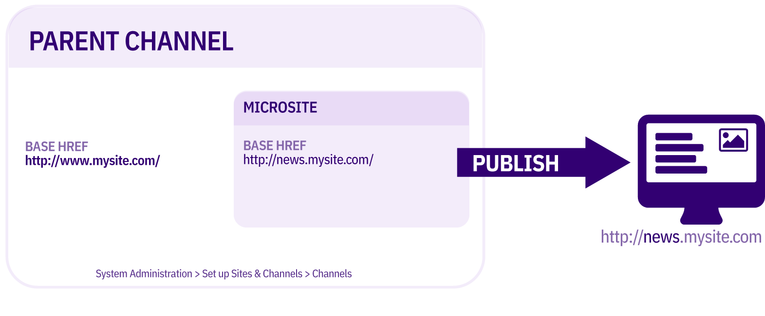
Or a fully-formed Microsite may be on a different domain to the main channel. For example:
- Parent Channel: http://www.mysite.com/
- Microsite: http://www.myfastupdates.com/
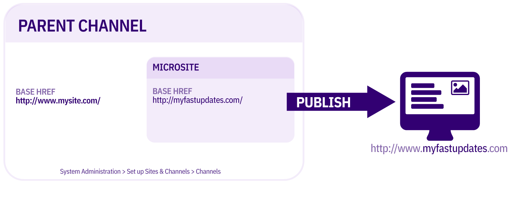
To create a fully-formed Microsite, populate the output directory, Base HREF and Site root.
When an Output Directory is specified, it applies to all directories and files generated on publish. Media Items used in this Microsite will be output to a subdirectory of the Microsite rather than the media folder of the main Channel when publishing occurs, e.g., http://news.mysite.com/media/.
When to use a Microsite or another Channel?
You should consider the following when choosing to use a Microsite or create another Channel for your website:
Shared Access Rights
Access rights are the same for the Parent Channel and the Microsite.
Shared Personalization
Personalization is the same for the Parent Channel and the Microsite.
Granular Publish controls
Permissions can be assigned to Power Users for Microsite publishing that are separate to those of the Parent Channel. For example, a Power User can be assigned to a particular Microsite allowing that user to publish just a single Microsite and not the Parent Channel. Or, a Power user can be tasked to manage a particular Channel or Microsite.
Linking between Microsites
You can create Section or Content Item links between Microsites within the same Channel. This is not possible to do between Channels.
Navigation Objects
It is not possible to aggregate Content Items between Channels using Navigation Objects but it is possible between Channels and Microsites. For example, if you had a central directory of Staff profiles or Courses, and they are "tagged" according to department/school, it is not possible to pull a Staff/Course List onto a particular department page when the department is on a separate Channel, but it would be possible to pull the Staff/Course List if the department is a Microsite of the Channel where they exist.
Mirroring Content Items
It is possible to mirror individual Content Items between Channels. It is also possible to Mirror Sections between Channels, but the Content Items and Page Layouts can only be edited in the original location but not within the Mirrored Section.
Re-using Page Layouts
Due to an issue with Content Item re-use between Channels, it is often not possible to re-use Page Layouts across Channels unless they are specifically configured to allow it. For example, in your Page Layouts, if the code for the global analytics is stored within a Content Item, this Content Item could not be used across Channels with the same Page Layout. The Page Layouts instead, should be built and configured specifically with the Channel re-use in mind. In the case of the analytics, this code may be stored instead in a Media Item, which can be re-used across Channels; or it may be stored in a Section and a Related Content Navigation Object can be used to look for a Section with a specific name rather than selecting a particular Section.
Typically, TERMINALFOUR would recommend that Channels are used for different websites, with different designs, where there is minimal linking between the different sites (or where there is linking, it is typically linking to top-level pages that could be hard-coded external links). Additionally, a website associated with your organization that uses different branding should usually use a separate Channel.
Websites should use Microsites when they have the same or similar design that all fall under the umbrella of the main site, and have links or share Content Items with other parts of the website.
Transfer Settings
Description
To configure the transfer settings go to System Administration > System Settings > Transfer
| Item | Description |
|---|---|
| Change set directory | Sets the directory to output changesets |
| Enable transfer of all written files | If checked, all files that are written are transferred. If unchecked, only changed files are transferred |
| Delete change set on successful transfer | Deletes the changeset file at the beginning of the following transfer |
| Disable change set if no transfer channels | Prevents creation of changesets if there isn't a channel associated with the transfer |
| Enable transfer now | Starts a transfer of the relevant channel each time something is published via a manual or scheduled publish or publish now |
| Transfer now interval | Sets the interval in seconds to check for files available for transfer |
| Enable search storage | Enables new configuration options in transfer sites to enable search storage, to improve indexing |
| Search security class name | Enter the custom-built class name for a search security plugin module which allows access control information to be stored in an external database to provide personalized search results. The custom class needs to be added to the system library files as a JAR file |
| Maximum failures before termination of transfer | Sets the number of consecutive failed file transfers before terminating the transfer |
| Maximum errors during cleanup before termination | Sets the number of errors before terminating the cleanup |
| Number of concurrent transfers | Sets the maximum number of concurrent running transfers |
| Maximum attempts to process failed file | Sets the maximum number of attempts to transfer a file, before the file is ignored. After a file is ignored, it is removed from the changesets. Set this option to 0 to never ignore failed files. You can transfer a file that has been ignored by updating the content and publishing again |
| Send email on successful completion | Sends an email after a successful scheduled transfer |
| Enable output to log file during a transfer | Outputs the transfer logs to a designated directory |
| Log file directory | Sets the directory to output transfer logs. The default is the content store directory |
Channel mappings
If Transfer Now is enabled, then for each Publish Channel, you can select the transfer site(s) you wish to start
Create section
Description
What is a Section?
When viewing the Site Structure, you'll see that it is made up of folders and subfolders. These are the Sections of your site(s) and they are the containers for your content. We can also assign a Page Layout or Page Layouts that the Section will use on Publish.
A Section containing Subsections is called a Branch:
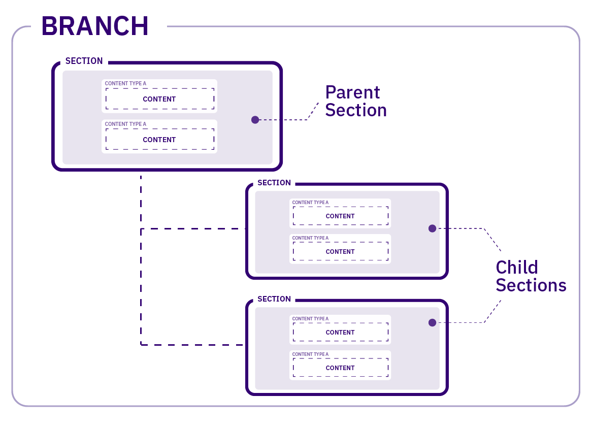
Who can Create a Section?
The default minimum access level required to create, edit and delete Sections is Moderator though this is configurable in Role Customization and can include Contributors. More advanced Section editing such as setting Output URIs is restricted to Moderators and up.
Roles can also be customized to only show the Sections to a user that they have been granted edit rights to. Showing only those Sections makes content editing even easier especially for those who are editing content in just a small amount of Sections.
How is a Section created?
In the Site Structure, pick the location of your new Section, go to the Section Action Menu and select Create New Section. In this example, a Subsection will be created within the Home Section:
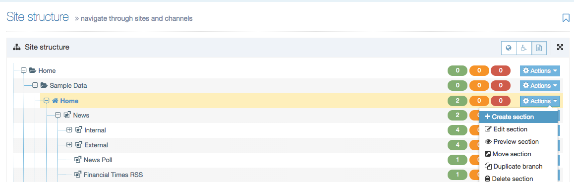
The Section configuration screen will appear. Most of the settings entered can be changed later if needed.
General
The General tab of the Section configuration screen is split into General Section details and Advanced settings.
When you first create a Section you can select Save changes which will take you back to the Site Structure or choose Save and edit section which will save the changes and reload the Section screen.
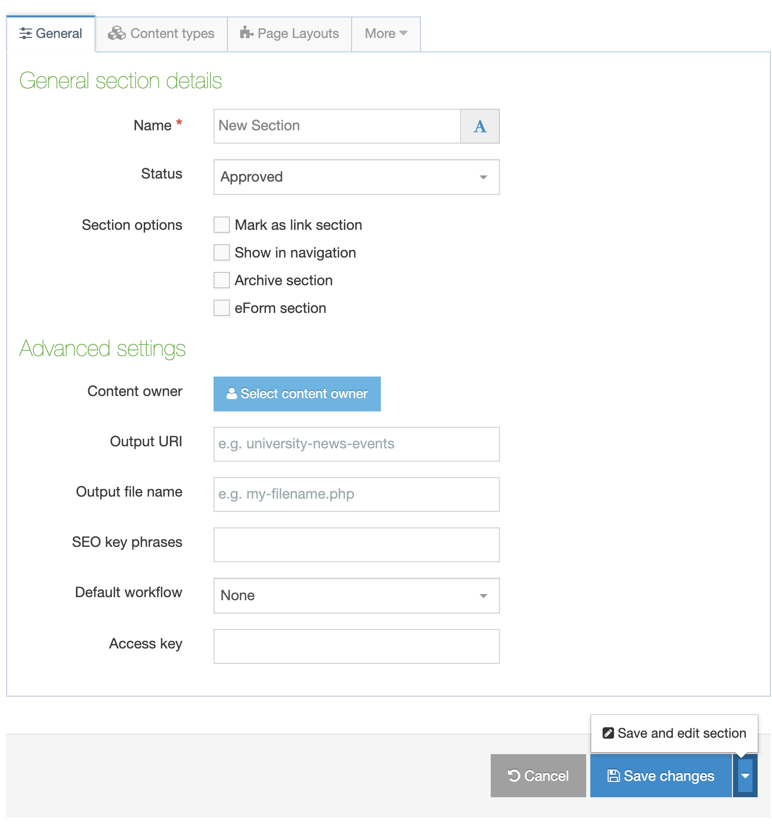
General section settings
| Item | Description |
|---|---|
| Name |
The Section name should give a clear indication of the page's content. It's better to use whole words instead of abbreviations. For example, use "Web training" as opposed to "web-tng". This helps when you are searching for the Section. Because the name of the Section is used as the basis for the URL for the published page (if an Output URI is not specified) any spaces will be replaced by a character when the URL is output (e.g., News and Events could be changed to news-and-events if the character to replace is -). |
| Status |
There are three status levels: Approved: Sections are published when they have at least one approved Content Item. Sections cannot be published without approved content in them. This is to avoid pages looking empty or half done. Pending: Pending Sections will not publish, even if the content within the Section is Approved. The status can be changed to Approved, once all content is ready to be published, and the Section will publish. Inactive: Deleted Sections have an Inactive status. Sections can be restored by changing the status to Approved or by restoring the section through the Recycle menu option. Inactive Sections cannot be published to a live site. |
| Mark as Link Section |
Link Sections contain no content and instead link to another Section in the Site Structure or an external URL. Learn about creating a Link Section here. You might notice that existing Sections do not display this option. That's because Sections that can contain content cannot be converted into Link Sections |
| Show in Navigation | When this box is checked, the Section appears in the navigation. Unchecked the Section is hidden from navigation. This is useful for Sections that you might want to publish but not link to from your main site e.g., a landing page. |
| Archive Section |
By default, Archive Sections are not published when a site is published. An Archive Section can be used for areas of the site where publishing is not required each time a site is published, e.g., Sections where content may not change frequently. This can greatly reduce publish time especially for Sections with a lot of Content. It still is possible to include them in a publish by using the Advanced Publish options in the Task Scheduler. Archive Sections will also be published if the Publish Branch or Publish Section options are used. When selected, Child Sections automatically inherit that status as well. |
| eForm Section |
This option is used if you want to submit an eForm. Refer to the documentation for eForms for further details. When you mark a section as an eForm section, the entire branch accepts eForm content. |
Advanced settings
It should be noted that depending on your Section metadata content type, more fields may be available at the top of the Advanced settings. These fields are installation specific and hence not covered here.
| Item | Description |
|---|---|
| Content Owner | Select the Content Owner from the list. If left blank, it will inherit from the parent section. The content owner can be used in workflows or get notified when content expires. A Content Owner Report is available to report on and manage owners. |
| Output URI |
Lets you specify the Uniform Resource Identifier (URI) as the destination of the new Section. Using this field improves Search Engine Optimization (SEO) for this Section. Otherwise, with the field left blank, the Section's name is used when publishing. Have a look at this article on the importance of URIs/URLs for SEO. An Output URI is used for a short or friendly URL. You might have created a Section with the name "News & Events". To get a shorter URL, set the Output URI to simply "News". If the URL needs to be more specific (perhaps for SEO purposes), you can expand it to "TERMINALFOUR News and Events". You can also convert spaces to a default character if this is set in the Channel. The Output URI can either be used on its own or as a path. An Output URI Path is used to shorten a URL. You might set an Output URI of /news, which brings it up to the root level without moving the Section. As there is a risk of conflicting Output URI paths, '/', '\' and '..' characters are reserved for users with permission to "Set a path as an output URI". |
| Output filename |
Specify the file name used for the page. When you leave this blank, the system uses the default file name configured in the Channel Settings. For example, if:
then here are a few examples of how the Output URI and Output file work together to create the URL:
|
| SEO key phrases |
To run an SEO report for a Channel, at least one SEO keyphrase should be added to the Root Section. If nothing is entered for Subsections, the SEO key phrases for parent sections are used. For more information regarding how to choose the phrases, see Google AdWords. SEO key phrases are used for SEO reporting only and are not published on the site. |
| Default workflow | The default Workflow for this Section's content. |
| Access key |
The "Access key" feature entered a deprecation phase from 8.3.13. It will be removed entirely in a future release of Terminalfour. You can enter a single character, which can be used as a shortcut within a Link menu Navigation Object and the Breadcrumbs Navigation Object. |
Navigating to parent Sections
From version 8.3.6 you can navigate to a parent Section using the "Currently editing" breadcrumb links:
Link Sections
Link Sections do not contain content but can instead act as pointers to other Sections or external URLs. This is useful if you want to add a Section from another part of the Site Structure to a Navigation Object Link Menu generated from a Branch. Similarly, an External Link Section can add a link to a Navigation Object from an external source, this could be a subdomain such as shop.mysite.com.
To create a Link Section, create a Section and, in the General Settings screen, select Mark as Link Section from the Section Options. When this option is selected, the other Section Options are hidden.
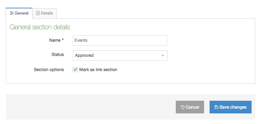
In the Details tab, select the Link Type:
- Section will link to another Section in the Site Structure. Depending on your Hierarchy Configuration, editors may either have access to link to the sections to which they have been granted access, or they may have access to link to the any section (regardless of whether they have edit rights to that section).
- External URL will link to a URL
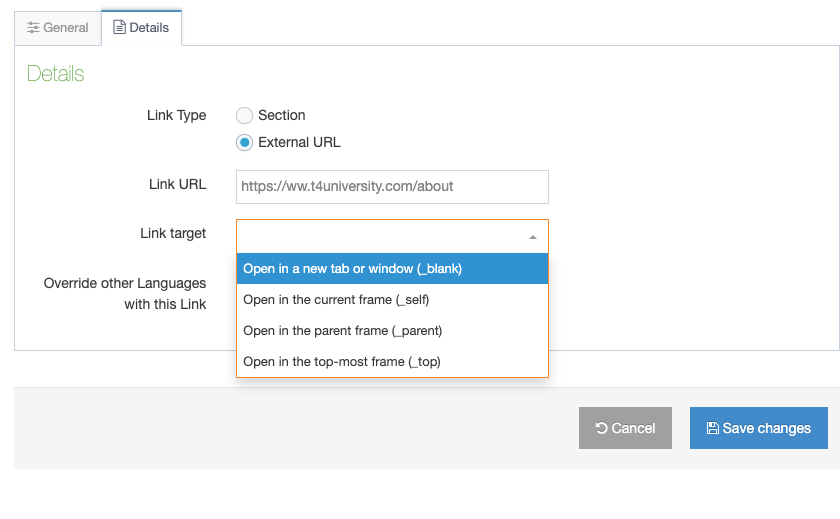
The Link Target determines whether the link will open in
- Open in a new tab or window (_blank)
- Open in the current frame (_self)
- Open in the parent frame (_parent)
- Open in the top-most frame (_top)
There's a description of the difference between the other options here.
When Override other Languages with this link is checked, all languages will use this Link Section/URL otherwise other languages can use specific links.
Content Types
Before adding content, you have to assign one or more Content type to the Section. There are a few things to bear in mind when using Content Types:
- Only those Content Types assigned to the Section can be used
- You can only use a Content Type when you are a member of the Group within which it was created (unless it is a Global Content Type).
- Your User Level must equal or exceed the minimum user level requirement specified in the Content Type itself.
1. Click the tab marked Content types. This opens the screen shown below:
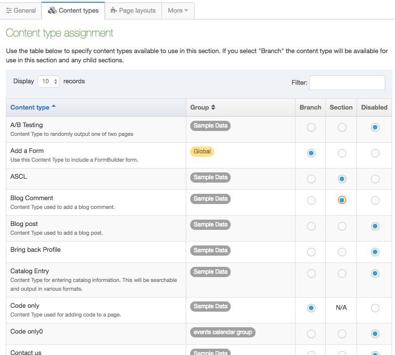
2. There are five columns to this table: Content type, Group, Enabled (branch), Enabled (section), and Disabled.
- The list is ordered alphabetically and grouped by the owning group. If you enable a Content Type for a Branch, it can be used in the current Section, the Section's Subsections or children (for the Branch).
- Select the corresponding radio button in the row for the Enabled (Branch) (it can be used in the current Section and the Section's Subsections) or Enabled (Section) (it can be used in the current Section, but not in any Subsections) for the Content Type you want to assign.
3. When you have completed your selections, review for accuracy, and then click Save changes.
Page Layouts
Users with Moderator access and above can assign a Page Layout to a Section. Moderators and Power Users can only use the Page Layouts in the Groups that they are members of or Global Page Layouts. Administrators can use any Page Layouts.
A Page Layout can either be assigned when adding a Section or when modifying a Section.
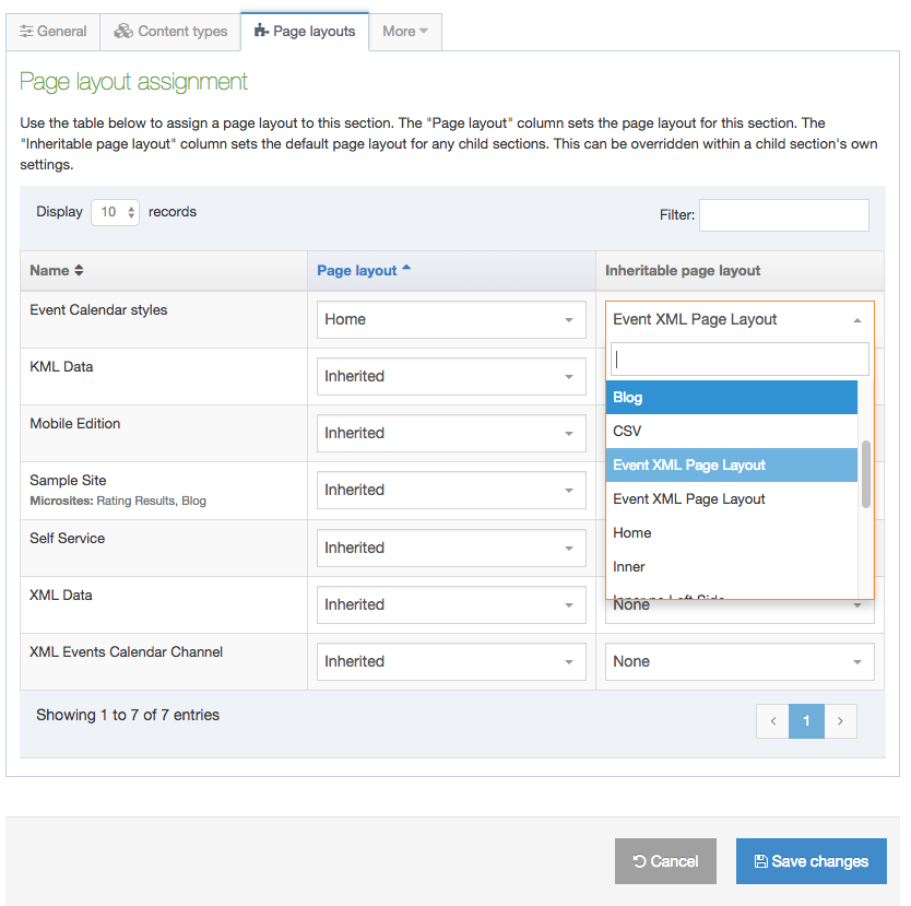
1. Select the Page Layout you want to use from the drop-down menu for the relevant Channel. The selected layout is used for the Section it is assigned to as well as any Subsections (children) for which no Page Layout has been specified.
2. Selecting an Inheritable Page Layout will apply this Page Layout to Subsections. If left as None, the main Page Layout is used for any Subsections for which no Page Layout has been specified.
3. Review your selections, and click Save changes.
Metadata
From the More tab, select Metadata. Metadata can be added at various levels, such as, for a specific Content Item, for a section or to a Page Layout. The metadata options available depend on how you configure Meta Tags.
By default, the metadata described below can be added to a Section.
For sites that publish in multiple languages, the language dependence of Meta Tags can be configured on each tag. Depending on the configuration, Metadata may need to be entered in both languages, or may only be entered in one language.
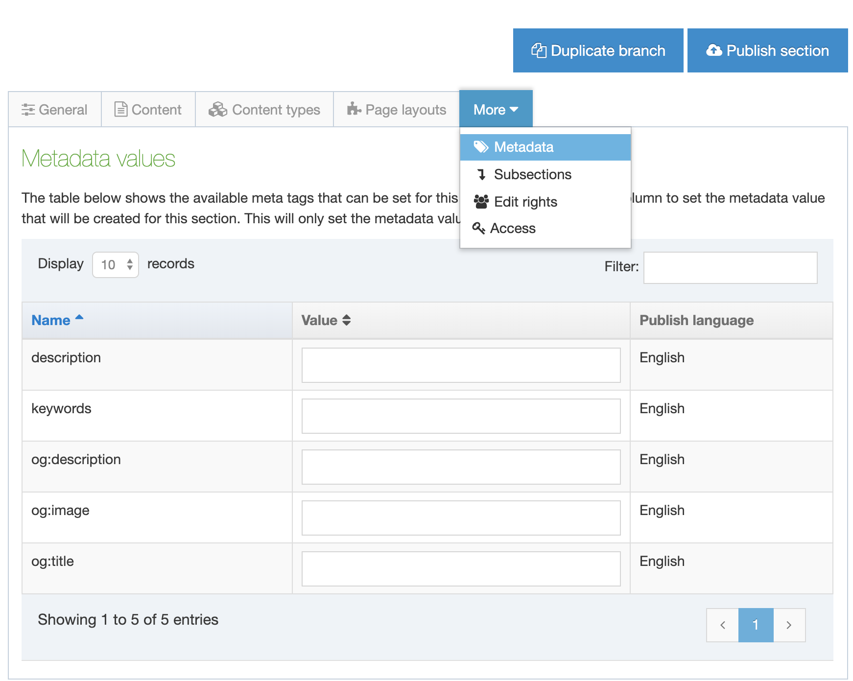
It is optional whether you enter some or all of the metadata values for a Section.
Edit Rights
To assign Edit Rights to the Section, select Edit rights from the drop-down list (Note: you may have to check inside the "More" tab depending on your screen width and Terminalfour version). This opens the screen below.
In addition to Administrators, who have full rights to the entire Site Structure, other users can be assigned Edit Rights to this Section. You can specify the Edit Rights as you create a new Section.
Edit Rights are automatically inherited by the new Section's Subsections.
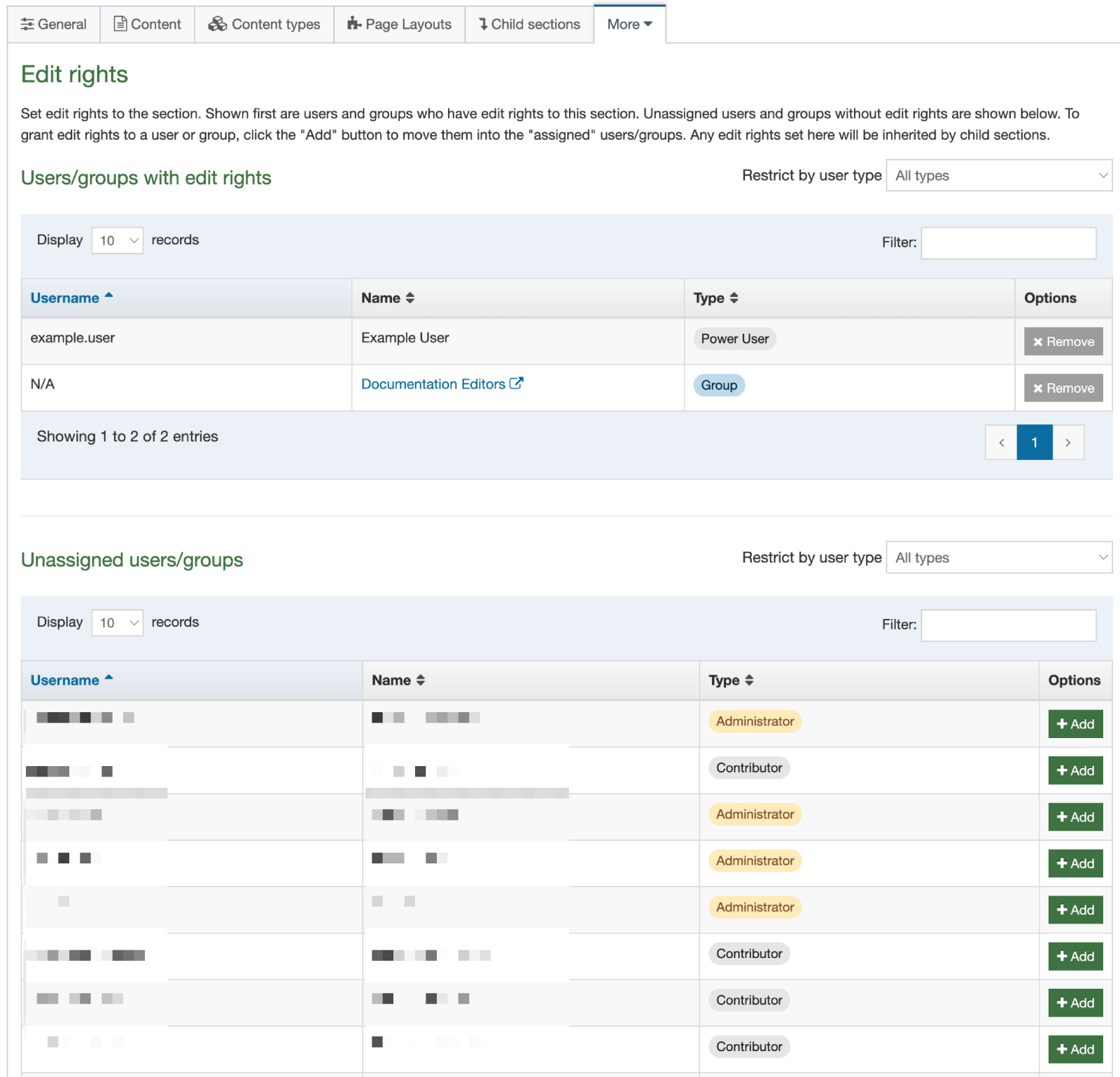
You can click on a Group's Name to open that group in a new browser tab. This allows you to quickly check what users are in that group.
The table on the bottom shows the Unassigned Users/Groups
To move a user to the Edit Rights list select Add.
To remove a user from the current list select Remove.
Remember to Save Changes.
Access
The Access tab enables you to restrict access to the published section. Depending on your system configuration, this tab could be blank unless you have Access control set up. The options available on the Access tab will differ, depending on the configuration of the Access Control Content Type.
Edit section
Editing a Section
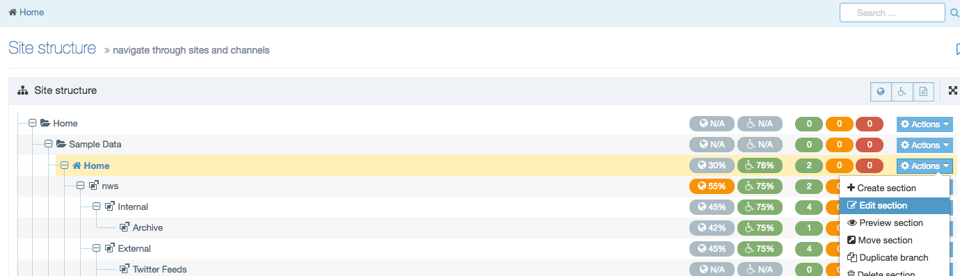
1. In the Site Structure, select the Section you want to edit
2. Hover the pointer over the Section Action Menu associated with your Section.
3. Select Edit Section from the menu.
4. The screen opens to the General tab on your section.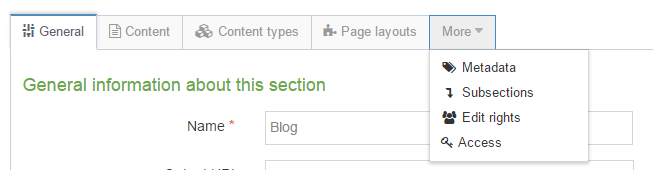
- Navigate between the tabs to make changes as needed.
- For more information about the options in each tab, see Create section.
5. After you make the necessary changes, click Save Changes which will send you to the Site Structure or click Save and edit section
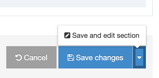
Site Structure Widget
In the Section screen, you can see a view of the Site Structure on the left of the screen with the current Section is highlighted.
You can also navigate to search for other Sections with the Section filter:
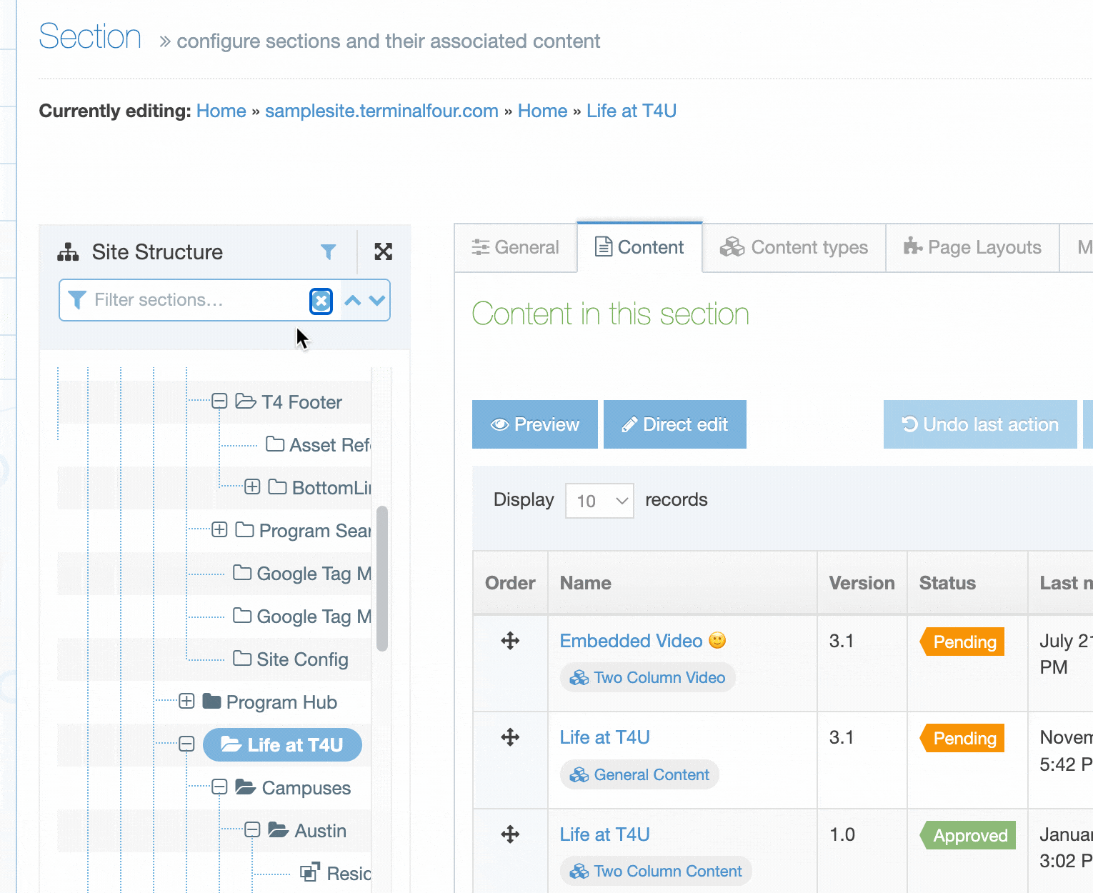
Subsections
Subsections can be added and re-ordered in the Subsections tab. To go to Subsections, select the More tab and select Subsections from the drop-down list.
This option is only visible when you are editing a Section and does not appear when creating a new Section.
Subsections can be manually re-ordered or automatic ordering can be applied. Subsection Automatic Ordering works the same way as Content Item automatic ordering.
Site structure
Description
The Site Structure makes adding, moving, duplicating and deleting Sections as easy as managing folders on your PC. That's not all though - you can also:
- get an overview of the status of content approval
- see the number of inactive content items
- view ratings for Accessibility and Search Engine Optimisation (SEO) performance of Sections
- access the Section Action Menu which provides options for using Sections, editing content and Publishing
Using the Site Structure
Your System Administrator may have configured the Site Structure as the default page in your instance of Terminalfour. In this case, the Site Structure page displays when you log in or when you select the "Terminalfour" label from the top left of the header.
The Site Structure has a button in the Header so you can access it regardless of how your system is configured or what screen you are on:
Sections with a "+" (plus) symbol beside the name, can be expanded to show Child Sections. They can be collapsed again using the "-" (minus) symbol.
Section Icons
There are a few types of Section and each type has an icon so you can identify it:
| Icon | Icon Name | Description |
|---|---|---|
 |
Root Section | The Section is level one of a Channel or Microsite |
 |
Normal Section | The Section publishes and is available in Navigation Objects. |
 |
Pending Section | The Section status has been set to "Pending". Updates will not be published until this is changed to "Approved". |
 |
Inactive Section |
The Section status has been set to "Inactive". Updates will not be published until this is changed to "Approved". When a Section has been deleted, the status is also set to "Inactive". You can set it to "Approved" in the Edit Section screen to ensure it publishes again. |
 |
Hidden Section | The Section publishes but does not appear in Navigation Objects. |
 |
Internal Link Section |
The Section links to another Section within the Site Structure |
 |
External Link Section | The Section links to an external URL |
 |
Destination Mirrored Section | The current Section has been mirrored from another Section. |
 |
Origin Mirrored Section | The current Section is mirrored in another Section. |
 |
Destination Mirrored Hidden Section | The current Section is mirrored in another hidden Section |
 |
Origin Mirrored Hidden Section | The current hidden Section is mirrored in another Section. |
 |
eForm Section | The Section allows content to be added using an eForm. |
 |
Archive Section | Content in this Section will not update on Publish. |
Many of the Section types can be configured in the Create / Edit Section screen (you can access this screen by selecting the Section name in the Site Structure or using the Section Action Menu and selecting Edit Section):
Page Controls
The Site Structure page has a few controls to help you manage your Sections. You'll see them in the top right corner:
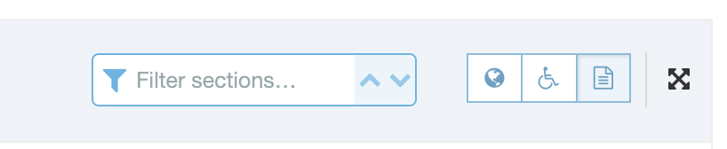
| Item | Description |
|---|---|
| Search box | Search for a Section or Content Type name. |
| Bookmark | To Bookmark a Section or any page in Terminalfour that you frequently use, select the Bookmark icon (it goes dark when selected). Bookmarked pages can be accessed from the Bookmark section of the Header menu (beside the Site Structure icon). |
| Toggle SEO Scores | Toggles the visibility of the SEO scores in the Site Structure. |
| Toggle Accessibility Scores |
Toggles the visibility of the Accessibility scores in the Site Structure. From Terminalfour 8.4.2, a new accessibility report tool has been introduced and the old accessibility report tool has been released. |
| Toggle Content Statistics | Toggles the visibility of the Content Statistics in the Site Structure. |
| Toggle Full screen | Toggles the Site Structure full-screen mode. This hides the Header to give you more room. |
The toggle options can be seen below: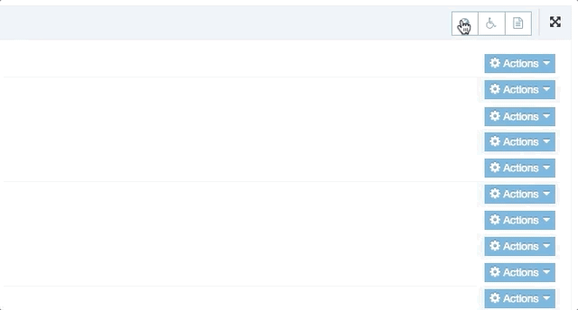
Section Scores
Each Section displays useful information to help you improve the SEO and web accessibility of your pages, as well as information on the Publish status of content in each Section.
For an excellent primer on SEO, check out Moz's Beginner's Guide to SEO and, for some tips on web accessibility, have a look at these 10 tips on web accessibility.
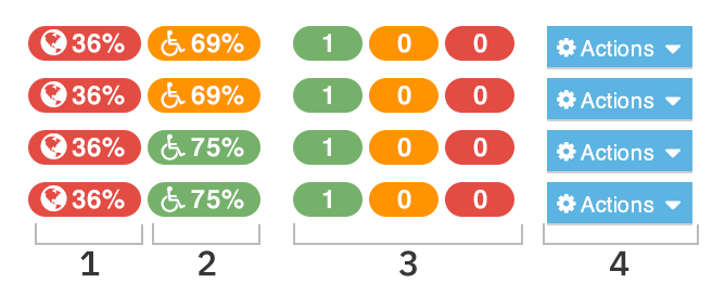
| Item | Description |
|---|---|
| 1 | The SEO score: 36% is rated as unsatisfactory in this example, which displays a red background. Refer to the documentation on SEO reports to learn more about how to configure them to suit your requirements and run reports. |
| 2 | The Accessibility score: in this example, 69% is satisfactory, which displays an orange background while 75% is considered good and has a green background. Refer to the documentation on Accessibility reports to learn more about how to configure them to suit your requirements and to run reports. |
| 3 |
Content Statistics:
|
| 4 |
The options that are available in the Section Action Menu will depend on the user level and system configuration. The full list of options available are:
|
Section filtering
From version 8.3.15, you can filter Sections by name in the Site Structure:
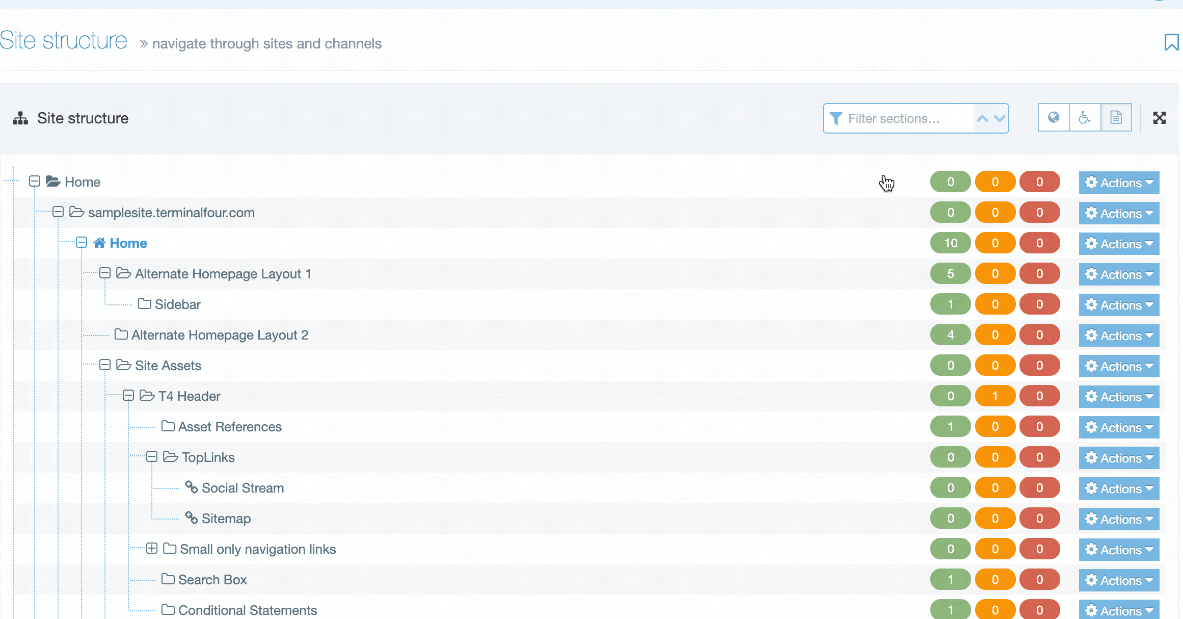
In the section filtering input, add the name of the Section you are looking for and all matching Sections will be displayed and highlighted. Because you might have Sections named similarly (or even the same), you can see the parent Sections of a search result to help differentiate them.
The Actions menu and all Sections statistics are displayed for Sections matching your search term.
The arrows in the search input can be used to move up and down the search results. You can also use the up and down arrows on the keyboard to move between the results – just hit Enter to navigate to the Section edit screen on a selected Section.
Preview a section
Description
As part of your Quality Assurance process, you might want to ensure that, even before content has been approved, a page publishes as intended. Although you can preview a Content Item from the Edit Content page, you can also preview directly from the Site Structure, which saves you from drilling down into the content.
How to Preview a Section
There are two ways you can preview a Section:
1. From the Site Structure
Pick the Section you want to preview and select Preview Section from the Section Action Menu.
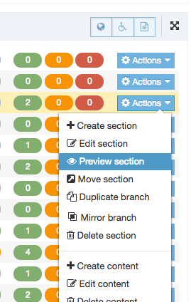
2. From the Section screen
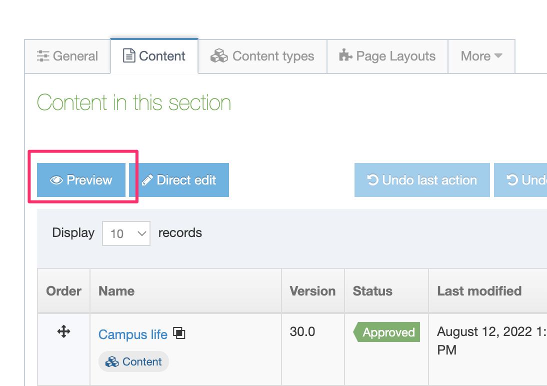
The content that will be previewed is the last saved content, which may be different from the currently approved content on your live site.
A Section can only be previewed when there is a Channel associated with it.
If the selected Section or its Root has more than one Channel associated with it and depending on the default preview channel configuration, a modal window may display from which you can select the Channel to preview:
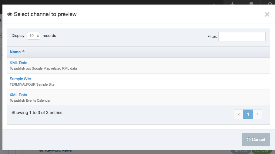
The Preview Channel is configured in the Channel Settings at System Administration > Set Sites & Channels > Channels > {Channel Name}.
The preview will open in a new tab or window (depending on your browser preferences).
Move a section
Description
A Section can be moved from its current location to a new one using drag and drop in the Site Structure or with the Section Action Menu.
When a Section is moved, all links to and from that Section are updated. Similarly, if the Section features in navigation or site maps generated with Navigation Objects, those will be updated too.
There is a configurable option in the Role Customization allowing you to restrict access rights to alter Sections.
How do Content Items behave when automatic ordering has been applied to a Section?
Moving a Section
- From the Site Structure, go to the Section to be moved and, from the Section Action Menu, select Move Section. Confirm that you want to move the Section.
- Once confirmed a modal Browse/Search box will open.
- Select the Section's destination. The selected Section is highlighted with a yellow background:
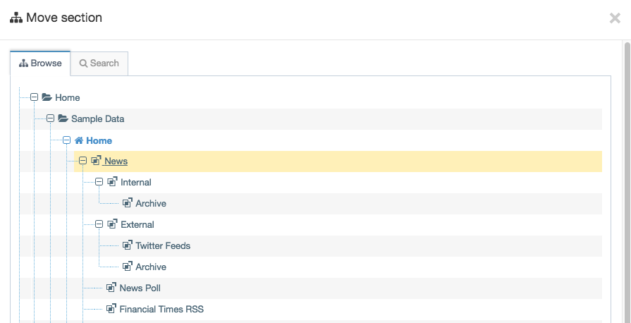
When the Section has been moved, a banner will appear confirming it:
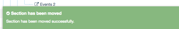
Ordering Sections
To change the ordering Child Sections within a Parent Section go to the More dropdown tab and select Child Sections.
It's worth noting that automatically and manually ordering Sections works the same as Content Item ordering.
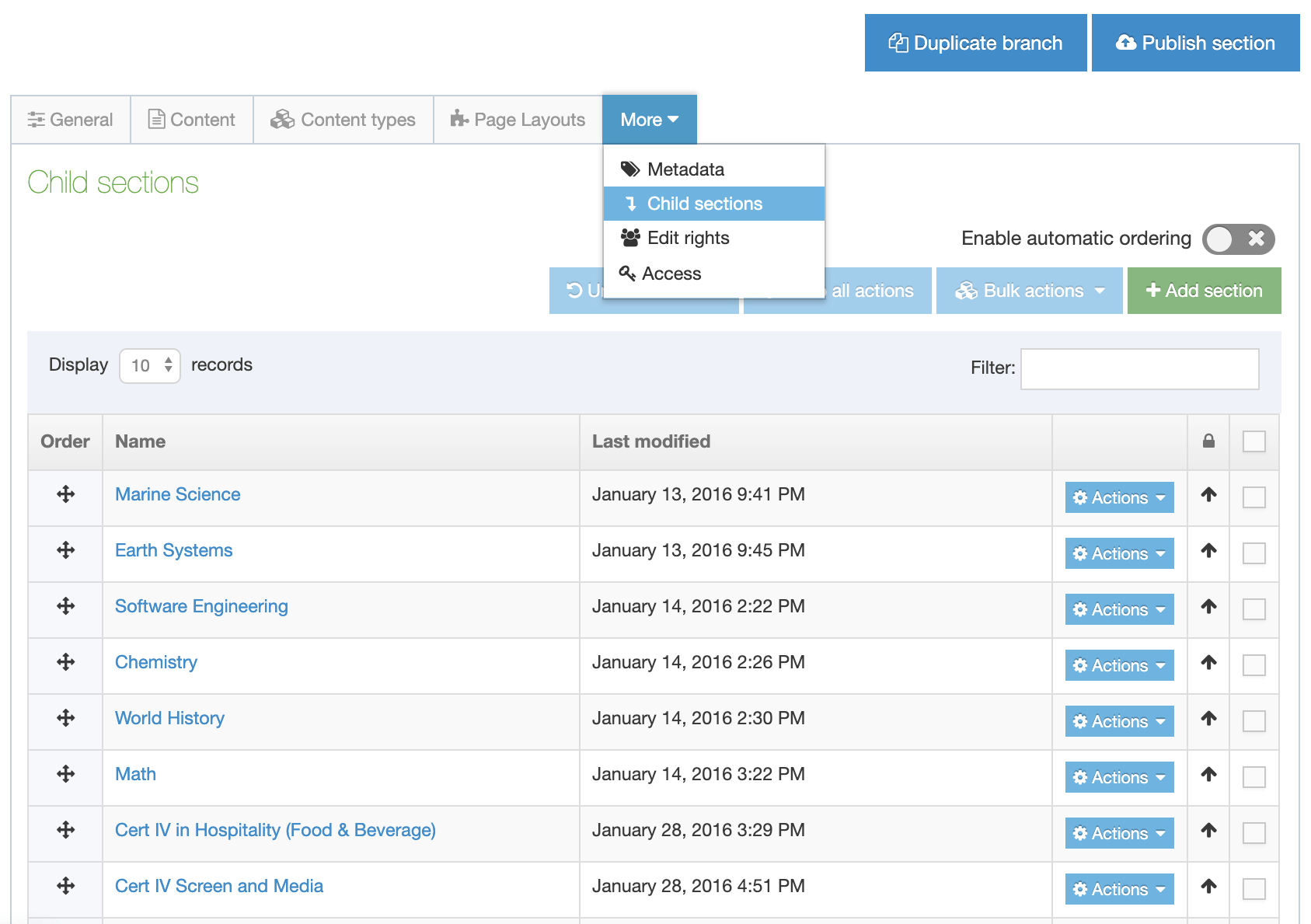
Automatic Ordering
You can choose to order the Sections alphabetically (ascending or descending) or by the date that the Section was last updated (ascending or descending) by moving the Automatic Ordering toggle to the on position:
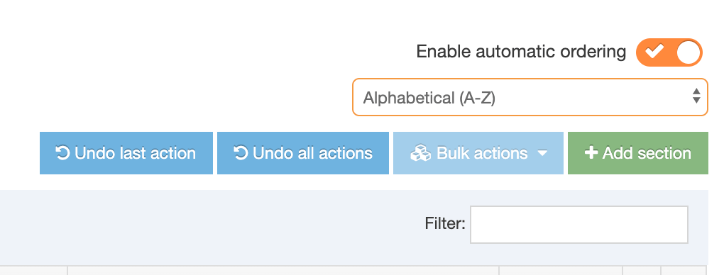
Only unlocked Sections can be reordered. To unlock Sections select the checkbox on the right of the Sections you would like to unlock, or, if you want to unlock all Sections select the top checkbox in the column, go to Bulk Actions and choose Bulk unlock.
Ordering Sections and Content Items woks the same so you can find more detail on Bulk Actions in the Content ordering documentation.
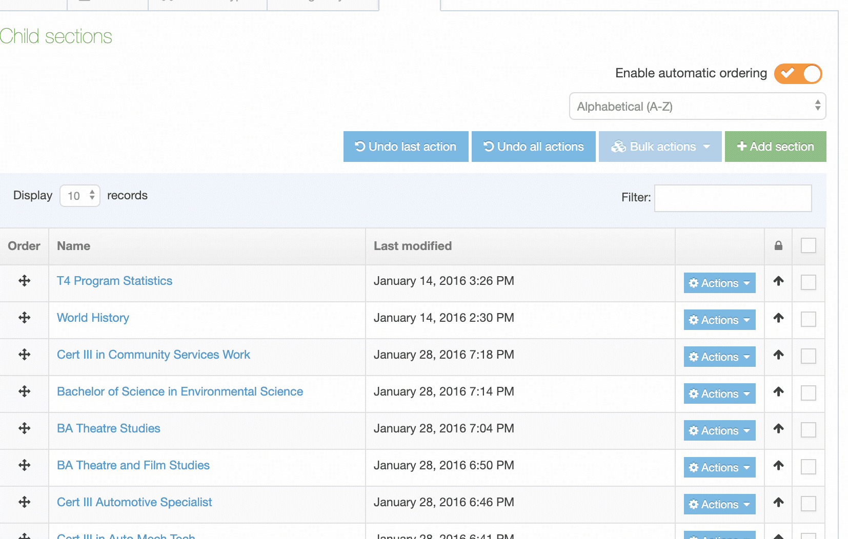
Manual Ordering
To manually move the Sections, use the Order icon on the left to move Sections up and down.
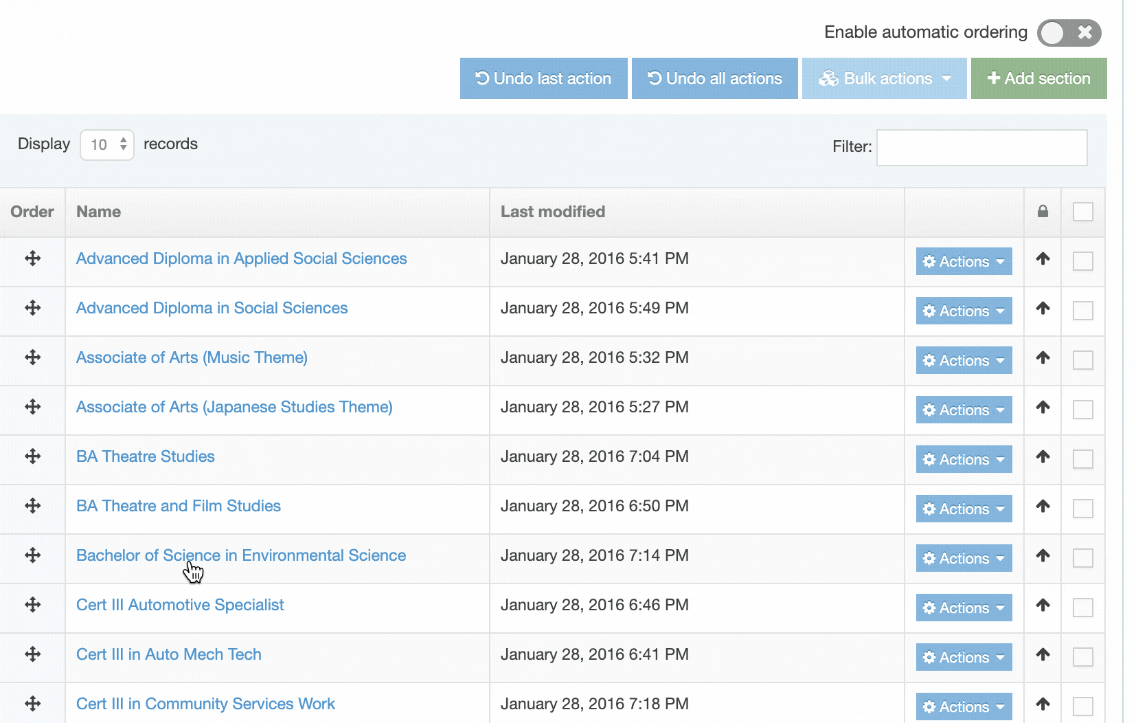
Changes to Section ordering are automatically saved.
Duplicate branch
Description
A Branch is a Section that contains Subsections (or Child Sections). You can duplicate a Branch and, if you choose, its content to another location within the Site Structure.
Duplication creates a new Section with a separate Section ID (sid) and both are independent of each other.
How to Duplicate a Branch
To duplicate a Branch, locate the Branch to be duplicated on the Site Structure select the Section Action Menu.
Select Duplicate Branch. A modal window appears from which you can select the options to apply on the destination duplicate:
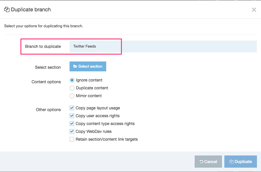
Branch to Duplicate - in this example "Test Section" is the name of the Branch that will be duplicated
Select Section will display a modal window containing the Site Structure, allowing you to select the section in which the duplicate will be created:
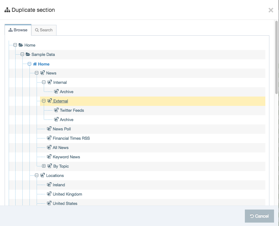
When the Section has been selected the first modal window screen is displayed again and the path to the selected Section is shown in the Select Section
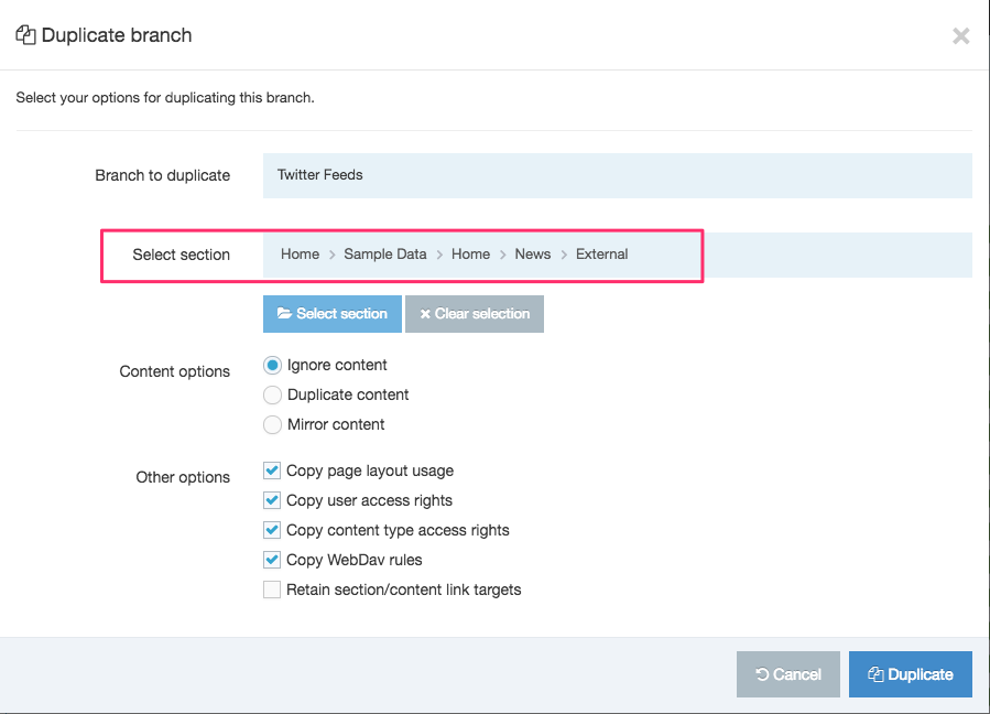
Duplicate Branch Options
| Item | Description |
|---|---|
| Content Options |
What will happen to the content in the duplicated Branch?
|
| Copy Page Layout Usage | Copies the Page Layouts assigned to the original Branch, instead of inheriting the Page Layouts from the new Parent Section. |
| Copy User Access Rights | Copies the user access rights from the original Branch, instead of inheriting the rights from the new Parent Section. |
| Copy Content Type Access Rights | Copies the Content Types assigned to the original Branch, instead of inheriting the Content Types from the new Parent Section. |
| Copy WebDAV Rules | Copies the rules applied to the original Branch to the duplicate Branch. This is a legacy setting that is not used in v8. |
| Retain Section/Content Link Targets |
Only relevant if the Content options is set to Mirror content and the branch is being duplicated within the same channel. When duplicating the branch to a different channel, all links within the duplicate branch point back to the original, and are therefore removed on publish. The duplicate content retains the links to the original Section and content. |
Click Duplicate and a "Success" banner appears.
Mirror Branch
Description
When you duplicate a Branch, the source Branch is copied to another location in the Site Structure. Subsequent changes to the source Branch are not reflected in the duplicated Branch.
However, when a Branch is mirrored, changes such as adding and deleting content, content reordering and the addition new Sections are reflected in the mirrored Branch.

The option to mirror a Branch can be enabled/disabled in the Hierarchy configuration. If you disable the feature and currently have mirrored branches in your Site Structure, these Branches remain mirrored.
The Hierarchy settings can also be configured to prevent mirroring (called "non-mirroring") of new Sections, new content or both.
When the non-mirroring content option is selected, newly created content in the source Branch will not be mirrored in the destination Branch.
When the non-mirroring Section option is selected, newly created Sections in the source Branch will not be mirrored in the destination Branch.
Mirrored Sections can be identified in the Site Structure by two folder icons:
| Item | Description |
|---|---|
|
Icon for origin mirrored Section |
|
Icon for destination mirrored Section |
|
Icon for origin hidden mirrored Section |
|
Icon for destination hidden mirrored Section |
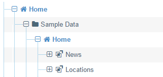
How to Mirror a Branch
To mirror a Branch, locate the Branch to be mirrored on the Site Structure select the Section Action Menu.
Select Mirror Branch. A modal window appears from which you can select the options to apply on the destination:
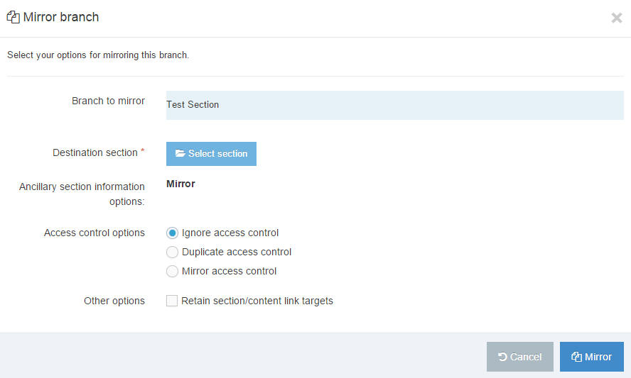
Branch to mirror - in this example "Test Section" is the name of the Branch that will be mirrored.
Destination section will display a modal window containing the Site Structure, allowing you to select the section in which the mirror will be created
Click the blue Mirror selected section. The first popup screen re-appears:
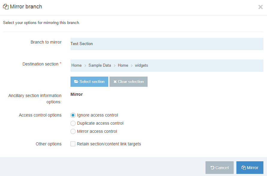
Mirror Branch Options
| Item | Description |
|---|---|
| Access control options |
What will happen to the Access Control in the mirrored Branch?
|
| Retain Section/Content Link Targets |
Only relevant where the branch is being mirrored within the same channel. When mirroring the branch to a different channel, all links within the mirrored branch point back to the original, and are therefore removed on publish. When checked, mirrored content retains the links to the original Section and content. |
If you have Mirrored a Branch in error you can delete the Mirrored Branch to undo it.
Delete section
Description
A Section can be deleted from TERMINALFOUR even if it contains content. Deleted Sections are highlighted in red in the Site Structure and are not published.

After a Section has been deleted, its Status is set to Inactive. To publish it again, set the Status to "Approved", or to continue working on the section and content, without publishing, set the Status to "Pending". An Administrator can either re-activate or purge the Section from the Recycle Content area.
There is a configurable option in the Role Customization allowing you to restrict access rights to alter Sections.
How to Delete a Section
1. To delete a Section, expand the Site Structure until the relevant Section can be seen.
2. Click the Actions button associated with the section you want to delete.
3. Click Delete Section from the menu. A Confirm Delete modal window will appear:
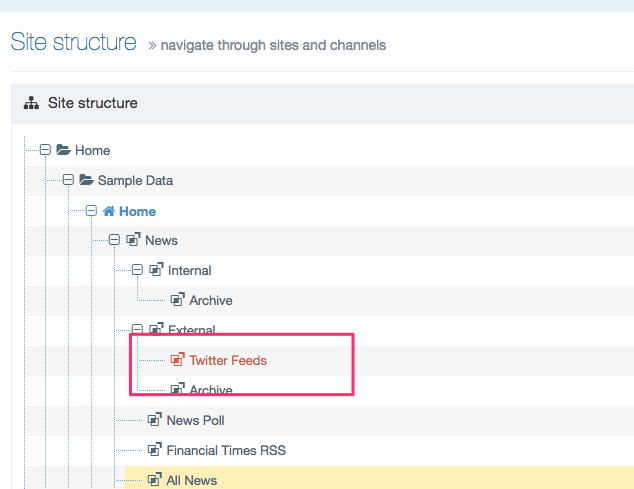
4. To confirm your selection, click Delete.
5. After you delete, the Section appears highlighted in red. The Section's Status is now Inactive.
6. To re-activate the section, see instructions in Recycle Content.
Sections with inbound links
If the Section that is being deleted contains inbound links to it, a modal listing all content with links to the Section will appear. This provides an opportunity to update links prior to deleting the Section.
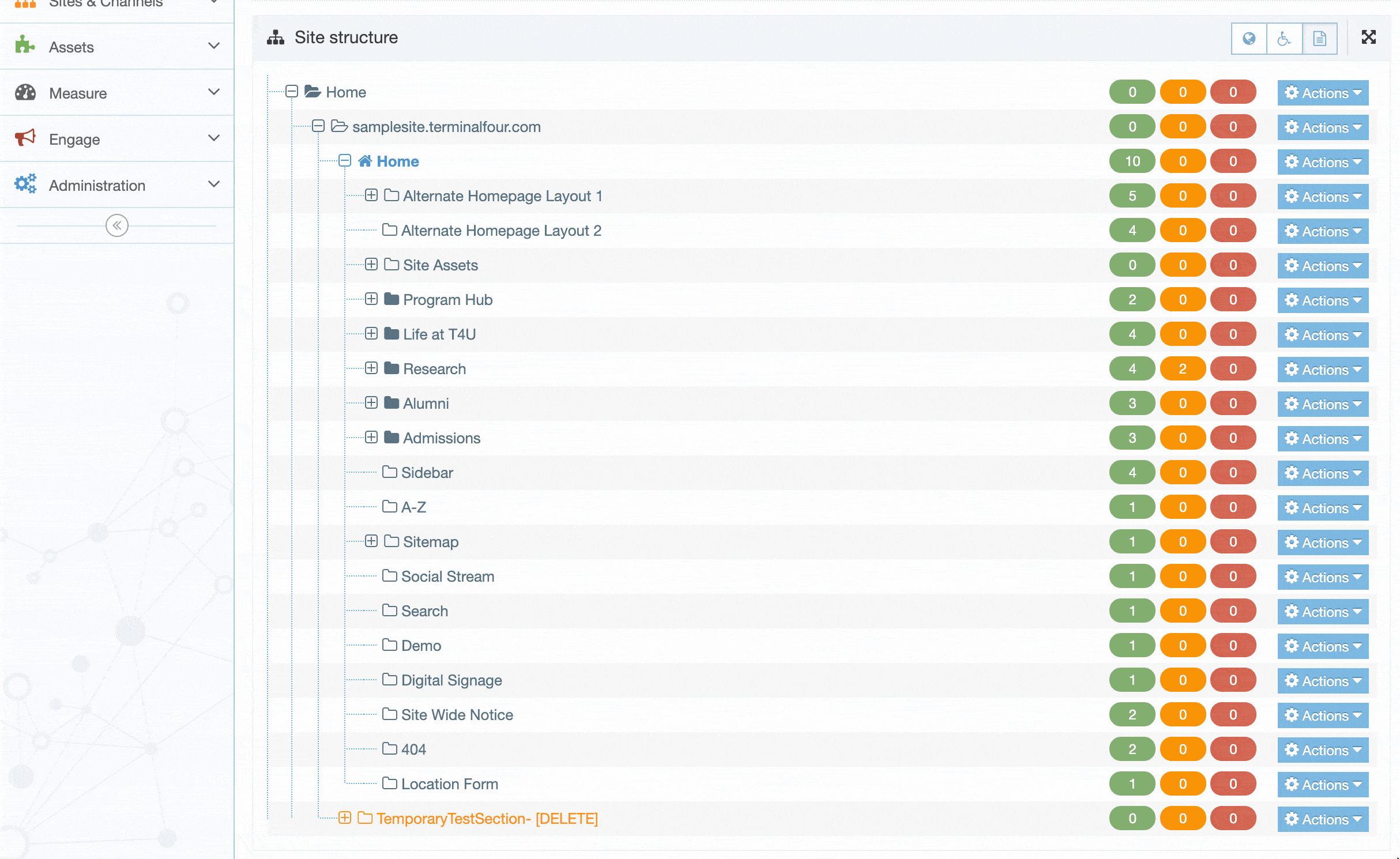
Bookmarks
Description
With Bookmarks you can save the location of a screen or Section you return to frequently. You can Bookmark a screen from the:
- Section Actions menu
- screen you are working on
Bookmarking is easy and you can add and remove pages as your needs change.
Bookmark from the Section Action Menu
From the Site Structure menu, select the appropriate section and click the Actions menu, and click Bookmark Section.
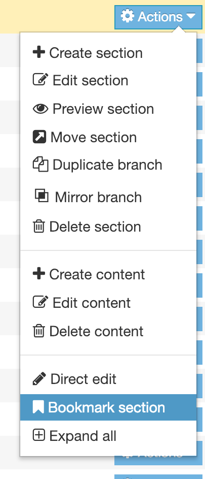
The action is completed when you see this green banner:
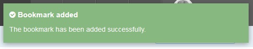
If you select a Section that has already been Bookmarked you will see this banner:
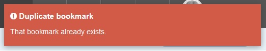
Bookmark from a screen
Lastly, you can always mark a screen while you have that Section open. Simply click the blank Bookmark symbol on the page - shown below:
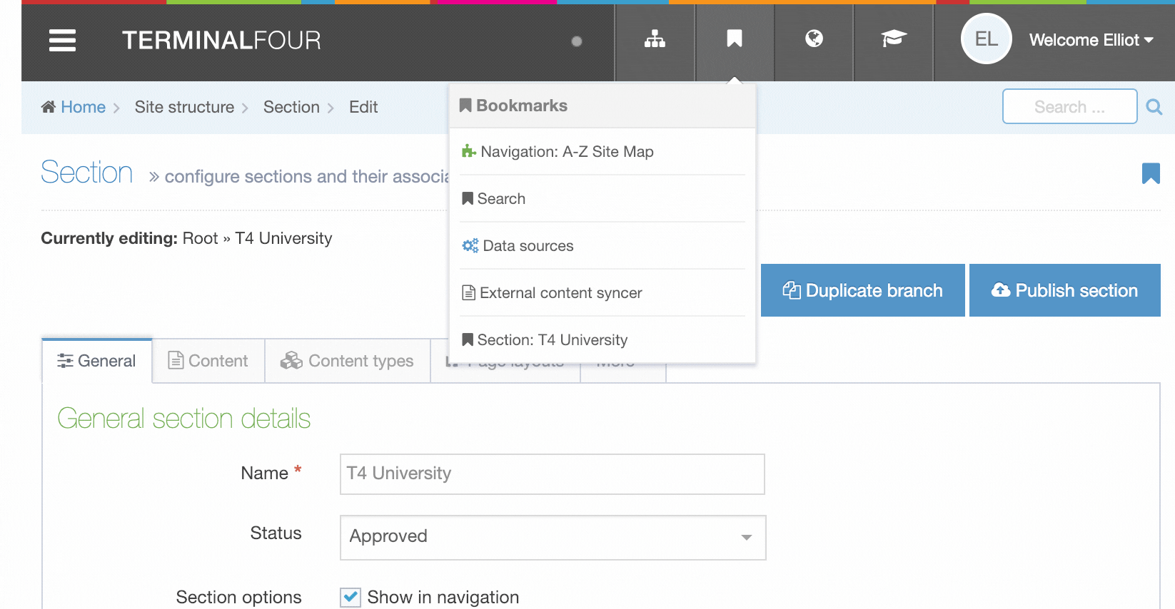
When you click the symbol it turns dark indicating the page is now marked. To confirm you can always check the Bookmarks in the Header Menu.
Remember that Bookmarks are unique to each user. Bookmark choices let you personalize the system and help you navigate within TERMINALFOUR.
View Bookmarks
To review what Bookmarks are in place, click the Header Menu symbol for Bookmarks:
Here, you can see that the Bookmark icons match the icons in their menu category, i.e. the "Forms" icons matches the "Engage" menu item icon.
Each Bookmark links to that screen or Section.
Hierarchy configuration settings
Description
To configure the hierarchy settings go to System Administration > Hierarchy & Content Settings > Hierarchy.
Complete these entries and click Save changes:
| Item | Description |
|---|---|
| Full access for section/content links | Enables users to see all sections and content when selecting the destination for a section or content link (including those they are not assigned to). If checked, users are able to see all sections and content (includes those they are not assigned to) when selecting the destination for a section or content link. If unchecked, users only see the sections to which they have been given access when creating section or content links. See our troubleshooting guide for access for creating links. Similarly, in Role customization, users can be granted full access to the site structure when viewing the site structure, rather than only seeing the sections to which they have access. |
| Meta data content type | Specifies a system content type to use for adding extra section metadata on the section general tab |
| Enable spell check | Enables spell check on the section name when creating and editing a section |
| Enable output to filename | Enables a page to be created with a different filename to the default filename specified in the channel. This adds the Output file option to the General tab when creating or editing sections. |
| Enable mirroring of sections | Allows users to mirror sections |
| Enable mirroring of section meta data | Mirrors section meta data content for mirrored sections. This is not to be confused with the metadata tab on a section. |
| Enable mirroring of access control content | Mirrors access control for mirrored sections |
| Allow non-mirroring of sections | Enables the user to choose whether the new section is mirrored to the mirrored section, or if a new section is created under a mirrored section |
| Allow non-mirroring of content | Enables the user to choose whether the content is mirrored to the mirrored section, or if new content is created in a mirrored section |
| Branch id's which disable auto mirroring | Disables auto-mirroring of content in these sections/branches. To "switch off" auto-mirroring of content when the source content resides in certain sections or branches, enter a comma-separated list of section IDs where the auto-mirroring will not be used. If content (which meets the pre-existing criteria for being auto-mirrored) belongs to a section in this "disable list" or belongs to a section which is an ancestor of anything in this list, then that content will not be auto-mirrored. The list of sections IDs specified are to be considered the roots of branches. So if the source content belongs to anything in and under those IDs, it will not be auto-mirrored. If source content is modified and approved in one section, that section may not be the only section that is compared with the "disable list". All the sections the content belongs to, will be compared with the "disable list". |
| Retain content/section link targets default |
Section and content links are retained and linked to the original targets. Alternatively, section and content links within the mirrored or duplicated branch are treated as "relative":
|
Site Structure Configure based on Role
In addition to the configuration options above, it is also possible to configure certain options for the Site Structure based on the user's role. This is done at System administration > User rights & roles > Role customization.
- The minimum access level required to create/edit/delete se ctions
- The minimum access level required to set output URIs and/or to set a path as an output URI
- Whether to restricts the site structure for the user level to only display sections to which they have been granted edit rights
Creating a Tiny MCE plugin
Description
This article covers creating a custom TinyMCE plugin that can be used with Terminalfour's HTML Editor.
If you are on version 8.3.12+ have a look at this article on upgrading your plugins so they're compatible with TinyMCE 5.
Creating a plugin
Terminalfour's HTML Editor is built with TinyMCE 4 so you can use the plugins that are compatible with this version. In addition to the plugins pre-installed with your Terminalfour instance, you can also create custom plugins too.
There are details on how to create a plugin on the TinyMCE site including this sample plugin code.
Basics
Create a directory. The name of the directory and the reference name for the plugin used in the script must match.
For Terminalfour to recognize a custom plugin:
- it should begin with a lowercase letter
- the plugin directory name should be appended with "_CP". Terminalfour will append "_CP" after the plugin folder name if you don't add it.
In the directory, add a file called "plugin.js" and a minified version of the file called "plugin.min.js".
The reference name of the plugin in the "plugin.js" file must also be appended with "_CP":
tinymce.PluginManager.add('myCustomPlugin_CP', function(editor, url) {})TinyMCE matches the folder name to the plugin name for loading, therefore both need to be "_CP" in order for it to show in the editor.
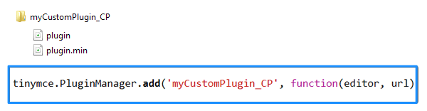
If you don't have a minified version of the plugin and Terminalfour is running in minified mode, a 403 error will be thrown when TinyMCE loads. Either create a minified version of your file and name it plugin.min.js or simply duplicate your plugin file and name it plugin.min.js
When you have written your plugin, zip the folder and upload it to System Administration > Hierarchy & Content Settings > HTML Editor:
Folders zipped on a Mac can create extra folders named _MACOSX and .DS_Store.These folders are hidden on macOS. When you upload your zipped plugin these extra folders can prevent the plugin from installing. As a workaround, you can zip your folder on a PC or use the command line to zip your folder.
Don't add the root folder to another folder and don't use spaces in the plugin's root folder.
Multiple plugins
If you have multiple custom plugins you can zip them & upload them together. Each plugin should have its own root folder and reference name as above. Select all of the plugin folders, right-click and zip them.
Don't add them to a single folder and zip and don't use spaces in the plugin's root folder.Upload the zip to System Administration > Hierarchy & Content Settings > HTML Editor as per single upload.
Using CDN/PXL
Description
CDN/PXL offers a way to distribute media and files globally. With PXL functionality you can edit images on the fly to improve image performance on your site.
How do I use CDN/PXL on my site?
If you have CDN/PXL enabled on your site you add either of the following attributes to a T4 Tag in a Content Layout, Media Layout or Media Element :
|
Attribute |
Example |
Notes |
|
cdn="<BOOLEAN_VALUE>" |
cdn="true" |
Files are published to the CDN when the attribute’s value is “true”. A "false" or other value will publish the files to the Channel’s output directory which is the default behavior. |
|
pxl-filter-id="<PXL_FILTER_ID>" |
pxl-filter-id="1" |
Only valid PXL filter IDs are applied to an image and published to PXL. If the PXL filter ID doesn’t exist, the file will be published locally as normal. |
The supported file types are listed on this page.
When adding a PXL filter attribute the CDN attribute is not required. The T4 Tag builder can add both, but the CDN attribute is ignored if the pxl-filter-id attribute is set.
Configuration
Your Terminalfour instance must be hosted with AWS to use CDN/PXL. To enable the feature go to Settings > CDN/PXL:
The Client Services team will configure CDN/PXL with a unique Client organization and Environment identifier. A folder must also be configured for CDN/PXL in the Channel settings for the site.
These identifiers form the base URL that’s used to serve up your images
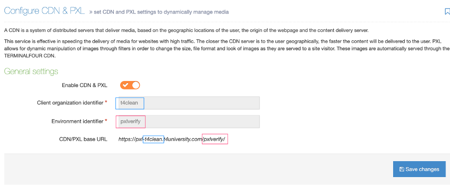
Creating Filters
A Filter is a defined preset to make image manipulations on the fly, so you don’t have to create multiple copies of the same image. A single image can be output in multiple sizes, formats and have effects applied to it.
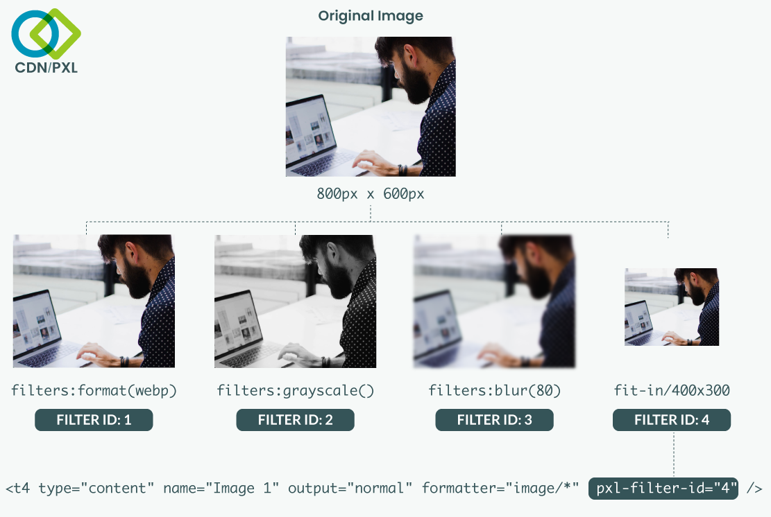
In this example, we’ll create a Filter to create a grayscale version of the image. The original image, in the Media Library, won’t be altered.
To create a Filter, go to Settings>CDN/PXL and ensure that CDN/PXL is enabled.
Select “Create PXL filter”:
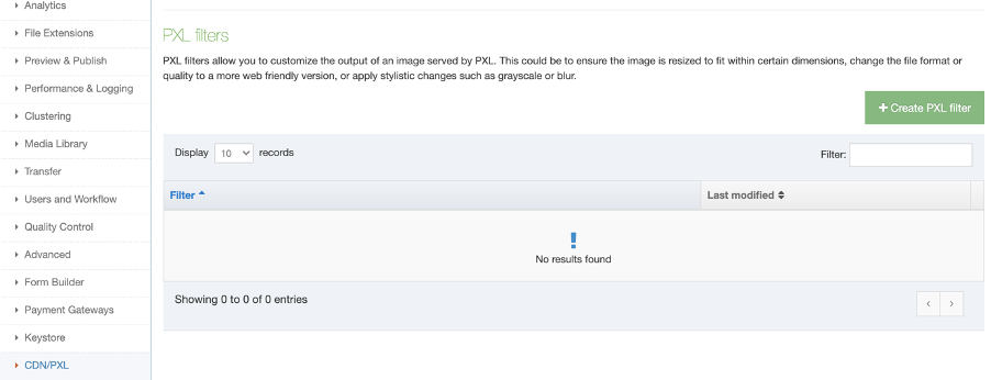
In the Edit PXL Filter screen give the PXL Filter a name and optional description:
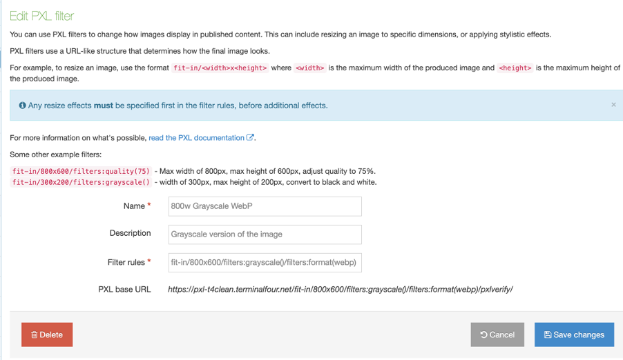
You must also add filter rules. In this example, I’ve added the grayscale filter.
Filter rules
Filter rules follow a format:
filters:filtername(value)
The only one that is different is the resizing filter which follows this convention:
fit-in/wxh
|
Filter Name |
Filter Syntax |
Notes |
|
Blur |
/filters:blur(7) |
Adds a Gaussian Blur to an image. The blur value ranges from 0 to 150. |
|
Grayscale |
/filters:grayscale()/ |
Changes a color image to grayscale. No values are required. |
|
Image format |
/filters:format(image_format) |
Specifies the output format of the image. Values can be jpeg, png, gif, or webp. |
|
Quality |
/filters:quality(0-100) |
Determines the amount of compression that’s applied to a JPEG. Is not applied to other file formats. Value ranges from 0 (none) to 100 (maximum) |
|
Resize |
/fit-in/800x600 |
Resizes the image to fit within an area of specified dimensions without cropping. If the width and height ratio of the original image is different from the ratio provided by the fit-in dimensions then the smallest value is used to determine the other value. E.g., if the original image is 800 x 600 and fit-in value of 300 x 200 is provided, the resulting image would be resized to 267 x 200.
Width and height values are in pixels only.
|
|
RGB |
/filters:rgb(20,-20,40) |
Changes the amount of color in the Red, Green, Blue (RGB) color channels.
Each color channel value ranges from -100 to 100. |
|
Rotate |
/filters:rotate(90) |
Rotate the image to a given angle value.. |
| Crop |
fit-in/750x950xmiddle/filters:quality(95)/CROP |
After the height add a value to tell PXL where to start the crop of the image from: top/middle/bottom, here we are using middle and add the CROP placeholder at the end of the filter. For more information see our page on CDN/PXL Cropping. |
To add more than one filter just prepend each filter name and value with the filters keyword, e.g.:
fit-in/800x600/filters:grayscale()/filters:format(webp)
This will create an instance of the image that:
- fits into area that’s 800px wide and 600px wide
- is grayscale
- will output as WebP
All saved PXL Filters are listed in the PXL Filters table. Each Filter has a unique ID to identify it:

Using a PXL Filter
Now that we have a Filter created let’s apply it to an image from the Media Library.
In a Section I’ve added a Content Item from a basic Content Type that contains just one image from the Media Library:

To compare the images I’ve added placeholders for the original image and the PXL image in the Content Layout. To add the image, select Generate T4 Tag:

When a Media, File, or Image Element is selected from the Content Element dropdown, The CDN/PXL options will display:
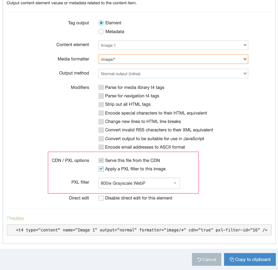
|
Item |
Description |
|
Serve this file from the CDN |
This will cache a copy of the file on the Content Distribution Network (CDN) to serve it from a location closer to your site visitor. Even if you don’t intend to use PXL for image manipulation, you can still use the CDN to distribute it. CDN usage isn’t just limited to images and can be used to deliver CSS and JavaScript files, PDFs as well as audio and video. |
|
Apply a PXL Filter to this image |
When this is selected the “Serve this file from the CDN” option is also selected. A dropdown will appear to select an existing Filter. |
|
PXL Filter |
Lists all existing PXL Filters. |
Once you’ve selected a PXL Filter from the dropdown, select “Copy to clipboard”.
You might notice that there are two new attributes added to the T4 Tag:

When the CDN is used the cdn attribute has a value of “true”. The pxl-filter-id specifies the Filter that will be used.
When adding a PXL filter attribute the CDN attribute is not required. The T4 Tag builder can add both, but the CDN attribute is ignored if the pxl-filter-id attribute is set.
In the following example, the top T4 Tag uses CDN/PXL while the bottom is just a standard image T4 Tag. Both tags reference the same image from the Media Library.
The filter we created earlier has the following settings:
fit-in/800x600/filters:grayscale()/filters:format(webp)
When we preview the page we can see how the same image compares:

Comparing the images in the Sources tab in Chrome Developer Tools we can see that the dimensions, file size, and format have been updated:

Approaches to using CDN/PXL filters
CDN/PXL attributes can only be applied to the following types of T4 Tags:
|
Description |
Original |
With CDN attributes |
With PXL attributes |
|
File element |
|
|
|
|
Image element |
|
|
|
|
Media element |
|
|
|
|
Media T4 tag |
|
|
|
How you use CDN/PXL is up to you but you should consider the method that’s easiest to maintain and provides the most flexibility. Adding the same PXL Filter manually to all T4 Tags across your site may not be the best approach.
Adding T4 Tags to Content and Page Layouts
You can select to use a CDN/PXL attributes on T4 Tag when adding content to a Page Layout or Content Layout. The benefit of this is that even if the Media Item is changed the same filter is applied.
This gives you control over published images on your site so you can ensure that even if a large image is added to a Content Item it will be resized to the area on the page allocated to it as well lowering the file size. Similarly, if the Filter is updated, the update will be applied to all T4 Tags that use that Filter.
Using Media Layouts
Responsive images and CDN/PXL
A useful application of CDN/PXL is when creating image or picture elements that can be used for responsive images
If you’re not familiar with responsive images check out this primer from Mozilla.
Paying attention to image performance will speed up your site and ensure that you’re serving the best image format and size to your site visitor’s device.
Unfortunately, creating an image element that does this can end up looking like this:
<picture>
         <source srcset="/small.jpg 650w,
             /med.jpg 1000w,
              /large.jpg 1600w" type="image/jpeg">
         <source srcset="/small.webp 650w,
             /med.webp 1000w,
             /large.webp 1600w" type="image/webp">
         <img src="/small.jpg" alt="My great image">
</picture>
This isn’t something you want to create each time so using a Media Layout that uses CDN/PXL filters to create the images would ensure that you could create this once, roll it out across your site, and update as your image requirements change.
To use PXL in a Media Layout replace the file URLs with T4 Tags:
<picture><source srcset="<t4 type="content" name="Media" output="file" modifiers="" pxl-filter-id="2" /> 650w,
...
Then, when you want to use the Media Tag you can use a single T4 Tag with your custom formatted:
<t4 type="media" id="28" formatter="image/pxl" />The benefits of this approach include:
- This will allow users to select the Media Layout they wish to use when selecting media from the Media Library.
- A new Media Type can be created or an existing one can be edited. The Media Layout can be added to the list of associated layouts or set as the default Media Layout.
- The Media Layout can be manually added to T4 Tags if required. You’ll need to ensure that the Media Layout is associated with your Media Type
- This approach can only be used with Media Elements as well as T4 Media Tags
Using a T4 Media Tag
This approach is useful for one-off applications of a PXL filter or CDN attribute but it’s not recommended for site-wide use of a PXL filter or CDN tag as its harder to maintain.
CDN/PXL attribute precedence
It’s worth being aware of the scenarios where CDN and PXL attributes could conflict with each other:
- If a CDN attribute and a PXL filter attribute are applied to the same T4 Tag, the CDN attribute is ignored and the PXL attribute is applied
- If a CDN/PXL attribute is applied to a Media Layout and a different CDN/PXL attribute is added to the T4 Media Tag then the Media Layout CDN/PXL attribute will be used
Troubleshooting
Three possible scenarios for unsuccessful CDN publishing might be:
- If the CDN is unavailable before the publish begins
- in this case, the publish will fail
- If the CDN becomes unavailable during a publish
- in this case, the publish will fail
- If the CDN is unavailable on Preview
- in this case, Media Items will be previewed from the Channel’s output directory and PXL filters will not be applied
If you encounter an issue check that your CDN/PXL configuration is correct. If you're unsure of your configuration settings or you're still having issues, just contact Client Support.
CDN/PXL Overview
On average, images are the largest share of a web page’s size so when it comes to improving site speed, it’s a no brainer that optimizing images is the best place to start. Terminalfour’s CDN/PXL feature improves image delivery in two ways:
- Improving latency (this is the CDN part)
- Optimizing image files (this is PXL)
Latency (CDN)
Simple geography can have an outsized impact on your site’s user experience. Let’s say your site is hosted on the east coast of the US and someone from Australia visits. That visitor won’t just get a slightly longer download time but they’ll see a longer interval between when the image is first requested by the browser and when the server starts the download. Adding milliseconds to the speed of a page mightn’t sound like much but when you have multiple images on a page and multiple pages are visited it begins to affect a visitor’s experience of your site.
When your site uses a CDN (Content Delivery Network) that image file can be served from a location nearer to the visitor, speeding up your site and improving the overall user experience. Globally distributed CDN servers ensure that regardless of where your site is hosted, its assets will be served from a location close to your visitors.
Image optimization (PXL)
Want to know how to set up PXL Filters? Go here.
Optimizing images is all about balancing file size and image quality and you can’t assume that all your content editors know how to use image-editing software or care about compression methods. With PXL you can offload image processing tasks like compression and resizing to the cloud, based on your own custom presets.
A single image can be output in multiple dimensions and file formats with different levels of compression applied. You can even add effects like grayscale or color balance enhancements all on the fly without opening Photoshop.
CDN + PXL
Once processed each file is cached globally to ensure that your site visitors are served the right image quickly.
While the CDN can cache and distribute any file type only image files can be used with PXL.
The following file types have been verified and tested:
- XLSX application/vnd.openxmlformats-officedocument.spreadsheetml.sheet
- DOCX application/vnd.openxmlformats-officedocument.wordprocessingml.document
- PDF application/pdf
- MP3 audio/mpeg
- ZIP application/zip
- CSS text/css
- JPG image/jpeg
- SVG image/svg+xml
- PNG image/png
- PPTX application/vnd.openxmlformats-officedocument.presentationml.presentation
- HTML text/html +TXT text/plain
- MP4 video/mp4
With PXL you can manipulate images on the fly by appending filter parameters to the image URL. PXL supports the following file extensions.
- .jpg/.jpeg
- .png
- .webp
- .tiff
Non-image files like PDFs are not supported. Like CDN, the file is pushed up to the cloud and hosted on a distributed group of servers.
CDN/PXL Previewing
There are three types of "preview" in Terminalfour and each behaves the same when previewing PXL images.
- Normal section & content preview
- Direct Edit content preview
- HTML editor (TinyMCE) preview when editing content
CDN attribute
When previewing files that have a CDN attribute, the file is treated as a normal file. The preview creates a temporary local copy of the image for the purpose of the preview. The file is not pushed to the CDN.
PXL Filter attribute
When previewing images that have a PXL filter attribute, the file is pushed to the PXL application. This allows you to preview the image with your PXL filter applied to the image, so you can see what it will look like in the content. The file pushed to the PXL application is temporary and will be removed after 24 hours.
CDN/PXL Channel Configuration
Channel settings
An additional configuration option has been added to the Channel settings for CDN/PXL. This setting is named CDN/PXL S3 folder name and is located under Publish Options.
This is the directory where CDN/PXL Media Items will be published for that Channel. The value of this setting must be unique on your system and cannot match any other Channel's or Microsite's CDN/PXL S3 folder name value.

In the event that this value is not set, the value will be generated for you using the channels ID, although it is advisable to set this value.
CDN/PXL must be enabled before you can set the CDN/PXL S3 folder name value in your Channels.
The CDN/PXL S3 folder name configuration option is hidden and not displayed in the Channels setting page when CDN/PXL is disabled.
| Channel Name |
Channel ID |
CDN/PXL S3 folder name |
Example CDN/PXL URLs |
Description |
|
terminalfour.com |
2 |
terminalfour-cdn-pxl |
https://pxl-terminalfouredu.terminalfour.net/prod01/terminalfour-cdn-pxl/media/homepage_banner.jpg |
The CDN/PXL S3 folder name is used in the URLs. |
|
intranet.terminalfour.com |
5 |
https://pxl-terminalfouredu.terminalfour.net/prod01/channel_5/media/homepage_banner.jpg |
The CDN/PXL S3 folder name is generated when it doesn't exist. |
Microsites and CDN/PXL
Types of Microsites
Using CDN/PXL with Microsites is similar, however, there are some slight differences depending on the type of Microsite.
There are two types of Microsites:
- Fully-formed
- Symbolic
The type of Microsite you have depends on the settings that are configured for the Microsite and the parent Channel.
A microsite is considered Fully-formed when the following criteria are true
- The parent Channel of the microsite has a Base HREF set
- The parent Channel of the microsite has an output directory set
- The Microsite has a Base HREF set
- The Microsite has an output directory set
If at least one of the above criteria is not met, then the Microsite is considered a Symbolic microsite.
What does this mean for CDN/PXL?
The CDN/PXL S3 folder name configuration option is only displayed for Fully-formed Microsites shown when CDN/PXL is set up and enabled.
The CDN/PXL S3 folder name option will not be displayed for Symbolic Microsites
|
Type of Microsite |
Result |
|
Fully-formed Microsite |
It is possible to set and uses its own CDN/PXL S3 folder name. |
|
Symbolic Microsite |
Uses the parent’s CDN/PXL S3 folder name. It is not possible to set a CDN/PXL S3 folder name |
Cropping with PXL
Prerequisites
- CDN is set up following the configuration steps
- PXL V6 is installed in your Terminalfour environment, please contact the Client Support Team if you are unsure
Overview
A script added to a content layout on Media System Content Type performs the cropping. It calculates the coordinates required to crop the new image from the original image and the PXL filter used.
The script can crop from 3 points:
- top - crop from the top if cropping vertically or crop from the left if cropping horizontally
- middle - crop from the middle of the image
- bottom - crop from the bottom if cropping vertically or crop from the right if cropping horizontally
The script will work out whether the original image needs to be cropped horizontally or vertically by comparing the aspect ratio of the original image to the aspect ratio of the new size required:
- if the aspect ratio of the original image is greater than the new size required it will crop from the top, middle or bottom
- else the aspect ratio of the original image is less than the new size required it will crop from the left, middle or right
In this example, we want to crop a landscape image, the screenshot shows how the script would crop images with a lower and higher aspect ratio.
In this example, we want to crop a portrait image, the screenshot shows how the script would crop images with a lower and higher aspect ratio.
How To Install The PXL Cropping Script
- Add a Content Layout to the Media System Content Type
Element Value Name image/pxl-crop File extension Default Syntax type JavaScript Content layout processor JavaScript Content - Paste in the full script:
try { var FullListOutputImports = JavaImporter( com.terminalfour.media.utils.ImageInfo, com.terminalfour.spring.ApplicationContextProvider, com.terminalfour.publish.utils.BrokerUtils, com.terminalfour.media.IMediaManager, com.terminalfour.media.utils.MediaUtils ); with(FullListOutputImports) { function processTags(t4Tag, contentID, sectionID) { var oContent = content || null; var CachedSection = section; if (typeof contentID !== 'undefined') { if (typeof sectionID === 'undefined') { document.write('Error: sectionID is undefined'); return ''; } oContent = utils.getContentFromId(contentID); CachedSection = utils.getCachedSectionFromId(sectionID); if (CachedSection == '' || !oContent) { document.write('Error getting the custom content and section'); return ''; } } return com.terminalfour.publish.utils.BrokerUtils.processT4Tags(dbStatement, publishCache, CachedSection, oContent, language, isPreview, t4Tag); } function getImageWidth(mediaObj){ return MediaUtils.getDimension(publishCache, mediaObj, MediaUtils.WIDTH); } function getImageHeight(mediaObj){ return MediaUtils.getDimension(publishCache, mediaObj, MediaUtils.HEIGHT); } function pxlCrop() { var mediaManager, thisMediaObject, originalImageWidth, originalImageHeight, mediaID = content.getID(), language = 'en'; /* Get the image and find out its width and height */ mediaManager = ApplicationContextProvider.getBean (IMediaManager); thisMediaObject = mediaManager.get(mediaID, language).getContent(); originalImageWidth = getImageWidth(thisMediaObject); originalImageHeight= getImageHeight(thisMediaObject); /* get the path for the image - this will be the returned with the CDN URL and filter applied */ var imagePath = processTags('<t4 type="content" name="Media" output="file" />'); var imagePathParts = imagePath.split('/'); /* Check the path returned has at least the number of parts required */ if (imagePathParts.length < 5) { throw 'Image Path doesn\'t contain all parts, please check CDN filter is set up and applied correctly'; } /* Check the 4th item of the array - this will contain the dimensions of the new image we need to crop to and the crop from point This should get the format widthxheightxcropFromPoint e.g. 750x950xtop */ var imageDimensions = imagePathParts[4]; var imageDimensionsParts = imageDimensions.split('x'); if (imageDimensionsParts.length < 2) { throw 'Image Dimensions not found, please check CDN filter is set up correctly'; } /* We're good - get the width and height of the new image and crop from point */ var width = imageDimensionsParts[0]; var height = imageDimensionsParts[1]; var cropFrom = 'middle'; if (typeof imageDimensionsParts[2] !== 'undefined') { cropFrom = imageDimensionsParts[2]; } /* Init vars for the new image we want */ var aspectRatio, newImageWidth, newImageHeight, crop, cropStartX, cropStartY, cropEndX, cropEndY, newImagePath; /* Calculate the aspect ratio of the new image */ aspectRatio = height/width; /* And aspect ratio of the image we are cropping */ originalImageAspectRatio = originalImageHeight/originalImageWidth; /* Work out if we need crop horizontally or vertically */ if (originalImageAspectRatio > aspectRatio) { //multiply width of uploaded image by height/width of desired image to get the necessary height. newImageHeight = Math.round(originalImageWidth * (height/width)); newImageWidth = originalImageWidth; if (cropFrom == 'top') { //cropping height from top... cropStartX = 0; cropStartY = 0; cropEndX = originalImageWidth; cropEndY = newImageHeight; } else if (cropFrom == 'middle') { //cropping height from middle... cropStartX = 0; cropStartY = Math.round((originalImageHeight - newImageHeight) / 2); cropEndX = originalImageWidth; cropEndY = cropStartY + newImageHeight; } else { //cropping height from bottom... cropStartX = 0; cropStartY = Math.round((originalImageHeight - newImageHeight)); cropEndX = originalImageWidth; cropEndY = originalImageHeight; } } else { //multiply height of uploaded image by width/height of desired image to get the necessary width. newImageWidth = Math.round(originalImageHeight * (width/height)); newImageHeight = originalImageHeight; if (cropFrom == 'top') { //cropping width from left... cropStartX = 0; cropStartY = 0; cropEndX = newImageWidth; cropEndY = originalImageHeight; } else if (cropFrom == 'middle') { //cropping width from middle... cropStartX = Math.round((originalImageWidth - newImageWidth) / 2); cropStartY = 0; cropEndX = cropStartX + newImageWidth; cropEndY = originalImageHeight; } else { //cropping width from right... cropStartX = Math.round((originalImageWidth - newImageWidth)); cropStartY = 0; cropEndX = originalImageWidth; cropEndY = originalImageHeight; } } /* assemble coordinates for cropping */ crop = cropStartX + 'x' + cropStartY + ':' + cropEndX + 'x' + cropEndY; /* Build our new image path */ newImagePath = ''; for (i=0; i<imagePathParts.length; i++) { //put in the width and height, this remove the crop from value if (i == 4) { newImagePath += width + 'x' + height; } else { newImagePath += imagePathParts[i]; } newImagePath += '/'; } /* Return new image path - replace CROP placeholder with crop coordinates - trim / from the end of the path */ return newImagePath.replace('CROP', crop).replace(/^\/+|\/+$/g, ''); } var output = pxlCrop(); document.write(output); document.write(''); } } catch (err) { var contentID = typeof content !== 'undefined' ? ' content ID: ' + content.getID() : ''; var sectionID = typeof section !== 'undefined' ? ' section ID: ' + section.getID() : ''; var message = 'Programmable Layout Error: ' + err + ' occurred in ' + contentID + sectionID + ')'; var outputImports = JavaImporter( org.apache.commons.lang.StringEscapeUtils, java.lang.System ); with(outputImports) { if (isPreview) { document.write(message); } else { document.write(''); } System.out.println(message); } } - Add the new Content Layout to the relevant Media Type:
- Go to Administration > Settings > Media Library
- Click the Media Types tab
- Select the relevant Media type e.g., Image
- Click the Add row button, select image/pxl-crop from the drop down list and Save changes
How To Crop An Image With PXL
In this example we'll create a PXL filter to crop a 750px x 950px image.
-
Create a PXL filter. Start off adding your filter rules as you usually for a would for a filter to resize an image following the PXL documentation e.g.:
fit-in/750x950/filters:quality(95)After the height add a value to tell PXL where to start the crop of the image from: top/middle/bottom, here we are using middle and add the CROP placeholder at the end of the filter e.g.:
fit-in/750x950xmiddle/filters:quality(95)/CROP - Go to your Content Type, open the relevant content layout and generate a T4 Tag:
Element Value Content element Select element for the Image Media formatter image/pxl-crop CDN / PXL options Check Serve this file from the CDN and Apply a PXL filter to this image PXL filter Select the filter created in step 1
Your generated tag will look something like:
<t4 type="content" name="Image" output="normal" formatter="image/pxl-crop" cdn="true" pxl-filter-id="61" /> - Add the T4 tag to your content layout. The t4 tag will output the path to the image, so insert it within an <img> tag e.g.
<img src="<t4 type="content" name="Image" output="normal" formatter="image/pxl-crop" cdn="true" pxl-filter-id="61" />" alt="" /> - To verify the cropping is working when previewing content, inspect the code using browser dev tools and it should look something like this:

Note how the value added to the dimensions xmiddle is gone, this is correct. And the CROP placeholder has been replaced with coordinates PXL needs to crop the new image.
How To Let The User Choose The Crop Point
In this example we'll create a PXL filter to crop a 750px x 950px image and allow the Terminalfour user to choose whether the new image is cropped from the top, middle or bottom.
-
Create a 3 PXL filters. Start off adding your filter rules as you usually for a would for a filter to resize an image following the PXL documentation e.g.:
fit-in/750x950/filters:quality(95)Add a filter for top, middle and bottom:
fit-in/750x950xtop/filters:quality(95)/CROPfit-in/750x950xmiddle/filters:quality(95)/CROPfit-in/750x950xbottom/filters:quality(95)/CROP - Go to your content type and generate 3 T4 Tags, 1 for each of the filters. Make a note of them as you will need them for the step 3.
Element Value Content element Select element for the Image Media formatter image/pxl-crop CDN / PXL options Check Serve this file from the CDN and Apply a PXL filter to this image PXL filter Select each of the filters created in step 1
Your generated tags will look something like:
<t4 type="content" name="Image" output="normal" formatter="image/pxl-crop" cdn="true" pxl-filter-id="60" /><t4 type="content" name="Image" output="normal" formatter="image/pxl-crop" cdn="true" pxl-filter-id="61" /><t4 type="content" name="Image" output="normal" formatter="image/pxl-crop" cdn="true" pxl-filter-id="62" /> - Create a list:
And add the T4 tags generated in step 2 as list items:Element Value Name [content type name] crop from positions Description List to hold PXL filters used from cropping the image
Name Value Selected Top / Left <t4 type="content" name="Image" output="normal" formatter="image/pxl-crop" cdn="true" pxl-filter-id="60" />Middle <t4 type="content" name="Image" output="normal" formatter="image/pxl-crop" cdn="true" pxl-filter-id="61" />x Bottom / Right <t4 type="content" name="Image" output="normal" formatter="image/pxl-crop" cdn="true" pxl-filter-id="62" /> - Go back to your Content Type, add a new select element using the list created in step 3:
Name Description Type Required Select crop Select where to crop the image from Select, choose list created in step 3 Yes - In your content layout add a T4 Tag to output the value of the Select crop from element e.g.,
<t4 type="content" name="Mobile crop from" output="normal" display_field="value" /> - Add content and preview. The crop of image will reflect the selected option. For example in the screenshot below see how new image is generated cropping from the left, middle and right of the original image:

Please note: if you have multiple Content Types that require the same image crop you can reuse the same list if the element names are the same. If element names are different you will need a different list but you can still use the same PXL filters.
Getting Started with handlebars
Description
The following document assumes some knowledge of T4 tags and uses T4 tags to explain how Handlebars will function.
If you'd like to attend Handlebars Training, get in touch with us!
Instead of using T4 tags with Handlebars content, you can now use handlebars expressions by selecting Handlebars content when choosing a processor type on your Content or Page Layouts.
Handlebars expressions use double curly braces {{}} to denote placeholders, that contain "helpers". These expressions are then replaced with actcual data when the layout is Published – much like the t4 tags you may be familiar with today.
This document will aim to give you the basics you need in order to start building your layouts with Handlebars.
If you're not familiar with the Handlebars templating engine you may want to refer to the Introduction to Handlebars Concepts page for some background.
Terminalfour 8.4.2 introduced a new UI to help you generate Handlebars Expressions. The expression builder helps you generate the most commonly used Handlebars Expressions. The extensive list of all available Handlebars Helpers can be found on this page.
Ensure you've read the Handlebars overview in full before continuing.
There are a number of different "Helpers" which can be used to output data or apply logic.
Let's start with the most basic:
The publish Helper is used in Content layouts to output the elements of a Content type.
Using the publish Helper to output a plain text element called "Title":
The equivalent T4 tag would be:
<t4 type="Content" name="Title" output="normal" />
A key thing to note is that when using the publish Helper with two curly braces ({{}}), is that it will not process any HTML and instead will output the HTML encoded equivalent by default.
If you need the output the data as HTML (for example, if you're using a HTML element, or if it's a Plain text element being used to output "Code") then you would use triple curly braces {{{}}} .
Using the publish Helper to output an HTML element called "Main content":
The equivalent T4 tag would be:
<t4 type="content" name="Main Content" output="normal" modifiers="medialibrary,nav_sections" />
You do not need to add any additional parameters or "modifiers" in order for Media, or links to be published. This happens automatically.
You can use the publish Helper in conjunction with the String Manipulation helpers outlined below to further control the output of Plain text and HTML elements.
An important note about Direct Edit
Support for inline editing Handlebars content in Direct Edit has been introduced in Terminalfour 8.4.1. That means that you must be using 8.4.1 or above in order for it to be possible to inline edit Content Elements that have been output with the publish Helper.
It's possible to inline edit content from Plain Text and HTML elements but you'll need to make sure your expression contains the inline-edit="true" flag like so
The link Helper is used to give you more control around how Section / Content Link elements are output.
By default, if you output a Section/Content Link element using the publish Helper a full link will be output.
Using the example of an element called "Event Link":
You may need to access just the link URL or just the link text.
This is where the link Helper can help.
The link Helper is our first example of a "block level" helper. That means it has an opening and closing expression and content can be output in between.
It's used like:
The {{linkUrl}} and {{linkText}} expressions are only available when used inside the Block level link Helper.
Introduced in Terminalfour 8.4.0
The selectedNames and selectedValues Helpers are used to give you some control over how List elements are output:
- Select Box
- Check Box
- Radio Button
- Multi-select List
- Multiple Select
- Cascading List
By default, if you output a List element with the publish Helper (in 8.4.0 and above), the selected List Item's Name will be output. If more than one item is selected, the names will be separated by a comma and a space , .
The selectedNames Helper allows you to modify that separator value if required (it defaults to , if the argument isn't passed).
If the selected list items contain sublists then you can choose to modify the level-separator between the parent and child items. It defaults to > if the argument isn't passed.
The selectedValues Helper works exactly the same way, except instead of outputting the selected list item's name, it output's the value.
The list and selected Helpers are both used in order to give full control over the output of List elements:
- Select Box
- Check Box
- Radio Button
- Multi-select List
- Multiple Select
- Cascading List
The list and selected Helpers can't be used with the Keyword Selector element as that element accepts a mix of list items and plain text. You can use the publish Helper to output the value of a Keyword Selector element if required.
Both the list and selected Helpers are designed to be used alongside the built-in each block expression with handlebars.
Let's start with the list Helper:
The above code is looping over every element in the list whether it is selected by the user or not and outputting the name and value in paragraphs.
However, there are a lot more variables available to use than just {{name}} and {{value}}. With both the list and selected Helpers we have the following variables available to us:
- listId - The Id of the list that this entry belongs to.
- listName - The Name of the list that this entry belongs to. (introduced in 8.4.0)
- entryId - The Id of this list entry.
- name - The name of this list entry.
- value - The value of this list entry.
- sequence - The sequence of this entry in the list.
- language - The language of the list entry.
- selected - true if the list entry is selected, false otherwise.
- hasSubList - true if the entry contains a sub-list.
- subList - A reference to the sub-list, if one is present.
- subListId - the Id of the sub-list, if present.
- subListName - the Name of the sub-list, if present. (introduced in 8.4.0)
In addition to the variables relating to each list entry returned, there are a number of variables made available to give the developer more information about the position of each entry in the list.
- @first - true if this is the first entry in the list/array.
- @last - true if this is the last entry in the list/array.
- @length - Returns the total number of entries in the list. (introduced in 8.4.2)
- @odd - true if this this entry has an odd index. Note that the array is zero-indexed.
- @even - true if this this entry has an even index. Note that the array is zero-indexed.
- @index - Returns the index of this entry within the list/array. (Starting from "zero" for the first item)
- @index_1 - Returns the index of this entry within the list/array. (Starting from "one" for the first item)
These allow us full control over how the lists should be output.
In the following example we'll create a HTML unordered list (<ul>) containing all the values in the list, and the values the user has selected in the content type should be output in bold:
We make use of the if block expression to only output information if the parameter passed in is true. We'll deep dive into conditional logic a little later.
Here's a more complex example where we make use of the subList and hasSubList variables to output a List and its sublists as a nested unordered list (<ul>).
If a user has selected an item from the list (or sublist) it will be output inside a <strong> tag. If the user hasn't selected an item, it will be output in an <em> tag.
This is especially useful if you need to output the selected child items in sublists for elements like Multi-select and Cascading list elements.
The selected Helper works exactly the same way and has the same variables available to us. The only difference is that while the list Helper allows you to loop over all items in the list (whether they're selected or not), the selected Helper will allow you to loop over just the list items a user has selected in the content.
Introduced in 8.4.0
The listById Helper works exactly like the list and selected Helpers above, and includes all the same variables. The difference is this Helper outputs the list by referencing the list ID, rather than a list element.
This can be useful if you need to output a full list, but don't need it to be an item of content.
When using the listById Helper the selected variable will now return true or false depending on whether the list item is set to be selected by default in the List configuration page.
The repeater Helper is used to output a Repeater element (introduced in 8.4.1).
By default, if you output a repeater element with the publish Helper, then the repeater will be output using the default Content Layout associated with the repeater configuration.
If you need more control over which layout should be output you can use the repeater Helper to explicitly select a layout like so:
If you need even more control over how the repeated items should be output the repeater Helper can be used in an each expression to give you full control. For example:
In the above example above, the word "Output" will be output once for every repeater instance that exists in the content. So if the content contains five slides, then "output" will be output 5 times.
Because we're inside an each block, we have several variables available to us:
- @length - this will return a number corresponding to how many repeated items there are in this element.
- @first - true if this is the first repeater instance being output
- @last - true if this is the last repeater instance being output
- @odd - true if this this repeater instance has an odd index. Note that the array is zero-indexed.
- @even - true if this this repeater instance has an even index. Note that the array is zero-indexed.
- @index - Returns the index of this entry within the repeater instance. (Starting from "zero" for the first item)
- @index_1 - Returns the index of this entry within the repeater instance. (Starting from "one" for the first item)
While inside this each loop the context or scope has shifted to the "Repeated" content type. This means that you can output the elements and content metadata from the repeated child items.
For example:
The above code will output the Name element of each Repeated content item, not the Name element of the "parent" content item.
If you need Helpers to be evaluated from the parent content item's scope, you can pass a scope="parent" flag into your helpers.
For example:
The scope="parent" is ignored if it's not used within an each Helper looping over repeated content items.
If you were to output a Date element using the publish Helper like this:
You'd get an output in the following format.
Thu, 25 Apr 2024 09:00:05 UTC
This is where the dateElement Helper comes in. The dateElement Helper is used alongside the built-in dateFormat Helper in order to allow you to output Date elements in whatever format you need.
If I wanted to output a Date Element using a custom format I could do that like:
Which would output something like:
2024/04/25 09:00AM
If you were to output a Media element using the publish Helper like this:
The media element would be output using the standard media layout selected in the UI.
If you needed to enforce a specific alternate Media layout you can pass the mediaID Helper into the media Helper as a subexpression to do so.
It would work like:
The mediaId Helper outputs the ID of the selected Media element and then passes it through to the media Helper to output with an alternate layout.
The file Helper is used to output File elements.
It's used like this:
The equivalent T4 tag would be:
<t4 type="content" name="File Element" output="download" />
The filesize Helper is used to output the size of the referenced Content Element. In the case of text elements, it outputs the length of the text returned by the publish method. For elements such as "File" it will output the size of the file.
It's used like:
The scale Helper is used to scale images that are output by Image or File elements. It's generally used within the Media Content Layouts.
It can be used as a standard or block level expression.
When this Helper is used as a Block Level expression, you have more control over the generated output and can output the path as well as the scaled width and height in the block.
There are four variables available within the Block level expression when using the scale helper:
- path - This is the path (URL) to which the scaled image has been published. It should be noted that if client-scaling was specified, the image will not have been scaled during publish.
- width - This is the scaled width of the image, based solely on the original dimensions and the max-width and max-height expression attributes.
- height - This is the scaled height of the image, based solely on the original dimensions and the max-width and max-height expression attributes.
- error - This contains the generated error message and should assist with debugging. Can be output within the
{{else}}
Important note: Editable attributes are not yet supported with Handlebars. If you need to allow users to resize images or add alt text inline via TinyMCE then we recommend continuing to use T4 Tags for the time being.
The process Helper is used to tell the Handlebars engine to explicitly try and process content editor supplied text for Handlebars expressions.
It's used like:
In the above example if a user supplied some text that included Handlebars expressions (e.g. a form Helper to include a form on a page), any user-provided expressions will be processed as expected during Preview or Publish.
Without using the process Helper, handlebars expressions will not be processed and will be output as plain text on the page.
The raw Helper allows for the contents of the block to be output as-is, without any further processing.
This can be particularly useful when the block may contain handlebars expressions, but the developer wants them to be output as-is within the published page.
It's used like:
In the above example, the contents of the raw block will be published directly within the page, without the {{canonicalURL}} handlebars expression being evaluated.
Conditional Helpers
One of the most powerful things about handlebars is that you can apply conditional logic to change how things get output.
Below are some examples of how to work with these helpers.
The ifSet Block level Helper allows you to determine whether or not a content element has been set/used.
For example, you may decide to display different things depending on whether a Checkbox is checked, or when an element does or doesn't have a value.
It's used like:
Note the use of the {{else}} expression – allowing us to determine what should be output if an element isn't set.
Alongside the ifSet Helper for checking whether an element has been used, you also have access to the built-in if and unless handlebars helpers.
These can be used to check whether a value is true or false and then modify our output.
For example here's an if:
Unless is the inverse behaviour of if. Here's an example of unless:
For an in-depth overview on these Helpers and how they work you can check out our dedicated guide on conditional logic.
There are a number of helpers to allow you to compare values:
- eq - Tests if two values are equal
- neq - Tests if two values are not equal
- gt - Tests if one value is greater than another
- gte - Tests if one value is greater than or equal to another
- lt - Tests if one value is less than another
- lte - Tests if one value is less than or equal to another
- and - Tests if values are true (you can pass 2 or more arguments)
- or - Tests if any values are true (you can pass 2 or more arguments)
- not - If the provided input is false then the block will be processed. Used to test if a value is NOT true.
This is a good time to talk about the syntax used for passing arguments/parameters to handlebar expressions as it may not be intuitive if you're used to how we pass parameters into functions in languages like Java, JavaScript, PHP, Python etc.
Arguments are space separated when passed to handlebars expressions (as opposed to comma separated).
So for example if I want to check if the number 5 is less than 8 I would do:
This would be most useful when comparing data a user has input with expected data.
For example if we want to output information if a user enters the word "Hello" in a plain text element called "Greeting".
Asset Helpers
The nav helper is a simple helper that allows you to output a navigation object.
It's used like:
The equivalent T4 tag would be:
<t4 type="navigation" id="123" name="My Related Content Navigation Object" />
Note: The nav helper will always return data unescaped. Navigation objects are generally expected to return HTML, so this has been accounted for by not requiring triple-stashing
The media helper is a simple helper that allows you to output an item from the media library.
It's used like:
The equivalent T4 tag would be:
<t4 type="media" id="123" formatter="image/responsive" />
From 8.4.1 it's possible to also add CDN or PXL Filters to your Handlebars expressions so that they will be processed by CDN/PXL.
"CDN Only" example
If you have CDN configured, then you can ensure your Media is output via the CDN by passing the cdn="true" flag like so:
"PXL Filter" example
If you have CDN/PXL configured, then you can ensure your images are output via PXL by passing the PXL filter into the media expression like so:
The cdn Helper was introduced in Terminalfour 8.4.1.
This is a block level helper that will ensure all media and files inside the block level expression will be output to the CDN (if the CDN is configured).
The pxl Helper was introduced in Terminalfour 8.4.1.
This is a block level helper that will ensure all media and files inside the block level expression will be output with PXL with the provided PXL filter.
The form helper is a simple helper that allows you to output a Form Builder form.
You can choose to output the form with or without an iframe.
It's used like:
or
The equivalent T4 tag would be:
<t4 type="form" name="My form" id="123" />
The meta helper is a simple helper that will output defined meta tags.
It's used like:
The equivalent T4 tag would be:
<t4 type="meta" id="123" />
Content Position Helpers
You may want to modify the format of content in a section depending on where that content is positioned in a section.
There are a number of block level helpers that will allow you to do this.
The first Block level helper will be true when the content item is the first piece of content in a section.
Used like:
The last Block level expression will be true when the content item is the last piece of content in a section.
Used like:
The firstOfType Block level helper will be true when the content item is the first piece of content using this Content Type in a section.
Used like:
The lastOfType Block level helper will be true when the content item is the last piece of content using this Content Type in a section.
Used like:
The firstInSequence Block level helper will be true when the content item is the first piece of content using this Content Type in an uninterrupted sequence of content in a section.
Used like:
By default firstInSequence considers single instances of items as being in a sequence (of one). If you need this to be considered false you can pass the optional parameter match-single="false" like so:
{{#firstInSequence match-single="false"}}
This will not be output if the content before and after this content item use a different Content type.
{{/firstInSequence}}
The lastInSequence Block level helper will be true when the content item is the last piece of content using this Content Type in an uninterrupted sequence of content in a section.
Used like:
By default lastInSequence considers single instances of items as being in a sequence (of one). If you need this to be considered false you can pass the optional parameter match-single="false" like so:
{{#lastInSequence match-single="false"}}
This will not be output if the content before and after this content item use a different Content type.
{{/lastInSequence}}
Summary of position helpers
Consider this section with 8 instances of content:
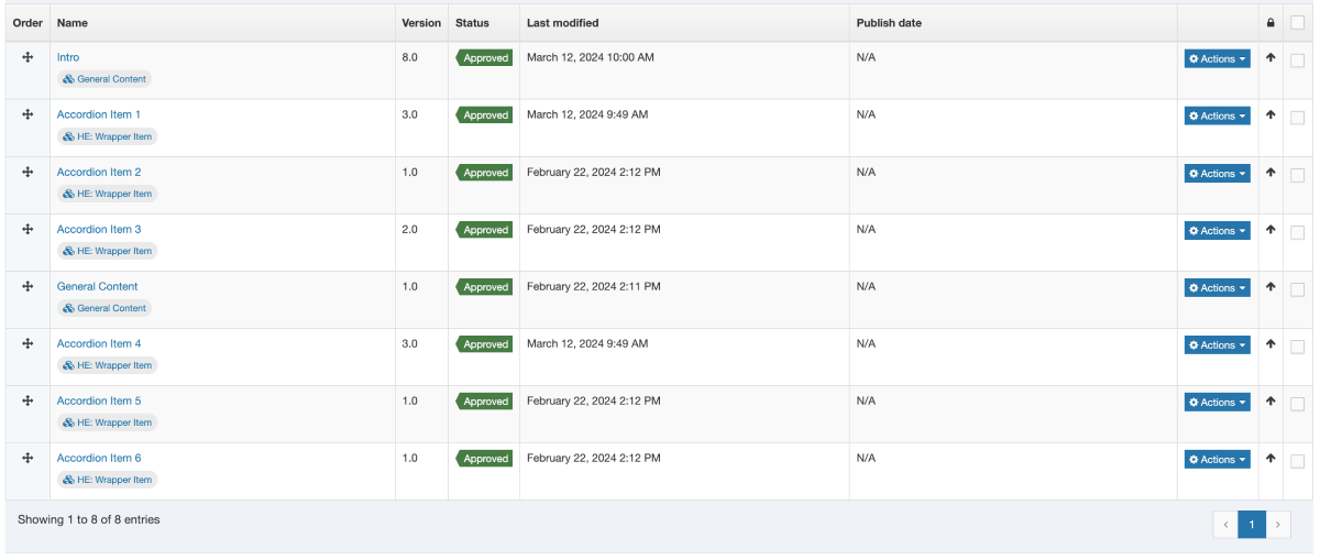
there is:
- 1 "general content"
- 3 "wrapper item"s
- 1 "general content"
- 3 more "wrapper items"
This is the resulting logic table:
| Order | Content Type | first | last | firstOfType | lastOfType | firstInSequence | lastInSequence |
|---|---|---|---|---|---|---|---|
| 1 | General Content | ✅ | ❌ | ✅ | ❌ | ✅ | ✅ |
| 2 | Wrapper Item | ❌ | ❌ | ✅ | ❌ | ✅ | ❌ |
| 3 | Wrapper Item | ❌ | ❌ | ❌ | ❌ | ❌ | ❌ |
| 4 | Wrapper Item | ❌ | ❌ | ❌ | ❌ | ❌ | ✅ |
| 5 | General Content | ❌ | ❌ | ❌ | ✅ | ✅ | ✅ |
| 6 | Wrapper Item | ❌ | ❌ | ❌ | ❌ | ✅ | ❌ |
| 7 | Wrapper Item | ❌ | ❌ | ❌ | ❌ | ❌ | ❌ |
| 8 | Wrapper Item | ❌ | ✅ | ❌ | ✅ | ❌ | ✅ |
Preview and Fulltext Helpers
The following helpers give you information about the current page context, whether it's being previewed, or it's a fulltext page.
The preview Block level helper is used to determine whether or not the page is currently being previewed or not.
It's used like:
The fulltextURL Helper was introduced in Terminalfour 8.4.1.
It will output the URL to the fulltext page for the current content item. This is useful if you just need the URL and don't need the full link to be generated.
It's used like:
The fulltext Helper has both a standard and block level variant. It behaves differently depending on which is used.
The fulltext Helper used in a standard expression outputs a link to the fulltext page of a given content type.
It's used like:
This would have the same output as this equivalent t4 tag based layout:
<a href="<t4 type="content" name="Name" output="fulltext" />">Keep reading</a>
To control which element is used to form the output filename of the fulltext page, be sure to mark the element in the UI.
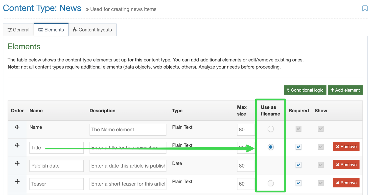
When used in a block level expression, the fulltext helper can be used to let you know if the current page is a fulltext page or not. This is most useful in a Page Layout.
For example:
A great benefit of the fulltext helper as a block level expression in Page Layouts means that you can output content elements from a page layout. This is something that isn't possible with T4 tags but makes for some pretty interesting use cases.
For example – create a custom title element using the "Title" element of a content type if on a fulltext page.a
The following example could be put into a Page Layout:
Context Helpers
You may want to modify the format of content layouts or page layouts depending on the context in which they are being output. The following Helpers aim to simplify that process.
You can also see our dedicated guide on context aware layouts for examples on how you can use these helpers on your sites.
Introduced in version 8.4.0
The sectionLevel Helper is used to output the current Section Level in the hierarchy of the site.
The channel Root is considered level 1. Direct children of that section are considered level 2, etc.
This can be used in conjunction with the Comparison Operators above to give you more control over your Page Layouts and Content Layouts.
or
Introduced in version 8.4.0
The pageLayoutId Helper is used to output the ID of the currently processing Page Layout.
This can be used in conjunction with the Comparison Operators above to give you more control over your Content Layouts.
For example you may want to output a slightly different layout of your content type when it's being used within the "Full Width" Page Layout.
Introduced in version 8.4.2
The contentInSection Helper allows you to loop over the content in the current section context.
It's used in conjunction with an each Helper
There is an optional parameter named contentTypeId that allows you to only loop over content types in the current section context.
This could be used, for example, in a Page Layout to loop over all the content in the section of type "Sidebar Content" (ID:23) and embed an alternate layout of that content into a sidebar like so:
It's important to recognise that inside the each loop, information is processed from the content's scope.
This means that if I call a helper like contentId while inside this loop, it will output the content ID of the currently processing content item.
The contentInSection Helper, is made even more powerful when used in conjunction with the linkTarget Helper.
Alternate Layout Helpers
The following helpers allow you to output content or process content layouts from other places.
The embed helper is used to embed an alternate content layout from the current Content Type. This can be really useful if you want to have variations on a template or want to display content in different ways depending on conditions.
It's also useful for keeping Content layout code clean, organised and isolated.
It's used like:
It doesn't matter if what the processor type is of the layout you're embedding. So whether it's a standard T4 tag layout, a Handlebars layout, or even a Programmable layout you can use the snippet helper to include it.
It's quite common to use the SectionMetaDescription Content type to create layouts for code or information that you want to be available in every section.
This is often used alongside a Related Content navigation object that looks in the current section for content with an alternate layout.
With the snippet Helper you can now pull in a layout from the SectionMetaDescription Content type without the need to create any navigation objects.
Used like:
It doesn't matter if what the processor type is of the layout you're including with the snippet Helper. So whether it's a standard T4 tag layout, a Handlebars layout, or even a Programmable layout you can use the snippet helper to include it.
The linkTarget Helper allows you to process Handlebars Expressions from within the context Section or Content a user has selected with a Section/Content Link element.
It's used in conjunction with a with helper in order for you to change the processing context to what's selected.
For example, you may have a Content Type with a Section/Content Link element called "Select News Item". A user can use that element to select a news item from somewhere else in the system. Using with and linkTarget you can now process Handlebars expressions from that selected content item.
For example, maybe you want to embed an alternate layout from the selected Content Item
{{#with (linkTarget element="Select News Item")}}
{{embed layout="text/homepage-promo"}}
{{/with}}The above example assumes the user has selected a Content Link.
We can tell whether the user selected a Section Link or a Content Link by checking whether the contentId is a value greater than zero. If it is, the user selected a Content Link.
{{#with (linkTarget element="Select News Item")}}
{{#gt (contentId) 0}} {{!-- Check if the content Id is greater than 0 --}}
{{!-- This is a content Link --}}
{{embed layout="text/homepage-promo"}}
{{else}}
{{!-- This is a section Link --}}
DO SOMETHING ELSE INSTEAD.
MAYBE OUTPUT AN ERROR?
{{/gt}}
{{/with}}
If instead they have selected a Section Link you may want to loop over all the Content in that section.
This can be done by making use of the contentInSection Helper.
{{sectionName}}
{{!-- The above will output "Home" because this content item exists in the Home section --}}
{{#with (linkTarget element="Select News Item")}}
{{#gt (contentId) 0}}
{{!-- This is a content Link --}}
{{embed layout="text/homepage-promo"}}
{{else}}
{{!-- This is a section Link --}}
{{sectionName}}
THE ABOVE EXPRESSION will output "News" because the user selected the "News" section
and all Handlebars Helpers inside the `with` block are being processed as if they're in that selected section.
You may use add a scope="parent" to expressions if you need them processed at the parent scope, like so:
{{sectionName scope="parent"}}
{{/gt}}
{{/with}}
Miscellaneous Content Helpers
There are a number of miscellaneous Helpers to output information about a piece of content.
Used to output the content Id of the content it's used in.
Used like:
Used to output the content version of the content it's used in.
Used like:
Used to output a span tag with an id for the specific content item. Used so you can link to specific pieces of content and it will scroll them in to view.
Used like:
Content Date Helpers
There are a number of Helpers to output dates associated with content items.
The following helpers can all be used in conjunction with the dateFormat Helper in order to format the date as you like.
The date format string can contain values as outlined in the format Dates section of the documentation.
Used to output the publish date of content if it is set (if it isn't set this returns an empty value).
Used like:
Used to output the expiry date of content if it is set (if it isn't set this returns an empty value).
Used like:
Used to output the last modified date of the current content (if there's no currently publishing version of the content this will return an empty value).
Used like:
Used to output the last modified date the content was first created.
Used like:
The now Helper allows you to output the current datetime.
It's important to recognise that it will output the datetime at the time it is processed.
That means when you preview a page, it will output the current date and time.
When you view it on the published page, it will output the date and time that the page was published.
The above will output the date and time the layout is processed. For example:
2025/04/25 09:00AM
Miscellaneous Page URL Helpers
There are a number of miscellaneous Helpers to provide you with information about the URL of the page being viewed (whether it's a fulltext page, or a standard index page).
The following URL Helpers all rely on the Channel settings including a "Channel publish URL" value. If this field is blank in your channel settings these helpers cannot output the published page URLs.
Used to output the current page URL. In preview this will output the Preview URL, and in publish it will output the published URL.
Used like:
Used to output the current page's publish URL. In preview and in publish it will output the published URL.
Used like:
Used to output the current page's preview URL. In preview and in publish it will output the preview URL.
Used like:
Used to output the current page's canonical URL. Generally this is used to output a <link> tag in the header of a Page Layout so that if a section is mirrored, the canonicalURL will always return the original URL.
Used like:
You can learn more about Canonical URLs on our dedicated guide.
Language Related Helpers
All language related helpers were introduced in version 8.4.0
Outputs the currently publishing language code.
Used like:
You may want to use this with Comparison Operators to modify your content layouts depending on what language they're currently being published with.
The languageLink Helper relies on the Channel settings including a "Channel publish URL" value. If this field is blank in your channel settings these helpers cannot output the URLs.
The languageLink Helper is used to output a link to an alternate language version of the current page.
It can be used within a Standard Expression or within a Block Level Expression.
When used in a Standard Expression, the helper will return a link to the language passed within the target argument.
When used in a Block-level expression, you'll have access to three variables to give you full control of the markup.
- targetLanguageCode - returns whatever was passed into the target attribute.
- targetLanguageURL - returns the URL to the translated page.
- targetLanguageName - returns the name of the language corresponding to the value passed in the target attribute
Miscellaneous Section and Channel Helpers
The following helpers allow you to output information about a section or a channel.
The section helper can be used to output an element from the SectionMetaDescription content type.
It's used like:
The field attribute is an element name from the SectionMetaDescription content type.
Used to output the ID of the current section.
It's used like:
Used to output the name of the current section.
It's used like:
Used to output the current Channel's ID.
It's used like:
Used to output the Name of the current Channel.
Used like:
Used to output the Description of the current Channel.
Used like:
Introduced in Terminalfour 8.4.3, this helper is used to output the Channel Publish URL of the current Channel.
Used like:
Note: This is the value set for the field named "Channel Publish URL" when editing a channel. It represents the root of the current channel.
Not to be confused with Helpers used to output the current page's URL.
Miscellaneous CMS Links helper
The following helpers allow you to output quick links to manage the current page or content.
Used to output a link to Direct Edit a section.
Used like:
Used to output a link to edit this section in the standard Terminalfour interface
Used like:
Used to create a link that will create a subsection of the current section in the standard Terminalfour interface.
Used like:
Used to create a link to edit the current content item within the standard Terminalfour interface.
Used like:
Used to create a link that will create content within the current section in the standard Terminalfour interface.
Used like:
String Manipulation Helpers
The following Helpers allow you to modify Strings before they are output to the page.
Introduced in Terminalfour 8.4.3, the jsonString Helper is used to escape a string so that is safe to be used in JSON.
It's used like:
When used with the publish Helper it might be used like so:
The above expression will escape all characters that are not JSON safe. This Helper should be used whenever the content being output will be used to create a JSON file.
The abbreviate Helper is used to truncate a string to the provided number of characters. If a string is smaller than the provided number it is not changed. Otherwise an ellipses (...) is appended to the abbreviated string.
It's used like:
When used with the publish Helper it might be used like so:
The above expression will output the first 20 characters of the Title element.
For example, if the abbreviate Helper was called like so:
{{abbreviate "This is a string that will be abbreviated" 10}}
then the expected output would be:
This is a ...
The capitalize Helper is used to capitalize all the white space separated words in the provided string.
It's used like:
When used with the publish Helper it might be used like so:
The above expression will capitalize the first letter in each word provided in the Title element.
For example, if the capitalize Helper was called like so:
{{capitalize "This is a string that will be capitalized"}}
then the expected output would be:
This Is A String That Will Be Capitalized
The capitalizeFirst Helper is used to capitalize the first word in the provided string.
It's used like:
When used with the publish Helper it might be used like so:
The above expression will capitalize the first letter of the first word provided in the Title element.
For example, if the capitalizeFirst Helper was called like so:
{{capitalizeFirst "this is a string"}}
then the expected output would be:
This is a string
The replace Helper is used to replace all substrings of a given string with a different string. For example, you can replace all occurrences of the word "T4U" with the phrase "Terminalfour University".
It's used like:
When used with the publish Helper it might be used like so:
The above expression will find all occurrences of the string "T4U" provided in the Title element and replace them with the string "Terminalfour University".
For example, if the replace Helper was called like so:
{{replace "This is a string" "string" "sentence"}}
then the expected output would be:
This is a sentence
The slugify Helper is used to make a given string suitable for use in a URL (or other situation where you want to avoid spaces and special characters). It converts the given string to all lowercase, removes non-word characters (alphanumerics and underscores) and converts spaces to hyphens. It will also strip leading and trailing whitespace.
It's used like:
When used with the publish Helper it might be used like so:
The above expression will "slugify" the string provided in the Title element.
For example, if the slugify Helper was called like so:
{{slugify " This is a string "}}
then the expected output would be:
this-is-a-string
The cut Helper is used to remove all occurrences of a given value or string from the provided string.
It's used like:
When used with the publish Helper it might be used like so:
The above expression will remove all space characters (" ") provided in the Title element.
For example, if the cut Helper was called like so:
{{cut "This is a string" " "}}
then the expected output would be:
Thisisastring
The stripTags Helper is used to remove all [X]HTML tags from a given string.
It's used like:
When used with the publish Helper it might be used like so:
The above expression will remove all [X]HTML tags provided in the Title element if any are present.
For example, if the stripTags Helper was called like so:
{{stripTags "This is a <em>string</em>"}}
then the expected output would be:
This is a string
The nl2br (New Line to <br> tag) Helper is used to convert all line breaks with <br> characters to ensure the output on the publish page contains the line breaks.
It's generally used with the publish Helper with Plain Text elements like:
For example, if the nl2br Helper was called like so:
{{nl2br "this is a \nstring"}}
then the expected output would be:
This is a <br>string
The upper Helper is used to convert a string into all uppercase.
It's used like:
When used with the publish Helper it might be used like so:
The above expression will replace all lowercase characters found in the Title element with their uppercase equivalent.
For example, if the upper Helper was called like so:
{{upper "This is a string"}}
then the expected output would be:
THIS IS A STRING
The lower Helper is used to convert a string into all lowercase.
It's used like:
When used with the publish Helper it might be used like so:
The above expression will replace all uppercase characters found in the Title element with their lowercase equivalent.
For example, if the lower Helper was called like so:
{{lower "THIS is a STRING"}}
then the expected output would be:
this is a string
Development Related Helpers
These helpers are aimed specifically at developers to improve the development experience while working with Handlebars.
The following Helpers were introduced in Terminalfour 8.4.3
The try Helper is used to ensure that any errors encountered in your layout do not cause Preview and Publish to fail entirely.
Terminalfour recommends making use of the try Helper when working on new layouts where errors are more likely.
The try Helper is used in a Block level expression. Any code inside the try block will process as normal. However, if an error is encountered, Terminalfour will continue to process any layouts or pages found after the try block.
It's used like:
There are two variables available within the else block of a try expression (@error and @output).
These can be used to help debug what the problem is with the layout if it fails.
The @error variable will output more detail about the error encountered.
The @ouput variable will output everything that was processed in the try block before the error was encountered.
Example:
The captureLogs Helper is used to help assist with debugging errors encountered when using Handlebars.
It is used in a Block level expression. Any code inside the captureLogs block will process as normal. However, if an error/warning/debug log is triggered, those logs will be output to the user. This Helper should only be used during development and should be removed when putting the layout live.
It's used like:
There are several optional parameters that can be passed to the captureLogs Helper.
1. mode
The mode parameter defines whether the logs will be output to a HTML table (mode="table") or whether they'll be output within HTML comments (mode="comment").
If no mode parameter is passed, the default behaviour is for logs to be output in a HTML comment.
Example:
The mode is only used for page preview. captureLogs won't output anything on the published site by default.
2. level
There are four levels of severity for logs:
errorwarninfodebug
By default, the captureLogs Helper will output logs that are warn and above.
If you need to see info or debug logs, you can pass this in as a parameter.
Example:
3. publish
If, for some reason, you need to see the log information on the published page you will need to set the attribute publish="true".
Example:
If this attribute is not set, no logs will be output to the page during publish. They will still continue to be saved into the standard log files on disk.
Note: Even when publish="true" is set; the logs will only every be output as HTML comments on a published page. The value of the mode attribute (defined above) is ignored on published pages.
Introduction to Handlebars Concepts
If you don't have experience with Handlebars in other products or frameworks, this article aims to walk you through some basic concepts to get you up to speed.
What is Handlebars exactly?
Handlebars in Terminalfour is implemented using handlebars.java which is a Java port of the popular templating engine handlebars.js. This open source templating engine is a standard used by many other frameworks and platforms so many developers are already familiar with how it works.
Glossary of Terminology
Helper
A helper is a function you can use in your template (e.g. Page Layout or Content Layout) to do some work, perform an action, or output a value. For example, different helpers could do things like format dates, change text to uppercase, or even output the contents of Content Elements.
Terminalfour has shipped a large number of Helpers out of the box that you can use when making your Content and Page Layouts. You can learn more in our getting started guide.
Expression
An expression is anything inside the double curly braces {{...}}. It can be a variable, a helper, or a combination of both. Expressions are what Handlebars evaluates and replaces in the final HTML.
Block-level expression
A block-level expression is a type of expression that uses an opening and a closing tag (like HTML) to define a larger chunk of content. Block expressions are typically used to control how content inside the block is rendered, often based on conditions, loops, or custom logic.
Block-level expressions are opened with a # character and closed with a / character (see below for examples)
Common use cases
Conditionals
Only display a value when a condition is true:
Loops
Loop over an array and output data for each iteration:
Providing an area for accessing locally scoped variables
Some Handlebars expressions are variables that are only available inside a Block-level expression.
In the following example we'll use the link Helper as a block level expression and once we're inside that block we have access to the linkUrl and linkText variables.
Subexpression
A subexpression is an expression inside another expression. It’s used when you want to call a helper or a calculation inside another expression. Subexpressions are wrapped in parentheses.
For example if we wanted to use the publish Helper to output the Title element of a Content item it might look like this:
But if we wanted to make use of the built in upper Helper to output that value in uppercase we'd need to pass in the publish Helper into the upper Helper as a subexpression like this:
"Double stashing" and "Triple stashing"
With some limited exceptions, Handlebars HTML-escapes values returned by an expression using two curly-braces (e.g. {{expression}}).
This means certain special characters will be converted to their HTML equivalents. For example, if a user entered a value of < then a "double-stashed" handlebars expression would convert that to <.
If you don't want Handlebars to escape a value, use the "triple-stash", {{{.
Double-stash example
If a user enters the value <h2>Test</h2> into a Title element then this expression would output
<h2>Test</h2> (the value is HTML-escaped)
Triple-stash example
If a user enters the value <h2>Test</h2> into a Title element then this expression would output
<h2>Test</h2> (the value is not HTML-escaped)
Handling whitespace in Handlebars layouts
By default, whitespace that exists inside your layouts (for example inside block-level expressions) is retained once the Handlebars code is processed.
In almost all cases this won't be a problem because the additional whitespace is ignored by web browsers. If you do need full control of the whitespace of your published content you can tell handlebars to ignore the additional whitespace.
For example, if we had a layout that contained:
When this publishes if we were to look at the source code of the page the link URL, the <br> tag, and the link text will all be on separate lines with two space characters before them.
We can use the ~ character in our Handlebars expression to tell Handlebars to ignore the whitespace and output everything on a single line.
That may look like this:
When the ~ is applied, all whitespace on that side of the expression will be removed up to the first handlebars expression or non-whitespace character on that side.
Adding Comments in Handlebars Layouts
Handlebars allows you to add comments in your layouts that will be ignored when a page is being Previewed or Published.
This might be useful if you want to add some comments about how a layout works but don't want those comments to end up on the published site.
Handlebars comments begin with a {{!-- and end with --}}
For example:
Comments can span multiple lines:
Programmable Layouts:
Best Practice Tips
Description
Programmable Layouts are an incredibly powerful feature; they give you access to a range of capabilities beyond what you can do in the TERMINALFOUR UI alone. So if you need to only publish content that meets a set of criteria you can use Programmable Layouts to do it. With JavaScript. However, great power brings great responsibility so to prevent problems like publish errors you should be aware of some best practice guidelines. Similarly, if you haven't used Programmable Layouts in a while then you should be aware of more up to date techniques because Programmable Layouts, like any product feature, can be updated with a new product release.
Programmable Layout imports
Avoid using importPackage () and instead only import the class that is required in the Programmable Layout. Conflicts or other issues can arise when there are two classes of the same name from different packages.
When reviewing Programmable Layouts check the following:
- Are the imports actually being used in the code? If not, they should be removed
- Are imports using old/unused code? If so, replace those imports with the new code
- Are Managers being imported? The cache should be used in place of Managers. If Managers are required, the
ApplicationContextProvider.getBean()should be used instead
If a class has to be imported, avoid using the fully qualified name when invoking a method from that class. Example:
new java.io.StringWriter ();
    //Should be
    newStringWriter ();
Conditionals for running Programmable Layouts
Most Programmable Layout code may not need to run at all in a specific Section, especially if you are using the "SectionMetaDescription" technique. Checks like conditional statements should be placed at the beginning of your code to run the Programmable Layout code only when it required. This increased performance and ensures that code is only run when it is required.
Below is a simple example of what we mean by conditionals for running the Programmable Layout. The code will only run when the content has an ID above 100. So this document.write is never run for those Content Items with IDs less than 100.
 try {
    if (content.getID > 100) {
        document.write ("Hello world");
    }
}
catch(error) {
    document.write (error);
}
ApplicationContextProvider usage
Be advised that the class ApplicationContextProvider will be removed in a future release. Since there is currently no alternative, it will remain for now.
It's intended that future versions may have ApplicationContextProvider loaded in, so it may be possible to use context.getBean ().This is awaiting implementation.
The ApplicationContextProvider.getBean () method can be used to import other classes into your Programmable Layout as in this snippet:
var userMgr = ApplicationContextProvider.getBean (IUserManager);Note that the IUserManager does not have .class after its name. and an error will be thrown if it is added. The code below will fail:
var userMgr = ApplicationContextProvider.getBean (IUserManager.class)Use of Managers
If the Managers you intend to use have an interface, then they are likely to be new and should be used in preference over those that don't. An example of this can be seen below:
ServerSideLinkManagerdoes not implement an interface. This is the old manager and should not be usedServerSideLinkManagerImpldoes implement an interface calledIServerSideLinkManager. Notice the "I" in front of the interface and then the "Impl" at the end of the class name of the manager. This is the new manager and should be used
Managers vs cache
Managers go to the database and, as a rule, should be avoided. Go to the cache instead. For example, the cahe should be used instead of TemplateManager, to prevent potential performance issues.
Other examples of known old managers:
| Old v7 Manager | New v8 Manager Interface | New Manager Implementation |
|---|---|---|
|
ContentManager |
IContentManager |
ContentManagerImpl |
|
HierarchyManager |
IHierarchyManager |
HierarchyManagerImpl |
|
MediaManager |
IMediaManager |
MediaManagerImpl |
| ServerSideLinkManager | IServerSideLinkManager |
ServerSideLinkManagerImpl |
| TemplateManager | IContentTypeManager |
ContentTypeManagerImpl |
| UserManager | IUserManager |
UserManagerImpl |
Available variables
Below is a list of variables that are autowired and are available in a Programmable Layout by default. Do not overwrite the variables above. Doing so will cause publishing errors and may yield other unanticipated results.
| Name of variable | Object type | Description | Example |
|---|---|---|---|
document |
T4StreamWriter | Used to write out strings to the page | document.write ('Hello'); |
dbStatement |
Statement | Database statement used to accessed DB | |
isPreview |
Boolean | Is the current mode preview? | true or false |
content |
Content | The current Content Item being processed | content.getID(); |
section |
CachedSection | The current Section being processed | Section.getParentID(); |
language |
String | The language of the currently publishing/previewing content | English content: 'en' |
publishCache |
PublishCache | The publish cache, which is generated at the beginning of the publish | publishCache.getTemplateFormatting(dbStatement, 1, 'text/html'); |
contentList |
CachedContent array | Returns a cached content array of the current context | |
template |
Template object | The current content's Content Type | template.getID (); |
templateFormat |
TemplateFormat object | The current content's Content Layout | templateFormat.getFormatting (); |
oCache |
Cache | The system cache | oCache.get(234); //Get CachedSection ID: 234 |
Managing database connections
Managing DB Connections - dbStatement vs ConnectionManager.getManager().getConnection()
Newer Managers do not require the passing of connections or statements
It is very important that proper care, such as closing database connections, is given to cleaning up code after execution.
Cached content APPROVED versus CURRENT
CachedContent.CURRENT should be used on Preview but never on publish. Instead CachedContent.APPROVED should be used on Publish.
Catching and dealing with errors
It is important to catch and handle errors in your Programmable Layout code. Since the API may not always do this for you, you should add try...catch blocks around programmable code is to catch exceptions and errors with the code.
Some tips
It is advised to always surround all Programmable Layout code with try...catch statements.
Try...catch blocks should output the information of the content/Section/Content Type/Page Layouts IDs so it is easily identifiable if an error occurs. See below for examples.
try{
    document.write("Hello");
}
catch(err){
    document.write(err + "err in content ID: " + content.getID() + ". Section ID: " + Section.getID());
}
This will output errors to the Tomcat logs:
try{
    document.write("Hello");
}
catch(err){
    Print(err + "err + "err in content ID: " + content.getID() + ". Section ID: " + Section.getID());
}
Importing Java classes
Programmable layouts allow you to import our API and other Java classes which provides access to Java functionality within your JavaScript code. It allows you to make use of our Terminalfour API and Java other utility methods. This can be helpful in preventing you having to "re-invent the wheel" when creating some logic in your code. Please note the following:
- Class paths that start with
com.terminalfour.in their package path is our Terminalfour API. These classes are available to you in programmable layouts. - Class paths that start with
java.refer to core Java classes, some of which are available for use in programmable layouts. - All other classes with different class path prefixes are considered third-party classes, and their availability is not guaranteed in future versions of Terminalfour. We advise you test all programmable layouts in a test or development environment prior to upgrading Terminalfour.
Other general information on Programmable Layouts
- You should NOT overwrite the auto-wired or reserved variables, such as: content, oCache, section etc.
- Do not import Packages as this is not best practice
- Programmable layouts should not be used to create content or media. The publishing process should only retrieve information, not create it.
Programmable Layouts: Channel & Microsite Information
Introduction
With Programmable Layouts, you can retrieve information about the current Channel or Microsite that your content is in. This can be useful when you want to set dependencies within the content or retrieve the settings used in the Channel configuration.
Information
This is a list of the common methods used for Channels and Microsites.
Programmable Layouts: Publish, Preview and Direct Edit
Introduction
TERMINALFOUR uses different modes to show Sections or content:
- Publish: Used when a Section or content will be published live. Only approved content should be visible in this mode
- Preview: This mode lets content editors see a preview of the Section or specific content before publishing. Pending content is also visible.
- Direct Edit: Like Preview, in Direct Edit you can see how a page and its content will look before it is published. The added benefit is that you can also edit the content in place so you can see how your changes will look as you make them. Using Programmable Layouts, it is possible to hide/disable content in Direct Edit that is visible in Preview.
And sometimes, it is important to ensure that Programmable Layouts are working correctly and showing the relevant information only in the correct mode.
Programmable Layouts: Section Information
Introduction
You can use Programmable Layouts to get Section information for the current Section, specific Sections, the parent Section, or grandparent Section.
Methods
The following is a list of common methods you can use to retrieve information about Sections.
Programmable Layouts: Content Layout Information
- Last Modified:
- 14 Dec 2018
- User Level:
Introduction
Programmable Layouts can retrieve information about the Content Layout in use or other Content Layouts.
Since Programmable Layouts are used as a type of Content Layout, it is often necessary to retrieve information about them. Here are some useful methods:
Programmable Layouts:
Creating a Google Sitemap
Description
Though you can create sitemaps through the Terminalfour UI, sometimes you might want more control. Using a Programmable Layout will provide you with more flexibility when you need it.
If you need a quick primer on sitemaps, look no further than this article from Google.
Instructions
1. Create a Content Type
Create a Content Type called Sitemap in Assets > Content Types:
| Name | Description | Type | Required | Max Size | Note |
|---|---|---|---|---|---|
| Channel IDs | ID's of the channel and/or its microsites | Plain Text | Yes | 80 | Id's of the channel and/or its microsites |
| Base HREF | The domain of your site, including the http protocol e.g. https://www.mysite.com | Plain Text | Yes | 80 | Domain of your site |
| Exclusions | These are file extensions outside the default index pages of your website. Only add if you want to include media types like images or video to your sitemap e.g. jpg, png, mp4 etc. | Plain Text | No | 1000 | The max size is dependent on the number of exclusions you require. |
| Include file extensions | These are the sections you want to exclude from the sitemap in a comma separated list, e.g. Section A,Section B,Section C. If a section has an output uri, use the output uri rather than the name. | Plain Text | No | 80 | Only add if you want to include media types like images or video to your sitemap e.g. jpg, png, mp4 etc. |
Save Changes.
2. Create a Content Layout
text/html
Create a Content Layout called text/html (or the default layout that you use on your channel) and set the Content Layout Processor to JavaScript Content.
Copy & paste the code below into the layout:
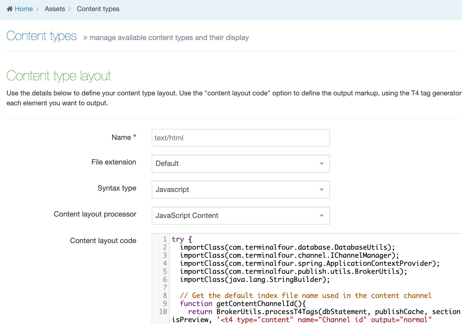
try {
  importClass(com.terminalfour.database.DatabaseUtils);
  importClass(com.terminalfour.channel.IChannelManager);
  importClass(com.terminalfour.spring.ApplicationContextProvider);
  importClass(com.terminalfour.publish.utils.BrokerUtils);
  importClass(java.lang.StringBuilder);

  //Get the channels and/or microsite id's needed for the sitemap
  function getContentChannelIds(){
    var ids = BrokerUtils.processT4Tags(dbStatement, publishCache, section, content, language, isPreview, '<t4 type="content" name="Channel IDs" output="normal" modifiers="striptags,htmlentities" />').split(",");

    for (var i = 0; i < ids.length; i++){
       ids[i] = ids[i].trim();
    }
    return ids;
  }

  //Get the users extra file extensions permitted in the site map
  function getFileExtensions(){
    var fileExtensions = BrokerUtils.processT4Tags(dbStatement, publishCache, section, content, language, isPreview, '<t4 type="content" name="Include file extensions" output="normal" modifiers="striptags,htmlentities" />').split(",");

    for (var i = 0; i < fileExtensions.length; i++){
        fileExtensions[i] = fileExtensions[i].trim();
    }
    return fileExtensions;
  }

  // Build a query to retrieve the path and last modified fields from the database for the content Channel
  function buildPubFileInfoQuery(fileExtensions, channelIds, defaultFileName){
    var query = new StringBuilder("SELECT path, last_modified FROM published_file_info WHERE channel_id");
    var num;
    if (channelIds.length > 1){
      query.append(" IN (");
      for (var id = 0; id < channelIds.length; id++){
        num = id + 1;
        if (id + 1 == channelIds.length){
          query.append(channelIds[id])
          .append(")");
        }else{
          query.append(channelIds[id])
          .append(", ");
        }
      }
    }else{
       query.append(" = ")
       .append(channelIds[0]);
    }
    if (fileExtensions.length == 1 && fileExtensions[0] == ''){
      query.append(" AND path LIKE '%")
      .append(defaultFileName)
      .append("' AND approved_pending = 0");
    }else{
      query.append(" AND (path LIKE '%")
      .append(defaultFileName)
      .append("'");
      for (ext in fileExtensions){
        query.append(" OR path LIKE '%")
        .append(fileExtensions[ext])
        .append("'");
      }
      query.append(") AND approved_pending = 0");
    }
    return query;
  }

  // Retrieves the paths and dates to be used in the sitemap
  function getPubFileInfo(query){
    var dbConnection,
        pubFileInfo = [],
        paths = [],
        path = 0,
        lastModDates = [],
        lastModDate = 0,
        pathStr,
        lastModStr,
        pubFileInfoStmt,
        pubFileInfoRS;
    try {
      dbConnection  = DatabaseUtils.getConnection();
      pubFileInfoStmt = dbConnection.createStatement();
      pubFileInfoRS = pubFileInfoStmt.executeQuery(query);
      while (pubFileInfoRS.next()){
        paths[path] = pubFileInfoRS.getString("path");
        lastModDates[lastModDate] = pubFileInfoRS.getString("last_modified");
        path++;
        lastModDate++;
      }
      pubFileInfo[0] = paths;
      pubFileInfo[1] = lastModDates;
    }catch (err){
      document.write ("An error occurred getting the publish file information for the T4 sitemap");
    }finally{
      DatabaseUtils.closeQuietly(pubFileInfoRS);
      DatabaseUtils.closeQuietly(pubFileInfoStmt);
      DatabaseUtils.closeQuietly(dbConnection);
    }
    return pubFileInfo;
  }

  // Format path for use in the Sitemap
  function formatPath(paths, defaultFileName, channel){
    var pubDir,
        microSite = publishCache.getMicroSiteFromChild(section),
        path = 0;
    if(microSite) {
        pubDir = microSite.getFileOutputPath().toLowerCase().trim();
    } else {
        pubDir = channel.getFileOutputPath().toLowerCase().trim();
    }
    defaultFileName = "/" + defaultFileName;
    pubDir = pubDir.replace("\\", "/");
    if (pubDir.substring(pubDir.length() - 1) == '/'){
      pubDir = pubDir.substring(0, pubDir.length() - 1);
    }
    while (path < paths.length){
      paths[path] = paths[path].replace("\\", "/").toLowerCase();
      paths[path] = paths[path].replace(pubDir, "");
      if (paths[path].indexOf(defaultFileName) >= 0){
        paths[path] = paths[path].replace(defaultFileName, '/');
      }
      path++;
    }
    return paths;
  }

  // Format last modified fields for use in the Sitemap
  function  formatLastModified(lastModDates){
    var lastModDate = 0;

    while (lastModDate < lastModDates.length){
      lastModDates[lastModDate] = lastModDates[lastModDate].replaceAll(" ([01]?[0-9]|2[0-3]):[0-5][0-9]:[0-5][0-9](\.[0-9])?", "");
      lastModDate++;
    }
    return lastModDates;
  }

  // Exclusions are what pages we don't want in the sitemap
  function getExclusions(){
    var exclusionArray = [],
        exclusions = BrokerUtils.processT4Tags(dbStatement, publishCache, section, content, language, isPreview, '<t4 type="content" name="Exclusions" output="normal" modifiers="striptags,htmlentities" />');
    if (exclusions.length() > 0){
      exclusionArray = exclusions.split(",");
      for (var i = 0; i < exclusionArray.length; i++){
        exclusionArray[i] = exclusionArray[i].trim();
      }
    }else{
      exclusionArray = null;
    }
    return exclusionArray;
  }

  // Check for a valid baseHref and set it if it is not
  function getBaseHref(){
    var baseHref = BrokerUtils.processT4Tags(dbStatement, publishCache, section, content, language, isPreview, '<t4 type="content" name="Base HREF" output="normal" modifiers="striptags,htmlentities" />').trim();
    if (baseHref.substring(baseHref.length()-1) == '/'){
      baseHref = baseHref.substring(0, baseHref.length()-1);
    }
    return baseHref;
  }

  /* Check if spaces are to be replaced in section names. If so, exclusions need to have their spaces replaced.
  This should cover spaces in output uri's being replaced also because if section name spaces are removed, the
  output uri ones tend to be also. Both options having different enabled status have not been accounted for. */
  function formatExclusions(channel, exclusionArray){
    var query,
        fileNameSep,
        configRS,
        dbConnection,
        configStmt;

    if (channel.isConvertSpacesInSectionNameEnabled() == true){
      try{
        dbConnection = DatabaseUtils.getConnection();
        configStmt = dbConnection.createStatement();
        query = "SELECT config_value FROM config_option WHERE config_key = 'previewPublish.replaceSpacesInFilenamesWith'";
        configRS = configStmt.executeQuery(query);
        if (configRS.next()){
          fileNameSep = configRS.getString('config_value');
        }
        if (fileNameSep === null || fileNameSep === '' || fileNameSep === undefined){
          fileNameSep = ',';
        }
      }catch (err){
        document.write ("An error occurred getting the file part separator for the T4 sitemap");
      }finally{
        DatabaseUtils.closeQuietly(configRS);
        DatabaseUtils.closeQuietly(configStmt);
        DatabaseUtils.closeQuietly(dbConnection);
      }
    }else{
      fileNameSep = '';
    }
    if (exclusionArray !== null){
      for(var i = 0; i < exclusionArray.length; i++){
        exclusionArray[i] = exclusionArray[i].replaceAll("[\'\,\(\)]", "");
        exclusionArray[i] = exclusionArray[i].replace(" ", fileNameSep);
        var exclusion = new StringBuilder(exclusionArray[i]);
        if (exclusionArray[i].substring(0, 1) != '/'){

          exclusion.insert(0, '/');
        }
        if (exclusionArray[i].substring(exclusionArray[i].length() - 1) != '/'){

          exclusion.append('/');
        }
        exclusionArray[i] = exclusion;
      }
    }
    return exclusionArray;
  }

  // Skip over any excluded URL's and generate the Sitemap XML for the remaining ones
  function generateSitemap(paths, exclusionArray, lastModDates){
    var len = paths.length,
        skip,
        baseHref = getBaseHref();
    document.writeln('<?xml version="1.0" encoding="UTF-8"?>');
    document.writeln('<urlset xmlns="http://www.sitemaps.org/schemas/sitemap/0.9">');
    for (var path = 0, date = 0;path < len; path++, date++){
      skip = false;
      // Check if there are exclusions to skip in sitemap
      if (exclusionArray !== null){
        if (exclusionArray.length > 0 || exclusionArray.length != undefined){
          for(var i = 0; i < exclusionArray.length; i ++ ){
            if (paths[path].indexOf(exclusionArray[i].toLowerCase()) >= 0){
              skip = true;
            }
          }
        }
      }
      if (skip === false){
        document.writeln('<url>');
        document.writeln('<loc>' + baseHref + paths[path] + '</loc>');
        document.writeln('<changefreq>daily</changefreq>');
        document.writeln('<priority>1</priority>');
        document.writeln('<lastmod>' + lastModDates[date] + '</lastmod>');
        document.writeln('</url>');
      }
    }
    document.writeln('</urlset>');
  }

  /*--------------------------------------------------------------------------
  Main program
  --------------------------------------------------------------------------*/
  var channelId,
    contentChannel,
    query,
    pubFileInfo,
    paths = [],
    lastModDates = [],
    exclusionArray = [],
    channel = publishCache.getChannel(),
    defaultFileName;
    channelId = getContentChannelIds();
    defaultFileName = channel.getIndexFileName();
    query = buildPubFileInfoQuery(getFileExtensions(), channelId, defaultFileName);
    pubFileInfo = getPubFileInfo(query);
    paths = formatPath(pubFileInfo[0], defaultFileName, channel);
    lastModDates = formatLastModified(pubFileInfo[1]);
    exclusionArray = getExclusions();
    exclusionArray = formatExclusions(channel, exclusionArray);
    generateSitemap(paths, exclusionArray, lastModDates);
}catch(err){
  document.write(err);
}
3. Create a Page Layout
Go to Assets > Page Layouts and create a Page Layout named "Blank" and Save (leave the Header and Footer sections empty).
4. Site Structure
Create a Section directly under the channel / site root named "Google Sitemap" with the following settings:
| Name | Google Sitemap |
|---|---|
| Show in navigation | Disabled |
| Archive section | Enabled This is important to ensure that it does not impact on publish performance. |
| Output URI | Blank |
| Output file name | sitemap-en.xml Note: If the Output file name option does not appear, this can be configured in Hierarchy configuration. |
| Content Types | Enable the Sitemap Content Type from Step 1 for this section. |
| Page Layout | Set the Page Layout to be the Blank layout created in step 3. |
5. Create Content
Create content in the new Sitemap section with the following values:
| Name | Google Sitemap |
|---|---|
| Channel IDs | Add in the ID's of the channels or microsites that you want to use. You can get this from System Administration > Set up Sites & Channels > Channels. |
| Base HREF | The http protocol version of your site, e.g. https://www.mysite.com |
| Include file extensions | By default, only your index files are used in the sitemap. To include fulltext pages and any media, put their file extensions here as a comma separated list, e.g. jpg, png, php |
| Exclusions | These are the sections you want to exclude from the sitemap. It's a comma separated list, e.g. Section A,Section B,Section C. If a section has an output uri, you must put that in the content rather than the section name. If the output URI is a path (e.g. contains a / character), then that value should be used. e.g. /section-a/section-1/,/section-b/ |
Save Changes.
6. Putting it all together
- Publish the sitemap by using any type of Publish, e.g. Channel, Section, etc.
- Check that the sitemap has published out correctly using either of the following methods:
- Check the output directory of the Channel on the server to make sure your sitemap has appeared in the root of it; look for a file named "sitemap-en.xml".
- If you have a staging site for your published Channel on the Terminalfour application server, or you Publish to Live on your webservers, then access the sitemap by substituting the name of the site with the name of your staging site, e.g. {staging-site-url}sitemap-en.xml
- Once you're happy with the sitemap, you can create a schedule to publish out your channel, selecting the option to Publish archive sections. Any new Sections you create will then be included in the subsequent sitemap publishes. We recommend setting this to a time that is out of hours when no users are on the system and when other scheduled published aren't running. You may consider also creating a microsite for the Google Sitemap section, and schedule the publish of the microsite, if that suits your publishing model better.
Programmable Layouts:
Pull Content from Selected Section
Description
Sometimes you may want to be able to select content to pull into the page, and display that content using a specific layout. For example, selecting a Staff Profile, and displaying the person's first name, last name and photograph, linking through to further information. It is a bit like a Related Content navigation object, but
- allowing the section that is used to be chosen by the user who is creating the content, as opposed to it being set in the navigation object
- allowing the user who is creating the content to choose specific Content Items
This Programmable Layout can be used in a Content Layout to achieve this. It uses a section/content link to choose the content or section that contains the content and it alllows you to:
- use a section link to display all content in the linked section
- use a content link to display to link a specific content
- customise if you want to use only section link or content link or both
- add as many "containers" (section/content link elements) as you wish
- add a before and after HTML that wraps the containers, which can be standard layouts and optional
- add a different before and after HTML that wrap each different container, which can be standard layouts and optional.
- select content from the current section or a different section
- use either be a standard layout or another programmable layout to define the layout of the content being displayed
- easily specify which Content Layout needs to be used
- not display any errors if in the selected section does not contain any content with the specified Content Layout
- have optional containers
Instructions
1. Create a Content Type with the Containers
Create a Content Type called that contains the "containers" in Assets > Content Types. This implementation has a specific Content Type called "Column container" that is the container and has separate section / content link elements to find the content that needs to be displayed in each column. Any content can be selected and displayed, provided it has the specified content layout (in this case text/display).
| Name | Type | Required | Max Size |
|---|---|---|---|
| Column 1 | Section/Content Link | Yes | n/a |
| Column 2 | Section/Content Link | No | n/a |
| Column 3 | Section/Content Link | No | n/a |
Save Changes.
2. Create the Content Layouts
text/before
This content layout will display what needs to appear before everything. It needs text/html (the programmable layout) in order to be displayed.
Name: text/before
Syntax Type: any
Content layout processor: T4 Standard Content
Content layout code: any
text/after
This content layout will display what needs to appear after everything. It needs text/html (the programmable layout) to be displayed.
Name: text/after
Syntax Type: any
Content layout processor: T4 Standard Content
Content layout code: any
text/colum-1-before
This content layout will display what needs to appear before the first column/container. It needs text/html (the programmable layout) to be displayed.
Name: text/column-1-before
Syntax Type: any
Content layout processor: T4 Standard Content
Content layout code: any
text/colum-1-after
This content layout will display what needs to appear after the first column/container. It needs text/html (the programmable layout) to be displayed.
Name: text/column-1-after
Syntax Type: any
Content layout processor: T4 Standard Content
Content layout code: any
text/colum-2-before
This content layout will display what needs to appear before the second column/container. It needs text/html (the programmable layout) to be displayed.
Name: text/column-2-before
Syntax Type: any
Content layout processor: T4 Standard Content
Content layout code: any
text/colum-2-after
This content layout will display what needs to appear after the second column/container. It needs text/html (the programmable layout) to be displayed.
Name: text/column-2-after
Syntax Type: any
Content layout processor: T4 Standard Content
Content layout code: any
text/colum-3-before
This content layout will display what needs to appear before the third column/container. It needs text/html (the programmable layout) to be displayed.
Name: text/column-3-before
Syntax Type: any
Content layout processor: T4 Standard Content
Content layout code: any
text/colum-3-after
This content layout will display what needs to appear after the third column/container. It needs text/html (the programmable layout) to be displayed.
Name: text/column-3-after
Syntax Type: any
Content layout processor: T4 Standard Content
Content layout code: any
text/html
This content layout will handle all the Programmable Layout code that creates the columns/containers that call all the different content and Content Layouts required.
Create a Content Layout called text/html (or the default layout that you use on your channel) and set the Content Layout Processor to JavaScript Content.
Copy & paste the code below into the layout:
try {
var FullListOutputImports = JavaImporter(
com.terminalfour.publish.utils.TreeTraversalUtils,
com.terminalfour.spring.ApplicationContextProvider,
com.terminalfour.content.IContentManager,
com.terminalfour.version.Version,
com.terminalfour.publish.utils.BrokerUtils,
java.io.StringWriter,
com.terminalfour.utils.T4StreamWriter,
com.terminalfour.publish.ContentPublisher,
com.terminalfour.navigation.ServerSideLinkManager,
com.terminalfour.sitemanager.cache.CachedContent,
com.terminalfour.sitemanager.cache.utils.CSHelper
);
with(FullListOutputImports) {
var columnElements = ['Column 1', 'Column 2', 'Column 3'];
var columnLayout = 'text/display';
var type = 'both';
var htmlBeforeLayout = 'text/before';
var htmlAfterLayout = 'text/after';
var htmlBeforeColumnLayout = ['text/column-1-before', 'text/column-2-before', 'text/column-3-before'];
var htmlAfterColumnLayout = ['text/column-1-after', 'text/column-2-after', 'text/column-3-after'];
function getCachedSectionFromId(sectionID) {
if (typeof sectionID === 'undefined') {
return section
} else if (section.getID() == sectionID) {
return section
}
sectionID = Number(sectionID)
if (sectionID == 0) {
throw 'Passed Incorrect Section ID to getCachedSectionFromId'
}
return TreeTraversalUtils.findSection(
publishCache.getChannel(),
section,
sectionID,
language
)
}
function getContentManager() {
return ApplicationContextProvider.getBean(
IContentManager
)
}
function getCachedContentFromId(contentID, contentVersion) {
if (typeof contentID === 'undefined' && typeof contentVersion === 'undefined') {
return content
} else if (Number(contentID) <= 0 && typeof contentVersion !== 'undefined' && content !== null) {
contentID = content.getID();
} else {
contentID = Number(contentID);
}
if (content === null && contentID === 0) {
throw 'Passed Incorrect Content ID to getContentFromId'
}
var contentManager = getContentManager();
if (typeof contentVersion !== 'undefined') {
return contentManager.get(contentID, language, Version(contentVersion))
} else {
var version;
if (isPreview) {
version = contentManager.get(contentID, language).version;
} else {
version = contentManager.getLastApprovedVersion(contentID, language);
}
return contentManager.get(contentID, language, version);
}
}
function getContentTypeFromId(contentID) {
if (typeof contentID === 'undefined' || (Number(contentID) <= 0 && content !== null)) {
return content.getContentTypeID()
}
contentID = Number(contentID);
if (content !== null && contentID === 0) {
throw 'Passed Incorrect Content ID to getContentTypeFromId'
}
var contentManager = getContentManager();
return contentManager.getContentType(contentID)
}
function processT4Tags(t4tag, contentID, sectionID, forMediaFile) {
var cachedContent = content || null;
var cachedSection = section;
if (typeof sectionID !== 'undefined' && sectionID !== null && Number(sectionID) > 0) {
cachedSection = getCachedSectionFromId(sectionID);
}
if (contentID === null && sectionID !== null) {
cachedContent = null;
} else if (typeof contentID !== 'undefined' && Number(contentID) > 0) {
cachedContent = getCachedContentFromId(contentID);
if (cachedContent == null) {
throw 'Could not get cachedContent';
}
}
if (cachedSection == null) {
throw 'Could not get cachedSection';
}
if (forMediaFile !== true) {
forMediaFile = false;
}
var renderedHtml = String(BrokerUtils.processT4Tags(dbStatement, publishCache, cachedSection, cachedContent, language, isPreview, t4tag));
if (forMediaFile) {
renderedHtml = renderedHtml.replace(/&/gi, '&');
}
return renderedHtml;
}
function getLayout(contentLayout, contentID, sectionID, displayError, forMediaFile) {
if (typeof contentLayout === 'undefined') {
throw 'getLayout: contentLayout is required for getLayout (' + contentLayout + ' of ' + content.getID() + ').';
}
if (contentLayout === '') {
return '';
}
if (forMediaFile !== true) {
forMediaFile = false;
}
var cachedSection = section;
var cachedContent = content;
if (typeof contentID !== 'undefined' && Number(contentID) > 0) {
if (typeof sectionID !== 'undefined' && Number(sectionID) > 0) {
cachedSection = getCachedSectionFromId(sectionID);
} else {
cachedSection = section;
}
cachedContent = getCachedContentFromId(contentID);
if (cachedSection == null || cachedContent == null) {
throw 'getLayout: Getting the custom content and section was not possible';
}
} else {
contentID = content.getID();
if (typeof sectionID !== 'undefined' && Number(sectionID) > 0) {
cachedSection = getCachedSectionFromId(sectionID);
} else {
sectionID = section.getID();
}
}
var tid, format, formatString, renderedHtml;
tid = getContentTypeFromId(contentID)
format = publishCache.getTemplateFormatting(dbStatement, tid, contentLayout)
formatString = format.getFormatting()
processorType = format.getProcessor().getProcessorType()
if (String(processorType) !== 't4tag') {
try {
var sw = new StringWriter()
var t4w = new T4StreamWriter(sw)
new ContentPublisher()
.write(
t4w,
dbStatement,
publishCache,
cachedSection,
cachedContent,
contentLayout,
isPreview
)
renderedHtml = sw.toString()
} catch (e) {
if (typeof displayError === 'undefined') {
displayError = true
}
if (displayError == true) {
throw '(getLayout' +
contentLayout +
'of ' +
contentID +
')' + e
} else {
renderedHtml = ''
}
}
} else {
renderedHtml = processT4Tags(formatString, contentID, sectionID)
}
if (forMediaFile) {
renderedHtml = renderedHtml.replace(/&/gi, '&');
}
return renderedHtml
}
function getLinkFromSectionLinkElement(elementName) {
if (typeof elementName === 'undefined' && elementName === '') {
throw 'elementName is required.'
}
var mySSLManager = ServerSideLinkManager.getManager()
sectionElement = content.get(elementName)
if (sectionElement.getValue() !== null && sectionElement.getValue() != '') {
return mySSLManager.getLink(
dbStatement.getConnection(),
sectionElement.getValue(),
section.getID(),
content.getID(),
language
)
} else {
return null
}
}
function getContentFromSection(excludeHidden, sectionID) {
cachedSection = section
if (typeof sectionID !== 'undefined' && Number(sectionID) > 0) {
cachedSection = getCachedSectionFromId(Number(sectionID))
}
if (typeof excludeHidden === 'undefined') {
excludeHidden = true
}
var mode = isPreview ?
CachedContent.CURRENT_IF_NO_DRAFT :
CachedContent.APPROVED
sectionContentAll = cachedSection.getContent(publishCache.getChannel(), language, mode, false)
if (excludeHidden === true) {
return CSHelper.extractCachedContent(
CSHelper.removeSpecialContent(
sectionContentAll
)
)
} else {
return CSHelper.extractCachedContent(
sectionContentAll
)
}
}
function getLayoutFromLink(columnElements, columnLayout, type, htmlBeforeLayout, htmlAfterLayout, htmlBeforeColumnLayout, htmlAfterColumnLayout) {
if (typeof columnElements === 'undefined') {
throw 'Please specify the element';
}
if (typeof columnLayout === 'undefined') {
columnLayout = 'text/html';
}
if (typeof type === 'undefined') {
type = 'both';
} else if (type != 'section' && type != 'content') {
type = 'both';
} else {
type = String(type)
}
if (typeof htmlBeforeLayout === 'undefined') {
htmlBeforeLayout = '';
}
if (typeof htmlAfterLayout === 'undefined') {
htmlAfterLayout = '';
}
if (typeof htmlBeforeColumnLayout !== 'object') {
htmlBeforeColumnLayout = [];
}
if (typeof htmlAfterColumnLayout !== 'object') {
htmlAfterColumnLayout = [];
}
var html = '';
if (htmlBeforeLayout) {
html += getLayout(htmlBeforeLayout);
}
for (var i = 0; i < columnElements.length; i++) {
var columnHtml = '';
var getElementLink = getLinkFromSectionLinkElement(columnElements[i]);
if (getElementLink !== null) {
if (getElementLink.toContentID > 0 && type != 'section') {
columnHtml += getLayout(columnLayout, getElementLink.toContentID, getElementLink.toSectionID);
} else if (getElementLink.toSectionID > 0 && type != 'content') {
var sectionContent = getContentFromSection(true, getElementLink.toSectionID);
for (var s = 0; s < sectionContent.length; s++) {
columnHtml += getLayout(columnLayout, sectionContent[s].getID(), getElementLink.toSectionID, false);
}
} else {
linkType = type === 'both' ? '' : type;
throw 'You didn\'t select a valid ' + linkType + 'link for ' + columnElements[i];
}
}
if (columnHtml != '') {
if (htmlBeforeColumnLayout[i]) {
columnHtml = getLayout(htmlBeforeColumnLayout[i]) + columnHtml;
}
if (htmlAfterColumnLayout[i]) {
columnHtml += getLayout(htmlAfterColumnLayout[i]);
}
}
html += columnHtml;
}
if (htmlAfterLayout) {
html += getLayout(htmlAfterLayout);
}
return html;
}
if (!(typeof htmlBeforeLayout === 'string' || htmlBeforeLayout instanceof String)) {
throw "htmlBeforeLayout must be a string"
}
if (!(typeof htmlAfterLayout === 'string' || htmlAfterLayout instanceof String)) {
throw "htmlAfterLayout must be a string"
}
if (!(typeof type === 'string' || type instanceof String)) {
throw "type must be a string"
}
if (typeof htmlBeforeColumnLayout !== 'undefined' && !Array.isArray(htmlBeforeColumnLayout)) {
throw "htmlBeforeColumnLayout must be an array"
}
if (typeof htmlBeforeColumnLayout === 'undefined') {
var htmlBeforeColumnLayout = [];
}
if (typeof htmlAfterColumnLayout !== 'undefined' && !Array.isArray(htmlAfterColumnLayout)) {
throw "htmlAfterColumnLayout must be an array"
}
if (typeof htmlAfterColumnLayout === 'undefined') {
var htmlAfterColumnLayout = [];
}
if (typeof columnElements !== 'undefined' && !Array.isArray(columnElements)) {
throw "columnElements must be an array"
}
if (typeof columnElements === 'undefined') {
var columnElements = [];
}
if (typeof columnLayout === 'undefined' || (typeof columnLayout !== 'undefined' && String(columnLayout) === '')) {
throw "columnLayout must be not empty"
}
if (typeof columnElements === 'undefined' || (typeof columnElements !== 'undefined' && String(columnElements) === '')) {
throw "columnElements must be not empty"
}
var html = getLayoutFromLink(columnElements, columnLayout, type, htmlBeforeLayout, htmlAfterLayout, htmlBeforeColumnLayout, htmlAfterColumnLayout)
document.write(html);
document.write('');
}
} catch (err) {
var contentID = typeof content !== 'undefined' ? ' content ID: ' + content.getID() : '';
var sectionID = typeof section !== 'undefined' ? ' section ID: ' + section.getID() : '';
var message = 'Programmable Layout Error: ' + err + ' occurred in ' + contentID + sectionID + ')';
var outputImports = JavaImporter(
org.apache.commons.lang.StringEscapeUtils,
java.lang.System
);
with(outputImports) {
if (isPreview) {
document.write(message);
} else {
document.write('');
}
System.out.println(message);
}
}
Depending on your requirements, the following lines of code can be customized:
The names of the elements used
var columnElements = ['Column 1', 'Column 2', 'Column 3'];
Enter the names of the elements that you created in your Column Content Content Type earlier. If there is only one element, this will be similar to:
var columnElements = ['Column 1'];
The names of Content Layout used to display the selected content
var columnLayout = 'text/display';
Enter the name of the Content Layout used to display the selected content.
Whether to allow the user to select Sections, Content or Either
var type = 'both';
Enter 'content' to only retrieve content if the user selects a Content item; enter 'section' to only retrieve content if a user selects a section; enter 'both' to retrieve content regardless of whether a user selects a section or content.
The Content Layout to output before any selected content
var htmlBeforeLayout = 'text/before';
Enter the name of the Content Layout that is added to this Content Type that outputs before all content.
The Content Layout to output after any selected content
var htmlAfterLayout = 'text/after';
Enter the name of the Content Layout that is added to this Content Type that outputs after all content.
The Content Layout to output before each container
var htmlBeforeColumnLayout = ['text/column-1-before', 'text/column-2-before', 'text/column-3-before'];
Enter the names of the layouts that are added to this Content Type that outputs before each container. If there is only one element this will look something like:
var htmlBeforeColumnLayout = ['text/column-1-before'];
The Content Layout to output after each container
var htmlAfterColumnLayout = ['text/column-1-after', 'text/column-2-after', 'text/column-3-after'];
Enter the names of the layouts that are added to this Content Type that outputs after each container.
3. Add Content Layouts to display the selected content
For each Content Type that is expected to display within the selected containers, the specified Content Layout needs to be added to define how the content is displayed. This Content Layout needs to be have the same name specified in programmable layout
var columnLayout = 'text/display';
For each Content Type, create a new Content Layout:
text/display
Name: text/display
Syntax Type: any
Content layout processor: T4 Standard Content
Content layout code: any
4. Create Content
Create Content using the "Column Container" Content Type, selecting either sections or content that is to be displayed by the containers. The selected sections and content must have the specified Content Layout in order to display.
Create Content
Description
When creating content in Terminalfour, there are a couple of things to consider first:
- is there an existing Content Type to add the content to, or do you need to create one?
- is there an existing Section to which the content will be added, or do you need to create one?
You can choose to create content from the Content menu item in the sidebar or select a Section from the Site Structure and create content from there.
Create content from the menu
Go to Content > Create Content:
A modal window will appear in which you can choose the Section to add the content to:
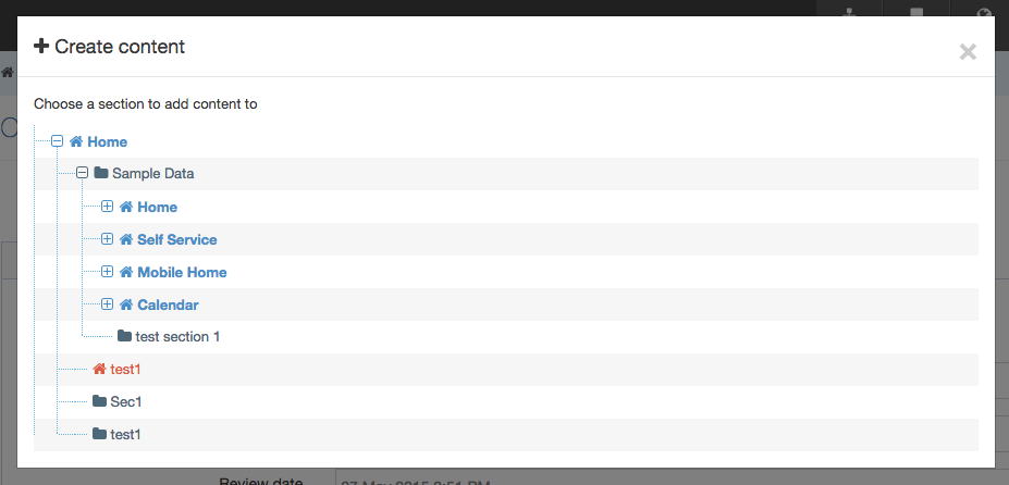
If necessary, expand the Branches in Site Structure using the plus (+) icon to the left of the Branch name. Select the name of the Section you want to add content to.
You will then be asked to choose a Content Type to add the content to.
Create content from the Site Structure
Select the Section that you are going to add content to. From the Section Action Menu select Create Content:
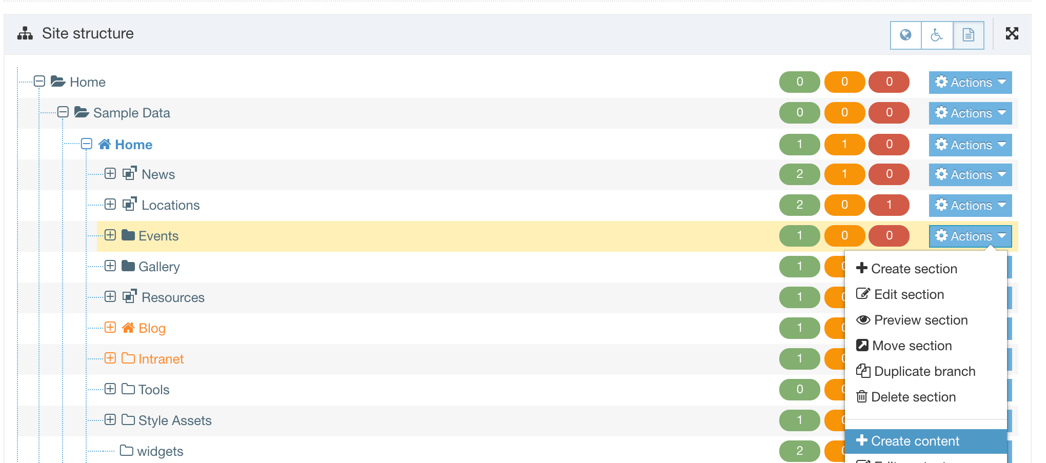
You will then be asked to choose a Content Type to add the content to.
Choose a Content Type
A Content Item's structure is provided by a Content Type so when you are adding content you must choose the Content Type that the content will use. When you have specified the Section that your content will be added to you will choose the Content Type:
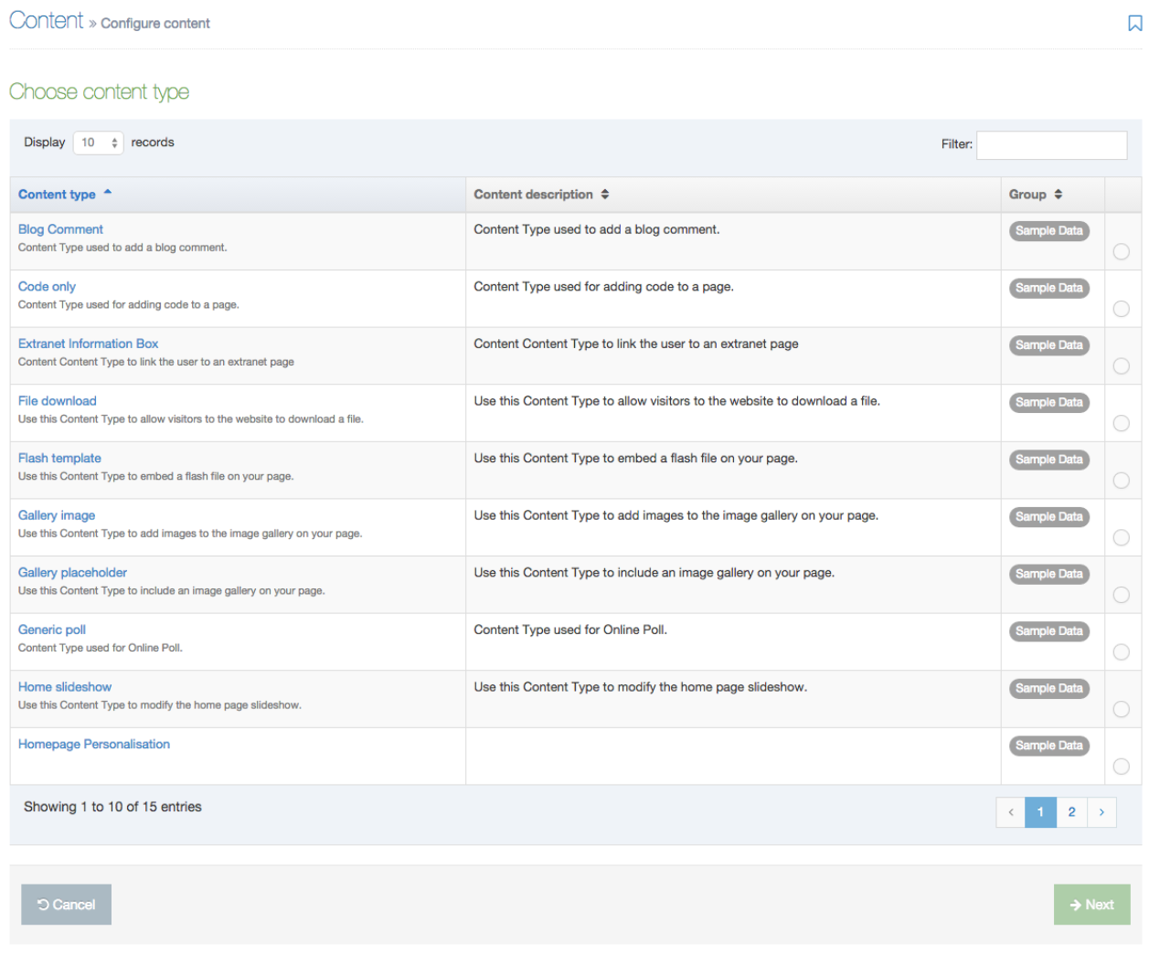
You will only see Content Types that have been assigned to this Branch or Section. If you don't see the Content Type you want to use, you must go to Content Types in the Section settings, enable it and return to Content > Create Content.
Content tab: Enter content details
When a Content Type has been selected you will be directed to the Content tab from which you can begin adding content. The Content Elements (fields) you will see are determined by the Content Type.
Each Content Item has a Name which is used to describe the content.
Hovering over the field will display help text.
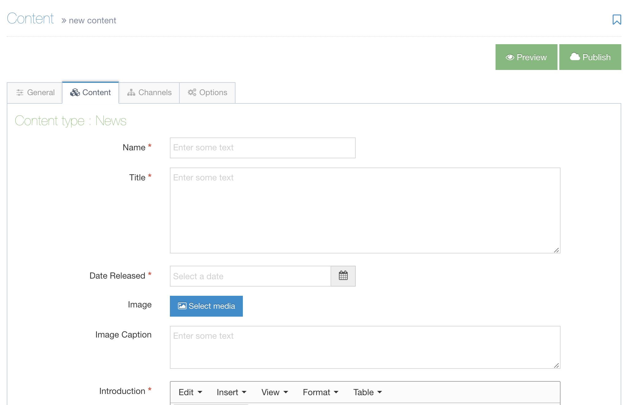
Required elements
All Content Elements marked with a red asterisk (*) are required. If a required field is empty, the screen will scroll to the first empty required element when you try to save changes. A Content Item will not save until all required elements are complete.
Examples of Content Elements
Below are examples of all the different types of content elements that may appear when creating or editing content.
| Name | Description | Example |
|---|---|---|
| Plain Text | Enter text and numbers without formatting. |  |
| HTML | Use the “WYSIWYG” editor to enter and format text, images, links, etc. See more information about the TinyMCE editor. |  |
| Date | Select a date and time from the calendar. |  |
| Media | Select a file (e.g., image, pdf, sound file) from the Media library. If permissions allow, media can also be added and selected. For more information regarding the use of images see Media library. |  |
| File | Upload a file from your computer. |  |
| Image | Upload an image from your computer. |  |
| Section/Content Link | Create a link to a section (page) or a Content Item. |  |
| Decimal Number | Insert a number with decimal places. |  |
| Whole Number | Insert a number with no decimal places. | 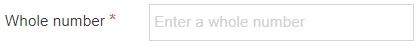 |
| Keyword Selector | Select keywords from a predefined list. | 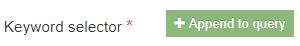 |
| Content Owner | Specify the owner of the content by selecting the user from the list. | 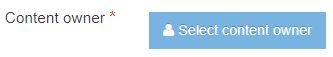 |
| Group Select | Used with Access Control. Select one or multiple groups. | |
| Cascading List | Select from a predefined list with one or multiple sub-lists. It works like a drop-down list with sub-lists branching off of particular options. | 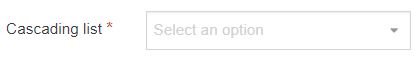 |
| Check Box | Check one or more options from a predefined list. | 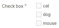 |
| Multiple Select | Select one or multiple options from a predefined drop-down list. | 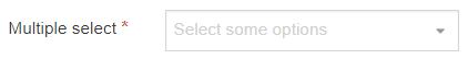 |
| Multi-select List | Select multiple items from a predefined list. | 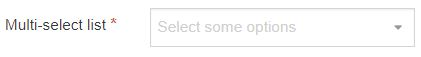 |
| Radio Button | Select one option from predefined list items. | 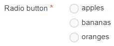 |
| Select Box | Select one option from a predefined drop-down list. | 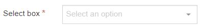 |
Using Date elements
Move the pointer to inside the field and you have access to two pop-up screens - a dd/mm/yyyy calendar and a hh:mm, am/pm clock to set.
For the calendar - the default setting is the date you view the calendar - you can forward set the date as needed. The clock icon is shown at the bottom of the box.
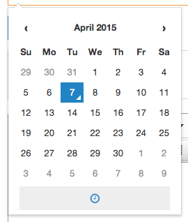
For the time: the default setting is when you opened the clock - use the up/down symbols to set the hour and minute for release, plus select AM or PM. The calendar icon is shown at the top of the box.
Options Tab
In the Options tab, you can configure the content for publication with Content embargo and Expiry information. Additionally, you can assign an Archive Section and assign a content owner:
| Item | Description |
|---|---|
| Publish date |
The date and time when the content will be published by Terminalfour if it is approved. The Publish date does not initiate a publish of the page or site at that date and time, but the content will be published as part of the next publish that runs after this date and time, whether that is a manual publish or a scheduled publish. If a publish date is added to an already published Content Item, the Content Item will be unpublished until the specified publish date. Learn more about scheduling updates to existing Content Items. |
| Expiry date |
The date and time that the content will expire. The content will be expire and/or be removed from your site when the next publish runs, whether that is a manual publish or a scheduled publish. There are two ways that expired content is treated:
To restore an expired Content Item, select the content to edit it and save the changes. |
| Review date | The date and time when the content should be reviewed. An email reminder is sent to the user who last modified the content, or to the content owner (if one is set). The content review date gets removed from the content once the date is met. |
| Archive Section | Specify a Section for the content to move to once it has expired. Under Content Configuration Settings, a Default Archive Section can be set to move expired content to. Content with an explicit Archive Section set overrides this default. If you are publishing lots of content, it may be a good idea to create an Archive Section to store expired content. This way the content can be used and published again at a later date. |
| Content Owner | Assign a Content Owner to a Content Item. If this is not set, the content owner will be inherited from the Section or the Branch above. |
As with the other tabs, you have the same Save changes options and the same Preview process.
Schedule an update to a published Content Item
If you'd like to update an existing Content Item with a new one at a specified publish date you can:
- Duplicate the existing Content Item
- Set a publish date on the new Content Item
- On the original Content Item set an expiry date that's the same as the new Content Item
- Approve both Content Items
- Now, when the original Content Item expires the new one will start to publish
Channels tab
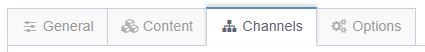
Content can be set to be published to multiple Channels, and the relevant Channels are generally selected by default.
For example, you can publish to an intranet and website Channel based on the same Site Structure, where a single Content Item needs to appear in both locations. Of course, you can publish via a single Channel too.
To proceed, click the Channels tab - the screen opens (shown below)
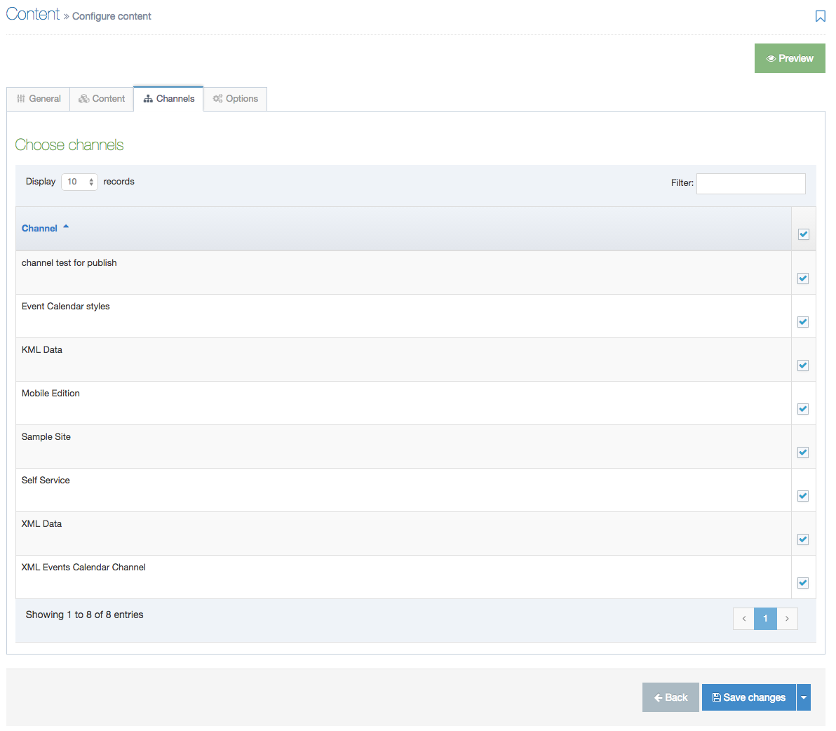
Choose the Channels appropriate for your content.
As with the saving content, the Save changes button for the Channels tab has the same options.
Make your choice to save the Channel selections.
If the content is created before the Channel has been created, the content will not be associated with the Channel. To associate all content under a Channel root with the Channel, use the Reset Content option on the Channel.
Preview content

To preview the content - from the top of the page, click the green Preview button. Depending on the default preview configuration for the user, the screen below may appear and you can choose which channel you use to preview the content. Select a Channel to preview and click the Preview button.
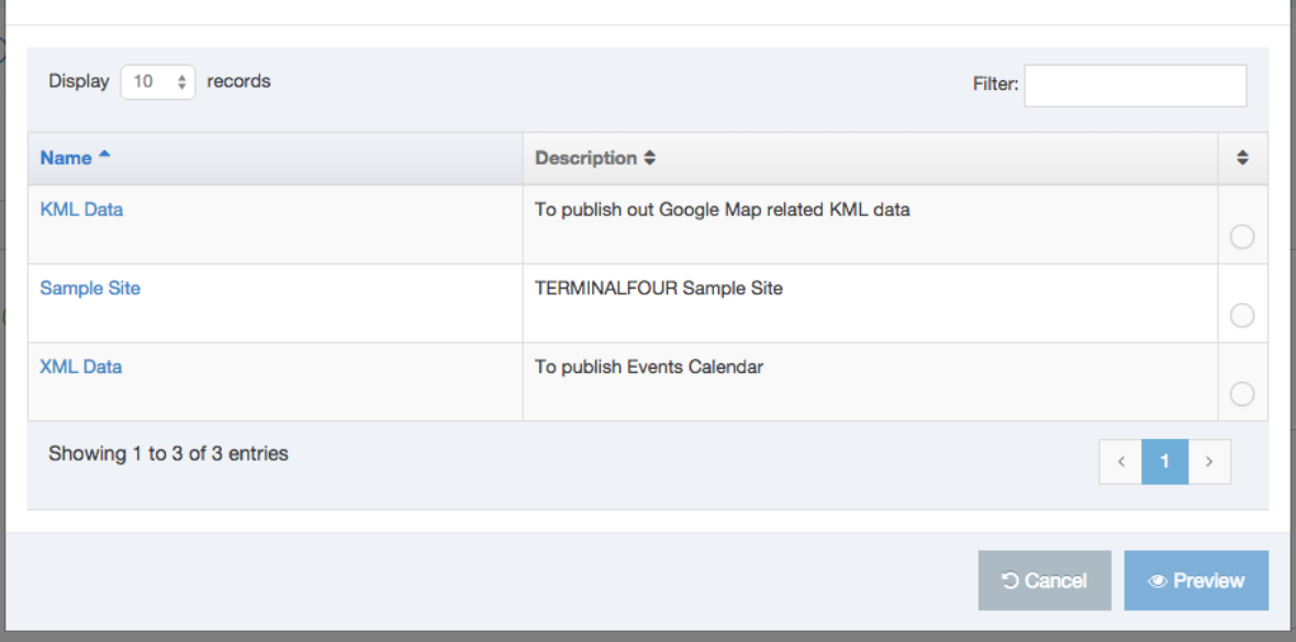
View the content in the Preview page.

Saving content
When saving content there are different options, depending on your user level and configuration settings.
| Option | Description |
|---|---|
| Save changes | Saves the content with a status of Pending. Content then appears in the approval list. The previously approved version of the content (if there is one) will be published until this content item is approved. |
| Save as draft | Saves the content with a status of Draft. The user can keep working on the content without risk of it being published, as it does not appear in the approval queue. Until it is approved, the previously approved version of the content (if there is one) will be published. |
| Save and approve | Saves and approves the content with a status of Approved. This button will only appear if automatic approval is configured for the user level. |
| Publish now | Saves, approves and publishes the content with a status of Approved. This button will only appear if Publish Now is enabled and automatic approval and Publish Now are configured for the user level. |
Edit content
Description
Editing Content is just as easy as creating it in the first place. You can start from the Menu bar on the left or from the Section Action Menu in the Site Structure.
You can choose to create content from the Content menu item in the Menu or select a Section from the Site Structure and create content from there.
Edit content from the menu
Go to Content > Edit Content:

You will then be asked to select the Section that contains the Content you want to edit:
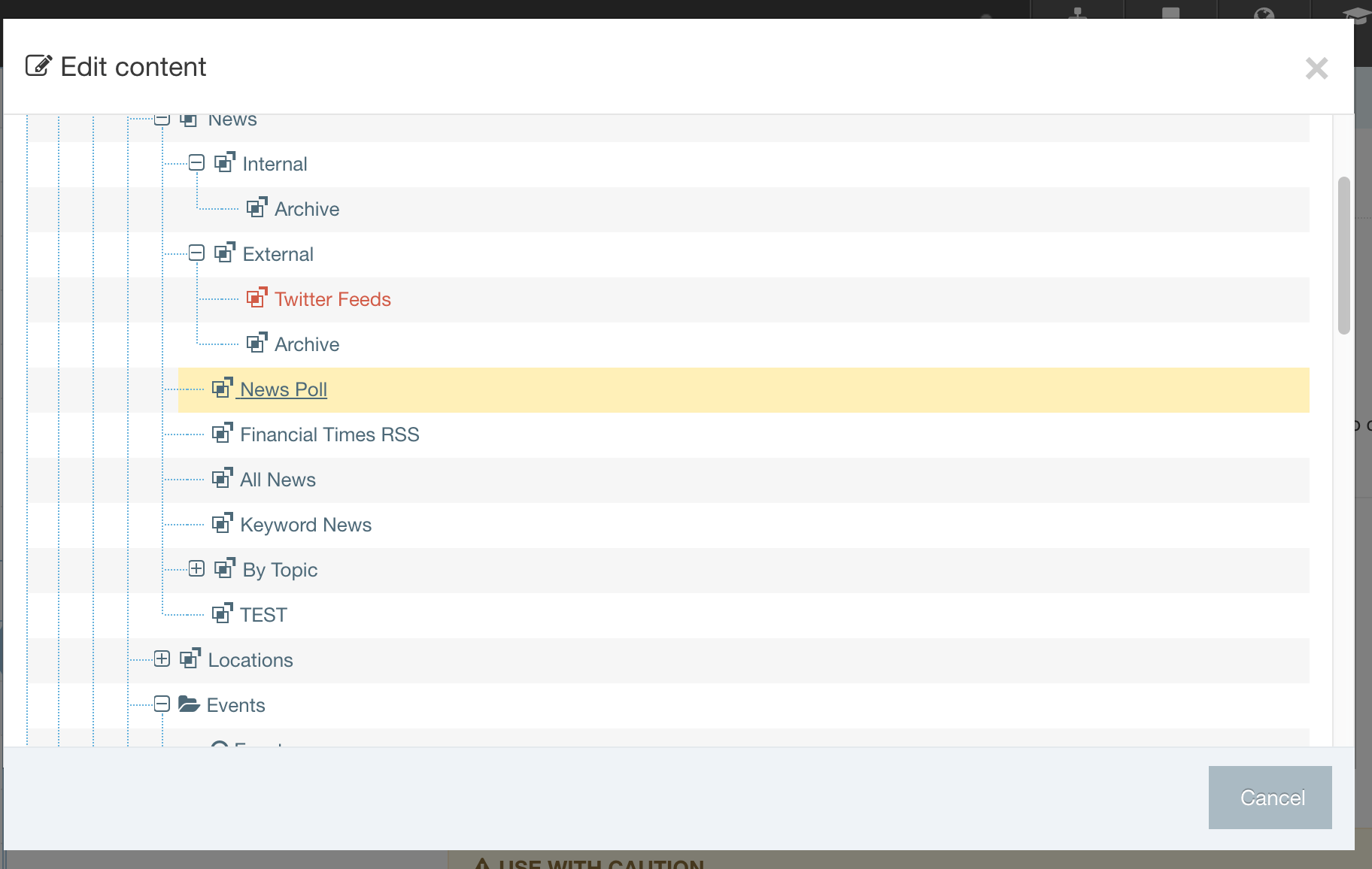
Once the Section has been selected, you can then select the Content Item that you want to edit:

Edit Content from Site Structure
In the Site Structure, select the Section with the content you want to edit. From the Section Action Menu select Edit Content:
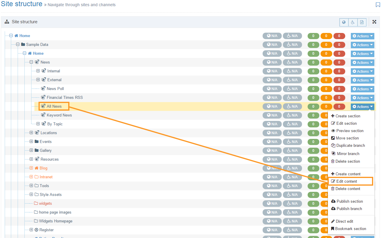
This will open the Content tab in the selected Section screen. From here, you can choose the Content Item you intend to edit:
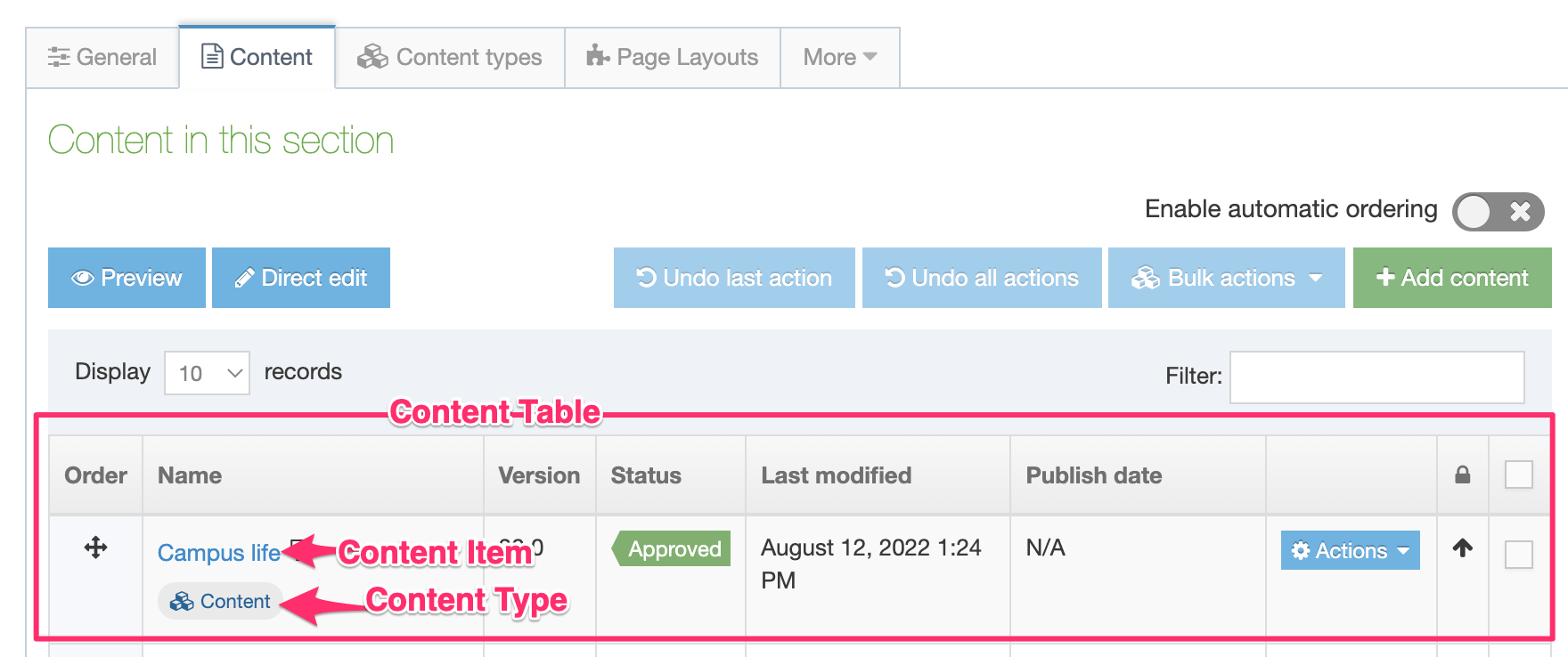
The buttons at the top and bottom of the Content Table are:
| Item | Description |
|---|---|
| Above Content Table | |
| Preview | Preview the Content Items in the Section |
| Direct Edit | Open the Section in Direct Edit* *This will option will only display when Direct Edit is enabled |
| Undo last action | Undo the last re-ordering action |
| Undo all actions | Undo all content re-ordering actions |
| Bulk actions |
This is a drop-down menu of options which can be applied only if multiple Content Items are selected. These options are:
|
| Create Content | Create a content item. When you select this, you will be asked to choose a Content Type to add the content to. See this article on creating Content for more detail on this. |
| Below Content Table | |
| Delete | Delete the current Section |
| Cancel | Return to Site Structure without saving changes. Changes to ordering are saved as they are made. |
| Save Changes | Save changes and return to Site Structure. |
Content Table
The Content Table features the following column names:
| Item | Description |
|---|---|
| Order | Dragging the cross icon will change the order of a Content Item. This icon is not displayed for content that is automatically ordered, except for content that is locked to the top or bottom. |
| Name | The name of the Content Item |
| Version | The version number of the Content Item. Each time you make and save an edit to a Content Item a version is created. This allows you to view and compare older versions of Content Items. |
| Status |
|
| Last modified | The date on which the Content Item was last modified. |
| Publish date | If a publish date is set for the Content Item it is displayed. |
| Lock status | Locks a Content Item's order, preventing it from being reordered. The position of each Content Item in the ordering is either locked or unlocked, determined by whether or not Automatic Ordering is enabled for the Section. |
To edit a Content Item select the name or select the Actions Menu and choose Edit.
Other options on the Actions list are covered below.
Depending on the User Level of the editor, changes made to existing content might require approval before publishing on the live site. When published the changes appear on the live site.
After you have selected the Content Item to edit, the Content tab on the Content Item screen will be displayed:
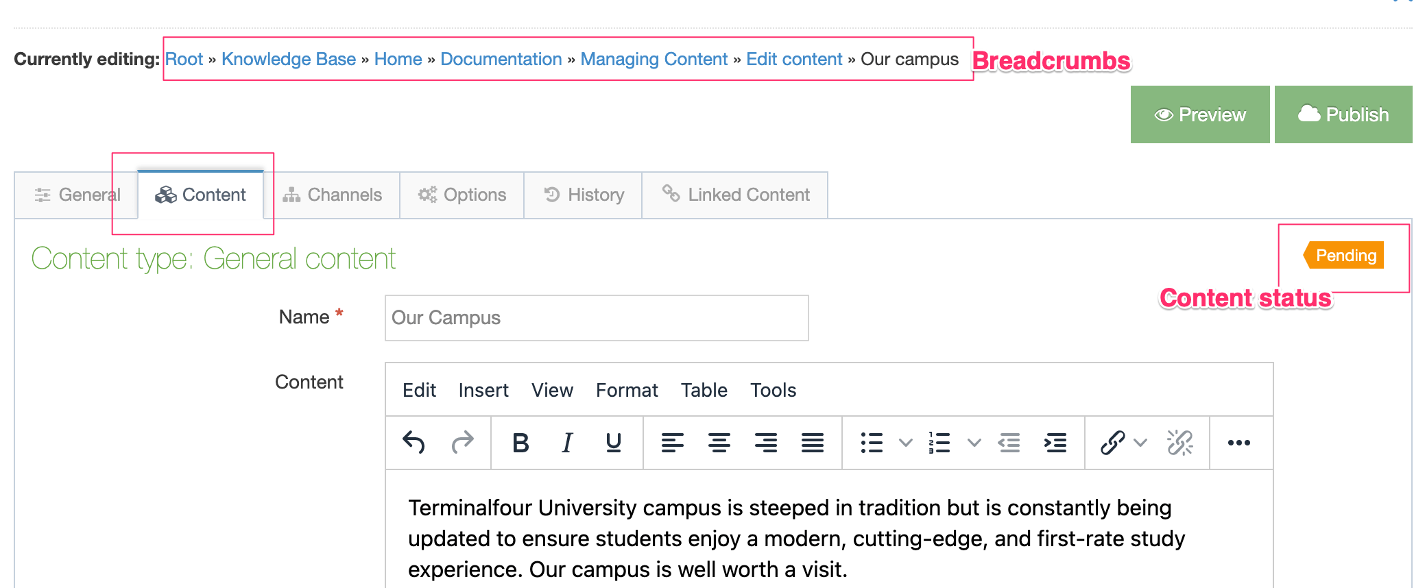
In this example, the Content Type that this Content Item uses has three Content Elements:
- Name: a plain text element
- Content: an HTML element in which text can be formatted using TinyMCE
Text can be edited in both fields. You can navigate to the Section containing the Content Item using the "Currently Editing" breadcrumb above the table.
You can also see the current status of the Content Item on the upper right of the Content tab.
If you are satisfied with your changes, click the appropriate Save Changes option. There are four options you can choose from when you have made your content edits. There's a description of the save options here.
When your changes have been successfully saved you will see a Content Updated alert:
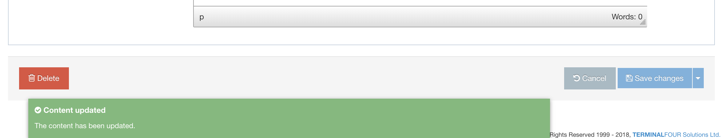
The Section screen will load with the Content tab active.
Content Lock
While you are editing or adding content, the Content Item is locked to prevent other users from making edits to it until you are finished with it or when your lock has expired. The content lock timeout duration can be set at System Administration > Hierarchy & Content Settings > Content.
There are three ways this lock expires:
- When you have saved the Content Item
- When you have Cancelled out of the Content Item
- Leaving your session idle for the duration that has been set by your Administrator at System Administration > Hierarchy & Content Settings > Content; the default is 30 mins), then your lock expires.
Depending on the expiration setting this request box appears to ask if you want to renew the lock:
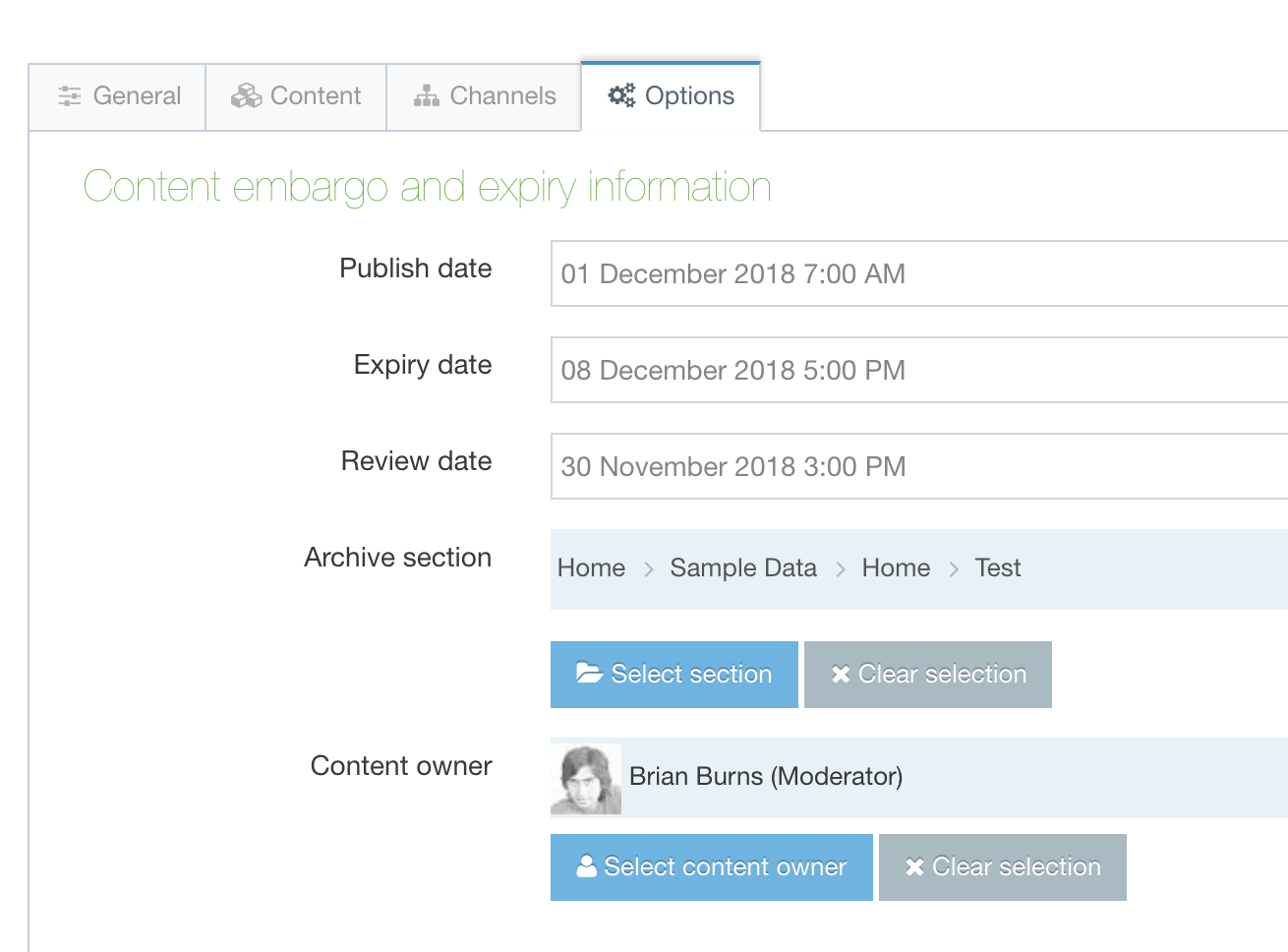
Choose Renew to ensure that the Content Item remains locked or Cancel to remove the lock.
Content Actions
Preview
To Preview your content on the site before it has been published ensures that your page and content looks as intended.
Previewing is possible only when the Content Type uses the same Content Layout name that is specified by the Channel (e.g., text/html). A Preview opens in a new tab or window (depending on your browser). This shows the content as it would appear when it is published.
The Preview window is only as current as the last Preview. Subsequent changes are not 'automatically' updated to an existing Preview. You must repeat a Preview to see the latest version.
From the Content Action drop-down menu - select Preview.
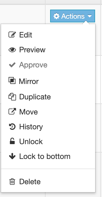
If there is more than one Channel associated with the Section you must select a Channel to view the content. This screen opens with your Channel selections:

The available Channels are listed by Name and Description - with a corresponding radio button to check. Select one, and click Preview.
In this example, a page from the Sample Site is previewed. After you review the content, close the window and repeat as needed.
A Pending section can only be shown when Preview is enabled via Preview & Publish.
You cannot preview Content that has future publish dates (even when it is Approved).
Pending Content Items can be approved by selecting the "Approve" option from the Actions dropdown:
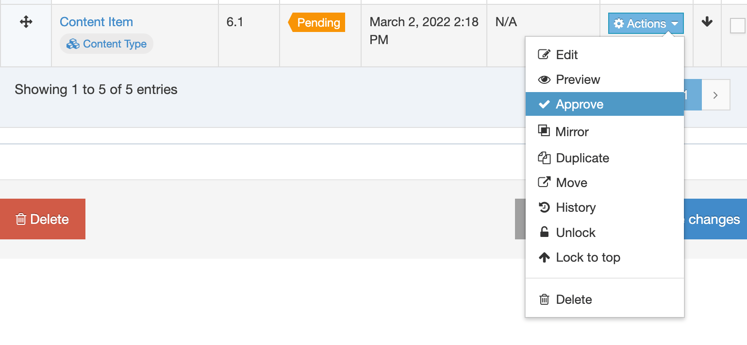
The Approve option will be disabled when the Content Item is:
- already approved
- locked
- in a Workflow
- Inactive
Unlike duplication of content, mirroring ensures that when the original content is updated, the changes are also reflected in the mirrored content. When you duplicate content – a change made in the original has no effect on the duplicate.
This feature is useful for content that is shared between multiple pages. Examples are office opening hours, contact details, or event information, or any information which users may want to share across functional units or departments.
To begin, select Mirror from the Content drop-down menu and this popup screen appears to select a destination location:
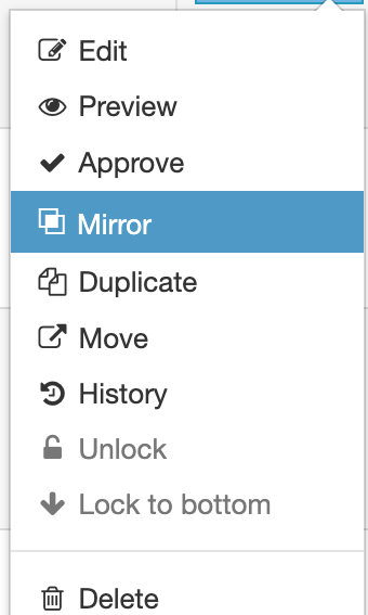
From this modal window, you can see the Site Structure. Select the destination for the content. The selection is highlighted, and in the lower left corner the destination section is shown by Mirror to:. Alternatively - you can click the Search tab and make an entry to the Search box. After locating the destination, click your selection. The destination is shown in Mirror to:.
Select Mirror selected content to complete the task.
It is also possible to Bulk Mirror multiple Content Items.
When duplicating content a copy of the content is added to in another Section. A change to the original content has no effect on the other's content.
To begin, select Duplicate from the drop-down menu and this popup screen appear to select a destination location:
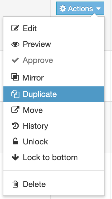
From this popup window, you can see the Site Structure. Select the destination for the duplicated content. The selection is highlighted, and in the lower left corner the destination section is shown by Duplicate to:. Alternatively, you can click the Search tab and make an entry to the Search box. After locating the destination, click your selection. The destination is shown in Duplicate to:.
Click Duplicate selected content to complete the task.
It is also possible to Bulk Duplicate multiple Content Items.
To Move content, click the departing content Actions button, scroll to Move and select. As with other transfers, a modal appears:
After you select the destination for the content, select Move selected content.
It is also possible to Bulk Move multiple Content Items.
TERMINALFOUR keeps a history of all versions of content created. This enables you to view all items saved in History, compare versions, and revert to a previous version at any stage if needed.
Select the History tab from the Content Item screen. This screen then appears:
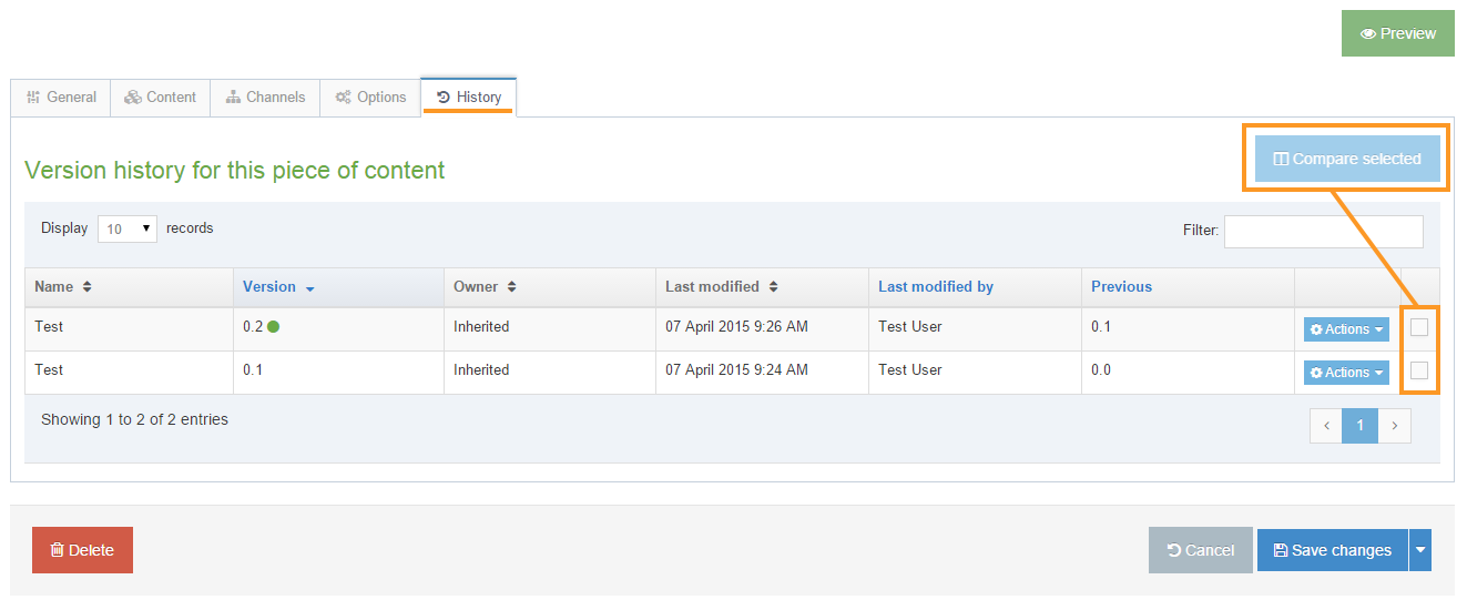
The columns are assigned as:
| Item | Description |
|---|---|
| Name | Content Item name. This may have changed between versions. |
| Version | The version number of the Content Item. The green dot indicates this is the current "Approved" content. You can click the column name to reverse the order and show the oldest version on top. |
| Owner | The User/Group who is the owner of the Content Item. This can also display "Inherited". |
| Last modified | Timestamp of the last edit |
| Last modified by | User who made the last edit |
| Previous | Previous version |
| Actions Menu |
This does not delete the current or previous versions. A green dot will appear to the right of the now version number to denote that this is the current version. |
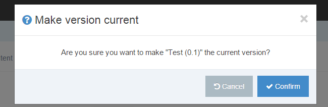
In the last column are checkboxes (these are highlighted above). To compare content select two checkboxes Check these when you want to make use of the Compare function - when two or more versions are checked the Compare Selected button is activated. To compare, select the versions, click Compare selected. This screen appears:
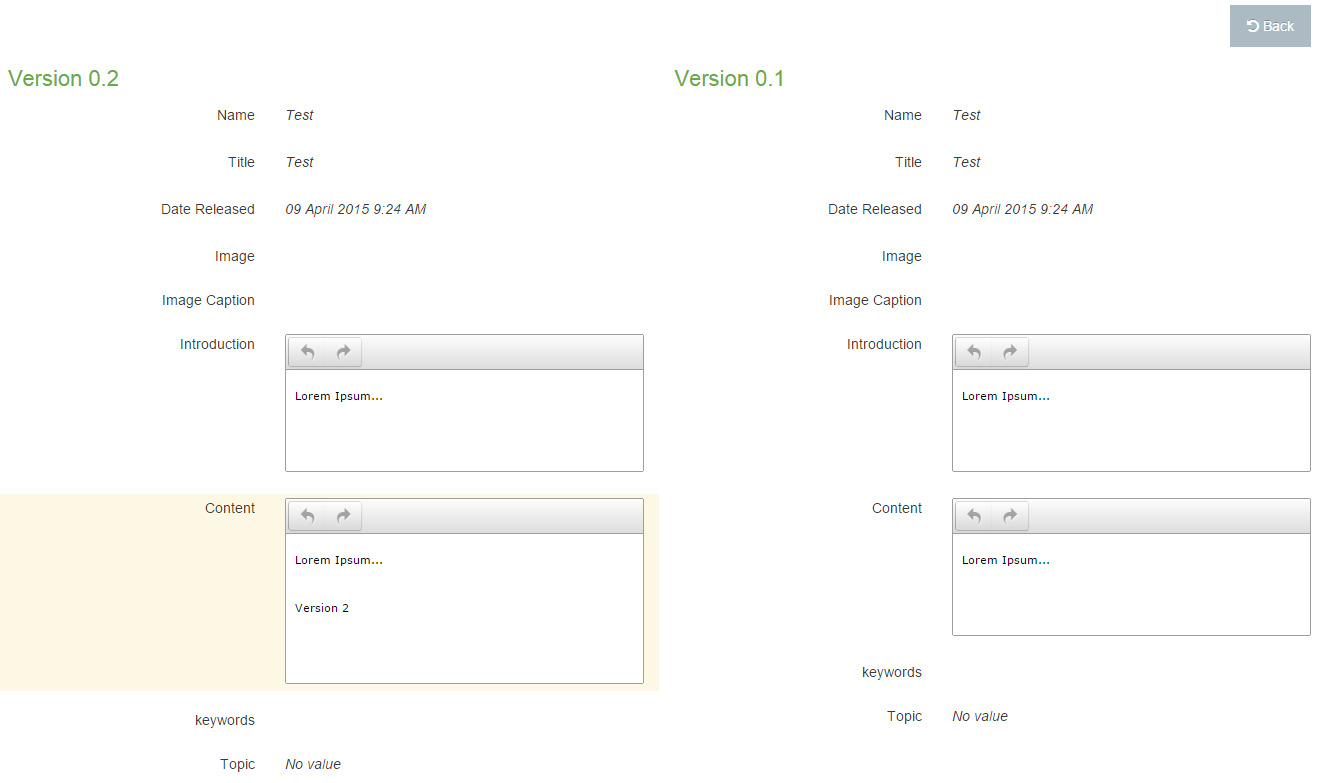
This feature is useful when you are approving content and want an overview of the modifications made to a Content Item You can only compare two items of content at a time.
After you compare content, click the Back button to return to the History tab.
Ordering Content Items
Each Content Item's ordering in a Section is either locked or unlocked. This order can be changed manually by clicking and dragging the cross icon in the Order column on the left. When enabled, Automatic Ordering will lock the order of the Content Items by one of the following criteria:
- Alphabetical (A-Z)
- Alphabetical (Z-A)
- Last updated (newest)
- Last updated (oldest)
- Publish date (newest)
- Publish date (oldest)
Only unlocked Content Items will be automatically ordered so you may need to manually unlock Content Items if they are not ordering:
Unlock
To Unlock content, go to the Actions button corresponding to the Content Item and select Unlock. This unlocks the Content Item and places it at the bottom of the list. The arrows (in the up position) indicate the content is locked to the top. When you unlock content the arrow disappears.
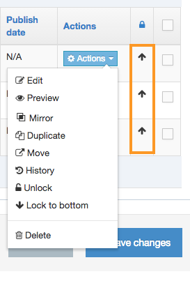
Lock to top or bottom
To Lock the content to the top or bottom, go to the Actions button corresponding to the Content Item. Select Lock to the top (or bottom):
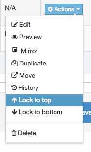
The Content Item is then locked in the position you want, and the arrow (pointing up or down) appears.
It is also possible to Bulk Lock and Unlock multiple Content Items.
To Delete content, go to the Actions button corresponding to the content. Scroll down to Delete and click.
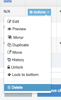
Deleted content can be recovered or purged in the Inactive and Orphaned tab of the Recycle Content screen (Content > Recycle Content). For further information refer to our page about deleting content.
It is also possible to Bulk Delete multiple Content Items.
Bulk Actions
You can perform the same action (mirror, duplicate, move, lock and delete) with two or more Content Items using the Bulk actions menu found on the Section Content tab.
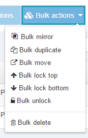
Select which function you want to perform. For transferring content via Mirror, Duplicate, or Move - the actions are similar:
- Select multiple Content Items by selecting the corresponding checkboxes in the rightmost column of the Content Table
- Select the Bulk actions blue button, scroll down and select the action you want
- This opens the Site Structure in a modal window where you select the content's destination
- If the destination contains a Content Item with the same name as the content you are transferring, a naming conflict prompt will appear in which you can rename the content:
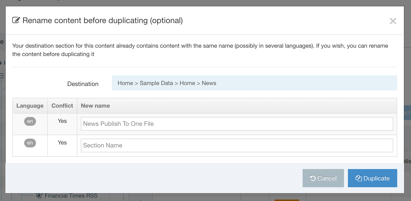
For the items Bulk lock top, Bulk lock bottom, and Bulk unlock the method in step 1 is repeated (refer to additional information on Lock features).
Delete Content
Description
When you delete content in Terminalfour, you do not remove it from the system immediately. Instead, an Administrator must purge the content before it actually disappears from the system. After the Administrator's actions, the content and its history are removed from the system.
Therefore, deleting content is a two-step process to prevent content from being inadvertently removed:
- Places the deleted content in an Inactive state.
- Completes the deletion using the Purge function in Recycle content. (An Administrators-only function)
You can choose to delete content from the Content menu item in the Menu, select a Section from the Site Structure and delete content from there, or Bulk Delete content.
Delete Content From the Menu
Go to Content > Delete Content. You will then be asked to select the Section that contains the Content you want to delete:
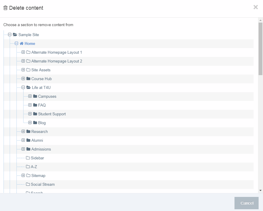
Once the Section has been selected, you can then select the Content Items that you want to delete and press Delete:
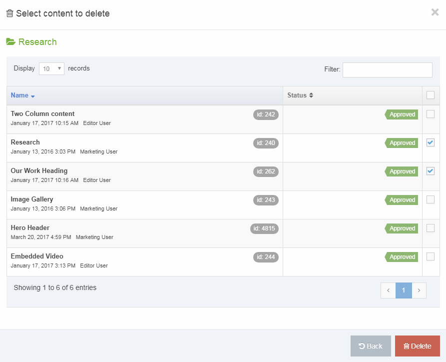
Delete Content from Site Structure
In the Site Structure, select the Section with the content you want to delete. From the Section Action Menu select Delete Content:
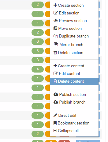
This will open the Content tab in the selected Section screen. From here you can choose the Content Item you intend to delete:
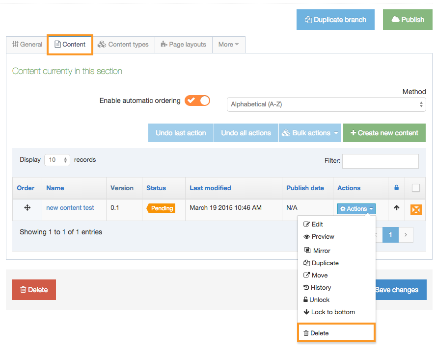
To delete a Content Item select the Actions Menu and choose Delete.
Delete Mirrored content
In some cases, you can have content (A) that is mirrored in another section (B). When you click to delete content A, the Confirm delete popup window offers you two choices:
- Delete only content A but leave it in B - mark the Remove from Section radio button
- Delete content A and delete it from section B - mark the Delete content radio button
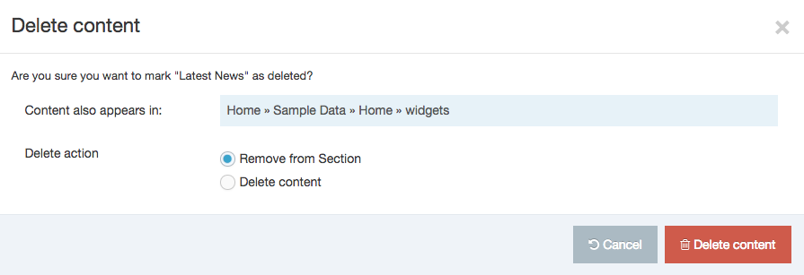
Mirrored Content Items can also be bulk deleted.
Bulk delete content
When you have two or more Content Items you want to delete, use the Bulk delete method. The Bulk actions button is found on the section Content tab. Click the blue button Bulk actions and this menu appears:
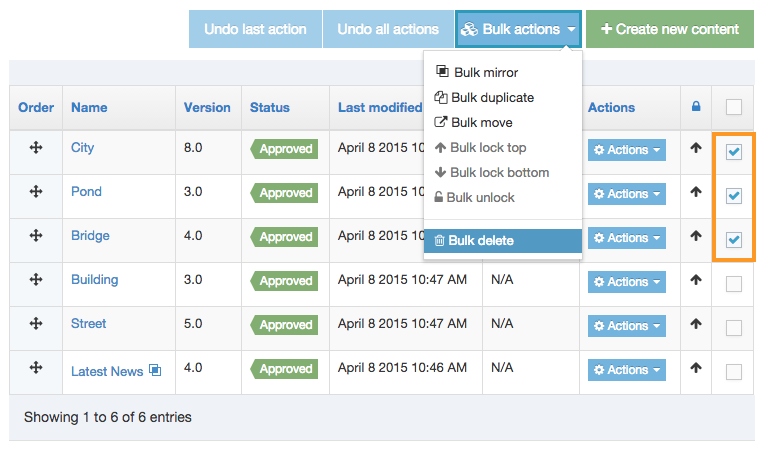
Select multiple Content Items by selecting the corresponding checkboxes in the rightmost column of the Content Table. Select the Bulk actions blue button, scroll down and select Bulk delete.
A modal will appear to confirm you want to delete the selected Content Items:
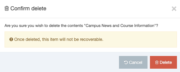
Bulk deleting linked Content Items
If one or more of the Content Items that you are bulk deleting is linked to by another Content Item a modal will be displayed listing those Content Items.
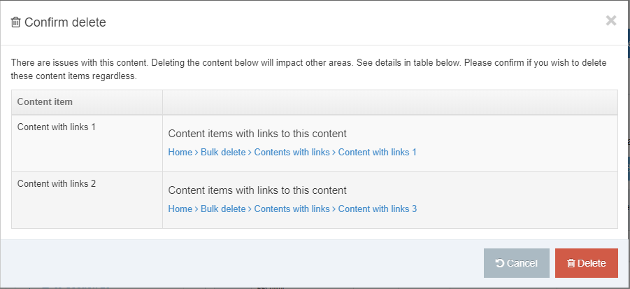
Bulk deleting Mirrored Content Items
If one or more of the Content Items that you are bulk deleting is a Mirrored a modal will be displayed listing those Content Items. In this instance, you can also choose the "Delete action" for the Mirrored Content Item:
- Remove from Section
- deletes the Content Item from this Section only
- Delete content
- deletes the Content Item from this Section and all Sections it appears in
In the screenshot below there are two linked Content Items and a single Mirrored Content Item (highlighted). The "Delete action" will be applied to the Mirrored Content Item:
Restore content
Deleted content has a status of Inactive and can be purged or restored from Recycle Content. To restore Inactive content you can also edit the content and approve .
Approve content
Description
When a Content Item is added to or edited in TERMINALFOUR, it must be approved it's published. This ensures only content that has been through the approval process is published on your site.
New and edited Content Items appear in a list of content awaiting approval in the Approve Content screen (Content > Approve Content).
- When new content is created or existing content is edited in TERMINALFOUR, the status is set to Pending and it appears in the Approval queue.
- Content with the status of Draft does not appear in the Approval menu and will not be published to your site unless there is a previously approved version of the content. Draft content, when completed, must be approved before publishing.
- Content with the status of Rejected is never published to your site. Rejected content, after possible remedial actions, must be approved before it can be published.
- If a Content Item is assigned to a Workflow, approving the content advances it to the next step in the workflow.
- You can approve content from the Direct edit screen.
Examine and review content
To access the list of content pending your approval, go to Content > Approve Content.
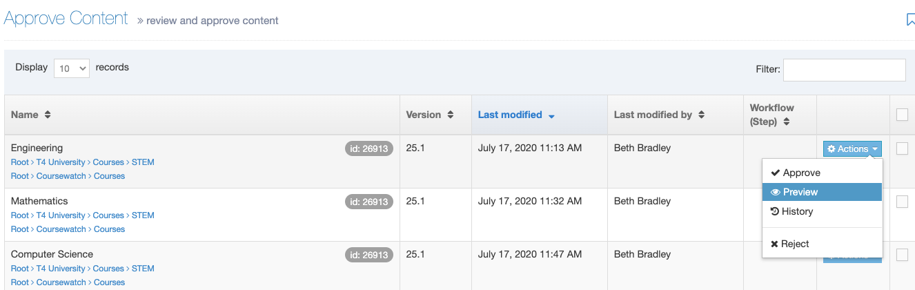
This page opens in a tabular format with seven columns:
- Name - shows the content name, ID number, and a breadcrumb link to edit it.
- Version - the version number of the Content Item. Each time you make and save an edit to a Content Item a version is created.
- Each time a draft is saved, the version point number of the Content Item increments, e.g, 0.0.1.
- When an approved version of the Content Item is saved the version number increments, e.g., 1.0.0
- Last modified - the date on which the Content Item was last modified
- Last modified by - the user who last modified the content
- Workflow (Step) - shows the Workflow step (if the content is in a Workflow)
- Actions (button) - drop-down menu with these items: Approve, Preview, History, and Reject
- Checkboxes - check as needed to take approval action or move content forward in the Workflow. A check to the box in the header row is the Select all function. This only appears if selective approval has been enabled for the current user level.
Content can be sorted by clicking on the table headings, or filtered by entering text within the Filter.
When you select more than one item you'll see an alert that will show you the number of items that have been selected:
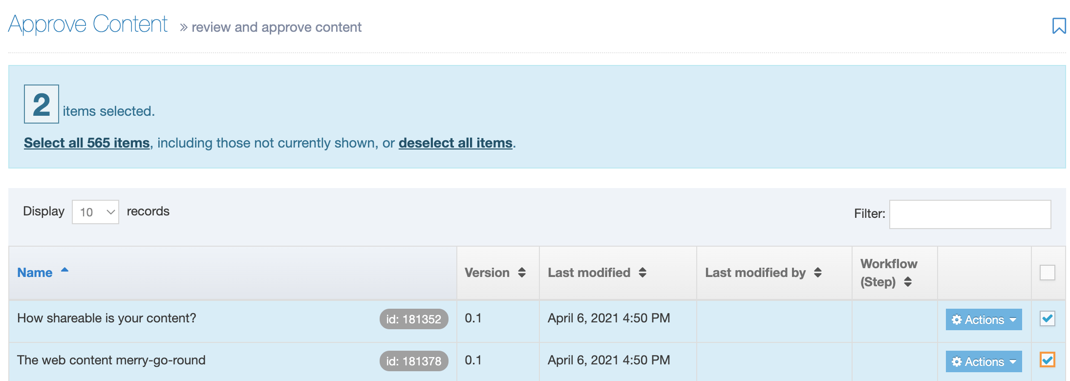
To review a pending Content Item, simply click the Name of the content to edit the content, providing the option for Preview.
Approve content
Once content has been reviewed and it is correct and ready to approve, click the associated Actions button, scroll to Approve and click. Alternatively, if selective approval is enabled, check the checkboxes in the right column, and select the Approve button.
A confirmation popup window confirms the Name and Sections of the content. Additionally, there is a Comments box intended to allow comments to be inserted upon approval. Inserting comments is optional and content can be approved without comment. Click Approve.
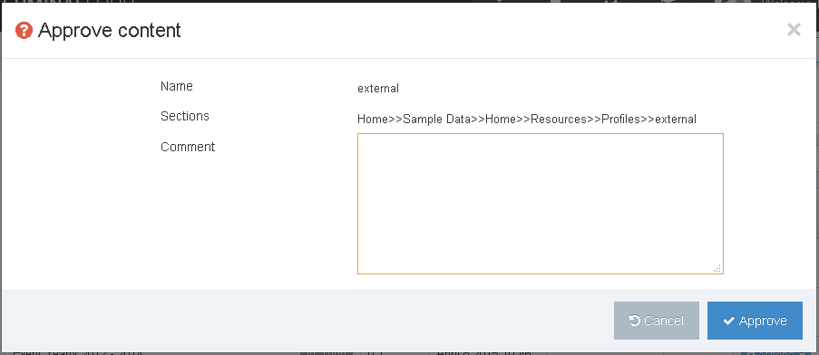
If content is in a workflow, and selective approval is enabled, Administrators have the additional options to:
- Advance to next step: The content is moved to the next step of the workflow. If there is no next step, the content is approved. This can be used if the workflow step requires approval by multiple users and the Administrator chooses to skip the multiple approval requirement.
- Advance to completion: The content is approved through all steps of the workflow, and is marked as Approved.
To use these, check the content using the checkboxes, and click the down arrow aside the Approve button. Click the appropriate statement and proceed with the approval, as above.
Preview
From version 8.3.5 you can preview a Content Item on the page as part of the Approval process.
When Preview is selected from the Action dropdown menu a preview of the page will open in a new tab.
If the Content Item is Mirrored in one or more Sections a "Sections to preview" modal will display. From this modal, you can select the Section to preview the Content Item in:
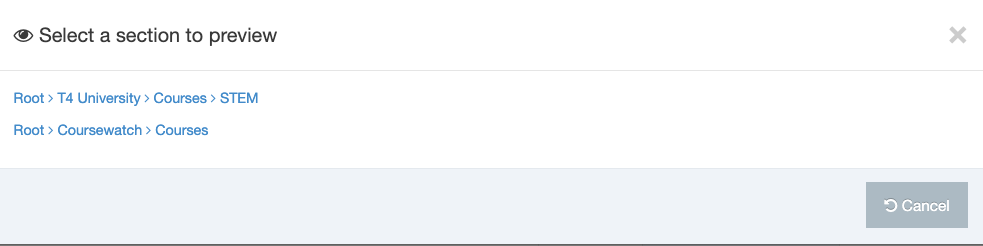
Content History
For content that has a history (previous versions), you can review the history using the Actions drop-down menu and selecting History.
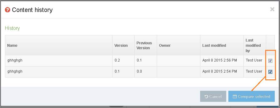
This popup box shows a formatted table with the Name, Version, Previous version, Owner, Last modified, and Last modified by header titles.
When you have two or more versions, you can do a side-by-side comparison of the content. Check at least two check boxes in the far right column to select the versions for comparison. Click the Compare selected button. This screen appears:
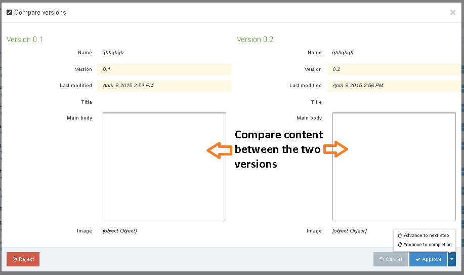
After you review the content details, you can make an Approval decision (included Workflow if needed), or Reject the content. Make your choice or cancel.
Reject content
In some cases you might want to reject content outright. When this is the case, the process is simple. After your review of the content, and you want to reject, then click the appropriate Actions button and scroll to Reject and click. This popup window appears:
Briefly describe the reason for rejection. Be specific in the reasons and suggest remedial actions that could enable the content to be resubmitted if appropriate. You can reject the content without reason. Click the Reject button to complete the rejection and send an email to the content editor.
The "from" address of these emails can be configured to be the logged in user's email address in Approval configuration settings. This can be useful as users have been known to reply to the Workflow emails. Alternatively the emails will use the application default email address (configured in General configuration).
Recycle content
Description
When Content Items, Sections, or Categories are marked as inactive, they are stored in "Recycle Content" and remain there until the Administrator takes action to purge or re-activate them.
When Content Items and Sections are purged they are deleted permanently and cannot be recovered.
If Sections and Content Items have not been purged, the Administrator can restore Sections and content to an “Approved” status. Categories and Media Items cannot be restored.
To access Recycle Content, go to Content > Recycle Content. The Section is divided into three areas:
- Inactive content: Content that has a status of Inactive.
- Inactive Sections: Sections that have a status of Inactive and deleted Media Categories
- Orphaned content: Content that existed within a Section that was purged.
Inactive content
The Inactive content tab lists the content name, path to the content, content id and last modified date/time of content which has been deleted.
To permanently remove any items of content, place a check in the box beside the content and click the Purge content button. You can Select all items by checking the box located in the header row.
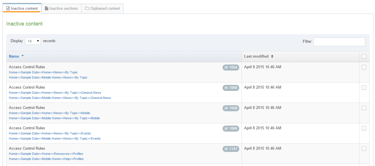
A Confirm purge text box appears. To confirm your choices, click Confirm. The content is permanently deleted and cannot be restored.
Inactive Sections
The Inactive Sections tab lists the Section name, the path to the Section, Section id and mirrored paths of Sections which have been deleted.

To permanently remove any Sections, place a check in the box beside the Section and click Purge Section. You can Select all items by checking the box located in the header row. If the Section contains content they are moved to Orphaned content tab.
A Confirm purge text box appears. To confirm your choices, click Confirm. The content is permanently deleted and cannot be restored.
Orphaned content
If a Section that contains content is purged, these items then reside in the Orphaned content tab. The Orphaned content tab lists the content name, content id and last modified date/time of orphaned content.
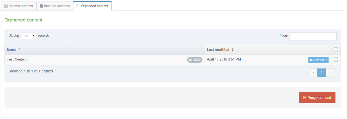
To permanently remove any items of content, place a check in the box beside the content and click the Purge content button. You can Select all items by checking the box located in the header row.
A Confirm purge text box appears. To confirm your choices, click Confirm. The content is permanently deleted and cannot be restored.
Restore Sections and Content
You can return deleted/inactive Sections and Content items by changing the status back to Approved.
This feature does not apply to Categories or Media items.
Sections
For a Section in the Site structure, use the Actions menu to Edit Section:

On the General tab, change the status from Inactive to either Approved or Pending and Click Save changes.
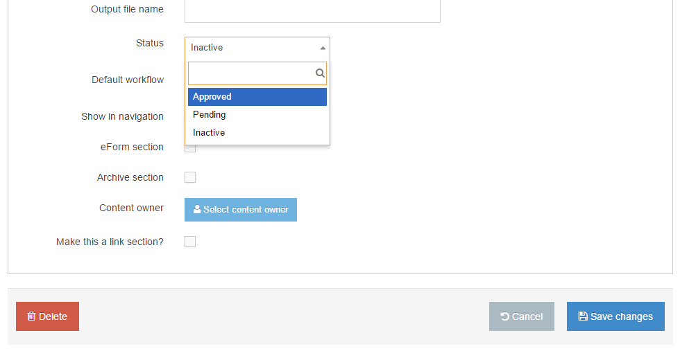
Content
For a Section in the Site structure, use the Actions menu to Edit content, edit the content (if required) and choose one of the Save options.
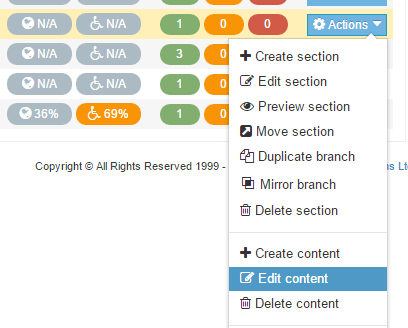
Media Library
Description
Unless you have been granted read/write access rights to the Media Library – your access is "read-only".
The Media Library is the home to the Media Items you will be using in your site(s). Media Items can be:
- images
- documents (e.g., text files, MS Office, PDFs, etc.)
- code files (e.g. JavaScript, CSS, PHP, etc.)
- audio and video
By default, any user can access these files to use them in a Content Item (via a Media Content Element or the HTML Editor), Content Layout or Page Layout (using the Generate T4 Tag feature), but only Administrators or users who have been granted appropriate access can add and modify files in the Media Library. Read access can also be removed for particular Media Categories. Power Users and Administrators also have direct access to the Media Library from most assets.
Media Items in the Media Library use a System Content Type referred to as a Media Content Type. This is the only Content Type associated with the Media Library. The Media Library can be accessed from many parts of the system, including directly from the content if you have a Media or HTML element or via the menu at Content > Media Library.
The Media Library is categorized to help you organize your Media Items.
Using the Media Library
To access the Media Library, go to Content > Media Library. This screen appears:
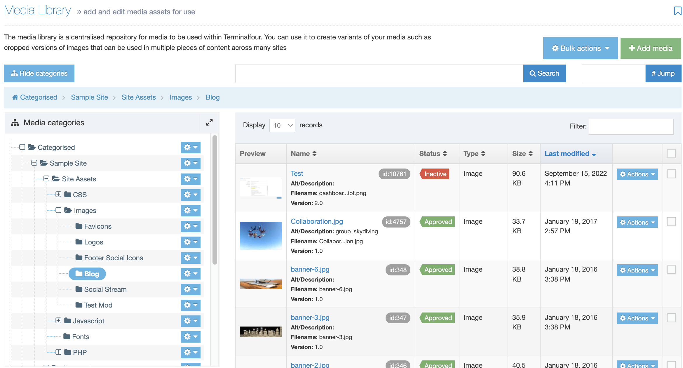
With a new installation, the list is empty, but as you add more items to the Media Library, the list will grow.
Media Library Controls
The Media Library controls let you add, move, delete and retrieve media items.
- Search: To locate Media Items, enter the Media Item name or the keywords associated with it in the Search box and click Search.
- Jump: Each Media Item has a unique ID number associated with it. If you have the ID for the Media Item, enter it into the Jump box and select Jump.
- Bulk actions: Delete or move multiple files to a different Category. You must select two or more items' checkboxes to use the Bulk actions.
- Add Media: Create new media within the currently selected Category.
Media Categories
Categories help you keep stay organized. When you add a new item to the Media Library you can choose to add it to a new or existing Category folder. Categories are arranged in a hierarchical folder structure so you can place Child Categories inside Parent Category folders. It's worth taking time to plan the Categories and Child Categories organization that would work best for your organization.
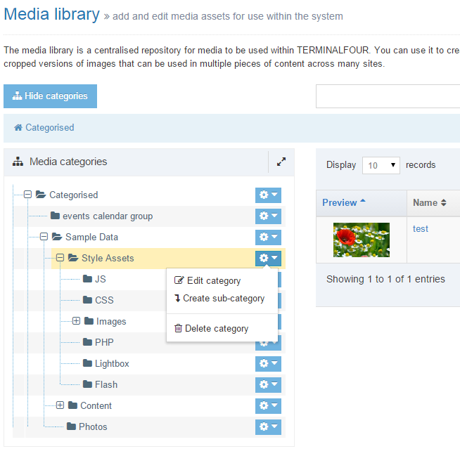
It is possible to:
- Expand and collapse Categories using the + and - buttons to the left of a parent Category. Categories can expand to full page size.
- Create Category, Edit Category and Delete Category.
Media Items
Media Items are listed in a table. You can change the number of items that will be listed per page by using the records dropdown options on the top right. To quickly search through the items in the selected Category you can enter text in the Filter input on the top right.
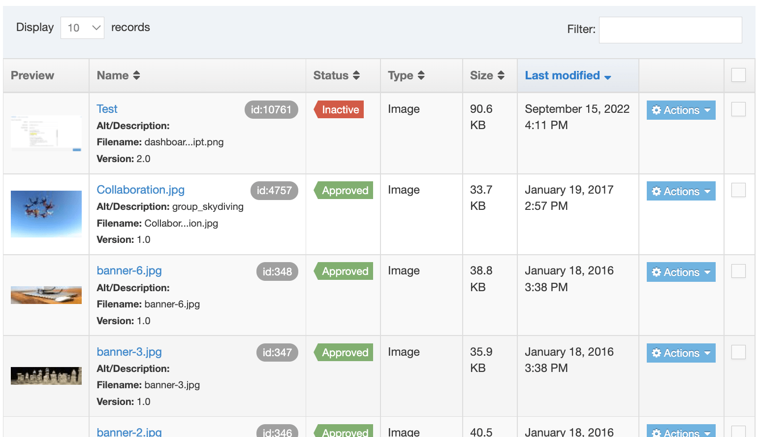
Each Media Item is a row in the table and the columns are sortable:
| Name | Description |
|---|---|
| Preview |
A thumbnail view of image files will be displayed. For other file types, a document icon is displayed. |
| Name |
The name of the Media Item. This links to the Edit screen where you can change the Media Item's settings or upload a new file. This column also contains:
|
| Status |
A Media Item has a status of Approved when uploaded. When deleted the status is changed to Inactive and it will no longer publish. To permanently delete a Media Item go to Content > Recycle Content. In the Inactive Content tab, you can use the Filter to search for the Media Item. When it is selected, click on Purge Content. To revert the status of a Media Item from 'Inactive' to 'Approved' just change any of the Media Item settings in the Edit screen and Save Changes. |
| Size | The Media Item's filesize in kilobytes |
| Last modified |
The date that the Media Item was last modified. This includes when it was added originally. |
| Actions |
When clicked, the Action Menu will expand to show the following options:
|
| Checkbox |
Select multiple Media Items to apply the Move and Delete Bulk Actions |
Adding a Media Item to your content
The Media Library doesn't just store media files like images, video and audio. You can also store CSS and JavaScript files that can be added to Page Layouts or documents like PDFs and MS Office docs that can be added to your Content Items.
To add a Media Item to a Content Item, the Content Type used must include an HTML element:
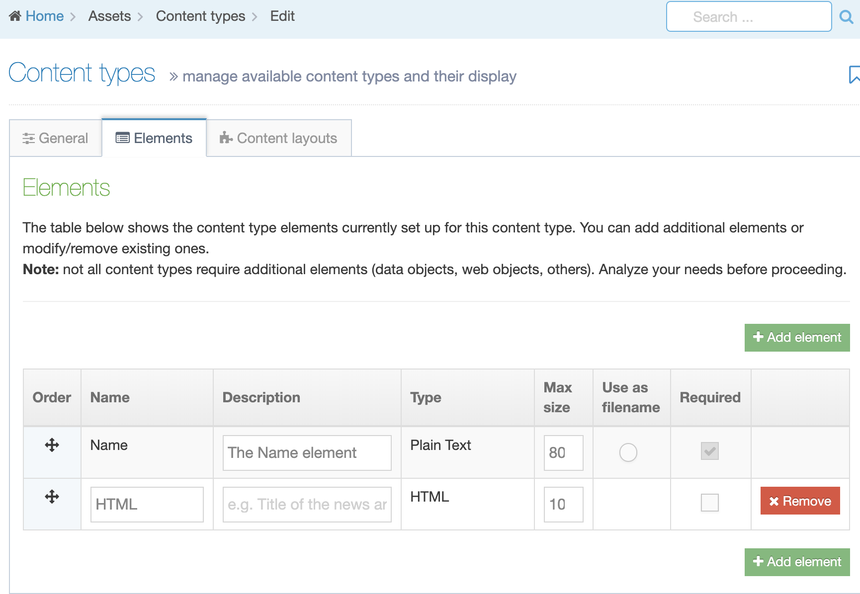
When creating a Content Item with an HTML element you will see the HTML editor. To add a Media Item select the Insert from Media button:

When an image is selected from the Media Library it will use the image Media Content Layout to output the img HTML element so the image will display on the page. If a document like a PDF or Office doc is selected, the name of the Media Item will be output with a link to the file.
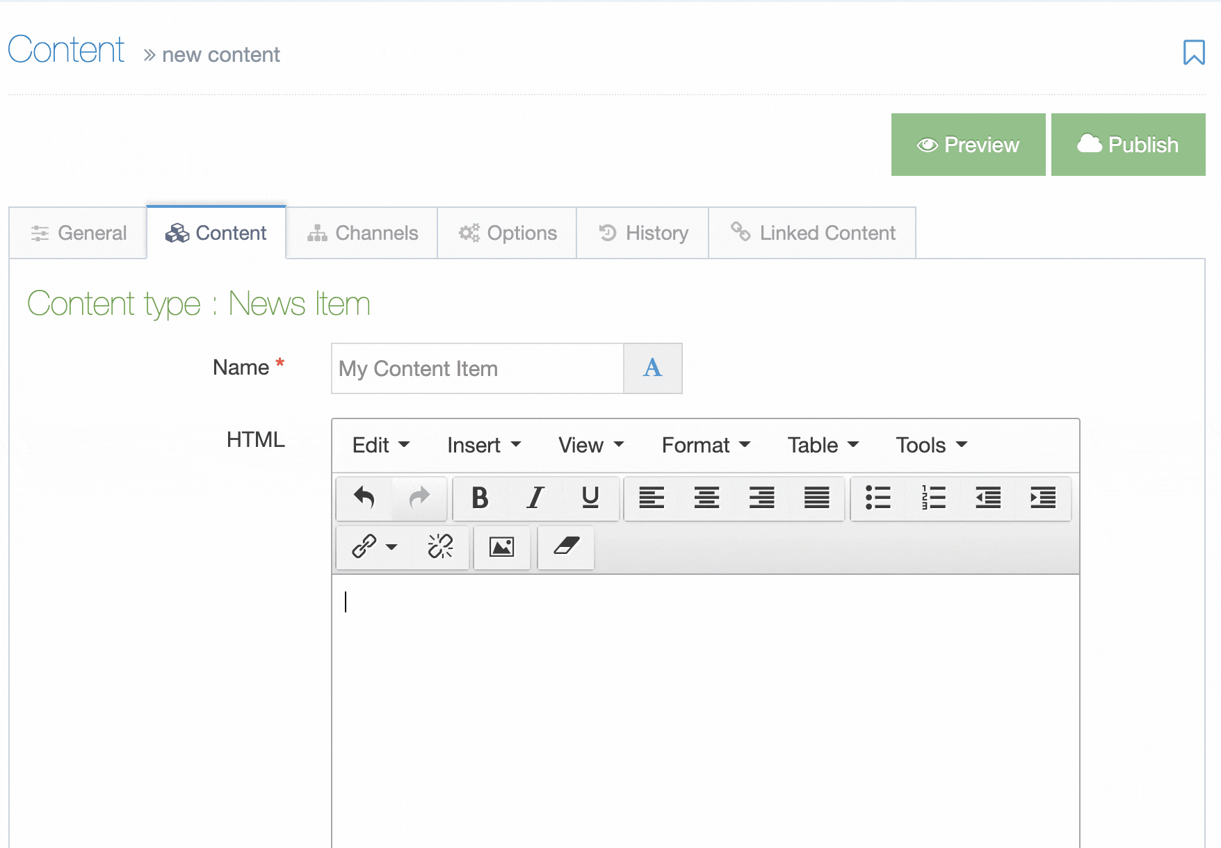
To learn more about setting up Media Types and Media Content Layouts have a look at this video.
Delete category
You can delete from any tab, or from the Actions menu, select Delete. A "Confirm delete" popup window appears for you to confirm the request:
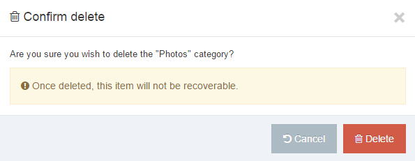
To proceed, click Delete. The media category is removed from the Site Structure.
Once a Media Category is deleted, it is no longer visible in the Media Library, but it is in the Recycle Bin. Media within deleted Categories is removed from the published content.
Direct Edit
Description
For content editors, whose focus is solely on adding and changing content, Direct Edit offers an even easier way to edit content by editing it directly within a page preview. This offers a more intuitive content editing experience since changes appear exactly as they will look on the published site.
Direct Edit Tour
From version 8.3.3, a user will be given a brief tour of Direct Edit the first time it's launched. Once dismissed with the Skip button it will not be displayed again until the help button at the bottom of the sidebar is selected.

Who Can Use Direct Edit?
Your Administrator assigns rights to Direct Edit. Depending on your assigned User Level, you can have access to Direct Edit. Normally, the Contributor User Level is restricted to Add/Edit/Delete content.
You can only access Direct Edit if it has been enabled by your Administrator. If you are not able to access, contact your Administrator.
Link Sections do not have a Direct Edit option.
Access Direct Edit
You can open a Section in Direct Edit from the Site Structure or the Section screen.
To open from the Site Structure, select the Action button from the Section you want to edit, expand the Section Action Menu and select Direct Edit:
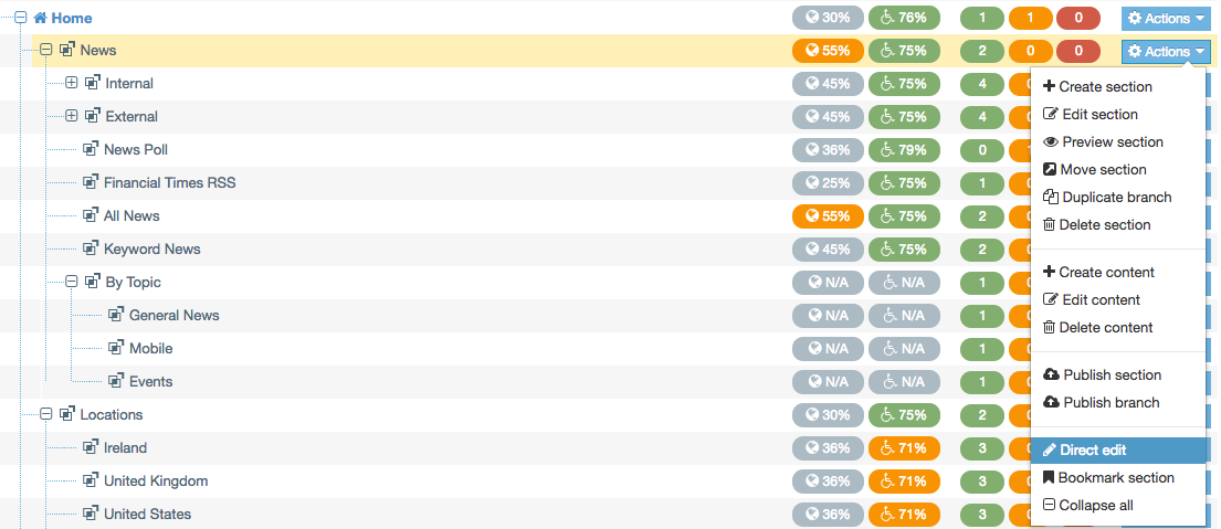
You can also click on the Direct Edit button from the Content tab of the Section screen:
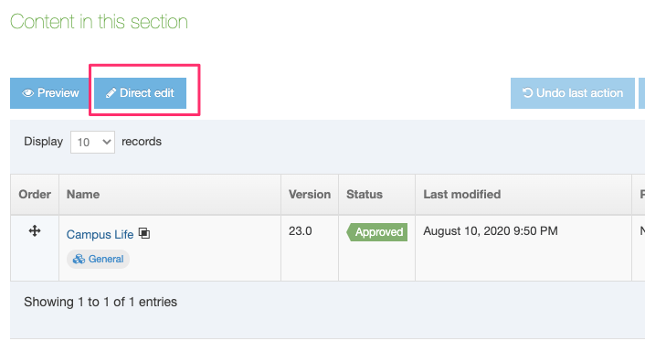
If more than one Channel is associated with the Section in Channel Configuration, you will be asked to select the Channel to use Direct Edit.
The Direct Edit screen is made up of two areas:
- the Sidebar, which contains page options
- the Direct Edit area, which shows a preview of the page with editable (highlighted with a dashed line) and non-editable areas
Though areas highlighted as non-editable cannot be edited within the Direct Edit area, some, like the Page Name, can be edited from the Sidebar. Others, such as navigation elements generated by Navigation Objects, can only be edited from the Terminalfour main interface.
You might notice that within the Direct Edit settings, there are plenty of mentions of "pages" instead of "Sections". This is intentional. Sections let you Preview and Publish to various Channels using different Page and Content Layouts across multiple sites.
When using Direct Edit, we edit a page previewed through a specific Channel using particular Layouts. We are also limited to the site in which the current page is located, so we cannot move a page across sites.
Similarly, you cannot creates Link Sections, Hidden Sections, or other features in Direct Edit.
Add Page
To add a new child page or Section below the page currently being edited in Direct Edit, select Add page and provide a name. Direct Edit will reload with the new page ready to edit.
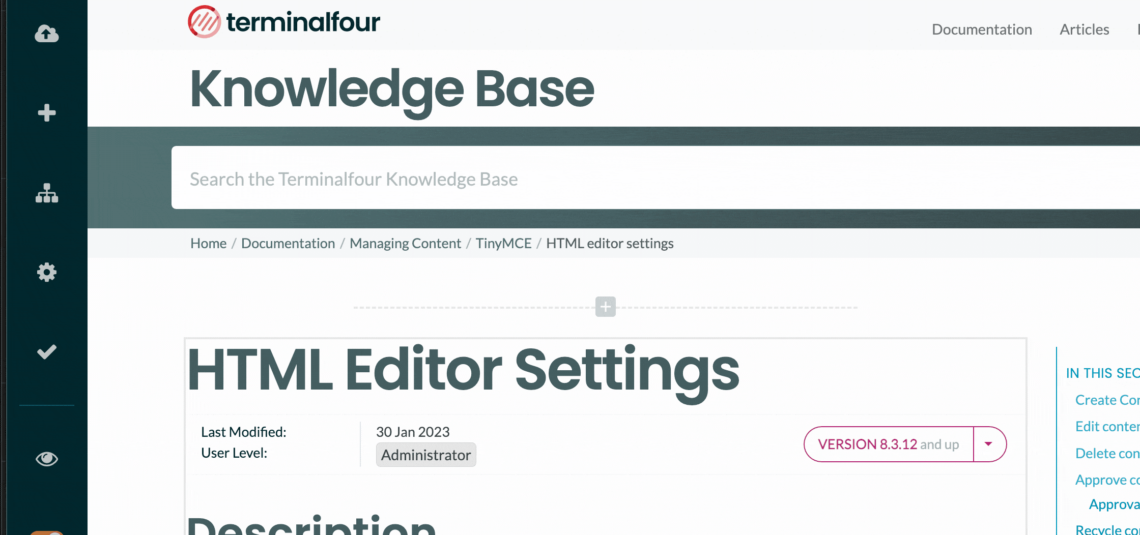
Sitemap
The Sitemap option will display the Site Structure of the current site only. From this, you can navigate to other pages or, using the Actions menu, add a child page or delete a page.
Link Sections cannot be edited in Direct Edit.
Page Settings
With Page Settings, you can configure the page options. The settings are grouped into categories. Select the category name or the arrow to the left of the category name to expand it. For further information on these options, refer to the documentation about Creating Sections.
Link to page
If the page you are editing is published, you can visit the link. Clicking on the link will open it in a new tab. Terminalfour first checks the link; if it's unavailable (if the page has not been published or removed), the link will appear as text.
General
The information shown on this page reflects the latest settings for this page.
Page Layout
You can change the Page Layout and the Inheritable Page Layout for multiple Channels here. The Channel names are on the right in caps.
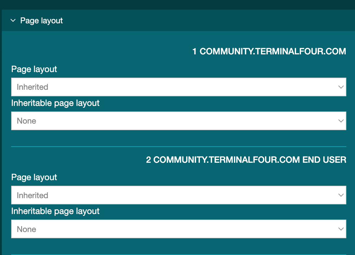
Metadata
You can edit the page's metadata values here. The metadata properties listed here can be configured in the Metadata settings.
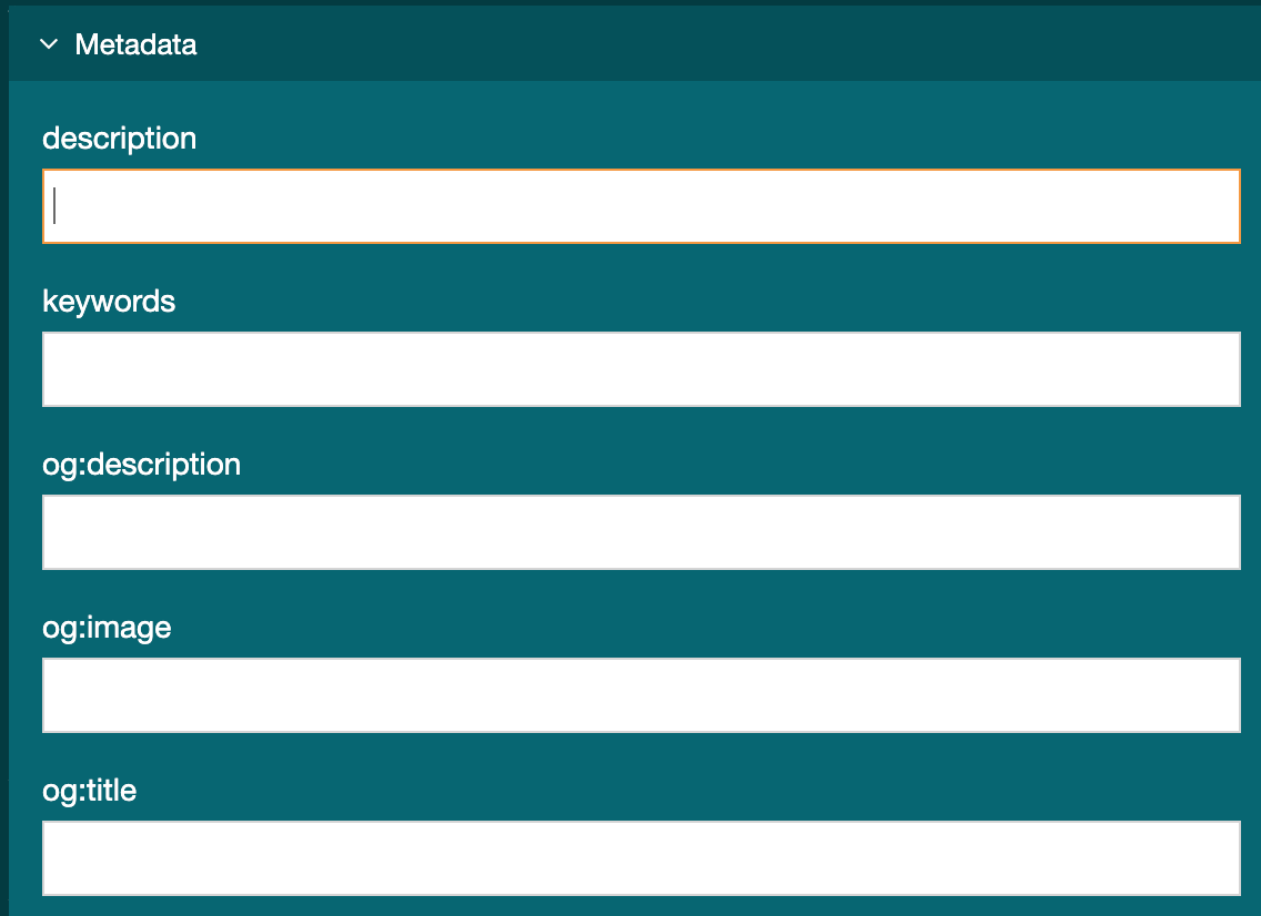
Edit Rights
This tab lets you see the page Edit rights for your Users or Groups.
This tab is read-only, you must use the standard interface to make changes.
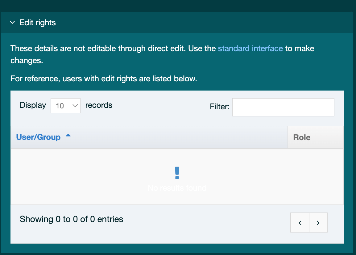
| Item | Description |
|---|---|
| User/group | the Users or Groups that have editing rights to this page. |
| Role | the Access Role of the corresponding User/Group. |
Content Types
You cannot edit from this tab; you must use the standard interface to make changes to the Content Types on this page.
Access Control
If you want to restrict access to this page, check the Restrict Access box and choose the Group(s) you want to provide access to. Being restricted means the users indicated can only view this content when they log in.
Approval Queue
This displays a list of content items which are currently pending approval. Approval requires an Administrator or a Power User or Moderator if assigned the rights. Each item in the queue shows the following information:
| Item | Description |
|---|---|
| Title | The name of the Content Item. Clicking on the Title will display the Content Options modal. |
| Last Modified | The date and time when the content was last modified |
| ID | The unique content ID number |
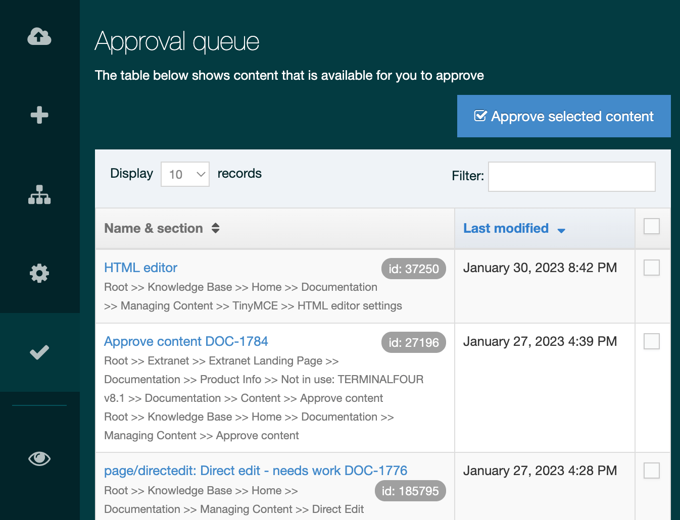
Edit Content
Those editable parts of the page are identified with a surrounding dashed line. Editable areas are Content Items with a Content Type with Direct Edit enabled. Page Layout and Navigation Object Content Items are not editable in Direct Edit and can only be edited within the main interface.
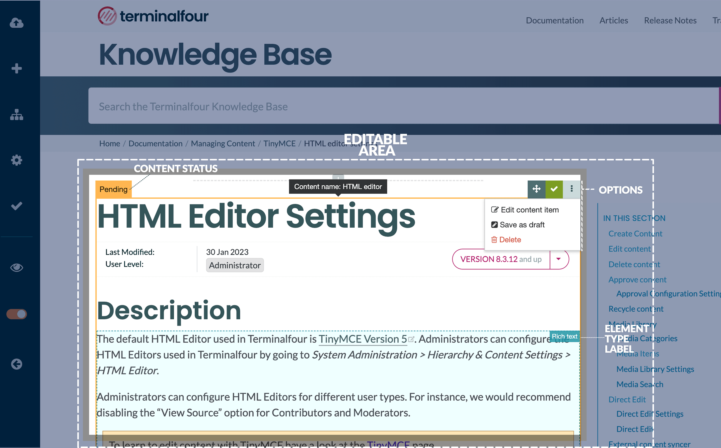
There are two types of Content Elements:
| Plain Text |
Plain Text elements cannot be formatted
|
|---|---|
| Rich text |
With Rich Text elements, you can add formatting to text and tables, images and links:
To format text or add a link just select the text and use the Quick Toolbar to add formatting. If you need more control (like adding an image or a linking to a file in the Media Library ), just click the Formatting button to see the full HTML editor menus and toolbars to add images and tables. Alternatively, just right-click and select "Show formatting options" or "Insert file link or image".
|

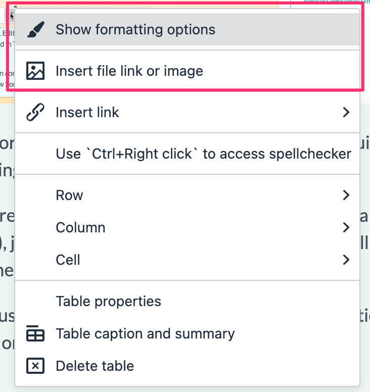
The status of the content is displayed on the top right of the Content Item:
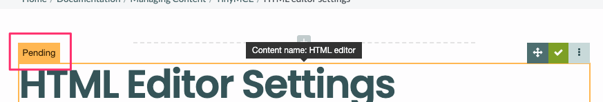
There are three content statuses Direct Edit:
| Draft | Draft Content Items are not sent for approval and this staus is best used if you are working on something that you intend to return to a complete |
|---|---|
| Pending | Pending Content Items do not publish. A previously approved version will continue to publish until a new version is approved. |
| Approved | Only Approved content is published. Content Items in a pending Section do not publish. |
Analytics
From version 8.3.16, Terminalfour supports Google Analytics 4 only.
Direct Edit provides content editors with insights from Google Analytics to see how well a page's content has performed over time. To see analytics in Direct Edit, you will need to ensure that the following is in place:
- In System Administration > System Settings > Analytics
- set up a Google Analytics in Analytics Accounts
- create a Dashboard
- assign the Channel that your page will be published with to the Dashboard
- add a Report to the Dashboard
- the page's Page Layout should include the Google Analytics tracking snippet
When Analytics is successfully set up, it will be available in Direct Edit:
When Analytics in Direct Edit is working correctly, the following page statistics are displayed:
- Total visitors
- recorded periods can be a day, week, month or year. Each point on the graph shows indicates the date of a content change. With this, you can see the effect that content changes have on site visits
- Bounce rate
- Bounce rate measures a website's effectiveness in encouraging visitors to continue with their visit. If the visitor only visits one page and then leaves without viewing another page on the site - this is a "bounce". It is expressed as a percentage and represents the proportion of visits that end on the first page of the website that the visitor sees.
- the lower the number the better the page is performing
- Average time a user is on this page
- to calculate time on page, Google Analytics subtracts the difference between the timestamps for two pages. For example, if a visitor visits Page A at 10:00 a.m. and then Page B at 10:05 a.m., the time on page for Page A will be 5 minutes. To get an average time on a specific page, the time spent for the selected date range is divided by the number of unique visits to that page. The value is shown in minutes.
- Most visits from
- this is a geographical reference to where most site visitors originate.
Content Item Options
The Content Item options are available on the top right of the Content Item block
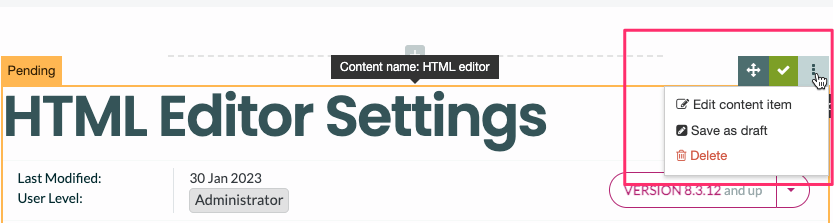
| Name | Description |
|---|---|
| Move | Select and hold to drag the Content Item to another position on the page. |
| Save and Approve | If the Content Item status is "Pending" a green button with a checkmark will be displayed. This allows users with approval rights to save and approve the Content Item in one click. |
| Save |
If the Content Item has a status of "Approved", the Save button will allow you to revert it to Pending |
| More | The button with three vertical dots will display the submenu items |
| More > Edit Content Item | Displays the Content Item modal to give you even more control over your content editing. |
| More > Save as Draft | Changes to Content Item status to Draft |
| More > Delete | Changes the Content Item status to Inactive. Inactive Content Items are not displayed in Direct Edit. |
Preview
Selecting the Preview option from the side menu allows the user to Preview the page outside of the Direct Edit interface. This will give a clearer representation of the page's appearance once published.
Edit Mode Toggle
Selecting the Edit Mode toggle from the side menu allows the user to disable the editing mode in order to get a more accurate view of how the content will look once published, and to click links within the content (with Edit mode enabled, it is not possible to click links within content).
Exit Direct Edit
To exit Direct Edit select Exit direct edit from the side menu. This provides a modal that allows the user to either Log out of Terminalfour, or switch to the standard interface:
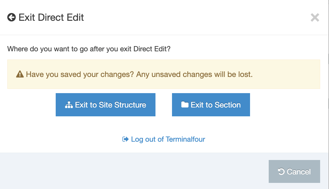
External Content Syncer
Description
The External Content Syncer is used to import and update content from an external data source like a database, XML/RSS feed or even a CSV file. When content is synced, each row in the data source is added to Terminalfour as a content item. Syncing can ensure that the link between the external data source persists. This means that updates made to content in the external data source are reflected in the synced content in Terminalfour. Synced content can also be edited and amended in Terminalfour.
For instance, if your staff profile information was stored on an external database, that content can be synced with Terminalfour so it can be published on your website. The external database may not include photos but these can be managed directly within Terminalfour.
Content edits are synced in one direction only – from the data source to Terminalfour – so while synced content can be edited in Terminalfour, those edits will not update content back in the data source. Edits to synced content in Terminalfour will be overwritten by changes to content in the data source when the next sync occurs.
Before configuring the External Content Syncer you will need to set up the data source connection details in a Data Source.
There's more than one way to integrate external data in Terminalfour and the method you choose can depend on the type of data and what you want to do with it.
Check out our guide to help you choose the right one.
Using the External Content Syncer
To use, go to Content > Integration Tools > External Content Syncer:
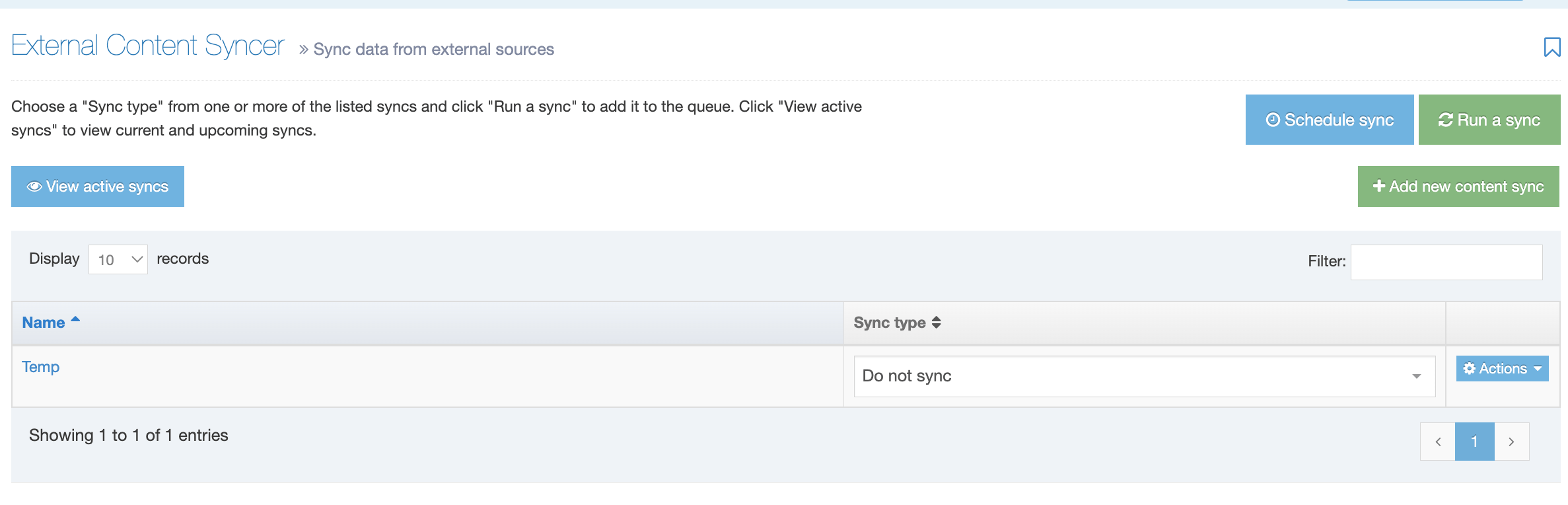
From this page you can:
Configure the External Content Syncer
Data Source
Before configuring the External Content Syncer, you must set up a Data Source.
Once a Data Source is has been set up, go to Content > Integration tools > External Content Syncer and click the Create new Content Sync.
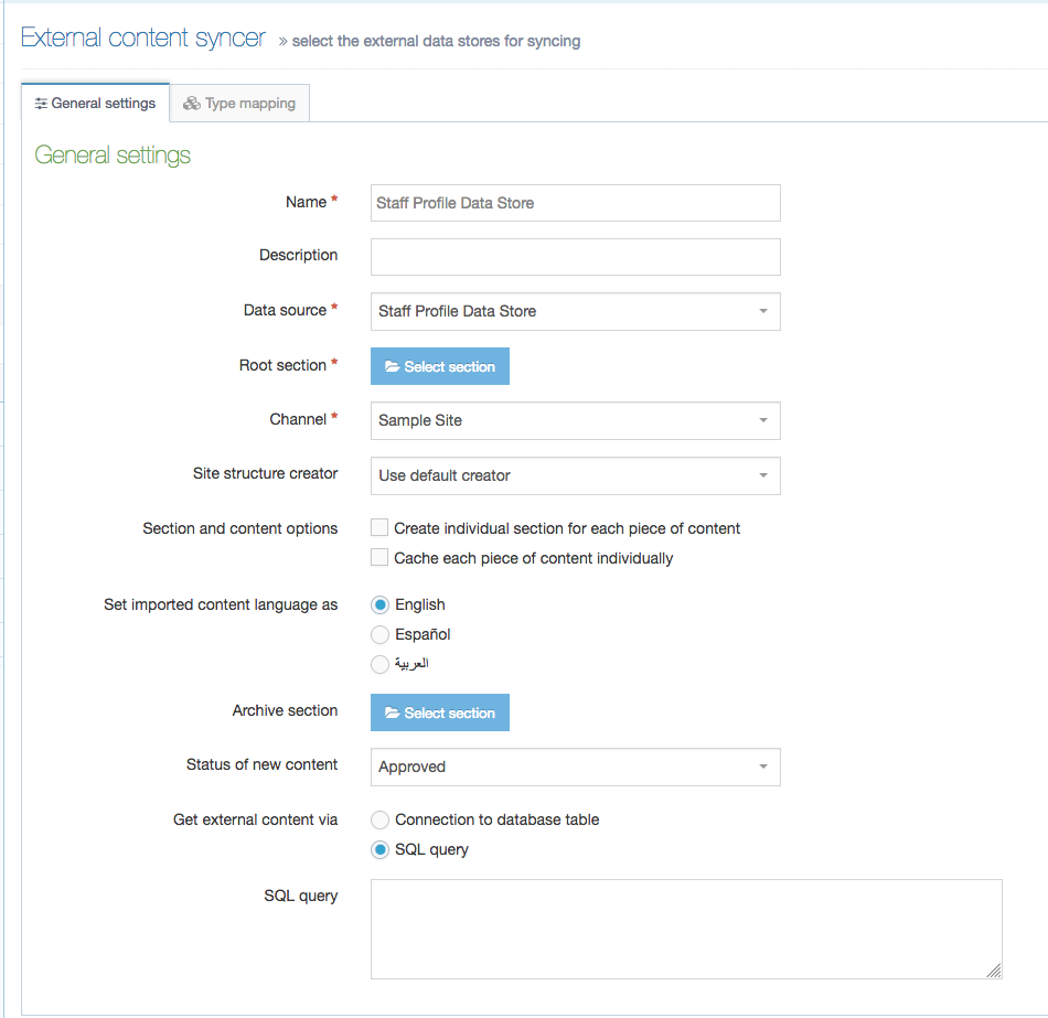
There are two tabs here – General Information and Type Mapping:
General Information
| Item | Description |
|---|---|
| Name | Give your Content Sync a name. It is recommended to make the name as descriptive as possible. This is required. |
| Description | This is used by the filter on the External Content Syncer listing and can be useful for finding Content Sync. |
| Data Source | Select a Data Source to use. This must be already configured. This is required. |
| Root Section | Set the Section to import the content into via Browse or Search. The Content Type being used to import content must be enabled on this section to allow the External Content Syncer to import the content. This is required. |
| Channel | Select the Channel to publish the imported content. This is required. |
| Site Structure Creator |
By default, either all content will be added to one Section, or a separate Section will be created for each Content Item, under the Root Section selected above. This depends on the option to Create individual Section for each Content Item below. Using a custom Site Structure Creator plugin allows you to generate a custom Site Structure rather than using the default. Leave it as Use default creator to use the default. |
| Section and content options |
|
| Set imported language as | Select the language into which content is imported. This is particularly important for multi-language websites. |
| Archive section | Set the Section to move content to when it is no longer found in the external database. If left blank, content is not moved but is marked as Inactive. |
| Status of new content | Choose from Approved, Pending, Inactive, or Draft. If set to Pending, this may allow users to review new content before it is published on the site. This only applies for new content; updates to existing content do not alter the content status i.e. if content is approved and then updated by the external content syncer, the content remains as approved. |
| Get external content via |
|
| Database table | If Get external content via is Connection to database to get table, select the database table. |
| SQL Query | If Get external content via is SQL Query, enter the SQL query that should be used to retrieve the content. |
Type Mapping
When syncing content, you must select the Content Type that the synced content will use. When a Content Type is selected from the drop-down list, the Content Type Elements will be listed on the left. To map, just input the Table column name from the external data source in the corresponding Type Element field:
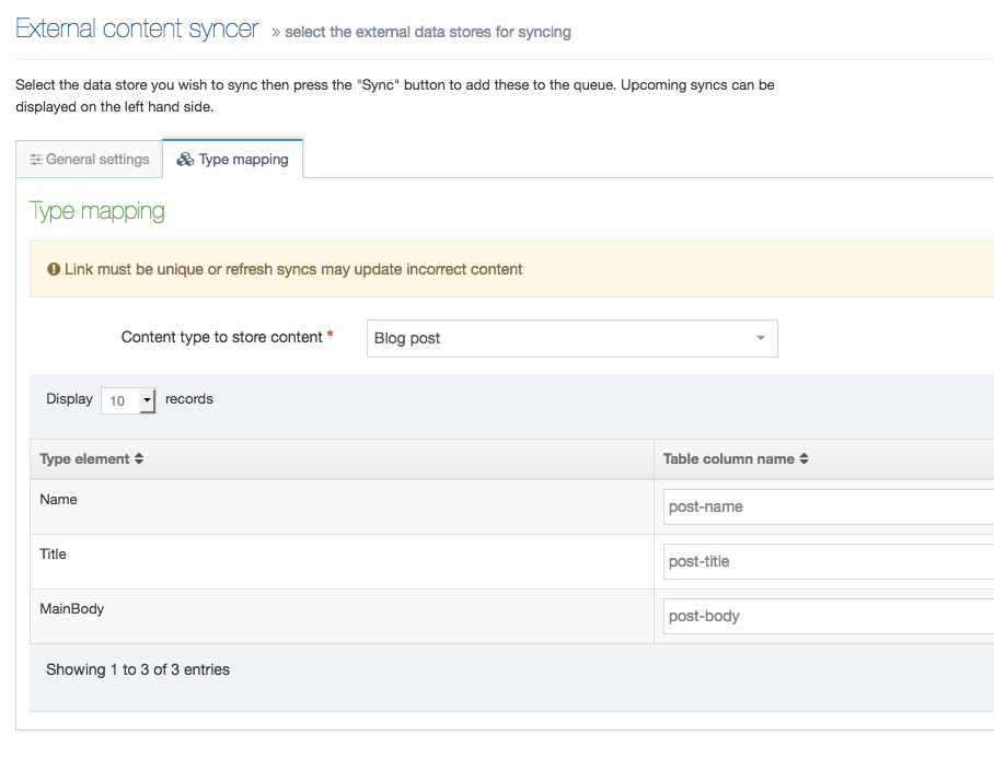
It is currently possible to sync into plain text, HTML, date, select box and radio button elements. For date elements the date format needs to be yyyy-MM-dd HH:mm:ss (e.g., 2018-03-31 23:59:59). When the elements are select box or radio button elements, the value in the database must match the list entry name (rather than the value).
While using multi-select lists may be possible, they are not currently officially supported. It may work in the following scenarios:
- the value in the database must match the list entry name (rather than the value)
- there is only one entry in the list (e.g., a list with one entry that is "Yes" that is a checkbox in the Content Type)
At least one of the elements or database fields should be selected as the Link. This should be the element that can uniquely identify the content item, and which may be used as a Primary Key in the external database. Examples could be a Staff ID or a Staff Email Address. If there is no one unique element, a combination of two can be used, meaning that the combination of the two elements will always be unique. This is used to match the Terminalfour content item with the relevant record in the external database. The values in the field(s) selected as the Link should not change - if the value of the field selected in the Link changes, a new Content Item will be imported for this new Link value, as opposed to updating the existing Content Item. It is worth noting that a unique element/field can be imported, and used internally as the Link, but not output by the Content Layout and not published with the content, if preferred.
If connecting to a CSV file, refer to the article on Content Syncers with CSV files for information on the Table Column Names in CSV files.
Mapping a Content Item's embargo and expiry dates
From version 8.3.3. you can map a Content Item's embargo and expiry dates:
- Publish date
- Expiry date
- Review date
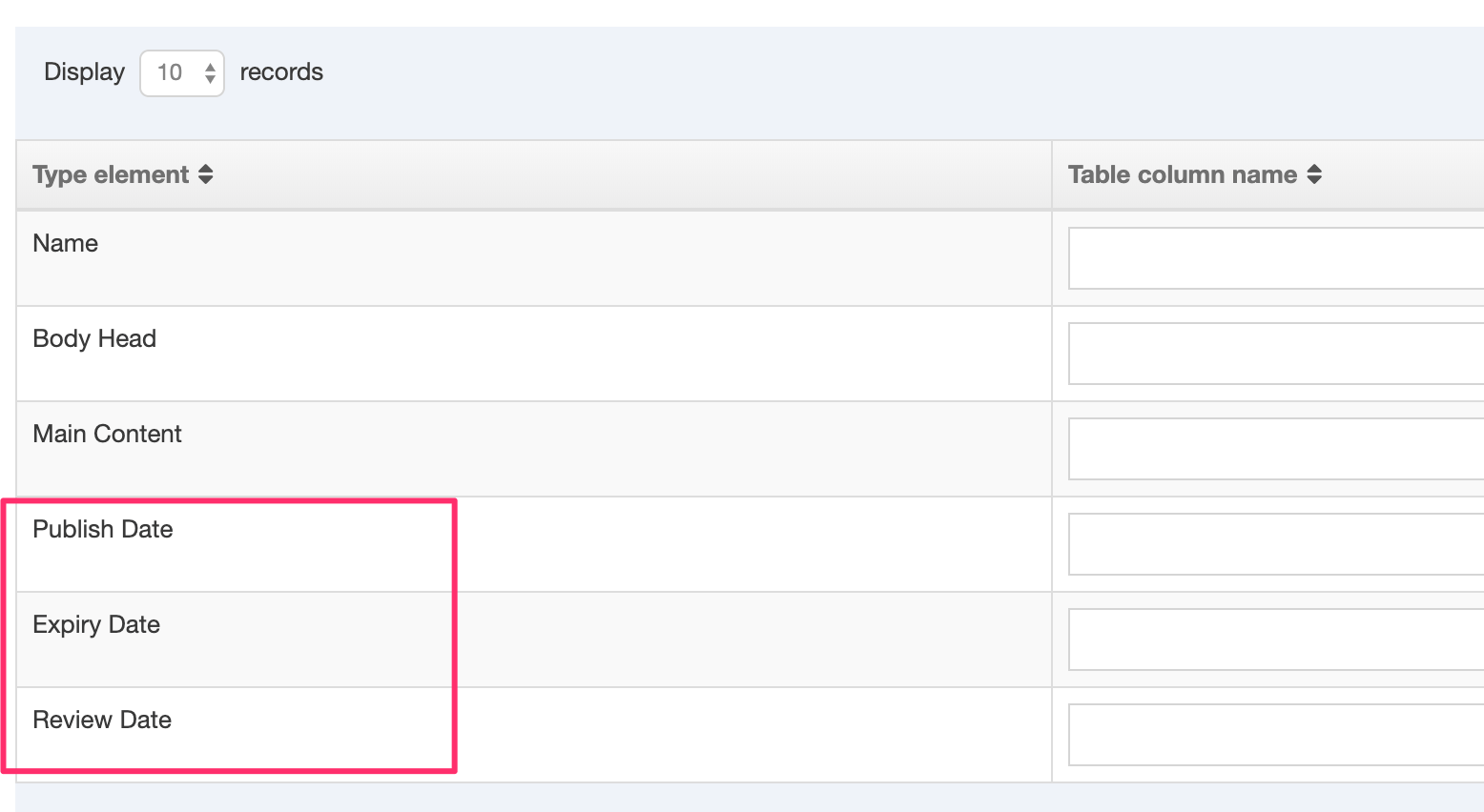
Run a Sync
For each content sync, select the Sync Type and select Sync:
| Item | Description |
|---|---|
| Initial Sync | Used on the first import. It creates a new Content Item for each entry in the database |
| Full Sync |
The Full Sync was introduced in Terminalfour 8.4.2 |
| Data Sync Refresh | Refreshes content synced initially and updates with new content, if changed in the source. |
| Data Sync New & Refresh | Creates new content for each new entry and updates content that has already been synced. |
| Data Sync Old Status |
Refreshes content synced initially and updates with new content, if changed in the source. It also removes content if it no longer exists in the source depending on whether an Archive Section is set:
|
| Clean & Initial Sync | Deletes all content and does Initial Sync |
Schedule Sync
Click Schedule sync. A popup window appears with the following fields to be completed:
| Item | Description |
|---|---|
| Next due | The starting day and time of the next sync. |
| Execution interval | How often you wish this schedule to be run. |
| Fixed rate | When "Fixed rate" is enabled, the execution interval starts only when the previous task has finished and will disregard any Daylight Savings Time (DST) changes. |
| Maximum executions |
The number of times this task will run. This option is only displayed when a frequency interval is selected (i.e., any option but "Once") and "Infinite" is not selected. |
| Content sync | The content sync you want to run. |
| Sync type | The sync type you want to run in this schedule. |
| Email address | The email address of the person(s) you want to be notified in case of a failure of the sync. |
Click Confirm, and the task is added to the Task Scheduler.
The most common sync that is needed is "Data Sync New and Refresh" and "Data Sync Old Status." To schedule both of these, create two separate scheduled syncs, one of each type.
Active Syncs
After you confirm your schedule request, in the active syncs column, the sync you requested is shown:

You can choose several syncs for your content. This screen shows three syncs in the queue:
Content migration
Description
Terminalfour offers multiple ways to get migrate your content. Packages are a way for you to create a collection of Terminalfour assets. You can choose to import these assets into your current Terminalfour instance or another.
Content Migration from external sources or from other Terminalfour instances can be messy but it doesn't need to be. With Packages, you can gather assets and content together in a single file that can be imported to the same or a different instance.
There are two types of Packages:
- External content Packages
- Cross-instance Packages
External content Packages
These are the Packages that are used to migrate content from an external source into Terminalfour. Before you use these Packages you should consider the following about the type and amount of data you want to migrate:
Database Content
If the content is in a database, then consider the External Content Syncer. This is great for text-based content that doesn't require a hierarchy or folder structure on import (e.g., staff profiles, program information etc.).
Have a look at this primer of content syncing to help you get started. Content Syncing is not ideal for HTML content because it won't import images or files (like documents) that are referenced. Neither will it parse for links and update them into Terminalfour-managed links.
Manual vs auto-migration
Whether migration is auto or manual is down to the number and consistency of the page design. When all or most pages in a site adhere to a uniform mark-up structure, mapping to Content Types is straightforward and the auto-migration task requires less manual input. In most cases, a combination of manual and auto-migration is used to balance accuracy and speed.
Talk to your account manager about the best way for you
The following Package types are used to migrate external content into Terminalfour:
- Media Archive Package
- used to bulk upload media files like images or documents to the Media Library.
- HTML Package
- uses the DOM structure of the HTML page to determine the Site Structure, content area of the page, and the Content Type to be used for the content. On import, all documents and images that are referenced are imported into the Media Library, and any internal links between the HTML files are converted into Terminalfour Section Links.
Cross-instance Packages
We've noticed some challenges with Packages in Terminalfour, particularly with complex builds which can cause problems during package creation and import. Specifically, creating channel and section packages can sometimes lead to corrupt packages due to the build or configuration within the application.
Packages was originally designed for less complex Terminalfour implementations and may not fully support more intricate features like programmable layouts and some navigation objects.
Your feedback is valuable to us! If you've encountered issues or have unique use cases for Packages, please reach out and share your thoughts and experiences with us. It helps us plan for future improvements.
The following Package types are used to export from one instance of Terminalfour to import into another instance of Terminalfour:
- Channel Package
- exports the Channel configuration, Site Structure, Content, Media Items, and all assets that are used or referenced (Page Layouts, Content Types, Navigation Objects, Lists and Sublists) within a selected Channel. Once created, the Package can be imported into the Site Structure of the same or another Terminalfour instance.
- Section Package
- exports the Subsections, Content, Media Items, and all assets that are used or referenced (Page Layouts, Content Types, Navigation Objects, Lists and Sublists) within a selected Branch. Once created, the Package can be imported into the Site Structure of the same or another Terminalfour instance.
- Group Package
- export assets (Page Layouts, Content Types, Navigation Objects, Lists and Sublists) owned by a specific Group. These assets can then be imported into an existing or a new Group.
- Media Category Package
- exports a Media Category, including Subcategories, and all Media Items from the Media Library. These can then be imported into a separate area of the same Media Library, or into the Media Library in a different Terminalfour instance.
- Individual Assets Package
- exports one or more specified Content Items, Content Types, Page Layouts, Navigation Objects, Media Items, Lists or Sub Lists
HTML Editor
Description
From version 8.3.12, Terminalfour now uses TinyMCE v5.
When you create or edit HTML content in Terminalfour, the default WYSIWYG HTML Editor is TinyMCE. With TinyMCE, all content editors, regardless of their HTML or CSS expertise, can apply advanced formatting to text content in Content Elements whose type is set to HTML. TinyMCE is compatible with the most popular browsers; there's a complete list of compatible browsers here.
In our testing, we have discovered some issues with TinyMCE and Firefox so we’d recommend using Chrome or Edge.
Instances of the HTML Editor can be configured for users based on their requirements.
TinyMCE will feel familiar to anyone who has used a popular word-processing application. To apply formatting or add a link to text, select the text and choose the relevant option from the toolbar. TinyMCE generates the corresponding, standards-based HTML. If the option is enabled, an editor with HTML knowledge can even amend the source code directly within the editor (via Tools > Source Code in the Toolbar).
An Administrator can use the HTML Editor Settings to add and remove menu and tool items and enable plugins. If your menus and toolbar look slightly different to the screenshot above your Editor may be configured differently.
HTML Editor toolbar
The controls comprise a top menu and icons on the toolbar. The toolbar setup here shows the basic icons and menus.
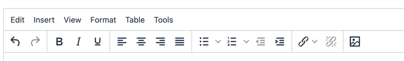
Menus and corresponding icons
Not all functions have toolbar icons. Most functions are listed in the drop-down menus.
| Menu | Item | Icon | Subitem | Further subitem | Description / Shortcut |
|---|---|---|---|---|---|
| Edit | Undo |  |
Undoes the last operation. | ||
| Redo |  |
Redoes the last 'Undo' operation | |||
| Cut | Cuts the current selection into the clipboard. Ctrl+X |
||||
| Copy | Copies the current selection into the clipboard. Ctrl+C |
||||
| Paste | Pastes the clipboard contents into the editor. Ctrl+V |
||||
| Paste as text | Removes formatting from clipboard text and pastes as plain text. | ||||
| Select all | Selects all the editor contents. Ctrl+A |
||||
| Find and replace | Search and/or Replaces contents within the editor. Ctrl+F | ||||
| Insert | |||||
| Insert file link or image |  |
Insert a Media Item from the Media Library. When selected, a Media Library dialogue box is opened where you can search for a Media Item. Images are placed into the HTML Editor and can be resized if necessary. When other file types are selected (e.g., a Word document or PDF ), a link to the file is added. |
|||
| Insert link |  |
Insert Section link | Inserts a link to a Section. | ||
| Insert Content link | Inserts a link to a Content item. | ||||
| Insert/edit external link | Inserts a link to an external URL. | ||||
| Insert anchor | Inserts an anchor to link to a specific part of a page. | ||||
| Insert date/time | Inserts the current date/time. | ||||
| Horizontal line | Inserts a horizontal rule into the editor. | ||||
| View | |||||
| Show blocks | Toggles the visibility of block elements. | ||||
| Show invisible characters | Toggles the visibility of non-breaking character elements. | ||||
| Visual aids | Toggles the visual aids for invisible elements. | ||||
| Fullscreen | Toggles fullscreen mode. Ctrl+Alt+F |
||||
| Format | |||||
| Bold |  |
Bolds the current selection. Ctrl+B |
|||
| Italic |  |
Italicises the current selection. |
|||
| Underline |  |
Underlines the current selection. | |||
| Strikethrough | Applies strike though format to the current selection. | ||||
| Superscript | Applies superscript format to the current selection. | ||||
| Subscript | Applies subscript format to the current selection. | ||||
| Formats | Headings | Heading 1 | Changes text to Heading 1. Ctrl + 1 | ||
| Heading 2 | Changes text to Heading 2. Ctrl + 2 | ||||
| Heading 3 | Changes text to Heading 3. Ctrl + 3 | ||||
| Heading 4 | Changes text to Heading 4. Ctrl + 4 | ||||
| Heading 5 | Changes text to Heading 5. Ctrl + 5 | ||||
| Heading 6 | Changes text to Heading 6. Ctrl + 6 | ||||
| |
Inline | Bold | Applies the bold format to the current selection. Ctrl+B |
||
| |
Italic | Applies the italic format to the current selection. Ctrl+I |
|||
| |
Underline | Applies the underline format to the current selection. Ctrl+U |
|||
| Strikethrough | Applies strikethrough format to the current selection. | ||||
| Superscript | Applies superscript format to the current selection. | ||||
| Subscript | Applies subscript format to the current selection. | ||||
| Code | Applies a monospaced font to the current selection. | ||||
| Blocks | Paragraph | Applies a paragraph format to the current block-level element. | |||
| Blockquote | Applies block quote format to the current block-level element. | ||||
| Div | Adds a div tag or wraps the selection with a div to create a block level element. | ||||
| Pre | Adds pre and code tags around the current selection to create a code block. | ||||
 |
Alignment | Left | Left-aligns the current block or image. | ||
 |
Center | Center-aligns the current block or image. | |||
 |
Right | Right-aligns the current block or image. | |||
 |
Justify | Justifies the current block or image. | |||
| Clear formatting | Removes the inline styles and formatting from the current selection. | ||||
| Table | |||||
| Insert table with column headings | See Insert Table | ||||
| Insert table with column and row headings | |||||
| Table properties |
Change table layout and appearance properties like width, height, padding and border. Under the advanced settings, you can add CSS styles. See the documentation on Table Properties below. |
||||
| Delete table | |||||
| Cell | Cell properties | ||||
| Merge cells | |||||
| Split cell | |||||
| Row | Insert row before | ||||
| Insert row after | |||||
| Delete row | |||||
| Row properties | |||||
| Cut row | |||||
| Copy row | |||||
| Paste row before | |||||
| Paste row after | |||||
| Column | Insert column before | ||||
| Insert column after | |||||
| Delete column | |||||
| Tools | |||||
| Source code | Opens the source code viewer. |
Icons that don't have a menu option
| Item | Icon | Description |
|---|---|---|
| bullet list |  |
Formats the current selection as an unordered bullet list. |
| number list |  |
Formats the current selection as an ordered number list. |
| outdent |  |
Outdents the current list item or block element. |
| indent |  |
Indents the current list item or block element. |
| unlink |  |
Removes links from the current selection. |
| Insert file link or image |
Insert a Media Item from the Media Library. When selected, a Media Library dialogue box is opened where you can search for a Media Item. Images are placed into the HTML Editor and can be resized if necessary. When other file types are selected (e.g., a Word document or PDF ), a link to the file is added. |
Keyboard Shortcuts
You can also use keyboard shortcuts to add formatting in the HTML Editor.
The keyboard shortcuts have changed since TinyMCE 4.
Imported formats
When copying and pasting content from an external source (such as MS Word or Excel), all proprietary formatting and tags are changed to their HTML equivalent. When there is no HTML equivalent the formatting is removed.
Formatting is especially important for people using a screen reader. If not applied correctly, screen readers might not interpret the content as intended.
Have a look at this primer on HTML and Accessibility.
Adding a link
There are two types of links – internal and external.
Internal links
To link to a Terminalfour Section or Content Item select text or an image and go to Insert > Insert link > Insert section link or Insert content link (or select the link icon from the menu).
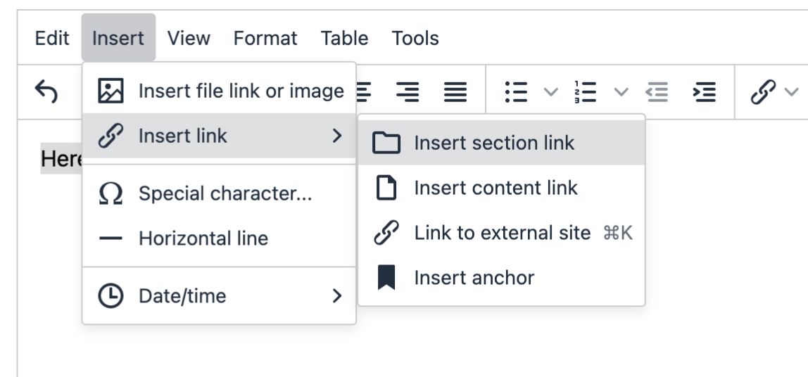
When you click “Insert section link” or “Insert content link”, a modal will be displayed to link to the section and/or the content. Depending on your Hierarchy Configuration, editors may either have access to link to the sections to which they have been granted access, or they may have access to link to the any section (regardless of whether they have edit rights to that section).
Section filtering
From 8.3.15, you can find the Section or Content Item you want to link to with the Section Filtering input:
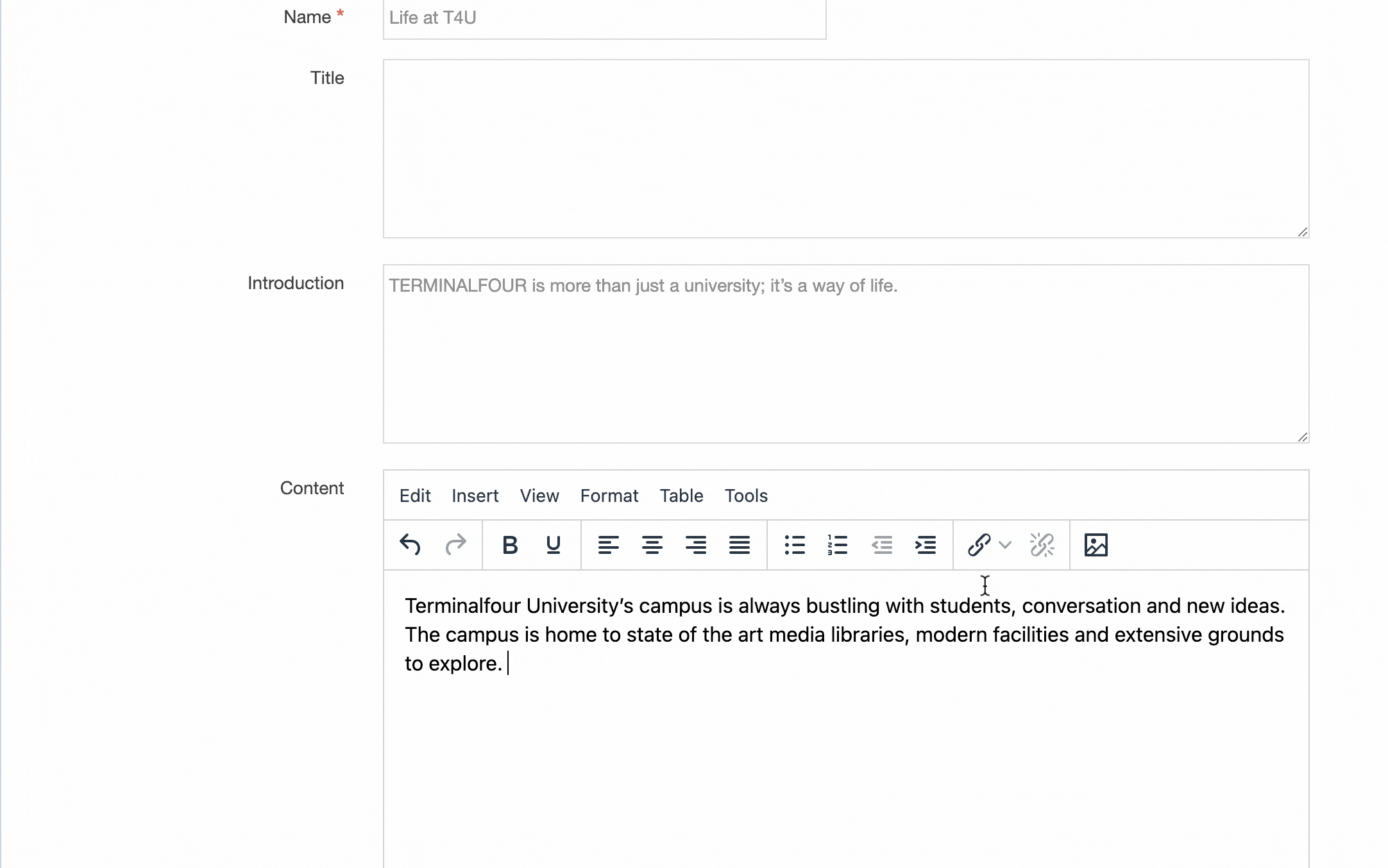
Editing an internal link
To edit an internal link, double-click on the text and change the link text:
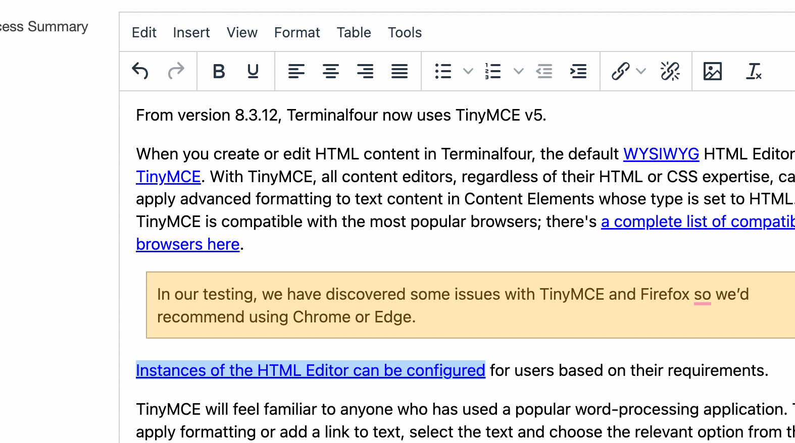
External link
To link to an external website select text or an image and go to Insert > Insert link > Link to external site (or select the link icon from the menu). Alternatively, you can use the Ctrl+K key combination.
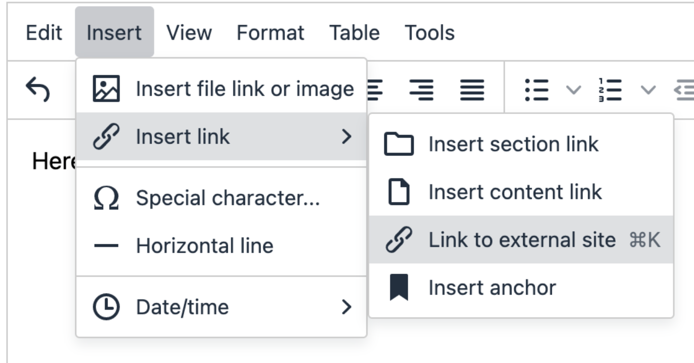
Editing an external link
Select the linked item and right-click and select Insert link > Link to external site (Ctrl+K):
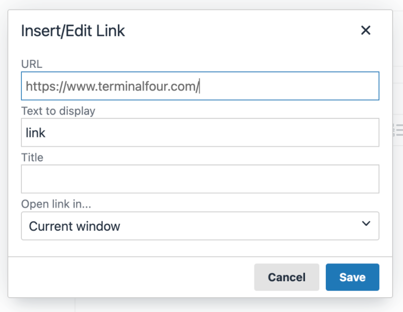
From here, you can edit the link URL, text, title and which window it should open in.
Adding Media
To add a Media Item select the “Add image or link to file” button from the menu:
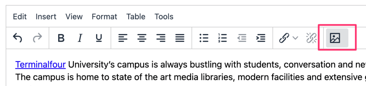
When you click on this, the Media Library modal will be displayed where you can select a Media Item.
Double-clicking on the Media Item will show the editable media attributes.
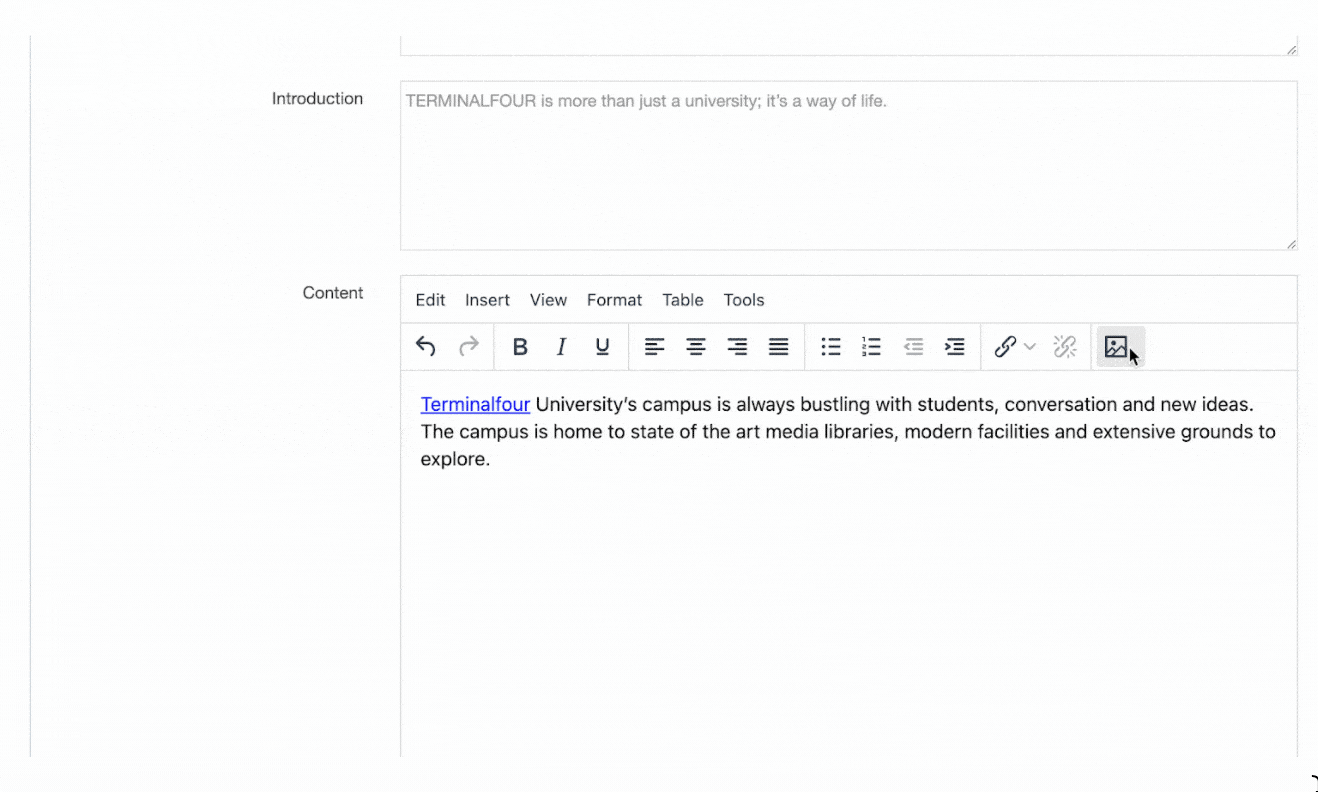
Adding a file link
If the Media Item you use is a file with a supported Media Layout a link will be created for it.
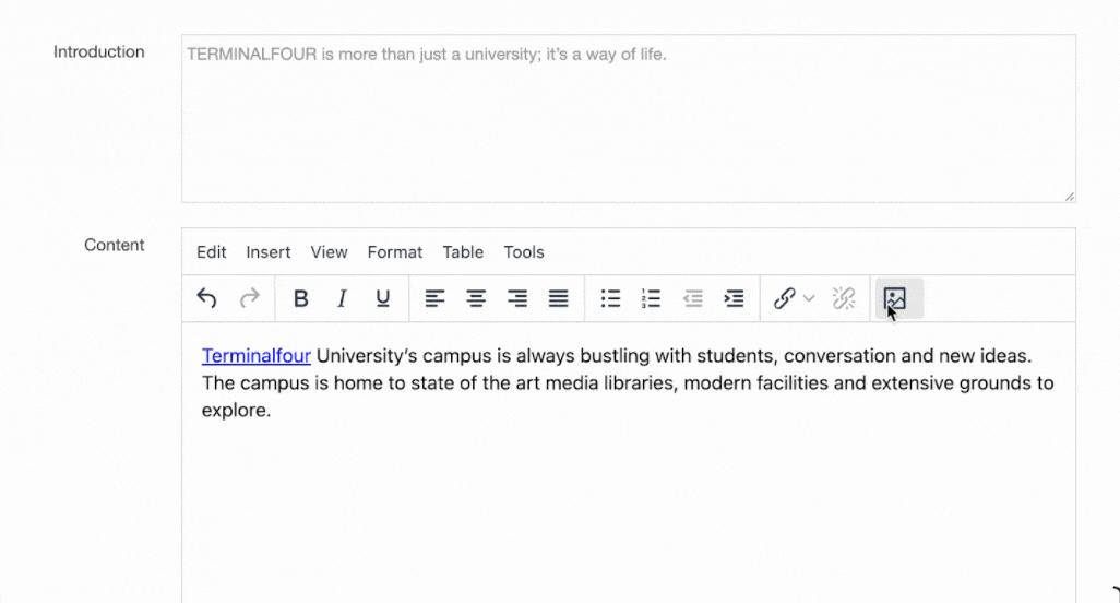
Spell Check
The free spell check plugin has been deprecated by TinyMCE and has been removed in 8.3.12 however you can use the native browser spellchecking.
A misspelt word will be underlined in the browser. To fix it, press Ctrl and click which will display the browser context menu with a list of suggestions.
Find and Replace
- Find - enter the word to search for
- Replace with - enter the word to replace
- Match case - check if you want to distinguish instances of the word in upper/lower cases
- Whole words - search only whole words
- Command buttons - Find - Replace - Replace all - Prev - Next - use as needed to complete the task.
Insert Table
To insert a table, click Table on the toolbar menu. This screen opens:
1. In this example, a 4x4 table has been chosen to insert. The maximum setting from the template is a 10x10 table.
2. Click the lowest right corner box to insert.
3. As there is no content, the table is collapsed. To expand, click and drag a corner to a convenient starting size. You can adjust after filling with content. See below for instructions on Cell Properties and Row Properties (there are no Column Properties).
Table Properties
General
From here you can specify the values for table layout and appearance settings:
- Width (in pixels)
- Height (in pixels)
- Cell spacing – the space between table cells (in pixels)
- Cell padding – the distance between cell borders and the content within a cell (in pixels)
- Border - the border width (in pixels); the border color can be selected under the "Advanced" tab
- Caption – select to add a table caption (in pixels)
- Alignment
Advanced
From Version 8.3 there's a "CSS class" option in the "Advanced" tab so you can add classes to your table
It's recommended that visual styling is applied in your stylesheet with CSS rather than the inline styles that are applied here.
Check out this article on table styling with CSS for some tips.
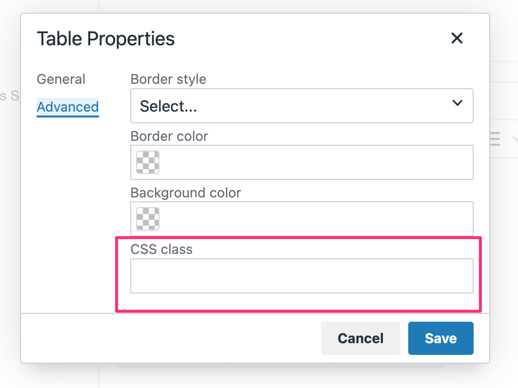
Cell Properties
For Cell properties:
1. Right-click from within a cell
2. From the toolbar: Table > Cell > Cell Properties. This popup appears:
General
Advanced

Row Properties
For Cell properties:
1. Right-click from within a cell
2. From the toolbar: Table > Row > Row properties. This popup appears:
General
1. Row type - choose from Header, Body, or Footer (in Advanced you can also set colors.)
Advanced

Footer
Located in the footer status bar of the editor is a descriptor corresponding to the location of the cursor/pointer. This is similar to breadcrumbs as there can be several elements to the descriptor. Each element is linked to a point on the page. Click the last element (td) and that area is highlighted.
For example, here is a descriptor indicating where the cursor is located in a cell in the table:
This is a textual reference for an unordered list - click the last element (li):
Content configuration settings
Description
To configure the content settings go to System Administration > Hierarchy & Content Settings > Content
Complete these entries and click Save changes:
| Item | Description |
|---|---|
| Content lock timeout | Sets the number of minutes before the Content Lock times out. |
| Channel selection method |
Sets the pre-selected Channels when creating or editing content. The options are:
|
| Selected Channels | If the Channel selection method is Select pre-chosen, set the Channels to be selected on the Channel tab for created content. |
| Enable spell checker | Enables the spell check function for plain text elements when creating or editing content. |
| Inherit owner from parent branch if not set | Sets the owner from the parent if it is not set on the Section / Content Item. |
| Alert administrators on expiration | Sends a content expiration notice email to the administrator, for the specified Content Types. |
| Alert owner on expiration | Sends a content expiration notice email to the owner for the specified Content Types. |
| Choose content types for expiration alert | Sets the content types to send alerts when content expires. |
| Restrict modification of content | Restricts editing of a Content Item to members of groups that have access to the Content Type. |
| Enable warnings on update | Sets a warning message to appear when editing a Content Item. The warning message can be configured for each content type. |
| Allowed file extensions |
Restricts the file types that can be uploaded into file elements. Image elements can be configured in the Media Library configuration. Doesn't function in versions prior to 8.3.15 |
| Default archive Section |
Sets a default archive Section to move expired Content Items to. Content Items with an explicit archive Section overrides this default. |
| Auto mirroring: Enable auto mirroring of content |
Enables auto mirroring of Content Items so that content can be automatically mirrored based on value(s) selected from a List element in a Content Type. For each list, select whether to Use as auto mirroring list. If the List is being used, then for each list value, select the Section into which content with that value should be mirrored. It is possible to "switch off" auto-mirroring when the source content resides in certain Sections or Branches. |
Merging Content Items into a Target Section
Description
When you move, duplicate or Mirror Content Items from one Section to another it's worth being aware of how the Content Items will be ordered when they arrive in the target Section.
How Content Items are ordered in a Section depends on the ordering rule applied to that Section. The default mode is "Standard ordering" where the Content Items are manually ordered and can be re-ordered by a user. The other mode is "Automatic ordering" where, as the name suggests, Content Items are ordered automatically based on the rules of a set criteria like date or name.
A Content Item can also be locked in place so it appears at the top or the bottom of the list of Content Items. All of this means that it can be sometimes difficult to figure out how the resulting order of Content Items in the target Section.
Below are four typical scenarios where the Content Items have been moved, mirrored or duplicated into a target Section.
Scenario 1
- Source Section uses standard ordering
- Target Section uses standard ordering
In this scenario, the ordering of the Content Items from the source Section is maintained in the target Section.
Scenario 2
- Source Section uses standard ordering
- Target Section uses automatic ordering
In this scenario, all Content Items from the source Section will have a sequence of 0 applied to them. As a result, the source Content Items and the Content Items already in the target Section will be published based on the ordering rule applied to the target Section.
Scenario 3
- Source Section uses automatic ordering
- Target Section uses standard ordering
In this scenario, Content Items that had a sequence of 0 applied to them in the source Section, will keep the same relative ordering in the target Section as they had in the source Section.
For example, the Source section has automatic ordering enabled and has two automatically ordered Content Items "A" and "B". When the Content Items are duplicated, moved or Mirrored to the target Section, the sequence numbers applied to them in the target Section will be the same as they were in the source Section (i.e., "A" above "B").
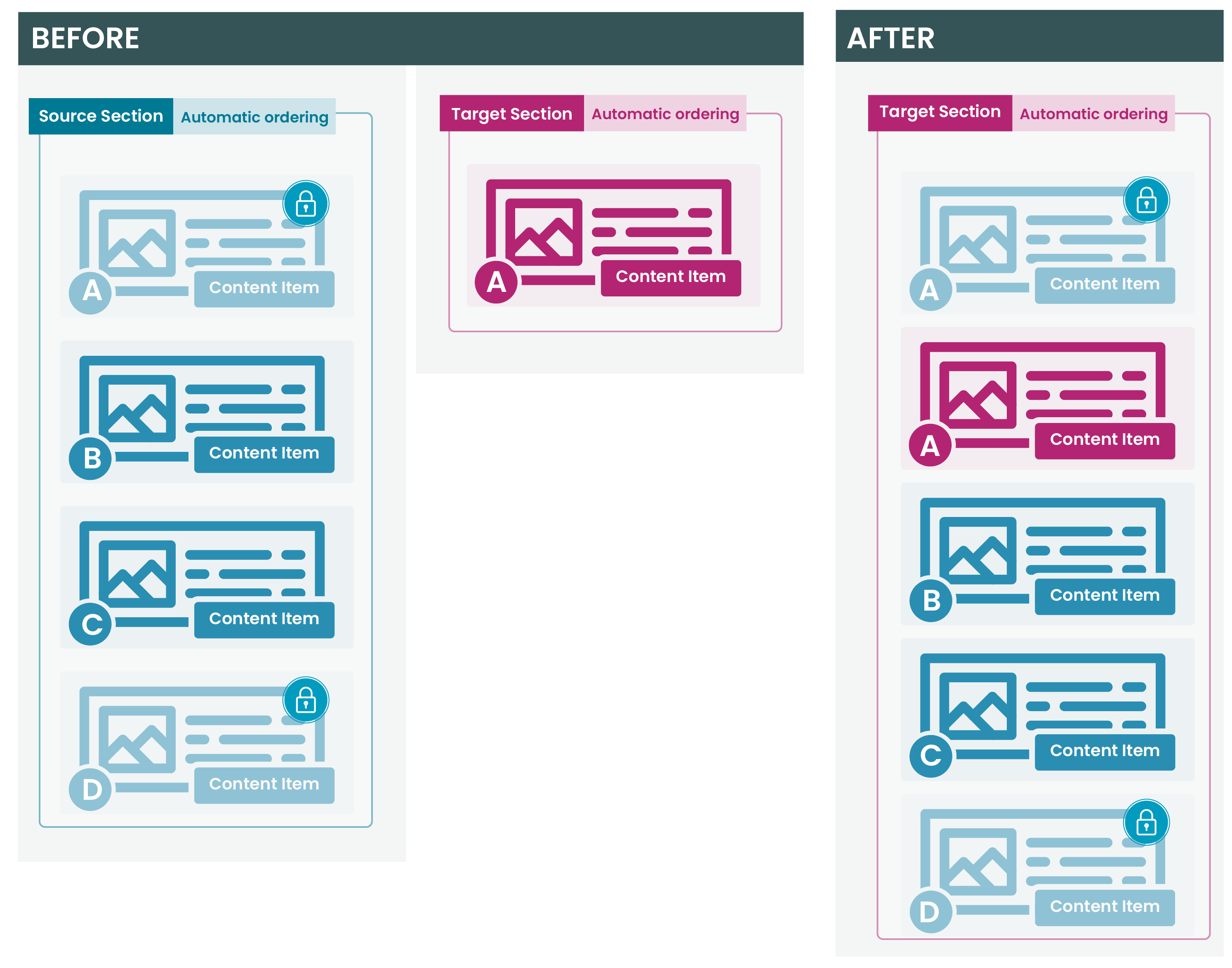
Scenario 4
- Source Section uses automatic ordering
- Target Section uses automatic ordering
In this scenario, all automatically ordered content from the source Section will have a sequence of 0 applied to it in the target Section as well. As a result, the source Content Items and the automatically ordered Content Items in the target Section will be published based on the ordering rule applied to the Target section.

TinyMCE editor
Description
When you are creating or editing HTML content in TERMINALFOUR, the default WYSIWYG HTML Editor is TinyMCE. With TinyMCE, all content editors, regardless of their HTML or CSS expertise, can apply advanced formatting to text content in Content Elements whose type is set to HTML. TinyMCE is compatible with most popular browsers; there's a full list of compatible browsers here.
Instances of the HTML Editor can be configured for users base on their requirements.
TinyMCE will feel familiar to anyone who has used a popular word processing application. To apply formatting or add a link to text, select the text and choose the relevant option from the toolbar. TinyMCE generates the corresponding, standards-based HTML. If the option is enabled, an editor with HTML knowledge can even amend the source code directly within the editor (via Tools > Source Code in the Toolbar).
Your view when starting with TinyMCE begins with this screen image:
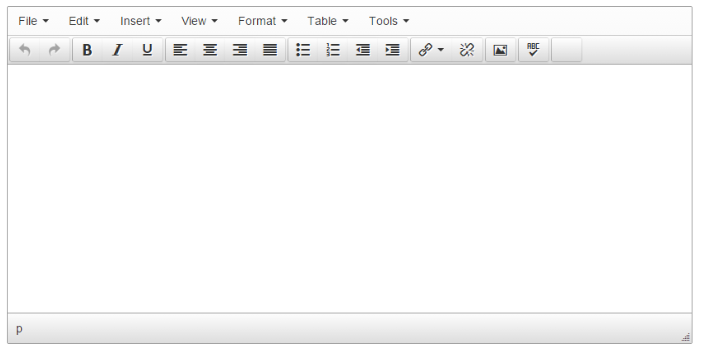 The toolbar contents and functions are explained below.
An Administrator can use the HTML Editor feature to add and delete components. The Menu and toolbar may look slightly different for you.
TinyMCE toolbar
The controls comprise a top menu and icons on the toolbar. The toolbar setup here shows the basic icons and menus.

Menus and corresponding icons
Not all functions have toolbar icons. Most functions are listed in the drop-down menus.
| Menu | Item | Icon | Subitem | Further subitem | Description / Shortcut |
|---|---|---|---|---|---|
| Edit | Undo | |
Undoes the last operation. | ||
| Redo | |
Redoes the last 'Undo' operation | |||
| Cut | Cuts the current selection into the clipboard. Ctrl+X |
||||
| Copy | Copies the current selection into the clipboard. Ctrl+C |
||||
| Paste | Pastes the clipboard contents into the editor. Ctrl+V |
||||
| Paste as text | Removes formatting from clipboard text and pastes as plain text. | ||||
| Select all | Selects all the editor contents. Ctrl+A |
||||
| Find and replace | Search and/or Replaces contents within the editor. Ctrl+F | ||||
| Insert | |||||
| Insert file link or image | |
Insert a Media Item from the Media Library. When selected, a Media Library dialogue box is opened where you can search for a Media Item. Images are placed into the HTML Editor and can be resized if necessary. When other file types are selected (e.g., a Word document or PDF ), a link to the file is added. |
|||
| Insert link | |
Insert Section link | Inserts a link to a Section. | ||
| Insert Content link | Inserts a link to a Content item. | ||||
| Insert/edit external link | Inserts a link to an external URL. | ||||
| Insert anchor | Inserts an anchor to link to a specific part of a page. | ||||
| Insert date/time | Inserts the current date/time. | ||||
| Horizontal line | Inserts a horizontal rule into the editor. | ||||
| View | |||||
| Show blocks | Toggles the visibility of block elements. | ||||
| Show invisible characters | Toggles the visibility of non-breaking character elements. | ||||
| Visual aids | Toggles the visual aids for invisible elements. | ||||
| Fullscreen | Toggles fullscreen mode. Ctrl+Alt+F |
||||
| Format | |||||
| Bold | |
Bolds the current selection. Ctrl+B |
|||
| Italic | |
Italicises the current selection. |
|||
| Underline | |
Underlines the current selection. | |||
| Strikethrough | Applies strike though format to the current selection. | ||||
| Superscript | Applies superscript format to the current selection. | ||||
| Subscript | Applies subscript format to the current selection. | ||||
| Formats | Headings | Heading 1 | Changes text to Heading 1. Ctrl + 1 | ||
| Heading 2 | Changes text to Heading 2. Ctrl + 2 | ||||
| Heading 3 | Changes text to Heading 3. Ctrl + 3 | ||||
| Heading 4 | Changes text to Heading 4. Ctrl + 4 | ||||
| Heading 5 | Changes text to Heading 5. Ctrl + 5 | ||||
| Heading 6 | Changes text to Heading 6. Ctrl + 6 | ||||
| |
Inline | Bold | Applies the bold format to the current selection. Ctrl+B |
||
| |
Italic | Applies the italic format to the current selection. Ctrl+I |
|||
| |
Underline | Applies the underline format to the current selection. Ctrl+U |
|||
| Strikethrough | Applies strikethrough format to the current selection. | ||||
| Superscript | Applies superscript format to the current selection. | ||||
| Subscript | Applies subscript format to the current selection. | ||||
| Code | Applies a monospaced font to the current selection. | ||||
| Blocks | Paragraph | Applies a paragraph format to the current block-level element. | |||
| Blockquote | Applies block quote format to the current block-level element. | ||||
| Div | Adds a div tag or wraps the selection with a div to create a block level element. | ||||
| Pre | Adds pre and code tags around the current selection to create a code block. | ||||
| |
Alignment | Left | Left-aligns the current block or image. | ||
| |
Center | Center-aligns the current block or image. | |||
| |
Right | Right-aligns the current block or image. | |||
| |
Justify | Justifies the current block or image. | |||
| Clear formatting | Removes the inline styles and formatting from the current selection. | ||||
| Table | |||||
| Insert table | See Insert Table | ||||
| Table properties |
Change table layout and appearance properties like width, height, padding and border. Under the advanced settings, you can add CSS styles. See the documentation on Table Properties below. |
||||
| Delete table | |||||
| Cell | Cell properties | ||||
| Merge cells | |||||
| Split cell | |||||
| Row | Insert row before | ||||
| Insert row after | |||||
| Delete row | |||||
| Row properties | |||||
| Cut row | |||||
| Copy row | |||||
| Paste row before | |||||
| Paste row after | |||||
| Column | Insert column before | ||||
| Insert column after | |||||
| Delete column | |||||
| Tools | |||||
| Spellcheck |  |
Spellchecks the current editor contents. | |||
| Source code | Opens the source code viewer. |
Icons that don't have a menu option
| Item | Icon | Description |
|---|---|---|
| bullet list | |
Formats the current selection as an unordered bullet list. |
| number list | |
Formats the current selection as an ordered number list. |
| outdent | |
Outdents the current list item or block element. |
| indent | |
Indents the current list item or block element. |
| unlink | |
Removes links from the current selection. |
| Insert file link or image |
Insert a Media Item from the Media Library. When selected, a Media Library dialogue box is opened where you can search for a Media Item. Images are placed into the HTML Editor and can be resized if necessary. When other file types are selected (e.g., a Word document or PDF ), a link to the file is added. |
|
| Remove formatting |  |
Removes formatting and markup (apart from paragraph elements) from selected content. In versions before 8.3 this was labelled "Remove all formatting" and removed formatting from all content. |
The word count is displayed in the bottom right of the status bar.
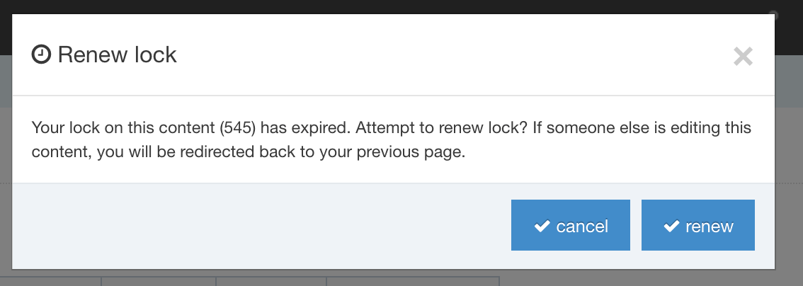
Imported formats
When copying and pasting content from an external source (such as MS Word or Excel), all proprietary formatting and tags are changed to their HTML equivalent. When there is no HTML equivalent the formatting is removed.
Formatting is especially important for people using a screen reader. If not applied correctly, screen readers might not interpret the content as intended.
Have a look at this primer on HTML and Accessibility.
Spell Check
If you have used versions previous to Version 8, there are changes to the Spellcheck functionality. You can still click a button to scan the content for misspelled words, but the popup screen is no longer used. The on-screen function is more up-to-date and similar to other system's spell check methods.
At any point, you can click the ABC√ button to run a spell check of the text. Red lines indicate misspelled words. To fix errors, click the pointer on the word. An on-screen popup window appears and shows possible correct spellings. In our example, the misspelled word is 'lazzy' - the system suggests the correct spelling is 'lazy'. To correct the word click 'lazy' and the text repairs to the correct spelling.
Options
- Add to dictionary - when there is an instance of a word spelled differently than the one in the dictionary but is correct in its usage, you can choose to add the word to the dictionary. An example might be the spelling of script names, or the use of an abbreviation - as in "StateU", or a made-up word "kegathon". Use this option where you will be repeating the term throughout the content.
- Ignore - ignore this occurrence
- Ignore all - ignore all uses of the word throughout the text
- Finish - click when you have completed the spellcheck (at any time during the process)
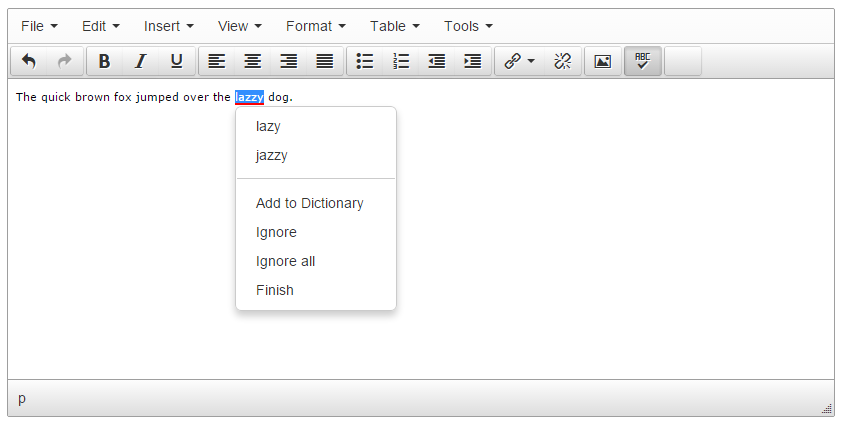
Find and Replace
- Find - enter the word to search for
- Replace with - enter the word to replace
- Match case - check if you want to distinguish instances of the word in upper/lower cases
- Whole words - search only whole words
- Command buttons - Find - Replace - Replace all - Prev - Next - use as needed to complete the task.
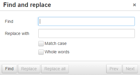
Insert Table
To insert a table, click Table on the toolbar menu. This screen opens:
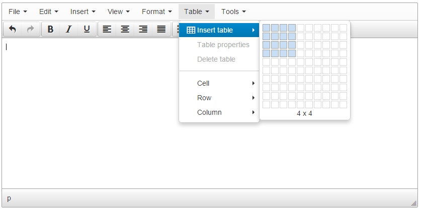
1. In this example, a 4x4 table has been chosen to insert. The maximum setting from the template is a 10x10 table.
2. Click the lowest right corner box to insert.
3. As there is no content, the table is collapsed. To expand, click and drag a corner to a convenient starting size. You can adjust after filling with content. See below for instructions on Cell Properties and Row Properties (there are no Column Properties).
Table Properties
General
From here you can specify the values for table layout and appearance settings:
- Width (in pixels)
- Height (in pixels)
- Cell spacing – the space between table cells (in pixels)
- Cell padding – the distance between cell borders and the content within a cell (in pixels)
- Border - the border width (in pixels); the border color can be selected under the "Advanced" tab
- Caption – select to add a table caption (in pixels)
- Alignment
Advanced
From Version 8.3 there's a "CSS class" option in the "Advanced" tab so you can add classes to your table
It's recommended that visual styling is applied in your stylesheet with CSS rather than the inline styles that are applied here.
Check out this article on table styling with CSS for some tips.

Cell Properties
For Cell properties:
1. Right-click from within a cell
2. From the toolbar: Table > Cell > Cell Properties. This popup appears:
General
Advanced
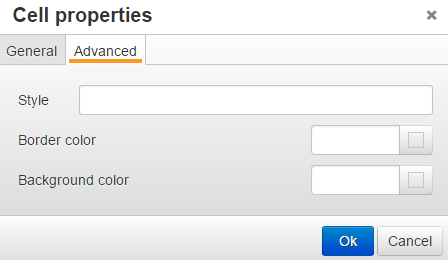
Row Properties
For Cell properties:
1. Right-click from within a cell
2. From the toolbar: Table > Row > Row properties. This popup appears:
General
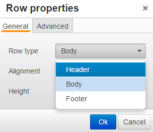
1. Row type - choose from Header, Body, or Footer (in Advanced you can also set colors.)
Advanced
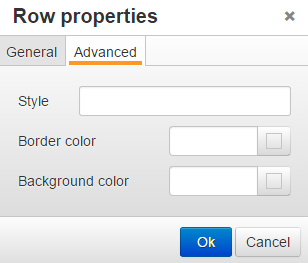
Footer
Located in the footer status bar of the editor is a descriptor corresponding to the location of the cursor/pointer. This is similar to breadcrumbs as there can be several elements to the descriptor. Each element is linked to a point on the page. Click the last element (td) and that area is highlighted. For example, here is a descriptor indicating where the cursor is located in a cell in the table:
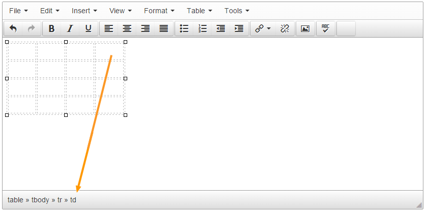
This is a textual reference for an unordered list - click the last element (li):
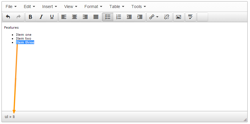
HTML Editor Settings
Description
The default HTML Editor used in Terminalfour is TinyMCE Version 5. Administrators can configure the HTML Editors used in Terminalfour by going to System Administration > Hierarchy & Content Settings > HTML Editor.
Administrators can configure HTML Editors for different user types. For instance, we would recommend disabling the “View Source” option for Contributors and Moderators.
To learn to edit content with TinyMCE have a look at the TinyMCE page.
An Administrator can use the HTML Editor feature to create more than one instance of the editor. Each instance can be customized to your user's needs whether they are content editors or end users by configuring the visibility of menu and toolbar icons.
If you wish to see how to remove toolbar menu items and icons, then skip to this section.
HTML Editor
HTML Editor Listing
All the HTML Editors used in your Terminalfour install are listed on this screen. Each Editor has a corresponding “Minimum access rights” dropdown where you can specify the minimum user role who can access the HTML Editor. For example, if you wanted to only permit Power Users and up to use an HTML Editor then set the “Minimum access rights” to Power Users.
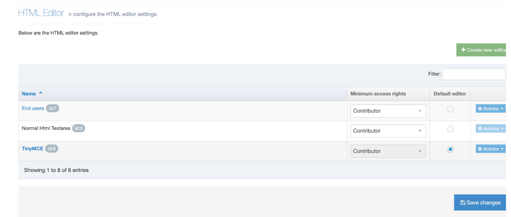
| Item | Description |
|---|---|
| Name | The name of the Editor. The default editor name is bolded. |
| Default HTML editor | Assigns this as the default editor for new users. It can be changed on an individual user's profile |
| Minimum access rights | Set the minimum user level for each editor. If you, for instance, allow Moderators to have access to the Standard Textarea Editor, any user from this level and up will be able to select this editor in the User Profile. Additional editors can be configured on the Editors tab. |
| Default Editor |
|
To edit an HTML Editor click on the name or go to Action > Edit.
Plain text editors cannot be edited.
Configure The HTML Editor Settings
All HTML Editors are listed in the Editors tab. To customize one of your HTML Editors, select its name. To create a new editor, select Create new editor.
Configure the HTML editor settings
General settings
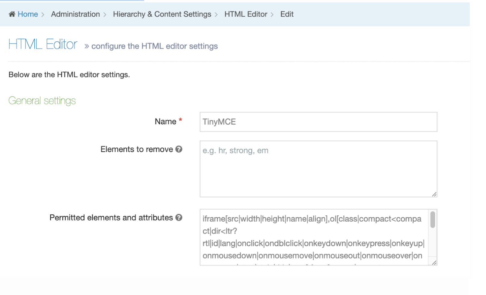
| Item | Description |
|---|---|
| Name | Sets the name used to identify the editor in the application |
| Elements to remove |
In previous versions this was labelled "Invalid elements". Comma-separated list of element names to be removed from your content. This allows specific code to be removed automatically from content. |
| Permitted elements and attributes |
In previous versions this was labelled "Extended valid elements". Sets the permitted extended elements and attributes. Please note that any rules defined here will overwrite the default TinyMCE rules. This could cause unexpected behavior. E.g., images won't be displayed in TinyMCE if the The following is an example of the extended valid elements TERMINALFOUR recommends with your editor: iframe[src|width|height|name|align], If you want to add a |
Two options that have been removed in 8.3.12 - “Enable cleanup” and “Convert fonts to spans”. Both of these options are enabled by default in the TinyMCE core.
Custom Styles
You can apply custom classes and IDs from your own stylesheet directly from the Formats menu in the HTML Editor. These are listed under Format > Formats > Custom Formats.
To add a custom stylesheet just upload a CSS file to the Media Library, check the 'Enable custom styles' option, and select the stylesheet.
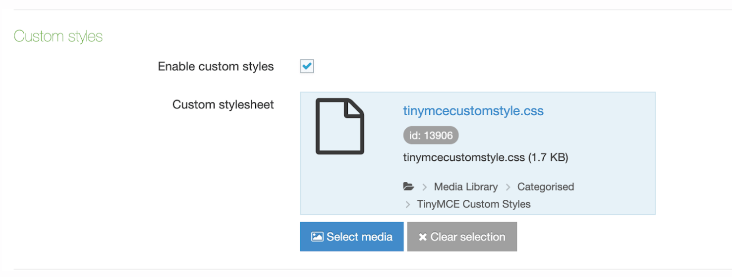
Menu & toolbars
Menu Options
| Item | Description |
|---|---|
| Menu options to hide | Sets which options to hide in the editor's main menu |
| Menu items to hide | Sets which subitems to hide in the editor's menu options |
| Custom plugin menu items | Add menu items from custom plugins |
Toolbar options
| Standard toolbar icons to hide | A dropdown of all of the default toolbar options that can be hidden. |
|---|---|
| Additional toolbar icons to hide | Permits "extra" toolbar icons to be hidden that could be put in place by custom plugins. Enter values in plain text, separated by commas or spaces. |
| Custom plugins toolbar items |
You can add toolbar icons from standard and custom plugins by add in the name to this list. |
Format options
| Custom block formats |
Sets the block formats that can be selected from a drop-down menu in the toolbar. Once set, a new toolbar item will appear with the options specified here. |
|---|---|
| Default formats to hide |
If you don't want to list one or more formats in the Formats menu (Format > Formats), you can hide them by adding them here. Styles from your custom stylesheet, if you are using one, are not available here. Selecting options here does not remove them from the "Format > Blocks" option or from the toolbar item when "Custom block formats" has been set. See Hide Default Block Formats below. |
Formats
Block Formats
The block formats under the format menu are controlled by the Custom block formats option.
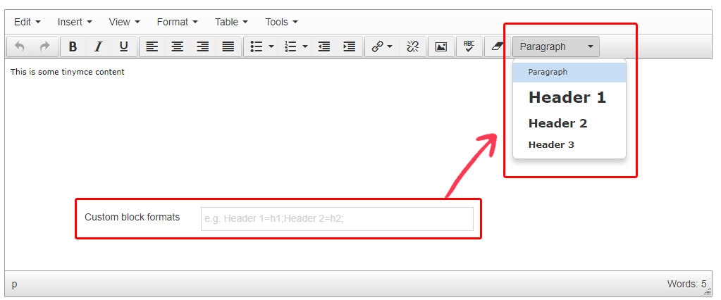
Hide Default Block Formats
The block formats under the format menu are controlled by the Default formats to hide options.

Plugins
The HTML Editor comes pre-installed with custom plugins to add features to Tiny MCE's core functionality. These plugins can be enabled/disabled as required.
If you want to add your own custom plugins, read this guide.
The Add custom plugin button allows additional TinyMCE plugins to be added. Each plugin should be an individual folder within the uploaded .zip file. Multiple plugins can be added to a single .zip file.
Creating custom plugins has changed from TinyMCE 4 to TinyMCE 5 so we've created this guide to help you migrate your plugins.
Below is a description of the standard plugins provided.
|
Plugin |
Summary |
Description |
|---|---|---|
|
advlist |
Create styled number and bulleted lists. |
Extends the core bullist and numlist toolbar controls by adding CSS list-style-type styled number formats and bullet types to the controls. |
|
anchor |
Insert anchors (sometimes referred to as a bookmark). |
Adds an anchor/bookmark button to the toolbar that inserts an anchor at the editor's cursor insertion point. It also adds the menu item anchor under the Insert menu. |
|
autolink |
Automatically create hyperlinks. |
Automatically creates hyperlinks when a user inputs a valid, complete URL. For example, www.example.com is converted to http://www.example.com. |
|
code |
Edit your content's HTML source. |
Adds a toolbar button that allows a user to edit the HTML code hidden by the WYSIWYG view. It also adds the menu item Source code under the Tools menu. |
|
contextmenu |
Right-click to perform actions in TinyMCE |
Adds a configurable context menu that appears when a user right-clicks in the editable area. |
|
directionality |
Toolbar buttons for setting the left-to-right or right-to-left direction of content. |
Adds directionality controls to the toolbar, enabling TinyMCE to better handle languages written from right to left. It also adds a toolbar button for each of its values, ltr for left-to-right text, and rtl for right-to-left text. |
|
fullscreen |
Zoom TinyMCE up to the whole screen. |
Adds full screen editing capabilities to TinyMCE. When the toolbar button is pressed the editable area will fill the browser's viewport. The plugin adds a toolbar button and a menu item Fullscreen under the View menu. |
|
hr |
Insert a horizontal line. |
Allows a user to insert a horizontal rule on the page at the cursor insertion point. It also adds a toolbar button and a menu item Horizontal line under the Insert menu. |
|
insertdatetime |
Insert the current date and/or time into TinyMCE. |
Provides a toolbar control and menu item Insert date/time (under the Insert menu) that lets a user easily insert the current date and/or time into the editable area at the cursor insertion point. |
|
lists |
Normalizes list behavior between browsers. |
This list plugin Normalizes list behavior between browsers. |
|
noneditable |
Prevent users from changing content within elements. Ideal for templates. |
Enables you to prevent users from being able to edit content within elements assigned the mceNonEditable class. |
|
paste |
Standard version of features for copying-and-pasting content from Microsoft Word. |
Also adds a menu item Paste as text under the Edit menu dropdown and a toolbar button. |
|
|
Print the content in TinyMCE. |
Adds a print button to the toolbar. It also adds a Print item to the File menu dropdown. |
|
searchreplace |
Find and replace content in TinyMCE. |
Adds search/replace dialogs to TinyMCE. It also adds a toolbar button and Find and replace menu item under the Edit menu dropdown. |
|
spellchecker |
Enables TinyMCE's spellcheck functionality. |
Enables TinyMCE's spellcheck functionality. It also adds a toolbar button and the menu item Spellcheck under the Tools menu dropdown. |
|
tabfocus |
Tab into and out of the TinyMCE control in your web form. |
Adds the possibility to tab in/out of TinyMCE. |
|
table |
Table editing features. |
Adds table management functionality to TinyMCE. It also adds a new menubar item Table with various options in its drop-down including Insert table and options to modify cells, rows, and columns, and a toolbar button with the same functionality. |
|
textpattern |
Matches special patterns in the text and applies formats or executed commands on these patterns. |
Matches special patterns in the text and applies formats or executed commands on these patterns. start and end text with * applies the format 'italic' start and end text with ** applies the format 'bold' # applies the format'h1' ## applies the format'h2' ### applies the format'h3' #### applies the format'h4' ##### applies the format'h5' ###### applies the format'h6' 1. ', cmd: 'InsertOrderedList' * ', cmd: 'InsertUnorderedList' - ', cmd: 'InsertUnorderedList' The default pattern is similar to Markdown syntax, so you can type # text to produce a header or **text** to make text bold. More instructions required - see https://www.tinymce.com/docs/plugins/textpattern/ |
|
visualblocks |
Allows a user to see block-level elements such as paragraphs. |
Allows a user to see block-level elements in the editable area. It is similar to WYSIWYG hidden character functionality but at a block level. It also adds a toolbar button and a menu item Show blocks under the View menu dropdown. |
|
visualchars |
See invisible characters like non-breaking spaces. |
Adds the ability for users to see invisible characters displayed in the editable area.
It also adds a toolbar control and a menu item labelled “Show invisible characters” under the View menu. |
|
t4cleanup |
T4 special |
Removes attributes and html tags from the content |
|
t4customstyles |
T4 special |
Allows you to have additional styles under formats |
|
t4externallink |
T4 special |
This is identical to the standard 'link' plugin except for the addition of the 'insertLink:presubmit' event being fired |
|
t4links |
T4 special |
Handles the insert section link, content link, anchors |
|
t4media |
T4 special |
Handles insertion of media & media attributes modal |
Tiny MCE Settings
Description
To configure the HTML editor go to System Administration > Hierarchy & Content Settings > HTML Editor.
To learn to edit content with TinyMCE have a look at the TinyMCE page.
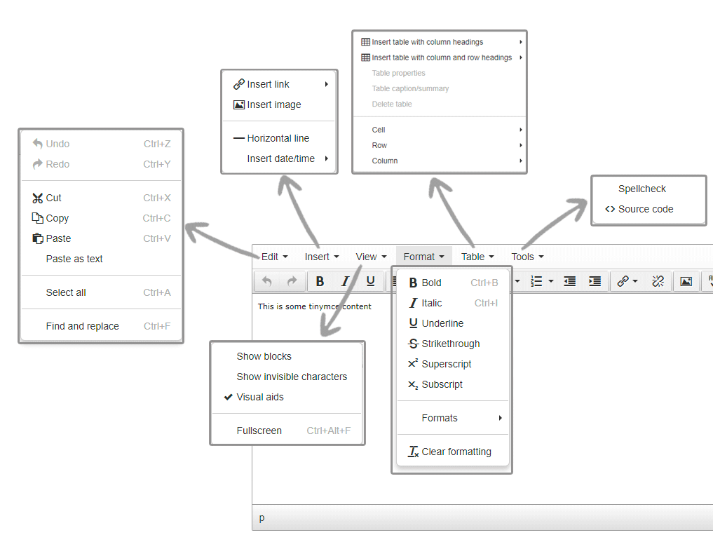
An Administrator can use the HTML Editor feature to create more than one instance of the editor. Each instance can be customized to your user's needs whether they are content editors or end users by configuring the visibility of menu and toolbar icons.
HTML Editor
HTML Editor Settings Tab
In the HTML Editor Settings tab, you can select the default HTML editor to be used.
Below you'll see a list of all available HTML Editors on the left. The User Level required to use the Editor is selected from the corresponding drop-down menu on the right.
| Item | Description |
|---|---|
| Default HTML editor | Assigns this as the default editor for new users. It can be changed on an individual user's profile |
| User access rights | Set the minimum user level for each editor. If you, for instance, allow Moderators to have access to the Standard Textarea Editor, any user from this level and up will be able to select this editor in the User Profile. Additional editors can be configured on the Editors tab. |
| Default title in editor |
Specifies the title text used when creating a link within the editor. This is used when creating or editing content but is not visible on preview or publish. The options are:
|
Editors Tab
All HTML Editors are listed in the Editors tab. To customize one of your HTML Editors, select its name. To create a new editor, select Create new editor.

Configure the HTML editor settings
General settings
| Item | Description |
|---|---|
| Name | Sets the name used to identify the editor in the application |
| Enable cleanup | Uses TinyMCE's cleanup functionality to strip certain tags from the produced HTML and automatically add closing tags where necessary. Historically, this enabled the cleanup of code in the TinyMCE editor when content is pasted from MS Word or other sources. This feature is now enabled by default and can't be disabled. In future releases, this option will be removed from the configuration page. |
| Invalid elements | Comma-separated list of element names to be removed from your content. This allows specific code to be removed automatically from content. E.g., strong, em would remove all strong and em tags from content. |
| Extended valid elements |
Sets the permitted extended elements and attributes. Please note that any rules defined here will overwrite the default TinyMCE rules. This could cause unexpected behavior. E.g., images won't be displayed in TinyMCE if the The following is an example of the extended valid elements TERMINALFOUR recommends with your editor:
|
| Convert fonts to spans | Enables automatic conversion of font tags to span tags |
| Theme advanced blockformats |
You can make it easier for your users to apply styles by displaying a dropdown list of block-level elements in the Toolbar. You can even add your own labels so your users don't have to be familar with HTML element names. To add the elements you want to display, you can them in the following format:
e.g., to add a paragraph, h1, h2 and h3 add the following:
See more here |
| Enable custom styles |
Enables custom styles in the Format > Formats menu. Define these custom styles by selecting a CSS file below. |
| Custom styles media |
Defines the custom styles required in a CSS file in the Media Library |
Toolbars

| Item | Description |
|---|---|
| Standard toolbar icons to hide | Sets which buttons should be hidden in the toolbar |
| Additional toolbar icons to hide | Permits "extra" toolbar icons to be hidden that could be put in place by custom plugins. Enter values in plain text, separated by commas or spaces. |
Theme advanced Blockformats
The advanced block formats under the format menu are controlled by the "Theme advanced blockformats" options:
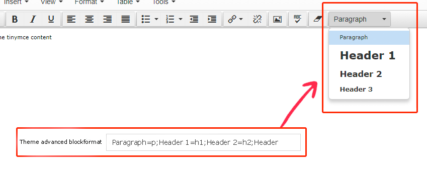
Using Custom CSS
You can list the selectors (e.g., classes and IDs) from your own CSS rules in the Formats menu. These are listed under Format > Formats. Just upload a CSS file to the Media Library, check the "Enable custom styles" option and select the stylesheet.

Plugins
Plugins that have been uploaded are shown. Plugins can be enabled/disabled and removed.
The Add custom plugin button allows additional TinyMCE plugins to be added. Each plugin should be an individual folder within the uploaded .zip file. Multiple plugins can be added to a single .zip file.
Below is a description of the standard plugins provided.
| Plugin | Summary | Description |
|---|---|---|
| advlist | Create styled number and bulleted lists. | Extends the core bullist and numlist toolbar controls by adding CSS list-style-type styled number formats and bullet types to the controls. |
| anchor | Insert anchors (sometimes referred to as a bookmark). | Adds an anchor/bookmark button to the toolbar that inserts an anchor at the editor's cursor insertion point. It also adds the menu item anchor under the Insert menu. |
| autolink | Automatically create hyperlinks. | Automatically creates hyperlinks when a user inputs a valid, complete URL. For example, www.example.com is converted to http://www.example.com. |
| code | Edit your content's HTML source. | Adds a toolbar button that allows a user to edit the HTML code hidden by the WYSIWYG view. It also adds the menu item Source code under the Tools menu. |
| contextmenu | Right-click to perform actions in TinyMCE | Adds a configurable context menu that appears when a user right-clicks in the editable area. |
| directionality | Toolbar buttons for setting the left-to-right or right-to-left direction of content. | Adds directionality controls to the toolbar, enabling TinyMCE to better handle languages written from right to left. It also adds a toolbar button for each of its values, ltr for left-to-right text and rtl for right-to-left text. |
| fullscreen | Zoom TinyMCE up to the whole screen. | Adds full screen editing capabilities to TinyMCE. When the toolbar button is pressed the editable area will fill the browser's viewport. The plugin adds a toolbar button and a menu item Fullscreen under the View menu. |
| hr | Insert a horizontal line. | Allows a user to insert a horizontal rule on the page at the cursor insertion point. It also adds a toolbar button and a menu item Horizontal line under the Insert menu. |
| image | Insert an image into TinyMCE. | Enables the user to insert an image into TinyMCE's editable area. Note that this is not drag-drop functionality and the user is required to enter the path to the image. Optionally the user can also enter the image description, dimensions, and whether image proportions should be constrained (selected via a checkbox). Some of these settings can be preset using the plugin's configuration options. The plugin also adds a toolbar button and an Insert/edit image menu item under the Insert menu. |
| insertdatetime | Insert the current date and/or time into TinyMCE. | Provides a toolbar control and menu item Insert date/time (under the Insert menu) that lets a user easily insert the current date and/or time into the editable area at the cursor insertion point. |
| lists | Normalizes list behavior between browsers. | This list plugin Normalizes list behavior between browsers. Enable it if you have problems with consistency making lists. |
| noneditable | Prevent users from changing content within elements. Ideal for templates. | Enables you to prevent users from being able to edit content within elements assigned the mceNonEditable class. |
| paste | Standard version of features for copying-and-pasting content from Microsoft Word. | Also adds a menu item Paste as text under the Edit menu dropdown and a toolbar button. |
| Print the content in TinyMCE. | Adds a print button to the toolbar. It also adds a Print item to the File menu dropdown. | |
| searchreplace | Find and replace content in TinyMCE. | Adds search/replace dialogs to TinyMCE. It also adds a toolbar button and the menu item Find and replace under the Edit menu dropdown. |
| spellchecker | Enables TinyMCE's spellcheck functionality. | Enables TinyMCE's spellcheck functionality. It also adds a toolbar button and the menu item Spellcheck under the Tools menu dropdown. |
| tabfocus | Tab into and out of the TinyMCE control in your web form. | Adds the possibility to tab in/out of TinyMCE. |
| t4accessibletable | Table editing features. | Adds table management functionality to TinyMCE. It also adds a new menubar item Table with various options in its drop-down including Insert table and options to modify cells, rows, and columns, and a toolbar button with the same functionality. |
| textpattern | Matches special patterns in the text and applies formats or executed commands on these patterns. | Matches special patterns in the text and applies formats or executed commands on these patterns. start and end text with * applies the format 'italic' start and end text with ** applies the format 'bold' # applies the format'h1' ## applies the format'h2' ### applies the format'h3' #### applies the format'h4' ##### applies the format'h5' ###### applies the format'h6' 1. ', cmd: 'InsertOrderedList' * ', cmd: 'InsertUnorderedList' - ', cmd: 'InsertUnorderedList' The default pattern is similar to Markdown syntax, so you can type # text to produce a header or **text** to make text bold. More instructions required - see https://www.tinymce.com/docs/plugins/textpattern/ |
| visualblocks | Allows a user to see block level elements such as paragraphs. | Allows a user to see block level elements in the editable area. It is similar to WYSIWYG hidden character functionality but at a block level. It also adds a toolbar button and a menu item Show blocks under the View menu dropdown. |
| visualchars | See invisible characters like non-breaking spaces. | Adds the ability for users to see invisible characters like displayed in the editable area. It also adds a toolbar control and a menu item Show invisible characters under the View menu. |
| wordcount | Show a word count in the TinyMCE status bar. | Adds word count functionality to TinyMCE, placing a counter on the right edge of the status bar. |
| t4cleanup | T4 special | Removes attributes and html tags from the content |
| t4customstyles | T4 special | Allows you to have additional styles under formats |
| t4externallink | T4 special | This is identical to the standard 'link' plugin except for the addition of the 'insertLink:presubmit' event being fired |
| t4links | T4 special | Handles the insert section link, content link, anchors |
| t4media | T4 special | Handles insertion of media & media attributes modal |
| t4tableshim | T4 special | Handling attributes on resizing tables. comment in code: TinyMCE doesn't fire events onSubmit / onClose of its modals, so hijack onClose for the table plugin to fire our own event // The resizing of tables assigns the deprecated 'width' attribute so remove this and manually update the inline CSS that should be used. |
| t4tablestrip | T4 special | Removal of default in table cells |
Menu and icons
The controls are made up of a menu and icons on the toolbar. The toolbar setup here shows the basic icons and menus.

Menus and corresponding icons
Not all functions have toolbar icons. Most functions are listed in the drop-down menus.
| Menu / Item | Icon | Can it be removed? |
|---|---|---|
| Edit | ||
| Undo | |
Yes, via the Menu items to hide option and the icon can be hidden via the Standard toolbar icons to hide option. |
| Redo | |
Yes, via the Menu items to hide option and the icon can be hidden via the Standard toolbar icons to hide option. |
| Cut | Yes, via the Menu items to hide option. | |
| Copy | Yes, via the Menu items to hide option. | |
| Paste | Yes, via the Menu items to hide option. | |
| Paste as text | Yes, via the Menu items to hide option. | |
| Select all | Yes, via the Menu items to hide option. | |
| Find and replace | Yes, via the searchreplace plugin. | |
| Insert | ||
| Insert image | Yes, via the image plugin. | |
| Insert link | |
Yes, via the t4links plugin. The icon can be hidden via the Standard toolbar icons to hide option. |
| Insert link > Insert section link | ||
| Insert link > Insert content link | ||
| Insert link > Insert/edit external link | ||
| Insert link > Insert anchor | ||
| Insert date/time | Yes, via the insertdatetime plugin. | |
| Horizontal line | Yes, via the Menu items to hide option. | |
| View | ||
| Show blocks | Yes, via the visualblocks plugin. | |
| Show invisible characters | Yes, via the visualchars plugin. | |
| Visual aids | Yes, via the Menu items to hide option. | |
| Fullscreen | Yes, via the fullscreen plugin. | |
| Format | ||
| Bold | |
Yes, via the Menu items to hide option and the icon can via the Standard toolbar icons to hide option. |
| Italic | |
Yes, via the Menu items to hide option and the icon can be hidden via the Standard toolbar icons to hide option. |
| Underline | |
Yes, via the Menu items to hide option and the icon can be hidden via the Standard toolbar icons to hide option. |
| Strikethrough | Yes, via the Menu items to hide option. | |
| Superscript | Yes, via the Menu items to hide option. | |
| Subscript | Yes, via the Menu items to hide option. | |
| Formats > Headings > Heading 1 | Yes, via the Default formats to hide option. | |
| Formats > Headings > Heading 2 | Yes, via the Default formats to hide option. | |
| Formats > Headings > Heading 3 | Yes, via the Default formats to hide option. | |
| Formats > Headings > Heading 4 | Yes, via the Default formats to hide option. | |
| Formats > Headings > Heading 5 | Yes, via the Default formats to hide option. | |
| Formats > Headings > Heading 6 | Yes, via the Default formats to hide option. | |
| Formats > Inline > Bold | |
Yes, via the Default formats to hide option and the icon can via the Standard toolbar icons to hide option. |
| Formats > Inline > Italic | |
Yes, via the Default formats to hide option and the icon can via the Standard toolbar icons to hide option. |
| Formats > Inline > Underline | |
Yes, via the Default formats to hide option and the icon can via the Standard toolbar icons to hide option. |
| Formats > Inline > Strikethrough | Yes, via the Default formats to hide option. | |
| Formats > Inline > Superscript | Yes, via the Default formats to hide option. | |
| Formats > Inline > Subscript | Yes, via the Default formats to hide option | |
| Formats > Inline > Code | Yes, via the Default formats to hide option. | |
| Formats > Blocks > Paragraph | Yes, via the Default formats to hide option. | |
| Formats > Blocks > Blockquote | Yes, via the Default formats to hide option. | |
| Formats > Blocks > Div | Yes, via the Default formats to hide option. | |
| Formats > Blocks > Pre | Yes, via the Default formats to hide option. | |
| Formats > Alignment > Left | |
Yes, via the Default formats to hide option and the icon can be hidden via the Standard toolbar icons to hide option. |
| Formats > Alignment > Center | |
Yes, via the Default formats to hide option and the icon can be hidden via the Standard toolbar icons to hide option. |
| Formats > Alignment > Right | |
Yes, via the Default formats to hide optionand the icon can be hidden via the Standard toolbar icons to hide option. |
| Formats > Alignment > Justify | |
Yes, via the Default formats to hide option and the icon can be hidden via the Standard toolbar icons to hide option. |
| Clear formatting | Yes, via the Menu items to hide option. | |
| Table | ||
| Insert table | Yes, via the table plugin. | |
| Table properties | ||
| Delete table | ||
| Cell > Cell properties | ||
| Cell > Merge cells | ||
| Cell > Split cell | ||
| Row > Insert row before | ||
| Row > Insert row after | ||
| Row > Delete row | ||
| Row > Row properties | ||
| Row > Cut row | ||
| Row > Copy row | ||
| Row > Paste row before | ||
| Row > Paste row after | ||
| Column > Insert column before | ||
| Column > Insert column after | ||
| Column > Delete column | ||
| Tools | ||
| Spellcheck | |
Yes, via the spellchecker plugin. The icon can be hidden via the Standard toolbar icons to hide option. |
| Source code | Yes, via the code plugin. | |
Icons that don't have a menu option
The icons can be removed via the Standard toolbar icons to hide option.
| Item | Icon |
|---|---|
| bullist | |
| numlist | |
| outdent | |
| indent | |
| unlink | |
| t4media | |
| cleanup | |
Broken links
When editing a Content Item, broken links are highlighted with a red border.
You can learn more on the dedicated Broken Links Checker page.
Other options
The word count is displayed in the bottom right of the status bar and can be removed via the wordcount plugin.
The menu displayed when the mouse is right-clicked can be removed via the contextmenu plugin.
Tiny MCE Settings
Menu and icons
The controls are made up of a menu and icons on the toolbar. The toolbar setup here shows the basic icons and menus.
Menus and corresponding icons
Not all functions have toolbar icons. Most functions are listed in the drop-down menus.
| Menu / Item | Icon | Description | Can it be removed? |
|---|---|---|---|
| Edit | |||
| Undo | |
Yes, via the Menu items to hide option and the icon can be hidden via the Standard toolbar icons to hide option. | |
| Redo | |
Yes, via the Menu items to hide option and the icon can be hidden via the Standard toolbar icons to hide option. | |
| Cut | Yes, via the Menu items to hide option. | ||
| Copy | Yes, via the Menu items to hide option. | ||
| Paste | Yes, via the Menu items to hide option. | ||
| Paste as text | Yes, via the Menu items to hide option. | ||
| Select all | Yes, via the Menu items to hide option. | ||
| Find and replace | Yes, via the searchreplace plugin. | ||
| Insert | |||
| Insert image | Yes, via the image plugin. | ||
| Insert link | |
Yes, via the t4links plugin. The icon can be hidden via the Standard toolbar icons to hide option. | |
| Insert link > Insert section link | |||
| Insert link > Insert content link | |||
| Insert link > Insert/edit external link | |||
| Insert link > Insert anchor | |||
| Insert date/time | Yes, via the insertdatetime plugin. | ||
| Horizontal line | Yes, via the Menu items to hide option. | ||
| View | |||
| Show blocks | Yes, via the visualblocks plugin. | ||
| Show invisible characters | Yes, via the visualchars plugin. | ||
| Visual aids | Yes, via the Menu items to hide option. | ||
| Fullscreen | Yes, via the fullscreen plugin. | ||
| Format | |||
| Bold | |
Yes, via the Menu items to hide option and the icon can via the Standard toolbar icons to hide option. | |
| Italic | |
Yes, via the Menu items to hide option and the icon can be hidden via the Standard toolbar icons to hide option. | |
| Underline | |
Yes, via the Menu items to hide option and the icon can be hidden via the Standard toolbar icons to hide option. | |
| Strikethrough | Yes, via the Menu items to hide option. | ||
| Superscript | Yes, via the Menu items to hide option. | ||
| Subscript | Yes, via the Menu items to hide option. | ||
| Formats > Headings > Heading 1 | Yes, via the Default formats to hide option. | ||
| Formats > Headings > Heading 2 | Yes, via the Default formats to hide option. | ||
| Formats > Headings > Heading 3 | Yes, via the Default formats to hide option. | ||
| Formats > Headings > Heading 4 | Yes, via the Default formats to hide option. | ||
| Formats > Headings > Heading 5 | Yes, via the Default formats to hide option. | ||
| Formats > Headings > Heading 6 | Yes, via the Default formats to hide option. | ||
| Formats > Inline > Bold | |
Yes, via the Default formats to hide option and the icon can via the Standard toolbar icons to hide option. | |
| Formats > Inline > Italic | |
Yes, via the Default formats to hide option and the icon can via the Standard toolbar icons to hide option. | |
| Formats > Inline > Underline | |
Yes, via the Default formats to hide option and the icon can via the Standard toolbar icons to hide option. | |
| Formats > Inline > Strikethrough | Yes, via the Default formats to hide option. | ||
| Formats > Inline > Superscript | Yes, via the Default formats to hide option. | ||
| Formats > Inline > Subscript | Yes, via the Default formats to hide option | ||
| Formats > Inline > Code | Yes, via the Default formats to hide option. | ||
| Formats > Blocks > Paragraph | Yes, via the Default formats to hide option. | ||
| Formats > Blocks > Blockquote | Yes, via the Default formats to hide option. | ||
| Formats > Blocks > Div | Yes, via the Default formats to hide option. | ||
| Formats > Blocks > Pre | Yes, via the Default formats to hide option. | ||
| Formats > Alignment > Left | |
Yes, via the Default formats to hide option and the icon can be hidden via the Standard toolbar icons to hide option. | |
| Formats > Alignment > Center | |
Yes, via the Default formats to hide option and the icon can be hidden via the Standard toolbar icons to hide option. | |
| Formats > Alignment > Right | |
Yes, via the Default formats to hide optionand the icon can be hidden via the Standard toolbar icons to hide option. | |
| Formats > Alignment > Justify | |
Yes, via the Default formats to hide option and the icon can be hidden via the Standard toolbar icons to hide option. | |
| Clear formatting | Yes, via the Menu items to hide option. | ||
| Table | |||
| Insert table with column headings |
Adds a table with column headings prepopulated with text to make editing easier. The markup that is output uses the following format to align with accessibility requirements: |
Yes, via the table plugin. | |
| Insert table with column and row headings |
Adds a table with column and row headings prepopulated with text to make editing easier. Column headings markup use the following format to align with accessibility requirements: |
||
| Table properties | You can add inline styles and classes to the table. | ||
| Table caption/summary | Add captions and a summary to your table to improve the accessibility of your table. | ||
| Delete table | |||
| Cell > Cell properties | |||
| Cell > Merge cells | |||
| Cell > Split cell | |||
| Row > Insert row before | |||
| Row > Insert row after | |||
| Row > Delete row | |||
| Row > Row properties | |||
| Row > Cut row | |||
| Row > Copy row | |||
| Row > Paste row before | |||
| Row > Paste row after | |||
| Column > Insert column before | |||
| Column > Insert column after | |||
| Column > Delete column | |||
| Tools | |||
| Spellcheck | |
Yes, via the spellchecker plugin. The icon can be hidden via the Standard toolbar icons to hide option. | |
| Source code | Yes, via the code plugin. | ||
Icons that don't have a menu option
The icons can be removed via the Standard toolbar icons to hide option.
| Item | Icon |
|---|---|
| bullist | |
| numlist | |
| outdent | |
| indent | |
| unlink | |
| t4media | |
| cleanup | |
Plugins
The HTML Editor comes pre-installed with custom plugins to add features to Tiny MCE's core functionality. These plugins can be enabled/disabled as required.
If you want to add your own custom plugins then have a read of this guide.
The Add custom plugin button allows additional TinyMCE plugins to be added. Each plugin should be an individual folder within the uploaded .zip file. Multiple plugins can be added to a single .zip file.
Below is a description of the standard plugins provided.
| Plugin | Summary | Description |
|---|---|---|
| advlist | Create styled number and bulleted lists. | Extends the core bullist and numlist toolbar controls by adding CSS list-style-type styled number formats and bullet types to the controls. |
| anchor | Insert anchors (sometimes referred to as a bookmark). | Adds an anchor/bookmark button to the toolbar that inserts an anchor at the editor's cursor insertion point. It also adds the menu item anchor under the Insert menu. |
| autolink | Automatically create hyperlinks. | Automatically creates hyperlinks when a user inputs a valid, complete URL. For example, www.example.com is converted to http://www.example.com. |
| code | Edit your content's HTML source. | Adds a toolbar button that allows a user to edit the HTML code hidden by the WYSIWYG view. It also adds the menu item Source code under the Tools menu. |
| contextmenu | Right-click to perform actions in TinyMCE | Adds a configurable context menu that appears when a user right-clicks in the editable area. |
| directionality | Toolbar buttons for setting the left-to-right or right-to-left direction of content. | Adds directionality controls to the toolbar, enabling TinyMCE to better handle languages written from right to left. It also adds a toolbar button for each of its values, ltr for left-to-right text and rtl for right-to-left text. |
| fullscreen | Zoom TinyMCE up to the whole screen. | Adds full screen editing capabilities to TinyMCE. When the toolbar button is pressed the editable area will fill the browser's viewport. The plugin adds a toolbar button and a menu item Fullscreen under the View menu. |
| hr | Insert a horizontal line. | Allows a user to insert a horizontal rule on the page at the cursor insertion point. It also adds a toolbar button and a menu item Horizontal line under the Insert menu. |
| image | Insert an image into TinyMCE. | Enables the user to insert an image into TinyMCE's editable area. Note that this is not drag-drop functionality and the user is required to enter the path to the image. Optionally the user can also enter the image description, dimensions, and whether image proportions should be constrained (selected via a checkbox). Some of these settings can be preset using the plugin's configuration options. The plugin also adds a toolbar button and an Insert/edit image menu item under the Insert menu. |
| insertdatetime | Insert the current date and/or time into TinyMCE. | Provides a toolbar control and menu item Insert date/time (under the Insert menu) that lets a user easily insert the current date and/or time into the editable area at the cursor insertion point. |
| lists | Normalizes list behavior between browsers. | This list plugin Normalizes list behavior between browsers. Enable it if you have problems with consistency making lists. |
| noneditable | Prevent users from changing content within elements. Ideal for templates. | Enables you to prevent users from being able to edit content within elements assigned the mceNonEditable class. |
| paste | Standard version of features for copying-and-pasting content from Microsoft Word. | Also adds a menu item Paste as text under the Edit menu dropdown and a toolbar button. |
| Print the content in TinyMCE. | Adds a print button to the toolbar. It also adds a Print item to the File menu dropdown. | |
| searchreplace | Find and replace content in TinyMCE. | Adds search/replace dialogs to TinyMCE. It also adds a toolbar button and the menu item Find and replace under the Edit menu dropdown. |
| spellchecker | Enables TinyMCE's spellcheck functionality. | Enables TinyMCE's spellcheck functionality. It also adds a toolbar button and the menu item Spellcheck under the Tools menu dropdown. |
| tabfocus | Tab into and out of the TinyMCE control in your web form. | Adds the possibility to tab in/out of TinyMCE. |
| table | Table editing features. | Adds table management functionality to TinyMCE. It also adds a new menubar item Table with various options in its drop-down including Insert table and options to modify cells, rows, and columns, and a toolbar button with the same functionality. |
| textpattern | Matches special patterns in the text and applies formats or executed commands on these patterns. | Matches special patterns in the text and applies formats or executed commands on these patterns. start and end text with * applies the format 'italic' start and end text with ** applies the format 'bold' # applies the format'h1' ## applies the format'h2' ### applies the format'h3' #### applies the format'h4' ##### applies the format'h5' ###### applies the format'h6' 1. ', cmd: 'InsertOrderedList' * ', cmd: 'InsertUnorderedList' - ', cmd: 'InsertUnorderedList' The default pattern is similar to Markdown syntax, so you can type # text to produce a header or **text** to make text bold. More instructions required - see https://www.tinymce.com/docs/plugins/textpattern/ |
| visualblocks | Allows a user to see block level elements such as paragraphs. | Allows a user to see block level elements in the editable area. It is similar to WYSIWYG hidden character functionality but at a block level. It also adds a toolbar button and a menu item Show blocks under the View menu dropdown. |
| visualchars | See invisible characters like non-breaking spaces. | Adds the ability for users to see invisible characters like displayed in the editable area. It also adds a toolbar control and a menu item Show invisible characters under the View menu. |
| wordcount | Show a word count in the TinyMCE status bar. | Adds word count functionality to TinyMCE, placing a counter on the right edge of the status bar. |
| t4cleanup | T4 special | Removes attributes and html tags from the content |
| t4customstyles | T4 special | Allows you to have additional styles under formats |
| t4externallink | T4 special | This is identical to the standard 'link' plugin except for the addition of the 'insertLink:presubmit' event being fired |
| t4links | T4 special | Handles the insert section link, content link, anchors |
| t4media | T4 special | Handles insertion of media & media attributes modal |
| t4tableshim | T4 special | Handling attributes on resizing tables. comment in code: TinyMCE doesn't fire events onSubmit / onClose of its modals, so hijack onClose for the table plugin to fire our own event // The resizing of tables assigns the deprecated 'width' attribute so remove this and manually update the inline CSS that should be used. |
| t4tablestrip | T4 special | Removal of default in table cells |
Other options
The wordcount is displayed in the bottom right of the status bar and can be removed via the wordcount plugin.
The menu displayed when the mouse is right-clicked can be removed via the contextmenu plugin.
Packages
Description
We've noticed some challenges with Packages in Terminalfour, particularly with complex builds which can cause problems during package creation and import. Specifically, creating channel and section packages can sometimes lead to corrupt packages due to the build or configuration within the application.
Packages was originally designed for less complex Terminalfour implementations and may not fully support more intricate features like programmable layouts and some navigation objects.
Your feedback is valuable to us! If you've encountered issues or have unique use cases for Packages, please reach out and share your thoughts and experiences with us. It helps us plan for future improvements.
What is a Package?
With Packages, you can batch import and export content and assets to and from Terminalfour. Using Packages you can move assets between Terminalfour instances or batch upload media items.
The following assets can be used with Packages:
- Content
- Media
- Sections and Channels
- Content Types
- Page Layouts
- Navigation Objects
- Lists
Assets are exported individually or in groups and dependencies are resolved.
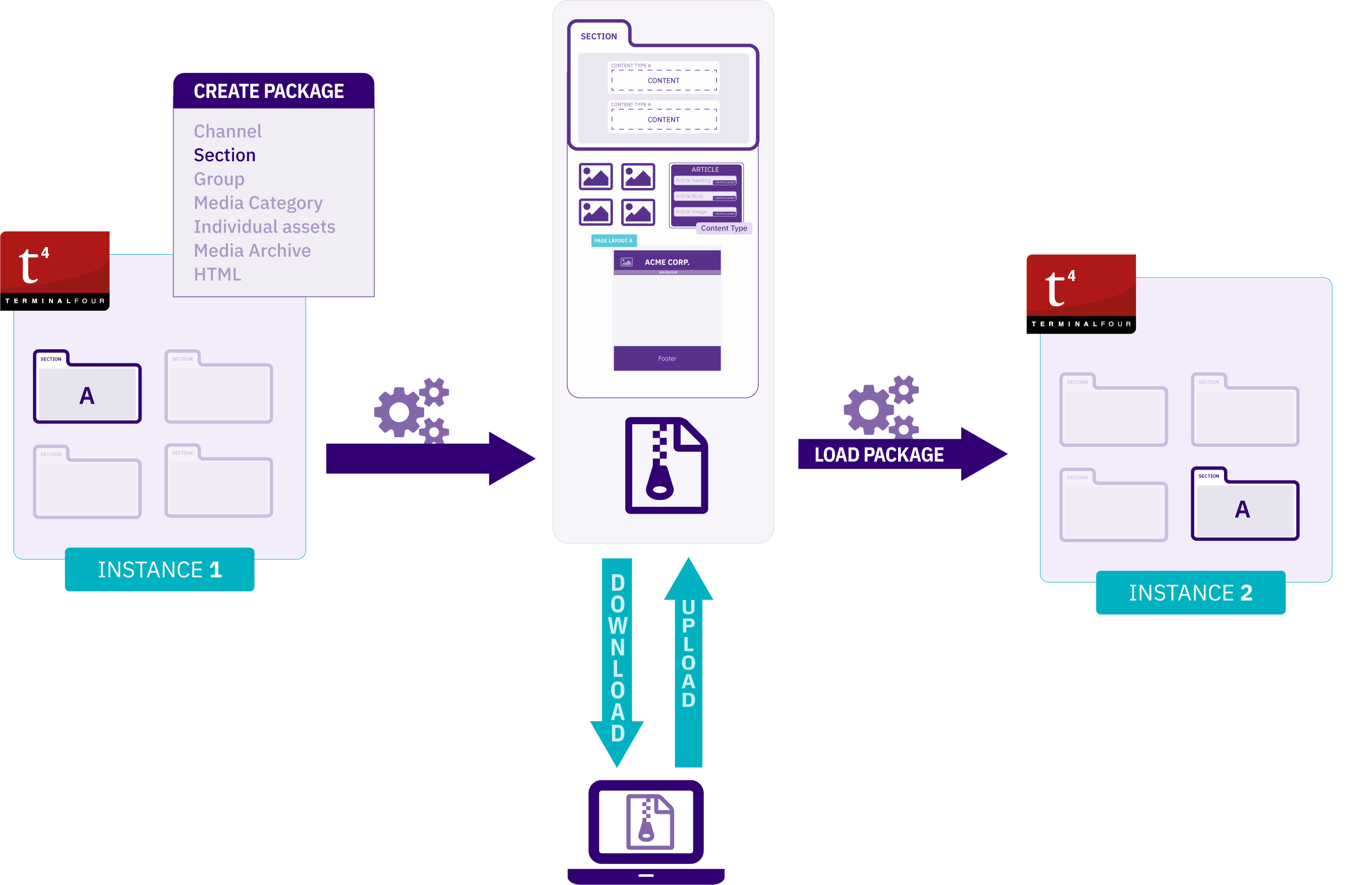
Key features
- The Packages functionality does not require server access so you can create, delete, rename, duplicate and download Packages from the Terminalfour interface. Packages can be uploaded directly from your local PC or transferred from an external website by entering a URL
- Progress is reported for import and export tasks that take over one minute
- Packages can be easily rolled back following an import removing all changes made by the import.
- Package contents and error reports and warnings are viewable. You can enable full debug logging, this feature uses system's logging configuration. You can enable this feature for Packages alone, or for the entire system instance.
- Packages include dependencies
- e.g., content in Terminalfour uses a Content Type and the Content Type includes Content Layouts. When a Package is created, all of these system dependencies are resolved and included in the Package.
Who Can Use Packages?
The minimum user level for all Packages other than Media Archive Packages is Administrator. The minimum user level for Media Archive Packages can be configured in Role Customization.
There's more than one way to integrate external data in Terminalfour and the method you choose can depend on the type of data and what you want to do with it.
How to use Packages
To access this feature, go to Content > Content Migration > Packages:
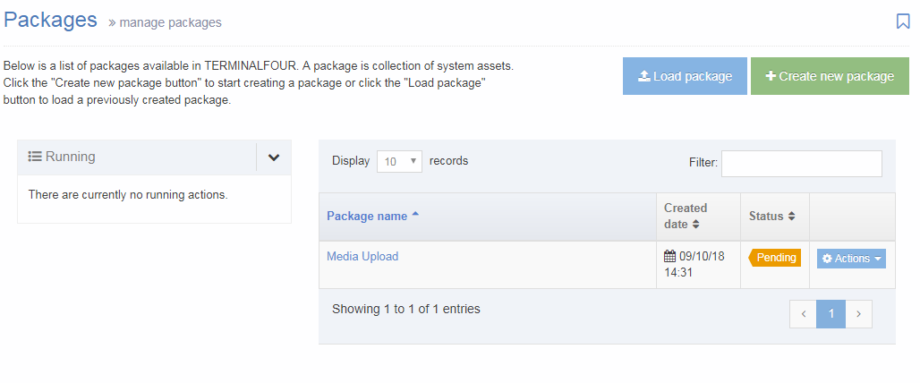
On this page you can:
- You can sort by Name, Created Date, Status (see below)
Use the Action Menu button to Edit a Package, Import (if the Package status is ‘Pending’), Rollback (if Package status is ‘Imported’), View, Download or Delete. - View active Package exports and imports
- Load a Package
- Create new Package
The status of each Package can be:
 |
The package exists in the system and has already been imported, it can be edited, viewed, deleted, downloaded or rolled back. |
 |
The package exists in the system and is available to be imported, it can be edited, viewed, deleted, downloaded or imported. |
 |
The package has an error, there was an error creating the package, it can be viewed (to see the error), deleted, downloaded but not imported. |
Create New Package
To create a new Package, select Create new Package and select the type of Package you need:
- Channel
- A Package from the selected Channel or Microsite. This Package will include:
- the Channel configuration
- Site Structure
- Assets that are used or referenced:
- Page Layouts
- Content Types
- Navigation Objects
- Lists and Sublists
- Content
- Media
- A Package from the selected Channel or Microsite. This Package will include:
- Section:
- A Package from the selected Section including:
- Subsections
- Assets that are used or referenced:
- Page Layouts
- Content Types
- Navigation Objects
- Lists and Sublists
- Content
- Media
- A Package from the selected Section including:
- Group:
- A Package of all assets associated with the selected Group including:
- Assets that are used or referenced:
- Page Layouts
- Content Types
- Navigation Objects
- Lists and Sublists
- Media category
- A Package of Media Items from a selected Media Category. All Subcategories are included too
- Individual assets:
- A Package of selected assets, content and media
- Assets that can be added:
- Page Layouts
- Content Types
- Navigation Objects
- Lists and Sublists
- Media archive:
- To bulk import media files, like images, to the Media Library, you can zip and upload them. When the zip file uploaded, a Package with a Status of ‘Pending’ is created. Importing the Package will add the media files to the Media Library as media items. Any folders within the original file will become Media Categories to help keep you organized.
- Html:
- Create a Package from a remote HTML file or upload a zip archive containing an existing website, to map the HTML to existing Content Types and import content from the HTML.
To continue, select Next.
Load Package
Select the Load Package button.
A Package created in another instance of Terminalfour can be uploaded directly from your local PC or downloaded from a remote server by providing a link to the Package.
Upload from my local computer
To upload a Package select Upload from my local computer and drag the Package zip file to the file upload box. When the file uploads to the server it is visible in the Packages list and has a status of ‘Pending’.
To add the Package, click Load Package. The Package is then included in the Package listing on the main Packages page.
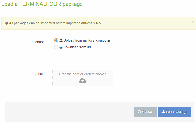
Download from a remote URL
To avoid uploading and downloading large files through your web browser, you can download a Package directly into Terminalfour from an external server.
Before you load a Package check if there are any firewalls or other security measures that might prevent Terminalfour from accessing the external location. In some instances, although you may be able to access the Package from your browser, the Terminalfour server can have different security policies.
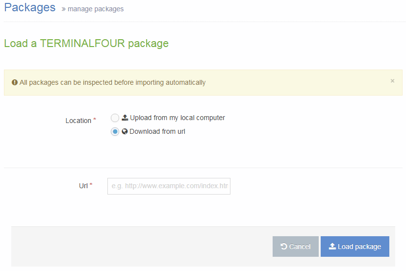
Enter the URL of the Package and click Load Package.
Import
Once a Package has been created, it has a status of ‘Pending’ and can then be imported. To import a Package, select Import from the Actions Menu. Depending on the type of Package you are importing, different options will be selected:
- Channel Package
- Section Package
- Group Package
- Media category Package
- Individual asset Package
- Media Archive Package
- Html Package
Rollback
After a Package has been imported, it is possible to Rollback the Package to removes any Package assets that have been added as part of the import and set the status of the Package back to ‘Pending’. A Package can be rolled back from the Package list by choosing Rollback on the Actions Menu.
Performing this action does not delete the Package. A rolled back Package appears in the Package listing screen as 'Pending'.
View a Package
To see a list of Package contents and a report of any errors or warnings generated on Package creation, select View from the Actions Menu for the Package.
Download a Package
Once a Package has been created, it can be downloaded so you can transfer assets from one instance of Terminalfour to another.
To download a Package, select Download from the Actions Menu for the Package.
Delete a Package
When it is necessary to Delete a Package, go to the Packages start page and select the Delete option on the Actions Menu for the item to be deleted.
Migration configuration settings
Description
To configure the settings used for migrating content using Packages, go to System Administration > Hierarchy & Content Settings > Migration.
It's not recommended that you change these settings.
| Item | Description |
|---|---|
| Migration configuration content type | Specifies the Content Type that will be used to hold the migration configuration details. Only System Content Types are available for selection. Changing this setting can result in Packages not functioning as expected. |
| Log file location | Sets the location on the server to generate log files. |
| Use existing content types | This is a legacy setting and can be ignored. Existing Content Types are always used for HTML Packages Migrations. For other types of Packages (e.g. Channel Packages), there is an option on import for whether to use existing Content Types or create new Content Types. |
Channel Packages
Description
We've noticed some challenges with Packages in Terminalfour, particularly with complex builds which can cause problems during package creation and import. Specifically, creating channel and section packages can sometimes lead to corrupt packages due to the build or configuration within the application.
Packages was originally designed for less complex Terminalfour implementations and may not fully support more intricate features like programmable layouts and some navigation objects.
Your feedback is valuable to us! If you've encountered issues or have unique use cases for Packages, please reach out and share your thoughts and experiences with us. It helps us plan for future improvements.
A Channel Package is a type of Package used to export a Channel, including the Channel configuration, Site Structure, Content, Media Items, and all assets that are used or referenced (Page Layouts, Content Types, Navigation Objects, Lists and Sublists) within the Channel.
Once created, the Package can be imported into the Site Structure of the same or another Terminalfour instance.
Who can use Channel Packages?
The minimum user level for Channel Packages is an Administrator.
Create a Channel Package
To create a Channel Package, go to Content > Content Migration > Packages and select Create New Package.
Select Channel from the Package Type list and click Next.
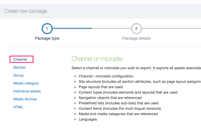
Enter the following details:
| Item | Description |
|---|---|
| Name | Give the Package a name. This is displayed in the listing on the main Packages page. |
| Description | Give the Package an optional description. This will help you identify it later. |
| Language |
Select the Language(s) of the Sections and Content to export. Check All Languages to export all languages. |
| Channel | Select the Channel or Microsite to export. |
Select Next and wait for the Package to resolve.
Once the Package is resolved, the Package information is displayed, showing all assets that would be exported with the Package. The Report, at the end of the page, details any warnings or errors generated when the Package was created.
Select Next and then click Finish.
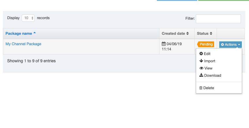
The Package has been created and is listed with a status of "Pending", and is now ready to Import or Download. If you want to archive or import the Package on another instance of Terminalfour, select Download. This will download a zip file containing the packaged Assets and content.
Import a Channel Package
On the Packages listing, select Import from the Actions menu:
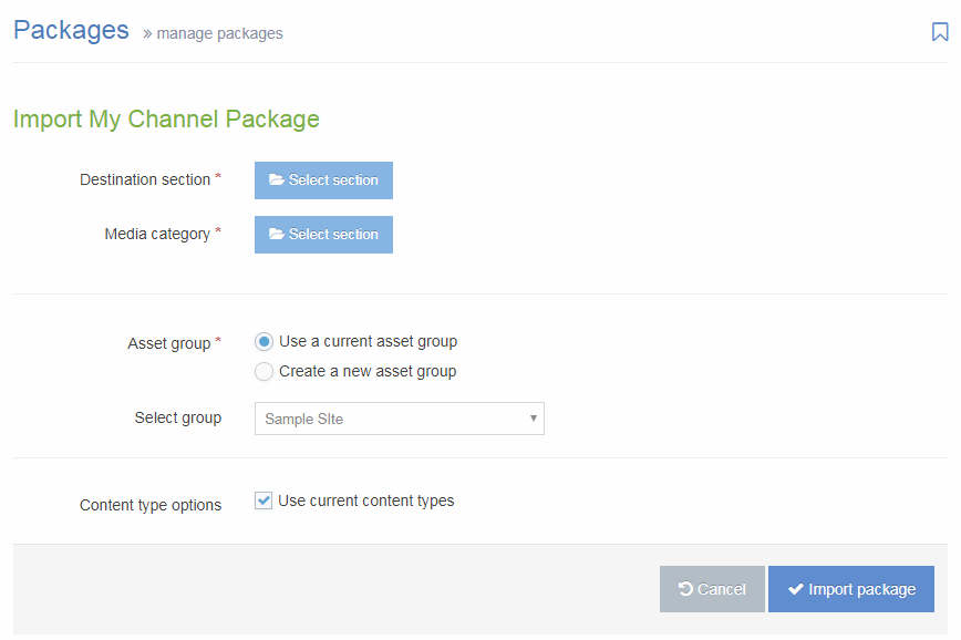
| Item | Description |
|---|---|
| Destination section | Select the Section that you would like to import the Package contents to. |
| Media category | If there are Media Items within the Package, select the Media Category into which to import. |
| Asset group |
|
| Content type options |
Check the Use current Content Types option to re-use existing Content Types. Leave unchecked to create new Content Types. When re-using existing Content Types, Terminalfour will compare the Content Type name and elements with existing Content Types, and if it matches, will re-use the Content Types. If no match is found, a new Content Type is created. |
Select Import Package. Once imported, select All Packages and the Package will now have a status of "Imported".
Navigate to the Site Structure to view the imported section and content.
Section Packages
Description
We've noticed some challenges with Packages in Terminalfour, particularly with complex builds which can cause problems during package creation and import. Specifically, creating channel and section packages can sometimes lead to corrupt packages due to the build or configuration within the application.
Packages was originally designed for less complex Terminalfour implementations and may not fully support more intricate features like programmable layouts and some navigation objects.
Your feedback is valuable to us! If you've encountered issues or have unique use cases for Packages, please reach out and share your thoughts and experiences with us. It helps us plan for future improvements.
A Section Package is a type of Package used to export a Branch of the Site Structure, including Subsections, Content, Media Items, and all assets that are used or referenced (Page Layouts, Content Types, Navigation Objects, Lists and Sublists) within the Branch.
Once created, the Package can be imported into the Site Structure of the same or another Terminalfour instance.
Who can use Section Packages?
The minimum user level for Section Packages is an Administrator.
Create a Section Package
To create a Section Package, go to Content > Content Migration > Packages and select Create New Package.
Select "Section" from the Package Type list and click Next.
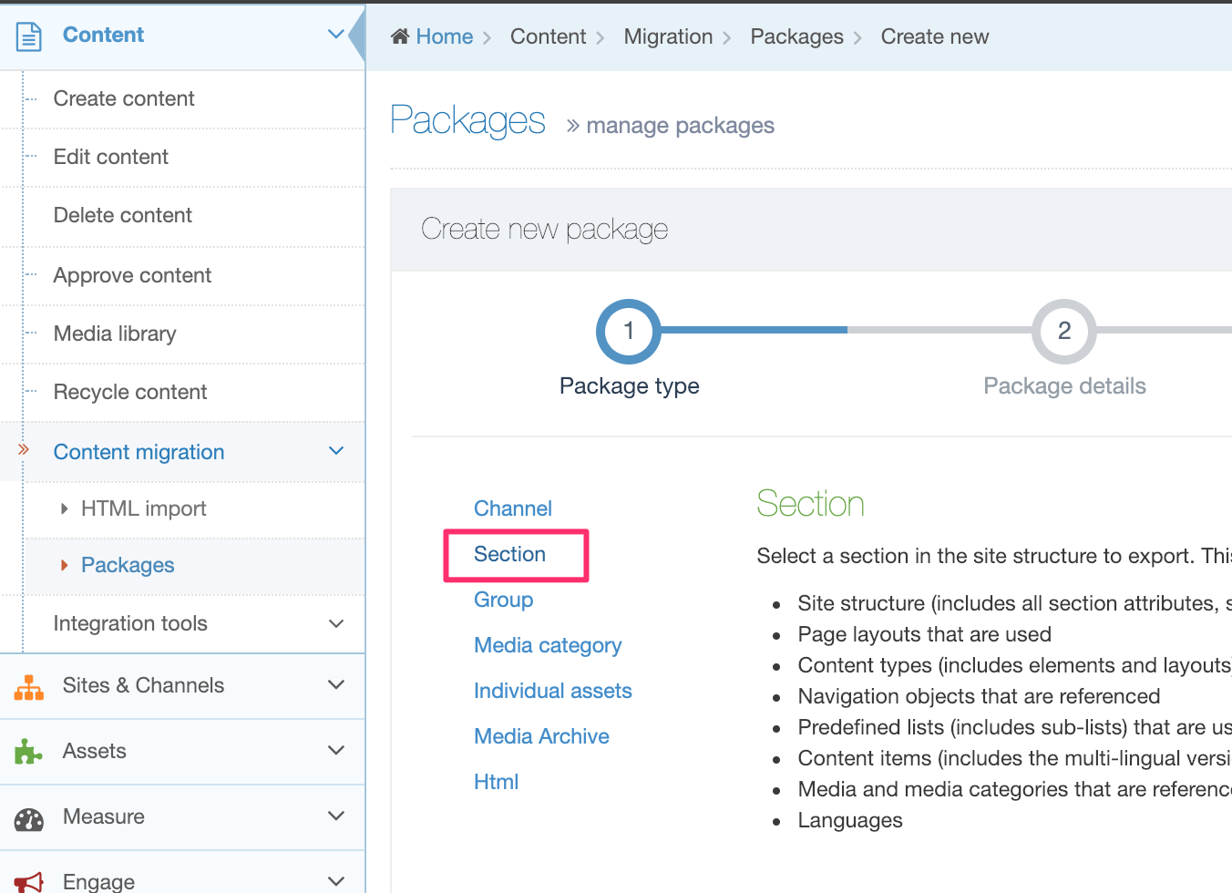
Enter the following details:
| Item | Description |
|---|---|
| Name | Give the Package a name. This is displayed in the listing on the main Packages page. |
| Description | Give the Package an optional description. This will help you identify it later. |
| Language |
Select the Language(s) of the Sections and Content to export. Check All Languages to export all languages. |
| Section | Select the Section to export from the Site Structure. |
Select Next and wait for the Package to resolve.
Once the Package is resolved, the Package information is displayed, showing all assets that would be exported with the Package. The Report, at the end of the page, details any warnings or errors generated when the Package was created.
Select Next and then click Finish.
The Package has been created and is listed with a status of "Pending", and is now ready to Import or Download:
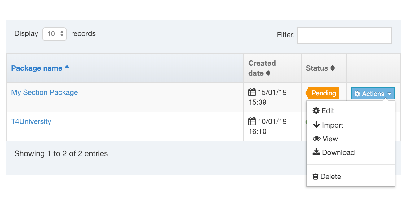
If you want to archive or import the Package on another instance of Terminalfour, select Download. This will download a zip file containing the packaged Assets and content.
Import a Section Package
On the Packages listing, select Import from the Actions menu:
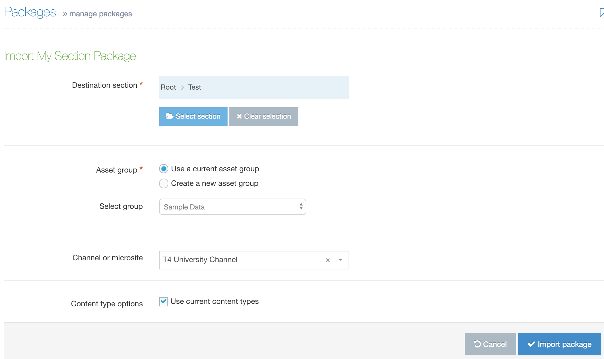
| Item | Description |
|---|---|
| Destination section | Select the Section that you would like to import the Package contents to. |
| Media category | If there is Media within the Package, select the Media Category into which to import. |
| Asset group |
|
| Channel or microsite |
Select the Channel that will be associated with the content that is imported (if content is included in the Package). Following import, it is possible to Reset Content on the channel, if preferred. |
| Content type options |
Check the Use current Content Types option to re-use existing Content Types. Leave unchecked to create new Content Types. When re-using existing Content Types, Terminalfour will compare the Content Type name and elements with existing Content Types, and if it matches, will re-use the Content Types. If no match is found, a new Content Type is created. |
Select Import Package. Once imported, select All Packages and the Package will now have a status of "Imported".
Navigate to the Site Structure to view the imported section and content.
Group Packages
Description
We've noticed some challenges with Packages in Terminalfour, particularly with complex builds which can cause problems during package creation and import. Specifically, creating channel and section packages can sometimes lead to corrupt packages due to the build or configuration within the application.
Packages was originally designed for less complex Terminalfour implementations and may not fully support more intricate features like programmable layouts and some navigation objects.
Your feedback is valuable to us! If you've encountered issues or have unique use cases for Packages, please reach out and share your thoughts and experiences with us. It helps us plan for future improvements.
A Group Package is a type of Package that is used to export Assets (Page Layouts, Content Types, Navigation Objects, Lists and Sublists) owned by a specific Group. These Assets can then be imported into:
- another, already existing Group within the same Terminalfour instance
- a new Group that you can create when you import the Package on the same or a different Terminalfour instance
Who can use Group Packages?
The minimum user level for Section Packages is an Administrator.
Create a Group Package
To create a Group Package, go to Content > Content Migration > Packages and select Create new package.
Select "Group" from the Package Type list and click Next:
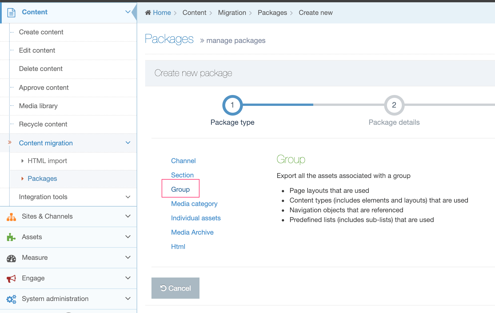
Enter the following details:
| Item | Description |
|---|---|
| Name | Give the Package a name. This is displayed in the listing on the main Packages page. |
| Description | Give the Package an optional description. This will help you identify it later. |
| Language |
Select the Language(s) of the Sections and Content to export. Check All Languages to export all languages. |
| Group | Select the Group to export. |
Select Next and wait for the Package to resolve.
Once the Package is resolved, the Package information is displayed, showing all assets that would be exported with the Package. The Report, at the end of the page, details any warnings or errors generated when the Package was created.
Select Next and then click Finish.
The Package has been created and is listed as "Pending", and is now ready to Import or Download (to import into another instance of Terminalfour). Select Import from the Action Menu:
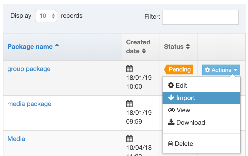
Import a Group Package
When Import has been selected you will see the Import Group Packages screen:
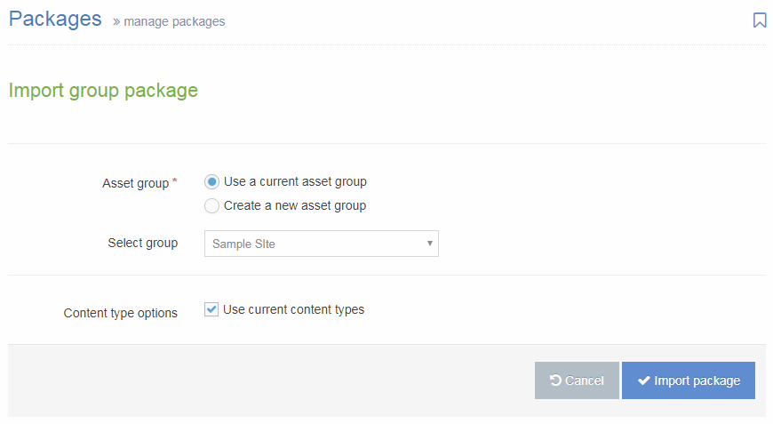
| Item | Description |
|---|---|
| Asset group |
|
| Content type options |
Check the Use current Content Types option to re-use existing Content Types. Leave unchecked to create new Content Types. When re-using existing Content Types, Terminalfour will compare the Content Type name and elements with existing Content Types, and if it matches, will re-use the Content Types. If no match is found, a new Content Type is created. |
Select Import Package. Once imported, select All Packages and the Package will now have a status of "Imported".
Navigate to the Content Types, Page Layouts and Navigation Object pages to view the imported assets.
Media Category Packages
Description
A Media Category Package is a type of Package that is used to export a Media Category, including Subcategories, and all Media Items from the Media Library. These can then be imported into a separate area of the same Media Library, or into the Media Library in a different TERMINALFOUR instance.
For bulk upload of Media into the Media Library, use a Media Archive Package.
Who can use Media Category Packages?
The minimum user level for Media Category Packages is an Administrator.
Create a Media Category Package
To create a Media Category Package, go to Content > Content Migration > Packages and select Create new package.
Select the Type of Media Category and click Next.
Enter the following details:
| Item | Description |
|---|---|
| Name | Give the Package a name. This is displayed in the listing on the main Packages page. |
| Description | Give the Package an optional description. This will help you identify it later. |
| Language | Select the Languages of Media to export, or check the All Languages option to export all languages. |
| Media Category | Select the Category to export. |
Select Next and wait for the Package to resolve.
Once the Package is resolved, the Package information is displayed, showing all assets that would be exported with the Package. The Report, at the end of the page, details any warnings or errors generated when the Package was created.
Select Next and then click Finish.
The Package has been created and is listed as "Pending", and is now ready to Import or Download (to import into another instance of TERMINALFOUR):
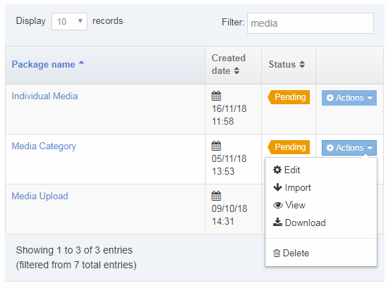
Import a Media Category Package
On the Packages listing, select Import from the Actions menu:
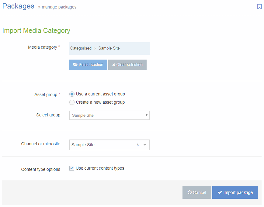
| Item | Description |
|---|---|
| Media category | Select the Media Category into which the Media will be imported. |
| Asset group | Select Use a current asset group and select any group. Since the only asset is the Media Content Type, the group will not be used for any assets. |
| Channel or microsite | Can be left blank. |
| Content type options | Check the option to Use current content types to re-use the existing Media Content Type. |
Select Import Package. Once imported, select All Packages and the Package will now have a status of "Imported".
Navigate to the Media Library to see the imported Media Categories and Items.
Individual Assets Packages
Description
An Individual Assets Package is a type of Package that is used to export one or all of the following:
- a single Content Item
- a single Media Item
- a single, multiple or all Content Types
- a single, multiple or all Page Layouts
- a single, multiple or all Navigation Objects
- a single, multiple or all Individual Lists, including Sub Lists
Once created, the Package can be imported into the same or a different instance of TERMINALFOUR.
Who can use Individual Assets Packages?
The minimum user level for Individual Asset Packages is an Administrator.
Create an Individual Assets Package
To create an Individual Asset Package, go to Content > Content Migration > Packages and select Create new package.
Select Individual Assets Package from the Package Type list and click Next.
Enter the following details:
| Item | Description |
|---|---|
| Name | Give the Package a name. This is displayed in the listing on the main Packages page. |
| Description | Give the Package an optional description. This will help you identify it later. |
| Language |
Select the Languages of the Asset to export (this would only be relevant for Media, Content and Lists). Check All Languages to export all languages. |
| Content |
Select an individual Content Item to export. This will export the Content Type, and Content Layouts associated with the Content Type. On import, you can choose to import the Content Type used or re-use an existing Content Type. |
| Media |
Select an individual Media Item to export. This will export the Media Content Type, Media Types, and Content Layouts associated with the Media Content Type. On import, the existing Media Content Type will always be used. |
| Content types | Select the Content Type(s) to export, or check the option to export All content types. The Layouts associated with the Content Types will export. |
| Page layouts |
Select the Page Layout(s) to export, or check the option to export All page layouts. This will export the Navigation objects, Content Types, Content Layouts, Lists, Sections and Content referenced by the Page Layout. On import, you can choose to import the Content Types used or re-use existing Content Types. |
| Navigation |
Select the Navigation Object(s) to export, or check the option to export All navigation objects. This will export the Section, Content, Page Layout(s), Content Types, Content Layouts, Navigation objects and Lists referenced by the Navigation Object and the content that it includes. On import, you can choose to import the Content Types used or re-use existing Content Types. |
| Lists | Select the List(s) to export, or check the option to export All lists. This will export the List and all Sublists referenced by the list. |
Select Next and wait for the Package to resolve.
Once the Package is resolved, the Package information is displayed, showing all assets that would be exported with the Package. The Report, at the end of the page, details any warnings or errors generated when the Package was created.
Select Next and then click Finish.
The Package has been created and is listed with a status of "Pending", and is now ready to Import or Download (to import into another instance of TERMINALFOUR):
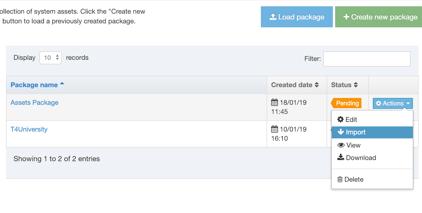
Import an Individual Assets Packages
On the Packages listing, select Import from the Actions menu:
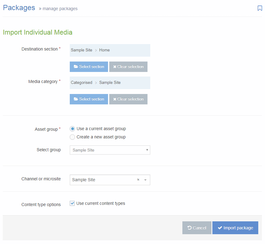
| Item | Description |
|---|---|
| Destination section | If there are Sections or Content Items within the Package, select the Section that you would like to import the Package contents to. |
| Media category | If there is Media within the Package, select the Media Category that you would like to import the Package contents to. |
| Asset group |
|
| Channel or microsite |
Select the Channel that will be associated with the imported content (if a Content Item is included in the Package). Following import, it is possible to Reset Content on the Channel, if preferred. |
| Content type options |
Check the Use current Content Types option to re-use existing Content Types. Leave unchecked to create new Content Types. When re-using existing Content Types, TERMINALFOUR will compare the Content Type name and elements with existing Content Types, and if it matches, will re-use the Content Types. If no match is found, a new Content Type is created. |
Select Import Package. Once imported, select All Packages and the Package will now have a status of "Imported".
Media Archive Packages
Description
Media Archive Packages are a type of Package used to bulk upload media files like images or documents to the Media Library. Media files are uploaded to Terminalfour in a single zip file which is converted to a Media Archive Package. When the Package is imported all files are added to a selected Media Category (folder) in the Media Library where:
- The folder structure within the zip file becomes the Media Category structure in the Media Library
- Each file in the zip becomes a Media Item
- The file name is used as the Media Item name in Terminalfour
- The description (and all other metadata) is not imported and is left blank
- The minimum user level for Media Archive Packages can be configured in Role Customization. The minimum user level for all other types of Packages is an Administrator.
Who can use Media Archive Packages?
The minimum user level for Media Archive Packages can be configured in Role Customization. The minimum user level for all other types of Packages is an Administrator.
Create a Media Archive Package
To create a Media Archive Package, go to Content > Content Migration > Packages and select Create new package.
Select the Type of Media Archive and click Next.
Enter the following details:
| Item | Description |
|---|---|
| Name | Give the Package a name (avoid special characters or spaces). This is displayed in the listing on the main Packages page. |
| Description | Give the Package a description. |
| Language |
If your site uses multiple languages, select whether the Media is to be added as either:
For single language sites, select Language independent. |
| Select | Select the zip file containing the Media Files to upload. |
| Media Type |
Select the type of media that will be uploaded. If the file extension of the uploaded files does not match the permitted file extension for the selected Media Type, the Media Item will not be created. |
Select Next and wait for the Package to resolve.
Once the Package is resolved, the Package information is displayed, showing all assets that would be imported with the Package. The Report, at the end of the page, details any warnings or errors generated when the Package was created.
Select Next and then click Finish.
The Package has been created and is listed as "Pending", and is now ready to Import or Download (to import into another instance of Terminalfour):
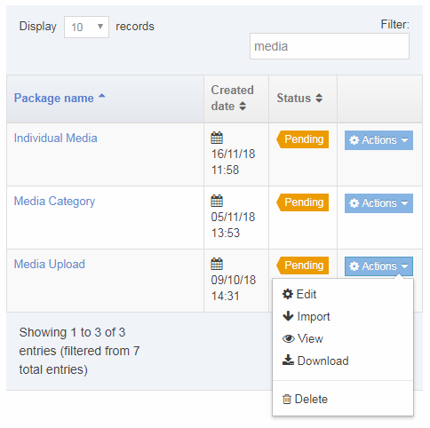
Import a Media Archive Package
Once the Package has been created, it is ready to Import. On the Packages listing, select Import from the Actions menu:
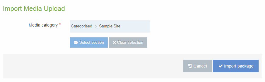
Select the Media Category into which the Media will be imported (folders within the zip will create a folder structure beneath the within the selected Media Category).
Select Import Package. Once imported, select All Packages and the Package will now have a status of "Imported".
Navigate to the Media Library to see the imported Media Items.
Packages
Description
HTML Packages are a type of Package that is used to import content from HTML files into Terminalfour. It uses the DOM structure of the HTML page to determine the Site Structure, content area of the page, and the Content Type to be used for the content. On import, all documents and images that are referenced are imported into the Media Library, and any internal links between the HTML files are converted into Terminalfour Section Links.
HTML Packages Functionality and Options
Site Structure
The order of the Sections created in Terminalfour will match the order that they are identified by Packages. This ordering can be manually changed post migration if required.
All Sections are migrated as visible in navigation. Those that need to be hidden can be updated post migration.
If the site navigation contains links to external URLs or links to other folders on the site, these will not be imported and will not be visible on the new site structure. These should be created post migration.
Where pages exist on multiple URLs (e.g. a friendly/short URL for a page) or the same content appears on multiple pages, those pages will be imported multiple times. The import application will not identify any duplicates or copies of content/pages.
The Site Structure can either be based on the folder structure of the source HTML or on a breadcrumb.
Folder Structure
The Site Structure that will be created in Terminalfour will be constructed in the same hierarchical file/folder structure of the source files that are provided for the migration. A Terminalfour Section will be created for each folder, and the index.html file within that folder will be evaluated for any matching content. Where there are multiple files within a folder, the index.html file is used as the source of content for the Section, and a sub-section is created for each other file.
It is possible to configure the Default Filename if it is not index.htmlFor example, if the about-us folder contains:
- index.html
- more-about-us.html
- locations.html
Packages will create a folder structure as:
- about-us (contains content from index.html)
- more-about-us (contains content from more-about-us.html)
- locations (contains content from locations.html)
Breadcrumb
The Site Structure that will be created in Terminalfour can be based on the breadcrumb that appears on each page by configuring the Selector for structure. If the page has no breadcrumb, the page will only be created if there are child pages, and the name of the page created will be based on the link text within the breadcrumb.
Section Name
The name of the section created in Terminalfour can be derived from an HTML node in the page by configuring the Section name option.
Media Library
Any linked media files associated with the HTML pages will be automatically imported into the Media Library in the same hierarchical structure as they are found in the local folder structure. For example, a media file that is found at /directory 1/directory 2/directory 3/filename will be migrated into the following Category in the Media Library:
- directory 1
- directory 2
- directory 3 - {filename}
- directory 2
The filename will be used to name the piece of media that is created in the Media Library.
When creating the Package, it is possible to configure the Media Types that are imported. The type of the media item created in Terminalfour will be automatically determined based on the file extension of the file. If a file extension matches two media types, the importer will use the first media type for that media item. It may be necessary to update the permitted file extensions for each of the above Media Types before migration to ensure that all relevant media is imported.
The maximum file size that will be allowed to be migrated is an installation-wide configuration option that is configurable in the Advanced Configuration (Max upload size (KB)). Any files that exceed this limit will note migrate and any references to those files will not be updated to a Media Item tag.
Where a media item (e.g. an image) is used on multiple pages, it will only be imported into the Media Library once, but referenced from each page. While the description and keywords fields of the media item will not be set by Packages, image alt attribute values will be imported into the “Description” attribute within content (i.e. not into the Media Library). If an image is used multiple times, the alt tag could be different on different pages. The existing content will have alt attribute values for each instance of the image from the Media Library (provided they are set in the source HTML), but any new instances/uses of the imported image (for new content) will have a blank alt tag, unless an alt tag is set by the author or updated in the Media Library.
Metadata
When importing an HTML Package, there is the option to populate metadata. If checked, any metadata in the source HTML that matches the meta tags configured in Terminalfour, will migrate the content into the Section metadata that can be accessed in the Metadata tab when editing a Section. The metadata in the source HTML should be in the format
<meta name="description" content="description of my current page" />
Create a HTML Package
To create an HTML Package, go to Content > Content Migration > Packages and select Create new package.
Select "HTML" from the Package Type list and click Next.
Enter the following details:
| Item | Description |
|---|---|
| Name | Give the Package a name. This is displayed in the listing on the main Packages page. |
| Descrption | Give the Package a description. |
| Language | Select the language into which the content is imported, |
| Location |
|
| Url |
Enter the URL that should be used to crawl the site. Terminalfour recommends using a sitemap page, that contains links to all other pages and that the sitemap is within the root of the Package. It is possible to point to a http:// reference (e.g. http://www.terminalfour.com) or a file path to a file on the server (e.g. file:///tmp/import/index.html for Linux or file:///C:/temp/import/index.html for Windows). If using a file on the server, all links within that sitemap need to be absolute links to file paths on the server e.g. <a href="file:///tmp/import/about-us/index.html">link text</a>) If using a file on the server, note that the path has a triple-slash at the start. |
| Crawl depth | The crawl depth controls how far to crawl from the initial URL. If left blank the crawler continues until all links from the entered URL run out. If 0 is entered only the entered URL is used for content. Only links that match the domain of the entered link are crawled. For example, if http://www.terminalfour.com is entered only links starting with http://www.terminalfour.com are followed. |
| Select | If the Location is Upload from my local computer, select the zip file of HTML. |
| Index filename | Enter the path to the HTML file that should be used as the start of the crawl. Packages will follow all links on that page to find other pages. It is recommended to use a sitemap for this e.g. sitemap.html or /about/this/site/sitemap.html |
| Advanced | Check this option to view the Advanced import options. |
| Default Filename | Enter the default index filename that exists within each folder (e.g. index.html). |
| Section name | An element from the index file can be used for the Section name, enter a selector value to extract this information. Enter an HTML selector for the element. If this element is left blank the title of the page will be used (i.e. the value within the <title> element). |
| Selector for structure |
If left blank, the folder structure is used. A Section will be created for each folder. The "Default filename" file within each folder is used as the source of content for the Section, and a SubSection is created for each other file. Alternatively, the structure could be based on an HTML element on the page, for example, a breadcrumb. Where this option is used, if a page does not contain the breadcrumb, the page will only be created if there are child pages, and the name of the page created will be based on the link text within the breadcrumb. |
| Remove from Section name | When creating the Section, the Section name option determines the text to use. Where this consistently contains a string of text that should be ignored, enter that string of text. For example, if the <title> is being used, and the tag is <title>About us | Terminalfour</title> or <title>News | Terminalfour</title>, then enter " | Terminalfour" to be ignored. |
| Exclusion rules | To exclude URLs from the crawl, select Add exclusion and enter the URL. Regular expressions can be used to exclude a group of pages e.g. www.terminalfour.com/blog/* will exclude all URLs that start with www.terminalfour.com/blog/; or asp$ will exclude all URLs that end with asp. |
| Media types | Select the type of media that will be uploaded. If the file extension of the uploaded files does not match the allowed file extension for the selected type, the media will not be created. |
Map Content Types
For each Content Type that is being used, a mapping is provided to map specific HTML tags to the Content Type and to each element that is being used. For each Content Type, select the Content Type from the dropdown, and enter:
| Item | Description |
|---|---|
| Mapping type |
|
| Selector | If using a Selector, enter the HTML selector that contains the content to be imported into the selected Content Type. For each instance of this selector on the page, a Content Item will be added using the selected Content Type. |
| XPath | If using XPath, enter the XPath to specify the content that would import into the selected Content Type. As above, for each instance of this selector on the page, a Content Item will be added using the selected Content Type. |
| Default value | This can be left blank when mapping a Content Type. |
| Content |
For the selector specified, what content should be selected:
|
Map Content Elements
After entering the Content Type Mapping, click Next element and map each element that will be used for the import:
It is not possible to map Image or File elements.
| Item | Description |
|---|---|
| Mapping type |
|
| Selector |
If using a Selector, enter the HTML selector that contains the content to be imported into the selected element. This is relative to the selector used for the Content Type. For example, if the selector for the Content Type is div.content, the selector used for the element does not need to contain the div.content (and if the Content Type is using Inner HTML, the selector for the element cannot contain the div.content). If multiple instances of that selector exist for the current Content Item, all instances are returned and migrated into the one element. For example, if the selector is h2 and the Content Item contains multiple h2's, all h2's will be concatenated and imported into the element. |
| XPath | If using XPath, enter the XPath to specify the content that would import into the selected element. As above for the Selector, this is relative to the selector for the Content Type, and multiple instances of the selector will be concatenated. |
| Default value | If no value is found using the Selector or XPath specified, enter an optional Default value that can be used to populate the element. This is recommended for the Name element. |
| Content |
For the selector specified, what content should be selected:
For List elements (e.g. Radio button, Multi-select List), the content in the source HTML should match either the List entry name or List entry value for the element. If it does not match, the element is not populated. If the list allows for multiple values to be selected (e.g. checkbox), the Separator for the values can be specified. If the list contains sub-lists, the content in the source HTML should match either the List entry name or List entry value for the sub-list entry. For Media elements, the content needs to be an anchor tag (e.g. <a href="/path/to/document.doc">Text for link</a>) or an image tag (e.g. <img src="/path/to/image.png" />). For Section/Content Link elements, the content needs to be an anchor tag (e.g. <a href="/path/for/link/">Text for link</a>). |
| Separator | For list elements, it is possible to specify the expected Separator in the source content. For example, if the content in the HTML is "News; Events; Release", where each item matches a separate list item, the separator would be "; ". This should include space character, if there is one. For Radio buttons and Select box elements, this can be left blank (since they are single-select lists and do not need a Separator). |
| Date format | For date elements, it is possible to specify the expected date format in the source content. For example, if the date in the source content is 31/12/2018 then the date format is dd/MM/yyy. For more information on date formats, refer to the page about formatting dates. |
| Parse for media | Check this option to parse the content for Media within the content (images and documents), to import those files into the Media Library, and to convert the content to use the Media Item. |
| Must be populated |
Check this option to treat the content element as Compulsory for the Package migration. If checked and the content does not have a value for the element, the content will not be added. The Compulsory / Non-compulsory option on the Content Type definition are not used for migration, and a compulsory element can be migrated as blank if this option is not checked. |
| Preview |
To test the mapping, you can add a link to a page/path that contains a matching content item, and click "Preview" to see the content returned by the mapping. Similar to the Sitemap option above, it is possible to point to a http:// reference (e.g. http://www.terminalfour.com) or a file path to a file on the server (e.g. file:///tmp/import/index.html for Linux or file:///C:/temp/import/index.html for Windows). |
Repeat this for each element within the Content Type that is being used for migration. Once all elements for a Content Type are mapped, click Save changes.
To map another Content Type, select the Content Type, and configure the mappings.
Once all mappings are complete, click Next and allow the Package to complete Resolving.
Selectors
HTML selector
The HTML selector uses 'selectors' to match elements in the Package. Below is a table listing the APIs, what it matches, and an example:
| Selectors | Matches | Examples |
|---|---|---|
| * | Every element | * |
| tag | Specific tag | div |
| #id | Elements with an ID attribute | #container |
| .class | Elements with a class attribute | .left |
| [attr] | Elements with an attribute | a[href] |
| :it(n) | Elements whose index is less than n |
td:lt(3) |
For more information on the selector API http://jsoup.org/apidocs/org/jsoup/select/Selector.html
XPath selector
the XPath selector uses 'selectors' to match elements in the Package. Below is a table listing the selectors, what it matches, and an example:
| Selectors | Matches | Examples |
|---|---|---|
| //tag | Each tag on the page | //p |
| /tag/tag | Specific tag | /html/head/title |
| /tag[@attr="value"] | Select tags where attr = value | //div[@class="content"] |
For more information on xpath http://msdn.microsoft.com/en-us/library/ms256086(v=vs.110).aspx
Package Information
Once the Package is resolved, the Package information is displayed.
Selected Assets
This displays the assets that will be imported, with a graph to visualize the number of items of each asset that will import.
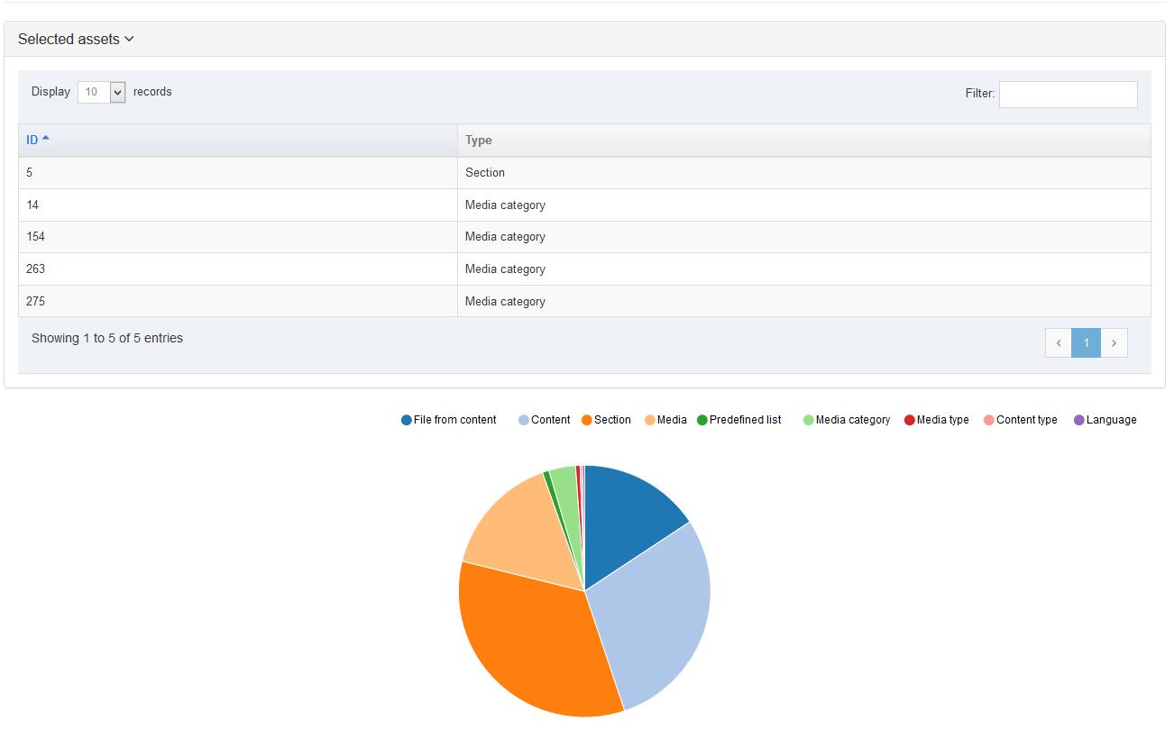
All Assets
This Section shows the Assets assigned to the package. You can use the Display list to increase the items displayed. or Search within this list. The head row titles are:
- ID: this is the ID assigned to the asset information in the row.
- Name: this column lists the names, the languages, and the details for the information in this row.
- Type: this column lists the Type of assets associated with the information in the row.
- From Section: where the Section asset is located.
- From content: where the content asset is located.
Report
The report contains information about the Package and lists any Warnings or Errors (filter for the word Warning or Error to see them).
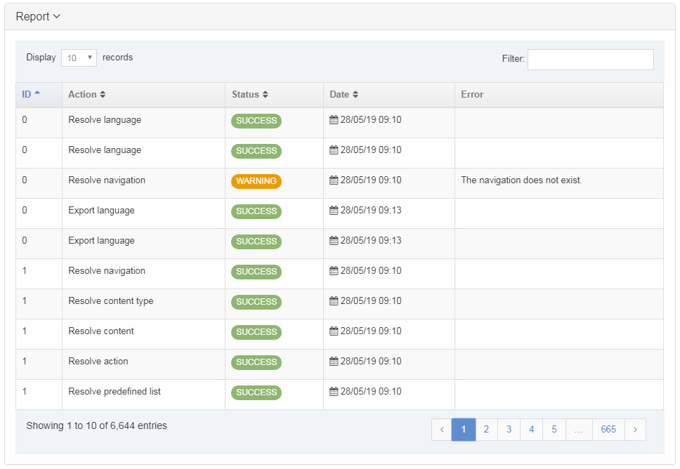
Each row lists the following information for the record by column:
- ID: reference ID of the associated asset.
- Action: the action taken on the asset identified.
- Status: either an Error, Warning or Success
- Date: the date of package created
- Error: description of the error causing the Warning label
If you are satisfied with the entries, you can click Next to create your package. Alternatively, click Prev to return to the previous page and fix any errors.
Generate package
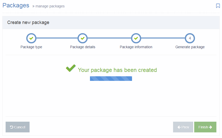
The Package has been created and is listed as "Pending", and is now ready to Import or Download (to import into another instance of Terminalfour).
Import a HTML Package
Once the Package has been created, it is ready to Import. On the Packages listing, select Import from the Actions menu:
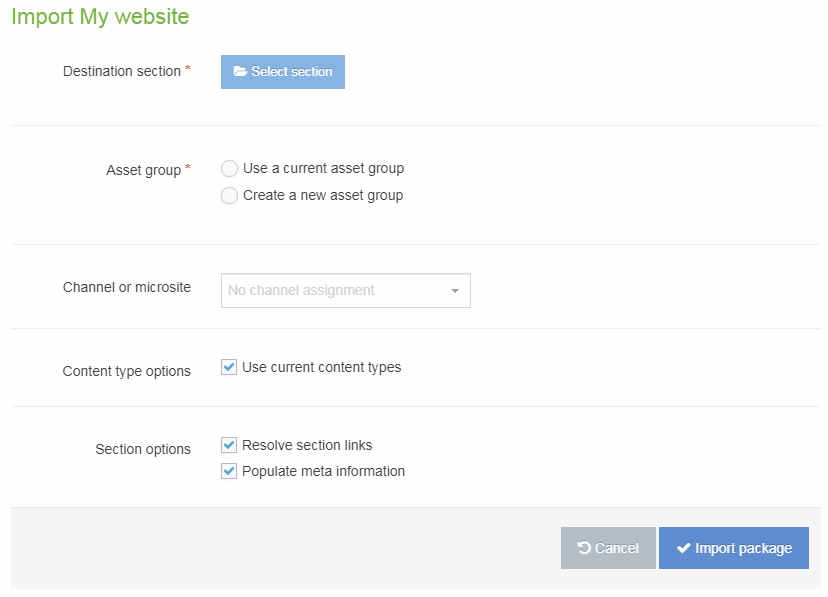
| Item | Description |
|---|---|
| Destination section | Select the Section that you would like to import the Package contents to. |
| Media category | If there is Media within the Package, select the Media Category into which to import. |
| Asset group |
|
| Channel or microsite |
Select the Channel that will be associated with the content that is imported (if content is included in the Package). Following import, it is possible to Reset Content on the channel, if preferred. |
| Content type options |
Check the Use current Content Types option to re-use existing Content Types. |
| Section options |
|
Select Import Package. Once imported, select All Packages and the Package will now have a status of "Imported".
Navigate to the Site Structure to see the imported Sections and content.
External Content Syncer
Description
The External Content Syncer is used to import and update content from an external data source like a database, XML file or even a CSV file. When content is synced, each row in the data source is added to Terminalfour as a content item. Syncing can ensure that the link between the external data source persists. This means that updates made to content in the external data source are reflected in the synced content in Terminalfour. Synced content can also be edited and amended in Terminalfour.
For instance, if your staff profile information was stored on an external database, that content can be synced with Terminalfour so it can be published on your website. The external database may not include photos but these can be managed directly within Terminalfour.
Content edits are synced in one direction only – from the data source to Terminalfour – so while synced content can be edited in Terminalfour, those edits will not update content back in the data source. Edits to synced content in Terminalfour will be overwritten by changes to content in the data source when the next sync occurs.
Before configuring the External Content Syncer you will need to set up the data source connection details in a Data Source.
There's more than one way to integrate external data in Terminalfour and the method you choose can depend on the type of data and what you want to do with it.
Check out our guide to help you choose the right one.
Using the External Content Syncer
To use, go to Content > Integration Tools > External Content Syncer:
From this page you can:
Configure the External Content Syncer
Data Source
Before configuring the External Content Syncer, you must set up a Data Source.
Once a Data Source is has been set up, go to Content > Integration tools > External Content Syncer and click the Create new data store.
There are two tabs here – General Information and Type Mapping:
General Information
| Item | Description |
|---|---|
| Name | Give your Data Store a name. It is recommended to make the name as descriptive as possible. This is required. |
| Description | This is used by the filter on the External Content Syncer listing and can be useful for finding Data Stores. |
| Data Source | Select a Data Source to use. This must be already configured. This is required. |
| Root Section | Set the Section to import the content into via Browse or Search. This is required. |
| Channel | Select the Channel to publish the imported content. This is required. |
| Site Structure Creator |
By default, either all content will be added to one Section, or a separate Section will be created for each Content Item, under the Root Section selected above. This depends on the option to Create individual Section for each Content Item below. Using a custom Site Structure Creator plugin allows you to generate a custom Site Structure rather than using the default. Leave it as Use default creator to use the default. |
| Section and content options |
|
| Set imported language as | Select the language into which content is imported. This is particularly important for multi-language websites. |
| Archive section | Set the Section to move content to when it is no longer found in the external database. If left blank, content is not moved but is marked as Inactive. |
| Status of new content | Choose from Approved, Pending, Inactive, or Draft. If set to Pending, this may allow users to review new content before it is published on the site. This only applies for new content; updates to existing content do not alter the content status i.e. if content is approved and then updated by the external content syncer, the content remains as approved. |
| Get external content via |
|
| Database table | If Get external content via is Connection to database to get table, select the database table. |
| SQL Query | If Get external content via is SQL Query, enter the SQL query that should be used to retrieve the content. |
Type Mapping
When syncing content, you must select the Content Type that the synced content will use. When a Content Type is selected from the drop-down list, the Content Type Elements will be listed on the left. To map, just input the Table column name from the external data source in the corresponding Type Element field:
It is currently possible to sync into plain text, HTML, date, select box and radio button elements. For date elements the date format needs to be yyyy-MM-dd HH:mm:ss (e.g., 2018-03-31 23:59:59).
When the elements are select box or radio button elements, the value in the database must match the list entry name (rather than the value).
A known product issue means that the content sync will not work correctly if the list entry name is a number.
List entry names must contain some alphanumeric characters for the External Syncer to map correctly.
This issue is being tracked as RDSM-39152.
While using multi-select lists may be possible, they are not currently officially supported. It may work in the following scenarios:
- the value in the database must match the list entry name (rather than the value)
- there is only one entry in the list (e.g., a list with one entry that is "Yes" that is a checkbox in the Content Type)
At least one of the elements or database fields should be selected as the Link. This should be the element that can uniquely identify the content item, and which may be used as a Primary Key in the external database. Examples could be a Staff ID or a Staff Email Address. If there is no one unique element, a combination of two can be used, meaning that the combination of the two elements will always be unique. This is used to match the TERMINALFOUR content item with the relevant record in the external database. The values in the field(s) selected as the Link should not change - if the value of the field selected in the Link changes, a new Content Item will be imported for this new Link value, as opposed to updating the existing Content Item. It is worth noting that a unique element/field can be imported, and used internally as the Link, but not output by the Content Layout and not published with the content, if preferred.
If connecting to a CSV file, refer to the article on Content Syncers with CSV files for information on the Table Column Names in CSV files.
Mapping a Content Item's embargo and expiry dates
From version 8.3.3. you can map a Content Item's embargo and expiry dates:
- Publish date
- Expiry date
- Review date
Run a Sync
For each Data Store that is being updated, select the Sync Type and select Sync:
| Item | Description |
|---|---|
| Initial Sync | Used on the first import. It creates a new Content Item for each entry in the database |
| Data Sync Refresh | Refreshes content synced initially and updates with new content, if changed |
| Data Sync New & Refresh | Creates new content for each new entry and updates content that has already been synced |
| Data Sync Old Status | The status of content in the database is compared with the status of content that has already been synced. If an Archive Section has been configured the content is moved to the Archive Section and the content status is not changed. If an Archive Section has not been configured, the missing content is not moved and its status is updated to "Inactive". |
| Clean & Initial Sync | Deletes all content and does Initial Sync |
Schedule Sync
Click Schedule sync. A popup window appears with the following fields to be completed:
| Item | Description |
|---|---|
| Next due | The starting day and time of the next sync. |
| Execution interval | How often you wish this schedule to be run. |
| Data store | The data store to sync. |
| Sync type | The sync type you want to run in this schedule. |
| Email address | The email address of the person(s) you want to be notified in case of a failure of the sync. |
Click Confirm and the task is added to the Task Scheduler.
The most common sync that is needed is "Data Sync New and Refresh" and "Data Sync Old Status." To scheduled both of these, create two separate scheduled syncs, one of each type.
Active Syncs
After you confirm your schedule request, in the active syncs column, the sync you requested is shown:
You can choose several syncs for your content. This screen shows three syncs in the queue:
Data sources
Description
The Data Sources store the database connection details used by the External Content Syncer. Terminalfour keeps the Database connection details separate from the import functionality as a security measure.
Data Sources Listing
To manage Data Sources, go to Administration > Configure Integration Tools > Data Sources
This page does not become populated until at least one Data Source is configured.
From this page you can:
- View the Data Sources that have been configured and sort by Name, Username, Driver and URL.
- Use the Action button to Test, Edit or Delete Data Sources
- Create new Content Sync
Create New Content Sync
When you select Create new Content Sync the General Information screen is displayed:
| Item | Description |
|---|---|
| Name | This is a mandatory entry. Give your Content Sync a name - it is recommended to make the name as descriptive as possible. |
| Username | Enter the username which has access to the database. This user only needs read access. If possible, try to restrict the tables to which the user has access to minimize the list of tables displayed when configuring the External Content Syncer. |
| Password | Enter the password for the username provided above; this password will not be displayed. Clicking the associated toggle can display and hide the password. |
| URL |
Enter the JDBC URL used to connect to the database. This should be in the format Example for MySQL: Example for SQL Server: Examples for CSV and XML Files differ depending on Windows vs Linux, and whether it is pointing to the file or the directory. Refer to the article about CSV File Content Syncers or the article about XML File Content Syncers for further information. |
| Driver |
Enter the driver that is used to connect to the database. Examples:
If you have not created a Content Sync to connect to this type of database before, a database driver may need to be installed. |
If you are satisfied with your inputs, then click Save Changes.
Test Data Source Connection
After creating a data source, test the connection to the database by using the action menu next to the data source list. Next to the Data Source, select Actions and Test connection. A notice will appear that is either a successful connection or an error.
Once the connection is successful, configure the External Content Syncer.
Delete Data Source connection
In the row of the corresponding Data Source, open the Actions drop-down list and select Delete.
A confirmation pop-up window appears and you can confirm your choice and Delete, or Cancel the action. Upon successful deletion, a green banner appears confirming the deletion, and the Data Source is removed from the list.
When a Data Source is deleted, you cannot recover the data.
Database Drivers
Terminalfour 8.2+ includes drivers to allow the External Content Syncer to connect to CSV and XML files.
The driver for the database used by your Terminalfour application (MySQL/MS SQL Server/Oracle) will already be installed. Drivers for other databases will require a separate install in order to sync with them.
To install other drivers, the driver (JAR file) should be accessible to the Terminalfour application i.e., included in the Terminalfour application's classpath. For example, the JAR file could be placed in the Tomcat's lib directory, or another location that is referenced by the Tomcat server.xml configuration file.
For further assistance, please discuss this with your Terminalfour server administrator or contact our support team.
Data sources
Description
The Data Sources store the database connection details used by the External Content Syncer. Terminalfour keeps the Database connection details separate from the import functionality as a security measure.
Data Sources Listing
To manage Data Sources, go to System Administration > Configure Integration Tools > Data Sources
This page does not become populated until at least one Data Source is configured.
From this page you can:
- View the Data Sources that have been configured and sort by Name, Username, Driver and URL.
- Use the Action button to Test, Edit or Delete Data Sources
- Create a new data source
Create New Data Source
When you select Create new data source the General Information screen is displayed:
| Item | Description |
|---|---|
| Name | This is a mandatory entry. Give your Data Source a name - it is recommended to make the name as descriptive as possible. |
| Username | Enter the username which has access to the database. This user only needs read access. If possible, try to restrict the tables to which the user has access to minimize the list of tables displayed when configuring the External Content Syncer. |
| Password | Enter the password for the username provided above; this password will not be displayed. Clicking the associated toggle can display and hide the password. |
| URL |
Enter the JDBC URL used to connect to the database. This should be in the format Example for MySQL: Example for SQL Server: Examples for CSV and XML Files differ depending on Windows vs Linux, and whether it is pointing to the file or the directory. Refer to the article about CSV File Content Syncers or the article about XML File Content Sycers for further information. |
| Driver |
Enter the driver that is used to connect to the database. Examples:
If you have not created a Data Source to connect to this type of database before, a database driver may need to be installed. |
If you are satisfied with your inputs, then click Save Changes.
Test Data Source Connection
After creating a data source, test the connection to the database by using the action menu next to the data source list. Next to the Data Source, select Actions and Test connection. A notice will appear that is either a successful connection or an error.
Once the connection is successful, configure the External Content Syncer.
Delete Data Source connection
In the row of the corresponding Data Source, open the Actions drop-down list and select Delete.
A confirmation pop-up window appears and you can confirm your choice and Delete, or Cancel the action. Upon successful deletion, a green banner appears confirming the deletion, and the Data Source is removed from the list.
When a Data Source is deleted, you cannot recover the data.
Database Drivers
Terminalfour 8.2+ includes drivers to allow the External Content Syncer to connect to CSV and XML files.
The driver for the database used by your Terminalfour application (MySQL/MS SQL Server/Oracle) will already be installed. Drivers for other databases will require a separate install in order to sync with them.
To install other drivers, the driver (JAR file) should be accessible to the Terminalfour application i.e., included in the Terminalfour application's classpath. For example, the JAR file could be placed in the Tomcat's lib directory, or another location that is referenced by the Tomcat server.xml configuration file.
For further assistance, please discuss this with your Terminalfour server administrator or contact our support team.
Direct edit configuration settings
Description
Direct Edit provides a user-friendly interface for your content editors to edit content quickly and easily.
Go to System Administration > Hierarchy & Content > Direct Edit
The following options are available for configuration here:
| Item | Description |
|---|---|
| Enable Direct Edit | Enable Direct Edit. This is a global setting. |
| Show Future Content | Content with a publish date in the future will be shown in Direct Edit. |
| Allow scripts in page and content layouts | Introduced in 8.2.13. Some JavaScript libraries and scripts used on a site can conflict with the JavaScript used for Direct Edit and may need to be disabled. Check this option to execute Javascript within Page and Content Layouts when editing a page in Direct Edit. This setting can be overridden in a Channel's settings. |
Direct Edit
Description
For content editors, whose focus is solely on adding and changing content, Direct Edit offers an even easier way to edit content by editing it directly within a page preview. This offers a more intuitive content editing experience since changes appear exactly as they will look on the published site.
Direct Edit Tour
From version 8.3.3, a user will be given a brief tour of Direct Edit the first time it's launched. Once dismissed with the Skip button it will not be displayed again until the help button at the bottom of the sidebar is selected.
Who Can Use Direct Edit?
Your Administrator assigns rights to Direct Edit. Depending on your assigned User Level, you can have access to Direct Edit. Normally, the Contributor User Level is restricted to Add/Edit/Delete content.
You can only access Direct Edit if it has been enabled by your Administrator. If you are not able to access, contact your Administrator.
Link Sections do not have a Direct Edit option.
Access Direct Edit
You can open a Section in Direct Edit from the Site Structure or the Section screen.
To open from the Site Structure, select the Action button from the Section you want to edit, expand the Section Action Menu and select Direct Edit:
You can also click on the Direct Edit button from the Content tab of the Section screen:
If more than one Channel is associated with the Section in Channel Configuration, you will be asked to select the Channel to use Direct Edit.
The Direct Edit screen is made up of two areas:
- the Sidebar which contains page options
- the Direct Edit area which shows a preview of the page with editable (highlighted with a dashed line) and non-editable areas
Though areas highlighted as non-editable cannot be edited within the Direct Edit area, some, like the Page Name, can be edited from the Sidebar. Others, such as navigation elements generated by Navigation Objects, can only be edited from the TERMINALFOUR main interface.
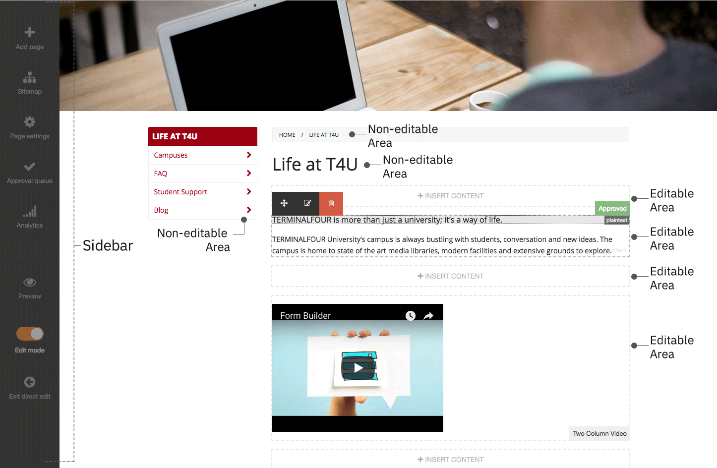
You might notice that within the Direct Edit settings, there are plenty of mentions of "pages" instead of "Sections". This is intentional. Sections let you Preview and Publish to a variety of Channels using different Page and Content Layouts across multiple sites.
When we are using Direct Edit we are editing a page previewed through a specific Channel using particular Layouts. We are also limited to the site that the current page is located in, so we are unable to move a page across sites.
Similarly, you cannot create Link Sections, Hidden Sections, or other features in Direct Edit.
Add Page
To add a new child page or Section below the page currently being edited in Direct Edit select Add page and provide a name. Direct Edit will reload with the new page ready to edit.
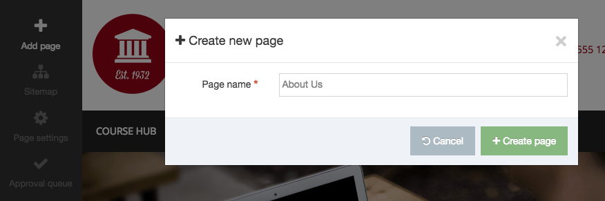
Sitemap
The Sitemap option will display the Site Structure of the current site only. From this, you can navigate to other pages or, using the Actions menu, add a child page or delete a page.
Link Sections cannot be edited in Direct Edit.
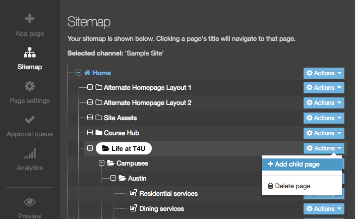
Page Settings
With Page Settings, you can configure the page options. The settings are grouped in categories. Select the category name or the arrow to the left of the category name to expand it. For further information on these options, refer to the documentation about Creating Sections.
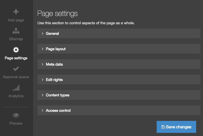
General
The information shown in this page reflect the latest settings for this page.
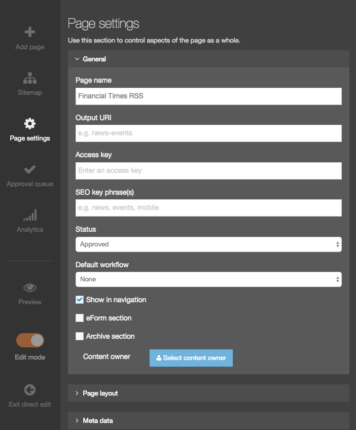
Page Layout
You can change the Page Layout and the Inheritable Page Layout for multiple Channels here. The Channel names are on the right in caps.
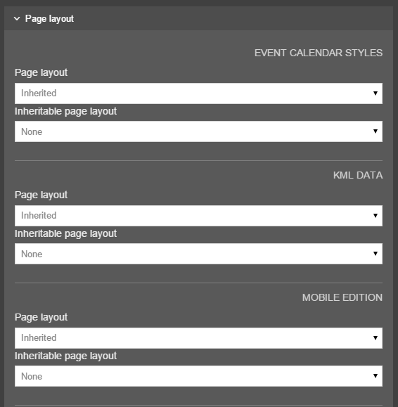
Metadata
You can edit the page's metadata values here. The metadata properties listed here can be configured in the Metadata settings.
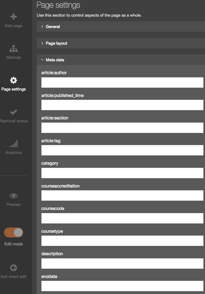
Edit Rights
This tab lets you see what the page Edit rights are for your Users or Groups.
This tab is read-only, you must use the standard interface to make changes.
| Item | Description |
|---|---|
| User/group | the Users or Groups that have editing rights to this page. |
| Role | the Access Role of the corresponding User/Group. |
Content Types
You cannot edit from this tab, you must use the standard interface to make changes to the Content Types on this page.
Access Control
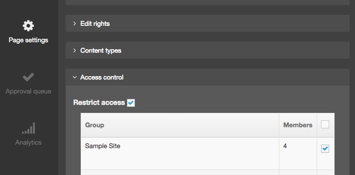
If you want to restrict access to this page, check the Restrict Access box, and then choose the Group(s) you want to provide access to. Being restricted means the users indicated can only view this content when they log in.
Approval Queue
This displays a list of content items which are currently pending approval. Approval requires an Administrator, or if assigned the rights, a Power User or Moderator. Each item in the queue shows the following information:
| Item | Description |
|---|---|
| Title | The name of the Content Item. Clicking on the Title will display the Content Options modal. |
| Last Modified | The date and time when the content was last modified |
| ID | The unique content ID number |
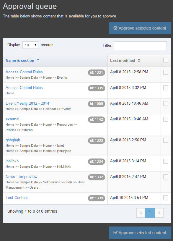
Analytics
Direct Edit provides content editors with insights from Google Analytics so they can see how well a page's content has performed over time. To see analytics in Direct Edit, you will need to ensure that the following is in place:
- In Administration > Settings > Analytics
- set up a Google Analytics in Analytics Accounts
- create a Dashboard
- assign the Channel that your page will be published with to the Dashboard
- add a Report to the Dashboard
- the page's Page Layout should include the Google Analytics tracking snippet
When Analytics is successfully set up, it will be available in Direct Edit:
When Analytics in Direct Edit is working correctly, the following page statistics are displayed:
- Unique/total visitors
- a unique visitor is an individual that visits the site once a day for three days out of a week. This is recorded as three visits by one visitor. Recorded time periods can be a day, week, month or year. Each point on the graph shows indicates the date of a content change. With this, you can see the effect that content changes have on site visits
- Unique page views this month
- with unique page views, you eliminate the factor of multiple views of the same page within a single session. If a user views the same page more than once in a session, this will only count as a single unique page view. For this reason, unique views can be understood as user sessions per page, with each session potentially representing multiple views of the page but a minimum of one view per session.
- Bounce rate
- Bounce rate is a measure of the effectiveness of a website in encouraging visitors to continue with their visit. If the visitor only visits one page and then leaves without viewing another page on the site - this is a "bounce". It is expressed as a percentage and represents the proportion of visits that end on the first page of the website that the visitor sees.
- Average time a user is on this page
- to calculate time on page, Google Analytics subtracts the difference between the timestamps for two pages. For example, if a visitor visits Page A at 10:00 a.m. and then Page B at 10:05 a.m., the time on page for Page A will be 5 minutes. To get an average time on page for a specific page, the total time spent on a page for the selected date range is divided by the number of unique visits to that page. The value is shown in minutes.
- Most visits from
- this is a geographical reference as to the location where most site visitors originate.
Edit Content
Those parts of the page that are editable are identified with a surrounding dashed line. Editable areas are Content Items that use a Content Type with Direct Edit enabled. Page Layout and Navigation Object Content Items are not editable in Direct Edit and can only be edited within the main interface.
The empty content areas on a page are labeled with Insert Content text. Editable areas of the page are highlighted when the cursor hovers over them. Here, we can see the cursor highlighting an editable empty content area, plain text and HTML areas of the page.
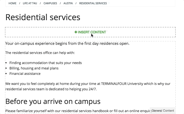
We can also see if the approval status of the content area on the right-hand side.
Both Plain Text and HTML can be edited in place using Direct Edit. When editing HTML content formatting, links and Media Items using the HTML editor.
To add an image or a link to a file in the Media Library, like a PDF, just go to Insert > File link or image or select the photo icon in the icon row.
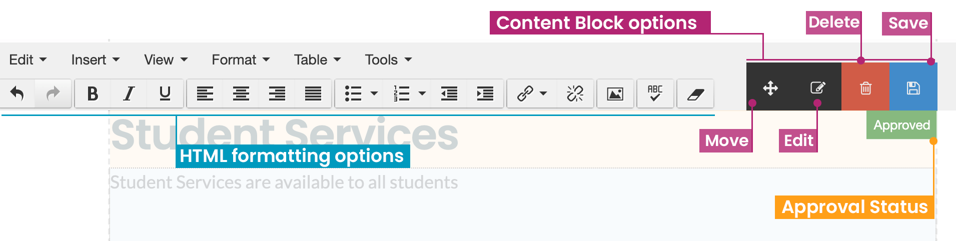 Content Item Options
| Name | Description |
|---|---|
| Move | Select and hold to drag the Content Item to another position on the page. |
| Edit | Opens a modal window with advanced content editing options that are not accessible from the Direct Edit area alone. |
| Delete |
Users with appropriate permissions can delete the current Content Item. Deleted content is flagged as Inactive and can be retrieved or permanently purged from Recycle Content. A modal window will be displayed to confirm the deletion. When deleting a Mirrored Content Item a confirmation modal window will appear. |
| Save | The Save button will display when the Content Item has been edited. When selected, edits to the current Content Item are saved. |
Preview
Selecting the Preview option from the side menu allows the user to Preview the page outside of the Direct Edit interface. This will give a clearer representation of how the page will look once published.
Edit Mode Toggle
Selecting the Edit Mode toggle from the side menu allows the user to disable the editing mode in order to get a more accurate view of how the content will look once published, and to click links within the content (with Edit mode enabled, it is not possible to click links within content).
Exit Direct Edit
To exit Direct Edit select Exit direct edit from the side menu. This provides a modal that allows the user to either Log out of Terminalfour, or switch to the standard interface:
Edit content
Description
Editing Content is just as easy as creating it in the first place. You can start from the Menubar on the left or from the Section Action Menu in the Site Structure.
You can choose to create content from the Content menu item in the Menu or select a Section from the Site Structure and create content from there.
Edit content from the menu
Go to Content > Edit Content:
You will then be asked to select the Section that contains the Content you want to edit:
Once the Section has been selected, you can then select the Content Item that you want to edit:
Edit Content from Site Structure
In the Site Structure, select the Section with the content you want to edit. From the Section Action Menu select Edit Content:
This will open the Content tab in the selected Section screen. From here you can choose the Content Item you intend to edit:
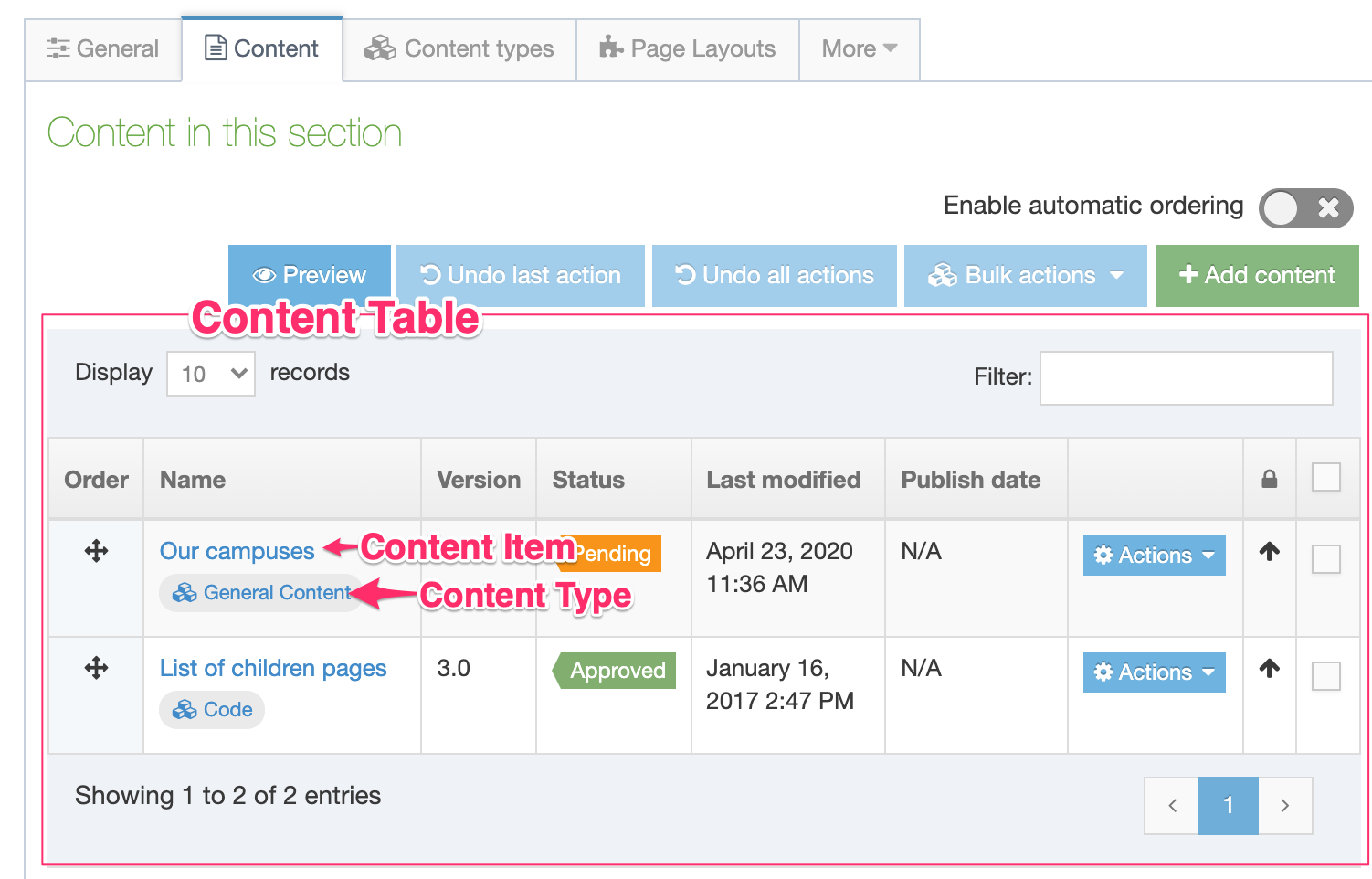
The buttons at the top and bottom of the Content Table are:
| Item | Description |
|---|---|
| Above Content Table | |
| Preview | Preview the Content Items in the Section |
| Undo last action | Undo the last re-ordering action |
| Undo all actions | Undo all content re-ordering actions |
| Bulk actions |
This is a drop-down menu of options which can be applied only if multiple Content Items are selected. These options are:
|
| Create Content | Create a content item. When you select this, you will be asked to choose a Content Type to add the content to. See this article on creating Content for more detail on this. |
| Below Content Table | |
| Delete | Delete the current Section |
| Cancel | Return to Site Structure without saving changes. Changes to ordering are saved as they are made. |
| Save Changes | Save changes and return to Site Structure. |
Content Table
The Content Table features the following column names:
| Item | Description |
|---|---|
| Order | Dragging the cross icon will change the order of a Content Item. This icon is not displayed for content that is automatically ordered, except for content that is locked to the top or bottom. |
| Name | The name of the Content Item |
| Version | The version number of the Content Item. Each time you make and save an edit to a Content Item a version is created. This allows you to view and compare older versions of Content Items. |
| Status |
|
| Last modified | The date on which the Content Item was last modified. |
| Publish date | If a publish date is set for the Content Item it is displayed. |
| Lock status | Locks a Content Item's order, preventing it from being reordered. The position of each Content Item in the ordering is either locked or unlocked, determined by whether or not Automatic Ordering is enabled for the Section. |
To edit a Content Item select the name or select the Actions Menu and choose Edit.
Other options on the Actions list are covered below.
Depending on the User Level of the editor, changes made to existing content might require approval before publishing on the live site. When published the changes appear on the live site.
Media Categories
Description
Categories help keep your media organized with a labeled folder structure. When you add a new item to the Media Library you can choose to add it to a new or existing Category folder. Categories are arranged in a hierarchical folder structure so you can place Child Categories inside parent Category folders. It's worth taking time to plan the Categories and Child Category organization that would work best for your organization.
Categories can be used to manage access to create/edit media (write access) and use media (read access). Categories are also used as the folder names for images and documents when they are published (if this has been enabled under Generate Media in Preview & Publish Settings)
Create Category
To create a Category, click Create Subcategory on the Actions menu and the General tab opens. Give the Category a name and click Save changes. Additional options are available when editing a category.
Edit Category
To edit a Category, select Edit Category in the Actions menu (this option only appears if you have been granted Write access to the category). When you click Edit Category the screen below is displayed.
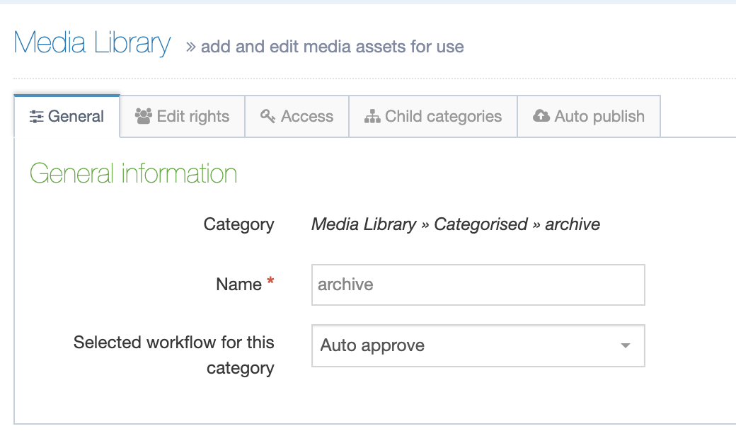
This gives you access to the following tabs:
If necessary, you can Delete a Category/Subcategory from any of the tabs. At the bottom of each page is a red Delete button. Click and a confirmation popup box appears, click Confirm and the Category is deleted.
General Tab
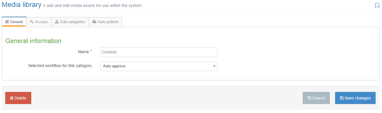
In the General tab, you can edit the Category Name and select a Workflow for the Category. If no Workflow is specified, choose Auto Approve.
TERMINALFOUR recommends the use of Auto Approve. Applying a Workflow to Media can delay the publication of content that uses unapproved Media.
Edit Rights Tab
Write Access settings define the users or groups that can upload or edit media within the system to this Category or its Child Categories. Any users of groups added here automatically have "Read access" to this Category and any Child Categories.
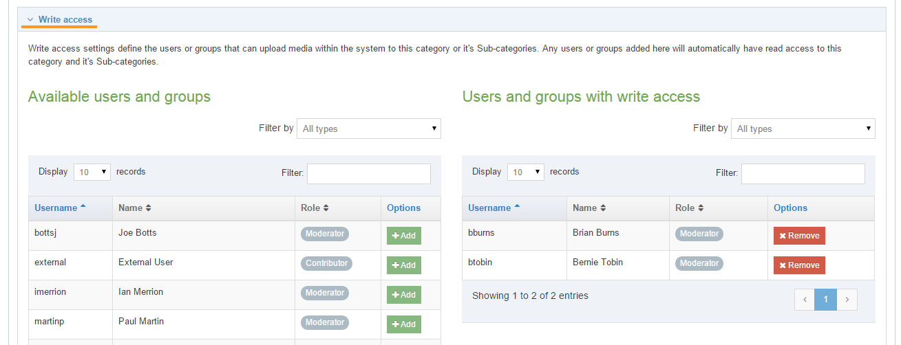
Read access settings - Read access settings define the users or groups that can use media in this category or any sub-categories.
If this is not configured for a category, ALL users have read access to that category.
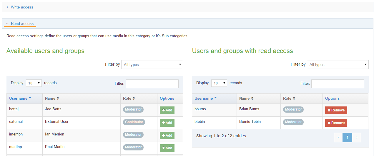
Access tab
Access control is used to restrict access to Published assets. If enabled, the options available will depend on the Access Control Content Type and Access Control that has been configured.
Do not confuse Published assets with the Read and Write access presented above.
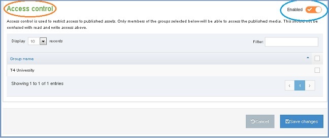
Subcategories
The Subcategories tab allows the user to create a new Subcategory, re-order Subcategories and to automatically order the Subcategories.
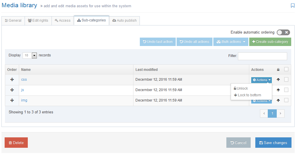
To create a new Subcategory, click Create Subcategory. The General tab opens, complete the entries, and click Save changes.
To automatically order the media Categories, select to Enable automatic ordering and select whether to order alphabetically or by last modified. It is then possible to lock specific sub-categories to the top or the bottom of the list.
Move Category
To Move a Category, drag and drop it in the Category view of the Media Library.
To re-order Categories, Edit the parent Category and select the Subcategories tab.
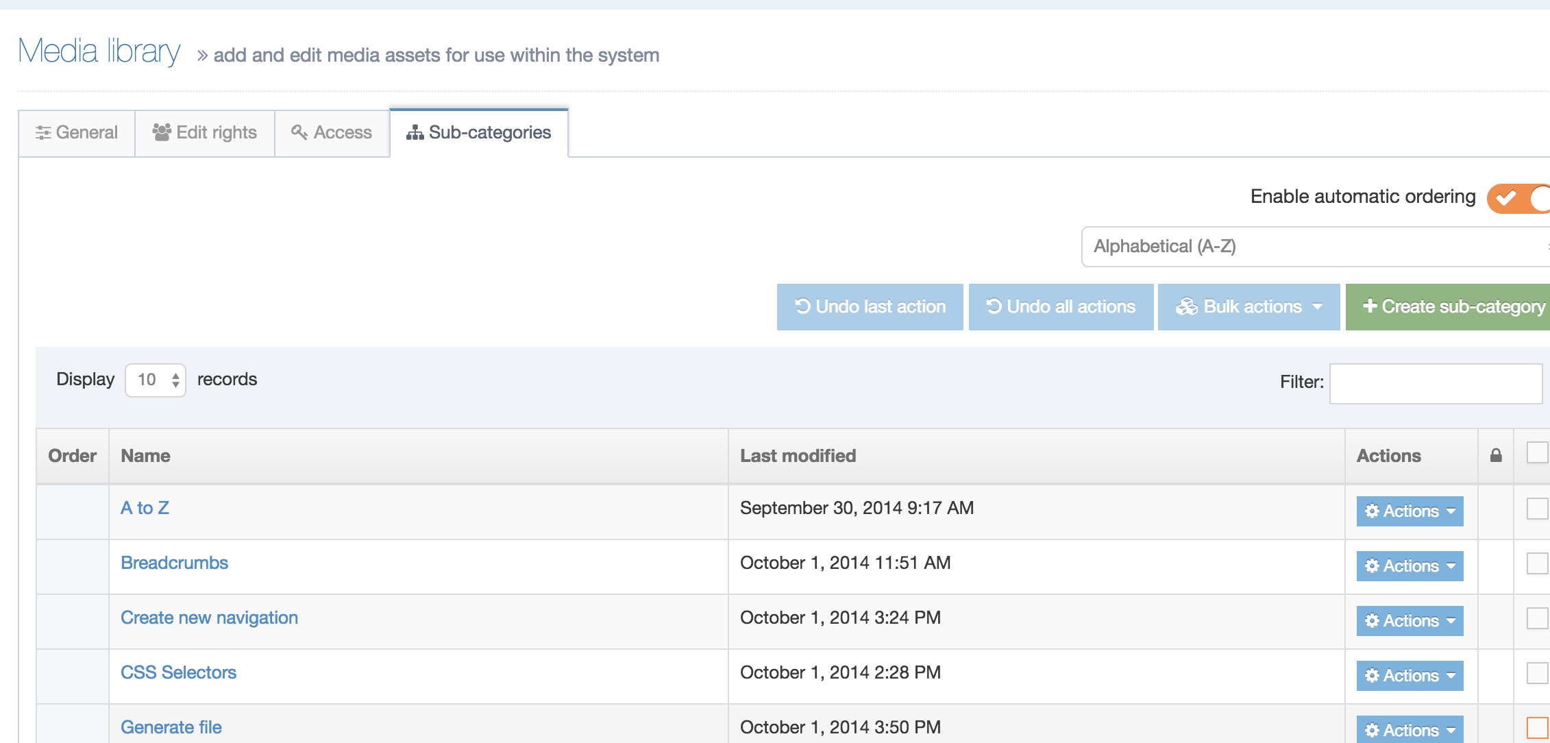
Delete category
You can delete from any tab, or from the Actions menu, select Delete. A "Confirm delete" popup window appears for you to confirm the request:
To proceed, click Delete. The media category is removed from the Site Structure.
Once a Media Category is deleted, it is no longer visible in the Media Library, but it is in the Recycle Bin. Media within deleted Categories is removed from the published content.
Auto publish
With Auto publish you can specify rules to control how Media Items of certain Media Types are published. This is useful if a T4 Tag doesn't reference a Media Item, but you still want to ensure that it is updated when a publish is run. An example of this could be PDF documents that may not necessarily be linked to by a T4 Tag but could be updated frequently and be linked to by external sites. In this instance, you'll want to ensure that the latest version of a PDF is always published even if none of your pages link to it.
While Auto publish can be configured per Channel, you can also configure it for individual Categories. The three types of rules are:
- Always publish – Always publish Media Items of this Media Type
- e.g., always Auto publish PDFs
- Category – Publish Media Items of this Media Type only if other Media Items with the same Media Type are going to be published in this Category (e.g., if they are referenced in a T4 Tag)
- e.g., only Auto publish PDFs if other PDFs in the Category are reference by a published page's T4 Tag
- None – Don't automatically publish Media of this Media Type
Auto publish rules configured for a Channel are global and recursive. This means that rules are applied to the Root Media Category (Categorized) and all Child Categories.
Auto publish rules associated with a Media Category only, are not inheritable and must be defined for each Category they are required for.
Media Items
Description
Media Items are stored within the Media Library and are organized into Media Categories. To access the Media Library, go to Content > Media Library.
Below the Add media button, and the options to navigate the Media Library, Media for the currently selected category is displayed in a tabular view, displaying a preview icon (for images) and sortable columns for the Media Name, Filename, Type and Size.
An icon is displayed for Media Items that have Variants. To see the number of Variants just hover your cursor over the icon.
The last column is a checkbox that allows you to select items for Bulk actions.
You can sort the listed Media Items by the Name, Status, Type, Size and Last modified columns.
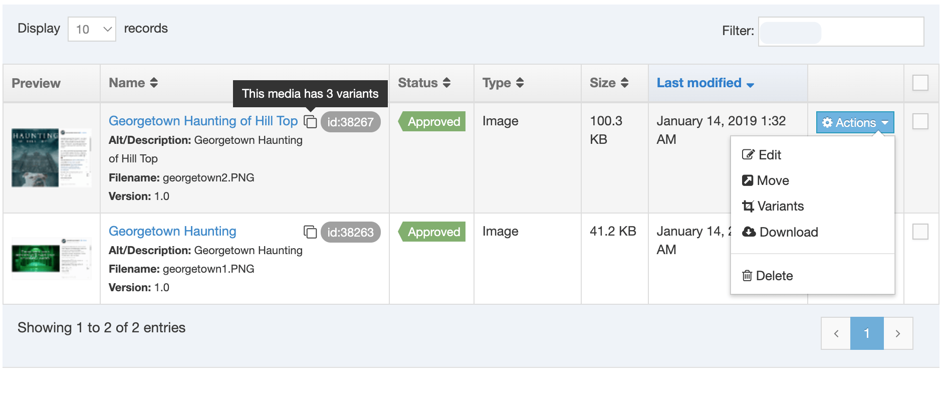
The Actions menu gives the options for:
Add or Edit a Media Item
Add a Media Item
To add a Media Item navigate to the Media Category that the media will be added to and select the Add media button (you'll only see this button if you've been granted Write access to the Media Category).
This opens the General tab:
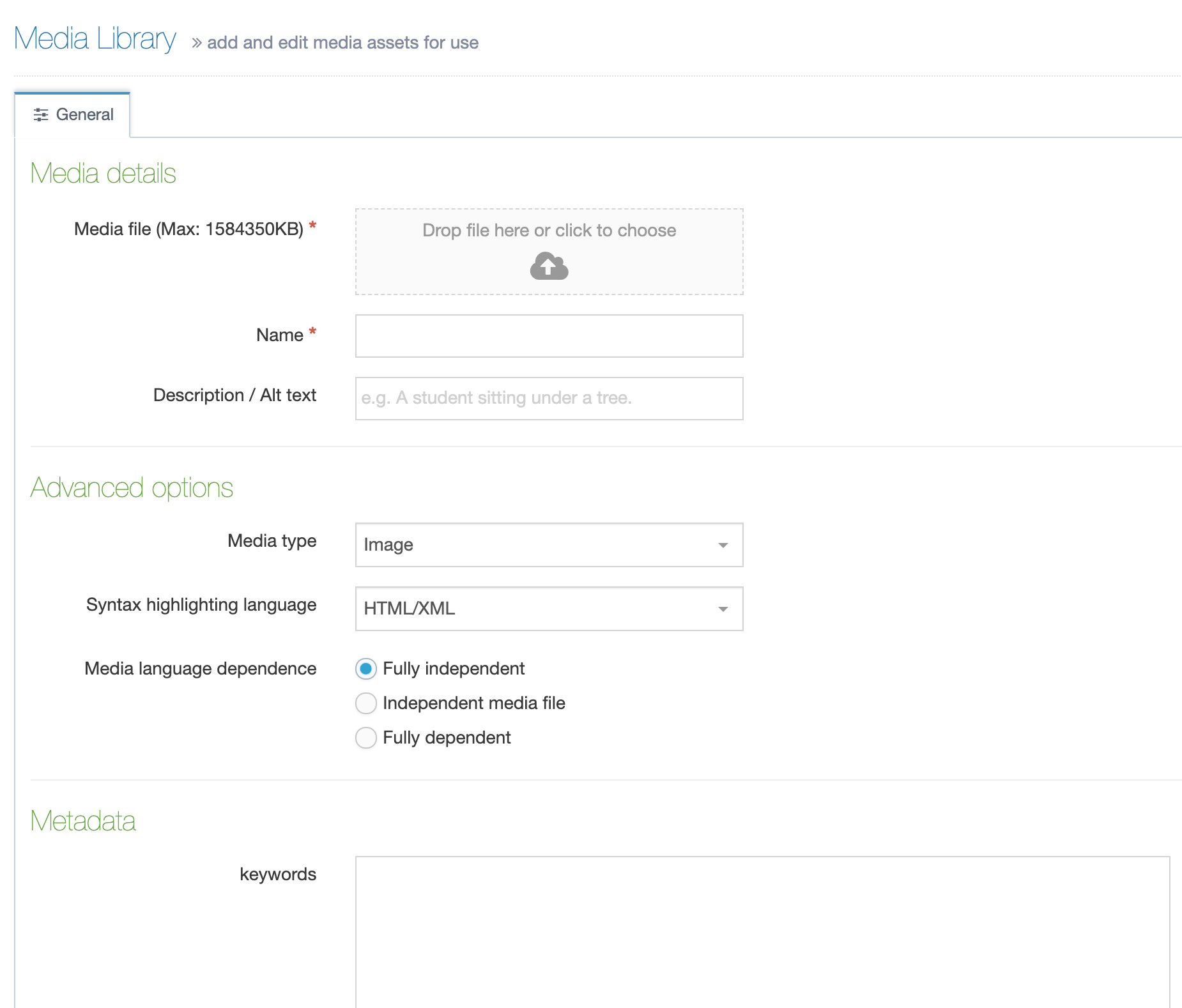
Add or edit the following details:
| Item | Description | ||||||||||||||||||||||||
|---|---|---|---|---|---|---|---|---|---|---|---|---|---|---|---|---|---|---|---|---|---|---|---|---|---|
| Media file* | To upload a file click the dropzone and select a file from your local machine or drag a file to the dropzone. | ||||||||||||||||||||||||
| Media type* | The Media type automatically determined based on the Media types configuration but the type can be modified. If the file extension is unknown within the media types, you need to select the type manually. | ||||||||||||||||||||||||
| Name | Add a descriptive Name. This becomes the name of the media item to Media library users. For Microsoft Office and PDF documents, this is often used as the default link text when using the document within a Content Item. | ||||||||||||||||||||||||
| Description/ Alt text | Provide a brief Description. This value is also used as the alt text for image Media Items | ||||||||||||||||||||||||
| Syntax highlighting language | Sets the language used for the syntax highlighter when editing this Media Item. This is only used for non-binary Media Types. | ||||||||||||||||||||||||
| Media language dependence |
This is only relevant for sites that are in multiple languages. For single-language websites, you can use the default.
|
||||||||||||||||||||||||
| Keywords | Include some keywords that can be used when searching for Media Items in the Media Library. |
If you are satisfied with the entries, then click Save changes.
Bulk uploading
If you need to bulk upload Media Items, you can use a Media Archive Package to bulk upload Media Items like images or documents to the Media Library.
Add or Edit a Media Item
Edit a Media Item
Go to Content > Media Library and select the Media Item name, icon, or thumbnail from the list on the right (see screenshot above).
Image Media Items have thumbnails while other file types are accompanied by an icon.
A download button has been added to the Media Item edit screen in version 8.3.5.
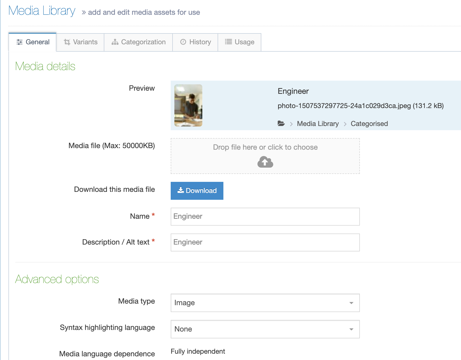
Media Variants
With Media Variants, you can create resized and cropped versions of Media Items, while retaining the original. Depending on the Media Variant configuration, these may be created automatically when Media is added, or they can be created manually.
Prior to version 8.3.19, updating an image in the Media Library did NOT automatically update the variants. Variants will need to be individually updated on these version.
To create a variant, select the Variants option on the Action menu next to a Media item (this option will only appear if you have been granted Write access to the selected Media Category).
You'll need to provide a Name for the Variant as well as an optional Description. The description text you add will be used for the alt text when the image is published. If no description text is provided for the Variant, the parent Media Item description text will be output for the alt text.
When you select Variants you'll see the crop/resize options as well as your image with a crop area highlighted.
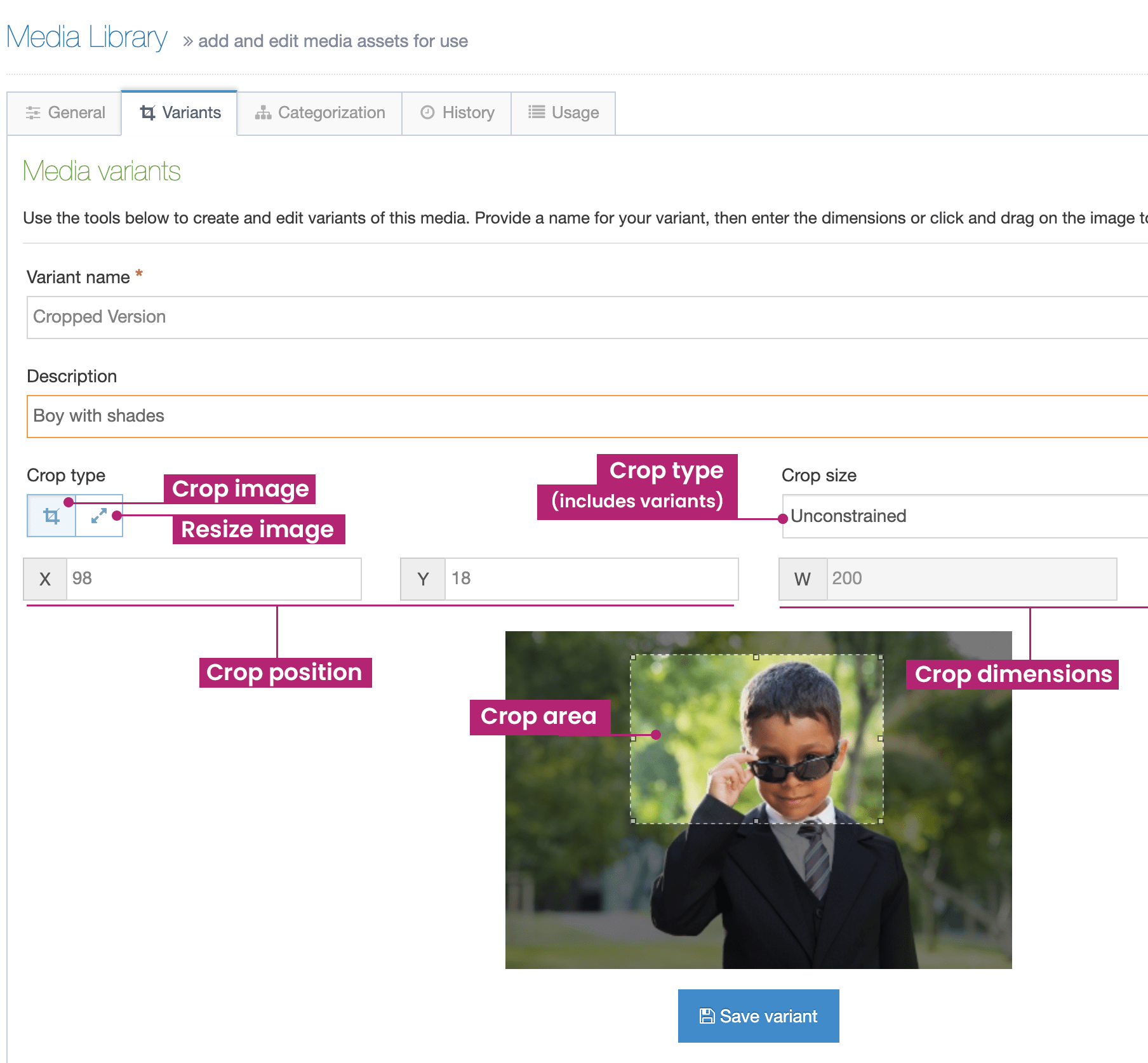
Crop Tool
This tool is similar to most image editing tools. The tool is activated when you click the Crop icon.
- Crop size: If specific image dimensions are required, select Exact dimensions, or one of the Predefined variant sizes; otherwise leave this as Unconstrained.
- X: Enter the starting X coordinate for the crop (or leave this blank to select it on the image).
- Y: Enter the starting X coordinate for the crop (or leave this blank to select it on the image).
- W and H: If Exact dimensions has been selected, enter the Width and Height in pixels. If the image is larger than the user's screen dimension they will see an alert informing them that the image has been scaled down.
Using your pointer, trace the boundaries of the cropped image you want to save. The portion of the image that remains dark is the portion that will be removed from the image.
Enter a Name and a Description and click Create variant to save the variant.
Resize
To resize the image, you have three options - see image below:

- Predefined variants: If specific image dimensions are required, select Exact dimensions, or one of the Predefined variant sizes.
- Maintain aspect ratio: Check this option to maintain the original aspect ratio when resizing the image. If checked, entering a value into the Width or Height will automatically calculate and populate the other value.
- W and H: Enter the width and height for resizing.
Enter a Name and a Description and click Create variant to save the variant.
Save variant
When you're satisfied with your crop/resize area and have added the name and optional description select the Save Variant below the image preview.
Existing variants
All Variants (resized or cropped) are added to the Existing Variants table. From the Actions menu, you can Edit, Duplicate, Download or Delete a Variant.
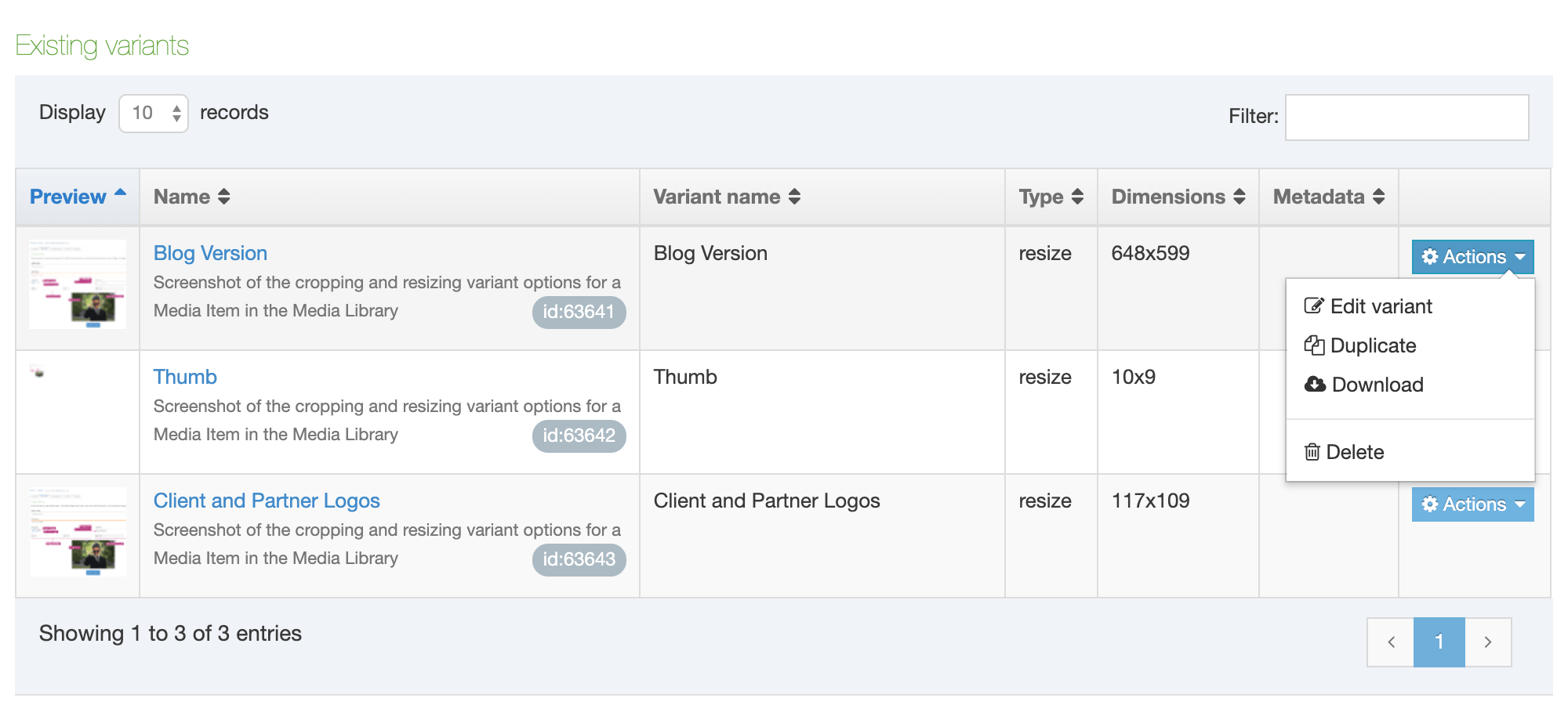
Categorization (and Move Media)
When Media is added to the Media Library, it is added to a Media Category. Similar to Mirrored content, media can exist in multiple categories. To move Media to a different category, or to mirror the Media to multiple categories, select Move on the Actions menu for the Media, which will bring you to the Categorization tab.

Expand the structure to reveal where the media is to be filed (the checkbox on the right is checked).
- To Move Media, uncheck the current category, and check the category into which it will move. If there are large volumes of Media items to move, use the Bulk actions to move multiple Media items at once.
- To Mirror Media, check the categories into which the Media will be Mirrored.
If satisfied with your choices, click Save changes.
History
To view the History on a Media Item, select Edit on the Actions menu for the Media and select the History tab. This displays each version of the Media, showing the Name, Version, Previous version, Last modified date and time, and the Last modified user.
Usage
To view where a Media Item is used, select Edit on the Actions menu for the Media and select the Usage tab. The information listed for the media is:
- Content name
- Asset type
- Variant
- Location
- Occurrences
This is useful in determining where a Media Item is used, and whether it can be deleted.
Download media
To Download an item from the Media Library, select an item, and from the Actions menu, select Download.
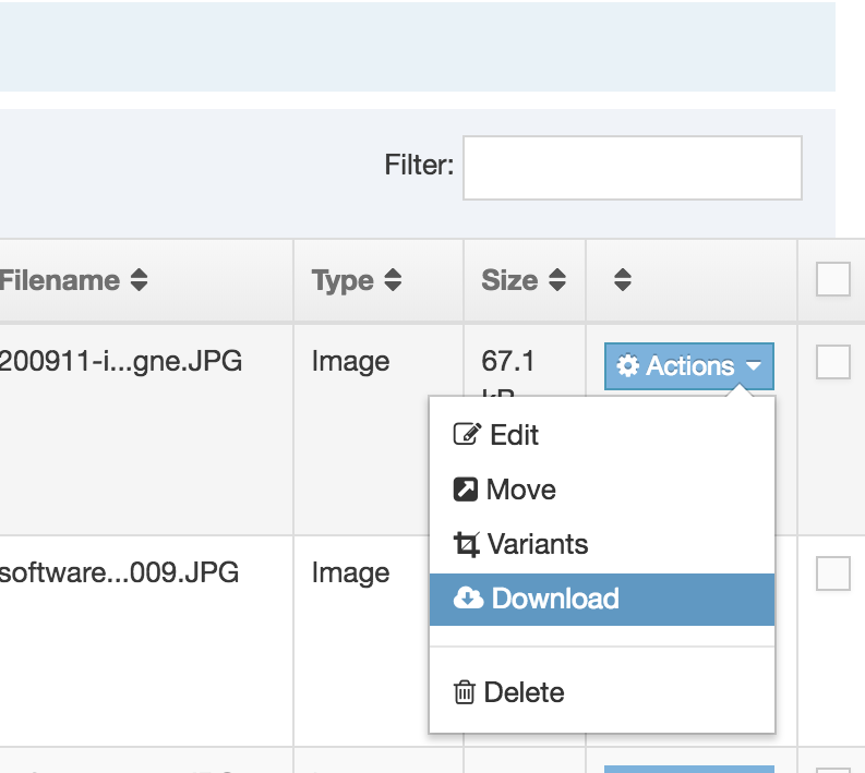
This action may open the file in your Operating System dialog box. See below from Windows:
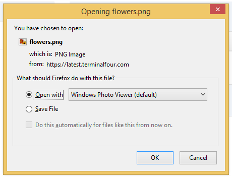
Open the file with an image viewer, or select Save file, and click OK. Save the download to a location of your choice.
Delete Media
You can Delete media from the Media Library. To do so, select the file you want to delete, click the Actions button, and select Delete. This action prompts a "Confirm delete" popup window (see below):
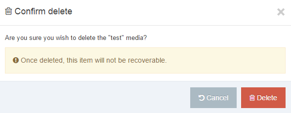
If you want to proceed, click Delete.
From version 8.3.10 the Confirm Delete modal will list the Content Items where the Media Item is present:
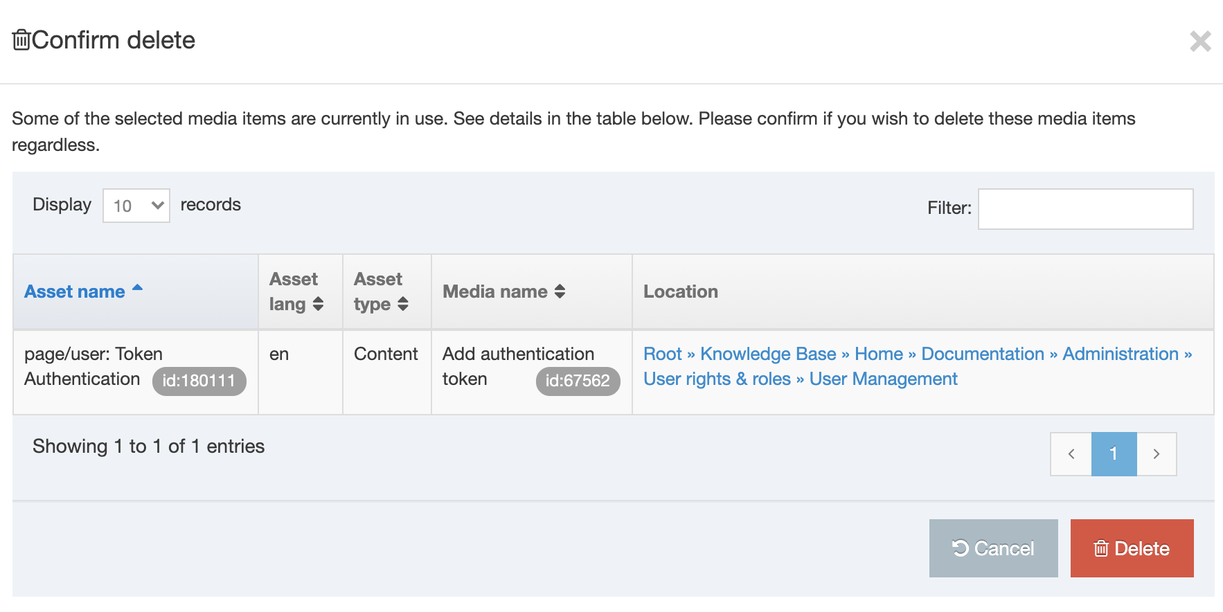 To visit the Content Item that the Media Item appears in select the path and it will open in a new tab.
Bulk deleting
If there is a large number of Media Items to delete, use the Bulk actions to delete multiple Media Items at once.
Alternatively, when you have any of the Media Items open, you can choose to delete from any of the four tabs. If you choose to delete the media from any of these pages, click the red Delete button, and again a "Confirm delete" popup window appears. To proceed, click Delete, and the media is removed from the library.
Once Media is deleted, it is sent to the Recycle Bin where it can be purged or recovered. If the Media Item is used in a Content Item, it will be removed from the Content Item.
Bulk Actions
When you want to Move or Delete more than one media file, you can use Bulk actions button. To Move or Delete, you need to select the appropriate media files. Do this by checking the boxes in the far right column of the table. When you select two or more files, the Bulk actions button has the option to:
- Move: move the selected Media by selecting the destination category
- Delete: delete the selected Media
Media Library Configuration Settings
Description
This page describes the settings used to configure the Media Library.
Media Library documentation can be found here.
You can find the Media Library settings at System Administration > System Settings > Media Library.
General Settings
The General Settings tab contains some general configuration options for the Media Library.
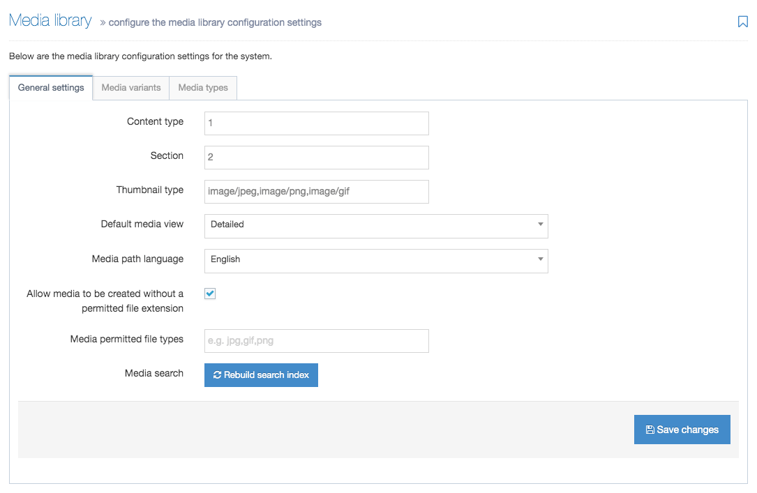
| Item | Description |
|---|---|
| Content Type | Sets the ID of the Content Type used to upload content to the Media Library |
| Section | Sets the ID of the Section to store Media Library items. This setting should generally be left unchanged |
| Thumbnail Type | A comma-separated list of the MIME types that have thumbnails enabled in the Media Library e.g. image/gif, image/jpeg, image/png |
| Default Media View | Exists from legacy v7.4 and is not used in TERMINALFOUR v8. |
| Media Path Language | For Multilanguage sites, this sets the language used to determine the published file path for fully independent and binary media files |
| Allow media to be created without a permitted file extension | Enables users to upload Media Items with extensions not currently associated with the media type. |
| Media permitted file types | Enter a comma-separated list of file extensions to restrict the file types that can be uploaded into the Media Library. This also applies to image elements in Content Types. File elements can be configured in the content configuration. If blank, no restrictions are applied. e.g. jpg,gif,png |
| Media search | Select Rebuild search index if the Media Search is not functioning correctly. |
Media Variants
When an image is uploaded to the Media Library you may want one or more resized versions to be automatically created, e.g., when a large photo is uploaded, a small thumbnail is generated as well. The presets used for these variants are configured here.
All existing Variants are listed here.
Select the Create New Media Variant button.
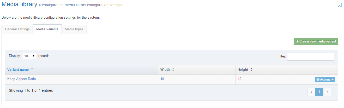
| Item | Description |
|---|---|
| Variant Name | Each Variant should have a unique and recognizable name. |
| Width | Use pixel values |
| Height | Use pixel values |
| Options |
|
Once the settings have been entered, select Save changes.
Media Types
A Media Type is associated with items added to the Media Library which determines its formatting when published. The system will automatically select the Media Type based on the file extension when a file is uploaded to the Media Library. However, if the same file extension is associated with multiple Media Types, you will be prompted to select one.
To create a new Media Type, click the Create New Media Type button.
| Item | Description |
|---|---|
| Name | Identifies the Media Type. e.g. Adobe PDF document |
| Permitted File extensions | Comma-separated list of accepted file extensions. e.g. .doc, .docx, .ppt etc. |
| Maximum File Size | Sets the maximum file size in bytes for this type. This cannot exceed the default maximum file size of the Media element specified in the Media Content Type, which cannot exceed the global Max upload size set in Advanced Configuration. Leave blank to use the default value in the Media Content Type. |
| Binary File | Prevent users from editing these files as text within the Media Library. Use for image, audio and video files. |
| Parse for T4 Tags | Parse non-binary (text) files for T4 Tags. Use for CSS or JavaScript files. |
If your Media Type does not function as expected, you may need to rebuild the cache after creating it.
Associated Content Layouts
Select Add Row when you have entered the settings and select the Media Content Layout to be used when the media is inserted into a Content Item. If multiple layouts are selected, you should select a default.
If you are satisfied with the entries, then click Save Changes.
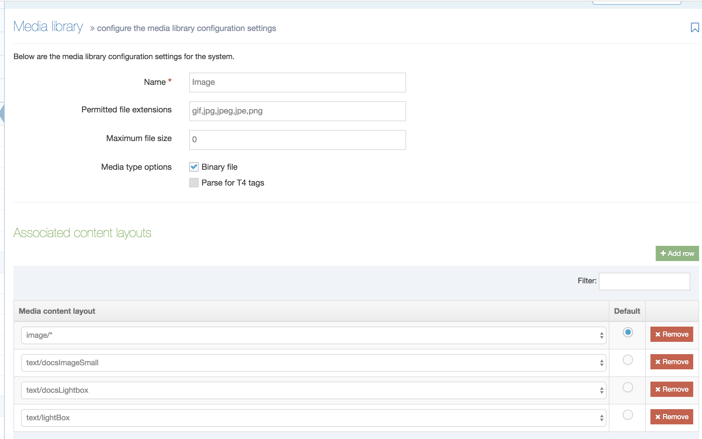
Media Search
Description
As your site grows so will your Media Library so it's important that you can find your files as quickly as possible. The Media Search makes file retrieval fast and efficient.
We've created a guide to installing Simple Search, the engine powering Media Search.
Search Media
To search for a Media File, go to the Media Library screen and enter your search terms into the search box:
You can use the following search terms:
- filename
- the name of the uploaded file
- Media File name
- a more meaningful name than the original filename can be given to a Media File. Unlike the filename, this does not contain a file extension and can be changed in the Media Library.
- keyword
- description
- Media File ID number
- Media Type
Search Results Page
The search results page will list the following information for each Media File in :
| Column | Name | Description |
|---|---|---|
| Preview | Preview | A thumbnail will be displayed for image files. For other file types, an icon representing the file type is shown. |
| Media | Name |
The name that has been given to the Media File when the file was added to the Media Library. The name can be updated in the Media File settings. When the name is clicked on you can edit the Media File details. |
| Description | The Media File description provides more information about the file. This is also used to populate the alt attribute value. | |
| Keywords | Adding keywords to your Media Files lets you group them and find them. | |
| Category |
The Category for the Media File. On rollover, the path to the Category is displayed, e.g., Category > Subcategory. When the Media File belongs to more than one Category a badge will be displayed with the number of other Categories that the Media File also appears in. Rollover the badge to see a list of other Categories and their paths. |
|
| ID | The Media File unique ID number. | |
| File details | Filename | The name and file extension of the uploaded file. |
| File size | The size of the file in kilobytes or megabytes. | |
| Media Type | A Media Type, based on the file extension, is associated with a file when it is uploaded to the Media Library. The Media Type can be changed in the Edit Media settings screen. | |
| Status | A Media Item has a status of Approved when uploaded. When a Media File is deleted the status is changed to Inactive and it will no longer publish. | |
| Last modified | A timestamp of the date and time the file was changed last. | |
| Action Menu |
The following options can be selected: |
If you notice that the search is not behaving as expected, e.g., Media Files are not appearing in the search results, you can trigger a re-index from the Media Library settings.
Approval configuration settings
Description
To configure the approval settings go to System Administration > Hierarchy & content settings > Approval.
| Item | Description |
|---|---|
| Page refresh rate | Sets the number of seconds between an automatic refresh of the content approval page. Exists from legacy v7.4 and is not used in TERMINALFOUR v8. |
| Enable override of default sender for rejected content | Sets the "from" address for content rejection emails (sent as part of Workflows or Rejecting content) to the logged in user's email address. This can be useful as users have been known to reply to the Workflow emails. Unchecked, content rejection emails come from the application default email address (configured in General settings). |